(UPDATED with examples for Bootstrap v4, v3 and v3)
Examples of forms with validation classes for the past few major versions of Bootstrap.
Bootstrap v4
See the live version on codepen

<div class="container">
  <form>
    <div class="form-group row">
      <label for="inputEmail" class="col-sm-2 col-form-label text-success">Email</label>
      <div class="col-sm-7">
        <input type="email" class="form-control is-valid" id="inputEmail" placeholder="Email">
      </div>
    </div>

    <div class="form-group row">
      <label for="inputPassword" class="col-sm-2 col-form-label text-danger">Password</label>
      <div class="col-sm-7">
        <input type="password" class="form-control is-invalid" id="inputPassword" placeholder="Password">
      </div>
      <div class="col-sm-3">
        <small id="passwordHelp" class="text-danger">
          Must be 8-20 characters long.
        </small>
      </div>
    </div>
  </form>
</div>
Bootstrap v3
See the live version on codepen

<form role="form">
  <div class="form-group has-warning">
    <label class="control-label" for="inputWarning">Input with warning</label>
    <input type="text" class="form-control" id="inputWarning">
    <span class="help-block">Something may have gone wrong</span>
  </div>
  <div class="form-group has-error">
    <label class="control-label" for="inputError">Input with error</label>
    <input type="text" class="form-control" id="inputError">
    <span class="help-block">Please correct the error</span>
  </div>
  <div class="form-group has-info">
    <label class="control-label" for="inputError">Input with info</label>
    <input type="text" class="form-control" id="inputError">
    <span class="help-block">Username is taken</span>
  </div>
  <div class="form-group has-success">
    <label class="control-label" for="inputSuccess">Input with success</label>
    <input type="text" class="form-control" id="inputSuccess" />
    <span class="help-block">Woohoo!</span>
  </div>
</form>
Bootstrap v2
See the live version on jsfiddle

The .error, .success, .warning and .info classes are appended to the .control-group. This is standard Bootstrap markup and styling in v2. Just follow that and you’re in good shape. Of course you can go beyond with your own styles to add a popup or «inline flash» if you prefer, but if you follow Bootstrap convention and hang those validation classes on the .control-group it will stay consistent and easy to manage (at least since you’ll continue to have the benefit of Bootstrap docs and examples)
  <form class="form-horizontal">
    <div class="control-group warning">
      <label class="control-label" for="inputWarning">Input with warning</label>
      <div class="controls">
        <input type="text" id="inputWarning">
        <span class="help-inline">Something may have gone wrong</span>
      </div>
    </div>
    <div class="control-group error">
      <label class="control-label" for="inputError">Input with error</label>
      <div class="controls">
        <input type="text" id="inputError">
        <span class="help-inline">Please correct the error</span>
      </div>
    </div>
    <div class="control-group info">
      <label class="control-label" for="inputInfo">Input with info</label>
      <div class="controls">
        <input type="text" id="inputInfo">
        <span class="help-inline">Username is taken</span>
      </div>
    </div>
    <div class="control-group success">
      <label class="control-label" for="inputSuccess">Input with success</label>
      <div class="controls">
        <input type="text" id="inputSuccess">
        <span class="help-inline">Woohoo!</span>
      </div>
    </div>
  </form>
Уведомления
Предоставляйте контекстные сообщения обратной связи для типичных действий пользователя с помощью нескольких доступных и гибких предупреждающих сообщений.
Примеры
Уведомления доступны для любой длины как текста, так и опциональной кнопки отмены. Для правильной стилизации используйте один из 8 требуемых контекстуальных классов (например, .alert-success). Для строчного отклонения используйте плагин уведомлений jQuery.
<div class="alert alert-primary" role="alert">
  Это основное уведомление — check it out!
</div>
<div class="alert alert-secondary" role="alert">
  Это дополнительное уведомление — check it out!
</div>
<div class="alert alert-success" role="alert">
  Это уведомление об успехе — check it out!
</div>
<div class="alert alert-danger" role="alert">
  Это уведомление об опасности — check it out!
</div>
<div class="alert alert-warning" role="alert">
  Это уведомление-предупреждение — check it out!
</div>
<div class="alert alert-info" role="alert">
  Это инфо-уведомление — check it out!
</div>
<div class="alert alert-light" role="alert">
  Это инфо-уведомление — check it out!
</div>
<div class="alert alert-dark" role="alert">
  Это темное уведомление — check it out!
</div>
Использование вспомогательных технологий
Использование цвета как дополнительного инструмента информативности доступно только в визуальной сфере, что ограничивает пользователей вспомогательных технологий, например, программ для чтения текста с экрана. Удостоверьтесь, что информация, обозначенная цветом, также доступна из самого контента (т.е. в тексте) или содержится в альтернативных средствах – таких как дополнительный скрытый в классе .sr-only текст.
Цвет ссылки
Используйте класс .alert-link для соответствия цвета ссылок цветам уведомлений.
<div class="alert alert-primary" role="alert">
  Это основное уведомление с <a href="#" class="alert-link">примером ссылки</a>.
</div>
<div class="alert alert-secondary" role="alert">
  Это дополнительное уведомление с <a href="#" class="alert-link">примером ссылки</a>.
</div>
<div class="alert alert-success" role="alert">
  Это уведомление об успехе с <a href="#" class="alert-link">примером ссылки</a>.
</div>
<div class="alert alert-danger" role="alert">
  Это уведомление об опасности с <a href="#" class="alert-link">примером ссылки</a>.
</div>
<div class="alert alert-warning" role="alert">
  Это уведомление-предупреждение с <a href="#" class="alert-link">примером ссылки</a>.
</div>
<div class="alert alert-info" role="alert">
  Это инфо-уведомление с <a href="#" class="alert-link">примером ссылки</a>.
</div>
<div class="alert alert-light" role="alert">
  Это светлое уведомление с <a href="#" class="alert-link">примером ссылки</a>.
</div>
<div class="alert alert-dark" role="alert">
  Это темное уведомление с <a href="#" class="alert-link">примером ссылки</a>.
</div>
Дополнительное содержимое
Уведомления также могут содержать элементы HTML – заголовки, параграфы и т.п.
<div class="alert alert-success" role="alert">
  <h4 class="alert-heading">Отличная работа!</h4>
  <p>Вы успешно прочитали это важное сообщение. Это пример текста немного длиннее, так что вы увидите, как работает спейсинг в сообщениях уведомлений.</p>
  <hr>
  <p class="mb-0">Когда необходимо, используйте марджины для создания необходимых отступов.</p>
</div>
Отмена («крестик»)
Использование JS-плагина уведомлений дает возможность закрыть «крестиком» любое строчное уведомление.
- Удостоверьтесь, что подгрузили плагин уведомлений, или компилированный JavaScript из Bootstrap.
- Если вы загружаете JavaScript для уведомлений из файла, это потребует
util.js. Он есть в компилированной версии. - Добавьте «крестик» отмены и класс
.alert-dismissible, который создаст дополнительный паддинг справа от сообщения и спозиционирует кнопку класса.close. - В «крестике» отмены добавьте атрибут
data-dismiss="alert", запускающий функциональность JS. Используйте элемент<button>для правильной работы на всех устройствах. - Для анимации уведомлений при их закрытии добавьте классы
.fadeи.show.
Вот демо:
<div class="alert alert-warning alert-dismissible fade show" role="alert">
<strong>Holy guacamole!</strong> You should check in on some of those fields below.
<button type="button" class="close" data-dismiss="alert" aria-label="Close">
<span aria-hidden="true">×</span>
</button>
</div>«Поведение» JavaScript
Триггеры
Включите закрытие уведомления через JavaScript:
$(".alert").alert()Или сделайте это с помощью атрибутов data на кнопке внутри уведомления, как показано ниже:
<button type="button" class="close" data-dismiss="alert" aria-label="Close">
<span aria-hidden="true">×</span>
</button>Заметим, что закрытие уведомления удалит его из DOM-структуры документа.
Методы
| Метод | Описание |
|---|---|
$().alert() |
Заставляет уведомление «слушать» события по клику на дочерние элементы с атрибутом data-dismiss="alert". (Необязательно использовать здесь авто-инициализацию API) |
$().alert('close') |
Закрывает уведомление методом удаления его из DOM-структуры. Если в элемент добавлены классы .fade и .show – уведомление исчезнет до того, как удалено. |
$().alert('dispose') |
Уничтожает уведомление элемента. |
$(".alert").alert('close')События
Плагин уведомлений Bootstrap использует несколько событий для связи с функциональностью уведомлений.
| Событие | Описание |
|---|---|
close.bs.alert |
Это событие запускается немедленно при вызове экземпляра метода close. |
closed.bs.alert |
Это событие запускается, когда уведомление закрыто (событие будет ждать завершения «переходов» СSS). |
$('#myAlert').on('closed.bs.alert', function () {
  // do something…
})Содержание
- Alerts
- Examples
- Link color
- Additional content
- Well done!
- Icons
- Dismissing
- Variables
- Variant mixin
- JavaScript behavior
- Triggers
- Methods
- Events
- Alerts
- Examples
- Link color
- Additional content
- Well done!
- Dismissing
- JavaScript behavior
- Triggers
- Methods
- Events
- Уведомления
- Примеры
- Цвет ссылки
- Дополнительный контент
- Отлично сработано!
- Иконки
- Отклонение
- Отклонение
- Переменные
- Вариант миксина
- Поведение JavaScript
- Триггеры
- Методы
- События
- Alerts
- Examples
- Live example
- Link color
- Additional content
- Well done!
- Icons
- Dismissing
- Variables
- Variant mixin
- JavaScript behavior
- Initialize
- Triggers
- Methods
- Events
Alerts
Provide contextual feedback messages for typical user actions with the handful of available and flexible alert messages.
Examples
Alerts are available for any length of text, as well as an optional close button. For proper styling, use one of the eight required contextual classes (e.g., .alert-success ). For inline dismissal, use the alerts JavaScript plugin.
Conveying meaning to assistive technologies
Using color to add meaning only provides a visual indication, which will not be conveyed to users of assistive technologies – such as screen readers. Ensure that information denoted by the color is either obvious from the content itself (e.g. the visible text), or is included through alternative means, such as additional text hidden with the .visually-hidden class.
Link color
Use the .alert-link utility class to quickly provide matching colored links within any alert.
Additional content
Alerts can also contain additional HTML elements like headings, paragraphs and dividers.
Well done!
Aww yeah, you successfully read this important alert message. This example text is going to run a bit longer so that you can see how spacing within an alert works with this kind of content.
Whenever you need to, be sure to use margin utilities to keep things nice and tidy.
Icons
Similarly, you can use flexbox utilities and Bootstrap Icons to create alerts with icons. Depending on your icons and content, you may want to add more utilities or custom styles.
Need more than one icon for your alerts? Consider using more Bootstrap Icons and making a local SVG sprite like so to easily reference the same icons repeatedly.
Dismissing
Using the alert JavaScript plugin, it’s possible to dismiss any alert inline. Here’s how:
- Be sure you’ve loaded the alert plugin, or the compiled Bootstrap JavaScript.
- Add a close button and the .alert-dismissible class, which adds extra padding to the right of the alert and positions the close button.
- On the close button, add the data-bs-dismiss=»alert» attribute, which triggers the JavaScript functionality. Be sure to use the element with it for proper behavior across all devices.
- To animate alerts when dismissing them, be sure to add the .fade and .show classes.
You can see this in action with a live demo:
Variables
Variant mixin
Used in combination with $theme-colors to create contextual modifier classes for our alerts.
Loop that generates the modifier classes with the alert-variant() mixin.
JavaScript behavior
Triggers
Enable dismissal of an alert via JavaScript:
Or with data attributes on a button within the alert, as demonstrated above:
Note that closing an alert will remove it from the DOM.
Methods
You can create an alert instance with the alert constructor, for example:
This makes an alert listen for click events on descendant elements which have the data-bs-dismiss=»alert» attribute. (Not necessary when using the data-api’s auto-initialization.)
| Method | Description |
|---|---|
| close | Closes an alert by removing it from the DOM. If the .fade and .show classes are present on the element, the alert will fade out before it is removed. |
| dispose | Destroys an element’s alert. (Removes stored data on the DOM element) |
| getInstance | Static method which allows you to get the alert instance associated to a DOM element, you can use it like this: bootstrap.Alert.getInstance(alert) |
| getOrCreateInstance | Static method which returns an alert instance associated to a DOM element or create a new one in case it wasn’t initialised. You can use it like this: bootstrap.Alert.getOrCreateInstance(element) |
Events
Bootstrap’s alert plugin exposes a few events for hooking into alert functionality.
| Event | Description |
|---|---|
| close.bs.alert | Fires immediately when the close instance method is called. |
| closed.bs.alert | Fired when the alert has been closed and CSS transitions have completed. |
Bootstrap
- Designed and built with all the love in the world by the Bootstrap team with the help of our contributors.
- Code licensed MIT, docs CC BY 3.0.
- Currently v5.0.2.
- Analytics by Fathom.
Источник
Alerts
Provide contextual feedback messages for typical user actions with the handful of available and flexible alert messages.
Examples
Alerts are available for any length of text, as well as an optional dismiss button. For proper styling, use one of the eight required contextual classes (e.g., .alert-success ). For inline dismissal, use the alerts jQuery plugin.
Conveying meaning to assistive technologies
Using color to add meaning only provides a visual indication, which will not be conveyed to users of assistive technologies – such as screen readers. Ensure that information denoted by the color is either obvious from the content itself (e.g. the visible text), or is included through alternative means, such as additional text hidden with the .sr-only class.
Link color
Use the .alert-link utility class to quickly provide matching colored links within any alert.
Additional content
Alerts can also contain additional HTML elements like headings, paragraphs and dividers.
Well done!
Aww yeah, you successfully read this important alert message. This example text is going to run a bit longer so that you can see how spacing within an alert works with this kind of content.
Whenever you need to, be sure to use margin utilities to keep things nice and tidy.
Dismissing
Using the alert JavaScript plugin, it’s possible to dismiss any alert inline. Here’s how:
- Be sure you’ve loaded the alert plugin, or the compiled Bootstrap JavaScript.
- If you’re building our JavaScript from source, it requires util.js . The compiled version includes this.
- Add a dismiss button and the .alert-dismissible class, which adds extra padding to the right of the alert and positions the .close button.
- On the dismiss button, add the data-dismiss=»alert» attribute, which triggers the JavaScript functionality. Be sure to use the element with it for proper behavior across all devices.
- To animate alerts when dismissing them, be sure to add the .fade and .show classes.
You can see this in action with a live demo:
JavaScript behavior
Triggers
Enable dismissal of an alert via JavaScript:
Or with data attributes on a button within the alert, as demonstrated above:
Note that closing an alert will remove it from the DOM.
Methods
| Method | Description |
|---|---|
| $().alert() | Makes an alert listen for click events on descendant elements which have the data-dismiss=»alert» attribute. (Not necessary when using the data-api’s auto-initialization.) |
| $().alert(‘close’) | Closes an alert by removing it from the DOM. If the .fade and .show classes are present on the element, the alert will fade out before it is removed. |
| $().alert(‘dispose’) | Destroys an element’s alert. |
Events
Bootstrap’s alert plugin exposes a few events for hooking into alert functionality.
Источник
Уведомления
Предоставляйте контекстные сообщения обратной связи для типичных действий пользователя с помощью нескольких доступных и гибких предупреждающих сообщений.
Примеры
Уведомления доступны для текста любой длины, а также с кнопкой закрытия. Для правильного оформления используйте один из восьми обязательных контекстных классов (например, .alert-success ). Для встроенного отклонения используйте подключаемый модуль JavaScript уведомлений.
Передача смысла вспомогательным технологиям
Использование цвета для добавления смысла обеспечивает только визуальную индикацию, которая не будет передана пользователям вспомогательных технологий, таких как программы чтения с экрана. Убедитесь, что информация, обозначенная цветом, либо очевидна из самого содержимого (например, видимый текст), либо включена с помощью альтернативных средств, таких как дополнительный текст, скрытый с помощью класса .visually-hidden .
Цвет ссылки
Используйте служебный класс .alert-link , чтобы быстро предоставлять соответствующие цветные ссылки в любом уведомлении.
Дополнительный контент
Уведомления также могут содержать дополнительные элементы HTML, такие как заголовки, абзацы и разделители.
Отлично сработано!
О да, Вы успешно прочитали это важное уведомляющее сообщение. Этот пример текста будет работать немного дольше, чтобы Вы могли увидеть, как интервалы в уведомлении работают с этим типом контента.
Когда Вам нужно, обязательно используйте утилиты полей, чтобы все было в хорошо и аккуратно.
Иконки
Точно так же вы можете использовать утилиты flexbox и Bootstrap Icons для создания предупреждений с помощью иконок. В зависимости от ваших иконок и содержимого вы можете добавить больше утилит или настраиваемых стилей.
Вам нужно более одного значка для ваших уведомлений? Подумайте о том, чтобы использовать больше иконок Bootstrap и создать такой локальный спрайт SVG, чтобы легко ссылаться на одни и те же иконки повторно.
Отклонение
Точно так же вы можете использовать утилиты flexbox и Иконки Bootstrap для создания предупреждений с помощью иконок. В зависимости от ваших иконок и содержимого вы можете добавить больше утилит или настраиваемых стилей.
Вам нужно более одной иконки для ваших уведомлений? Рассмотрите возможность использования большего количества иконок Bootstrap и создания подобного локального спрайта SVG, чтобы можно было легко ссылаться на одни и те же иконки повторно.
Отклонение
Используя плагин уведомлений JavaScript, можно отклонить любые встроенные уведомления. Вот как:
- Убедитесь, что Вы загрузили плагин уведомлений или скомпилированный Bootstrap JavaScript.
- Добавьте кнопку закрытия и класс .alert-dismissible , который добавляет дополнительный отступ справа от уведомления и позиционирует кнопку закрытия.
- На кнопку закрытия добавьте атрибут data-bs-dismiss=»alert» , который активирует функциональность JavaScript. Обязательно используйте с ним элемент для правильного поведения на всех устройствах.
- Чтобы анимировать уведомления при их отклонении, не забудьте добавить классы .fade и .show .
Вы можете увидеть это в действии на живой демонстрации:
Переменные
Вариант миксина
Используется в сочетании с $theme-colors для создания классов контекстных модификаторов для наших предупреждений.
Цикл, который генерирует классы модификаторов с помощью миксина alert-variant() .
Поведение JavaScript
Триггеры
Включите отклонение уведомления через JavaScript:
Или с атрибутами data на кнопке в пределах уведомления, как показано выше:
Обратите внимание, что закрытие уведомления приведет к его удалению из DOM.
Методы
Вы можете создать экземпляр оповещения с помощью конструктора оповещений, например:
Это заставляет предупреждение прослушивать события клика на дочерних элементах, которые имеют атрибут data-bs-dismiss=»alert» . (Не требуется при использовании автоматической инициализации data-api.)
| Метод | Описание |
|---|---|
| close | Закрывает уведомление, удаляя его из модели DOM. Если в элементе присутствуют классы .fade и .show , предупреждение исчезнет, прежде чем оно будет удалено. |
| dispose | Уничтожает уведомление элемента (Удаляет сохраненные данные в элементе DOM) |
| getInstance | Статический метод, который позволяет Вам получить экземпляр предупреждения, связанный с элементом DOM, Вы можете использовать его следующим образом: bootstrap.Alert.getInstance(alert) |
| getOrCreateInstance | Статический метод, который возвращает экземпляр предупреждения, связанный с элементом DOM, или создает новый, если он не был инициализирован. Вы можете использовать это так: bootstrap.Alert.getOrCreateInstance(element) |
События
Плагин уведомлений Bootstrap предоставляет несколько событий для подключения к функциям уведомлений.
| Событие | Описание |
|---|---|
| close.bs.alert | Срабатывает немедленно при вызове метода экземпляра close . |
| closed.bs.alert | Срабатывает, когда уведомление закрыто и переходы CSS завершены. |
Bootstrap
- Разработан и построен с любовью в мире командой Bootstrap с помощью наших участников.
- Код под лицензией MIT, документация CC BY 3.0.
- Текущая версия v5.0.2.
Источник
Alerts
Provide contextual feedback messages for typical user actions with the handful of available and flexible alert messages.
Examples
Alerts are available for any length of text, as well as an optional close button. For proper styling, use one of the eight required contextual classes (e.g., .alert-success ). For inline dismissal, use the alerts JavaScript plugin.
Conveying meaning to assistive technologies
Using color to add meaning only provides a visual indication, which will not be conveyed to users of assistive technologies – such as screen readers. Ensure that information denoted by the color is either obvious from the content itself (e.g. the visible text), or is included through alternative means, such as additional text hidden with the .visually-hidden class.
Live example
Click the button below to show an alert (hidden with inline styles to start), then dismiss (and destroy) it with the built-in close button.
We use the following JavaScript to trigger our live alert demo:
Link color
Use the .alert-link utility class to quickly provide matching colored links within any alert.
Additional content
Alerts can also contain additional HTML elements like headings, paragraphs and dividers.
Well done!
Aww yeah, you successfully read this important alert message. This example text is going to run a bit longer so that you can see how spacing within an alert works with this kind of content.
Whenever you need to, be sure to use margin utilities to keep things nice and tidy.
Icons
Similarly, you can use flexbox utilities and Bootstrap Icons to create alerts with icons. Depending on your icons and content, you may want to add more utilities or custom styles.
Need more than one icon for your alerts? Consider using more Bootstrap Icons and making a local SVG sprite like so to easily reference the same icons repeatedly.
Dismissing
Using the alert JavaScript plugin, it’s possible to dismiss any alert inline. Here’s how:
- Be sure you’ve loaded the alert plugin, or the compiled Bootstrap JavaScript.
- Add a close button and the .alert-dismissible class, which adds extra padding to the right of the alert and positions the close button.
- On the close button, add the data-bs-dismiss=»alert» attribute, which triggers the JavaScript functionality. Be sure to use the element with it for proper behavior across all devices.
- To animate alerts when dismissing them, be sure to add the .fade and .show classes.
You can see this in action with a live demo:
Variables
Variant mixin
Used in combination with $theme-colors to create contextual modifier classes for our alerts.
Loop that generates the modifier classes with the alert-variant() mixin.
JavaScript behavior
Initialize
Initialize elements as alerts
For the sole purpose of dismissing an alert, it isn’t necessary to initialize the component manually via the JS API. By making use of data-bs-dismiss=»alert» , the component will be initialized automatically and properly dismissed.
See the triggers section for more details.
Triggers
Dismissal can be achieved with the data attribute on a button within the alert as demonstrated below:
or on a button outside the alert using the data-bs-target as demonstrated below:
Note that closing an alert will remove it from the DOM.
Methods
| Method | Description |
|---|---|
| close | Closes an alert by removing it from the DOM. If the .fade and .show classes are present on the element, the alert will fade out before it is removed. |
| dispose | Destroys an element’s alert. (Removes stored data on the DOM element) |
| getInstance | Static method which allows you to get the alert instance associated to a DOM element, you can use it like this: bootstrap.Alert.getInstance(alert) |
| getOrCreateInstance | Static method which returns an alert instance associated to a DOM element or create a new one in case it wasn’t initialized. You can use it like this: bootstrap.Alert.getOrCreateInstance(element) |
Events
Bootstrap’s alert plugin exposes a few events for hooking into alert functionality.
| Event | Description |
|---|---|
| close.bs.alert | Fires immediately when the close instance method is called. |
| closed.bs.alert | Fired when the alert has been closed and CSS transitions have completed. |
Bootstrap
- Designed and built with all the love in the world by the Bootstrap team with the help of our contributors.
- Code licensed MIT, docs CC BY 3.0.
- Currently v5.1.3.
- Analytics by Fathom.
Источник
Introduction
This article demonstrates you a different way of using bootstrap warning, success, info, and error alert message in your projects. Bootstrap 4 provides an easy way to create predefined alert messages. It provides contextual feedback messages for typical user actions with the handful of available and flexible alert messages. Alerts are available for any length of text, as well as an optional dismiss button.
Bootstrap 4 Alert CSS Classes
| .alert | Creates an alert message box |
| .alert-dismissible |
Indicates a closable alert box. Together with the .close class, this class is used to close the alert (adds extra padding)
|
| .alert-heading |
Adds color:inherit to the specified element
|
| .alert-link | Used on links inside alerts to provide matching colored links |
| .close | Styles the close button for the alert message (floats right with a specified font-size, color, etc.) |
Bootstrap 4 alert contextual classes
| .alert-primary | Blue alert. Indicates an important action |
| .alert-secondary | Grey alert. Indicates a «less» important action |
| .alert-danger | Red alert. Indicates a dangerous or potentially negative action |
| .alert-success | Green alert. Indicates a successful or positive action |
| .alert-info | Light-blue alert. Indicates a neutral informative change or action |
| .alert-light | Light alert. Light grey alert box |
| .alert-dark | Dark alert. Dark grey alert box |
| .alert-warning | Yellow alert. Indicates caution should be taken with this action |
Close Alerts Via data-* Attributes
Add data-dismiss="alert" to a link or a button, element to close the alert message.
To use Bootstrap 4 alert in your project, you need have the following downloaded or cdn link scripts.
- link rel=«stylesheet» href=«https://maxcdn.bootstrapcdn.com/bootstrap/4.1.3/css/bootstrap.min.css»>
- <script src=«https://ajax.googleapis.com/ajax/libs/jquery/3.3.1/jquery.min.js»></script>
- <script src=«https://maxcdn.bootstrapcdn.com/bootstrap/4.1.3/js/bootstrap.min.js»></script>
Close Alerts via JavaScript
- <script type=«text/javascript»>
- $(document).ready(function () {
- $(«.close»).click(function () {
- $(«#myAlert»).alert(«close»);
- });
- });
- </script>
Alert Methods
| .alert(«close») | Closes the alert message |
| .alert(«dispose») | Destroys an element’s alert. |
Alert Events
| close.bs.alert | Occurs when the alert message is about to be closed |
| closed.bs.alert | Occurs when the alert message has been closed (will wait for CSS transitions to complete) |
Example of warning alert message in Bootstrap 4
- <!DOCTYPE html>
- <html>
- <head>
- <title>Warning Alerts</title>
- <meta charset=«utf-8» />
- <link rel=«stylesheet» href=«https://maxcdn.bootstrapcdn.com/bootstrap/4.1.3/css/bootstrap.min.css»>
- <script src=«https://ajax.googleapis.com/ajax/libs/jquery/3.3.1/jquery.min.js»></script>
- <script src=«https://maxcdn.bootstrapcdn.com/bootstrap/4.1.3/js/bootstrap.min.js»></script>
- </head>
- <body>
- <div class=«container py-5»>
- <h4 class=«text-center text-uppercase»>Bootstrap 4 warning messages</h4>
- <h6>Basic Warning alert</h6>
- <div class=«alert alert-warning»>
- <strong>Warning!</strong> There was a problem with connection.
- </div>
- <h6>Warning alert with link</h6>
- <div class=«alert alert-warning»>
- <strong>Warning!</strong> There was a problem with internet connection<a href=«#» class=«alert-link»> Contact us</a>.
- </div>
- <h6>Warning alert with close button</h6>
- <div class=«alert alert-warning»>
- <button type=«button» class=«close» data-dismiss=«alert»>×</button>
- <strong>Warning!</strong> There was a problem with connection.
- </div>
- <h6>Warning alert with close button and fade animation</h6>
- <div class=«alert alert-warning alert-dismissible fade show»>
- <button type=«button» class=«close» data-dismiss=«alert»>×</button>
- <strong>Warning!</strong> There was a problem with connection.
- </div>
- <h6>Warning alert with heading</h6>
- <div class=«alert alert-warning alert-dismissible fade show»>
- <button type=«button» class=«close» data-dismiss=«alert»>×</button>
- <h5 class=«alert-heading»>Warning!</h5> There was a problem with connection.
- </div>
- </div>
- </body>
- </html>
Output
Example of success alert message in Bootstrap 4
- <!DOCTYPE html>
- <html>
- <head>
- <title>Succuss Alerts</title>
- <meta charset=«utf-8» />
- <link rel=«stylesheet» href=«https://maxcdn.bootstrapcdn.com/bootstrap/4.1.3/css/bootstrap.min.css»>
- <script src=«https://ajax.googleapis.com/ajax/libs/jquery/3.3.1/jquery.min.js»></script>
- <script src=«https://maxcdn.bootstrapcdn.com/bootstrap/4.1.3/js/bootstrap.min.js»></script>
- </head>
- <body>
- <div class=«container py-5»>
- <h4 class=«text-center text-uppercase»>Bootstrap 4 Succuss messages</h4>
- <h6>Basic Succuss alert</h6>
- <div class=«alert alert-success»>
- <strong>Succuss!</strong> Your message has been sent successfully..
- </div>
- <h6>Succuss alert with link</h6>
- <div class=«alert alert-success»>
- <strong>Succuss!</strong> Your message has been sent successfully. <a href=«#» class=«alert-link»>View our service page</a>
- </div>
- <h6>Succuss alert with close button</h6>
- <div class=«alert alert-success»>
- <button type=«button» class=«close» data-dismiss=«alert»>×</button>
- <strong>Succuss!</strong> Your message has been sent successfully..
- </div>
- <h6>Succuss alert with close button and fade animation</h6>
- <div class=«alert alert-success alert-dismissible fade show»>
- <button type=«button» class=«close» data-dismiss=«alert»>×</button>
- <strong>Succuss!</strong> Your message has been sent successfully..
- </div>
- <h6>Succuss alert with heading</h6>
- <div class=«alert alert-success alert-dismissible fade show»>
- <button type=«button» class=«close» data-dismiss=«alert»>×</button>
- <h4 class=«alert-heading»>Succuss!</h4> Your message has been sent successfully..
- </div>
- </div>
- </body>
- </html>
Output

Example of info alert message in Bootstrap 4
- <!DOCTYPE html>
- <html>
- <head>
- <title>Info Alerts</title>
- <meta charset=«utf-8» />
- <link rel=«stylesheet» href=«https://maxcdn.bootstrapcdn.com/bootstrap/4.1.3/css/bootstrap.min.css»>
- <script src=«https://ajax.googleapis.com/ajax/libs/jquery/3.3.1/jquery.min.js»></script>
- <script src=«https://maxcdn.bootstrapcdn.com/bootstrap/4.1.3/js/bootstrap.min.js»></script>
- </head>
- <body>
- <div class=«container py-5»>
- <h4 class=«text-center text-uppercase»>Bootstrap 4 Info messages</h4>
- <h6>Basic Info alert</h6>
- <div class=«alert alert-info»>
- <strong>Note!</strong> Please read the comments carefully.
- </div>
- <h6>Info alert with link</h6>
- <div class=«alert alert-info»>
- <strong>Note!</strong> Please read the <a href=«#» class=«alert-link»>comments</a> carefully.
- </div>
- <h6>Info alert with close button</h6>
- <div class=«alert alert-info»>
- <button type=«button» class=«close» data-dismiss=«alert»>×</button>
- <strong>Note!</strong> Please read the comments carefully.
- </div>
- <h6>Info alert with close button and fade animation</h6>
- <div class=«alert alert-info alert-dismissible fade show»>
- <button type=«button» class=«close» data-dismiss=«alert»>×</button>
- <strong>Note!</strong> Please read the comments carefully.
- </div>
- <h6>Info alert with heading</h6>
- <div class=«alert alert-info alert-dismissible fade show»>
- <button type=«button» class=«close» data-dismiss=«alert»>×</button>
- <h4 class=«alert-heading»>Note!</h4> Please read the comments carefully.
- </div></div>
- </body>
- </html>
Output

Example of danger alert message in Bootstrap 4
- <!DOCTYPE html>
- <html>
- <head>
- <title>Danger Alerts</title>
- <meta charset=«utf-8» />
- <link rel=«stylesheet» href=«https://maxcdn.bootstrapcdn.com/bootstrap/4.1.3/css/bootstrap.min.css»>
- <script src=«https://ajax.googleapis.com/ajax/libs/jquery/3.3.1/jquery.min.js»></script>
- <script src=«https://maxcdn.bootstrapcdn.com/bootstrap/4.1.3/js/bootstrap.min.js»></script>
- </head>
- <body>
- <div class=«container py-5»>
- <h4 class=«text-center text-uppercase»>Bootstrap 4 Danger(Error) messages</h4>
- <h6>Basic Danger(Error) alert</h6>
- <div class=«alert alert-danger»>
- <strong>Error!</strong> A problem has been occurred while submitting your data.
- </div>
- <h6>Danger(Error) alert with link</h6>
- <div class=«alert alert-danger»>
- <strong>Error!</strong> A problem has been <a href=«#» class=«alert-link»>occurred</a> while submitting your data.
- </div>
- <h6>Danger(Error) alert with close button</h6>
- <div class=«alert alert-danger»>
- <button type=«button» class=«close» data-dismiss=«alert»>×</button>
- <strong>Error!</strong> A problem has been occurred while submitting your data.
- </div>
- <h6>Danger(Error) alert with close button and fade animation</h6>
- <div class=«alert alert-danger alert-dismissible fade show»>
- <button type=«button» class=«close» data-dismiss=«alert»>×</button>
- <strong>Error!</strong> A problem has been occurred while submitting your data.
- </div>
- <h6>Danger(Error) alert with heading</h6>
- <div class=«alert alert-danger alert-dismissible fade show»>
- <button type=«button» class=«close» data-dismiss=«alert»>×</button>
- <h4 class=«alert-heading»>Error!</h4> A problem has been occurred while submitting your data.
- </div>
- </div>
- </body>
- </html>
Output

In this tutorial you will learn how to create alerts messages with Bootstrap.
Creating Alert Messages with Bootstrap
Alert boxes are used quite often to stand out the information that requires immediate attention of the end users such as warning, error or confirmation messages.
With Bootstrap you can easily create elegant alert messages for various purposes by adding the contextual classes (e.g., .alert-success, .alert-warning, .alert-info etc.) to the .alert base class. You can also add an optional close button to dismiss any alert.
Bootstrap provides total 8 different types of alerts. The following example will show you the most commonly used alerts, which are: success, error or danger, warning and info alerts.
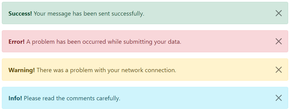
<!-- Success Alert -->
<div class="alert alert-success alert-dismissible fade show">
    <strong>Success!</strong> Your message has been sent successfully.
    <button type="button" class="btn-close" data-bs-dismiss="alert"></button>
</div>

<!-- Error Alert -->
<div class="alert alert-danger alert-dismissible fade show">
    <strong>Error!</strong> A problem has been occurred while submitting your data.
    <button type="button" class="btn-close" data-bs-dismiss="alert"></button>
</div>

<!-- Warning Alert -->
<div class="alert alert-warning alert-dismissible fade show">
    <strong>Warning!</strong> There was a problem with your network connection.
    <button type="button" class="btn-close" data-bs-dismiss="alert"></button>
</div>

<!-- Info Alert -->
<div class="alert alert-info alert-dismissible fade show">
    <strong>Info!</strong> Please read the comments carefully.
    <button type="button" class="btn-close" data-bs-dismiss="alert"></button>
</div>
— The output of the above example will look something like this:
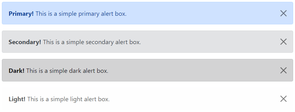
Here’re the remaining four Bootstrap alerts that can be used for various purposes.
<!-- Primary Alert -->
<div class="alert alert-primary alert-dismissible fade show">
    <strong>Primary!</strong> This is a simple primary alert box.
    <button type="button" class="btn-close" data-bs-dismiss="alert"></button>
</div>

<!-- Secondary Alert -->
<div class="alert alert-secondary alert-dismissible fade show">
    <strong>Secondary!</strong> This is a simple secondary alert box.
    <button type="button" class="btn-close" data-bs-dismiss="alert"></button>
</div>

<!-- Dark Alert -->
<div class="alert alert-dark alert-dismissible fade show">
    <strong>Dark!</strong> This is a simple dark alert box.
    <button type="button" class="btn-close" data-bs-dismiss="alert"></button>
</div>

<!-- Light Alert -->
<div class="alert alert-light alert-dismissible fade show">
    <strong>Light!</strong> This is a simple light alert box.
    <button type="button" class="btn-close" data-bs-dismiss="alert"></button>
</div>
— The output of the above example will look something like this:
Tip: The .fade and .show classes on the .alert element enable the fading transition effect while closing the alert boxes. If you don’t want animation just removes these classes. Also, the class .alert-dismissible is required on the .alert element for proper positioning of the .btn-close. If your alert doesn’t have a close button you can skip this class.
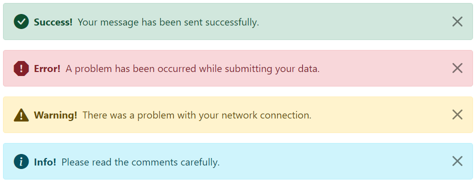
Adding Icons to Bootstrap Alerts
You can also place icons inside Bootstrap alerts. You can either use Bootstrap icons or third-party icons like Font Awesome. Let’s take a look at the following example:
<!-- Success Alert -->
<div class="alert alert-success alert-dismissible d-flex align-items-center fade show">
    <i class="bi-check-circle-fill"></i>
    <strong class="mx-2">Success!</strong> Your message has been sent successfully.
    <button type="button" class="btn-close" data-bs-dismiss="alert"></button>
</div>

<!-- Error Alert -->
<div class="alert alert-danger alert-dismissible d-flex align-items-center fade show">
    <i class="bi-exclamation-octagon-fill"></i>
    <strong class="mx-2">Error!</strong> A problem has been occurred while submitting your data.
    <button type="button" class="btn-close" data-bs-dismiss="alert"></button>
</div>

<!-- Warning Alert -->
<div class="alert alert-warning alert-dismissible d-flex align-items-center fade show">
    <i class="bi-exclamation-triangle-fill"></i>
    <strong class="mx-2">Warning!</strong> There was a problem with your network connection.
    <button type="button" class="btn-close" data-bs-dismiss="alert"></button>
</div>

<!-- Info Alert -->
<div class="alert alert-info alert-dismissible d-flex align-items-center fade show">
    <i class="bi-info-circle-fill"></i>
    <strong class="mx-2">Info!</strong> Please read the comments carefully.
    <button type="button" class="btn-close" data-bs-dismiss="alert"></button>
</div>
— The output of the above example will look something like this:
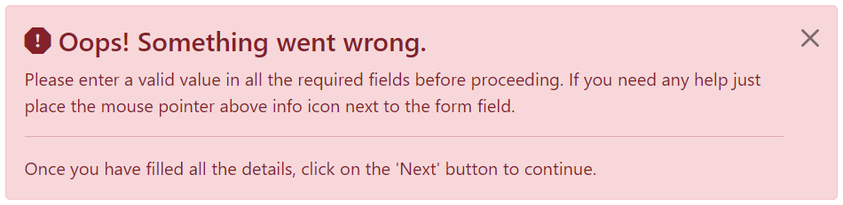
Additional Content inside Alerts
You can also place additional HTML elements like headings, paragraphs and dividers inside an alert. To manage spacing between the elements you can use margin utility classes, as here:
<div class="alert alert-danger alert-dismissible fade show">
    <h4 class="alert-heading"><i class="bi-exclamation-octagon-fill"></i> Oops! Something went wrong.</h4>
    <p>Please enter a valid value in all the required fields before proceeding. If you need any help just place the mouse pointer above info icon next to the form field.</p>
    <hr>
    <p class="mb-0">Once you have filled all the details, click on the 'Next' button to continue.</p>
    <button type="button" class="btn-close" data-bs-dismiss="alert"></button>
</div>
— The output of the above example will look something like this:
Matching Links Color inside Alerts
You can apply the utility class .alert-link to the links inside any alert boxes to quickly create matching colored links, as shown in the example below:
<div class="alert alert-warning alert-dismissible fade show">
    <strong>Warning!</strong> A simple warning alert with <a href="#" class="alert-link">an example link</a>.
    <button type="button" class="btn-close" data-bs-dismiss="alert"></button>
</div>
— The output of the above example will look something like this:

Similarly, you can match links inside other alert boxes. Let’s try out the following example:
<!-- Success Alert -->
<div class="alert alert-success alert-dismissible fade show">
    <strong>Success!</strong> A simple success alert with <a href="#" class="alert-link">an example link</a>.
    <button type="button" class="btn-close" data-bs-dismiss="alert"></button>
</div>

<!-- Error Alert -->
<div class="alert alert-danger alert-dismissible fade show">
    <strong>Error!</strong> A simple danger alert with <a href="#" class="alert-link">an example link</a>.
    <button type="button" class="btn-close" data-bs-dismiss="alert"></button>
</div>

<!-- Warning Alert -->
<div class="alert alert-warning alert-dismissible fade show">
    <strong>Warning!</strong> A simple warning alert with <a href="#" class="alert-link">an example link</a>.
    <button type="button" class="btn-close" data-bs-dismiss="alert"></button>
</div>

<!-- Info Alert -->
<div class="alert alert-info alert-dismissible fade show">
    <strong>Info!</strong> A simple info alert with <a href="#" class="alert-link">an example link</a>.
    <button type="button" class="btn-close" data-bs-dismiss="alert"></button>
</div>

<!-- Primary Alert -->
<div class="alert alert-primary alert-dismissible fade show">
    <strong>Primary!</strong> A simple primary alert with <a href="#" class="alert-link">an example link</a>.
    <button type="button" class="btn-close" data-bs-dismiss="alert"></button>
</div>

<!-- Secondary Alert -->
<div class="alert alert-secondary alert-dismissible fade show">
    <strong>Secondary!</strong> A simple secondary alert with <a href="#" class="alert-link">an example link</a>.
    <button type="button" class="btn-close" data-bs-dismiss="alert"></button>
</div>

<!-- Dark Alert -->
<div class="alert alert-dark alert-dismissible fade show">
    <strong>Dark!</strong> A simple dark alert with <a href="#" class="alert-link">an example link</a>.
    <button type="button" class="btn-close" data-bs-dismiss="alert"></button>
</div>

<!-- Light Alert -->
<div class="alert alert-light alert-dismissible fade show">
    <strong>Light!</strong> A simple light alert with <a href="#" class="alert-link">an example link</a>.
    <button type="button" class="btn-close" data-bs-dismiss="alert"></button>
</div>
Closing Alerts via Data Attribute
Data attributes provides a simple and easy way to add close functionality to the alert boxes.
Just add the data-bs-dismiss="alert" to the close button and it will automatically enable the dismissal of the containing alert message box. Also, add the class .alert-dismissible to the .alert element for proper positioning of the .btn-close button.
<div class="alert alert-info alert-dismissible fade show">
    <strong>Note!</strong> This is a simple example of dismissible alert.
    <button type="button" class="btn-close" data-bs-dismiss="alert"></button>
</div>
Use the <button> element for creating the close button for consistent behavior across all devices.
Closing Alerts via JavaScript
You may also dismiss an alert via JavaScript. Let’s try out an example and see how it works:
<script>
$(document).ready(function(){
    $("#myBtn").click(function(){
        $("#myAlert").alert("close");
    });
});
</script>
<script>
document.addEventListener("DOMContentLoaded", function(){
var btn = document.getElementById("myBtn");
var element = document.getElementById("myAlert");
// Create alert instance
var myAlert = new bootstrap.Alert(element);
btn.addEventListener("click", function(){
myAlert.close();
});
});
</script>Methods
These are the standard bootstrap’s alerts methods:
close
This method closes an alert by removing it from the DOM. If the .fade and .show classes are present on the element, the alert will fade out before it is removed.
<script>
$(document).ready(function(){
    $("#myBtn").click(function(){
        $("#myAlert").alert("close");
    });
});
</script>
<script>
document.addEventListener("DOMContentLoaded", function(){
var btn = document.getElementById("myBtn");
var element = document.getElementById("myAlert");
// Create alert instance
var myAlert = new bootstrap.Alert(element);
btn.addEventListener("click", function(){
myAlert.close();
});
});
</script>dispose
This method destroys an element’s alert (i.e. removes stored data on the DOM element).
<script>
$(document).ready(function(){
    $("#myBtn").click(function(){
        $("#myAlert").alert("dispose");
    });
});
</script>
<script>
document.addEventListener("DOMContentLoaded", function(){
var btn = document.getElementById("myBtn");
var element = document.getElementById("myAlert");
// Create alert instance
var myAlert = new bootstrap.Alert(element);
btn.addEventListener("click", function(){
myAlert.dispose();
});
});
</script>getInstance
This is a static method which allows you to get the alert instance associated with a DOM element.
<script>
$(document).ready(function(){
    // Create alert instance
    $("#myAlert").alert();

    // Get alert instance on button click
    $("#myBtn").click(function(){
        var myAlert = bootstrap.Alert.getInstance($("#myAlert")[0]);
        console.log(myAlert);
        // {_element: div#myAlert.alert.alert-info.alert-dismissible.fade.show}
    });
});
</script>
<script>
document.addEventListener("DOMContentLoaded", function(){
var btn = document.getElementById("myBtn");
var element = document.getElementById("myAlert");
// Create alert instance
var myAlert = new bootstrap.Alert(element);
// Get tooltip instance on button click
btn.addEventListener("click", function(){
var alert = bootstrap.Alert.getInstance(element);
console.log(alert);
// {_element: div#myAlert.alert.alert-info.alert-dismissible.fade.show}
});
});
</script>getOrCreateInstance
This is a static method which allows you to get the alert instance associated with a DOM element, or create a new one in case if the alert wasn’t initialized.
<script>
$(document).ready(function(){
    $("#myBtn").click(function(){
        var myAlert = bootstrap.Alert.getOrCreateInstance($("#myAlert")[0]);
        console.log(myAlert);
        // {_element: div#myAlert.alert.alert-info.alert-dismissible.fade.show}
    });
});
</script>
<script>
document.addEventListener("DOMContentLoaded", function(){
var btn = document.getElementById("myBtn");
var element = document.getElementById("myAlert");
btn.addEventListener("click", function(){
var myAlert = bootstrap.Alert.getOrCreateInstance(element);
console.log(myAlert);
// {_element: div#myAlert.alert.alert-info.alert-dismissible.fade.show}
});
});
</script>Events
Bootstrap’s alert class includes few events for hooking into alert functionality.
| Event | Description |
|---|---|
| close.bs.alert | This event fires immediately when the close instance method is called. |
| closed.bs.alert | This event is fired when the alert has been closed and CSS transitions have completed. |
The following example displays an alert message to the user when fade out transition of an alert message box has been fully completed.
<script>
$(document).ready(function(){
    $("#myAlert").on("closed.bs.alert", function(){
        alert("Alert message box has been closed.");
    });
});
</script>
<script>
document.addEventListener("DOMContentLoaded", function(){
var myAlert = document.getElementById("myAlert");
myAlert.addEventListener("closed.bs.alert", function(){
alert("Alert message box has been closed.");
});
});
</script>