(UPDATED with examples for Bootstrap v4, v3 and v3)
Examples of forms with validation classes for the past few major versions of Bootstrap.
Bootstrap v4
See the live version on codepen

<div class="container">
  <form>
    <div class="form-group row">
      <label for="inputEmail" class="col-sm-2 col-form-label text-success">Email</label>
      <div class="col-sm-7">
        <input type="email" class="form-control is-valid" id="inputEmail" placeholder="Email">
      </div>
    </div>

    <div class="form-group row">
      <label for="inputPassword" class="col-sm-2 col-form-label text-danger">Password</label>
      <div class="col-sm-7">
        <input type="password" class="form-control is-invalid" id="inputPassword" placeholder="Password">
      </div>
      <div class="col-sm-3">
        <small id="passwordHelp" class="text-danger">
          Must be 8-20 characters long.
        </small>
      </div>
    </div>
  </form>
</div>
Bootstrap v3
See the live version on codepen

<form role="form">
  <div class="form-group has-warning">
    <label class="control-label" for="inputWarning">Input with warning</label>
    <input type="text" class="form-control" id="inputWarning">
    <span class="help-block">Something may have gone wrong</span>
  </div>
  <div class="form-group has-error">
    <label class="control-label" for="inputError">Input with error</label>
    <input type="text" class="form-control" id="inputError">
    <span class="help-block">Please correct the error</span>
  </div>
  <div class="form-group has-info">
    <label class="control-label" for="inputError">Input with info</label>
    <input type="text" class="form-control" id="inputError">
    <span class="help-block">Username is taken</span>
  </div>
  <div class="form-group has-success">
    <label class="control-label" for="inputSuccess">Input with success</label>
    <input type="text" class="form-control" id="inputSuccess" />
    <span class="help-block">Woohoo!</span>
  </div>
</form>
Bootstrap v2
See the live version on jsfiddle

The .error, .success, .warning and .info classes are appended to the .control-group. This is standard Bootstrap markup and styling in v2. Just follow that and you’re in good shape. Of course you can go beyond with your own styles to add a popup or «inline flash» if you prefer, but if you follow Bootstrap convention and hang those validation classes on the .control-group it will stay consistent and easy to manage (at least since you’ll continue to have the benefit of Bootstrap docs and examples)
  <form class="form-horizontal">
    <div class="control-group warning">
      <label class="control-label" for="inputWarning">Input with warning</label>
      <div class="controls">
        <input type="text" id="inputWarning">
        <span class="help-inline">Something may have gone wrong</span>
      </div>
    </div>
    <div class="control-group error">
      <label class="control-label" for="inputError">Input with error</label>
      <div class="controls">
        <input type="text" id="inputError">
        <span class="help-inline">Please correct the error</span>
      </div>
    </div>
    <div class="control-group info">
      <label class="control-label" for="inputInfo">Input with info</label>
      <div class="controls">
        <input type="text" id="inputInfo">
        <span class="help-inline">Username is taken</span>
      </div>
    </div>
    <div class="control-group success">
      <label class="control-label" for="inputSuccess">Input with success</label>
      <div class="controls">
        <input type="text" id="inputSuccess">
        <span class="help-inline">Woohoo!</span>
      </div>
    </div>
  </form>
Нам известно, что в настоящее время пользовательские стили проверки и всплывающие подсказки на стороне клиента недоступны, поскольку они недоступны для вспомогательных технологий. Пока мы работаем над решением, мы рекомендуем использовать либо серверную опцию, либо метод проверки браузера по умолчанию.
Как это работает
Вот как валидация форм работает с Bootstrap:
- Валидация форм HTML работает на 2 псевдоклассах CSS:
:invalidи:valid, применяемых к элементам<input>,<select>и<textarea>. - Стили этих псевдоклассов применяются к родительскому классу
.was-validated, обычно применяемому к<form>. В ином случае любое другое требуемое поле без значения становится невалидным при загрузке страницы. Таким образом можно выбирать, когда активировать формы (обычно после того, как нажато подтверждение). - Для сброса внешнего вида формы (например, в случае отправки динамической формы с использованием AJAX) удалите класс
.was-validatedиз<form>после отправки. - Как резервный вариант, классы
.is-invalidи.is-validможно использовать вместо псевдоклассов при серверной валидации. Они не требуют родительского класса.was-validated. - Благодаря ограничениям, заложенным в самой природе CSS, нельзя (по крайней мере, сегодня) применять стили к элементу
<label>, который в DOM расположен перед элементами контроля формы, без использования JavaScript. - Все современные браузеры поддерживают API проверки ограничений – серию методов JavaScript для валидации органов контроля форм.
- В качестве сообщений обратной связи в формах можно использовать таковые по умолчанию браузеров (разные для каждого браузера, и неизменяемые через CSS) или наши стандартные стили сообщений обратной связи с дополнительным HTML и CSS.
- Вы можете создать сообщения валидации методом
setCustomValidityв JavaScript.
Знаю всё это, посмотрите следующие демонстрации использования стилей валидации форм, серверных классы и настроек браузера по умолчанию.
Пользовательские стили
Для стандартных сообщений проверки форм Bootstrap вам потребуется добавить логический атрибут novalidate к <form>. Это деактивирует всплывающие сообщения обратной связи, существующие в браузере по умолчанию, но одновременно сохранит доступ JS к API валидации форм. Попробуйте войти в форму ниже, наш JavaScript выдаст вам сообщение обратной связи. При попытке входа вы увидите, как стили :invalid и :valid применятся к элементам управления формы.
В пользовательских стилях обратной связи применяются пользовательские цвета, границы, стили фокусировки и значки фона для лучшей передачи обратной связи. Фоновые значки для <select> доступны только с .custom-select, но не с .form-control.
<form class="row g-3 needs-validation" novalidate>
  <div class="col-md-4">
    <label for="validationCustom01" class="form-label">Имя</label>
    <input type="text" class="form-control" id="validationCustom01" value="Иван" required>
    <div class="valid-feedback">
      Все хорошо!
    </div>
  </div>
  <div class="col-md-4">
    <label for="validationCustom02" class="form-label">Фамилия</label>
    <input type="text" class="form-control" id="validationCustom02" value="Петров" required>
    <div class="valid-feedback">
      Все хорошо!
    </div>
  </div>
  <div class="col-md-4">
    <label for="validationCustomUsername" class="form-label">Имя пользователя</label>
    <div class="input-group has-validation">
      <span class="input-group-text" id="inputGroupPrepend">@</span>
      <input type="text" class="form-control" id="validationCustomUsername" aria-describedby="inputGroupPrepend" required>
      <div class="invalid-feedback">
        Пожалуйста, выберите имя пользователя.
      </div>
    </div>
  </div>
  <div class="col-md-6">
    <label for="validationCustom03" class="form-label">Город</label>
    <input type="text" class="form-control" id="validationCustom03" required>
    <div class="invalid-feedback">
      Укажите действующий город.
    </div>
  </div>
  <div class="col-md-3">
    <label for="validationCustom04" class="form-label">Область</label>
    <select class="form-select" id="validationCustom04" required>
      <option selected disabled value="">Выберите...</option>
      <option>...</option>
    </select>
    <div class="invalid-feedback">
      Пожалуйста, выберите корректный город.
    </div>
  </div>
  <div class="col-md-3">
    <label for="validationCustom05" class="form-label">Индекс</label>
    <input type="text" class="form-control" id="validationCustom05" required>
    <div class="invalid-feedback">
      Пожалуйста, предоставьте действующий почтовый индекс.
    </div>
  </div>
  <div class="col-12">
    <div class="form-check">
      <input class="form-check-input" type="checkbox" value="" id="invalidCheck" required>
      <label class="form-check-label" for="invalidCheck">
        Примите условия и соглашения
      </label>
      <div class="invalid-feedback">
        Вы должны принять перед отправкой.
      </div>
    </div>
  </div>
  <div class="col-12">
    <button class="btn btn-primary" type="submit">Отправить форму</button>
  </div>
</form>
// Пример стартового JavaScript для отключения отправки форм при наличии недопустимых полей
(function () {
'use strict'
// Получите все формы, к которым мы хотим применить пользовательские стили проверки Bootstrap
var forms = document.querySelectorAll('.needs-validation')
// Зацикливайтесь на них и предотвращайте отправку
Array.prototype.slice.call(forms)
.forEach(function (form) {
form.addEventListener('submit', function (event) {
if (!form.checkValidity()) {
event.preventDefault()
event.stopPropagation()
}
form.classList.add('was-validated')
}, false)
})
})()
Настройки браузера по умолчанию
Не нужны стандартные сообщения обратной связи? Не хотите писать скрипты JavaScript для изменения поведения форм? Используйте умолчания браузера. Попробуйте войти в форму ниже. В зависимости от вашего браузера и ОС вы увидите немного разные стили обратной связи.
Хотя эти сообщения обратной связи нельзя настраивать CSS, их можно настроить с JavaScript.
<form class="row g-3">
  <div class="col-md-4">
    <label for="validationDefault01" class="form-label">Имя</label>
    <input type="text" class="form-control" id="validationDefault01" value="Иван" required>
  </div>
  <div class="col-md-4">
    <label for="validationDefault02" class="form-label">Фамилия</label>
    <input type="text" class="form-control" id="validationDefault02" value="Петров" required>
  </div>
  <div class="col-md-4">
    <label for="validationDefaultUsername" class="form-label">Имя пользователя</label>
    <div class="input-group">
      <span class="input-group-text" id="inputGroupPrepend2">@</span>
      <input type="text" class="form-control" id="validationDefaultUsername"  aria-describedby="inputGroupPrepend2" required>
    </div>
  </div>
  <div class="col-md-6">
    <label for="validationDefault03" class="form-label">Город</label>
    <input type="text" class="form-control" id="validationDefault03" required>
  </div>
  <div class="col-md-3">
    <label for="validationDefault04" class="form-label">Область</label>
    <select class="form-select" id="validationDefault04" required>
      <option selected disabled value="">Выберите...</option>
      <option>...</option>
    </select>
  </div>
  <div class="col-md-3">
    <label for="validationDefault05" class="form-label">Индекс</label>
    <input type="text" class="form-control" id="validationDefault05" required>
  </div>
  <div class="col-12">
    <div class="form-check">
      <input class="form-check-input" type="checkbox" value="" id="invalidCheck2" required>
      <label class="form-check-label" for="invalidCheck2">
        Примите условия и соглашения
      </label>
    </div>
  </div>
  <div class="col-12">
    <button class="btn btn-primary" type="submit">Отправить форму</button>
  </div>
</form>
Проверка на стороне сервера
Мы рекомендуем использовать валидацию со стороны клиента, но если вам понадобится таковая со стороны сервера, вы можете обозначать валидные и невалидные поля форм классами .is-invalid и .is-valid. Заметим, что их можно также использовать с классом .invalid-feedback.
Для недопустимых полей убедитесь, что недопустимая обратная связь или сообщение об ошибке связано с соответствующим полем формы с помощью aria-describedby (учитывая, что этот атрибут позволяет ссылаться на несколько id идентификаторов, если поле уже указывает на дополнительный текст формы).
Чтобы обойти проблему с радиусами границ, необходимо применять дополнительный класс.has-validation.
<form class="row g-3">
  <div class="col-md-4">
    <label for="validationServer01" class="form-label">Имя</label>
    <input type="text" class="form-control is-valid" id="validationServer01" value="Иван" required>
    <div class="valid-feedback">
      Все хорошо!
    </div>
  </div>
  <div class="col-md-4">
    <label for="validationServer02" class="form-label">Фамилия</label>
    <input type="text" class="form-control is-valid" id="validationServer02" value="Петров" required>
    <div class="valid-feedback">
      Все хорошо!
    </div>
  </div>
  <div class="col-md-4">
    <label for="validationServerUsername" class="form-label">Имя пользователя</label>
    <div class="input-group has-validation">
      <span class="input-group-text" id="inputGroupPrepend3">@</span>
      <input type="text" class="form-control is-invalid" id="validationServerUsername" aria-describedby="inputGroupPrepend3 validationServerUsernameFeedback" required>
      <div id="validationServerUsernameFeedback" class="invalid-feedback">
        Пожалуйста, выберите имя пользователя.
      </div>
    </div>
  </div>
  <div class="col-md-6">
    <label for="validationServer03" class="form-label">Город</label>
    <input type="text" class="form-control is-invalid" id="validationServer03" aria-describedby="validationServer03Feedback" required>
    <div id="validationServer03Feedback" class="invalid-feedback">
      Укажите действующий город.
    </div>
  </div>
  <div class="col-md-3">
    <label for="validationServer04" class="form-label">Область</label>
    <select class="form-select is-invalid" id="validationServer04" aria-describedby="validationServer04Feedback" required>
      <option selected disabled value="">Выберите...</option>
      <option>...</option>
    </select>
    <div id="validationServer04Feedback" class="invalid-feedback">
      Пожалуйста, выберите корректный город.
    </div>
  </div>
  <div class="col-md-3">
    <label for="validationServer05" class="form-label">Индекс</label>
    <input type="text" class="form-control is-invalid" id="validationServer05" aria-describedby="validationServer05Feedback" required>
    <div id="validationServer05Feedback" class="invalid-feedback">
      Пожалуйста, предоставьте действующий почтовый индекс.
    </div>
  </div>
  <div class="col-12">
    <div class="form-check">
      <input class="form-check-input is-invalid" type="checkbox" value="" id="invalidCheck3" aria-describedby="invalidCheck3Feedback" required>
      <label class="form-check-label" for="invalidCheck3">
        Примите условия и соглашения
      </label>
      <div id="invalidCheck3Feedback" class="invalid-feedback">
        Вы должны принять перед отправкой.
      </div>
    </div>
  </div>
  <div class="col-12">
    <button class="btn btn-primary" type="submit">Отправить форму</button>
  </div>
</form>
Поддерживаемые элементы
Стили проверки доступны для следующих элементов управления формы и компонентов:
<input>и<textarea>с.form-control(включая до одного.form-controlв группах ввода)<select>с.form-select.form-check
Текстовое поле
Пожалуйста, введите сообщение в текстовое поле.
Отметьте этот флажок
Пример неверного текста обратной связи
Переключить это радио
Или переключить это другое радио
Еще пример неверного текста обратной связи
Пример обратной связи неверного выбора
Пример обратной связи неверной формы выбора файла
<form class="was-validated">
  <div class="mb-3">
    <label for="validationTextarea" class="form-label">Текстовое поле</label>
    <textarea class="form-control is-invalid" id="validationTextarea" placeholder="Обязательный пример текстового поля" required></textarea>
    <div class="invalid-feedback">
      Пожалуйста, введите сообщение в текстовое поле.
    </div>
  </div>

  <div class="form-check mb-3">
    <input type="checkbox" class="form-check-input" id="validationFormCheck1" required>
    <label class="form-check-label" for="validationFormCheck1">Отметьте этот флажок</label>
    <div class="invalid-feedback">Пример неверного текста обратной связи</div>
  </div>

  <div class="form-check">
    <input type="radio" class="form-check-input" id="validationFormCheck2" name="radio-stacked" required>
    <label class="form-check-label" for="validationFormCheck2">Переключить это радио</label>
  </div>
  <div class="form-check mb-3">
    <input type="radio" class="form-check-input" id="validationFormCheck3" name="radio-stacked" required>
    <label class="form-check-label" for="validationFormCheck3">Или переключить это другое радио</label>
    <div class="invalid-feedback">Еще пример неверного текста обратной связи</div>
  </div>

  <div class="mb-3">
    <select class="form-select" required aria-label="select example">
      <option value="">Откройте это меню выбора</option>
      <option value="1">Один</option>
      <option value="2">Два</option>
      <option value="3">Три</option>
    </select>
    <div class="invalid-feedback">Пример обратной связи неверного выбора </div>
  </div>

  <div class="mb-3">
    <input type="file" class="form-control" aria-label="file example" required>
    <div class="invalid-feedback">Пример обратной связи неверной формы выбора файла</div>
  </div>

  <div class="mb-3">
    <button class="btn btn-primary" type="submit" disabled>Отправить форму</button>
  </div>
</form>
Если разметка ваших форм позволит, вы можете заменить классы .{valid|invalid}-feedback классами .{valid|invalid}-tooltip — для отображения обратной связи валидации, стилизованной под всплывающую подсказку. Для правильного позиционирования всплывающей подсказки удостоверьтесь, что родительский элемент содержит position: relative. В примере ниже наши классы колонок уже имеют этот атрибут, но ваш проект может потребовать иные настройки.
<form class="row g-3 needs-validation" novalidate>
  <div class="col-md-4 position-relative">
    <label for="validationTooltip01" class="form-label">Имя</label>
    <input type="text" class="form-control" id="validationTooltip01" value="Иван" required>
    <div class="valid-tooltip">
      Все хорошо!
    </div>
  </div>
  <div class="col-md-4 position-relative">
    <label for="validationTooltip02" class="form-label">Фамилия</label>
    <input type="text" class="form-control" id="validationTooltip02" value="Петров" required>
    <div class="valid-tooltip">
      Все хорошо!
    </div>
  </div>
  <div class="col-md-4 position-relative">
    <label for="validationTooltipUsername" class="form-label">Имя пользователя</label>
    <div class="input-group has-validation">
      <span class="input-group-text" id="validationTooltipUsernamePrepend">@</span>
      <input type="text" class="form-control" id="validationTooltipUsername" aria-describedby="validationTooltipUsernamePrepend" required>
      <div class="invalid-tooltip">
        Пожалуйста, выберите уникальное и действительное имя пользователя.
      </div>
    </div>
  </div>
  <div class="col-md-6 position-relative">
    <label for="validationTooltip03" class="form-label">Город</label>
    <input type="text" class="form-control" id="validationTooltip03" required>
    <div class="invalid-tooltip">
      Укажите действующий город.
    </div>
  </div>
  <div class="col-md-3 position-relative">
    <label for="validationTooltip04" class="form-label">Область</label>
    <select class="form-select" id="validationTooltip04" required>
      <option selected disabled value="">Выберите...</option>
      <option>...</option>
    </select>
    <div class="invalid-tooltip">
      Пожалуйста, выберите корректный город.
    </div>
  </div>
  <div class="col-md-3 position-relative">
    <label for="validationTooltip05" class="form-label">Индекс</label>
    <input type="text" class="form-control" id="validationTooltip05" required>
    <div class="invalid-tooltip">
      Пожалуйста, предоставьте действующий почтовый индекс.
    </div>
  </div>
  <div class="col-12">
    <button class="btn btn-primary" type="submit">Отправить форму</button>
  </div>
</form>
Sass
Переменные
$form-feedback-margin-top:          $form-text-margin-top;
$form-feedback-font-size:           $form-text-font-size;
$form-feedback-font-style:          $form-text-font-style;
$form-feedback-valid-color:         $success;
$form-feedback-invalid-color:       $danger;

$form-feedback-icon-valid-color:    $form-feedback-valid-color;
$form-feedback-icon-valid:          url("data:image/svg+xml,<svg xmlns='http://www.w3.org/2000/svg' viewBox='0 0 8 8'><path fill='#{$form-feedback-icon-valid-color}' d='M2.3 6.73L.6 4.53c-.4-1.04.46-1.4 1.1-.8l1.1 1.4 3.4-3.8c.6-.63 1.6-.27 1.2.7l-4 4.6c-.43.5-.8.4-1.1.1z'/></svg>");
$form-feedback-icon-invalid-color:  $form-feedback-invalid-color;
$form-feedback-icon-invalid:        url("data:image/svg+xml,<svg xmlns='http://www.w3.org/2000/svg' viewBox='0 0 12 12' width='12' height='12' fill='none' stroke='#{$form-feedback-icon-invalid-color}'><circle cx='6' cy='6' r='4.5'/><path stroke-linejoin='round' d='M5.8 3.6h.4L6 6.5z'/><circle cx='6' cy='8.2' r='.6' fill='#{$form-feedback-icon-invalid-color}' stroke='none'/></svg>");
Миксины
Два миксина объединяются вместе с помощью нашего цикла, чтобы сгенерировать наши стили обратной связи для проверки формы.
@mixin form-validation-state-selector($state) {
  @if ($state == "valid" or $state == "invalid") {
    .was-validated #{if(&, "&", "")}:#{$state},
    #{if(&, "&", "")}.is-#{$state} {
      @content;
    }
  } @else {
    #{if(&, "&", "")}.is-#{$state} {
      @content;
    }
  }
}

@mixin form-validation-state(
  $state,
  $color,
  $icon,
  $tooltip-color: color-contrast($color),
  $tooltip-bg-color: rgba($color, $form-feedback-tooltip-opacity),
  $focus-box-shadow: 0 0 $input-btn-focus-blur $input-focus-width rgba($color, $input-btn-focus-color-opacity)
) {
  .#{$state}-feedback {
    display: none;
    width: 100%;
    margin-top: $form-feedback-margin-top;
    @include font-size($form-feedback-font-size);
    font-style: $form-feedback-font-style;
    color: $color;
  }

  .#{$state}-tooltip {
    position: absolute;
    top: 100%;
    z-index: 5;
    display: none;
    max-width: 100%; // Contain to parent when possible
    padding: $form-feedback-tooltip-padding-y $form-feedback-tooltip-padding-x;
    margin-top: .1rem;
    @include font-size($form-feedback-tooltip-font-size);
    line-height: $form-feedback-tooltip-line-height;
    color: $tooltip-color;
    background-color: $tooltip-bg-color;
    @include border-radius($form-feedback-tooltip-border-radius);
  }

  @include form-validation-state-selector($state) {
    ~ .#{$state}-feedback,
    ~ .#{$state}-tooltip {
      display: block;
    }
  }

  .form-control {
    @include form-validation-state-selector($state) {
      border-color: $color;

      @if $enable-validation-icons {
        padding-right: $input-height-inner;
        background-image: escape-svg($icon);
        background-repeat: no-repeat;
        background-position: right $input-height-inner-quarter center;
        background-size: $input-height-inner-half $input-height-inner-half;
      }

      &:focus {
        border-color: $color;
        box-shadow: $focus-box-shadow;
      }
    }
  }

  // stylelint-disable-next-line selector-no-qualifying-type
  textarea.form-control {
    @include form-validation-state-selector($state) {
      @if $enable-validation-icons {
        padding-right: $input-height-inner;
        background-position: top $input-height-inner-quarter right $input-height-inner-quarter;
      }
    }
  }

  .form-select {
    @include form-validation-state-selector($state) {
      border-color: $color;

      @if $enable-validation-icons {
        &:not([multiple]):not([size]),
        &:not([multiple])[size="1"] {
          padding-right: $form-select-feedback-icon-padding-end;
          background-image: escape-svg($form-select-indicator), escape-svg($icon);
          background-position: $form-select-bg-position, $form-select-feedback-icon-position;
          background-size: $form-select-bg-size, $form-select-feedback-icon-size;
        }
      }

      &:focus {
        border-color: $color;
        box-shadow: $focus-box-shadow;
      }
    }
  }

  .form-check-input {
    @include form-validation-state-selector($state) {
      border-color: $color;

      &:checked {
        background-color: $color;
      }

      &:focus {
        box-shadow: $focus-box-shadow;
      }

      ~ .form-check-label {
        color: $color;
      }
    }
  }
  .form-check-inline .form-check-input {
    ~ .#{$state}-feedback {
      margin-left: .5em;
    }
  }

  .input-group .form-control,
  .input-group .form-select {
    @include form-validation-state-selector($state) {
      @if $state == "valid" {
        z-index: 1;
      } @else if $state == "invalid" {
        z-index: 2;
      }
      &:focus {
        z-index: 3;
      }
    }
  }
}
Карта
Это карта валидации Sass из _variables.scss. Переопределите или расширьте это, чтобы создать другие или дополнительные состояния.
$form-validation-states: (
  "valid": (
    "color": $form-feedback-valid-color,
    "icon": $form-feedback-icon-valid
  ),
  "invalid": (
    "color": $form-feedback-invalid-color,
    "icon": $form-feedback-icon-invalid
  )
);
Карты $form-validation-states могут содержать три необязательных параметра для переопределения всплывающих подсказок и стилей фокуса.
Цикл
Используется для перебора значений карты $form-validation-states для генерации наших стилей проверки. Любые изменения в приведенной выше карте Sass будут отражены в Вашем скомпилированном CSS через этот цикл.
@each $state, $data in $form-validation-states {
  @include form-validation-state($state, $data...);
}
Пользовательские настройки
Состояния проверки можно настроить через Sass с помощью карты $form-validation-states. Эта карта Sass, расположенная в нашем файле _variables.scss, используется для генерации состояний валидации по умолчанию valid/invalid. ключена вложенная карта для настройки цвета каждого состояния, значка, цвета всплывающей подсказки и тени фокуса. Хотя браузеры не поддерживают никакие другие состояния, те, кто использует собственные стили, могут легко добавить более сложную обратную связь с формой.
Обратите внимание, что мы не рекомендуем настраивать значения $form-validation-states без изменения миксина form-validation-state.
Содержание
- Validation
- How it works
- Browser defaults
- Server side
- Supported elements
- Tooltips
- Variables
- Mixins
- Customizing
- Validation
- How it works
- Browser defaults
- Server side
- Supported elements
- Tooltips
- Variables
- Mixins
- Customizing
- Validation
- How it works
- Browser defaults
- Server side
- Supported elements
- Tooltips
- Variables
- Mixins
- Customizing
- Forms
- Overview
- Form controls
- Readonly
- Readonly plain text
- Checkboxes and radios
- Default (stacked)
- Bootstrap Form Inputs (more)
- Static Control
- Example
- Bootstrap Input Groups
- Example
- Example
- Bootstrap Form Control States
- Example
Validation
Provide valuable, actionable feedback to your users with HTML5 form validation, via browser default behaviors or custom styles and JavaScript.
How it works
Here’s how form validation works with Bootstrap:
- HTML form validation is applied via CSS’s two pseudo-classes, :invalid and :valid . It applies to , , and
elements.
Bootstrap scopes the :invalid and :valid styles to parent .was-validated class, usually applied to the
Browser defaults
Not interested in custom validation feedback messages or writing JavaScript to change form behaviors? All good, you can use the browser defaults. Try submitting the form below. Depending on your browser and OS, you’ll see a slightly different style of feedback.
While these feedback styles cannot be styled with CSS, you can still customize the feedback text through JavaScript.
Server side
We recommend using client-side validation, but in case you require server-side validation, you can indicate invalid and valid form fields with .is-invalid and .is-valid . Note that .invalid-feedback is also supported with these classes.
For invalid fields, ensure that the invalid feedback/error message is associated with the relevant form field using aria-describedby (noting that this attribute allows more than one id to be referenced, in case the field already points to additional form text).
To fix issues with border radius, input groups require an additional .has-validation class.
Supported elements
Validation styles are available for the following form controls and components:
s with .form-control (including up to one .form-control in input groups)
If your form layout allows it, you can swap the .-feedback classes for .-tooltip classes to display validation feedback in a styled tooltip. Be sure to have a parent with position: relative on it for tooltip positioning. In the example below, our column classes have this already, but your project may require an alternative setup.
Variables
Mixins
Two mixins are combined together, through our loop, to generate our form validation feedback styles.
This is the validation Sass map from _variables.scss . Override or extend this to generate different or additional states.
Maps of $form-validation-states can contain three optional parameters to override tooltips and focus styles.
Used to iterate over $form-validation-states map values to generate our validation styles. Any modifications to the above Sass map will be reflected in your compiled CSS via this loop.
Customizing
Validation states can be customized via Sass with the $form-validation-states map. Located in our _variables.scss file, this Sass map is how we generate the default valid / invalid validation states. Included is a nested map for customizing each state’s color, icon, tooltip color, and focus shadow. While no other states are supported by browsers, those using custom styles can easily add more complex form feedback.
Bootstrap
- Designed and built with all the love in the world by the Bootstrap team with the help of our contributors.
- Code licensed MIT, docs CC BY 3.0.
- Currently v5.2.3.
Источник
Validation
Provide valuable, actionable feedback to your users with HTML5 form validation, via browser default behaviors or custom styles and JavaScript.
How it works
Here’s how form validation works with Bootstrap:
- HTML form validation is applied via CSS’s two pseudo-classes, :invalid and :valid . It applies to , , and
elements.
Bootstrap scopes the :invalid and :valid styles to parent .was-validated class, usually applied to the
Browser defaults
Not interested in custom validation feedback messages or writing JavaScript to change form behaviors? All good, you can use the browser defaults. Try submitting the form below. Depending on your browser and OS, you’ll see a slightly different style of feedback.
While these feedback styles cannot be styled with CSS, you can still customize the feedback text through JavaScript.
Server side
We recommend using client-side validation, but in case you require server-side validation, you can indicate invalid and valid form fields with .is-invalid and .is-valid . Note that .invalid-feedback is also supported with these classes.
For invalid fields, ensure that the invalid feedback/error message is associated with the relevant form field using aria-describedby (noting that this attribute allows more than one id to be referenced, in case the field already points to additional form text).
To fix issues with border radii, input groups require an additional .has-validation class.
Supported elements
Validation styles are available for the following form controls and components:
s with .form-control (including up to one .form-control in input groups)
If your form layout allows it, you can swap the .-feedback classes for .-tooltip classes to display validation feedback in a styled tooltip. Be sure to have a parent with position: relative on it for tooltip positioning. In the example below, our column classes have this already, but your project may require an alternative setup.
Variables
Mixins
Two mixins are combined together, through our loop, to generate our form validation feedback styles.
This is the validation Sass map from _variables.scss . Override or extend this to generate different or additional states.
Maps of $form-validation-states can contain three optional parameters to override tooltips and focus styles.
Used to iterate over $form-validation-states map values to generate our validation styles. Any modifications to the above Sass map will be reflected in your compiled CSS via this loop.
Customizing
Validation states can be customized via Sass with the $form-validation-states map. Located in our _variables.scss file, this Sass map is how we generate the default valid / invalid validation states. Included is a nested map for customizing each state’s color, icon, tooltip color, and focus shadow. While no other states are supported by browsers, those using custom styles can easily add more complex form feedback.
Please note that we do not recommend customizing $form-validation-states values without also modifying the form-validation-state mixin.
Bootstrap
- Designed and built with all the love in the world by the Bootstrap team with the help of our contributors.
- Code licensed MIT, docs CC BY 3.0.
- Currently v5.0.2.
- Analytics by Fathom.
Источник
Validation
Provide valuable, actionable feedback to your users with HTML5 form validation, via browser default behaviors or custom styles and JavaScript.
How it works
Here’s how form validation works with Bootstrap:
- HTML form validation is applied via CSS’s two pseudo-classes, :invalid and :valid . It applies to , , and
elements.
Bootstrap scopes the :invalid and :valid styles to parent .was-validated class, usually applied to the
Browser defaults
Not interested in custom validation feedback messages or writing JavaScript to change form behaviors? All good, you can use the browser defaults. Try submitting the form below. Depending on your browser and OS, you’ll see a slightly different style of feedback.
While these feedback styles cannot be styled with CSS, you can still customize the feedback text through JavaScript.
Server side
We recommend using client-side validation, but in case you require server-side validation, you can indicate invalid and valid form fields with .is-invalid and .is-valid . Note that .invalid-feedback is also supported with these classes.
For invalid fields, ensure that the invalid feedback/error message is associated with the relevant form field using aria-describedby (noting that this attribute allows more than one id to be referenced, in case the field already points to additional form text).
To fix issues with border radii, input groups require an additional .has-validation class.
Supported elements
Validation styles are available for the following form controls and components:
s with .form-control (including up to one .form-control in input groups)
If your form layout allows it, you can swap the .-feedback classes for .-tooltip classes to display validation feedback in a styled tooltip. Be sure to have a parent with position: relative on it for tooltip positioning. In the example below, our column classes have this already, but your project may require an alternative setup.
Variables
Mixins
Two mixins are combined together, through our loop, to generate our form validation feedback styles.
This is the validation Sass map from _variables.scss . Override or extend this to generate different or additional states.
Maps of $form-validation-states can contain three optional parameters to override tooltips and focus styles.
Used to iterate over $form-validation-states map values to generate our validation styles. Any modifications to the above Sass map will be reflected in your compiled CSS via this loop.
Customizing
Validation states can be customized via Sass with the $form-validation-states map. Located in our _variables.scss file, this Sass map is how we generate the default valid / invalid validation states. Included is a nested map for customizing each state’s color, icon, tooltip color, and focus shadow. While no other states are supported by browsers, those using custom styles can easily add more complex form feedback.
Please note that we do not recommend customizing $form-validation-states values without also modifying the form-validation-state mixin.
Bootstrap
- Designed and built with all the love in the world by the Bootstrap team with the help of our contributors.
- Code licensed MIT, docs CC BY 3.0.
- Currently v5.1.3.
- Analytics by Fathom.
Источник
Forms
Examples and usage guidelines for form control styles, layout options, and custom components for creating a wide variety of forms.
Overview
Bootstrap’s form controls expand on our Rebooted form styles with classes. Use these classes to opt into their customized displays for a more consistent rendering across browsers and devices.
Be sure to use an appropriate type attribute on all inputs (e.g., email for email address or number for numerical information) to take advantage of newer input controls like email verification, number selection, and more.
Here’s a quick example to demonstrate Bootstrap’s form styles. Keep reading for documentation on required classes, form layout, and more.
Form controls
Textual form controls—like s,
Readonly
Add the readonly boolean attribute on an input to prevent modification of the input’s value. Read-only inputs appear lighter (just like disabled inputs), but retain the standard cursor.
Readonly plain text
If you want to have elements in your form styled as plain text, use the .form-control-plaintext class to remove the default form field styling and preserve the correct margin and padding.
Checkboxes and radios
Default checkboxes and radios are improved upon with the help of .form-check , a single class for both input types that improves the layout and behavior of their HTML elements. Checkboxes are for selecting one or several options in a list, while radios are for selecting one option from many.
Disabled checkboxes and radios are supported, but to provide a not-allowed cursor on hover of the parent , you’ll need to add the disabled attribute to the .form-check-input . The disabled attribute will apply a lighter color to help indicate the input’s state.
Checkboxes and radios use are built to support HTML-based form validation and provide concise, accessible labels. As such, our s and s are sibling elements as opposed to an within a . This is slightly more verbose as you must specify id and for attributes to relate the and .
Default (stacked)
By default, any number of checkboxes and radios that are immediate sibling will be vertically stacked and appropriately spaced with .form-check .
Источник
Bootstrap Form Inputs (more)
Static Control
If you need to insert plain text next to a form label within a horizontal form, use the .form-control-static class on a
Example
Bootstrap Input Groups
The .input-group class is a container to enhance an input by adding an icon, text or a button in front or behind it as a «help text».
The .input-group-addon class attaches an icon or help text next to the input field.
Example
The .input-group-btn attaches a button next to an input. This is often used together with a search bar:
Example
Bootstrap Form Control States
- INPUT FOCUS — The outline of the input is removed and a box-shadow is applied on focus
- DISABLED INPUTS — Add a disabled attribute to disable an input field
- DISABLED FIELDSETS — Add a disabled attribute to a fieldset to disable all controls within
- READONLY INPUTS — Add a readonly attribute to an input to prevent user input
- VALIDATION STATES — Bootstrap includes validation styles for error, warning, and success messages. To use, add .has-warning , .has-error , or .has-success to the parent element
- ICONS — You can add feedback icons with the .has-feedback class and an icon
- HIDDEN LABELS — Add a .sr-only class on non-visible labels
The following example demonstrates some of the form control states above in a Horizontal form:
Example
And here is an example of some of the form control states in an Inline form:
Источник
Компонент «Формы» — это набор CSS-классов, которые предназначены для оформления HTML форм: form-group, form-control, input-group, input-group-addon, input-group-btn, form-horizontal, form-inline, has-feedback, has-success, has-warning, has-error.
Правила создания форм:
- Поместить каждую группу элементов (например,
inputи связанный с нимlabel) в элементdivс классомform-group. Этот класс добавляет нижние отступы к группам элементов. - Добавить к каждому текстовому элементу управления формы
input,selectиtextareaклассform-control. Данный класс добавляет к элементам формы стили визуального оформления, размеры и многое другое.
В Bootstrap три вида форм: вертикальная (без добавления класса), горизонтальная (.form-horizontal) и в одну строку (.form-inline).
Вертикальная форма
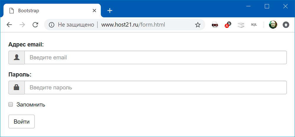
<form>
    <div class="form-group">
        <label for="input-email">Адрес email:</label>
        <input type="email" class="form-control" id="input-email" placeholder="Введите email">
    </div>
    <div class="form-group">
        <label for="input-password">Пароль:</label>
        <input type="password" class="form-control" id="input-password" placeholder="Введите пароль">
    </div>
    <div class="form-group">
        <div class="checkbox">
            <label>
                <input type="checkbox"> Запомнить
            </label>
        </div>
    </div>
    <div class="form-group">
        <button type="submit" class="btn btn-default">Войти</button>
    </div>
</form>

Горизонтальная форма
<form class="form-horizontal">
    <div class="form-group">
        <label for="input-email" class="col-sm-2 control-label">Адрес email:</label>
        <div class="col-sm-10">
            <input type="email" class="form-control" id="input-email" placeholder="Введите email">
        </div>
    </div>
    <div class="form-group">
        <label for="inputPassword" class="col-sm-2 control-label">Пароль:</label>
        <div class="col-sm-10">
            <input type="password" class="form-control" id="inputPassword" placeholder="Введите пароль">
        </div>
    </div>
    <div class="form-group">
        <div class="col-sm-offset-2 col-sm-10">
            <div class="checkbox">
                <label><input type="checkbox"> Запомнить</label>
            </div>
        </div>
    </div>
    <div class="form-group">
        <div class="col-sm-offset-2 col-sm-10">
            <button type="submit" class="btn btn-default">Войти</button>
        </div>
    </div>
</form>

Форма в одну строку
<form class="form-inline">
    <div class="form-group">
        <label for="input-email" class="sr-only">Адрес email</label>
        <input type="email" class="form-control" id="input-email" placeholder="Введите email">
    </div>
    <div class="form-group">
        <label class="sr-only" for="input-password">Пароль</label>
        <input type="password" class="form-control" id="input-password" placeholder="Введите пароль">
    </div>
    <div class="form-group">
        <div class="checkbox">
            <label>
                <input type="checkbox"> Запомнить
            </label>
        </div>
    </div>
    <div class="form-group">
        <button type="submit" class="btn btn-default">Войти</button>
    </div>
</form>

Классы input-group-addon и input-group-btn
Класс input-group-addon позволяет добавить иконки к полям формы:
<form>
    <div class="form-group">
        <label for="input-email">Адрес email:</label>
        <div class="input-group">
            <span class="input-group-addon"><i class="glyphicon glyphicon-user"></i></span>
            <input type="email" class="form-control" id="input-email" placeholder="Введите email">
        </div>
    </div>
    <div class="form-group">
        <label for="input-password">Пароль:</label>
        <div class="input-group">
            <span class="input-group-addon"><i class="glyphicon glyphicon-lock"></i></span>
            <input type="password" class="form-control" id="input-password" placeholder="Введите пароль">
        </div>
    </div>
    <div class="form-group">
        <div class="checkbox">
            <label>
                <input type="checkbox"> Запомнить
            </label>
        </div>
    </div>
    <div class="form-group">
        <button type="submit" class="btn btn-default">Войти</button>
    </div>
</form>
Класс input-group-btn позволяет объединить поле ввода и кнопку:
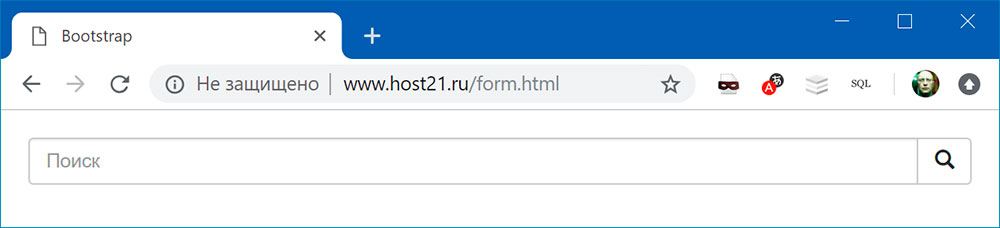
<form>
    <div class="input-group">
        <input type="text" class="form-control" placeholder="Search">
        <div class="input-group-btn">
            <button class="btn btn-default" type="submit">
                <span class="glyphicon glyphicon-search"></span>
            </button>
        </div>
    </div>
</form>
Подсветка полей формы
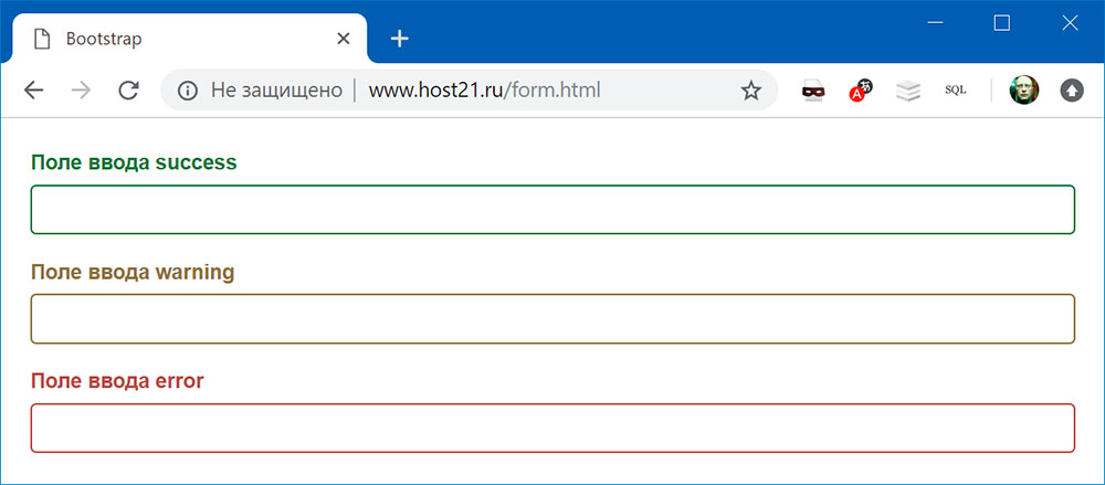
<form>
    <div class="form-group has-success has-feedback"> <!-- класс has-success -->
        <!-- чтобы текст label был выделен цветом, нужно добавить класс control-label -->
        <label for="input-success" class="control-label">Поле ввода с иконкой success</label>
        <input type="text" class="form-control" id="input-success">
    </div>
    <div class="form-group has-warning has-feedback"> <!-- класс has-warning -->
        <!-- чтобы текст label был выделен цветом, нужно добавить класс control-label -->
        <label for="input-warning" class="control-label">Поле ввода с иконкой warning</label>
        <input type="text" class="form-control" id="input-warning">
    </div>
    <div class="form-group has-error has-feedback"> <!-- класс has-error -->
        <!-- чтобы текст label был выделен цветом, нужно добавить класс control-label -->
        <label for="input-error" class="control-label">Поле ввода с иконкой error</label>
        <input type="text" class="form-control" id="input-error">
    </div>
</form>
Можно еще добавить иконки:
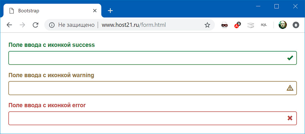
<form>
    <div class="form-group has-success has-feedback"> <!-- класс has-success -->
        <!-- чтобы текст label был выделен цветом, нужно добавить класс control-label -->
        <label for="input-success" class="control-label">Поле ввода с иконкой success</label>
        <input type="text" class="form-control" id="input-success">
        <span class="glyphicon glyphicon-ok form-control-feedback"></span> <!-- иконка-->
    </div>
    <div class="form-group has-warning has-feedback"> <!-- класс has-warning -->
        <!-- чтобы текст label был выделен цветом, нужно добавить класс control-label -->
        <label for="input-warning" class="control-label">Поле ввода с иконкой warning</label>
        <input type="text" class="form-control" id="input-warning">
        <span class="glyphicon glyphicon-warning-sign form-control-feedback"></span> <!-- иконка-->
    </div>
    <div class="form-group has-error has-feedback"> <!-- класс has-error -->
        <!-- чтобы текст label был выделен цветом, нужно добавить класс control-label -->
        <label for="input-error" class="control-label">Поле ввода с иконкой error</label>
        <input type="text" class="form-control" id="input-error">
        <span class="glyphicon glyphicon-remove form-control-feedback"></span> <!-- иконка-->
    </div>
</form>
Поиск:
Bootstrap • CSS • HTML • Web-разработка • Верстка • Форма • Фреймворк
Bootstrap • March 10, 2021 • 7 minutes READ
Form validation is one of the most critical factors when it comes to collecting information and preventing web form misuse.
Apart from saving you from possible cyber-attacks, form validation also protects your website from poor form entries. During form submission with validation, the user will be given the option to modify data fields that contain invalid data before submitting.
In general, you need form validation as a security measure since invalidated form data is one of the main sources of website security vulnerabilities.
Forms are fully supported in Bootstrap 5. Most of the components are mainly used to make the forms look clean and responsive which can be used with any screen size. While Bootstrap 5 forms automatically receive the correct formatting via given classes, when it comes to form validation you need to set up some extra classes and some JavaScript in order to take advantage of its contemporary validation support right out of the box.
In this article, I will show you how you can use Bootstrap 5 form validation to showcase some decent actionable feedback on form data fields such as textbox, select, checkbox, radio button along with some other available bootstrap’s form fields upon form submission. We will use JavaScript to disable form submissions if there are invalid fields entered.
Note: HTML 5 has its own validation means, but it has limitations especially when it comes to browser support. One of the noticeable limitations is the lack of customization when it comes to handling error messages which you will need to find a way to get sorted. Fortunately, Bootstrap 5 has contemporary form validation styles at hand.
Online Email Template Builder
With Postcards you can create and edit email templates online without any coding skills! Includes more than 100 components to help you create custom emails templates faster than ever before.
Try FreeOther Products
How it Works
Bootstrap 5 comes with super easy to use, yet powerful validation styles for input fields. These validation styles are used to showcase some form styles and messages, both errors and success states for form fields, and can be triggered when you submit the actual form.
Supported HTML Elements
Bootstrap 5 validation styles can be used on the following HTML elements including up to one .form-control class in input groups.
- <input>
- <select>
- <textarea>
For the input element, you can use Bootstrap 5 validation styles on commonly used tags such as textbox, radio button, checkbox, and file element tag.
Bootstrap 5 form validation basically has two states: error and success. These are represented by the following semantic classes.
- .is-invalid: Error
- .is-valid: Success
Let’s take a look at the code to render these two validation states:
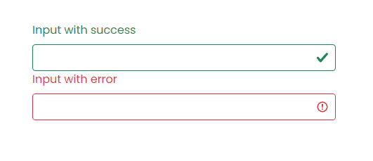
<div class="col-md-4">
   <label for="validationSuccess" class="form-label text-success">Input with success</label>
   <input type="text" class="form-control is-valid" id="validationSuccess" required>
</div>
<div class="col-md-4">
   <label for="validationError" class="form-label text-danger">Input with error</label>
   <input type="text" class="form-control is-invalid" id="validationError" required>
</div>
The markup that you see above is very similar to usual inputs with the addition of a few CSS classes to apply the proper state look and feel.
Let’s go over code you need to be aware of:
- The first input is the success state. The input field needs to have a class called .is-valid added to it.
- The second input is the error state. The input field needs to have a class called .is-invalid added to it.
- Notice each input has an icon to the right edge of it. These icons are automatically added when you include the required bootstrap CSS files.
- Each <label> tag has a class .text-success and .text-danger added to it. These are not required in form validation but these are for demonstration purposes only to color the label to match the state color.
Let’s take a look at how these validation inputs should look in the browser:
Next, let’s see how form validation messages work with Bootstrap 5 form validation at a very basic level. Bootstrap 5 form validation also provides two states for form validation messages similar to input validation above: error and success.
These are represented by the following semantic classes.
- .invalid-feedback: Error
- .valid-feedback: Success
Let’s take a look at the code to render these two validation messages states:
<div class="col-md-4">
   <label for="validationSuccess" class="form-label text-success">Input with success</label>
   <input type="text" class="form-control is-valid" id="validationSuccess" required>
   <div class="valid-feedback">
      This is a success state form validation message!
   </div>
</div>
<div class="col-md-4">
<label for="validationError" class="form-label text-danger">Input with error</label>
<input type="text" class="form-control is-invalid" id="validationError" required>
<div class="invalid-feedback">
   This is an error state form validation message!
</div>
Let’s go over code you need to be aware of:
- The div with a class .valid-feedback is the form validation message success.
- The div with a class .invalid-feedback is the form validation message error.
- Each class stated above needs to be used together below the input field and then bootstrap with the help of JavaScript will determine which one to show based on user entry upon form submission. More on this later.
Let’s take a look at how these validation inputs should look in the browser:
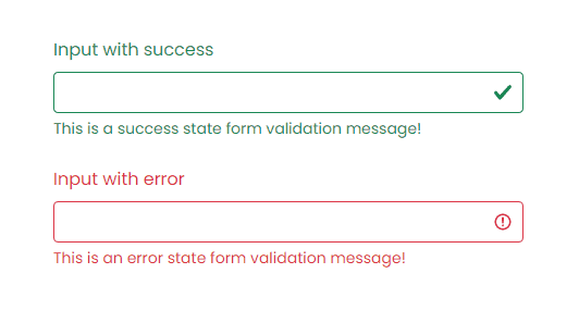
As seen above, the inputs and form validation messages are colored to match their state. Additionally, notice that we used .is-valid and .is-invalid to match the state for a particular validation.
However, with Bootstrap along with the use of JavaScript upon form submission, you don’t need to imperatively put these two classes on each data field. Bootstrap will handle it for you accordingly. Bootstrap form validation is applied using CSS’s two pseudo-classes, :valid and:invalid. Bootstrap out looked these classes’ styles which is usually applied with the use of .was-validated class in the <form> tag. The .is-valid and .is-invalid classes may still be used instead of the pseudo-classes for server-side validation. Please take note that if you will use these classes on server-side validation you don’t need to add .was-validated class.
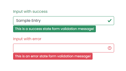
Validation Style Using Tooltips
Bootstrap also comes with tooltip styles for its contemporary validation styles. Tooltip or infotip is a common user interface element where in hovering over an element, a pop up box displays the required information for that specific element but in this case, it would be the validation message.
For the tooltip validation feature to work you need to use .valid-tooltip or .invalid-tooltip class to match the state for a particular validation style and form validation message instead of using .valid-feedback and .invalid-feedback. Additionally, you need to have a parent element with position: relative style for tooltip positioning.
The code below is identical to the code above but this time using tooltip as it’s contemporary validation style.
<div class="col-md-4 position-relative">
   <label for="validationSuccess" class="form-label text-success">Input with success</label>
   <input type="text" class="form-control" value="Samuel Norton" required>
   <div class="valid-tooltip">
      This is a success state form validation message!
   </div>
</div>
<div class="col-md-4 position-relative">
   <label for="validationError" class="form-label text-danger">Input with error</label>
   <input type="text" class="form-control" id="validationError" required>
   <div class="invalid-tooltip">
      This is an error state form validation message!
   </div>
</div>
Let’s take a look at how these validation inputs should look in the browser:
Using JavaScript
Now let’s see how JavaScript can help our bootstrap validation styles prevent any invalid submissions from the users.
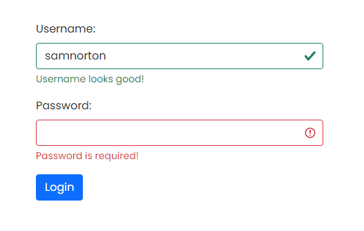
First, take a look at the following markup:
<form class="row g-3 requires-validation" novalidate>
   <div class="col-md-12">
      <label for="username" class="form-label">Username:</label>
      <input type="text" class="form-control" id="username" required>
      <div class="valid-feedback">
         Username looks good!
      </div>
      <div class="invalid-feedback">
         Username is required!
      </div>
   </div>
   <div class="col-md-12">
      <label for="password" class="form-label">Password:</label>
      <input type="text" class="form-control" id="password" required>
      <div class="valid-feedback">
         Password looks good!
      </div>
      <div class="invalid-feedback">
         Password is required!
      </div>
   </div>
   <div class="col-12">
      <button class="btn btn-primary" type="submit">Login</button>
   </div>
</form>
Let’s take a look closer at the markup above:
- The form tag has a novalidate boolean attribute. This prevents the browser default feedback tooltips without the occlusion of access to the form validation APIs in JavaScript.
- We did not include the .is-valid and .is-invalid classes on each data field. Bootstrap’s :invalid and :valid styles will apply it to the form controls with the use of JavaScript.
- We added a .requires-validation class inside the form tag. This is not a semantic class from bootstrap. You can rename it to whatever class name you prefer. The purpose of this class is to help JavaScript fetch all the form elements to apply custom bootstrap validation styles accordingly (more on this later).
- On each data field or inputs, we added the required attribute at the end. This simply states that a particular data field must be filled out before submitting the form.
- Again, we use .valid-feedback and .invalid-feedback at the bottom of each data field. The div with a class .valid-feedback is the form validation message success Wherein, the div with a class .invalid-feedback is the form validation message error state.
Next, let’s add the JavaScript code to disable form submissions if there are invalid fields when the user submits the form:
<script>
(function () {
'use strict'
const forms = document.querySelectorAll('.requires-validation')
Array.from(forms)
  .forEach(function (form) {
    form.addEventListener('submit', function (event) {
  	if (!form.checkValidity()) {
        event.preventDefault()
        event.stopPropagation()
  	}

      form.classList.add('was-validated')
	}, false)
  })
})()
</script>
The JavaScript code above simply gets all forms via querySelectorAll method and returns a static NodeList which represents a list of the document’s elements using the .requires-validation class.
Next, for each one of the forms found, the JavaScript code will add an EventListener that will be called whenever the specified event is delivered and that is submitted. So whenever a user submits the form, form.checkValidity() will be called out. This method verifies whether the data field has any constraints and fulfills the given constraints. If it fails, the browser simply fires an invalid event and returns false.
So if it fails, it will call both of the following JavaScript methods:
- preventDefault() – a method that will simply prevent the default event to be taken as it normally would be. In this case the submission of the form.
- stopPropagation() – a method that prevents further propagation (bubbling up) of the current event.
Finally, it will add .was-validated class in the form tag to show the form validation state and messages.
Bootstrap scopes the :invalid and :valid styles to parent .was-validated class when it is applied to the form. You can actually put the .was-validated class to the form tag even without the help of JavaScript but that will automatically show the form validation states and messages even before the user submits the form. However, having JavaScript to take care of the form submission and validation event will give you a more secure contemporary validation process on the client-side.
Let’s take a look at how this should look in the browser:
Putting It All Together
Now to put this all together, let’s create a simple registration page and see how we can apply Bootstrap 5 contemporary validation styles on each data field.
Below is the markup.
<div class="form-body">
   <div class="row">
      <div class="form-holder">
         <div class="form-content">
            <div class="form-items">
               <h3>Register Today</h3>
               <p>Fill in the data below.</p>
               <form class="requires-validation" novalidate>
                  <div class="col-md-12">
                     <input class="form-control" type="text" name="name" placeholder="Full Name" required>
                     <div class="valid-feedback">Username field is valid!</div>
                     <div class="invalid-feedback">Username field cannot be blank!</div>
                  </div>
                  <div class="col-md-12">
                     <input class="form-control" type="email" name="email" placeholder="E-mail Address" required>
                     <div class="valid-feedback">Email field is valid!</div>
                     <div class="invalid-feedback">Email field cannot be blank!</div>
                  </div>
                  <div class="col-md-12">
                     <select class="form-select mt-3" required>
                        <option selected disabled value="">Position</option>
                        <option value="jweb">Junior Web Developer</option>
                        <option value="sweb">Senior Web Developer</option>
                        <option value="pmanager">Project Manager</option>
                     </select>
                     <div class="valid-feedback">You selected a position!</div>
                     <div class="invalid-feedback">Please select a position!</div>
                  </div>
                  <div class="col-md-12">
                     <input class="form-control" type="password" name="password" placeholder="Password" required>
                     <div class="valid-feedback">Password field is valid!</div>
                     <div class="invalid-feedback">Password field cannot be blank!</div>
                  </div>
                  <div class="col-md-12 mt-3">
                     <label class="mb-3 mr-1" for="gender">Gender: </label>
                     <input type="radio" class="btn-check" name="gender" id="male" autocomplete="off" required>
                     <label class="btn btn-sm btn-outline-secondary" for="male">Male</label>
                     <input type="radio" class="btn-check" name="gender" id="female" autocomplete="off" required>
                     <label class="btn btn-sm btn-outline-secondary" for="female">Female</label>
                     <input type="radio" class="btn-check" name="gender" id="secret" autocomplete="off" required>
                     <label class="btn btn-sm btn-outline-secondary" for="secret">Secret</label>
                     <div class="valid-feedback mv-up">You selected a gender!</div>
                     <div class="invalid-feedback mv-up">Please select a gender!</div>
                  </div>
                  <div class="form-check">
                     <input class="form-check-input" type="checkbox" value="" id="invalidCheck" required>
                     <label class="form-check-label">I confirm that all data are correct</label>
                     <div class="invalid-feedback">Please confirm that the entered data are all correct!</div>
                  </div>
                  <div class="form-button mt-3">
                     <button id="submit" type="submit" class="btn btn-primary">Register</button>
                  </div>
               </form>
            </div>
         </div>
      </div>
   </div>
</div>
Next, I’ve added CSS to customize the look and feel of our form.
@import url('https://fonts.googleapis.com/css2?family=Poppins:wght@300;400;500;700;900&display=swap');
*,
body {
	font-family: 'Poppins', sans-serif;
	font-weight: 400;
	-webkit-font-smoothing: antialiased;
	text-rendering: optimizeLegibility;
	-moz-osx-font-smoothing: grayscale;
}

html,
body {
	height: 100%;
	background-color: #152733;
	overflow: hidden;
}

.form-holder {
	display: flex;
	flex-direction: column;
	justify-content: center;
	align-items: center;
	text-align: center;
	min-height: 100vh;
}

.form-holder .form-content {
	position: relative;
	text-align: center;
	display: -webkit-box;
	display: -moz-box;
	display: -ms-flexbox;
	display: -webkit-flex;
	display: flex;
	-webkit-justify-content: center;
	justify-content: center;
	-webkit-align-items: center;
	align-items: center;
	padding: 60px;
}

.form-content .form-items {
	border: 3px solid #fff;
	padding: 40px;
	display: inline-block;
	width: 100%;
	min-width: 540px;
	-webkit-border-radius: 10px;
	-moz-border-radius: 10px;
	border-radius: 10px;
	text-align: left;
	-webkit-transition: all 0.4s ease;
	transition: all 0.4s ease;
}

.form-content h3 {
	color: #fff;
	text-align: left;
	font-size: 28px;
	font-weight: 600;
	margin-bottom: 5px;
}

.form-content h3.form-title {
	margin-bottom: 30px;
}

.form-content p {
	color: #fff;
	text-align: left;
	font-size: 17px;
	font-weight: 300;
	line-height: 20px;
	margin-bottom: 30px;
}

.form-content label,
.was-validated .form-check-input:invalid~.form-check-label,
.was-validated .form-check-input:valid~.form-check-label {
	color: #fff;
}

.form-content input[type=text],
.form-content input[type=password],
.form-content input[type=email],
.form-content select {
	width: 100%;
	padding: 9px 20px;
	text-align: left;
	border: 0;
	outline: 0;
	border-radius: 6px;
	background-color: #fff;
	font-size: 15px;
	font-weight: 300;
	color: #8D8D8D;
	-webkit-transition: all 0.3s ease;
	transition: all 0.3s ease;
	margin-top: 16px;
}

.btn-primary {
	background-color: #6C757D;
	outline: none;
	border: 0px;
	box-shadow: none;
}

.btn-primary:hover,
.btn-primary:focus,
.btn-primary:active {
	background-color: #495056;
	outline: none !important;
	border: none !important;
	box-shadow: none;
}

.form-content textarea {
	position: static !important;
	width: 100%;
	padding: 8px 20px;
	border-radius: 6px;
	text-align: left;
	background-color: #fff;
	border: 0;
	font-size: 15px;
	font-weight: 300;
	color: #8D8D8D;
	outline: none;
	resize: none;
	height: 120px;
	-webkit-transition: none;
	transition: none;
	margin-bottom: 14px;
}

.form-content textarea:hover,
.form-content textarea:focus {
	border: 0;
	background-color: #ebeff8;
	color: #8D8D8D;
}

.mv-up {
	margin-top: -9px !important;
	margin-bottom: 8px !important;
}

.invalid-feedback {
	color: #ff606e;
}

.valid-feedback {
	color: #2acc80;
}
Finally, we will use the same JavaScript code above to prevent the user from submitting empty fields as well as to show the validation states and form validation message styles.
I’ve compiled the code below on Codepen. Feel free to modify it and play around.
See the Pen
Registration Form (Bootstrap 5 Validation) by Sam Norton (@samnorton)
on CodePen.
Wrapping Up
Building websites and even applications today is a lot more challenging and time-consuming than it used to be. Using Bootstrap 5 contemporary validation methods and styles will provide you an easy way, but valuable and actionable feedback to your users out of the box without worrying too much about styles.
The best part is that you can still customize the form validation message, including the styles to your liking without reinventing the wheel.