Мало кому стоит подробно объяснять, какие ошибки относятся к орфографическим, а какие к пунктуационным. Эти «галочки» и «палочки» на полях школьных тетрадей по русскому языку до боли знакомы, без преувеличения, каждому поколению.
Существуют еще стилистические и грамматические ошибки, но о них – разговор особый, отдельный.
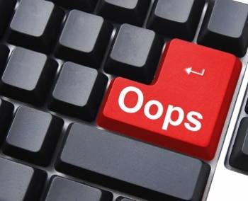
А все ли знакомы с таким понятием, как типографические ошибки? Едва ли. Что ж, значит, как раз и есть очередная тема для серьезного разговора.
Знакомьтесь – типографические ошибки!
Разумеется, печатный текст сильно отличается от рукописного – и по внешнему виду, и по оформлению. Здесь свои законы. Так вот – нарушение оных и будет называться типографическими ошибками.
И если кто-то вдруг сочтёт какие-то мелкие недочеты пустяком, не достойным внимания (дескать, можно списать на опечатку), то сильно ошибется.
Среди заказчиков на биржах копирайтинга встречаются люди весьма дотошные, пунктуальные и щепетильные, для которых именно каждая мелочь и важна. И когда заказ возвращается исполнителю на доработку, тот начинает искренне недоумевать: а в чем, собственно, дело? Что такого я нарушил? Вот где и «вылезает» элементарное незнание типографических ошибок. Остановимся на основных.
Как оформляется заголовок?
- Правило, которое требуется усвоить в первую очередь – в заголовке первая буква – всегда заглавная! Точка после заголовка никогда не ставится. Кстати, к подзаголовкам данное правило тоже относится – приставка «-под» не отменяет их значимости внутри текста.
Запрет не распространяется на вопросительный и восклицательный знаки – они допускаются в заголовках. Однако только в единственном числе. Незачем превращать заголовок во фразу из общения в «аське» или Skype, где многие законы языка элементарно не работают и попросту игнорируются.
- Не забываем отключать клавишу Caps Lock! Как будет выглядеть заголовок на сайте – уже не ваше дело, но при сдаче заказа – никаких вольностей!
Не злоупотребляем пробелами и внимательнее со знаками препинания
- Пробел делаем в конце каждого абзаца, после точки – двойным нажатием Enter.
- Следим за тем, чтобы никаких двойных пробелов.
- Пробел нужен везде, где есть тот или иной знак препинания. Обратите внимание на исключения. Например, если открываются скобки, то перед ними он нужен, а вот после них текст идет без пробела. То же самое касается последнего слова фразы, которая стоит в скобках. Когда скобки закрываем – ставим тот или иной знак, но без пробела. Кстати, если фраза заключается в кавычки, то тоже обходимся без пробела.
- Печатаем последнюю букву в предложении – сразу ставим точку. Используем другой знак – тоже ставим его сразу, без пробела.
Различаем дефис и тире!
Между этими знаками – принципиальная разница. Дефис чаще всего используется в составе местоимений. Эта «черточка» меньше, чем тире, и пробелов не требует.
Тире же разделяет части предложения, а также ставится перед определением, например, собака – это … Более подробно об этом знаке препинания рассказано в статье «Когда ставится тире».
Что ж, успехов на копирайтерской «ниве» и минимума, а еще лучше – полного отсутствия типографических ошибок!
Доработка и модернизация сайтов
Привет👋🏼
Качественная типографика невероятно важна в Ux&Ui дизайне. Правильные решения позволят не просто улучшить эстетический облик продукта, но и улучшить пользовательский опыт. Крутая типографика поможет пользователю быстрее читать текст, лучше ориентироваться в информации и значительно быстрее решать любые задачи.
Однако огромное количество современных продуктов допускает ряд типографических ошибок. Об этих ошибках мы и поговорим.
1. Использование в одном макете большого количества шрифтов
Одна из самых распространенных ошибок в типографике — использовать множество шрифтов в одном макете. А если, вдруг, используются разные шрифты в одном абзаце, то можно смело вызывать полицию.
Оптимально в одном проекте использовать 1-2 шрифта.
2. Использование экзотических шрифтов
Бывает, когда с целью отличиться и добавить в дизайн изюминку используются неудобные для чтения шрифты. Кроме того они идут вразрез с 4-ой эвристикой Якоба Нильсена о том, что большую часть времени пользователи проводят на других сайтах и приложениях, а значит для их комфортного взаимодействия с нашим дизайном мы не должны слишком резко отличаться от конкурентов.
Оптимальнее всего использовать шрифты проверенные временем, так как они по сей день смотрятся актуально. Примеры: Roboto, Bodoni, Open Sans, Montserrat и подобные.
3. Основной текст большими буквами
Текст большими буквами плохо читается и выглядит не эстетично. Его можно применять, но только когда идёт речь о небольших заголовках.
4. Текст поверх фото или видео
В редких случаях текст поверх фотографий и видео имеет право существовать, но в большинстве случаев это ухудшает читаемость.
5. Нарушенная иерархия
Для быстрого и удобного считывания информации в структуре текста должна быть чёткая иерархия. От H1 заголовка к тексту должен уменьшаться размер шрифта и как правило уменьшаться жирность.
6. Выравнивание не по левому краю
Выравнивание по правому краю осложняет чтение текста. Выравнивание по центру допустимо при небольшом количестве строк 2-4.
7. Длинные и короткие строки
Короткие строки делают текст рваным, а длинный очень не удобно читать.
8. Увеличение кёрнинга
Это правило иногда можно нарушать, но в большинстве случаев это приводит к неаккуратному и сложно читаемому тексту. Самый здравый кейс для увеличения кёрнинга — это текст полностью из заглавных букв. Опять же, всё должно быть в меру.
9. Использование жирности, наклонности и подчеркивания во всём блоке текста
Подчеркнутый, жирный или наклонный текст нужны в основном для выделения моментов в тексте, но никак для выделения всего текста. Исключением может быть цитата, которую можно полностью написать наклонным текстом.
10. Отступы между блоками текста такие же или меньше межстрочных отступов
Вспомним один из 7-ми замечательных принципов Гештальта — принцип близости. Тогда станет очевидно что строки внутри одного блока текста должны выглядеть более связанными, а значит расстояние их блока от остальных должно быть больше чем расстояние между строками.
Спасибо, что дочитали до конца! Делитесь своим мнением в комментариях.
Если понравилась эта статья, советую прочитать вторую часть.
Пока👋🏼
From Wikipedia, the free encyclopedia
«Fat finger» redirects here. For the trading mistake, see Fat-finger error.
A typographical error (often shortened to typo), also called a misprint, is a mistake (such as a spelling mistake)[1] made in the typing of printed (or electronic) material. Historically, this referred to mistakes in manual type-setting (typography). Technically, the term includes errors due to mechanical failure or slips of the hand or finger,[2] but excludes errors of ignorance, such as spelling errors, or changing and misuse of words such as «than» and «then». Before the arrival of printing, the copyist’s mistake or scribal error was the equivalent for manuscripts. Most typos involve simple duplication, omission, transposition, or substitution of a small number of characters.
Fat finger or fat-finger syndrome (especially in the financial sector) is a slang term referring to an unwanted secondary action when typing. When a finger is bigger than the touch zone, with touchscreens or keyboards, there can be inaccuracy and one may hit two keys in a single keystroke. An example is buckled instead of bucked, due to the «L» key being next to the «K» key on the QWERTY keyboard, the most common keyboard for Latin-script alphabets.
Marking typos[edit]

Correction fluid is used to correct typographical errors after the document is printed.
When using a typewriter without correction tape, typos were commonly overstruck with another character such as a slash. This saved the typist the trouble of retyping the entire page to eliminate the error, but as evidence of the typo remained, it was not aesthetically pleasing.
In computer forums, sometimes «^H» (a visual representation of the ASCII backspace character) was used to «erase» intentional typos: «Be nice to this fool^H^H^H^Hgentleman, he’s visiting from corporate HQ.»[3]
In instant messaging, users often send messages in haste and only afterward notice the typo. It is common practice to correct the typo by sending a subsequent message in which an asterisk is placed before (or after) the correct word.[4]
In formal prose, it is sometimes necessary to quote text containing typos or other doubtful words. In such cases, the author will write «[sic]» to indicate that an error was in the original quoted source rather than in the transcription.[5]
Scribal errors[edit]
Scribal errors received a lot of attention in the context of textual criticism. Many of these mistakes aren’t specific to manuscripts and can be referred to as typos. Some classifications include homeoteleuton and homeoarchy (skipping a line due to the similarity of the ending or beginning), haplography (copying once what appeared twice), dittography (copying twice what appeared once), contamination (introduction of extraneous elements), metathesis (reversing the order of some elements), unwitting mistranscription of similar elements, mistaking similar looking letters, the substitution of homophones, fission and fusion (joining or separating words).[6][7]
Biblical errors[edit]


The Wicked Bible omits the word «not» in the commandment «thou shalt not commit adultery».
The Judas Bible is a copy of the second folio edition of the authorized version, printed by Robert Barker, printer to King James I, in 1613, and given to the church for the use of the Mayor of Totnes. This edition is known as the Judas Bible because in Matthew 26:36 «Judas» appears instead of «Jesus». In this copy, the mistake (in the red circle) is corrected with a slip of paper pasted over the misprint.
«Intentional» typos[edit]
Certain typos, or kinds of typos, have acquired widespread notoriety and are occasionally used deliberately for humorous purposes. For instance, the British newspaper The Guardian is sometimes referred to as The Grauniad due to its reputation for frequent typesetting errors in the era before computer typesetting.[8] This usage began as a running joke in the satirical magazine Private Eye.[9] The magazine continues to refer to The Guardian by this name.
Typos are common on the internet in chatrooms, Usenet, and the World Wide Web, and some—such as «teh», «pwned», and «zomg»—have become in-jokes among Internet groups and subcultures. P0rn is not a typo but an example of obfuscation, where people make a word harder for robots to understand by changing it.[10]
Typosquatting[edit]
Typosquatting is a form of cybersquatting that relies on typographical errors made by users of the Internet.[11] Typically, the cybersquatter will register a likely typo of a frequently-accessed website address in the hope of receiving traffic when internet users mistype that address into a web browser. Deliberately introducing typos into a web page, or into its metadata, can also draw unwitting visitors when they enter these typos in Internet search engines.
An example of this is gogole.com instead of google.com which could potentially be harmful to the user.
Typos in online auctions[edit]
Since the emergence and popularization of online auction sites such as eBay, misspelled auction searches have quickly become lucrative for people searching for deals.[12] The concept on which these searches are based is that, if an individual posts an auction and misspells its description and/or title, regular searches will not find this auction. However, a search that includes misspelled alterations of the original search term in such a way as to create misspellings, transpositions, omissions, double strikes, and wrong key errors would find most misspelled auctions. The resulting effect is that there are far fewer bids than there would be under normal circumstances, allowing the searcher to obtain the item for less. A series of third-party websites have sprung up allowing people to find these items.[13]
Atomic typos[edit]
Another kind of typo—informally called an «atomic typo«—is a typo that happens to result in a correctly spelled word that is different from the intended one. Since it is spelled correctly, a simple spellchecker cannot find the mistake. The term was used at least as early as 1995 by Robert Terry.[14]
A few illustrative examples include:
- «now» instead of «not»,[15][16]
- «unclear» instead of «nuclear»
- «you» instead of «your»
- «Sudan» instead of «sedan» (leading to a diplomatic incident in 2005 between Sudan and the United States regarding a nuclear test code-named Sedan)
- «Untied States» instead of «United States»
- «the» instead of «they»
and many more. For any of these, the converse is also true.
See also[edit]
- Clerical error – Mistake in clerical work, e.g. data entry
- Comparison of web browsers – Native spell checkers are indicated in the table «Browser features».
- Fat-finger error – Keyboard input error in financial markets
- Human error – Action with unintended consequences
- Orthography – Conventions when writing in a language
- Scrivener’s error – Clerical error in a legal document
- Titivillus – Demon who introduces errors into texts
- Transcription error – Data entry error
References[edit]
- ^ «Typo — Definition». Free Merriam-Webster Dictionary. Merriam-Webster. Retrieved 2012-01-03.
- ^ «Wordnet definition». Wordnet. Princeton University. Retrieved 2007-11-12.
- ^ Chapter 5. Hacker Writing Style, The Jargon File, version 4.4.7
- ^ Magnan, Sally Sieloff (2008). Mediating discourse online. AILA Applied Linguistics Series. John Benjamins Publishing Company. p. 260. ISBN 978-90-272-0519-3.
- ^ Wilson, Kenneth G. (1993). «sic (adv.)». The Columbia Guide to Standard American English. Columbia University Press. Archived from the original on 11 December 2007. Retrieved 2007-11-12.
- ^ Paul D. Wegner, A Student’s Guide to Textual Criticism of the Bible: Its History, Methods, and Results, InterVarsity Press, 2006, p. 48.
- ^ «Manuscript Studies: Textual analysis (Scribal error)». www.ualberta.ca. Archived from the original on 4 April 2016. Retrieved 2 May 2018.
- ^ Taylor, Ros (2000-09-12). «Internet know-how: Spelling». Guardian Unlimited. Retrieved 2007-11-12.
- ^ Lyall, Sarah (1998-02-16). «Confession as Strength At a British Newspaper». The New York Times. Retrieved 2007-11-12.
- ^ Marsden, Rhodri (2006-10-18). «What do these strange web words mean?». The Independent. Retrieved 22 December 2016.
- ^ Sullivan, Bob (2000-09-23). «‘Typosquatters’ turn flubs into cash». ZDNet. Archived from the original on 2007-10-24. Retrieved 2007-11-12.
- ^ KING5 Staff (2004-07-01). «How finding mistakes can net great deals on eBay». King5. KING-TV. Archived from the original on 2007-12-20. Retrieved 2007-11-12.
- ^ Douglas Quenqua (2008-11-23). «Help for eBay Shoppers Who Can’t Spell». The New York Times.
- ^ Hanif, C. B. (August 10, 1995). «Hurricane Coverage Kicks Up Dust». The Palm Beach Post. p. 14. Retrieved January 25, 2018 – via Newspapers.com.

- ^ Callan, Tim (2011-04-23). «The now vs. not typo». Tim Callan on Marketing and Technology. Retrieved 2021-08-13.
- ^ Karr, Phyllis Ann (2012). Frostflower and Thorn. Wildside Press. p. 415. ISBN 9781479490028.
External links[edit]
- BookErrata.com
- «How Many Errorrs are in this Essay?» on famous typos, in The Millions
From Wikipedia, the free encyclopedia
«Fat finger» redirects here. For the trading mistake, see Fat-finger error.
A typographical error (often shortened to typo), also called a misprint, is a mistake (such as a spelling mistake)[1] made in the typing of printed (or electronic) material. Historically, this referred to mistakes in manual type-setting (typography). Technically, the term includes errors due to mechanical failure or slips of the hand or finger,[2] but excludes errors of ignorance, such as spelling errors, or changing and misuse of words such as «than» and «then». Before the arrival of printing, the copyist’s mistake or scribal error was the equivalent for manuscripts. Most typos involve simple duplication, omission, transposition, or substitution of a small number of characters.
Fat finger or fat-finger syndrome (especially in the financial sector) is a slang term referring to an unwanted secondary action when typing. When a finger is bigger than the touch zone, with touchscreens or keyboards, there can be inaccuracy and one may hit two keys in a single keystroke. An example is buckled instead of bucked, due to the «L» key being next to the «K» key on the QWERTY keyboard, the most common keyboard for Latin-script alphabets.
Marking typos[edit]
Correction fluid is used to correct typographical errors after the document is printed.
When using a typewriter without correction tape, typos were commonly overstruck with another character such as a slash. This saved the typist the trouble of retyping the entire page to eliminate the error, but as evidence of the typo remained, it was not aesthetically pleasing.
In computer forums, sometimes «^H» (a visual representation of the ASCII backspace character) was used to «erase» intentional typos: «Be nice to this fool^H^H^H^Hgentleman, he’s visiting from corporate HQ.»[3]
In instant messaging, users often send messages in haste and only afterward notice the typo. It is common practice to correct the typo by sending a subsequent message in which an asterisk is placed before (or after) the correct word.[4]
In formal prose, it is sometimes necessary to quote text containing typos or other doubtful words. In such cases, the author will write «[sic]» to indicate that an error was in the original quoted source rather than in the transcription.[5]
Scribal errors[edit]
Scribal errors received a lot of attention in the context of textual criticism. Many of these mistakes aren’t specific to manuscripts and can be referred to as typos. Some classifications include homeoteleuton and homeoarchy (skipping a line due to the similarity of the ending or beginning), haplography (copying once what appeared twice), dittography (copying twice what appeared once), contamination (introduction of extraneous elements), metathesis (reversing the order of some elements), unwitting mistranscription of similar elements, mistaking similar looking letters, the substitution of homophones, fission and fusion (joining or separating words).[6][7]
Biblical errors[edit]
The Wicked Bible omits the word «not» in the commandment «thou shalt not commit adultery».
The Judas Bible is a copy of the second folio edition of the authorized version, printed by Robert Barker, printer to King James I, in 1613, and given to the church for the use of the Mayor of Totnes. This edition is known as the Judas Bible because in Matthew 26:36 «Judas» appears instead of «Jesus». In this copy, the mistake (in the red circle) is corrected with a slip of paper pasted over the misprint.
«Intentional» typos[edit]
Certain typos, or kinds of typos, have acquired widespread notoriety and are occasionally used deliberately for humorous purposes. For instance, the British newspaper The Guardian is sometimes referred to as The Grauniad due to its reputation for frequent typesetting errors in the era before computer typesetting.[8] This usage began as a running joke in the satirical magazine Private Eye.[9] The magazine continues to refer to The Guardian by this name.
Typos are common on the internet in chatrooms, Usenet, and the World Wide Web, and some—such as «teh», «pwned», and «zomg»—have become in-jokes among Internet groups and subcultures. P0rn is not a typo but an example of obfuscation, where people make a word harder for robots to understand by changing it.[10]
Typosquatting[edit]
Typosquatting is a form of cybersquatting that relies on typographical errors made by users of the Internet.[11] Typically, the cybersquatter will register a likely typo of a frequently-accessed website address in the hope of receiving traffic when internet users mistype that address into a web browser. Deliberately introducing typos into a web page, or into its metadata, can also draw unwitting visitors when they enter these typos in Internet search engines.
An example of this is gogole.com instead of google.com which could potentially be harmful to the user.
Typos in online auctions[edit]
Since the emergence and popularization of online auction sites such as eBay, misspelled auction searches have quickly become lucrative for people searching for deals.[12] The concept on which these searches are based is that, if an individual posts an auction and misspells its description and/or title, regular searches will not find this auction. However, a search that includes misspelled alterations of the original search term in such a way as to create misspellings, transpositions, omissions, double strikes, and wrong key errors would find most misspelled auctions. The resulting effect is that there are far fewer bids than there would be under normal circumstances, allowing the searcher to obtain the item for less. A series of third-party websites have sprung up allowing people to find these items.[13]
Atomic typos[edit]
Another kind of typo—informally called an «atomic typo«—is a typo that happens to result in a correctly spelled word that is different from the intended one. Since it is spelled correctly, a simple spellchecker cannot find the mistake. The term was used at least as early as 1995 by Robert Terry.[14]
A few illustrative examples include:
- «now» instead of «not»,[15][16]
- «unclear» instead of «nuclear»
- «you» instead of «your»
- «Sudan» instead of «sedan» (leading to a diplomatic incident in 2005 between Sudan and the United States regarding a nuclear test code-named Sedan)
- «Untied States» instead of «United States»
- «the» instead of «they»
and many more. For any of these, the converse is also true.
See also[edit]
- Clerical error – Mistake in clerical work, e.g. data entry
- Comparison of web browsers – Native spell checkers are indicated in the table «Browser features».
- Fat-finger error – Keyboard input error in financial markets
- Human error – Action with unintended consequences
- Orthography – Conventions when writing in a language
- Scrivener’s error – Clerical error in a legal document
- Titivillus – Demon who introduces errors into texts
- Transcription error – Data entry error
References[edit]
- ^ «Typo — Definition». Free Merriam-Webster Dictionary. Merriam-Webster. Retrieved 2012-01-03.
- ^ «Wordnet definition». Wordnet. Princeton University. Retrieved 2007-11-12.
- ^ Chapter 5. Hacker Writing Style, The Jargon File, version 4.4.7
- ^ Magnan, Sally Sieloff (2008). Mediating discourse online. AILA Applied Linguistics Series. John Benjamins Publishing Company. p. 260. ISBN 978-90-272-0519-3.
- ^ Wilson, Kenneth G. (1993). «sic (adv.)». The Columbia Guide to Standard American English. Columbia University Press. Archived from the original on 11 December 2007. Retrieved 2007-11-12.
- ^ Paul D. Wegner, A Student’s Guide to Textual Criticism of the Bible: Its History, Methods, and Results, InterVarsity Press, 2006, p. 48.
- ^ «Manuscript Studies: Textual analysis (Scribal error)». www.ualberta.ca. Archived from the original on 4 April 2016. Retrieved 2 May 2018.
- ^ Taylor, Ros (2000-09-12). «Internet know-how: Spelling». Guardian Unlimited. Retrieved 2007-11-12.
- ^ Lyall, Sarah (1998-02-16). «Confession as Strength At a British Newspaper». The New York Times. Retrieved 2007-11-12.
- ^ Marsden, Rhodri (2006-10-18). «What do these strange web words mean?». The Independent. Retrieved 22 December 2016.
- ^ Sullivan, Bob (2000-09-23). «‘Typosquatters’ turn flubs into cash». ZDNet. Archived from the original on 2007-10-24. Retrieved 2007-11-12.
- ^ KING5 Staff (2004-07-01). «How finding mistakes can net great deals on eBay». King5. KING-TV. Archived from the original on 2007-12-20. Retrieved 2007-11-12.
- ^ Douglas Quenqua (2008-11-23). «Help for eBay Shoppers Who Can’t Spell». The New York Times.
- ^ Hanif, C. B. (August 10, 1995). «Hurricane Coverage Kicks Up Dust». The Palm Beach Post. p. 14. Retrieved January 25, 2018 – via Newspapers.com.
- ^ Callan, Tim (2011-04-23). «The now vs. not typo». Tim Callan on Marketing and Technology. Retrieved 2021-08-13.
- ^ Karr, Phyllis Ann (2012). Frostflower and Thorn. Wildside Press. p. 415. ISBN 9781479490028.
External links[edit]
- BookErrata.com
- «How Many Errorrs are in this Essay?» on famous typos, in The Millions
Что такое типографические ошибки
Типографические ошибки встречаются в работах многих копирайтеров – как начинающих, так и вполне опытных. Изучив основы SEO-рерайта и привыкнув набивать текст ключевыми словами в нужной заказчику последовательности, «авторы» начинают с равнодушием относиться к многочисленным ошибкам, так как полагают, что все тексты в интернете предназначены лишь для поисковиков. Однако это в корне не верно. Ни один владелец сайта для людей не позволит себе разместить на своем ресурсе статьи с ошибками и опечатками. На качественном проекте проверкой текстов перед размещением занимается отдельный специалист. А в случае если веб-мастер занимается сайтом в одиночку, то и вычиткой статей перед размещением он занимается самостоятельно.
Ошибки и опечатки в статье – это лишнее время, которое будет потрачено владельцем сайта на их корректировку. Именно поэтому заказчики предпочитают авторов, которые способны писать статьи, не требующие даже малейших правок, а некоторые биржи статей даже снимают с продажу тексты, содержащие множество типографических ошибок.
Что такое типографические ошибки
Типографические ошибки – это нарушение правил, по которым оформляется печатный текст. Как и любые ошибки в тексте другого типа, они требуют времени на их исправление, поэтому, если для вас важно наличие постоянных заказчиков, которые будут довольны вашей работой, постарайтесь избегать их в своей работе.
Типографические ошибки в заголовке
Все заголовки и подзаголовки в статье должны начинаться с заглавной буквы. Точку после заголовка ставить не следует, однако вопросительный и восклицательный знаки допускаются. Однако ставить два или три вопроса или восклицательных знака подряд запрещается. Так что, подзаголовок «Как же все-таки раскрутить сайт???» будет неправильным.
Еще одна распространенная ошибка – это набор всего заголовка заглавными буквами. Это не только выглядит весьма некрасиво, но и может быть воспринято поисковыми роботами как спам. Кроме того, подобный набор текста уже давно считается дурным тоном.
Типографические ошибки в пробелах и знаках препинания
После каждого знака препинания необходимо ставить пробел. Однако инициалы имени и отчества рядом с фамилией пробелом не отделяются. Существует и еще ряд исключений. Между закрывающей скобкой и последней буквой слова в скобках пробел не ставится. После того, как скобка будет закрыта, ставится точка, но между скобкой и точкой тоже нет пробела. Точно такое же правило действует и для кавычек.
Чем отличается дефис от тире
Дефис – это орфографический знак, который ставится между частями слова, например, перед частицами то, либо, нибудь. Тире – это пунктуационный знак, необходимый для связки слов в предложении. Дефис пишется слитно со словами, перед и после тире ставятся пробелы. В датах, обозначающих года, ставится тире без пробелов.
На клавиатуре для обозначения и дефиса, и тире используется одна и та же клавиша, при нажатии на которую в документе Word появляется дефис, деформирующийся в тире после того, как после него будет написано и отделено пробелом новое слово.