Время прочтения
5 мин
Просмотры 239K
Все знакомы с css параметром border, но есть ли вещи, которые мы не знаем о нем?
Основы
Всем знакомо такое использование:
border: 1px solid black;Это однопиксельная сплошная рамка. Немного меняем синтаксис:
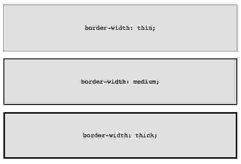
border-width: thick;
border-style: solid;
border-color: black;
Например у параметра border-width есть три параметра: thin, medium, thick:
Если необходимо менять цвет границы при наведении на объект:
.box {
    border: 1px solid red;
}
.box:hover {
    border: 1px solid green;
}
Но так это реализовать проще и правильнее:
.box {
    border: 1px solid red;
}
.box:hover {
    border-color: green;
}
Border-Radius
border-radius — это новый параметр CSS3 для отображения закругленных углов, который корректно работает во всех современных браузерах, за исключением Internet Explorer 8 (и более старых версий).
Для каждого угла можно назначить свое закругление:
border-top-left-radius: 20px;
border-top-right-radius: 0;
border-bottom-right-radius: 30px;
border-bottom-left-radius: 0;
В приведенном примере необязательно назначать «0» border-top-right-radius и border-bottom-left-radius, если они не наследуют значения, которые должны быть изменены.
Всю конструкцию можно сжать в одну строку:
/* top left, top right, bottom right, bottom left */
border-radius: 20px 0 30px 0;
А вот как можно нарисовать лимон средствами CSS:
.lemon {
   width: 200px; height: 200px;
   background: #F5F240;
   border: 1px solid #F0D900;
   border-radius: 10px 150px 30px 150px;
}
Здесь описаны самые простые и популярные примеры применения параметра border. Перейдем к более сложным.
Несколько границ
Border-Style
solid, dashed, and dotted — самые популярные значения параметра border-style, но давайте рассмотрим другие, например, groove and ridge.
border: 20px groove #e3e3e3;Или более подробно:
border-color: #e3e3e3;
border-width: 20px;
border-style: groove;
Outline
Самый популярный способ создания двойной границы — это параметр outline:
.box {
   border: 5px solid #292929;
   outline: 5px solid #e3e3e3;
}
Этот способ отлично работает, но ограничен созданием двойной рамки. Если вам необходимо отобразить несколько границ элемента, то необходимо использовать другую технику.
Псевдоэлементы
Можно использовать такую конструкцию:
.box {
  width: 200px; height: 200px;
  background: #e3e3e3;
  position: relative;
  border: 10px solid green;
}
/* Create two boxes with the same width of the container */
.box:after, .box:before {
  content: '';
  position: absolute;
  top: 0; left: 0; bottom: 0; right: 0;
}
.box:after {
  border: 5px solid red;
  outline: 5px solid yellow;
}
.box:before {
  border: 10px solid blue;
}
Возможно это не самое элегантное решение, однако оно работает
Box-Shadow
Еще один способ, с применением теней:
.box {
    border: 5px solid red;
     box-shadow:
       0 0 0 5px green,
       0 0 0 10px yellow,
       0 0 0 15px orange;
}
Изменение углов
К параметру border-radius можно применять два значения, используя «/», например:
border-radius: 50px / 100px; /* horizontal radius, vertical radius */Это то же самое, что:
border-top-left-radius: 50px 100px;
border-top-right-radius: 50px 100px;
border-bottom-right-radius: 50px 100px;
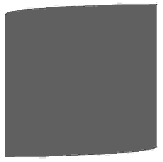
border-bottom-left-radius: 50px 100px;Эта техничка бывает полезна, если необходимо имитировать искривление, а не закругление. Например, так можно получить эффект скрученной бумаги:
.box {
    width: 200px; height: 200px;
    background: #666;
    border-top-left-radius: 15em 1em;
    border-bottom-right-radius: 15em 1em;
}
CSS фигуры
В следующих примерах предполагается такая разметка:
<div class="box"></div>И такой базовый css:
.box {
   width: 200px;
   height: 200px;
   background: black;
}
Наиболее частым примером использования CSS фигур является отображение стрелок. Чтобы понять, как это работает, необходимо разобраться с использованием отдельного border-color для каждой стороны и установкой значения «0» для width и height:
.arrow {
  width: 0; height: 0;
  border-top: 100px solid red;
  border-right: 100px solid green;
  border-bottom: 100px solid blue;
  border-left: 100px solid yellow;
}
Или то же самое:
.arrow {
  width: 0; height: 0;
  border: 100px solid;
  border-top-color: red;
  border-right-color: green;
  border-bottom-color: blue;
  border-left-color: yellow;
}
Или так:
.arrow {
  width: 0; height: 0;
  border: 100px solid;
  border-color: red green blue yellow;
}
А теперь оставляем только синий треугольник:
.arrow {
  width: 0; height: 0;
  border: 100px solid;
  border-bottom-color: blue;
}
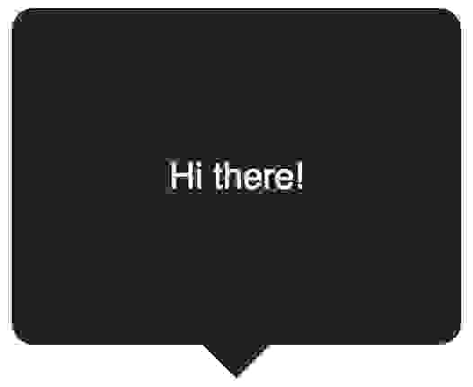
Создание Speech Bubble
Наша базовая разметка:
<div class="speech-bubble">Hi there!</div>И стили:
.speech-bubble {
    position: relative;
    background-color: #292929;
    width: 200px;
    height: 150px;
    line-height: 150px; /* vertically center */
    color: white;
    text-align: center;
}
Теперь нужно расположить стрелку-треугольник в нужном месте. Вот наш цветной квадратик:
.speech-bubble:after {
  content: '';
  position: absolute;
  width: 0;
  height: 0;
  border: 10px solid;
  border-color: red green blue yellow;
}
Оставляем только четверть квадратика:
.speech-bubble:after {
  content: '';
  position: absolute;
  width: 0;
  height: 0;
  border: 10px solid;
  border-top-color: red;
}
Теперь перемещаем ниже и закрашиваем:
.speech-bubble {
   /* … other styles */
   border-radius: 10px;
}
.speech-bubble:after {
  content: '';
  position: absolute;
  width: 0;
  height: 0;
  border: 15px solid;
  border-top-color: #292929;
  top: 100%;
  left: 50%;
  margin-left: -15px; /* adjust for border width */
}
Примеры применения:
/*
   Speech Bubbles
   Usage: Apply a class of .speech-bubble and .speech-bubble-DIRECTION
   <div class="speech-bubble speech-bubble-top">Hi there</div>
*/

.speech-bubble {
  position: relative;
  background-color: #292929;
  width: 200px;
  height: 150px;
  line-height: 150px; /* vertically center */
  color: white;
  text-align: center;
  border-radius: 10px;
  font-family: sans-serif;
}

.speech-bubble:after {
  content: '';
  position: absolute;
  width: 0;
  height: 0;
  border: 15px solid;
}

/* Position the Arrow */

.speech-bubble-top:after {
  border-bottom-color: #292929;

  left: 50%;
  bottom: 100%;
  margin-left: -15px;
}
.speech-bubble-right:after {
  border-left-color: #292929;

  left: 100%;
  top: 50%;
  margin-top: -15px;
}

.speech-bubble-bottom:after {
  border-top-color: #292929;

  top: 100%;
  left: 50%;
  margin-left: -15px;
}

.speech-bubble-left:after {
  border-right-color: #292929;
  top: 50%;
  right: 100%;
  margin-top: -15px;
}
Вертикальное центрирование текста
минус использования line-height при вертикальном центрировании в ограничении текста одной строкой. Для решения этой проблемы, можно применить display: table к нашему Speech Bubble и display: table-cell к тексту:
.speech-bubble {
 /* other styles */
  display: table;
}
.speech-bubble p {
  display: table-cell;
  vertical-align: middle;
}
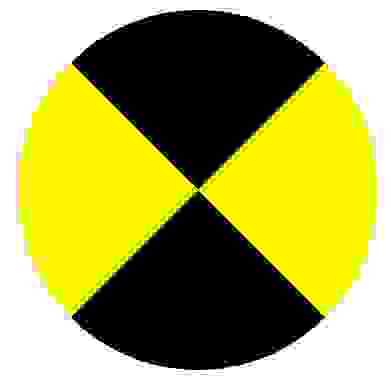
Еще один пример нестандартного использования границ:
.biohazard {
  width: 0; height: 0;
  border: 60px solid;
  border-radius: 50%;
  border-top-color: black;
  border-bottom-color: black;
  border-left-color: yellow;
  border-right-color: yellow;
}
Итог
Использование параметра border не ограничивается одним лишь «1px solid black», с помощью границ можно создавать различные фигуры, причем достаточно один раз написать CSS-класс и применять его к множеству элементов на странице.
Summary
CSS-свойство border-width определяет ширину рамки элемента. Но обычно её задают не отдельно, а в составе свойства border.
| Начальное значение | как и у каждого из подсвойств этого свойства:
|
|---|---|
| Применяется к | все элементы. Это также применяется к ::first-letter. |
| Наследуется | нет |
| Обработка значения | как и у каждого из подсвойств этого свойства:
|
| Animation type | как и у каждого из подсвойств этого свойства:
|
Синтаксис
Общий синтаксис (en-US):
border-width =
<line-width>{1,4} (en-US)<line-width> =
<length [0,∞]> | (en-US)
thin | (en-US)
medium | (en-US)
thick
border-width: ширина                  /* Одно значение */
border-width: вертикальная горизонтальная    /* Два значения */
border-width: верх горизонтальная основание    /* Три значения */
border-width: верх право основание лево  /* Четыре значения */

border-width: inherit /* Родительское значение */
Values
<br-width>-
: Is either a non-negative explicit <length>value or a keyword denoting the thickness of the bottom border. The keyword must be one of the following values:thinA thin border mediumA medium border thickA thick border The specification doesn’t precisely define the thickness of each of the keywords, which is therefore implementation specific. Nevertheless, it requests that the thickness does follow the thin ≤ medium ≤ thickinequality and that the values are constant on a single document.
-
inherit- : Is a keyword indicating that all four values are inherited from their parent’s element calculated value.
Examples
A mix of values and lengths
HTML
<p id="sval">
    one value: 6px wide border on all 4 sides</p>
<p id="bival">
    two different values: 2px wide top and bottom border, 10px wide right and left border</p>
<p id="treval">
    three different values: 0.3em top, 9px bottom, and zero width right and left</p>
<p id="fourval">
    four different values: "thin" top, "medium" right, "thick" bottom, and 1em right</p>
CSS
#sval {
    border: ridge #ccc;
    border-width: 6px;
}
#bival {
    border: solid red;
    border-width: 2px 10px;
}
#treval {
    border: dotted orange;
    border-width: 0.3em 0 9px;
}
#fourval {
    border: solid lightgreen;
    border-width: thin medium thick 1em;
}
p {
    width: auto;
    margin: 0.25em;
    padding: 0.25em;
}
Result
Specifications
| Specification | Status | Comment |
|---|---|---|
| CSS Backgrounds and Borders Module Level 3 Определение ‘border-width’ в этой спецификации. |
Кандидат в рекомендации | No direct change, the <length> CSS data type extension has an effect on this property. |
| CSS Level 2 (Revision 1) Определение ‘border-width’ в этой спецификации. |
Рекомендация | Added the constraint that values’ meaning must be constant inside a document. |
| CSS Level 1 Определение ‘border-width’ в этой спецификации. |
Рекомендация |
Browser compatibility
BCD tables only load in the browser
See also
Есть рамка вокруг текста
border-top: 1px solid #000;
border-bottom: 1px solid #000;
padding: 5px;
Как сделать рамку длиннее или наоборот?

задан 21 мар 2012 в 14:34
1
Не совсем понятно, что именно вам нужно.
border-top: 1px solid #000;— верхняя часть рамки толщиной в1pxцвета#000border-bottom: 1px solid #000;— нижняя часть рамки1pxцвета#000padding: 5px;— внутренний отступ (отступ от текста внутри рамки до самой рамки)5px
Длина же задается параметром width (высота — height). Например:
width 100px;
border-top: 1px solid #000;
border-bottom: 1px solid #000;
padding: 5px;
Возможно, вам поможет эта статья или эта.
Regent
19k6 золотых знаков28 серебряных знаков43 бронзовых знака
ответ дан 21 мар 2012 в 14:56
sonniysonniy
1,0298 серебряных знаков22 бронзовых знака
1
ответ дан 21 мар 2012 в 14:39
Alex KapustinAlex Kapustin
11.6k18 серебряных знаков22 бронзовых знака
С помощью border такого не сделаешь, она либо на всю длину либо никак. Поробуйте сделать так:
div{position:relative;}
div:before{
    position:absolute;
    top:0;
    left:0;
    width:50%;
    border-top:1px solid #000;
    content:"";
}
ответ дан 17 окт 2016 в 8:52
bad4izbad4iz
1,25211 серебряных знаков21 бронзовый знак
Попробуйте так
border: 1px solid #000;
padding: 0 60px 0 0;
ответ дан 21 мар 2012 в 14:41
span {
  border: 1px solid red;
}

span.long {
  padding: 0 2em;
}

span.long-2 {
  padding: 0 2em;
  margin: 0 -2em;
}
<p>Как сделать <span>рамку</span> длиннее?</p>
<p>Как сделать <span class="long">рамку</span> длиннее?</p>
<p>Как сделать только <span class="long-2">рамку</span> длиннее?</p>
VenZell
19.8k5 золотых знаков43 серебряных знака61 бронзовый знак
ответ дан 17 окт 2016 в 10:05
Qwertiy♦Qwertiy
119k24 золотых знака117 серебряных знаков285 бронзовых знаков
Интересно а 10 лет назад были псевдо элементы ::before; ::after?
Можно было было бы так:
.parent-element {
    display: flex;
    width: 1200px;
    height: 500px;
    &::after {
        content: '';
        width: 800px;
        margin: 0 auto;
        height: 1px;
        border: 0.5px solid black;
    }
}
ответ дан 26 авг 2022 в 12:44
В этой статье изучим CSS-свойства для стилизации границ элемента: border, border-width, border-style, border-color, border-radius, border-image, border-image-source, border-image-slice, border-image-width, border-image-outset и border-image-repeat.
CSS-свойство border предназначено для управления оформлением границ элемента. Границы располагаются перед фоном элемента.
border – это универсальное свойство для стилизации границ (рамки) вокруг элемента. Оно позволяет установить сразу три характеристики: толщину границ (border-width), стиль линий (border-style) и цвет (border-color).
Например:
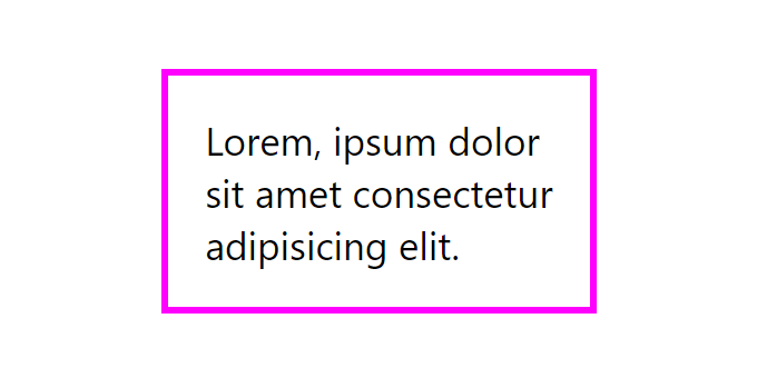
.card {
  border:
    3px       /* width */
    solid     /* style */
    magenta;  /* color */
}
border состоит из трёх других свойств (в скобках приведены значения каждого из них, которые они имеют по умолчанию):
border-width(medium);border-style(none);border-color(currentcolor).
Свойство border устанавливает стили сразу для всех четырёх границ. В отличие от него border-width, border-style и border-color могут принимать до 4 значений, и тем самым стилизовать каждую из сторон по-отдельности.
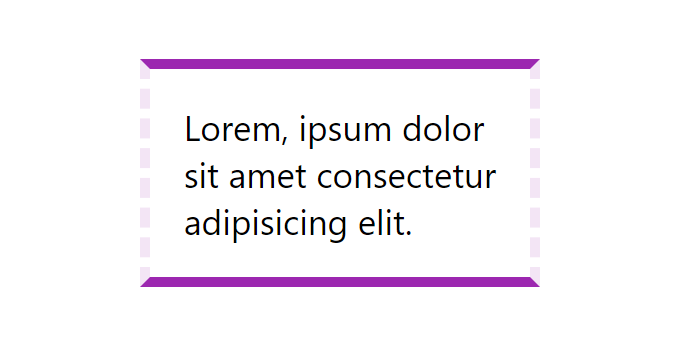
.card {
  border-width: 5px 5px 5px 5px;
  border-style: solid dashed solid dashed;
  border-color: #9c27b0 #f3e5f5 #9c27b0 #f3e5f5;
}
При установке меньшего количества значений:
.card {
  border-width: 5px 10px 20px; /* top - 5px, left и right - 10px, bottom - 20px */
  border-width: 5px 10px; /* top и bottom - 5px, left и right - 10px */
  border-width: 5px; /* top, bottom, left и right - 5px */
}
border-width – толщина границы
CSS-свойство border-width определяет толщину границы. По умолчанию данное свойство имеет значение medium, что эквивалентно 3px.
Задавать значение можно с помощью ключевых слов: thin (эквивалентно 1px), medium (3px) и thick (5px), а также используя различные единицы измерения: px, em, rem, vh, vw.
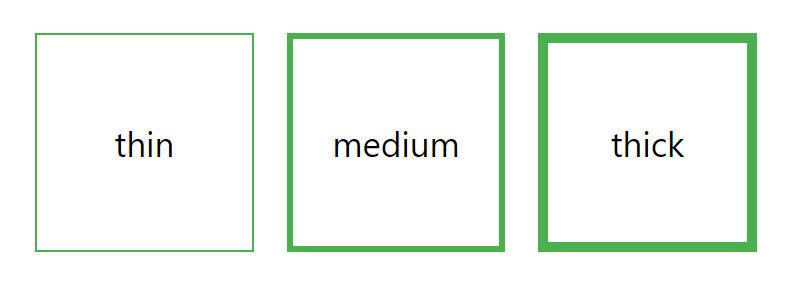
.thin {
  border-width: thin;
}
.medium {
  border-width: medium;
}
.thick {
  border-width: thick;
}
border-style – тип линии
CSS-свойство border-style предназначено для установки стилей границам.
Значения:
solid– сплошная непрерывная линия;none(по умолчанию) – без отображения границы;hidden– то же самое, чтоnone, за исключением отображения границ у ячеек таблицы сborder-collapse: collapse;dashed– штриховая линия;dotted– линия из точек;double– двойная линия;groove– линия со вдавленным эффектом;ridge– линия с выпуклым эффектом;inset– добавляет эффект к границе таким образом, чтобы весь блок выглядел вдавленным;outset– добавляет эффект к границе таким образом, чтобы весь блок выглядел выпуклым;
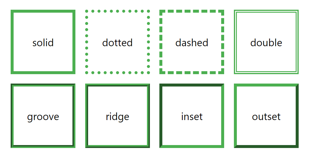
.solid {
border-style: solid;
}
.dotted {
border-style: dotted;
}
.dashed {
border-style: dashed;
}
.double {
border-style: double;
}
.groove {
border-style: groove;
}
.ridge {
border-style: ridge;
}
.inset {
border-style: inset;
}
.outset {
border-style: outset;
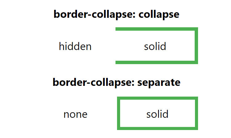
}Отличие между border-style: none и border-style: hidden:
<style>
  td {
    border: thick solid #4caf50;
  }
  .hidden {
    border-style: hidden;
  }
  .none {
    border-style: none;
  }
</style>

<!-- border-collapse: collapse -->
<table style="border-collapse: collapse">
  <tr>
    <td class="hidden">hidden</td>
    <td>solid</td>
  </tr>
</table>

<!-- border-collapse: separate -->
<table>
  <tr>
    <td class="none">none</td>
    <td>solid</td>
  </tr>
</table>
border-color – цвет линии
CSS-свойство border-color используется для установки цвета границам элемента. По умолчанию оно имеет значение currentcolor, т.е. наследует цвет элемента.
Задать определённый цвет границам можно разными способами, а именно с помощью:
- названия цвета, например:
red,greenи т.д.; - шестнадцатеричного кода, например:
#ff0000,#00ff00и т.д.; rgb(),rgba(),hsl()илиhsla();transparent(прозрачный);
Если указать одно значение, то оно будет применено сразу к 4 границам (верхней, правой, нижней и левой).
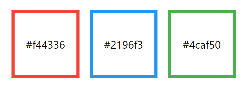
.danger {
  border-color: #f44336;
}
.primary {
  border-color: #2196f3;
}
.success {
  border-color: #4caf50;
}
Но можно установить и отдельно для каждой, для этого значения необходимо перечислить через пробел:
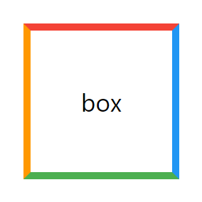
.box {
  border-color: #f44336 #2196f3 #4caf50 #ff9800;
}
Свойства для стилизации границ по-отдельности
В CSS имеются свойства, которые позволяют задать стиль определённой границы (top – верхней, right – правой, bottom – нижней и left – левой): border-top, border-right, border-bottom и border-left.
Кроме этого также доступны CSS-свойства для задания отдельных характеристик границ:
- для толщины:
border-top-width,border-right-width,border-bottom-widthиborder-left-width; - для типа линии:
border-top-style,border-right-style,border-bottom-styleиborder-left-style; - для цвета:
border-top-color,border-right-color,border-bottom-colorиborder-left-color.
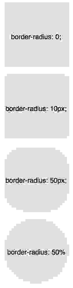
border-radius – закругление углов
CSS-свойство border-radius позволяет скруглить углы границ элементов.
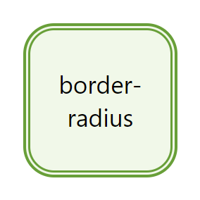
border-radius работает даже если у элемента нет границ, т.к. его действие распространяется и на фон.
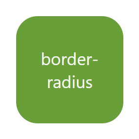
В основном border-radius используется с одним значением.
Например:
.box {
  border-radius: 20px;
}
Когда вы используете только одно значение, все углы элемента скругляются на это значение.
Кроме указания значений, с помощью единиц измерения для задания фиксированной длины (например: px, rem, em и т.д.), вы также можете использовать проценты.
В основном это используется для создания круга путем установки border-radius, равным 50%.
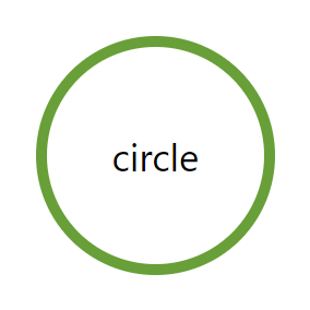
.circle {
  border-radius: 50%;
}
Значение, заданное в процентах, вычисляется в зависимости от ширины и высоты элемента. Поэтому, когда вы используете его для прямоугольника, углы у вас будут не симметричными.
Пример, показывающий разницу между border-radius: 40px и border-radius: 40% применительно к прямоугольнику:
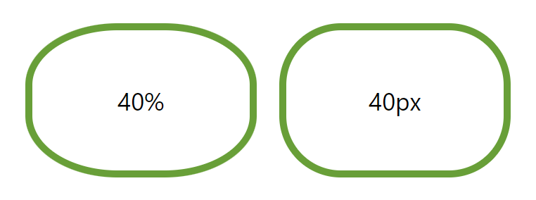
.rect-1 {
  width: 150px;
  height: 100px;
  border: thick solid #689f38;
  border-radius: 40%;
}
.rect-2 {
  width: 150px;
  height: 100px;
  border: thick solid #689f38;
  border-radius: 40px;
}
border-radius позволяет установить радиус скругления отдельно для каждого угла. Для этого необходимо перечислить значения через пробел (начиная с верхнего левого угла и далее двигаясь по часовой стрелке):
Кроме этого, скруглить отдельно каждый угол можно с помощью свойств border-top-left-radius, border-top-right-radius, border-bottom-right-radius и border-bottom-left-radius.
С двумя значениями:
.rect {
  border-radius: 10px 20px;
}
С тремя значениями:
.rect {
  border-radius: 10px 20px 30px;
}
Кроме этого, border-radius позволяет создавать ассиметрично скруглённые углы. Осуществляется это с помощью косой черты.
.rect {
  border-radius: 10px 20px 30px 40px / 20px 40px 60px 80px;
}
Перед косой черты указываются значения, отвечающие за горизонтальные расстояния, а после — вертикальные.
border-image – изображение в качестве рамки
border-image – это CSS-свойство, которое позволяет установить в качестве границ элемента изображение или CSS градиент.
border-image можно применить к любому элементу, за исключением тегов, определяющих содержимое таблицы (tr, th, td) когда в качестве значения border-collapse установлено collapse.
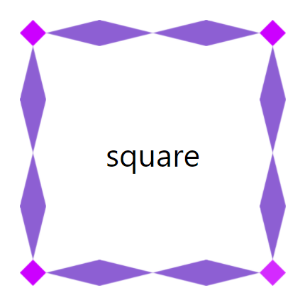
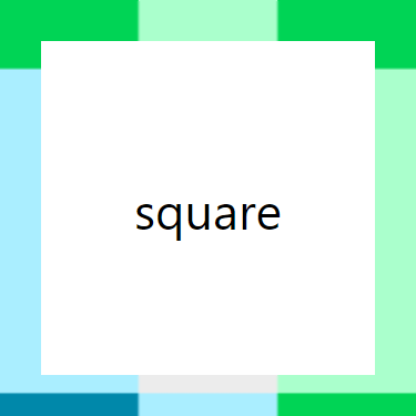
<style>
.square {
  border: 30px solid transparent;
  border-image: url('/examples/images/border.png') 16.66666667% / 1 / 0 stretch;
}
</style>

<div class="square">square</div>
border-image является краткой записью следующих пяти свойств:
border-image-source(none);border-image-slice(100%);border-image-width(1);border-image-outset(0);border-image-repeat(stretch).
Таким образом, пример приведённый выше с помощью специальных CSS-свойств можно записать следующим образом:
.square {
  border: 30px solid transparent;
  /* border-image: url('/examples/images/border.png') 16.66666667% / 1 / 0 stretch; */
  border-image-source: url('/examples/images/border.png');
  border-image-slice: 16.66666667%;
  border-image-width: 1;
  border-image-outset: 0;
  border-image-repeat: stretch;
}
Пример создания градиентной границы с помощью border-image:
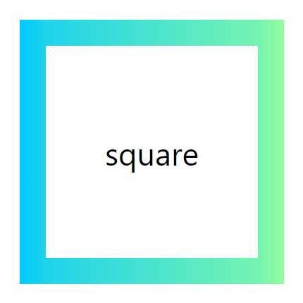
<style>
.square {
  border: 30px solid transparent;
  border-image: linear-gradient(90deg, #00C9FF 0%, #92FE9D 100%) 20% / 1 / 0 stretch;
  /*  border-image-source: linear-gradient(90deg, #00C9FF 0%, #92FE9D 100%);
    border-image-slice: 20%;
    border-image-width: 1;
    border-image-outset: 0;
    border-image-repeat: stretch; */
}
</style>

<div class="square">square</div>
border-image-source
border-image-source – задаёт изображение (посредством URL-адреса, URI-данных или встроенного SVG) или CSS градиент, который необходимо использовать для отрисовки границы. Значение по умолчанию: none.
border-image-slice
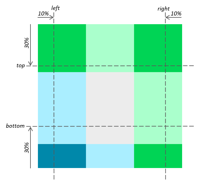
border-image-slice – сообщает браузеру, как необходимо «разрезать» изображение и тем самым определить области для отрисовки границ.
В процессе нарезки изображения образуется 9 областей: четыре угла, четыре стороны и центр.
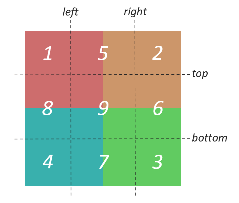
- Области 1 – 4 используется всего один раз для отрисовки соответствующих углов границ элемента;
- Области 5 – 8 применяются для отрисовки соответствующих сторон границ, расположенных между углами. В зависимости от значения свойства
border-image-repeatобласть исходного изображения может растягиваться, повторяться, масштабироваться или иным образом изменяться, чтобы соответствовать размерам элемента; - Область 9 является центральной и по умолчанию отбрасывается.
Для использования области 9 в качестве фонового изображения элемента, необходимо добавить в любое место значения border-image-slice ключевое слово fill. При этом это фоновое изображение будет располагаться поверх фактического background.
Указывать смещения от краёв для нарезки изображения можно с помощью числа, так и процентов. При указании числа расстояние будет определяться количеством пикселей для растровых изображений или координатой для векторных. При указании процентов – в процентах от размера исходного изображения.
В border-image-slice можно установить от одного до четырёх значений:
- при указании одного значения, все четыре среза создаются на одинаковом расстоянии от соответствующих сторон;
- если два значения, то первая величина определяет срезы сверху и снизу, а вторая — слева и справа;
- когда указаны три значения, первое создает срез сверху, второе – слева и справа, а третье – снизу;
- при задании четырех значений, они определяют срезы соответственно сверху, справа, снизу и слева (т.е. по часовой стрелке).
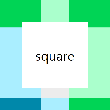
При указании одного значения:
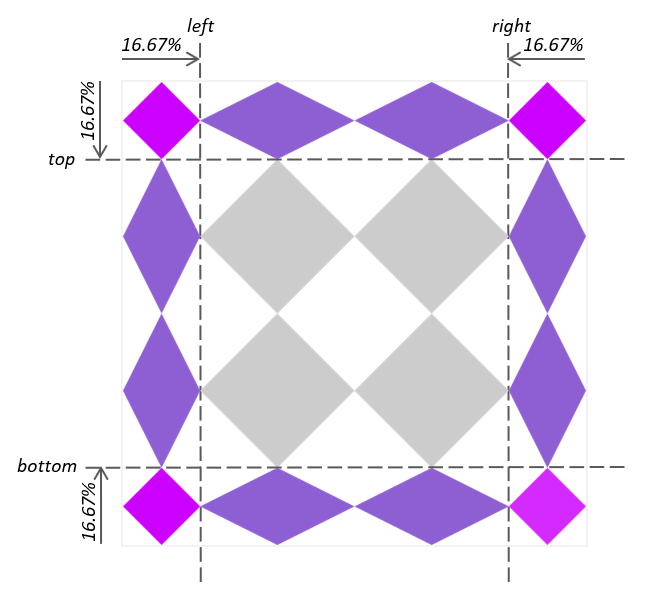
.square {
  border: 30px solid transparent;
  border-image-source: url('/examples/images/border.png');
  border-image-slice: 16.67%;
}
При указании двух значений:
.square {
  border: 30px solid transparent;
  border-image-source: url('/examples/images/border-01.png');
  border-image-slice: 30% 10%;
}
Свойства border-image-repeat, border-image-width и border-image-outset позволяют задать каким образом эти области должны использоваться для формирования окончательной отрисовки границы.
border-image-width
Свойство border-image-width устанавливает толщину границы для изображения. По умолчанию имеет значение 1 (это означает, что она равна border-width).
Если значение этого свойства задать больше, чем border-width, то тогда граница будет накладываться под внутренний контент элемента.
В border-image-width можно задать от одного до четырех значений:
- при указании одного значения, все четыре границы будут иметь одну эту толщину;
- при задании двух значений, первая величина будет определять толщину верхней и нижней границы, а вторая – левой и правой;
- когда указаны три значения: первая величина будет задавать толщину верхней границы, вторая – левой и правой, а третья – нижней;
- при задании четырёх значений: первая величина – за толщину верхней границы, вторая – правой, третья – нижней и четвёртая – левой (т.е. по часовой стрелке, начиная с верхней).
Задавать значение можно с помощью:
- числа – в этом случае, толщина границы будет вычисляться как значение
border-widthумноженное на это число; - px и других единиц – в соответствии с указанными единицами;
- процентов (%) – толщина границы будет вычисляться в процентах относительно размера блока;
- ключевого слова
auto– толщина границы берётся изborder-image-slice(если подходящего размера нет, то используется то, что задано вborder-width).
Пример установки толщины границы для изображения в раза превышающей border-width:
<style>
.square {
  border: 30px solid transparent;
  border-image-source: url('/examples/images/border-01.png');
  border-image-slice: 30% 10%;
  border-image-width: 2; /* толщина границы */
}
</style>

<div class="square">square</div>
border-image-outset
СSS-свойство border-image-outset задает расстояние, на которое нужно сместить границы наружу относительно их начального положения.
В border-image-outset можно задать от одного до четырёх значений:
- при задании одного значения, оно применяется ко всем четырем сторонам;
- если указаны два значения, то первое применяется к верхней и нижней границам, а второе — к левой и правой;
- указании трёх значений, первое применяется к верхней границе, второе — к левой и правой, а третье — к нижней;
- указаны четыре значения, они применяются к верхней, правой, нижней и левой границам в указанном порядке (по часовой стрелке).
Задавать значения можно с помощью:
- px, em, rem и других CSS единиц — в этом случае смещение будет определяться в соответствии с этим значением;
- числа – в этом случае расстояние будет равно этому число умноженное на значение
border-width.
Пример, в котором сместим границы на величину, равную 1 * border-width:
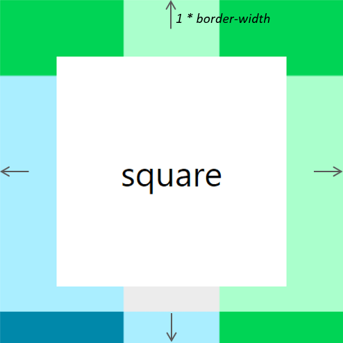
<style>
.square {
  border: 30px solid transparent;
  border-image-source: url('/examples/images/border-01.png');
  border-image-slice: 30% 10%;
  border-image-width: 2;
  /* смещение всех 4 границ на величину равную величине border-width */
  border-image-outset: 1;
}
</style>

<div class="square">square</div>
border-image-repeat
CSS свойство border-image-repeat определяет как должны быть заполнены части границ, расположенные между углами в соответствии с областями 5 – 8 исходного изображения.
border-image-repeat может быть установлено с использованием одного или двух значений.
Когда указано одно значение, то оно применяет одно и то же поведение ко всем четырем сторонам. При задании двух значений, первое применяется к верхней и нижней сторонам, а второе — к левому и правому.
Значения:
stretch(по умолчанию) – растягивает области 5 – 8 исходного изображения для заполнения частей границ между углами;repeat– повторяет области 5 – 8 исходного для заполнения промежутка между углами границ границей (если область изображения целиком не помещается, то оно обрезается);round– тоже самое чтоrepeat, за исключением того, что когда часть изображения не помещается, оно масштабируется таким образом, чтобы вписать его N раз;space– тоже самое чтоrepeat, за исключением того, что когда часть изображения не помещается, между ними добавляется пустое пространство таким образом, чтобы вписать его N раз.
Пример border-image-repeat с одним значением:
<style>
.rectangle {
  width: 400px;
  height: 300px;
  border: 30px solid transparent;
  border-image-source: url('/examples/images/border-02.png');
  border-image-slice: 16.66666667%;
  /* определяем как должны повторяться части границ между углами */
  border-image-repeat: round;
}
</style>

<div class="rectangle">rectangle</div>
Пример border-image-repeat с двумя значениями:
<style>
.rectangle {
  width: 400px;
  height: 300px;
  border: 30px solid transparent;
  border-image-source: url('/examples/images/border-02.png');
  border-image-slice: 16.66666667%;
  /* определяем как должны повторяться части границ между углами */
  border-image-repeat: stretch round;
}
</style>

<div class="rectangle">rectangle</div>| Internet Explorer | Chrome | Opera | Safari | Firefox | Android | iOS | |
| 6.0+ | 8.0+ | 1.0+ | 3.5+ | 1.0+ | 1.0+ | 1.0+ | 1.0+ |
Краткая информация
| Значение по умолчанию | Зависит от использования |
|---|---|
| Наследуется | Нет |
| Применяется | Ко всем элементам |
| Ссылка на спецификацию | http://www.w3.org/TR/CSS21/box.html#propdef-border |
Версии CSS
| CSS 1 | CSS 2 | CSS 2.1 | CSS 3 |
|---|---|---|---|
Описание
Универсальное свойство border позволяет одновременно установить толщину, стиль и цвет границы вокруг
элемента. Значения могут идти в любом порядке, разделяясь пробелом, браузер
сам определит, какое из них соответствует нужному свойству. Для установки границы
только на определенных сторонах элемента, воспользуйтесь свойствами border-top,
border-bottom, border-left,
border-right.
Синтаксис
border: [border-width || border-style || border-color] | inherit
Значения
Значение border-width определяет толщину границы.
Для управления ее видом предоставляется несколько значений border-style.
Их названия и результат действия представлен на рис. 1.
Рис.1. Стили рамок
border-color устанавливает цвет границы, значение
может быть в любом допустимом для CSS формате.
inherit наследует значение родителя.
Пример
HTML5CSS2.1IECrOpSaFx
<!DOCTYPE html>
<html>
 <head>
  <meta charset="utf-8">
  <title>border</title>
  <style>
   .brd {
    border: 4px double black; /* Параметры границы */
    background: #fc3; /* Цвет фона */
    padding: 10px; /* Поля вокруг текста */
   }
  </style>
 </head>
 <body>
  <div class="brd">
    Lorem ipsum dolor sit amet, consectetuer adipiscing elit, sed diem nonummy
    nibh euismod tincidunt ut lacreet dolore magna aliguam erat volutpat. Ut wisis
    enim ad minim veniam, quis nostrud exerci tution ullamcorper suscipit lobortis
    nisl ut aliquip ex ea commodo consequat.
   </div>
 </body>
</html>
В данном примере вокруг слоя добавляется двойная граница. Результат показан на рис. 2.
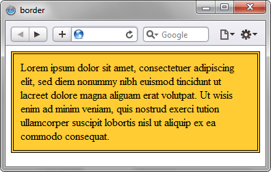
Рис. 2. Применение свойства border
Объектная модель
[window.]document.getElementById(«elementID«).style.border
Браузеры
Браузер Internet Explorer до шестой версии включительно при толщине границы 1px отображает dotted как dashed. При толщине 2px и выше значение dotted работает корректно. Эта ошибка исправлена в IE7, но только для всех границ толщиной 1px. Если одна из границ блока имеет толщину 2px и выше, то в IE7 значение dotted превращается в dashed.
Internet Explorer до версии 7.0 включительно не поддерживает значение inherit.
Стиль границы в разных браузерах может несколько различаться при использовании значений groove, ridge, inset или outset.
In this chapter, we will speak about borders and how we can give styles to
them. We can give width, style and color to the border.
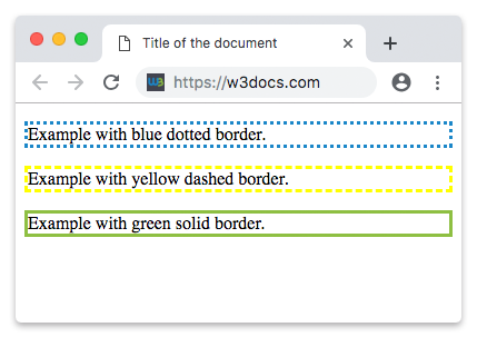
Example of the border property:
<!DOCTYPE html>
<html>
  <head>
    <title>Title of the document</title>
  </head>
  <body>
    <p style="border:3px dotted #1c87c9"> Example with a blue dotted border.</p>
    <p style="border:3px dashed #ffff00"> Exaxmple with a yellow dashed border.</p>
    <p style="border:3px solid #8ebf42"> Example with a green solid border.</p>
  </body>
</html>
Result
The border-width property sets the width of a border.
The width can be specified in pixels. It can also be specified by one of the three pre-defined values: medium, thin, or thick.
You cannot use the «border-width» property alone. It will not work. Use «border-style» for setting the borders first.
Example of the border-width property:
<!DOCTYPE html>
<html>
  <head>
    <style>
      p.border-width-1 {
        border-style: solid;
        border-width: 6px;
      }
      p.border-width-2 {
        border-style: dotted;
        border-width: 1px;
      }
        p.border-width-3 {
        border-style: dotted;
        border-width: medium;
      }
      p.border-width-4 {
        border-style: double;
        border-width: 8px;
      }
      p.border-width-5 {
        border-style: double;
        border-width: thick;
      }
      p.border-width-6 {
        border-style: solid;
        border-width: 3px 12px 6px 18px;
      }
    </style>
  </head>
  <body>
    <h2>The border-width Property</h2>
    <p class="border-width-1">Example with border-width.</p>
    <p class="border-width-2">Example with border-width.</p>
    <p class="border-width-3">Example with border-width.</p>
    <p class="border-width-4">Example with border-width.</p>
    <p class="border-width-5">Example with border-width.</p>
    <p class="border-width-6">Example with border-width.</p>
  </body>
</html>
The border-color property is used to set the color of a border. The color can be set by:
- name — specifies a color name, like «red»
- RGB — specifies a RGB value, like «rgb(255,0,0)»
- Hex — specifies a hex value, like «#ff0000»
You cannot use the «border-color» property alone. It will not work. Use «border-style» for setting the borders first.
Usually, we write these three properties together in one row.
Example of the border-color property:
<!DOCTYPE html>
<html>
  <head>
    <style>
      p.color-one {
        border-style: solid;
        border-color: blue;
      }
      p.color-two {
        border-style: dotted;
        border-color: yellow;
      }
      p.color-three {
        border-style: solid;
        border-color: DarkBlue orange green red;
      }
    </style>
  </head>
  <body>
    <h2>The border-color Property</h2>
    <p class="color-one">Example with blue solid border-color.</p>
    <p class="color-two">Example with yellow dotted border-color.</p>
    <p class="color-three">Example with multicolor border-color.</p>
  </body>
</html>
You can try other examples with our CSS Maker tool.
The CSS border-style property sets the style of all four sides of an element’s borders. Borders are placed on the top of an element’s background. It can have from one to four values. So, each side can have its value. The default value of border-style is none.
Border-style has the following values:
- dotted
- dashed
- solid
- double
- groove
- ridge
- inset
- outset
Some browsers do not support some styles. Usually, when a style is not supported, the browser draws the border as a solid one.
CSS provides properties that specify each border (right, left, bottom and top).
The border-style property can have 4 values, for example, border-style: dotted solid double dashed; where the top border is dotted, the bottom border is double, the right border is solid, and the left border is dashed.
The border-style property can have 3 values, for example, border-style: dotted solid double; where the top border is dotted, the bottom border is double, and the right and left borders are solid.
The border-style property can have 2 values, for example, border-style: dotted solid; where the right and left borders are solid, and the top and bottom borders are dotted.
And, of course, this property can have only 1 value, for example, border-style: solid; where all the sides are solid.
Example of the border properties for individual sides:
<!DOCTYPE html>
<html>
  <head>
    <style>
      p {
        border-top-style: double;
        border-right-style: solid;
        border-bottom-style: dotted;
        border-left-style: groove;
      }
    </style>
  </head>
  <body>
    <p>Example with border individual sides.</p>
  </body>
</html>
The CSS border property is a shorthand property for the following individual border properties:
- The CSS border-width property, which sets the width of all four sides of an element’s border.
- The CSS border-style property, which sets the style of all four sides of an element’s borders.
- The CSS border-color property, which sets the color of all four sides of an element’s border.
Example of the border shorthand property:
<!DOCTYPE html>
<html>
  <head>
    <style>
      p.border-all {
        border: 3px solid red;
      }
      p.border-left {
        border-left: 4px solid blue;
        background-color: #dcdcdc;
      }
      p.border-top {
        border-top: 6px solid green;
        background-color: #dcdcdc;
      }
    </style>
  </head>
  <body>
    <h2>The border Shorthand Property</h2>
    <p class="border-all">Example with a shorthand property for border-width, border-style, and border-color.</p>
    <p class="border-left">Example with a shorthand property for border-left-width, border-left-style, and border-left-color.</p>
    <p class="border-top">Example with a shorthand property for border-top-width, border-top-style, and border-top-color.</p>
  </body>
</html>
Using the CSS border-radius property, you can add rounded borders to an element.
Example of the border-radius property:
<!DOCTYPE html>
<html>
  <head>
    <style>
      p.normal {
        border: 3px solid blue;
      }
      p.round-one {
        border: 3px solid blue;
        border-radius: 6px;
      }
      p.round-two {
        border: 3px solid blue;
        border-radius: 9px;
      }
      p.round-three {
        border: 3px solid blue;
        border-radius: 15px;
      }
    </style>
  </head>
  <body>
    <h2>The border-radius Property</h2>
    <p class="normal">Example with normal border</p>
    <p class="round-one">Example with round border</p>
    <p class="round-two">Example with rounder border</p>
    <p class="round-three">Example with roundest border</p>
  </body>
</html>
Outlines and borders are usually confusing because they are very similar. But there are differences between these two:
- Outlines are drawn outside of the content of an element, so they don’t take up space.
- Outlines usually are rectangular, although they don’t have to be.
В языке CSS за оформление рамок или обводок отвечает свойство border, а точнее, четыре свойства, названия которых начинаются с этого слова. Они позволяют вебмастеру управлять цветом, внешним видом, толщиной и формой углов рамки, которая обрамляет содержимое какого-либо блока.
Содержание
- Синтаксис и значения border
- border-style
- border-width
- border-color
- border-radius
- Более детальные свойства
Свойств, отвечающих за оформление границы или рамки, – четыре. Вид определяет свойство border-style, ширину можно задать, используя border-width, с помощью border-color назначается цвет, border-radius закругляет углы. Также есть общее свойство border, в котором можно объединить все значения.
Его синтаксис:
border: <border-width> || <border-style> || <color>Например, создадим элемент и применим к нему свойства:
.element {
  width:100px;
  height:100px;
  border:2px solid red;
}
Значения свойства border здесь указывают, что у элемента должна быть рамка толщиной 2px, сплошная (solid), и красного цвета.
See the Pen
border simple by Андрей (@adlibi)
on CodePen.
border-style
С помощью border-style можно сделать рамку в виде пунктирной линии, последовательности точек, придать ей объем, а всему блоку эффект выпуклости или вдавленности. Значение по умолчанию – none (отсутствие рамок).
Ниже перечислены значения, которые можно задать свойству, и эффекты, которые при этом появляются.
- solid
- сплошная линия
- none
- по умолчанию – линии нет
- double
- двойная линия
- dashed
- пунктир
- dotted
- набор точек
- groove
- придание линии вогнутости
- ridge
- придание линии выпуклости
- inset
- эффект вдавленности блока
- outset
- эффект выпуклости блока
На примере ниже показаны все стили рамок, кроме solid, который продемонстрирован выше.
See the Pen
border style by Андрей (@adlibi)
on CodePen.
Примечание: при использовании стиля
dashedсоотношение длины штриха и ширины пробела зависит от браузера, в котором открыт сайт.
border-width
Толщина линии, образующей рамку, может задаваться как словом, так и количеством пикселей.
Возможные значения:
- <length>
- Числовая величина, измеряемая в px, em, rem, vh и vw.
- thin
- Эквивалент 1px
- medium
- Эквивалент 3px
- thick
- Эквивалент 5px
border-color
Цвет рамки можно задавать несколькими способами:
- словом – названием предустановленного цвета на английском языке – red, green, pink и т.д.;
- с помощью шестнадцатеричного числа, например #ff0099;
- с помощью RGB-модели – rgb (интенсивность каждого из цветов выражается числом от 0 до 255 или в процентах; значения разделяются запятыми).
- Посредством RGBA-модели, при которой четвертый параметр цвета – степень его прозрачности.
Цвет по умолчанию – black (черный). Установка значения transparent (border-color: transparent) означает полностью прозрачную рамку.
Примеры записи цвета:
border-color: red;
border-color: #aaaabb;
border-color: rgb(88, 255, 250);
border-radius
С помощью свойства можно уходить от квадратных углов, вводя величину радиуса скругления.
На примере ниже 2 квадрата. Один залит синим цветом, у вокруг второго нарисована рамка. Для элементов задано скругление:
border-radius: 10px;See the Pen
border radius by Андрей (@adlibi)
on CodePen.
Для каждого угла можно задать свой радиус скругления.
Так, для квадрата на примере ниже, задано такое свойство:
border-radius: 10px 20px 30px 20px;Значения устанавливаются для углов по часовой стрелке.
See the Pen
border radius 4 by Андрей (@adlibi)
on CodePen.
Количество значений может быть от 1 до 4. В таблице приведены результаты введения разного количества значений.
| Количество значений свойства | Результат |
|---|---|
| 1 | Все стороны выполнены в одном стиле |
| 2 | Стиль устанавливается отдельно для горизонтальных (1-е значение) и вертикальных границ (2-е значение) |
| 3 | 1-е значение – верх лево; 2-е – верх право и низ лево; 3-е – низ право. |
| 4 | Все границы выполнены в разных стилях. Соответствие значениям (с 1-го по 4-е) – по часовой стрелке, начиная с верхней. |
Интересно, что для каждого угла можно задать два параметра скругления через знак слэша. При этом первая величина – горизонтальный радиус, вторая – вертикальный. Показать это лучше на примере. Вот что получится, если для фигуры задать свойство:
border-radius: 10px/30px; See the Pen
border radius 2 by Андрей (@adlibi)
on CodePen.
Необходимо иметь в виду, что при задании свойства
border-radiusформа блока остается прежней, то есть прямоугольной, и при больших значениях радиусов, запланированная рамка вокруг текста может попасть на сам текст.
Радиуса скругления можно задавать в процентах. Это удобно, например, если вы хотите нарисовать круг, то просто задайте для квадрата border-radius: 50%;.
See the Pen
border radius 50percent by Андрей (@adlibi)
on CodePen.
Более детальные свойства
Существует и другой способ сделать обводку или придать ей определенный стиль для конкретной стороны рамки или угла. Для этого предусмотрены специальные расширения свойств, в названия которых входит обозначение стороны границы. Верхняя обозначается как top, нижняя – bottom, левая – left и правая – right.
Например:
border-bottom-widthborder-left-colorborder-right-styleborder-top-left-radius.
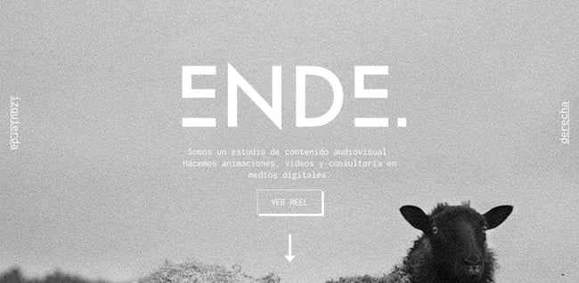
Borders are an important element in web design. They can be used to separate or draw attention to content on a web page, making it easier for people to understand and take action on your site.


For example, the audiovisual content studio Ende uses a border and box-shadow effect to emphasize the CTA button encouraging visitors to check out their reel.
To ensure you can effectively use this element in your website design, we’re going to cover everything you need to know about the CSS border properties, including:
- how to define the border-style property
- how to define the border-width property
- how to define the border-color property
- how to define the border shorthand property
- why border not showing
- how to define border padding
- how to add border shadow
- how to set an image as a border
- how to create a border gradient
- how to create a border with rounded edges
- how to collapse borders in a table element
CSS Border Style
The CSS border-style property specifies what type of border to display. There are ten possible values you can use to set the border-style property. Let’s take a quick look at them below.
- None: specifies no border
- Solid: specifies a solid border
- Dashed: specifies a dashed border
- Dotted: specifies a dotted border
- Double: specifies a double border
- Groove: specifies a 3D grooved border
- Ridge: specifies a 3D ridged border
- Inset: specifies a 3D inset border, which makes the element appear embedded
- Outset : specifies a 3D outset border, which makes the element appear embossed
- Hidden: specifies a hidden border
The effect of the groove, ridge, inset, and outset values depends on the value set for the border-color property. If no border-color value is given, then black is the default.
The border-style property can have between one and four values. If only one value is defined, then it applies to all sides of the element. If two values are defined, then the first value represents the top and bottom borders and the second represents the right and left borders. If three values are defined, the first value represents the top border, the second represents the left and right, and the fourth represents the bottom border. If four values are defined, they represent the top, right, bottom, and left, respectively.
Let’s take a look at examples of all these values below.
See the Pen zYZyMmx by Christina Perricone (@hubspot) on CodePen.
CSS Border Width
The CSS border-width property specifies the width of the border. You can set this property using keyword values or length values. Let’s take a quick look at them below.
- Keyword values: thin, medium, thick
- Length values: px, pt, em, rem, vh, and more
Like the border-style property, the border-width property can have between one and four values. If only one value is defined, then it applies to all sides of the element. If two values are defined, then the first value represents the top and bottom border widths and the second represents the right and left border widths. If three values are defined, the first value represents the top border width, the second represents the left and right, and the fourth represents the bottom width. If four values are defined, they represent the top, right, bottom, and left, respectively.
Let’s take a look at examples defined by different border-width values below.
See the Pen CSS Border Width by Christina Perricone (@hubspot) on CodePen.
CSS Border Color
The CSS border-color property specifies the color of the border. You can set this property using color names, hex color codes, RGB or RGBA values, and HSL or HSLA values.
Like the border-style and border-width properties, the border-color property can have between one and four values. If only one value is defined, then it applies to all sides of the element. If two values are defined, then the first value represents the top and bottom border colors and the second represents the right and left border colors. If three values are defined, the first value represents the top border color, the second represents the left and right, and the fourth represents the bottom color. If four values are defined, they represent the top, right, bottom, and left, respectively.
Let’s take a look at examples defined by different border-color values below.
See the Pen CSS Border Color by Christina Perricone (@hubspot) on CodePen.
CSS Border Shorthand
CSS shorthand is a group of CSS properties that allow values of multiple properties to be set simultaneously. These values are separated by spaces.
The border property, for example, is shorthand for the individual border properties above: border-width, border-style, and border-color.
So I could write the following declarations in longhand:
border-width: 5px;
border-style: solid;
border-color: #00A4BD;
Or in one declaration using the shorthand border property:
border: 5px solid #00A4BD;
While this shorthand property can save you time and make your code look cleaner, it does introduce room for error. Let’s take a look at a common issue you may run into when using this shorthand property.
CSS Border Not Showing
If you’ve set the shorthand border property in CSS and the border is not showing, the most likely issue is that you did not define the border style. While the border-width and border-color property values can be omitted, the border-style property must be defined. Otherwise, it will not render.
If values for the border-width and border-color properties are omitted, the border line will be rendered as black and about 3px wide by default.
Here’s an example of a border that shows because it’s been coded correctly, and a border that doesn’t show because it’s been coded incorrectly.
See the Pen CSS Border Not Showing by Christina Perricone (@hubspot) on CodePen.
CSS Border Padding
The CSS padding property creates space between an element’s content and an element’s border. If the padding property is not defined, then there is no space between its content and its border.
To add space, you can set the padding property using length or percentage values. Values must be positive. Negative values will not render.
Like the properties above, the padding property can have between one and four values. If only one value is defined, then it applies to all sides of the element. If two values are defined, then the first value represents the top and bottom padding and the second represents the right and left padding. If three values are defined, the first value represents the top padding, the second represents the left and right, and the fourth represents the bottom padding. If four values are defined, they represent the top, right, bottom, and left, respectively.
Let’s take a look at examples defined by different padding values below.
See the Pen jOBXXRW by Christina Perricone (@hubspot) on CodePen.
CSS Border Shadow
The CSS box-shadow property can be used in combination with the border property to create a shadow effect. There are two required values to set the border-style property: the h-offset and the v-offset. Let’s define these below:
- h-offset: This value sets the horizontal offset of the shadow. A positive value sets the shadow on the right side of the box, a negative value sets the shadow on the left side.
- v-offset: This value sets the vertical offset of the shadow. A positive value sets the shadow below the box, a negative value sets the shadow above.
There are four optional values that you can add after the h- and v-offset values to affect the box-shadow. Let’s take a quick look at them below.
- Blur: Include a third value to add a blurred effect. The higher the number, the more blurred the shadow will be.
- Spread: Include a fourth value to define the spread of the shadow. A positive value increases the size of the shadow, a negative value decreases it.
- Color: Include a color name, hex code, or other color value to define the color of the shadow. If no color value is included, the shadow color is the text color.
- Inset: Include the inset keyword to set the shadow inside the box.
You can also define multiple shadows. Simply separate the set of required and optional values by commas. Make sure to increase the h- and v-offset values of the cascading shadows so you can actually see them.
Let’s take a look at examples defined by different border-shadow values below.
See the Pen CSS Border Shadow by Christina Perricone (@hubspot) on CodePen.
CSS Image Border
The CSS border-image property allows you to set an image as a border instead of a border line.
The property is shorthand for the border-image-source, border-image-slice, border-image-width, border-image-outset and border-image-repeat properties. Only three are required to be defined when using the shorthand property. These are:
- border-image-source: specifies the image URL or file path
- border-image-slice: specifies how to slice the image
- border-image-repeat: specifies whether the border image should be stretched, repeated, or rounded
For an image border to render, the border property must be defined as well.
Let’s take a look at examples defined by different border-image values below.
See the Pen CSS Image Border by Christina Perricone (@hubspot) on CodePen.
CSS Border Gradient
You can also use the CSS border-image property to set a CSS gradient as a border. To create the border gradient, set the border-image property to “linear-gradient” or “repeating-linear-gradient.” Then, in parentheses, add as many color stops as you want. You can use any combination of HTML color names, hex color codes, RGB color codes, and HSL color values. Then add a value to define the border-image-slice property.
For the gradient border to render, the border property must be defined as well.
Let’s take a look at some examples:
See the Pen CSS Border Gradient by Christina Perricone (@hubspot) on CodePen.
You can learn more about creating CSS color gradients in How to Add & Change Background Color in HTML.
Rounded Border in CSS
The CSS border-radius property can be used to round the edges of a border. You can set this property using length values. The higher the value, the rounder the edges.
Like the border-style, border-width, border-color, and padding properties, the border-radius property can have between one and four values. If only one value is defined, then it applies to all sides of the element. If two values are defined, then the first value represents the top and bottom border edges and the second represents the right and left border edges. If three values are defined, the first value represents the top border edge, the second represents the left and right, and the fourth represents the bottom edge. If four values are defined, they represent the top, right, bottom, and left, respectively.
Let’s take a look at examples defined by different border-radius values below.
See the Pen Rounded Border in CSS by Christina Perricone (@hubspot) on CodePen.
To learn how else you can use this property in your website designs, check out How to Draw a Circle Using the CSS Border Radius Property.
CSS Border Collapse
If you are creating a table in HTML and the table element as well as the table row and cell elements have a defined border, then you can keep the borders separate. Or, you can collapse them using the CSS border-collapse property.
Here’s how a simple table element would look like with the border-collapse property set to “separate.” Please note that since the default value of this property is separate, you can leave it out of your CSS.
Here’s how that example would look if the border-collapse property were set to “collapse” instead.
See the Pen CSS Border Collapse by Christina Perricone (@hubspot) on CodePen.
It’s important to note that if the border-collapse property is set to “collapse,” then the border-radius property won’t render. You’ll need the border-collapse property to be set to “separate” to use the border-radius property.
Adding Borders Around Elements in Your Website Design
Borders can help make content easier to understand and more eye-catching on your website. The best part is how easy it is to create and style borders thanks to the CSS border properties. With a basic understanding of HTML and CSS, you can add this design element to your web pages quickly and easily.
