This tutorial will show you how to create and customize error messaging for various form elements. In this tutorial, we will customize everything from a basic error message to input field errors and tooltips. The best part? We will be using only CSS for customizations – that means no images or javascript required!
HTML
Below is the markup for the form elements we will be creating error messaging for. This is all of the HTML used throughout this tutorial. Copy and paste this code into your working file:
<!-- Basic Error Message -->
<div class="error-message">
  <span class="error-text">Checkout could not be completed. Please check your login information and try again.</span>
</div>

<!-- Input Field Error -->
<div class="input-group error">
  <label>Password *</label>
  <input type="text">
  <div class="error-message">Password is a required field.</div>
</div>

<!-- Input Field Error with Tooltip -->
<div class="input-group error">
  <label>Quantity</label>
  <input type="text">
  <div class="error-tip">Enter a quantity</div>
</div>
CSS
Now onto my personal favorite: the CSS. We will keep the basic functionality of the form elements but completely customize their appearance. In the end, they will stand on their own as custom design elements that thoughtfully guide the user through the form process, making it as straightforward and painless as possible.
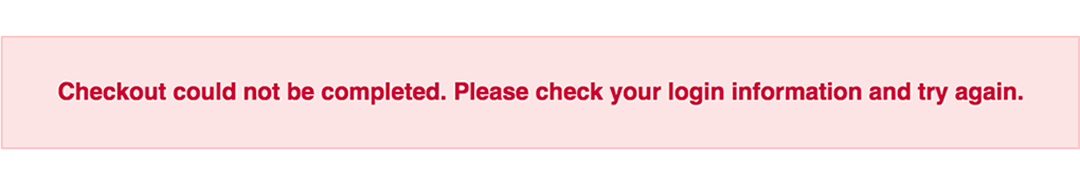
Basic Error Message
Let’s start with a basic error message. We are going to customize the HTML above to look like this:
This is what we start out with, by default, after adding the HTML:

Customizing a basic error message is really simple. All we have to do is give our text a colored background and a couple font styles using CSS. To style the error message background, add the following styles to your CSS stylesheet:
.error-message {
  background-color: #fce4e4;
  border: 1px solid #fcc2c3;
  float: left;
  padding: 20px 30px;
}
Now let’s style the text itself by adding the following font styles:
.error-text {
  color: #cc0033;
  font-family: Helvetica, Arial, sans-serif;
  font-size: 13px;
  font-weight: bold;
  line-height: 20px;
  text-shadow: 1px 1px rgba(250,250,250,.3);
}
That’s it! Keep reading to learn how to style input field and tooltip errors.
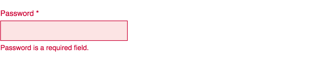
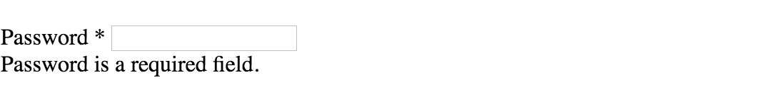
Input Field Error
Now that we have our basic error message styled, let’s work on input field errors. This is what the final product will look like:
And this is what we start out with by default:
First, we want to override the browser’s default styles. Add the following CSS to give your input field a custom look:
/* Basic Input Styling */
.input-group {
  color: #333;
  float: left;
  font-family: Helvetica, Arial, sans-serif;
  font-size: 13px;
  line-height: 20px;
  margin: 0 20px 10px;
  width: 200px;
}

label {
  display: block;
  margin-bottom: 2px;
}

input[type=text] {
  background: #fff;
  border: 1px solid #999;
  float: left;
  font-size: 13px;
  height: 33px;
  margin: 0;
  padding: 0 0 0 15px;
  width: 100%;
}
Next, we need to add the styling for the error message that displays when a user does not correctly fill out an input field (i.e. the “This is a required field” message):
.error-message {
  color: #cc0033;
  display: inline-block;
  font-size: 12px;
  line-height: 15px;
  margin: 5px 0 0;
}
Lastly, add the error-specific styling for the input field elements:
.error label {
  color: #cc0033;
}

.error input[type=text] {
  background-color: #fce4e4;
  border: 1px solid #cc0033;
  outline: none;
}
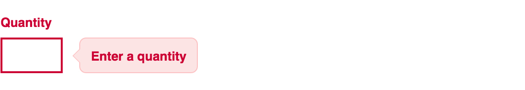
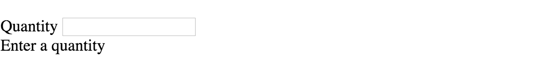
Input Field Error with Tooltip
The last element we’re tackling is the tooltip. It is slightly more complicated than the others but well worth the effort. We will also be utilizing Sass nesting to better organize our code, and because we are only using SCSS it is 100% editable and scalable.
Once we are done, the tooltip will look like this:
And by default, this is what we start with after adding the HTML:
First, we override the browser’s default styles with our own custom styling:
/* Basic Input Styling */
.input-group {
  color: #333;
  float: left;
  font-family: Helvetica, Arial, sans-serif;
  font-size: 13px;
  line-height: 20px;
  margin-bottom: 10px;
  width: 100%;
}

label {
  display: block;
  margin-bottom: 5px;
}

input[type=text] {
  background: #fff;
  border: 1px solid #ccc;
  color: #333;
  float: left;
  font-family: Helvetica, Arial, sans-serif;
  font-size: 13px;
  height: 33px;
  line-height: 20px;
  margin: 0;
  padding: 0 0 0 15px;
  width: 45px;
}
Just like our previous example, we need to add the tooltip error message styling that displays when a form error occurs. Note: we are using Sass here to nest the tooltip’s left arrow properties. This comes in handy when trying to keep track of which values are assigned to the tooltip specifically:
/* Tooltip Styling */
.error-tip {
  background-color: #fce4e4;
  border: 1px solid #fcc2c3;
  border-radius: 7px;
  -moz-border-radius: 7px;
  -webkit-border-radius: 7px;
  display: inline;
  color: #cc0033;
  float: left;
  font-weight: bold;
  line-height: 24px;
  position: relative;
  padding: 7px 11px 4px;
  margin-left: 17px;
  // Left Arrow Styling Starts Here
  &:after, &:before {
    content: '';
    border: 7px solid transparent;
    position: absolute;
    top: 11px;
  }
  &:after {
    border-right: 7px solid #fce4e4;
    left: -14px;
  }
  &:before {
    border-right: 7px solid #fcc2c3;
    left: -15px;
  }
} // end .error-tip
Now all that’s left to do is define the input’s error-specific styling. Again, we will nest these styles under an “error” class selector to make classification and future changes easier:
/* Error Styling */
.error.input-group {
  label {
    color: #cc0033;
    font-weight: bold;
  }
  input {
    border: 2px solid #cc0033;
    line-height: 37px;
    outline: none;
  }
  .status {
    display: none;
  }
  .error-tip {
    display: inline;
  }
} // end .error
And that’s it! All the code you need to customize error messaging for default form elements. To experiment with the final results and copy and paste to your heart’s content (without fear of breaking anything), jump on over to Codepen by selecting any of the tutorial links below.
Codepen/Tutorial Links
All: codepen.io/seskew/
Basic Error Message: codepen.io/seskew/pen/akhLx
Input Field Error: codepen.io/seskew/pen/XKJKNQ
Input Field Error with Tooltip: codepen.io/seskew/pen/NrPNBp
How do I style the HTML5 form validation error messages with CSS?
JJJ
32.6k20 gold badges89 silver badges102 bronze badges
asked Mar 16, 2011 at 17:01
1
Currently, there is no way to style those little validation tooltips. The only other option, which is what I have chosen to do, is to disable the browser validation all together for now and rely on my own client-side validation scripts.
According to this article:
http://blog.oldworld.fr/index.php?post/2010/11/17/HTML5-Forms-Validation-in-Firefox-4
«The simplest way to opt out is to add the novalidate attribute to your <form>. You can also set formnovalidate on your submit controls.»
alex
473k198 gold badges872 silver badges978 bronze badges
answered May 20, 2011 at 13:54
RaminRamin
2234 silver badges10 bronze badges
1
Update: This method is obsolete.
Chrome provides a native look and feel for their validation error speach bubbles. The error bubble is made up of four containing elements that are not normative elements. These four elements are stylable via pseudo-elements that apply to separate sections of the bubble:
::-webkit-validation-bubble

::-webkit-validation-bubble-arrow-clipper

::-webkit-validation-bubble-arrow

::-webkit-validation-bubble-message
Mark Fisher
9031 gold badge11 silver badges28 bronze badges
answered Jul 2, 2011 at 8:15
EstelleEstelle
691 silver badge2 bronze badges
5
Use pseudo selectors, as easwee said. For example, to make the form element green when valid, and red when invalid, do something like this:
:invalid {
    background: #ffdddd;
         }
:valid{
      background:#ddffdd;
      }
If you need a full reference of these, head to Mozilla’s reference.
P.S. Sorry if I’m doing these answers wrong, I’m new to this community.
answered Mar 29, 2011 at 22:01
RemixzRemixz
1471 silver badge5 bronze badges
1
A required field will be invalid until the correct input is entered. A field that isn’t required but has validation, such as a URL field, will be valid until text is entered.
 input:invalid {
border:solid red;
}
for more info http://msdn.microsoft.com/en-us/library/ie/hh772367(v=vs.85).aspx
answered May 1, 2014 at 19:00
GANIGANI
1,9954 gold badges34 silver badges69 bronze badges
Latest Collection of hand-picked free Html CSS Alert Box Examples with Code Snippet.
1. Pure HTML + CSS Alerts with Dismiss
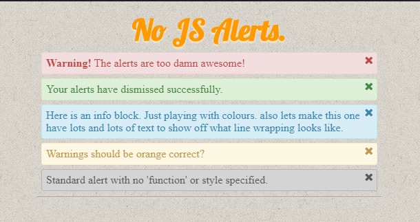
CSS Alerts with Dismiss
demo and code Get Hosting
2. Modern Alerts
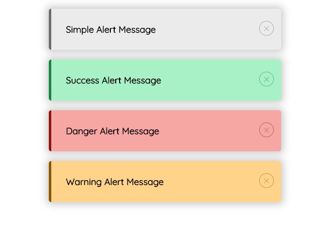
Modern Alerts
Author
- MohammadReza keikavousi
Made with
- HTML / CSS / js
demo and code Get Hosting
3. UI Alert CSS
UI Alert CSS
Made with
- HTML / CSS (SCSS)
demo and code Get Hosting
4. Alerts Component
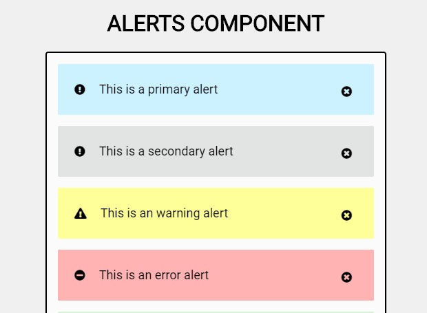
css error message component
Made with
- HTML / CSS (SCSS) / JS
demo and code Get Hosting
5. Re-styled Bootstrap alerts (CSS)
demo and code Get Hosting
6. message display
Made with
- HTML / CSS (SCSS)
demo and code Get Hosting
7. Toast with VueJS
Made with
- HTML (Pug) / CSS (SCSS) / JS (Babel)
demo and code Get Hosting
8. Error message banner
Made with
- HTML / CSS / JS
demo and code Get Hosting
9. UI daily challenge – flash message
Made with
- HTML / CSS (SCSS) / JS
demo and code Get Hosting
10. Message Types
Made with
- HTML / CSS (SCSS)
demo and code Get Hosting
11. Warning, Info and Error css
demo and code Get Hosting
12. Alert Boxes With CSS3
demo and code Get Hosting
13. Error, Success, Warning and Info Messages
demo and code Get Hosting
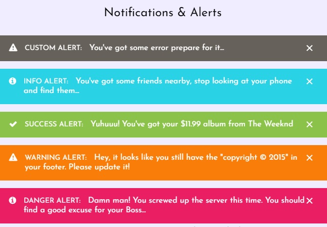
14. Notifications
Made with
- HTML / CSS (SCSS) / JS
demo and code Get Hosting
15. Simple css alerts
Made with
- HTML / CSS (SCSS)
demo and code Get Hosting