From Wikipedia, the free encyclopedia

Error bars are graphical representations of the variability of data and used on graphs to indicate the error or uncertainty in a reported measurement. They give a general idea of how precise a measurement is, or conversely, how far from the reported value the true (error free) value might be. Error bars often represent one standard deviation of uncertainty, one standard error, or a particular confidence interval (e.g., a 95% interval). These quantities are not the same and so the measure selected should be stated explicitly in the graph or supporting text.
Error bars can be used to compare visually two quantities if various other conditions hold. This can determine whether differences are statistically significant. Error bars can also suggest goodness of fit of a given function, i.e., how well the function describes the data. Scientific papers in the experimental sciences are expected to include error bars on all graphs, though the practice differs somewhat between sciences, and each journal will have its own house style. It has also been shown that error bars can be used as a direct manipulation interface for controlling probabilistic algorithms for approximate computation.[1] Error bars can also be expressed in a plus–minus sign (±), plus the upper limit of the error and minus the lower limit of the error.[2]
A notorious misconception in elementary statistics is that error bars show whether a statistically significant difference exists, by checking simply for whether the error bars overlap; this is not the case.[3][4][5][6]
See also[edit]
- Box plot
- Information graphics
- Model selection
- Significant figures
References[edit]
- ^ Sarkar, Advait; Blackwell, Alan F.; Jamnik, Mateja; Spott, Martin (2015). «Interaction with Uncertainty in Visualisations» (PDF). Eurographics Conference on Visualization (Eurovis) — Short Papers. doi:10.2312/eurovisshort.20151138.
- ^ Brown, George W. (1982). «Standard Deviation, Standard Error: Which ‘Standard’ Should We Use?». American Journal of Diseases of Children. 136 (10): 937–941. doi:10.1001/archpedi.1982.03970460067015. PMID 7124681..
- ^ Cumming, Geoff; Fidler, Fiona; Vaux, David L. (9 April 2007). «Error bars in experimental biology». The Journal of Cell Biology. 177 (1): 7–11. doi:10.1083/jcb.200611141. PMC 2064100. PMID 17420288.
- ^ Knol, Mirjam J.; Pestman, Wiebe R.; Grobbee, Diederick E. (19 March 2011). «The (mis)use of overlap of confidence intervals to assess effect modification». European Journal of Epidemiology. 26 (4): 253–254. doi:10.1007/s10654-011-9563-8. PMC 3088813. PMID 21424218.
- ^ Munger, Dave. «Most researchers don’t understand error bars». Cognitive Daily. Archived from the original on 2018-11-01. Retrieved 17 March 2018.
- ^ Belia, Sarah; Fidler, Fiona; Williams, Jennifer; Cumming, Geoff (2005). «Researchers misunderstand confidence intervals and standard error bars». Psychological Methods. 10 (4): 389–396. doi:10.1037/1082-989X.10.4.389. PMID 16392994.
error.bars: Plot means and confidence intervals
Description
One of the many functions in R to plot means and confidence intervals. Can be done using barplots if desired. Can also be combined with such functions as boxplot to summarize distributions. Means and standard errors are calculated from the raw data using describe. Alternatively, plots of means +/- one standard deviation may be drawn.
Usage
error.bars(x,stats=NULL, ylab = "Dependent Variable",xlab="Independent Variable", main=NULL, ylim = NULL, alpha=.05,sd=FALSE, labels = NULL, pos = NULL, arrow.len = 0.05,arrow.col="black", add = FALSE,bars=FALSE,within=FALSE, ...)
Arguments
x
A data frame or matrix of raw data
stats
Alternatively, a data.frame of descriptive stats from (e.g., describe)
ylim
if specified, the limits for the plot, otherwise based upon the data
alpha
alpha level of confidence interval — defaults to 95% confidence interval
sd
if TRUE, draw one standard deviation instead of standard errors at the alpha level
pos
where to place text: below, left, above, right
arrow.len
How long should the top of the error bars be?
arrow.col
What color should the error bars be?
add
add=FALSE, new plot, add=TRUE, just points and error bars
bars
bars=TRUE will draw a bar graph if you really want to do that
within
should the error variance of a variable be corrected by 1-SMC?
…
other parameters to pass to the plot function, e.g., typ=»b» to draw lines, lty=»dashed» to draw dashed lines
Value
- Graphic output showing the means + x
These confidence regions are based upon normal theory and do not take into account any skew in the variables. More accurate confidence intervals could be found by resampling.
Details
Drawing the mean +/- a confidence interval is a frequently used function when reporting experimental results. By default, the confidence interval is 1.96 standard errors.
If within=TRUE, the error bars are corrected for the correlation with the other variables by reducing the variance by a factor of (1-smc). This allows for comparisons between variables.
The error bars are normally calculated from the data using the describe function. If, alternatively, a matrix of statistics is provided with column headings of values, means, and se, then those values will be used for the plot (using the stats option). However, in this case, the error bars will be one s.e. rather than a function of the alpha level.
If sd is TRUE, then the error bars will represent one standard deviation from the mean rather than be a function of alpha and the standard errors.
See Also
error.crosses for two way error bars, error.bars.by for error bars for different groups
In addition, as pointed out by Jim Lemon on the R-help news group, error bars or confidence intervals may be drawn using
ll{
function package
bar.err (agricolae)
plotCI (gplots)
xYplot (Hmisc)
dispersion (plotrix)
plotCI (plotrix)
}
For advice why not to draw bar graphs with error bars, see http://biostat.mc.vanderbilt.edu/wiki/Main/DynamitePlots
Examples
Run this code
x <- replicate(20,rnorm(50))
boxplot(x,notch=TRUE,main="Notched boxplot with error bars")
error.bars(x,add=TRUE)
abline(h=0)

error.bars(attitude,alpha=.5,main="50 percent confidence limits") #another example
error.bars(attitude,bar=TRUE)  #show the use of bar graphs


#combine with a strip chart and boxplot
stripchart(attitude,vertical=TRUE,method="jitter",jitter=.1,pch=19,main="Stripchart with 95 percent confidence limits")
boxplot(attitude,add=TRUE)
error.bars(attitude,add=TRUE,arrow.len=.2)

#use statistics from somewhere else
my.stats <- data.frame(values=c(1,4,8),means=c(10,12,18),se=c(2,3,5))
error.bars(stats=my.stats,type="b",main="data with confidence intervals")
#note that in this case, the error bars are 1 s.e.  To modify that, change the s.e.

#Consider the case where we get stats from describe
temp <- describe(attitude)
error.bars(stats=temp)
#these error bars will be just one s.e.

#adjust the s.e. to vary by alpha level
alpha <- .05
temp[,"se"] <- temp[,"se"] * qt(1-alpha/2,temp[,"n"])
error.bars(stats=temp)
#show these do not differ from the other way by overlaying the two
error.bars(attitude,add=TRUE)
Run the code above in your browser using DataCamp Workspace
17 авг. 2022 г.
читать 2 мин
Часто вам может быть интересно добавить планки погрешностей к диаграммам в Python, чтобы отразить неопределенность измерений или вычисленных значений. К счастью, это легко сделать с помощью библиотеки matplotlib.
В этом руководстве объясняется, как добавить планки погрешностей как в гистограммы, так и в линейные диаграммы в Python.
Планки погрешностей в гистограммах
Предположим, у нас есть следующий набор данных из 10 значений в Python:
import numpy as np
import matplotlib.pyplot as plt

#define dataset
data = [4, 6, 6, 8, 9, 14, 16, 16, 17, 20]
Чтобы создать гистограмму с планками погрешностей для этого набора данных, мы можем определить ширину полос погрешностей как стандартную ошибку , которая вычисляется
Стандартная ошибка = с / √n
куда:
- s: стандартное отклонение выборки
- n: размер выборки
Следующий код показывает, как вычислить стандартную ошибку для этого примера:
#calculate standard error
std_error = np.std(data, ddof=1) / np.sqrt(len(data))

#view standard error
std_error

1.78
Наконец, мы можем создать гистограмму, используя полосы погрешностей, ширина которых равна стандартной ошибке:
#define chart
fig, ax = plt.subplots()

#create chart
ax.bar(x=np.arange(len(data)), #x-coordinates of bars
 height=data, #height of bars
 yerr=std_error, #error bar width
 capsize=4) #length of error bar caps
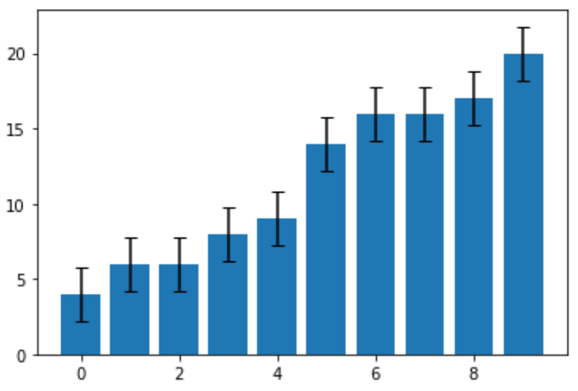
Стандартная ошибка оказалась равной 1,78.Это ширина полосы погрешности, которая простирается в обоих направлениях от точечных оценок на графике. Например, значение первого столбца на диаграмме равно 4, поэтому он имеет полосу погрешности, которая простирается от:
- Нижний конец: 4 – 178 = 2,22
- Верхний предел: 4 + 1,78 = 5,78
Каждая полоса ошибок на диаграмме имеет одинаковую ширину.
Планки погрешностей в линейных диаграммах
В следующем коде показано, как создать линейную диаграмму с планками погрешностей для того же набора данных:
import numpy as np
import matplotlib.pyplot as plt

#define data
data = [4, 6, 6, 8, 9, 14, 16, 16, 17, 20]

#define x and y coordinates
x = np.arange(len(data))
y = data

#create line chart with error bars
fig, ax = plt.subplots()

ax.errorbar(x, y,
 yerr=std_error,
 capsize=4)
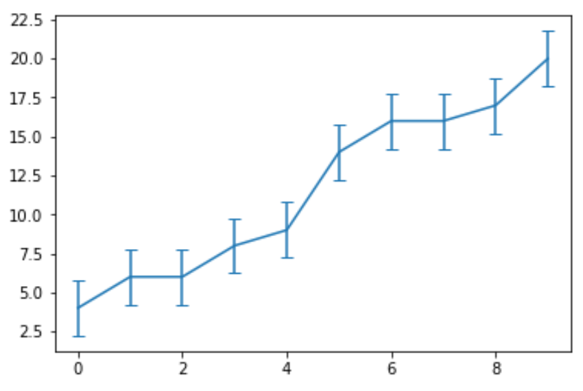
Обратите внимание, что аргумент yerr указывает Python создавать вертикальные планки погрешностей. Вместо этого мы могли бы использовать горизонтальные вертикальные полосы, используя аргумент xerr :
#create line chart with horizontal error bars
fig, ax = plt.subplots()

ax.errorbar(x, y,
 xerr =std_error,
 capsize=4)

Вы можете найти больше руководств по Python здесь .
1
error bar
Англо-русский толковый словарь терминов и сокращений по ВТ, Интернету и программированию. > error bar
2
error bar
Большой англо-русский и русско-английский словарь > error bar
3
error bar
Англо-русский словарь технических терминов > error bar
4
error bar
Универсальный англо-русский словарь > error bar
5
error bar
2) оценка ошибки; доверительный интервал
English-Russian electronics dictionary > error bar
6
error bar
2) оценка ошибки; доверительный интервал
The New English-Russian Dictionary of Radio-electronics > error bar
7
error bar
English-Russian dictionary of computer science and programming > error bar
8
error bar
Англо-русский словарь компьютерных и интернет терминов > error bar
9
error bar
English-Russian dictionary of terms that are used in computer games > error bar
10
error bar
English-Russian scientific dictionary > error bar
11
error bar
English-Russian dictionary of Information technology > error bar
12
error bar
The English-Russian dictionary on reliability and quality control > error bar
13
error bar (variability)
English-Russian dictionary of program «Mir-Shuttle» > error bar (variability)
14
error
1. n ошибка, заблуждение, ложное представление
2. n ошибка, погрешность
actual error — истинная ошибка, истинная величина ошибки
3. n проступок, грех
4. n тех. отклонение; потеря точности
5. n радио рассогласование
error signal — сигнал ошибки; сигнал рассогласования
6. n юр. фактическая или юридическая ошибка, допущенная судом в судебном процессе
Синонимический ряд:
1. blooper (noun) blooper; blunder; boner; bull; bungle; erratum; faux pas; fluff; inaccuracy; miscue; misstep; mistake; omission; oversight; rock; slip; slipup; solecism; trip; x
3. fault (noun) delusion; erroneousness; fallaciousness; fallacy; falsehood; falseness; falsity; fault; iniquity; misdeed; misunderstanding; offence; offense; sin; transgression; untruth
Антонимический ряд:
accuracy; certainty; certitude; correction; correctness; precision; rectification; truth
English-Russian base dictionary > error
15
bar
I
barometer
II
barometric
III
barrel
барабан; бочка
IV
4) лом, вага
 гидр. бар
25) трик. гребёнка
27) исключать, запрещать
•
Англо-русский словарь технических терминов > bar
16
bar
1. штанга; балка, стержень; планка
2. соединительный штрих
3. полоса
4. штрих, короткая черта
air bar — воздуходувная штанга, штанга с поддувом воздуха, штанга с воздушной подушкой
air diverter bar — поворотная штанга с поддувом воздуха, поворотная штанга с воздушной подушкой
anticurl bar — планка, предотвращающая скручивание бумаги
calender bar — полоса, образующаяся при каландрировании
Coanda air bar — воздуходувная штанга, создающая эффект флотации
delivery bar — штанга приёмно-выводного транспортёра, листовыводная штанга с захватами
equalizer bar — выравнивающая планка; стабилизирующая штанга
feed bar — подающая планка; толкатель самонаклада
gripper bar — штанга с захватами, форгрейферная штанга
5. рейтер
6. прижимная планка
7. приклон
8. бортик
9. штанга для регулирования натяжения
10. регистровая рейка
11. приводочная планка
sharp bar — штанга с острой кромкой; ребристая штанга
side piling bar — боковая направляющая планка стапельного стола ; направляющая планка, предотвращающая боковое смещение верхних листов
12. выключающая планка
13. штанга с опорными щёчками захватов
14. штанга с присосами, присасывающая штанга
15. колодка, соединённая с вакуумной системой
tail piling bar — задняя направляющая планка стапельного стола ; направляющая планка, предотвращающая продольное смещение верхних листов
bar none — без всяких исключений; все или всё без исключения
16. шрифтовая штанга
17. линотипная строка
English-Russian big polytechnic dictionary > bar
17
bar
English-Russian electronics dictionary > bar
18
bar
The New English-Russian Dictionary of Radio-electronics > bar
19
error
ошибка; погрешность; неточность измерения; отклонение; потеря точности
English-Russian dictionary on nuclear energy > error
20
error correction level
- уровень коррекции ошибки
- долговременная маркировка
04.02.27 долговременная маркировка [ permanent marking]: Изображение, полученное с помощью интрузивного или неинтрузивного маркирования, которое должно оставаться различимым, как минимум, в течение установленного срока службы изделия.
Сравнить с терминологической статьей «соединение» по ИСО/МЭК19762-11).
______________
1)Терминологическая статья 04.02.27 не связана с указанной терминологической статьей.
<2>4 Сокращения
ECI интерпретация в расширенном канале [extended channel interpretation]
DPM прямое маркирование изделий [direct part marking]
BWA коррекция ширины штриха [bar width adjustment]
BWC компенсация ширины штриха [barwidth compensation]
CPI число знаков на дюйм [characters per inch]
PCS сигнал контраста печати [print contrast signal]
ORM оптический носитель данных [optically readable medium]
FoV поле обзора [field of view]
Алфавитный указатель терминов на английском языке
|
(n, k)symbology |
04.02.13 |
|
add-on symbol |
03.02.29 |
|
alignment pattern |
04.02.07 |
|
aperture |
02.04.09 |
|
auto discrimination |
02.04.33 |
|
auxiliary character/pattern |
03.01.04 |
|
background |
02.02.05 |
|
bar |
02.01.05 |
|
bar code character |
02.01.09 |
|
bar code density |
03.02.14 |
|
barcode master |
03.02.19 |
|
barcode reader |
02.04.05 |
|
barcode symbol |
02.01.03 |
|
bar height |
02.01.16 |
|
bar-space sequence |
02.01.20 |
|
barwidth |
02.01.17 |
|
barwidth adjustment |
03.02.21 |
|
barwidth compensation |
03.02.22 |
|
barwidth gain/loss |
03.02.23 |
|
barwidth increase |
03.02.24 |
|
barwidth reduction |
03.02.25 |
|
bearer bar |
03.02.11 |
|
binary symbology |
03.01.10 |
|
characters per inch |
03.02.15 |
|
charge-coupled device |
02.04.13 |
|
coded character set |
02.01.08 |
|
column |
04.02.11 |
|
compaction mode |
04.02.15 |
|
composite symbol |
04.02.14 |
|
contact scanner |
02.04.07 |
|
continuous code |
03.01.12 |
|
corner marks |
03.02.20 |
|
data codeword |
04.02.18 |
|
data region |
04.02.17 |
|
decodability |
02.02.28 |
|
decode algorithm |
02.02.01 |
|
defect |
02.02.22 |
|
delineator |
03.02.30 |
|
densitometer |
02.02.18 |
|
depth of field (1) |
02.04.30 |
|
depth of field (2) |
02.04.31 |
|
diffuse reflection |
02.02.09 |
|
direct part marking |
04.02.24 |
|
discrete code |
03.01.13 |
|
dot code |
04.02.05 |
|
effective aperture |
02.04.10 |
|
element |
02.01.14 |
|
erasure |
04.02.21 |
|
error correction codeword |
04.02.19 |
|
error correction level |
04.02.20 |
|
even parity |
03.02.08 |
|
field of view |
02.04.32 |
|
film master |
03.02.18 |
|
finder pattern |
04.02.08 |
|
fixed beam scanner |
02.04.16 |
|
fixed parity |
03.02.10 |
|
fixed pattern |
04.02.03 |
|
flat-bed scanner |
02.04.21 |
|
gloss |
02.02.13 |
|
guard pattern |
03.02.04 |
|
helium neon laser |
02.04.14 |
|
integrated artwork |
03.02.28 |
|
intercharacter gap |
03.01.08 |
|
intrusive marking |
04.02.25 |
|
label printing machine |
02.04.34 |
|
ladder orientation |
03.02.05 |
|
laser engraver |
02.04.35 |
|
latch character |
02.01.24 |
|
linear bar code symbol |
03.01.01 |
|
magnification factor |
03.02.27 |
|
matrix symbology |
04.02.04 |
|
modular symbology |
03.01.11 |
|
module (1) |
02.01.13 |
|
module (2) |
04.02.06 |
|
modulo |
03.02.03 |
|
moving beam scanner |
02.04.15 |
|
multi-row symbology |
04.02.09 |
|
non-intrusive marking |
04.02.26 |
|
odd parity |
03.02.07 |
|
omnidirectional |
03.01.14 |
|
omnidirectional scanner |
02.04.20 |
|
opacity |
02.02.16 |
|
optically readable medium |
02.01.01 |
|
optical throw |
02.04.27 |
|
orientation |
02.04.23 |
|
orientation pattern |
02.01.22 |
|
oscillating mirror scanner |
02.04.19 |
|
overhead |
03.01.03 |
|
overprinting |
02.04.36 |
|
pad character |
04.02.22 |
|
pad codeword |
04.02.23 |
|
permanent marking |
04.02.27 |
|
photometer |
02.02.19 |
|
picket fence orientation |
03.02.06 |
|
pitch |
02.04.26 |
|
pixel |
02.04.37 |
|
print contrast signal |
02.02.20 |
|
printability gauge |
03.02.26 |
|
printability test |
02.02.21 |
|
print quality |
02.02.02 |
|
quiet zone |
02.01.06 |
|
raster |
02.04.18 |
|
raster scanner |
02.04.17 |
|
reading angle |
02.04.22 |
|
reading distance |
02.04.29 |
|
read rate |
02.04.06 |
|
redundancy |
03.01.05 |
|
reference decode algorithm |
02.02.26 |
|
reference threshold |
02.02.27 |
|
reflectance |
02.02.07 |
|
reflectance difference |
02.02.11 |
|
regular reflection |
02.02.08 |
|
resolution |
02.01.15 |
|
row |
04.02.10 |
|
scanner |
02.04.04 |
|
scanning window |
02.04.28 |
|
scan, noun (1) |
02.04.01 |
|
scan, noun (2) |
02.04.03 |
|
scan reflectance profile |
02.02.17 |
|
scan, verb |
02.04.02 |
|
self-checking |
02.01.21 |
|
shift character |
02.01.23 |
|
short read |
03.02.12 |
|
show through |
02.02.12 |
|
single line (beam) scanner |
02.04.11 |
|
skew |
02.04.25 |
|
slot reader |
02.04.12 |
|
speck |
02.02.24 |
|
spectral response |
02.02.10 |
|
spot |
02.02.25 |
|
stacked symbology |
04.02.12 |
|
stop character/pattern |
03.01.02 |
|
structured append |
04.02.16 |
|
substitution error |
03.02.01 |
|
substrate |
02.02.06 |
|
symbol architecture |
02.01.04 |
|
symbol aspect ratio |
02.01.19 |
|
symbol character |
02.01.07 |
|
symbol check character |
03.02.02 |
|
symbol density |
03.02.16 |
|
symbology |
02.01.02 |
|
symbol width |
02.01.18 |
|
tilt |
02.04.24 |
|
transmittance (l) |
02.02.14 |
|
transmittance (2) |
02.02.15 |
|
truncation |
03.02.13 |
|
two-dimensional symbol (1) |
04.02.01 |
|
two-dimensional symbol (2) |
04.02.02 |
|
two-width symbology |
03.01.09 |
|
variable parity encodation |
03.02.09 |
|
verification |
02.02.03 |
|
verifier |
02.02.04 |
|
vertical redundancy |
03.01.06 |
|
void |
02.02.23 |
|
wand |
02.04.08 |
|
wide: narrow ratio |
03.01.07 |
|
X dimension |
02.01.10 |
|
Y dimension |
02.01.11 |
|
Z dimension |
02.01.12 |
|
zero-suppression |
03.02.17 |
<2>Приложение ДА1)
______________
1)
Источник: ГОСТ Р ИСО/МЭК 19762-2-2011: Информационные технологии. Технологии автоматической идентификации и сбора данных (АИСД). Гармонизированный словарь. Часть 2. Оптические носители данных (ОНД) оригинал документа
Англо-русский словарь нормативно-технической терминологии > error correction level
См. также в других словарях:
-
Error bar — Error bars are used on graphs to indicate the error in a reported measurement. They give a general idea of how accurate a measurement is, or conversely, how far from the reported value the true (error free) value might be. Often, but not always,… … Wikipedia
-
error bar — noun Mathematics a line through a point on a graph, parallel to one of the axes, which represents the uncertainty or error of the corresponding coordinate of the point … English new terms dictionary
-
error bar — noun A bar used on a graphs to indicate the range of one standard deviation in the result of an experimental measurement … Wiktionary
-
error bar — noun Date: 1968 the estimated uncertainty in experimental data … New Collegiate Dictionary
-
error bar — noun : the estimated uncertainty especially in data on a graph usually expressed as the range of values lying between a plotted value plus or minus a value ; broadly : degree of imprecision … Useful english dictionary
-
Error analysis — is the study of kind and quantity of error that occurs, particularly in the fields of applied mathematics (particularly numerical analysis), applied linguistics and statistics. Error analysis in numerical modelling In numerical simulation or… … Wikipedia
-
Error — The word error has different meanings and usages relative to how it is conceptually applied. The concrete meaning of the Latin word error means wandering or straying . To the contrary of an illusion, an error or a mistake can sometimes be… … Wikipedia
-
Error Fundamental de la Atribución — Saltar a navegación, búsqueda El error fundamental de atribución (conocido también como sesgo de correspondencia o efecto de sobre atribución) es la teoría que describe cognitivamente la tendencia o disposición de la gente a sobredimensionar… … Wikipedia Español
-
Bar-Hebraeus — (1226 near Malatya, Sultanate of Rûm (modern Turkey) – 30 July 1286 in Maraga, Persia) was catholicos (bishop) of the Syriac Orthodox Church in the 13th century. He is noted for his works addressing philosophy, poetry, language, history, and… … Wikipedia
-
Error message — An error message is information displayed when an unexpected condition occurs, usually on a computer or other device. On modern operating systems with graphical user interfaces, error messages are often displayed using dialog boxes. Error… … Wikipedia
-
Error-correcting codes with feedback — In mathematics, computer science, telecommunication, information theory, and searching theory, error correcting codes with feedback refers to error correcting codes designed to work in the presence of feedback from the receiver to the sender.See… … Wikipedia
Автор оригинала: Team Python Pool.
В этой статье мы узнаем о панели ошибок Matplotlib в Python. Модуль Pyplot библиотеки Matplotlib предоставляет интерфейс, подобный MATLAB. А функция matplotlib.pyplot.errorbar() выводит y против x в виде линий и/или маркеров с прикрепленными полосами ошибок. Кроме того, полосы ошибок помогают указать предполагаемую ошибку или неопределенность, чтобы дать общее представление о том, насколько точны измерения; это делается с помощью маркеров, нарисованных поверх исходного графика и его точек данных. Прежде чем мы рассмотрим примеры Matplotlib errorbar и гистограмм ошибок, позвольте мне кратко рассказать вам о синтаксисе и вернуть то же самое.
Синтаксис matplotlib errorbar()
matplotlib.pyplot.errorbar(x, y,,, fmt=",,,,,,,,,,, *,, **kwargs)Параметры панели ошибок Matplotlib:
- x, y: Горизонтальные и вертикальные координаты точек данных.
- fmt: Содержит строковое значение (необязательно)
- xerr, yerr: Массив, содержащий ошибки, и ошибки должны быть положительными значениями.
- ecolor: (по умолчанию: NONE) Простыми словами, это цвет линий errorbar. (Необязательно)
- elinewidth: Linewidth строк errorbar со значением по умолчанию NONE. (Необязательно)
- capsize: Длина заглавных букв строки ошибок в точках со значением по умолчанию NONE. (Необязательно)
- barsabove: (по умолчанию: False)Содержит логические значения для построения баров ошибок над символами графика. (Необязательно)
- lolims, uplims, xlolims, xuplims: Содержит логические значения, которые указывают, что значение дает только верхние/нижние пределы. (Необязательно) errorevery: Содержит целочисленные значения, которые помогают рисовать полосы ошибок на подмножестве данных. (Необязательно)
Возвращаемый тип Matplotlib Errorbar:
Функция Matplotlib errorbar() возвращает контейнер, имеющий: plotline: Line2D экземпляр маркеров x, y plot и/или line. caplines: Кортеж Line2D экземпляров шапки бара ошибок. barlinecols: Кортеж LineCollection с горизонтальным и вертикальным диапазонами ошибок.
Пример Matplotlib Errorbar в Python
Панель ошибок поможет вам понять природу графиков и их сходимость. Панель ошибок может дать представление о дисперсии графиков с ее средним значением. Соответственно, вы можете определить выбросы из вашего графика и позаботиться о них. Более того, он представляет неопределенность в вашем графике.
import numpy as np
import matplotlib.pyplot as plt
  .arange(0.1, 4, 0.5) .exp(-xval)

plt.errorbar(xval, yval,.4,.5)

plt.title('matplotlib.pyplot.errorbar() function Example')
plt.show()
ВЫХОД:

ОБЪЯСНЕНИЕ:
Во-первых, приведенный выше пример является фундаментальной реализацией функции Matplotlib errorbar (). “xval” и “yval” содержат горизонтальные и вертикальные координаты точек данных, необходимых для построения диаграммы ошибок. Кроме того, “xerr” и “yerr” являются аргументами функции errorbar. Присвоенные им значения равны 0,4 и 0,5, соответственно, положительным значениям погрешности. Наконец, эти четыре параметра, переданные функции error bar (), являются обязательными аргументами, необходимыми для построения любых ошибок Python.
Matplotlib Errorbar в Python Несколько строк
Очень важно иметь возможность построить несколько линий на одном и том же графике. В следующем примере мы построим несколько полос ошибок на одном графике.
import numpy as np
import matplotlib.pyplot as plt
   .figure() .arange(10)  * np.sin(x / 20 * np.pi) .linspace(0.05, 0.2, 10)

plt.errorbar(x, y + 7,,
            )
plt.errorbar(x, y + 5,,
            ,
            )
plt.errorbar(x, y + 3,,
            ,
            ,
            )

upperlimits = [True, False] * 5
lowerlimits = [False, True] * 5
plt.errorbar(x, y,,
            ,
            ,
            )
   )

plt.title('matplotlib.pyplot.errorbar()
function Example')
plt.show()
ВЫХОД:
ОБЪЯСНЕНИЕ:
Во-первых, в приведенном выше примере функция matplotlib errorbar() создает несколько строк errorbar. Определенные x и y являются координатами точек данных. Вдоль оси y – ошибка построения графика. Следовательно, для каждой строки указывается только “yerr”. Кроме того, верхний и нижний пределы указывают значения только для верхнего и нижнего пределов. Кроме того, метка является аргументом, указывающим строки как строка 1, строка 2 и т. Д.
Гистограмма ошибок с ошибкой в x
import matplotlib.pyplot as plt

# making a simple plot
x =[1, 2, 3, 4, 5, 6, 7]
y =[1, 2, 1, 2, 1, 2, 1]

# creating error .5

# ploting graph
plt.plot(x, y)
plt.errorbar(x, y,
            ,
            )
ВЫХОД:
ОБЪЯСНЕНИЕ:
Во-первых, в приведенном выше примере x и y-это массивы, определенные с координатами x и y для построения графика. Кроме того, “x_error” равен 0,5, что приводит к ошибкам только вдоль оси x. X, y и xers являются обязательными параметрами, передаваемыми в панель ошибок Matplotlib в Python. Также передается необязательный параметр ‘fmt’, содержащий строковое значение.
Гистограмма ошибок с ошибкой в вашем
import matplotlib.pyplot as plt


# making a simple plot
x =[1, 2, 3, 4, 5, 6, 7]
y =[1, 2, 1, 2, 1, 2, 1]

# creating error .2

# ploting graph
plt.plot(x, y)

plt.errorbar(x, y,
            ,
            )
ВЫХОД:
ОБЪЯСНЕНИЕ:
Во-первых, в приведенном выше примере x и y-это массивы, определенные с координатами x и y для построения графика. Значение “y_error” равно 0,2, что приводит к ошибкам только вдоль оси y. X, y и yerr являются обязательными параметрами, передаваемыми функции errorbar. Также передается необязательный параметр ‘fmt’, содержащий строковое значение.
Гистограмма ошибок с переменной ошибкой в x и y
import matplotlib.pyplot as plt

x =[1, 2, 3, 4, 5]
y =[1, 2, 1, 2, 1]

y_errormin =[0.1, 0.5, 0.9,
             0.1, 0.9]
y_errormax =[0.2, 0.4, 0.6,
             0.4, 0.2]
  .5
y_error =[y_errormin, y_errormax]

# ploting graph
# plt.plot(x, y)
plt.errorbar(x, y,
            ,
            ,
            )
ВЫХОД:
ОБЪЯСНЕНИЕ:
В приведенном выше примере показан график гистограммы ошибок для переменных ошибок. Аналогично, x и y-это два массива, определенные, содержащие координатные точки. Ошибка по оси x равна 0,5. Одновременно ошибка по оси y между двумя массивами равна y_errormin и y_errormax. Эти параметры являются аргументами функции Matplotlib errorbar для получения желаемого результата.
Вывод
Эта статья наглядно представляет вам различные способы использования панели ошибок Matplotlib в Python. Примеры как штриховых линий ошибок, так и графиков приведены с подробным объяснением. Полосы ошибок обеспечивают дополнительный уровень детализации представленных данных. Обратитесь к этой статье для любых запросов, связанных с функцией Matplotlib errorbar ().
Однако, если у вас есть какие-либо сомнения или вопросы, дайте мне знать в разделе комментариев ниже. Я постараюсь помочь вам как можно скорее.
Счастливого Пифонирования!
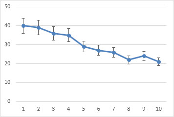
Error bars give a general idea of how precise a measurement is, or conversely, how far from the reported value the true (error free) value might be. If the value displayed on your barplot is the result of an aggregation (like the mean value of several data points), you may want to display error bars.
# Libraries
library(tidyverse)
library(hrbrthemes)
library(viridis)
library(patchwork)

# create dummy data
data <- data.frame(
  name=letters[1:5],
  value=sample(seq(4,15),5),
  sd=c(1,0.2,3,2,4)
)

# Plot
ggplot(data) +
    geom_bar( aes(x=name, y=value), stat="identity", fill="#69b3a2", alpha=0.7, width=0.5) +
    geom_errorbar( aes(x=name, ymin=value-sd, ymax=value+sd), width=0.4, colour="black", alpha=0.9, size=1) +
    theme_ipsum() +
    theme(
      legend.position="none",
      plot.title = element_text(size=11)
    ) +
    ggtitle("A barplot with error bar") +
    xlab("")
In the graphic above 5 groups are reported. The bar heights represent their mean value. The black error bar gives information on how the individual observations are dispersed around the average. For instance, it appears that measurements in group B are more precise than in group E.
Error bars hide information
The first issue with error bars is that they hide information. Here is a figure from a paper in PLOS Biology. It illustrates that the full data may suggest different conclusions than the summary statistics. The same barplot with error bars (left) can represent several situations. Both groups can have the same kind of distribution (B), one group can have outliers (C), one group can have a bimodal distribution (D), or groups can have unequal sample sizes:
Weissgerber et al. 2015
Thus, the same barplot with error bars can in fact tell very different stories, hidden to the reader.
Always show your individual data points if you can #showyourdata
What is an error bar?
The second issue with error bars is that they are used to show different metrics, and it is not always clear which one is being shown. Three different types of values are commonly used for error bars, sometimes giving very different results. Here is an overview of their definitions and how to calculate them on a simple vector in R.
- Standard Deviation (SD) represents the amount of dispersion of the variable. Calculated as the root square of the variance
sd <- sd(vec)
sd <- sqrt(var(vec))- Standard Error (SE) is the standard deviation of the mean of the variable, calculated as the SD divided by the square root of the sample size. By construction, the SE is smaller than the SD. With a very large sample size, the SE tends toward 0.
se = sd(vec) / sqrt(length(vec))- A Confidence Interval (CI) is defined so that there is a specified probability that a value lies within it. It is calculated as t * SE where t is the value of the Student’s t-distribution for a specific alpha. Its value is often rounded to 1.96 (its value with a large sample size). If the sample size is huge or the distribution not normal, it is better to calculate the CI using the bootstrap method, however.
alpha=0.05
t=qt((1-alpha)/2 + .5, length(vec)-1)   # tend to 1.96 if sample size is big enough
CI=t*se
Here is an application of these 3 metrics to the famous Iris dataset. It shows the average sepal length of three species of Iris. The variation around the average length is represented using error bars.
# Data
data <- iris %>% select(Species, Sepal.Length)

# Calculates mean, sd, se and ci
my_sum <- data %>%
  group_by(Species) %>%
  summarise(
    n=n(),
    mean=mean(Sepal.Length),
    sd=sd(Sepal.Length)
  ) %>%
  mutate( se=sd/sqrt(n))  %>%
  mutate( ic=se * qt((1-0.05)/2 + .5, n-1))

# Standard deviation
p1 <- ggplot(my_sum) +
  geom_bar( aes(x=Species, y=mean), stat="identity", fill="#69b3a2", alpha=0.7, width=0.6) +
  geom_errorbar( aes(x=Species, ymin=mean-sd, ymax=mean+sd), width=0.4, colour="black", alpha=0.9, size=1) +
  ggtitle("standard deviation") +
  theme(
    plot.title = element_text(size=6)
  ) +
  theme_ipsum() +
  xlab("") +
  ylab("Sepal Length")

# Standard Error
p2 <- ggplot(my_sum) +
  geom_bar( aes(x=Species, y=mean), stat="identity", fill="#69b3a2", alpha=0.7, width=0.6) +
  geom_errorbar( aes(x=Species, ymin=mean-se, ymax=mean+se),width=0.4, colour="black", alpha=0.9, size=1) +
  ggtitle("standard error") +
  theme(
    plot.title = element_text(size=6)
  ) +
  theme_ipsum() +
  xlab("") +
  ylab("Sepal Length")

# Confidence Interval
p3 <- ggplot(my_sum) +
  geom_bar( aes(x=Species, y=mean), stat="identity", fill="#69b3a2", alpha=0.7, width=0.6) +
  geom_errorbar( aes(x=Species, ymin=mean-ic, ymax=mean+ic), width=0.4, colour="black", alpha=0.9, size=1) +
  ggtitle("confidence interval") +
  theme(
    plot.title = element_text(size=6)
  ) +
  theme_ipsum() +
  xlab("") +
  ylab("Sepal Length")

p1 + p2 + p3
It is quite obvious that the 3 metrics report very different visualizations and conclusions.
Always specify which metrics you used for the error bars
Workaround
It is better to avoid error bars as much as you can. Of course it is not possible if you only have summary statistics. But if you know the individual data points, show them. Several workarounds are possible. The boxplot with jitter is a good one for a relatively small amount of data. The violin plot is another possibility if you have a large sample size to display.
data %>%
  ggplot( aes(x=Species, y=Sepal.Length)) +
    geom_boxplot( fill="#69b3a2", notch=TRUE) +
    geom_jitter( size=0.9, color="orange", width=0.1) +
    ggtitle("confidence interval") +
    theme(
      plot.title = element_text(size=6)
    ) +
    theme_ipsum() +
    xlab("") +
    ylab("Sepal Length")
Going further
- Weissgerber et al. 2015, Beyond Bar and Line Graphs: Time for a New Data Presentation Paradigm. link
- Making boxplots in R and Python
- Making violin plots in R and Python
Any thoughts on this? Found any mistakes? Disagree? Please drop me a word on twitter or in the comment section below:
The meaning of error bars is often misinterpreted, as is the statistical significance of their overlap.
Last month in Points of Significance, we showed how samples are used to estimate population statistics. We emphasized that, because of chance, our estimates had an uncertainty. This month we focus on how uncertainty is represented in scientific publications and reveal several ways in which it is frequently misinterpreted.
The uncertainty in estimates is customarily represented using error bars. Although most researchers have seen and used error bars, misconceptions persist about how error bars relate to statistical significance. When asked to estimate the required separation between two points with error bars for a difference at significance P = 0.05, only 22% of respondents were within a factor of 2 (ref. 1). In light of the fact that error bars are meant to help us assess the significance of the difference between two values, this observation is disheartening and worrisome.
Here we illustrate error bar differences with examples based on a simplified situation in which the values are means of independent (unrelated) samples of the same size and drawn from normal populations with the same spread. We calculate the significance of the difference in the sample means using the two-sample t-test and report it as the familiar P value. Although reporting the exact P value is preferred, conventionally, significance is often assessed at a P = 0.05 threshold. We will discuss P values and the t-test in more detail in a subsequent column.
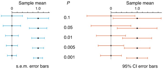
The importance of distinguishing the error bar type is illustrated in Figure 1, in which the three common types of error bars—standard deviation (s.d.), standard error of the mean (s.e.m.) and confidence interval (CI)—show the spread in values of two samples of size n = 10 together with the P value of the difference in sample means. In Figure 1a, we simulated the samples so that each error bar type has the same length, chosen to make them exactly abut. Although these three data pairs and their error bars are visually identical, each represents a different data scenario with a different P value. In Figure 1b, we fixed the P value to P = 0.05 and show the length of each type of bar for this level of significance. In this latter scenario, each of the three pairs of points represents the same pair of samples, but the bars have different lengths because they indicate different statistical properties of the same data. And because each bar is a different length, you are likely to interpret each one quite differently. In general, a gap between bars does not ensure significance, nor does overlap rule it out—it depends on the type of bar. Chances are you were surprised to learn this unintuitive result.
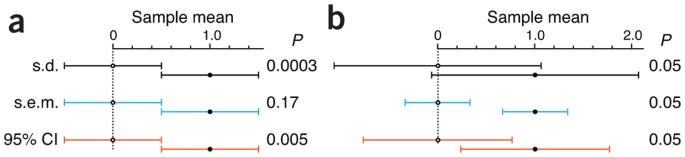
(a,b) Example graphs are based on sample means of 0 and 1 (n = 10). (a) When bars are scaled to the same size and abut, P values span a wide range. When s.e.m. bars touch, P is large (P = 0.17). (b) Bar size and relative position vary greatly at the conventional P value significance cutoff of 0.05, at which bars may overlap or have a gap.
Full size image
The first step in avoiding misinterpretation is to be clear about which measure of uncertainty is being represented by the error bar. In 2012, error bars appeared in Nature Methods in about two-thirds of the figure panels in which they could be expected (scatter and bar plots). The type of error bars was nearly evenly split between s.d. and s.e.m. bars (45% versus 49%, respectively). In 5% of cases the error bar type was not specified in the legend. Only one figure2 used bars based on the 95% CI. CIs are a more intuitive measure of uncertainty and are popular in the medical literature.
Error bars based on s.d. inform us about the spread of the population and are therefore useful as predictors of the range of new samples. They can also be used to draw attention to very large or small population spreads. Because s.d. bars only indirectly support visual assessment of differences in values, if you use them, be ready to help your reader understand that the s.d. bars reflect the variation of the data and not the error in your measurement. What should a reader conclude from the very large and overlapping s.d. error bars for P = 0.05 in Figure 1b? That although the means differ, and this can be detected with a sufficiently large sample size, there is considerable overlap in the data from the two populations.
Unlike s.d. bars, error bars based on the s.e.m. reflect the uncertainty in the mean and its dependency on the sample size, n (s.e.m. = s.d./√n). Intuitively, s.e.m. bars shrink as we perform more measurements. Unfortunately, the commonly held view that “if the s.e.m. bars do not overlap, the difference between the values is statistically significant” is incorrect. For example, when n = 10 and s.e.m. bars just touch, P = 0.17 (Fig. 1a). Conversely, to reach P = 0.05, s.e.m. bars for these data need to be about 0.86 arm lengths apart (Fig. 1b). We cannot overstate the importance of recognizing the difference between s.d. and s.e.m.
The third type of error bar you are likely to encounter is that based on the CI. This is an interval estimate that indicates the reliability of a measurement3. When scaled to a specific confidence level (CI%)—the 95% CI being common—the bar captures the population mean CI% of the time (Fig. 2a). The size of the s.e.m. is compared to the 95% CI in Figure 2b. The two are related by the t-statistic, and in large samples the s.e.m. bar can be interpreted as a CI with a confidence level of 67%. The size of the CI depends on n; two useful approximations for the CI are 95% CI ≈ 4 × s.e.m (n = 3) and 95% CI ≈ 2 × s.e.m. (n > 15). A common misconception about CIs is an expectation that a CI captures the mean of a second sample drawn from the same population with a CI% chance. Because CI position and size vary with each sample, this chance is actually lower.
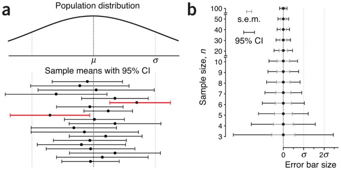
On average, CI% of intervals are expected to span the mean—about 19 in 20 times for 95% CI. (a) Means and 95% CIs of 20 samples (n = 10) drawn from a normal population with mean m and s.d. σ. By chance, two of the intervals (red) do not capture the mean. (b) Relationship between s.e.m. and 95% CI error bars with increasing n.
Full size image
This variety in bars can be overwhelming, and visually relating their relative position to a measure of significance is challenging. We provide a reference of error bar spacing for common P values in Figure 3. Notice that P = 0.05 is not reached until s.e.m. bars are separated by about 1 s.e.m, whereas 95% CI bars are more generous and can overlap by as much as 50% and still indicate a significant difference. If 95% CI bars just touch, the result is highly significant (P = 0.005). All the figures can be reproduced using the spreadsheet available in Supplementary Table 1, with which you can explore the relationship between error bar size, gap and P value.
Examples are based on sample means of 0 and 1 (n = 10).
Full size image
Be wary of error bars for small sample sizes—they are not robust, as illustrated by the sharp decrease in size of CI bars in that regime (Fig. 2b). In these cases (e.g., n = 3), it is better to show individual data values. Furthermore, when dealing with samples that are related (e.g., paired, such as before and after treatment), other types of error bars are needed, which we will discuss in a future column.
It would seem, therefore, that none of the error bar types is intuitive. An alternative is to select a value of CI% for which the bars touch at a desired P value (e.g., 83% CI bars touch at P = 0.05). Unfortunately, owing to the weight of existing convention, all three types of bars will continue to be used. With our tips, we hope you’ll be more confident in interpreting them.
References
-
Belia, S.F., Fidler, F., Williams, J. & Cumming, G. Psychol. Methods 10, 389–396 (2005).
Article
Google Scholar
-
Frøkjær-Jensen, C., Davis, M.W., Ailion, M. & Jorgensen, E.M. Nat. Methods 9, 117–118 (2012).
Article
Google Scholar
-
Cumming, G., Fidler, F. & Vaux, D.L. J. Cell. Biol. 177, 7–11 (2007).
Article
CASGoogle Scholar
Download references
Author information
Authors and Affiliations
-
Martin Krzywinski is a staff scientist at Canada’s Michael Smith Genome Sciences Centre.,
Martin Krzywinski
-
Naomi Altman is a Professor of Statistics at The Pennsylvania State University.,
Naomi Altman
Authors
- Martin Krzywinski
You can also search for this author in
PubMed Google Scholar - Naomi Altman
You can also search for this author in
PubMed Google Scholar
Ethics declarations
Competing interests
The authors declare no competing financial interests.
Supplementary information
Supplementary Table 1
Examples and sample calculations spreadsheet. Please note that the workbook requires that macros be enabled. (XLSM 148 kb)
Rights and permissions
About this article
Cite this article
Krzywinski, M., Altman, N. Error bars.
Nat Methods 10, 921–922 (2013). https://doi.org/10.1038/nmeth.2659
Download citation
-
Published: 27 September 2013
-
Issue Date: October 2013
-
DOI: https://doi.org/10.1038/nmeth.2659
Error bars in charts you create can help you see margins of error and standard deviations at a glance. They can be shown on all data points or data markers in a data series as a standard error amount, a percentage, or a standard deviation. You can set your own values to display the exact error amounts you want. For example, you can show a 10 percent positive and negative error amount in the results of a scientific experiment like this:
You can use error bars in 2-D area, bar, column, line, xy (scatter), and bubble charts. In scatter and bubble charts, you can show error bars for x and y values.
Note: The following procedures apply to Office 2013 and newer versions. Looking for Office 2010 steps?
Add or remove error bars
-
Click anywhere in the chart.
-
Click the Chart Elements button
next to the chart, and then check the Error Bars box. (Clear the box to remove error bars.) -
To change the error amount shown, click the arrow next to Error Bars, and then pick an option.
-
Pick a predefined error bar option like Standard Error, Percentage or Standard Deviation.
-
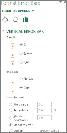
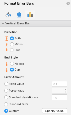
Pick More Options to set your own error bar amounts, and then under Vertical Error Bar or Horizontal Error Bar, choose the options you want. This is also where you can change the direction, end style of the error bars, or create custom error bars.
-
 next to the chart, and then check the Error Bars box. (Clear the box to remove error bars.)
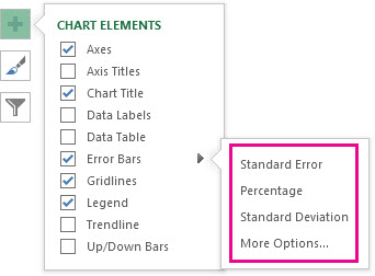
Note: The direction of the error bars depends on the type of chart you’re using. Scatter charts can show both horizontal and vertical error bars. You can remove either of these error bars by selecting them, and then pressing Delete.
Review equations for calculating error amounts
People often ask how Excel calculates error amounts. Excel uses the following equations to calculate the Standard Error and Standard Deviation amounts that are shown on the chart.
|
This option |
Uses this equation |
|---|---|
|
Standard Error |
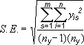
Where: s = series number i = point number in series s m = number of series for point y in chart n = number of points in each series yis = data value of series s and the ith point ny = total number of data values in all series |
|
Standard Deviation |
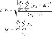
Where: s = series number i = point number in series s m = number of series for point y in chart n = number of points in each series yis = data value of series s and the ith point ny = total number of data values in all series M = arithmetic mean |
Add, change, or remove errors bars in a chart in Office 2010
In Excel, you can display error bars that use a standard error amount, a percentage of the value (5%), or a standard deviation.
Standard Error and Standard Deviation use the following equations to calculate the error amounts that are shown on the chart.
|
This option |
Uses this equation |
Where |
|---|---|---|
|
Standard Error |
|
s = series number i = point number in series s m = number of series for point y in chart n = number of points in each series yis = data value of series s and the ith point ny = total number of data values in all series |
|
Standard Deviation |
|
s = series number i = point number in series s m = number of series for point y in chart n = number of points in each series yis = data value of series s and the ith point ny = total number of data values in all series M = arithmetic mean |
-
On 2-D area, bar, column, line, xy (scatter), or bubble chart, do one of the following:
-
To add error bars to all data series in the chart, click the chart area.
-
To add error bars to a selected data point or data series, click the data point or data series that you want, or do the following to select it from a list of chart elements:
-
Click anywhere in the chart.
This displays the Chart Tools, adding the Design, Layout, and Format tabs.
-
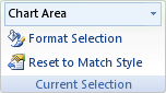
On the Format tab, in the Current Selection group, click the arrow next to the Chart Elements box, and then click the chart element that you want.
-
-
-
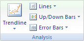
On the Layout tab, in the Analysis group, click Error Bars.
-
Do one of the following:
-
Click a predefined error bar option, such as Error Bars with Standard Error, Error Bars with Percentage, or Error Bars with Standard Deviation.
-
Click More Error Bar Options, and then under Vertical Error Bars or Horizontal Error Bars, click the display and error amount options that you want to use.
Note: The direction of the error bars depends on the chart type of your chart. For scatter charts, both horizontal and vertical error bars are displayed by default. You can remove either of these error bars by selecting them, and then pressing DELETE.
-
-
On a 2-D area, bar, column, line, xy (scatter), or bubble chart, click the error bars, the data point, or the data series that has the error bars that you want to change, or do the following to select them from a list of chart elements:
-
Click anywhere in the chart.
This displays the Chart Tools, adding the Design, Layout, and Format tabs.
-
On the Format tab, in the Current Selection group, click the arrow next to the Chart Elements box, and then click the chart element that you want.
-
-
On the Layout tab, in the Analysis group, click Error Bars, and then click More Error Bar Options.
-
Under Display, click the error bar direction and end style that you want to use.
-
On a 2-D area, bar, column, line, xy (scatter), or bubble chart, click the error bars, the data point, or the data series that has the error bars that you want to change, or do the following to select them from a list of chart elements:
-
Click anywhere in the chart.
This displays the Chart Tools, adding the Design, Layout, and Format tabs.
-
On the Format tab, in the Current Selection group, click the arrow next to the Chart Elements box, and then click the chart element that you want.
-
-
On the Layout tab, in the Analysis group, click Error Bars, and then click More Error Bar Options.
-
Under Error Amount, do one or more of the following:
-
To use a different method to determine the error amount, click the method that you want to use, and then specify the error amount.
-
To use custom values to determine the error amount, click Custom, and then do the following:
-
Click Specify Value.
-
In the Positive Error Value and Negative Error Value boxes, specify the worksheet range that you want to use as error amount values, or type the values that you want to use, separated by commas. For example, type 0.4, 0.3, 0.8.
Tip: To specify the worksheet range, you can click the Collapse Dialog button
, and then select the data that you want to use in the worksheet. Click the Collapse Dialog button again to return to the dialog box.Note: In Microsoft Office Word 2007 or Microsoft Office PowerPoint 2007, the Custom Error Bars dialog box may not show the Collapse Dialog button, and you can only type the error amount values that you want to use.
-
-
 , and then select the data that you want to use in the worksheet. Click the Collapse Dialog button again to return to the dialog box.
-
On a 2-D area, bar, column, line, xy (scatter), or bubble chart, click the error bars, the data point, or the data series that has the error bars that you want to remove, or do the following to select them from a list of chart elements:
-
Click anywhere in the chart.
This displays the Chart Tools, adding the Design, Layout, and Format tabs.
-
On the Format tab, in the Current Selection group, click the arrow next to the Chart Elements box, and then click the chart element that you want.
-
-
Do one of the following:
-
On the Layout tab, in the Analysis group, click Error Bars, and then click None.
-
Press DELETE.
-
Tip: You can remove error bars immediately after you add them to the chart by clicking Undo on the Quick Access Toolbar or by pressing CTRL+Z.
Do any of the following:
Express errors as a percentage, standard deviation, or standard error
-
In the chart, select the data series that you want to add error bars to.
For example, in a line chart, click one of the lines in the chart, and all the data marker of that data series become selected.
-
On the Chart Design tab, click Add Chart Element.
-
Point to Error Bars, and then do one of the following:

|
Click |
To |
|---|---|
|
Standard Error |
Apply the standard error, using the following formula:
s = series number |
|
Percentage |
Apply a percentage of the value for each data point in the data series |
|
Standard Deviation |
Apply a multiple of the standard deviation, using the following formula:
s = series number |


Express errors as custom values
-
In the chart, select the data series that you want to add error bars to.
-
On the Chart Design tab, click Add Chart Element, and then click More Error Bars Options.
-
In the Format Error Bars pane, on the Error Bar Options tab, under Error Amount, click Custom, and then click Specify Value.
-
Under Error amount, click Custom, and then click Specify Value.
-
In the Positive Error Value and Negative Error Value boxes, type the values that you want for each data point, separated by commas (for example, 0.4, 0.3, 0.8), and then click OK.
Note: You can also define error values as a range of cells from the same Excel workbook. To select the range of cells, in the Custom Error Bars dialog box, clear the contents of the Positive Error Value or Negative Error Value box, and then select the range of cells that you want to use.
Add up/down bars
-
In the chart, select the data series that you want to add up/down bars to.
-
On the Chart Design tab, click Add Chart Element, point to Up/Down Bars, and then click Up/down Bars.
Depending on the chart type, some options may not be available.
See Also
Create a chart
Change the chart type of an existing chart
In this Python tutorial, we will discuss Matplotlib plot error bars in python. Here we will cover different examples related to error bars using matplotlib. And we will also cover the following topics:
- Matplotlib plot error bars
- Matplotlib plot error bars example
- Matplotlib interactive plot error bars
- Matplotlib chart error bars
- Matplotlib scatter plot error bars
- Matplotlib plot_date error bars
- Matplotlib plot only error bars
- Matplotlib plot error bars symmetric
- Matplotlib plot error bars asymmetric
- Matplotlib polar plot error bars
In this section, we are going to learn about the error bar. Before starting error bars firstly, we understand what does error means.
Error is a mistake or we can say that difference between the calculated value and actual value.
When we graphical represent the data, some of the data have irregularity. To indicate these irregularities or uncertainties we use Error Bars.
Basically, error bars are used to represent errors in the graphical plot.
The following steps are used to plot error bars in matplotlib which is outlined below:
- Defining Libraries: Import the libraries which are required to plot error bars (For data creation and manipulation: Numpy, For data visualization: pyplot from matplotlib).
- Define X and Y: Define the data values used for plotting. Data values of x-axis and y-axis.
- Plot error bars: By using the errorbar() method we can plot the error bars.
- Display: Finally we have to use the show() method to display the plot.
The syntax to plot error bars is as below:
matplotlib.pyplot.errorbar(x, y, yerr=None, xerr=None, fmt='', ecolor=None, elinewidth=None, capsize=None, barsabove=False, lolims=False, uplimes=False, xlolims=False, xuplims=False, errorevery=1, capthick=None, * , data=None, **kwargs)The above-used parameters are outlined as below:
- x: specifies horizontal coordinates of the data points.
- y: specifies vertical coordinates of the data points.
- xerr: Define the horizontal error bar sizes. Must have a float or array-like shape.
- yerr: Define the vertical error bar sizes. Must have a float or array-like shape.
- fmt: Contains string value. By default, this plot error bars with markers. Use ‘none’ to plot error bars without markers.
- ecolor: specifies the color of the error bars.
- elinewidth: specifies linewidth of the error bars.
- capsize: specifies the length of error bars in points or float.
- capthick: specifies the thickness of error bars cap in float or points.
- barsabove: It contains bool value. By default value is False, if the value is True error bars are plotted above the plot symbol.
- lolims,uplims,xlolims,xuplims: specifies that value gives only upper and lower limits. It contains bool value.
- errorevery: It contains integer values and is used to draw error bars on the subset of the data.
First, learn “How to install matplotlib python“.
Matplotlib plot error bars example
In the above sections, we discussed what does error and error bars mean. And we also discussed what are the various steps used to plot error bars.
Let’s understand the concept with the help of an example as below:
# Import Library

import matplotlib.pyplot as plt

# Define Data

x= [1, 2, 3, 5]
y= [9, 15, 20, 25]

# Plot error bar

plt.errorbar(x, y, xerr = 0.9)

# Display graph

plt.show()- In the above, example we import the matplotlib.pyplot library.
- Then we define the x-axis and y-axis data points.
- plt.errorbar() method is used to plot error bars and we pass the argument x, y, and xerr and set the value of xerr = 0.9.
- Then we use plt.show() method to display the error bar plotted graph.

Read: Matplotlib plot a line
Matplotlib plot interactive error bars
Here we format the error bars or we can say that customizing the error bar according to our choice to become our error bar more interactive.
Let’s change the following things in the error bars to become it more interactive:
- fmt: change style of marker. Set it to circle.
- color: change the color of the marker. Set it to orange.
- ecolor: change the color of the error bar. Set it to lightgreen.
- elinewidth: change the line width of the error bar. Set it to 5.
- capsize: change the capsize of the error bar. Set it to 10.
Understand the concept with the help of an example:
# Import Library

import matplotlib.pyplot as plt

# Define Data

x= [1, 2, 3, 5]
y= [9, 15, 20, 25]

# Plot error bar

plt.errorbar(x, y, xerr = 0.9, fmt = 'o',color = 'orange',
            ecolor = 'lightgreen', elinewidth = 5, capsize=10)

# Display graph

plt.show()- In the above example, we plot the error bars and format them according to above mention list.
- We use plt.errorbar() method to plot error bars and become it more interactive.

Read: Python plot multiple lines using Matplotlib
Matplotlib chart error bars
In this section, we will create a chart plot with error bars using Matplotlib. We use plt.errorbar() method to plot error bars in bar charts.
The following are the cases in the bar chart in which we draw error bars:
- Error in x values
- Error in y values
- Error in both x and y values
Matplotlib chart error bars in x values
By using the plt.errorbar() method we plot the error bars and pass the argument xerr to plot error on the x values.
The syntax for this is:
matplotlib.pyplot.errorbar(x, y, xerr=None)Let’s understand this concept with the help of an example:
# Import Library

import matplotlib.pyplot as plt

# Define Data

x= [6, 15, 2.3, 9]
y= [9, 15, 20, 25]

# Define Error

x_error = [2.3, 5.1, 1, 3.1]

# Plot Bar chart

plt.bar(x,y)

# Plot error bar

plt.errorbar(x, y, xerr = x_error,fmt='o',ecolor = 'red',color='yellow')

# Display graph

plt.show()- In the above example, we import matplotlib.pyplot library and define the data point on the x-axis and y-axis.
- Then we define the error value and use the plt.bar() method to plot a bar chart.
- plt.errorbar() method is used to plot error bars and we pass xerr as an argument and set its value to be x_error value which we define.

Matplotlib chart error bars in y values
By using the plt.errorbar() method we plot the error bars and pass the argument yerr to plot error on the y values.
The syntax to plot error bars on y values is as given below:
matplotlib.pyplot.errorbar(x, y, yerr=None)Let’s take an example for better understanding:
# Import Library

import matplotlib.pyplot as plt

# Define Data

x= [6, 15, 2.3, 9]
y= [9, 15, 20, 25]

# Define Error

y_error = [2.3, 5.1, 1, 3.1]

# Plot Bar chart

plt.bar(x,y)

# Plot error bar

plt.errorbar(x, y, yerr = y_error,fmt='o',ecolor = 'red',color='yellow')

# Display graph

plt.show()- In the above example, we import matplotlib.pyplot library
- After this defines the data point on the x-axis and y-axis.
- Then we define the error value and use the plt.bar() method to plot a bar chart and use plt.errorbar() method is used to plot error bars.
- Pass yerr as an argument and set its value to equal y_error value which we define.

Matplotlib chart error bars in x and y values
By using the plt.errorbar() method we plot the error bars and pass the argument xeer and yerr to plot error on both x and y values respectively.
The syntax to plot error bars on both the values is as given below:
matplotlib.pyplot.errorbar(x, y, xerr=None, yerr=None)Let’s take an example to know how to plot errorbars on both values:
# Import Library

import matplotlib.pyplot as plt

# Define Data

x= [6, 15, 2.3, 9]
y= [9, 15, 20, 25]

# Define Error

x_error = [4.2, 6, 10, 8.6]
y_error = [2.3, 5.1, 1, 3.1]

# Plot Bar chart

plt.bar(x,y)

# Plot error bar

plt.errorbar(x, y, xerr = x_error, yerr = y_error,
             fmt='o', ecolor = 'red',color='yellow')

# Display graph


plt.show()- In the above example, we import matplotlib.pyplot library
- After this defines the data point on the x-axis and y-axis.
- Then we define the error value and use the plt.bar() method to plot a bar chart and use plt.errorbar() method is used to plot error bars.
- Pass xeer, yerr as an argument and set its value to equal x_error, y_error value respectively which we define.

Read: What is matplotlib inline
Matplotlib scatter plot error bars
In this section, we will create a scatter plot with error bars using Matplotlib. We use plt.errorbar() method to plot error bars in scatter plot.
The following are the cases in the scatter plot in which we draw error bars:
- Error in x values
- Error in y values
- Error in both x and y values
Matplotlib scatter plot error bars in x values
By using the plt.errorbar() method we plot the error bars and pass the argument xerr to plot error on the x values in the scatter plot.
The syntax for this is:
matplotlib.pyplot.errorbar(x, y, xerr=None)Let’s understand this concept with the help of an example:
# Import Library

import matplotlib.pyplot as plt

# Define Data

x= [10, 20, 30, 40]
y= [4, 8, 12, 16]

# Define Error

x_error = [2, 4, 6, 8]

# Plot scatter plot

plt.scatter(x,y)

# Plot error bar

plt.errorbar(x, y, xerr = x_error,fmt='o',ecolor = 'cyan',color='black')

# Display graph

plt.show()- In the above example, we import matplotlib.pyplot library and define the data point on the x-axis and y-axis.
- Then we define the error value and use the plt.scatter() method to draw a scatter plot.
- plt.errorbar() method is used to plot error bars and we pass xerr as an argument and set its value to be x_error value which we define.

Matplotlib scatter plot error bars in y values
By using the plt.errorbar() method we plot the error bars and pass the argument yerr to plot error on the y values in the scatter plot.
The syntax to plot error bars on y values is as given below:
matplotlib.pyplot.errorbar(x, y, yerr=None)Let’s take an example for better understanding:
# Import Library

import matplotlib.pyplot as plt

# Define Data

x= [10, 20, 30, 40]
y= [4, 8, 12, 16]

# Define Error

y_error = [2, 4, 6, 8]

# Plot Scatter Plot

plt.scatter(x,y)

# Plot error bar

plt.errorbar(x, y, yerr = y_error,fmt='o',ecolor = 'cyan',color='black')

# Display graph

plt.show()- In the above example, we import matplotlib.pyplot library
- After this defines the data point on the x-axis and y-axis.
- Then we define the error value and use the plt.scatter() method to plot a scatter plot and use plt.errorbar() method is used to plot error bars.
- Pass yerr as an argument and set its value to equal y_error value which we define.

Matplotlib scatter plot error bars in x and y values
By using the plt.errorbar() method we plot the error bars and pass the argument xeer and yerr to plot error on both x and y values respectively.
The syntax to plot error bars on both the values is as given below:
matplotlib.pyplot.errorbar(x, y, xerr=None, yerr=None)Let’s take an example to know how to plot errorbars on both values:
# Import Library

import matplotlib.pyplot as plt

# Define Data


x= [10, 20, 30, 40]
y= [4, 8, 12, 16]

# Define Error

x_error= [3, 6, 9, 12]
y_error = [2, 4, 6, 8]

# Plot Scatter Plot

plt.scatter(x,y)

#Plot error bar

plt.errorbar(x, y, xerr= x_error, yerr = y_error,fmt='o',ecolor = 'cyan',color='black')

# Display graph

plt.show()- In the above example, we import matplotlib.pyplot library
- After this defines the data point on the x-axis and y-axis.
- Then we define the error value and use the plt.scatter() method to plot a scatter plot and use plt.errorbar() method is used to plot error bars.
- Pass xeer, yerr as an argument and set its value to equal x_error, y_error value which we define.

Read: Matplotlib plot bar chart
Matplotlib plot_date error bars
In this section, we will create a dates plot with error bars using Matplotlib. We use plt.errorbar() method to plot error bars.
The following are the cases in the dates plot in which we draw error bars:
- Error in x values
- Error in y values
- Error in both x and y values
Matplotlib plot_date error bars in x values
By using the plt.errorbar() method we plot the error bars and pass the argument xerr to plot error on the x values in the date plot.
The syntax for this is:
matplotlib.pyplot.errorbar(x, y, xerr=None)Let’s understand this concept with the help of an example:
# Import Library

import matplotlib.pyplot as plt

# Define Data

x= [1, 2, 3]
y= [1.5, 2, 2.5]

# Define Error

x_error= 1.5

# Plot Date

plt.plot_date(x,y)

#Plot error bar

plt.errorbar(x, y, xerr= x_error, fmt='o',
             ecolor = 'lightblue',color='m')

# Display graph


plt.tight_layout()

plt.show()- In the above example, we import matplotlib.pyplot library and define the data point on the x-axis and y-axis.
- Then we define the error value and use the plt.plot_date() method to draw a plot consisting dates.
- plt.errorbar() method is used to plot error bars and we pass xerr as an argument and set its value to be x_error value which we define.

Read: Matplotlib subplot tutorial
Matplotlib plot_date error bars in y values
By using the plt.errorbar() method, we plot the error bars and pass the argument yerr to plot the error on the y values in the date plot.
The syntax to plot error bars on y values is as given below:
matplotlib.pyplot.errorbar(x, y, yerr=None)Let’s take an example for better understanding:
# Import Library

import matplotlib.pyplot as plt

# Define Data


x= [1, 2, 3]
y= [0.5, 0.8, 1]

# Define Error


y_error= 0.1

# Plot Date

plt.plot_date(x,y)

# Plot error bar

plt.errorbar(x, y, yerr= y_error, fmt='o',
             ecolor = 'lightblue',color='m')

# Display graph

plt.tick_params(axis='x', which='major', labelsize=8)

plt.tight_layout()

plt.show()- In the above example, we import matplotlib.pyplot library
- After this defines the data point on the x-axis and y-axis.
- Then we define the error value and use the plt.plot_date() method to plot a graph consisting of dates and use plt.errorbar() method is used to plot error bars.
- Pass yerr as an argument and set its value to equal y_error value which we define.

Matplotlib plot_date error bars in x and y values
By using the plt.errorbar() method we plot the error bars and pass the argument xeer and yerr to plot error on both x and y values respectively in the date plot.
The syntax to plot error bars on both the values is as given below:
matplotlib.pyplot.errorbar(x, y, xerr=None, yerr=None)Let’s take an example to know how to plot errorbars on both valuesin date plot:
# Import Library

import matplotlib.pyplot as plt

# Define Data

x= [1,2,3]
y= [1.5, 2, 2.5]

# Define Error


x_error= 1.5
y_error = 2.3

# Plot Date

plt.plot_date(x,y)

# Plot error bar


plt.errorbar(x, y, xerr= x_error, yerr = y_error,fmt='o',ecolor = 'lightblue',color='m')

# Display graph


plt.tight_layout()

plt.show()- In the above example, we import matplotlib.pyplot library
- After this defines the data point on the x-axis and y-axis.
- Then we define the error value and use the plt.plot_date() method to plot a dates and use plt.errorbar() method is used to plot error bars.
- Pass xeer, yerr as an argument and set its value to equal x_error, y_error value which we define.

Read: Matplotlib best fit line
Matplotlib plot only error bars
Here we learn about how we can plot error bars only.
The syntax to plot error bars is:
matplotlib.pyplot.errorbar(x,y,xerr=None,yerr=None)The parameters used above are:
- x: horizontal coordinates of the data points.
- y: vertical coordinates of the data points.
- xerr: Define the horizontal error bar sizes. Must have a float or array-like shape.
- yerr: Define the vertical error bar sizes. Must have a float or array-like shape.
Let’s take an example to create only error bars:
# Import Library

import matplotlib.pyplot as plt

# Define Data

x= [1, 2, 3]
y= [1.5, 2, 2.5]

# Define Error

x_error = 0.2
y_error = 0.5

#Plot error bar

plt.errorbar(x, y, xerr= x_error, yerr = y_error,fmt='o',
             ecolor = 'pink',color='blue')

# Display graph

plt.show()
In the above example, we define the data and error values, and by using the errorbar() method we plot the only error bar graph.

Read: Matplotlib subplots_adjust
Matplotlib plot error bars symmetric
Here we learn what does symmetric error bars are. Errors are constant values and we represent the error values in the array form.
Sometimes, we have a case in which an error differed for each point, but the lower and upper values of error are equal. That type of case is known as the symmetric error bar.
In the symmetric case, the shape of an array is in the form: (N,)
Let’s see the example of symmetric error bars:
# Import library

import numpy as np
import matplotlib.pyplot as plt

# Define Data

x = np.arange(2, 16, 1.5)
y = np.exp(x*2)

# Define Data

error = 0.1 * x

# Plot error

plt.errorbar(x, y, yerr=error, fmt='-o')

# Display Graph

plt.show()- In the above example, we define data using NumPy arrange() method and exp() method. After that, we define error value in the shape of (N,).
- By using plt.errorbar() method, we plot the symmetric error bars.

Read: Matplotlib log log plot
Matplotlib plot error bars asymmetric
Here we learn what does asymmetric error bars are. Errors are constant values and they are represented in the array form.
Sometimes, we have a case in which an error differed for each point, but the lower and upper limits of error are unequal or different in nature. That type of case is known as the asymmetric error bar.
In the asymmetric case, the shape of an array is in the form: (2, N).
Let’s see the example of asymmetric error bars:
# Import Libraries

import numpy as np
import matplotlib.pyplot as plt

# Define Data

x = np.arange(2, 16, 1.5)
y = np.exp(x*2)

# Define errors

error = 0.1 * x

# Lower limit of error

lower_error = 0.6 * error

# Upper limit of error

upper_error = error

# plot error bars

asymmetric_error = [lower_error, upper_error]
plt.errorbar(x, y, xerr=asymmetric_error, fmt='o')

# Display Graph

plt.show()
In the above example, we define different values of error of lower and upper limits. By using the plt.errorbar() method we plot error bars in asymmetric nature.

Read: Matplotlib plot_date
Matplotlib polar plot error bars
A Cartesian coordinate system is plotted using the polar coordinates. plt.polar() method is used to plot the polar coordinates.
The syntax to plot polar plot is as given below:
matplotlib.pyplot.polar(r, theta)The parameter used above are:
- r: specifies the distance from the origin.
- theta: Specifies the angle at which distance from the origin has to be measured.
Let’s see an example of plotting error bars in polar coordinates:
# Import Library

import matplotlib.pyplot as plt
import numpy as np

# Define Data

r= np.arange(0, 4, 0.5)
theta= 2*np.pi*r

# Define Error

x_error = 0.2
y_error = 5

# Plot polar coordinates

plt.polar(r,theta,"ro")

# Plot error bar

plt.errorbar(r, theta, xerr = x_error, yerr= y_error,                           color='black')

# Display graph

plt.show()- In the above example, we import matplotlib and numpy library.
- After that, we define ‘r’ and ‘theta‘ i.e distance and angle.
- Then we plot the polar coordinates by using the plt.polar() method and by using the plt.errorbar() method we plot error bars in the polar plot.
- Finally, we display plt.show() method to display the polar plot.
You may also like to read the following Matplotlib tutorials.
- Matplotlib dashed line
- Matplotlib scatter marker
- Matplotlib change background color
- Matplotlib rotate tick labels
- Matplotlib remove tick labels
In this Python tutorial, we have discussed the “Matplotlib plot error bars” and we have also covered some examples related to it. These are the following topics that we have discussed in this tutorial.
- Matplotlib plot error bars
- Matplotlib plot error bars example
- Matplotlib interactive plot error bars
- Matplotlib chart error bars
- Matplotlib scatter plot error bars
- Matplotlib plot_date error bars
- Matplotlib plot only error bars
- Matplotlib plot error bars symmetric
- Matplotlib plot error bars asymmetric
- Matplotlib polar plot error bars

Python is one of the most popular languages in the United States of America. I have been working with Python for a long time and I have expertise in working with various libraries on Tkinter, Pandas, NumPy, Turtle, Django, Matplotlib, Tensorflow, Scipy, Scikit-Learn, etc… I have experience in working with various clients in countries like United States, Canada, United Kingdom, Australia, New Zealand, etc. Check out my profile.