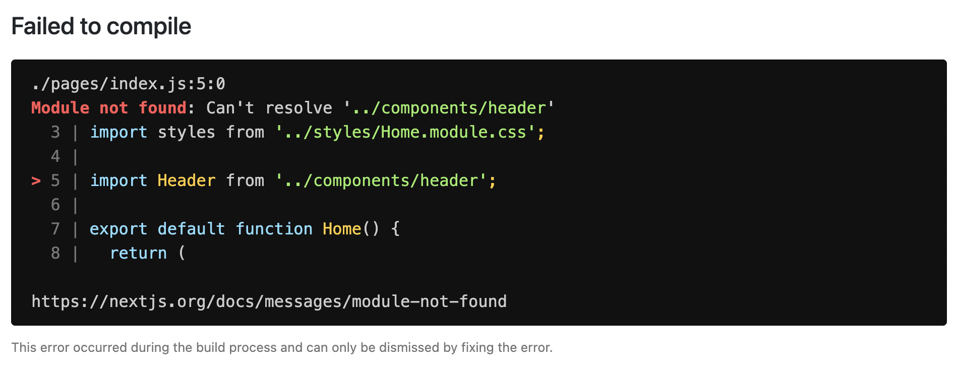
This documentation explains how you can handle development, server-side, and client-side errors.
Handling Errors in Development
When there is a runtime error during the development phase of your Next.js application, you will encounter an overlay. It is a modal that covers the webpage. It is only visible when the development server runs using next dev, npm run dev, or yarn dev and not in production. Fixing the error will automatically dismiss the overlay.
Here is an example of an overlay:
Handling Server Errors
Next.js provides a static 500 page by default to handle server-side errors that occur in your application. You can also customize this page by creating a pages/500.js file.
Having a 500 page in your application does not show specific errors to the app user.
You can also use 404 page to handle specific runtime error like file not found.
Handling Client Errors
React Error Boundaries is a graceful way to handle a JavaScript error on the client so that the other parts of the application continue working. In addition to preventing the page from crashing, it allows you to provide a custom fallback component and even log error information.
To use Error Boundaries for your Next.js application, you must create a class component ErrorBoundary and wrap the Component prop in the pages/_app.js file. This component will be responsible to:
- Render a fallback UI after an error is thrown
- Provide a way to reset the Application’s state
- Log error information
You can create an ErrorBoundary class component by extending React.Component. For example:
class ErrorBoundary extends React.Component {
  constructor(props) {
    super(props)

    // Define a state variable to track whether is an error or not
    this.state = { hasError: false }
  }
  static getDerivedStateFromError(error) {
    // Update state so the next render will show the fallback UI

    return { hasError: true }
  }
  componentDidCatch(error, errorInfo) {
    // You can use your own error logging service here
    console.log({ error, errorInfo })
  }
  render() {
    // Check if the error is thrown
    if (this.state.hasError) {
      // You can render any custom fallback UI
      return (
        <div>
          <h2>Oops, there is an error!</h2>
          <button
            type="button"
            onClick={() => this.setState({ hasError: false })}
          >
            Try again?
          </button>
        </div>
      )
    }

    // Return children components in case of no error

    return this.props.children
  }
}

export default ErrorBoundary
The ErrorBoundary component keeps track of an hasError state. The value of this state variable is a boolean. When the value of hasError is true, then the ErrorBoundary component will render a fallback UI. Otherwise, it will render the children components.
After creating an ErrorBoundary component, import it in the pages/_app.js file to wrap the Component prop in your Next.js application.
// Import the ErrorBoundary component
import ErrorBoundary from '../components/ErrorBoundary'

function MyApp({ Component, pageProps }) {
  return (
    // Wrap the Component prop with ErrorBoundary component
    <ErrorBoundary>
      <Component {...pageProps} />
    </ErrorBoundary>
  )
}

export default MyApp
You can learn more about Error Boundaries in React’s documentation.
Reporting Errors
To monitor client errors, use a service like Sentry, Bugsnag or Datadog.
The error.js file convention allows you to gracefully handle runtime errors in nested routes.
- Automatically wrap a route segment and its nested children in a React Error Boundary.
- Create error UI tailored to specific segments using the file-system hierarchy to adjust granularity.
- Isolate errors to affected segments while keeping the rest of the app functional.
- Add functionality to attempt to recover from an error without a full page reload.
Create error UI by adding an error.js file inside a route segment and exporting a React component:

app/dashboard/error.tsx
'use client'; // Error components must be Client components

import { useEffect } from 'react';

export default function Error({
  error,
  reset,
}: {
  error: Error;
  reset: () => void;
}) {
  useEffect(() => {
    // Log the error to an error reporting service
    console.error(error);
  }, [error]);

  return (
    <div>
      <h2>Something went wrong!</h2>
      <button
        onClick={
          // Attempt to recover by trying to re-render the segment
          () => reset()
        }
      >
        Try again
      </button>
    </div>
  );
}
How error.js Works
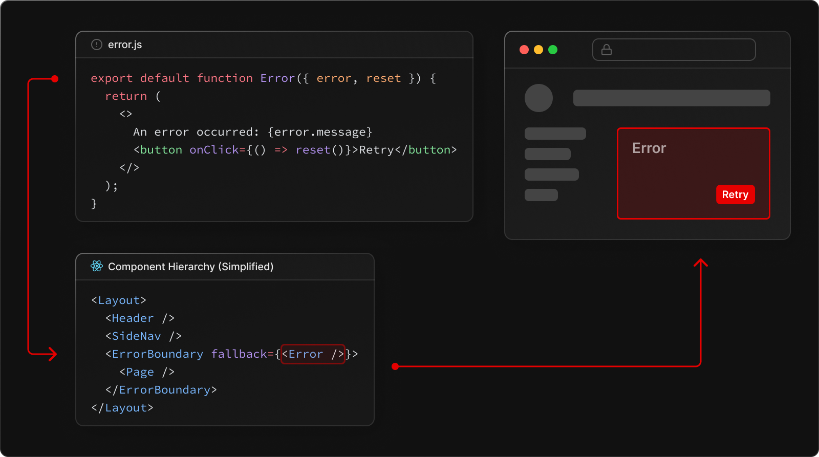
error.jsautomatically creates an React Error Boundary that wraps a nested child segment orpage.jscomponent.- The React component exported from the
error.jsfile is used as the fallback component. - If an error is thrown within the error boundary, the error is contained, and the fallback component is rendered.
- When the fallback error component is active, layouts above the error boundary maintain their state and remain interactive, and the error component can display functionality to recover from the error.
Recovering From Errors
The cause of an error can sometimes be temporary. In these cases, simply trying again might resolve the issue.
An error component can use the reset() function to prompt the user to attempt to recover from the error. When executed, the function will try to re-render the Error boundary’s contents. If successful, the fallback error component is replaced with the result of the re-render.
app/dashboard/error.tsx
'use client';

export default function Error({
  error,
  reset,
}: {
  error: Error;
  reset: () => void;
}) {
  return (
    <div>
      <h2>Something went wrong!</h2>
      <button onClick={() => reset()}>Try again</button>
    </div>
  );
}
Nested Routes
React components created through special files are rendered in a specific nested hierarchy.
For example, a nested route with two segments that both include layout.js and error.js files are rendered in the following simplified component hierarchy:
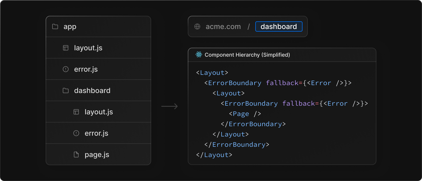
The nested component hierarchy has implications for the behavior of error.js files across a nested route:
- Errors bubble up to the nearest parent error boundary. This means an
error.jsfile will handle errors for all its nested child segments. More or less granular error UI can be achieved by placingerror.jsfiles at different levels in the nested folders of a route. - An
error.jsboundary will not handle errors thrown in alayout.jscomponent in the same segment because the error boundary is nested inside that layouts component.
Handling Errors in Layouts
error.js boundaries do not catch errors thrown in layout.js or template.js components of the same segment. This intentional hierarchy keeps important UI that is shared between sibling routes (such as navigation) visible and functional when an error occurs.
To handle errors within a specific layout or template, place an error.js file in the layouts parent segment.
To handle errors within the root layout or template, use a variation of error.js called global-error.js.
Handling Errors in Root Layouts
The root app/error.js boundary does not catch errors thrown in the root app/layout.js or app/template.js component.
To specifically handle errors in these root components, use a variation of error.js called app/global-error.js located in the root app directory.
Unlike the root error.js, the global-error.js error boundary wraps the entire application, and its fallback component replaces the root layout when active. Because of this, it is important to note that global-error.js must define its own <html> and <body> tags.
global-error.js is the least granular error UI and can be considered «catch-all» error handling for the whole application. It is unlikely to be triggered often as root components are typically less dynamic, and other error.js boundaries will catch most errors.
Even if a global-error.js is defined, it is still recommended to define a root error.js whose fallback component will be rendered within the root layout, which includes globally shared UI and branding.
app/global-error.tsx
'use client';

export default function GlobalError({
  error,
  reset,
}: {
  error: Error;
  reset: () => void;
}) {
  return (
    <html>
      <head></head>
      <body>
        <h2>Something went wrong!</h2>
        <button onClick={() => reset()}>Try again</button>
      </body>
    </html>
  );
}
Handling Server Errors
If an error is thrown during data fetching or inside a Server Component, Next.js will forward the resulting Error object to the nearest error.js file as the error prop.
When running next dev, the error will be serialized and forwarded from the Server Component to the client error.js. To ensure security when running next start in production, a generic error message is forwarded to error along with a .digest which contains a hash of the error message. This hash can be used to correspond to server logs.
Next Steps
Loading UI
Learn how to create Loading States for your application.
error.js
Required and optional params for error files.
Содержание
- Next.js Layouts RFC in 5 minutes
- Creating Routes
- Creating Layouts
- Sharing Layouts
- Loading & Error Boundaries
- Route Groups
- Summary
- Error Boundary for Next.js API routes
- Exceptions and Errors
- Common REST API Exception Codes
- Custom Exception throwable class
- Error Boundary
- Exception & Error Responders
- Example Usage
- HTTP Method Recognition
- Writing API Routes
- Handling runtime errors when server side rendering with Next.js
- Intro
- 1. Error boundary
- 2. Try . catch
- 3. Optional Chaining
- Conclusion
- Next.js
- Documentation
- API Reference
- Error Handling
- Handling Errors in Development
- Handling Server Errors
- Handling Client Errors
- Reporting Errors
Next.js Layouts RFC in 5 minutes
VP of Developer Experience
The Next.js team at Vercel released the Layouts RFC a few months ago outlining the vision for the future of routing, layouts, and data fetching in the framework. The RFC is detailed and covers both basic and advanced features.
This post will cover the most important features of the upcoming Next.js changes landing in the next major version that you should be aware of.
Creating Routes
In the new app directory, folders are used to define routes. To create a route, add a page.js file inside a folder. For example, app/page.js :
A new Page inside the app directory.
A page (with the page.js naming convention) is UI that is unique to a specific route segment. In this instance, the route segment is / (or the root segment).

Each route segment is mapped to a corresponding segment in a URL path.
Each route segment is mapped to a corresponding segment in a URL path.
You can incrementally adopt the app directory from the existing pages directory.
Creating Layouts
You can create nestable layouts that are shared across pages by adding layout.js files.

Creating routes using pages and layouts.
Creating routes using pages and layouts.
To make your first layout, you will create a new file app/layout.js .
Root layout inside the app directory.
app/page.js above will render as a child of app/layout.js :
The rendered HTML output from the root layout and page.
Sharing Layouts
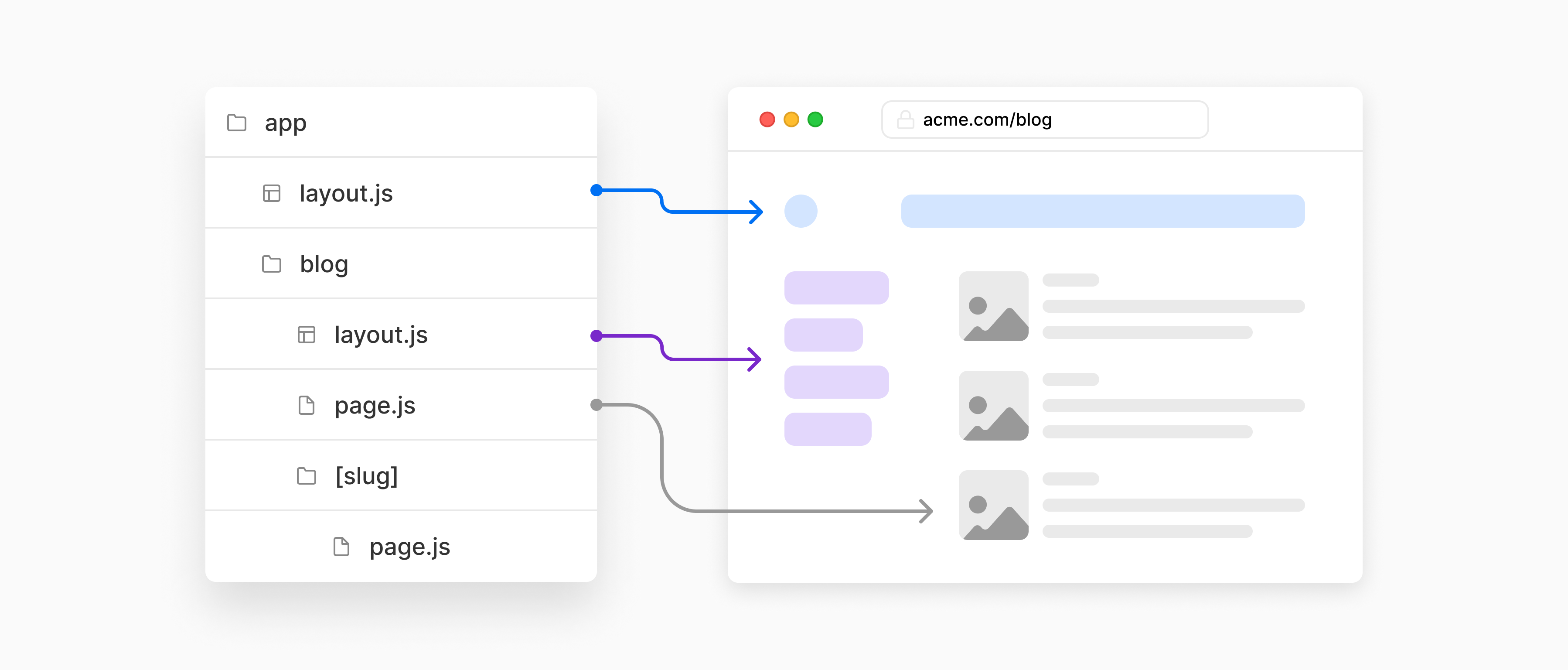
Layouts can be shared across different pages. Every route in app/ shares the same root layout, defined at app/layout.js . For example, if we created a new route segment app/blog/page.js :
Blog page inside the app directory.
This page would use the same root layout. app/blog/page.js would render as a child of app/layout.js .
The rendered HTML output from the root layout and blog page.
If we wanted a custom layout for this route segment, we would create a new layout at app/blog/layout.js . For example, maybe our blog needs a sidebar navigation layout:
Layout specific to the blog route segment.
app/blog/page.js would render as a child of app/layout.js and app/blog/layout.js :
The rendered HTML output from the root layout, blog layout, and blog page.
Similarly, if we created a nested dynamic route app/blog/[slug]/page.js for an individual blog post, it would also use the same layouts:
Page for a specific blog post, using a dynamic route.
Layout for the individual blog post page with a dynamic route.
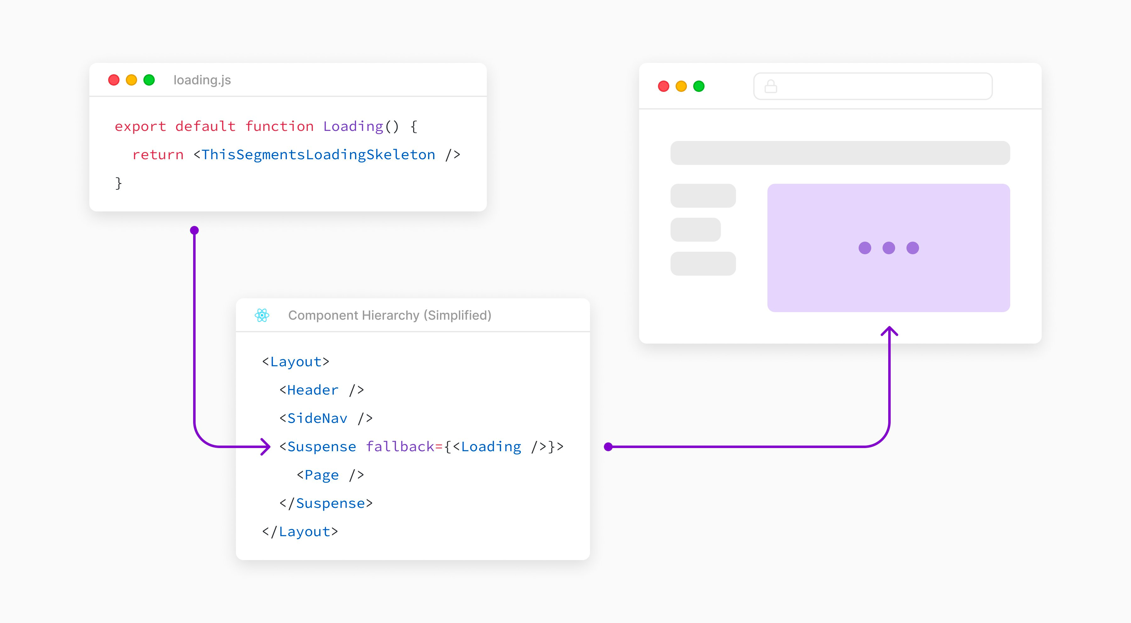
Loading & Error Boundaries
loading.js automatically wraps a page or nested segment in a React Suspense Boundary. Next.js will show your loading component immediately on the first load and again when navigating between sibling routes.
You can use this to create meaningful loading UI for specifics part of your UI.

The Next.js Loading UI creates a React Suspense boundary.
The Next.js Loading UI creates a React Suspense boundary.
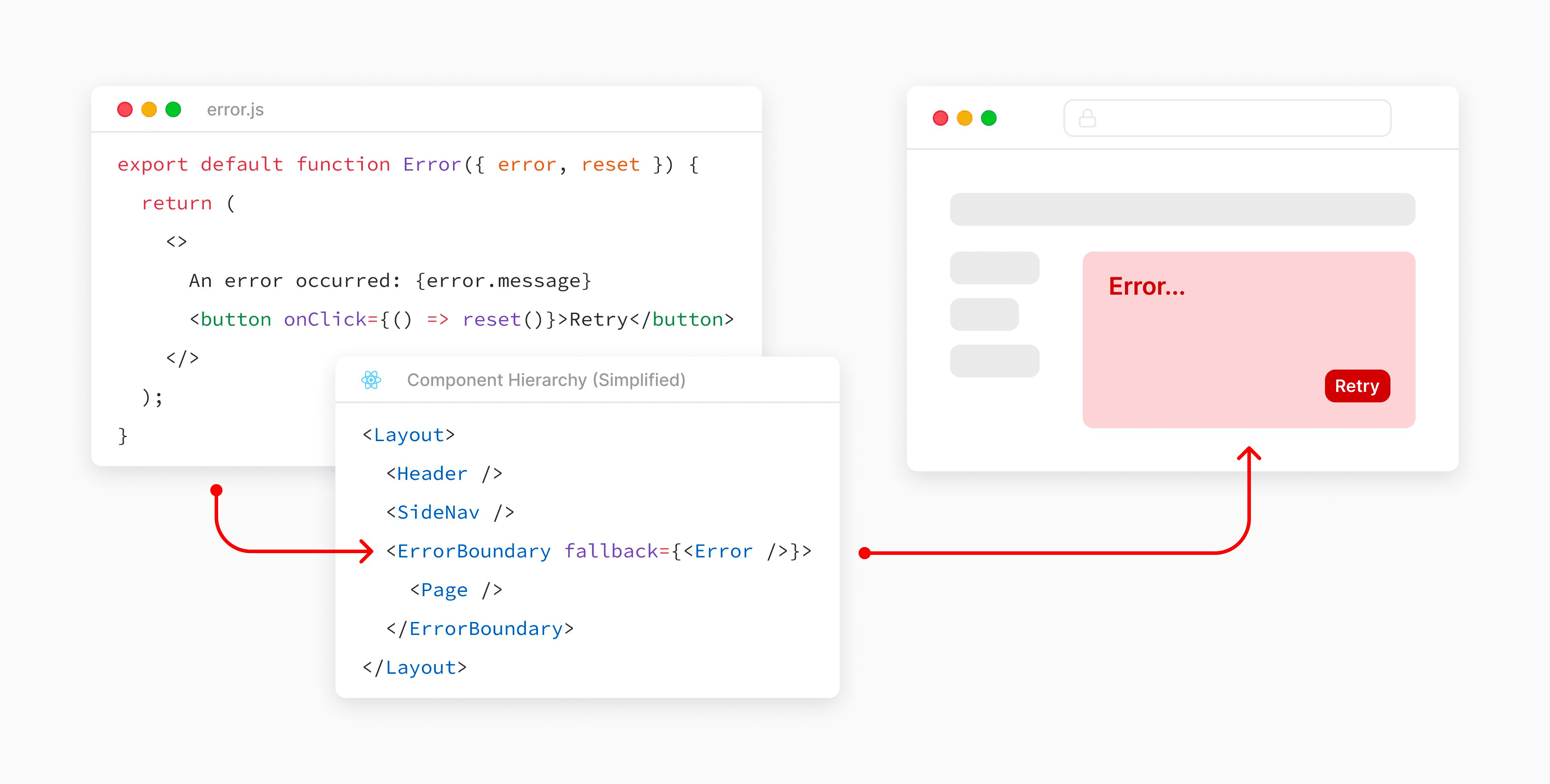
error.js automatically wraps a page or nested segment in a React Error Boundary. Next.js will show your error component whenever an error in a subtree is caught.

The Next.js Error UI creates a React error boundary.
The Next.js Error UI creates a React error boundary.
Use this to isolate errors to specific parts of an app, show specific error information, and attempt to recover.
Route Groups
Route groups can be used to:
- Organize routes without affecting the URL path
- Opt a segment out of a layout
- Create multiple root layouts for sections of an app with a completely different UI

You can exclude routes from layouts using route groups.
You can exclude routes from layouts using route groups.
Summary
An example app directory using some of the above concepts would look as follows:
Источник
Error Boundary for Next.js API routes
Next.js ships with a simple, yet powerful router for JSON / REST APIs. There are, however, two features I’ve found missing. Error boundary and HTTP method recognition. Let’s have a look how to handle them.
Exceptions and Errors
By default, any Error thrown within an API route will result in Status 500 “Internal Server Error.” That’s fine for internal errors, obviously, but in reality, plenty of API calls would result in 4xx states.
Common REST API Exception Codes
400 Bad Request for validation exceptions
401 Unauthorized requiring user to sign in
403 Forbidden for authorized users looking where they shouldn’t
404 Not Found
405 Method Not Allowed for unsupported HTTP methods
Custom Exception throwable class
First, let’s build our Exception class as an extension of native Error class. We’ll use this to throw Exceptions in HTTP status range of 400–499.
Error Boundary
All we need is to make our Wrapper function, which’ll encaptule our API handler functions into a try–catch block.
Now it’s same to assume all errors will respond with HTTP 400–500 status and a JSON object, while successful calls will respond with status 200.
Exception & Error Responders
Responses for Exceptions should bear all message , statusCode and optional data object.
Responses for other Errors, on the other hand, should log the error and its trace to console.warn , while responding simply with 500 Internal Server Error .
Example Usage
Now we’re able to throw a meaningful Exception from anywhere within our Wrapper function. API routes are still very simple:
Example of secure API route:
Other simple examples:
We’ve got our simple Exception and Error handling working, but we’ve still got one thing missing…
HTTP Method Recognition
The only thing I’ve never felt comfortable with Next.js was handling all methods of a call at once. We’ll start with a simple method resolver function.
Now let’s incorporate method resolution within our Wrapper function
Writing API Routes
Method resolution syntax couldn’t be any simpler.
Источник
Handling runtime errors when server side rendering with Next.js
Avoid bad user experience by exploring different ways to manage runtime errors with Next.js
Intro
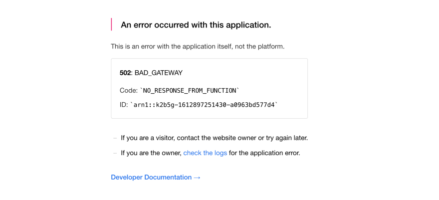
If you are working with Next.js, there is quite a good chance to bump into internal server errors (5xx) when on production. If not handled correctly, a single error can bring down the complete page. Imagine a user shopping online for their favourite gadget and they end up seeing this page resulting in a bad UX.
Nextjs shipped SSG support with version 9.3 and brought in a lot of positives. For instance: getting errors at build time rather than runtime. Switching from SSR to SSG, ended up in an amazing user experience as everything was statically generated before the site was deployed.
However, in some cases, we still require our website pages to use server side rendering (SSR) instead of static site generation (SSG). Example: checking if the user is logged in or not?
In this article, let’s take a look at a typical error, the “TypeError“
Consider our web-application consuming data from a CMS. At some point the marketing team tries to change a property and they accidentally end up removing one. Or, for the sake of this article let’s consider the CMS backend server goes offline. We fail fetching the data from the CMS and the TypeError is born.

This example considers a scenario when your webpage uses Server side rendering.
Let’s take a look of ways how can we avoid a webpage from crashing in production?
1. Error boundary
Exit fullscreen mode
Since we’re using React, we are aware of using error boundaries as React exposes getDerivedStateFromError or componentDidCatch lifecycle methods so we can handle the runtime errors.
These lifecycle method won’t run in Next.js as componentDidCatch does not work when using SSR
If an error occurs in the Error Boundary, the webpage will simply throw a internal server error (500) and result in an errored page.
So if you are using error boundaries to handle runtime errors & if an error occurs on production, the page will render like so: https://ssr-error-handling-git-main.meetdave3.vercel.app/error-boundary
You will see a 500 internal server error. Yes, it’s annoying and we don’t want our end users to see it either.
2. Try . catch
When server side rendering, Our old friend Try … catch is a good replacement to the error boundary as it works expectedly on server side, helps us avoiding the annoying 500 internal server error.
You can wrap your risky component with a try catch like so
Exit fullscreen mode
and you can see how the complete page doesn’t crash any more
3. Optional Chaining
Exit fullscreen mode
This method is the best case from all the options when we want to solve a TypeError. It’s minimal, it’s fast, still it can only help us in accessing chained properties without throwing any error.
Conclusion
It’s not necessary to use any of these methods if you are statically generating the site (SSG)
Why? Because we will get the TypeError at build time when running next build and a production build won’t be created.
When using SSR, we need to fallback to the try .. catch solution when we are trying to do something more error prone like calculating the total tax of the shopping basket when rendering the checkout page.
It’s best to use a mix of optional chaining and try catch to avoid server side errors. Avoid falling into the trap of using React error boundaries when creating a server side rendered page.
Источник
Next.js
Documentation
Migrating to Next.js
API Reference
Error Handling
This documentation explains how you can handle development, server-side, and client-side errors.
Handling Errors in Development
When there is a runtime error during the development phase of your Next.js application, you will encounter an overlay. It is a modal that covers the webpage. It is only visible when the development server runs using next dev , npm run dev , or yarn dev and not in production. Fixing the error will automatically dismiss the overlay.
Here is an example of an overlay:
Handling Server Errors
Next.js provides a static 500 page by default to handle server-side errors that occur in your application. You can also customize this page by creating a pages/500.js file.
Having a 500 page in your application does not show specific errors to the app user.
You can also use 404 page to handle specific runtime error like file not found .
Handling Client Errors
React Error Boundaries is a graceful way to handle a JavaScript error on the client so that the other parts of the application continue working. In addition to preventing the page from crashing, it allows you to provide a custom fallback component and even log error information.
To use Error Boundaries for your Next.js application, you must create a class component ErrorBoundary and wrap the Component prop in the pages/_app.js file. This component will be responsible to:
- Render a fallback UI after an error is thrown
- Provide a way to reset the Application’s state
- Log error information
You can create an ErrorBoundary class component by extending React.Component . For example:
The ErrorBoundary component keeps track of an hasError state. The value of this state variable is a boolean. When the value of hasError is true , then the ErrorBoundary component will render a fallback UI. Otherwise, it will render the children components.
After creating an ErrorBoundary component, import it in the pages/_app.js file to wrap the Component prop in your Next.js application.
You can learn more about Error Boundaries in React’s documentation.
Reporting Errors
To monitor client errors, use a service like Sentry, Bugsnag or Datadog.
Источник
Avoid bad user experience by exploring different ways to manage runtime errors with Next.js
Intro
If you are working with Next.js, there is quite a good chance to bump into internal server errors (5xx) when on production. If not handled correctly, a single error can bring down the complete page. Imagine a user shopping online for their favourite gadget and they end up seeing this page resulting in a bad UX.
Nextjs shipped SSG support with version 9.3 and brought in a lot of positives. For instance: getting errors at build time rather than runtime. Switching from SSR to SSG, ended up in an amazing user experience as everything was statically generated before the site was deployed.
However, in some cases, we still require our website pages to use server side rendering (SSR) instead of static site generation (SSG). Example: checking if the user is logged in or not?
Plot
In this article, let’s take a look at a typical error, the “TypeError“
Consider our web-application consuming data from a CMS. At some point the marketing team tries to change a property and they accidentally end up removing one. Or, for the sake of this article let’s consider the CMS backend server goes offline. We fail fetching the data from the CMS and the TypeError is born.
This example considers a scenario when your webpage uses Server side rendering.
The source code is spun out of a simple next.js boilerplate, Deployed on https://ssr-error-handling-git-main.meetdave3.vercel.app and available on Github: https://github.com/meetdave3/ssr-error-handling
Let’s take a look of ways how can we avoid a webpage from crashing in production?
1. Error boundary
function Tile(props) {
return (
<ErrorBoundary FallbackComponent={ErrorFallback} key={props.id}>
<a key={props.id} href={props.link} className={styles.card}>
<h3>{props.error.title} →</h3>
<p>{props.para.para.para}</p>
</a>
</ErrorBoundary>
);
}
Enter fullscreen mode
Exit fullscreen mode
Since we’re using React, we are aware of using error boundaries as React exposes getDerivedStateFromError or componentDidCatch lifecycle methods so we can handle the runtime errors.
These lifecycle method won’t run in Next.js as componentDidCatch does not work when using SSR
If an error occurs in the Error Boundary, the webpage will simply throw a internal server error (500) and result in an errored page.
So if you are using error boundaries to handle runtime errors & if an error occurs on production, the page will render like so: https://ssr-error-handling-git-main.meetdave3.vercel.app/error-boundary
You will see a 500 internal server error. Yes, it’s annoying and we don’t want our end users to see it either.
2. Try … catch
When server side rendering, Our old friend Try … catch is a good replacement to the error boundary as it works expectedly on server side, helps us avoiding the annoying 500 internal server error.
You can wrap your risky component with a try catch like so
function Tile(props) {
try {
return (
<a key={props.id} href={props.link} className={styles.card}>
<h3>{props.title} →</h3>
<p>{props.para.para.para}</p>
</a>
);
} catch (e) {
// Send to an error monitoring solution or log it.
return null;
}
}
Enter fullscreen mode
Exit fullscreen mode
Check: https://ssr-error-handling-git-main.meetdave3.vercel.app/try-catch
and you can see how the complete page doesn’t crash any more
3. Optional Chaining
function Tile(props) {
return (
<a href={props?.link} className={styles.card}>
<h3>{props?.error?.title} →</h3>
<p>{props?.para?.para?.para}</p>
</a>
);
}
Enter fullscreen mode
Exit fullscreen mode
This method is the best case from all the options when we want to solve a TypeError. It’s minimal, it’s fast, still it can only help us in accessing chained properties without throwing any error.
Conclusion
It’s not necessary to use any of these methods if you are statically generating the site (SSG)
Why? Because we will get the TypeError at build time when running next build and a production build won’t be created.
When using SSR, we need to fallback to the try .. catch solution when we are trying to do something more error prone like calculating the total tax of the shopping basket when rendering the checkout page.
It’s best to use a mix of optional chaining and try catch to avoid server side errors. Avoid falling into the trap of using React error boundaries when creating a server side rendered page.
The Next.js team at Vercel released the Layouts RFC a few months ago outlining the vision for the future of routing, layouts, and data fetching in the framework. The RFC is detailed and covers both basic and advanced features.
This post will cover the most important features of the upcoming Next.js changes landing in the next major version that you should be aware of.
Creating Routes
In the new app directory, folders are used to define routes. To create a route, add a page.js file inside a folder. For example, app/page.js:
// app/page.js

export default function Page() {
  return <h1>Hello, Next.js!</h1>
}A new Page inside the app directory.
A page (with the page.js naming convention) is UI that is unique to a specific route segment. In this instance, the route segment is / (or the root segment).

You can incrementally adopt the app directory from the existing pages directory.
Creating Layouts
You can create nestable layouts that are shared across pages by adding layout.js files.
To make your first layout, you will create a new file app/layout.js.
// app/layout.js

export default function RootLayout({ children }) {
  return (
    <html>
      <head>
        <title>Next.js Layouts RFC in 5 Minutes</title>
      </head>
      <body>{children}</body>
    </html>
  );
}Root layout inside the app directory.
app/page.js above will render as a child of app/layout.js:
<html>
  <head>
    <title>Next.js Layouts RFC in 5 Minutes</title>
  </head>
  <body>
    <h1>Hello, Next.js!</h1>
  </body>
</html>The rendered HTML output from the root layout and page.
Sharing Layouts
Layouts can be shared across different pages. Every route in app/ shares the same root layout, defined at app/layout.js. For example, if we created a new route segment app/blog/page.js:
// app/blog/page.js

export default function BlogPage() {
  return <h1>Blog Posts</h1>
}Blog page inside the app directory.
This page would use the same root layout. app/blog/page.js would render as a child of app/layout.js.
<html>
  <head>
    <title>Next.js Layouts RFC in 5 Minutes</title>
  </head>
  <body>
    <h1>Blog Posts</h1>
  </body>
</html>The rendered HTML output from the root layout and blog page.
If we wanted a custom layout for this route segment, we would create a new layout at app/blog/layout.js. For example, maybe our blog needs a sidebar navigation layout:
// app/blog/layout.js export default function BlogLayout({ children }) { return ( <> <aside> <nav>...</nav> </aside> {children} </> ) }Layout specific to the blog route segment.
app/blog/page.js would render as a child of app/layout.js and app/blog/layout.js:
<html>
  <head>
    <title>Next.js Layouts RFC in 5 Minutes</title>
  </head>
  <body>
    <aside>
      <nav>...</nav>
    </aside>
    <h1>Blog Posts</h1>
  </body>
</html>The rendered HTML output from the root layout, blog layout, and blog page.
Similarly, if we created a nested dynamic route app/blog/[slug]/page.js for an individual blog post, it would also use the same layouts:
// app/blog/[slug]/page.js

export default function IndividualBlogPost() {
  return (
    <main>
      <h1>Routing with Next.js</h1>
      <p>Lorem ipsum dolor sit amet</p>
    </main>
  )
}Page for a specific blog post, using a dynamic route.
<html>
  <head>
    <title>Next.js Layouts RFC in 5 Minutes</title>
  </head>
  <body>
    <aside>
      <nav>...</nav>
    </aside>
    <main>
      <h1>Routing with Next.js</h1>
      <p>Lorem ipsum dolor sit amet</p>
    </main>
  </body>
</html>Layout for the individual blog post page with a dynamic route.
Loading & Error Boundaries
loading.js automatically wraps a page or nested segment in a React Suspense Boundary. Next.js will show your loading component immediately on the first load and again when navigating between sibling routes.
You can use this to create meaningful loading UI for specifics part of your UI.
error.js automatically wraps a page or nested segment in a React Error Boundary. Next.js will show your error component whenever an error in a subtree is caught.
Use this to isolate errors to specific parts of an app, show specific error information, and attempt to recover.
Route Groups
Route groups can be used to:
- Organize routes without affecting the URL path
- Opt a segment out of a layout
- Create multiple root layouts for sections of an app with a completely different UI
Summary
An example app directory using some of the above concepts would look as follows:
Read the full Layouts RFC and stay tuned for more information from the Next.js team at Vercel.

Привет, друзья!
В этой серии из 2 статей-туториалов мы с вами продолжаем разрабатывать клиент-серверное (фуллстек — fullstack) приложение с помощью Next.js и TypeScript.
- Руководство по Next.js.
- Карманная книга по TypeScript.
- Наше приложение будет представлять собой блог — относительно полноценную платформу для публикации, редактирования и удаления постов.
- Мы реализовали собственный сервис аутентификации на основе JSON Web Tokens и HTTP-куки.
- Данные пользователей и постов будут храниться в реляционной базе данных SQLite.
В первом туториале мы подготовили и настроили проект, а также реализовали серверную часть приложения с помощью интерфейса роутов (API Routes), во втором — разработаем клиента и проверим работоспособность приложения.
Обратите внимание: данный туториал рассчитан на разработчиков, которые имеют некоторый опыт работы с React и Node.js.
Для тех, кого интересует только код, вот соответствующий репозиторий.
Интересно? Тогда прошу под кат.
Настройка проекта
Why Did You Render
Why Did You Render — утилита для отладки React-приложений, позволяющая определить причину повторного рендеринга компонента. Для того, чтобы иметь возможность использовать эту утилиту в Next.js-приложении необходимо сделать 2 вещи:
- настроить пресет (preset) транспилятора Babel;
- инициализировать утилиту и импортировать ее в основной компонент приложения.
Настраиваем пресет Babel в файле babel.config.js в корне проекта:
module.exports = function (api) {
  const isServer = api.caller((caller) => caller?.isServer)
  const isCallerDevelopment = api.caller((caller) => caller?.isDev)

  // пресеты
  const presets = [
    [
      'next/babel',
      {
        'preset-react': {
          runtime: 'automatic',
          importSource:
            // код wdyr должен выполняться только на клиенте
            // и только в режиме разработки
            !isServer && isCallerDevelopment
              ? '@welldone-software/why-did-you-render'
              : 'react'
        }
      }
    ]
  ]

  return { presets }
}
Инициализируем WDYR в файле utils/wdyr.ts:
import React from 'react'

// код выполняется только в режиме разработки
// и только на клиенте
if (process.env.NODE_ENV === 'development' && typeof document !== 'undefined') {
  const whyDidYouRender = require('@welldone-software/why-did-you-render')
  whyDidYouRender(React, {
    trackAllPureComponents: true
  })
}

export {}
Импортируем WDYR в файле _app.tsx:
import '@/utils/wdyr'После этого для отладки в файле компонента достаточно добавить такую строчку:
SomeComponent.whyDidYouRender = trueMaterial UI
Material UI — самая популярная библиотека компонентов React. Для ее правильного использования в Next.js-приложении необходимо сделать 2 вещи:
- настроить плагин (plugin) Babel;
- настроить кэш Emotion — решения CSS-в-JS, которое используется MUI для стилизации компонентов.
Настраиваем плагин Babel в файле babel.config.js:
module.exports = function (api) {
  // пресеты
  // ...

  // плагины
  const plugins = [
    [
      'babel-plugin-import',
      {
        libraryName: '@mui/material',
        libraryDirectory: '',
        camel2DashComponentName: false
      },
      'core'
    ]
  ]

  return { presets, plugins }
}
Для чего нужен этот плагин? Для уменьшения размера клиентской сборки. Проблема в том, что при импорте компонента MUI по названию, например:
import { Button } from '@mui/material'В сборку попадет весь пакет @mui/material, т.е. все компоненты MUI независимо от того, используются они в приложении или нет. babel-plugin-import преобразует именованный импорт в дефолтный, т.е. на выходе мы получаем, например:
import Button from '@mui/material/Button'Таким образом, в сборку попадают только компоненты, которые используются в приложении.
Настройка кэша Emotion необходима для предотвращения вспышки нестилизованного контента (flash of unstyled content), например, когда сначала загружаются дефолтные стили браузера и только потом стили MUI, а также для обеспечения возможности легкой перезаписи стилей MUI, т.е. кастомизации компонентов (источник решения).
Определяем утилиту для создания кэша Emotion в файле utils/createEmotionCache.ts:
import createCache from '@emotion/cache'

// Создаем на клиенте тег `meta` с `name="emotion-insertion-point"` в начале  <head>.
// Это позволяет загружать стили MUI в первоочередном порядке.
// Это также позволяет разработчикам легко перезаписывать стили MUI, например, с помощью модулей CSS.
export default function createEmotionCache() {
  let insertionPoint

  if (typeof document !== 'undefined') {
    const emotionInsertionPoint = document.querySelector<HTMLMetaElement>(
      'meta[name="emotion-insertion-point"]'
    )
    insertionPoint = emotionInsertionPoint ?? undefined
  }

  return createCache({ key: 'mui-style', insertionPoint })
}
Кэш необходимо создавать при запуске приложения как на сервере, так и на клиенте. Настраиваем рендеринг документа в файле _document.tsx (создание кэша на сервере):
import createEmotionCache from '@/utils/createEmotionCache'
import createEmotionServer from '@emotion/server/create-instance'
import Document, {
  DocumentContext,
  Head,
  Html,
  Main,
  NextScript
} from 'next/document'

export default function MyDocument(props: any) {
  return (
    <Html lang='en'>
      <Head>
        <link rel='icon' href='data:.' />
        {/* дефолтным шрифтом MUI является Roboto, мы будем использовать Montserrat */}
        <link rel='preconnect' href='https://fonts.googleapis.com' />
        <link rel='preconnect' href='https://fonts.gstatic.com' />
        <link
          href='https://fonts.googleapis.com/css2?family=Montserrat:wght@300;400;500&display=swap'
          rel='stylesheet'
        />
        {/* ! */}
        <meta name='emotion-insertion-point' content='' />
        {props.emotionStyleTags}
      </Head>
      <body>
        <Main />
        <NextScript />
      </body>
    </Html>
  )
}

// `getInitialProps` принадлежит `_document` (а не `_app`),
// это совместимо с генерацией статического контента (SSG).
MyDocument.getInitialProps = async (docContext: DocumentContext) => {
  // Порядок разрешения
  //
  // На сервере:
  // 1. app.getInitialProps
  // 2. page.getInitialProps
  // 3. document.getInitialProps
  // 4. app.render
  // 5. page.render
  // 6. document.render
  //
  // На сервере в случае ошибки:
  // 1. document.getInitialProps
  // 2. app.render
  // 3. page.render
  // 4. document.render
  //
  // На клиенте:
  // 1. app.getInitialProps
  // 2. page.getInitialProps
  // 3. app.render
  // 4. page.render

  const originalRenderPage = docContext.renderPage

  // Кэш Emotion можно распределять между всеми запросами SSR для повышения производительности.
  // Однако это может привести к глобальным побочным эффектам.
  const cache = createEmotionCache()
  const { extractCriticalToChunks } = createEmotionServer(cache)

  docContext.renderPage = () =>
    originalRenderPage({
      enhanceApp: (App: any) =>
        function EnhanceApp(props) {
          return <App emotionCache={cache} {...props} />
        }
    })

  const docProps = await Document.getInitialProps(docContext)
  // Важно. Это не позволяет Emotion рендерить невалидный HTML.
  // См. https://github.com/mui/material-ui/issues/26561#issuecomment-855286153
  const emotionStyles = extractCriticalToChunks(docProps.html)
  const emotionStyleTags = emotionStyles.styles.map((style) => (
    <style
      data-emotion={`${style.key} ${style.ids.join(' ')}`}
      key={style.key}
      // eslint-disable-next-line react/no-danger
      dangerouslySetInnerHTML={{ __html: style.css }}
    />
  ))

  return {
    ...docProps,
    emotionStyleTags
  }
}
Настраиваем рендеринг компонентов в файле _app.tsx (создание кэша на клиенте):
import '@/utils/wdyr'
// глобальные стили
import '@/global.scss'
import createEmotionCache from '@/utils/createEmotionCache'
import { CacheProvider, EmotionCache } from '@emotion/react'
// сброс CSS
import CssBaseline from '@mui/material/CssBaseline'
import { createTheme, ThemeProvider } from '@mui/material/styles'
import type { AppProps } from 'next/app'

// настраиваем тему MUI
const theme = createTheme({
  typography: {
    fontFamily: 'Montserrat, sans-serif'
  },
  components: {
    MuiListItem: {
      styleOverrides: {
        root: {
          width: 'unset'
        }
      }
    },
    MuiListItemButton: {
      styleOverrides: {
        root: {
          flexGrow: 'unset'
        }
      }
    }
  }
})

// создаем клиентский кэш
const clientSideEmotionCache = createEmotionCache()

export default function App({
  Component,
  pageProps,
  emotionCache = clientSideEmotionCache
}: AppProps & { emotionCache?: EmotionCache }) {
  return (
    <>
      {/* провайдер кэша */}
      <CacheProvider value={emotionCache}>
        {/* провайдер темы */}
        <ThemeProvider theme={theme}>
          {/* сброс стилей */}
          <CssBaseline />
          {/* ... */}
        </ThemeProvider>
      </CacheProvider>
    </>
  )
}
Формирование структуры компонентов
В нашем приложении будет использоваться несколько «глобальных» компонентов:
- компонент уведомлений (react-toastify);
- компонент слайдера (swiper);
- предохранитель (react-error-boundary).
У нас будет общий макет (layout) для всех страниц приложения. Мы сформируем его прямо в _app.tsx.
Кроме того, мы будем анимировать переход между страницами с помощью @formkit/auto-animate (данную утилиту можно рассматривать как современную альтернативу React Transition Group).
Импортируем компоненты и стили:
// ...
import ErrorFallback from '@/components/ErrorFallback'
import Footer from '@/components/Footer'
import CustomHead from '@/components/Head'
import Header from '@/components/Header'
import { useAutoAnimate } from '@formkit/auto-animate/react'
import Box from '@mui/material/Box'
import Container from '@mui/material/Container'
import { ErrorBoundary } from 'react-error-boundary'
import { ToastContainer } from 'react-toastify'
import 'react-toastify/dist/ReactToastify.css'
import 'swiper/css'
import 'swiper/css/navigation'
import 'swiper/css/pagination'
Формируем структуру компонентов:
export default function App({
  Component,
  pageProps,
  emotionCache = clientSideEmotionCache
}: AppProps & { emotionCache?: EmotionCache }) {
  // ссылка на анимируемый элемент
  const [animationParent] = useAutoAnimate()

  return (
    <>
      <CacheProvider value={emotionCache}>
        <ThemeProvider theme={theme}>
          <CssBaseline />
          {/* компонент для добавления метаданных в `head` */}
          <CustomHead
            title='Default Title'
            description='This is default description'
          />
          {/* предохранитель */}
          <ErrorBoundary
            // резервный компонент
            FallbackComponent={ErrorFallback}
            onReset={() => window.location.reload()}
          >
            <Container
              maxWidth='xl'
              sx={{
                minHeight: '100vh',
                display: 'flex',
                flexDirection: 'column',
                overflow: 'hidden'
              }}
            >
              <Header />
              <Box component='main' flexGrow={1} ref={animationParent}>
                {/* компонент страницы */}
                <Component {...pageProps} />
              </Box>
              <Footer />
            </Container>
            {/* компонент уведомлений */}
            <ToastContainer autoClose={2000} hideProgressBar theme='colored' />
          </ErrorBoundary>
        </ThemeProvider>
      </CacheProvider>
    </>
  )
}
Компонент для добавления метаданных в раздел head документа (components/head.tsx):
import Head from 'next/head'

type Props = {
  title: string
  description: string
  children?: JSX.Element
}

export default function CustomHead({ title, description, children }: Props) {
  return (
    <Head>
      <title>{title}</title>
      <meta name='description' content={description} />
      {children}
    </Head>
  )
}
Резервный компонент (components/ErrorFallback.tsx):
import {
  Button,
  Card,
  CardActions,
  CardContent,
  CardHeader,
  Typography
} from '@mui/material'

type Props = {
  error: Error
  resetErrorBoundary: (...args: Array<unknown>) => void
}

export default function ErrorFallback({ error, resetErrorBoundary }: Props) {
  return (
    <Card
      role='alert'
      sx={{
        display: 'flex',
        flexDirection: 'column',
        alignItems: 'center',
        justifyContent: 'center',
        width: 320,
        mt: 2,
        mx: 'auto',
        pb: 2
      }}
    >
      <CardHeader title='Something went wrong' />
      <CardContent>
        <Typography variant='body1' color='error'>
          {/* сообщение об ошибке */}
          {error.message || 'Unknown error'}
        </Typography>
      </CardContent>
      <CardActions>
        {/* предлагаем пользователю перезагрузить страницу */}
        <Button
          variant='contained'
          color='success'
          onClick={resetErrorBoundary}
        >
          Reload
        </Button>
      </CardActions>
    </Card>
  )
}
Подвал сайта (components/Footer.tsx):
import { Box, Typography } from '@mui/material'
export default function Footer() {
return (
<Box component='footer' p={1} bgcolor='primary.main'>
<Typography variant='body2' textAlign='center' color='white'>
{new Date().getFullYear()}. © All rights reserved
</Typography>
</Box>
)
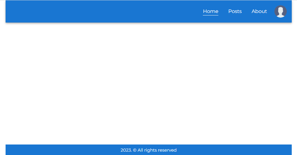
}Шапка сайта (components/Header.tsx):
import { AppBar } from '@mui/material'
import DesktopMenu from './Menu/Desktop'
import MobileMenu from './Menu/Mobile'

export type PageLinks = { title: string; href: string }[]

// наше приложение состоит из 3 страниц:
// Главной, Блога и Контактов
const PAGE_LINKS = [
  { title: 'Home', href: '/' },
  { title: 'Posts', href: '/posts' },
  { title: 'About', href: '/about' }
]

export default function Header() {
  return (
    <AppBar position='relative'>
      {/* в зависимости от ширины экрана рендерится либо десктопное меню, любо мобильное */}
      <DesktopMenu links={PAGE_LINKS} />
      <MobileMenu links={PAGE_LINKS} />
    </AppBar>
  )
}
Десктопное меню (components/Menu/Desktop.tsx):
import { List, ListItem } from '@mui/material'
import { useTheme } from '@mui/material/styles'
import ActiveLink from '../ActiveLink'
import ProfileButton from '../Buttons/Profile'
import type { PageLinks } from '../Header'

type Props = {
  links: PageLinks
}

export default function DesktopMenu({ links }: Props) {
  const theme = useTheme()

  return (
    <List
      sx={{
        // управляем видимостью элемента на основе ширины экрана
        display: { xs: 'none', sm: 'flex' },
        justifyContent: 'flex-end',
        paddingInline: theme.spacing(1)
      }}
    >
      {links.map((link, i) => (
        <ListItem key={i}>
          <ActiveLink href={link.href} activeClassName='current'>
            {link.title}
          </ActiveLink>
        </ListItem>
      ))}
      <ProfileButton />
    </List>
  )
}
Данный компонент представляет собой список ссылок и кнопку профиля.
Мобильное меню (components/Menu/Mobile.tsx):
import MenuIcon from '@mui/icons-material/Menu'
import { Box, Drawer, List, ListItem, ListItemButton } from '@mui/material'
import { useTheme } from '@mui/material/styles'
import { useState } from 'react'
import ActiveLink from '../ActiveLink'
import ProfileButton from '../Buttons/Profile'
import type { PageLinks } from '../Header'

type Props = {
  links: PageLinks
}

export default function MobileMenu({ links }: Props) {
  const theme = useTheme()
  // ссылка на якорь для меню
  const [anchorEl, setAnchorEl] = useState<HTMLElement | null>(null)
  // индикатор открытости меню
  const open = Boolean(anchorEl)

  // метод для открытия меню
  const openMenu = (e: React.MouseEvent<HTMLDivElement>) => {
    setAnchorEl(e.currentTarget)
  }

  // метод для закрытия меню
  const closeMenu = () => {
    setAnchorEl(null)
  }

  return (
    <Box
      // управляем видимостью элемента на основе ширины экрана
      sx={{ display: { xs: 'flex', sm: 'none' } }}
      alignItems='center'
      justifyContent='space-between'
    >
      <ListItemButton
        id='menu-button'
        sx={{ borderRadius: '50%', px: theme.spacing(1) }}
        aria-controls={open ? 'mobile-menu' : undefined}
        aria-haspopup='true'
        aria-expanded={open ? 'true' : undefined}
        onClick={openMenu}
      >
        <MenuIcon />
      </ListItemButton>
      <Drawer anchor='left' open={open} onClose={closeMenu} id='mobile-menu'>
        <List sx={{ minWidth: '128px' }}>
          {links.map((link, i) => (
            <ListItem
              onClick={closeMenu}
              key={i}
              sx={{ justifyContent: 'center' }}
            >
              <ActiveLink href={link.href} activeClassName='current'>
                {link.title}
              </ActiveLink>
            </ListItem>
          ))}
        </List>
      </Drawer>
      <ProfileButton />
    </Box>
  )
}
Данный компонент представляет собой боковую панель со списком ссылок (+ кнопка для открытия меню) и кнопку профиля. О ProfileButton мы поговорим в разделе про аутентификацию и авторизацию.
С вашего позволения, в дальнейшем мы не будет рассматривать каждый используемый компонент.
Результат:
Десктоп
Мобайл (меню закрыто)
Мобайл (меню открыто)
Генерация статического контента
Генерация статического контента (или статической страницы) (static-site generation, SSG) — это процесс, в результате которого сервер генерирует готовую к использованию разметку (HTML) на этапе сборки приложения. Готовность к использованию означает, что, во-первых, клиент мгновенно получает страницу в ответ на запрос, во-вторых, такие страницы хорошо индексируются поисковыми ботами (SEO).
Статический контент бывает 2 видов: с данными и без. Статика без данных — это просто разметка. Статика с данными — это разметка, для генерации которой используются данные, доступные на этапе сборки (данные могут храниться как локально, так и удаленно). Еще раз: страница генерируется на основе данных, актуальных на момент сборки. По общему правилу, это означает невозможность обновления страницы свежими данными без создания новой сборки. Next.js позволяет обойти это ограничение с помощью генерации статического контента с инкрементальной (частичной) регенерацией.
В нашем приложении статическими являются главная страница и страница контактов. Для генерации обеих этих страниц используются данные. Данные для главной страницы хранятся локально. Предполагается, что они обновляются между сборками. Данные для страницы контактов хранятся удаленно (на JSONBin.io). Предполагается, что они обновляются каждые 12 часов. Для обновления страницы контактов каждые 12 часов запускается процесс инкрементальной регенерации.
Главная страница
Главная страница (pages/index.tsx) состоит из слайдера и 4 информационных блоков и генерируется с помощью данных, которые находятся в файле public/data/home.json. Для передачи данных компоненту страницы используется функция getStaticProps, а для чтения данных — модуль Node.js fs:
import Animate, { SLIDE_DIRECTION } from '@/components/AnimateIn'
import CustomHead from '@/components/Head'
import Slider from '@/components/Slider'
import type { Blocks } from '@/types'
import { useUser } from '@/utils/swr'
import { Box, Grid } from '@mui/material'
import Typography from '@mui/material/Typography'
import type { GetStaticPropsContext, InferGetStaticPropsType } from 'next'
import Image from 'next/image'
// модули Node.js
import { readFile } from 'node:fs/promises'
import { join } from 'node:path'

// компонент статической страницы
export default function Home({
  data
}: InferGetStaticPropsType<typeof getStaticProps>) {
  // данные информационных блоков
  const { blocks } = data
  // об этом позже
  const { user } = useUser()

  return (
    <>
      <CustomHead title='Home Page' description='This is Home Page' />
      <Typography variant='h4' textAlign='center' py={2}>
        Welcome, {user ? user.username || user.email : 'stranger'}
      </Typography>
      {/* слайдер */}
      <Slider slides={blocks} />
      {/* информационные блоки */}
      <Box my={2}>
        {blocks.map((block, i) => (
          {/* самописная библиотека анимации */}
          <Animate.SlideIn
            key={block.id}
            direction={i % 2 ? SLIDE_DIRECTION.RIGHT : SLIDE_DIRECTION.LEFT}
          >
            <Grid container spacing={2} my={4}>
              {i % 2 ? (
                <>
                  <Grid item md={6}>
                    <Typography variant='h5'>{block.title}</Typography>
                    <Typography variant='body1' mt={2}>
                      {block.description}
                    </Typography>
                  </Grid>
                  <Grid item md={6}>
                    <Image
                      width={1024}
                      height={320}
                      src={block.imgSrc}
                      alt={block.imgAlt}
                      style={{
                        borderRadius: '6px'
                      }}
                    />
                  </Grid>
                </>
              ) : (
                <>
                  <Grid item md={6}>
                    <Image
                      width={1024}
                      height={320}
                      src={block.imgSrc}
                      alt={block.imgAlt}
                      style={{
                        borderRadius: '6px'
                      }}
                    />
                  </Grid>
                  <Grid item md={6}>
                    <Typography variant='h5'>{block.title}</Typography>
                    <Typography variant='body1' mt={2}>
                      {block.description}
                    </Typography>
                  </Grid>
                </>
              )}
            </Grid>
          </Animate.SlideIn>
        ))}
      </Box>
    </>
  )
}

// функция генерации статического контента с данными
export async function getStaticProps(ctx: GetStaticPropsContext) {
  let data = {
    blocks: [] as Blocks
  }

  // путь к данным
  const dataPath = join(process.cwd(), 'public/data/home.json')

  try {
    // читаем файл
    const dataJson = await readFile(dataPath, 'utf-8')
    if (dataJson) {
      // преобразуем данные из строки JSON в объект JS
      data = JSON.parse(dataJson)
    }
  } catch (e) {
    console.error(e)
  }

  // передаем данные компоненту страницы в виде пропа
  return {
    props: {
      data
    }
  }
}
Результат:

Страница контактов
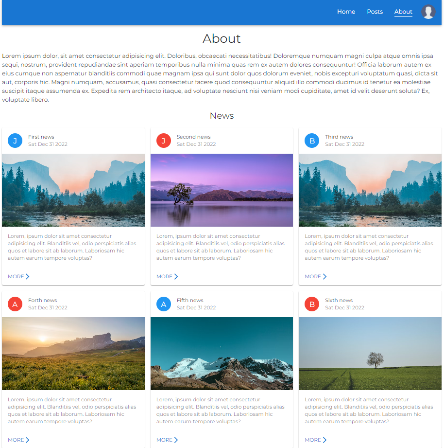
Страница контактов (pages/about.tsx) состоит из блока с приветствием и 6 новостных блоков и генерируется на основе данных, хранящихся на JSONBin.io. Для получения данных используется fetch. У каждой новости имеется собственная страница (pages/news/[id].tsx). Для передачи данных компоненту страницы контактов используется функция getStaticProps. А для передачи данных странице новости — функции getStaticProps и getStaticPaths. getStaticPaths сообщает Next.js о том, сколько у нас новостей, т.е. сколько новостных страниц необходимо сгенерировать на этапе сборки приложения.
Начнем со страницы контактов (pages/about.tsx):
import Animate from '@/components/AnimateIn'
import CustomHead from '@/components/Head'
import NewsPreview from '@/components/NewsPreview'
import type { NewsArr } from '@/types'
import { Grid, Typography } from '@mui/material'
import type { GetStaticPropsContext, InferGetStaticPropsType } from 'next'

// компонент статической страницы
export default function About({
  data
}: InferGetStaticPropsType<typeof getStaticProps>) {
  // данные новостных блоков
  const { news } = data

  return (
    <>
      <CustomHead title='About Page' description='This is About Page' />
      <Typography variant='h4' textAlign='center' py={2}>
        About
      </Typography>
      {/* блок с приветствием */}
      <Typography variant='body1'>
        Lorem ipsum dolor, sit amet consectetur adipisicing elit. Doloribus,
        obcaecati necessitatibus! Doloremque numquam magni culpa atque omnis
        ipsa sequi, nostrum, provident repudiandae sint aperiam temporibus nulla
        minima quas rem ex autem dolores consequuntur! Officia laborum autem ex
        eius cumque non aspernatur blanditiis commodi quae magnam ipsa qui sunt
        dolor quos dolorum eveniet, nobis excepturi voluptatum quasi, dicta sit
        aut, corporis hic. Magni numquam, accusamus, quasi consectetur facere
        quod consequuntur aliquid illo commodi ducimus id tenetur ea molestiae
        suscipit itaque assumenda ex. Expedita rem architecto itaque, ad
        voluptate nesciunt nisi veniam modi cupiditate, amet id velit deserunt
        soluta? Ex, voluptate libero.
      </Typography>
      <Typography variant='h5' textAlign='center' py={2}>
        News
      </Typography>
      {/* новостные блоки */}
      {/* превью новости содержит ссылку на соответствующую страницу */}
      <Grid container spacing={2} pb={2}>
        {news.map((n) => (
          <Grid item md={6} lg={4} key={n.id}>
            <Animate.FadeIn>
              <NewsPreview news={n} />
            </Animate.FadeIn>
          </Grid>
        ))}
      </Grid>
    </>
  )
}

// функция генерации статического контента с данными
export async function getStaticProps(ctx: GetStaticPropsContext) {
  let data = {
    news: [] as NewsArr
  }

  try {
    const response = await fetch(
      `https://api.jsonbin.io/v3/b/${process.env.JSONBIN_BIN_ID}?meta=false`,
      {
        headers: {
          'X-Master-Key': process.env.JSONBIN_X_MASTER_KEY
        }
      }
    )
    if (!response.ok) {
      throw response
    }
    data = await response.json()
  } catch (e) {
    console.error(e)
  }

  return {
    props: {
      data
    },
    // данная настройка включает инкрементальную регенерацию
    // значением является время в секундах - 12 часов
    revalidate: 60 * 60 * 12
  }
}
Благодаря настройке revalidate страница генерируется на этапе сборки и обновляется каждые 12 часов. Это означает следующее:
- Ответ на любой запрос к странице контактов до истечения 12 часов мгновенно возвращается (доставляется) из кэша;
- по истечении 12 часов следующий запрос также получает в ответ кэшированную версию страницы;
- после этого в фоновом режиме запускается процесс регенерации страницы (вызывается
getStaticProps()и формируется новая разметка); - после успешной регенерации кэш инвалидируется и отображается новая страница. При провале регенерации старая страница остается неизменной.
Страница новости (pages/news/[id].tsx):
import CustomHead from '@/components/Head'
import type { News, NewsArr } from '@/types'
import ArrowBackIosNewIcon from '@mui/icons-material/ArrowBackIosNew'
import {
  Avatar,
  Box,
  Button,
  Card,
  CardContent,
  CardHeader,
  CardMedia,
  Typography
} from '@mui/material'
import { blue, red } from '@mui/material/colors'
import type {
  GetStaticPathsContext,
  GetStaticPropsContext,
  InferGetStaticPropsType
} from 'next'
import Link from 'next/link'

// компонент статической страницы
export default function ArticlePage({
  news
}: InferGetStaticPropsType<typeof getStaticProps>) {
  return (
    <>
      <CustomHead title={news.title} description={news.text.slice(0, 10)} />
      <Box py={2}>
        <Card>
          <CardHeader
            avatar={
              <Avatar
                sx={{ bgcolor: news.id % 2 === 0 ? red[500] : blue[500] }}
                aria-label='author avatar'
              >
                {news.author.slice(0, 1)}
              </Avatar>
            }
            action={
              <Link href='/about'>
                <Button aria-label='return to about page'>
                  <ArrowBackIosNewIcon fontSize='small' />
                  <Typography variant='body2'>Back</Typography>
                </Button>
              </Link>
            }
            title={news.title}
            subheader={new Date(news.datePublished).toDateString()}
          />
          <CardMedia
            component='img'
            height='300'
            image={news.imgSrc}
            alt={news.imgAlt}
          />
          <CardContent>
            <Typography variant='body1'>{news.text}</Typography>
          </CardContent>
        </Card>
      </Box>
    </>
  )
}

// функция генерации путей статических страниц
export async function getStaticPaths(ctx: GetStaticPathsContext) {
  let data = {
    news: [] as NewsArr
  }

  try {
    // здесь нас интересуют данные всех новостей
    const response = await fetch(
      `https://api.jsonbin.io/v3/b/${process.env.JSONBIN_BIN_ID}?meta=false`,
      {
        headers: {
          'X-Master-Key': process.env.JSONBIN_X_MASTER_KEY
        }
      }
    )
    if (!response.ok) {
      throw response
    }
    data = await response.json()
  } catch (e) {
    console.error(e)
  }

  // пути страниц
  const paths = data.news.map((n) => ({
    params: { id: String(n.id) }
  }))

  // Во время сборки будут предварительно отрендерены только страницы с указанными путями
  // `{ fallback: 'blocking' }` означает, что Next.js попытается
  // отрендерить страницу по отсутствующему пути на сервере
  return {
    paths,
    fallback: 'blocking'
  }
}

export async function getStaticProps({
  params
}: GetStaticPropsContext<{ id: string }>) {
  let news = {} as News

  try {
    // здесь нас интересуют данные только одной новости
    const response = await fetch(
      `https://api.jsonbin.io/v3/b/${process.env.JSONBIN_BIN_ID}?meta=false`,
      {
        headers: {
          'X-Master-Key': process.env.JSONBIN_X_MASTER_KEY,
          'X-JSON-Path': `news[${Number(params?.id) - 1}]`
        }
      }
    )
    if (!response.ok) {
      throw response
    }
    const data = await response.json()
    news = data[0]
    // важно!
    // если данные новости с указанным id отсутствуют,
    // рендерим страницу 404
    if (!news) {
      return {
        notFound: true
      }
    }
  } catch (e) {
    console.error(e)
  }

  return {
    props: {
      news
    },
    // инкрементальная регенерация
    revalidate: 60 * 60 * 12
  }
}
Результат:
Страница контактов
Страница новости

Аутентификация, авторизация и загрузка файлов
При запуске приложение запрашивает у сервера данные пользователя. Это единственные данные, за изменением которых «наблюдает» приложение. Запрос данных пользователя реализован с помощью SWR. SWR позволяет кэшировать данные и мутировать их при необходимости, например, после регистрации пользователя. Благодаря SWR мы можем обойтись без инструмента для управления состоянием приложения (state manager).
Определяем абстракцию над SWR для получения данных пользователя в файле utils/swr.ts:
import type { User } from '@prisma/client'
import useSWRImmutable from 'swr/immutable'

async function fetcher<T>(
  input: RequestInfo | URL,
  init?: RequestInit | undefined
): Promise<T> {
  return fetch(input, init).then((res) => res.json())
}

// запрос на получение данных пользователя выполняется один раз
export function useUser() {
  // утилита возвращает данные пользователя и токен доступа, ошибку и
  // функцию инвалидации кэша (метод для мутирования данных, хранящихся в кэше)
  const { data, error, mutate } = useSWRImmutable<any>(
    '/api/auth/user',
    (url) => fetcher(url, { credentials: 'include' }),
    {
      onErrorRetry(err, key, config, revalidate, revalidateOpts) {
        return false
      }
    }
  )

  // `error` - обычная ошибка (необработанное исключение)
  // `data.message` - сообщение о кастомной ошибке, например:
  // res.status(404).json({ message: 'User not found' })
  if (error || data?.message) {
    console.log(error || data?.message)

    return {
      user: undefined,
      accessToken: undefined,
      mutate
    }
  }

  return {
    user: data?.user as User,
    accessToken: data?.accessToken as string,
    mutate
  }
}
Аутентификация и авторизация
В шапке сайте имеется кнопка профиля (ProfileButton):
import { useUser } from '@/utils/swr'
import { Avatar, ListItemButton } from '@mui/material'
import { useTheme } from '@mui/material/styles'
import AuthTabs from '../AuthTabs'
import Modal from '../Modal'
import UserPanel from '../UserPanel'

export default function ProfileButton() {
  // запрашиваем данные пользователя
  const { user } = useUser()
  const theme = useTheme()

  // содержимое модального окна зависит от наличия данных пользователя
  const modalContent = user ? <UserPanel /> : <AuthTabs />

  return (
    <Modal
      // компонент, взаимодействие с которым приводит к открытию модального окна
      triggerComponent={
        <ListItemButton sx={{ borderRadius: '50%', px: theme.spacing(1) }}>
          <Avatar
            // источником аватара является либо файл, загруженный пользователей, либо дефолтное изображение
            src={user && user.avatarUrl ? user.avatarUrl : '/img/user.png'}
          />
        </ListItemButton>
      }
      modalContent={modalContent}
    />
  )
}
Функционал регистрации, авторизации, загрузки аватаров и выхода из системы инкапсулирован в модальном окне (components/Modal.tsx):
import CloseIcon from '@mui/icons-material/Close'
import { Box, IconButton, Modal as MuiModal } from '@mui/material'
import { cloneElement, useMemo, useState } from 'react'

type Props = {
  triggerComponent: JSX.Element
  modalContent: JSX.Element
  size?: 'S' | 'M'
}

export default function Modal({
  triggerComponent,
  modalContent,
  size = 'S'
}: Props) {
  // состояние открытости модалки
  const [open, setOpen] = useState(false)

  // метод для открытия модалки
  const handleOpen = () => setOpen(true)
  // метод для закрытия модалки
  const handleClose = () => setOpen(false)

  // содержимому модалки в качестве пропа передается метод для закрытия модалки
  const content = cloneElement(modalContent, { closeModal: handleClose })

  const modalStyles = useMemo(
    () => ({
      bgcolor: 'background.paper',
      borderRadius: 1,
      boxShadow: 24,
      left: '50%',
      maxWidth: size === 'S' ? 425 : 576,
      p: 2,
      position: 'absolute' as 'absolute',
      top: '50%',
      transform: 'translate(-50%, -50%)',
      width: '100%',
      outline: 'none'
    }),
    [size]
  )

  return (
    <>
      <Box onClick={handleOpen}>{triggerComponent}</Box>
      <MuiModal open={open} onClose={handleClose}>
        <Box sx={modalStyles}>
          <IconButton
            sx={{
              position: 'absolute',
              top: '1rem',
              right: '1rem'
            }}
            onClick={handleClose}
          >
            <CloseIcon />
          </IconButton>
          {content}
        </Box>
      </MuiModal>
    </>
  )
}
При отсутствии данных пользователя содержимым модалки являются вкладки аутентификации (components/AuthTabs.tsx):
import storageLocal from '@/utils/storageLocal'
import { Box, Tab, Tabs } from '@mui/material'
import { useEffect, useState } from 'react'
import LoginForm from './Forms/Login'
import RegisterForm from './Forms/Register'

type TabPanelProps = {
  children?: React.ReactNode
  index: number
  value: number
}

function TabPanel({ children, value, index, ...otherProps }: TabPanelProps) {
  return (
    <Box
      aria-labelledby={`auth-tab-${index}`}
      display={value === index ? 'block' : 'none'}
      hidden={value !== index}
      id={`auth-tabpanel-${index}`}
      role='tabpanel'
      {...otherProps}
    >
      {value === index && children}
    </Box>
  )
}

function a11yProps(index: number) {
  return {
    id: `auth-tab-${index}`,
    'aria-controls': `auth-tabpanel-${index}`
  }
}

type Props = { closeModal?: () => void }

export default function AuthTabs({ closeModal }: Props) {
  // состояние индекса открытой вкладки
  const [tabIndex, setTabIndex] = useState(0)
  // состояние индикатора загрузки
  const [loading, setLoading] = useState(true)

  // метод для переключения вкладок
  const handleChange = (event: React.SyntheticEvent, value: number) => {
    setTabIndex(value)
  }

  // после регистрации мы не только записываем данные пользователя в БД,
  // но также фиксируем факт регистрации в локальном хранилище
  // если пользователь зарегистрирован, мы показываем ему вкладку авторизации,
  // если нет - вкладку регистрации
  useEffect(() => {
    if (storageLocal.get('user_has_been_registered')) {
      setTabIndex(1)
    }
    setLoading(false)
  }, [])

  if (loading) return null

  return (
    <>
      <Box display='flex'>
        <Tabs
          value={tabIndex}
          onChange={handleChange}
          aria-label='auth tabs'
        >
          <Tab label='Register' {...a11yProps(0)} />
          <Tab label='Login' {...a11yProps(1)} />
        </Tabs>
      </Box>
      <TabPanel value={tabIndex} index={0}>
        <RegisterForm closeModal={closeModal} />
      </TabPanel>
      <TabPanel value={tabIndex} index={1}>
        <LoginForm closeModal={closeModal} />
      </TabPanel>
    </>
  )
}
Форма регистрации (components/Forms/Register.tsx):
import type { UserResponseData } from '@/types'
import storageLocal from '@/utils/storageLocal'
import { useUser } from '@/utils/swr'
import MailOutlineIcon from '@mui/icons-material/MailOutline'
import PersonOutlineIcon from '@mui/icons-material/PersonOutline'
import VpnKeyIcon from '@mui/icons-material/VpnKey'
import {
Button,
FormControl,
FormHelperText,
Input,
InputLabel,
Typography
} from '@mui/material'
import { useTheme } from '@mui/material/styles'
import type { User } from '@prisma/client'
import { useRouter } from 'next/router'
import { useState } from 'react'
import FormFieldsWrapper from './Wrapper'
type Props = {
closeModal?: () => void
}
export default function RegisterForm({ closeModal }: Props) {
const theme = useTheme()
const router = useRouter()
// метод для мутирования данных пользователя
const { mutate } = useUser()
// состояние ошибок
const [errors, setErrors] = useState<{
email?: boolean
password?: boolean
passwordConfirm?: boolean
}>({})
// обработчик отправки формы
const handleSubmit: React.FormEventHandler<HTMLFormElement> = async (e) => {
e.preventDefault()
// данные пользователя в виде объета
const formData = Object.fromEntries(
new FormData(e.target as HTMLFormElement)
) as unknown as Pick<User, 'username' | 'email' | 'password'> & {
passwordConfirm?: string
}
// валидация формы
const _errors: typeof errors = {}
if (formData.password.length < 6) {
_errors.password = true
}
if (formData.password !== formData.passwordConfirm) {
_errors.passwordConfirm = true
}
// если имеются ошибки
if (Object.keys(_errors).length) {
return setErrors({ ..._errors })
}
// удаляем лишние данные
delete formData.passwordConfirm
try {
// отправляем данные на сервер
const res = await fetch('/api/auth/register', {
method: 'POST',
body: JSON.stringify(formData)
})
// если ответ имеет статус-код 409,
// значит, пользователь уже зарегистрирован
if (res.status === 409) {
return setErrors({ email: true })
} else if (!res.ok) {
throw res
}
// извлекаем данные пользователя и токен доступа из ответа
const data = await res.json() as UserResponseData
// инвалидируем кэш
mutate(data)
// фиксируем факт регистрации пользователя в локальном хранилище
storageLocal.set('user_has_been_registered', true)
// закрываем модалку
if (closeModal) {
closeModal()
}
// перенаправляем пользователя на главную страницу
if (router.pathname !== '/') {
router.push('/')
}
} catch (e) {
console.error(e)
}
}
// обработчик ввода
const handleInput: React.FormEventHandler<HTMLFormElement> = () => {
// сбрасываем ошибки при наличии
if (Object.keys(errors).length) {
setErrors({})
}
}
return (
<FormFieldsWrapper handleSubmit={handleSubmit} handleInput={handleInput}>
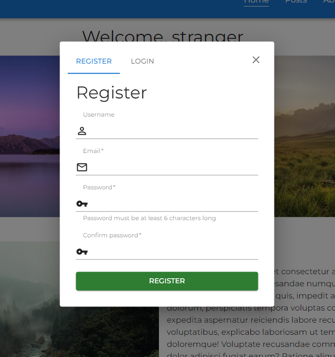
<Typography variant='h4'>Register</Typography>
<FormControl required>
<InputLabel htmlFor='username'>Username</InputLabel>
<Input
sx={{ gap: theme.spacing(1) }}
id='username'
name='username'
startAdornment={<PersonOutlineIcon />}
/>
</FormControl>
<FormControl required error={errors.email}>
<InputLabel htmlFor='email'>Email</InputLabel>
<Input
sx={{ gap: theme.spacing(1) }}
id='email'
type='email'
name='email'
startAdornment={<MailOutlineIcon />}
/>
{errors.email && <FormHelperText>Email already in use</FormHelperText>}
</FormControl>
<FormControl required error={errors.password}>
<InputLabel htmlFor='password'>Password</InputLabel>
<Input
sx={{ gap: theme.spacing(1) }}
id='password'
type='password'
name='password'
startAdornment={<VpnKeyIcon />}
/>
<FormHelperText>
Password must be at least 6 characters long
</FormHelperText>
</FormControl>
<FormControl required error={errors.passwordConfirm}>
<InputLabel htmlFor='password-confirm'>Confirm password</InputLabel>
<Input
sx={{ gap: theme.spacing(1) }}
id='password-confirm'
type='password'
name='passwordConfirm'
startAdornment={<VpnKeyIcon />}
/>
{errors?.passwordConfirm && (
<FormHelperText>Passwords must be the same</FormHelperText>
)}
</FormControl>
<Button type='submit' variant='contained' color='success'>
Register
</Button>
</FormFieldsWrapper>
)
}Форма авторизации почти идентична форме регистрации.
Результат:
Форма регистрации
Форма авторизации

Пользовательская панель
При наличии данных пользователя содержимым модалки, которая рендерится при нажатии кнопки профиля, является пользовательская панель (components/UserPanel.tsx), содержащая форму для загрузки аватара и кнопку для выхода пользователя из системы:
import { Divider } from '@mui/material'
import LogoutButton from './Buttons/Logout'
import UploadForm from './Forms/Upload'

type Props = {
  closeModal?: () => void
}

export default function UserPanel({ closeModal }: Props) {
  return (
    <>
      <UploadForm closeModal={closeModal} />
      <Divider />
      <LogoutButton closeModal={closeModal} />
    </>
  )
}
Форма загрузки аватара (components/Forms/Upload.tsx):
import { useUser } from '@/utils/swr'
import { Avatar, Box, Button, Typography } from '@mui/material'
import { useRef, useState } from 'react'
import FormFieldsWrapper from './Wrapper'

type Props = {
  closeModal?: () => void
}

export default function UploadForm({ closeModal }: Props) {
  // ссылка на элемент для превью загруженного файла
  const previewRef = useRef<HTMLImageElement | null>(null)
  // состояние файла
  const [file, setFile] = useState<File>()
  const { user, accessToken, mutate } = useUser()

  if (!user) return null

  // обработчик отправки формы
  const handleSubmit: React.FormEventHandler<HTMLFormElement> = async (e) => {
    if (!file) return

    e.preventDefault()

    const formData = new FormData()

    // создаем экземпляр `File`, названием которого является id пользователя + расширение файла
    const _file = new File([file], `${user.id}.${file.type.split('/')[1]}`, {
      type: file.type
    })
    formData.append('avatar', _file)

    try {
      // отправляем файл на сервер
      const res = await fetch('/api/upload', {
        method: 'POST',
        body: formData,
        headers: {
          // роут для загрузки аватара является защищенным
          Authorization: `Bearer ${accessToken}`
        }
      })

      if (!res.ok) {
        throw res
      }

      // извлекаем обновленные данные пользователя
      const user = await res.json()
      // инвалидируем кэш
      mutate({ user })

      // закрываем модалку
      if (closeModal) {
        closeModal()
      }
    } catch (e) {
      console.error(e)
    }
  }

  // обработчик изменения состояния инпута для загрузки файла
  const handleChange: React.ChangeEventHandler<HTMLInputElement> = (e) => {
    if (e.target.files && previewRef.current) {
      // извлекаем файл
      const _file = e.target.files[0]
      // обновляем состояние
      setFile(_file)
      // получаем ссылку на элемент `img`
      const img = previewRef.current.children[0] as HTMLImageElement
      // формируем и устанавливаем источник изображения
      img.src = URL.createObjectURL(_file)
      img.onload = () => {
        // очищаем память
        URL.revokeObjectURL(img.src)
      }
    }
  }

  return (
    <FormFieldsWrapper handleSubmit={handleSubmit}>
      <Typography variant='h4'>Avatar</Typography>
      <Box display='flex' alignItems='center' gap={2}>
        <input
          accept='image/*'
          style={{ display: 'none' }}
          id='avatar'
          name='avatar'
          type='file'
          onChange={handleChange}
        />
        <label htmlFor='avatar'>
          <Button component='span'>Choose file</Button>
        </label>
        <Avatar alt='preview' ref={previewRef} src='/img/user.png' />
        <Button
          type='submit'
          variant='contained'
          color='success'
          disabled={!file}
        >
          Upload
        </Button>
      </Box>
    </FormFieldsWrapper>
  )
}
Кнопка для выхода из системы (components/Buttons/Logout.tsx):
import { useUser } from '@/utils/swr'
import { Box, Button } from '@mui/material'

type Props = {
  closeModal?: () => void
}

export default function LogoutButton({ closeModal }: Props) {
  const { accessToken, mutate } = useUser()

  // обработчик нажатия кнопки
  const onClick = async () => {
    try {
      // сообщаем серверу о выходе пользователя из системы
      const response = await fetch('/api/auth/logout', {
        headers: {
          // роут является защищенным
          Authorization: `Bearer ${accessToken}`
        }
      })

      if (!response.ok) {
        throw response
      }

      // инвалидируем кэш
      mutate({ user: undefined, accessToken: undefined })

      // закрываем модалку
      if (closeModal) {
        closeModal()
      }
    } catch (e) {
      console.error(e)
    }
  }

  return (
    <Box display='flex' justifyContent='flex-end' pt={2} pr={2}>
      <Button color='error' variant='contained' onClick={onClick}>
        Logout
      </Button>
    </Box>
  )
}
Результат:
Без превью

С превью
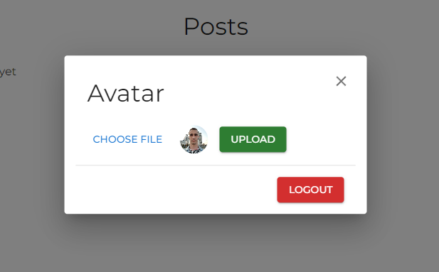
После загрузки аватар пользователя отображается в шапке сайте на месте кнопки профиля.
Создание, обновление, удаление и лайк постов
Для генерации страницы блога и страниц постов используется рендеринг на стороне сервера с помощью функции getServerSideProps. Данная функция позволяет выполнять серверный код и вызывается при каждом запросе страницы.
На странице блога (pages/posts/index.tsx) рендерится кнопка для создания нового поста и список постов (при наличии):
import Animate from '@/components/AnimateIn'
import CreatePostButton from '@/components/Buttons/CreatePost'
import CustomHead from '@/components/Head'
import PostPreview from '@/components/PostPreview'
import prisma from '@/utils/prisma'
import { Divider, Grid, Typography } from '@mui/material'
import type {
  GetServerSidePropsContext,
  InferGetServerSidePropsType
} from 'next'

// компонент динамической страницы
export default function Posts({
  posts
}: InferGetServerSidePropsType<typeof getServerSideProps>) {
  return (
    <>
      <CustomHead title='Blog Page' description='This is Blog Page' />
      {/* кнопка для создания поста */}
      <CreatePostButton />
      <Divider />
      <Typography variant='h4' textAlign='center' py={2}>
        Posts
      </Typography>
      {/* список постов или сообщение об их отсутствии */}
      {posts.length ? (
        <Grid container spacing={2} pb={2}>
          {posts.map((post) => (
            <Grid item md={6} lg={4} key={post.id}>
              <Animate.FadeIn>
                <PostPreview post={post} />
              </Animate.FadeIn>
            </Grid>
          ))}
        </Grid>
      ) : (
        <Typography mt={2}>There are no posts yet</Typography>
      )}
    </>
  )
}

// функция серверного рендеринга
export async function getServerSideProps(ctx: GetServerSidePropsContext) {
  try {
    // получаем все посты из БД
    const posts = await prisma.post.findMany({
      select: {
        id: true,
        title: true,
        content: true,
        author: true,
        authorId: true,
        likes: true,
        createdAt: true
      }
    })
    return {
      props: {
        posts: posts.map((post) => ({
          ...post,
          // предотвращаем ошибку, связанную с несериализуеомстью объекта `Date`
          createdAt: new Date(post.createdAt).toLocaleDateString()
        }))
      }
    }
  } catch (e) {
    console.log(e)
    return {
      props: {
        posts: []
      }
    }
  }
}
Кнопка создания поста (components/Button/CreatePost.tsx):
import { useUser } from '@/utils/swr'
import { Button } from '@mui/material'
import { toast } from 'react-toastify'
import CreatePostForm from '../Forms/CreatePost'
import Modal from '../Modal'

// при наличии данных пользователя рендерится модалка с формой для создания поста
// при отсутствии данных пользователя рендерится уведомление о необходимости авторизации
export default function CreatePostButton() {
  const { user } = useUser()

  const onClick = () => {
    toast('Authorization required', {
      type: 'warning'
    })
  }

  return user ? (
    <Modal
      triggerComponent={
        <Button variant='contained' sx={{ my: 2 }}>
          Create new post
        </Button>
      }
      modalContent={<CreatePostForm />}
      size='M'
    />
  ) : (
    <Button variant='contained' sx={{ my: 2 }} onClick={onClick}>
      Create new post
    </Button>
  )
}
Форма создания поста (components/Forms/CreatePost.tsx):
import { useUser } from '@/utils/swr'
import { CssVarsProvider } from '@mui/joy/styles'
import Textarea from '@mui/joy/Textarea'
import {
  Box,
  Button,
  FormControl,
  FormHelperText,
  Input,
  InputLabel,
  Typography
} from '@mui/material'
import { red } from '@mui/material/colors'
import { useTheme } from '@mui/material/styles'
import type { Post } from '@prisma/client'
import { useRouter } from 'next/router'
import { useState } from 'react'
import FormFieldsWrapper from './Wrapper'

type Props = {
  closeModal?: () => void
}

export default function CreatePostForm({ closeModal }: Props) {
  const theme = useTheme()
  const { user, accessToken } = useUser()
  const router = useRouter()

  // состояние ошибок
  const [errors, setErrors] = useState<{
    content?: number
  }>({})

  if (!user) return null

  // обработка отправки формы
  const handleSubmit: React.FormEventHandler<HTMLFormElement> = async (e) => {
    if (!user) return
    e.preventDefault()
    // данные поста в виде объекта
    const formData = Object.fromEntries(
      new FormData(e.target as HTMLFormElement)
    ) as unknown as Pick<Post, 'title' | 'content'>

    // валидация формы
    if (formData.content.length < 50) {
      return setErrors({ content: formData.content.length })
    }

    try {
      // отправляем данные поста на сервер
      const response = await fetch('/api/post', {
        method: 'POST',
        body: JSON.stringify(formData),
        headers: {
          // роут является защищенным
          Authorization: `Bearer ${accessToken}`
        }
      })

      if (!response.ok) {
        throw response
      }

      // извлекаем данные поста из ответа
      const post = await response.json()

      // выполняем перенаправление на страницу поста
      router.push(`/posts/${post.id}`)

      // закрываем модалку
      if (closeModal) {
        closeModal()
      }
    } catch (e) {
      console.error(e)
    }
  }

  // обработчик ввода
  const onInput = () => {
    if (Object.keys(errors).length) {
      setErrors({ content: undefined })
    }
  }

  return (
    <FormFieldsWrapper handleSubmit={handleSubmit}>
      <Typography variant='h4'>Create post</Typography>
      <FormControl required>
        <InputLabel htmlFor='title'>Title</InputLabel>
        <Input
          sx={{ gap: theme.spacing(1) }}
          id='title'
          type='text'
          name='title'
          inputProps={{
            minLength: 3
          }}
        />
      </FormControl>
      <Box>
        <InputLabel>
          Content * <Typography variant='body2'>(50 symbols min)</Typography>
          <CssVarsProvider>
            <Textarea
              name='content'
              required
              minRows={5}
              sx={{ mt: 1 }}
              onInput={onInput}
              defaultValue='Lorem ipsum dolor sit amet consectetur adipisicing elit. Soluta sed dicta eos ratione dolores doloribus magni repellendus aliquid sit dolor harum nemo porro voluptate incidunt quidem, molestias quia cum sequi minima debitis quae magnam est eius quas! Similique, enim non ad facilis dolores nulla corrupti assumenda, harum, ipsa consequuntur pariatur!'
            />
          </CssVarsProvider>
        </InputLabel>
        {errors.content && (
          <FormHelperText sx={{ color: red[500] }}>
            {50 - errors.content} symbols left
          </FormHelperText>
        )}
      </Box>
      <Button type='submit' variant='contained' color='success'>
        Create
      </Button>
    </FormFieldsWrapper>
  )
}
Страница поста (pages/posts/[id].tsx):
import EditPostButton from '@/components/Buttons/EditPost'
import LikePostButton from '@/components/Buttons/LikePost'
import RemovePostButton from '@/components/Buttons/RemovePost'
import CustomHead from '@/components/Head'
import prisma from '@/utils/prisma'
import { useUser } from '@/utils/swr'
import ArrowBackIosNewIcon from '@mui/icons-material/ArrowBackIosNew'
import {
  Avatar,
  Box,
  Button,
  Card,
  CardActions,
  CardContent,
  CardHeader,
  CardMedia,
  Typography
} from '@mui/material'
import type {
  GetServerSidePropsContext,
  InferGetServerSidePropsType
} from 'next'
import Link from 'next/link'

// компонент динамической страницы
export default function PostPage({
  post
}: InferGetServerSidePropsType<typeof getServerSideProps>) {
  const { user } = useUser()
  // определяем принадлежность поста пользователю
  const isPostBelongsToUser = user && user.id === post.authorId

  return (
    <>
      <CustomHead title={post.title} description={post.content.slice(0, 10)} />
      <Box py={2}>
        <Card>
          <CardHeader
            avatar={<Avatar src={post.author.avatarUrl || '/img/user.png'} />}
            action={
              <Link href='/posts'>
                <Button aria-label='return to about page'>
                  <ArrowBackIosNewIcon fontSize='small' />
                  <Typography variant='body2'>Back</Typography>
                </Button>
              </Link>
            }
            title={post.title}
            subheader={post.createdAt}
          />
          <CardMedia
            component='img'
            height='200'
            // у нет роута для загрузки изображений поста
            image='https://images.unsplash.com/photo-1486312338219-ce68d2c6f44d?ixlib=rb-4.0.3&ixid=MnwxMjA3fDB8MHxwaG90by1wYWdlfHx8fGVufDB8fHx8&auto=format&fit=crop&w=1172&q=80'
            alt=''
          />
          <CardContent>
            <Typography variant='body1'>{post.content}</Typography>
          </CardContent>
          {/* лайкать посты могут только авторизованные пользователи */}
          <CardActions>
            <Box display='flex' justifyContent='flex-end' gap={2} width='100%'>
              <LikePostButton post={post} />
              {/* редактировать и удалять посты могут только создавшие их пользователи */}
              {isPostBelongsToUser && (
                <>
                  <EditPostButton post={post} icon={false} />
                  <RemovePostButton
                    postId={post.id}
                    authorId={post.authorId}
                    icon={false}
                  />
                </>
              )}
            </Box>
          </CardActions>
        </Card>
      </Box>
    </>
  )
}

// функция серверного рендеринга
export async function getServerSideProps({
  params
}: GetServerSidePropsContext<{ id: string }>) {
  try {
    // получаем данные поста по id
    const post = await prisma.post.findUnique({
      where: {
        id: params?.id
      },
      select: {
        id: true,
        title: true,
        content: true,
        author: true,
        authorId: true,
        likes: true,
        createdAt: true
      }
    })
    // если данные поста отсутствуют,
    // возвращаем страницу 404
    if (!post) {
      return {
        notFound: true
      }
    }
    return {
      props: {
        post: {
          ...post,
          // предотвращаем ошибку, связанную с несериализуемостью объекта `Date`
          createdAt: new Date(post.createdAt).toLocaleDateString()
        }
      }
    }
  } catch (e) {
    console.error(e)
  }
}
Кнопка лайка поста (components/Buttons/LikePost.tsx):
import { useUser } from '@/utils/swr'
import FavoriteIcon from '@mui/icons-material/Favorite'
import FavoriteBorderIcon from '@mui/icons-material/FavoriteBorder'
import { Badge, IconButton } from '@mui/material'
import type { Like, Post } from '@prisma/client'
import { useRouter } from 'next/router'

type Props = {
  post: Omit<Post, 'createdAt' | 'updatedAt'> & {
    likes: Like[]
    createdAt: string
  }
}

export default function LikePostButton({ post }: Props) {
  const router = useRouter()
  const { user, accessToken } = useUser()
  if (!user) return null
  // определяем, лайкал ли пользователь этот пост
  const like = post.likes.find((l) => l.userId === user.id)
  const isLiked = Boolean(like)

  // если пользователь лайкал пост, удаляем лайк
  // если нет, создаем лайк
  // оба роута являются защищенными
  const likePost = async () => {
    let res: Response
    try {
      if (isLiked) {
        res = await fetch(`/api/like?likeId=${like?.id}&postId=${post.id}`, {
          method: 'DELETE',
          headers: {
            Authorization: `Bearer ${accessToken}`
          }
        })
      } else {
        res = await fetch('/api/like', {
          method: 'POST',
          body: JSON.stringify({ postId: post.id }),
          headers: {
            Authorization: `Bearer ${accessToken}`
          }
        })
      }
      if (!res.ok) throw res
      // перезагружаем страницу для повторного вызова `getServerSideProps`
      router.push(router.asPath)
    } catch (e) {
      console.log(e)
    }
  }

  return (
    <Badge
      badgeContent={post.likes.length}
      color='error'
      anchorOrigin={{
        vertical: 'top',
        horizontal: 'left'
      }}
    >
      <IconButton onClick={likePost}>
        {isLiked ? <FavoriteIcon color='error' /> : <FavoriteBorderIcon />}
      </IconButton>
    </Badge>
  )
}
Кнопка удаления поста (components/Buttons/RemovePost.tsx):
import { useUser } from '@/utils/swr'
import DeleteOutlineIcon from '@mui/icons-material/DeleteOutline'
import { Button, IconButton } from '@mui/material'
import { useRouter } from 'next/router'

type Props = {
  postId: string
  authorId: string
  icon?: boolean
}

export default function RemovePostButton({
  postId,
  authorId,
  icon = true
}: Props) {
  const router = useRouter()
  const { user, accessToken } = useUser()

  // проверяем наличие пользователя и его полномочия на удаление поста
  if (!user || user.id !== authorId) return null

  const removePost = async () => {
    try {
      // сообщаем серверу о необходимости удаления поста
      await fetch(`/api/post?id=${postId}`, {
        method: 'DELETE',
        headers: {
          // роут является защищенным
          Authorization: `Bearer ${accessToken}`
        }
      })
      // выполняем перенаправление на страницу блога
      router.push('/posts')
    } catch (e: unknown) {
      console.error(e)
    }
  }

  return icon ? (
    <IconButton onClick={removePost} color='error'>
      <DeleteOutlineIcon />
    </IconButton>
  ) : (
    <Button variant='contained' color='error' onClick={removePost}>
      Remove
    </Button>
  )
}
Кнопка редактирования поста (components/Buttons/EditPost.tsx):
import { useUser } from '@/utils/swr'
import DriveFileRenameOutlineIcon from '@mui/icons-material/DriveFileRenameOutline'
import { Button, IconButton } from '@mui/material'
import type { Post } from '@prisma/client'
import EditPostForm from '../Forms/EditPost'
import Modal from '../Modal'

type Props = {
  post: Omit<Post, 'createdAt' | 'updatedAt'> & {
    createdAt: string
  }
  icon?: boolean
}

export default function EditPostButton({ post, icon = true }: Props) {
  const { user } = useUser()

  // проверяем наличие пользователя и его полномочия на редактирование поста
  if (!user || user.id !== post.authorId) return null

  return (
    <Modal
      triggerComponent={
        icon ? (
          <IconButton color='info'>
            <DriveFileRenameOutlineIcon />
          </IconButton>
        ) : (
          <Button variant='contained' color='info'>
            Edit
          </Button>
        )
      }
      modalContent={<EditPostForm post={post} />}
      size='M'
    />
  )
}
При нажатии этой кнопки рендерится модалка с формой для редактирования поста (components/Forms/EditPost.tsx), которая почти идентична форме создания поста.
Кнопки лайка, редактирования и удаления поста дублируются на странице блога в карточках превью постов в виде иконок.
Результат:
Форма создания поста

Страница поста

Форма редактирования поста

Страница блога

На этом разработку нашего приложения можно считать завершенной. Надеюсь, вы узнали что-то новое и не зря потратили время.
Приветствуются любые замечания и предложения.
Благодарю за внимание и happy coding!

Errors are an inevitable part of development. They always seem to pop up at the most inopportune times to make sure our apps don’t work as intended. Regardless of how they find their way into our code, error handling is the antidote to these unintentional dev snafus, better known as exceptions.
In regular JavaScript, the try…catch statement offers an API with which we can try and gracefully catch potentially error-prone code:
try {
  console.log(p)
} catch (error) {
  console.log(`Error: ${error}`) // ReferenceError: p is not defined
}
Any error detected in the try block is thrown as an exception and caught in the catch block, keeping our applications more resilient to errors. In React, this construct works fine for handling JavaScript errors as below, wherein we’re fetching data with useEffect:
useEffect(() => {
  try {
    fetchUsers();
  } catch(error) {
    setError(error);
  }
}, []);
But this doesn’t work so well in React components.
Why try...catch doesn’t catch JavaScript errors in React components
It’s wrong to think that by virtue of what it does and how it works that the try...catch statement can be used to catch JavaScript errors in React components. This is because the try...catch statement only works for imperative code, as opposed to the declarative code we have in components.
function ErrorFallbackUI({ errorMessage }) {
  return (
    <div className="article-error">
      <h3>There was a problem displaying the article:</h3>
      <h3 className="error">{errorMessage}</h3>
    </div>
  );
}

// There's an attempt to uppercase each publication title
function Publication({ publication }) {
  return (
    <a href={publication.href} className="article-cta">
      <h3 className="title">{publication.title.toUpperCase()}</h3>
      <h3 className="info">{publication.lead}</h3>
    </a>
  );
}

// Map over the list of publications and try to render a <Publication/>
function Publications({ publications }) {
  try {
    return publications.map((publication, index) => (
      <div key={index}>
        <Publication {...{ publication }} />
      </div>
    ));
  } catch (error) {
    return <ErrorFallbackUI {...{ errorMessage: error.errorMessage }} />;
  }
}
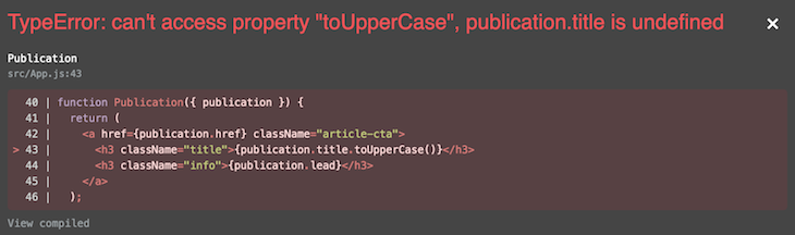
It’s important to note that the errors above will only show up in development. In production, the UI will be corrupted, and the user will be served a blank screen. How can we solve for this? Enter error boundaries.
N.B., tools like create-react-app and Next.js have an error overlay component that blocks the UI whenever there is an error, overshadowing your own error boundaries. In create-react-app, which this tutorial uses, we need to dismiss or close the overlay with the X mark in the upper right-hand corner to view our own error boundaries in use.
Using error boundaries in React
Error boundaries are React components that offer a way to gracefully handle JavaScript errors in React components. With them, we can catch JavaScript runtime errors in our components, act on those errors, and display a fallback UI.
import ErrorBoundary from "error-boundary";

function Users() {
  return (
    <div>
      <ErrorBoundary>
        {/* the rest of your application */}
      </ErrorBoundary/>
    </div>
  )
}
Error boundaries operate like the catch block in the JavaScript try...catch statement with a couple exceptions: they are declarative and, perhaps needless to say, only catch errors in React components.
More specifically, they catch errors in their child component(s), during the rendering phase, and in lifecycle methods. Errors thrown in any of the child components of an error boundary will be delegated to the closest error boundary in the component tree.
In contrast, error boundaries do not catch errors for, or that occur in:
- Event handlers
- Asynchronous code
- Server-side rendering
- Errors thrown in the error boundary itself
There are a few rules to follow for a component to act as an error boundary:
- It must be a class component
- It must define one or both of the lifecycle methods
static getDerivedStateFromError()orcomponentDidCatch()
The rule of thumb is that static getDerivedStateFromError() should be used to render a fallback UI after an error has been thrown, while componentDidCatch() should be used to log those error(s).
The <PublicationErrorBoundary/> component below is an error boundary since it satisfies the necessary criteria:
class PublicationErrorBoundary extends Component {
  state = { error: false, errorMessage: '' };

  static getDerivedStateFromError(error) {
    // Update state to render the fallback UI
    return { error: true, errorMessage: error.toString() };
  }

  componentDidCatch(error, errorInfo) {
    // Log error to an error reporting service like Sentry
    console.log({ error, errorInfo });
  }

  render() {
    const { error, errorMessage } = this.state;
    const { children } = this.props;

    return error ? <ErrorFallbackUI {...{ error, errorMessage }} /> : children;
  }
}
The <PublicationErrorBoundary/> replaces the try...catch block from the <Publications/> component above with the following update:
function Publications({ publications }) {
  return publications.map((publication, index) => (
    <div key={index}>
      <PublicationErrorBoundary>
        <Publication {...{ publication }} />
      </PublicationErrorBoundary>
    </div>
  ));
}
Now, the error thrown from <Publication/> trying to uppercase each publication title allows for graceful exception handling. The error has been isolated and a fallback UI displayed.
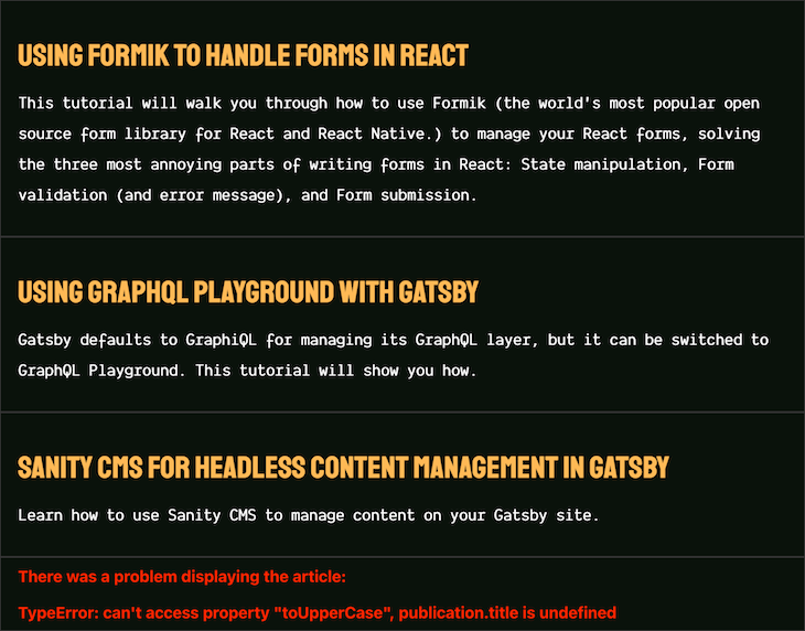
You can see this example on CodeSandbox.
Where to place error boundaries in the component tree
The Next.js documentation does a good job of explaining the general rule of thumb: error boundaries shouldn’t be too granular; they are used by React in production and should always be designed intentionally.
Error boundaries are special React components and should be used to catch errors only where appropriate. Different error boundaries can be used in different parts of an application to handle contextual errors, though they can be generic — for example, a network connection error boundary.
Notice that in the prior example, the <PublicationErrorBoundary/> is used in Publications instead of Publication. If used otherwise, the error thrown from the attempt to uppercase each publication title won’t be caught by the <PublicationErrorBoundary/> because the children of <PublicationErrorBoundary/> will be a hyperlink and not a component. However, using it in <Publications/> solves for this.
// This won't work because the children of `PublicationErrorBoundary`
// aren't components
function Publication({ publication }) {
  return (
    <PublicationErrorBoundary>
      <a href={publication.href} className="article-cta">
        <h3 className="title">{publication.title.toUpperCase()}</h3>
        <h3 className="info">{publication.lead}</h3>
      </a>
    </PublicationErrorBoundary>
  );
}
Also, notice that each publication has an error boundary listening for it to err. What if it makes sense to display no publications at all if there’s an error with at least one of them? <Publications/> can be updated:
// Before
function Publications({ publications }) {
  return publications.map((publication, index) => (
    <div key={index}>
      <PublicationErrorBoundary>
        <Publication {...{ publication }} />
      </PublicationErrorBoundary>
    </div>
  ));
}

// After. Notice the location of `PublicationErrorBoundary`
function Publications({ publications }) {
  return (
    <PublicationErrorBoundary>
      {publications.map((publication, index) => (
        <div key={index}>
          <Publication {...{ publication }} />
        </div>
      ))}
    </PublicationErrorBoundary>
  );
}
The UI will be updated to show the fallback UI:

Error boundary propagation
Similarly to how the catch block works, if an error boundary fails trying to render the error message, the error will propagate to the closest error boundary above it. If errors thrown are not caught by any of the error boundaries, the whole component tree will be unmounted.
This is a new behavior as of React 16, with the argument being that it is better to completely remove a corrupted UI than to leave it in place, and that it provides a better user experience in the event of an error.
<AppErrorBoundary>
  <App>
    <PublicationsErrorBoundary>
      <Publications>
        <PublicationErrorBoundary>
          <Publication />
        <PublicationErrorBoundary>
      </Publications>
    </PublicationsErrorBoundary>
  </App>
</AppErrorBoundary>
Take the contrived component tree above as an example. If an error is caught in <Publication/>, the closest error boundary, <PublicationErrorBoundary/>, will be responsible for it. In the event that it fails in its responsibility, <PublicationsErrorBoundary/> will act as a fallback. If that fails as well, <AppErrorBoundary/> will attempt to handle the error before the component is completely unmounted.
Resetting error boundaries
This is one of the edge cases I find in using error boundaries. Typically, this is done by resetting the UI state and recovering the UI from corruption.
Say a user loses connection, and a connection error boundary has succeeded in displaying a fallback UI alerting the user to check their connection. Can we recover the UI when the connection state becomes active? The simple answer is yes, and the other is that it depends.
Errors can be tricky, dynamic, and non-deterministic, and it is better you look into data fetching tools like SWR or React Query, or the react-error-boundary package, which alleviates these kinds of problems.
Conclusion
Wherever it is rational to do so, you should be using error boundaries to handle runtime errors in your React applications. The more familiar you get with them, the more you understand the reason for their existence.
With the react-error-boundary package specifically, you can reduce the amount of redundant code and uncertainty you encounter with a well-tested abstraction — which, as Kent Dodds puts it, is the last error boundary component anyone needs.
Cut through the noise of traditional React error reporting with LogRocket
LogRocket
is a React analytics solution that shields you from the hundreds of false-positive errors alerts to just a few truly important items. LogRocket tells you the most impactful bugs and UX issues actually impacting users in your React applications.
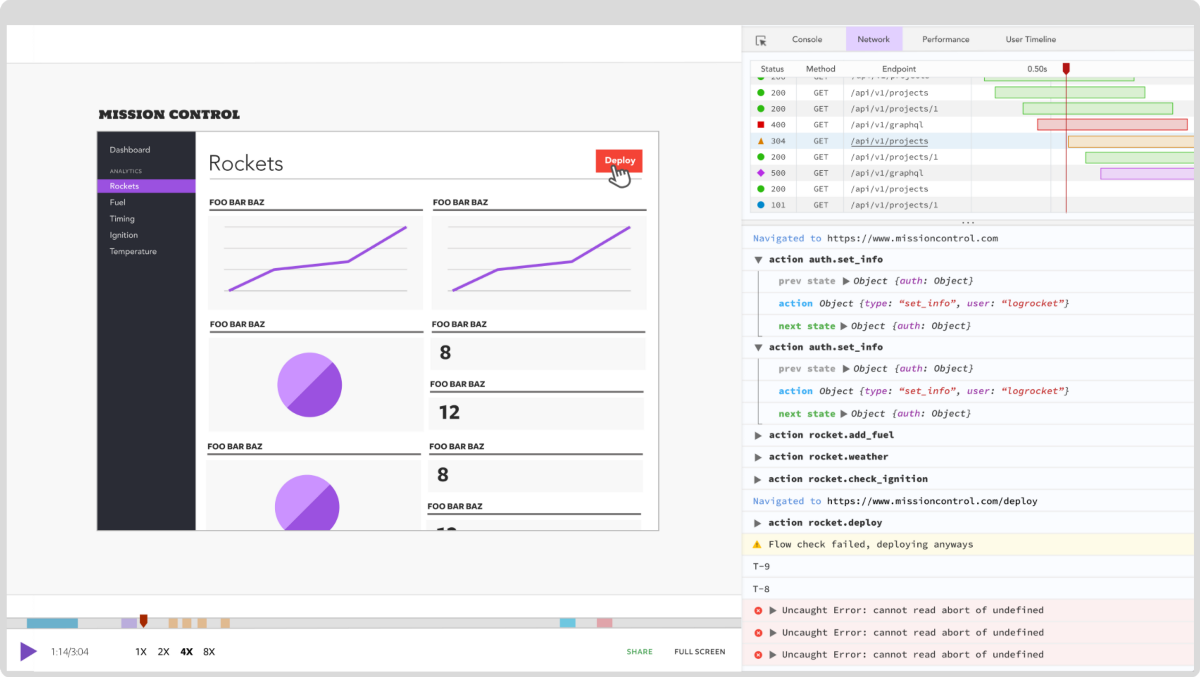
LogRocket
automatically aggregates client side errors, React error boundaries, Redux state, slow component load times, JS exceptions, frontend performance metrics, and user interactions. Then LogRocket uses machine learning to notify you of the most impactful problems affecting the most users and provides the context you need to fix it.
Focus on the React bugs that matter —
try LogRocket today.
Using NextJS, I see 2 kinds of errors:
Server Error
- generated it using
throw new Error(...)inside getInitialProps… - it can occur due to some business logic or unexpected API response;
- screenshot:

Unhandled Runtime Error
- generated it using
throw new Error(...)inside a component - it can occur due to some business logic;
- the error here is captured by the ErrorBoundary (which is set inside
_app.js) - screenshot:

Question:
unhandled run time errors are captured inside Error Boundary (as they do in ReactJS)… how to best handle the ‘server errors’… what is the best practice?
asked Oct 29, 2020 at 1:56
Akber IqbalAkber Iqbal
14.4k12 gold badges50 silver badges65 bronze badges
2
One of the best practices to handle errors is use Early Return, by returning a statusCode prop inside of the getInitialProps and use that statusCode to render the error page after render the page to prevent handle the posible errors inside the page.
- If everything is ok 200
- If does not exist 404
- If server error 503
import Error from "next/error"

function Page({ stars, statusCode}) {

  if(statusCode !== 200) {
    return <Error statusCode={statusCode} />
  }

  return <div>Next stars: {stars}</div>
}

Page.getInitialProps = async (ctx) => {

  try{
    const res = await fetch('https://api.github.com/repos/vercel/next.js')
    const json = await res.json()

    if(res.status >= 400){
      return { stars: json.stargazers_count, statusCode: res.status }
    }

    return { stars: json.stargazers_count, statusCode: 200 }


  } catch(error){

    return {stars: null, statusCode: 503}
  }

}

export default Page
machineghost
32.7k29 gold badges150 silver badges224 bronze badges
answered Apr 7, 2021 at 1:14