Validating form input
You can improve overall data quality by validating user input for accuracy and completeness.
This page shows how to validate user input from the UI and display useful validation messages, in both reactive and template-driven forms.
Prerequisites
Before reading about form validation, you should have a basic understanding of the following.
- TypeScript and HTML5 programming
- Fundamental concepts of Angular application design
- The two types of forms that Angular supports
- Basics of either Template-driven Forms or Reactive Forms
Get the complete example code for the reactive and template-driven forms used here to illustrate form validation.
Run the .
Validating input in template-driven forms
To add validation to a template-driven form, you add the same validation attributes as you would with native HTML form validation.
Angular uses directives to match these attributes with validator functions in the framework.
Every time the value of a form control changes, Angular runs validation and generates either a list of validation errors that results in an INVALID status, or null, which results in a VALID status.
You can then inspect the control’s state by exporting ngModel to a local template variable.
The following example exports NgModel into a variable called name:
Notice the following features illustrated by the example.
-
The
<input>element carries the HTML validation attributes:requiredandminlength.
It also carries a custom validator directive,forbiddenName.
For more information, see the Custom validators section. -
#name="ngModel"exportsNgModelinto a local variable calledname.
NgModelmirrors many of the properties of its underlyingFormControlinstance, so you can use this in the template to check for control states such asvalidanddirty.
For a full list of control properties, see the AbstractControl API reference.-
The
*ngIfon the<div>element reveals a set of nested messagedivsbut only if thenameis invalid and the control is eitherdirtyortouched. -
Each nested
<div>can present a custom message for one of the possible validation errors.
There are messages forrequired,minlength, andforbiddenName.
-
To prevent the validator from displaying errors before the user has a chance to edit the form, you should check for either the dirty or touched states in a control.
- When the user changes the value in the watched field, the control is marked as «dirty»
- When the user blurs the form control element, the control is marked as «touched»
Validating input in reactive forms
In a reactive form, the source of truth is the component class.
Instead of adding validators through attributes in the template, you add validator functions directly to the form control model in the component class.
Angular then calls these functions whenever the value of the control changes.
Validator functions
Validator functions can be either synchronous or asynchronous.
| Validator type | Details |
|---|---|
| Sync validators | Synchronous functions that take a control instance and immediately return either a set of validation errors or null. Pass these in as the second argument when you instantiate a FormControl. |
| Async validators | Asynchronous functions that take a control instance and return a Promise or Observable that later emits a set of validation errors or null. Pass these in as the third argument when you instantiate a FormControl. |
For performance reasons, Angular only runs async validators if all sync validators pass.
Each must complete before errors are set.
Built-in validator functions
You can choose to write your own validator functions, or you can use some of Angular’s built-in validators.
The same built-in validators that are available as attributes in template-driven forms, such as required and minlength, are all available to use as functions from the Validators class.
For a full list of built-in validators, see the Validators API reference.
To update the hero form to be a reactive form, use some of the same
built-in validators —this time, in function form, as in the following example.
In this example, the name control sets up two built-in validators —Validators.required and Validators.minLength(4)— and one custom validator, forbiddenNameValidator.
(For more details see custom validators.)
All of these validators are synchronous, so they are passed as the second argument.
Notice that you can support multiple validators by passing the functions in as an array.
This example also adds a few getter methods.
In a reactive form, you can always access any form control through the get method on its parent group, but sometimes it’s useful to define getters as shorthand for the template.
If you look at the template for the name input again, it is fairly similar to the template-driven example.
This form differs from the template-driven version in that it no longer exports any directives.
Instead, it uses the name getter defined in the component class.
Notice that the required attribute is still present in the template.
Although it’s not necessary for validation, it should be retained to for accessibility purposes.
Defining custom validators
The built-in validators don’t always match the exact use case of your application, so you sometimes need to create a custom validator.
Consider the forbiddenNameValidator function from previous reactive-form examples.
Here’s what the definition of that function looks like.
The function is a factory that takes a regular expression to detect a specific forbidden name and returns a validator function.
In this sample, the forbidden name is «bob», so the validator rejects any hero name containing «bob».
Elsewhere it could reject «alice» or any name that the configuring regular expression matches.
The forbiddenNameValidator factory returns the configured validator function.
That function takes an Angular control object and returns either null if the control value is valid or a validation error object.
The validation error object typically has a property whose name is the validation key, 'forbiddenName', and whose value is an arbitrary dictionary of values that you could insert into an error message, {name}.
Custom async validators are similar to sync validators, but they must instead return a Promise or observable that later emits null or a validation error object.
In the case of an observable, the observable must complete, at which point the form uses the last value emitted for validation.
Adding custom validators to reactive forms
In reactive forms, add a custom validator by passing the function directly to the FormControl.
Adding custom validators to template-driven forms
In template-driven forms, add a directive to the template, where the directive wraps the validator function.
For example, the corresponding ForbiddenValidatorDirective serves as a wrapper around the forbiddenNameValidator.
Angular recognizes the directive’s role in the validation process because the directive registers itself with the NG_VALIDATORS provider, as shown in the following example.
NG_VALIDATORS is a predefined provider with an extensible collection of validators.
The directive class then implements the Validator interface, so that it can easily integrate with Angular forms.
Here is the rest of the directive to help you get an idea of how it all comes together.
Once the ForbiddenValidatorDirective is ready, you can add its selector, appForbiddenName, to any input element to activate it.
For example:
Notice that the custom validation directive is instantiated with useExisting rather than useClass.
The registered validator must be this instance of the ForbiddenValidatorDirective —the instance in the form with its forbiddenName property bound to «bob».
If you were to replace useExisting with useClass, then you’d be registering a new class instance, one that doesn’t have a forbiddenName.
Control status CSS classes
Angular automatically mirrors many control properties onto the form control element as CSS classes.
Use these classes to style form control elements according to the state of the form.
The following classes are currently supported.
.ng-valid.ng-invalid.ng-pending.ng-pristine.ng-dirty.ng-untouched.ng-touched.ng-submitted(enclosing form element only)
In the following example, the hero form uses the .ng-valid and .ng-invalid classes to
set the color of each form control’s border.
Cross-field validation
A cross-field validator is a custom validator that compares the values of different fields in a form and accepts or rejects them in combination.
For example, you might have a form that offers mutually incompatible options, so that if the user can choose A or B, but not both.
Some field values might also depend on others; a user might be allowed to choose B only if A is also chosen.
The following cross validation examples show how to do the following:
- Validate reactive or template-based form input based on the values of two sibling controls,
- Show a descriptive error message after the user interacted with the form and the validation failed.
The examples use cross-validation to ensure that heroes do not reveal their true identities by filling out the Hero Form.
The validators do this by checking that the hero names and alter egos do not match.
Adding cross-validation to reactive forms
The form has the following structure:
const heroForm = new FormGroup({
‘name’: new FormControl(),
‘alterEgo’: new FormControl(),
‘power’: new FormControl()
});
Notice that the name and alterEgo are sibling controls.
To evaluate both controls in a single custom validator, you must perform the validation in a common ancestor control: the FormGroup.
You query the FormGroup for its child controls so that you can compare their values.
To add a validator to the FormGroup, pass the new validator in as the second argument on creation.
const heroForm = new FormGroup({
‘name’: new FormControl(),
‘alterEgo’: new FormControl(),
‘power’: new FormControl()
}, { validators: identityRevealedValidator });
The validator code is as follows.
The identity validator implements the ValidatorFn interface.
It takes an Angular control object as an argument and returns either null if the form is valid, or ValidationErrors otherwise.
The validator retrieves the child controls by calling the FormGroup‘s get method, then compares the values of the name and alterEgo controls.
If the values do not match, the hero’s identity remains secret, both are valid, and the validator returns null.
If they do match, the hero’s identity is revealed and the validator must mark the form as invalid by returning an error object.
To provide better user experience, the template shows an appropriate error message when the form is invalid.
This *ngIf displays the error if the FormGroup has the cross validation error returned by the identityRevealed validator, but only if the user finished interacting with the form.
Adding cross-validation to template-driven forms
For a template-driven form, you must create a directive to wrap the validator function.
You provide that directive as the validator using the NG_VALIDATORS token, as shown in the following example.
You must add the new directive to the HTML template.
Because the validator must be registered at the highest level in the form, the following template puts the directive on the form tag.
To provide better user experience, an appropriate error message appears when the form is invalid.
This is the same in both template-driven and reactive forms.
Creating asynchronous validators
Asynchronous validators implement the AsyncValidatorFn and AsyncValidator interfaces.
These are very similar to their synchronous counterparts, with the following differences.
- The
validate()functions must return a Promise or an observable, - The observable returned must be finite, meaning it must complete at some point.
To convert an infinite observable into a finite one, pipe the observable through a filtering operator such asfirst,last,take, ortakeUntil.
Asynchronous validation happens after the synchronous validation, and is performed only if the synchronous validation is successful.
This check lets forms avoid potentially expensive async validation processes (such as an HTTP request) if the more basic validation methods have already found invalid input.
After asynchronous validation begins, the form control enters a pending state.
Inspect the control’s pending property and use it to give visual feedback about the ongoing validation operation.
A common UI pattern is to show a spinner while the async validation is being performed.
The following example shows how to achieve this in a template-driven form.
<input [(ngModel)]=»name» #model=»ngModel» appSomeAsyncValidator>
<app-spinner *ngIf=»model.pending»></app-spinner>
Implementing a custom async validator
In the following example, an async validator ensures that heroes pick an alter ego that is not already taken.
New heroes are constantly enlisting and old heroes are leaving the service, so the list of available alter egos cannot be retrieved ahead of time.
To validate the potential alter ego entry, the validator must initiate an asynchronous operation to consult a central database of all currently enlisted heroes.
The following code creates the validator class, UniqueAlterEgoValidator, which implements the AsyncValidator interface.
The constructor injects the HeroesService, which defines the following interface.
interface HeroesService {
isAlterEgoTaken: (alterEgo: string) => Observable<boolean>;
}
In a real world application, the HeroesService would be responsible for making an HTTP request to the hero database to check if the alter ego is available.
From the validator’s point of view, the actual implementation of the service is not important, so the example can just code against the HeroesService interface.
As the validation begins, the UniqueAlterEgoValidator delegates to the HeroesService isAlterEgoTaken() method with the current control value.
At this point the control is marked as pending and remains in this state until the observable chain returned from the validate() method completes.
The isAlterEgoTaken() method dispatches an HTTP request that checks if the alter ego is available, and returns Observable<boolean> as the result.
The validate() method pipes the response through the map operator and transforms it into a validation result.
The method then, like any validator, returns null if the form is valid, and ValidationErrors if it is not.
This validator handles any potential errors with the catchError operator.
In this case, the validator treats the isAlterEgoTaken() error as a successful validation, because failure to make a validation request does not necessarily mean that the alter ego is invalid.
You could handle the error differently and return the ValidationError object instead.
After some time passes, the observable chain completes and the asynchronous validation is done.
The pending flag is set to false, and the form validity is updated.
Adding async validators to reactive forms
To use an async validator in reactive forms, begin by injecting the validator into the constructor of the component class.
Then, pass the validator function directly to the FormControl to apply it.
In the following example, the validate function of UniqueAlterEgoValidator is applied to alterEgoControl by passing it to the control’s asyncValidators option and binding it to the instance of UniqueAlterEgoValidator that was injected into HeroFormReactiveComponent.
The value of asyncValidators can be either a single async validator function, or an array of functions.
To learn more about FormControl options, see the AbstractControlOptions API reference.
Adding async validators to template-driven forms
To use an async validator in template-driven forms, create a new directive and register the NG_ASYNC_VALIDATORS provider on it.
In the example below, the directive injects the UniqueAlterEgoValidator class that contains the actual validation logic and invokes it in the validate function, triggered by Angular when validation should happen.
Then, as with synchronous validators, add the directive’s selector to an input to activate it.
Optimizing performance of async validators
By default, all validators run after every form value change.
With synchronous validators, this does not normally have a noticeable impact on application performance.
Async validators, however, commonly perform some kind of HTTP request to validate the control.
Dispatching an HTTP request after every keystroke could put a strain on the backend API, and should be avoided if possible.
You can delay updating the form validity by changing the updateOn property from change (default) to submit or blur.
With template-driven forms, set the property in the template.
<input [(ngModel)]=»name» [ngModelOptions]=»{updateOn: ‘blur’}»>
With reactive forms, set the property in the FormControl instance.
new FormControl(», {updateOn: ‘blur’});
Interaction with native HTML form validation
By default, Angular disables native HTML form validation by adding the novalidate attribute on the enclosing <form> and uses directives to match these attributes with validator functions in the framework.
If you want to use native validation in combination with Angular-based validation, you can re-enable it with the ngNativeValidate directive.
See the API docs for details.
@reviewed 2022-02-28
Валидация форм
Независимо от выбранной технологии построения формы ее валидация происходит на основе данных о состоянии самой формы и каждого ее поля в отдельности.
Для того чтобы задать валидацию, используются стандартные атрибуты валидации форм HTML5 (required, minlength, max, pattern и т. д.).
<form>
  <div>
    <label>Bill Amount</label>
    <input type="number" max="100" required />
  </div>
</form>
Вывод сообщений, информирующих о неправильно заполненном поле, осуществляется на основе данных состояния поля. Доступ к этим данным может быть получен с помощью шаблонной переменной.
<form>
  <div>
    <label>Bill Amount</label>
    <input
      type="number"
      [(ngModel)]="bill.amount"
      #amount="ngModel"
      max="100"
      required
    />
  </div>
</form>
Теперь переменная #amount содержит объект с информацией о поле, на которое оно ссылается. Список необходимых для валидации свойств объекта:
dirty—true, если пользователь осуществлял ввод (выбор) значения;touched—true, если поле потеряло фокус;invalid—true, если поле невалидно;valid—true, если поле валидно;errors— содержит объект со свойствами тех атрибутов валидации, которые не удовлетворяют заданному условию.
Общепринято отображать ошибки только тогда, когда пользователь хоть как-то взаимодействовал с полем, то есть когда свойства invalid и dirty или touched ровно true. Вывод той или иной ошибки зависит от того, какой именно атрибут валидации не прошел проверку.
<form>
  <div>
    <label>Bill Amount</label>
    <input
      type="number"
      [(ngModel)]="bill.amount"
      #amount="ngModel"
      max="100"
      required
    />

    <div
      *ngIf="amount.invalid && (amount.dirty || amount.touched)"
    >
      <div *ngIf="amount.errors.required">
        Required field
      </div>
      <div *ngIf="amount.errors.max">
        Max possible value is 100
      </div>
    </div>
  </div>
</form>
Валидация реактивных форм Angular
Для реактивных форм вся валидация устанавливается в классе компонента при описании модели формы. Каждому полю задается свой массив валидаторов.
Список встроенных валидаторов (Angular validators):
required— поле обязательно для заполнения;email— проверка валидностиemail;min(min: number)— минимальное возможное значение;max(max: number)— максимальное возможное значение;minLength(minLength: number)— минимальная длина вводимой строки;maxLength(maxLength: number)— максимальная длина вводимой строки;pattern(pattern: string | RegExp)— регулярное выражение, которому должно соответствовать вводимое значение.
reactive-form-validation.ts
@Component({
  selector: 'reactive-form-validation',
  templateUrl: './reactive-form-validation.component.html',
})
export class ReactiveFormValidationComponent {
  clientForm: FormGroup

  constructor(private fb: FormBuilder) {
    this._createForm()
  }

  private _createForm() {
    this.clientForm = this.fb.group({
      client: ['', [Validators.required]],
      clientAge: [
        '',
        [
          Validators.required,
          Validators.min(16),
          Validators.pattern(/^[0-9]+(?!.)/),
        ],
      ],
    })
  }

  get _client() {
    return this.clientForm.get('client')
  }

  get _clientAge() {
    return this.clientForm.get('clientAge')
  }
}
reactive-form-validation.html
<form [formGroup]="clientForm" novalidate>
  <div>
    <label>Client</label>
    <input type="text" formControlName="client" />
    <div
      *ngIf="_client.invalid && (_client.touched || _client.dirty)"
    >
      <span *ngIf="_client.errors?.required"
        >Field is required</span
      >
    </div>
  </div>

  <div>
    <label>Age</label>
    <input type="text" formControlName="clientAge" />
    <div
      *ngIf="_clientAge.invalid && (_clientAge.touched || _clientAge.dirty)"
    >
      <span *ngIf="_clientAge.errors?.required"
        >Обязательное поле</span
      >
      <span *ngIf="_clientAge.errors?.min"
        >Значение должно быть больше или равно
        {{_clientAge.errors?.min.min}}</span
      >
      <span
        *ngIf="_clientAge.errors?.pattern?['/^[0-9]+(?!.)/']"
        >Разрешаются только цифры</span
      >
    </div>
  </div>
</form>
Механизм вывода ошибок практически аналогичен механизму «стандартных» форм. Но для того чтобы получить в шаблоне ссылку на объект с данными о поле, можно использовать геттеры или реализовать метод, который будет возвращать поле по его имени.
Свойства полученного объекта поля, используемые для валидации:
dirty—true, если пользователь осуществлял ввод (выбор) значения;touched—true, если поле потеряло фокус;invalid—true, если поле невалидно;valid—true, если поле валидно;errors— содержит объект со свойствами тех атрибутов валидации, которые не удовлетворяют заданному условию.
Остановимся на поле errors. Многие Angular validators принимают входные параметры (maxLength, pattern и др.), поэтому для получения исчерпывающей информации о неправильном заполнении полей, к которым они применены, их значения в errors реализованы в виде объектов. В таком объекте содержатся данные о текущем значении и ограничения, накладываемые на это значение (см. пример выше).
Например, ключи объекта ошибки валидатора pattern — сами регулярные выражения. Что позволяет однозначно идентифицировать ошибку и отобразить пользователю соответствующее сообщение.
Более подробное описание можно найти в документации.
Для работы с ошибками в реактивных формах предусмотрены прикладные методы:
setErrors(errors: ValidationErrors)— используется для того, чтобы задать ошибку вручную;getError(errorCode: string)— вернет объект с данными о запрашиваемой ошибке, если поле валидно, то вернетсяnullилиundefined;hasError(errorCode: string)— вернетtrue, если поле имеет указанную ошибку.
this.clientForm.get('client').hasError('required')
Для динамического добавления полю валидаторов используется метод setValidators().
this.clientForm
  .get('client')
  .setValidators([Validators.maxLength(100)])
Чтобы удалить все привязанные к полю Angular validators, необходимо вызвать метод clearValidators().
this.clientForm.get('client').clearValidators()
Еще один редко используемый, но крайне полезный метод updateValueAndValidity(), который запускает обновление значения и состояния формы или ее группы (поля).
this.clientForm.get('clientAge').updateValueAndValidity()
Для большинства случаев подойдут встроенные валидаторы, но бывают задачи, которые требуют особых проверок. Поэтому реактивные формы предоставляют инструмент для разработки пользовательских валидаторов.
account.validator.ts
export function accountValidator(): ValidatorFn {
  return (
    control: AbstractControl
  ): { [key: string]: boolean } | null => {
    let accountRgEx: RegExp = /^[0-9]{20}(?!.)/
    let valid =
      !control.value || accountRgEx.test(control.value)
    return valid ? null : { account: true }
  }
}
import {accountValidator} from './validators/account.validator.ts';

//
accountNumber: ['', [accountValidators()]],
//
В примере accountValidator() проверяет корректность номера банковского счета (20 цифр — проверка условная). Если номер введен не верно, тогда для поля accountNumber будет установлена ошибка account со значением true.
Валидатор всегда должен возвращать null, если переданное значение удовлетворяет всем его проверкам.
Асинхронные валидаторы Angular
Использование механизма асинхронной валидации (Angular async validators) позволяет проверять введенное значение на удаленном сервере. Например, проверка уникальности имени пользователя при регистрации.
Перейдем к практике. Допустим, имеется форма заказа какого-либо товара, где пользователь указывает желаемое его количество. Создадим валидатор checkGoodsLeftValidator(), который будет проверять, имеется ли запрошенное покупателем количество товара.
goods.service.ts
@Injectable({ providedIn: 'root' })
export class GoodsService {
  constructor(private http: HttpClient) {}

  checkGoodsLeft(count: number | string): Observable<any> {
    return this.http.get('/api/goods/left')
  }
}
check-goods-left.validator.ts
export function checkGoodsLeftValidator(
  control: AbstractControl
) {
  return this.checkGoodsLeft(control.value).pipe(
    tap((response) => {
      return response ? null : { goodsLeft: true }
    })
  )
}
check-goods-left-validator-example.component.ts
@Component({
  selector: 'check-goods-left-validator-example',
  templateUrl:
    './check-goods-left-validator-example.component.html',
})
export class CheckGoodsLeftValidatorExampleComponent {
  orderForm: FormGroup

  constructor(
    private fb: FormBuilder,
    private goodsService: GoodsService
  ) {
    this._createForm()
  }

  private _createForm() {
    this.orderForm = this.fb.group({
      client: ['', [Validators.required]],
      goodsCount: [
        '',
        [Validators.required],
        [checkGoodsLeftValidator.bind(this.goodsService)],
      ],
    })
  }
}
Поскольку наш Angular async validator обращается к методу сервиса, а сам валидатор вызывается в контексте компонента, который его использует, здесь используется привязка контекста сервиса GoodsService с помощью bind().
Все асинхронные валидаторы указываются в массиве третьим параметром.
Стилизация формы
В зависимости от состояния и статуса валидации, форме и ее полям устанавливаются соответствующие CSS-классы, которые можно использовать для стилизации элементов.
ng-valid;ng-invalid;ng-pending;ng-pristine;ng-dirty;ng-untouched;ng-touched.
Ссылки
- Form Validation
I am working on a login form and if the user enters invalid credentials we want to mark both the email and password fields as invalid and display a message that says the login failed. How do I go about setting these fields to be invalid from an observable callback?
Template:
<form #loginForm="ngForm" (ngSubmit)="login(loginForm)" id="loginForm">
  <div class="login-content" fxLayout="column" fxLayoutAlign="start stretch">
    <md-input-container>
      <input mdInput placeholder="Email" type="email" name="email" required [(ngModel)]="email">
    </md-input-container>
    <md-input-container>
      <input mdInput placeholder="Password" type="password" name="password" required [(ngModel)]="password">
    </md-input-container>
    <p class='error' *ngIf='loginFailed'>The email address or password is invalid.</p>
    <div class="extra-options" fxLayout="row" fxLayoutAlign="space-between center">
     <md-checkbox class="remember-me">Remember Me</md-checkbox>
      <a class="forgot-password" routerLink='/forgot-password'>Forgot Password?</a>
    </div>
    <button class="login-button" md-raised-button [disabled]="!loginForm.valid">SIGN IN</button>
     <p class="note">Don't have an account?<br/> <a [routerLink]="['/register']">Click here to create one</a></p>
   </div>
 </form>
Login method:
 @ViewChild('loginForm') loginForm: HTMLFormElement;

 private login(formData: any): void {
    this.authService.login(formData).subscribe(res => {
      alert(`Congrats, you have logged in. We don't have anywhere to send you right now though, but congrats regardless!`);
    }, error => {
      this.loginFailed = true; // This displays the error message, I don't really like this, but that's another issue.
      this.loginForm.controls.email.invalid = true;
      this.loginForm.controls.password.invalid = true;
    });
  }
In addition to setting the inputs invalid flag to true I’ve tried setting the email.valid flag to false, and setting the loginForm.invalid to true as well. None of these cause the inputs to display their invalid state.
isherwood
56.5k16 gold badges109 silver badges151 bronze badges
asked Apr 21, 2017 at 23:39
3
in component:
formData.form.controls['email'].setErrors({'incorrect': true});
and in HTML:
<input mdInput placeholder="Email" type="email" name="email" required [(ngModel)]="email"  #email="ngModel">
<div *ngIf="!email.valid">{{email.errors| json}}</div>
answered Apr 22, 2017 at 1:23
Julia PassynkovaJulia Passynkova
16.7k5 gold badges33 silver badges32 bronze badges
11
Adding to Julia Passynkova’s answer
To set validation error in component:
formData.form.controls['email'].setErrors({'incorrect': true});
To unset validation error in component:
formData.form.controls['email'].setErrors(null);
Be careful with unsetting the errors using null as this will overwrite all errors. If you want to keep some around you may have to check for the existence of other errors first:
if (isIncorrectOnlyError){
   formData.form.controls['email'].setErrors(null);
}
answered Sep 22, 2017 at 17:12
Eric D.Eric D.
1,4671 gold badge9 silver badges4 bronze badges
5
In new version of material 2 which its control name starts with mat prefix setErrors() doesn’t work, instead Juila’s answer can be changed to:
formData.form.controls['email'].markAsTouched();
answered Mar 22, 2018 at 11:33
M_FarahmandM_Farahmand
8542 gold badges9 silver badges21 bronze badges
2
I was trying to call setErrors() inside a ngModelChange handler in a template form. It did not work until I waited one tick with setTimeout():
template:
<input type="password" [(ngModel)]="user.password" class="form-control"
 id="password" name="password" required (ngModelChange)="checkPasswords()">

<input type="password" [(ngModel)]="pwConfirm" class="form-control"
 id="pwConfirm" name="pwConfirm" required (ngModelChange)="checkPasswords()"
 #pwConfirmModel="ngModel">

<div [hidden]="pwConfirmModel.valid || pwConfirmModel.pristine" class="alert-danger">
   Passwords do not match
</div>
component:
@ViewChild('pwConfirmModel') pwConfirmModel: NgModel;

checkPasswords() {
  if (this.pwConfirm.length >= this.user.password.length &&
      this.pwConfirm !== this.user.password) {
    console.log('passwords do not match');
    // setErrors() must be called after change detection runs
    setTimeout(() => this.pwConfirmModel.control.setErrors({'nomatch': true}) );
  } else {
    // to clear the error, we don't have to wait
    this.pwConfirmModel.control.setErrors(null);
  }
}
Gotchas like this are making me prefer reactive forms.
answered Apr 14, 2018 at 21:59
Mark RajcokMark Rajcok
361k114 gold badges491 silver badges491 bronze badges
4
In my Reactive form, I needed to mark a field as invalid if another field was checked. In ng version 7 I did the following:
    const checkboxField = this.form.get('<name of field>');
    const dropDownField = this.form.get('<name of field>');

    this.checkboxField$ = checkboxField.valueChanges
        .subscribe((checked: boolean) => {
            if(checked) {
                dropDownField.setValidators(Validators.required);
                dropDownField.setErrors({ required: true });
                dropDownField.markAsDirty();
            } else {
                dropDownField.clearValidators();
                dropDownField.markAsPristine();
            }
        });
So above, when I check the box it sets the dropdown as required and marks it as dirty. If you don’t mark as such it then it won’t be invalid (in error) until you try to submit the form or interact with it.
If the checkbox is set to false (unchecked) then we clear the required validator on the dropdown and reset it to a pristine state.
Also — remember to unsubscribe from monitoring field changes!
answered Aug 1, 2019 at 9:00
Katana24Katana24
8,42318 gold badges73 silver badges116 bronze badges
You could also change the viewChild ‘type’ to NgForm as in:
@ViewChild('loginForm') loginForm: NgForm;
And then reference your controls in the same way @Julia mentioned:
 private login(formData: any): void {
    this.authService.login(formData).subscribe(res => {
      alert(`Congrats, you have logged in. We don't have anywhere to send you right now though, but congrats regardless!`);
    }, error => {
      this.loginFailed = true; // This displays the error message, I don't really like this, but that's another issue.

      this.loginForm.controls['email'].setErrors({ 'incorrect': true});
      this.loginForm.controls['password'].setErrors({ 'incorrect': true});
    });
  }
Setting the Errors to null will clear out the errors on the UI:
this.loginForm.controls['email'].setErrors(null);
answered Dec 2, 2019 at 17:30
JacquesJacques
6,7748 gold badges42 silver badges99 bronze badges
Here is an example that works:
MatchPassword(AC: FormControl) {
  let dataForm = AC.parent;
  if(!dataForm) return null;

  var newPasswordRepeat = dataForm.get('newPasswordRepeat');
  let password = dataForm.get('newPassword').value;
  let confirmPassword = newPasswordRepeat.value;

  if(password != confirmPassword) {
    /* for newPasswordRepeat from current field "newPassword" */
    dataForm.controls["newPasswordRepeat"].setErrors( {MatchPassword: true} );
    if( newPasswordRepeat == AC ) {
      /* for current field "newPasswordRepeat" */
      return {newPasswordRepeat: {MatchPassword: true} };
    }
  } else {
    dataForm.controls["newPasswordRepeat"].setErrors( null );
  }
  return null;
}

createForm() {
  this.dataForm = this.fb.group({
    password: [ "", Validators.required ],
    newPassword: [ "", [ Validators.required, Validators.minLength(6), this.MatchPassword] ],
    newPasswordRepeat: [ "", [Validators.required, this.MatchPassword] ]
  });
}
Jason Roman
8,04610 gold badges35 silver badges39 bronze badges
answered May 28, 2018 at 18:55
1
Though its late but following solution worked form me.
    let control = this.registerForm.controls['controlName'];
    control.setErrors({backend: {someProp: "Invalid Data"}});
    let message = control.errors['backend'].someProp;
answered Dec 23, 2018 at 5:47
Dila GurungDila Gurung
1,61821 silver badges25 bronze badges
1
This sample in Angular documentation might help:
<input type=»text» id=»name» name=»name» class=»form-control»
      required minlength="4" appForbiddenName="bob"
      [(ngModel)]="hero.name" #name="ngModel">

<div *ngIf="name.invalid && (name.dirty || name.touched)"
    class="alert">

  <div *ngIf="name.errors?.['required']">
    Name is required.
  </div>
  <div *ngIf="name.errors?.['minlength']">
    Name must be at least 4 characters long.
  </div>
  <div *ngIf="name.errors?.['forbiddenName']">
    Name cannot be Bob.
  </div>

</div>
answered Oct 24, 2022 at 11:03
For unit test:
spyOn(component.form, 'valid').and.returnValue(true);
double-beep
4,85916 gold badges32 silver badges41 bronze badges
answered Feb 15, 2019 at 22:18
When building large scale forms with the Angular Forms module, the available built-in validators (such as making a field required, etc.) usually won’t be sufficient, and so you will have to develop your own custom form validation rules.
In this post, you will learn everything that you need to know in order to implement your own custom form validators, including both synchronous and asynchronous, field-level, form-level, and both for template-driven and reactive forms.
Table of Contents
This post will cover the following topics:
- What is a form field validator?
- Custom Validators for reactive forms
- Displaying error messages for custom validators
- Custom Validators for template-driven forms
- Comparing validation in template-driven vs reactive forms
- Form-level (multi-field) Validators
- Asynchronous Validators
- How to use the updateOn field property
- Summary
This post is part of our ongoing series on Angular Forms, you can find all the articles available here.
So without further ado, let’s get started learning everything that we need to know to write our own custom form validators!
What is a form field Validator?
If you have used either the Angular Forms or ReactiveForms modules, you will have noticed that every form has a couple of important properties:
- the form value, consisting of the values of all the individual form fields
- a form validity state, which is true if all the form fields are valid, and false if at least one of the forms fields is invalid
Each form field has its own set of business validation rules: the fields can be mandatory, have a minimum length of 10 characters, etc.
Here is an example of a simple reactive form, with a couple of standard validators:
As we can see, this is a simple login form with an email and password fields. We don’t see any business validation rules because this is a reactive form, so all validation rules are defined on the component, and not on the template.
Here is the corresponding component class:
There are a lot of validation rules being used here. Let’s go through them one at a time, starting with the simpler ones.
In this particular reactive form, we are using the FormBuilder API in order to define our form fields and validation rules in a concise way.
For example, the email field is marked as mandatory via the Validators.required validator, and it also needs to follow the format of a valid email, due to the use of the Validators.email validator.
These are two examples of the several built-in validators that we have available to use, right out of the box.
So how do these validators work, what is a validator?
A form field validator is a function that the form can call in order to decide if a given form field is valid or not.
A validator function returns true if the form field is valid according to the validator rules, or false otherwise.
A validator can be plugged in directly into a reactive form simply by adding it to the validators list. Each form field has its own list of separate validators.
Two alternative syntaxes for configuring validators
If you noticed, the validation rules for the email and the password fields were configured in a slightly different way.
The password field was configured in the way that you are probably the most used to, by using the FormBuilder API simplified array syntax:
With this syntax, each form field has an array containing both the initial value of the form field and its list of synchronous validators.
Although this syntax is compact, it might become a bit difficult to read for fields with a larger number of validators.
An alternative syntax is the one used by the email field:
In this alternative and more powerful syntax, but also slightly more verbose, the second value of the configuration array (after the initial form field value) is a configuration object containing 3 properties that we can optionally use:
- validators: contains the list of synchronous validators for the form field
- asyncValidators: contains the list asynchronous validators for the form field (not used in this example)
- updateOn: specifies the moment when the form should be updated with the new form field value and recalculate the field validity (more on this later).
Our advice is to switch to the more powerful syntax with the configuration object as soon as you need to, either to set the updateOn property or to make the form field definition more readable.
Notice also, in the login reactive form, that next to the standard built-in required and minLength validators of the password field, we have a non-standard validator createPasswordStrengthValidator().
This is a custom validator, that we have written ourselves.
Custom Validators for Reactive Forms
The password strength validator ensures that the password has enough strength besides a minimum length. The password strength might be used to require the password to contain not only lowercase characters but also upper case and numeric characters, for example.
With reactive forms, writing a custom validator is as easy as writting a new function:
Let’s break down what is going on here. As we can see, the
createPasswordStrengthValidator() function is not the validator function itself.
This is actually a validator creation function, that returns as its output the validator. So it’s a function that returns a function, as we can see this by its return type ValidatorFn.
The validator creation function can have any arguments needed to set up the validator (in this case no arguments were needed), and returns as the output the validator function itself.
The validator function is then going to be called by the form in order to determine if the form field value is valid or not.
And as we can see, the validator function needs to follow certain conventions.
How to write a Validator function
The form field validator function, returned by the validator creation function, needs to follow these rules:
- only one input argument is expected, which is of type
AbstractControl. The validator function can obtain the value to be validated via thecontrol.valueproperty - The validator function needs to return null if no errors were found in the field value, meaning that the value is valid
- If any validation errors are found, the function needs to return an object of type
ValidationErrors - The
ValidationErrorsobject can have as properties the multiple errors found (usually just one), and as values the details about each error. - The value of the
ValidationErrorsobject can be an object with any properties that we want, allowing us to provide a lot of useful information about the error if needed - If we just want to indicate that an error occurred, without providing further details, we can simply return
trueas the value of an error property in theValidationErrorsobject
In the particular case of our password strength validator function, we are checking for the presence of all required characters, and in the end, we are either:
- returning
nullif the password is valid and no errors were found - returning
{passwordStrength:true}as an output error object, in case that the password is not strong enough
As we can see, we are only returning a boolean flag in the error object indicating that an error was found, without more details. But we could instead also return an error object similar to this one:
This ValidationErrors object can have any form that we need. We can return nested objects if we need to, in order to convey all the necessary information about what caused the error.
Once we have a new custom validator function written, all we have to do is plug it in our reactive form:
Let’s remember, the createPasswordStrengthValidator() function did not need input arguments, but we could have defined any arguments that we needed in order to perform the validation, and pass them in this function call.
Displaying error messages for custom Validators
In order to inform the user that there is a problem with the password strength, we can add the following message to the template:
As we can see, the ValidationErrors object that we returned as the output of our custom validator was added to the pasword field errors object.
If the password is not strong enough, the ngIf condition will turn to true and the error message will then be shown to the user.
Custom Validators for Template-Driven Forms
For template-driven forms, it takes a bit more work to define a custom form field validator.
With template driven forms, all the business validation rules are defined at the level of the template using directives, and not at the level of the component class.
For example, here is what the same login form would look like in its template-driven version:
As we can see, in the case of template-driven forms, there is a lot more going on in the template.
For example, we can see the standard required, minlength, maxlength and email directives applied to the email and password fields.
The way that these directives work, is that they use internally the corresponding validator functions Validators.required, Validators.minlength, and
Validators.maxLength.
Notice also the non-standard passwordStrength directive, applied to the password field. This one we will have to build ourselves!
So in the case of template-driven forms, besides the validator function, we also need to create a custom directive to go along with it.
Otherwise, we won’t be able to use our custom validators in our template-driven forms.
How to write a custom Validator directive
Let’s have a look at what the custom form field passwordStrength directive looks like:
Let’s break this down step by step, starting with the implementation of the validation functionality itself:
- in order to implement a custom validation directive, we need to implement the
Validatorinterface, which only has thevalidatemethod - the
validatemethod is going to call the validation creation function, and pass the control reference (the password control in this case) to the validator - the validator is going to return
nullif the password valid is false, on aValidationErrorserror object otherwise
But implementing the Validator interface is not enough to make this a valid custom validation directive. We also have to configure it properly in the Angular dependency injection system.
Understanding the DI configuration of a custom validator directive
The Angular Forms module needs to know what are the multiple custom validation directives available. It does so by asking the dependency injection system for the NG_VALIDATORS injection token (a sort of unique dependency injection key, that uniquely identifies a dependency).
This dependency in of type multi:true meaning that it includes multiple values, and not just one value. This is to be expected, as there are many custom validator directives, and not just one.
We can see in our directive declaration that we are creating a new provider, meaning that we are setting up a new value in the DI system and we are making the PasswordStrengthDirective available to be instantiated by the DI system if needed.
Because the NG_VALIDATORS provider is of type multi:true, we are adding the
PasswordStrengthDirective to the list of existing custom validation directives, instead of replacing the new list with a single value.
Notice that adding the proper DI configuration to your custom validation directive is essential for it to work. Without this, the validate() method simply won’t get triggered.
Comparing custom Validation in template-driven vs reactive forms
As we can see, it takes a bit more work and also more general Angular knowledge to implement custom validation in template-driven forms.
With reactive forms, all we have to do is to write a function. But in template-driven forms, besides implementing a Validator function, we also have to know how to write our own custom directive and know how to configure the dependency injection system.
But even though things are a bit harder in template-driven forms, it’s still quite doable.
If you want to learn more about the differences between template-driven and reactive forms, you can check out our previous article.
Form-level (multi-field) Validators
Besides being able to define custom validators at the level of each field, we can also define custom validators at the level of the form.
This is very useful in order to do for example multi-field validation, when a validation rule can be true or false depending on the values of multiple different form fields, as opposed to just one field.
Here is an example, imagine a reactive form that takes in two separate input dates, a start date and an end date:
In order for the form to be considered valid, it’s not enough to make the two dates mandatory. We also need to put in place a validation rule that says that the start date should be before the end date.
And this can’t be done with a custom validator at the level of the form field. Instead, we need to define a validator at the level of the form.
And we can do so also by defining a custom validator function, in a similar way to field-level validators.
Here is an example of a form-level validator for checking if the start date is before the end date:
As we can see, defining a form-level validator is almost the same as a field-level validator! The only difference is that the input of the function is a
FormGroup object instead of a form control.
Using the FormGroup, we can easily access any value of the form and compare multiple values together, like for example the start date and end date fields.
Once the form-level validator function is written, all we have to do it is to apply it in the configuration of the form:
As we can see, this type of validator needs to be configured at the level of the form group as a separate configuration object, and not at the level of any of the form fields.
This form-level configuration object can also take the asyncValidators and
updateOn property, which we will cover in a moment.
Asynchronous form field Validators
All of the custom validators that we have been showing so far are synchronous, meaning that the new validity state is immediately calculated by the validator as soon as the validator function is called.
For the case of simple validators like mandatory, minimum length, password strength etc. this makes sense, but there are situations where we would like for this new validity state to be calculated in an asynchronous way.
Imagine that in order to determine the new validity state, we would need to perform some sort of asynchronous operation, such as for example calling a backend or using any sort of promise-based library.
In that case, synchronous validators would simply not work. One such example would be the case of the email field. In the case of a user creation form, we want the form button to be enabled only if the user email is not yet used on the backend.
In order to check if the user already exists, we need to call the backend and query the database, which requires an asynchronous operation, and that’s where asynchronous validators come in.
Here is what our user creation form would look like:
As we can see, an error message will be shown to the user informing that an user with that email already exists, if the property userExists is present at the level of the field errors object.
Let’s now see what the component class looks like, focusing on the email field only:
Synchronous and asynchronous validators cannot be mixed, so that is why we have used the more powerful configuration object syntax to
bind an asynchronous validator to the email field.
We are passing to the validator creation function userExistsValidator an input argument of type UserService. This is the service that we are going to be using to call the backend and check if a user with the same email already exists.
How to write an Asynchronous Validator
And here is what our userExistsValidator asynchronous validator looks like:
As we can see, this is very similar to a normal validator like we have implemented before. The main difference is that the type returned by the validator creation function userExistsValidator() is of type AsyncValidatorFn.
This means that the validation function itself needs to return either a promise or an Observable that emits a value of type ValidationErrors.
In the case of our implementation, we have used Observables, by calling the HTTP based UserService that called our backend and checked if the user exists on the database.
The last piece of the puzzle for fully understanding custom validators, is that
updateOn property that we have used on the email field.
How to use the updateOn field property
The updateOn property can be used both at the level of the form control, like the email field, or at the level of the whole form, like in the case of the start date / end date example.
The updateOn property is useful to define when the form value should be updated with the latest form field value.
When we link a form control such as a text input box to a form model, either by using ngModel, formControl, or formControlName, what happens is that the value of the form control will start to be tracked by the parent form.
When the user starts typing new values or changing the value of the form field, that new value will then be communicated back to the parent form.
The parent form will then need to update its global form.value property, but it will also need to determine if the new value is valid or not.
And for that, it needs to call the validators of the form field and calculate a new field validity state, which will then be used to calculate the new form validity state.
The question is, when will the new value of the form field be communicated back to the parent form?
This is important because by default the value is communicated as quickly as possible. For example, in the case of an input text field, this will by default be communicated with each key pressed by the user, which might be too fast for certain scenarios.
For example, in the case of our userExistsValidator, this would be too much because a new HTTP request to the backend would be triggered with each key pressed.
Instead, we would like the request to be done to the backend only when the user finishes typing the email, so that is why we have set the updateOn property to blur.
This way, only when the user finishes interacting with the email field and moves to another field (either by tabbing away or clicking elsewhere), will then a single HTTP request be triggered to validate the email.
Note that while the asynchronous validation is in progress, the ng-pending css state class will be applied to the email field.
This can be used for styling the email field and informing the user that the validation is in progress if needed.
When to set updateOn to blur?
Besides asynchronous validators, we might also want to set updateOn to blur due to the behavior of certain plain synchronous validators as well.
For example, something as simple as the email validator might not work well if it gets triggered with every key pressed.
When the user starts typing an email, the email will not immediately be valid, which might cause an error message like «The email is invalid» to be shown to the user while he is still typing and then disappear as the email is fully typed, which might be a bit awkward for the user.
What are the different values that updateOn can take?
There are three values that we can set for the updateOn property:
change: this is the default value. It means that the form will be updated with every new field value (causing all field validators to be triggered). For a select box or checkbox this will happen when the user chooses a new value, but for a text box this will happen with every key pressedblur: this means that the form will be updated with the new field value only when the field is blurred, meaning that the user either tabbed away or clicked elsewhere on the pagesubmit: this is rarely used, but its available if needed. This means that the form will only be updated with the new value immediately after the form gets submitted.
The updateOn property can be defined both at the level of the form field and also at level of the overall form itself.
Summary
Let’s now quickly summarize everything that we have learned about custom form validators:
- a custom validator is a function that validates the value of a form field according to a business rule, such as form example the field is mandatory or the password needs to have a certain strength
- With reactive forms, it’s much easier to define custom validators. All we have to do is to define a function, and plug it into the form configuration.
- with template-driven forms, it’s also possible to do custom form validation but it’s a bit trickier. We will have to define besides the validator function a custom directive and plug it into the dependency injection system
- Validators can also be defined at the form level, and this is especially useful for writing validators that depend on the values of multiple fields, such as for example to ensure that the password and confirm password fields in a user creation form are identical
- certain validators can need to perform an asynchronous operation, like calling a backend or a promise-based library. This can be implemented by having the validator return either a promise or an observable
- For validation to work properly, it’s usually necessary to fine-tune exactly when the validators of a field are triggered. This can be done using the
updateOnproperty
I hope that you have enjoyed this post, if you would like to learn a lot more about Angular Forms, we recommend checking the Angular Forms In Depth course, where validators, custom form controls, and many other advanced form topics are covered in detail.
Also, if you have some questions or comments please let me know in the comments below and I will get back to you.
To get notified of upcoming posts on Angular, I invite you to subscribe to our newsletter:
And if you are just getting started learning Angular, have a look at the Angular for Beginners Course:

If you don’t know what are reactive forms check this first. https://dev.to/vishesh1king/angular-reactive-forms-formsmodule-is-it-necessary-2aca
In this article i will be explaining the below two things
- Handling reactive form errors
- Adding custom validation functions to form controls
Current problem
Let’s assume we have an application with large list of forms in many pages. Thus you have decided to use reactive form controls. Great ! I assume we will come up with something like below.
Component TS
import { Component } from '@angular/core';
import { FormGroup, FormControl, Validators } from '@angular/forms';

@Component({
  selector: 'app-profile-editor',
  templateUrl: './profile-editor.component.html',
  styleUrls: ['./profile-editor.component.css']
})
export class ProfileEditorComponent {
  loginForm = new FormGroup({
    email: new FormControl('', [Validators.required, Validators.minLength(8)]),
    password: new FormControl('', [Validators.required, Validators.minLength(8)]),
  });
}
Enter fullscreen mode
Exit fullscreen mode
Component HTML
<input id="name" type="email" class="form-control"
      required [(ngModel)]="loginForm.email" #name="ngModel" >

<span *ngIf="name.invalid && (loginForm.email.dirty || loginForm.email.touched)"
    class="alert alert-danger">
    Email must is required and must be greater than 8 charecters
</span>
Enter fullscreen mode
Exit fullscreen mode
But as you can see in the HTML. We have used a span tag to display the error message. Here, we are displaying same error message for all errors. This is not right. Because we always have to show the user correct error message rather than showing all/one common message and confusing user.
The direct solution could be is to write new spans for each type of error. Yes, this can work. Here is a simple calculation
No of forms = 5
No of fields in 1 form = 5
No of error messages for a field = 4 (required, min, max, pattern)
∴ 5*5 = 25 fields in the application
∴ 25*4 = 100 error conditions hard coded in the application.
This is lot of work. Even in case we did it. What if you want to change something ? Or change the basic styling of error message. You will have to modify all places and retest all items. This is huge change.
Thus now as u understood the problem. Lets take a look at the solution.
Solution
Simple ! Create form fields as separate components and use them as child components in the forms.
This promotes code reuse, have single source for validation error messages, etc… Below i have demonstrated an example UI components. Full code can be found here
Solution Pseudocode
- Create a reusable input component. It must accept input attributes including form control from parent component.
- Handle form control errors in this input reusable component.
- Use this component instead of direct html input tags. As the error handing is already done in the reusable input component.
- Add custom error functions to the form control that takes the field name and validates and returns the exact error message. Lets store in common file called > app.utility.ts
Thus the folder structure will be like below,

Let’s start
Step 1: Create a new folder UI components. This is where we will have to store all our form fields(email, password, text, etc…) as separate components.
Input component (input.component.ts)
import { ChangeDetectorRef, Component, EventEmitter, Input, OnInit, Output } from '@angular/core';
import { FormControl, FormGroup } from '@angular/forms';

@Component({
  selector: 'app-input',
  templateUrl: './input.component.html',
  styleUrls: ['./input.component.css']
})
export class InputComponent implements OnInit {

  constructor(
    private ref: ChangeDetectorRef
  ) {
    this.onBlur = new EventEmitter();
  }

  @Input() appAutoFocus = false;
  @Input() formGroup: FormGroup;
  @Input() control: FormControl;
  @Input() type: 'text' | 'password' | 'email' = 'text';
  @Input() id = '';
  @Input() name: string = this.id || '';
  @Input() placeholder = '';
  @Input() label = '';
  @Input() errorMessage: string | boolean = null;
  @Input() extraClass: string | string[] = '';

  @Input() maxLength = 15;
  @Input() minLength = 0;

  // tslint:disable-next-line: no-output-on-prefix
  @Output() onBlur: EventEmitter<boolean>;

  // HTML helpers
  objectFn = Object;

  ngOnInit() { }

  blur() {
    this.onBlur.emit(true);
  }

}
Enter fullscreen mode
Exit fullscreen mode
In the component we get the input elements basic attributes like name, id, label, placeholder, control (Form control), group (Form group), etc. Also we can emit the input elements events like blur, enter, click, etc. This events can be used in parent component and perform any activity based on it.
Input component (input.component.html)
<div class="form-control" [formGroup]="formGroup"
  [ngClass]="extraClass" [class.invalid]="control.touched && control.invalid">
  <label *ngIf="label">{{label}}</label>
  <input
    [type]="type"
    [placeholder]="placeholder"
    [attr.name]="name"
    [attr.id]="id"
    [formControl]="control"
    [maxlength]="maxLength"
    [minLength]="minLength"
    autocomplete="off"
    (blur)="blur()" />
    <span class="error-msg" *ngIf="control.errors && control.touched">
      {{ control.errors[objectFn.keys(control.errors)[0]] }}
  </span>
</div>
Enter fullscreen mode
Exit fullscreen mode
In the HTML we have just applied the input attributes. Also displayed the first error message if its present. Since we going to use custom error messages this will work perfect. [check app.utility.ts app.component.ts].
Step 2: Create the form control in the form component. This is where we will add the custom error function.
Form component (app.component.ts)
import { Component } from '@angular/core';
import { FormControl, FormGroup, Validators } from '@angular/forms';

@Component({
  selector: 'app-root',
  templateUrl: './app.component.html',
  styleUrls: ['./app.component.css']
})
export class AppComponent {

  loginForm = new FormGroup({
    name: new FormControl('', [
          this.util.requiredValidator('Name'),
          this.util.minlengthValidator('Name', 3),
          this.util.maxlengthValidator('Name', 25),
        ]),
    email: new FormControl('', [
          this.util.requiredValidator('Email ID'),
          this.util.emailValidator,
          this.util.minlengthValidator('Email ID', 8),
          this.util.maxlengthValidator('Email ID', 45),
        ]),
    password: new FormControl('', [
          this.util.requiredValidator('Password'),
          this.util.minlengthValidator('Password', 8),
          this.util.maxlengthValidator('Password', 16),
        ]),
  });

  login() {
    this.loginForm.markAllAsTouched();
  }

}
Enter fullscreen mode
Exit fullscreen mode
You might be wondering why i have used a custom function while form module provides default validators. But if we use it, its difficult to edit the error message or its styling (Camel casing, label addition, etc…). Thus i have written own validator functions in utility component.
Utility component (app.utility.ts)
import { Injectable } from "@angular/core";
import { FormControl } from "@angular/forms";

@Injectable({
  providedIn: "root"
})
export class UtilityFunctions {
  constructor() {}

  /** Validate the text passed */
  validateText(str: string, length?, maxLength?): boolean {
    str = str ? str.toString() : "";
    if (str) {
      if (
        !str.trim() ||
        str.trim() === "" ||
        (length && str.length < length) ||
        (maxLength && str.length > maxLength)
      ) {
        return false;
      }
      return true;
    }
    return false;
  }

  // Required validator function
  public requiredValidator(
    fieldName: string = ""
  ) {
    return (control: FormControl) => {
      const name = control.value;
      if (!name || !this.validateText(name)) {
        return {
          required: "Please enter your " + fieldName
        };
      }
      return null;
    };
  }

  // Required validator function
  public maxlengthValidator(fieldName: string = "", length: number) {
    return (control: FormControl) => {
      const name = control.value;
      if (name && !this.validateText(name, null, length)) {
        return {
          maxlength: `${fieldName} can't be greater than ${length} characters`
        };
      }
      return null;
    };
  }

  // Required validator function
  public minlengthValidator(fieldName: string = "", length: number) {
    return (control: FormControl) => {
      const name = control.value;
      if (name && !this.validateText(name, length)) {
        return {
          minlength: `${fieldName} can't be lesser than ${length} characters`
        };
      }
      return null;
    };
  }

  // Email form control validator function
  public emailValidator = function(control: FormControl) {
    const email = control.value;
    const reg = /^([a-z0-9_-.]+)@[a-z0-9-]+(.[a-z0-9-]+)*(.[a-z]{2,3})$/;
    if (email && !reg.test(email)) {
      return {
        email: "Please enter a valid email address"
      };
    }
    return null;
  };

  // Only alpha numeric hyphen validator
  public password(fieldName: string = "") {
    return (control: FormControl) => {
      const name = control.value;
      if (
        name &&
        !/^(?=.*[a-z])(?=.*[A-Z])(?=.*d)(?=.*[@$!%*?&-_])[A-Za-zd@$!%*?&-_]{8,50}$/.test(
          name
        )
      ) {
        return {
          password:
            fieldName +
            " must contain minimum 8 and maximum 50 characters, at least one uppercase letter, one lowercase letter, one number and one special character"
        };
      }
      return null;
    };
  }
}
Enter fullscreen mode
Exit fullscreen mode
You can notice that i have taken label names fieldName from the form component itself so that the error messages have label in them too. You can do much more…
Form component (app.component.html)
<form class="main-form" (submit)="login()">
  <h3>Form</h3>
  <div class="form-control">
    <app-input [type]="'text'" [placeholder]="'Name'" [control]="loginForm.get('name')"
              [minLength]="3" [maxLength]="25"
              [id]="'name'" [formGroup]="loginForm" [label]="'Name'"></app-input>
  </div>
  <div class="form-control">
    <app-input [type]="'email'" [placeholder]="'Email ID'" [control]="loginForm.get('email')"
              [minLength]="6" [maxLength]="55"
              [id]="'email'" [formGroup]="loginForm" [label]="'Email ID'"></app-input>
  </div>
  <div class="form-control">
    <app-password [placeholder]="'Password'" [control]="loginForm.get('password')"
              [minLength]="8" [maxLength]="15"
              [id]="'password'" [formGroup]="loginForm" [label]="'Password'"></app-password>
  </div>
  <button type="submit">
    Save
  </button>
</form>
Enter fullscreen mode
Exit fullscreen mode
Finally in the form component html call our newly created input components instead of default input tags. Pass the label, id, name, placeholder and importantly the group and control values. That’s it…
Improvements
Based on the need we can keep getting more input data from parent component and add conditions. But its not recommended to do so because, it brings too much complications in html code. Thus its better to split as two different components. Ex: One for basic input text or email elements. One for password element where we need to display a hint to know password format.
These can further be used through-out the application. Thus tomorrow when u need to add new kind of error. Just mention in the form control validations and add a new span condition in input component if necessary. Since we are reusing this input component. It will be available in all the forms, we just need to mention the error function in form control validations.
Conclusion
This might sound like a lot of work. But once you do it. You will never have most of your validation and error message display issues. This will also force you to write all validations like min, max, name and id which we forget in many times and run into lot of small issues.
Happy Coding !!
В отличии от AngularJS в Angular сделали целый модуль, который помогает в обработке форм.
Angular предлагает 2 подхода работы с формами:
- основанный на шаблонах (template-driven)
- реактивный (reactive)
Шаблонный более традиционный для декларативного подхода фреймворка. Реактивный появился позже и считается более прогрессивным и гибким. Мы разберем оба подхода.
Подключение модуля форм
Для начала работы с формами необходимо подключить модуль форм(FormsModule):
import { FormsModule } from '@angular/forms';
если мы хотим работать в реактивном подходе, то подключаем модуль ReactiveFormsModule:
import { ReactiveFormsModule } from '@angular/forms';
И конечно импортируем их в наш основной модуль:
Шаблоно-ориентированный подход (template-driven)
В шаблонно ориентированном подходе мы по большей части оперируем 3мя сущностями: ngModel, ngModelGroup и ngForm.
ngModel
Чтобы привязать данные к элементу формы мы можем поставить директиву ngModel:
<input type="text" [ngModel]="name">
Есть 3 способа как получить введенные данные:
- двухстороннее связывание
- обработку события изменения
- ссылку на элемент (либо ngModel)
ngModel и двухстороннее связывание (two way binding)
Способ, который пришел из AngularJs и в Angular практически не используется, но тем не менее, его хорошо знать:
<input type="text" [(ngModel)]="name">
то есть вы используете специальный синтаксис двойных скобок: сначала прямоугольные, затем круглые ( чтобы было проще запомнить последовательность используется подсказка “коробка с бананами” )
Теперь при вводе данных в элемент формы у нас будет обновляться и свойство контроллера name.
ngModel и обработка события
Вы можете использовать как родное событие поля ввода, например: для type text это будет input:
<input type="checkbox" [ngModel]="name" (input)="name = $event.target.value">
так и использовать специальное событие ngModelChange:
<input type="text" [ngModel]="name" (ngModelChange)="name = $event">
ngModel и обращение по ссылке
Чтобы поставить ссылку на ngModel, мы делаем следующее:
<input type="text" [ngModel]="name" #name>
теперь мы можем обратиться в шаблоне к значению свойства элемента:
{{name.value}}
либо в контроллере компонента через специальный декоратор ViewChild:
Также мы можем сделать ссылку не только на элемент, но и на сам контроллер ngModel:
<input type="text" [ngModel]="name" #nameModel="ngModel">
Теперь в nameModel нам доступно не только значение модели, но и все дополнительные свойства и методы контроллера модели:
nameModel.valid
Валидация данных в шаблонном подходе
Полностью(или почти полностью) поддерживаются HTML5 валидация. То есть, например, если проставить полю атрибут require, то Angular его подхватит.
Свои валидаторы в шаблонном подходе
Не самый очевидный способ предлагают нам разработчики ангуляра для того, чтобы расширить валидаторы в шаблонном подходе. Мы должны создать директиву, в которой переопределить набор стантартных валидаторов NG_VALIDATORS, точнее дополнить своим(своими) с помощью флага multi:
таким образом мы создали свой валидатор, который проверит не является ли значение равным ‘3’. Плюс попрошу обратить ваше внимание на селектор для директивы мы указали не только сам атрибут имени директивы, но также что на элементе будет присутствовать ngModel.
Свои асинхронные валидаторы в шаблонном подходе
Полностью идентичны синхронным, отличие только в том что ваш метод валидации возвращает Promise либо Observable, а прописывается не в NG_VALIDATORS, в а NG_ASYNC_VALIDATORS:
Вывод ошибок
Чтобы вывести ошибки также можем обратиться к контроллеру ngModel по ссылке и получить его свойство errors:
{{nameModel.errors | json}}
.
…и теперь…
.
Реактивный (reactive) подход
Реактивном подходе мы настраиваем элементы формы не в шаблоне, а в контроллере, оперируя при этом следующими понятиями: FormControl, FormGroup, FormArray, FormBuilder.
На каждый элемент формы создается(вручную или автоматически) свой FormControl.
FormControl
Чтобы создать FormControl мы определяем свойство в контроллере компонента:
name: FormControl = new FormControl('Alice');
и привязываем его к конкретному элементу в шаблоне:
<input type="text" [formControl]="name">
После чего в контроллере мы можем подписаться на изменения:
this.name.valueChanges.subscribe(console.log)
Либо на изменения статуса(валидности):
this.name.statusChanges.subscribe(console.log)
Также можно получать статические значения (не подписываясь):
this.name.value
this.name.valid
Полный список свойств можно посмотреть в описании AbstractControl (от которого наследуется FromControl)
FormGroup
FormGroup помогает удобно группировать контролы. Например: если мы хотим задавать не просто имя, а полное имя, содержащее само имя и фамилию:
и подключаем в шаблоне:
Обратите внимание, что для контролов обернутых в formGroup мы уже ставим formControlName свойство (а не [formControl]), которое будет указывать на то, где брать контрол в группе.
FormArray
FormArray прекрасно подойдет тогда, когда в форме у вас используется список, в который вы можете добавлять элементы. Давайте сделаем форму “учасников”, которая содержит список участников:
и в шаблоне это будет выглядеть так:
как видите мы выводим список контролов используя итератор(index) как имя контрола(formControlName) в списке.
Давайте добавим возможность добавления участников:
и для этого в контроллере компонента определим 2 дополнительных метода removeUser и addUser:
В итоге получим:
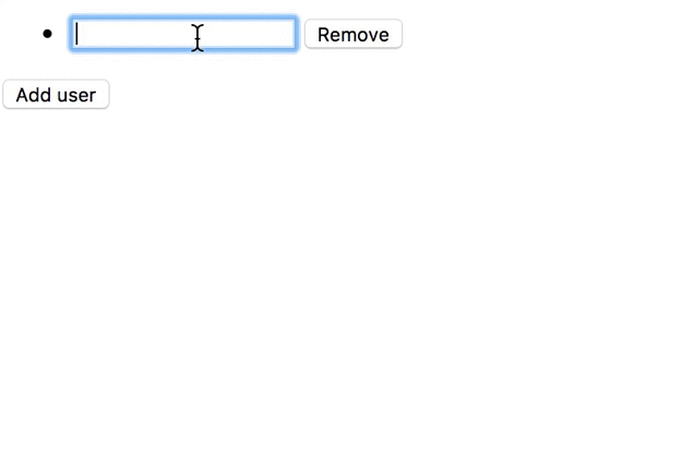
FormBuilder
Упростить процесс создания новых форм нам помогает сервис FormBuilder. Который мы можем инжектировать в контроллер:
После чего создать туже форму (“учасники”), только теперь с помощью сервиса:
вы можете сказать, что кода не стало меньше. Да, это так. FormBuilder имеет смысл использовать только для сложных форм с большим динамическим количеством контролов.
Валидация данных в реактивном подходе
Чтобы добавить валидатор на контрол мы всего лишь добавляем второй параметр, который может быть как одним валидатором, так и массивом(применяем разные проверки):
name: FormControl = new FormControl('Alice', [Validators.required]);
предварительно импортировав коллекцию валидаторов:
import { Validators } from “@angular/forms”;
Мы можем задавать один и больше валидатор. На данный момент в коллекции есть следующие валидаторы:
- min
- max
- required
- requiredTrue
- minLength
- maxLength
- pattern
Создание своих валидаторов
Валидатор представляет из себя простую функцию, которая возвращает либо объект ошибки либо null:
добавляется вторым параметром в контрол( вместе со стандартными валидаторами):
name: FormControl = new FormControl('Alice', [Validators.required, myNameValidator]);
В реальных проектах валидаторы собирают в группы заворачивают в классы и делают статическими методами классов.
Валидаторы с параметрами
Для создания валидаторов с параметрамми нам всего лишь необходимо завернуть нашу функцию валидатор в еще одну функцию, которая создаст замыкание для хранения параметров:
Асинхронные валидаторы
Асинхронные валидаторы отличаются от синхронных только тем, что возвращают не статические данные, а Observable либо Promise:
и также определяются 3-м параметром в конструкторе контрола:
name: FormControl = new FormControl('Alice', [myNameValidator], [myAsyncNameValidator]);
Вывод ошибок
Ошибки контрола хранятся в свойстве errors:
this.name.errors
Чтобы сделать какие-то действия в случае появления ошибок, можем написать так: добавив фильтры на изменение состояния и собственно валидность данных:
Свойство есть не только у обычного контрола, но так же и у FormGroup, поэтому вы можете получить объект со всеми ошибками формы:
this.participantsForm.errors
Создание кастомных контроллов
Решил вынести эту главу в отдельный пост.
Время прочтения
6 мин
Просмотры 34K

На данный момент Angular является одним из самых популярных и быстроразвивающихся фреймворков. Одна из его сильных сторон — большой встроенный инструментарий для работы с формами.
Реактивные формы — модуль, который позволяет работать с формами в реактивном стиле, создавая в компоненте дерево объектов и связывая их с шаблоном, и дает возможность подписаться из компонента на изменение в форме или отдельном контроле.
В первой части речь шла о том, как начать работать с реактивными формами. В данной статье рассмотрим валидацию форм, динамическое добавление валидации, написание собственных синхронных и ассинхронных валидаторов.
Код примеров прилагается.
Начало работы
Для работы напишем реактивную форму создания пользователей, состоящую из четырех полей:
— тип (администратор или пользователь);
— имя;
— адрес;
— пароль.
Компонент:
import { Component, OnInit } from '@angular/core';
import { FormBuilder, FormGroup } from '@angular/forms';

@Component({
 selector: 'my-app',
 templateUrl: './app.component.html',
 styleUrls: ['./app.component.css']
})
export class AppComponent implements OnInit {
 userForm: FormGroup;
 userTypes: string[];

 constructor(private fb: FormBuilder) { }

 ngOnInit() {
  this.userTypes = ['администратор', 'пользователь'];
  this.initForm();
 }

 private initForm(): void {
  this.userForm = this.fb.group({
   type: null,
   name: null,
   address: null,
   password: null
  });
 }

}
Шаблон:
<form class="user-form" [formGroup]="userForm">

  <div class="form-group">
    <label for="type">Тип пользователя:</label>
    <select id="type" formControlName="type">
     <option disabled value="null">выберите</option>
     <option *ngFor="let userType of userTypes">{{userType}}</option>
   </select>
  </div>

  <div class="form-group">
    <label for="name">Имя пользователя:</label>
    <input type="text" id="name" formControlName="name" />
  </div>

  <div class="form-group">
    <label for="address">Адрес пользователя:</label>
    <input type="text" id="address" formControlName="address" />
  </div>

  <div class="form-group">
    <label for="password">Пароль пользователя:</label>
    <input type="text" id="password" formControlName="password" />
  </div>
</form>
<hr/>

<div>{{userForm.value|json}}</div>
Добавим стандартные валидаторы (работа с ними была описана в первой части):
private initForm(): void {
 this.userForm = this.fb.group({
  type: [null, [Validators.required]],
   name: [null, [
    Validators.required,
    Validators.pattern(/^[A-z0-9]*$/),
    Validators.minLength(3)]
   ],
   address: null,
   password: [null, [Validators.required]]
  });
}
Динамическое добавление валидаторов
Иногда необходимо проверять поле только при определенных условиях. В реактивных формах можно добавлять и удалять валидаторы с помощью методов контрола.
Сделаем поле “адрес” не обязательным для администратора и обязательным для всех остальных типов пользователей.
В компоненте создаем подписку на изменение типа пользователя:
private userTypeSubscription: Subscription;
Через метод get формы получим нужный контрол и подпишемся на свойство valueChanges:
private subscribeToUserType(): void {
 this.userTypeSubscription = this.userForm.get('type')
  .valueChanges
  .subscribe(value => console.log(value));
}
Добавим подписку в ngOnInit после инициализации формы:
ngOnInit() {
 this.userTypes = ['администратор', 'пользователь'];
 this.initForm();
 this.subscribeToUserType();
}
И отписку в ngOnDestroy:
 ngOnDestroy() {
  this.userTypeSubscription.unsubscribe();
 }
Добавление валидаторов к контролу происходит с помощью метода setValidators, а удаление с помощью метода clearValidators. После манипуляций с валидаторами необходимо обновить состояние контрола с помощью метода updateValueAndValidity:
private toggleAddressValidators(userType): void {
 /** Контрол адреса */
 const address = this.userForm.get('address');
 /** Массив валидаторов */
 const addressValidators: ValidatorFn[] = [
  Validators.required,
  Validators.min(3)
 ];
 /** Если не админ, то добавляем валидаторы */
 if (userType !== this.userTypes[0]) {
  address.setValidators(addressValidators);
 } else {
  address.clearValidators();
 }
 /** Обновляем состояние контрола */
 address.updateValueAndValidity();
}
Добавим метод toggleAddressValidators в подписку:
private subscribeToUserType(): void {
 this.userTypeSubscription = this.userForm.get('type')
  .valueChanges
  .subscribe(value => this.toggleAddressValidators(value));
}
Создание кастомного валидатора
Валидатор представляет из себя функцию, на вход которой подается контрол, к которому она привязана, на выходе при ошибке валидации возвращается объект типа ValidationErrors, а при успешном прохождении валидации возвращается null.
Помимо валидаторов, предоставляемых Angular, разработчик имеет возможность написать валидатор под свои нужды.
Создадим валидатор пароля с проверкой на следующие условия:
— пароль должен содержать заглавные буквы;
— пароль должен содержать прописные буквы;
— пароль должен содержать цифры;
— длина должна быть не менее восьми символов.
/** Валидатор пароля */
private passwordValidator(control: FormControl): ValidationErrors {
 const value = control.value;
 /** Проверка на содержание цифр */
 const hasNumber = /[0-9]/.test(value);
 /** Проверка на содержание заглавных букв */
 const hasCapitalLetter = /[A-Z]/.test(value);
 /** Проверка на содержание прописных букв */
 const hasLowercaseLetter = /[a-z]/.test(value);
 /** Проверка на минимальную длину пароля */
 const isLengthValid = value ? value.length > 7 : false;

/** Общая проверка */
 const passwordValid = hasNumber && hasCapitalLetter && hasLowercaseLetter && isLengthValid;

 if (!passwordValid) {
  return { invalidPassword: 'Пароль не прошел валидацию' };
 }
  return null;
}
В данном примере текст при ошибке валидации один, но при желании можно сделать несколько вариантов ответов.
Добавим валидатор в форму к паролю:
private initForm(): void {
 this.userForm = this.fb.group({
  type: [null, [Validators.required]],
  name: [null, [
   Validators.required,
   Validators.pattern(/^[A-z0-9]*$/),
   Validators.minLength(3)]
  ],
  address: null,
  password: [null, [
   Validators.required,
   /** Валидатор пароля */
   this.passwordValidator]
  ]
 });
}
Получить доступ к ошибке валидации контрола можно с помощью метода getError. Добавим отображение ошибки в шаблоне:
<div class="form-group">
 <label for="password">Пароль пользователя:</label>
 <input type="text" id="password" formControlName="password" />
</div>
<div class="error"
 *ngIf="userForm.get('password').getError('invalidPassword') && userForm.get('password').touched">
 {{userForm.get('password').getError('invalidPassword')}}
</div>
Создание асинхронного валидатора
Асинхронный валидатор осуществляет валидацию с использованием данных сервера. Он представляет из себя функцию, на вход которой подается контрол, к которому она привязана, на выходе возвращается Promise или Observable (в зависимости от типа HTTP запроса) с типом ValidationErrors при ошибке и типом null при успешной валидации.
Проверим, занято ли имя пользователя.
Создадим сервис с запросом валидации (вместо http запроса будем возвращать Observable с проверкой заданного в сервисе массива пользователей):
import { Injectable } from '@angular/core';
import { ValidationErrors } from '@angular/forms';
import { Observable } from 'rxjs/Observable';
@Injectable()
export class UserValidationService {
 private users: string[];
 constructor() {
  /** Пользователи, зарегистрированные в системе */
  this.users = ['john', 'ivan', 'anna'];
 }

 /** Запрос валидации */
 validateName(userName: string): Observable<ValidationErrors> {
  /** Эмуляция запроса на сервер */
  return new Observable<ValidationErrors>(observer => {
   const user = this.users.find(user => user === userName);
   /** если пользователь есть в массиве, то возвращаем ошибку */
   if (user) {
    observer.next({
     nameError: 'Пользователь с таким именем уже существует'
    });
     observer.complete();
    }

    /** Если пользователя нет, то валидация успешна */
    observer.next(null);
    observer.complete();
   }).delay(1000);
  }
}
Метод delay устанавливает задержку ответа, эмулируя ассинхронность.
Теперь в компоненте создадим сам валидатор:
/** Асинхронный валидатор */
nameAsyncValidator(control: FormControl): Observable<ValidationErrors> {
 return this.userValidation.validateName(control.value);
}
В данном случае валидатор возвращает вызов метода, но если сервер в случае прохождения валидации возвращает не null, то для Observable можно использовать метод map.
Асинхронный валидатор добавляется в массив описания контрола третьим элементом:
/** Инициализация формы */
private initForm(): void {
 this.userForm = this.fb.group({
  type: [null, [Validators.required]],
  name: [null, [
   Validators.required,
   Validators.pattern(/^[A-z0-9]*$/),
   Validators.minLength(3)],
  /** Массив асинхронных валидаторов */
   [this.nameAsyncValidator.bind(this)]
  ],
  address: null,
  password: [null, [
   Validators.required,
   this.passwordValidator]
  ]
 });
}
В первой части говорилось, что Angular добавляет на элементы формы css классы. При использовании асинхронных валидаторов появляется еще один css класс — ng-pending, показывающий, что ответ от сервера по запросу валидации еще не получен.
Добавим в css стили, показывающие, что запрос валидации находится в обработке:
input.ng-pending{
 border: 1px solid yellow;
}
Потеря контекста у валидатора
Функция валидатора, вне зависимости от того, является она синхронной или асинхронной, только добавляется к контролу, а не вызывается. Вызов происходит во время валидации вне компонента, поэтому контекст теряется, и если в валидаторе используется this, то он уже не будет указывать на компонент, и произойдет ошибка. Сохранить контекст можно, используя метод bind, или обернув валидатор в стрелочную функцию.
Ссылки
Код примера находится тут.
Более подробную информацию можно получить из официальной документации.
Все интересующиеся Angular могут присоединяться к группе русскоговорящего Angular сообщества в Telegram.