- 18 min read
- UX,
Usability,
Design Patterns
When we design interfaces, we rarely think about error messages first. After all, how much is there to design anyway? We highlight the error, display a message, and nudge users toward the correct input. As it turns out, a strategic and thorough design of these messages can be critical for businesses, especially if they struggle with high abandonment. Error messages can make or break the experience in situations when things go south.
Errors are everywhere, and so are error messages. They are of course common in web forms, but also in complex tables, incompatible filters, search queries and failed interactions. They can be small error notes and large error summaries; short tooltips and lengthy toast messages. So, where do we start? From the beginning.
Pssst! This article is part of our ongoing series on design patterns. It’s also a part of Smart Interface Design Patterns 🍣 and is available in the Live Interface Design Training 🍕 as well.
Not All Error Messages Are Equal
Not all errors are the same. As Page Laubheimer has noted, there are actually two different types of errors. Slips occur when users intend to perform one action but do another (e.g., when filling in a form on autopilot). Mistakes occur when there is a mismatch between the mental model of a user and the system. Our interfaces need to support both types of errors, and slips are usually much easier to resolve than mistakes.
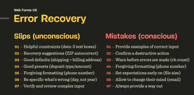
For slips, we can include helpful constraints (e.g. a reasonable width of a text box, prefixes and suffixes), provide recovery suggestions (e.g. autocomplete), choose reasonable defaults, and use forgiving formatting.
To prevent mistakes, we need to confirm destructive actions (when users go back to the previous page), set expectations early on (password requirements or file size), allow users to change their minds (change email or payment method), and in general, always provide a way out.
To measure the success of our error messages, we can define error-focused design KPIs and track them over time. These could include:
- the average number of mistakes in a user journey,
- the error recovery time,
- the completion rates, and
– completion times.
We can’t really eliminate mistakes altogether since no human input can be bulletproof, but we can reduce the number of errors by making it more difficult to make mistakes. One simple way of doing so is to improve the discovery errors, by never relying on the color of error messages alone.
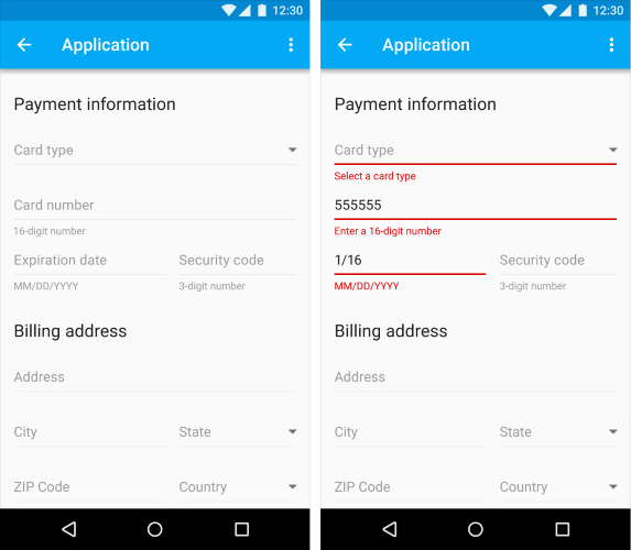
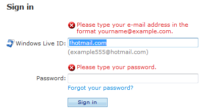
Never Rely On Red Color Alone
When we think of error messages, we almost subconsciously think of bold red text errors. That’s indeed a very established pattern, but often not enough to indicate to all users that something is wrong.

Due to color vision deficiencies, it’s a good idea to always complement error messages with an icon, e.g., a large exclamation mark on a red background — right next to the error message. We can also highlight the entire section, along with the field, label, the hint, the error message and the input field. For example, a thick red vertical line next to the error message is a common pattern for error messages on Gov.uk.

Sometimes the icon is displayed inside of the input field, on the right or on the left edge of the text box. When we display the icon on the right, users who zoom in and out might have difficulties spotting them. That’s why placing the icon on the left edge seems to be just a bit more reliable.

Additionally, it might be a good idea to guide users towards specific issues of the form with an error summary. That summary can contain links to the areas in the form which contain errors, so users can jump there directly.
The summary can appear on the top of the page, or just above the action button, as displayed in the example above.
Most importantly, error summary probably shouldn’t appear under the action button. Too often, especially on mobile, users don’t realize that there is any error message at all, and keep clicking on that poor submit button hoping to get any kind of feedback — be it a status update from the browser, or a change of the URL. The feedback is actually there, under the button, yet in testing, it often shows very poor discovery rates.
If the page is fully refreshed upon validation, the error summary should be at the very top of the page. But if the page is updated without a refresh, it’s reasonable to add the error summary just above the action button where the user has just clicked or tapped — and highlight it with the red color and icon as well.
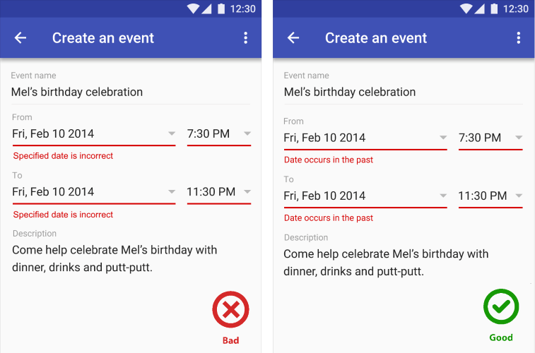
Once a user clicks on the submit button, should we automatically scroll them to the first error? There is no clear answer to that question. Personally, I saw this pattern working very well for some users, but failing miserably for others.
Any sudden movements on the page are likely to cause frustration with at least some users. If anything, users tend to find auto-jumps more annoying than auto-scrolling — as the latter at least communicates the direction of change and hints better at where users have moved to.
Short answer? Start without auto-scrolling and display just an error summary with links. If it’s too slow, or doesn’t work as expected, consider adding auto-scrolling. And by no means move users up and down the page for no obvious reason — that’s a safe way to increase completion times and introduce confusion when it’s probably not needed.
Never Cover User’s Input
When we display error messages, we convey to users that there is a problem; a good error message, however, also guides users to a solution. This, however, requires the ability to consult the error as the error is being fixed. In other words, users should be able to edit the input field while also reviewing the error message(s) provided to them.

So far, so good. However, things become quite complicated once we also have a tooltip in play. Once a tooltip is open, users might lose sight of both the error message and the input. Should they desire to be able to see all three pieces of information at once, they’d be out of luck.

However, we can fix it relatively easily. First of all, we avoid tooltips that open on hover and display the tooltip only once tapped or clicked. That means that a tooltip will never disappear automatically and must be closed manually.
Then, we use the details component and inline accordions as an alternative to tooltips. Hence, we make space for the content of the tooltip to expand between the label and the other content, so nothing will be covered. The error message would be visible at all times as well, next to the input field.

This way, we show all three pieces of information at the same time — and users always have a choice to select what exactly they’d like to see. Is it too much? Maybe. But that’s a great option to keep in mind: at least to always display the input field and the error at the same time without them being covered by the tooltip.
More after jump! Continue reading below ↓
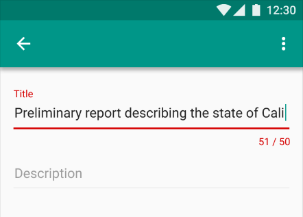
In Forms, Display Error Messages Above Input
Now, this might sound a little bit confusing at first. Usually, error messages will be sitting conveniently under the input field, or perhaps — less frequently — on the right side of the input field. As it turns out, there are a few accessibility issues that come as a cost of these conventions.
- Users of a magnifying software might miss the error message when it’s located on the right.
- On mobile, users might not be able to see the error message under the input because it will be covered by the virtual keyboard.
- When editing input, error messages might be covered by the browser’s autofill or dropdown’s autocomplete suggestions.

Displaying error messages above input fields typically helps us avoid the accessibility issues listed above. The cost of it, though, is layout shifts: with every new error appearing dynamically, the entire form has to shift vertically as we need to make space for the error message to appear. It might be noisy, but sometimes that noise might be very much worth it.
For lengthy error messages, it might sound tempting to display them as a tooltip, yet with it come all the usability issues discussed in the previous section. Using a collapsible accordion instead might be a better idea there.
In Tables, Display Error Messages Inline
When displaying error messages in tables, it might be a good idea to consider alternative approaches as otherwise we would end up with a lot of layout shifts for each row.
One of the simpler patterns is to display the error message in the same row where the content lives. In that case, the error message is more likely to live under the input field, not above it. Lengthy error messages could be collapsed and expanded with a tap/click on the entire row.

If the same error affects multiple rows, we might want to highlight the rows that contain errors and display an error message at the very top of the page that would explain the error and what needs to be done to fix it.

Don’t Rely On Toast Error Messages
But what about good ol’ toast error messages? Those animated notifications, informing users about change of status of the system with floating messages. They might be uncommon for forms, but they frequently appear in tables and enterprise dashboards.

There are a few common usability issues with toast error messages:
- Users often don’t get a chance to fully read or understand the error message before it has disappeared, and there is no way to restore it or keep it floating.
- Toast messages typically appear on the edges of the screen, and usually, it’s quite far away from the problematic input that has caused the error. There is quite a disconnect between the error message and the input, and it’s rarely possible to read the error message and correct the mistake simultaneously.
- Lengthy toast messages usually block large areas of content that a user might be relying on — and potentially even the input that has caused the error.
- Toast messages need to be announced to screen reader users while also allowing users to bring their focus back and forth between the error message and the erroneous input.
- With toasts, we usually don’t have enough space to provide a detailed help using images or videos, and have to rely on plain text and links leading to external help pages that would usually open in a new tab.

If anything, toasts should be persistent if displaying information that can be acted upon, and users should be able to manually dismiss the notification.
Personally, I’d definitely stay away from designing error messages as toasts, even if they are persistent. The better we can connect an error with its cause visually, the less likely it is to be overlooked. And the better we can explain how to solve that error close to the erroneous input box, the faster users will understand what they need to do.
Allow Users To Override An Error Message
We’ve all been there before: full of hope and passion, you type in your shipping address in an eCommerce checkout, willing to proceed with payment right away. Yet here it comes, an aggressive address validator, telling you that your address is wrong, and you better double check it. You have been living at that address for the last five years, yet for some reason, that’s not good enough for the address validator.
What options do you have? Unless you are willing to deliver the item to another address, this problem will likely cause a 100% abandonment — an extremely high price to pay for a poor address validator. Surely you don’t want to deliver an item to non-existing addresses, yet you don’t want to abandon customers either. Indeed, it might be that only a small portion of customers will be affected by it, but why should we lose these customers either?

No single validation library is 100% reliable and bulletproof for all the edge cases. Eventually some percentage of your customers will be left out there in the woods, trying to figure out what to do next to proceed. Aggressive validators cost money. Especially when they come in tandem with disabled buttons that literally block users without telling them what exactly needs to be done to fix the issue.
For cases when a validator might be too restrictive, we can allow customers to override validator’s warning. Surely we will get some wrong addresses as a result of that. But as a business, we need to measure just how much money we are losing due to increase in service desk inquiries vs. how much money we gain by allowing people to find a way to proceed even although the interface doesn’t want to play along. More often than not, it’s worth it.
While this pattern works flawlessly for address input and telephone input, it probably won’t work for any input that needs to follow a particular convention — such as the length and checksum of an IBAN number or a credit card number. There, instead of giving customers a carte blanche, we need to meticulously check user’s input and guide them towards what exactly the problem seems to be.
Establish Stop-Words For Your Error Messages
Many error messages in most web applications are remarkably generic. They do indicate errors, but they aren’t very helpful in indicating solutions on how to fix these errors. Most of the time, these messages don’t really refer to the specifics of the user’s input. They provide a very general statement explaining that the input is wrong, with plenty of floral and cryptic words along with it.
In my personal experience, starting a project off by exploring and defining error messaging can be a very valuable exercise. If we can convey friendliness and personality while being concise and helpful in our error messages, we should surely be able to achieve the same in our navigation, body copy and form labels. In many ways, the way we write error messages can help us figure out just the right voice and tone of the entire design.

Depending on your product’s voice and tone, you might want to be very strategic about how your error messages should sound. Here are some of the stop-words that Gov.uk tends to avoid in their interface:
- technical jargon like ‘form post error’, ‘unspecified error’, and ‘error 0x0000000643’;
- words like ‘forbidden’, ‘illegal’, ‘you forgot’, and ‘prohibited’;
- ‘please’ because it implies a choice;
- ‘sorry’ because it does not help fix the problem;
- ‘valid’ and ‘invalid’ because they do not add anything to the message;
- humourous, informal language like ‘oops’.
The choice of words matters. It’s worth emphasizing that spending time and effort on crafting helpful, adaptive error messages is probably one of the best investments a company might make to reduce abandonment and drive conversions.
Provide Examples Of Correct Input
Talking about the choice of words, how do we make it more helpful? And in general, what makes an error message helpful? For example, a clear set of guidelines of what a correct input is. That means adding a hint under the label and provide an example of correct input, so users understand how to re-route and what is expected from them.


Surely, sometimes adding an example might feel unnecessary and just taking up the space in design. I’d challenge you to tackle your conversion issues with well-crafted examples of corrent input. Often it’s the easiest way to improve conversion, as users otherwise just can’t find a way to make something work — even if it’s as simple as an extra empty space.
Display Error Summary On The Top
Inline validation deserves a separate conversation. As an alternative approach, of course we could validate the form on submit only. But it doesn’t mean that we have to drive users from one page to a separate new page with all the errors displayed. We could display an error summary just next to the Submit button (as displayed below, sketched by Jordan Moore). It would probably be better to display the error message above the Submit button rather than below it to prevent it from being rendered below the bottom of the viewport and thus not to be visible (thanks Rik!).

Submit button. Sketched by Jordan Moore. (Large preview)
However, if there are a few problems with the form, we can also use an error summary component. With it, we highlight the errors as links so that users can jump to them via the keyboard as well. While doing so, we need to bring focus to the first form field with an error. Preferably with a bit of scroll-margin-top, so screen reader users understand where they currently are.

Additionally, you might want to adjust the favicon and the title of the document if errors do appear, so impatient users who might have already left the form perhaps have a chance to return back and fix the errors, rather than assuming that everything has worked flawlessly.

Wrapping Up
At the first glance, dealing with error messages might not sound like a big deal. However, as we dive into fine details, there are plenty of considerations that might either cause high abandonment or help people resolve issues quickly.
Here’s a quick overview of what we can do to improve the Error Messages UX in our websites and applications:
- Define error-focused design KPIs by measuring the average number of mistakes in a user journey, the error recovery time, the completion rates, and completion times.
- Never rely on the color of the error message alone, and use icons, borders, and section highlights to indicate erroneous input.
- Never cover user’s input nor the error message. Ideally, allow users to consult the error message, the tooltip, and their input at the same time, e.g., by using inline accordions and avoiding tooltips for important details.
- Consider displaying error messages above input to avoid issues with auto-fill, autocomplete, magnifying software, and virtual keyboard.
- Use inline validation for password strength meters, but not for validating every field as users type in. Consider breaking the form into small steps and validate each step only on submit.
- For complex tables, don’t rely on toast error messages and display errors within rows where an error has occurred.
- Be strategic about your error messaging and craft helpful messages that match the voice and tone of your brand, rather than being general and generic.
- Always provide examples of correct input, especially for complex input that are less likely to be auto-filled.
- Allow users to override your validators for address input and telephone input, but not for any input that needs to follow a particular convention.
- When validating on submit, display an error summary on the top of the page, or guide users to an error in a popover. Also, change the favicon and the title of the document to communicate to users who’ve already left that something went wrong.
With these guidelines, we should be better off when boosting our error messages UX. And if you can’t really do much around the way errors appear in your product, explore what you can do to replace generic error messages with helpful ones. This might be a small change with a huge impact that will eventually show up in large business KPIs dashboards.
Meet “Smart Interface Design Patterns”
If you are interested in similar insights around UX, take a look at Smart Interface Design Patterns, our shiny new 9h-video course with 100s of practical examples from real-life projects. Plenty of design patterns, guidelines and a live UX training — with 5 new segments added every year. Just sayin’! Check a free preview.

100 design patterns & real-life
examples.
9h-video course + live UX training. Free preview.
Useful Resources
- Back Button Expectations, Baymard Institute
- Designing With the Web in Mind, Chloe Sanderson
- Designing A Perfect Configurator
- Designing A Perfect Accordion
- Designing A Perfect Infinite Scroll
- Designing A Perfect Feature Comparison
- Designing A Perfect Slider
Related Articles
- “How To Design Error States For Mobile Apps”, Nick Babich
- “Designing Better Tooltips For Mobile User Interfaces”, Eric Olive
(vf, yk, il)
‘Errors’ happen. They happen in our apps and they happen in our life. Sometimes they happen because we made mistakes. Sometimes because a system failed. Whatever the cause, these errors — and how they are handled — can have a huge impact on the way a user experiences your app.
Often overlooked, a lazy error handling and ill-constructed error messages can fill users with frustration, and make them stop using your app. A well-crafted error handling, on the other hand, can turn a moment of failure into a moment of delight.
In this article, we’ll examine how the design of apps can be optimized to prevent excessive user errors and how to create good error messages.
[otw_is sidebar=otw-sidebar-1]
What is an Error?
Errors (or error condition) occur when an app fails to complete an expected action, such as:
- The application does not understand user input
- The application fails
- A user intends to run incompatible operations concurrently
Every error, regardless of who is to blame, becomes a point of friction for your users. Luckily, a well-designed error handling can help reduce that friction.
Preventing User Errors
If you’re a web or app designer, you should be familiar with constraints. For example, it’s hard to fill out a certain form or it’s impossible to properly sync a data if a device has a poor network connection. You should take these constraints into account in order to minimize errors by designing an app that makes it easy for users to use it. In other words, it’s better to prevent users from making errors in the first place by offering suggestions, utilizing constraints, and being flexible.
Twitter famously has a strict character limit for tweets and warns users before they exceed that limit with a remaining character count.
Make Error Message Informative and Consistent
One of the 10 Usability Heuristics advises that it’s important to communicate errors to users gracefully and clearly. An effective error message provides following information:
- Communicate what is happening
- Describe how a user can resolve it
- Preserve as much user-entered input as possible
By providing explanation and feedback, you can decrease the potential friction of user experience.
User Input Errors
User input validations are meant to have conversations with users and guide them through the difficult times of errors and uncertainty. The output of this process is emotional rather than technical.
The primary principle of input validation is this: “Talk to the users! Tell when them what is wrong!” Generally speaking, there are three important elements that good form validation consists of:
- Right time and place for informing about errors
- Right color for the message
- Clear language for your message
And all these moments have one major goal — avoid confusion.
Right Time and Place (Inline Validation)
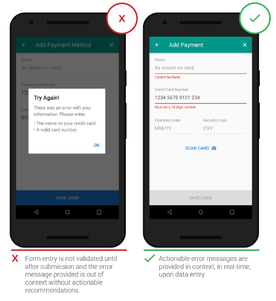
Users dislike when they go through the process of filling out a form only to find out at submission, that they’ve made an error. The right time to inform about the success/failure of provided data is right after the user has submitted the information. And it’s a time when real-time validation comes into play.
Real-time inline validation immediately informs users about the correctness of provided data. If you are performing inline form validation, and the field with the error is clearly marked, the submit button may be disabled until the error is corrected. It allows users to correct the errors they make faster without having to wait until they press the submit button to see the errors.
Below are a few examples of inline validation:
- Incompatible values
- Over/under character or word count
[otw_is sidebar=otw-sidebar-2]
Right Color (Intuitive Design)
Color is one of the best tools to use when designing validation.
Because it works on an instinctual level, adding red to error messages and yellow to warning messages is incredibly powerful. Error text should be legible, with noticeable contrast against its background color. But make sure that colors in your digital interface are accessible for your users, it’s a really important aspect of a well-executed visual design.
Clear Message (What Happened)
Make sure your error messages sound like they’ve been written for humans. In order to achieve this you should speak the same language as your users, avoid using technical jargon, express everything in the user’s vocabulary. Your validation message should clearly state:
- What went wrong and possibly why.
- What’s the next step the user should take to fix the error.
App Errors
App errors occur independently of user input. It is an example of a situation where the user is getting something other than their desired state. When showing errors, explain why user cannot see anything, and how to solve this.
[otw_is sidebar=otw-sidebar-3]
Sync Error/Failure To Load
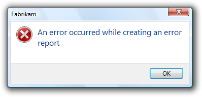
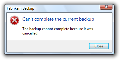
When sync or connectivity is down or content has failed to load, the user should know that. Tell them upfront. Since you don’t have a data, you can use empty states to fill this gap. Sad fact that most empty states often look… empty. In the example below, error screen only states “An error occurred” and doesn’t provide any helpful information.
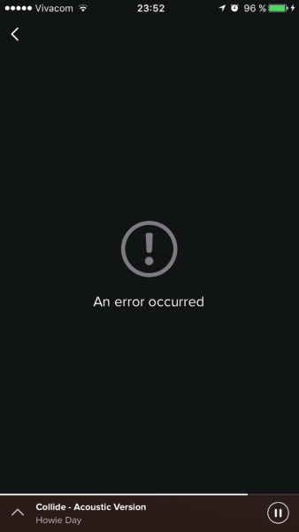
Think of your error message as a conversation with your user. Use friendly and helpful empty states in a moment of failure. Assist users by providing the basic required information, and encourage users to solve the problem.

If appropriate, present a link (or button) to help a user accomplish their task. But you should only offer options that you can actually support. For example, don’t offer an option like “Try again” in cases where you can detect that the operation will fail.
Or if the case is a loading time issue, make sure you have a progress indicator in place.
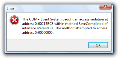
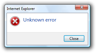
Never Show The Raw Error Message
Messages like the example below are cryptic and scary.
Don’t assume people know about the context of a message or they are tech-savvy, tell people what’s wrong in simple words. How would you explain the error to them, in human speak? Write those words down. That’s your error message.
Incompatible State Errors
Incompatible state errors occur when users attempt to run operations that conflict, such as making a call while in airplane mode or trying to play online video while being offline. You should help prevent users from putting themselves into these situations by clearly communicating the states they are selecting. Simply, don’t let people start something they can’t finish.

The best error message is the one that never shows up. It is always best to prevent errors from happening in the first place by guiding users in the right direction ahead of time. But when errors do arise, a well-designed error handling not only help teach users how to use the app as you intended, but they also prevent users from feeling ignorant.
About the author:
This post originally appeared on babich.biz, written by Nick Babich. Nick is a software developer who’s passionate about user experience.
[otw_is sidebar=otw-sidebar-4]
Capture feedback easily. Get more insights and confidence.

Getting feedback has never been easier and we hope you’ve realized that after reading this article. Let us know what you think, your feedback is important.
And if you’re ready to try out a customer feedback software, Usersnap offers a free trial. Sign up today or book a demo with our feedback specialists.
Error messages are frustrating to see. They mean that somewhere, somehow, something went wrong. The mistake can be due to a user error or a system malfunction. Either way, both us as humans and the product we’re interacting with are imperfect by nature, which means mistakes are bound to happen.
Because of this reality, error messages are a vital aspect in the user experience in any app or web design. The key is making errors useful so that users can be helped to overcome roadblocks, instead of abandoning the experience altogether.
The list of best practices below can help make error message user experience (UX) more effective.
By clearly describing what the error is, why it happened, and how to overcome the problem, an error message can be a powerful UX resource to empower users.
1. Make error messages human friendly
Be clear and specific
Error messages are seen as an annoyance because they’re often extremely vague. They might say that “an error occurred,” but not much else. This leads to a dead end since the user doesn’t know the true cause of the error, nor which action to take next in order to overcome the problem.
Users shouldn’t have to guess what’s wrong with the product they’re using. By clearly describing what the error is, why it happened, and when possible, how the user can overcome the problem, an error message can be a powerful UX resource to empower users despite any mistakes that occur.

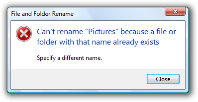
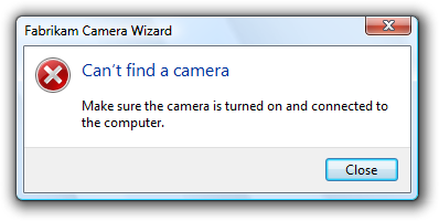
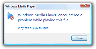
The above left is a good example of an error message that is clear. It explains what the error is (a rename error), it explains why it happened — because another file with that name exists. Finally, it explains how the user can overcome it, by specifying a different name. The error message is specific enough, so that the issue doesn’t turn into an insurmountable obstacle.

In the above example, Doordash has a nicely designed error user experience. When entering an invalid coupon code, it gives a helpful and descriptive error as to why it’s invalid, thereby helping the user to understand what action they need to take next. Helpful information like this can prevent users from abandoning a product altogether.
Avoid jargon
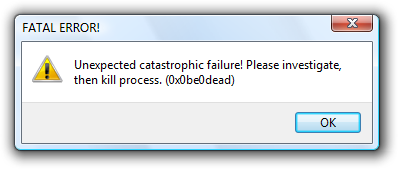
Using technical jargon can scare users off because they don’t know, and don’t care, what it means. Instead, use simple language that the average user can understand. As designers, we may sometimes forget that we’re not designing for ourselves, but for people who will use the product on a regular basis. By keeping the user in mind at all times, we can ensure that even error messages are presented in a human-friendly way.

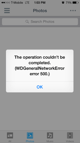
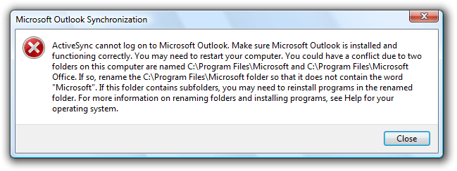
In the above example to the right, a user is presented with an error that contains meaningless jargon and no way to overcome the error. The only action the user is presented with is to hit “OK.” Clearly, in this case, an “unrecoverable error” is not ok.
Instead, we can present users with different actions they may take, and explain the error using clear UX writing language.
Keep it short and to the point
An error message shouldn’t feel like reading an essay. Most of the time, the extra details are meaningless for users who’re looking for a much quicker bottom line. Instead, keep error messages short and simple and leave out any lengthy explanations.

In the example above, Microsoft acknowledges an error and gives the user actions to try to recover, along with reporting the problem, so the company can further examine what happened. Also notable is the error code listed in the bottom left corner. Instead of trying to include all the technical error details, this short and unobtrusive code allows users who wish to do so, to search for any resolutions on their own.
2. Don’t play the blame game
The famous saying holds true when it comes to error UX: “It’s not what you say, but how you say it.” Tone plays a big role in how users perceive an experience. The last thing you’d want to do is make the user feel stupid for using your product, or like the error was their fault.
Use positive verbiage
Writing good error messages is quite similar to resolving conflicts between humans. Using negative phrases only escalates the situation, so it’s important to avoid phrases that make the user feel attacked. A good rule of thumb when writing error messages is to think: “Would I actually verbalize these words to a real person?”

Don’t (visually) yell at the user
Even though a product may not physically yell, it can give that impression by using all capital letters or if the design looks too alarming. A design that feels too negative could create an unpleasant experience and put their continued use of the product at risk.

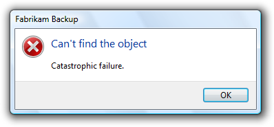
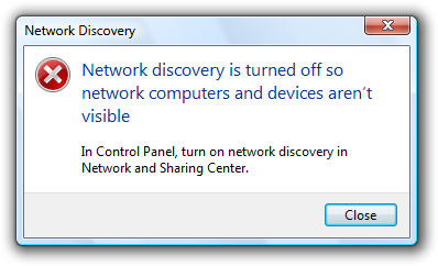
In the above example, Chase Bank avoids using phrases like “you did” or “you failed to do,” and instead, takes the blame gracefully, explaining that they “can’t find” the missing information. Chase then proceeds to provide additional steps to help the user recover their information.
It’s important to remember that users form an opinion of your company based on how they experience your product or service. Blaming them for issues, even if they are their fault, is a quick way to lose customers. By designing error messages that convey information in a positive, encouraging way, you improve your product’s overall user experience, and empower them to overcome any issues encountered.
3. Make error messages a learning experience
Jakob Nielsen, principal of Nielsen Norman Group, said in 1996 that users don’t really read documentation: ”Nielsen’s first law of computer documentation is that users don’t read it. The second law is that if they read it anyway, it’s because they are in deep trouble and need the answer to a specific problem.“
This “law” still holds true today. Seldom will users actually read documentation or help guides before using a product, and, if they do, it’s usually because something has gone wrong. We can use this behavior to design error messages that educate and guide users in the process.
For example, when presenting an error that’s due to something a user “can’t” do, it may be beneficial to provide suggestions of actions they can perform. Alternatively, we can provide a link to resources that will help with what the user is trying to perform.
4. Make error messages accessible
UX designers should be concerned with making their designs accessible to all types of users. These may include people who have visual, motor, speech, or other impairments. Since users with a wide range of abilities will face errors, it’s important that they, too, can recover from unexpected roadblocks.
Don’t rely solely on color
We’ve become quite comfortable with the notion that red equals error. However, some users may have different vision impairments. In these situations, it’s important to have an alternative, such as a communicative icon or a thicker border, so that the error still stands out to the user.

In the above example, we see multiple cues to indicate an error state. In addition to the common red color around the input state, there’s clear text signaling for what’s required from the user, along with the exclamation warning icon, so that the error is recognizable even without color.
Level up error UX with keyboard navigation
Users with motor disabilities may navigate content mostly using a keyboard. One way we can improve the UX of error interactions is by “auto-tabbing” the cursor to the relevant error and allowing them to tab to the next error, instead of having to manually go through the entire form, including the parts without errors.
Keep error layouts consistent and natural
Errors should be consistent in where and how they appear. For instance, it would be confusing if system errors are displayed at the top of the screen at first, and then other parts of the screen later on. By keeping the placement and visual language consistent, users can identify the error quickly and feel gain control of their experience.
5. Improve UX with error message prevention
The only thing better than user-friendly error messages are error messages that never appear. Though it may not be feasible to prevent every error, it is possible to reduce the amount that users see by applying a few design enhancements.
Prevent input mistakes
One of the most common sources of error messages is when users fill out input fields. We can put some thought into the design to prevent common mistakes.

In this example, Lemonade Ltd. uses address autocomplete suggestions to prevent users from entering an incorrect address.
Another common input error relates to phone numbers and Social Security numbers. Sometimes, websites expect users to include the dash “-” when entering a number and will generate an error if only numbers are typed. A better approach would be to design input fields that auto-format information to the way you need it, thereby preventing unnecessary errors from slowing down users.
Here are a few more input error prevention tips depending on the design:
-
Disable booking dates in the past
-
If a website has an age requirement, disable birth years past the requirement
-
Auto complete email addresses with “.com”
Error prevention should be a part of the user experience design process. It means thinking about the entire user flow and analyzing what could go wrong. After identifying potential issues, we can then improve the design so that the errors never occur in the first place.
Present information in bite sized chunks
Another great way to prevent errors from happening is to not overload the user with too many actions at once. In the case of web forms, users are often presented with 4 or more fields to fill out. The more users have to do, the higher the chance for errors.

Slack onboards new users by having them fill out just a little bit at a time, instead of presenting a typical web form with multiple inputs. With only one piece of information to insert, users feel welcomed and encouraged, and there’s a lower chance for an error to occur.
Conclusion
Error messages are annoying. Though it may not be possible to get rid of every blunder along the way, we can make errors more pleasant to encounter. Good error message design contributes to the overall experience of your product and perception of your company. Like any other aspect of the design, it’s important to test and validate how users experience error messages and continue to improve them.
Remember, the main goal is to make sure that any obstacles that come up don’t stop users in their tracks completely. Keep them moving and empower them with error messages that are beneficial to real humans.
Содержание
- How to Write and Design User-Friendly Error Messages
- 1. Clarity is key
- Avoid abstract error messages
- Get rid of technical terms
- 2. Write concisely, but precisely
- Don’t over-communicate the problem
- 3. Don’t blame users
- Avoid phrases like“You did,” “Your action caused.”
- Avoid using upper case text and (or) exclamation marks in the messages
- 4. Give users a solution
- Do not explain the meaning of buttons
- 5. Using the right format for your error messages
- 6. Limit the number of error messages that users see
- Use constrained controls
- Do not report errors that users don’t care about
- Correct errors automatically
- Have an error message design strategy
- Error Messages in Windows 7
- Is this the right user interface?
- Design concepts
- Guidelines
- Presentation
- User input errors
- Troubleshooting
- Icons
- Progressive disclosure
- Default values
- Error codes
- Sound
- Documentation
How to Write and Design User-Friendly Error Messages


We all know that the best error message is the one that never shows up. But no matter how good our design is, errors are unavoidable. When people interact with products, eventually, something is bound to go wrong.
Error messages may seem trivial, but they are a critical component of user experience. Users often evaluate the quality of the product by the quality of error messages. Poorly written error messages are one of the things that annoy users. Good error message UX design, on the other hand, can increase the speed of use and users’ subjective satisfaction.
In this article, I want to share the top six recommendations on how to write and design user-friendly error messages. The recommendations are based on guidelines created by Microsoft and Apple design guidelines.
1. Clarity is key
When it comes to writing error messages, clarity is your top priority. You need to describe what happened, why it happened, and what the user can do about it. The message should be written in plain language so that the target users can easily understand both the problem and the solution.
Avoid abstract error messages
Abstract error messages don’t contain enough information about the problem. In many cases, they simply state the fact that something went wrong and don’t help users understand the root cause of the problem. Don’t just assume people know about the context of a message—be explicit and indicate what exactly has gone wrong.
It can be confusing when an error message design doesn’t offer any clarity as to what exactly went wrong. This is an example of an abstract error message during the Windows 10 setup.
Get rid of technical terms
If an error message contains technical terms or jargon, the user gets confused. The error message should always describe the problem in terms of target user actions or goals. Even when your users are tech-savvy, it’s still better to use non-technical terms that everyone can easily understand.
This error message uses a lot of technical jargon. Image by IDW.
2. Write concisely, but precisely
People rarely read pages word-by-word; instead, they scan the page, picking out individual sentences. The more text on a page, the harder the text is to scan, and the more likely users won’t read the text at all. Research by the American Press Institute found that shorter sentences resulted in greater understanding:
- If sentences contain eight words or less, readers understand 100 percent of the information.
- If sentences contain 43 words or longer, the reader’s comprehension drops to less than 10 percent.
Try to reduce the text down to its essentials in all parts of your GUI, including error messages. Your goal is to write short but meaningful error messages.
Don’t over-communicate the problem
Error messages should enable users to easily resolve a problem. Messages should only contain the information required to help them achieve this. Understand what you want to communicate and get rid of the unnecessary details that don’t help you do this.
Well-designed error messages often try to explain how to fix the error. However, in some cases, it’s hard to explain the problem in a single sentence, so designers use troubleshooters — step-by-step instructions on how to solve the problem. In the following example, the error message attempts to explain every troubleshooting step. As a result, the error message becomes unreadable.
Avoid displaying troubleshooters as a body text in error message. Image by Microsoft.
Don’t try to explain a complicated troubleshooting process within an error message. Instead, use progressive disclosure to provide this information. The section that contains the steps should be hidden by default, and when the users want to learn more about the problem, they click “How to fix it.”
3. Don’t blame users
Human tone and language play a tremendous impact on how users comprehend the message. Use proper tone to help users relate better to a situation with an error, and help them understand it.
Avoid phrases like“You did,” “Your action caused.”
Some error messages are phrased in a way that accuses the user of making an error; errors are already frustrating, and there’s no need to add to frustration with judgment. In the end, these messages are an important, albeit, small way that we communicate and build relationships with our users. Always focus on the problem, not the user action that led to the problem.
Here are two ways you can handle a situation when the user enters incorrect login credentials:
- Don’t say: You have entered an incorrect login or password.
- Do say: Your login and password do not match.
Quick tip: A good way to incorporate a more human tone in error message UX design is to think about explaining them out loud to the person you care about.
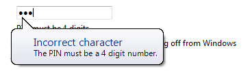
Notice how Dropbox politely requests the missing character.
Avoid using upper case text and (or) exclamation marks in the messages
Both upper case text and exclamation marks create a lousy user experience. The upper case text makes the error message difficult to read. When an error message ends with an exclamation mark, it creates an impression that the system is yelling at the users.
4. Give users a solution
Imagine you wrote a very important email and clicked the “Send” button. Right after that you see the message, “Your email could not be sent,” without any details. As a result, you don’t know what you can do about it. You have to pause your task and invest your time in finding the solution to the problem.
An example of a dead-end error message.
When the user has to stop their task in order to correct an error, it defeats the foundation of user-centered design—help your audience get through a task efficiently and effectively.
Effective error message UX design not only informs users that a problem occurred and explains why it happened, but it also provides the next steps for users so they can fix the problem. The next step can be contextually-relevant actions.
This error message provides context-relevant actions.
Do not explain the meaning of buttons
Error message UX design typically provides buttons that let users complete certain operations. In many cases, the buttons allow users to either proceed with the operation, or cancel, if they have changed their mind. The basic rule of good button design is simple—users should understand what buttons will do by reading their labels. If your error message text and button labels are clear, there should be no need to explain what the buttons do.
Delete the playlist error message in Apple Music. No need to explain the meaning of the “Delete” button here.
5. Using the right format for your error messages
Error messages are typically presented using modal dialog boxes—overlays that prevent users from interacting with underlying content. Putting error messages in modal dialog boxes has a major benefit—it gets 100 percent of the user’s attention. However, this quickly becomes a drawback if that attention isn’t necessary. In many cases, it’s possible to show the error messages using alternative patterns such as inline or as a status message.
When designing error messages, ask a simple question, “Does the user need to be interrupted to read this message?” If not, consider alternatives to using a modal dialog box.
6. Limit the number of error messages that users see
Frequently displayed error messages are a sign of bad error message UX. Error messages disrupt the user experience and create friction. Thus, they should only be used in important situations like destructive actions (such as deletions). The infrequency of alerts helps ensure that people take them seriously.
Use constrained controls
It’s usually better to prevent an error than to report one. Many errors can be avoided through better empathetic design. UI elements like sliders and date and time pickers should be constrained to valid values. For example, for an experience that lets you book with a hotel date picker, you should disable the dates in the past.В
Booking.com prevents users from selecting incorrect dates by disabling dates in the past.
It’s also possible to constrain text boxes to accept only certain characters. For example, if you expect users to enter a phone number in the text field, you can accept only numbers and create a phone number mask for this field.
Telephone input text field. Image by Github.
Last but not least, you can disable the call-to-action buttons for input forms at times when clicking them would result in an error. This point is valid for data submission forms—as long as it’s obvious why the control is disabled, it prevents users from making unnecessary actions.
Do not report errors that users don’t care about
Software developers often rely on error messages that indicate some error system conditions. The messages that indicate that there is a bug in a system have meaning only to the programmer, but users don’t care about them. Aside from dismissing the error message, there is nothing users can do about such messages.
Correct errors automatically
If the problem can be corrected automatically, it should be corrected automatically. For example, the search form should automatically correct mistyping.
Amazon autocorrects minor typos.
Have an error message design strategy
When it comes to designing error messages, it’s vital to think holistically. Start with research and analysis and think about all the places in your product that things could go wrong. List them out, and then start to design a concise and friendly error message for each.
Work with UX writers to review existing error messages. UX writers will take both the context and the user’s state of mind into account when reviewing the errors and update error text where required. And don’t forget to validate your solutions. Always test your error messages with real users.
Error message design might seem like an insignificant part of information architecture, but it can have a tremendous impact on user experience. By reducing friction, you keep users on track and help them complete what they’ve planned.
Источник
Error Messages in Windows 7
This design guide was created for Windows 7 and has not been updated for newer versions of Windows. Much of the guidance still applies in principle, but the presentation and examples do not reflect our current design guidance.
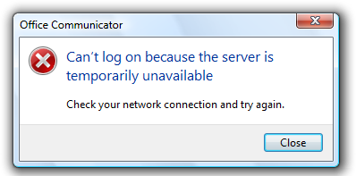
Error messages in Windows 7 alert users of problems that have already occurred. In contrast, warning messages alert users of conditions that might cause problems in the future. Error messages can be presented using modal dialog boxes, in-place messages, notifications, or balloons.
A typical modal error message.
Effective error messages inform users that a problem occurred, explain why it happened, and provide a solution so users can fix the problem. Users should either perform an action or change their behavior as the result of an error message.
Well-written, helpful error messages are crucial to a quality user experience. Poorly written error messages result in low product satisfaction, and are a leading cause of avoidable technical support costs. Unnecessary error messages break users’ flow.
Note: Guidelines related to dialog boxes, warning messages, confirmations, standard icons, notifications, and layout are presented in separate articles.
Is this the right user interface?
To decide, consider these questions:
- Is the user interface (UI) presenting a problem that has already occurred? If not, the message isn’t an error. If the user being alerted of a condition that might cause a problem in the future, use a warning message.
- Can the problem be prevented without causing confusion? If so, prevent the problem instead. For example, use controls that are constrained to valid values instead of using unconstrained controls that may require error messages. Also, disable controls when clicking would result in error, as long as it’s obvious why the control is disabled.
- Can the problem be corrected automatically? If so, handle the problem and suppress the error message.
- Are users likely to perform an action or change their behavior as the result of the message? If not, the condition doesn’t justify interrupting the user so it’s better to suppress the error.
- Is the problem relevant when users are actively using other programs? If so, consider showing the problem using a notification area icon.
- Is the problem not related to the current user activity, does it not require immediate user action, and can users freely ignore it? If so, use an action failure notification instead.
- Does the problem relate to the status of a background task within a primary window? If so, consider showing the problem using a status bars.
- Are the primary target users IT professionals? If so, consider using an alternative feedback mechanism, such as log file entries or e-mail alerts. IT professionals strongly prefer log files for non-critical information.
Design concepts
The characteristics of poor error messages
It should be no surprise that there are many annoying, unhelpful, and poorly written error messages. And because error messages are often presented using modal dialogs, they interrupt the user’s current activity and demand to be acknowledged before allowing the user to continue.
Part of the problem is that there are so many ways to do it wrong. Consider these examples from the Error Message Hall of Shame:
Unnecessary error messages
Incorrect:

This example from Windows XP might be the worst error message ever. It indicates that a program couldn’t launch because Windows itself is in the process of shutting down. There is nothing the user can do about this or even wants to do about this (the user chose to shut Windows down, after all). And by displaying this error message, Windows prevents itself from shutting down!
The problem: The error message itself is the problem. Aside from dismissing the error message, there is nothing for users to do.
Leading cause: Reporting all error cases, regardless of users’ goals or point of view.
Recommended alternative: Don’t report errors that users don’t care about.
«Success» error messages
Incorrect:
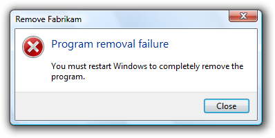
This error message resulted from the user choosing not to restart Windows immediately after program removal. The program removal was successful from the user’s point of view.
The problem: There’s no error from the user’s point of view. Aside from dismissing the error message, there is nothing for users to do.
Leading cause: The task completed successfully from the user’s point of view, but failed from the uninstall program’s point of view.
Recommended alternative: Don’t report errors for conditions that users consider acceptable.
Completely useless error messages
Incorrect:
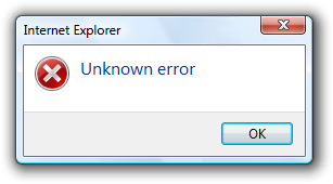
Users learn that there was an error, but have no idea what the error was or what to do about it. And no, it’s not OK!
The problem: The error message doesn’t give a specific problem and there is nothing users can do about it.
Leading cause: Most likely, the program has poor error handling.
Recommended alternative: Design good error handling into the program.
Incomprehensible error messages
Incorrect:
In this example, the problem statement is clear, but the supplemental explanation is utterly baffling.
The problem: The problem statement or solution is incomprehensible.
Leading cause: Explaining the problem from the code’s point of view instead of the user’s.
Recommended alternative: Write error message text that your target users can easily understand. Provide solutions that users can actually perform. Design your program’s error message experience don’t have programmers compose error messages on the spot.
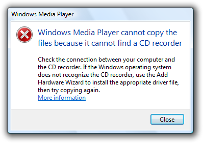
Error messages that overcommunicate
Incorrect:
In this example, the error message apparently attempts to explain every troubleshooting step.
The problem: Too much information.
Leading cause: Giving too many details or trying to explain a complicated troubleshooting process within an error message.
Recommended alternative: Avoid unnecessary details. Also, avoid troubleshooters. If a troubleshooter is necessary, focus on the most likely solutions and explain the remainder by linking to the appropriate topic in Help.
Unnecessarily harsh error messages
Incorrect:
The program’s inability to find an object hardly sounds catastrophic. And assuming it is catastrophic, why is OK the response?
The problem: The program’s tone is unnecessarily harsh or dramatic.
Leading cause: The problem is due to a bug that appears catastrophic from the program’s point of view.
Recommended alternative: Choose language carefully based on the user’s point of view.
Error messages that blame users
Incorrect:
Why make users feel like a criminal?
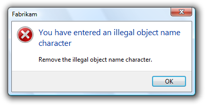
The problem: The error message is phrased in a way that accuses the user of making an error.
Leading cause: Insensitive phrasing that focuses on the user’s behavior instead of the problem.
Recommended alternative: Focus on the problem, not the user action that led to the problem, using the passive voice as necessary.
Silly error messages
Incorrect:
In this example, the problem statement is quite ironic and no solutions are provided.
The problem: Error message statements that are silly or non-sequitors.
Leading cause: Creating error messages without paying attention to their context.
Recommended alternative: Have your error messages crafted and reviewed by a writer. Consider the context and the user’s state of mind when reviewing the errors.
Programmer error messages
Incorrect:
In this example, the error message indicates that there is a bug in the program. This error message has meaning only to the programmer.
The problem: Messages intended to help the program’s developers find bugs are left in the release version of the program. These error messages have no meaning or value to users.
Leading cause: Programmers using normal UI to make messages to themselves.
Recommended alternative: Developers must conditionally compile all such messages so that they are automatically removed from the release version of a product. Don’t waste time trying to make errors like this comprehensible to users because their only audience is the programmers.
Poorly presented error messages
Incorrect:
This example has many common presentation mistakes.
The problem: Getting all the details wrong in the error message presentation.
Leading cause: Not knowing and applying the error message guidelines. Not using writers and editors to create and review the error messages.
The nature of error handling is such that many of these mistakes are very easy to make. It’s disturbing to realize that most error messages could be nominees for the Hall of Shame.
The characteristics of good error messages
In contrast to the previous bad examples, good error messages have:
- A problem. States that a problem occurred.
- A cause. Explains why the problem occurred.
- A solution. Provides a solution so that users can fix the problem.
Additionally, good error messages are presented in a way that is:
- Relevant. The message presents a problem that users care about.
- Actionable. Users should either perform an action or change their behavior as the result of the message.
- User-centered. The message describes the problem in terms of target user actions or goals, not in terms of what the code is unhappy with.
- Brief. The message is as short as possible, but no shorter.
- Clear. The message uses plain language so that the target users can easily understand problem and solution.
- Specific. The message describes the problem using specific language, giving specific names, locations, and values of the objects involved.
- Courteous. Users shouldn’t be blamed or made to feel stupid.
- Rare. Displayed infrequently. Frequently displayed error messages are a sign of bad design.
By designing your error handling experience to have these characteristics, you can keep your program’s error messages out of the Error Message Hall of Shame.
Avoiding unnecessary error messages
Often the best error message is no error message. Many errors can be avoided through better design, and there are often better alternatives to error messages. It’s usually better to prevent an error than to report one.
The most obvious error messages to avoid are those that aren’t actionable. If users are likely to dismiss the message without doing or changing anything, omit the error message.
Some error messages can be eliminated because they aren’t problems from the user’s point of view. For example, suppose the user tried to delete a file that is already in the process of being deleted. While this might be an unexpected case from the code’s point of view, users don’t consider this an error because their desired outcome is achieved.
Incorrect:
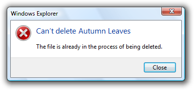
This error message should be eliminated because the action was successful from the user’s point of view.
For another example, suppose the user explicitly cancels a task. For the user’s point of view, the following condition isn’t an error.
Incorrect:
This error message should also be eliminated because the action was successful from the user’s point of view.
Sometimes error messages can be eliminated by focusing on users’ goals instead of the technology. In doing so, reconsider what an error really is. Is the problem with the user’s goals, or with your program’s ability to satisfy them? If the user’s action makes sense in the real world, it should make sense in software too.
For example, suppose within an e-commerce program a user tries to find a product using search, but the literal search query has no matches and the desired product is out of stock. Technically, this is an error, but instead of giving an error message, the program could:
- Continue to search for products that most closely match the query.
- If the search has obvious mistakes, automatically recommend a corrected query.
- Automatically handle common problems such as misspellings, alternative spellings, and mismatching pluralization and verb cases.
- Indicate when the product will be in stock.
As long as the user’s request is reasonable, a well designed e-commerce program should return reasonable results not errors.
Another great way to avoid error messages is by preventing problems in the first place. You can prevent errors by:
- Using constrained controls. Use controls that are constrained to valid values. Controls like lists, sliders, check boxes, radio buttons, and date and time pickers are constrained to valid values, whereas text boxes are often not and may require error messages. However, you can constrain text boxes to accept only certain characters and accept a maximum number of characters.
- Using constrained interactions. For drag operations, allow users to drop only on valid targets.
- Using disabled controls and menu items. Disable controls and menu items when users can easily deduce why the control or menu item is disabled.
- Providing good default values. Users are less likely to make input errors if they can accept the default values. Even if users decide to change the value, the default value lets users know the expected input format.
- Making things just work. Users are less likely to make mistakes if the tasks are unnecessary or performed automatically for them. Or if users make small mistakes but their intention is clear, the problem is fixed automatically. For example, you can automatically correct minor formatting problems.
Providing necessary error messages
Sometimes you really do need to provide an error message. Users make mistakes, networks and devices stop working, objects can’t be found or modified, tasks can’t be completed, and programs have bugs. Ideally, these problems would happen less often for example, we can design our software to prevent many types of user mistakes but it isn’t realistic to prevent all of these problems. And when one of these problems does happen, a helpful error message gets users back on their feet quickly.
A common belief is that error messages are the worst user experience and should be avoided at all costs, but it is more accurate to say that user confusion is the worst experience and should be avoided at all costs. Sometimes that cost is a helpful error message.
Consider disabled controls. Most of the time, it is obvious why a control is disabled, so disabling the control is a great way to avoid an error message. However, what if the reason a control is disabled isn’t obvious? The user can’t proceed and there is no feedback to determine the problem. Now the user is stuck and either has to deduce the problem or get technical support. In such cases, it’s much better to leave the control enabled and give a helpful error message instead.
Incorrect:
Why is the Next button disabled here? Better to leave it enabled and avoid user confusion by giving a helpful error message.
If you aren’t sure whether you should give an error message, start by composing the error message that you might give. If users are likely either to perform an action or to change their behavior as a result, provide the error message. By contrast, if users are likely to dismiss the message without doing or changing anything, omit the error message.
Designing for good error handling
While crafting good error message text can be challenging, sometimes it is impossible without good error handling support from the program. Consider this error message:
Incorrect:
Chances are, the problem really is unknown because the program’s error handling support is lacking.
While it’s possible that this is a very poorly written error message, it more likely reflects the lack of good error handling by the underlying code there is no specific information known about the problem.
In order to create specific, actionable, user-centered error messages, your program’s error handling code must provide specific, high-level error information:
- Each problem should have a unique error code assigned.
- If a problem has several causes, the program should determine the specific cause whenever possible.
- If the problem has parameters, the parameters must be maintained.
- Low-level problems must be handled at a sufficiently high level so that the error message can be presented from the user’s point of view.
Good error messages aren’t just a UI problem, they are a software design problem. A good error message experience isn’t something that can be tacked on later.
Troubleshooting (and how to avoid it)
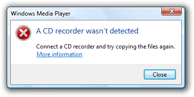
Troubleshooting results when a problem with several different causes is reported with a single error message.
Incorrect:
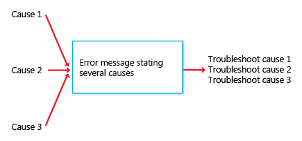
Correct:
Troubleshooting results when several problems are reported with a single error message.
In the following example, an item couldn’t be moved because it was already moved or deleted, or access was denied. If the program can easily determine the cause, why put the burden on the user to determine the specific cause?
Incorrect:
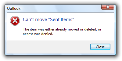
Well, which is it? Now the user has to troubleshoot.
The program can determine if access was denied, so this problem should be reported with a specific error message.
Correct:
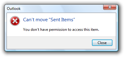
With a specific cause, no troubleshooting is required.
Use messages with multiple causes only when the specific cause cannot be determined. In this example, it would be difficult for the program to determine if the item was moved or deleted, so a single error message with multiple causes might be used here. However, it’s unlikely that users are going to care if, for example, they couldn’t move a deleted file. For these causes, the error message isn’t even necessary.
Handling unknown errors
In some cases, you genuinely won’t know the problem, cause, or the solution. If it would be unwise to suppress the error, it is better to be up front about the lack of information than to present problems, causes, or solutions that might not be right.
For example, if your program has an unhandled exception, the following error message is suitable:
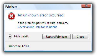
If you can’t suppress an unknown error, it is better to be up front about the lack of information.
On the other hand, do provide specific, actionable information if it is likely to be helpful most of the time.
This error message is suitable for an unknown error if network connectivity is usually the problem.
Determine the appropriate message type
Some issues can be presented as an error, warning, or information, depending on the emphasis and phrasing. For example, suppose a Web page cannot load an unsigned ActiveX control based on the current Windows Internet Explorer configuration:
- Error. «This page cannot load an unsigned ActiveX control.» (Phrased as an existing problem.)
- Warning. «This page might not behave as expected because Windows Internet Explorer isn’t configured to load unsigned ActiveX controls.» or «Allow this page to install an unsigned ActiveX Control? Doing so from untrusted sources may harm your computer.» (Both phrased as conditions that may cause future problems.)
- Information. «You have configured Windows Internet Explorer to block unsigned ActiveX controls.» (Phrased as a statement of fact.)
To determine the appropriate message type, focus on the most important aspect of the issue that users need to know or act upon. Typically, if an issue blocks the user from proceeding, you should present it as an error; if the user can proceed, present it as a warning. Craft the main instruction or other corresponding text based on that focus, then choose an icon (standard or otherwise) that matches the text. The main instruction text and icons should always match.
Error message presentation
Most error messages in Windows programs are presented using modal dialog boxes (as are most examples in this article), but there are other options:
- In-place
- Balloons
- Notifications
- Notification area icons
- Status bars
- Log files (for errors targeted at IT professionals)
Putting error messages in modal dialog boxes has the benefit of demanding the user’s immediate attention and acknowledgement. However, this is also their primary drawback if that attention isn’t necessary.
Do you really need to interrupt users so that they can click the Close button? If not, consider alternatives to using a modal dialog box.
Modal dialogs are a great choice when the user must acknowledge the problem immediately before continuing, but often a poor choice otherwise. Generally, you should prefer to use the lightest weight presentation that does the job well.
Avoid overcommunicating
Generally, users don’t read, they scan. The more text there is, the harder the text is to scan, and the more likely users won’t read the text at all. As a result, it is important to reduce the text down to its essentials, and use progressive disclosure and Help links when necessary to provide additional information.
There are many extreme examples, but let’s look at one more typical. The following example has most of the attributes of a good error message, but its text isn’t concise and requires motivation to read.
Incorrect:
This example is a good error message, but it overcommunicates.
What is all this text really saying? Something like this:
Correct:
This error message has essentially the same information, but is far more concise.
By using Help to provide the details, this error message has an inverted pyramid style of presentation.
For more guidelines and examples on overcommunicating, see User Interface Text.
If you do only eight things
- Design your program for error handling.
- Don’t give unnecessary error messages.
- Avoid user confusion by giving necessary error messages.
- Make sure the error message gives a problem, cause, and solution.
- Make sure the error message is relevant, actionable, brief, clear, specific, courteous, and rare.
- Design error messages from the user’s point of view, not the program’s point of view.
- Avoid involving the user in troubleshooting use a different error message for each detectable cause.
- Use the lightest weight presentation method that does the job well.
Usage patterns
Error messages have several usage patterns:
| Label | Value |
|---|---|
| System problems The operating system, hardware device, network, or program has failed or is not in the state required to perform a task. |
Many system problems can be solved by the user:
|
| File problems A file or folder required for a task initiated by the user was not found, is already in use, or doesn’t have the expected format. |
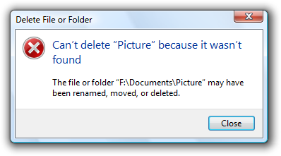 In this example, the file or folder can’t be deleted because it wasn’t found. 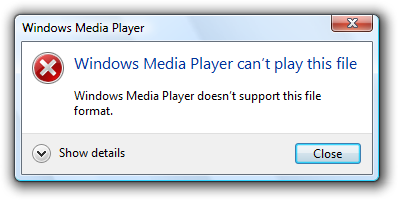 In this example, the program doesn’t support the given file format. |
| Security problems The user doesn’t have permission to access a resource, or sufficient privilege to perform a task initiated by the user. |
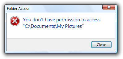 In this example, the user doesn’t have permission to access a resource. 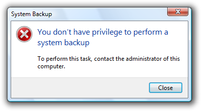 In this example, the user doesn’t have the privilege to perform a task. |
| Task problems There is a specific problem performing a task initiated by the user (other than a system, file not found, file format, or security problem). |
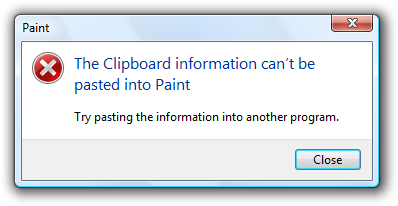 In this example, the Clipboard data can’t be pasted into Paint. 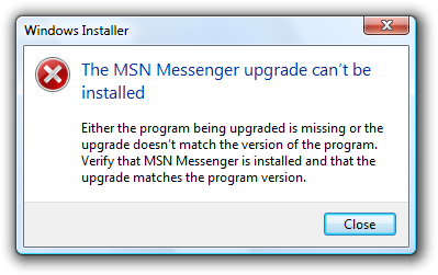 In this example, the user can’t install a software upgrade. |
| User input problems The user entered a value that is incorrect or inconsistent with other user input. |
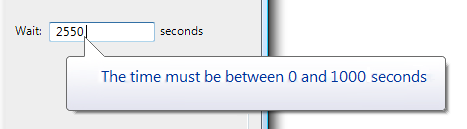 In this example, the user entered an incorrect time value. 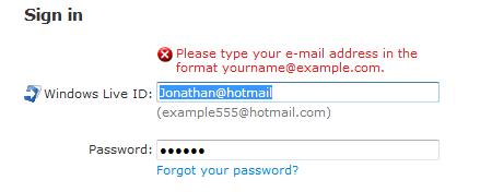 In this example, user input is not in the correct format. |
Guidelines
Presentation
- Use task dialogs whenever appropriate to achieve a consistent look and layout. Task dialogs require Windows Vista or later, so they aren’t suitable for earlier versions of Windows. If you must use a message box, separate the main instruction from the supplemental instruction with two line breaks.
User input errors
- Whenever possible, prevent or reduce user input errors by:
- Using controls that are constrained to valid values.
- Disabling controls and menu items when clicking would result in error, as long as it’s obvious why the control or menu item is disabled.
- Providing good default values.
Incorrect:
In this example, an unconstrained text box is used for constrained input. Use a slider instead.
- Use modeless error handling (in-place errors or balloons) for contextual user input problems.
- Use balloons for non-critical, single-point user input problems detected while in a text box or immediately after a text box loses focus.Balloons don’t require available screen space or the dynamic layout that is required to display in-place messages. Display only a single balloon at a time. Because the problem isn’t critical, no error icon is necessary. Balloons go away when clicked, when the problem is resolved, or after a timeout.
In this example, a balloon indicates an input problem while still in the control.
- Use in-place errors for delayed error detection, usually errors found by clicking a commit button. (Don’t use in-place errors for settings that are immediately committed.) There can be multiple in-place errors at a time. Use normal text and a 16×16 pixel error icon, placing them directly next to the problem whenever possible. In-place errors don’t go away unless the user commits and no other errors are found.
In this example, an in-place error is used for an error found by clicking the commit button.
- Use modal error handling (task dialogs or message boxes) for all other problems, including errors that involve multiple controls or are non-contextual or non-input errors found by clicking a commit button.
- When a user input problem is reported, set input focus to the first control with the incorrect data. Scroll the control into view if necessary. If the control is a text box, select the entire contents. It should always be obvious what the error message is referring to.
- Don’t clear incorrect input. Instead, leave it so that the user can see and correct the problem without starting over.
- Exception: Clear incorrect password and PIN text boxes because users can’t correct masked input effectively.
Troubleshooting
- Avoid creating troubleshooting problems. Don’t rely on a single error message to report a problem with several different detectable causes.
- Use a different error message (typically a different supplemental instruction) for each detectable cause. For example, if a file cannot be opened for several reasons, provide a separate supplemental instruction for each reason.
- Use a message with multiple causes only when the specific cause can’t be determined. In this case, present the solutions in order of likelihood of fixing the problem. Doing so helps users solve the problem more efficiently.
Icons
Modal error message dialogs don’t have title bar icons. Title bar icons are used as a visual distinction between primary windows and secondary windows.
Use an error icon. Exceptions:
If the error is a user input problem displayed using a modal dialog box or balloon, don’t use an icon. Doing so is counter to the encouraging tone of Windows. However, in-place error messages should use a small error icon (16×16 pixel) to clearly identify them as error messages.
In these examples, user input problems don’t need error icons.
In this example, an in-place error message needs a small error icon to clearly identify it as an error message.
If the problem is for a feature that has an icon (and not a user input problem), you can use the feature icon with an error overlay. If you do this, also use the feature name as the error’s subject.
In this example, the feature icon has an error overlay, and the feature is the subject of the error.
Don’t use warning icons for errors. This is often done to make the presentation feel less severe. Errors aren’t warnings.
Incorrect:
In this example, a warning icon is incorrectly used to make the error feel less severe.
For more guidelines and examples, see Standard Icons.
Progressive disclosure
- Use a Show/Hide details progressive disclosure button to hide advanced or detailed information in an error message. Doing so simplifies the error message for typical usage. Don’t hide needed information, because users might not find it.
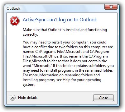
In this example, the progressive disclosure button helps users drill down to more detail if they want it, or simplify the UI if they don’t.
- Don’t use Show/Hide details unless there really is more detail. Don’t just restate the existing information in a more verbose format.
- Don’t use Show/Hide details to show Help information. Use Help links instead.
Don’t show this message again
- If an error message needs this option, reconsider the error and its frequency. If it has all the characteristics of a good error (relevant, actionable, and infrequent), it shouldn’t make sense for users to suppress it.
For more guidelines, see Dialog Boxes.
Default values
- Select the safest, least destructive, or most secure response to be the default. If safety isn’t a factor, select the most likely or convenient command.
- Design error messages to avoid the need for Help. Ordinarily users shouldn’t have to read external text to understand and solve the problem, unless the solution requires several steps.
- Make sure the Help content is relevant and helpful. It shouldn’t be a verbose restatement of the error message rather, it should contain useful information that is beyond the scope of the error message, such as ways to avoid the problem in the future. Don’t provide a Help link just because you can.
- Use specific, concise, relevant Help links to access Help content. Don’t use command buttons or progressive disclosure for this purpose.
- For error messages that you can’t make specific and actionable, consider providing links to online Help content. By doing so, you can provide users with additional information that you can update after the program is released.
For more guidelines, see Help.
Error codes
- For error messages that you can’t make specific and actionable or they benefit from Help, consider also providing error codes. Users often use these error codes to search the Internet for additional information.
- Always provide a text description of the problem and solution. Don’t depend just on the error code for this purpose.
Incorrect:
In this example, an error code is used as a substitute for a solution text.
- Assign a unique error code for each different cause. Doing so avoids troubleshooting.
- Choose error codes that are easily searchable on the Internet. If you use 32-bit codes, use a hexadecimal representation with a leading «0x» and uppercase characters.
Correct:
Incorrect:
- Use Show/Hide details to display error codes. Phrase as Error code: .
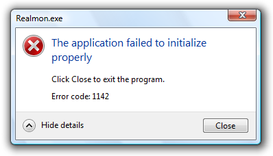
In this example, an error code is used to supplement an error message that can benefit from further information.
Sound
- Don’t accompany error messages with a sound effect or beep. Doing so is jarring and unnecessary.
- Exception: Play the Critical Stop sound effect if the problem is critical to the operation of the computer, and the user must take immediate action to prevent serious consequences.
General
- Remove redundant text. Look for it in titles, main instructions, supplemental instructions, command links, and commit buttons. Generally, leave full text in instructions and interactive controls, and remove any redundancy from the other places.
- Use user-centered explanations. Describe the problem in terms of user actions or goals, not in terms of what the software is unhappy with. Use language that the target users understand and use. Avoid technical jargon.
Incorrect:
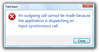
Correct:
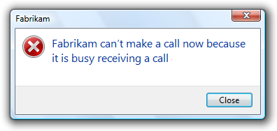
In these examples, the correct version speaks the user’s language whereas the incorrect version is overly technical.
- Don’t use the following words:
- Error, failure (use problem instead)
- Failed to (use unable to instead)
- Illegal, invalid, bad (use incorrect instead)
- Abort, kill, terminate (use stop instead)
- Catastrophic, fatal (use serious instead)
These terms are unnecessary and contrary to the encouraging tone of Windows. When used correctly, the error icon sufficiently communicates that there is a problem.
Incorrect:
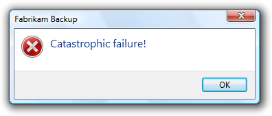
Correct:
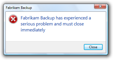
In the incorrect example, the terms «catastrophic» and «failure» are unnecessary.
- Don’t use phrasing that blames the user or implies user error. Avoid using you and your in the phrasing. While the active voice is generally preferred, use the passive voice when the user is the subject and might feel blamed for the error if the active voice were used.
Incorrect:
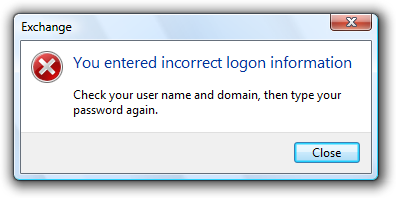
Correct:
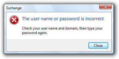
The incorrect example blames the user by using the active voice.
- Be specific. Avoid vague wording, such as syntax error and illegal operation. Provide specific names, locations, and values of the objects involved.
Incorrect:
Value out of range.
Character is invalid.
Device not available.
These problems would be much easier to solve with specific names, locations, and values.
- Don’t give possibly unlikely problems, causes, or solutions in an attempt to be specific. Don’t provide a problem, cause, or solution unless it is likely to be right. For example, it is better to say An unknown error occurred than something that is likely to be inaccurate.
- Avoid the word «please,» except in situations in which the user is asked to do something inconvenient (such as waiting) or the software is to blame for the situation.
Correct:
Please wait while Windows copies the files to your computer.
- Use the word «sorry» only in error messages that result in serious problems for the user (for example, data loss or inability to use the computer). Don’t apologize if the issue occurred during the normal functioning of the program (for example, if the user needs to wait for a network connection to be found).
Correct:
We’re sorry, but Fabrikam Backup detected an unrecoverable problem and was shut down to protect files on your computer.
- Refer to products using their short names. Don’t use full product names or trademark symbols. Don’t include the company name unless users associate the company name with the product. Don’t include program version numbers.
Incorrect:
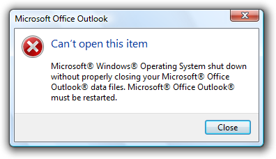
Correct:
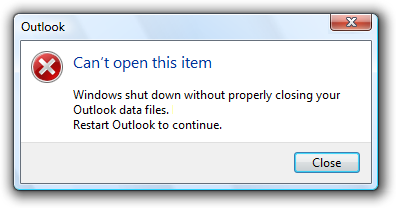
In the incorrect example, full product names and trademark symbols are used.
- Use double quotation marks around object names. Doing so makes the text easier to parse and avoids potentially embarrassing statements.
- Exception: Fully qualified file paths, URLs, and domain names don’t need to be in double quotation marks.
Correct:
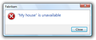
In this example, the error message would be confusing if the object name weren’t in quotation marks.
- Avoid starting sentences with object names. Doing so is often difficult to parse.
- Don’t use exclamation marks or words with all capital letters. Exclamation marks and capital letters make it feel like you are shouting at the user.
For more guidelines and examples, see Style and Tone.
Titles
- Use the title to identify the command or feature from which the error originated. Exceptions:
- If an error is displayed by many different commands, consider using the program name instead.
- If that title would be redundant or confusing with the main instruction, use the program name instead.
- Don’t use the title to explain or summarize the problem that’s the purpose of the main instruction.
Incorrect:
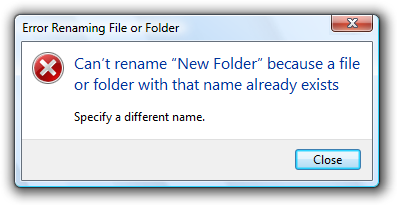
In this example, the title is being incorrectly used to explain the problem.
- Use title-style capitalization, without ending punctuation.
Main instructions
- Use the main instruction to describe the problem in clear, plain, specific language.
- Be concise use only a single, complete sentence. Pare the main instruction down to the essential information. You can leave the subject implicit if it is your program or the user. Include the reason for the problem if you can do so concisely. If you must explain anything more, use a supplemental instruction.
Incorrect:
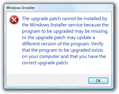
In this example, the entire error message is put in the main instruction, making it hard to read.
- Be specific if there are objects involved, give their names.
- Avoid putting full file paths and URLs in the main instruction. Rather, use a short name (such as the file name) and put the full name (such as the file path) in the supplemental instruction. However, you can put a single full file path or URL in the main instruction if the error message doesn’t otherwise need a supplemental instruction.
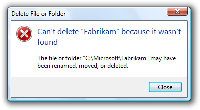
In this example, only the file name is in the main instruction. The full path is in the supplemental instruction.
- Don’t give the full file path and URL at all if it’s obvious from the context.
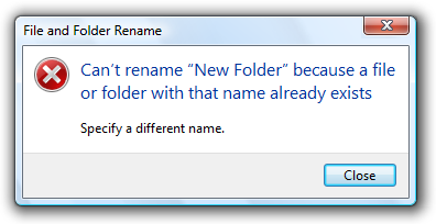
In this example, the user is renaming a file from Windows Explorer. In this case, the full file path isn’t needed because it’s obvious from the context.
- Use present tense whenever possible.
- Use sentence-style capitalization.
- Don’t include final periods if the instruction is a statement. If the instruction is a question, include a final question mark.
Main instruction templates
While there are no strict rules for phrasing, try using the following main instruction templates whenever possible:
- [optional subject name] can’t [perform action]
- [optional subject name] can’t [perform action] because [reason]
- [optional subject name] can’t [perform action] to «[object name]»
- [optional subject name] can’t [perform action] to «[object name]» because [reason]
- There is not enough [resource] to [perform action]
- [Subject name] doesn’t have a [object name] required for [purpose]
- [Device or setting] is turned off so that [undesired results]
- [Device or setting] isn’t [available | found | turned on | enabled]
- «[object name]» is currently unavailable
- The user name or password is incorrect
- You don’t have permission to access «[object name]»
- You don’t have privilege to [perform action]
- [program name] has experienced a serious problem and must close immediately
Of course, make changes as needed for the main instruction to be grammatically correct and comply with the main instruction guidelines.
Supplemental instructions
- Use the supplemental instruction to:
- Give additional details about the problem.
- Explain the cause of the problem.
- List steps the user can take to fix the problem.
- Provide measures to prevent the problem from reoccurring.
- Whenever possible, propose a practical, helpful solution so users can fix the problem. However, make sure the proposed solution is likely to solve the problem. Don’t waste users’ time by suggesting possible, but improbable, solutions.
Incorrect:
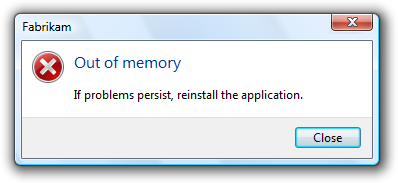
In this example, while the problem and its recommended solution are possible, they are very unlikely.
- If the problem is an incorrect value that the user entered, use the supplemental instruction to explain the correct values. Users shouldn’t have to determine this information from another source.
- Don’t provide a solution if it can be trivially deduced from the problem statement.
In this example, no supplemental instruction is necessary; the solution can be trivially deduced from the problem statement.
- If the solution has multiple steps, present the steps in the order in which they should be completed. However, avoid multi-step solutions because users have difficulty remembering more than two or three simple steps. If more steps are required, refer to the appropriate Help topic.
- Keep supplemental instructions concise. Provide only what users need to know. Omit unnecessary details. Aim for a maximum of three sentences of moderate length.
- To avoid mistakes while users perform instructions, put the results before the action.
Correct:
To restart Windows, click OK.
Incorrect:
Click OK to restart Windows.
In the incorrect example, users are more likely to click OK by accident.
- Don’t recommend contacting an administrator unless doing so is among the most likely solutions to the problem. Reserve such solutions for problems that really can only be solved by an administrator.
Incorrect:
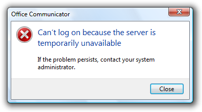
In this example, most likely the problem is with the user’s network connection, so it’s not worth contacting an administrator.
- Don’t recommend contacting technical support. The option to contact technical support to solve a problem is always available, and doesn’t need to be promoted through error messages. Instead, focus on writing helpful error messages so that users can solve problems without contacting technical support.
Incorrect:
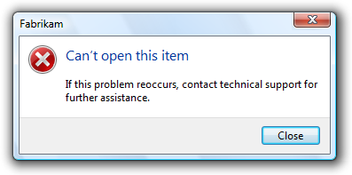
In this example, the error message incorrectly recommends contacting technical support.
- Use complete sentences, sentence-style capitalization, and ending punctuation.
Commit buttons
- If the error message provides command buttons or command links that solve the problem, follow their respective guidelines in Dialog Boxes.
- If the program must terminate as a result of the error, provide an Exit program button. To avoid confusion, don’t use Close for this purpose.
- Otherwise, provide a Close button. Don’t use OK for error messages, because this wording implies that problems are OK.
- Exception: Use OK if your error reporting mechanism has fixed labels (as with the MessageBox API.)
Documentation
When referring to errors:
- Refer to errors by their main instruction. If the main instruction is long or detailed, summarize it.
- If necessary, you may refer to an error message dialog box as a message. Refer to as an error message only in programming and other technical documentation.
- When possible, format the text using bold. Otherwise, put the text in quotation marks only if required to prevent confusion.
Example: If you receive a There is no CD disc in the drive message, insert a new CD disc in the drive and try again.
Источник
4 error message examples to help users navigate your UI – plus a FREE mobile error message downloadable by Justinmind
Error messages give users feedback when something has gone wrong in their web and mobile interfaces. Small as they are, these messages, instructions, reminders and warnings are essential to a brand’s user experience, conversion rate and reputation.
When designing an input form in a user interface, error messages are often badly designed or left out altogether. Bad error message examples include messages appearing at the wrong time or with misleading and/or erroneous information.
According to UXMas, error message design should be human, helpful, humble and humorous, if possible! Here are four best practices for designing error messages in your prototypes, with Justinmind’s prototyping tool.
Error message examples and best practices for prototyping them
Error messages are used in input forms, such as login or sign up forms, to inform the user of how and why there is a roadblock in their task flow. The user is reliant on the error message to move past these roadblocks, which is why it’s important to make each occurrence as seamless and meaningful as possible. For more information, check out post on testing and validating forms.
Poor error message design stems from poor planning in the UX design process. Designing error messages early on with a paper prototype will help ensure that the user receives as much help as possible when trying to complete a task. As the prototype evolves, so will your messages.
Want to design your own error messages? We’ve create a mobile example that you can download and customize to create your own app error messages. First of all, you’ll need to download Justinmind’s wireframe tool!
Download Justinmind’s mobile error message here and try it out here!
1— Error message examples: consider placement and timing
Effective error messages appear immediately after an error is committed and are strategically placed on-screen, at the optimal moment, so the user can’t miss them.
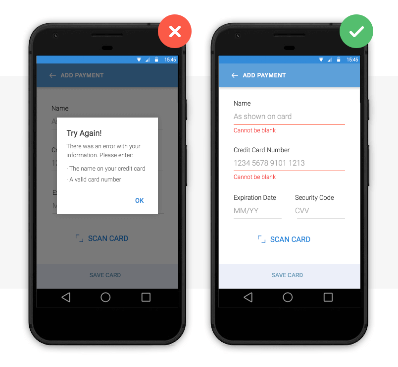
Image credit: Nick Babich
Above we have two error message examples. The left payment form uses a pop up to inform the user that they are required to fill in their details in order to make a payment. The user has to click out of the pop up to make these adjustments, which adds an additional step to their user journey. There is also the risk that the user will forget the pop up’s instruction and will be forced to return to the pop up. This can be time-consuming and frustrating – bad error message UX.
The right form uses inline validation. Clearly visible instructions immediately appear under each input field if the user leaves them blank. The user receives instant feedback and the required adjustments are clearly marked.
How to prototype this error message
Creating an inline validation error message in your web or mobile prototypes is easy with Justinmind. Use input text field widgets and a button to create the input form. Then, add text fields below each input field and write your error message in each.
To make your error messages interactive, combine ‘On Click’ (for web) or ‘On Tap’ (for mobile) with ‘Show’ actions with conditions. Learn how to simulate error messages in our website wireframe tool.
2— Error message examples: make them actionable
No matter how well-designed or strategically positioned, your error message is no good if it doesn’t offer the user a way out.
The user not only needs to know that there is a problem, but also how to rectify it. Actionable error messages are ones that tell the user what to do next in order to complete a task.
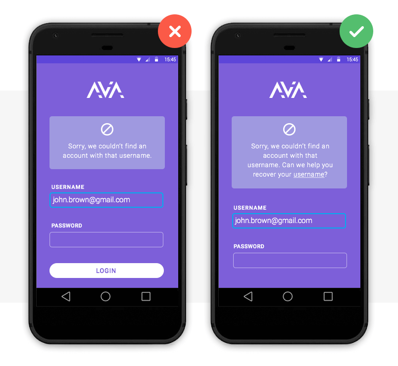
This is one of the best error message examples we’ve seen. The system not only informs the user that their email address is already in use, it also tells them how to log in by recovering their username.
How to prototype this error message
To prototype this error message, you’ll need two screens: a sign up and a recover username screen. Create them with input field and button widgets as above.
In the sign up screen, add a paragraph widget. Write the error message text and underline the text that will hold the login link. Mark it as hidden in the Properties palette.
Then, highlight text to be linked and add an ‘On Click’ (for web) or ‘On Tap’ (for mobile) and ‘Link’ event, selecting the recover username screen. You’ll need to add a condition that will make the error message appear only if the email address is already registered.
*Note that if you wish to add two links, you’ll need to use hotspot navigation widgets.
3— Error message visual examples: make them noticeable
Error messages are a waste of time if the user doesn’t notice them. As Jakob Nielsen puts it, “the very worst error messages are those that don’t exist”. Large fonts and garish pop ups quickly become irritating. So how do you make sure your messages get through? With the right use of color.
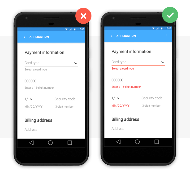
Image credit: Nick Babich
Color is one of the best tools for user validation. Error messages are typically displayed as red text/warning icon against a white background for contrast.
Note that color should not be the only indicator of an error. In order for your web or mobile design to be accessible, Jakob Nielsen advises to include redundant cues that color-blind users can see.
With smart technology (Augmented Reality, Artificial Intelligence and Voice user interface design) on the up, human-user interaction needs to be as natural as possible. Learn more about making your prototype accessible with our accessibility design post.
How to prototype this error message
You can change the font color, size and family of the error message in Justinmind’s Properties palette. If you wish to use a warning icon, you can change its color upon a user’s interaction by using SVG vectors.
4— Error message text examples: be specific
So you’ve mastered the error message aesthetics, you’re so close! Don’t let your design down with convoluted explanations or obscure codes and abbreviations.
Here’s some advice on how to make sure your error message is readable and has a human tone:
- Be empathetic, not technical e.g. never show raw error data such as ‘an error of type 2 has occurred’
- Be informative and precise by indicating that something has gone wrong and what it is exactly
- Be consistent by using the same tone and precision in each message
- Always give advice on how to fix the problem
As Jonathan Colman explains, a good error message is simple and clearly worded, a bad message won’t provide details about what happened, where it happened, or what to do next, and an ugly error message will completely conceal the problem.
Below are some error message text examples:
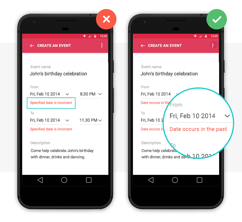
Image credit: Nick Babich
How to prototype this error message
If you’re unsure what kind of error message text to opt for, it’s time to user test your design. With user testing, you’ll see how users react to your design in real-time and get instant feedback to make an informed decision.
With Justinmind, you can quickly and easily link prototypes with user testing tools, such as UserTesting and UserZoom.
Why use error messages in your UI design?
When users interact with a site or app, errors are inevitable – after all, to err is human. But that’s what error messages are for.
Error messages help overcome roadblocks in the user journey and reduce the time it takes to get from Point A to B. They also help to alleviate frustration when errors occur, improving the user experience.
According to Nielsen’s First Law of Computer Documentation, users don’t always pay attention to system messages or warnings. But when users want to recover from an error, they are particularly attentive. So if UI/UX designers up their error message game, users will appreciate it.
Start by prototyping your error messages with Justinmind and become a pro in no time.

Gone are the days of useless and generic error messaging.
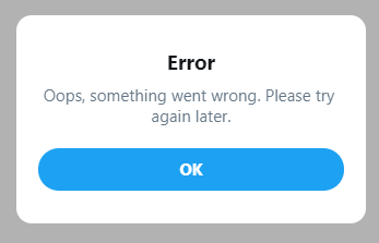
If you’re here, you’re likely concerned with making your user-facing products as delightful as possible. And error messaging plays an important role in that.
Having useful error messages can go a long way toward making a frustrating scenario for an end-user as pleasant as possible.
This article is split into two parts. The first builds context around error messages and why they’re important. This section should be useful, regardless of whether you’re a JavaScript developer or not.
The second part is a short follow-along to help get you started managing your own error messages.
The current state of error messaging
In a perfect world, error messages would be redundant and users would be able to use anything you’ve built a-okay, no problem-o. But errors will happen, and your end-users will run into them.
These errors can stem from:
- Failing validation
- Server-side failures
- Rate limiting
- Borked code
- Acts of god
And when things go wrong, often the client-facing error messaging takes shape in one of two ways:
- Generic errors with no meaningful information, e.g.
Something went wrong, please try again later - Hyper specific messages from the stack trace sent by the server, e.g.
Error 10x29183: line 26: error mapping Object -> Int32
Neither are helpful for our end-users.
For our users, the generic error can create a feeling of helplessness and frustration. If they get such a message, they can’t complete an action, and have no way of knowing why the error happened and how (or if) they can resolve it. This can result in loss of end-user trust, loss of customer, or an angry review.
On the other hand, hyper-specific error messages are a leaky abstraction and shouldn’t be seen by our end-user’s eyes.
For one, these kind of errors provide implementation information about our server-side logic. Is this a security concern? probably? I’m no pen-tester.
Secondly, if we’re in the business of crafting engaging user experiences, (and why wouldn’t you be?) our error messages should feel human and be service-oriented. This is a sentiment shared in a number of resource I’ve come across, many of which of I’ve included in a further reading section at the end.
Why should I create sane error messaging?
To help maintain developer sanity
Hunting bugs is hard, and scanning logs is tedious. Sometimes we’re provided with context about why things failed, and other times we aren’t. If an end-user reports a bug it’s important they can present to us as much useful information as possible.
A report from a user that says:
Hi, I was using the app sometime last night updating my profile and all of a sudden it stopped working. The error said something about a validation error, but I don't know what that means
is much less useful than:
Hi, I was using the app sometime last night updating my profile and all of a sudden it stopped working. The error said "We had trouble updating your details. Your address must be located within the EU" but I live in England
This saves us time and cuts down on red herrings. A clear and specific error message may also help an end-user understand what they themselves have done wrong, and can allow them to fix their mistake.
To help maintain organisation sanity
Sane error messages also yield benefits on an organisation level. For those working in larger companies, copy/messaging may be the responsibility of an entirely separate department. The more places in the code that require copy changes, the easier it is for the copy to get out of sync with your company’s brand guidelines.
Conversely, keeping all of your error messages in a single source makes it much easier for those owning copy to adhere to those brand guidelines.
Other departments, like the support team, may be inundated with support tickets from users. If you’re an engineer, why not reach out to your support team to see how many support tickets could be avoided with improved error messaging.
Fixing the problems with your messaging when a user incorrectly fills out a form, has missing data, or doesn’t have permissions for a specific action could positively impact the lives of the support team.
To help maintain end-user sanity
By providing sane error messaging we hope to not leave our end users feeling helpless.
As described earlier, our messaging should be service—oriented. They should guide our user on how to complete their process, or at least let them know where they can go and get help if the problem is beyond their control.
In Jon Yablonski’s book, the Laws of UX, he describes a psychological concept called the Peak-end Rule:
People judge an experience largely based on how they felt at its peak and at its end rather than the total sum or average of every moment of the experience
In the context of this article, if people become so frustrated that they rage quit your site, their lasting memory of your application is of how frustrating it is to use.
Error messages play a large part in preventing this, as they can act as the final gatekeeper preventing a user who is simply stuck from turning to one so frustrated they quit your app.
If someone is using your product for a transactional purpose like buying an airplane ticket or shopping online, and they’ve been stopped dead in their tracks during a task with no way to continue, the likelihood of them leaving your site for another skyrockets. Another lost customer.
While this is wholly anecdotal, I’ve rage quit sites often from not knowing how to complete a process – either nothing happened when I clicked a button, or I just kept getting vague error messages.
Unless these sites/apps are one of those few ubiquitous platforms (like Google, Instagram, Apple), I likely haven’t have used them since. I’m sure you can even remember a time this happened to you. In fact, I’ll openly welcome pictures of awful error messages via Twitter
Using sane error messaging can help offset this frustration if something doesn’t go right. Surprisingly, creating a useful error message only requires a handful of qualities.
What makes a good error message?
Taken from Microcopy: A complete guide. A useful error message should satisfy these qualities:
- Explain clearly that there is a problem
- Explain what the problem is
- If possible, provide a solution so that the user can complete the process, or
- Point them to where they can go for help
- Make a frustrating scenario as pleasant as possible
This might sound like a lot to cover with just a couple of sentences, but here are some examples of what I deem to be good error messages:
- We’ve limited how many times you can reset your password every hour. You can try again later.
- Please log in to view this profile
- We couldn’t create your profile, only UK residents can use our app.
It’s worth noting that I’m not a UX researcher/designer, just a frontend developer with a keen interest in UX. It may be that my above examples miss the mark on what’s required within your project or organisation.
Saying that, if you’re a frontend engineer, improving your organisation’s error messaging makes for an excellent opportunity to upskill and collaborate with your UXer colleagues.
How can I start writing sane error messages?
I’ve open-sourced a simple tool called sane-error-messages. Running the tool will generate a brand new repo designed to house your default error messaging. You can tweak the default values, add or remove messages, and then publish it to consume within your client facing apps.
sane-error-messages works by aggregating all of your messaging in to a single JavaScript object. The key is an error code, and the value is a corresponding message.
The error codes should be the same codes you receive from your server, such as POSTS_NOT_FOUND or CONFLICTING_USER_RECORD. Your error messaging repo exposes a function to get your error message from an error code.
This approach was inspired by how tools like Cypress handle their error messaging.
As long as your server returns predictable error codes, the server-side implementation doesn’t matter. The following sequence is just one way of implementing sane-error-messages
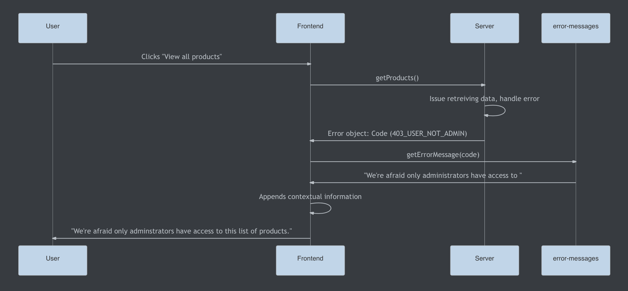
In short:
- The user «views all products»
- The frontend makes a network request
- The network request fails and returns an error code «USER_NOT FOUND»
- The frontend requests the corresponding error message from your
error-messagespackage. - The frontend applies any relevant contextual information
- The frontend displays this information to the end user.
If you want to try something hands on, you can play with this CodeSandbox. The CodeSandbox fires off a request to a mock server which returns 1 of 12 error codes at random.
The client side will use the error code to retrieve a sane error message from the error messages repo. The client side then displays the error message to the user. If the code doesn’t have a specified message, the generic fallback gets shown (and it sucks).
Note: You can find the repo here. If you come across any problems during the tutorial process you can file a GitHub issue.
Begin by running
yarn global add sane-error-message
then
sane-error-messages create <dirName>
to scaffold your project. Doing so will create a brand new module for you to customise with your default error messages.
Your new module uses tsdx under-the-hood to handle all of the module management scripts, such as running, building, and testing.
You can learn more about tsdx here.
In short, the contents of your new package will look like this:
/* errorCodes.ts: The file that defines each error code like */
const USER_NOT_ADMIN = '403_USER_NOT_ADMIN'

/* defaultErrorMessages.ts: Maps each code to a default message */
const errorCodes {
  // your codes and messages go here...
  [USER_NOT_ADMIN]: "We're afraid only administrators have access to "
}

/* ErrorMessages.ts: The class you'll use to instantiate your error messages object in the consuming project */
class ErrorMessages {
  // You can override default messages with more specific ones
  constructor: (customErrorMessages: Partial<Record<string | number, string>>): ErrorMessages;

  // Pass through an error code to get your custom message
  getErrorMessage: (code: string | number, fallbackMessage?: string): string;

  // Checks to see if the argument is a valid error code and acts as a guard for non-ErrorCode values
  isErrorCode(code: string | number): boolean;

  // Returns the errorCodes object with your custom messages
  messages: Record<ErrorCode, string>
}

type ErrorCode = ValueOf<errorCodes>
How to consume your error messages
If you created a repo with the name custom-error-messages and published it to npm, you’d be able to consume it within your apps by doing the following:
import { ErrorMessages } from 'custom-error-messages';

const customErrorMessages = {
  '400_validation': 'Please enter the fields in your form correctly',
};

// Initialise your errorMessages object with your custom messages
const errorMessages = new ErrorMessages(customErrorMessages);

function riskyFunction() {
  try {
    // Throws an error
    await boom();
  } catch (err) {
    // Get the error code our server sent over
    const { code } = err;

    // Get the code's corresponding message
    const message = errorMessages.getErrorMessage(code);

    // Display the message to the client
    displayNotification(message);
  }
}
You can then take all of the error codes that your server-side returns and apply corresponding messages to them.
Once you’re ready, you can publish your tool to NPM, and then consume it from your client-facing apps.
Conclusion
I hope you’ve enjoyed learning about an often overlooked aspect of web development.
I’ve done a bunch of reading to learn about error messaging and I’ve shared some of my favourite resources below. Some are books and others are short articles, but they’re all worth your time.
You can also reach out if any part of the tutorial wasn’t clear, or if you feel I can streamline things. Thanks for reading.
FAQs
Why can’t the server-side just return these messages?
The server shouldn’t be concerned with any client-facing logic. But if you’re fortunate enough to work with an API that gives useful error codes with each failed request, then you’re nearly there.
Will I need to create an instance of error-messages for every API consumer?
Not necessarily. Because this package can take a list of default messages and codes, as long as it’s in sync with the APIs, your frontends will be able to consume the same package.
In each client-side instance, you can pass through additional error codes, or override existing messages to tailor your frontend messaging.
I think this package should have X or do Y differently
I’m dogfooding this internally at my job, and this is a problem space I’m very new to. I would love to hear of any suggestions, or improvements to the overall architecture or feature-set of sane-error-messages.
Further Reading
Microcopy: A Complete Guide
I mentioned this book a little earlier, and it’s one of my favourites when it comes to making my user-facing products a lot more personable.
The book’s author Kinneret Yifrah, has graciously provided a coupon for 10% off, you can purchase it here.
Coupon code for the eBook: andrico-ebook
Coupon code for the bundle: andrico-bundle
Error messaging guidelines: NN Group
A short article on the importance of sane error messaging which shares some very useful tips on how to create sane error messaging.
In short:
- Errors should be expressed in plain language
- Indicate what the problem is
- Suggest a solution
Error Messages (Design basics): Microsoft
An in-depth article that covers both design guidelines messaging practices
Laws of UX
A short book that introduces how a handful of psychology concepts can be used to improve your products UX.
Learn to code for free. freeCodeCamp’s open source curriculum has helped more than 40,000 people get jobs as developers. Get started
A typical interaction with websites involves filling in forms. When shopping online, for example, you must enter card details, delivery address and other personal information which generate error messages. In this article, we look at how to provide user-friendly error messages.
Outline
In order to display error messages on forms, you need to consider the following four basic rules:
- The error message needs to be short and meaningful
- The placement of the message needs to be associated with the field
- The message style needs to be separated from the style of the field labels and instructions
- The style of the error field needs to be different than the normal field
By combining these four rules, it is possible to provide the necessary information to users where they have made mistakes on filling in forms and how to rectify them quickly and easily. This will encourage and help users to continue with their journey on the site; reduce basket abandonment; increase site registrations; increase enquiries about an application form and so forth.
Through clever placement of labels, instructions to fill in a field and additional design elements can make a form less daunting and may result in fewer mistakes made (Jarrett, C. and Gaffney, G., 2008). However, I have seen that users make the same mistakes on forms again and again as these websites show error messages which are either not very clear to the user or, because of their placement, users are unclear what messages relate to. This article focuses on how to provide error messages on forms from a user experience perspective.
The message
The error message needs to be clear, precise, short and punchy. Users should be able to immediately understand what ‘mistakes they have made’ and how to recover the error. This is fundamental and will have a huge impact if users can’t immediately understand what mistake they have made. One example of an unclear error message is on the Hotmail registration page where it asks for user’s ‘Birth year’. Before the year 2000, it was common to use only two digits to represent a year. In this instance, the form does not give any instruction on that; even the error message does not give a clear idea of what was wrong with entering two digits for a birth year.
")
Figure 1: Hotmail registration page- error message not providing how to put the birth year (e.g. ‘yyyy’)
The error message should mention the format of the birth year that the user needs to follow, for example “Please enter birth year in 4 digits (e.g. 1973)” as shown in the following figure.

Figure 2: Improved error message to make it clear to people what mistake they have made
The placement
Not only does the message need to be short and concise, but it also needs to be well placed to associate it with the field. This poses the question of where is it best to place an error message- above, after, left or right of the field? This depends on the type of the error message. If it is a ‘missing required field’ error, it can be placed on top, to the right or to the bottom of the field.
")
Figure 3: Showing example of ‘missing required field’ error messages at the bottom of the associated fields (from eBay)

Figure 4: Showing example of ‘missing required field’ error messages above the labels
The association between the field and the error message needs to be visually clear. Although this might not be a large usability issue for smaller forms like Figure 5 (Google login form), for a long form, this might significantly confuse and lead to repeated mistakes (as shown in Figure 6).

Figure 5 : Google login error message

Figure 6 : Error messages displayed the same way as Google login for a long form which might confuse users
For an ‘instructional’ error message, it is particularly important to consider careful placement as we need users to read the instruction and follow it to fill in the field. Previous research on label placement by Matteo Penzo and further investigation by Caroline Jarrett revealed that instructions for filling in forms work best when placed above the field. Therefore, if it is necessary for the user to read an instruction to fill in the field, it is best to also provide the error message at the top of the field.
For example, the LinkedIn registration form provides both types of error message (‘missing required field’ and ‘instructional’ error messages) at the top of the field and just beside the labels. By doing this, when a user is completing the form, they would read the label, then look at the error they have made (and how to rectify it) and then re-enter their answer in the field after the error message.

Figure 7: Error messages displayed matching user reading pattern
So, what about long forms? We have seen from our previous experience that if a user makes a mistake filling out a long form, and the field in error is below the fold, they get confused trying to understand what happened.
")
Figure 8: Example of a long form (from The Common Application)
To prevent this, it is necessary to list the errors at the top of the page as well as showing the error messages associated with the fields. This will give a clear indication to users about where they have made mistakes. However, it is necessary to make sure that these error messages don’t overwhelm the users as in the example shown in Figure 9.
")
Figure 9 : Error messages shown at the top and with the associated fields (Sainsbury’s register page)
The message style
Users must be able to distinguish between form labels, instructions and error messages. Using different font size and colour will provide visual cues to users about why the form could not be submitted and what mistakes they made.
The field style
In addition to the message style, the style of the error fields needs to be distinguishable from the normal input field. This usually helps in a long form where the user made only one or two mistakes. They can then easily spot where they have made mistakes and rectify them.

Figure 10: WordPress registration form giving a different border style on the error field
Example of using the four point rules for displaying error messages
In a usability testing session of an e-commerce website, one tester was trying to purchase a product. This particular website requires all users to be registered before the purchase process begins. During the registration process, the user filled out the form with her name, a username and a password and submitted it. The same form was then displayed with an error message: “Please type a new user name with a mixture of alphanumeric characters ranging from 6-14 characters. This has to be unique for all of our customers.” Additionally, the password field where she had entered her desired password became empty.
The tester thought that she had made a mistake with the password. So she entered a new password with numbers, characters and capital letters, re-entered it, and submitted the form. The same thing came up again. She was certain that the password she had given had a mixture of characters and numbers with capital letters, so why wasn’t it working? Frustrated with the system, she re-read the message slowly and finally understood where she was making the mistake; it was the ‘username’ she needed to worry about and not the password.
So she entered a different user name with all the necessary characters and submitted the form. This time the form said that the password field was empty… Although this happened in lab conditions, I am not sure how desirable the product has to be to persevere with this registration process to buy it. Her response was to gve up and try to find the same product on another website.
Now, what went wrong?
First of all, the form was poorly designed without any instructions up-front about the user name. But that’s a whole other topic of designing effective forms and where to put instructions (about which Caroline Jarrett and Luke Wroblewski have written some great articles and books). Secondly, the way of describing the error was poor. Let’s put it into perspective- someone is trying to buy something from you, they don’t have the whole day to read a big explanation of “Why they are wrong!” Thirdly, the position of the error message made it unclear to the user which field it was related to. And finally, there was no visual cue for which field the user had to modify to rectify ‘their’ error. This made the user change her password rather than changing the username resulting in the same error message coming up repeatedly on the form.
Using the basic four point rules of displaying error messages
If we adopt these rules for the example shown above, we can come up with multiple solutions.
Displaying error messages on the forms with labels placed on the left:
For example, if we want to fix the error message which said “Please type a new username with a mixture of alphanumeric characters ranging from 6-14 characters. This has to be unique for all of our customers.”, it might become something like “Username must be 6-14 characters long and must contain at least 1 number and 1 character.”. Using placement and styling rules, we can provide the following example:

Figure 11: Example of using the 4 point rules of displaying error message
Displaying error messages following a user’s reading pattern:
If the labels are provided above the fields, following example shows how you can provide the error messages and match a user’s reading pattern:

Figure 12: Example of using the 4 point rules of displaying error messages on a form
Conclusion
Ever changing web technologies and evolving user behaviour towards the web makes it difficult to standardise web experience. However, we can attempt to make things better by providing a good user experience from what we have learnt. At Nomensa, we conduct experiments to identify best practice and solutions. We witness people struggling to fill out different types of forms on a daily basis. By using the combination of the four rules to display error messages and our own methods of multi-variant testing to display error messages, we can help people achieve their goals as smoothly and as quickly as possible.
Displaying form error messages might be a small part of a large website, but it can have a significant impact on people, especially if they cannot understand the mistakes they have made. This would ultimately cause them to leave the site. By combining these four rules to display error messages, you can tell people very politely what mistakes they have made and help them to easily recover and complete their journey.
UX Design can be a real differentiator for your products and services and getting it right can set you apart from your competition, which is something we explore in depth in this article ‘The value of strategic UX’.
Nomensa is an award-winning UX design agency with offices in Bristol, London and Amsterdam.
If you would like us to help you with your user experience challenges or to provide you with a UX evaluation of your website/mobile app, please don’t hesitate to get in touch. You can give us a call on +44 (0) 117 929 7333 or submit this short form. In the meantime, take a full look at the UX Design services that we offer.
References
- Jarrett, C. and Gaffney, G., Forms that work, Designing web forms for Usability, 2008.
- Penzo, M., Label Placement in Forms, Published in UX Matters, July 2006.
- Wroblewski, L., Web Application Form Design, January 2005.