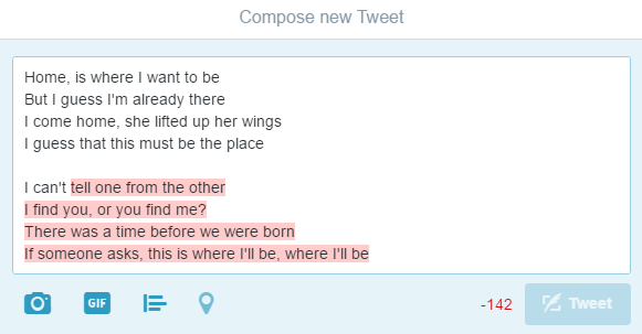
1. Keep language clear and concise
The rule that applies to all UX microcopy also applies to error messaging. The longer a message, the less likely your users will read them. In fact, an oft-cited study by the American Press Institute showed that shorter sentences results in greater understanding by users. So, when sentences were 14 words or less, users understood 90% of the messaging. When the sentences were 8 words or less, users understood the whole 100%.
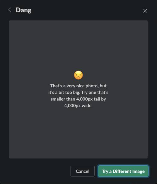
Now, sometimes it might not be possible to write a message that short, so don’t beat yourself up attempting to get to 8 words on your error popup. Just remember that less is more and clarity and usefulness are the most important things.
For example, don’t do:
Sure, it’s a short message but does it tell users anything at all?
Instead, this works better:
Clear, concise, and empathetic messaging from Spotify. Users know what the problem is and what they need to do to fix it.
2. Keep user actions specific and logical
The action buttons for your error messages should be very clear to users. Even if they don’t read the whole error message, they should be able to easily see which option to choose in order to solve the issue. If the error message has a “yes,” “no,” or “cancel” action button, consider adding an action word after it. “Yes, refresh the page.” or “No, stay in the app.”
Within the error message itself, there should also be the consequences of those actions. If they stay in the app or refresh instead, what will happen to their progress thus far? Make sure everything is explained as simply and clearly as possible.
Please, don’t do this:
I feel like these are trick buttons for users.
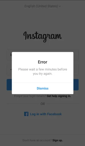
Rather, this is much clearer:
Instagram gives users two clear actions that go along with the message above them.
3. Avoid oops and whoops
The Internet has come a long way from those original “Oops!” messages. Users have been oopsed and whoopsed to death at this point, so generally it’s best to avoid the cutesy sounding language.
It doesn’t really help smooth anything over for users any more and might even annoy them. Would you say whoops to your manager or to a professional colleague if you made an error? Probably not.
It’s generally not good business to talk to your users like they’re children or baby internet users either. At this point, they’ve probably seen error messages and realize what their purpose is, so the “oops” is no longer necessary. (Some people might also throw “yikes” in that group as well but this can also depend on your brand’s tone and voice.)
Please, don’t do:
So many things wrong with this one. What if your users aren’t native English speakers? Also, what happened to using periods at the end of sentences?
This is much better:
Twitch’s error messaging is on brand, a little humorous, but not cutesy or annoying.
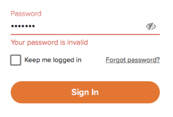
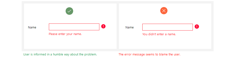
4. Don’t blame the user
Users are already going to be frustrated when they get an error message—don’t make it worse by placing the blame on them. This means you should avoid using phrases like “you did” or “you didn’t” when explaining what went wrong. Instead, keep directives specific to what the user needs to do to remedy the problematic action. If the email address they entered is incorrect, then say “Please enter a valid email address using the following format: [email protected]” instead of telling the user: “You entered your email incorrectly.”
Don’t do this:
I feel like I’m in trouble and I don’t even know why.
This works much better:
HBOMax demonstrating the correct format needed rather than telling me I did it wrong.
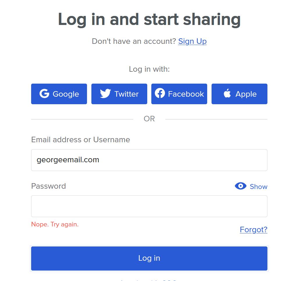
5. Avoid ambiguity
How many times have you gotten frustrated at an error message that popped up with nothing helpful anywhere? We all have been there. Try to keep your users from wanting to shout at the screen by being specific about the error. No, that doesn’t mean you need to put a long jargon-heavy error code. That won’t mean anything to the user. Instead tell them why there was an error and how they can address the issue.
Avoid vague messaging like this:

Instead, keep it specific, like this:
Slack is known for having great (and appropriately humorous) microcopy.
6. Don’t mock your users / Keep the jokes to a minimum
No one likes being talked down to. Unfortunately, a lot of “humor” found online and in UX can come across as condescending. There are lots of other places to inject friendly, light humor into UX microcopy but an error message isn’t always the best place for it. It would be like asking a friend for advice about your bad day and then they make a sarcastic comment instead. Not the best way to keep user stress levels low.
Mailchimp’s style guide lays it out more specifically, “don’t go out of your way to make a joke — forced humor can be worse than none at all. If you’re unsure, keep a straight face.” (Check out more style guides for notes on humor and jokes in microcopy.)
Best to not do this:

A perfectly unnecessary example of condescending microcopy on an unsubscribe link.
Instead, humor can be used to have a little fun when appropriate:
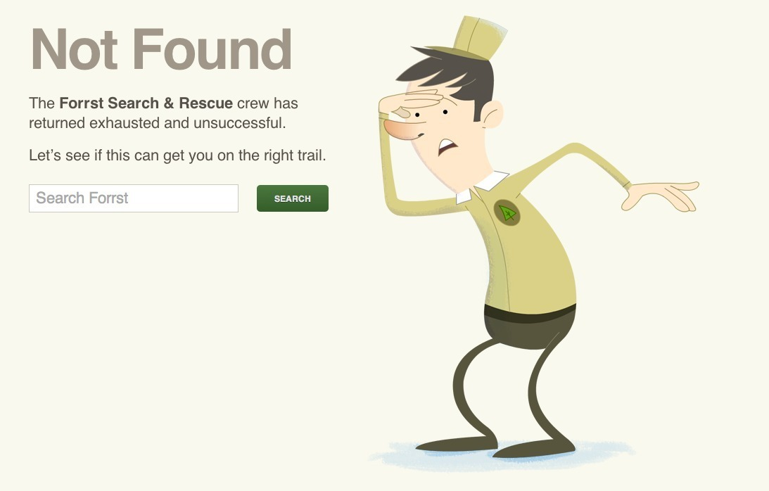
This is on brand and a tiny bit silly but it still made me chuckle. (For more great examples of 404 pages done well, check out ten examples here and even more here.)
7. Avoid negative words
This goes along with user blaming and condescending language. The user is already going to be experiencing some levels of stress because, well, they’re getting an error message.
This should be an opportunity to positively inform users about errors rather than reinforce a negative interaction. It’s a simple language adjustment that can really help users breathe a little easier. Some style guides, like Apple’s, prefer a friendly tone over choosing positive words so check with your company’s style guide to be sure.
Please, please don’t do this:
Not only is this microcopy from Bitly negative, it comes across as condescending and doesn’t tell the user what is wrong with the password OR the email format. 😠
This is much, much better:
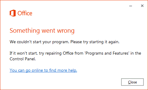
Microsoft Office taking the blame and telling users what to do next without any negative words directed at them.
8. Write for humans
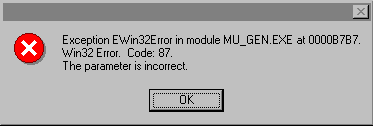
No one wants to get one of those Windows messages with a file name three lines long. (What does GeneralNetworkUserError_502 mean anyway?) UX microcopy is all about connecting with users and providing a good experience for them, not bombarding them with technical jargon that they won’t understand (And probably will not help them solve the issue that led to the error in the first place.)
This is one of those universal microcopy rules that applies to all messaging. Write like you’re a human, not a jargon robot. (If you need to include more information about a particular error, then add in a drop down that the user can opt to click should they want to learn more about Error 502.)
Definitely don’t do this:
Umm, what does that error message even mean?
Instead, do this:
Straight to the point and in simple language that sounds like an actual person is talking.
9. Don’t write in ALL CAPS (and avoid exclamation marks)
Everyone knows that one person who sends them messages in all caps. And we all should know that typing in all caps is basically like shouting in real life. As are exclamation points. Now, I love to use exclamation points all the time in my emails but when it comes to mircoropy or content, it’s mostly a big “no.” They can add stress or anxiety when it’s completely avoidable by just not using them.
Don’t do this:
(Yes, I know this is from a game. I’ve talked about microcopy in games before.) But still, when everything has an exclamation point, users really don’t know which buttons are important.
If you really have to want to use an exclamation point, do it like this:
Github is trying to bring attention to the message with the yellow highlight and very light usage of that exclamation point. There’s a bit of humor injected so users don’t feel like they’re being shouted at.
10. Try to use inline validation
This guideline is less about microcopy and more about UX design. Rather than having an error message pop up with a long list of things the user needs to complete, it’s much better UX to have inline validation. Inline validation is basically putting the error message right next to or above the label it belongs with. This also assists with accessibility as screen readers should read the error message and the field label together, allowing all users to better address the issue at hand.
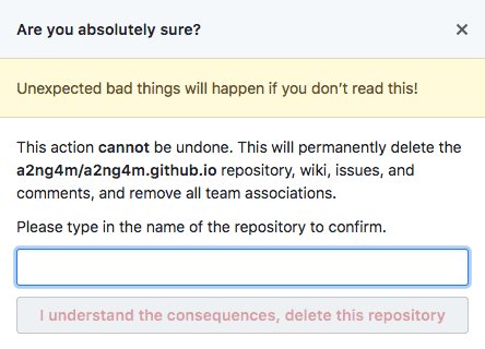
This really is the worst possible way to do this:
Giving users a long list is only going to frustrate them further and make it extremely difficult to understand, especially users with screen readers.
Please make life better for all users by doing this:
Hulu showing that inline validation is becoming standard across the Internet and apps because it’s a much better experience for users.
Do you agree with our guidelines or do you think something is missing?
I’d love to hear more. You can find me on LinkedIn; I love chatting about words. The UX and Microcopy Facebook group is into discussing all sorts of microcopy. Come and join the discussion!
Keep learning
Your visitors are bound to make the occasional mistake while completing your online forms. When it comes to shipping or registration forms, for example, there are a number of form fields a visitor is required to complete. And let’s face it, your visitor may not be thrilled about having to enter their address, credit card information, and more, and therefore, they may move through your form quickly. Chances are, some visitors will misspell something, type in an incorrect zip code, or miss a number in the credit card field.

You might be wondering how to ensure your visitors stay efficient and accurate so they aren’t wasting any of their own time trying to locate and correct their errors in your forms. You also may be wondering how to achieve this so you don’t waste any of your own time trying to work through incorrect or invalid information.

Enter: Error messages.
What is an error message?
When someone enters an incorrect piece of information in your form, an error message is what pops up (in the best case scenario, in real-time) to notify your visitor about their mistake. Error messages help them easily locate the issue, fix it, and submit the form error-free.
Why Are Error Messages Important?
Error messages play a large role in your visitors’ user experience. If someone is repeatedly unable to submit your form and has no idea why or what the issue is, there’s a large chance they’re going to feel frustrated, angry, or simply leave your site altogether.
By adding well-crafted error messages to your forms, your form will feel professional and thoughtful to your visitors. Most importantly, error messages will enhance your form’s user experience — and great user experience means you’re more likely to see a boost in conversions. It also means more happy customers who are likely to return to your site and become promoters for your business.
To achieve a fantastic user experience, you can’t simply implement any error message in your forms. In fact, there are plenty of forms out there that include error messages that aren’t thoughtful or effective. In this post, we’ll cover some of the most frequently made error message mistakes.
Error Message Design: 6 Mistakes to Avoid and Good Examples to Follow
Let’s review six common mistakes you’ll want to avoid while creating error messages for your web forms and six preferable examples you can implement instead.
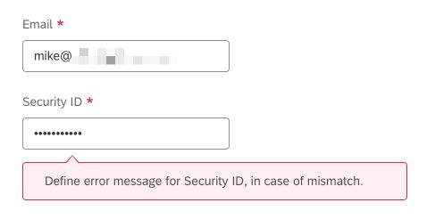
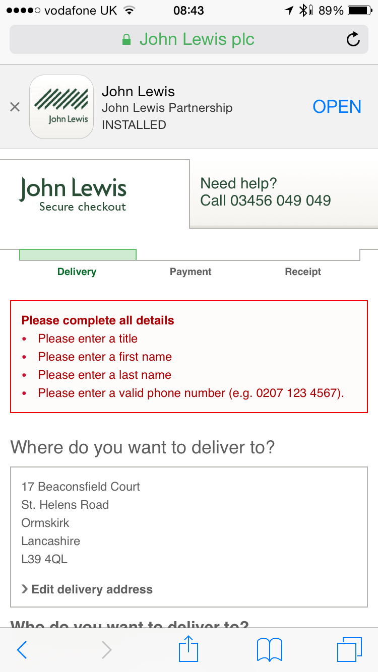
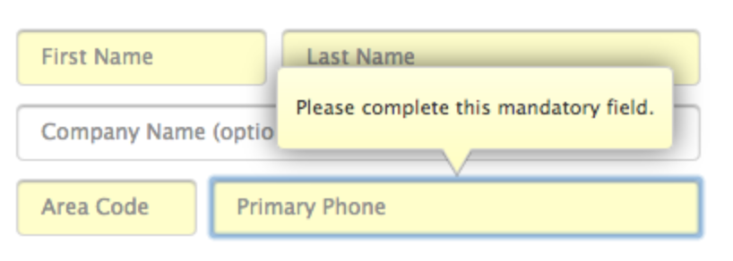
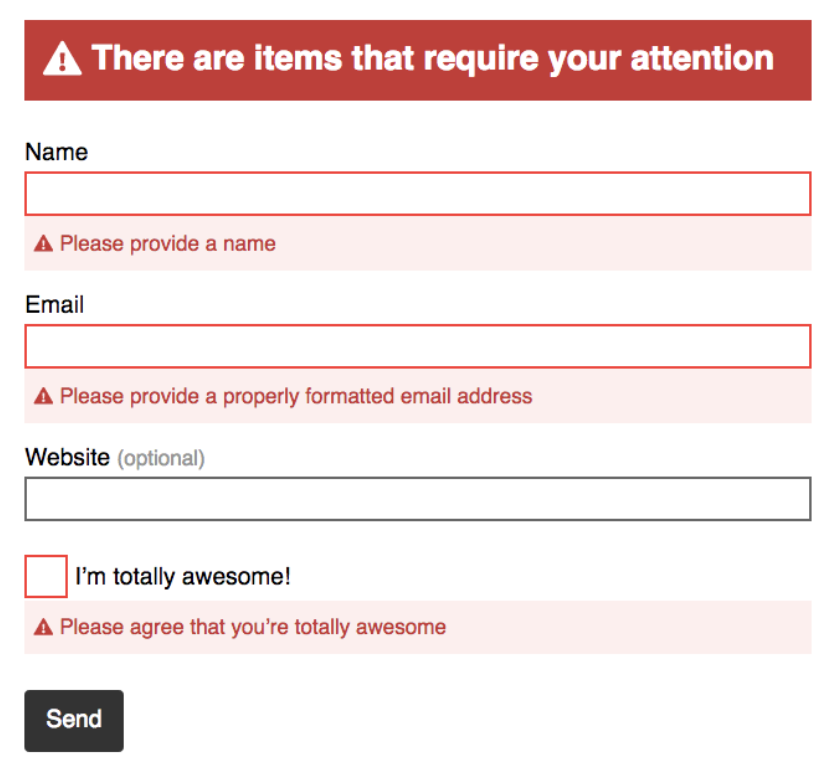
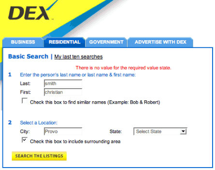
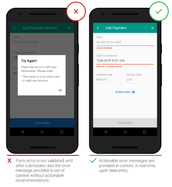
1. Error Message Placement
The placement of your error message is crucial. If someone submits your form and then sees a red box with the message “Your form contains errors” they wouldn’t actually know where the errors are located. Instead, avoid making your visitors feel confused by placing the message next to the error itself.
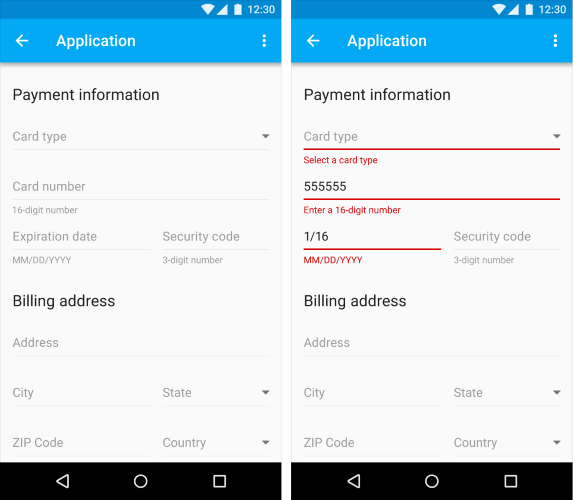
Mistake: Poor error message placement
Source
This is an example of unhelpful and vague error message placement. It would be exceptionally difficult for someone to automatically know the exact location of the error with such an unclear message located in a pop-up box.
Good example: Great error message placement
Source
This is called inline error message placement — it’s located directly inline with the error so your visitors are able to clearly see the issue at hand and quickly fix it.
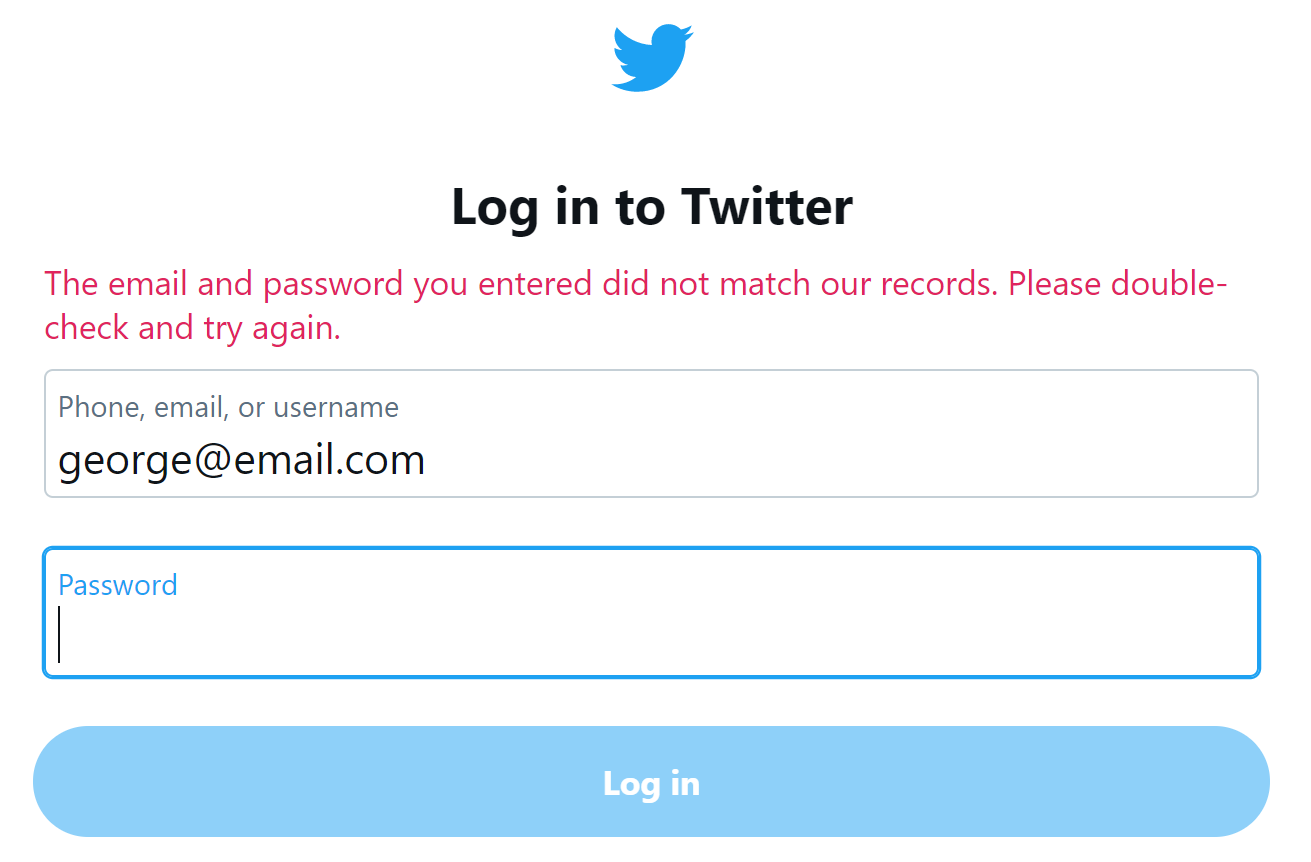
2. Blame the User
Ever heard that saying, “The customer’s always right”?
Well, that same message applies to your web forms and their error messages. You should avoid any negative language and refrain from blaming your visitors for the error — use positive phrases and don’t place the blame anyone or anything.
Mistake: Blame the User
The last thing you want to do is target your visitor and make them feel bad or belittled. Don’t ever blame them for the error in the form (even if they really did cause the issue).
You should also avoid negative and vague phrases such as, “Oops!” or “Something went wrong.” Having to correct an error or two might be a frustrating process for a person in a rush or someone who has already worked through multiple other errors in the same form. And lets face it, negative language isn’t going to make your visitors excited about correcting their mistakes — it’s also simply not at all helpful.
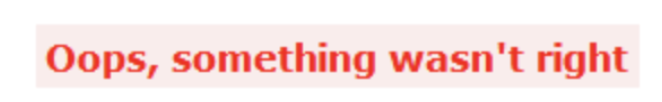
Source
Good example: Don’t blame anyone or anything
Source
In your error messages, you want to sound positive, calm, and straightforward. You should also avoid blaming anyone or anything. Inserting polite words and phrases such as “please” is also a nice and professional way to ask your visitors to correct their errors while also making a good impression.
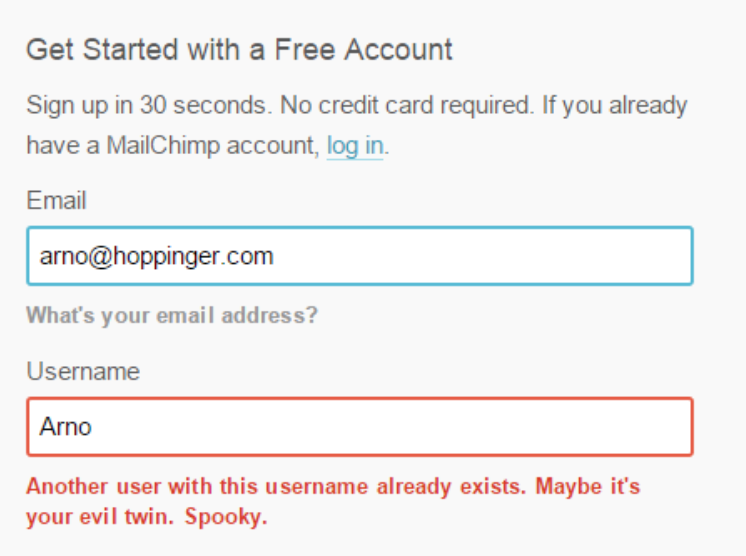
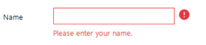
3. Error Message Copy
Your error message copy (what the error message actually says) matters. Otherwise, how would your visitor understand what the error actually is or how to fix it? Using clear and direct language will help your visitors understand what caused their error in the first place and how they should go about correcting it.
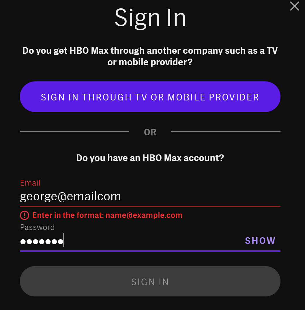
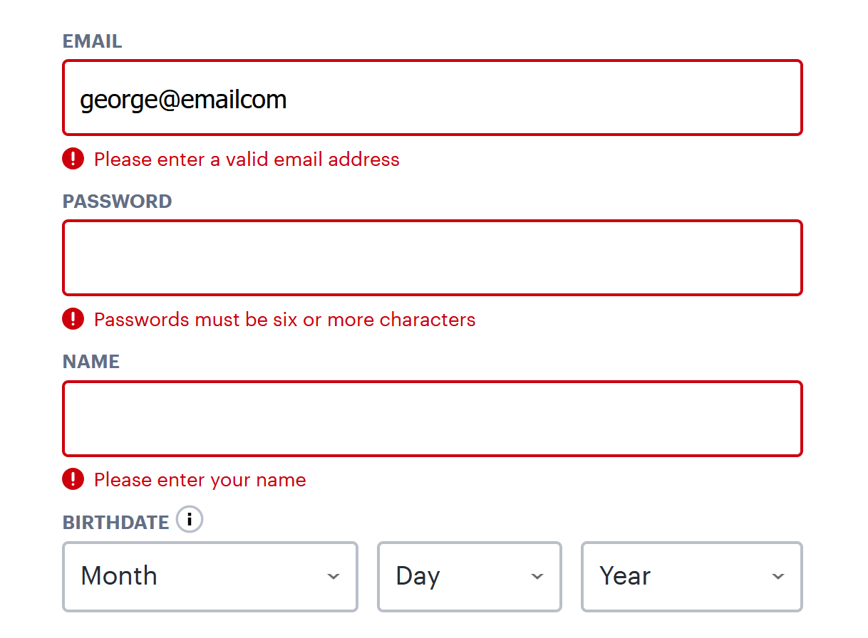
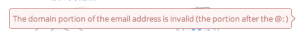
Mistake: Lack of clarity
Source
Although this error message is inline and shows the visitor there’s an issue with the email address they entered, simply saying the address is “invalid” isn’t helpful for visitors. In this scenario, how are visitors supposed to know if they misspelled their email address, if they need to try another email address, or if already have an account they forgot about (and need to head to the login page instead)?
Unclear and vague copy puts your visitors through a not-so-exciting and time-consuming guessing game.
Good example: Be clear and concise
Your message copy should not only be clear, concise, and explain the issue at hand, but it should also give the visitor simple directions on how to fix the error. This way, they stay productive and both your company and form feel professional and thoughtful.
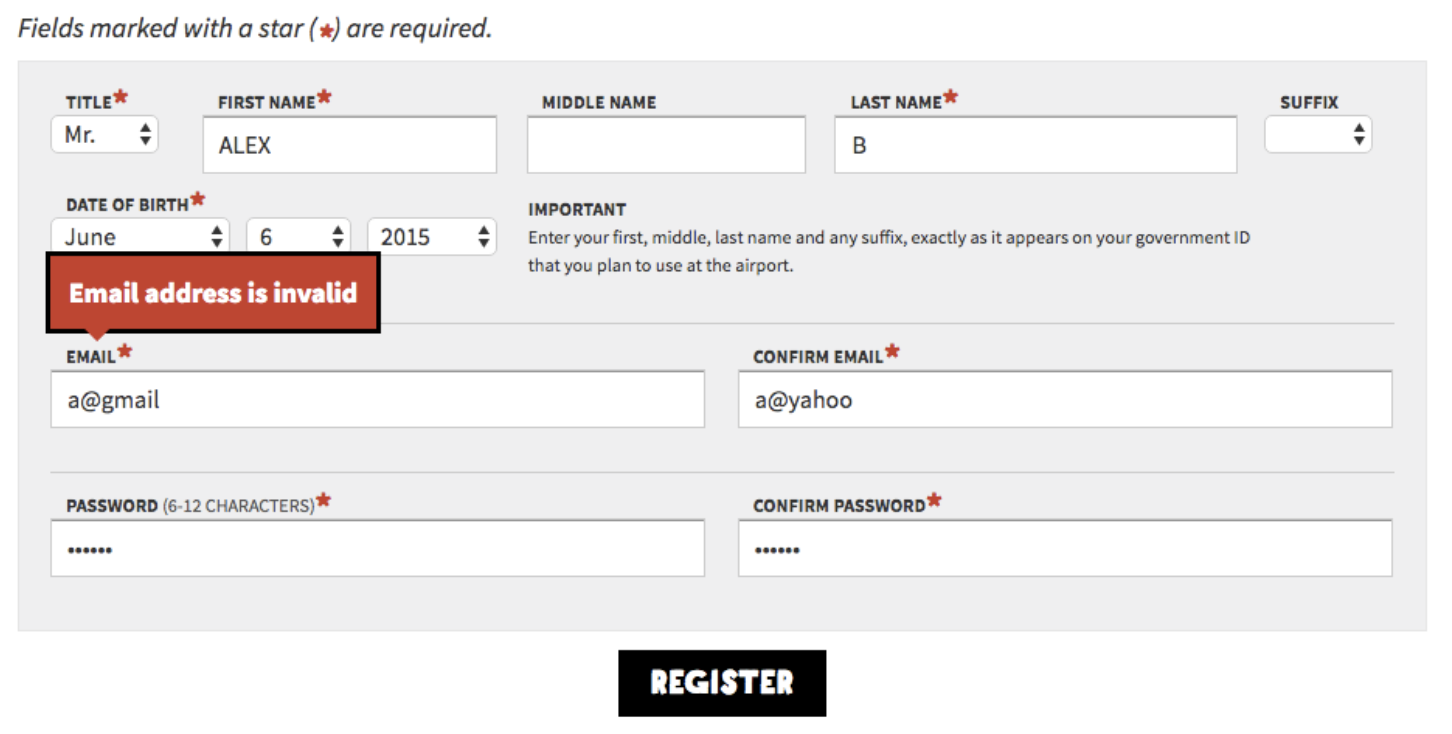
4. Error Message Clarity
Error message copy is a great lead-in to a similar, common mistake: lack of error message clarity. Your message should be so clear that an elementary school student could understand it and know how to fix the error.
To determine your error message’s level of clarity, you should take a look at your form field requirements. For example, if you have unclear requirements listed and an error message pops up on the form, your visitors are going to have a hard time understanding how they’re supposed to fix the issue .
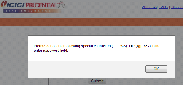
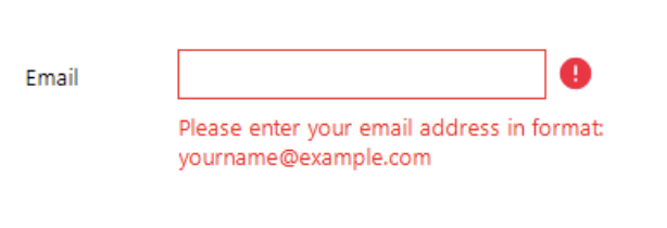
Mistake: Not listing form field requirements
Source
If your form has password requirements yet you don’t clearly list them out anywhere, your visitor will most likely find it difficult to create a valid password. They’ll have to use the process of elimination to create a password successfully which could take a lot of time. Again, talk about an agitating process that your visitors simply don’t have the time for.
Good example: List form field requirements
By clearly listing your form field requirements, such as your exact password requirements, you provide your visitors with a solution to avoid making any errors in your form. And if they do still make a mistake, they can quickly skim those requirements to learn how to amend the issue.
5. Concise Error Message Descriptions
While completing your form, it’s probably safe to assume your visitors aren’t going to want to sit around reading a long error message description. Reading wordy, long-winded descriptions about anything can feel confusing and tedious. To avoid this, your error message descriptions should briefly explain the precise actions your visitors can take to fix their mistake.
Mistake: Long, confusing error message descriptions
Source
Long and confusing error message descriptions typically defeat the purpose of what you’re trying to do (which is help your visitor correct their error). In fact, they can make it significantly more difficult to uncover the real issue at hand and understand how to fix it.
Good example: Keep error messages straightforward
Source
When you explain the reason for your visitor’s error, be as straightforward and short as possible. Use language that points the visitor directly to their mistake and briefly explains how to fix it so they can make the correction on their own without any hesitation or confusion in a timely manner.
6. Obvious Error Messages
Making your error messages pop so they’re easy to see and read is a simple way to enhance UX (user experience). Make your error messages bright, bold, and obvious so your visitors can quickly correct their mistake and move on with their submission. To create an obvious error message, consider things like size, color, font, and other factors that contribute to the message’s overall appearance.
Mistake: Make the error message hard to see
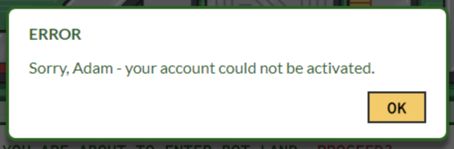
Source
Typically, error messages and warning signs are the color red — this error message example is green … which is a color that often signals success. You can see how this might lead to some puzzled visitors.
Using narrow and light-colored font on a white background is also slightly difficult to read. Additionally, the message’s action button, “OK”, stands out more than the word “ERROR” at the top of the summary box. And “Error” is arguably the most important part of this message because it’s what actually tells visitors there’s an issue with their submission.
Good example: Make the error message easy to identify
Source
When creating your error message, use intuitive, error-related cues (such as the color red) to bring the mistake to your visitor’s attention.
Some may say that a lot of bright red on a page could potentially overwhelm a visitor or make them feel targeted. But incorporating neutrals such as white or black, or even a faded or less-abrasive shade of red, helps bring balance to your message. This error message also uses warning signal icons that direct visitors to the locations in which errors exist, a readable font, and an easy-to-see action button that clearly states you can resubmit, or “Send”, your form again.
Back To You
Including well-crafted error messages in your web forms is a great way to enhance your user experience and, therefore, boost your conversions. There are a number of ways to avoid the most commonly made error message mistakes that may cause your visitors to feel frustrated, angry, or leave your site altogether.
By incorporating the quick fixes to these mistakes, your forms will feel professional and thoughtful, initiating a positive relationship with your visitors that will keep them coming back to your site. So get started crafting great error messages today with these easy-to-implement guidelines that will improve your UX and increase your number of leads and conversions.
![Blog - Website Redesign Workbook Guide [List-Based]](https://no-cache.hubspot.com/cta/default/53/4b5bb572-5d0e-45b8-8115-f79e2adc966b.png)
4 error message examples to help users navigate your UI – plus a FREE mobile error message downloadable by Justinmind
Error messages give users feedback when something has gone wrong in their web and mobile interfaces. Small as they are, these messages, instructions, reminders and warnings are essential to a brand’s user experience, conversion rate and reputation.
When designing an input form in a user interface, error messages are often badly designed or left out altogether. Bad error message examples include messages appearing at the wrong time or with misleading and/or erroneous information.
According to UXMas, error message design should be human, helpful, humble and humorous, if possible! Here are four best practices for designing error messages in your prototypes, with Justinmind’s prototyping tool.
Error message examples and best practices for prototyping them
Error messages are used in input forms, such as login or sign up forms, to inform the user of how and why there is a roadblock in their task flow. The user is reliant on the error message to move past these roadblocks, which is why it’s important to make each occurrence as seamless and meaningful as possible. For more information, check out post on testing and validating forms.
Poor error message design stems from poor planning in the UX design process. Designing error messages early on with a paper prototype will help ensure that the user receives as much help as possible when trying to complete a task. As the prototype evolves, so will your messages.
Want to design your own error messages? We’ve create a mobile example that you can download and customize to create your own app error messages. First of all, you’ll need to download Justinmind’s wireframe tool!
Download Justinmind’s mobile error message here and try it out here!
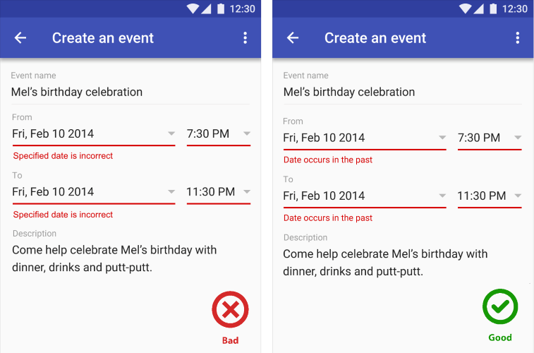
1— Error message examples: consider placement and timing
Effective error messages appear immediately after an error is committed and are strategically placed on-screen, at the optimal moment, so the user can’t miss them.
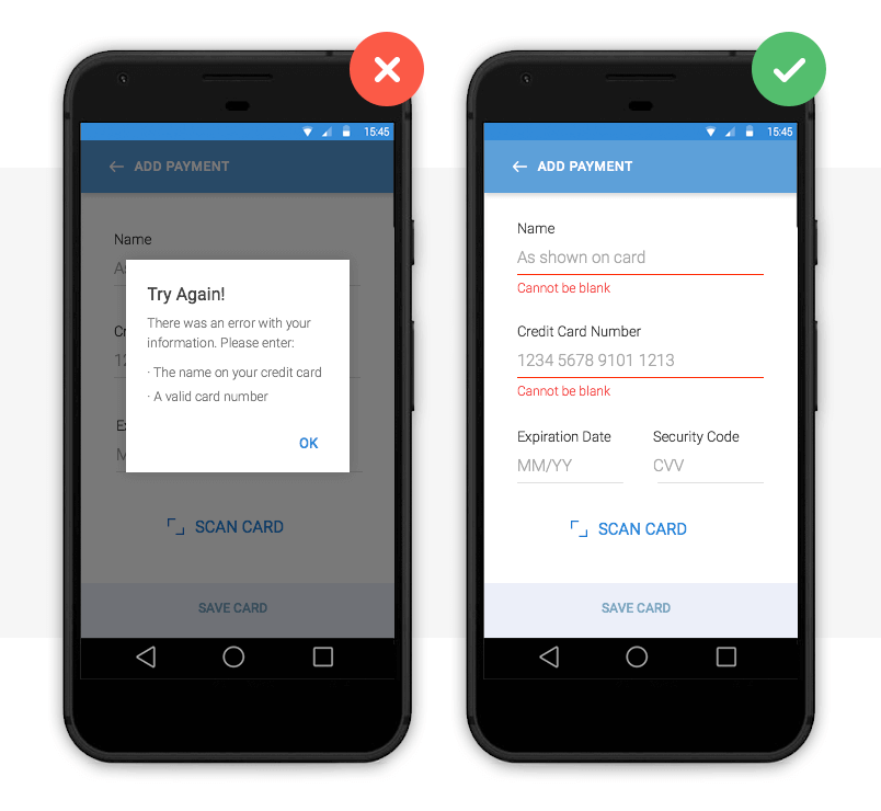
Image credit: Nick Babich
Above we have two error message examples. The left payment form uses a pop up to inform the user that they are required to fill in their details in order to make a payment. The user has to click out of the pop up to make these adjustments, which adds an additional step to their user journey. There is also the risk that the user will forget the pop up’s instruction and will be forced to return to the pop up. This can be time-consuming and frustrating – bad error message UX.
The right form uses inline validation. Clearly visible instructions immediately appear under each input field if the user leaves them blank. The user receives instant feedback and the required adjustments are clearly marked.
How to prototype this error message
Creating an inline validation error message in your web or mobile prototypes is easy with Justinmind. Use input text field widgets and a button to create the input form. Then, add text fields below each input field and write your error message in each.
To make your error messages interactive, combine ‘On Click’ (for web) or ‘On Tap’ (for mobile) with ‘Show’ actions with conditions. Learn how to simulate error messages in our website wireframe tool.
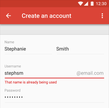
2— Error message examples: make them actionable
No matter how well-designed or strategically positioned, your error message is no good if it doesn’t offer the user a way out.
The user not only needs to know that there is a problem, but also how to rectify it. Actionable error messages are ones that tell the user what to do next in order to complete a task.
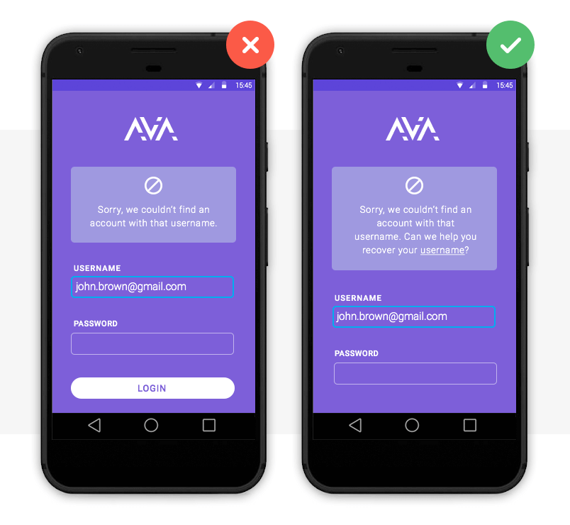
This is one of the best error message examples we’ve seen. The system not only informs the user that their email address is already in use, it also tells them how to log in by recovering their username.
How to prototype this error message
To prototype this error message, you’ll need two screens: a sign up and a recover username screen. Create them with input field and button widgets as above.
In the sign up screen, add a paragraph widget. Write the error message text and underline the text that will hold the login link. Mark it as hidden in the Properties palette.
Then, highlight text to be linked and add an ‘On Click’ (for web) or ‘On Tap’ (for mobile) and ‘Link’ event, selecting the recover username screen. You’ll need to add a condition that will make the error message appear only if the email address is already registered.
*Note that if you wish to add two links, you’ll need to use hotspot navigation widgets.
3— Error message visual examples: make them noticeable
Error messages are a waste of time if the user doesn’t notice them. As Jakob Nielsen puts it, “the very worst error messages are those that don’t exist”. Large fonts and garish pop ups quickly become irritating. So how do you make sure your messages get through? With the right use of color.
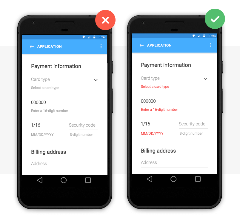
Image credit: Nick Babich
Color is one of the best tools for user validation. Error messages are typically displayed as red text/warning icon against a white background for contrast.
Note that color should not be the only indicator of an error. In order for your web or mobile design to be accessible, Jakob Nielsen advises to include redundant cues that color-blind users can see.
With smart technology (Augmented Reality, Artificial Intelligence and Voice user interface design) on the up, human-user interaction needs to be as natural as possible. Learn more about making your prototype accessible with our accessibility design post.
How to prototype this error message
You can change the font color, size and family of the error message in Justinmind’s Properties palette. If you wish to use a warning icon, you can change its color upon a user’s interaction by using SVG vectors.
4— Error message text examples: be specific
So you’ve mastered the error message aesthetics, you’re so close! Don’t let your design down with convoluted explanations or obscure codes and abbreviations.
Here’s some advice on how to make sure your error message is readable and has a human tone:
- Be empathetic, not technical e.g. never show raw error data such as ‘an error of type 2 has occurred’
- Be informative and precise by indicating that something has gone wrong and what it is exactly
- Be consistent by using the same tone and precision in each message
- Always give advice on how to fix the problem
As Jonathan Colman explains, a good error message is simple and clearly worded, a bad message won’t provide details about what happened, where it happened, or what to do next, and an ugly error message will completely conceal the problem.
Below are some error message text examples:
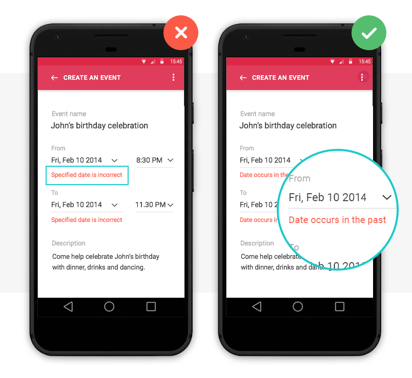
Image credit: Nick Babich
How to prototype this error message
If you’re unsure what kind of error message text to opt for, it’s time to user test your design. With user testing, you’ll see how users react to your design in real-time and get instant feedback to make an informed decision.
With Justinmind, you can quickly and easily link prototypes with user testing tools, such as UserTesting and UserZoom.
Why use error messages in your UI design?
When users interact with a site or app, errors are inevitable – after all, to err is human. But that’s what error messages are for.
Error messages help overcome roadblocks in the user journey and reduce the time it takes to get from Point A to B. They also help to alleviate frustration when errors occur, improving the user experience.
According to Nielsen’s First Law of Computer Documentation, users don’t always pay attention to system messages or warnings. But when users want to recover from an error, they are particularly attentive. So if UI/UX designers up their error message game, users will appreciate it.
Start by prototyping your error messages with Justinmind and become a pro in no time.
How hard could writing an effective error message be? There are a surprising number of ways this outwardly simple task can go wrong. Bad error messages are such a common problem in the user experience (UX) community that they’ve become a cultural meme. Know Your Meme even has a page dedicated to collecting lousy error messages and memes making fun of those messages.
It would be great if errors never occurred, but the world doesn’t work that way – and neither, no matter how good, does your digital application. Errors may result from the user, your system or even incompatible states, like trying to make a call while in airplane mode. Errors can be as simple as a typo and as prevalent as a broken link.
But as errors occur, you need to offer solutions. Hence, error messages. These messages are vital, and hopefully, you’re reading this article because you’re aware of the impact they have on your users.
Errors are frustrating to users. Your potential customer expects one result and, instead, gets a different outcome that interrupts their workflow. At this moment, they have to decide whether it’s worth it to continue interacting with your website – and even if it is, they may not be able to figure out how to move forward.
This is your chance to minimize frustration and provide a helpful message that promotes task completion. Writing error messages that solve problems instead of turning users away is another example of how good UX increases conversions.
Error messages shouldn’t be barriers; they should empower, reassure and guide your users towards success.
So, here are 15 tips on writing and designing good error messages that do just that.
1. Be Informative
When writing an error message, there are two components you have to include:
- What happened
- How to fix it
Claiming that there has been an error or mistake without explaining how to resolve it leaves the user without direction. An example would be telling a user, “Couldn’t rename file,” without telling them what to do next.
Telling the user what to do without explaining why there was an error might leave them confused about what they’re even fixing. In the scenario above, this might look like saying, “Please try another name,” without any explanation. Now they don’t know what was wrong with the name they chose and might even retry it.
A good error message would read, “There’s already a file with that name. Please try another name.” Now they know what to do and how to go about it.
Before you can write an informative error message, you need to understand the situation yourself. Start by asking yourself what has gone wrong, how it’s gone wrong, whether it’s a user or system error and how to fix it.
Some errors the operating system may control, so it’s also worth asking if it’s something you can change.
2. Always Provide a Solution
This tip branches off the first but is too important not to mention. You must always provide a solution to the error at hand. Otherwise, the user’s frustration will grow as they either waste their time trying to discover the answer on their own or give up.
Imagine a scenario where a user enters an invalid symbol in their username while trying to create an account. Instead of reminding them of the symbols they can use or sharing that it’s an issue with the username, your message reads, “You can’t create an account.” What are they supposed to do with that but leave?
When providing solutions, it is possible for there to be more than one option. For instance, a 404 error may be from a typo, moved content or deleted content. A useful 404 error page may encourage users to check their link spelling or take an alternative route to find the content they are looking for.
3. Speak the Same Language
As with all UX writing or copywriting, you want to speak the same language as your audience. This means removing jargon or technical terms. You can be explicit about the error and what to do, but users can’t follow your directions if they can’t understand them.
A common issue among error messages is the use of error codes that users don’t have a background in.
Hemingway It (AKA Be Concise)
No one wants to read an essay for most things – let alone to fix an error. It’s a known fact that people skim where they can. Your users want to get to the point, and your error message copy should help.
Writing shorter error messages will also increase your users’ understanding. A study by the American Press Institute shows that readers understand 100% of a message with eight words but only 90% of a message with 14 words. Worse yet, at 43 words, comprehension drops to a mere 10%.
When you do cut words, make sure that you still get the point across. Remove everything the user doesn’t need to know, but keep necessary information. The goal is to be precise and concise.
5. Let Them Choose the Level of Disclosure
On the topic of being concise and speaking your users’ language, it’s true that most won’t understand the technical information behind a system error. Regardless, it’s nice to give the users who might find this information beneficial the opportunity to access it. You can do this with progressive disclosure techniques.
Progressive disclosure is when you add a “show more” or “learn more” link or drop-down option that reveals more information. This allows users interested in the details to view them without overwhelming those who aren’t interested.
6. Take the Blame (Or Don’t Assign It)
It’s human nature to defend oneself, so it’s best not to offend users from the get-go. We’re talking about accusing users of causing the error at hand. Even if the user causes the error, you’ll provide a better user experience by not pointing fingers. This means taking the blame or not assigning it at all.
You can prevent accusatory language by focusing on the solution instead of the user action that caused the error. For example, your login error message can say, “That password doesn’t match. Please try again,” instead of, “The password you entered is incorrect.”
7. Be Gentle
WARNING: NO ONE LIKES BEING YELLED AT!
And yet, people often use all uppercase letters or exclamation points to convey importance. Instead, it can come across as aggressive or heighten the user’s stress about the error. When dealing with what may already be a frustrating situation for your user, be more gentle.
8. Use Positive Language
Using positive language when conveying errors can help soothe and guide your users, whereas negative language makes the scenario feel uncomfortable. Notice how “use positive language” sounds nicer than “avoid negative language” or how “be gentle” is more pleasant than “don’t be aggressive.”
Prioritizing the solution over the problem can help. For example, a form with an invalid zip code can say:
- The form has errors: You entered an incorrect zip code.
Or
- Please enter a valid zip code for your state.
Which would you prefer? We’re guessing the latter.
As long as you remain clear, giving your language a positive makeover can make errors less upsetting.
9. Use Your Brand Voice
Your brand is the core of your company, and it’s intended to prevail in all areas. Write error messages in your brand voice to help contribute to a seamless experience that makes the error feel like less of an interruption.
Of course, you want to keep the tone consistent with the user’s emotional experience. A fun brand can create a more playful error message so long as it remains helpful and doesn’t make the user feel like you’re not taking the problem seriously. Humorous error messages can relieve tension or frustrate the user more. It all depends on context.
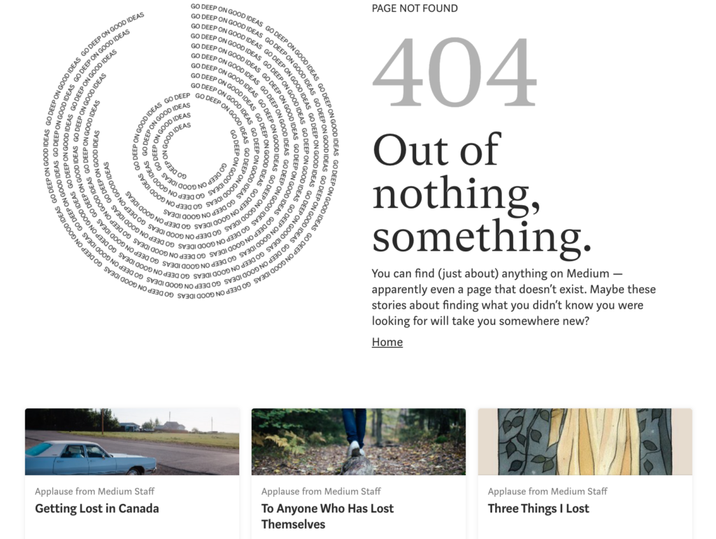
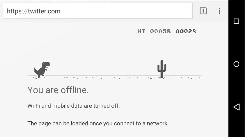
Some businesses replace generic error messages with creative alternatives. Google provides an offline game that users can play when disconnected from the internet. Medium, a publishing platform, uses its 404 Page Not Found error to say, “You can find (just about) anything on Medium – apparently even a page that doesn’t exist,” and links to intriguing articles about being lost.
10. Be a Friend, Not a Robot
It’s easy when conveying system errors to turn into a robot, but the best thing you can do is fight for your humanity. Making your error messages human and friendly humanizes the brand and makes it feel more like you care. Users prefer getting help from a person, and being friendly can remove frustration and generate understanding.
11. Make CTAs Clear
Depending on the content of your error message, you may need a call to action button (CTA) that guides the user, one that dismisses the message or none at all.
If you do use a CTA button, make it clear what the button does. Buttons like “yes,” “no” or “okay” might be too vague if not set up by the descriptive text. You may also have more than one CTA, at which point you’ll want to ensure that the user can distinguish between the results of each.
When writing an error message CTA, a good rule of thumb is to use the same text on the button that you do in the description. For instance, don’t say “erase” in the description and then write “delete” on the corresponding action button.
12. Account for Timing
Timing is another important element of how to make an error message. Will it be immediate? In post? The timing of an error message can be the difference between a helpful hint and an irritating occurrence.
More often than not, real-time alerts are more helpful. Picture filling out a form. You make a spelling error, and immediately after, red text appears next to the box asking you to include the missing element. Or, you fill out the form, hit submit and get a list of red errors to correct. Generally, users prefer the former.
13. Be Smart About Colors
Color is also a design element, but if you’re writing for UX, you should work with the UX designer to ensure proper representation of error messages.
Color is important to friendly error message design as it plays a large role in drawing attention to the message. But using attention-grabbing colors isn’t the only thing to consider. You also want to ensure that your message will be visible to people who are color blind. This includes using appropriate color combinations and icons to help indicate errors.
Refer to our guide on UI design for color blind users to make your error messages, and the rest of your platform, accessible.
14. Consider Format and Location
When designing error messages, you’ll also decide on the format of the message and where it will display on the screen. Is your message so urgent that it should take up the entire screen and prevent all other action so that users have to see it? If it’s more of a minor notification, interrupting users to such a large degree may be annoying. A newer, less disruptive practice with forms is to take away the option to hit submit until users correct all errors.
You can display error messages as full-page pop-ups, banners or inline errors. The type you choose will depend on the context and severity of the error. For example, inline messages are ideal for forms as they notify the user of the error right next to the error itself, making it easy to spot and correct.
15. Prevent Error From the Start
Some error is inevitable, but you should prevent it where you can. With empathetic design, you can reduce the number of error occurrences to create a more seamless experience.
You can start by creating a customer journey map that reveals where errors are often made. Then, see if it’s possible to make design edits that prevent those errors. Here are some design elements that reduce error:
- Crossing out booking dates that aren’t available so users can’t select them
- Autocorrecting typos (careful with this one)
- Using white space to prevent misclicks or mistaps
- Clearly labeling forms
You can also reduce repeat errors by providing better direction. For example, many users have multiple usernames and passwords. “That username doesn’t exist,” provides better direction for what to try next than saying, “Your login information is incorrect.”
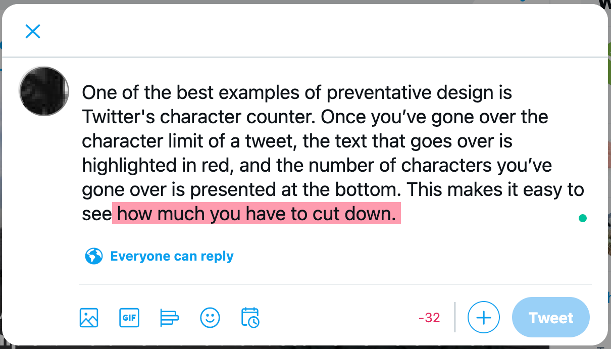
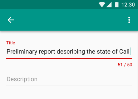
One of the best examples of preventative design is Twitter’s character counter. Once you’ve gone over the character limit of a tweet, the characters that go over are highlighted in red, and the number of characters you’ve gone over is presented at the bottom. This makes it easy to see how much you have to cut down.
Go Forth and Conquer All Error
If you’re ready to start creating effective error messages that empower your users instead of irritating them, start by knowing what errors you’re helping with. You may be starting from scratch, have error messages to rewrite or just making sure that you have all bases covered.
Sometimes the best error messages aren’t necessary but are worth investing in to help the user experience. Some email platforms notify you that your email doesn’t have a file attached when you mentioned attaching one in the email. They aren’t obligated to catch this forgetful moment, but it sure helps when they do.
Evaluate all elements of your software or website, and make a list of all the places something can go wrong or users can mess up. Once you’ve done that, use these 15 tips to write user-friendly messages. And if you need some help, reach out.
‘Errors’ happen. They happen in our apps and they happen in our life. Sometimes they happen because we made mistakes. Sometimes because a system failed. Whatever the cause, these errors — and how they are handled — can have a huge impact on the way a user experiences your app.
Often overlooked, a lazy error handling and ill-constructed error messages can fill users with frustration, and make them stop using your app. A well-crafted error handling, on the other hand, can turn a moment of failure into a moment of delight.
In this article, we’ll examine how the design of apps can be optimized to prevent excessive user errors and how to create good error messages.
[otw_is sidebar=otw-sidebar-1]
What is an Error?
Errors (or error condition) occur when an app fails to complete an expected action, such as:
- The application does not understand user input
- The application fails
- A user intends to run incompatible operations concurrently
Every error, regardless of who is to blame, becomes a point of friction for your users. Luckily, a well-designed error handling can help reduce that friction.
Preventing User Errors
If you’re a web or app designer, you should be familiar with constraints. For example, it’s hard to fill out a certain form or it’s impossible to properly sync a data if a device has a poor network connection. You should take these constraints into account in order to minimize errors by designing an app that makes it easy for users to use it. In other words, it’s better to prevent users from making errors in the first place by offering suggestions, utilizing constraints, and being flexible.
Twitter famously has a strict character limit for tweets and warns users before they exceed that limit with a remaining character count.
Make Error Message Informative and Consistent
One of the 10 Usability Heuristics advises that it’s important to communicate errors to users gracefully and clearly. An effective error message provides following information:
- Communicate what is happening
- Describe how a user can resolve it
- Preserve as much user-entered input as possible
By providing explanation and feedback, you can decrease the potential friction of user experience.
User Input Errors
User input validations are meant to have conversations with users and guide them through the difficult times of errors and uncertainty. The output of this process is emotional rather than technical.
The primary principle of input validation is this: “Talk to the users! Tell when them what is wrong!” Generally speaking, there are three important elements that good form validation consists of:
- Right time and place for informing about errors
- Right color for the message
- Clear language for your message
And all these moments have one major goal — avoid confusion.
Right Time and Place (Inline Validation)
Users dislike when they go through the process of filling out a form only to find out at submission, that they’ve made an error. The right time to inform about the success/failure of provided data is right after the user has submitted the information. And it’s a time when real-time validation comes into play.
Real-time inline validation immediately informs users about the correctness of provided data. If you are performing inline form validation, and the field with the error is clearly marked, the submit button may be disabled until the error is corrected. It allows users to correct the errors they make faster without having to wait until they press the submit button to see the errors.
Below are a few examples of inline validation:
- Incompatible values
- Over/under character or word count
[otw_is sidebar=otw-sidebar-2]
Right Color (Intuitive Design)
Color is one of the best tools to use when designing validation.
Because it works on an instinctual level, adding red to error messages and yellow to warning messages is incredibly powerful. Error text should be legible, with noticeable contrast against its background color. But make sure that colors in your digital interface are accessible for your users, it’s a really important aspect of a well-executed visual design.
Clear Message (What Happened)
Make sure your error messages sound like they’ve been written for humans. In order to achieve this you should speak the same language as your users, avoid using technical jargon, express everything in the user’s vocabulary. Your validation message should clearly state:
- What went wrong and possibly why.
- What’s the next step the user should take to fix the error.
App Errors
App errors occur independently of user input. It is an example of a situation where the user is getting something other than their desired state. When showing errors, explain why user cannot see anything, and how to solve this.
[otw_is sidebar=otw-sidebar-3]
Sync Error/Failure To Load
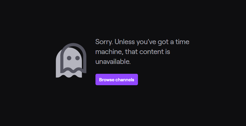
When sync or connectivity is down or content has failed to load, the user should know that. Tell them upfront. Since you don’t have a data, you can use empty states to fill this gap. Sad fact that most empty states often look… empty. In the example below, error screen only states “An error occurred” and doesn’t provide any helpful information.
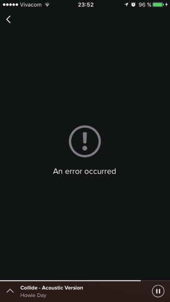
Think of your error message as a conversation with your user. Use friendly and helpful empty states in a moment of failure. Assist users by providing the basic required information, and encourage users to solve the problem.

If appropriate, present a link (or button) to help a user accomplish their task. But you should only offer options that you can actually support. For example, don’t offer an option like “Try again” in cases where you can detect that the operation will fail.
Or if the case is a loading time issue, make sure you have a progress indicator in place.
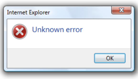
Never Show The Raw Error Message
Messages like the example below are cryptic and scary.
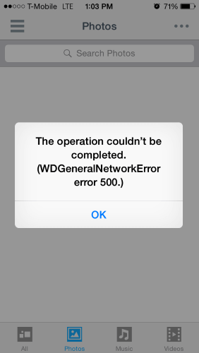
Don’t assume people know about the context of a message or they are tech-savvy, tell people what’s wrong in simple words. How would you explain the error to them, in human speak? Write those words down. That’s your error message.
Incompatible State Errors
Incompatible state errors occur when users attempt to run operations that conflict, such as making a call while in airplane mode or trying to play online video while being offline. You should help prevent users from putting themselves into these situations by clearly communicating the states they are selecting. Simply, don’t let people start something they can’t finish.

The best error message is the one that never shows up. It is always best to prevent errors from happening in the first place by guiding users in the right direction ahead of time. But when errors do arise, a well-designed error handling not only help teach users how to use the app as you intended, but they also prevent users from feeling ignorant.
About the author:
This post originally appeared on babich.biz, written by Nick Babich. Nick is a software developer who’s passionate about user experience.
[otw_is sidebar=otw-sidebar-4]
Capture feedback easily. Get more insights and confidence.

Getting feedback has never been easier and we hope you’ve realized that after reading this article. Let us know what you think, your feedback is important.
And if you’re ready to try out a customer feedback software, Usersnap offers a free trial. Sign up today or book a demo with our feedback specialists.
Good error message, bad error message
Error messages are like letters from the tax authorities. You’d rather not get them, but when you do, you’d prefer them to be clear about what they want you to do next.
When integrating a new API it is inevitable that you’ll encounter an error at some point in your journey. Even if you’re following the docs to the letter and copy & paste code samples, there’s always something that will break – especially if you’ve moved beyond the examples and are now adapting them to fit your use case.
Good error messages are an underrated and underappreciated part of APIs. I would argue that they are just as important a learning path as documentation or examples in teaching developers how to use your API.
As an example, there are many people out there who prefer kinesthetic learning, or learning by doing. They forgo the official docs and prefer to just hack away at their integration armed with an IDE and an API reference.
Let’s start by showing an example of a real error message I’ve seen in the wild:
{
  status: 200,
  body: {
    message: "Error"
  }
}
Enter fullscreen mode
Exit fullscreen mode
If it seems underwhelming, that’s because it is. There are many things that make this error message absolutely unhelpful; let’s go through them one by one.
Send the right code
The above is an error, or is it? The body message says it is, however the status code is 200, which would indicate that everything’s fine. This is not only confusing, but outright dangerous. Most error monitoring systems first filter based on status code and then try to parse the body. This error would likely be put in the “everything’s fine” bucket and get completely missed. Only if you add some natural language processing could you automatically detect that this is in fact an error, which is a ridiculously overengineered solution to a simple problem.
Status codes are for machines, error messages are for humans. While it’s always a good idea to have a solid understanding of status codes, you don’t need to know all of them, especially since some are a bit esoteric. In practise this table is all a user of your API should need to know:
| Code | Message |
|---|---|
| 200 — 299 | All good |
| 400 — 499 | You messed up |
| 500 — 599 | We messed up |
You of course can and should get more specific with the error codes (like a 429 should be sent when you are rate limiting someone for sending too many requests in a short period of time).
The point is that HTTP response status codes are part of the spec for a reason, and you should always make sure you’re sending back the correct code.
This might seem obvious, but it’s easy to accidentally forget status codes, like in this Node example using Express.js:
// ❌ Don't forget the error status code
app.post('/your-api-route', async (req, res) => {
  try {
    // ... your server logic
  } catch (error) {
    return res.send({ error: { message: error.message } });
  }

  return res.send('ok');
});

// ✅ Do set the status correctly
app.post('/your-api-route', async (req, res) => {
  try {
    // ... your server logic
  } catch (error) {
    return res.status(400).send({ error: { message: error.message } });
  }

  return res.send('ok');
});
Enter fullscreen mode
Exit fullscreen mode
In the top snippet we send a 200 status code, regardless of whether an error occurred or not. In the bottom we fix this by simply making sure that we send the appropriate status along with the error message. Note that in production code we’d want to differentiate between a 400 and 500 error, not just a blanket 400 for all errors.
Be descriptive
Next up is the error message itself. I think most people can agree that “Error” is just about as useful as not having a message at all. The status code of the response should already tell you if an error happened or not, the message needs to elaborate so you can actually fix the problem.
It might be tempting to have deliberately obtuse messages as a way of obscuring any details of your inner systems from the end user; however, remember who your audience is. APIs are for developers and they will want to know exactly what went wrong. It’s up to these developers to display an error message, if any, to the end user. Getting an “An error occurred” message can be acceptable if you’re the end user yourself since you’re not the one expected to debug the problem (although it’s still frustrating). As a developer there’s nothing more frustrating than something breaking and the API not having the common decency to tell you what broke.
Let’s take that earlier example of a bad error message and make it better:
{
  status: 404,
  body: {
    error: {
      message: "Customer not found"
    }
  }
}
Enter fullscreen mode
Exit fullscreen mode
Already we can see:
- We have a relevant status code: 404, resource not found
- The message is clear: this was a request that tried to retrieve a customer, and it failed because the customer could not be found
- The error message is wrapped in an error object, making working with the error a little easier. If not relying on status codes, you could simply check for the existence of
body.errorto see if an error occurred.
That’s better, but there’s room for improvement here. The error is functional but not helpful.
Be helpful
This is where I think great APIs distinguish themselves from simply “okay” APIs. Letting you know what the error was is the bare minimum, but what a developer really wants to know is how to fix it. A “helpful” API wants to work with the developer by removing any barriers or obstacles to solving the problem.
The message “Customer not found” gives us some clues as to what went wrong, but as API designers we know that we could be giving so much more information here. For starters, let’s be explicit about which customer was not found:
{
  status: 404,
  body: {
    error: {
      message: "Customer cus_Jop8JpEFz1lsCL not found"
    }
  }
}
Enter fullscreen mode
Exit fullscreen mode
Now not only do we know that there’s an error, but we get the incorrect ID thrown back at us. This is particularly useful when looking through a series of error logs as it tells us whether the problem was with one specific ID or with multiples. This provides clues on whether it’s a problem with a singular customer or with the code that makes the request. Furthermore, the ID has a prefix, so we can immediately tell if it was a case of using the wrong ID type.
We can go further with being helpful. On the API side we have access to information that could be beneficial in solving the error. We could wait for the developer to try and figure it out themselves, or we could just provide them with additional information that we know will be useful.
For instance, in our “Customer not found” example, it’s possible that the reason the customer was not found is because the customer ID provided exists in live mode, but we’re using test mode keys. Using the wrong API keys is an easy mistake to make and is trivial to solve once you know that’s the problem. If on the API side we did a quick lookup to see if the customer object the ID refers to exists in live mode, we could immediately provide that information:
{
  status: 404,
  body: {
    error: {
      message: "Customer cus_Jop8JpEFz1lsCL not found; a similar object exists in live mode, but a test mode key was used to make this request."
    }
  }
}
Enter fullscreen mode
Exit fullscreen mode
This is much more helpful than what we had before. It immediately identifies the problem and gives you a clue on how to solve it. Other examples of this technique are:
- In the case of a type mismatch, state what was expected and what was received (“Expected a string, got an integer”)
- Is the request missing permissions? Tell them how to get them (“Activate this payment method on your dashboard with this URL”)
- Is the request missing a field? State exactly which one is missing, perhaps linking to the relevant page in your docs or API reference
Note: Be careful with what information you provide in situations like that last bullet point, as it’s possible to leak information that could be a security risk. In the case of an authentication API where you provide a username and password in your request, returning an “incorrect password” error lets a would-be attacker know that while the password isn’t correct, the username is.
Provide more pieces of the puzzle
We can and should strive to be as helpful as possible, but sometimes it isn’t enough. You’ve likely encountered the situation where you thought you were passing in the right fields in your API request, but the API disagrees with you. The easiest way to get to a solution is to look back at the original request and what exactly you passed in. If a developer doesn’t have some sort of logging setup then this is tricky to do, however an API service should always have logs of requests and responses, so why not share that with the developer?
At Stripe we provide a request ID with every response, which can easily be identified as it always starts with req_. Taking this ID and looking it up on the Dashboard gets you a page that details both the request and the response, with extra details to help you debug.

Note how the Dashboard also provides the timestamp, API version and even the source (in this case version 8.165 of stripe-node).
As an extra bonus, providing a request ID makes it extremely easy for Stripe engineers in our Discord server to look up your request and help you debug by looking up the request on Stripe’s end.
Be empathetic
The most frustrating error is the 500 error. It means that something went wrong on the API side and therefore wasn’t the developer’s fault. These types of errors could be a momentary glitch or a potential outage on the API provider’s end, which you have no real way of knowing at the time. If the end user relies on your API for a business critical path, then getting these types of errors are very worrying, particularly if you start to get them in rapid succession.
Unlike with other errors, full transparency isn’t as desired here. You don’t want to just dump whatever internal error caused the 500 into the response, as that would reveal sensitive information about the inner workings of your systems. You should be fully transparent about what the user did to cause an error, but you need to be careful what you share when you cause an error.
Like with the first example way up top, a lacklustre “500: error” message is just as useful as not having a message at all. Instead you can put developers at ease by being empathetic and making sure they know that the error has been acknowledged and that someone is looking at it. Some examples:
- “An error occurred, the team has been informed. If this keeps happening please contact us at
{URL}” - “Something went wrong, please check our status page at
{URL}if this keeps happening” - “Something goofed, our engineers have been informed. Please try again in a few moments”
It doesn’t solve the underlying problem, but it does help to soften the blow by letting your user know that you’re on it and that they have options to follow up if the error persists.
Putting it all together
In conclusion, a valuable error message should:
- Use the correct status codes
- Be descriptive
- Be helpful
- Provide elaborative information
- Be empathetic
Here’s an example of a Stripe API error response after trying to retrieve a customer with the wrong API keys:
{
  status: 404,
  body: {
    error: {
      code: "resource_missing",
      doc_url: "https://stripe.com/docs/error-codes/resource-missing",
      message: "No such customer: 'cus_Jop8JpEFz1lsCL'; a similar object exists in live mode, but a test mode key was used to make this request.",
      param: "id",
      type: "invalid_request_error"
    }
  },
  headers: {
    'request-id': 'req_su1OkwzKIeEoCy',
    'stripe-version': '2020-08-27',
  }
}
Enter fullscreen mode
Exit fullscreen mode
(some headers omitted for brevity)
Here we are:
- Using the correct HTTP status code
- Wrapping the error in an “error” object
- Being helpful by providing:
- The error code
- The error type
- A link to the relevant docs
- The API version used in this request
- A suggestion on how to fix the issue
- Providing the request ID to look up the request and response pairing
The result is an error message so overflowing with useful information that even the most junior of developers will be able to fix the issue and discover how to use the available tools to debug their code themselves.
Designing APIs for humans
By putting all these pieces together we not only provide a way for developers to correct mistakes, but also ensure a powerful way of teaching developers how to use our API. Designing APIs with the human developer in mind means we take steps to make sure that our API isn’t just intuitive, but easy to work with as well.
We covered a lot here and it might seem overwhelming to implement some of these mitigations, however luckily there are some resources out there that can help you make your API human-friendly:
- The excellent APIs you won’t hate community (co-run by my colleague Mike Bifulco) has some great articles on the subject:
- Why Show Users Garbage API Errors?
- Creating Good API errors in REST, GraphQL and gRPC
- Tools like Spectral can be set up to provide useful linting for APIs — catching things like “200 OK — Error” and making sure best practices are adhered to
Got any examples of error messages you thought were excellent (or terrible, because those are more fun)? I’d love to see them! Drop a comment below or reach out on Twitter.
About the author

Paul Asjes is a Developer Advocate at Stripe where he writes, codes and hosts a monthly Q&A series talking to developers. Outside of work he enjoys brewing beer, making biltong and losing to his son in Mario Kart.
Mistakes are unavoidable in our lives. When a user is working on a product, it is very likely that he may stuck somewhere in response to his actions.
Such kind of situations can be frustrating for users if not handled properly within the product. It depends on the experience the product is providing to its users.
“A product should be usable enough to handle the user’s erroneous actions gracefully.”
Below mentioned are few tips that when followed, error messages can also provide a pleasant experience to the user.
1. Be Clear And Not Ambiguous
Write error messages in clear and simple language. The user should be able to understand the problem while reading an error message.
If the error message is ambiguous and the user is not able to find the reason for the message, then it is of no use. Users cannot do anything to fix the problem and it badly impacts the experience of the product.

Examples:


2. Be Short And Meaningful
The error message should contain the necessary information. Most of the time user is not willing to read a long story.
Be concise and write a short description that is meaningful for the user and gives him a clear idea of the problem and how to resolve it.
Avoid using redundant words and do not over-communicate the problem.

Examples:


3. Don’t Use Technical Jargons
Most of the users are not interested in the technical details of the problem that occurred. If a message contains technical terms or jargons, the user gets confused.
Try to use simple and plain language without referring to implementation details.
If there is a need to mention technical and complex details, then place them in a troubleshooting section and direct the user so that he can resolve the issue quickly.

Examples:

4. Be Humble — Don’t Blame User
A good error message is humble. It conveys the issues gracefully to its user without blaming him for his actions.
The user can perform an incorrect action again and again. But the design’s responsibility is to inform him about his mistakes in a good way.
“A good way to incorporate more human tone to your error messages is to think about explaining it out loud to someone. How does it sound when you speak it in conversation.” — Sonia Gregory
5. Avoid Negative Words
There are certain negative words that need to avoid on the user interface. Since error messages are based on some unusual actions of the user, there is a chance that the system displays something disrespectful for the user.
John Ekman gives a very good example of using “yes” and “no”:
“Some years ago, while checking in at the airport in Stockholm on my way to the U.S., I asked the woman at the counter if it would be possible to get an upgrade to business class. Her response: “I’m sorry, but that’s not possible. You would have to pay extra for that.” Checking in for the return flight, I tried the same thing again, but this time the answer was: “Of course, sir! How would you like to pay for that?”
So even though the seat availability and possibility for an upgrade was the same, I got two completely different answers: one “yes” and one “no.””
6. Give Direction to User
A good error message has three parts: problem identification, cause details if helpful, and a solution if possible.
Whenever an error occurs, the user wants to fix it as soon as possible. The error message should have enough information for the user that guides him on how to get out of the erroneous situation.
The message can also direct the user to some other place or person from where he can get detailed help about the problem.

Examples:

7. Be Specific And Relevant
The message should contain relevant information so that the user can relate to the specified location and options easily.
Point out the exact location of the problem — where the user should go and what steps are needed to follow to resolve it.
If an error message contains vague information, the user will get confused and it becomes difficult for him to remove the error.
8. Avoid Uppercase Text
Upper case text is difficult to read it gives an impact of shouting on the user.
An error message is a place where the user is informed about some critical scenario, so using upper case text can give him a feeling of discouragement.

9. Provide Appropriate Actions
Actions are an important part of the error message. Appropriate actions provide guidance to the user about the next step.
Actions are possible routes to solve the problem. A message can contain one or more actions for the user.
“Give alert buttons succinct, logical titles. The best button titles consist of one or two words that describe the result of selecting the button.” — iOS guidelines
If the user has to perform specific actions to remove the error, then use the same action name as the button title.

Examples:

10. Use Progressive Disclosure Approach
If there is detailed information related to a message that the user may not want to see, then place it in the Show/Hide section. It can be useful for an advanced user that may want to know about technical details.
Just make sure to place the least needed information in these sections as most of the time users will not go to the Show/Hide section.

Examples:

11. Use Proper Placement
It is very important to place an error message closer to the area from where it belongs to. Users should not have to look here and there after reading the message that what it talks about.
For example, when the user is filling the information in a form, it is the best experience to provide validation error along with the controls it relates to.
Otherwise, user will first find the erroneous control and then resolve it.
An error message should be visible and noticeable. A message appearing on a screen should display in the current view even user has scrolled the view to the top or bottom.

Conclusion
“The best error message is the one that never shows up” — Thomas Fuchs
It is good to avoid errors at all, but since we live in a world of humans, it is not possible to make everything perfect.
However, by following standard rules and guidelines, the errors can be handled in a helping way instead of scolding the user for his mistakes.
Good reading material on error messages UX guidelines:
Subscribe for more related articles at UX World.
If you have any questions, contact here: Facebook | YouTube | Twitter | Instagram | Linkedin
