This tutorial will show you how to create and customize error messaging for various form elements. In this tutorial, we will customize everything from a basic error message to input field errors and tooltips. The best part? We will be using only CSS for customizations – that means no images or javascript required!
HTML
Below is the markup for the form elements we will be creating error messaging for. This is all of the HTML used throughout this tutorial. Copy and paste this code into your working file:
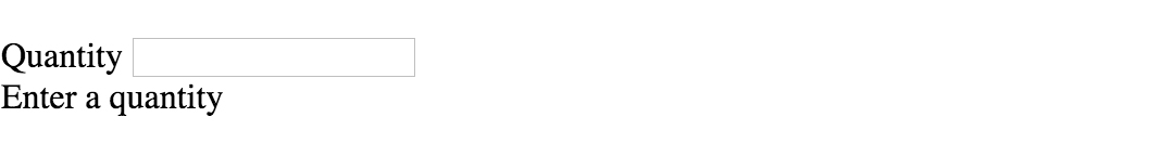
<!-- Basic Error Message -->
<div class="error-message">
  <span class="error-text">Checkout could not be completed. Please check your login information and try again.</span>
</div>

<!-- Input Field Error -->
<div class="input-group error">
  <label>Password *</label>
  <input type="text">
  <div class="error-message">Password is a required field.</div>
</div>

<!-- Input Field Error with Tooltip -->
<div class="input-group error">
  <label>Quantity</label>
  <input type="text">
  <div class="error-tip">Enter a quantity</div>
</div>
CSS
Now onto my personal favorite: the CSS. We will keep the basic functionality of the form elements but completely customize their appearance. In the end, they will stand on their own as custom design elements that thoughtfully guide the user through the form process, making it as straightforward and painless as possible.
Basic Error Message
Let’s start with a basic error message. We are going to customize the HTML above to look like this:
This is what we start out with, by default, after adding the HTML:

Customizing a basic error message is really simple. All we have to do is give our text a colored background and a couple font styles using CSS. To style the error message background, add the following styles to your CSS stylesheet:
.error-message {
  background-color: #fce4e4;
  border: 1px solid #fcc2c3;
  float: left;
  padding: 20px 30px;
}
Now let’s style the text itself by adding the following font styles:
.error-text {
  color: #cc0033;
  font-family: Helvetica, Arial, sans-serif;
  font-size: 13px;
  font-weight: bold;
  line-height: 20px;
  text-shadow: 1px 1px rgba(250,250,250,.3);
}
That’s it! Keep reading to learn how to style input field and tooltip errors.
Input Field Error
Now that we have our basic error message styled, let’s work on input field errors. This is what the final product will look like:
And this is what we start out with by default:
First, we want to override the browser’s default styles. Add the following CSS to give your input field a custom look:
/* Basic Input Styling */
.input-group {
  color: #333;
  float: left;
  font-family: Helvetica, Arial, sans-serif;
  font-size: 13px;
  line-height: 20px;
  margin: 0 20px 10px;
  width: 200px;
}

label {
  display: block;
  margin-bottom: 2px;
}

input[type=text] {
  background: #fff;
  border: 1px solid #999;
  float: left;
  font-size: 13px;
  height: 33px;
  margin: 0;
  padding: 0 0 0 15px;
  width: 100%;
}
Next, we need to add the styling for the error message that displays when a user does not correctly fill out an input field (i.e. the “This is a required field” message):
.error-message {
  color: #cc0033;
  display: inline-block;
  font-size: 12px;
  line-height: 15px;
  margin: 5px 0 0;
}
Lastly, add the error-specific styling for the input field elements:
.error label {
  color: #cc0033;
}

.error input[type=text] {
  background-color: #fce4e4;
  border: 1px solid #cc0033;
  outline: none;
}
Input Field Error with Tooltip
The last element we’re tackling is the tooltip. It is slightly more complicated than the others but well worth the effort. We will also be utilizing Sass nesting to better organize our code, and because we are only using SCSS it is 100% editable and scalable.
Once we are done, the tooltip will look like this:
And by default, this is what we start with after adding the HTML:
First, we override the browser’s default styles with our own custom styling:
/* Basic Input Styling */
.input-group {
  color: #333;
  float: left;
  font-family: Helvetica, Arial, sans-serif;
  font-size: 13px;
  line-height: 20px;
  margin-bottom: 10px;
  width: 100%;
}

label {
  display: block;
  margin-bottom: 5px;
}

input[type=text] {
  background: #fff;
  border: 1px solid #ccc;
  color: #333;
  float: left;
  font-family: Helvetica, Arial, sans-serif;
  font-size: 13px;
  height: 33px;
  line-height: 20px;
  margin: 0;
  padding: 0 0 0 15px;
  width: 45px;
}
Just like our previous example, we need to add the tooltip error message styling that displays when a form error occurs. Note: we are using Sass here to nest the tooltip’s left arrow properties. This comes in handy when trying to keep track of which values are assigned to the tooltip specifically:
/* Tooltip Styling */
.error-tip {
  background-color: #fce4e4;
  border: 1px solid #fcc2c3;
  border-radius: 7px;
  -moz-border-radius: 7px;
  -webkit-border-radius: 7px;
  display: inline;
  color: #cc0033;
  float: left;
  font-weight: bold;
  line-height: 24px;
  position: relative;
  padding: 7px 11px 4px;
  margin-left: 17px;
  // Left Arrow Styling Starts Here
  &:after, &:before {
    content: '';
    border: 7px solid transparent;
    position: absolute;
    top: 11px;
  }
  &:after {
    border-right: 7px solid #fce4e4;
    left: -14px;
  }
  &:before {
    border-right: 7px solid #fcc2c3;
    left: -15px;
  }
} // end .error-tip
Now all that’s left to do is define the input’s error-specific styling. Again, we will nest these styles under an “error” class selector to make classification and future changes easier:
/* Error Styling */
.error.input-group {
  label {
    color: #cc0033;
    font-weight: bold;
  }
  input {
    border: 2px solid #cc0033;
    line-height: 37px;
    outline: none;
  }
  .status {
    display: none;
  }
  .error-tip {
    display: inline;
  }
} // end .error
And that’s it! All the code you need to customize error messaging for default form elements. To experiment with the final results and copy and paste to your heart’s content (without fear of breaking anything), jump on over to Codepen by selecting any of the tutorial links below.
Codepen/Tutorial Links
All: codepen.io/seskew/
Basic Error Message: codepen.io/seskew/pen/akhLx
Input Field Error: codepen.io/seskew/pen/XKJKNQ
Input Field Error with Tooltip: codepen.io/seskew/pen/NrPNBp
Welcome to a quick tutorial on how to create custom error messages with pure CSS. By now, you should have experienced the intrusive default Javascript alert box. Every time it shows up, users get scared away. So here it is, let us walk through a few examples of “alternative” error notification bars that are more elegant and not as intrusive – Read on!
ⓘ I have included a zip file with all the source code at the start of this tutorial, so you don’t have to copy-paste everything… Or if you just want to dive straight in.
TABLE OF CONTENTS
DOWNLOAD & NOTES

Firstly, here is the download link to the example code as promised.
QUICK NOTES
If you spot a bug, feel free to comment below. I try to answer short questions too, but it is one person versus the entire world… If you need answers urgently, please check out my list of websites to get help with programming.
EXAMPLE CODE DOWNLOAD
Click here to download the source code, I have released it under the MIT license, so feel free to build on top of it or use it in your own project.
CSS-ONLY ERROR NOTIFICATIONS

Let us start with the raw basics by creating notification bars with just pure CSS and HTML.
1) BASIC NOTIFICATION BAR
1A) THE HTML
1-basic.html
<div class="bar">Plain message</div>
<div class="bar info">Information message</div>
<div class="bar success">Successful message</div>
<div class="bar warn">Warning message</div>
<div class="bar error">Error message</div>
That is actually all we need to create a custom error message, an HTML <div> with the notification message inside. Take note of the bar and info | success | warn | error CSS classes – We will use these to build the notification bar.
1B) THE CSS
error-bar.css
/* (A) THE BASE */
.bar {
  padding: 10px;
  margin: 10px;
  color: #333;
  background: #fafafa;
  border: 1px solid #ccc;
}

/* (B) THE VARIATIONS */
.info {
  color: #204a8e;
  background: #c9ddff;
  border: 1px solid #4c699b;
}
.success {
  color: #2b7515;
  background: #ecffd6;
  border: 1px solid #617c42;
}
.warn {
  color: #756e15;
  background: #fffbd1;
  border: 1px solid #87803e;
}
.error {
  color: #ba3939;
  background: #ffe0e0;
  border: 1px solid #a33a3a;
}
The CSS is straightforward as well –
.baris literally the “basic notification bar” with padding, margin, and border..info | .success | .warn | .errorsets various different colors to fit the “level of notification”.
Feel free to changes these to fit your own website’s theme.
1C) THE DEMO
Plain message
Information message
Successful message
Warning message
Error message
2) ADDING ICONS
2A) THE HTML
2-icon.html
<div class="bar">
  <i class="ico">☀</i> Plain message
</div>
<div class="bar info">
  <i class="ico">ℹ</i> Information message
</div>
<div class="bar success">
  <i class="ico">✔</i> Successful message
</div>
<div class="bar warn">
  <i class="ico">⚠</i> Warning message
</div>
<div class="bar error">
  <i class="ico">☓</i> Error message
</div>
To add icons to the notification bar, we simply prepend the messages with <i class="ico">&#XXXX</i>. For those who do not know – That &#XXXX is a “native HTML symbol”, no need to load extra libraries. Do a search for “HTML symbols list” on the Internet for a whole list of it.
P.S. Check out Font Awesome if you want more icon sets.
2B) THE CSS
error-bar.css
/* (C) ICONS */
i.ico {
  display: inline-block;
  width: 20px;
  text-align: center;
  font-style: normal;
  font-weight: bold;
}
Just a small addition to position the icon nicely.
2C) THE DEMO
☀ Plain message
ℹ Information message
✔ Successful message
⚠ Warning message
☓ Error message
JAVASCRIPT ERROR NOTIFICATIONS

The above notification bars should work sufficiently well, but here are a few small improvements if you are willing to throw in some Javascript.
3) ADDING CLOSE BUTTONS
3A) THE HTML
3-close.html
<div class="bar">
  <div class="close" onclick="this.parentElement.remove()">X</div>
  <i class="ico">☀</i> Plain message
</div>
<div class="bar info">
  <div class="close" onclick="this.parentElement.remove()">X</div>
  <i class="ico">ℹ</i> Information message
</div>
<div class="bar success">
  <div class="close" onclick="this.parentElement.remove()">X</div>
  <i class="ico">✔</i> Successful message
</div>
<div class="bar warn">
  <div class="close" onclick="this.parentElement.remove()">X</div>
  <i class="ico">⚠</i> Warning message
</div>
<div class="bar error">
  <div class="close" onclick="this.parentElement.remove()">X</div>
  <i class="ico">☓</i> Error message
</div>
Not much of a difference here, except that we now add a <div class="close"> that will act as the close button.
3B) THE CSS
error-bar.css
/* (D) CLOSE BUTTON */
.bar { position: relative; }
div.close {
  position: absolute;
  top: 30%;
  right: 10px;
  color: #888;
  cursor: pointer;
}
There is not much added to the CSS as well. We simply position the close button to the right of the notification bar, and that’s about it.
3C) THE DEMO
4) PACKAGED ERROR NOTIFICATIONS
4A) THE HTML
4-js.html
<!-- (A) LOAD CSS + JS -->
<link href="error-bar.css" rel="stylesheet">
<script src="error-bar.js"></script>

<!-- (B) HTML CONTAINER -->
<div id="demo"></div>

 <!-- (C) FOR TESTING -->
<script>
let demo = document.getElementById("demo");
ebar({ target: demo, msg: "Plain" });
ebar({ lvl: 1, target: demo, msg: "Information" });
ebar({ lvl: 2, target: demo, msg: "Success" });
ebar({ lvl: 3, target: demo, msg: "Warning" });
ebar({ lvl: 4, target: demo, msg: "Error" });
</script>
The notification bar is has gotten rather messy, and it is a pain to manually copy-paste them. So why not package everything into an easy-to-use Javascript ebar() function?
targetTarget HTML container to generate the error message.msgThe error or notification message.lvlOptional, error level.
4B) THE JAVASCRIPT
error-bar.js
function ebar (instance) {
// target : target html container
// msg : notification message
// lvl : (optional) 1-info, 2-success, 3-warn, 4-error

  // (A) CREATE NEW NOTIFICATION BAR
  let bar = document.createElement("div");
  bar.classList.add("bar");

  // (B) ADD CLOSE BUTTON
  let close = document.createElement("div");
  close.innerHTML = "X";
  close.classList.add("close");
  close.onclick = () => { bar.remove(); };
  bar.appendChild(close);

  // (C) SET "ERROR LEVEL"
  if (instance.lvl) {
    let icon = document.createElement("i");
    icon.classList.add("ico");
    switch (instance.lvl) {
      // (C1) INFO
      case 1:
        bar.classList.add("info");
        icon.innerHTML = "ℹ";
        break;

      // (C2) SUCCESS
      case 2:
        bar.classList.add("success");
        icon.innerHTML = "☑";
        break;

      // (C3) WARNING
      case 3:
        bar.classList.add("warn");
        icon.innerHTML = "⚠";
        break;

      // (C4) ERROR
      case 4:
        bar.classList.add("error");
        icon.innerHTML = "☓";
        break;
    }
    bar.appendChild(icon);
  }

  // (D) NOTIFICATION MESSAGE
  let msg = document.createElement("span");
  msg.innerHTML = instance.msg;
  bar.appendChild(msg);

  // (E) ADD BAR TO CONTAINER
  instance.target.appendChild(bar);
}
This may look complicated, but this function essentially just creates all necessary notification bar HTML.
4C) THE DEMO
LINKS & REFERENCES
- 6 Ways To Display Messages In HTML JS – Code Boxx
- 2 Ways To Display A Message After Submitting HTML Form – Code Boxx
- 10 Free CSS & JS Notification Alert Code Snippets -SpeckyBoy
- CSS Tips and Tricks for Customizing Error Messages! – Cognito Forms
THE END

Thank you for reading, and we have come to the end. I hope that it has helped you to better understand, and if you want to share anything with this guide, please feel free to comment below. Good luck and happy coding!
Simple Custom Error Messages With Pure CSS
Welcome to a quick tutorial on how to create custom error messages with pure CSS. By now, you should have experienced the intrusive default Javascript alert box. Every time it shows up, users get scared away. So here it is, let us walk through a few examples of “alternative” error notification bars that are more elegant and not as intrusive – Read on!
ⓘ I have included a zip file with all the source code at the start of this tutorial, so you don’t have to copy-paste everything… Or if you just want to dive straight in.
TABLE OF CONTENTS
DOWNLOAD & NOTES
Firstly, here is the download link to the example code as promised.
QUICK NOTES
EXAMPLE CODE DOWNLOAD
Click here to download the source code, I have released it under the MIT license, so feel free to build on top of it or use it in your own project.
CSS-ONLY ERROR NOTIFICATIONS
Let us start with the raw basics by creating notification bars with just pure CSS and HTML.
1) BASIC NOTIFICATION BAR
1A) THE HTML
That is actually all we need to create a custom error message, an HTML
1B) THE CSS
The CSS is straightforward as well –
- .bar is literally the “basic notification bar” with padding, margin, and border.
- .info | .success | .warn | .error sets various different colors to fit the “level of notification”.
Feel free to changes these to fit your own website’s theme.
1C) THE DEMO
2) ADDING ICONS
2A) THE HTML
To add icons to the notification bar, we simply prepend the messages with &#XXXX . For those who do not know – That &#XXXX is a “native HTML symbol”, no need to load extra libraries. Do a search for “HTML symbols list” on the Internet for a whole list of it.
P.S. Check out Font Awesome if you want more icon sets.
2B) THE CSS
Just a small addition to position the icon nicely.
2C) THE DEMO
JAVASCRIPT ERROR NOTIFICATIONS
The above notification bars should work sufficiently well, but here are a few small improvements if you are willing to throw in some Javascript.
3) ADDING CLOSE BUTTONS
3A) THE HTML
Not much of a difference here, except that we now add a
3B) THE CSS
There is not much added to the CSS as well. We simply position the close button to the right of the notification bar, and that’s about it.
Источник
Pure CSS Custom Error Messaging for Default Form Elements
This tutorial will show you how to create and customize error messaging for various form elements. In this tutorial, we will customize everything from a basic error message to input field errors and tooltips. The best part? We will be using only CSS for customizations – that means no images or javascript required!
Below is the markup for the form elements we will be creating error messaging for. This is all of the HTML used throughout this tutorial. Copy and paste this code into your working file:
Now onto my personal favorite: the CSS. We will keep the basic functionality of the form elements but completely customize their appearance. In the end, they will stand on their own as custom design elements that thoughtfully guide the user through the form process, making it as straightforward and painless as possible .
Basic Error Message
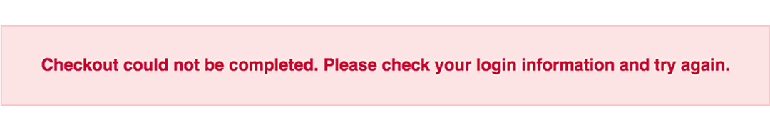
Let’s start with a basic error message. We are going to customize the HTML above to look like this:
This is what we start out with, by default, after adding the HTML:
Customizing a basic error message is really simple. All we have to do is give our text a colored background and a couple font styles using CSS. To style the error message background, add the following styles to your CSS stylesheet:
Now let’s style the text itself by adding the following font styles:
That’s it! Keep reading to learn how to style input field and tooltip errors .
Input Field Error
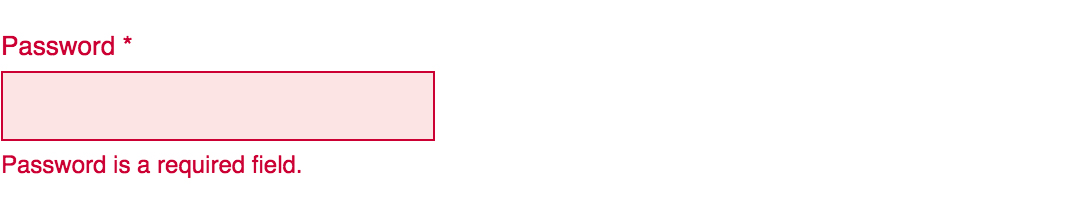
Now that we have our basic error message styled, let’s work on input field errors. This is what the final product will look like:
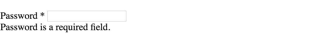
And this is what we start out with by default:
First, we want to override the browser’s default styles. Add the following CSS to give your input field a custom look:
Next, we need to add the styling for the error message that displays when a user does not correctly fill out an input field (i.e. the “This is a required field” message):
Lastly, add the error-specific styling for the input field elements:
Input Field Error with Tooltip
The last element we’re tackling is the tooltip. It is slightly more complicated than the others but well worth the effort. We will also be utilizing Sass nesting to better organize our code, and because we are only using SCSS it is 100% editable and scalable.
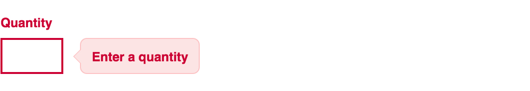
Once we are done, the tooltip will look like this:
And by default, this is what we start with after adding the HTML:
First, we override the browser’s default styles with our own custom styling:
Just like our previous example, we need to add the tooltip error message styling that displays when a form error occurs. Note: we are using Sass here to nest the tooltip’s left arrow properties. This comes in handy when trying to keep track of which values are assigned to the tooltip specifically:
Now all that’s left to do is define the input’s error-specific styling. Again, we will nest these styles under an “error” class selector to make classification and future changes easier:
And that’s it! All the code you need to customize error messaging for default form elements. To experiment with the final results and copy and paste to your heart’s content (without fear of breaking anything), jump on over to Codepen by selecting any of the tutorial links below.
Источник
Error Message CSS Style Example with Demo
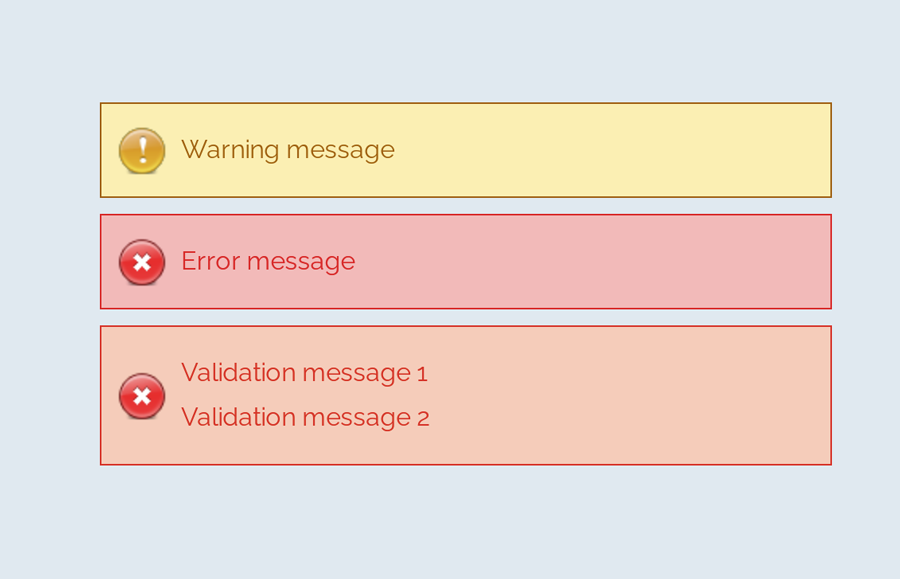
A message box is one of the informative components on a webpage. It displays on various events like success or failure of a process. These messages are really important in regards to interactive web design. In this tutorial, we are going to style an error message with the CSS code example.
Here, you’ll find not only an error message but also info, warning, and success message box design. Because of the CSS style quite similar for these type of messages except minor changes of color and icon. You can check out the final output on the demo page.
The coding concept is for this type of message boxes is clean and easy. You just need to wrap your message text in only a div tag with a specific class name. Then we’ll style these message boxes with CSS.
HTML Structure
The HTML is as simple as one line of code. You just need to wrap your “error message” in a div tag with the class name «error» . You can add any further elements inside this tag. Therefore, a basic HTML for an error message is as follows:
Additionally, you can also create the message boxes for info, success, warning, and validation with the same method mentioned above. Just add a relevant class name to your message that we’ll style in CSS.
You are not limited to add only plain text inside your message box element. You can also add any HTML elements such as images, buttons, links, or HTML5 videos. However, you’ll need to style these elements with additional CSS.
CSS Style for Error Message
First of all, define the common CSS for all types of messages. If you just need only an error message style, then simply erase the other class selector from the below code:
After that, create styles for an error message by targeting the «error» class. Define it’s color (for text), background color, and set error icon using CSS background-image property.
You can also add Font Awesome icon if you don’t want to add an image icon. To do so, include the Font Awesome CSS library into your project and add the specific icon by targeting the “.error:before” pseudo-selector. The following is an example of the use of the Font Awesome icon.
Similarly, create CSS styles for validation message as follows:
You may also need to style a “warning message” box to the attention of the users.
Likewise, create CSS styles for info and success messages described as follows:
That’s all! I hope you find this tutorial helpful to create an error message and successfully implement this CSS style example. If you need any further help in regards to CSS styling, let me know by comment below.
Источник
CSS Tips and Tricks for Customizing Error Messages!
Error: Your validation needs spicing up!
In this post, we’re going to completely customize the look of our form’s error messages with just a sprinkling of CSS. CSS is simply a set of text rules that you can write to tell browsers how to style websites. This post assumes no knowledge of CSS, but if you are a super thorough type of person, check out my general introduction to CSS.
In order to have error messages to style, we need to have errors; and in order to have errors, we need rules. Below, I’ve set up a simple form that requires everything except for the Name field. So, if someone tries to submit this form without filling out the required fields, they’ll see a bunch of pre-customized error messages with bright red backgrounds:
Before
After
This is the same form, but with that sprinkling of CSS that I mentioned earlier. When you try to submit this form, you’ll notice that the error messages look a little different:
See the Pen by CognitoForms (@CognitoForms) on CodePen.
Groundwork
A few things we need to cover before getting into the styling:
No Iframes
The CSS we’re writing will only affect the form if it’s seamlessly embedded on the page, and not in an iframe. Iframes are like tall fortress walls that keep out things like hoards of CSS lines; sometimes that’s great, but not in this case.
This CSS Can Go Anywhere
You can put this CSS anywhere on the webpage that hosts the form, either through a reference to an external CSS doc, or by placing the style rules directly on the same page (learn more about the mechanics of these options here). Normally, the order of CSS does matter, with rules that come later on the page tending to override earlier rules. But I’ll write this example in a way that will force our custom rules to be applied no matter where they are.
Selecting Elements
The Class Names
HTML elements can have class names for CSS rules to hook onto. Cognito Forms have several class names that allow you to do this very thing. The ones we’ll be making use of are:
- c-error — This class name is added to all field containers if that field has an error. In our example, this class will get applied to the parent container after the user tries to submit an invalid email address.
- c-validation — This class name is on the container of the error message. It isn’t visible until an error has been made. The validation message is contained by the element that will have the c-error class.
- c-label — This is the container of the field label (which is “Email” in this case). Labels are also contained by the element that will have the c-error class.
Selectors
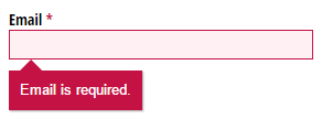
In my example, I’m styling four different things: the c-validation container, a triangle/arrow extending from that container, the asterisk next to “Email” that indicates the field is required, and the text field itself. These are the selectors we’re going to be using:
- .c-error .c-validation The dot in front of each class name just denotes that c-error and c-validation are class names. The order of the class names and how they are separated by a space mean that c-validation is contained by an element that has the class name c-error. All styles that we only want to take effect when there is an error will be prefaced with .c-error. Since this class is only on fields when they have errors, our styles won’t appear by default.
- .c-error .c-validation:before This is where the arrow/triangle is going to be. If you don’t want an arrow like this, then you don’t need the equivalent in your CSS. The “:before” means something like, “Create a pseudo-element that doesn’t really exist at the very beginning of c-validation.” The pseudo-element can be styled just like a real element, even though it doesn’t appear anywhere in the HTML.
- .c-label:after This is just like the “:before” pseudo-element, but it comes at the end of .c-label. This is how Cognito places the asterisks at the end of required labels. All we’re going to do with this is change the color of the asterisk. Since this asterisk shows up all the time on required fields, whether they have errors or not, we don’t want to qualify this by prefacing with the c-error class.
- .c-error input, .c-error select, .c-error .c-choice-option The commas here separate what are really three different selectors, all to only take effect with an error. “input” selects things like text inputs, “select” selects dropdown menus, and “.c-choice-option” selects the container of check boxes and radio buttons in Cognito Forms. We’re going to color the text and background color of all these things, as well as the border of inputs and selects.
The CSS
Here’s the CSS to style the error message itself:
We’ve already talked about the class “c-validation”. Every element that has that class name inside of an element with the c-error class will get the style rules inside the curly braces. I’ll go through them in order (the order doesn’t matter to the browser):
- background #c51244 is the code for the dark red I’ve chosen. Usually you don’t just know these codes off the top of your head; you can get them from a good color picker (like in Photoshop), or a website like this one. The “!important” at the end of this line means, “Hey, I don’t care what color Cognito Forms set as the background color, my color is more important!” Lines that need to override Cognito’s CSS will have this.
- padding This line just indicates that there should be a space of 10 pixels all the way around the error text and the edge of the box.
- border-radius By default, error messages have rounded corners on the bottom. By setting border-radius to 0, we are setting sharp corners instead.
- position This will help us when we place the arrow/triangle. I’ll explain this further below.
- box-shadow This adds a shadow to the box. I’ve set it to be the color #aaaaaa (gray), with 1 pixel on the right, 1 pixel on the bottom, and 1 pixel of blurriness. Learn more about the box-shadow property.
- margin-top This gives 10 pixels of space above the box. This is leaving room for the arrow we’ll talk about next.
Here’s the CSS for the arrow/triangle:
If you are curious about the first 6 properties of this, check out this classic explanation. Suffice it to say, the first 6 lines are for making a triangle.
position: absolute takes the triangle out of the flow of the document and layers it on top, preventing it from taking up space and pushing other elements around. top: -10px nudges it up 10 pixels. We needed the parent container to have position: relative for this to work right—that’s why we added it above.
The CSS to change the color of the required asterisk to match the c-validation box color is simply:
Note that since the color of the asterisk isn’t conditioned on whether there is an asterisk or not, we didn’t include the c-error class.
And finally, to color the background and text of the inputs, selects, and check box containers:
Plus, we can also color the border of just inputs and selects with:
And that’s it! Obviously you can copy what I did here exactly, but that’s boring. I hope you’ll take what you learned here and put your own spin on it. If you come up with something interesting, why not post it in the comments for others to see? If you have questions, feel free to post those in the comments too and I’ll be happy to help!

Tyler is the creative director for Cognito Forms. He is a gemini who was born in the year of the dog. Figure the rest out on your own!
Источник
Содержание
- Pure CSS Custom Error Messaging for Default Form Elements
- Basic Error Message
- Input Field Error
- Input Field Error with Tooltip
- :invalid
- Try it
- Syntax
- Examples
- Coloring elements to show validation
- Result
- Showing sections in stages
- Result
- Accessibility concerns
- Notes
- Radio buttons
- Gecko defaults
- Простая валидация формы без JS
- HTML5
- :invalid , :valid
- Кратко
- Пример
- Как понять
- Как пишется
- Подсказки
- На практике
- Денис Ежков советует
- Client-side form validation
- What is form validation?
- Different types of client-side validation
- Using built-in form validation
- Built-in form validation examples
- Simple start file
- The required attribute
- Validating against a regular expression
- Constraining the length of your entries
- Constraining the values of your entries
- Full example
- Validating forms using JavaScript
- The Constraint Validation API
- Implementing a customized error message
- A more detailed example
- Validating forms without a built-in API
- An example that doesn’t use the constraint validation API
- Test your skills!
- Summary
Pure CSS Custom Error Messaging for Default Form Elements
This tutorial will show you how to create and customize error messaging for various form elements. In this tutorial, we will customize everything from a basic error message to input field errors and tooltips. The best part? We will be using only CSS for customizations – that means no images or javascript required!
Below is the markup for the form elements we will be creating error messaging for. This is all of the HTML used throughout this tutorial. Copy and paste this code into your working file:
Now onto my personal favorite: the CSS. We will keep the basic functionality of the form elements but completely customize their appearance. In the end, they will stand on their own as custom design elements that thoughtfully guide the user through the form process, making it as straightforward and painless as possible .
Basic Error Message
Let’s start with a basic error message. We are going to customize the HTML above to look like this:
This is what we start out with, by default, after adding the HTML:
Customizing a basic error message is really simple. All we have to do is give our text a colored background and a couple font styles using CSS. To style the error message background, add the following styles to your CSS stylesheet:
Now let’s style the text itself by adding the following font styles:
That’s it! Keep reading to learn how to style input field and tooltip errors .
Input Field Error
Now that we have our basic error message styled, let’s work on input field errors. This is what the final product will look like:
And this is what we start out with by default:
First, we want to override the browser’s default styles. Add the following CSS to give your input field a custom look:
Next, we need to add the styling for the error message that displays when a user does not correctly fill out an input field (i.e. the “This is a required field” message):
Lastly, add the error-specific styling for the input field elements:
Input Field Error with Tooltip
The last element we’re tackling is the tooltip. It is slightly more complicated than the others but well worth the effort. We will also be utilizing Sass nesting to better organize our code, and because we are only using SCSS it is 100% editable and scalable.
Once we are done, the tooltip will look like this:
And by default, this is what we start with after adding the HTML:
First, we override the browser’s default styles with our own custom styling:
Just like our previous example, we need to add the tooltip error message styling that displays when a form error occurs. Note: we are using Sass here to nest the tooltip’s left arrow properties. This comes in handy when trying to keep track of which values are assigned to the tooltip specifically:
Now all that’s left to do is define the input’s error-specific styling. Again, we will nest these styles under an “error” class selector to make classification and future changes easier:
And that’s it! All the code you need to customize error messaging for default form elements. To experiment with the final results and copy and paste to your heart’s content (without fear of breaking anything), jump on over to Codepen by selecting any of the tutorial links below.
Источник
:invalid
The :invalid CSS pseudo-class represents any , , or other element whose contents fail to validate.
Try it
This pseudo-class is useful for highlighting field errors for the user.
Syntax
Examples
Coloring elements to show validation
Result
Showing sections in stages
In this example we use :invalid along with
, the general sibling combinator, to make a form appear in stages, so the form initially shows the first item to complete, and when the user completes each item the form displays the next one. When the whole form is complete the user can submit it.
Result
Accessibility concerns
The color red is commonly used to indicate invalid input. People who have certain types of color blindness will be unable to determine the input’s state unless it is accompanied by an additional indicator that does not rely on color to convey meaning. Typically, descriptive text and/or an icon are used.
Notes
Radio buttons
If any one of the radio buttons in a group is required , the :invalid pseudo-class is applied to all of them if none of the buttons in the group is selected. (Grouped radio buttons share the same value for their name attribute.)
Gecko defaults
By default, Gecko does not apply a style to the :invalid pseudo-class. However, it does apply a style (a red «glow» using the box-shadow property) to the :user-invalid pseudo-class, which applies in a subset of cases for :invalid .
Источник
Простая валидация формы без JS
 В данной статье я бы хотел поделиться методом быстрой валидации полей с помощью разметки и стилей. Данный метод не является кроссбраузерным и рекомендуется к использованию только как дополнительная фича. По ходу статьи мы будем уменьшать наши шансы на кроссбраузерность, но повышать функциональность.
Давайте попробуем собрать стандартную форму, которая будет включать в себя: Имя, E-Mail, Телефон, Ссылку на сайт и допустим Ваш рост, чтобы поэксперементировать с числовым полем.
HTML5
Сейчас уже никого не удивить атрибутами валидации input полей, которое принес нам стандарт HTML5. Однако, обходить стороной мы его не станем — этот метод валидации является наиболее поддерживаемым в современных браузерах.
Самый простой путь валидации — это определить тип input поля и расставить атрибуты required которые отвечают за обязательность заполнения.
Применение этих двух атрибутов позволит гораздо эффективнее валидировать вводимую информацию нативными методами. Ну и конечно же поддержка этих свойств браузерами наиболее широка.
Отдельно хотелось бы сказать про тип поля tel. Ожидается что браузер будет валидировать телефонные номера, но нет, поле с типом tel используется сейчас только для автозаполнения. Дело в том, что валидация телефонных номеров очень неоднозначная задача из-за слишком большого количества различных форматов телефонных номеров в разных странах, которые просто никак не получится унифицировать и записать в одно правило.
Однако, нам на помощь приходит атрибут pattern. Этот атрибут принимает в себя значение регулярного выражения. В нашем случае рассмотрим вариант паттерна для ввода мобильного телефона в РФ: +7 (123) 456-78-91. Для этого добавим простое регулярное выражение в наше поле с телефоном, а также ограничим минимальное и максимальное количество символов:
Обычно я использую данный паттерн в связке с маской для ввода номера, но тут к сожалению без JS пока что не обойтись. Если вы не используете маску, то я бы не стал использовать паттерны на вводе телефона, поскольку это в большинстве случаев вызовет больше неудобств для пользователя.
Поддержка браузерами атрибута pattern на данный момент очень хорошая. iOS начиная с версии 10.3 полностью поддерживает данное свойство, до этого наблюдалось отсутствие подсказок о неправильном вводе данных.
Стоит также учитывать, что атрибут minlength до сих пор не поддерживается в браузерах IE, EDGE и только с версии 10.3 появился в iOS. Однако maxlength поддерживается везде и очень давно. Нам в целом хватит и этого.
Давайте также поставим ограничение для поля с ростом. Допустим мы предполагаем, что пользователь нашего сайта определенно не может быть ниже 100 см и выше 250 см. Так и напишем:
С поддержкой этих атрибутов в браузерах, все хорошо.
Перейдем к стилизации!
Для того чтобы кастомно стилизовать нашу валидацию, воспользуемся псевдоклассами :invalid и :valid. Поддержка этих псевдоклассов в браузерах позволяет использовать их максимально широко на данный момент.
Казалось бы, берем полученные знания и применяем! Но не все так просто как кажется, давайте проверим как это работает. В результате мы получим, что все наши поля изначально пустые и обязательные будут считаться не валидными, а все остальные валидными. Совсем не красиво и непонятно для пользователя, что от него хотят.
Мы можем пойти на небольшую хитрость и использовать псевдокласс :placeholder-shown. С помощью этого псевдокласса мы можем определить отображается ли сейчас значение placeholder в нашем поле ввода. Атрибут placeholder отображается только тогда, когда в наше поле ничего не введено. Соответственно, чтобы применить этот псевдокласс нам просто нужно обратить его свойство с помощью :not. В итоге получаем вот такую конструкцию:
Если прочитать дословно: окрасить красным цветом границу инпута, когда наше поле не валидно и когда в нем не отображается значение атрибута placeholder. Если ваше поле не имеет атрибута placeholder, можно просто поставить внутри пробел:
У данного метода есть только один минус: поддержка. Псевдоэлемент :placeholder-shown поддерживается во всех браузерах кроме IE и EDGE. К счастью :not не обладает таким недостатком.
Для примера я набросал все вышесказанное в CodePen и добавил еще немного возможностей:
Источник
:invalid , :valid
Время чтения: меньше 5 мин
Обновлено 17 мая 2022
Кратко
Псевдоклассы используются для стилизации полей формы, филдсетов, либо самой формы:
- :invalid для заполнений с ошибкой;
- :valid для верных заполнений.
Пример
Как понять
Часто на сайтах мы встречаем формы. Это могут быть формы регистрации или формы оплаты покупки в интернет-магазине. Некоторые поля ввода и другие элементы управления в этих формах могут иметь особые требования к заполнению. Например, какие-то поля ввода должны быть обязательно заполнены, какие-то — иметь определённый формат данных (к примеру, текст в поле с типом email должен содержать знак @ ).
Чтобы показать что поле ввода заполнено корректно к нему можно применить особые стили используя псевдокласс :valid . Аналогично, для некорректно заполненного поля мы можем применить особые стили используя псевдокласс :invalid .
В примере выше можно увидеть пару моментов:
- Поле ввода имени и чекбокс обязательны к заполнению, но не заполнены, поэтому псевдокласс :invalid применяется к ним сразу же.
- Поле ввода электронной почты необязательно к заполнению, поэтому к нему сразу же применён псевдокласс :valid .
Но если ввести в поле хотя бы один символ, браузер запускает проверку на корректность ввода email (из-за того, что мы указали type = «email» ) и применяет псевдокласс :invalid до тех пор, пока не будет введён корректный адрес электронной почты.
Также указанные псевдоклассы применяются и к самой форме, в которой находится инпут.
В примере выше можно увидеть, что при наличии филдсета к нему также будет применён соответствующий псевдокласс.
Как пишется
К любому селектору добавляем двоеточие и ключевое слово invalid или valid . Селектор должен указывать на интерактивный элемент ввода, у которого предусмотрены правила проверки, на форму или на филдсет. Например, абзац браузер не умеет проверять на правильность, а значит, селектор p : invalid будет бесполезен.
Например, так выглядит селектор по классу:
Подсказки
💡 Если в форме есть группа связанных радиокнопок ( = «radio»> ), то если хотя бы у одной есть атрибут required , псевдокласс :invalid будет применён ко всем радиокнопкам сразу.
💡 Псевдоклассы :invalid или :valid применяются и к самой форме, и к тегу , в зависимости от того, есть ли внутри ошибки, или все инпуты заполнены верно.
💡 В отличие от комплексной валидации формы, которая происходит при попытке её отправить, эти псевдоклассы работают в реальном времени и сохраняют свою актуальность даже во время ввода.
На практике
Денис Ежков советует
🛠 В настоящий момент стили для псевдокласса :invalid применяются к невалидному полю сразу же, что не всегда удобно. Было бы круто, если бы валидация включалась, только если пользователь начал что-то вводить, но, к сожалению, пока нет такой возможности «из коробки».
В будущих версиях спецификации CSS должен появиться псевдокласс :user — invalid , который задуман как раз для целей, описанных выше. То есть он будет применяться, например, к полю ввода только после того, как пользователь начал там что-то писать.
Но это пока перспективы, а что же можно сделать сейчас? В настоящий момент добиться похожего поведения можно только для полей ввода. При этом нужно выполнить два условия:
- добавить атрибут placeholder ;
- использовать псевдокласс :placeholder — shown .
Открыть демо в новой вкладке + Развернуть
Источник
Client-side form validation
Before submitting data to the server, it is important to ensure all required form controls are filled out, in the correct format. This is called client-side form validation, and helps ensure data submitted matches the requirements set forth in the various form controls. This article leads you through basic concepts and examples of client-side form validation.
| Prerequisites: | Computer literacy, a reasonable understanding of HTML, CSS, and JavaScript. |
|---|---|
| Objective: | To understand what client-side form validation is, why it’s important, and how to apply various techniques to implement it. |
Client-side validation is an initial check and an important feature of good user experience; by catching invalid data on the client-side, the user can fix it straight away. If it gets to the server and is then rejected, a noticeable delay is caused by a round trip to the server and then back to the client-side to tell the user to fix their data.
However, client-side validation should not be considered an exhaustive security measure! Your apps should always perform security checks on any form-submitted data on the server-side as well as the client-side, because client-side validation is too easy to bypass, so malicious users can still easily send bad data through to your server. Read Website security for an idea of what could happen; implementing server-side validation is somewhat beyond the scope of this module, but you should bear it in mind.
What is form validation?
Go to any popular site with a registration form, and you will notice that they provide feedback when you don’t enter your data in the format they are expecting. You’ll get messages such as:
- «This field is required» (You can’t leave this field blank).
- «Please enter your phone number in the format xxx-xxxx» (A specific data format is required for it to be considered valid).
- «Please enter a valid email address» (the data you entered is not in the right format).
- «Your password needs to be between 8 and 30 characters long and contain one uppercase letter, one symbol, and a number.» (A very specific data format is required for your data).
This is called form validation. When you enter data, the browser and/or the web server will check to see that the data is in the correct format and within the constraints set by the application. Validation done in the browser is called client-side validation, while validation done on the server is called server-side validation. In this chapter we are focusing on client-side validation.
If the information is correctly formatted, the application allows the data to be submitted to the server and (usually) saved in a database; if the information isn’t correctly formatted, it gives the user an error message explaining what needs to be corrected, and lets them try again.
We want to make filling out web forms as easy as possible. So why do we insist on validating our forms? There are three main reasons:
- We want to get the right data, in the right format. Our applications won’t work properly if our users’ data is stored in the wrong format, is incorrect, or is omitted altogether.
- We want to protect our users’ data. Forcing our users to enter secure passwords makes it easier to protect their account information.
- We want to protect ourselves. There are many ways that malicious users can misuse unprotected forms to damage the application. See Website security.
Warning: Never trust data passed to your server from the client. Even if your form is validating correctly and preventing malformed input on the client-side, a malicious user can still alter the network request.
Different types of client-side validation
There are two different types of client-side validation that you’ll encounter on the web:
- Built-in form validation uses HTML form validation features, which we’ve discussed in many places throughout this module. This validation generally doesn’t require much JavaScript. Built-in form validation has better performance than JavaScript, but it is not as customizable as JavaScript validation.
- JavaScript validation is coded using JavaScript. This validation is completely customizable, but you need to create it all (or use a library).
Using built-in form validation
One of the most significant features of modern form controls is the ability to validate most user data without relying on JavaScript. This is done by using validation attributes on form elements. We’ve seen many of these earlier in the course, but to recap:
- required : Specifies whether a form field needs to be filled in before the form can be submitted.
- minlength and maxlength : Specifies the minimum and maximum length of textual data (strings).
- min and max : Specifies the minimum and maximum values of numerical input types.
- type : Specifies whether the data needs to be a number, an email address, or some other specific preset type.
- pattern : Specifies a regular expression that defines a pattern the entered data needs to follow.
If the data entered in a form field follows all of the rules specified by the above attributes, it is considered valid. If not, it is considered invalid.
When an element is valid, the following things are true:
- The element matches the :valid CSS pseudo-class, which lets you apply a specific style to valid elements.
- If the user tries to send the data, the browser will submit the form, provided there is nothing else stopping it from doing so (e.g., JavaScript).
When an element is invalid, the following things are true:
- The element matches the :invalid CSS pseudo-class, and sometimes other UI pseudo-classes (e.g., :out-of-range ) depending on the error, which lets you apply a specific style to invalid elements.
- If the user tries to send the data, the browser will block the form and display an error message.
Note: There are several errors that will prevent the form from being submitted, including a badInput , patternMismatch , rangeOverflow or rangeUnderflow , stepMismatch , tooLong or tooShort , typeMismatch , valueMissing , or a customError .
Built-in form validation examples
In this section, we’ll test out some of the attributes that we discussed above.
Simple start file
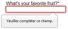
Let’s start with a simple example: an input that allows you to choose whether you prefer a banana or a cherry. This example involves a simple text with an associated and a submit . Find the source code on GitHub at fruit-start.html and a live example below.
To begin, make a copy of fruit-start.html in a new directory on your hard drive.
The required attribute
The simplest HTML validation feature is the required attribute. To make an input mandatory, add this attribute to the element. When this attribute is set, the element matches the :required UI pseudo-class and the form won’t submit, displaying an error message on submission when the input is empty. While empty, the input will also be considered invalid, matching the :invalid UI pseudo-class.
Add a required attribute to your input, as shown below.
Note the CSS that is included in the example file:
This CSS causes the input to have a red dashed border when it is invalid and a more subtle solid black border when valid. We also added a background gradient when the input is required and invalid. Try out the new behavior in the example below:
Note: You can find this example live on GitHub as fruit-validation.html. See also the source code.
Try submitting the form without a value. Note how the invalid input gets focus, a default error message («Please fill out this field») appears, and the form is prevented from being sent.
The presence of the required attribute on any element that supports this attribute means the element matches the :required pseudo-class whether it has a value or not. If the has no value, the input will match the :invalid pseudo-class.
Note: For good user experience, indicate to the user when form fields are required. It isn’t only good user experience, it is required by WCAG accessibility guidelines. Also, only require users to input data you actually need: For example, why do you really need to know someone’s gender or title?
Validating against a regular expression
Another useful validation feature is the pattern attribute, which expects a Regular Expression as its value. A regular expression (regex) is a pattern that can be used to match character combinations in text strings, so regexps are ideal for form validation and serve a variety of other uses in JavaScript.
Regexps are quite complex, and we don’t intend to teach you them exhaustively in this article. Below are some examples to give you a basic idea of how they work.
- a — Matches one character that is a (not b , not aa , and so on).
- abc — Matches a , followed by b , followed by c .
- ab?c — Matches a , optionally followed by a single b , followed by c . ( ac or abc )
- ab*c — Matches a , optionally followed by any number of b s, followed by c . ( ac , abc , abbbbbc , and so on).
- a|b — Matches one character that is a or b .
- abc|xyz — Matches exactly abc or exactly xyz (but not abcxyz or a or y , and so on).
There are many more possibilities that we don’t cover here. For a complete list and many examples, consult our Regular expressions documentation.
Let’s implement an example. Update your HTML to add a pattern attribute like this:
This gives us the following update — try it out:
Note: You can find this example live on GitHub as fruit-pattern.html (see also the source code.)
In this example, the element accepts one of four possible values: the strings «banana», «Banana», «cherry», or «Cherry». Regular expressions are case-sensitive, but we’ve made it support capitalized as well as lower-case versions using an extra «Aa» pattern nested inside square brackets.
At this point, try changing the value inside the pattern attribute to equal some of the examples you saw earlier, and look at how that affects the values you can enter to make the input value valid. Try writing some of your own, and see how it goes. Make them fruit-related where possible so that your examples make sense!
If a non-empty value of the doesn’t match the regular expression’s pattern, the input will match the :invalid pseudo-class.
Note: Some element types don’t need a pattern attribute to be validated against a regular expression. Specifying the email type, for example, validates the inputs value against a well-formed email address pattern or a pattern matching a comma-separated list of email addresses if it has the multiple attribute.
Note: The
element doesn’t support the pattern attribute.
Constraining the length of your entries
You can constrain the character length of all text fields created by or
by using the minlength and maxlength attributes. A field is invalid if it has a value and that value has fewer characters than the minlength value or more than the maxlength value.
Browsers often don’t let the user type a longer value than expected into text fields. A better user experience than just using maxlength is to also provide character count feedback in an accessible manner and let them edit their content down to size. An example of this is the character limit seen on Twitter when Tweeting. JavaScript, including solutions using maxlength , can be used to provide this.
Constraining the values of your entries
For number fields (i.e. ), the min and max attributes can be used to provide a range of valid values. If the field contains a value outside this range, it will be invalid.
Let’s look at another example. Create a new copy of the fruit-start.html file.
Now delete the contents of the element, and replace it with the following:
- Here you’ll see that we’ve given the text field a minlength and maxlength of six, which is the same length as banana and cherry.
- We’ve also given the number field a min of one and a max of ten. Entered numbers outside this range will show as invalid; users won’t be able to use the increment/decrement arrows to move the value outside of this range. If the user manually enters a number outside of this range, the data is invalid. The number is not required, so removing the value will still result in a valid value.
Here is the example running live:
Note: You can find this example live on GitHub as fruit-length.html. See also the source code.
Note: (and other types, such as range and date ) can also take a step attribute, which specifies what increment the value will go up or down by when the input controls are used (such as the up and down number buttons). In the above example we’ve not included a step attribute, so the value defaults to 1 . This means that floats, like 3.2, will also show as invalid.
Full example
Here is a full example to show usage of HTML’s built-in validation features. First, some HTML:
And now some CSS to style the HTML:
This renders as follows:
See Validation-related attributes for a complete list of attributes that can be used to constrain input values and the input types that support them.
Note: You can find this example live on GitHub as full-example.html (see also the source code.)
Validating forms using JavaScript
You must use JavaScript if you want to take control over the look and feel of native error messages. In this section we will look at the different ways to do this.
The Constraint Validation API
The Constraint Validation API consists of a set of methods and properties available on the following form element DOM interfaces:
The Constraint Validation API makes the following properties available on the above elements.
- validationMessage : Returns a localized message describing the validation constraints that the control doesn’t satisfy (if any). If the control is not a candidate for constraint validation ( willValidate is false ) or the element’s value satisfies its constraints (is valid), this will return an empty string.
- validity : Returns a ValidityState object that contains several properties describing the validity state of the element. You can find full details of all the available properties in the ValidityState reference page; below is listed a few of the more common ones:
- patternMismatch : Returns true if the value does not match the specified pattern , and false if it does match. If true, the element matches the :invalid CSS pseudo-class.
- tooLong : Returns true if the value is longer than the maximum length specified by the maxlength attribute, or false if it is shorter than or equal to the maximum. If true, the element matches the :invalid CSS pseudo-class.
- tooShort : Returns true if the value is shorter than the minimum length specified by the minlength attribute, or false if it is greater than or equal to the minimum. If true, the element matches the :invalid CSS pseudo-class.
- rangeOverflow : Returns true if the value is greater than the maximum specified by the max attribute, or false if it is less than or equal to the maximum. If true, the element matches the :invalid and :out-of-range CSS pseudo-classes.
- rangeUnderflow : Returns true if the value is less than the minimum specified by the min attribute, or false if it is greater than or equal to the minimum. If true, the element matches the :invalid and :out-of-range CSS pseudo-classes.
- typeMismatch : Returns true if the value is not in the required syntax (when type is email or url ), or false if the syntax is correct. If true , the element matches the :invalid CSS pseudo-class.
- valid : Returns true if the element meets all its validation constraints, and is therefore considered to be valid, or false if it fails any constraint. If true, the element matches the :valid CSS pseudo-class; the :invalid CSS pseudo-class otherwise.
- valueMissing : Returns true if the element has a required attribute, but no value, or false otherwise. If true, the element matches the :invalid CSS pseudo-class.
- willValidate : Returns true if the element will be validated when the form is submitted; false otherwise.
The Constraint Validation API also makes the following methods available on the above elements and the form element.
- checkValidity() : Returns true if the element’s value has no validity problems; false otherwise. If the element is invalid, this method also fires an invalid event on the element.
- reportValidity() : Reports invalid field(s) using events. This method is useful in combination with preventDefault() in an onSubmit event handler.
- setCustomValidity(message) : Adds a custom error message to the element; if you set a custom error message, the element is considered to be invalid, and the specified error is displayed. This lets you use JavaScript code to establish a validation failure other than those offered by the standard HTML validation constraints. The message is shown to the user when reporting the problem.
Implementing a customized error message
As you saw in the HTML validation constraint examples earlier, each time a user tries to submit an invalid form, the browser displays an error message. The way this message is displayed depends on the browser.
These automated messages have two drawbacks:
- There is no standard way to change their look and feel with CSS.
- They depend on the browser locale, which means that you can have a page in one language but an error message displayed in another language, as seen in the following Firefox screenshot.
Customizing these error messages is one of the most common use cases of the Constraint Validation API. Let’s work through a simple example of how to do this.
We’ll start with some simple HTML (feel free to put this in a blank HTML file; use a fresh copy of fruit-start.html as a basis, if you like):
And add the following JavaScript to the page:
Here we store a reference to the email input, then add an event listener to it that runs the contained code each time the value inside the input is changed.
Inside the contained code, we check whether the email input’s validity.typeMismatch property returns true , meaning that the contained value doesn’t match the pattern for a well-formed email address. If so, we call the setCustomValidity() method with a custom message. This renders the input invalid, so that when you try to submit the form, submission fails and the custom error message is displayed.
If the validity.typeMismatch property returns false , we call the setCustomValidity() method with an empty string. This renders the input valid, so the form will submit.
You can try it out below:
Note: You can find this example live on GitHub as custom-error-message.html (see also the source code.)
A more detailed example
Now that we’ve seen a really simple example, let’s see how we can use this API to build some slightly more complex custom validation.
First, the HTML. Again, feel free to build this along with us:
This simple form uses the novalidate attribute to turn off the browser’s automatic validation; this lets our script take control over validation. However, this doesn’t disable support for the constraint validation API nor the application of CSS pseudo-classes like :valid , etc. That means that even though the browser doesn’t automatically check the validity of the form before sending its data, you can still do it yourself and style the form accordingly.
Our input to validate is an , which is required , and has a minlength of 8 characters. Let’s check these using our own code, and show a custom error message for each one.
We are aiming to show the error messages inside a element. The aria-live attribute is set on that to make sure that our custom error message will be presented to everyone, including it being read out to screen reader users.
Note: A key point here is that setting the novalidate attribute on the form is what stops the form from showing its own error message bubbles, and allows us to instead display the custom error messages in the DOM in some manner of our own choosing.
Now onto some basic CSS to improve the look of the form slightly, and provide some visual feedback when the input data is invalid:
Now let’s look at the JavaScript that implements the custom error validation.
The comments explain things pretty well, but briefly:
- Every time we change the value of the input, we check to see if it contains valid data. If it has then we remove any error message being shown. If the data is not valid, we run showError() to show the appropriate error.
- Every time we try to submit the form, we again check to see if the data is valid. If so, we let the form submit. If not, we run showError() to show the appropriate error, and stop the form submitting with preventDefault() .
- The showError() function uses various properties of the input’s validity object to determine what the error is, and then displays an error message as appropriate.
Here is the live result:
Note: You can find this example live on GitHub as detailed-custom-validation.html. See also the source code.
The constraint validation API gives you a powerful tool to handle form validation, letting you have enormous control over the user interface above and beyond what you can do with HTML and CSS alone.
Validating forms without a built-in API
In some cases, such as custom controls, you won’t be able to or won’t want to use the Constraint Validation API. You’re still able to use JavaScript to validate your form, but you’ll just have to write your own.
To validate a form, ask yourself a few questions:
What kind of validation should I perform?
You need to determine how to validate your data: string operations, type conversion, regular expressions, and so on. It’s up to you.
What should I do if the form doesn’t validate?
This is clearly a UI matter. You have to decide how the form will behave. Does the form send the data anyway? Should you highlight the fields that are in error? Should you display error messages?
How can I help the user to correct invalid data?
In order to reduce the user’s frustration, it’s very important to provide as much helpful information as possible in order to guide them in correcting their inputs. You should offer up-front suggestions so they know what’s expected, as well as clear error messages. If you want to dig into form validation UI requirements, here are some useful articles you should read:
An example that doesn’t use the constraint validation API
In order to illustrate this, the following is a simplified version of the previous example without the Constraint Validation API.
The HTML is almost the same; we just removed the HTML validation features.
Similarly, the CSS doesn’t need to change very much; we’ve just turned the :invalid CSS pseudo-class into a real class and avoided using the attribute selector that doesn’t work on Internet Explorer 6.
The big changes are in the JavaScript code, which needs to do much more heavy lifting.
The result looks like this:
As you can see, it’s not that hard to build a validation system on your own. The difficult part is to make it generic enough to use both cross-platform and on any form you might create. There are many libraries available to perform form validation, such as Validate.js.
Test your skills!
You’ve reached the end of this article, but can you remember the most important information? You can find some further tests to verify that you’ve retained this information before you move on — see Test your skills: Form validation.
Summary
Client-side form validation sometimes requires JavaScript if you want to customize styling and error messages, but it always requires you to think carefully about the user. Always remember to help your users correct the data they provide. To that end, be sure to:
- Display explicit error messages.
- Be permissive about the input format.
- Point out exactly where the error occurs, especially on large forms.
Once you have checked that the form is filled out correctly, the form can be submitted. We’ll cover sending form data next.
Источник
A message box is one of the informative components on a webpage. It displays on various events like success or failure of a process. These messages are really important in regards to interactive web design. In this tutorial, we are going to style an error message with the CSS code example.
Here, you’ll find not only an error message but also info, warning, and success message box design. Because of the CSS style quite similar for these type of messages except minor changes of color and icon. You can check out the final output on the demo page.
The coding concept is for this type of message boxes is clean and easy. You just need to wrap your message text in only a div tag with a specific class name. Then we’ll style these message boxes with CSS.
HTML Structure
The HTML is as simple as one line of code. You just need to wrap your “error message” in a div tag with the class name "error". You can add any further elements inside this tag. Therefore, a basic HTML for an error message is as follows:
<div class="error">Error message</div>
Additionally, you can also create the message boxes for info, success, warning, and validation with the same method mentioned above. Just add a relevant class name to your message that we’ll style in CSS.
<div class="info">
   Info message
</div>
<div class="success">
   Successful operation message
</div>
<div class="warning">
   Warning message
</div>
<div class="validation">
   Validation message 1 <br>
   Validation message 2
</div>
You are not limited to add only plain text inside your message box element. You can also add any HTML elements such as images, buttons, links, or HTML5 videos. However, you’ll need to style these elements with additional CSS.
First of all, define the common CSS for all types of messages. If you just need only an error message style, then simply erase the other class selector from the below code:
.info,
.success,
.warning,
.error,
.validation {
	border: 1px solid;
	margin: 10px auto;
	padding: 15px 10px 15px 50px;
	background-repeat: no-repeat;
	background-position: 10px center;
	max-width: 460px;
}
After that, create styles for an error message by targeting the "error" class. Define it’s color (for text), background color, and set error icon using CSS background-image property.
.error {
	color: #D8000C;
	background-color: #FFBABA;
	background-image: url('https://i.imgur.com/GnyDvKN.png');
}
You can also add Font Awesome icon if you don’t want to add an image icon. To do so, include the Font Awesome CSS library into your project and add the specific icon by targeting the “.error:before” pseudo-selector. The following is an example of the use of the Font Awesome icon.
.error:before{
   font-family: FontAwesome;
   content: 'f057';
   font-size: 24px;
   color: #D8000C;
}
Similarly, create CSS styles for validation message as follows:
.validation {
	color: #D63301;
	background-color: #FFCCBA;
	background-image: url('https://i.imgur.com/GnyDvKN.png');
}
You may also need to style a “warning message” box to the attention of the users.
.warning {
	color: #9F6000;
	background-color: #FEEFB3;
	background-image: url('https://i.imgur.com/Z8q7ww7.png');
}
Likewise, create CSS styles for info and success messages described as follows:
.info {
	color: #00529B;
	background-color: #BDE5F8;
	background-image: url('https://i.imgur.com/ilgqWuX.png');
}

.success {
	color: #4F8A10;
	background-color: #DFF2BF;
	background-image: url('https://i.imgur.com/Q9BGTuy.png');
}
That’s all! I hope you find this tutorial helpful to create an error message and successfully implement this CSS style example. If you need any further help in regards to CSS styling, let me know by comment below.
This file contains bidirectional Unicode text that may be interpreted or compiled differently than what appears below. To review, open the file in an editor that reveals hidden Unicode characters.
Learn more about bidirectional Unicode characters
| <!DOCTYPE HTML> | |
| <html> | |
| <head> | |
| <style> | |
| body{ | |
| font-family: Arial, Helvetica, sans-serif; | |
| font-size: 13px; | |
| } | |
| .info, .success, .warning, .error, .validation { | |
| border: 1px solid; | |
| margin: 10px 0px; | |
| padding: 15px 10px 15px 50px; | |
| background-repeat: no-repeat; | |
| background-position: 10px center; | |
| } | |
| .info { | |
| color: #00529B; | |
| background-color: #BDE5F8; | |
| background-image: url(‘img/info.png’); | |
| } | |
| .success { | |
| color: #4F8A10; | |
| background-color: #DFF2BF; | |
| background-image: url(‘img/success.png’); | |
| } | |
| .warning { | |
| color: #9F6000; | |
| background-color: #FEEFB3; | |
| background-image: url(‘img/warning.png’); | |
| } | |
| .error{ | |
| color: #D8000C; | |
| background-color: #FFBABA; | |
| background-image: url(‘img/error.png’); | |
| } | |
| .validation{ | |
| color: #D63301; | |
| background-color: #FFCCBA; | |
| background-image: url(‘img/validation.png’); | |
| } | |
| </style> | |
| </head> | |
| <body> | |
| <div class=»info»>Info message</div> | |
| <div class=»success»>Successful operation message</div> | |
| <div class=»warning»>Warning message</div> | |
| <div class=»error»>Error message</div> | |
| <div class=»validation»>Validation message 1<br>Validation message 2</div> | |
| </body> | |
| </htm> |