Welcome to a quick tutorial on how to show error messages in HTML forms. This is probably one of the major bugbears for some beginners, how do we handle and show error messages for HTML forms?
There are no fixed ways to show errors in HTML forms, but the common methods to display error messages are:
- Simply add checking attributes to the HTML form fields, and the browser will automatically show the errors. For example,
<input type="text" required> - Use Javascript to show custom error messages as the user types in the fields.
- Collectively show all error messages in a popup box when the user submits an invalid form.
- Show error messages below the invalid fields.
That covers the broad basics, let us walk through detailed examples in this guide – Read on!
ⓘ I have included a zip file with all the source code at the start of this tutorial, so you don’t have to copy-paste everything… Or if you just want to dive straight in.
TABLE OF CONTENTS
DOWNLOAD & NOTES
Firstly, here is the download link to the example code as promised.
QUICK NOTES
If you spot a bug, feel free to comment below. I try to answer short questions too, but it is one person versus the entire world… If you need answers urgently, please check out my list of websites to get help with programming.
EXAMPLE CODE DOWNLOAD
Click here to download all the example source code, I have released it under the MIT license, so feel free to build on top of it or use it in your own project.
DISPLAY ERROR MESSAGES
All right, let us now get into the various examples of displaying error messages in an HTML form.
EXAMPLE 1) DEFAULT ERROR DISPLAY
1-default.html
<form onsubmit="return false;">
  <label for="fname">Name</label>
  <input type="text" name="fname" id="fname" required minlength="2" maxlength="8">

  <label for="fnumber">Number</label>
  <input type="number" name="fnumber" id="fnumber" min="1" max="12">

  <label for="fyes">Enter "Yes"</label>
  <input type="text" name="fyes" id="fyes" required pattern="Yes">

  <input type="submit" value="Go!">
</form>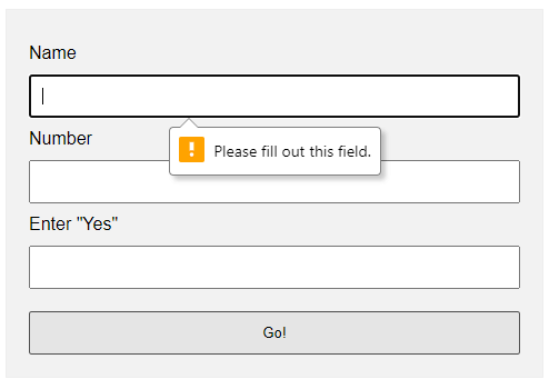
requiredSelf-explanatory. A required field that cannot be left blank.min-length max-lengthThe minimum and maximum number of characters allowed.min maxFor number fields only, the minimum and maximum allowed values.patternThis field must match the custom pattern. Will leave a link in the extras section below if you want to learn more.
Yes, that’s all. The browser will do the rest of the magic.
EXAMPLE 2) SHOW ERRORS AS-YOU-TYPE
2-type.html
<!-- (A) HTML FORM -->
<form onsubmit="return false;">
  <label for="fname">Name</label>
  <input type="text" name="fname" id="fname" required minlength="2" maxlength="8">

  <input type="submit" value="Go!">
</form>

<!-- (B) SET CUSTOM ERROR MESSAGE -->
<script>
var fname = document.getElementById("fname");
fname.addEventListener("input", () => {
  if (fname.validity.tooLong || fname.validity.tooShort || fname.validity.valueMissing) {
    fname.setCustomValidity("Name must be 2-8 characters.");
    fname.reportValidity();
  } else { fname.setCustomValidity(""); }
});
</script>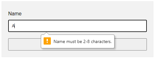
document.getElementById("ID")Get element by ID. Captain Obvious.FIELD.addEventListener("input", FUNCTION)Run this function whenever the user types something in the field.FIELD.validity.tooLong FIELD.validity.tooShort FIELD.validity.valueMissingWe can actually target various invalid statuses and show different messages. Will leave a link in the extras section below to the full list.FIELD.setCustomValidity("MESSAGE")andFIELD.reportValidity()Show custom error message.
EXAMPLE 3) DISPLAY ERROR MESSAGES IN POPUP
3-alert.html
<!-- (A) HTML FORM -->
<form onsubmit="return check()" novalidate>
  <label for="fname">Name</label>
  <input type="text" name="fname" id="fname" required minlength="2" maxlength="8">

  <label for="fnumber">Number</label>
  <input type="number" name="fnumber" id="fnumber" required min="1" max="12">

  <input type="submit" value="Go!">
</form>

<!-- (B) FORM CHECK -->
<script>
function check () {
  // (B1) INIT
  var error = "", field = "";

  // (B2) NAME
  field = document.getElementById("fname");
  if (!field.checkValidity()) {
    error += "Name must be 2-4 charactersrn";
  }

  // (B3) NUMBER
  field = document.getElementById("fnumber");
  if (!field.checkValidity()) {
    error += "Num must be between 1-12rn";
  }

  // (B4) RESULT
  if (error=="") { return true; }
  else {
    alert(error);
    return false;
  }
}
</script>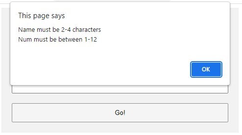
The less naggy method, where all the error messages are compiled into a single popup. Take note:
- A
novalidatehas been added to the<form>tag. This disables the default browser form checking, and we do our own in Javascript usingonsubmit="return check()". - The Javascript is pretty long-winded but straightforward.
- Use
var error = ""to collect all the error messages. - Fetch the field we want to check
field = document.getElementById("ID"). - Add a message if it is invalid
if (!field.checkValidity()) { error += "ERROR"; } - That’s all, repeat the check for all fields.
- Lastly, show the error message if not empty and don’t allow the form submission
if (error !="") { alert(error); return false; }
- Use
EXAMPLE 4) SHOW ERROR MESSAGE UNDER FIELD
4-below.html
 <!-- (A) SOME SIMPLE ERROR STYLES -->
<style>
.err { background: #ffe6ee; border: 1px solid #b1395f; }
.emsg { color: #c12020; font-weight: bold; }
</style>

<!-- (B) HTML FORM -->
<form onsubmit="return check()" novalidate>
  <label for="fname">Name</label>
  <input type="text" name="fname" id="fname" required minlength="2" maxlength="8">
  <div id="cname" class="emsg"></div>

  <label for="fnumber">Number</label>
  <input type="number" name="fnumber" id="fnumber" required min="1" max="12">
  <div id="cnumber" class="emsg"></div>

  <input type="submit" value="Go!">
</form>

<!-- (C) FORM CHECK -->
<script>
function check () {
  // (C1) INIT
  var valid = true, error = "", field = "";

  // (C2) NAME
  field = document.getElementById("fname");
  error = document.getElementById("cname");
  if (!field.checkValidity()) {
    valid = false;
    field.classList.add("err");
    error.innerHTML = "Name must be 2-4 charactersrn";
  } else {
    field.classList.remove("err");
    error.innerHTML = "";
  }

  // (C3) NUMBER
  field = document.getElementById("fnumber");
  error = document.getElementById("cnumber");
  if (!field.checkValidity()) {
    valid = false;
    field.classList.add("err");
    error.innerHTML = "Num must be between 1-12rn";
  } else {
    field.classList.remove("err");
    error.innerHTML = "";
  }

  // (C4) RESULT
  return valid;
}
</script>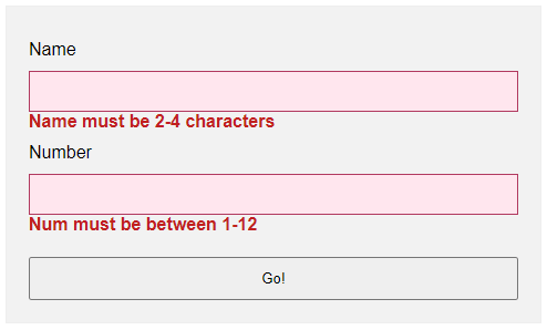
- Use
novalidateandonsubmitto do our own customization. - But instead of showing in a popup, we attach a
<div class="emsg">below all fields. - On an invalid input, we show the error message in the
<div>instead.
LINKS & REFERENCES
- HTML Pattern – MDN
- Validity State – MDN
- Form Validation – MDN
- HTML Form Validation Without Javascript – Code Boxx
THE END
Thank you for reading, and we have come to the end. I hope that it has helped you to better understand, and if you want to share anything with this guide, please feel free to comment below. Good luck and happy coding!
I want to display script errors in a popup alert instead of showing them in the browser console.
window.onerror = function() {
  var message = /* get error messages and put them here */;
  alert(message);
  return true;
};
DVK
126k32 gold badges210 silver badges325 bronze badges
asked Apr 9, 2010 at 3:44
6
Yes, that is the correct way.
See the reference here:
http://www.javascriptkit.com/javatutors/error2.shtml
And explanation of how to see more details of the error here:
http://www.javascriptkit.com/javatutors/error3.shtml
Their example:
window.onerror = function(msg, url, linenumber) {
    alert('Error message: '+msg+'nURL: '+url+'nLine Number: '+linenumber);
    return true;
}
If you wish to display a LIST of errors in a single pop-up, it’s trickier.
Since the errors occue 1 by 1, you need to do the following:
- have
window.onerrorhandler store error details in some array -
Check that array periodically — either via a timer, or on every N’th call of
window.onerrorhandler, or both.When the check happens, process entire array, display contents as desired, and empty out an array
answered Apr 9, 2010 at 3:50
DVKDVK
126k32 gold badges210 silver badges325 bronze badges
1
Just in case someone would like to use it with jQuery:
$(window).on("error", function(evt) {

    console.log("jQuery error event:", evt);
    var e = evt.originalEvent; // get the javascript event
    console.log("original event:", e);
    if (e.message) {
        alert("Error:nt" + e.message + "nLine:nt" + e.lineno + "nFile:nt" + e.filename);
    } else {
        alert("Error:nt" + e.type + "nElement:nt" + (e.srcElement || e.target));
    }
});
answered Aug 1, 2014 at 7:13
user1398498user1398498
3773 silver badges11 bronze badges
0
answered Apr 9, 2010 at 3:51
Adriaan StanderAdriaan Stander
161k30 gold badges283 silver badges283 bronze badges
<script>$(window).on("error", function(evt) {

console.log("jQuery error event:", evt);
var e = evt.originalEvent; // get the javascript event
console.log("original event:", e);
if (e.message) {
    alert("Error:nt" + e.message + "nLine:nt" + e.lineno + "nFile:nt" + e.filename);
} else {
    alert("Error:nt" + e.type + "nElement:nt" + (e.srcElement || e.target));
}
});
</script>
Aurasphere
3,77112 gold badges43 silver badges70 bronze badges
answered Jun 20, 2017 at 11:37
In this tutorial you will learn how to create alerts messages with Bootstrap.
Creating Alert Messages with Bootstrap
Alert boxes are used quite often to stand out the information that requires immediate attention of the end users such as warning, error or confirmation messages.
With Bootstrap you can easily create elegant alert messages for various purposes by adding the contextual classes (e.g., .alert-success, .alert-warning, .alert-info etc.) to the .alert base class. You can also add an optional close button to dismiss any alert.
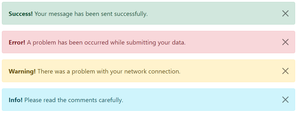
Bootstrap provides total 8 different types of alerts. The following example will show you the most commonly used alerts, which are: success, error or danger, warning and info alerts.
<!-- Success Alert -->
<div class="alert alert-success alert-dismissible fade show">
    <strong>Success!</strong> Your message has been sent successfully.
    <button type="button" class="btn-close" data-bs-dismiss="alert"></button>
</div>

<!-- Error Alert -->
<div class="alert alert-danger alert-dismissible fade show">
    <strong>Error!</strong> A problem has been occurred while submitting your data.
    <button type="button" class="btn-close" data-bs-dismiss="alert"></button>
</div>

<!-- Warning Alert -->
<div class="alert alert-warning alert-dismissible fade show">
    <strong>Warning!</strong> There was a problem with your network connection.
    <button type="button" class="btn-close" data-bs-dismiss="alert"></button>
</div>

<!-- Info Alert -->
<div class="alert alert-info alert-dismissible fade show">
    <strong>Info!</strong> Please read the comments carefully.
    <button type="button" class="btn-close" data-bs-dismiss="alert"></button>
</div>
— The output of the above example will look something like this:
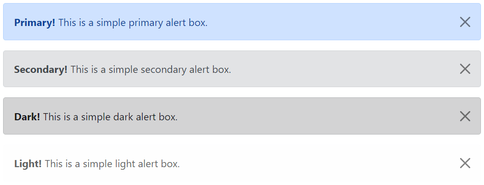
Here’re the remaining four Bootstrap alerts that can be used for various purposes.
<!-- Primary Alert -->
<div class="alert alert-primary alert-dismissible fade show">
    <strong>Primary!</strong> This is a simple primary alert box.
    <button type="button" class="btn-close" data-bs-dismiss="alert"></button>
</div>

<!-- Secondary Alert -->
<div class="alert alert-secondary alert-dismissible fade show">
    <strong>Secondary!</strong> This is a simple secondary alert box.
    <button type="button" class="btn-close" data-bs-dismiss="alert"></button>
</div>

<!-- Dark Alert -->
<div class="alert alert-dark alert-dismissible fade show">
    <strong>Dark!</strong> This is a simple dark alert box.
    <button type="button" class="btn-close" data-bs-dismiss="alert"></button>
</div>

<!-- Light Alert -->
<div class="alert alert-light alert-dismissible fade show">
    <strong>Light!</strong> This is a simple light alert box.
    <button type="button" class="btn-close" data-bs-dismiss="alert"></button>
</div>
— The output of the above example will look something like this:
Tip: The .fade and .show classes on the .alert element enable the fading transition effect while closing the alert boxes. If you don’t want animation just removes these classes. Also, the class .alert-dismissible is required on the .alert element for proper positioning of the .btn-close. If your alert doesn’t have a close button you can skip this class.
Adding Icons to Bootstrap Alerts
You can also place icons inside Bootstrap alerts. You can either use Bootstrap icons or third-party icons like Font Awesome. Let’s take a look at the following example:
<!-- Success Alert -->
<div class="alert alert-success alert-dismissible d-flex align-items-center fade show">
    <i class="bi-check-circle-fill"></i>
    <strong class="mx-2">Success!</strong> Your message has been sent successfully.
    <button type="button" class="btn-close" data-bs-dismiss="alert"></button>
</div>

<!-- Error Alert -->
<div class="alert alert-danger alert-dismissible d-flex align-items-center fade show">
    <i class="bi-exclamation-octagon-fill"></i>
    <strong class="mx-2">Error!</strong> A problem has been occurred while submitting your data.
    <button type="button" class="btn-close" data-bs-dismiss="alert"></button>
</div>

<!-- Warning Alert -->
<div class="alert alert-warning alert-dismissible d-flex align-items-center fade show">
    <i class="bi-exclamation-triangle-fill"></i>
    <strong class="mx-2">Warning!</strong> There was a problem with your network connection.
    <button type="button" class="btn-close" data-bs-dismiss="alert"></button>
</div>

<!-- Info Alert -->
<div class="alert alert-info alert-dismissible d-flex align-items-center fade show">
    <i class="bi-info-circle-fill"></i>
    <strong class="mx-2">Info!</strong> Please read the comments carefully.
    <button type="button" class="btn-close" data-bs-dismiss="alert"></button>
</div>
— The output of the above example will look something like this:
Additional Content inside Alerts
You can also place additional HTML elements like headings, paragraphs and dividers inside an alert. To manage spacing between the elements you can use margin utility classes, as here:
<div class="alert alert-danger alert-dismissible fade show">
    <h4 class="alert-heading"><i class="bi-exclamation-octagon-fill"></i> Oops! Something went wrong.</h4>
    <p>Please enter a valid value in all the required fields before proceeding. If you need any help just place the mouse pointer above info icon next to the form field.</p>
    <hr>
    <p class="mb-0">Once you have filled all the details, click on the 'Next' button to continue.</p>
    <button type="button" class="btn-close" data-bs-dismiss="alert"></button>
</div>
— The output of the above example will look something like this:
Matching Links Color inside Alerts
You can apply the utility class .alert-link to the links inside any alert boxes to quickly create matching colored links, as shown in the example below:
<div class="alert alert-warning alert-dismissible fade show">
    <strong>Warning!</strong> A simple warning alert with <a href="#" class="alert-link">an example link</a>.
    <button type="button" class="btn-close" data-bs-dismiss="alert"></button>
</div>
— The output of the above example will look something like this:
Similarly, you can match links inside other alert boxes. Let’s try out the following example:
<!-- Success Alert -->
<div class="alert alert-success alert-dismissible fade show">
    <strong>Success!</strong> A simple success alert with <a href="#" class="alert-link">an example link</a>.
    <button type="button" class="btn-close" data-bs-dismiss="alert"></button>
</div>

<!-- Error Alert -->
<div class="alert alert-danger alert-dismissible fade show">
    <strong>Error!</strong> A simple danger alert with <a href="#" class="alert-link">an example link</a>.
    <button type="button" class="btn-close" data-bs-dismiss="alert"></button>
</div>

<!-- Warning Alert -->
<div class="alert alert-warning alert-dismissible fade show">
    <strong>Warning!</strong> A simple warning alert with <a href="#" class="alert-link">an example link</a>.
    <button type="button" class="btn-close" data-bs-dismiss="alert"></button>
</div>

<!-- Info Alert -->
<div class="alert alert-info alert-dismissible fade show">
    <strong>Info!</strong> A simple info alert with <a href="#" class="alert-link">an example link</a>.
    <button type="button" class="btn-close" data-bs-dismiss="alert"></button>
</div>

<!-- Primary Alert -->
<div class="alert alert-primary alert-dismissible fade show">
    <strong>Primary!</strong> A simple primary alert with <a href="#" class="alert-link">an example link</a>.
    <button type="button" class="btn-close" data-bs-dismiss="alert"></button>
</div>

<!-- Secondary Alert -->
<div class="alert alert-secondary alert-dismissible fade show">
    <strong>Secondary!</strong> A simple secondary alert with <a href="#" class="alert-link">an example link</a>.
    <button type="button" class="btn-close" data-bs-dismiss="alert"></button>
</div>

<!-- Dark Alert -->
<div class="alert alert-dark alert-dismissible fade show">
    <strong>Dark!</strong> A simple dark alert with <a href="#" class="alert-link">an example link</a>.
    <button type="button" class="btn-close" data-bs-dismiss="alert"></button>
</div>

<!-- Light Alert -->
<div class="alert alert-light alert-dismissible fade show">
    <strong>Light!</strong> A simple light alert with <a href="#" class="alert-link">an example link</a>.
    <button type="button" class="btn-close" data-bs-dismiss="alert"></button>
</div>
Closing Alerts via Data Attribute
Data attributes provides a simple and easy way to add close functionality to the alert boxes.
Just add the data-bs-dismiss="alert" to the close button and it will automatically enable the dismissal of the containing alert message box. Also, add the class .alert-dismissible to the .alert element for proper positioning of the .btn-close button.
<div class="alert alert-info alert-dismissible fade show">
    <strong>Note!</strong> This is a simple example of dismissible alert.
    <button type="button" class="btn-close" data-bs-dismiss="alert"></button>
</div>
Use the <button> element for creating the close button for consistent behavior across all devices.
Closing Alerts via JavaScript
You may also dismiss an alert via JavaScript. Let’s try out an example and see how it works:
<script>
$(document).ready(function(){
    $("#myBtn").click(function(){
        $("#myAlert").alert("close");
    });
});
</script>
<script>
document.addEventListener("DOMContentLoaded", function(){
var btn = document.getElementById("myBtn");
var element = document.getElementById("myAlert");
// Create alert instance
var myAlert = new bootstrap.Alert(element);
btn.addEventListener("click", function(){
myAlert.close();
});
});
</script>Methods
These are the standard bootstrap’s alerts methods:
close
This method closes an alert by removing it from the DOM. If the .fade and .show classes are present on the element, the alert will fade out before it is removed.
<script>
$(document).ready(function(){
    $("#myBtn").click(function(){
        $("#myAlert").alert("close");
    });
});
</script>
<script>
document.addEventListener("DOMContentLoaded", function(){
var btn = document.getElementById("myBtn");
var element = document.getElementById("myAlert");
// Create alert instance
var myAlert = new bootstrap.Alert(element);
btn.addEventListener("click", function(){
myAlert.close();
});
});
</script>dispose
This method destroys an element’s alert (i.e. removes stored data on the DOM element).
<script>
$(document).ready(function(){
    $("#myBtn").click(function(){
        $("#myAlert").alert("dispose");
    });
});
</script>
<script>
document.addEventListener("DOMContentLoaded", function(){
var btn = document.getElementById("myBtn");
var element = document.getElementById("myAlert");
// Create alert instance
var myAlert = new bootstrap.Alert(element);
btn.addEventListener("click", function(){
myAlert.dispose();
});
});
</script>getInstance
This is a static method which allows you to get the alert instance associated with a DOM element.
<script>
$(document).ready(function(){
    // Create alert instance
    $("#myAlert").alert();

    // Get alert instance on button click
    $("#myBtn").click(function(){
        var myAlert = bootstrap.Alert.getInstance($("#myAlert")[0]);
        console.log(myAlert);
        // {_element: div#myAlert.alert.alert-info.alert-dismissible.fade.show}
    });
});
</script>
<script>
document.addEventListener("DOMContentLoaded", function(){
var btn = document.getElementById("myBtn");
var element = document.getElementById("myAlert");
// Create alert instance
var myAlert = new bootstrap.Alert(element);
// Get tooltip instance on button click
btn.addEventListener("click", function(){
var alert = bootstrap.Alert.getInstance(element);
console.log(alert);
// {_element: div#myAlert.alert.alert-info.alert-dismissible.fade.show}
});
});
</script>getOrCreateInstance
This is a static method which allows you to get the alert instance associated with a DOM element, or create a new one in case if the alert wasn’t initialized.
<script>
$(document).ready(function(){
    $("#myBtn").click(function(){
        var myAlert = bootstrap.Alert.getOrCreateInstance($("#myAlert")[0]);
        console.log(myAlert);
        // {_element: div#myAlert.alert.alert-info.alert-dismissible.fade.show}
    });
});
</script>
<script>
document.addEventListener("DOMContentLoaded", function(){
var btn = document.getElementById("myBtn");
var element = document.getElementById("myAlert");
btn.addEventListener("click", function(){
var myAlert = bootstrap.Alert.getOrCreateInstance(element);
console.log(myAlert);
// {_element: div#myAlert.alert.alert-info.alert-dismissible.fade.show}
});
});
</script>Events
Bootstrap’s alert class includes few events for hooking into alert functionality.
| Event | Description |
|---|---|
| close.bs.alert | This event fires immediately when the close instance method is called. |
| closed.bs.alert | This event is fired when the alert has been closed and CSS transitions have completed. |
The following example displays an alert message to the user when fade out transition of an alert message box has been fully completed.
<script>
$(document).ready(function(){
    $("#myAlert").on("closed.bs.alert", function(){
        alert("Alert message box has been closed.");
    });
});
</script>
<script>
document.addEventListener("DOMContentLoaded", function(){
var myAlert = document.getElementById("myAlert");
myAlert.addEventListener("closed.bs.alert", function(){
alert("Alert message box has been closed.");
});
});
</script>Last update on August 19 2022 21:51:33 (UTC/GMT +8 hours)
Introduction
Twitter Bootstrap allows you to style successful execution of a stuff, warning, and error messages of your website or app. In this tutorial, you will learn how to do that.
Creating a simple alert message
Using CSS class «alert», which is located from line number 2123 to 2175 of bootstrap.css version 2.0.1, you may create a simple alert message. You may add an optional close icon to it.
When you click the close icon in the alert box, it is closed. And for this interactivity, you have to add two JavaScript files
jquery.js and alert.js. You may add them just before your body element closes.
Example of creating a simple alert message with Twitter Bootstrap
<!DOCTYPE html>
<html lang="en">
<head>
<meta charset="utf-8">
<title>Basic alerts with twitter bootstrap</title>
<meta name="description" content="Creating basic alerts with Twitter Bootstrap. Examples of alerts and errors with Twitter Bootstrap">
<link href="/twitter-bootstrap/twitter-bootstrap-v2/docs/assets/css/bootstrap.css" rel="stylesheet">
<style type="text/css">
body {
padding: 50px;
}
</style>
</head>
<body>
<div class="container">
<div class="row">
<div class="span4">
<div class="alert">
  <a class="close" data-dismiss="alert">×</a>
  <strong>Warning!</strong> Best check yo self, you're not looking too good.
</div>
</div>
</div>
</div>
<script src="twitter-bootstrap-v2/docs/assets/js/jquery.js"></script>
<script src="twitter-bootstrap-v2/docs/assets/js/bootstrap-alert.js"></script>
</body>
</html>
Note that from line number 18 to 21 are required. Everything else is for demonstration purpose only.
Output

View Online
View the above example in a different browser window.
Extending simple alert message
With two more CSS classes «alert-block » and «alert-heading», you may extend the previously shown simple alert message. It gives you more control over text to rendered and you may add a text header preceding the alert text.
When you click the close icon in the alert box, it is closed. And for this interactivity, you have to add two JavaScript files
jquery.js and alert.js. You may add them just before your body element closes.
Example of extending simple alert message with Twitter Bootstrap
<!DOCTYPE html>
<html lang="en">
<head>
<meta charset="utf-8">
<title>Extending simple alert with twitter bootstrap</title>
<meta name="description" content="Extending simple alert with twitter bootstrap.">
<link href="/twitter-bootstrap/twitter-bootstrap-v2/docs/assets/css/bootstrap.css" rel="stylesheet">
<style type="text/css">
body {
padding: 50px;
}
</style>
</head>
<body>
<div class="container">
<div class="row">
<div class="span4">
<div class="alert alert-block">
  <a class="close" data-dismiss="alert">×</a>
  <h4 class="alert-heading">Warning!</h4>
 What are you doing?! this will delete all files!!
</div>
</div>
</div>
</div>
<script src="twitter-bootstrap-v2/docs/assets/js/jquery.js"></script>
<script src="twitter-bootstrap-v2/docs/assets/js/bootstrap-alert.js"></script>
</body>
</html>
Output
View Online
View the above example in a different browser window.
Creating alerts on error, success, and information
Twitter Bootstrap allows you to create alerts suitable to be rendered on error or danger, success, and information. For error, you need CSS class «alert-error», for success you need «alert-success» class and for the information you need a class «alert-info». And of course, like it is stated in the previous examples, you need to JS files jquery.js and alert.js.
Example of alerts on error, success, and information with Twitter Bootstrap
<!DOCTYPE html>
<html lang="en">
<head>
<meta charset="utf-8">
<title>Example alerts on error success and information with Twitter bootstrap</title>
<meta name="description" content="Example alerts on error success and information with Twitter bootstrap.">
<link href="/twitter-bootstrap/twitter-bootstrap-v2/docs/assets/css/bootstrap.css" rel="stylesheet">
<style type="text/css">
body {
padding: 50px;
}
</style>
</head>
<body>
<div class="alert alert-error">
  <a class="close" data-dismiss="alert">×</a>
  <strong>Error!</strong>This is a fatal error.
</div>
<div class="alert alert-success">
  <a class="close" data-dismiss="alert">×</a>
  <strong>Success!</strong>You have successfully done it.
</div>
<div class="alert alert-info">
  <a class="close" data-dismiss="alert">×</a>
  <strong>Info!</strong>Watch this, but you may forget.
</div>
<script src="twitter-bootstrap-v2/docs/assets/js/jquery.js"></script>
<script src="twitter-bootstrap-v2/docs/assets/js/bootstrap-alert.js"></script>
</body>
</html>
Output

View Online
View the above example in a different browser window
You may download all the HTML, CSS, JS and image files used in our tutorials here.
Previous: Twitter Bootstrap pagination tutorial
Next:
Creating a Pricing Table with Twitter Bootstrap 3 list group component
Despite the fact that for some interfaces, solid alert box are required. Remembering these things, CSS assumes as the good example to builds the wonderful alert boxes. The alert( )include is one useful component that is indigenous to CSS. In an exchange box that shows up on the screen, this element will demonstrate text. We can train CSS to watch these occasions and play out the given element in the event that they occur or when they occur. So in this article, we will discuss about different example of alert box with message that comes with varieties of animations and style achieved using HTMl, CSS, Javascript(Jquery) and Bootstrap.
The Awesome CSS alert box is useful to caution your customers to something noteworthy. Valuable CSS Alert Box with instructional exercises and models coding are significant for website specialist to spare time for website architecture venture.
A modest box will spring up and demonstrate the text you indicate in your code when a dialog box activates. All you have to do is you should pass your message to the implicit alert( ) function.
Collection of CSS Alert Box Examples with Code Snippet
As in the past, these ideas uses JavaScript alerts that were simply irritating. Be that as it may, these days we can assemble some quite wonderful stuff utilizing custom CSS and JS code.
Related
- Bootstrap Alert Dialog Code Snippet
- JavaScript Alert Box Code Snippet
- React Modal Alert Dialog Component
- CSS Notification Examples
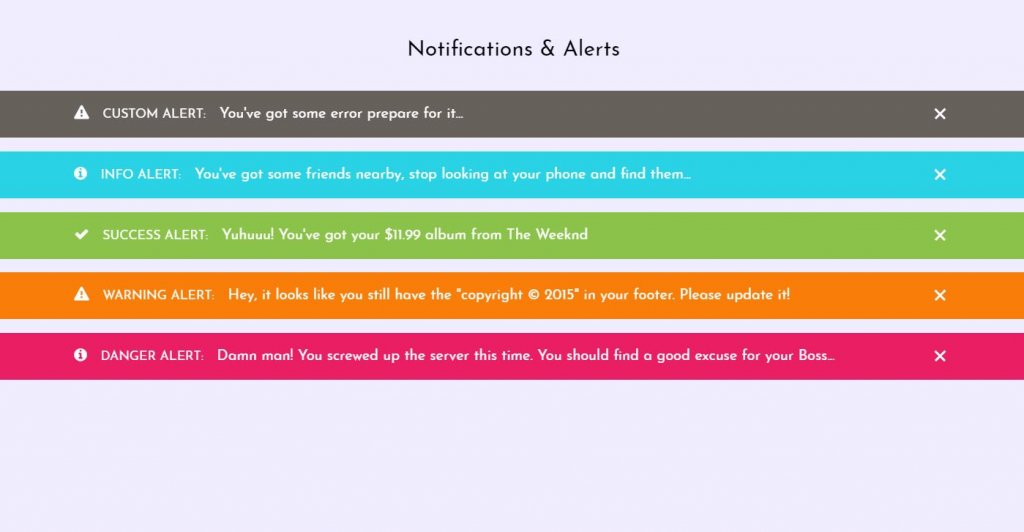
I’ve curated my top example of HTML and CSS notification messages, dialog boxes, alert windows, anything you desire to call them. In any case, they’re free and they offer a lot of motivation for UI/UX plan thoughts.
1. Pure HTML + CSS Alerts with Dismiss
In the absolute first model in the rundown is this pen loaded with alert discoursed. These can fit for blunders, admonitions, achievement messages, or simply fundamental enlightening substance.
Additionally on the off chance that you would prefer not to see the alert messages, you can essentially dismiss it by tapping the nearby symbol. The ‘@keyframes dismiss’ dismisses the given message.
Best of the considerable number of alerts are anything but difficult to modify inside this pen so you can make some alters, demo your progressions live, at that point duplicate/glue the code directly into your page.
Demo/Code
2. UI Alert HTML and CSS
This is a static plan that doesn’t contain any of the liveliness. On clicking anyplace wont do any effect. This UI model essentially utilizes HTML and CSS to show the warnings and alerts.
Likewise the icons are in the left half of the alert message. It very well also may be a venturing stone for the individuals who are new.
You can pass on straightforward message, for example, significant updates in the site done as of late.
Demo/Code
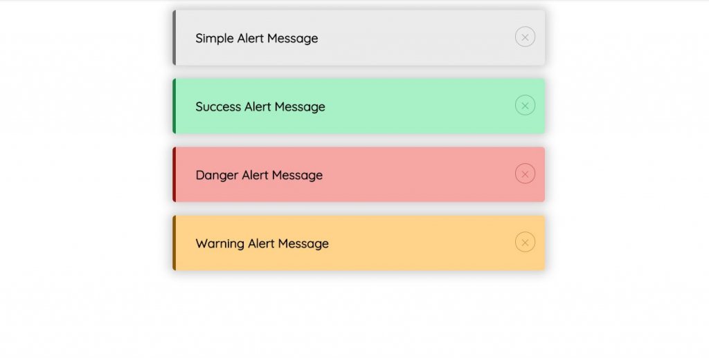
3. Modern HTML CSS Alert Box style Example
As should be obvious it is somewhat more advance and modern than the other discourse box up until this point. You can see the equivalent planned alert messages with shadow impacts also.
Likewise the messages basically becomes dim on tapping the nearby symbol. It is straightforward yet something that can make the work considerably more basic.
Another good position with this is it is irregularly with new plans and for better execution. Thus, you can use this code without any stress..
Demo/Code
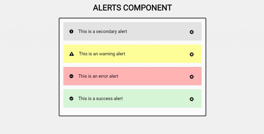
4. Alerts Component
This thoughts gives you a visual creator message box. All the fundamental data and notices are in this message box. With this structure, you can not simply exhibit the message, you can similarly show the icons related to the alerts. In this manner, there will be heaps of coding in this set.
Luckily the designer has also separated the source codes superbly with the objective that you can find the code piece for the exercises you need.
Demo/Code
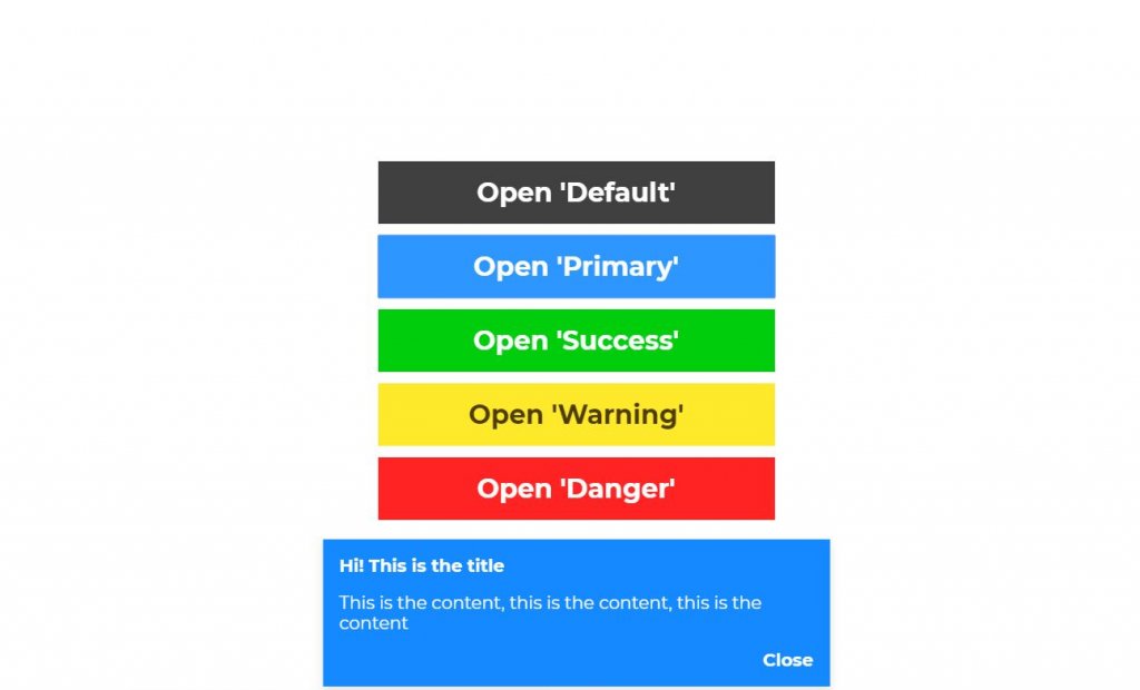
5. Toast with VueJS
Vue.js is an open-source JavaScript system for structure UIs and single-page applications. The designer has utilized a similar idea in this structure.
There are 5 diverse alert with various hues. On clicking any catch will introduce a spring up box to show the separate box and tapping on some other will pile the spring up boxes.
You can likewise just close the popup box by tapping on the nearby catch.
This is a basic, lightweight, JavaScript idea for sending stackable, non-blocking toast messages to end clients.
Demo/Code
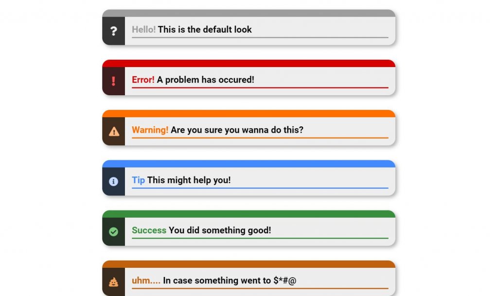
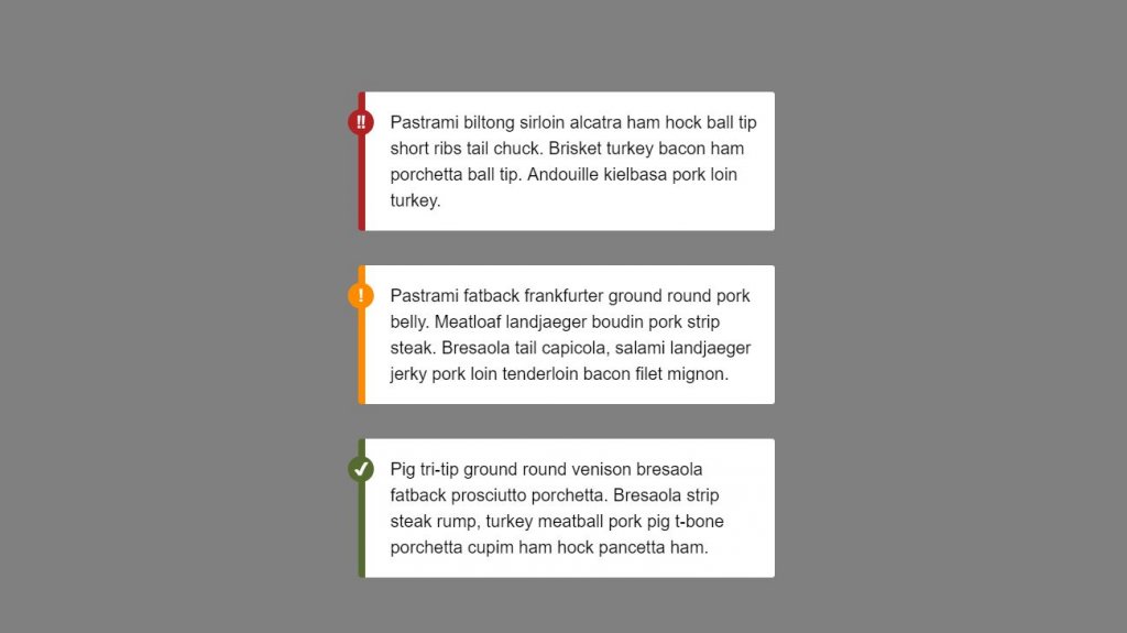
6. CSS Error Alert Message Display
In this structure, the designer has exhibited how the messages are shown and how the symbols contrasts as indicated by the message. Like in the mistake message, a shout imprint is appeared alongside a red concealing. So also the achievement symbol demonstrates a green checkmark.
Along these lines the clients can realize what kind of messages they are being shown.
Code content for all of the options is underneath so you can without a doubt work with this structure.
Demo/Code
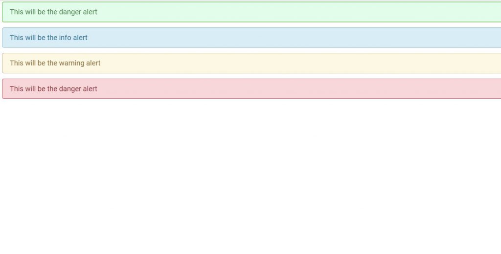
7. Re-styled Bootstrap Alert Box style (CSS)
This arrangement gives a 4 sorts of bootstrap warnings in a singular page. Firstly, the primary notice gives the peril alert message to the customer. Further, the second notice offers information to the customer.
The third notice gives cautioning message to the customer. Lastly, the fourth notice gives risk message to the customer.
You can pick any of them or all of them. The structure is direct, you ought to just to incorporate the limits you need and use it on your site or application.
Demo/Code
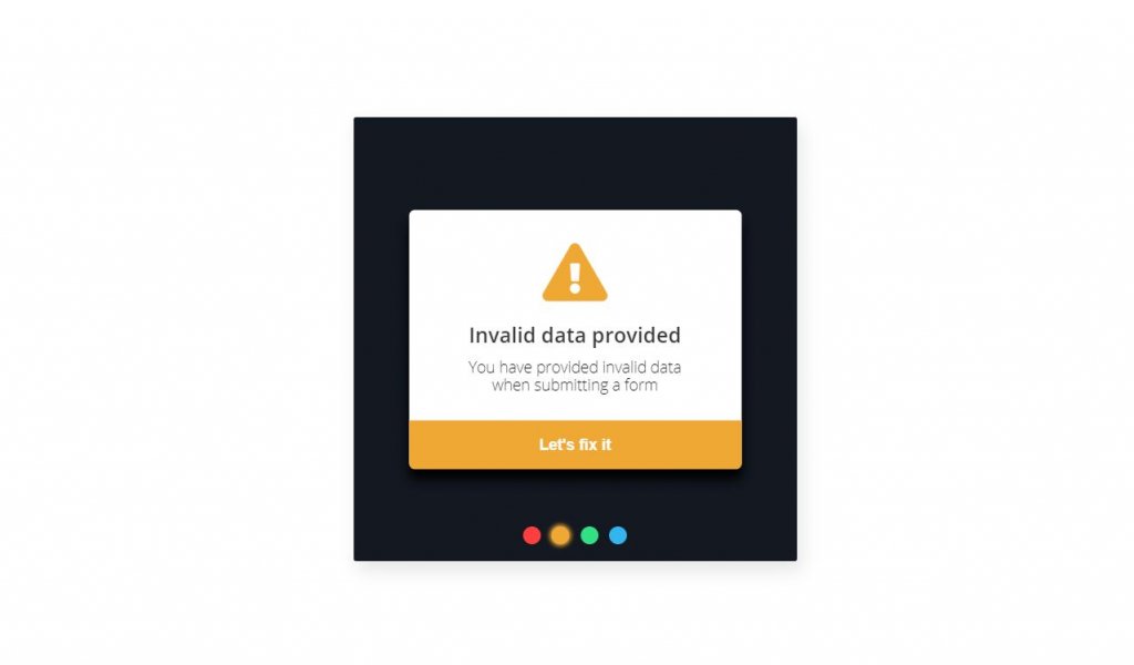
8. HTML CSS Alert Box style Example
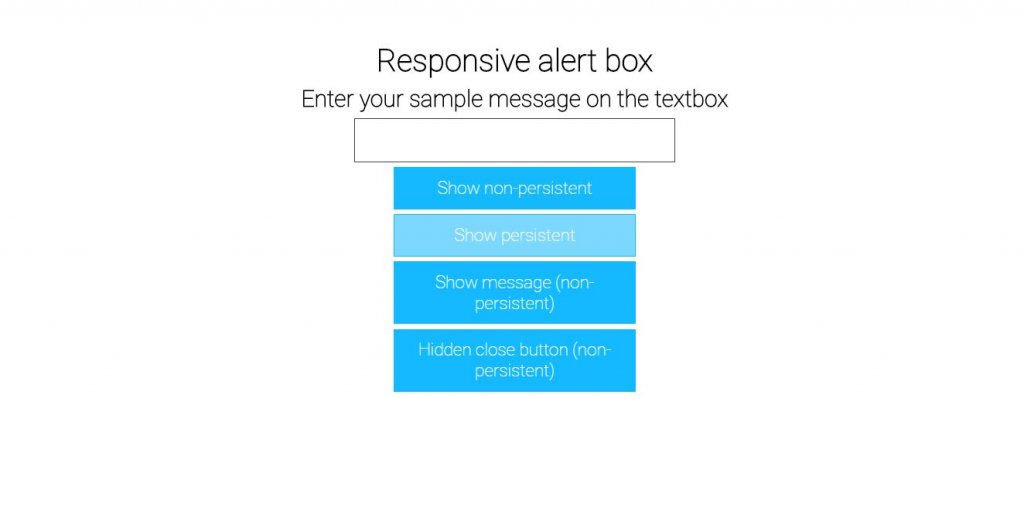
Rather than the alert messages appeared in a solitary page, here the designer has exhibited a colorful radio catch through which we can see diverse alert popups on clicking any of the catches.
The catch sparkles a little on snap. In the demo page, the developer has also properly assigned the code bits.
From this time forward, you can without quite a bit of a stretch find the code you like and start changing it immediately.
Demo/Code
9. Create Blink Warning
Like the blink of any eye the designer has presented a blinking warning design. The warning message keeps blinking on every interval. However the blinking animation requires the JavaScript section. This is a CSS alert box of a different style.
In this, the Jquery fadeIn() is used to fade in a hidden element whereas the opposite is for fadeOut() function.
Demo/Code
10. Warning Modal
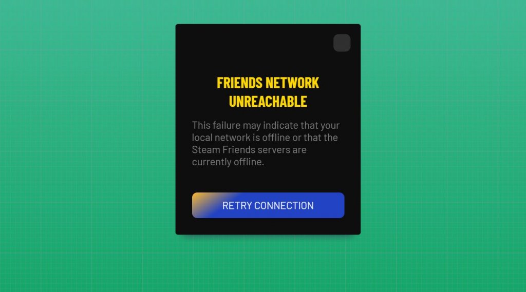
Everyone must have been familiar with the warning message when the page could not connect to the internet. This is somewhat similar to that. Just layouts differs and there are no animation effects.
The designer has not made the concept functional yet but as this uses only HTML and CSS, you can easily make it happen with some customizations.
Or you can design something generally equivalent to in solitude without an inordinate measure of effort.
Demo/Code
11. CSS Error Alert Message Banner
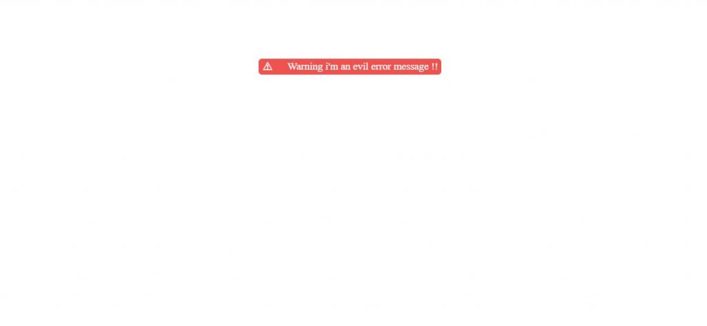
This is an animated error message banner using only HTML and CSS. The keyframes in the CSS code helps for the animation purpose. Also there is use of ::before and ::after pseudo elements.
The icon in the left side of the banner splits out and again joins in a certain interval of time.
This can be a proper way to give a warning message to the user so that they will give direct attention to it.
Demo/Code
12. CSS Flash Alert Message Box
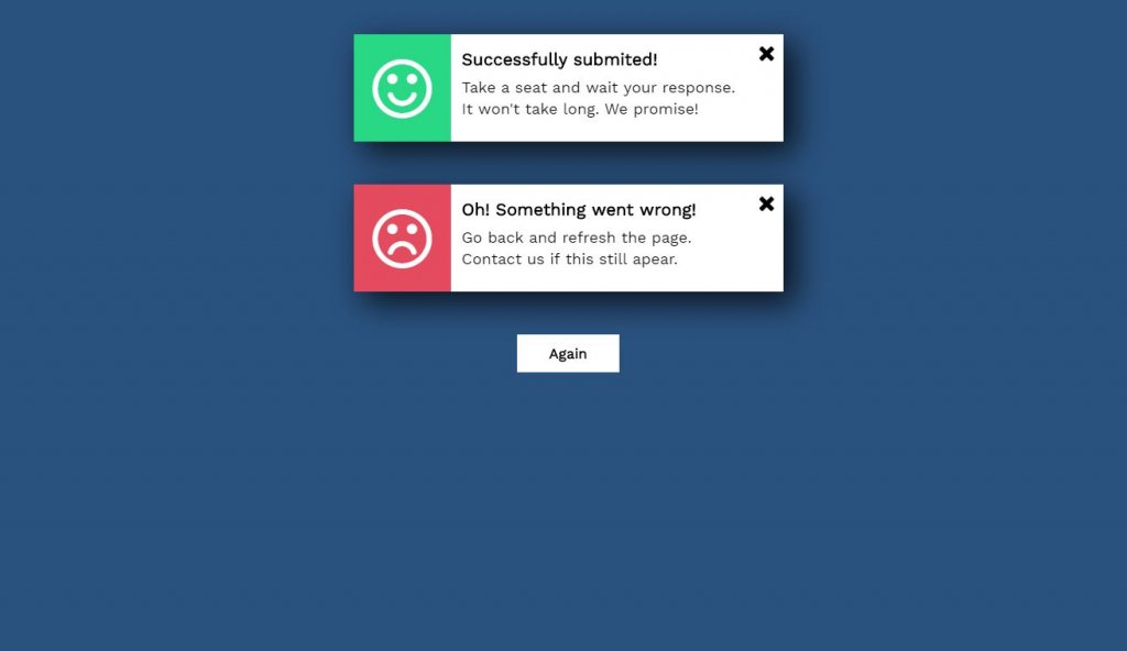
This is another alert message box that shows the success and error message. The upper one with a smiley emoji shows the successful message along with some sub messages and down there is a sad emoji that shows the error message.
You can simply close the message by clicking the cross icon.
If you want to see the message again, there is a ‘again’ button that displays the box that you recently closed.
Demo/Code
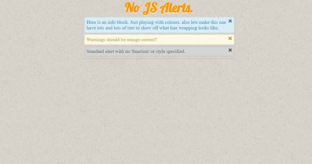
13. Different HTML CSS Alert Example
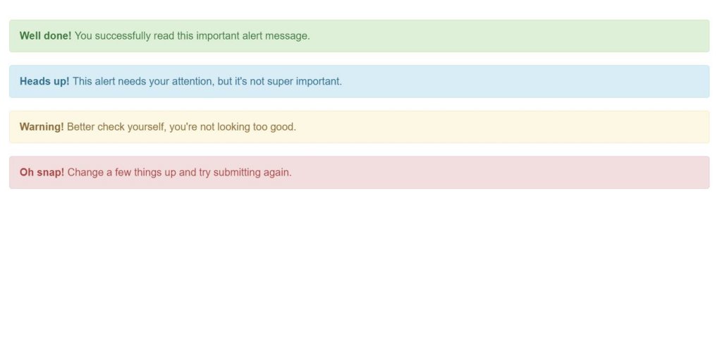
The designer has presented different alert messages in this design. The concept is same as the one we have been discussing till now. The colors for each of the alert box is different.
This is a static concept that does not have any function or buttons to be clicked.
The CSS border radius property characterizes the radius of a component’s corners which enables you to add rounded corners to components. We can see a similar idea here too.
Demo/Code
14. CSS Alert Message Types
Here we can see long messages in a box along with the icons from which we can simply guess what the message actually is about. Seeing the exclamation mark, we can see there is some error and likewise with the green checkmark icon, it says that the end result is succesful.
The developer has presented this design to make things simpler and for quicker approach.
In the event that you like to be imaginative, you can utilize diverse color plots according to your plan prerequisite.
Demo/Code
15. CPU Alert
The designer has presented the use of SVG to create this beautiful alert box example. With a red spicy background, the users can know that this is all about the warning concept.
The animation of the exclamation mark inside the triangle looks very appealing way as well.
As SVG is utilized to characterize vector-based graphics for the Web ,Every component and each quality in this idea is energized and animated.
Demo/Code
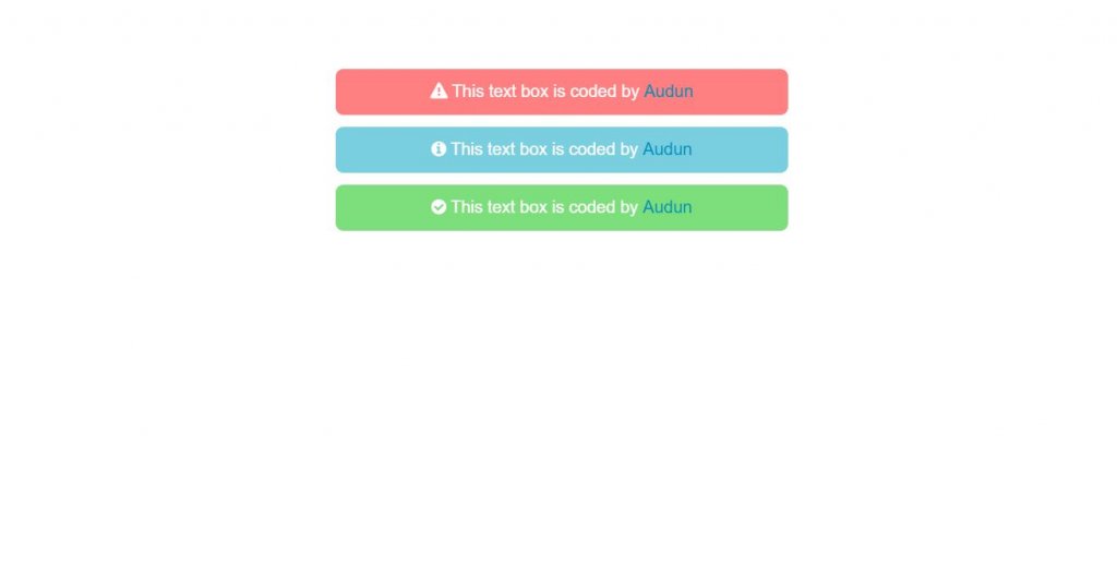
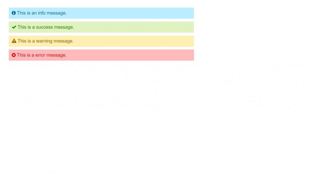
16. Warning, Info and Error CSS
We can see three different alert boxes with the icons as well. The colors are different for each of them. The designer has likewise imported the fonts from fontawesome. However three different classes are specified for each of the three alerts and they are styled in the CSS code.
The border-radius property is used so that the box has rounded corners. In case you desire to design the boxes like this, the demo along with the source code is underneath. So feel free to use it.
Demo/Code
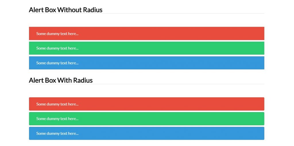
17. Alert Boxes With CSS3
The designer has clearly differentiate two alert box designs. The designs just differs in the border-radius property. In the above one border-radius property is not used while the property is used in the downwards boxes.
The developer has given you the basic limit, from here you have to work physically to make it a correct fit for your structure.
Since the huge work is done in this starting at now, your work is massively lessened.
Demo/Code
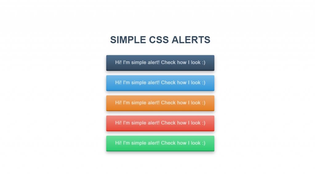
18. Simple CSS Alerts
Here 5 boxes are used which holds the same design except for the colors. The box-shadow property is used that includes shadow impacts around a component’s edge.
The flex-direction property is also utilized with the goal that it indicates the direction of the flexible items.
So the flexible items are shown vertically, as a column as flex-direction: column; is used in the CSS code.
Demo/Code
19. Responsive HTML CSS Alert Box message style Example
No one should assemble any advanced site without utilizing responsive strategies. They’re a staple for all website specialists, and each content you utilize ought to be responsive as well. Fortunately these alert boxes have that responsive structure style and they look beautiful.
You can also test the tenacious boxes or the non-industrious styles, all of which appear to be identical, and some incorporate a little “X” symbol to close it physically.
Heaps of assortment here and a lot of space to restyle them to coordinate your site.
Demo/Code
20. Error, Success, Warning and Info Alert Message CSS
View these idea for an a lot less difficult approach to deal with your alert boxes. These don’t have any uncommon liveliness or effects.
They also simply have assortments of hues alongside the symbols that demonstrates the messages.
You can also structure something fundamentally the same as all alone without an excessive amount of exertion. Be that as it may, you can also copy and paste it for your venture.
Demo/Code
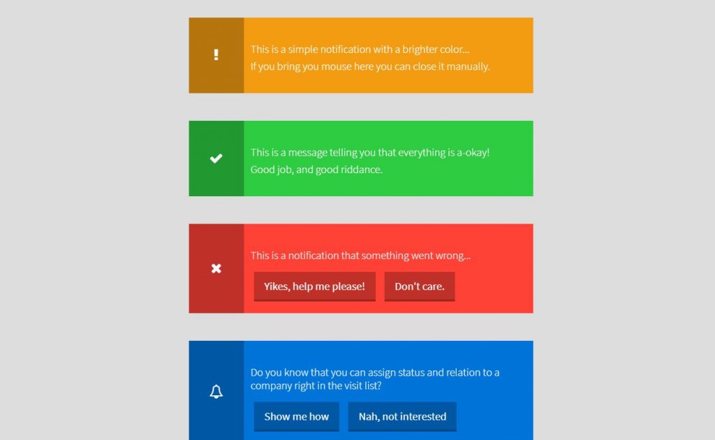
21. HTML CSS Notifications Alert Example
This is a real and functional alert box that we are going to discuss about. There are different boxes that looks proper with different variation of colors.
You can also simply find the close icon on hovering the box if you want to close it. Simply, let us take an example of the third box. On clicking the ‘Dont care’ option will clear the box and remove it.
Also on clicking on ‘Yikes, help me please’ you get a real alert box in your browser.
If you want a try, you can also simply watch the demo along with the source codes from underneath.
Demo/Code
Conclusion
So, an incredible method to indicate fast data to your clients is to utilize CSS alert boxes or windows. Alert boxes can likewise be utilized to alert them to admonitions, mistakes and that’s only the tip of the iceberg.
Whenever done accurately, attractive alerts can be a simple method to make your site feel increasingly current without a ton of additional work.
Numerous structures, for example, Twitter Bootstrap or Zurb Foundation, will incorporate alerts However, in the event that all you need is an extraordinary looking, simple to utilize alert boxes without moving your very own from the web, you can pick any of the one from the above models.
We will come up with more of the designs soon.
There are three types of errors in programming: (a) Syntax Errors, (b) Runtime Errors, and (c) Logical Errors.
Syntax Errors
Syntax errors, also called parsing errors, occur at compile time in traditional programming languages and at interpret time in JavaScript.
For example, the following line causes a syntax error because it is missing a closing parenthesis.
<script type = "text/javascript">
   <!--
      window.print(;
   //-->
</script>
When a syntax error occurs in JavaScript, only the code contained within the same thread as the syntax error is affected and the rest of the code in other threads gets executed assuming nothing in them depends on the code containing the error.
Runtime Errors
Runtime errors, also called exceptions, occur during execution (after compilation/interpretation).
For example, the following line causes a runtime error because here the syntax is correct, but at runtime, it is trying to call a method that does not exist.
<script type = "text/javascript">
   <!--
      window.printme();
   //-->
</script>
Exceptions also affect the thread in which they occur, allowing other JavaScript threads to continue normal execution.
Logical Errors
Logic errors can be the most difficult type of errors to track down. These errors are not the result of a syntax or runtime error. Instead, they occur when you make a mistake in the logic that drives your script and you do not get the result you expected.
You cannot catch those errors, because it depends on your business requirement what type of logic you want to put in your program.
The try…catch…finally Statement
The latest versions of JavaScript added exception handling capabilities. JavaScript implements the try…catch…finally construct as well as the throw operator to handle exceptions.
You can catch programmer-generated and runtime exceptions, but you cannot catch JavaScript syntax errors.
Here is the try…catch…finally block syntax −
<script type = "text/javascript">
   <!--
      try {
         // Code to run
         [break;]
      }

      catch ( e ) {
         // Code to run if an exception occurs
         [break;]
      }

      [ finally {
         // Code that is always executed regardless of
         // an exception occurring
      }]
   //-->
</script>
The try block must be followed by either exactly one catch block or one finally block (or one of both). When an exception occurs in the try block, the exception is placed in e and the catch block is executed. The optional finally block executes unconditionally after try/catch.
Examples
Here is an example where we are trying to call a non-existing function which in turn is raising an exception. Let us see how it behaves without try…catch−
<html>
   <head>
      <script type = "text/javascript">
         <!--
            function myFunc() {
               var a = 100;
               alert("Value of variable a is : " + a );
            }
         //-->
      </script>
   </head>

   <body>
      <p>Click the following to see the result:</p>

      <form>
         <input type = "button" value = "Click Me" onclick = "myFunc();" />
      </form>
   </body>
</html>
Output
Now let us try to catch this exception using try…catch and display a user-friendly message. You can also suppress this message, if you want to hide this error from a user.
<html>
   <head>

      <script type = "text/javascript">
         <!--
            function myFunc() {
               var a = 100;
               try {
                  alert("Value of variable a is : " + a );
               }
               catch ( e ) {
                  alert("Error: " + e.description );
               }
            }
         //-->
      </script>

   </head>
   <body>
      <p>Click the following to see the result:</p>

      <form>
         <input type = "button" value = "Click Me" onclick = "myFunc();" />
      </form>

   </body>
</html>
Output
You can use finally block which will always execute unconditionally after the try/catch. Here is an example.
<html>
   <head>

      <script type = "text/javascript">
         <!--
            function myFunc() {
               var a = 100;

               try {
                  alert("Value of variable a is : " + a );
               }
               catch ( e ) {
                  alert("Error: " + e.description );
               }
               finally {
                  alert("Finally block will always execute!" );
               }
            }
         //-->
      </script>

   </head>
   <body>
      <p>Click the following to see the result:</p>

      <form>
         <input type = "button" value = "Click Me" onclick = "myFunc();" />
      </form>

   </body>
</html>
Output
The throw Statement
You can use throw statement to raise your built-in exceptions or your customized exceptions. Later these exceptions can be captured and you can take an appropriate action.
Example
The following example demonstrates how to use a throw statement.
<html>
   <head>

      <script type = "text/javascript">
         <!--
            function myFunc() {
               var a = 100;
               var b = 0;

               try {
                  if ( b == 0 ) {
                     throw( "Divide by zero error." );
                  } else {
                     var c = a / b;
                  }
               }
               catch ( e ) {
                  alert("Error: " + e );
               }
            }
         //-->
      </script>

   </head>
   <body>
      <p>Click the following to see the result:</p>

      <form>
         <input type = "button" value = "Click Me" onclick = "myFunc();" />
      </form>

   </body>
</html>
Output
You can raise an exception in one function using a string, integer, Boolean, or an object and then you can capture that exception either in the same function as we did above, or in another function using a try…catch block.
The onerror() Method
The onerror event handler was the first feature to facilitate error handling in JavaScript. The error event is fired on the window object whenever an exception occurs on the page.
<html>
   <head>

      <script type = "text/javascript">
         <!--
            window.onerror = function () {
               alert("An error occurred.");
            }
         //-->
      </script>

   </head>
   <body>
      <p>Click the following to see the result:</p>

      <form>
         <input type = "button" value = "Click Me" onclick = "myFunc();" />
      </form>

   </body>
</html>
Output
The onerror event handler provides three pieces of information to identify the exact nature of the error −
-
Error message − The same message that the browser would display for the given error
-
URL − The file in which the error occurred
-
Line number− The line number in the given URL that caused the error
Here is the example to show how to extract this information.
Example
<html>
   <head>

      <script type = "text/javascript">
         <!--
            window.onerror = function (msg, url, line) {
               alert("Message : " + msg );
               alert("url : " + url );
               alert("Line number : " + line );
            }
         //-->
      </script>

   </head>
   <body>
      <p>Click the following to see the result:</p>

      <form>
         <input type = "button" value = "Click Me" onclick = "myFunc();" />
      </form>

   </body>
</html>
Output
You can display extracted information in whatever way you think it is better.
You can use an onerror method, as shown below, to display an error message in case there is any problem in loading an image.
<img src="myimage.gif" onerror="alert('An error occurred loading the image.')" />
You can use onerror with many HTML tags to display appropriate messages in case of errors.
В этой статье мы разберём 3 метода браузера (объекта window): alert, prompt и confirm.
Функция alert() предназначена для вывода в браузере предупреждающего модального диалогового окна с некоторым сообщением и кнопкой «ОК». При его появлении дальнейшее выполнение кода страницы прекращается до тех пор, пока пользователь не закроет это окно. Кроме этого, оно также блокирует возможность взаимодействия пользователя с остальной частью страницы. Применение этого окна в основном используется для вывода некоторых данных при изучении языка JavaScript, в реальных проектах команда alert() не используется.
Синтаксис метода alert():
// message - текст сообщения
alert(message);
Метод alert() имеет один аргумент (message) — текст сообщения,
которое необходимо вывести в модальном диалоговом окне. В качестве результата alert() ничего
не возвращает.
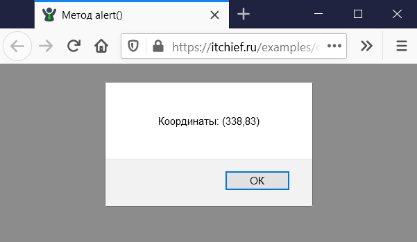
Например, выведем при клике в диалоговое окно alert координаты курсора:
// es6
document.addEventListener('click', (e) => {
alert(`Координаты: (${e.clientX},${e.clientY})`);
});
// es5
document.addEventListener('click', function (e) {
alert('Координаты: (' + e.clientX + ',' + e.clientY + ')');
});
Если alert сообщение нужно вывести на нескольких строках, то в этом случае следует воспользоваться «символом перевода строки», который в JavaScript записывается как n:
// перенос строки в alert
alert('Строка 1nСтрока 2');
Метод prompt()
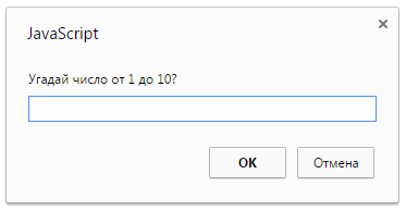
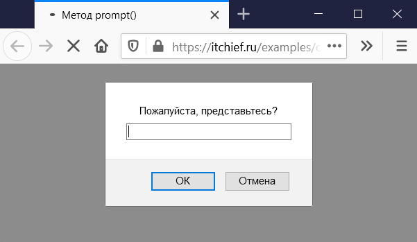
Метод prompt() предназначен для вывода диалогового окна с сообщением, текстовым полем для
ввода данных и кнопками «ОК» и «Отмена». Это окно предназначено для запроса данных, которые пользователю нужно ввести
в текстовое поле.
Синтаксис:
// message - текст сообщения (является не обязательным), предназначено для информирования пользователя о том, какие данные у него запрашиваются
// default - начальное значение для поля ввода, которое будет по умолчанию в нём отображаться (является не обязательным)
const result = prompt(message, default);
В переменную result возвращается значение введённое пользователем или null. Если пользователь не ввёл данные (поле ввода пустое) и нажал на «ОК», то в result будет находиться пустая строка.
Например, запросим имя пользователя при входе его на сайт с помощью prompt, а затем выведем его в элемент #welcome:
<div id="welcome"></div>
<script>
const name = prompt('Пожалуйста, представьтесь?');
if (name) {
  document.querySelector('#welcome').innerHTML = `<b>${name}</b>, добро пожаловать на сайт!`;
} else {
  document.querySelector('#welcome').innerHTML = '<b>Гость</b>, добро пожаловать на сайт!';
}
</script>
Метод confirm()
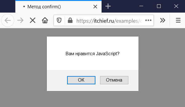
Метод confirm() объекта window применяется для вывода модального
диалогового окна с сообщением и кнопками «ОК» и «Отмена». Оно обычно используется для запроса у пользователя
разрешения на выполнение того или иного действия.
Синтаксис метода confirm():
// question - текст сообщения (вопроса)
const result = confirm(question);
В переменную result возвращается:
true— если пользователь нажал на кнопку «ОК»;false— в остальных случаях.
Например, выведем в элемент #result текст в зависимости то того на какую кнопку нажал
пользователь в диалоговом окне confirm:
<div id="result"></div>
<script>
// es6
const result = confirm('Вам нравится JavaScript?');
if (result) {
document.querySelector('#result').textContent = 'Вы ответили, что Вам нравится JavaScript';
} else {
document.querySelector('#result').textContent = 'Вы ответили, что Вам не нравится JavaScript';
}
</script>
Итого
В этой статье мы рассмотрели 3 функции браузера: alert, prompt и
confirm. Они предназначены для взаимодействия с пользователем. Диалоговые окна создаваемые
этими методами являются модальными. Это значит, что они блокируют доступ пользователя к остальной части страницы пока
оно не будет закрыто. Кроме этого, они ещё приостанавливают загрузку дальнейшей части страницы. По этим причинам, их
имеет смысл использовать в скриптах только при изучении JavaScript, чтобы запросить или вывести некоторую информацию
на экран. В настоящих проектах они обычно не используются.
Ещё одно ограничение при использовании этих окон связано с тем, что их расположение и оформление определяется
браузером. Как-то изменить или настроить это нельзя.
Примеры
1. Использование методов prompt и alert для создания игры «Угадай число»?
<script>
// число, которое нужно угадать, в данном случае 7
const number = 7;
let result = false;

while (!result) {
  const answer = prompt('Угадай число от 1 до 10?');
  if (answer === null) {
    break;
  }
  switch (+answer) {
    case number - 2:
    case number + 2:
      alert('Уже теплее!');
      break;
    case number - 1:
    case number + 1:
      alert('Горячо!');
      break;
    case number:
      alert('Ты угадал! Это число {$number}.');
      result = true;
      break;
    default:
      alert('Холодно!');
  }
}
</script>
