The :invalid CSS pseudo-class represents any <form>, <fieldset>, <input> or other <form> element whose contents fail to validate.
Try it
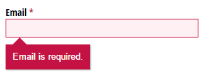
This pseudo-class is useful for highlighting field errors for the user.
Syntax
Examples
Coloring elements to show validation
HTML
<form>
  <div class="field">
    <label for="url_input">Enter a URL:</label>
    <input type="url" id="url_input" />
  </div>

  <div class="field">
    <label for="email_input">Enter an email address:</label>
    <input type="email" id="email_input" required />
  </div>
</form>
CSS
label {
  display: block;
  margin: 1px;
  padding: 1px;
}

.field {
  margin: 1px;
  padding: 1px;
}

input:invalid {
  background-color: #ffdddd;
}

form:invalid {
  border: 5px solid #ffdddd;
}

input:valid {
  background-color: #ddffdd;
}

form:valid {
  border: 5px solid #ddffdd;
}

input:required {
  border-color: #800000;
  border-width: 3px;
}

input:required:invalid {
  border-color: #c00000;
}
Result
Showing sections in stages
In this example we use :invalid along with ~, the general sibling combinator, to make a form appear in stages, so the form initially shows the first item to complete, and when the user completes each item the form displays the next one. When the whole form is complete the user can submit it.
HTML
<form>
  <fieldset>
    <label for="form-name">Name</label><br />
    <input type="text" name="name" id="form-name" required />
  </fieldset>

  <fieldset>
    <label for="form-email">Email Address</label><br />
    <input type="email" name="email" id="form-email" required />
  </fieldset>

  <fieldset>
    <label for="form-message">Message</label><br />
    <textarea name="message" id="form-message" required></textarea>
  </fieldset>

  <button type="submit" name="send">Submit</button>
</form>
CSS
/* Hide the fieldset after an invalid fieldset */
fieldset:invalid ~ fieldset {
  display: none;
}

/* Dim and disable the button while the form is invalid */
form:invalid button {
  opacity: 0.3;
  pointer-events: none;
}

input,
textarea {
  box-sizing: border-box;
  width: 100%;
  font-family: monospace;
  padding: 0.25em 0.5em;
}

button {
  width: 100%;
  border: thin solid darkgrey;
  font-size: 1.25em;
  background-color: darkgrey;
  color: white;
}
Result
Accessibility concerns
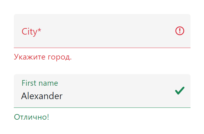
The color red is commonly used to indicate invalid input. People who have certain types of color blindness will be unable to determine the input’s state unless it is accompanied by an additional indicator that does not rely on color to convey meaning. Typically, descriptive text and/or an icon are used.
- MDN Understanding WCAG, Guideline 1.4 explanations
- Understanding Success Criterion 1.4.1 | W3C Understanding WCAG 2.0
Notes
Radio buttons
If any one of the radio buttons in a group is required, the :invalid pseudo-class is applied to all of them if none of the buttons in the group is selected. (Grouped radio buttons share the same value for their name attribute.)
Gecko defaults
By default, Gecko does not apply a style to the :invalid pseudo-class. However, it does apply a style (a red «glow» using the box-shadow property) to the :user-invalid pseudo-class, which applies in a subset of cases for :invalid.
Specifications
| Specification |
|---|
| HTML Standard # selector-invalid |
| Selectors Level 4 # validity-pseudos |
Browser compatibility
BCD tables only load in the browser
See also
- Other validation-related pseudo-classes:
:required,:optional,:valid - Related Mozilla pseudo-classes:
:user-invalid,:-moz-submit-invalid - Form data validation
- Accessing the validity state from JavaScript
Содержание
- :invalid
- Try it
- Syntax
- Examples
- Coloring elements to show validation
- Result
- Showing sections in stages
- Result
- Accessibility concerns
- Notes
- Radio buttons
- Gecko defaults
- Pure CSS Custom Error Messaging for Default Form Elements
- Basic Error Message
- Input Field Error
- Input Field Error with Tooltip
- CSS Tips and Tricks for Customizing Error Messages!
- Before
- After
- Groundwork
- No Iframes
- This CSS Can Go Anywhere
- Selecting Elements
- The Class Names
- Selectors
- The CSS
- Стилизация текстовых полей формы
- Введение
- Нормализация стилей
- Базовый вариант оформления input
- input с иконкой
- input с активной svg-иконкой
- input с кнопкой
- input с плавающим label
- input со счётчиком символов
- Стили для отображения состояния валидации input
- Пример валидации формы с помощью JavaScript
:invalid
The :invalid CSS pseudo-class represents any , , or other element whose contents fail to validate.
Try it
This pseudo-class is useful for highlighting field errors for the user.
Syntax
Examples
Coloring elements to show validation
Result
Showing sections in stages
In this example we use :invalid along with
, the general sibling combinator, to make a form appear in stages, so the form initially shows the first item to complete, and when the user completes each item the form displays the next one. When the whole form is complete the user can submit it.
Result
Accessibility concerns
The color red is commonly used to indicate invalid input. People who have certain types of color blindness will be unable to determine the input’s state unless it is accompanied by an additional indicator that does not rely on color to convey meaning. Typically, descriptive text and/or an icon are used.
Notes
Radio buttons
If any one of the radio buttons in a group is required , the :invalid pseudo-class is applied to all of them if none of the buttons in the group is selected. (Grouped radio buttons share the same value for their name attribute.)
Gecko defaults
By default, Gecko does not apply a style to the :invalid pseudo-class. However, it does apply a style (a red «glow» using the box-shadow property) to the :user-invalid pseudo-class, which applies in a subset of cases for :invalid .
Источник
Pure CSS Custom Error Messaging for Default Form Elements
This tutorial will show you how to create and customize error messaging for various form elements. In this tutorial, we will customize everything from a basic error message to input field errors and tooltips. The best part? We will be using only CSS for customizations – that means no images or javascript required!
Below is the markup for the form elements we will be creating error messaging for. This is all of the HTML used throughout this tutorial. Copy and paste this code into your working file:
Now onto my personal favorite: the CSS. We will keep the basic functionality of the form elements but completely customize their appearance. In the end, they will stand on their own as custom design elements that thoughtfully guide the user through the form process, making it as straightforward and painless as possible .
Basic Error Message
Let’s start with a basic error message. We are going to customize the HTML above to look like this:

This is what we start out with, by default, after adding the HTML:

Customizing a basic error message is really simple. All we have to do is give our text a colored background and a couple font styles using CSS. To style the error message background, add the following styles to your CSS stylesheet:
Now let’s style the text itself by adding the following font styles:
That’s it! Keep reading to learn how to style input field and tooltip errors .
Input Field Error
Now that we have our basic error message styled, let’s work on input field errors. This is what the final product will look like:
And this is what we start out with by default:
First, we want to override the browser’s default styles. Add the following CSS to give your input field a custom look:
Next, we need to add the styling for the error message that displays when a user does not correctly fill out an input field (i.e. the “This is a required field” message):
Lastly, add the error-specific styling for the input field elements:
Input Field Error with Tooltip
The last element we’re tackling is the tooltip. It is slightly more complicated than the others but well worth the effort. We will also be utilizing Sass nesting to better organize our code, and because we are only using SCSS it is 100% editable and scalable.
Once we are done, the tooltip will look like this:
And by default, this is what we start with after adding the HTML:
First, we override the browser’s default styles with our own custom styling:
Just like our previous example, we need to add the tooltip error message styling that displays when a form error occurs. Note: we are using Sass here to nest the tooltip’s left arrow properties. This comes in handy when trying to keep track of which values are assigned to the tooltip specifically:
Now all that’s left to do is define the input’s error-specific styling. Again, we will nest these styles under an “error” class selector to make classification and future changes easier:
And that’s it! All the code you need to customize error messaging for default form elements. To experiment with the final results and copy and paste to your heart’s content (without fear of breaking anything), jump on over to Codepen by selecting any of the tutorial links below.
Источник
CSS Tips and Tricks for Customizing Error Messages!
Error: Your validation needs spicing up!
In this post, we’re going to completely customize the look of our form’s error messages with just a sprinkling of CSS. CSS is simply a set of text rules that you can write to tell browsers how to style websites. This post assumes no knowledge of CSS, but if you are a super thorough type of person, check out my general introduction to CSS.
In order to have error messages to style, we need to have errors; and in order to have errors, we need rules. Below, I’ve set up a simple form that requires everything except for the Name field. So, if someone tries to submit this form without filling out the required fields, they’ll see a bunch of pre-customized error messages with bright red backgrounds:
Before
After
This is the same form, but with that sprinkling of CSS that I mentioned earlier. When you try to submit this form, you’ll notice that the error messages look a little different:
See the Pen by CognitoForms (@CognitoForms) on CodePen.
Groundwork
A few things we need to cover before getting into the styling:
No Iframes
The CSS we’re writing will only affect the form if it’s seamlessly embedded on the page, and not in an iframe. Iframes are like tall fortress walls that keep out things like hoards of CSS lines; sometimes that’s great, but not in this case.
This CSS Can Go Anywhere
You can put this CSS anywhere on the webpage that hosts the form, either through a reference to an external CSS doc, or by placing the style rules directly on the same page (learn more about the mechanics of these options here). Normally, the order of CSS does matter, with rules that come later on the page tending to override earlier rules. But I’ll write this example in a way that will force our custom rules to be applied no matter where they are.
Selecting Elements
The Class Names
HTML elements can have class names for CSS rules to hook onto. Cognito Forms have several class names that allow you to do this very thing. The ones we’ll be making use of are:
- c-error — This class name is added to all field containers if that field has an error. In our example, this class will get applied to the parent container after the user tries to submit an invalid email address.
- c-validation — This class name is on the container of the error message. It isn’t visible until an error has been made. The validation message is contained by the element that will have the c-error class.
- c-label — This is the container of the field label (which is “Email” in this case). Labels are also contained by the element that will have the c-error class.
Selectors
In my example, I’m styling four different things: the c-validation container, a triangle/arrow extending from that container, the asterisk next to “Email” that indicates the field is required, and the text field itself. These are the selectors we’re going to be using:
- .c-error .c-validation The dot in front of each class name just denotes that c-error and c-validation are class names. The order of the class names and how they are separated by a space mean that c-validation is contained by an element that has the class name c-error. All styles that we only want to take effect when there is an error will be prefaced with .c-error. Since this class is only on fields when they have errors, our styles won’t appear by default.
- .c-error .c-validation:before This is where the arrow/triangle is going to be. If you don’t want an arrow like this, then you don’t need the equivalent in your CSS. The “:before” means something like, “Create a pseudo-element that doesn’t really exist at the very beginning of c-validation.” The pseudo-element can be styled just like a real element, even though it doesn’t appear anywhere in the HTML.
- .c-label:after This is just like the “:before” pseudo-element, but it comes at the end of .c-label. This is how Cognito places the asterisks at the end of required labels. All we’re going to do with this is change the color of the asterisk. Since this asterisk shows up all the time on required fields, whether they have errors or not, we don’t want to qualify this by prefacing with the c-error class.
- .c-error input, .c-error select, .c-error .c-choice-option The commas here separate what are really three different selectors, all to only take effect with an error. “input” selects things like text inputs, “select” selects dropdown menus, and “.c-choice-option” selects the container of check boxes and radio buttons in Cognito Forms. We’re going to color the text and background color of all these things, as well as the border of inputs and selects.
The CSS
Here’s the CSS to style the error message itself:
We’ve already talked about the class “c-validation”. Every element that has that class name inside of an element with the c-error class will get the style rules inside the curly braces. I’ll go through them in order (the order doesn’t matter to the browser):
- background #c51244 is the code for the dark red I’ve chosen. Usually you don’t just know these codes off the top of your head; you can get them from a good color picker (like in Photoshop), or a website like this one. The “!important” at the end of this line means, “Hey, I don’t care what color Cognito Forms set as the background color, my color is more important!” Lines that need to override Cognito’s CSS will have this.
- padding This line just indicates that there should be a space of 10 pixels all the way around the error text and the edge of the box.
- border-radius By default, error messages have rounded corners on the bottom. By setting border-radius to 0, we are setting sharp corners instead.
- position This will help us when we place the arrow/triangle. I’ll explain this further below.
- box-shadow This adds a shadow to the box. I’ve set it to be the color #aaaaaa (gray), with 1 pixel on the right, 1 pixel on the bottom, and 1 pixel of blurriness. Learn more about the box-shadow property.
- margin-top This gives 10 pixels of space above the box. This is leaving room for the arrow we’ll talk about next.
Here’s the CSS for the arrow/triangle:
If you are curious about the first 6 properties of this, check out this classic explanation. Suffice it to say, the first 6 lines are for making a triangle.
position: absolute takes the triangle out of the flow of the document and layers it on top, preventing it from taking up space and pushing other elements around. top: -10px nudges it up 10 pixels. We needed the parent container to have position: relative for this to work right—that’s why we added it above.
The CSS to change the color of the required asterisk to match the c-validation box color is simply:
Note that since the color of the asterisk isn’t conditioned on whether there is an asterisk or not, we didn’t include the c-error class.
And finally, to color the background and text of the inputs, selects, and check box containers:
Plus, we can also color the border of just inputs and selects with:
And that’s it! Obviously you can copy what I did here exactly, but that’s boring. I hope you’ll take what you learned here and put your own spin on it. If you come up with something interesting, why not post it in the comments for others to see? If you have questions, feel free to post those in the comments too and I’ll be happy to help!

Tyler is the creative director for Cognito Forms. He is a gemini who was born in the year of the dog. Figure the rest out on your own!
Источник
Стилизация текстовых полей формы

В этой статье рассмотрим различные варианты стилизации текстовых полей HTML-форм. Сначала создадим базовый вариант оформления input, а затем множество других, дополняя каждый из них небольшим количеством CSS.
Введение
Веб-формы являются неотъемлемой частью многих веб-сайтов. Они позволяют пользователю ввести те или иные данные, которые затем отправляются на сервер или обрабатываются на стороне клиента, например, для изменения интерфейса.
Веб-формы также часто называют HTML-формами . Их проектирование осуществляется с помощью элементов управления форм (текстовых полей, выпадающих списков, кнопок, чекбоксов и т.д.) и некоторых дополнительных элементов, которые используются для придание форме определённой структуры.
Стилизация формы выполняется через CSS. В этом руководстве остановимся и подробно рассмотрим различные варианты оформления её текстовых полей .
Исходные коды примеров расположены на GitHub в папке text-field проекта «ui-components».
Нормализация стилей
1. Настройка box-sizing .
Обычно хорошей практикой считается для всех элементов включая псевдоэлементы установить box-sizing: border-box :
В этом случае браузер при рассчитывании ширины и высоты элементов будет включать в них поля (padding) и границы (border). Как правило, это сильно упрощает работу с размерами элементов, и избавляет нас от множества проблем при размещении контента.
2. Нормализация стилей .
Для того чтобы в разных браузерах отображался как можно более одинаково необходимо добавить следующее:
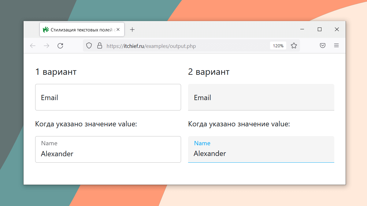
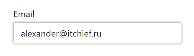
Базовый вариант оформления input
Для удобного добавления к элементам стилей создадим следующую HTML-разметку:
Т.е. добавим к с type=»text» класс text-field__input , к – text-field__label , а затем обернём их в элемент
Теперь напишем стили для этих элементов. А также сразу включим в них стили для нормализации, чтобы не добавлять их отдельно:
Примененные CSS свойства к элементу , и то, что они делают:
- display: block – устанавливает блочное отображение;
- width: 100% – занимает всю доступную ширину;
- height: calc(2.25rem + 2px) – высота элемента определяется путём сложения 2.25rem ( font-size * line-height + padding-top + padding-bottom ) и 2px (ширина верхней и нижней границы);
- margin: 0 – убирает margin отступы;
- padding: 0.375rem 0.75rem – внутренние поля: сверху и снизу – 0.375rem, а слева и справа – 0.75rem;
- font-family: inherit – чтобы шрифт был такой как у родительского элемента, а не тот который браузер по умолчанию назначает для ;
- font-size: 1rem – устанавливает явный размер шрифта, иначе будет браться из стилей браузера для ;
- font-weight: 400 – задаёт начертание шрифта;
- line-height: 1.5 – высота строки (1.5 * размер шрифта);
- color: #212529 – цвет шрифта;
- background-color: #fff – цвет фона;
- background-clip: padding-box – указывает, что фон (фоновое изображение) нужно рисовать только до внешнего края отступа (под границей не выводить);
- border: 1px solid #bdbdbd – устанавливает границу, у которой: 1px (толщина), solid (тип линии) и #bdbdbd (цвет);
- border-radius: 0.25rem – радиус скругления углов;
- transition: border-color 0.15s ease-in-out, box-shadow 0.15s ease-in-out – выполняет изменение значений свойств border-color и box-shadow с анимацией длительностью 0.15 секунд посредством временной функцией ease-in-out .
В результате получили следующее оформление:
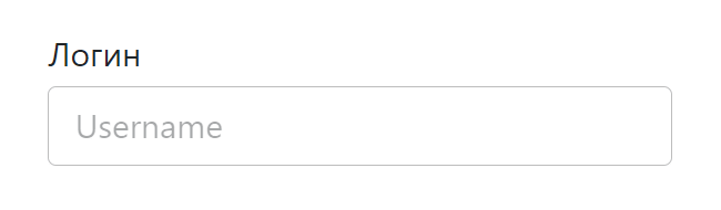
Стилизуем плейсхолдер . По умолчанию плейсхолдер отображается полупрозрачным или светло-серым цветом. Получить его можно с помощью ::placeholder . Оформим его следующим образом:
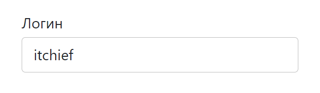
Стили для в состоянии фокуса (получить это состояние можно с помощью псевдокласса :focus ):
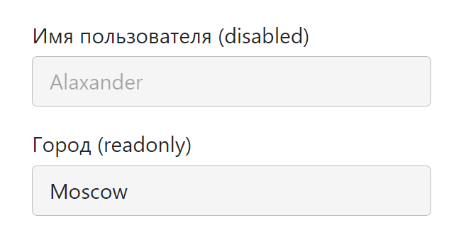
Оформление , когда он находится в состоянии disabled и readonly :
Этот набор стилей будет у нас отправной точкой для создания других.
input с иконкой
Рассмотрим пример вставки в input иконки с помощью псевдоэлементов.
Для этого дополнительно обернём элемент в
Первый класс ( text-field__icon ) будем использовать для того, чтобы установить относительное позиционирование ( position: relative ). Это действие позволит нам разместить иконку в нужном месте относительно input , используя уже абсолютное позиционирование ( position: absolute ). Второй класс ( text-field__icon_email ) будет определять иконку, которую мы хотим вставить.
Ещё один вариант оформления:
input с активной svg-иконкой
В этом примере поместим в input иконку, на которую можно нажать.
Для этого мы также как и в предыдущем примере обернули в
Оформление выполнили так:
Ещё пример вставки иконки в input :
input с кнопкой
HTML-разметка input с кнопкой:
Расположение кнопки справа от input выполним с помощью флексов:
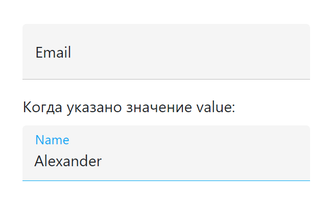
input с плавающим label
Разметка input с плавающим label:
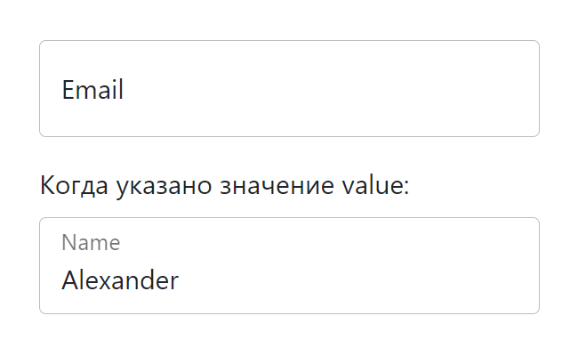
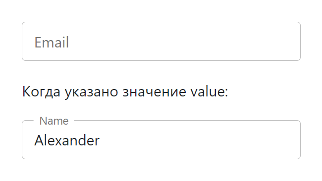
Ещё один вариант с «плавающей» меткой:
input со счётчиком символов
Пример в котором под input отображается количество набранных символов и максимальная длина:
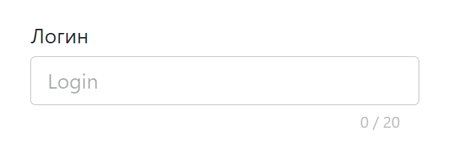
Это выполняется посредством следующего кода:
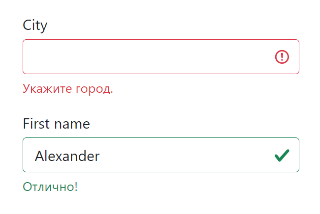
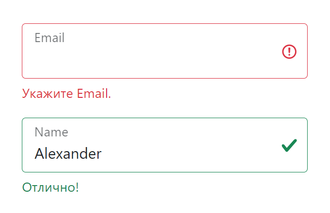
Стили для отображения состояния валидации input
Применить стили в зависимости от состояния поля в CSS можно с помощью специальных псевдоклассов. Например, :valid позволяет выбрать валидные элементы, а :invalid — не валидные.
Но, если вы хотите контролировать этот процесс и добавлять стили с помощью JavaScript, то тогда лучше это делать через классы. Например, использовать класс text-field__input_valid при успешной валидации, а text-field__input_invalid — при не успешной. Их следует добавлять к .
Отображать сообщения пользователю или подсказки можно через
Для с плавающим :
Пример валидации формы с помощью JavaScript
Валидацию элементов формы будем осуществлять с помощью функции checkValidity() . После этого, в зависимости от её результата, будем добавлять той или иной класс к , а также сообщение ( input.validationMessage ) в элемент .text-field__message .
Т.к. мы будем сами отображать сообщения, то необходимо отключить стандартные подсказки браузера. Для этого к тегу
Клиентская проверка формы после нажатия «Отправить»:
Источник
This tutorial will show you how to create and customize error messaging for various form elements. In this tutorial, we will customize everything from a basic error message to input field errors and tooltips. The best part? We will be using only CSS for customizations – that means no images or javascript required!
HTML
Below is the markup for the form elements we will be creating error messaging for. This is all of the HTML used throughout this tutorial. Copy and paste this code into your working file:
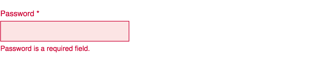
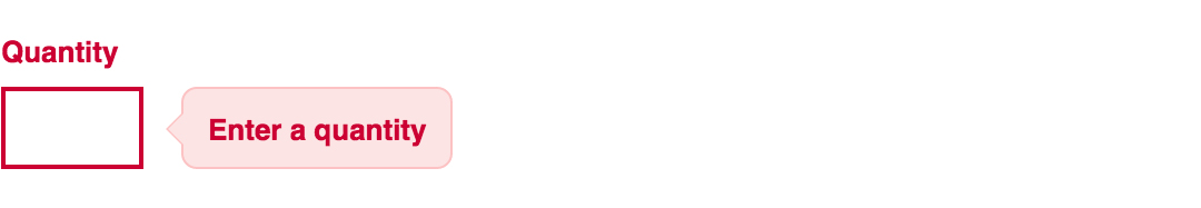
<!-- Basic Error Message -->
<div class="error-message">
  <span class="error-text">Checkout could not be completed. Please check your login information and try again.</span>
</div>

<!-- Input Field Error -->
<div class="input-group error">
  <label>Password *</label>
  <input type="text">
  <div class="error-message">Password is a required field.</div>
</div>

<!-- Input Field Error with Tooltip -->
<div class="input-group error">
  <label>Quantity</label>
  <input type="text">
  <div class="error-tip">Enter a quantity</div>
</div>
CSS
Now onto my personal favorite: the CSS. We will keep the basic functionality of the form elements but completely customize their appearance. In the end, they will stand on their own as custom design elements that thoughtfully guide the user through the form process, making it as straightforward and painless as possible.
Basic Error Message
Let’s start with a basic error message. We are going to customize the HTML above to look like this:
This is what we start out with, by default, after adding the HTML:
Customizing a basic error message is really simple. All we have to do is give our text a colored background and a couple font styles using CSS. To style the error message background, add the following styles to your CSS stylesheet:
.error-message {
  background-color: #fce4e4;
  border: 1px solid #fcc2c3;
  float: left;
  padding: 20px 30px;
}
Now let’s style the text itself by adding the following font styles:
.error-text {
  color: #cc0033;
  font-family: Helvetica, Arial, sans-serif;
  font-size: 13px;
  font-weight: bold;
  line-height: 20px;
  text-shadow: 1px 1px rgba(250,250,250,.3);
}
That’s it! Keep reading to learn how to style input field and tooltip errors.
Input Field Error
Now that we have our basic error message styled, let’s work on input field errors. This is what the final product will look like:
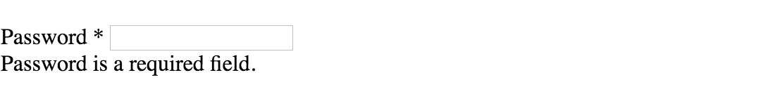
And this is what we start out with by default:
First, we want to override the browser’s default styles. Add the following CSS to give your input field a custom look:
/* Basic Input Styling */
.input-group {
  color: #333;
  float: left;
  font-family: Helvetica, Arial, sans-serif;
  font-size: 13px;
  line-height: 20px;
  margin: 0 20px 10px;
  width: 200px;
}

label {
  display: block;
  margin-bottom: 2px;
}

input[type=text] {
  background: #fff;
  border: 1px solid #999;
  float: left;
  font-size: 13px;
  height: 33px;
  margin: 0;
  padding: 0 0 0 15px;
  width: 100%;
}
Next, we need to add the styling for the error message that displays when a user does not correctly fill out an input field (i.e. the “This is a required field” message):
.error-message {
  color: #cc0033;
  display: inline-block;
  font-size: 12px;
  line-height: 15px;
  margin: 5px 0 0;
}
Lastly, add the error-specific styling for the input field elements:
.error label {
  color: #cc0033;
}

.error input[type=text] {
  background-color: #fce4e4;
  border: 1px solid #cc0033;
  outline: none;
}
Input Field Error with Tooltip
The last element we’re tackling is the tooltip. It is slightly more complicated than the others but well worth the effort. We will also be utilizing Sass nesting to better organize our code, and because we are only using SCSS it is 100% editable and scalable.
Once we are done, the tooltip will look like this:
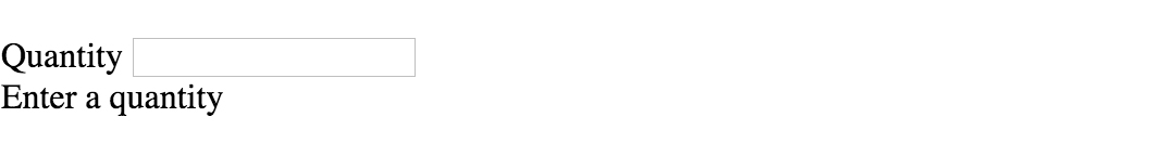
And by default, this is what we start with after adding the HTML:
First, we override the browser’s default styles with our own custom styling:
/* Basic Input Styling */
.input-group {
  color: #333;
  float: left;
  font-family: Helvetica, Arial, sans-serif;
  font-size: 13px;
  line-height: 20px;
  margin-bottom: 10px;
  width: 100%;
}

label {
  display: block;
  margin-bottom: 5px;
}

input[type=text] {
  background: #fff;
  border: 1px solid #ccc;
  color: #333;
  float: left;
  font-family: Helvetica, Arial, sans-serif;
  font-size: 13px;
  height: 33px;
  line-height: 20px;
  margin: 0;
  padding: 0 0 0 15px;
  width: 45px;
}
Just like our previous example, we need to add the tooltip error message styling that displays when a form error occurs. Note: we are using Sass here to nest the tooltip’s left arrow properties. This comes in handy when trying to keep track of which values are assigned to the tooltip specifically:
/* Tooltip Styling */
.error-tip {
  background-color: #fce4e4;
  border: 1px solid #fcc2c3;
  border-radius: 7px;
  -moz-border-radius: 7px;
  -webkit-border-radius: 7px;
  display: inline;
  color: #cc0033;
  float: left;
  font-weight: bold;
  line-height: 24px;
  position: relative;
  padding: 7px 11px 4px;
  margin-left: 17px;
  // Left Arrow Styling Starts Here
  &:after, &:before {
    content: '';
    border: 7px solid transparent;
    position: absolute;
    top: 11px;
  }
  &:after {
    border-right: 7px solid #fce4e4;
    left: -14px;
  }
  &:before {
    border-right: 7px solid #fcc2c3;
    left: -15px;
  }
} // end .error-tip
Now all that’s left to do is define the input’s error-specific styling. Again, we will nest these styles under an “error” class selector to make classification and future changes easier:
/* Error Styling */
.error.input-group {
  label {
    color: #cc0033;
    font-weight: bold;
  }
  input {
    border: 2px solid #cc0033;
    line-height: 37px;
    outline: none;
  }
  .status {
    display: none;
  }
  .error-tip {
    display: inline;
  }
} // end .error
And that’s it! All the code you need to customize error messaging for default form elements. To experiment with the final results and copy and paste to your heart’s content (without fear of breaking anything), jump on over to Codepen by selecting any of the tutorial links below.
Codepen/Tutorial Links
All: codepen.io/seskew/
Basic Error Message: codepen.io/seskew/pen/akhLx
Input Field Error: codepen.io/seskew/pen/XKJKNQ
Input Field Error with Tooltip: codepen.io/seskew/pen/NrPNBp
 В данной статье я бы хотел поделиться методом быстрой валидации полей с помощью разметки и стилей. Данный метод не является кроссбраузерным и рекомендуется к использованию только как дополнительная фича. По ходу статьи мы будем уменьшать наши шансы на кроссбраузерность, но повышать функциональность.
Давайте попробуем собрать стандартную форму, которая будет включать в себя: Имя, E-Mail, Телефон, Ссылку на сайт и допустим Ваш рост, чтобы поэксперементировать с числовым полем.
<form action="#" class="form">
	<input type="text" name="name" placeholder="Имя" />
	<input type="text" name="email" placeholder="E-Mail" />
	<input type="text" name="phone" placeholder="Телефон" />
	<input type="text" name="url" placeholder="Ваш сайт" />
	<input type="text" name="growth" placeholder="Ваш рост" />
	<button type="submit">Отправить</button>
</form>
HTML5
Сейчас уже никого не удивить атрибутами валидации input полей, которое принес нам стандарт HTML5. Однако, обходить стороной мы его не станем — этот метод валидации является наиболее поддерживаемым в современных браузерах.
Самый простой путь валидации — это определить тип input поля и расставить атрибуты required которые отвечают за обязательность заполнения.
<form action="#" class="form">
	<input type="text" name="name" placeholder="Имя" required />
	<input type="email" name="email" placeholder="E-Mail" />
	<input type="tel" name="phone" placeholder="Телефон" />
	<input type="url" name="url" placeholder="Ваш сайт" />
	<input type="number" name="growth" placeholder="Ваш рост" />
	<button type="submit">Отправить</button>
</form>
Применение этих двух атрибутов позволит гораздо эффективнее валидировать вводимую информацию нативными методами. Ну и конечно же поддержка этих свойств браузерами наиболее широка.
Отдельно хотелось бы сказать про тип поля tel. Ожидается что браузер будет валидировать телефонные номера, но нет, поле с типом tel используется сейчас только для автозаполнения. Дело в том, что валидация телефонных номеров очень неоднозначная задача из-за слишком большого количества различных форматов телефонных номеров в разных странах, которые просто никак не получится унифицировать и записать в одно правило.
Однако, нам на помощь приходит атрибут pattern. Этот атрибут принимает в себя значение регулярного выражения. В нашем случае рассмотрим вариант паттерна для ввода мобильного телефона в РФ: +7 (123) 456-78-91. Для этого добавим простое регулярное выражение в наше поле с телефоном, а также ограничим минимальное и максимальное количество символов:
<input type="tel" name="phone" placeholder="Телефон" pattern="[+]d{1}s[(]d{3}[)]sd{3}[-]d{2}[-]d{2}" minlength="18" maxlength="18" />
Обычно я использую данный паттерн в связке с маской для ввода номера, но тут к сожалению без JS пока что не обойтись. Если вы не используете маску, то я бы не стал использовать паттерны на вводе телефона, поскольку это в большинстве случаев вызовет больше неудобств для пользователя.
Поддержка браузерами атрибута pattern на данный момент очень хорошая. iOS начиная с версии 10.3 полностью поддерживает данное свойство, до этого наблюдалось отсутствие подсказок о неправильном вводе данных.
Стоит также учитывать, что атрибут minlength до сих пор не поддерживается в браузерах IE, EDGE и только с версии 10.3 появился в iOS. Однако maxlength поддерживается везде и очень давно. Нам в целом хватит и этого.
Давайте также поставим ограничение для поля с ростом. Допустим мы предполагаем, что пользователь нашего сайта определенно не может быть ниже 100 см и выше 250 см. Так и напишем:
<input type="number" name="growth" placeholder="Ваш рост" min="100" max="250" />
С поддержкой этих атрибутов в браузерах, все хорошо.
Перейдем к стилизации!
CSS3
Для того чтобы кастомно стилизовать нашу валидацию, воспользуемся псевдоклассами :invalid и :valid. Поддержка этих псевдоклассов в браузерах позволяет использовать их максимально широко на данный момент.
input:invalid {border-color: red;}
input:valid {border-color: green;}
Казалось бы, берем полученные знания и применяем! Но не все так просто как кажется, давайте проверим как это работает. В результате мы получим, что все наши поля изначально пустые и обязательные будут считаться не валидными, а все остальные валидными. Совсем не красиво и непонятно для пользователя, что от него хотят.
Мы можем пойти на небольшую хитрость и использовать псевдокласс :placeholder-shown. С помощью этого псевдокласса мы можем определить отображается ли сейчас значение placeholder в нашем поле ввода. Атрибут placeholder отображается только тогда, когда в наше поле ничего не введено. Соответственно, чтобы применить этот псевдокласс нам просто нужно обратить его свойство с помощью :not. В итоге получаем вот такую конструкцию:
input:invalid:not(:placeholder-shown) {border-color: red;}
input:valid:not(:placeholder-shown) {border-color: green;}
Если прочитать дословно: окрасить красным цветом границу инпута, когда наше поле не валидно и когда в нем не отображается значение атрибута placeholder. Если ваше поле не имеет атрибута placeholder, можно просто поставить внутри пробел:
<input type="text" placeholder=" " />У данного метода есть только один минус: поддержка. Псевдоэлемент :placeholder-shown поддерживается во всех браузерах кроме IE и EDGE. К счастью :not не обладает таким недостатком.
Для примера я набросал все вышесказанное в CodePen и добавил еще немного возможностей:
Итог
Таким образом, не прибегая к JS мы с помощью двух строк в CSS смогли стилизовать и валидировать форму. На текущий момент такая конструкция будет хорошо работать в большинстве браузеров, к сожалению, как всегда, веб-разработку подводят детища Microsoft.
I’m building a form and I want to use the :invalid selector to give the «required» input fields a red border if the user presses submit without filling them, but using this makes them appear highlighted right when the page loads. It seems unfriendly to give this kind of warning to the user before even giving him the chance to fill them at least once.
Is there a way that these fields appear highlighted only after trying to submit the form, said in another way, is there a way to run the validation only after clicking submit (or at least losing focus on the required input fields?)
![]()
asked Sep 27, 2011 at 22:01
![]()
1
I used this approach for a project of mine, so the invalid fields would be highlighted only after submit:
HTML:
<form>
  <input type="email" required placeholder="Email Address">
  <input type="password" required placeholder="Password">
  <input type="submit" value="Sign in">
</form>
CSS:
input.required:invalid {
    color: red;
}
JS (jQuery):
$('[type="submit"]').on('click', function () {
    // this adds 'required' class to all the required inputs under the same <form> as the submit button
    $(this)
        .closest('form')
        .find('[required]')
        .addClass('required');
});
![]()
Tunaki
130k46 gold badges326 silver badges414 bronze badges
answered Jan 25, 2016 at 12:00
![]()
0
Very simple just use #ID:invalid:focus
This only does the validation when focused on and not on page load
answered Nov 26, 2016 at 2:06
![]()
3
In addition to @Alexander Farkas’ post, Dave Rupert has a very workable solution here: Happier HTML5 Form Validation.
Essentially, what it does is add a CSS class to form input elements that only displays after a user attempts to submit the form. This is much better UX, in that these elements won’t show the invalid styling by default, or when a user tabs through them, which enhances accessibility.
Prior to finding this, I tried styling elements with :invalid:focus and other pseudo-elements, but didn’t get the desired effect. Although I try to do my styling with pure CSS as much as possible, this looks like a use case where efficient JS is the practical solution.
answered Jan 21, 2020 at 13:29
![]()
karoluskarolus
9027 silver badges13 bronze badges
No there is nothing out of the box.
Mozilla has its own pseudoclass for something very similiar called ‘:-moz-ui-invalid’. If you want to achieve something like this, you have to use the constraint validation DOM-API:
if(document.addEventListener){
    document.addEventListener('invalid', function(e){
        e.target.className += ' invalid';
    }, true);
}
You can also use webshims lib polyfill, which will not only polyfill incapable browsers, but also adds something similiar like -moz-ui-invalid to all browser (.form-ui-invalid).
answered Sep 27, 2011 at 23:08
![]()
alexander farkasalexander farkas
13.5k4 gold badges39 silver badges41 bronze badges
3
Another way is to add a hide-hints class to the inputs with JavaScript on load. When a user modifies a field you remove the class.
In your CSS you then apply styling to input:not(.hide-hints):invalid. This means the error styling will be shown for users without JavaScript as well.
answered Dec 11, 2011 at 11:22
![]()
Jacob RaskJacob Rask
21.6k8 gold badges37 silver badges35 bronze badges
1
Old question, but for people that might might find it useful: I made a little script that adds a class to a form when it’s attempted to be submitted, so that you can style forms that have and haven’t been attempted to be submitted differently:
window.addEventListener('load', function() {

    /**
     * Adds a class `_submit-attempted` to a form when it's attempted to be
     * submitted.
     *
     * This allows us to style invalid form fields differently for forms that
     * have and haven't been attemted to submit.
     */
    function addFormSubmitAttemptedTriggers() {

        var formEls = document.querySelectorAll('form');

        for (var i = 0; i < formEls.length; i++) {

            function addSubmitAttemptedTrigger(formEl) {

                var submitButtonEl = formEl.querySelector('input[type=submit]');

                if (submitButtonEl) {
                    submitButtonEl.addEventListener('click', function() {
                        formEl.classList.add('_submit-attempted');
                    });
                }

            }

            addSubmitAttemptedTrigger(formEls[i]);

        }

    }

    addFormSubmitAttemptedTriggers();

});
Now forms that are attempted to be submitted will get a class _submit-attempted, so you can only give these fields a red box shadow:
input {
    box-shadow: none;
}

form._submit-attempted input {
    box-shadow: 0 0 5px #F00;
}
answered Nov 13, 2015 at 11:24
![]()
gitaarikgitaarik
40.2k11 gold badges96 silver badges103 bronze badges
I tried this in my website:
<style id="validation"></style>
<script>
function verify() {
    document.getElementById("validation").innerHTML = "input:invalid { border: 1px solid red!important;}input:valid { border: 1px solid green;}";
    }
</script>
Then add onclick="verify()" to your submit button, just like this:
<input type="submit" onclick="verify()">
answered Sep 16, 2020 at 17:27
![]()
form.invalid {
  *:invalid {
    box-shadow: 0px 0px 2px 1px red;
  }
}
let form = document.querySelectorAll('form')[0]
form.addEventListener('submit', function() {
  if (!form.checkValidity()) {
    form.classList.add('invalid')
  }
})
With the above styles and javascript the form controls will only display the :invalid styles after the submit event and the checkValidity check failing. An invalid check will add the invalid class to the form and activate the styles, otherwise the form will submit as usual.
answered Mar 11, 2022 at 20:58
![]()
akaspickakaspick
1,45117 silver badges17 bronze badges
1
Here’s another solution that only styles the inputs after a submit attempt.
HTML
<form id="sign-up-form" method="post" enctype="multipart/form-data" class="login-form sign-in-form">
    <input type="text" placeholder="Name" id="full-name" name="full-name" required>
    ...
</form>
<script>
    (() => {
        const form = document.getElementById('sign-up-form');
        form.noValidate = true;

        form.onsubmit = function(e) {
            e.preventDefault();
            this.reportValidity();

            if (this.checkValidity()) return this.submit();

            this.classList.add('submit-attempt')
        }
    })()
</script>
CSS
.submit-attempt input:invalid, .submit-attempt select:invalid {
    border: 1px solid red;
}
answered Mar 11, 2022 at 22:47
![]()
mpenmpen
266k263 gold badges831 silver badges1210 bronze badges
for ‘required’ validation
way 1 — set ‘required’ attribute for each element on form submit
// submit button event
$('#form-submit-btn').click(function(event) {
    // set required attribute for each element
    $('#elm1, #elm2').attr('required','true');

    // since required attribute were not set (before this event), prevent form submission
    if(!$('#form')[0].checkValidity())
        return;

    // submit form if form is valid
    $('#form').submit();

});
way 2 — use ‘data’ attribute
<input type="text" data-required="1">

<script type="text/javascript">
// submit button event
$('#form-submit-btn').click(function(event) {
    // set required attribute based on data attribute
    $(':input[data-required]').attr('required','true');

    // since required attribute were not set (before this event), prevent form submission
    if(!$('#form')[0].checkValidity())
        return;

    // submit form if form is valid
    $('#form').submit();

});
</script>
answered Jun 18, 2015 at 5:42
![]()
abdulwadoodabdulwadood
5866 silver badges14 bronze badges
the problem with waiting for an onSubmit or «submit» event listener is that the form itself is never technically being submitted when the data from the inputs is false. What I did (in react but same principle) is to set a click listener on the submit button and then set a class like «submitted».. then apply the classes accordingly
 .submitted input:invalid{
    outline: 2px solid red; /* oranges! yey */
}
answered Jan 3 at 12:50
![]()
Expanding on previous answers: Instead of adding a class to the form to indicate whether to show the :invalid styles, you can use a hidden input. The advantage is that when the form is cleared (either by a type=reset button or through javascript), the :invalid styles automatically disappear. You could add another event handler to remove a class on reset, of course; just my preference.
Note that to do it this way you have to use an invisible checkbox rather than a hidden element and specifically change the checked property. Changing an input’s value or attribute through javascript changes the default value so far as .reset() is concerned. If you don’t put a name on the dummy element, it won’t be posted with the form, but you can still access it through javascript via id or class.
#attemptedSubmit[value=Yes] ~ :invalid,
#attemptedSubmit[value=Yes] ~ * :invalid {
  border: 1px solid red;
}
<form>
<input type="checkbox" style="display:none;" id="attemptedSubmit">
... rest of the form
<input type="text" name="text" required>
... rest of the form
<input type="submit" value="Submit" onclick="$('#attemptedSubmit').prop('checked', true)">
<input type="reset" value="Clear">
</form>answered Jan 4 at 9:24
![]()
Jay IrvineJay Irvine
2143 silver badges12 bronze badges
It is 2020 all modern browser support native form validation, and they also support styling valid and invalid form elements via CSS. In this article you will learn how to use the :valid and :invalid pseudo classes, when to use them and why it depends.
What are the :valid and :invalid pseudo classes #
By default, every form element is valid and therefore also the :valid pseudo-class will be executed. We can change that however by defining attributes. The following attributes are available today (2020) to get build-in validation: required, minlength, maxlength, min, max, type and pattern.
Here are two examples where :invalid would be applied:
<label for="text">Text</label>
<input type="text" required id="text" name="text"><label for="email">Email</label>
<input type="email" value="a" id="email" name="email">
The first one because it is required and is empty, the second one because it has type="email" and the current value »a« is not an email address.
So, this way you can style form elements differently, based on if they are valid or not.
One thing to note here about minlength — in this case validation only happens after user input, so if you have the following in your HTML,
<label for="whatever">Whatever</label>
<input type="text" minlength="12" value="123" id="whatever" name="whatever">
the :valid selector will be applied. However, once the user enters the same value »123« or any other value with a minimum length below twelve the :invalid selector will be applied.
Blame the user #
The big issue with setting :invalid on page load is that we blame the user by saying »Look, there is an error — correct that«, although the user had no chance to not make the »error« as they haven’t even done anything.
The same is true for :valid, we tell the user »Look, this is already valid« and the user may rightly ask »Why is this form element even there if it doesn’t require any input from my side«
Let’s have a look at some ways to change the default behaviour and try to not confuse users.
Restrict with CSS #
To not show the valid/invalid states without user interaction we can use CSS. In general there are two ways of doing this.
:focus #
The first approach is to only trigger :valid/:invalid when a form element has focus.
input:focus:invalid {
  border: 2px solid red;
}
This way the user first have to interact with the page to get a different styling. This comes with other issues though, as once the user moves to another form element the previous one will lose the validation styling.
:placeholder-shown #
The other approach is to use the :placeholder-shown pseudo class.
input:not(:placeholder-shown):invalid {
  border: 2px solid red;
}
This way, elements only get marked as invalid when the placeholder is not shown. We can enhance this further by only using :invalid when the form element is not focused.
input:not(:placeholder-shown):not(:focus):invalid {
  border: 2px solid red;
}
When you hear placeholder, you may think »placeholders are bad for accessibility and shouldn’t be used« and this is true to some point, as you should never replace a real label element with a placeholder text and should avoid placeholder text in most cases, but we don’t need any text for placeholder to get this working, all we need is
placeholder=" "That said, in some cases this may still be confusing for users, but it is probably the best approach we have.
Restrict with JavaScript #
Okay, so we can now switch to JavaScript to correct that to our needs and make it perfect for everybody. I long thought about the best way to do this and I always ended up with the conclusion that it is not worth it as every solution I can think of would still not be perfect and might do more harm than good in the end. That said, there might be a way to do this, and if you found such a solution please let me know.
:user-invalid #
To help with all the issues described here, there is a new proposed pseudo-class called :user-invalid. It is still in early stage, but it looks promising to solve the issues many have with :invalid. For example, a user agent (browser) may choose to have :user-invalid match an :invalid element once the user has typed some text into it and changed the focus to another element, and to stop matching only after the user has successfully corrected the input.
It is currently not supported in any browser, but Firefox has support for the non-standard pseudo-class :-moz-ui-invalid.
Not use colours alone #
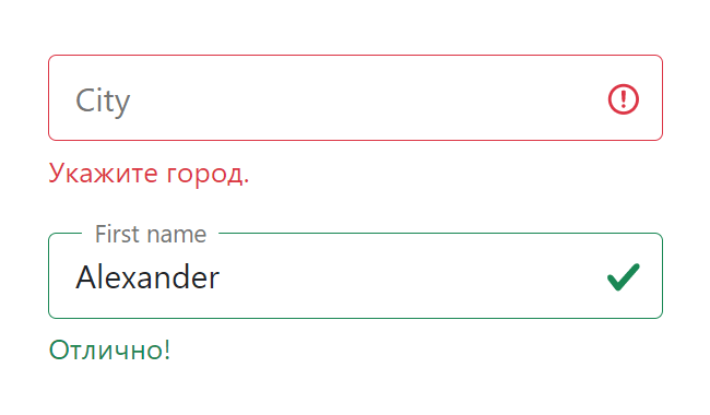
One thing you should always keep in mind is, that you should not indicate valid/invalid states with colour alone. Red–green colour blindness affects a lot of people for example, and for them there is no/little difference between a green and a red border.
As form elements are replaced elements, we can’t use pseudo elements (::before/::after) directly on them as of now, so as a workaround we can use an empty span next to form elements to show an icon for example.
<input type="text" required>
<span></span>
input:valid + span::after {
content: "";
background: transparent url(valid.svg) no-repeat 0 0;
}input:invalid + span::after {
content: "";
background: transparent url(invalid.svg) no-repeat 0 0;
}
Browser support #
Support for :valid and :invalid is very good, and even works all the way back to Internet Explorer 10. However, if you want to use :valid or :invalid on the form element, note that it is not supported in Internet Explorer.
In general, you can safely use these pseudo-classes to enhance your forms without needing to add a polyfill for unsupported browsers.
Conclusion #
It depends, and it is complicated. As outlined in this article you should always carefully test your chosen approach with real users. It might be even better to not use :valid/:invalid as it might to more harm than good.
Resources #
MDN :valid
MDN :invalid
MDN: :placeholder-shown
MDN: Client-side form validation
Browser support for CSS selector :valid
Browser support for CSS selector :invalid
How to target non-empty but invalid input elements with CSS
Updates #
- 10.11.2020 — Added info about :user-invalid