To validate a form data and add custom error message on client side before send to the form data on server; In this tutorial, we are going to show how to validate form data with adding error custom message on client side using the jQuery form validator plugin.
The jQuery provide several plugins for validating a diffrent diffrent types of form data on client side and also add error message using the plugin. In this form validation tutorial, we will discuss advance form validation using jQuery validator() method and add custom error message using the jquery plugin.
Contents
- Create one html form
- Keep jQuery cdn in form
- Write validation rules
- output
Create one html form
In this step, we need to create one html file. And inside this file we will create some fields like firstname, lastname, email, phone number, password.
<!DOCTYPE html>
<html>
<head>
<title>jQuery Form Validation Using validator()</title>
<script src="https://code.jquery.com/jquery-3.1.1.min.js"></script>
<script src="https://cdnjs.cloudflare.com/ajax/libs/jquery-validate/1.19.0/jquery.validate.js"></script>
<style>
  .error{
    color: red;
  }
  label,
  input,
  button {
    border: 0;
    margin-bottom: 3px;
    display: block;
    width: 100%;
  }
 .common_box_body {
    padding: 15px;
    border: 12px solid #28BAA2;
    border-color: #28BAA2;
    border-radius: 15px;
    margin-top: 10px;
    background: #d4edda;
}
</style>
</head>
<body>
<div class="common_box_body test">
  <h2>Registration</h2>
  <form action="#" name="registration" id="registration">

    <label for="firstname">First Name</label>
    <input type="text" name="firstname" id="firstname" placeholder="John"><br>

    <label for="lastname">Last Name</label>
    <input type="text" name="lastname" id="lastname" placeholder="Doe"><br>

    <label for="phone">Phone</label>
    <input type="text" name="phone" id="phone" placeholder="8889988899"><br>

    <label for="email">Email</label>
    <input type="email" name="email" id="email" placeholder="[email protected]"><br>

    <label for="password">Password</label>
    <input type="password" name="password" id="password" placeholder=""><br>

    <input name="submit" type="submit" id="submit" class="submit" value="Submit">
  </form>
</div>

</body>
</html>
Keep jQuery cdn in form
Now we need to put the jQuery library cdn plugin in form. In otherwords, To use jQuery Validation Plugin we need to include cdn library of jQuery validation plugin.
<script src="https://code.jquery.com/jquery-3.1.1.min.js"></script>
<script src="https://cdnjs.cloudflare.com/ajax/libs/jquery-validate/1.19.0/jquery.validate.js"></script>
Write validation rules
Next, we need to write some validation rules with custom error message in script tag. Below we have written this advance rules for validating a form data before send to the server. The validate() method is used to validate a form based on the selector provided.
<script>
$(document).ready(function(){
  $("#registration").validate({
    // Specify validation rules
    rules: {
      firstname: "required",
      lastname: "required",
      email: {
        required: true,
        email: true
      },
      phone: {
        required: true,
        digits: true,
        minlength: 10,
        maxlength: 10,
      },
      password: {
        required: true,
        minlength: 5,
      }
    },
    messages: {
      firstname: {
      required: "Please enter first name",
     },
     lastname: {
      required: "Please enter last name",
     },
     phone: {
      required: "Please enter phone number",
      digits: "Please enter valid phone number",
      minlength: "Phone number field accept only 10 digits",
      maxlength: "Phone number field accept only 10 digits",
     },
     email: {
      required: "Please enter email address",
      email: "Please enter a valid email address.",
     },
    },

  });
});
</script>
output
jQuery Form Validation Using validator()
Registration
To Remember
required – Makes the element required.
remote – Requests a resource to check the element for validity.
minlength – Element requires a minimum length.
maxlength – Element requires a maximum length.
min – Element is required to be given the minimum.
max – Element is required to be given the maximum.
stespan – Elements require a given stespan.
email – Element requires a valid email
url – Element require a valid url
date – Element require a date.
number – Element require a decimal number.
digits – Element require digits only.
You may like
- Registrtion form validation using jquery validator
- jQuery AJAX Form Submit PHP MySQL
- Simple Registration Form in PHP with Validation
- jQuery Ajax Form Submit with FormData Example
- Laravel 6 Ajax Form Submit With Validation Tutorial
- Google ReCaptcha Form Validation in Laravel
- Laravel 6 | jQuery Form Validation Tutorial with Demo Example
- Form Validation Example In Laravel 6
- Codeigniter php jQuery Ajax Form Submit with Validation

My name is Devendra Dode. I am a full-stack developer, entrepreneur, and owner of Tutsmake.com. I like writing tutorials and tips that can help other developers. I share tutorials of PHP, Python, Javascript, JQuery, Laravel, Livewire, Codeigniter, Node JS, Express JS, Vue JS, Angular JS, React Js, MySQL, MongoDB, REST APIs, Windows, Xampp, Linux, Ubuntu, Amazon AWS, Composer, SEO, WordPress, SSL and Bootstrap from a starting stage. As well as demo example.
View all posts by Admin
link Goals
The ultimate goal of this plugin is to make working with forms more fun for everyone. By improving the interaction, it is easier and less annoying for the user to fill out the form and submit it.
To achieve this, it is important that the plugin is actually deployed on websites around the world, so a lot of focus is spent on making it easy for developers – that’s you – to use the plugin.
The plugin can never replace server-side validation and doesn’t intend to do so. Having both in place gives you the necessary security for your application, as well as improved usability.
link Markup recommendations
Mandated: A ‘name’ attribute is required for all input elements needing validation, and the plugin will not work without this. A ‘name’ attribute must also be unique to the form, as this is how the plugin keeps track of all input elements. However, each group of radio or checkbox elements will share the same ‘name’ since the value of this grouping represents a single piece of the form data.
Optionally: Each input can have a label associated with it, where the ‘for’ attribute of the label refers to the ‘id’ attribute of the input. It’s also a common practice to have ‘id’ and ‘name’ attributes with the same value, although keep in mind that since this plugin does not use the ‘id’ attribute, this is not mandatory.
|
1 2 |
|
link Methods
A validation method implements the logic to validate any element. Provided are a set of default validation methods, such as required. Apart from required itself and equalTo, all validation methods declare an element valid when it has no value at all. That way an email field is optional unless required is specified. You can specify an element input to contain a valid email address, or nothing at all. Use jQuery.validator.addMethod to implement custom methods.
link Rules
A validation rule applies one or more validation methods to an input element. You can specify validation rules via metadata or via plugin settings (option rules). The decision is often influenced by serverside infrastructure. If a web framework is used, it is often easier to use metadata, which is also good for fast prototyping. Plugin settings produce cleaner markup, though valid markup results from both.
link Fields with complex names (brackets, dots)
If your form consists of fields using names that aren’t legal JavaScript identifiers, you have to quote those names when using the rules option:
|
1 2 3 4 5 6 7 8 9 10 |
|
link Refactoring rules
Whenever you have multiple fields with the same rules and messages, refactoring those can reduce a lot of duplication. Using addMethod() and addClassRules() are most effective for that.
Let’s consider an example where you have ten customer fields, each required and with a minlength of 2. You need custom messages for both rules. To avoid having to specify those rules and messages again and again, we can alias existing methods with different messages and group them into a single class:
|
1 2 3 4 5 6 7 8 9 |
|
With that in place, we can add a class customer to all customer fields and be done with it:
|
1 2 3 |
|
You can also reuse existing methods inside other custom methods, to reuse certain implementations. For example, if you’re writing a custom method for validating email addresses inside a single field, you could call the existing email method for each email:
|
1 |
|
link Error messages
An error message displays a hint for the user about invalid elements, and what is wrong. There are four ways to provide error messages. Via the title attribute of the input element to validate, via data attributes, via error labels and via plugin settings (option messages).
All validation rules included here provide a default error message which you can use for prototyping, because it is used when no specific message is provided.
The priorities are as follows: A custom message (passed by plugin options), the element’s title, the default message.
When using data attributes, you can set a generic message for all rules, or specific messages per rule:
|
1 2 |
|
link Error message display
Error messages are handled via label elements with an additional class (option errorClass). The link between the message and the invalid element is provided via the labels for attribute. When provided in the markup, they are shown and hidden accordingly, and otherwise created on demand. By default, labels are created after the invalid element, this is also customizable (option errorPlacement). It is also possible to put them into an error container (option errorLabelContainer). To use a different element then a label, specify the errorElement option.
link General messages
In addition to field-specific messages you can display a general «your form is invalid, please fix the highlighted fields!» message in a container anywhere on your page, eg. above the form (option errorContainer). The container is shown and hidden when errors occur and are fixed accordingly. The container for error labels (option errorLabelContainer) can also be nested inside the error container.
link Focusing of invalid elements
By default, the first invalid element in a form is focused after submitting a form with invalid elements. To prevent confusion on the behalf of the user, the plugin remembers the element that had focus when the form was submitted, and refocuses that element. That way the user can try to fill out elements of the form at the end, without being forced to focus them again and again. This can be disabled (option focusInvalid).
link Form submit
By default, the form submission is prevented when the form is invalid, and submitted as normal when it is valid. You can also handle the submission manually (option submitHandler).
link Skipping validation on submit
To skip validation while still using a submit-button, add the attribute «formnovalidate» to that input:
|
1 2 |
|
This used to work by adding class="cancel" to the input, this is now deprecated.
Demo for the cancel button
link Validation event
By default, forms are validated on submit, triggered by the user clicking the submit button or pressing enter when a form input is focused (option onsubmit). In addition, once a field was highlighted as being invalid, it is validated whenever the user types something in the field (option onkeyup). When the user enters something invalid into a valid field, it is also validated when the field loses focus (option onfocusout).
The goal of these interactions is to provide feedback as early as possible, whilst avoiding user annoyance. Displaying error messages before the user had the chance to even type something is not helpful.
link Developing and debugging a form
While developing and debugging the form, you should set the debug option to true. That prevents form submission on both valid and invalid forms and outputs some helpful messages to window.console (available via Firebug or Firebug Lite) that help debugging. When you have everything set up and don’t get any error messages displayed, check if your rules all accept empty elements as valid (like email or url methods).
Some issues are caused by certain form element’s names. A name you should avoid is «submit» (for submit buttons and anything else). Browsers expose form elements as properties of the form element, by their name, in this case hiding native methods like submit(). Just don’t use name=»submit» and you’re good.
link Validating multiple forms on one page
The plugin can handle only one form per call. In case you have multiple forms on a single page which you want to validate, you have to initialise them all individually:
|
1 2 3 |
|
You can avoid having to duplicate the plugin settings by modifying the defaults, using jQuery.validator.setDefaults to override multiple settings at once.
Из этой статьи вы узнаете, как реализовать простую валидацию формы с помощью jQuery-плагина.
Использование jQuery-плагина для проверки данных в форме удобно по нескольким причинам. Этот способ предоставляет дополнительные опции – например, возможность выводить сообщения об ошибках и добавлять обработку различных условий проверки. Применение готового плагина также позволяет добавлять валидацию в формы без внесения видимых изменений в макет страницы. Условия проверки можно с легкостью изменять, добавлять и удалять на любом этапе разработки.
- Приступаем к работе
- Валидация первой формы
- Опции validate() метода
- Добавление правил валидации для полей ввода
- Создание собственных сообщений об ошибках
- Кастомизация сообщений об ошибках
- Дополнительные опции настройки плагина
- Формы jQuery, доступные на CodeCanyon
- Конструктор пошаговых jQuery форм Timon Step Form
- Smart Forms
- Just Forms Advanced
- Forms Plus JS
- Sky Forms
- Заключение
В этом руководстве мы будем использовать плагин для валидации форм под названием jQuery Validation Plugin. Данный плагин имеет обширный набор функций, а также позволяет добавлять пользовательские условия проверки данных.
Перед использованием расширения на странице нам нужно будет добавить к нашему проекту необходимые файлы. Таких файлов два – первый включает в себя основную функциональность плагина для проверки базовых пользовательских данных. Второй файл содержит дополнительные методы валидации для проверки номеров банковских карт, телефонов и так далее.
Добавить файлы в проект можно с помощью менеджера пакетов – Bower или npm. Кроме того, можно получить прямую CDN-ссылку на эти файлы и вставить ее в тег script на странице. Поскольку это jQuery-плагин, вам также понадобится ссылка на соответствующую библиотеку:
<script src="https://cdnjs.cloudflare.com/ajax/libs/jquery/3.4.0/jquery.min.js"></script>
<script src="https://cdnjs.cloudflare.com/ajax/libs/jquery-validate/1.19.0/jquery.validate.min.js"></script>
После того, как ссылки добавлены в код страницы, можно приступать к валидации любой формы с помощью метода validate.
Рассматриваемый нами плагин можно использовать без внесения каких-либо заметных изменений в разметку страницы. Единственная поправка, которую вам потребуется сделать – это добавить id или class к форме, к которой нужно подключить валидацию.
Ниже приведена разметка базовой формы, ввод данных в которой мы будем проверять с помощью jQuery-плагина.
<form id="basic-form" action="" method="post">
<p>
<label for="name">Name <span>(required, at least 3 characters)</span></label>
<input id="name" name="name" minlength="3" type="text" required>
</p>
<p>
<label for="email">E-Mail <span>(required)</span></label>
<input id="email" type="email" name="email" required>
</p>
<p>
<input class="submit" type="submit" value="SUBMIT">
</p>
</form>
Для проверки введенной информации не потребуется написание дополнительного кода на JavaScript. При этом плагин обеспечит вывод сообщений об ошибках под каждым текстовым полем. У нас также будет возможность оформить сообщения в любом желаемом стиле.
Для подключения валидации к этой форме надо всего лишь вставить приведенный ниже фрагмент, написанный на JavaScript, в код страницы:
$(document).ready(function() {
$("#basic-form").validate();
});
Подразумевается, что вы уже добавили к проекту необходимые файлы плагина. Вставка приведенного выше фрагмента кода обеспечит надлежащую проверку формы и вывод сообщений об ошибках. Вот рабочая демонстрация плагина:
Рассматриваемая нами библиотека обеспечивает максимально дружеское отношение к пользователю: сообщения об ошибках появляются только в том случае, когда это действительно необходимо. К примеру, если вы пройдетесь по полям для ввода имени и адреса электронной почты, не вводя никаких данных, сообщения об ошибке вы не получите. Однако если вы перейдете на поле для ввода email-адреса после введения всего одной буквы в поле имени, вы увидите сообщение о том, что имя должно состоять как минимум из трех символов.
Сообщения об ошибках передаются в DOM (объектную модель документа) с помощью элемента label. Поскольку этот элемент предусматривает класс error, к сообщениям можно легко применить собственные стили. То же самое справедливо в отношении invalid input, у которого тоже имеется класс error.
В предыдущем примере мы вызывали метод validate() без передачи ему каких-либо параметров. Однако у нас есть возможность передать этому методу объект, содержащий множество параметров. Значения этих параметров будут определять способы, с помощью которых плагин будет проводить валидацию данных, выводить ошибки и так далее.
Если вы хотите, чтобы плагин игнорировал какие-то элементы в ходе проверки, вы можете передать нужный класс или селектор в метод ignore(). С этого момента плагин будет игнорировать класс при проверке данных в форме.
Вы также можете передать определенные правила в метод validate() для установления правил, в соответствии с которыми должна проверяться введенная информация. Значением параметра rules должны быть пары «ключ-значение». Ключом в каждом случае является название проверяемого элемента, а значением – набор правил для проверки информации.
Также можно добавить проверку условий данных в различных полях – с использованием ключевого слова depends («зависит от») и возвращая, соответственно, результат true («истинно») или false («ложно»). Ниже приведен пример использования простого набора правил для определения корректности введенных данных:
$(document).ready(function() {
$("#basic-form").validate({
rules: {
name : {
required: true,
minlength: 3
},
age: {
required: true,
number: true,
min: 18
},
email: {
required: true,
email: true
},
weight: {
required: {
depends: function(elem) {
return $("#age").val() > 50
}
},
number: true,
min: 0
}
}
});
});
В приведенном выше фрагменте кода ключи name («имя»), age («возраст»), email и weight («вес») представляют собой названия элементов ввода input. Каждому ключу соответствует объект-значение, а пары ключей и значений определяют логику проверки информации, введенной в форму.
Такие опции валидации схожи с атрибутами, которые вы можете добавить в разметку формы. Например, установка параметра required на true сделает элемент обязательно необходимым для успешной отправки формы. Установление minlength на значение 3 обяжет пользователей вводить в поле как минимум три символа. Есть и другие встроенные методы валидации, с которыми можно ознакомиться на странице с технической документацией.
Важный момент, на который необходимо обратить внимание в приведенном выше коде – использование depends для того, чтобы сделать обязательным условием ввод веса, если возраст превышает 50 лет. Условие реализовано с помощью возвращения значения true функцией обратного вызова в том случае, если значение, введенное в поле age, превышает 50.
Рассматриваемый нами плагин позволяет создавать собственный набор сообщений об ошибках, соответствующих различным правилам проверки данных, введенных в форму. Создание сообщения об ошибке начинается с задания объекта-значения для ключа messages. Для каждого поля ввода определяется такая пара ключа и значения, и соответствующее сообщение об ошибке.
Ниже приведен пример кода, который обеспечивает вывод сообщений об ошибках при вводе неверных данных в любое из полей формы:
messages : {
name: {
minlength: "Name should be at least 3 characters"
},
age: {
required: "Please enter your age",
number: "Please enter your age as a numerical value",
min: "You must be at least 18 years old"
},
email: {
email: "The email should be in the format: abc@domain.tld"
},
weight: {
required: "People with age over 50 have to enter their weight",
number: "Please enter your weight as a numerical value"
}
}
Как и правила, messages опираются на названия полей ввода. Каждое из этих полей принимает объект, состоящий из ключа и значения. Ключом является правило валидации, а значением – сообщение об ошибке, которое выводится в случае нарушения правила.
Например, поле age с помощью свойства required вызовет сообщение об ошибке, если останется незаполненным. Кроме того, если введенная информация не является числовым значением, поле вызовет ошибку number.
Как вы сможете убедиться, плагин отображает сообщения об ошибках, используемые по умолчанию в том случае, если вы не предоставили ему свои собственные. Попробуйте ввести различные данные в приведенный ниже демонстрационный образец, и вы увидите как стандартные, так и кастомные уведомления об ошибках.
Иногда возникает необходимость добавления собственных классов к элементам ввода – для использования дополнительных правил или для лучшей интеграции с существующей темой оформления сайта.
Классы, связанные с корректными и неверными элементами ввода, можно менять с использованием ключей errorClass и validClass. Это поможет предотвратить нежелательные конфликты, которые могут возникать при повторном использовании одного и того же названия класса. По умолчанию класс ошибки errorприсваивается каждому недопустимому входному элементу и метке. Допустимый класс valid присваивается каждому корректному входному элементу.
При этом важно помнить, что присвоение errorClass уведомлениям fail-alert удаляет класс error из недопустимых элементов. Для присвоения нескольких классов одному и тому же элементу следует использовать errorClass: «error fail-alert». То же самое касается validClass.
Если пользователь вводит корректные данные, дополнительные метки к форме не добавляются. Таким образом, классы validClass остаются присвоенными корректным входным элементам.
Дополнительный JavaScript-код используется только для присвоения классов:
$(document).ready(function() {
$("#basic-form").validate({
errorClass: "error fail-alert",
validClass: "valid success-alert",
// ... More validation code from previous example
Далее приведен CSS -код, который мы будем использовать для оформления сообщений об ошибках:
label.error.fail-alert {
border: 2px solid red;
border-radius: 4px;
line-height: 1;
padding: 2px 0 6px 6px;
background: #ffe6eb;
}
input.valid.success-alert {
border: 2px solid #4CAF50;
color: green;
}
Помимо создания стиля для сообщений об ошибках, мы также добавим собственный стиль к допустимым входным элементам. Ниже приводится демонстрационный пример с готовым результатом.
Вы можете отключить валидацию при случайном переходе в поле с помощью клавиши или при клике мышью. Для этого надо установить параметры onfocusout, onkeyup, или onclick на false. Обратите внимание, что логическое true не является допустимым значением для этих событий. Другими словами, если вы хотите, чтобы плагин осуществлял валидацию при этих событиях – просто оставьте соответствующие ключи без изменений.
У вас также есть возможность изменить элемент, который используется для вывода ошибок. По умолчанию используется label, но при желании вы можете изменить его на em или любой другой элемент, используя параметр errorElemet. Выбранный элемент, в свою очередь, можно обернуть в другой HTML-элемент, применив параметр wrapper.
Рассмотренные варианты – наиболее типичные опции валидации данных. Кроме этих вариантов, вам могут пригодиться и некоторые другие – например, если вы захотите изменить местоположение уведомлений или сгруппировать их вместе.
Самостоятельная реализация валидации данных – очень полезный навык. Дополнительную функциональность помогут добавить готовые пакеты, созданные на основе jQuery и JavaScript.

Если вам нужна пошаговая форма, обратите внимание на пакет Timon Step Form. В состав этого набора входит множество готовых элементов форм, а также коллекция эффектов перехода. Это визуальный конструктор, для его использования не нужны навыки программирования. Имеется встроенная jQuery-валидация входных данных.

Smart Forms представляет собой полнофункциональный фреймворк для создания, как простых, так и сложных форм. В его состав входит поддержка Google reCAPTCHA, проверка номеров телефонов и многое другое. Валидация реализована на jQuery, что делает данный фреймворк отличным выбором.

Название данного пакета говорит само за себя – это инструмент для создания продвинутых форм. В поставку входит более 110 готовых форм, а сам фреймворк позволяет разработать уникальную форму самостоятельно.

Forms Plus – фреймворк для создания форм с валидацией и вычислениями. Включает в себя более 100 шаблонов для разработки форм. Поддерживает:
- ввод капчи;
- выбор даты, времени и цвета;
- группировку полей;
- скрытые поля;
- создание блоков для действий.

Мы заканчиваем обзор на фреймворке Sky Forms. Данный пакет включает в себя обширный набор стильных элементов, более 300 векторных иконок и множество цветовых схем, поддерживает любую кастомизацию. Предусматривает обработку шести состояний для элементов ввода, включая наведение курсора, фокус и так далее. Формы, созданные с помощью Sky Forms, корректно работают во всех наиболее популярных браузерах.
В этой статье мы рассмотрели, как можно вывести валидацию форм на новый уровень, используя jQuery- плагин. Реализация проверки данных на основе JavaScript предоставляет разработчику дополнительный контроль над вводом, в отличие от базовой HTML-валидации. К примеру, вы сможете без труда добавить к форме сообщения об ошибках, которые будут выводиться, если пользователь введет недопустимые данные в соответствующие поля ввода.
В то же время вы сможете определить, какие действия пользователя и для каких входных элементов плагин должен игнорировать. Я настоятельно рекомендую изучить официальную документацию к плагину и некоторые примеры его использования.
In our previous tutorial, we discussed how to implement basic form validation using some input attributes in HTML5 and a little regex.
In this tutorial, you’ll learn how to use a jQuery plugin to add simple form validation to your website.
Using a jQuery plugin to validate forms serves a lot of purposes. It gives you additional abilities like easily displaying custom error messages and adding conditional logic to jQuery form validation. A validation library can also help you add validation to your HTML forms with minimal or no changes to the markup. The conditions for validity can also be added, removed, or modified at any time with ease.
Getting Started
We’ll use the jQuery Validation Plugin in this tutorial. The plugin offers a lot of features and also helps you define your own validation logic.
Before we can start using the plugin in our fields, we have to include the necessary files in our project. There are two different files to include. The first is the core file, which includes the core features of the plugin, including everything from different validation methods to some custom selectors. The second file contains additional methods to validate inputs like credit card numbers and US-based phone numbers.
You can add these files to your projects via package managers like Bower or NPM. You can also just directly get a CDN link to the files and add them to a script tag on your webpage. Since this is a jQuery-based plugin, you’ll also need to add a link to the jQuery library.
1 |
<script src="https://cdnjs.cloudflare.com/ajax/libs/jquery/3.4.0/jquery.min.js"></script> |
2 |
<script src="https://cdnjs.cloudflare.com/ajax/libs/jquery-validate/1.19.0/jquery.validate.min.js"></script> |
Once you’ve added these files, you can start validating any form with the validate method.
Validating Your First Form
You can start using this plugin without making any significant changes to your markup. The only thing that you might have to change is to add an id or class to the form you want to validate if it doesn’t have one already.
Here is the markup of a basic form that we’ll be validating using the jQuery validate plugin.
1 |
<form id="basic-form" action="" method="post"> |
2 |
<p>
|
3 |
<label for="name">Name <span>(required, at least 3 characters)</span></label> |
4 |
<input id="name" name="name" minlength="3" type="text" required> |
5 |
</p>
|
6 |
<p>
|
7 |
<label for="email">E-Mail <span>(required)</span></label> |
8 |
<input id="email" type="email" name="email" required> |
9 |
</p>
|
10 |
<p>
|
11 |
<input class="submit" type="submit" value="SUBMIT"> |
12 |
</p>
|
13 |
</form>
|
We are using the same attributes that we used in our previous HTML5-based form validation tutorial. The form will still do the validation without us adding any JavaScript. However, using the plugin for validation will let us show the error messages right below the invalid input field. We’ll also be able to style the errors however we want.
To start validating the form with this plugin, simply add the following JavaScript code on the webpage:
1 |
$(document).ready(function() { |
2 |
$("#basic-form").validate(); |
3 |
});
|
This is based on the assumption that you’ve already added the required JavaScript files. Adding those lines of JavaScript will make sure that your form is properly validated and shows all the error messages. Here is a working demo.
The library tries to be as user-friendly as possible by only showing error messages when they’re necessary. For example, if you tab through the name and email fields without actually entering any information, you won’t get any error messages. However, if you try to move to the email field after only entering one character in the name field, you’ll get an error message about entering at least three characters.
The error messages are injected into the DOM using the label element. All of them have an error class, so it’s easy to apply your own styling, as we did in our example. The same is true for invalid inputs, which also get an error class added to them.
Options for the validate() Method
In our previous example, we simply called the validate() method without passing any options to it. However, we can also pass an object to this method along with many options inside that object. The value of these options will determine how the form plugin handles validation, errors, etc.
If you want this plugin to ignore some elements during the validation process, you can do so easily by passing a class or selector to ignore(). The plugin will ignore all form elements with that particular selector when it validates the input.
Add Validation Rules for Input Fields
You can also pass some rules to the validate() method in order to determine how the input values are validated. The value of the rules parameter should be an object with key-value pairs. The key in each case is the name of the element that we want to validate. The value of that key is an object which contains a set of rules which will be used for validation.
You can also add conditional logic to the different fields that you’re validating by using the depends keyword and passing a callback function to it which returns either true or false. Here is an example which uses simple rules to define how the input is validated.
1 |
$(document).ready(function() { |
2 |
$("#basic-form").validate({ |
3 |
rules: { |
4 |
name : { |
5 |
required: true, |
6 |
minlength: 3 |
7 |
},
|
8 |
age: { |
9 |
required: true, |
10 |
number: true, |
11 |
min: 18 |
12 |
},
|
13 |
email: { |
14 |
required: true, |
15 |
email: true |
16 |
},
|
17 |
weight: { |
18 |
required: { |
19 |
depends: function(elem) { |
20 |
return $("#age").val() > 50 |
21 |
}
|
22 |
},
|
23 |
number: true, |
24 |
min: 0 |
25 |
}
|
26 |
}
|
27 |
});
|
28 |
});
|
In the above code snippet, the keys name, age, email and weight are simply the names of input elements. Each key has an object as its value, and the key-value pairs in the object determine how an input field will be validated.
These validation options are similar to the attributes that you can add in the markup of a form. For example, setting required to true will make the element required for form submission. Setting minlength to a value like 3 will force users to enter at least 3 characters in the text input. There are a few other built-in validation methods which are briefly described on the documentation page.
One thing that you should note in the above code is the use of depends to conditionally make the weight a required field if the age is over 50. This is done by returning true in the callback function if the value entered in the age input field is over 50.
Create Your Own Error Messages
This plugin also allows you to set error messages for different validation rules in a form. You begin by setting the value of the messages key to an object with key-value pairs for the input fields and the corresponding error messages.
Here is an example which will display custom error messages for each input field.
1 |
messages : { |
2 |
name: { |
3 |
minlength: "Name should be at least 3 characters" |
4 |
},
|
5 |
age: { |
6 |
required: "Please enter your age", |
7 |
number: "Please enter your age as a numerical value", |
8 |
min: "You must be at least 18 years old" |
9 |
},
|
10 |
email: { |
11 |
email: "The email should be in the format: abc@domain.tld" |
12 |
},
|
13 |
weight: { |
14 |
required: "People with age over 50 have to enter their weight", |
15 |
number: "Please enter your weight as a numerical value" |
16 |
}
|
17 |
}
|
Just like rules, messages rely on the name of the input fields. Each of these input fields will accept an object with key-value pairs as its value. The key in each case is the validation rule which has to be followed. The value is simply the error message that you want to display if a particular rule is violated.
For instance, the age input field will trigger the required error message if left blank. However, it will trigger the number error if you enter anything else besides a number in the input field.
One thing you’ll notice is that the plugin will show a generic error message for validation rules where you haven’t supplied a custom error message. Try filling out different values in the following demo, and you’ll see that the custom and generic error messages show up as expected.
Customizing the Appearance of Error Messages
There are times when you might want to add your own classes to valid and invalid input in order to target them more specifically or for better integration with an existing theme.
You can change the classes which are added to valid or invalid input elements using the errorClass and validClass keys. This can help prevent some unwanted clashes due to reusing the same class name. By default, the error class is assigned to every invalid input element and label. The valid class is assigned to every valid input element.
It’s important to remember that setting errorClass to something like fail-alert will remove the error class from the invalid elements. You’ll have to use errorClass: "error fail-alert" to assign multiple classes to the same element. The same goes for validClass.
There are no additional labels added to the form when users enter a valid input. So the classes from validClass are assigned to the valid input element.
The following code snippet builds upon the previous example to add custom CSS classes and styling to invalid and valid elements.
The only additional JavaScript code is used to assign the classes.
1 |
$(document).ready(function() { |
2 |
$("#basic-form").validate({ |
3 |
errorClass: "error fail-alert", |
4 |
validClass: "valid success-alert", |
5 |
// ... More validation code from previous example
|
Here is the CSS that we’ll use to change the appearance of error messages:
1 |
label.error.fail-alert { |
2 |
border: 2px solid red; |
3 |
border-radius: 4px; |
4 |
line-height: 1; |
5 |
padding: 2px 0 6px 6px; |
6 |
background: #ffe6eb; |
7 |
}
|
8 |
input.valid.success-alert { |
9 |
border: 2px solid #4CAF50; |
10 |
color: green; |
11 |
}
|
In addition to customizing the error messages, we are also adding our own styling to valid input elements. Here is a CodePen demo to show us the final result.
More Options to Change the Plugin Behavior
You can prevent the plugin from validating input fields on key up, click, and other such events by setting the value of onfocusout, onkeyup, or onclick to false. Keep in mind that boolean true is not a valid value for these keys. This basically means that if you want the plugin to validate or lose focus on a key up event, just leave these options untouched.
You also have the option to change the element in which the error appears. By default, the plugin uses the label element to show all error messages, but you can change it to em or any other element using the errorElement key. The error element itself can then be wrapped in another HTML element using the wrapper key.
These are some of the most common options that you’re likely to use when validating forms. However, there are some other validation options that might come in handy if you want to do something like changing the placement of error messages or grouping them all together.
jQuery Form Validation, JavaScript, and jQuery Forms Found on CodeCanyon
Learning how to do simple form validation by yourself is a great skill to have. But you can get even deeper with these useful jQuery and JavaScript form downloads from CodeCanyon:
1. jQuery Step Wizard With Step Form Builder: Timon Step Form


If you want to build a multi-step form, the Timon Step Form download is right for you. It features multiple form elements and transition effects that you can use to customize your work. Timon also has a drag-and-drop builder, meaning you can build your form without needing any coding knowledge. It also has jQuery form validation.
2. Just Forms Advanced


Reading the name of this purchase will let you know exactly what you’re getting here. But there’s more to these forms than meets the eye. The more than 110 included forms are ready for use, or you can use the framework to make a unique form for yourself.
3. Sky Forms


We round out our list with the highly customizable Sky Forms. It comes with modern elements and multiple color schemes. There are also six designed states, including hover, focus, and more. On top of these features and the cross-browser compatibility, there are over 300 vector icons in Sky Forms.
Final Thoughts
In this tutorial, we learned how to take our form validation to the next level using a jQuery plugin. Using simple JavaScript form validation gives us a lot of additional control over basic HTML validation. For instance, you can easily control how and when different error messages appear when an input is filled with invalid values.
Similarly, you can also specify if the plugin should skip validation for some particular elements. I’d strongly recommend that you read the documentation of this plugin and some best practices on how to use it properly.
In our next tutorial, you’ll learn about some more JavaScript-based tools and plugins to help you easily create and validate forms.
And while you’re here, check out some of our other posts on JavaScript forms and form validation!
Did you find this post useful?

Freelancer, Instructor
I am a full-stack developer who also loves to write tutorials. After trying out a bunch of things till my second year of college, I decided to work on my web development skills. Starting with just HTML and CSS, I kept moving forward and gained experience in PHP, JavaScript, and Python.
I usually spend my free time either working on some side projects or traveling around.
Есть множество статей о том, как написать свои правила для плагина jQuery validate, но мало какие из них объясняют внутреннюю работу этого плагина, что мы и обсудим в этой статье.
Это первая часть серии статей «Понимание ненавязчивой валидации Asp.NET MVC»
1. Работа плагина jQuery validate изнутри
2. Понимание Html-кода, сгенерированного ненавязчивой валидацией в ASP.Net MVC
3. Внутренняя работа плагина unobtrusive jQuery validate в ASP.Net MVC.
Что мы узнаем из этой статьи:
1. Как валидировать форму.
2. Сообщения валидации и как они работают.
3. Добавление собственных правил валидации.
4. Что именно происходит, когда мы вызываем метод валидации.
Как валидировать форму
Есть 2 основных способа, чтобы валидировать форму.
1. Использовать имена классов как правила
Как это работает
Мы добавляем к полю, которое нужно провалидировать, html атрибут «class», и это подключит валидацию.
Итак, если нам нужно, чтобы текстовое поле было обязательным мы добавляем в элемент input значение атрибута class = «required»
Html
<form action="/" method="post">
  <input id="Name" type="text" name="Name" value="" class ="required"  />
  <input type="submit" value="Submit" />
</form>
JavaScript
$(document).ready(function() {
  $('form').validate();
});
Так вы можете добавить к определенным классам несколько правил.
Плюсы и минусы такого подхода:
Работает только с правилами, которые не принимают аргументов.
Мы используем html атрибут «class» для того, для чего он не предназначен.
Но его легко установить.
Использование метода «addClassRules»
Использование функции «addClassRules» дает нам возможность использовать составное правило для одного класса.
JavaScript
 $.validator.addClassRules({
  name: {
    required: true,
    minlength: 2
  },
  zip: {
    required: true,
    digits: true,
    minlength: 5,
    maxlength: 5
  }
});
Этот код добавляет 2 новых правила для класса «name» и «zip», и, если у нас есть элемент «input», у которого класс «zip», то к нему применяются правила: его значение является обязательным, пользователь может вводить только цифры и длина должна быть точно 5 символов.
Html
<input class="zip" type="text" name="zipCode" />
Информация: Чтобы использовать собственное сообщение для определенного правила requires в составном правиле, нам нужно придумать псевдоним для правила «required», создать новое правило с этим псевдонимом и установить для него сообщение по умолчанию.
JavaScript
$.validator.addMethod("newrequired", $.validator.methods.required, "new name is required");
Или мы можем использовать html атрибут «title», его значение будет сообщением об ошибке для составного правила.
Заметка: Валидация по имени класса работает только для правил валидации, не принимающих никаких аргументов.
2. Добавление правил как JSON объекта к методу validate()
По названию, вы должны были догадаться, что этот метод валидации принимает объект json, поэтому мы можем определить поля, которые нам нужно валидировать и правила валидации для них.
Html
<form>
  <input id="something" type="text" name="userEmail" />
  <input id="submit" type="submit" value="submit" />
</form>
JavaScript
$('form').validate({
  rules: {
    userEmail: {
      email: true,
      required: true
    }
  }
});
Заметка: Когда мы передаем объект «rules» функции «validate» ключом должно быть значение атрибута «name», а не значение «id». Как можно увидеть в примере: ключ -это «userEmail», значение атрибута «name», а у атрибута «id» другое значение.
Плюсы и минусы этого подхода:
Этот подход дает нам возможность использовать больше правил валидации, которые принимают аргументы, такие как minlength, remote, equalTo и т.д.
Отличный и настраиваемый вручную контроль над всем.
Но пользователь должен делать отдельную функцию «validate» с разными опциями для каждой формы.
Добавление или удаление динамических правил.
Добавление правил
Чтобы добавить правило мы должны использовать метод «rules» для элементов jQuery после того как форма провалидирована и передавать как первый параметр строку «add» и как второй параметр — объект правил, которые мы хотим добавить к этому элементу (также мы можем передавать объект «сообщение» для правил, которые мы добавили).
JavaScript
$('.input').rules('add', {
  required: true,
  messages: {
    required: true
  }
})
Удаление правил
Если мы хотим удалить правило или набор правил, мы передаем строку «remove», как первый параметр для метода «rules», а вторым параметром будет строка, которая содержит правила, которые мы хотим удалить, отделенные пробелом.
JavaScript
$('.input').rules('remove', 'min max');
Подход настройки вручную
JavaScript
var validator = $('form').data('validator');
validator.settings.rules.objectName = {
  required: true
}
Этот подход очень полезен, если у вас есть созданные правила и объекты сообщений, вы можете расширить правила валидатора своими собственными:
JavaScript
$.extend(validator.settings, { rules: rules, messages: messages });
Сообщения валидации и как они работают
Есть три способа настроить сообщение валидации
1. Передать объект «messages» методу «validate». Объект «messages» состоит из пар ключзначение. Ключ — это значение атрибута «name» элемента. Значение — объект, содержащий каждое правило и его сообщение.
JavaScript
$('form').validate({
  rules: {
    userEmail: {
    email: true,
    required: true
    }
  },
  messages: {
    userEmail: {
    email: "Please enter your email",
    required: "*"
    }
  }
});
2. Определить значение атрибута «title» элемента
Html
<input id="Email" title="you have to enter a value" type="text" name="Email" />
3. Использовать сообщение по умолчанию. Когда определяется правило валидации, есть встроенные сообщения по умолчанию для встроенных правил.
Заметка: Эти три способа переопределяют друг друга, основываясь на приоритетности, самый приоритетный — переданный объект «messages», а наименее приоритетный — сообщение по умолчанию.
Добавление собственных правил валидации
Когда мы хотим добавить больше правил валидации, чем определены по умолчанию, мы используем метод
$.validator.addMethod
Этот метод принимает как параметры следующее:
- имя правила;
- функцию, которая осуществляет валидацию;
- сообщение по умолчанию.
Функция, которая производит валидацию, может быть с двумя или тремя параметрами
JavaScript
 function validationMethod (value, element)
// OR
function validationMethod (value, element, params)
Давайте объясню эти параметры.
Значение: значение DOM элемента, который будет валидироваться
Элемент: сам элемент DOM
Параметры: то, что мы передаем как значение. Для этого примера правила валидации — это то, чему должен равняться params.
JavaScript
$('form').validate({
  rules: {
    firstname: {
      compare: {
        type: "notequal",
        otherprop: "lastname"
      }
    }
  }
});
в этом примере params будет равен {type:«notequal», otherprop: «lastname»}
Пример добавления собственного правила:
JavaScript
$.validator.addMethod("notnumbers", function(value, element) {
  return !/[0-9]*/.test(value);
},
"Please don't insert numbers.")
Что именно происходит, когда мы вызываем метод «validate»
Когда мы вызваем метод validate на форме, за кулисами происходит много разных вещей:
Создается объект «validator» со всеми правилами и опциями, присоединенными к форме.
Метод «validate» присоединяет «validator» используя «$.data». Мы можем получить его выбрав форму и вызвав функцию jQuery «$.data» и передать ее «validator». Объект «vaidator» — это все метаданные для валидации, которые дают нам возможность доступа к опциям валидации в любое время жизненного цикла страницы.
Используя этот объект, мы можем изменить во время выполнения опции, которые мы передали методу валидации, такие как добавление или удаление правил, изменение поведения, если поле валидное или невалидное, или даже введение селектора игнорирования.
JavaScript
 //getting the validator
var validator = $("selector").data("validator")
Заметка: Когда вы вызываете метод «validate» на форме, которая уже провалидирована, он вернет только объект «validator», используется также $.data, и все предыдущие опции, переданные методом «validate», будут стерты.
JavaScript
var validator = $(".selector").validate(/* rules will be omitted */)
Присоединение событий формы
Что произойдет, когда мы нажмем submit(отправить форму), и в форме будет введено неверное значение для поля, к которому мы присоединили валидацию. Если одно из полей невалидное, то плагин валидации будет присматриваться к нему более пристально, чтобы проверять, валидное оно или нет, по событиям на этом поле.
Сообытия формы, на которые подписывается плагин — это «click», «focusin», «focusout», «keyup», «submit».
Заметка: Вы можете отключить валидацию по определенным событиям, передав их как ключи в методе validate, и false в качестве значений.
JavaScript
$(".selector").validate({
    onfocusout: false,
     onkeyup: false,
     onclick: false,
     onsubmit: false
});
Перевод статьи Nadeem Khedr «How the jQuery validate plugin works internally». nadeemkhedr.wordpress.com/2012/08/12/how-the-jquery-validate-plugin-works-internally/#goCallValidate
update 01.06.13: добавлены ссылки на другие посты серии
Definition of jQuery validate errorplacement
The jQuery validate errorplacement() function is used to customize the placement of an error message. This function is a built-in function in jQuery. These function changes the default behavior of the validation plugin to insert the error label after the input fields. The validation plugin is used to validate HTML forms for HTML input tags.
Syntax –
$( 'form' ).validate( {
rules: { //some rules for the input feilds },
errorPlacement : function( error, element ) {
if ( element.hasClass( 'customError' )) {
// custom error placement
}
else {
element.after( error ); // default error placement
}
}
});
Parameters:
- error – This is not an optional parameter. It specifies the error message which will insert or append to display.
- error – This is not an optional parameter. It specifies the HTML element for which we want to display the error message label.
Working of the jQuery validate errorplacement() function
The jQuery validate errorplacement() function accepts two parameters that are the error label message and the element for which the error message to be displayed. Suppose we have a form element in the HTML page that contains name, empid, projectcode input fields, which are required to fill all the inputs, if any one of the inputs is not provided then the error message will be displayed. Suppose we want to display the error message in that input placeholder or field itself, so we can use the statement as an element.attr(“placeholder”, “This field is required”); inside the validate errorplacement function. Now when we click submit button on the page without any entered field then the error message display inside the input field.
Examples
Example of jQuery validate errorplacement() function to show how the validation error message can place to a specific location.
Example #1
Code:
<!doctype html>
<html lang = "en">
<head>
<meta charset = "utf-8">
<title> This is an example for jQuery validate errorplacement function </title>
<!-- Using the jquery CDN -->
<script src = "https://www.webcodegeeks.com/wp-content/litespeed/localres/ajax.googleapis.com/ajax/libs/jquery/3.2.1/jquery.min.js"> </script>
<!-- Using the jquery validate plugin CDN -->
<script src = "https://www.webcodegeeks.com/wp-content/litespeed/localres/cdn.jsdelivr.net/jquery.validation/1.16.0/jquery.validate.min.js"> </script>
</head>
<body>
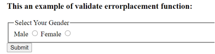
<h3> This an example of validate errorplacement function: </h3>
<form name = "myForm">
<fieldset id = "gender" name = "gender">
<legend> Select Your Gender </legend>
<div id = "radio">
<label title = "Select the Gender of the candicate "> </label>
<label for = "male "> Male </label>
<input type = "radio" id = "male" name = "gender1" value = "male" />
<label for = "female"> Female </label>
<input type = "radio" id = "famale" name = "gender1" value = "female" />
</div> <!-- end radio class-->
</fieldset>
<input type = "submit">
</form>
<script>
var v = $( "form" ).validate({
rules: {
gender1: 'required'
},
errorPlacement:
function( error, element ){
if(element.is( ":radio" )){
// error append here
error.appendTo('#radio');
}
else {
error.insertAfter(element);
}
}
});
</script>
</body>
</html>An output of the above code is –
Once we click on the button without selecting any radio button, the output is –
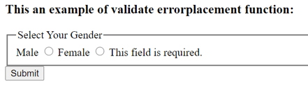
In the above code, the “form” element contains two “radio” elements for the gender, if non of the button is selected then the error message will be displayed. Next the validate errorplacement() function is used to place the error append to the radio elements as “error.appendTo(‘#radio’);”. So if we click submit button without selecting any gender then the error message display after the “radio” elements.
Example of jQuery validate errorplacement() function to show the placement of error message with highlight function –
Example #2
Code:
<!doctype html>
<html lang = "en">
<head>
<meta charset = "utf-8">
<title> This is an example for jQuery validate errorplacement function </title>
<!-- Using the jquery CDN -->
<script src = "https://www.webcodegeeks.com/wp-content/litespeed/localres/ajax.googleapis.com/ajax/libs/jquery/3.2.1/jquery.min.js"> </script>
<!-- Using the jquery validate plugin CDN -->
<script src = "https://www.webcodegeeks.com/wp-content/litespeed/localres/cdn.jsdelivr.net/jquery.validation/1.16.0/jquery.validate.min.js"> </script>
<style>
.errorClass{ background : red;}
</style>
</head>
<body>
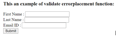
<h3> This an example of validate errorplacement function: </h3>
<form id = "form_id" action = "" method = "POST" name = "form_id">
First Name : <input type = "text" id = "first_name" class = "required" name = "first_name" placeholder = "" />
<br>
Last Name : <input type = "text" id = "last_name" class = "required" name = "last_name" placeholder = "" />
<br>
Email ID : <input type = "text" id = "email_id" class = "required" name = "email_id" placeholder = "" />
<br>
<input id="" class="" type="submit"> </input>
</form>
<script>
$( "#form_id" ).validate({
errorPlacement: function( error, element ) {
// attrib nameof the field
var n = element.attr("name");
if (n == "first_name")
element.attr("placeholder", "Please enter your first name");
else if (n == "last_name")
element.attr("placeholder", "Please enter your last name");
else if (n == "email_id")
element.attr("placeholder", "Please enter your email id");
},
rules: {
first_name : {
minlength: 6,
required: true
},
last_name : {
minlength: 6,
required: true
},
email_address : {
minlength : 10,
required: true,
email: true
}
},
highlight: function(element) {
// add a class "errorClass" to the element
$(element).addClass('errorClass');
},
unhighlight: function(element) {
// class "errorClass" remove from the element
$(element).removeClass('errorClass');
},
submitHandler: function(form) {
// now submit the form.
}
});
</script>
</body>
</html>An output of the above code is –
Once we click on the “Submit” button without enter any values into the input boxes, the output is –
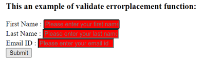
In the above code, the “form” element contains three “input” elements for the first name, last name, and email id, if any field left blank then the error message will be displayed at the placeholder for the specific element with the highlighted color. Next, the validate errorplacement() function is used to place the error at the placeholder for the specific input element for example first name is “element.attr(“placeholder”, “Please enter your first name”);”. So if we click submit button without entering any input field then the error message will display the placeholder location.
Conclusion
The jQuery validate errorplacement() function is a built-in function, which is used to customize the placement of a validate error message.
Recommended Articles
This is a guide to jQuery validate errorplacement. Here we discuss the definition, working of the jQuery validate errorplacement() along with the example for better understanding. You may also have a look at the following articles to learn more –
- jQuery eq()
- jQuery Calendar
- jQuery Array Sort
- jQuery contents