You can change the color directly in XML. Use buttonTint for the box: (as of API level 23)
<CheckBox
    android:layout_width="wrap_content"
    android:layout_height="wrap_content"
    android:buttonTint="@color/CHECK_COLOR" />
You can also do this using appCompatCheckbox v7 for older API levels:
<android.support.v7.widget.AppCompatCheckBox
    android:layout_width="wrap_content"
    android:layout_height="wrap_content"
    app:buttonTint="@color/COLOR_HERE" />
answered Nov 20, 2015 at 19:21
afathmanafathman
5,9042 gold badges20 silver badges28 bronze badges
7
If your minSdkVersion is 21+ use android:buttonTint attribute to update the color of a checkbox:
<CheckBox
  ...
  android:buttonTint="@color/tint_color" />
In projects that use AppCompat library and support Android versions below 21 you can use a compat version of the buttonTint attribute:
<CheckBox
  ...
  app:buttonTint="@color/tint_color" />
In this case if you want to subclass a CheckBox don’t forget to use AppCompatCheckBox instead.
PREVIOUS ANSWER:
You can change CheckBoxs drawable using android:button="@drawable/your_check_drawable" attribute.
answered May 2, 2011 at 6:33
MichaelMichael
53.3k21 gold badges133 silver badges138 bronze badges
4
you can set android theme of the checkbox to get the color you want in your styles.xml add :
<style name="checkBoxStyle" parent="Base.Theme.AppCompat">
    <item name="colorAccent">CHECKEDHIGHLIGHTCOLOR</item>
    <item name="android:textColorSecondary">UNCHECKEDCOLOR</item>
</style>
then in your layout file :
<CheckBox
     android:theme="@style/checkBoxStyle"
     android:id="@+id/chooseItemCheckBox"
     android:layout_width="wrap_content"
     android:layout_height="wrap_content"/>
unlike using android:buttonTint="@color/CHECK_COLOR" this method works under Api 23
answered Apr 14, 2016 at 23:44
Amr El AswarAmr El Aswar
3,3652 gold badges22 silver badges36 bronze badges
14
Use buttonTint to change color of button and color selector for above 21+ api version.
<android.support.v7.widget.AppCompatCheckBox
                android:id="@+id/check"
                android:layout_width="wrap_content"
                android:layout_height="wrap_content"
                app:buttonTint="@color/checkbox_filter_tint"
                tools:targetApi="21"/>
res/colors/checkbox_filter_tint.xml
<?xml version="1.0" encoding="utf-8"?>
<selector xmlns:android="http://schemas.android.com/apk/res/android">
    <item android:color="@color/light_gray_checkbox"
          android:state_checked="false"/>
    <item android:color="@color/common_red"
          android:state_checked="true"/>
</selector>
answered Sep 27, 2017 at 13:17
D. SergeevD. Sergeev
2,2051 gold badge13 silver badges16 bronze badges
5
Programmatic version:
int [][] states = {{android.R.attr.state_checked}, {}};
int [] colors = {color_for_state_checked, color_for_state_normal}
CompoundButtonCompat.setButtonTintList(checkbox, new ColorStateList(states, colors));
answered Sep 7, 2016 at 17:18
mbonninmbonnin
6,8133 gold badges35 silver badges54 bronze badges
6
I would suggest to use he style approach in android as the way to configure built-in android views, add new style in your project:
<style name="yourStyle" parent="Base.Theme.AppCompat">
    <item name="colorAccent">your_color</item> <!-- for uncheck state -->
    <item name="android:textColorSecondary">your color</item> <!-- for check state -->
</style>
and add assign this style to the theme of the checkbox:
android:theme=»@style/youStyle»
hope this helps.
answered Jan 30, 2017 at 12:21
3
Add buttonTint in your xml
<CheckBox
      android:id="@+id/chk_remember_signup"
      android:layout_width="wrap_content"
      android:layout_height="wrap_content"
      android:buttonTint="@android:color/white"
      android:text="@string/hint_chk_remember_me" />
answered Jul 29, 2016 at 12:27
Shweta ChauhanShweta Chauhan
6,5496 gold badges36 silver badges56 bronze badges
1
Add this line in your styles.xml file:
<style>
    <item name="android:colorAccent">@android:color/holo_green_dark</item>
</style>
edwoollard
12.2k6 gold badges42 silver badges74 bronze badges
answered Jul 11, 2015 at 7:02
Yogesh RathiYogesh Rathi
6,2614 gold badges49 silver badges77 bronze badges
4
Me faced same problem, I got a solution using below technic. Copy the btn_check.xml from android-sdk/platforms/android-#(version)/data/res/drawable to your project’s drawable folder and change the ‘on’ and ‘off’ image states to your custom images.
Then your xml will just need android:button="@drawable/btn_check"
<CheckBox
    android:button="@drawable/btn_check"
    android:layout_width="wrap_content"
    android:layout_height="wrap_content"
    android:checked="true" />
If you want to use different default Android icons, you can use:
android:button="@android:drawable/..."
JJD
49k57 gold badges199 silver badges335 bronze badges
answered Jul 16, 2013 at 9:53
sravansravan
5,2731 gold badge30 silver badges33 bronze badges
2
buttonTint worked for me try
android:buttonTint=»@color/white»
<CheckBox
    android:layout_width="wrap_content"
    android:layout_height="wrap_content"
    android:layout_centerHorizontal="true"
    android:id="@+id/agreeCheckBox"
    android:text="@string/i_agree_to_terms_s"
    android:buttonTint="@color/white"
    android:layout_below="@+id/avoid_spam_text"/>
answered Jul 5, 2018 at 10:50
saigopi.mesaigopi.me
13.1k2 gold badges79 silver badges54 bronze badges
create an xml Drawable resource file under res->drawable and name it, for example, checkbox_custom_01.xml
<?xml version="1.0" encoding="utf-8"?>
<selector xmlns:android="http://schemas.android.com/apk/res/android">
<item
   android:state_checked="true"
   android:drawable="@drawable/checkbox_custom_01_checked_white_green_32" />
  <item
   android:state_checked="false"
   android:drawable="@drawable/checkbox_custom_01_unchecked_gray_32" />
</selector>
Upload your custom checkbox image files (i recommend png) to your res->drawable folder.
Then go in your layout file and change your checkbox to
<CheckBox
    android:id="@+id/checkBox1"
    android:button="@drawable/checkbox_custom_01"
    android:layout_width="wrap_content"
    android:layout_height="wrap_content"
    android:layout_alignParentLeft="true"
    android:focusable="false"
    android:focusableInTouchMode="false"
    android:text="CheckBox"
    android:textSize="32dip"/>
you may customize anything, as long as android:button points to the correct XML file you created before.
NOTE TO NEWBIES: though it is not mandatory, it is nevertheless good practice to name your checkbox with a unique id throughout your whole layout tree.
answered Oct 19, 2016 at 11:35
tony giltony gil
9,3686 gold badges76 silver badges98 bronze badges
100% robust approach.
In my case, I didn’t have access to the XML layout source file, since I get Checkbox from a 3-rd party MaterialDialog lib.
So I have to solve this programmatically.
- Create a ColorStateList in xml:
res/color/checkbox_tinit_dark_theme.xml:
<?xml version="1.0" encoding="utf-8"?>
<selector xmlns:android="http://schemas.android.com/apk/res/android">
    <item android:color="@color/white"
        android:state_checked="false"/>
    <item android:color="@color/positiveButtonBg"
        android:state_checked="true"/>
</selector>
-
Then apply it to the checkbox:
ColorStateList darkStateList = ContextCompat.getColorStateList(getContext(), R.color.checkbox_tint_dark_theme);
CompoundButtonCompat.setButtonTintList(checkbox, darkStateList);
P.S. In addition if someone is interested, here is how you can get your checkbox from MaterialDialog dialog (if you set it with .checkBoxPromptRes(...)):
CheckBox checkbox = (CheckBox) dialog.getView().findViewById(R.id.md_promptCheckbox);
Hope this helps.
answered Oct 22, 2018 at 12:02
Kirill KarmazinKirill Karmazin
5,9662 gold badges53 silver badges40 bronze badges
You can change checkbox color using singe line of code
android:buttonTint="@color/app_color" //whatever color
answered Aug 18, 2018 at 6:14
Kishore ReddyKishore Reddy
2,3641 gold badge19 silver badges15 bronze badges
If textColorSecondary does not work for you, you might have defined colorControlNormal in your theme to be a different color. If so, just use
<style name="yourStyle" parent="Base.Theme.AppCompat">
    <item name="colorAccent">your_checked_color</item> <!-- for checked state -->
    <item name="colorControlNormal">your_unchecked_color</item> <!-- for unchecked state -->
</style>
answered Nov 12, 2020 at 5:14
J7bitsJ7bits
6517 silver badges14 bronze badges
Most answers go through the xml file. If you find an active answer for most Android versions and are just one color for the two statuses Check an UnCheck: here is my solution:
Kotlin:
val colorFilter = PorterDuffColorFilter(Color.CYAN, PorterDuff.Mode.SRC_ATOP)
CompoundButtonCompat.getButtonDrawable(checkBox)?.colorFilter = colorFilter
Java:
ColorFilter colorFilter = new PorterDuffColorFilter(Color.CYAN, PorterDuff.Mode.SRC_ATOP);
Drawable drawable = CompoundButtonCompat.getButtonDrawable(checkBox);
if (drawable != null) {
    drawable.setColorFilter(colorFilter);
}
answered Nov 18, 2019 at 3:55
ChanhChanh
4233 silver badges12 bronze badges
You can use the following two properties in «colors.xml»
<color name="colorControlNormal">#eeeeee</color>
<color name="colorControlActivated">#eeeeee</color>
colorControlNormal is for the normal view of checkbox, and colorControlActivated is for when the checkbox is checked.
answered Jul 1, 2017 at 4:49
Hi This is the theme code for both Dark Theme and Light Theme.
<attr name="buttonsearch_picture" format="reference"/>
<attr name="buttonrefresh_picture" format="reference"/>

<style name="Theme.Light" parent="Theme.AppCompat.Light.NoActionBar">
    <item name="android:windowNoTitle">true</item>
    <item name="android:windowBackground">@color/white</item>
    <item name="android:windowActionBar">false</item>
    <item name="android:textColorPrimary">@color/black</item>
    <item name="android:textColorSecondary">@color/black</item>
    <item name="android:textColor">@color/material_gray_800</item>
    <item name="actionOverflowButtonStyle">@style/LightOverflowButtonStyle</item>
    <item name="buttonsearch_picture">@drawable/ic_search_black</item>
    <item name="buttonrefresh_picture">@drawable/ic_refresh_black</item>
</style>

<style name="Theme.Dark" parent="Theme.AppCompat.NoActionBar">
    <item name="android:windowNoTitle">true</item>
    <item name="android:windowBackground">@color/white</item>
    <item name="android:windowActionBar">false</item>
    <item name="android:textColorPrimary">@color/white</item>
    <item name="android:textColorSecondary">@color/material_gray_500</item>
    <item name="android:textColor">@color/material_gray_800</item>
    <item name="actionOverflowButtonStyle">@style/DarkOverflowButtonStyle</item>
    <item name="buttonsearch_picture">@drawable/ic_search_white</item>
    <item name="buttonrefresh_picture">@drawable/ic_refresh_white</item>
    <item name="android:colorBackground">#ffffff</item>
    <item name="android:alertDialogTheme">@style/LightDialogTheme</item>
    <item name="android:alertDialogStyle">@style/LightDialogTheme</item>
  <!-- <item name="android:textViewStyle">@style/AppTheme.Widget.TextView</item>-->
    <item name="android:popupMenuStyle">@style/PopupMenu</item>
</style>
If you want to change checkbox color then «colorAccent» attribute will use for checked state and «android:textColorSecondary» will use for unchecking state.
«actionOverflowButtonStyle» will use for change the color of overflow icon in the Action bar.
«buttonsearch_picture» attribute will use for change tint color of Action Button in Action Bar.This is custom Attribute in style.xml
<attr name="buttonsearch_picture" format="reference"/>
Same is for refresh button which i am using in my app.
«android:popupMenuStyle» attribute is using to get Light theme popup menu style in Dark theme.
<style name="PopupMenu" parent="Theme.AppCompat.Light.NoActionBar">
</style>
And this is toolbar Code which I am using in my Rocks Player App.
 <android.support.v7.widget.Toolbar
    android:id="@+id/toolbar"
    app:contentInsetStart="0dp"
    android:title="Rocks Player"
    android:layout_width="match_parent"
    android:elevation="4dp"
    android:layout_height="48dp"
    app:layout_scrollFlags="scroll|enterAlways"
    android:minHeight="48dp"
    app:titleTextAppearance="@style/Toolbar.TitleText"
    app:popupTheme="@style/ThemeOverlay.AppCompat.Light"
    android:background="?attr/colorPrimary"
    >
</android.support.v7.widget.Toolbar>
Themes:-
 <style name="AppTheme0" parent="Theme.Light">
    <item name="colorPrimary">#ffffff</item>
    <item name="colorPrimaryDark">#cccccc</item>
    <item name="colorAccent">#0294ff</item>
</style>

<style name="AppTheme1" parent="Theme.Dark">
    <item name="colorPrimary">#4161b2</item>
    <item name="colorPrimaryDark">#4161b2</item>
    <item name="colorAccent">#4161b2</item>
</style>
answered Nov 1, 2017 at 10:10
Ashish SainiAshish Saini
2,29824 silver badges21 bronze badges
There is a much easier way to set the color programmatically by setting ColorStateList.
Checkbox.setButtonTintList(ColorStateList.valueOf(getContext().getColor(R.color.yourcolor)))
thatguy
20.3k6 gold badges26 silver badges38 bronze badges
answered Oct 15, 2019 at 21:41
SwaroopSwaroop
5321 gold badge4 silver badges16 bronze badges
You should try below code. It is working for me.
<selector xmlns:android="http://schemas.android.com/apk/res/android">
    <item android:drawable="@drawable/checked"
          android:state_checked="true">
        <color android:color="@color/yello" />
    </item>
    <!-- checked -->
    <item android:drawable="@drawable/unchecked"
          android:state_checked="false">
        <color android:color="@color/black"></color>
    </item>
    <!-- unchecked -->
    <item android:drawable="@drawable/checked"
          android:state_focused="true">
        <color android:color="@color/yello"></color>
    </item>
    <!-- on focus -->
    <item android:drawable="@drawable/unchecked">
        <color android:color="@color/black"></color>
    </item>
    <!-- default -->
</selector>
and CheckBox
<CheckBox
    Button="@style/currentcy_check_box_style"
    android:layout_width="wrap_content"
    android:layout_height="wrap_content"
    android:paddingLeft="20dp"
    android:text="@string/step_one_currency_aud" />
JJD
49k57 gold badges199 silver badges335 bronze badges
answered Aug 14, 2013 at 11:01
you can create your own xml in drawable and use this as android:background=»@drawable/your_xml»
in that you can give border corner everything
<item>
    <shape>
        <gradient

            android:endColor="#fff"
            android:startColor="#fff"/>
        <corners
            android:radius="2dp"/>
        <stroke
            android:width="15dp"
            android:color="#0013669e"/>

    </shape>
</item>
answered Sep 18, 2016 at 18:28
1
My minSdkVersion is 15, my BaseAppTheme parent is Theme.AppCompat.Light.NoActionBar and I am creating my Checkboxes programmatically. The following steps worked for me.
1. In your Java code, change
CheckBox checkBox = new CheckBox(context);
to
AppCompatCheckBox checkBox = new AppCompatCheckBox(context);
2. In your styles.xml, add:
<style name="MyCheckboxStyle" parent="Widget.AppCompat.CompoundButton.CheckBox">
    <item name="buttonTint">@color/primary_dark</item>
</style>
3. Finally, within your BaseAppTheme (or AppTheme) style, add:
<item name="checkboxStyle">@style/MyCheckboxStyle</item>
<item name="android:checkboxStyle">@style/MyCheckboxStyle</item>
answered Aug 9, 2020 at 13:32
My goal was to use a custom checkbox button and remove the accent color button tint. I tried the accepted answer but did now work instead this worked for me:
In the styles.xml file
<style name="Theme.Checkbox" parent="Widget.AppCompat.CompoundButton.CheckBox">
    <item name="android:button">@drawable/theme_checkbox_button</item>
    <item name="android:drawableLeft">@android:color/transparent</item>
    <item name="android:drawablePadding">10dp</item>
    <item name="android:buttonTint">@android:color/transparent</item>
    <item name="android:buttonTintMode">screen</item>
</style>
Now for this question, only required attributes are android:buttonTint and android:buttonTintMode
Now some extras:
- I needed to use a custom drawable, hence
android:buttonis set with aselectordrawable - I needed some spacing between the box and the text hence I followed this SO answer and set the
android:drawableLeftandandroid:drawablePadding
answered Mar 22, 2021 at 6:24
You can change the background color of the <CheckBox> by embedding it inside a <LinearLayout>. Then change the background color of <LinearLayout> to the color you want.
answered Jun 14, 2011 at 4:11
mellowgmellowg
1,7863 gold badges15 silver badges19 bronze badges
1
If you are going to use the android icons, as described above ..
android:button="@android:drawable/..."
.. it’s a nice option, but for this to work — I found you need to add toggle logic to show/hide the check mark, like this:
    checkBoxShowPwd.setOnCheckedChangeListener(new CompoundButton.OnCheckedChangeListener() {

        // checkbox status is changed from uncheck to checked.
        public void onCheckedChanged(CompoundButton buttonView, boolean isChecked) {

            int btnDrawable = android.R.drawable.checkbox_off_background;

            if (isChecked)
            {
                btnDrawable = android.R.drawable.checkbox_on_background;
            }

            checkBoxShowPwd.setButtonDrawable(btnDrawable);

        }
    });
answered Apr 23, 2015 at 18:26
Gene BoGene Bo
10.8k8 gold badges86 silver badges133 bronze badges
1
I prefer this extension function I’ve created:
fun CheckBox.setTint(@ColorInt color: Int?) {
    if (color == null) {
        CompoundButtonCompat.setButtonTintList(this, null)
        return
    }
    CompoundButtonCompat.setButtonTintMode(this, Mode.SRC_ATOP)
    CompoundButtonCompat.setButtonTintList(this, ColorStateList.valueOf(color))
}
It’s very similar to what I have for ImageView, in case anyone wants it too:
fun ImageView.setTint(@ColorInt color: Int?) {
    if (color == null) {
        ImageViewCompat.setImageTintList(this, null)
        return
    }
    ImageViewCompat.setImageTintMode(this, Mode.SRC_ATOP)
    ImageViewCompat.setImageTintList(this, ColorStateList.valueOf(color))
}
answered Aug 10, 2022 at 11:02
android developerandroid developer
115k143 gold badges719 silver badges1244 bronze badges
You can use the below lines of code to change the background of the Checkbox dynamically in your java code.
//Setting up background color on checkbox.
 checkbox.setBackgroundColor(Color.parseColor("#00e2a5"));
This answer was from this site. You can also use this site to convert your RGB color to the Hex value, you need to feed the parseColor
answered May 28, 2019 at 13:02
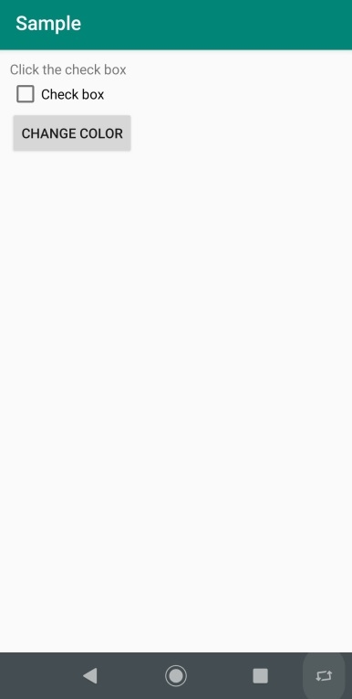
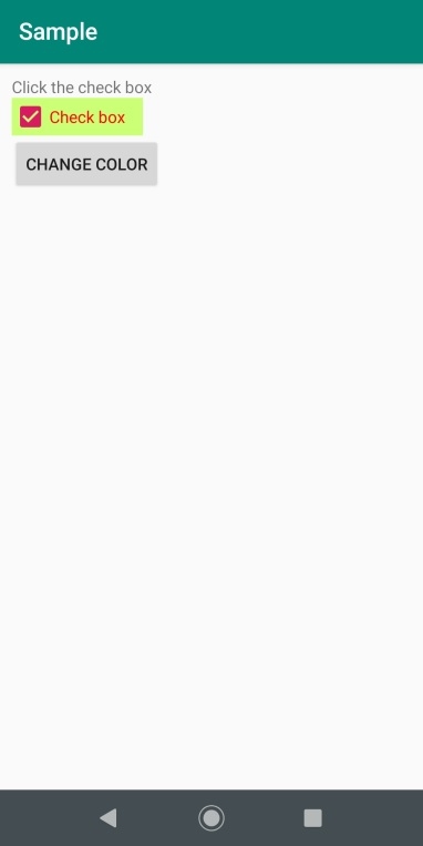
This example demonstrates how do I change the color of the check box in android.
Step 1 − Create a new project in Android Studio, go to File ⇒ New Project and fill all required details to create a new project.
Step 2 − Add the following code to res/layout/activity_main.xml.
<?xml version="1.0" encoding="utf-8"?>
<RelativeLayout xmlns:android="http://schemas.android.com/apk/res/android"
   xmlns:tools="http://schemas.android.com/tools"
   android:id="@+id/rl"
   android:layout_width="match_parent"
   android:layout_height="match_parent"
   android:padding="10dp"
   tools:context=".MainActivity">
   <TextView
      android:id="@+id/tv"
      android:layout_width="wrap_content"
      android:layout_height="wrap_content"
      android:text="Click the check box" />
   <CheckBox
      android:id="@+id/checkbox"
      android:layout_width="wrap_content"
      android:layout_height="wrap_content"
      android:text="Check box"
      android:layout_below="@id/tv"
      android:paddingRight="15dp"/>
   <Button
      android:id="@+id/button"
      android:layout_width="wrap_content"
      android:layout_height="wrap_content"
      android:text="Change Color"
      android:layout_below="@id/checkbox" />
</RelativeLayout>
Step 3 − Add the following code to src/MainActivity.java
import android.graphics.Color;
import android.support.v7.app.AppCompatActivity;
import android.os.Bundle;
import android.view.View;
import android.widget.Button;
import android.widget.CheckBox;
public class MainActivity extends AppCompatActivity {
   @Override
   protected void onCreate(Bundle savedInstanceState) {
      super.onCreate(savedInstanceState);
      setContentView(R.layout.activity_main);
      final CheckBox checkBox = (CheckBox) findViewById(R.id.checkbox);
      Button button = (Button) findViewById(R.id.button);
      button.setOnClickListener(new View.OnClickListener() {
         @Override
         public void onClick(View v) {
            checkBox.setTextColor(Color.RED);
            checkBox.setBackgroundColor(Color.parseColor("#cbff75"));
         }
      });
   }
}
Step 4 − Add the following code to androidManifest.xml
<?xml version="1.0" encoding="utf-8"?>
<manifest xmlns:android="http://schemas.android.com/apk/res/android" package="app.com.sample">
   <application
      android:allowBackup="true"
      android:icon="@mipmap/ic_launcher"
      android:label="@string/app_name"
      android:roundIcon="@mipmap/ic_launcher_round"
      android:supportsRtl="true"
      android:theme="@style/AppTheme">
      <activity android:name=".MainActivity">
         <intent-filter>
            <action android:name="android.intent.action.MAIN" />
            <category android:name="android.intent.category.LAUNCHER" />
         </intent-filter>
      </activity>
   </application>
</manifest>
Let’s try to run your application. I assume you have connected your actual Android Mobile device with your computer. To run the app from android studio, open one of your project’s activity files and click Run  icon from the toolbar. Select your mobile device as an option and then check your mobile device which will display your default screen −
Click here to download the project code.
In this blog, we will learn about Changing radio button and checkbox color and appearance in your android application.
The radio button and checkbox button all take the default accent color for selection from your application. Changing the layout to something that you want is not that simple, but is very easy if you follow through correctly.
After reading this blog, you can change the default colors of all your radio button and checkbox( whether created through XML or through java code).
APPROACH
For changing the colors of selected/ checked button state to some color of your choice, all you need to do is to create a drawable with correct state mapped to colors of your choice and a default color and set it in your styles.xml file.
CODE :
my_compound_button_color_selector.xml
|
<selector xmlns:android=«http://schemas.android.com/apk/res/android»> <item android:state_pressed=«true» android:color=«#1E88E5»/> <item android:state_checked=«true» android:color=«#00e676»/> <item android:color=«#757575»/> </selector> |
styles.xml
|
1 2 3 4 5 6 7 8 9 10 11 12 13 14 15 16 17 18 |
<style name=»AppTheme» parent=»Theme.AppCompat.Light.DarkActionBar»> ………….your other style configurations…………. <item name=»radioButtonStyle»>@style/MyRadioButtonStyle</item> <item name=»android:radioButtonStyle»>@style/MyRadioButtonStyle</item> <item name=»checkboxStyle»>@style/MyCheckBoxStyle</item> <item name=»android:checkboxStyle»>@style/MyCheckBoxStyle</item> </style> <style name=»MyCheckBoxStyle» parent=»Base.Widget.AppCompat.CompoundButton.CheckBox»> <item name=»android:textColor»>@drawable/my_compound_button_color_selector</item> <item name=»buttonTint»>@drawable/my_compound_button_color_selector</item> </style> <style name=»MyRadioButtonStyle» parent=»Widget.AppCompat.CompoundButton.RadioButton»> <item name=»android:textColor»>@drawable/my_compound_button_color_selector</item> <item name=»buttonTint»>@drawable/my_compound_button_color_selector</item> </style> |
And all your Radio Button and Checkbox colors will be changed from this settings.
Now, let’s see how we can change the appearance, what I needed was the button on the right side of the text and doing this was pretty easy.
APPROACH :
Your compound button should have layout params of (width: match_parent and height: wrap_content). now you need to reverse the layout direction from the parent layout direction. I needed this in my dynamic views created at runtime from java files, so I am sharing the snippet from Java code, but you can execute the same from your xmls too.
CODE :
|
1 2 3 4 5 6 7 8 9 10 11 12 13 14 15 16 17 18 |
RadioGroup radioGroup = new RadioGroup(getContext()); //create the RadioGroup radioGroup.setLayoutParams(new ViewGroup.LayoutParams(ViewGroup.LayoutParams.MATCH_PARENT, ViewGroup.LayoutParams.WRAP_CONTENT)); RadioButton radioButton = new RadioButton(getContext()); radioButton.setLayoutParams(new ViewGroup.LayoutParams(ViewGroup.LayoutParams.MATCH_PARENT, ViewGroup.LayoutParams.WRAP_CONTENT)); if (ViewCompat.getLayoutDirection(radioButton)== ViewCompat.LAYOUT_DIRECTION_LTR){ ViewCompat.setLayoutDirection(radioButton,ViewCompat.LAYOUT_DIRECTION_RTL); }else{ ViewCompat.setLayoutDirection(radioButton,ViewCompat.LAYOUT_DIRECTION_LTR); } radioGroup.addView(radioButton); CheckBox checkBox = new CheckBox(getContext()); checkBox.setLayoutParams(new ViewGroup.LayoutParams(ViewGroup.LayoutParams.MATCH_PARENT, ViewGroup.LayoutParams.WRAP_CONTENT)); if (ViewCompat.getLayoutDirection(checkBox)== ViewCompat.LAYOUT_DIRECTION_LTR){ ViewCompat.setLayoutDirection(checkBox,ViewCompat.LAYOUT_DIRECTION_RTL); }else { ViewCompat.setLayoutDirection(checkBox,ViewCompat.LAYOUT_DIRECTION_LTR); } |
And with this code, you can change the appearance of your compound buttons(Radio Button and Checkbox).
After following this blog, the appearance of your compound buttons will be like this from this code.
. . .
In Android, CheckBox is a type of two state button either unchecked or checked in Android. Or you can say it is a type of on/off switch that can be toggled by the users. You should use checkbox when presenting a group of selectable options to users that are not mutually exclusive. CompoundButton is the parent class of CheckBox class.
In android there is a lot of usage of check box. For example, to take survey in Android app we can list few options and allow user to choose using CheckBox. The user will simply checked these checkboxes rather than type their own option in EditText. Another very common use of CheckBox is as remember me option in Login form.
CheckBox code in XML:
<CheckBox
android:id="@+id/simpleCheckBox"
android:layout_width="wrap_content"
android:layout_height="wrap_content"
android:text="Simple CheckBox"/>

Important Note: You can check the current state of a check box programmatically by using isChecked() method. This method returns a Boolean value either true or false, if a check box is checked then it returns true otherwise it returns false. Below is an example code in which we checked the current state of a check box.
//initiate a check box
CheckBox simpleCheckBox = (CheckBox) findViewById(R.id.simpleCheckBox);

//check current state of a check box (true or false)
Boolean checkBoxState = simpleCheckBox.isChecked();
Attributes of CheckBox:
Now let’s we discuss important attributes that helps us to configure a check box in XML file (layout).
1.id: id is an attribute used to uniquely identify a check box. Below we set the id of a image button.
<CheckBox
android:id="@+id/simpleCheckBox"
android:layout_width="wrap_content"
android:layout_height="wrap_content"
android:text="Simple CheckBox"/>
2. checked: checked is an attribute of check box used to set the current state of a check box. The value should be true or false where true shows the checked state and false shows unchecked state of a check box. The default value of checked attribute is false. We can also set the current state programmatically.
Below is an example code in which we set true value for checked attribute that sets the current state to checked.
<CheckBox
    android:id="@+id/simpleCheckBox"
    android:layout_width="wrap_content"
    android:layout_height="wrap_content"
    android:text="Simple CheckBox"
    android:checked="true"/> <!--set the current state of the check box-->

Setting Current State Of CheckBox In Java Class:
Below we set the current state of CheckBox in java class.
/*Add in Oncreate() funtion after setContentView()*/
// initiate a check box
CheckBox simpleCheckBox = (CheckBox) findViewById(R.id.simpleCheckBox);

// set the current state of a check box
simpleCheckBox.setChecked(true);
3. gravity: The gravity attribute is an optional attribute which is used to control the alignment of the text in CheckBox like left, right, center, top, bottom, center_vertical, center_horizontal etc.
Below we set the right and center_vertical gravity for the text of a check box.
<CheckBox
    android:id="@+id/simpleCheckBox"
    android:layout_width="fill_parent"
    android:layout_height="wrap_content"
    android:text="Simple CheckBox"
    android:checked="true"
    android:gravity="right|center_vertical"/>  <!-- gravity of the check box-->

4. text: text attribute is used to set the text in a check box. We can set the text in xml as well as in the java class.
Below is the example code with explanation included in which we set the text “Text Attribute Of Check Box” for a check box.
<CheckBox
    android:id="@+id/simpleCheckBox"
    android:layout_width="wrap_content"
    android:layout_height="wrap_content"
    android:checked="true"
    android:text="Text Attribute Of Check Box"/> <!--displayed text of the check box-->

Setting text in CheckBox In Java class:
Below is the example code in which we set the text of a check box programmatically means in java class.
/*Add in Oncreate() funtion after setContentView()*/
// initiate check box
CheckBox simpleCheckBox = (CheckBox) findViewById(R.id.simpleCheckBox);

// displayed text of the check box
simpleCheckBox.setText("Text Attribute Of Check Box");
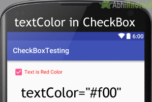
5. textColor: textColor attribute is used to set the text color of a check box. Color value is in form of “#argb”, “#rgb”, “#rrggbb”, or “#aarrggbb”.
Below we set the red color for the displayed text of a check box.
<CheckBox
    android:id="@+id/simpleCheckBox"
    android:layout_width="wrap_content"
    android:layout_height="wrap_content"
    android:text="Text is Red Color"
    android:textColor="#f00"
    android:checked="true"/> <!-- red color for the text of check box-->
Setting textColor in CheckBox In Java class:
Below we set the text color of a check box programmatically.
/*Add in Oncreate() funtion after setContentView()*/
//initiate the checkbox
CheckBox simpleCheckBox = (CheckBox) findViewById(R.id.simpleCheckBox);

//red color for displayed text
simpleCheckBox.setTextColor(Color.RED);
6. textSize: textSize attribute is used to set the size of text of a check box. We can set the text size in sp(scale independent pixel) or dp(density pixel).
Below is the example code in which we set the 20sp size for the text of a check box.
<CheckBox
    android:id="@+id/simpleCheckBox"
    android:layout_width="wrap_content"
    android:layout_height="wrap_content"
    android:text="Text size Attribute Of Check Box"
    android:textColor="#00f"
    android:checked="false"
    android:textSize="20sp"/><!--set Text Size of text in CheckBox-->

Setting Text Size in CheckBox In Java class:
Below we set the text size of a check box in java class.
/*Add in Oncreate() funtion after setContentView()*/
CheckBox simpleCheckBox = (CheckBox) findViewById(R.id.simpleCheckBox);
//set 20sp displayed text size
simpleCheckBox.setTextSize(20);
7. textStyle: textStyle attribute is used to set the text style of the text of a check box. The possible text styles are bold, italic and normal. If we need to use two or more styles for a text view then “|” operator is used for that.
Below we set the bold and italic text styles for text of a check box.
<CheckBox
    android:id="@+id/simpleCheckBox"
    android:layout_width="wrap_content"
    android:layout_height="wrap_content"
    android:text="Text Style Attribute Of Check Box"
    android:textColor="#44f"
    android:textSize="20sp"
    android:checked="false"
    android:textStyle="bold|italic"/>

8. background: background attribute is used to set the background of a check box. We can set a color or a drawable in the background of a check box.
Below we set the black color for the background, white color for the displayed text of a check box.
<CheckBox
    android:id="@+id/simpleCheckBox"
    android:layout_width="wrap_content"
    android:layout_height="wrap_content"
    android:text="Text size Attribute Of Check Box"
    android:textColor="#fff"
    android:textSize="20sp"
    android:textStyle="bold|italic"
    android:checked="true"
    android:background="#000" /><!-- black background for the background of check box-->
Setting Background in CheckBox In Java class:
Below is the example code in which we set the background color of a check box programmatically means in java class.
/*Add in Oncreate() funtion after setContentView()*/
CheckBox simpleCheckBox = (CheckBox) findViewById(R.id.simpleCheckBox);
// set background in CheckBox
simpleCheckBox.setBackgroundColor(Color.BLACK);
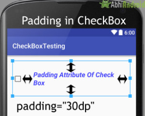
9. padding: padding attribute is used to set the padding from left, right, top or bottom.
- paddingRight :set the padding from the right side of the check box.
- paddingLeft :set the padding from the left side of the check box.
- paddingTop :set the padding from the top side of the check box.
- paddingBottom :set the padding from the bottom side of the check box.
- Padding :set the padding from the all side’s of the check box.
Below is the example code of padding where we set the 30dp padding from all the side’s of the check box.
<CheckBox
    android:id="@+id/simpleCheckBox"
    android:layout_width="wrap_content"
    android:layout_height="wrap_content"
    android:text="Padding Attribute Of Check Box"
    android:textColor="#44f"
    android:textSize="20sp"
    android:textStyle="bold|italic"
    android:checked="false"
    android:padding="30dp"/> <!--30dp padding from all side’s-->
Example of CheckBox In Android Studio:
Below is the example of CheckBox in Android, in which we display five check boxes using background and other attributes we discusses earlier in this post. Every check box represents a different subject name and whenever you click on a check box then text of that checked check box is displayed in a toast. Below is the final output, code and step by step explanation of the example:
Download Code ?

Step 1: Create a new project and name it CheckBoxExample
In this step we create a new project in android studio by filling all the necessary details of the app like app name, package name, api versions etc.
Select File -> New -> New Project and Fill the forms and click "Finish" button.
Step 2: Now Open res -> layout -> activity_main.xml (or) main.xml and add the following code:
In this step we open an xml file and add the code for displaying five one TextView and check boxes.
<RelativeLayout xmlns:android="http://schemas.android.com/apk/res/android"
    xmlns:tools="http://schemas.android.com/tools"
    android:layout_width="match_parent"
    android:layout_height="match_parent"
    android:paddingBottom="@dimen/activity_vertical_margin"
    android:paddingLeft="@dimen/activity_horizontal_margin"
    android:paddingRight="@dimen/activity_horizontal_margin"
    android:paddingTop="@dimen/activity_vertical_margin"
    tools:context=".MainActivity">

    <TextView
        android:layout_width="wrap_content"
        android:layout_height="wrap_content"
        android:text="Select Your Programming language: "
        android:textColor="#f00"
        android:textSize="20sp"
        android:textStyle="bold" />

    <LinearLayout
        android:id="@+id/linearLayout"
        android:layout_width="fill_parent"
        android:layout_height="wrap_content"
        android:layout_marginTop="30dp"
        android:background="#e0e0e0"
        android:orientation="vertical">

        <CheckBox
            android:id="@+id/androidCheckBox"
            android:layout_width="wrap_content"
            android:layout_height="wrap_content"
            android:layout_centerHorizontal="true"
            android:checked="false"
            android:padding="20dp"
            android:text="@string/android"
            android:textColor="#44f"
            android:textSize="20sp"
            android:textStyle="bold|italic" />

        <CheckBox
            android:id="@+id/javaCheckBox"
            android:layout_width="wrap_content"
            android:layout_height="wrap_content"
            android:layout_centerHorizontal="true"
            android:checked="false"
            android:padding="20dp"
            android:text="@string/java"
            android:textColor="#f44"
            android:textSize="20sp"
            android:textStyle="bold|italic" />

        <CheckBox
            android:id="@+id/phpCheckBox"
            android:layout_width="wrap_content"
            android:layout_height="wrap_content"
            android:layout_centerHorizontal="true"
            android:checked="false"
            android:padding="20dp"
            android:text="@string/php"
            android:textColor="#444"
            android:textSize="20sp"
            android:textStyle="bold|italic" />

        <CheckBox
            android:id="@+id/pythonCheckBox"
            android:layout_width="wrap_content"
            android:layout_height="wrap_content"
            android:layout_centerHorizontal="true"
            android:checked="false"
            android:padding="20dp"
            android:text="@string/python"
            android:textColor="#888"
            android:textSize="20sp"
            android:textStyle="bold|italic" />

        <CheckBox
            android:id="@+id/unityCheckBox"
            android:layout_width="wrap_content"
            android:layout_height="wrap_content"
            android:layout_centerHorizontal="true"
            android:checked="false"
            android:padding="20dp"
            android:text="@string/unity"
            android:textColor="#101010"
            android:textSize="20sp"
            android:textStyle="bold|italic" />
    </LinearLayout>

</RelativeLayout>
Step 3: Now Open app -> java-> package -> MainActivity.java
In this step we add the code to initiate the check boxes we created. And then we perform click event on button and display the text for selected check boxes using a toast.
package example.abhiandriod.checkboxexample;

import android.graphics.Color;
import android.support.v7.app.AppCompatActivity;
import android.os.Bundle;
import android.view.Menu;
import android.view.MenuItem;
import android.view.View;
import android.widget.Button;
import android.widget.CheckBox;
import android.widget.Toast;

public class MainActivity extends AppCompatActivity implements View.OnClickListener {

    CheckBox android, java, python, php, unity3D;

    @Override
    protected void onCreate(Bundle savedInstanceState) {
        super.onCreate(savedInstanceState);
        setContentView(R.layout.activity_main);
        // initiate views
        android = (CheckBox) findViewById(R.id.androidCheckBox);
        android.setOnClickListener(this);
        java = (CheckBox) findViewById(R.id.javaCheckBox);
        java.setOnClickListener(this);
        python = (CheckBox) findViewById(R.id.pythonCheckBox);
        python.setOnClickListener(this);
        php = (CheckBox) findViewById(R.id.phpCheckBox);
        php.setOnClickListener(this);
        unity3D = (CheckBox) findViewById(R.id.unityCheckBox);
        unity3D.setOnClickListener(this);
    }

    @Override
    public void onClick(View view) {

        switch (view.getId()) {
            case R.id.androidCheckBox:
                if (android.isChecked())
                    Toast.makeText(getApplicationContext(), "Android", Toast.LENGTH_LONG).show();
                break;
            case R.id.javaCheckBox:
                if (java.isChecked())
                    Toast.makeText(getApplicationContext(), "Java", Toast.LENGTH_LONG).show();
                break;
            case R.id.phpCheckBox:
                if (php.isChecked())
                    Toast.makeText(getApplicationContext(), "PHP", Toast.LENGTH_LONG).show();
                break;
            case R.id.pythonCheckBox:
                if (python.isChecked())
                    Toast.makeText(getApplicationContext(), "Python", Toast.LENGTH_LONG).show();
                break;
            case R.id.unityCheckBox:
                if (unity3D.isChecked())
                    Toast.makeText(getApplicationContext(), "Unity 3D", Toast.LENGTH_LONG).show();
                break;
        }
    }
}
Step 5: Open res ->values -> strings.xml
In this step we show string file which is used to store string data of an app.
<resources>
    <string name="app_name">CheckBoxExample</string>
    <string name="hello_world">Hello world!</string>
    <string name="action_settings">Settings</string>
    <string name="android">Android</string>
    <string name="java">Java</string>
    <string name="php">PHP</string>
    <string name="python" >Python</string>
    <string name="unity">Unity 3D</string>
</resources>
Output:
Now start the AVD in Emulator and run the App. You will see 5 checkbox option asking you to choose your programming language. Select and the text of that particular CheckBox will appear on Screen.

Continue Reading:
- All scaleType In ImageView Tutorial With Example in Android Studio
- ImageButton Tutorial With Example in Android Studio
- Switch (On/Off) Tutorial With Example in Android Studio
- ToggleButton (On/Off) Tutorial With Example in Android Studio
- RadioButton & RadioGroup Tutorial With Example in Android Studio
CheckBox это специфичная кнопка, имеющая два состояния (отмечена или не отмечена), которая представляет собой флажок, позволяющий пользователю выбирать один или несколько параметров в наборе.
Флажки удобно использовать, например, в настройках приложения, чтобы отмечать нужные функции, либо в списках, где необходимо выбрать сразу несколько элементов.
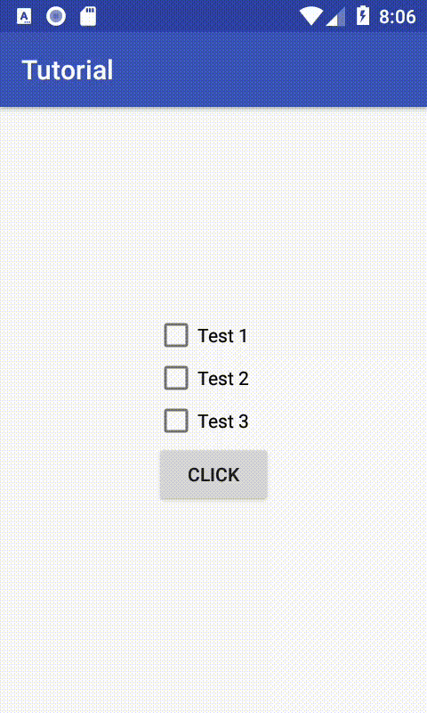
Чтобы добавить CheckBox в приложение, достаточно разместить следующий код:
<CheckBox
    android:layout_width="wrap_content"
    android:layout_height="wrap_content"
    android:text="Test 1"
    />
Если одного флажка мало, вы можете добавить несколько.
С помощью атрибута android:text вы можете задать текст, который будет пояснять, какое действие произойдёт при активации флажка. Также текст можно задать программно с помощью метода setText(). Получить текст можно с помощью метода getText().
CheckBox check = findViewById(R.id.check_1);
check.setText("Какой-то текст");
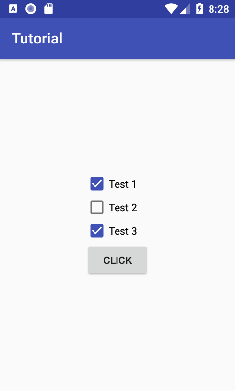
Состояние флажка меняется, когда пользователь нажимает на него, либо программно. Чтобы изменить программно, можно воспользоваться методами setChecked() или toggle().
CheckBox check = findViewById(R.id.check_1);
check.setChecked(true); // установит флажок в одно из состояний: true - активное, false - неактивное
check.toggle(); // меняет текущее состояние на противоположное
Также можно задать состояние флажка заранее через XML при создании CheckBox с помощью атрибута android:checked.
<CheckBox
    android:id="@+id/check_1"
    android:layout_width="wrap_content"
    android:layout_height="wrap_content"
    android:text="Test 1"
    android:checked="true"
    />
Аналогично ToggleButton, к флажкам можно добавить слушатель, который будет выполнять нужные операции при изменении состояния флажка. Сделать это можно с помощью метода setOnCheckedChangeListener(), либо интерфейса OnCheckedChangeListener (о том, как пользоваться интерфейсами, описано здесь).
CheckBox check = findViewById(R.id.check_1);
check.setOnCheckedChangeListener(new CompoundButton.OnCheckedChangeListener() {
  @Override public void onCheckedChanged(CompoundButton compoundButton, boolean b) {
    if (compoundButton.isChecked()) {
      // делаем работу, если кнопка стала активной
    } else {
      // делаем работу, если кнопка перестала быть активной
    }
  }
});
Чтобы узнать текущее состояние флажка, можно воспользоваться методом isChecked(), который вернёт true, если флажок активен и false — неактивен. Например, можно считывать значения флажков и выполнять соответствующие операции.
final CheckBox check1 = findViewById(R.id.check_1);
final CheckBox check2 = findViewById(R.id.check_2);
final CheckBox check3 = findViewById(R.id.check_3);
Button btn_test = findViewById(R.id.btn_test);
btn_test.setOnClickListener(new View.OnClickListener() {
  @Override public void onClick(View view) {
    if (!check1.isChecked() && !check2.isChecked() && !check3.isChecked()) {
      Toast.makeText(getApplicationContext(), "Ничего не выбрано", Toast.LENGTH_SHORT).show();
    } else {
      String s =
          (check1.isChecked() ? "n" + check1.getText().toString() : "") + (check2.isChecked() ?
              "n"
                  + check2.getText().toString() : "") + (check3.isChecked() ? "n"
              + check3.getText().toString() : "");
      Toast.makeText(getApplicationContext(), "Выбраны:" + s, Toast.LENGTH_SHORT).show();
    }
  }
});
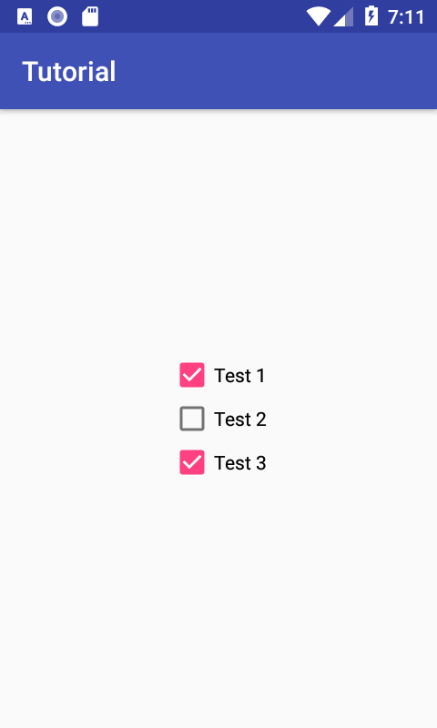
При необходимости, можно изменить цвет флажка со стандартного на какой-либо другой. Для этого в папке res/values/styles.xml нужно создать новый стиль. Возьмём, например, основной цвет приложения.
<style name="MyCheckBox" parent="Widget.AppCompat.CompoundButton.CheckBox">
  <item name="colorAccent">@color/colorPrimary</item>
</style>
После этого в коде разметки для CheckBox нужно добавить атрибут android:theme и указать созданный стиль.
<CheckBox
    android:id="@+id/check_1"
    android:layout_width="wrap_content"
    android:layout_height="wrap_content"
    android:text="Test 1"
    android:textSize="14sp"
    android:theme="@style/MyCheckBox"
    />

<CheckBox
    android:id="@+id/check_2"
    android:layout_width="wrap_content"
    android:layout_height="wrap_content"
    android:text="Test 2"
    android:textSize="14sp"
    android:theme="@style/MyCheckBox"
    />

<CheckBox
    android:id="@+id/check_3"
    android:layout_width="wrap_content"
    android:layout_height="wrap_content"
    android:text="Test 3"
    android:textSize="14sp"
    android:theme="@style/MyCheckBox"
    />
Теперь наши флажки будут окрашены в цвет, который мы задали в стилях.
Дополнительные материалы
Использование XML Drawables в приложениях