-

1
Определите цвет фона, который вы хотите использовать. В HTML цвета задаются кодами, которые определяют различные оттенки. Воспользуйтесь бесплатным онлайн-инструментом W3Schools HTML Color Picker, чтобы найти коды нужных цветов:
- Перейдите на страницу https://www.w3schools.com/colors/colors_picker.asp в веб-браузере компьютера.
- Выберите базовый цвет, который хотите использовать, в разделе «Pick a Color» (Выбрать цвет).
- Выберите оттенок в правой части страницы.
- Запишите код, который отобразится справа от выбранного оттенка.
-
2
Откройте HTML-файл в текстовом редакторе. Помните, что в HTML5 атрибут <bgcolor> больше не поддерживается. Поэтому цвет фона и другие параметры стиля страницы задаются с помощью CSS.[1]
- HTML-документ можно открыть в Notepad++ или Блокноте (Windows), а также в TextEdit или BBEdit (Mac).
-
3
Добавьте заголовок «html» в документ. Все параметры стиля страницы, включая цвет фона, должны находиться между тегами
<style></style>:<!DOCTYPE html> <html> <head> <style> </style> </head> </html>
-
4
Создайте пустую строку между тегами «style». На этой строке, которая должна находиться под тегом
<style>и над тегом</style>, вы введете необходимую информацию. -
6
Добавьте элемент «body». Введите следующий код между тегами
<style></style>:- Все, что будет заключено внутри элемента «body» в CSS, повлияет на всю страницу.
- Пропустите этот шаг, если хотите создать градиентный фон.
Реклама


5


-
1
Найдите заголовок «html». Он должен быть в верхней части документа.
-
2
Добавьте свойство «background-color» в элемент «body». Введите
background-color:в фигурных скобках внутри элемента «body». Должен получиться следующий код:body { background-color: }
- Обратите внимание, что в этом коде необходимо использовать слово «color», а не «colour».
-
3
Добавьте нужный цвет фона в свойство «background-color». Справа от «background-color:» введите числовой код выбранного цвета, а затем введите точку с запятой (;). Например, чтобы фон страницы сделать розовым, напишите следующий код:
body { background-color: #d24dff; }
-
4
Просмотрите информацию внутри тегов «style». На этом этапе заголовок вашего HTML-документа должен выглядеть следующим образом:
<!DOCTYPE html> <html> <head> <style> body { background-color: #d24dff } </style> </head> </html>
-
5
Используйте «background-color», чтобы задать цвет фона других элементов (заголовков, абзацев и тому подобных). Например, чтобы задать цвет фона основного заголовка (<h1>) или абзаца (<p>), напишите следующий код:[2]
<!DOCTYPE html> <html> <head> <style> body { background-color: #93B874; } h1 { background-color: #00b33c; } p { background-color: #FFFFFF); } </style> </head> <body> <h1>Заголовок на зеленом фоне</h1> <p>Абзац на белом фоне</p> </body> </html>
Реклама


-
1
Найдите заголовок «html». Он должен быть в верхней части документа.
-
2
Запомните основной синтаксис этого процесса. Чтобы создать градиент, необходимо знать две величины: начальную точку/угол и ряд цветов, которые будут переходить один в другой. Можно выбрать несколько цветов, чтобы они переходили друг в друга; также можно задать направление или угол перехода. [3]
background: linear-gradient(направление/угол, цвет1, цвет2, цвет3 и так далее);
-
3
Создайте вертикальный градиент. Если не задать направление, градиент будет идти сверху вниз. Чтобы создать такой градиент, введите следующий код между тегами
<style></style>:html { min-height: 100%; } body { background: -webkit-linear-gradient(#93B874, #C9DCB9); background: -o-linear-gradient(#93B874, #C9DCB9); background: -moz-linear-gradient(#93B874, #C9DCB9); background: linear-gradient(#93B874, #C9DCB9); background-color: #93B874; }
- В различных браузерах функции градиента реализованы по-разному, поэтому нужно добавить несколько версий кода.
-
4
Создайте направленный градиент. Если вы не хотите, чтобы градиент шел по вертикали, укажите направление перехода цветов. Для этого введите следующий код между тегами
<style></style>:[4]
html { min-height: 100%; } body { background: -webkit-linear-gradient(left, #93B874, #C9DCB9); background: -o-linear-gradient(right, #93B874, #C9DCB9); background: -moz-linear-gradient(right, #93B874, #C9DCB9); background: linear-gradient(to right, #93B874, #C9DCB9); background-color: #93B874; }
- Если хотите, переставьте слова «left» (влево) и «right» (вправо), чтобы поэкспериментировать с разными направлениями градиента.
-
5
Используйте другие свойства для настройки градиента. С ним можно сделать больше, чем кажется.
- Например, после каждого цвета можно ввести число в процентах. Так вы укажите, какое пространство будет занимать каждый цветовой сегмент. Вот пример кода с такими параметрами:
background: linear-gradient(#93B874 10%, #C9DCB9 70%, #000000 90%);
- Добавьте прозрачность к цвету. В этом случае он будет постепенно затухать. Чтобы добиться эффекта затухания, используйте один и тот же цвет. Чтобы задать цвет, понадобится функция rgba(). Последнее значение определит прозрачность: 0 — непрозрачный цвет и 1 — прозрачный цвет.
background: linear-gradient(to right, rgba(147,184,116,0), rgba(147,184,116,1));
- Например, после каждого цвета можно ввести число в процентах. Так вы укажите, какое пространство будет занимать каждый цветовой сегмент. Вот пример кода с такими параметрами:
-
6
Просмотрите код. Код для создания цветового градиента в качестве фона веб-страницы будет выглядеть примерно так:
<!DOCTYPE html> <html> <head> <style> html { min-height: 100%; } body { background: -webkit-linear-gradient(left, #93B874, #C9DCB9); background: -o-linear-gradient(right, #93B874, #C9DCB9); background: -moz-linear-gradient(right, #93B874, #C9DCB9); background: linear-gradient(to right, #93B874, #C9DCB9); background-color: #93B874; } </style> </head> <body> </body> </html>
Реклама


-
1
Найдите заголовок «html». Он должен быть в верхней части документа.
-
2
Добавьте свойство «animation» в элемент «body». Введите следующий код после «body {» и до закрывающей фигурной скобки:[5]
-webkit-animation: colorchange 60s infinite; animation: colorchange 60s infinite;
- Верхняя строка текста предназначена для браузеров на основе Chromium, а нижняя строка текста — для других браузеров.
-
3
Добавьте цвета в свойство «animation». Воспользуйтесь правилом «@keyframes», чтобы задать цвета фона, которые будут циклически меняться, а также время, в течение которого каждый цвет будет отображаться на странице. Не забудьте ввести разный код для различных браузеров. Введите следующий код под закрывающей фигурной скобкой элемента «body»: [6]
@-webkit-keyframes colorchange { 0% {background: #33FFF3;} 25% {background: #78281F;} 50% {background: #117A65;} 75% {background: #DC7633;} 100% {background: #9B59B6;} } @keyframes colorchange { 0% {background: #33FFF3;} 25% {background: #78281F;} 50% {background: #117A65;} 75% {background: #DC7633;} 100% {background: #9B59B6;} }
- Обратите внимание, что два правила (@-webkit-keyframes и @keyframes) имеют одинаковые цвета фона и проценты. Это сделано для того, чтобы меняющийся фон правильно работал в любом браузере.
- Проценты (0%, 25% и так далее) обозначают долю от времени (60 с). Когда страница загрузится, ее фоном будет цвет #33FFF3. Когда пройдет 15 с (25% от 60 с), фон сменится на цвет # 7821F и так далее.
- Измените время и цвета, чтобы они соответствовали желаемому результату.
-
4
Просмотрите код. Код для создания меняющегося фона должен выглядеть следующим образом:
<!DOCTYPE html> <html> <head> <style> body { -webkit-animation: colorchange 60s infinite; animation: colorchange 60s infinite; } @-webkit-keyframes colorchange { 0% {background: #33FFF3;} 25% {background: #78281F;} 50% {background: #117A65;} 75% {background: #DC7633;} 100% {background: #9B59B6;} } @keyframes colorchange { 0% {background: #33FFF3;} 25% {background: #78281F;} 50% {background: #117A65;} 75% {background: #DC7633;} 100% {background: #9B59B6;} } </style> </head> <body> </body> </html>
Реклама


Советы
- Если вы хотите использовать основные цвета в HTML-коде, можно вводить имена цветов (без символа #), а не их числовые коды. Например, чтобы создать оранжевый фон, введите
background-color: orange;. - В качестве фона веб-страницы можно установить изображение.
Реклама
Предупреждения
- Проверьте изменения, внесенные в код веб-сайта, прежде чем публиковать их.
Реклама
Источники
Об этой статье
Эту страницу просматривали 185 520 раз.
Была ли эта статья полезной?

Серёжа СыроежкинКопирайтер
Фон для сайта HTML можно изменить как с помощью атрибутов тега body, так и с помощью CSS-стилей, примененных также к тегу body. Рассмотрим оба варианта как сделать фон для сайта.
Меняем цвет фона с помощью HTML
Тег body, как и практически любой HTML-тег имеет свои атрибуты. К атрибутам тега body относятся:
- bgcolor — определяет цвет фона для страницы;
- background — позволяет задать картинку в качестве фона веб-страницы (подробно этот вопрос рассмотрен в статье: Как сделать фон сайта картинкой HTML);
- scroll — управляет отображением полосы прокрутки на странице;
- text — задает базовый цвет текста, который будет выводиться на веб-странице;
- bgproperties — указывает, будет ли прокручиваться фон вместе со страницей;
- link — управляет цветом ссылок по умолчанию на странице;
- alink — устанавливает цвет для активной ссылки;
- vlink — определяет цвет для посещенной ссылки на странице;
- leftmargin/rightmargin — задает отступ контента от левого или правого края окна браузера;
- topmargin/bottommargin — задает отступ контента от верхнего или нижнего края окна браузера;
Чтобы изменить цвет фона с помощью HTML, воспользуемся атрибутом bgcolor:
<html>
<head>
<title>Меняем фон сайта с помощью HTML - Нубекс</title>
</head>
<body bgcolor="#fa8e47" text="#fff">
<p>Это пример текста белого цвета, заданного с помощью атрибута text тега body.</p>
</body>
</html>Примечание: Рекомендуется определять цвет фона страницы, даже если фон белый. Это связано с тем, что некоторые пользователи могут использовать в браузере нестандартный цвет фона, и из-за этого текст на вашем сайте может быть нечитабельным.
Меняем цвет фона страницы с помощью CSS
Во избежании избыточности кода, рекомендуется всё, что связано с оформлением страницы, переносить на плечи CSS. К этому числу относится и задание цвета фона. CSS фон задается следующим образом:
<html>
<head>
<title>Меняем фон сайта с помощью CSS - Нубекс</title>
<style>
body {
background: #fa8e47;
color: #fff;
}
</style>
</head>
<body>
<p>Это пример текста белого цвета, заданного с помощью background CSS. Фон страницы также задан с помощью CSS.</p>
</body>
</html>В конструкторе сайтов «Нубекс» для любого сайта можно выбрать уже готовый фон из большой билиотеки изображений, или добавить свой.
Смотрите также:
Download Article
An easy-to-follow guide for coding with CSS and HTML to add the background colors of a page
Download Article
- Setting a Solid Background Color
- Creating a Gradient Background
- Creating a Changing Background
- Q&A
- Tips
- Warnings
|
|
|
|
|
Did you want to change the background color of that page using HTML? Unfortunately, with HTML 5, this is no longer possible in just HTML coding. Instead, you’ll need to use both HTML and CSS coding, which works even better. This wikiHow teaches you how to change the background color of a web page by editing its HTML and CSS.
Things You Should Know
- Although the attribute for HTML to manage background color is gone, you can still use HTML with CSS to change your background color easily.
- You’ll need a numeric code for the color you want if you want a specific color. If you don’t need a specific color, you can use words like «orange» or «light blue.»
- When editing a web page with HTML and CSS, you can create a solid background, gradient, or changing background.
-
1
Find your document’s «html» header. It should be near the top of the document.
-
2
Add the «background-color» property to the «body» element. Type
background-color:between the body brackets. You should now have the following «body» element:- In this context, only one spelling of «color» will work; you can’t use «colour» here.
body {
    background-color:
}
Advertisement
-
3
Add your desired background color to the «background-color» property. Type your selected color’s numeric code followed by a semicolon next to the «background-color:» element to do so. For example, to set your page’s background to pink, you would have the following:
body {
    background-color: #d24dff;
}
-
4
Review your «style» information. At this point, your HTML document’s header should resemble the following:
<!DOCTYPE html>
<html>
<head>
<style>
body {
background-color: #d24dff
}
</style>
</head>
</html>
-
5
Use «background-color» to apply background colors to other elements. Just as you set it in the body element, you can use «background-color» to define the backgrounds of other elements such as headers, paragraphs, and so on. For example, to apply a background color to a main header (<h1>) or a paragraph (<p>), you would have something resembling the following code:[1]
<!DOCTYPE html> <html> <head> <style> body { background-color: #93B874; } h1 { background-color: #00b33c; } p { background-color: #FFFFFF); } </style> </head> <body> <h1>Header with Green Background</h1> <p>Paragraph with white background</p> </body> </html>


Advertisement
-
1
Find your document’s «html» header. It should be near the top of the document.
-
2
Understand the basic syntax of this process. When making a gradient, there are two pieces of information you’ll need: the starting point/angle, and the colors that the gradient will transition between. You can select multiple colors to have the gradient move between all of them, and you can set a direction or angle for the gradient.[2]
background: linear-gradient(direction/angle, color1, color2, color3, etc);
}}
-
3
Make a vertical gradient. If you don’t specify the direction, the gradient will go from top to bottom. To create your gradient, add the following code between the
<style></style>tags:- Different browsers have different implementations of the gradient function, so you’ll have to include several versions of the code.
html {
    min-height: 100%;
}
body {
    background: -webkit-linear-gradient(#93B874, #C9DCB9);
    background: -o-linear-gradient(#93B874, #C9DCB9);
    background: -moz-linear-gradient(#93B874, #C9DCB9);
    background: linear-gradient(#93B874, #C9DCB9);
    background-color: #93B874;
}
-
4
Make a directional gradient. If you’d rather create a gradient that isn’t strictly vertical, you can add direction to the gradient in order to change the way the color shift appears. Do so by typing the following in between the
<style></style>tags:[3]
- You can play around with the «left» and «right» tags to experiment with different directions for your gradient.
html { min-height: 100%;} body { background: -webkit-linear-gradient(left, #93B874, #C9DCB9); background: -o-linear-gradient(right, #93B874, #C9DCB9); background: -moz-linear-gradient(right, #93B874, #C9DCB9); background: linear-gradient(to right, #93B874, #C9DCB9); background-color: #93B874; }
-
5
Use other properties to adjust the gradient. There’s a lot more that you can do with gradients.
- For example, not only can you add more than two colors, you can also put a percentage after each one. This will allow you to set how much spacing you want each color segment to have. Here’s a sample gradient that uses this principle:
background: linear-gradient(#93B874 10%, #C9DCB9 70%, #000000 90%);
- For example, not only can you add more than two colors, you can also put a percentage after each one. This will allow you to set how much spacing you want each color segment to have. Here’s a sample gradient that uses this principle:
-
6
Add transparency to your colors. This will make the color fade. Use the same color to fade from the color to nothing. You’ll need to use the rgba() function to define the color. The ending value determines the transparency: 0 for solid and 1 for transparent.
background: linear-gradient(to right, rgba(147,184,116,0), rgba(147,184,116,1));
-
7
Review your completed code. The code to create a color gradient as your website’s background will look something like this:
<!DOCTYPE html>
<html>
<head>
<style>
html {
    min-height: 100%;
}

body {
    background: -webkit-linear-gradient(left, #93B874, #C9DCB9);
    background: -o-linear-gradient(right, #93B874, #C9DCB9);
    background: -moz-linear-gradient(right, #93B874, #C9DCB9);
    background: linear-gradient(to right, #93B874, #C9DCB9);
    background-color: #93B874;
}
</style>
</head>
<body>
</body>
</html>


Advertisement
-
1
Find your document’s «html» header. It should be near the top of the document.
-
2
Add the animation property to the «body» element. Type the following into the space below the «body {» bracket and above the closing bracket:[4]
- The top line of text is for Chromium-based browsers while the bottom line of text is for other browsers.
    -webkit-animation: colorchange 60s infinite;
    animation: colorchange 60s infinite;
-
3
Add your colors to the animation. Now you’ll use the @keyframes rule to set the background colors through which you’ll cycle, as well as the length of time each color will appear on the page. Again, you’ll need separate entries for the different sets of browsers. Enter the following lines of code below the closed «body» bracket:[5]
- Note that the two rules (@-webkit-keyframes and @keyframes have the same background colors and percentages. You’ll want these to stay uniform so the experience is the same on all browsers.
- The percentages (0%, 25%, etc) are of the total animation length (60s). When the page loads, the background will be the color set at 0% (#33FFF3). Once the animation has played for 25% of of 60 seconds, the background will turn to #7821F, and so on.
- You can modify the times and colors to fit your desired outcome.
@-webkit-keyframes colorchange {
     0%  {background: #33FFF3;}
    25%  {background: #78281F;}
    50%  {background: #117A65;}
    75%  {background: #DC7633;}
    100% {background: #9B59B6;}
}
@keyframes colorchange {
     0%  {background: #33FFF3;}
    25%  {background: #78281F;}
    50%  {background: #117A65;}
    75%  {background: #DC7633;}
    100% {background: #9B59B6;}
}
-
4
Review your code. Your entire code for the changing background color should resemble the following:
<!DOCTYPE html>
<html>
<head>
<style>
body {
    -webkit-animation: colorchange 60s infinite;
    animation: colorchange 60s infinite;
}
@-webkit-keyframes colorchange {
     0%  {background: #33FFF3;}
    25%  {background: #78281F;}
    50%  {background: #117A65;}
    75%  {background: #DC7633;}
    100% {background: #9B59B6;}
}
@keyframes colorchange {
     0%  {background: #33FFF3;}
    25%  {background: #78281F;}
    50%  {background: #117A65;}
    75%  {background: #DC7633;}
    100% {background: #9B59B6;}
}
</style>
</head>
<body>
</body>
</html>


Advertisement
Add New Question
-
Question
How do I set a background color for a specific width?

Use the background-size property inside of the «body» element. For example, «background-size: 300px 150px» makes the background 300 pixels wide and 150 pixels high.
-
Question
It does not work. What can I do?
UsernameHere11
Community Answer
To make it black, try:
body {
background-color: #190707} -
Question
What is the correct HTML for adding a background color?
My text goes here!
Replace the html code above with your text and selected your preferred color.
See more answers
Ask a Question
200 characters left
Include your email address to get a message when this question is answered.
Submit
Advertisement
-
Use online HTML pickers if you want a very specific color for your background. If, for example, you want the background to be the same color as your walls, you can match HTML colors with paint splotches at certain sites.
-
If you want to use basic colors within your HTML code, you can type the colors’ names without the pound sign (#) instead of using an HTML color code. For example: to create an orange background, you would type in
background-color: orange;here.
Show More Tips
Thanks for submitting a tip for review!
Advertisement
-
Make sure you test any changes to your website before publishing them online.
Advertisement
References
About This Article
Thanks to all authors for creating a page that has been read 1,491,185 times.
Is this article up to date?
Download Article
An easy-to-follow guide for coding with CSS and HTML to add the background colors of a page
Download Article
- Setting a Solid Background Color
- Creating a Gradient Background
- Creating a Changing Background
- Q&A
- Tips
- Warnings
|
|
|
|
|
Did you want to change the background color of that page using HTML? Unfortunately, with HTML 5, this is no longer possible in just HTML coding. Instead, you’ll need to use both HTML and CSS coding, which works even better. This wikiHow teaches you how to change the background color of a web page by editing its HTML and CSS.
Things You Should Know
- Although the attribute for HTML to manage background color is gone, you can still use HTML with CSS to change your background color easily.
- You’ll need a numeric code for the color you want if you want a specific color. If you don’t need a specific color, you can use words like «orange» or «light blue.»
- When editing a web page with HTML and CSS, you can create a solid background, gradient, or changing background.
-
1
Find your document’s «html» header. It should be near the top of the document.
-
2
Add the «background-color» property to the «body» element. Type
background-color:between the body brackets. You should now have the following «body» element:- In this context, only one spelling of «color» will work; you can’t use «colour» here.
body {
    background-color:
}
Advertisement
-
3
Add your desired background color to the «background-color» property. Type your selected color’s numeric code followed by a semicolon next to the «background-color:» element to do so. For example, to set your page’s background to pink, you would have the following:
body {
    background-color: #d24dff;
}
-
4
Review your «style» information. At this point, your HTML document’s header should resemble the following:
<!DOCTYPE html>
<html>
<head>
<style>
body {
background-color: #d24dff
}
</style>
</head>
</html>
-
5
Use «background-color» to apply background colors to other elements. Just as you set it in the body element, you can use «background-color» to define the backgrounds of other elements such as headers, paragraphs, and so on. For example, to apply a background color to a main header (<h1>) or a paragraph (<p>), you would have something resembling the following code:[1]
<!DOCTYPE html>
<html>
<head>
<style>
body {
    background-color: #93B874;
}
h1 {
    background-color: #00b33c;
}
p {
    background-color: #FFFFFF);
}
</style>
</head>
<body>
<h1>Header with Green Background</h1>
<p>Paragraph with white background</p>
</body>
</html>
Advertisement
-
1
Find your document’s «html» header. It should be near the top of the document.
-
2
Understand the basic syntax of this process. When making a gradient, there are two pieces of information you’ll need: the starting point/angle, and the colors that the gradient will transition between. You can select multiple colors to have the gradient move between all of them, and you can set a direction or angle for the gradient.[2]
background: linear-gradient(direction/angle, color1, color2, color3, etc);
}}
-
3
Make a vertical gradient. If you don’t specify the direction, the gradient will go from top to bottom. To create your gradient, add the following code between the
<style></style>tags:- Different browsers have different implementations of the gradient function, so you’ll have to include several versions of the code.
html {
    min-height: 100%; }
body {
    background: -webkit-linear-gradient(#93B874, #C9DCB9);
    background: -o-linear-gradient(#93B874, #C9DCB9);
    background: -moz-linear-gradient(#93B874, #C9DCB9);
    background: linear-gradient(#93B874, #C9DCB9);
    background-color: #93B874; }
-
4
Make a directional gradient. If you’d rather create a gradient that isn’t strictly vertical, you can add direction to the gradient in order to change the way the color shift appears. Do so by typing the following in between the
<style></style>tags:[3]
- You can play around with the «left» and «right» tags to experiment with different directions for your gradient.
html {
    min-height: 100%;}

body {
    background: -webkit-linear-gradient(left, #93B874, #C9DCB9);
    background: -o-linear-gradient(right, #93B874, #C9DCB9);
    background: -moz-linear-gradient(right, #93B874, #C9DCB9);
    background: linear-gradient(to right, #93B874, #C9DCB9);
    background-color: #93B874; }
-
5
Use other properties to adjust the gradient. There’s a lot more that you can do with gradients.
- For example, not only can you add more than two colors, you can also put a percentage after each one. This will allow you to set how much spacing you want each color segment to have. Here’s a sample gradient that uses this principle:
background: linear-gradient(#93B874 10%, #C9DCB9 70%, #000000 90%);
- For example, not only can you add more than two colors, you can also put a percentage after each one. This will allow you to set how much spacing you want each color segment to have. Here’s a sample gradient that uses this principle:
-
6
Add transparency to your colors. This will make the color fade. Use the same color to fade from the color to nothing. You’ll need to use the rgba() function to define the color. The ending value determines the transparency: 0 for solid and 1 for transparent.
background: linear-gradient(to right, rgba(147,184,116,0), rgba(147,184,116,1));
-
7
Review your completed code. The code to create a color gradient as your website’s background will look something like this:
<!DOCTYPE html>
<html>
<head>
<style>
html {
    min-height: 100%;
}

body {
    background: -webkit-linear-gradient(left, #93B874, #C9DCB9);
    background: -o-linear-gradient(right, #93B874, #C9DCB9);
    background: -moz-linear-gradient(right, #93B874, #C9DCB9);
    background: linear-gradient(to right, #93B874, #C9DCB9);
    background-color: #93B874;
}
</style>
</head>
<body>
</body>
</html>
Advertisement
-
1
Find your document’s «html» header. It should be near the top of the document.
-
2
Add the animation property to the «body» element. Type the following into the space below the «body {» bracket and above the closing bracket:[4]
- The top line of text is for Chromium-based browsers while the bottom line of text is for other browsers.
    -webkit-animation: colorchange 60s infinite;
    animation: colorchange 60s infinite;
-
3
Add your colors to the animation. Now you’ll use the @keyframes rule to set the background colors through which you’ll cycle, as well as the length of time each color will appear on the page. Again, you’ll need separate entries for the different sets of browsers. Enter the following lines of code below the closed «body» bracket:[5]
- Note that the two rules (@-webkit-keyframes and @keyframes have the same background colors and percentages. You’ll want these to stay uniform so the experience is the same on all browsers.
- The percentages (0%, 25%, etc) are of the total animation length (60s). When the page loads, the background will be the color set at 0% (#33FFF3). Once the animation has played for 25% of of 60 seconds, the background will turn to #7821F, and so on.
- You can modify the times and colors to fit your desired outcome.
@-webkit-keyframes colorchange {
     0%  {background: #33FFF3;}
    25%  {background: #78281F;}
    50%  {background: #117A65;}
    75%  {background: #DC7633;}
    100% {background: #9B59B6;}
}
@keyframes colorchange {
     0%  {background: #33FFF3;}
    25%  {background: #78281F;}
    50%  {background: #117A65;}
    75%  {background: #DC7633;}
    100% {background: #9B59B6;}
}
-
4
Review your code. Your entire code for the changing background color should resemble the following:
<!DOCTYPE html>
<html>
<head>
<style>
body {
    -webkit-animation: colorchange 60s infinite;
    animation: colorchange 60s infinite;
}
@-webkit-keyframes colorchange {
     0%  {background: #33FFF3;}
    25%  {background: #78281F;}
    50%  {background: #117A65;}
    75%  {background: #DC7633;}
    100% {background: #9B59B6;}
}
@keyframes colorchange {
     0%  {background: #33FFF3;}
    25%  {background: #78281F;}
    50%  {background: #117A65;}
    75%  {background: #DC7633;}
    100% {background: #9B59B6;}
}
</style>
</head>
<body>
</body>
</html>
Advertisement
Add New Question
-
Question
How do I set a background color for a specific width?
Use the background-size property inside of the «body» element. For example, «background-size: 300px 150px» makes the background 300 pixels wide and 150 pixels high.
-
Question
It does not work. What can I do?
UsernameHere11
Community Answer
To make it black, try:
body {
background-color: #190707} -
Question
What is the correct HTML for adding a background color?
My text goes here!
Replace the html code above with your text and selected your preferred color.
See more answers
Ask a Question
200 characters left
Include your email address to get a message when this question is answered.
Submit
Advertisement
-
Use online HTML pickers if you want a very specific color for your background. If, for example, you want the background to be the same color as your walls, you can match HTML colors with paint splotches at certain sites.
-
If you want to use basic colors within your HTML code, you can type the colors’ names without the pound sign (#) instead of using an HTML color code. For example: to create an orange background, you would type in
background-color: orange;here.
Show More Tips
Thanks for submitting a tip for review!
Advertisement
-
Make sure you test any changes to your website before publishing them online.
Advertisement
References
About This Article
Thanks to all authors for creating a page that has been read 1,491,185 times.
Is this article up to date?
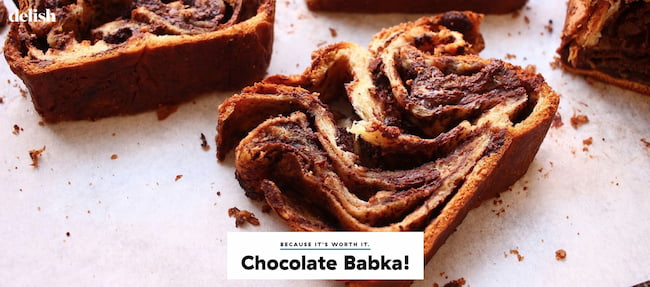
Setting the background color of a web page or an element on the page can enable you to create unique layouts.

Take the homepage of Delish as an example. The background image of its header section is a colorful soup. To ensure readers can still see the name of the recipe, the background color of the text box is set to white. The effect is striking and easy to read.
![Download Now: 25 HTML & CSS Hacks [Free Guide]](https://no-cache.hubspot.com/cta/default/53/bda442e5-294c-47ef-afde-339bbadd95e1.png)
In the past, you could use the background color attribute to change the background color of a page or element.
Say you wanted to change the background color of a web page to maroon. You would have simply added the bgcolor attribute in the opening body tag and set it to the hex color code #800000, as shown below.
<body bgcolor=”#800000">
However, this attribute has been deprecated in the latest version of HTML and replaced by a much better alternative, the CSS background-color property. Using this property, you can add and change background colors on your website.
Let’s go through how you can change background color in HTML. We’ll cover:
- Adding a background color in HTML
- Changing the background color in HTML
- Changing the background color of a div
- Choosing how to write your HTML color codes
- Adding transparency to a background color
- Creating a gradient background color
- Frequently asked questions
To add background color in HTML, use the CSS background-color property. Set it to the color name or code you want and place it inside a style attribute. Then add this style attribute to an HTML element, like a table, heading, div, or span tag.
Adding a background color can help a certain element stand out on the page, making it more readable.
We’ll walk through this process step-by-step. For this tutorial, we’ll make a table in HTML as an example.
1. Identify the HTML element you’d like to add a background to or create one.
Scan your HTML code to pinpoint which element you’d like to change. If it’s the header, look for the <header> opening tag. If it’s a div, look for the <div> tag.
In this example, we’re creating a table with the <table> tag.
2. Choose an HTML background color.
You have plenty of HTML color codes to choose from. For this example, we’ll make the color #33475b.
3. Add a style attribute to the opening tag.
Next, add the style attribute to the opening tag of your element. For this tutorial, only the background color of this specific table will change. The change will not affect any other element on the page.
Here’s the HTML with inline CSS:
 <table style="background-color:#33475b">
<tr>
<th>Name</th>
<th>Job Title</th>
<th>Email address</th>
</tr>
<tr>
<td>Anna Fitzgerald</td>
<td>Staff Writer</td>
<td>example@company.com</td>
</tr>
<tr>
<td>John Smith</td>
<td>Marketing Manager</td>
<td>example2@company.com</td>
</tr>
<tr>
<td>Zendaya Grace</td>
<td>CEO</td>
<td>example2@company.com</td>
</tr>
</table>

That’s simple. Now let’s look at what to do if you want to set the background color of multiple elements on a page.
How to Change Background Color in HTML
Let’s say you set the background color of your entire web page to one color and want to change the background color of a specific element to another color. The good news is the process for changing the background color of an element is nearly identical to the process for adding it.
You can use inline CSS to do this, but we’ll use multiple styles of CSS in the example below. Let’s walk through this process step-by-step.
1. Find the “body” CSS selector.
Rather than add this CSS in the body tag of the HTML file, we’ll add it using the body CSS selector. Find it in your website’s CSS code.
2. Change the background color of the body.
Next, we’ll change the background color of the entire web page using the background-color property.
Here’s the CSS:
 body {
background-color: #DBF9FC;
}
Here’s the result:
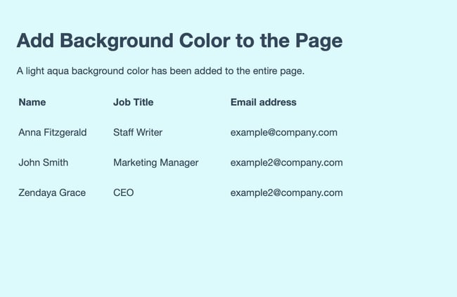
If this was the only CSS, then everything on the page would have the same light blue background. Next, we’ll add inline CSS to change the background color of the table.
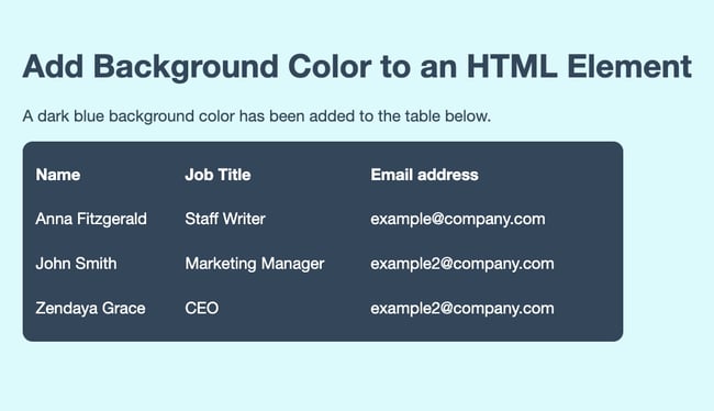
3. Add inline CSS to change the background color of specific elements.
If we want to change the background color of the table, we can use inline CSS to target that single element.
Here’s the opening tag with inline CSS:
<table style="background-color:#33475b">
Here’s the result:
How to Change a Div Background Color
A div is a container element that’s commonly used to designate different sections of a webpage.
Changing the background color of a div is identical to changing the background color of your web page’s body.
Usually, a web page will have many divs. In this tutorial, we’ll teach you how to change one div only.
Let’s go through the process step-by-step.
1. Add a CSS class to the div you’d like to change.
First, find the div in your HTML code and add a class to the opening tag. Adding a class to an element will allow you to change that element only.
Here’s what that looks like:
<div class=”example”>This is a div on a webpage. </div>
2. Add the new class selector to your CSS code.
Next, head over to your CSS code and add your new class selector. Within the brackets, include the background-color property.
Here’s what that looks like:
.example {background-color: ; }
3. Choose a new background color.
Next, choose a CSS background color for your background-color property. We chose rgb(255, 122, 89).
Here’s what that code looks like:
.example { background-color: rgb(255, 122, 89); }
Here’s the result:
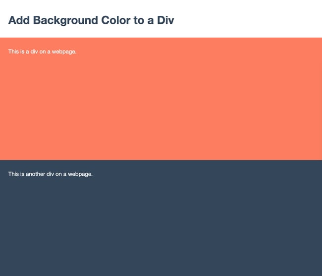
All done! You’ve changed the background of a div on your web page.
Learn More: The Beginner’s Guide to HTML & CSS
.png?width=269&name=Image%20Hackathon%20%E2%80%93%20Vertical%20(41).png)
Want to learn more about HTML? Download our free guide for best practices for getting started with HTML.
Background Color HTML Codes
In this post, we’ve been using color codes (more specifically, hex color codes) to add colors to the backgrounds of our page elements. But, there are actually a few ways to specify your background colors. Next, let’s review the different ways you can write colors in CSS.
Background Color Hex Codes
Hex codes are the most popular format for adding color to page elements in HTML. A hex code is a hexadecimal (base 16) number preceded by a hash symbol (#).
Every hex code contains six characters, and each pair of characters determines the intensity of the three primary colors (red, green, and blue in that order) from 00 (lowest intensity) to FF (highest intensity).
For example, the color white is the highest intensity of all three colors, so its hex code is #FFFFFF. Black is the opposite — the lowest intensity of all colors, or #000000. For the color green, we crank up the intensity for green and lower it for red and blue, giving us the hex code #00FF00. HubSpot’s signature shade of orange, Solaris, has the hex code #FF5C35.
If you do the math, this comes out to 16,777,216 possible hex codes. Fortunately, you don’t need to guess which color works best for your background. You can use an HTML color picker like this one to select a color from a spectrum, then simply copy the hex code it gives you.
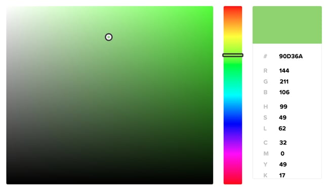
Image Source
Background Color Names
Hex values aren’t too difficult to understand, but there’s an even simpler way to add color in HTML: simply use the name of a color.
Modern browsers support 140 standardized HTML color names, including simple ones like Red, Green, Blue, Yellow, Orange, etc. There are also more precise hues like DarkRed, SpringGreen, SkyBlue, Khaki, and Coral.
Check out a color reference like this one for a list of all HTML color names and their corresponding hex and RGB codes. When you find a color value you like, use it as the value of your background-color property (no # symbol necessary).
body {
background-color: SpringGreen;
}
Background Color RGB Codes
We can also create HTML color values with RGB (red green blue) notation. Like hex codes, RGB values allow us to target a color value by specifying its red, green, and blue intensity.
To add color with RGB, we use the rgb() CSS function. This function takes three values inside the parentheses, each specifying the intensity of red, green, and blue in the color. Each value is a number from 0 to 255, with 0 being the least intense and 255 being the most intense.
For example, the RGB function for Solaris orange in CSS is rgb(255, 92, 53):
body {
background-color: rgb(255, 92, 53);
}
HTML color pickers will also provide RGB values along with hex codes, so this is the easiest way to find the RGB code you need. There are also plenty of hex-to-RGB converters online, like this one.
Alternatively, you can set an opacity level of your color with the CSS function rgba(). The “a” stands for alpha channel, which represents the level of transparency in a color. This function takes one extra value from 0 to 1, where 0 is completely transparent and 1 is completely opaque.
So, if I wanted to use Solaris with 75% transparency, I’d write the following:
body {
background-color: rgba(255, 92, 53, 0.75);
}
Background color HSL Values
Finally, you can use HSL values to set your colors in CSS. HSL, which stands for hue, saturation, and lightness, is written with the hsl() function. The syntax is similar to RGB, except you use percentages to indicate the saturation and lightness of the hue you pick.
To create Solaris with HSL, for example, use the function hsl(12, 100%, 60%).
body {
hsl(12, 100%, 60%);
}
You can also specify an alpha channel value with the function hsl(), which accepts an additional value from 0 to 1 and sets the transparency of the color.
How to Add Transparency to Your HTML Background Color
When changing background color in HTML, you aren’t limited to solid colors. You can change the opacity and transparency to create interesting visual effects.
To do that, you’d use the opacity property in CSS.
What’s the CSS opacity property?
The CSS opacity property is added to an HTML element (such as a div or a table) or a CSS attribute (such as a class) to make those elements partially or fully transparent. Values for this property range from 0 to 1, with 0 being completely transparent and 1 being completely opaque.
For this tutorial, we’ll use two buttons as an example. Let’s walk through the process of adding transparency step-by-step.
1. Identify the HTML elements you’d like to make transparent.
If you already know what you want to change, go ahead and find it in your HTML code.
In this tutorial, we have two Bootstrap buttons side by side. We want visitors to click one — the submit button — and not click the other — the “no thanks” option.
Here’s the HTML:
 <button class="btn" type="submit">Submit</button>
<button class="btn" type="submit">No thanks</button>
We want to decrease the opacity of the latter to make it seem deactivated and drive fewer clicks.
To achieve this result, we’ll use the CSS opacity property after adding a class to the button we’ll change.
2. Add a class to the element you’d like to change.
Next, we’ll assign an additional CSS class to the second button to distinguish it from the first.
We’ll add the class btn-secondary to the button we want to deemphasize.
Here’s what that looks like:
 <button class="btn" type="submit">Submit</button>
<button class="btn btn-secondary" type="submit">No thanks</button>
3. Add the class selector to your CSS code and apply the opacity property.
Now that you’ve created a new class, it’s time to add it to your CSS code.
To make the second button 40% see-through, we’ll use the .btn-secondary class selector to apply the opacity property. Then, we’ll set the opacity level to 0.4.
Here’s the CSS:
 .btn-secondary {
opacity: 0.4;
}
Here’s the result:

You may have noticed we did not need to use the CSS background-color property because we used Bootstrap’s default modifier classes.
Learn more about Bootstrap in The Ultimate Guide to Bootstrap CSS.
How to Create an HTML Background Color Gradient
For even more style options, you can create a gradient background. This is a special type of image that most commonly shows one color gradually changing to another color in a certain direction like top to bottom, left to right, or diagonally.
These are known as linear gradients. To create a linear gradient, you have to specify at least two color stops.
Let’s look at four quick examples below.
Linear Gradient Tutorial — Top to Bottom
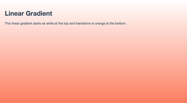
Say you want your background color to transition from white at the top of the screen to blue at the bottom.
Using the body CSS selector, you’ll apply unique style properties to the body of the web page. Here’s what that looks like from beginning to end.
- Step 1: Find the body selector in your CSS code.
- Step 2: Your body might already have a background-color property. Delete that. Rather than use the background-color property, you’ll use the background-image property.
- Step 3: Set the property to “linear-gradient” and specify two color stops in parentheses. Here’s the syntax:
body { background-image: linear-gradient(color, color); }
- Step 4: Next, you want to set the HTML element’s height to 100% to ensure this image takes up the entire screen.
All together, here’s the CSS:
 html {
height: 100%;
}
body {
background-image: linear-gradient(#FFFFFF, rgb(255, 122, 89));
}
Here’s the HTML (including the body tags):
 <body>
<h1>Linear Gradient</h1>
<p>This linear gradient starts as white at the top and transitions to orange at the bottom.</p>
</body>
Here’s the result:
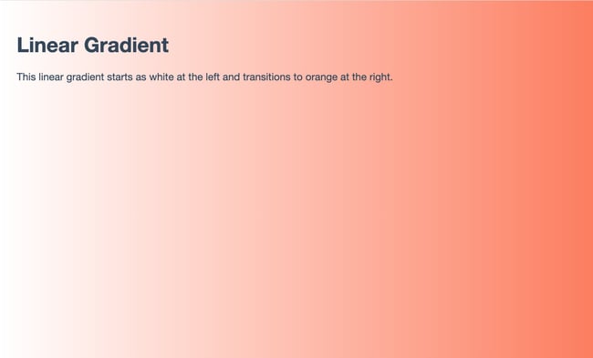
Linear Gradient — Left to Right
No direction was specified for the linear gradient above. That’s because top to bottom is the default direction.
If you’d like to specify another direction, then you’ll add it in the parentheses, before the color stops.
Here’s the CSS for the example above, rewritten so the gradient is left to right.
 html {
height: 100%;
}
body {
background-image: linear-gradient(to right, #FFFFFF, rgb(255, 122, 89));
}
Here’s the HTML:
 <body>
<h1>Linear Gradient</h1>
<p>This linear gradient starts as white at the left and transitions to orange at the right.</p>
</body>
Here’s the result:
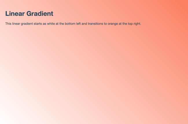
Linear Gradient — 45° Angle
If I wanted the gradient to go diagonally, then I could use the keywords “to bottom right,” “to bottom left,” “to top right,” or “to top left.” If you’d like more control over the direction of your gradient, then you could use angles rather than keywords.
Note that a value of 0 degrees is equivalent to the keyword «to top,” 90 degrees is equivalent to «to right,” and 180 degrees is equivalent to «to bottom.”
If I wanted the gradient to go to the top right, for example, then I could set the direction to 45deg.
Here’s the CSS:
 html {
height: 100%;
}
body {
background-image: linear-gradient(45deg, #FFFFFF, rgb(255, 122, 89));
}
Here’s the HTML:
 <body>
<h1>Linear Gradient</h1>
<p>This linear gradient starts as white at the bottom left and transitions to orange at the top right.</p>
</body>
Here’s the result:
Linear Gradient — Multiple Color Stops
To create a linear gradient, you need a minimum of two color stops. But there’s no maximum, which means you can use as many as you want. Below is an example with four color stops.
Here’s the CSS:
 html {
height: 100%;
}
body {
background-image: linear-gradient(to bottom right, #33475b, #0033CC, #FF77CC, rgb(255, 122, 89));
}
Here’s the HTML:
 <body>
<h1>Linear Gradient</h1>
<p>This linear gradient starts as dark blue at the top left and transitions from pink to orange at the bottom right.</p>
</body>
Here’s the result:

FAQs: Changing Background Color in HTML
Still have questions? We have answers for you.
How do you change text background color in HTML?
You can change the background color of text in HTML by adding a background-color property to a paragraph (p) or heading (H1, H2, H3… ) element.
Add this property either via inline CSS or on your website’s CSS code.
What is the default background color in HTML?
The default background color in HTML is transparent.
How do I make a background color transparent?
You can make a background color fully or partially transparent by using an RGBA color code to define the background-color property.
Here’s what that looks like in CSS:
background-color: rgba(255, 255, 255, 0);
The last value determines transparency. Be sure that it’s set to 0 if you want the color to be completely invisible.
How do I remove background color in HTML?
You can fully remove background color by setting the background-color property to “transparent.”
Here’s what that looks like in CSS:
background-color: transparent;
Changing Your Background Color with HTML & CSS
Using HTML and CSS, you can add background color to your web page or different elements on the page. This background color can be solid, transparent, or gradient depending on the style that you like. This basic web design knowledge can enable you to customize your website and make your content more readable and engaging.
Editor’s note: This post was originally published in September 2020 and has been updated for comprehensiveness.

Цвет фона
Цвет фона является достаточно важным элементом любой веб-страницы. Во-первых,
он задает нужное настроение и общий настрой сайта, а во-вторых, облегчает восприятие
текста.
Цвет фона веб-страницы задается с использованием атрибута bgcolor
тега <body>.
Пример 1. Изменение цвета фона
<!DOCTYPE HTML PUBLIC "-//W3C//DTD HTML 4.01 Transitional//EN" "http://www.w3.org/TR/html4/loose.dtd">
<html>
 <head>
  <meta http-equiv="Content-Type" content="text/html; charset=utf-8">
  <title>Цвет фона</title>
 </head>
 <body bgcolor="#c0c0c0">
   <p>...</p>
 </body>
</html>
Цвет можно указывать в шестнадцатеричном значении или по его имени.
Несмотря на то, что для фона можно указывать любой цвет, на большинстве
сайтов используются преимущественно белый фон и черные буквы, как
наиболее устоявшийся вариант.
Фоновый рисунок
В качестве фона можно использовать любое подходящее для этого изображение.
Фон не должен отвлекать внимание от текста, при этом должен хорошо сочетаться
с цветовой гаммой веб-страницы и быть маленьким по размеру, чтобы быстро загружаться.
Если после перечисленного вы все еще хотите добавить фоновый рисунок на страницу,
следует воспользоваться атрибутом background тега
<body>.
Пример 2. Добавление фонового рисунка
<!DOCTYPE HTML PUBLIC "-//W3C//DTD HTML 4.01 Transitional//EN" "http://www.w3.org/TR/html4/loose.dtd">
<html>
 <head>
  <meta http-equiv="Content-Type" content="text/html; charset=utf-8">
  <title>Фоновый рисунок</title>
 </head>
 <body background="images/bg.jpg">
  <p>...</p>
 </body>
</html>
Если изображение меньше размера экрана монитора, оно будет размножено
по горизонтали и вертикали.
Поскольку фоновый рисунок загружается медленнее, чем цвет фона,
может получиться, что текст не будет читаться некоторое время, пока
не произойдет загрузка рисунков. То же самое может случиться и при
отключенных в браузере рисунках. Поэтому рекомендуется всегда задавать
цвет фона наряду с фоновым рисунком (пример 3).
Пример 3. Использование фонового рисунка и цвета фона
<!DOCTYPE HTML PUBLIC "-//W3C//DTD HTML 4.01 Transitional//EN" "http://www.w3.org/TR/html4/loose.dtd">
<html>
 <head>
  <meta http-equiv="Content-Type" content="text/html; charset=utf-8">
  <title>Цвет фона</title>
 </head>
 <body bgcolor="#c0c0c0" background="images/bg.jpg">
   <p>...</p>
 </body>
</html>
Фиксированный фон
По умолчанию, при использовании полосы прокрутки, фоновый рисунок перемещается
вместе с содержимым веб-страницы. Internet Explorer позволяет сделать фон неподвижным
с помощью атрибута bgproperties=»fixed» тега <body>.
Пример 4. Задание фиксированного фона
<!DOCTYPE HTML PUBLIC "-//W3C//DTD HTML 4.01 Transitional//EN" "http://www.w3.org/TR/html4/loose.dtd">
<html>
 <head>
  <meta http-equiv="Content-Type" content="text/html; charset=utf-8">
  <title>Фон</title>
 </head>
 <body bgcolor="#c0c0c0" background="images/bg.jpg"
  bgproperties="fixed">
   <p>...</p>
 </body>
</html>
При указании атрибута bgproperties, как показано
в примере 4, фоновый рисунок на веб-странице будет оставаться неподвижным,
а текст, рисунки и другие элементы станут перемещаться вместе с полосой прокрутки.
Как сделать фон для сайта?
Любая комната будет выглядеть намного лучше, если ее пол устилает дорогой персидский ковер. Так чем хуже ваш сайт? Может, пришла пора и его пол «застелить» дорогим изящным паласом ручной работы. Разберемся подробнее, как сделать фон для сайта:

- Фон для сайта
- Основы работы с фоном в html
- Текстурный фон сайта
- Средства CSS
Бывает так, что старый дизайн сайта уже приелся. И хочется чего-нибудь новенького и вкусненького. А новый дизайн будет таковым, если его приготовить своими руками.
Но менять полностью весь дизайн ресурса самостоятельно – вещь неблагодарная. Да и не у всех под это дело как надо «заточены» руки. Поэтому легче всего освежить старый шаблон, изменив цвет фона ресурса или его фоновое изображение.
Существует несколько способов того, как поменять фон на сайте. Для этого используются возможности CSS или html. Но многие из свойств для работы с фоном имеют одинаковое название и методику применения в этих веб-технологиях.
В качестве фона можно использовать несколько элементов:
- Цвет;
- Фоновую картинку;
- Текстурное изображение.
Разберемся с применением каждого из них подробнее.
Для того чтобы установить цвет заднего фона для сайта используется свойство background-color стилевого атрибута style. То есть, чтобы задать основной цвет для веб-страницы, нужно прописать его внутри тега <body>. Например:
<body style="background-color: #55D52B">
<p>Фон сайта #55D52B</p>
</body>

Кроме шестнадцатеричного кода цвета поддерживается значение в формате ключевого слова или RGB. Примеры:
<body style="background-color: rgb(51,255,153)">
<p>Фон сайта rgb(23,113,44)</p>
</body>
<body style="background-color: green">
<p>Фон сайта green</p>
</body>

Установка цвета фона с помощью ключевых слов имеет ряд ограничений по сравнению с остальными двумя способами.
В html поддерживается всего 16 ключевых слов для задания цвета. Вот несколько из них: white, red, blue, black, yellow и другие.
Поэтому для того, чтобы установить фон для сайта html, лучше использовать шестнадцатеричный формат или RGB.
Кроме выбора цвета доступны и другие параметры настройки. Если свойству background-color задать значение transparent, то фон страницы станет прозрачным. Это значение данному свойству присвоено по умолчанию.
Теперь рассмотрим возможности языка гипертекста для установки фонового рисунка для сайта. Это возможно сделать с помощью свойства background-image.
Пример:
<body style="background-image: url(IMG_1809.jpg)">
 </body>

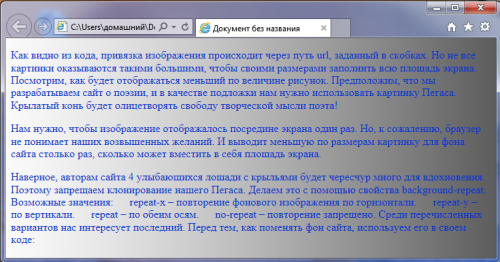
Как видно из кода, привязка изображения происходит через путь url, заданный в скобках. Но не все картинки оказываются такими большими, чтобы своими размерами заполнить всю площадь экрана. Посмотрим, как будет отображаться меньший по величине рисунок.
Предположим, что мы разрабатываем сайт о поэзии, и в качестве подложки нужно использовать изображение Пегаса. Крылатый конь будет олицетворять свободу творческой мысли поэта!

Нам нужно, чтобы изображение отображалось посредине экрана один раз. Но, к сожалению, браузер не понимает наших возвышенных желаний. И выводит меньшую по размерам картинку для фона сайта столько раз, сколько может вместить в себя площадь экрана:

Наверное, четырех улыбающихся лошадей с крыльями поэтам будет чересчур много для вдохновения. Поэтому запрещаем клонирование нашего Пегаса. Делаем это с помощью свойства background-repeat. Возможные значения:
- repeat-x – повторение фонового изображения по горизонтали;
- repeat-y – по вертикали;
- repeat – по обеим осям;
- no-repeat – повторение запрещено.
Среди перечисленных вариантов нас интересует последний. Перед тем, как поменять фон сайта, используем его в своем коде:
<body style="background-image: url(3.jpg); background-repeat: no-repeat" >
 </body>

Но, конечно, лучше, если бы наш летун расположился посредине экрана. Свойство background-position как раз и предназначено для позиционирования фонового рисунка на странице. Задавать координаты расположения можно несколькими способами:
- Ключевым словом (top , bottom , center, left, right);
- Процентами – отсчет начинается от верхнего левого угла;
- В единицах измерения (пикселях).
Воспользуемся самым простым вариантом центрирования:
<body style="background-image: url(3.jpg); background-repeat: no-repeat; background-position: top center">
 </body>
Бывает, что нужно зафиксировать положение рисунка при прокрутке. Поэтому прежде, как сделать картинку фоном сайта, воспользуйтесь специальным свойством background-attachment. Принимаемые им значения:
<ul>
<li> scroll;</li>
<li> fixed.</li>
</ul>
Нам нужно последнее значение. Теперь код нашего примера будет выглядеть вот так:[/HTML]
<body style="background-image: url(3.jpg); background-repeat: no-repeat; background-position: top center; background-attachment: fixed">
</body>
В первом примере для фона мы использовали большой и красивый пейзаж пустыни. Но за такую красоту приходится платить сполна. Вес изображения, выполненного в высоком качестве, может достигать нескольких мегабайт.
Такой объем никак не влияет на скорость загрузки страницы браузером при высокоскоростном соединении с интернетом. Но как быть с мобильным интернетом, при использовании которого загрузка нескольких «метров» займет много времени?
Все эти проблемы решаются с помощью текстурного фона. В нем в качестве рисунка текстуры используется маленькое изображение. Даже при условии его многократного повторения рисунок загружается лишь один раз.
Для создания темного фона для сайта заходим в Photoshop, создаем изображение в виде полоски длинной 1200 пикселей, и шириной 15 пикселей. Затем применяем простой черно-белый градиент и подключаем получившуюся текстуру к странице сайта:
<body style="background-image: url(1.png);color: rgb(0,51,204)">
</body>
Для наглядности мы добавили текст и задали его цвет с помощью свойства color. Вот что получилось:
Все свойства, описанные выше, также применимы и для каскадных таблиц стилей. Создадим фон сайта css, переписав код одного из наших предыдущих примеров:
<head>
<title>Документ без названия</title>
<style type="text/css">
body{
background-image: url(3.jpg);
background-repeat: no-repeat;
background-position: top center;
background-attachment: fixed;
}
</style>
</head>
<body>
</body>
Результат будет аналогичным.
Ну, вот мы и рассмотрели все варианты, как поменять фон на сайте. Теперь осталось лишь создать рисунок будущего ковра и расстелить его на страницах своего ресурса. Но это уже ваших рук дело.
Раздел:
Сайтостроение /
HTML /
|
|
План заработка в Интернете
Как правильно выбрать партнерские программы, чтобы гарантированно зарабатывать? Что необходимо сделать вначале, чтобы ваш заработок был стабильным и предсказуемым? Возможно ли стартовать вообще без денег и каких-либо вложений в рекламу? Этот план поможет вам сделать первые шаги к заработку, даст ответы на важные вопросы и убережет от ошибок в начале пути. |

Современные сайты часто используют в качестве фона страницы изображения (фотографии) или даже видео. И, тем не менее, знать простые способы изменения цвета фона страницы необходимо. Во всяком случае, обучение начинающих без этого не обходится.
Итак, если вы читали статью об обязательных тегах, то вы знаете,
что текст страницы располагается между тегами
<body></body>. Однако тег <body> не только определяет,
где должен быть текст страницы, но и может задавать многие параметры,
общие для всех элементов страницы.
Тег <body>
Слово body переводится с английского как
“тело”. Всё, что находится между тегами <body></body> — это тело
HTML-документа, это основа основ HTML-страницы.
В HTML4 (а также в XHTML) тег <body> может принимать множество атрибутов,
управляющих цветом и фоном документа. Некоторые браузеры предоставляют
дополнительные атрибуты для этого тега, однако мы не будем выходить за рамки
стандарта HTML 4.
Всё, что находится между открывающим тегом <body> и закрывающим тегом
</body> называется содержимым тела.
Закрывающий тег </body> в HTML можно не указывать, однако для
совместимости с XHTML лучше все теги делать парными.
Атрибуты тега <body> условно можно разделить на три части:
- Атрибуты, которые управляют внешним видом документа.
- Атрибуты, которые связывают функции в сценариях с самим документом.
- Атрибуты, которые отмечают, то есть именуют, дают имя телу, чтобы на него можно было ссылаться из других элементов сайта.
На этом краткое знакомство с тегом <body> пока закончим, и перейдём к
теме данной статьи.
Как задать цвет фона в HTML
Для задания цвета фона документа (страницы) используется атрибут bgcolor:
<body bgcolor="red">
В этом примере мы установили красный цвет фона страницы. Как задавать цвета с
помощью имён и чисел, я уже рассказывал здесь.
В теге <body> можно задать цвет не только для фона, но и для текста
страницы:
<body text="yellow" bgcolor="green">
Здесь мы установили зелёный фон и жёлтый текст для страницы. При необходимости
затем вы можете изменить цвет текста отдельного участка текста на странице,
как это мы делали здесь.
Можно также задавать цвета и некоторых других элементов страницы (например,
ссылок), но об этом в другой раз. Ну а если вам не терпится изучить все
премудрости вёрстки сайтов прямо сейчас, то решение здесь.
|
|
Как создать свой сайт
Очень небольшая книга, которую можно прочитать буквально за 15 минут. Но эти 15 минут дадут вам представление о том, как создаются современные сайты… |

|
|
Помощь в технических вопросах
Помощь студентам. Курсовые, дипломы, чертежи (КОМПАС), задачи по программированию: Pascal/Delphi/Lazarus; С/С++; Ассемблер; языки программирования ПЛК; JavaScript; VBScript; Fortran; Python; C# и др. Разработка (доработка) ПО ПЛК (предпочтение — ОВЕН, CoDeSys 2 и 3), а также программирование панелей оператора, программируемых реле и других приборов систем автоматизации. |
