
От автора: В этой статье мы познакомимся с инструментом range.css, предназначенным для оформления элемента <input type=»range»>. Данный тип элемента input является непростым в плане оформления, потому что требует непривычного сочетания стандартных селекторов и свойств с нестандартными селекторами, свойствами и вендорными префиксами.
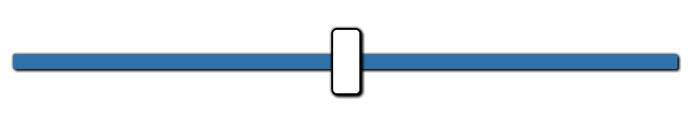
Возможности для стилизации элемента значительно улучшились с момента выхода версии браузера IE10. Теперь стало возможным создавать кроссбраузерные ползунки выбора диапазона (слайдеры), используя для этого только CSS. В этой обучающей статье мы возьмем стандартный элемент input типа range (Скриншот элемента input с типом range в Mac Chrome 38):

И превратим его вот в такой элемент (Оформление элемента input с типом range с помощью собственных стилей):


Практический курс по верстке адаптивного сайта с нуля!
Изучите курс и узнайте, как верстать современные сайты на HTML5 и CSS3
Узнать подробнее
Для того чтобы упростить процесс написания кроссбраузерных стилей, мы воспользуемся помощью препроцессора LESS. CSS стили также будут доступны.
Применение базовых CSS стилей
Необходимо применить несколько CSS правил, чтобы изменить отображение элемента input с типом range во всех браузерах.
|
1 2 3 4 5 6 7 8 9 10 11 12 13 14 15 16 17 18 19 20 |
input[type=range] { —webkit—appearance: none; /* Скрывает слайдер, чтобы можно было создать свой */ width: 100%; /* Указание параметра ширины требуется для Firefox. */ } input[type=range]::—webkit—slider—thumb { —webkit—appearance: none; } input[type=range]:focus { outline: none; /* Убирает голубую границу у элемента. Хотя, возможно, и стоит создавать некоторое оформления для состояния фокуса в целях обеспечения доступности. */ } input[type=range]::—ms—track { width: 100%; cursor: pointer; background: transparent; /* Скрывает слайдер, чтобы можно было добавить собственные стили. */ border—color: transparent; color: transparent; } |
В результате мы получим невидимые или нестилизованные элементы input type=»range» во всех браузерах. Теперь мы можем начать добавление собственных стилей.
Оформление ползунка
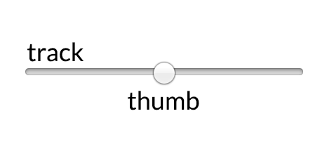
Небольшой графический элемент, по которому вы можете кликнуть и перетаскивать вдоль полосы диапазона, называется ползунок. Он поддается оформлению также, как и обычный HTML элемент.
|
1 2 3 4 5 6 7 8 9 10 11 12 13 14 15 16 17 18 19 20 21 22 23 24 25 26 27 28 29 30 31 32 33 34 |
/* Специальные правила для браузеров на движках WebKit/Blink */ input[type=range]::—webkit—slider—thumb { —webkit—appearance: none; border: 1px solid #000000; height: 36px; width: 16px; border—radius: 3px; background: #ffffff; cursor: pointer; margin—top: —14px; /* Вам нужно указать значение для поля в Chrome, но в Firefox и IE это происходит автоматически */ box—shadow: 1px 1px 1px #000000, 0px 0px 1px #0d0d0d; /* Добавляем классные эффекты для слайдера! */ } /* Тоже самое для Firefox */ input[type=range]::—moz—range—thumb { box—shadow: 1px 1px 1px #000000, 0px 0px 1px #0d0d0d; border: 1px solid #000000; height: 36px; width: 16px; border—radius: 3px; background: #ffffff; cursor: pointer; } /* Тоже самое для IE */ input[type=range]::—ms—thumb { box—shadow: 1px 1px 1px #000000, 0px 0px 1px #0d0d0d; border: 1px solid #000000; height: 36px; width: 16px; border—radius: 3px; background: #ffffff; cursor: pointer; } |
Обратите внимание на то, что повторение кода является в данном случае необходимым, т.к. мы не можем перечислить эти селекторы через запятую. Браузеры просто проигнорируют весь селектор целиком, если не поймут хотя бы какую-то его часть. Результат будет следующим: (Стилизованный элемент input на невидимой полосе диапазона (WebKit/Blink) или неоформленная полоса диапазона (Firefox и IE))

Оформление полосы диапазона
Линия, вдоль которой перемещается ползунок, называется полосой диапазона. Она также поддается оформлению, как и обычный HTML элемент.
На заметку: браузер Internet Explorer 10+ применяет немного другой подход к представлению элементов input type=»range». В IE вы можете определить совершенно разные стили для верхней (правая часть ползунка) и для нижней (левая часть ползунка) областей полосы диапазона.
А также стоит отметить, что вы можете изменить стили для состояния фокуса, когда пользователь взаимодействует с ползунком выбора диапазона.
|
1 2 3 4 5 6 7 8 9 10 11 12 13 14 15 16 17 18 19 20 21 22 23 24 25 26 27 28 29 30 31 32 33 34 35 36 37 38 39 40 41 42 43 44 45 46 47 48 49 50 51 |
input[type=range]::—webkit—slider—runnable—track { width: 100%; height: 8.4px; cursor: pointer; box—shadow: 1px 1px 1px #000000, 0px 0px 1px #0d0d0d; background: #3071a9; border—radius: 1.3px; border: 0.2px solid #010101; } input[type=range]:focus::—webkit—slider—runnable—track { background: #367ebd; } input[type=range]::—moz—range—track { width: 100%; height: 8.4px; cursor: pointer; box—shadow: 1px 1px 1px #000000, 0px 0px 1px #0d0d0d; background: #3071a9; border—radius: 1.3px; border: 0.2px solid #010101; } input[type=range]::—ms—track { width: 100%; height: 8.4px; cursor: pointer; background: transparent; border—color: transparent; border—width: 16px 0; color: transparent; } input[type=range]::—ms—fill—lower { background: #2a6495; border: 0.2px solid #010101; border—radius: 2.6px; box—shadow: 1px 1px 1px #000000, 0px 0px 1px #0d0d0d; } input[type=range]:focus::—ms—fill—lower { background: #3071a9; } input[type=range]::—ms—fill—upper { background: #3071a9; border: 0.2px solid #010101; border—radius: 2.6px; box—shadow: 1px 1px 1px #000000, 0px 0px 1px #0d0d0d; } input[type=range]:focus::—ms—fill—upper { background: #367ebd; } |
Этот код дает нам следующий результат (полоса диапазона без ползунка (Chrome) или неоформленный ползунок (Firefox and IE)):
Практический курс по верстке адаптивного сайта с нуля!
Изучите курс и узнайте, как верстать современные сайты на HTML5 и CSS3
Узнать подробнее

Создание полноценного элемента input с типом range
Теперь, когда мы создали отдельно ползунок и полосу диапазона, мы можем скомпоновать CSS стили вместе, чтобы получить полноценный элемент input с типом range.
Весь CSS код для оформления элементов input с типом range во всех браузерах
Далее приведен весь CSS код, необходимый для оформления элементов input с типом range во всех браузерах.
|
1 2 3 4 5 6 7 8 9 10 11 12 13 14 15 16 17 18 19 20 21 22 23 24 25 26 27 28 29 30 31 32 33 34 35 36 37 38 39 40 41 42 43 44 45 46 47 48 49 50 51 52 53 54 55 56 57 58 59 60 61 62 63 64 65 66 67 68 69 70 71 72 73 74 75 76 77 78 79 80 81 82 83 84 85 86 87 88 |
input[type=range] { —webkit—appearance: none; margin: 18px 0; width: 100%; } input[type=range]:focus { outline: none; } input[type=range]::—webkit—slider—runnable—track { width: 100%; height: 8.4px; cursor: pointer; animate: 0.2s; box—shadow: 1px 1px 1px #000000, 0px 0px 1px #0d0d0d; background: #3071a9; border—radius: 1.3px; border: 0.2px solid #010101; } input[type=range]::—webkit—slider—thumb { box—shadow: 1px 1px 1px #000000, 0px 0px 1px #0d0d0d; border: 1px solid #000000; height: 36px; width: 16px; border—radius: 3px; background: #ffffff; cursor: pointer; —webkit—appearance: none; margin—top: —14px; } input[type=range]:focus::—webkit—slider—runnable—track { background: #367ebd; } input[type=range]::—moz—range—track { width: 100%; height: 8.4px; cursor: pointer; animate: 0.2s; box—shadow: 1px 1px 1px #000000, 0px 0px 1px #0d0d0d; background: #3071a9; border—radius: 1.3px; border: 0.2px solid #010101; } input[type=range]::—moz—range—thumb { box—shadow: 1px 1px 1px #000000, 0px 0px 1px #0d0d0d; border: 1px solid #000000; height: 36px; width: 16px; border—radius: 3px; background: #ffffff; cursor: pointer; } input[type=range]::—ms—track { width: 100%; height: 8.4px; cursor: pointer; animate: 0.2s; background: transparent; border—color: transparent; border—width: 16px 0; color: transparent; } input[type=range]::—ms—fill—lower { background: #2a6495; border: 0.2px solid #010101; border—radius: 2.6px; box—shadow: 1px 1px 1px #000000, 0px 0px 1px #0d0d0d; } input[type=range]::—ms—fill—upper { background: #3071a9; border: 0.2px solid #010101; border—radius: 2.6px; box—shadow: 1px 1px 1px #000000, 0px 0px 1px #0d0d0d; } input[type=range]::—ms—thumb { box—shadow: 1px 1px 1px #000000, 0px 0px 1px #0d0d0d; border: 1px solid #000000; height: 36px; width: 16px; border—radius: 3px; background: #ffffff; cursor: pointer; } input[type=range]:focus::—ms—fill—lower { background: #3071a9; } input[type=range]:focus::—ms—fill—upper { background: #367ebd; } |
Полноценный элемент input с типом range
После применения стилей у нас получится следующий результат (Элемент input с типом range, созданный полностью с помощью собственных стилей.):
Бонус: Весь LESS код для оформления элементов input с типом range во всех браузерах
Для создания одинаковых элементов input с типом range для каждого браузера требуется большое количество CSS кода. Используя препроцессор, мы сможете значительно повысить эффективность вашей работы. Представленный далее LESS код используется для генерации CSS кода, который мы рассмотрели до этого.
|
1 2 3 4 5 6 7 8 9 10 11 12 13 14 15 16 17 18 19 20 21 22 23 24 25 26 27 28 29 30 31 32 33 34 35 36 37 38 39 40 41 42 43 44 45 46 47 48 49 50 51 52 53 54 55 56 57 58 59 60 61 62 63 64 65 66 67 68 69 70 71 72 73 74 75 76 77 78 79 80 81 82 83 84 85 86 87 88 89 90 91 92 93 94 95 96 97 98 99 100 101 102 103 104 105 106 107 108 109 110 111 112 |
@track—color: #424242; @thumb—color: #555bc8; @thumb—radius: 8px; @thumb—height: 30px; @thumb—width: 30px; @thumb—shadow—size: 1px; @thumb—shadow—blur: 1px; @thumb—shadow—color: #111; @thumb—border—width: 1px; @thumb—border—color: white; @track—width: 100%; @track—height: 10px; @track—shadow—size: 2px; @track—shadow—blur: 2px; @track—shadow—color: #222; @track—border—width: 1px; @track—border—color: black; @track—radius: 5px; @contrast: 5%; .shadow(@shadow—size,@shadow—blur,@shadow—color) { box—shadow: @shadow—size @shadow—size @shadow—blur @shadow—color, 0px 0px @shadow—size lighten(@shadow—color,5%); } .track() { width: @track—width; height: @track—height; cursor: pointer; animate: 0.2s; } .thumb() { .shadow(@thumb—shadow—size,@thumb—shadow—blur,@thumb—shadow—color); border: @thumb—border—width solid @thumb—border—color; height: @thumb—height; width: @thumb—width; border—radius: @thumb—radius; background: @thumb—color; cursor: pointer; } input[type=range] { —webkit—appearance: none; margin: @thumb—height/2 0; width: @track—width; &:focus { outline: none; } &::-webkit-slider-runnable-track { .track(); .shadow(@track—shadow—size,@track—shadow—blur,@track—shadow—color); background: @track—color; border—radius: @track—radius; border: @track—border—width solid @track—border—color; } &::-webkit-slider-thumb { .thumb(); —webkit—appearance: none; margin—top: ((—@track—border—width * 2 + @track—height) / 2) — (@thumb—height / 2); } &:focus::-webkit-slider-runnable-track { background: lighten(@track-color, @contrast); } &::-moz-range-track { .track(); .shadow(@track—shadow—size,@track—shadow—blur,@track—shadow—color); background: @track—color; border—radius: @track—radius; border: @track—border—width solid @track—border—color; } &::-moz-range-thumb { .thumb(); } &::-ms-track { .track(); background: transparent; border—color: transparent; border—width: @thumb—width 0; color: transparent; } &::-ms-fill-lower { background: darken(@track-color, @contrast); border: @track—border—width solid @track—border—color; border—radius: @track—radius*2; .shadow(@track—shadow—size,@track—shadow—blur,@track—shadow—color); } &::-ms-fill-upper { background: @track-color; border: @track—border—width solid @track—border—color; border—radius: @track—radius*2; .shadow(@track—shadow—size,@track—shadow—blur,@track—shadow—color); } &::-ms-thumb { .thumb(); } &:focus::-ms-fill-lower { background: @track-color; } &:focus::-ms-fill-upper { background: lighten(@track-color, @contrast); } } |
Браузерная поддержка
Сам по себе элемент input type=»range» имеет следующую браузерную поддержку: Firefox 23+, Safari 4+, iOS 5+, Chrome 6+, Opera 11+, IE 10+, Android 4.2+. Это довольно хорошо. Применение собственных стилей для оформления данного элемента не должно по большей части изменить данную браузерную поддержку, если вы будете следовать рекомендациям и коду, написанному в этой обучающей статье.
Вот скриншот демо-примера, иллюстрирующий отображение элемента input с типом range в современных версиях разных браузеров:

Если браузер не поддерживает элемент input type=»range», у вас будет просто отображаться элемент input type=»text», который будет валидным и будет работать.
Полезный инструмент
Возможность для создания кроссбраузерных стилей для элемента input с типом range появилась только в 2014 году, поэтому на данный момент существует не так много инструментов для генерации современных стилей. Инструмент range.css, который я создал, является очень удобным для этих целей.
Автор: Daniel Stern
Источник: //css-tricks.com/
Редакция: Команда webformyself.
Практический курс по верстке адаптивного сайта с нуля!
Изучите курс и узнайте, как верстать современные сайты на HTML5 и CSS3
Узнать подробнее

Верстка. Быстрый старт
Практический курс по верстке адаптивного сайта с нуля!
Смотреть
To style the range input with CSS you’ll need to apply styles to two pseudo-elements: ::-webkit-slider-thumb and ::-webkit-slider-runnable-track. Find out how you can apply custom styling and make the range input more functional and appealing.
Contents of the article:
- CSS selectors for the range input
- Improving usability
- A sprinkle of JavaScript
- Demo
The input element with a type of range is a native HTML form UI element that allows users to select a value by dragging a slider over a range field.
The default browser styling for this element is very basic and doesn’t provide enough information to the user which might confuse one. Also, the appearance of the range input element is different across browsers.
Range input HTML:
Range input appearance on different browsers:
Luckily there are ways you can improve that using nothing but native CSS and JavaScript.
CSS selectors for the range input
The range input widget consists of two parts the thumb and the track. Each one of these parts has its own pseudo-class selector for styling with a vendor suffix for cross-browser support.
Thumb:
input[type=”range”]::-webkit-slider-thumb
input[type=”range”]::-moz-range-thumb
input[type=”range”]::-ms-thumb
Track:
input[type=”range”]::-webkit-slider-runnable-track
input[type=”range”]::-moz-range-track
input[type=”range”]::-ms-track
input[type="range"] {
  -webkit-appearance: none;
  margin-right: 15px;
  width: 200px;
  height: 7px;
  background: rgba(255, 255, 255, 0.6);
  border-radius: 5px;
  background-image: linear-gradient(#ff4500, #ff4500);
  background-size: 70% 100%;
  background-repeat: no-repeat;
}

input[type="range"]::-webkit-slider-thumb {
  -webkit-appearance: none;
  height: 20px;
  width: 20px;
  border-radius: 50%;
  background: #ff4500;
  cursor: ew-resize;
  box-shadow: 0 0 2px 0 #555;
  transition: background .3s ease-in-out;
}

input[type=range]::-webkit-slider-runnable-track  {
  -webkit-appearance: none;
  box-shadow: none;
  border: none;
  background: transparent;
}
To indicate the selected value, we can add a color from the start of the track up until the thumb. To do that we can use the background-image property with the linear-gradient() value. The background-size property will be used to set the size, which can later be updated with JavaScript.
Improving usability
The default range input doesn’t specify any values selected. Which makes it hard for users to understand what value is currently selected.
While the hash marks and labels on the range input are a great way to aid users visually, this feature is yet to become available.
However, there are a few ways you can improve that with some additional HTML and JavaScript:
- Specify the output element to display the selected value
- Specify the number input that is synced to the range input
Specify the output element to display the selected value
The output element on the side of the range input will display the selected value. You’ll have to add an id attribute for the output element, and an oninput attribute for the range input with a short function as a value, that will update the output element contents.
<input type="range" min="0" max="100" oninput="rangevalue.value=value"/>
<output id="rangevalue">50</output>
Specify the number input that is synced to the range input
To take it a step further you can add a number input next to the range element.
That way the user will see the selected value and will have an option to modify it via the number input, which can be a better experience especially for mobile users.
<input type="range" value="50" min="0" max="100" id="range" oninput="rangevalue.value=value"/>
<input type="number" id="rangevalue" value="50" oninput="range.value=value">
A sprinkle of JavaScript
To finalize we’ll need some JavaScript code to make it all work. The oninput attribute is already updating value based on a target element.
But to update the selected area of the range input we need to calculate the ratio and apply that value to the input background-size property.
💡 NOTE: the value property of the range input is a string type, if you want to use is as a numeric value you should use valueAsNumber property.
const rangeInputs = document.querySelectorAll('input[type="range"]')
const numberInput = document.querySelector('input[type="number"]')

function handleInputChange(e) {
  let target = e.target
  if (e.target.type !== 'range') {
    target = document.getElementById('range')
  }
  const min = target.min
  const max = target.max
  const val = target.value

  target.style.backgroundSize = (val - min) * 100 / (max - min) + '% 100%'
}

rangeInputs.forEach(input => {
  input.addEventListener('input', handleInputChange)
})

numberInput.addEventListener('input', handleInputChange)
Custom range input Demo
Full example with all the code can be seen on CodePen:
See the Pen
Range Input with values (Pure HTML, CSS, JS) by Tippingpoint Dev (@tippingpointdev)
on CodePen.
The syntax differs from vendor to vendor, but in all cases, you have two components that need to be styled. The track is the long piece representing the range, and the thumb is the nub you slide to pick a value.
It is possible to apply styles directly to input[type=range], but you may run into cross-browser troubles. Best to take advantage of the vendor specific track and thumb selectors as much as possible. We’ll be using them to recreate this custom styled range slider.
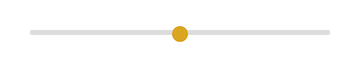
Webkit based browsers (Chrome, Safari, Opera)
In webkit based browsers, the track is styled with a special pseudo selector ::-webkit-slider-runnable-track, and the thumb with ::webkit-slider-thumb.
Custom focus styles can also be applied on the thumb and the track. If you go that route, you’ll have to remove default focus styles on the input itself.
Gotchas
You’ll need to tell webkit you want nothing to do with their default styles by including a -webkit-appearance: none; on both the input and the thumb.
input[type=range]{
-webkit-appearance: none;
}
input[type=range]::-webkit-slider-runnable-track {
width: 300px;
height: 5px;
background: #ddd;
border: none;
border-radius: 3px;
}
input[type=range]::-webkit-slider-thumb {
-webkit-appearance: none;
border: none;
height: 16px;
width: 16px;
border-radius: 50%;
background: goldenrod;
margin-top: -4px;
}
input[type=range]:focus {
outline: none;
}
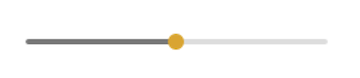
input[type=range]:focus::-webkit-slider-runnable-track {
background: #ccc;
}
Firefox
In Firefox, the track is styled using the ::-moz-range-track pseduo selector, and the thumb using ::-moz-range-thumb.
Gotchas
There’s currently a little bug in Firefox where outline: none doesn’t remove focus styles. If you have a solid background colour, you can hack a fix by hiding the outline under a border.
You’ll also need to give input[type=range] the same width as your track. It won’t expand to contain the track on it’s own.
input[type=range]{
    /* fix for FF unable to apply focus style bug  */
    border: 1px solid white;

    /*required for proper track sizing in FF*/
    width: 300px;
}

input[type=range]::-moz-range-track {
    width: 300px;
    height: 5px;
    background: #ddd;
    border: none;
    border-radius: 3px;
}

input[type=range]::-moz-range-thumb {
    border: none;
    height: 16px;
    width: 16px;
    border-radius: 50%;
    background: goldenrod;
}

/*hide the outline behind the border*/
input[type=range]:-moz-focusring{
    outline: 1px solid white;
    outline-offset: -1px;
}

input[type=range]:focus::-moz-range-track {
    background: #ccc;
}
Internet Explorer 10 +
Input type range is supported in IE10 and above. We can style the thumb with the ::-ms-thumb pseudo, and the track with ::-ms-track.
Gotchas
IE won’t let the thumb overflow the track, so you’ll have to settle for a taller track that’s at least as big as the thumb.
Update, 15.10.2014: The thumb still can’t overflow the track, but Graham Fowler pointed out a clever workaround. We can fake a wide enough track by adding a thick transparent border on the top and bottom of the track. We’ll also move most of our styles to ::-ms-fill-lower and ::-ms-fill-upper instead of ::ms-track to make sure things like border-radius render correctly.
To remove the default tick marks, you’ll need to set colour: transparent on the track.
Bonus
You can also use ::-ms-fill-lower and ::-ms-fill-upper to further customize the look of the track on either size of the thumb. Here, we’ve enhanced the UI by styling the lower part with a darker grey.
input[type=range]::-ms-track {
    width: 300px;
    height: 5px;

    /*remove bg colour from the track, we'll use ms-fill-lower and ms-fill-upper instead */
    background: transparent;

    /*leave room for the larger thumb to overflow with a transparent border */
    border-color: transparent;
    border-width: 6px 0;

    /*remove default tick marks*/
    color: transparent;
}
input[type=range]::-ms-fill-lower {
    background: #777;
    border-radius: 10px;
}
input[type=range]::-ms-fill-upper {
    background: #ddd;
    border-radius: 10px;
}
input[type=range]::-ms-thumb {
    border: none;
    height: 16px;
    width: 16px;
    border-radius: 50%;
    background: goldenrod;
}
input[type=range]:focus::-ms-fill-lower {
    background: #888;
}
input[type=range]:focus::-ms-fill-upper {
    background: #ccc;
}
Here’s the full cross-browser code snippet and result.

Cristofer
Posted on Apr 29, 2020
• Updated on May 7, 2020
We all as a developers know the importance of the <input /> tag element, without it, we wouldn’t have a way to receive any input from the user.
There are a lot of types that we can use on an input element, and each one, change the behavior of the element, here’s a list of the most common types of input’s:
- text: The default value. A single-line text field.

-
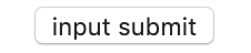
button: A push button with no default behavior displaying the value of the value attribute, empty by default. If it’s inside a
<form>tag, it will submit the form when pressed.
- checkbox: A check box allowing single values to be selected/deselected.

- color: A control for specifying a color; opening a color picker when active in supporting browsers.
- email: A field for editing an email address. Looks like a text input, but with validation parameters on supported devices.

- password: A single-line text field whose value is obscured. Will alert user if site is not secure.
- number: A control for entering a number. Displays a spinner and adds default validation when supported.
- hidden: A control that is not displayed but whose value is submitted to the server.
No image for obvious reason xD
- range: A control for entering a number whose exact value is not important. Displays as a range widget defaulting to the middle value.

As we can see, there are a lot of types that we can use, you can check them in deep here
<input type="range" />
In this post I’m going to show you how to modify the default style for the range input type so it looks better.
NOTE: All the code below works only on Chrome and Opera, TBH I didn’t even try to fix any visual bug on any other browser.
The very basic implementation of an input range looks like this:
<input type="range" />
Enter fullscreen mode
Exit fullscreen mode
This will render the same as the saw above:
We have available some extra properties when using this element:
-
value: String representation of a number, although it can’t be an empty string (""). The default value is always halfway betweenminandmaxproperties. This is how is calculated:
defaultValue = (rangeElem.max < rangeElem.min) ? rangeElem.min
               : rangeElem.min + (rangeElem.max - rangeElem.min)/2;
Enter fullscreen mode
Exit fullscreen mode
-
max&min: The maximum and minimum value permitted. -
step: The stepping interval. -
list: The id of the<datalist>element that contains optional pre-defined options.
Ok! enough with HTML Input 101, let’s put a style on that input!.
First we need the basic html structure, something like this:
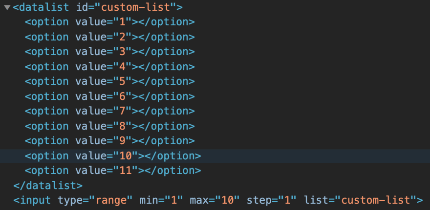
<div class="container">
  <datalist id="custom-list">
    <option value="1"></option>
    <option value="2"></option>
    <option value="3"></option>
    <option value="4"></option>
    <option value="5"></option>
    <option value="6"></option>
    <option value="7"></option>
    <option value="8"></option>
    <option value="9"></option>
    <option value="10"></option>
    <option value="11"></option>
  </datalist>
  <input type="range" min="1" max="10" step="1" list="custom-list"/>
</div>
Enter fullscreen mode
Exit fullscreen mode
The markup above will render this:
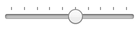
It renders a hash mark for each <option> of the <datalist> element.
Thumb and tracker
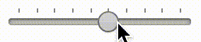
On any slider control, we have 2 element that we can interact to, the thumb and the tracker, the thumb is just the little widget that let you drag and drop along the track:

They’re called Shadow DOM elements and we can actually style them with CSS, so let’s start by that.
Enable user agent shadow DOM
I recommend you to enable the Shadow DOM on your browser, since we can’t inspect this elements by default, and sometimes it’s easier to just manipulate the element directly from the developer tools instead of the common process: change, save & reload.
I’ll show you how to activate it using Opera, but this works the same on Chrome, and I’m pretty sure that on FF it’s just as easy as it is on Opera (is just a checkbox, shouldn’t be a big issue on any browser).
So, first open the Developer Tools (F12) in your browser, once its open, either press F1 or use the kebab menu (A.K.A 3 dots menu) and click on the «settings» option:

This will open the settings section. Next, we only need to check the option «Show user agent shadow DOM» under the Elements list:

Now, if we inspect the input, instead of looking like a regular input element:
We’ll see the markup a bit different:
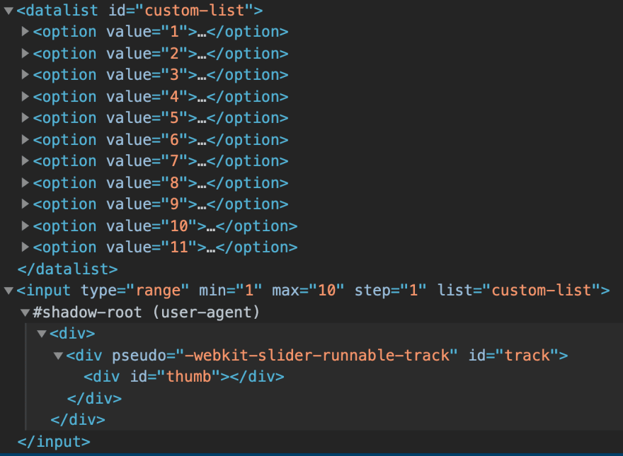
The input has elements inside, which represent the tracker and the thumb, now will be easier to inspect and modify the styles for this elements.
Styling
Let’s start by styling our container element and removing the default look & feel of the input
.container {
  position: relative;
  max-width: 450px;
  overflow: hidden;
}

input[type="range"] {
  -webkit-appearance: none;
  width: 100%;
}
Enter fullscreen mode
Exit fullscreen mode
To style the thumb and the tracker we have the pseudo-elements:
-
::-webkit-slider-runnable-track: Selector for the tracker. -
::-webkit-slider-thumb: Selector for the thumb.
IE and FF also have their pseudo-elements:
:-moz-range-trackand::-moz-range-thumbfor FF,::-ms-trackand::-ms-thumbfor IE
Using this, we’ll apply our custom styles, let’s start with the tracker:
input[type="range"]::-webkit-slider-runnable-track {
  width: 100%;
  height: 1.2em;
  cursor: pointer;
  border: 1px solid #29334f;
  overflow: hidden;
}
Enter fullscreen mode
Exit fullscreen mode
We set a border around the tracker and hide all the overflow content, now should look something like this:

I know, I know! It looks really ugly, so lets fix that by applying some style to the thumb:
input[type="range"]::-webkit-slider-thumb {
   height: 12px;
   width: 45px;
   cursor: pointer;
   -webkit-appearance: none;
   border-bottom: 1px solid #29334f;
   box-shadow: 0 0 0 red, -40px 0 0 red, -85px 0 0 red, -130px 0 0 red,
      -175px 0 0 red, -220px 0 0 red, -265px 0 0 red, -310px 0 0 red,
      -350px 0 0 red, -390px 0 0 red, -409px 0 0 red;
   background: black;
}
Enter fullscreen mode
Exit fullscreen mode
First remove the default look & feel for the thumb, then we create a box shadow (10 actually) for the thumb and position them one behind the other, so now the input looks better:
Remember, we have the shadowDOM active, if something doesn’t look the same, just inspect the element and change the style as you need.
Now, all we need to do is put some style in the <datalist> element:
#custom-list {
  display: flex;
  justify-content: space-between;
}

#custom-list option {
  position: relative;
  background: white;
  top: 18px;
  border-left: 1px solid black;
  border-right: 1px solid black;
}
Enter fullscreen mode
Exit fullscreen mode
Our datalist have a display flex and its items are align with a space between them, next, we just position all the datalist element upfront our input range (it was at the top). Finally we just set left and right borders on each option element. This is how it looks like:

Even though our input range is start taking shape, still looks a little weird, so let’s fix it.
The first problem, is the first option element with 2 borders, we don’t need that, so let’s hide it
#custom-list option:first-of-type {
  visibility: hidden;
}
Enter fullscreen mode
Exit fullscreen mode
But that’s not enough, we also need to fix the height of option so the top border of the option element will overflow a little bit the top border of the tracker.
You can base on the height we define for the thumb, in this case:
12px
#custom-list option {
  ...
  min-height: 12.5px; # just a little bit more
}
Enter fullscreen mode
Exit fullscreen mode
If we look at the end of our input range, we still se a weird border, something like «]» (is actually our input track), to fix that, let’s set overflow: hidden to the .container element:
.container {
  ...
  overflow: hidden;
}
Enter fullscreen mode
Exit fullscreen mode
And last but not least, let’s remove the ugly focus effect that the input have by default:
input[type="range"]:focus {
  outline: none;
}
Enter fullscreen mode
Exit fullscreen mode
And there you go!! Now you have a great looking input range, using only a few lines of CSS.
Before
After

You can check the full code here.
Happy coding!! 💻🤓