I need to change the background color of an image. The image is a circle image with white background, I need when you hover over it change the background of the circle image to blue. I need only the circle to be change.
My HTML code is
<div class="fb-icon">
<a href="http://www.facebook.com/mypage" target="_blank">
<img src="images/fb_normal.png" alt="Facebook">
</a>
</div>
In CSS I wrote:
.fb-icon:hover {
    background: blue;
}
The above code gives me blue color but as a frame around the circle icon. what I need is to change the background of the circle itself. Imagine it’s like a signal it’s white when you hover by mouse it goes to blue.
Please I need a solution if it can be done by CSS or whatever. Sorry if I make it too long.
The problem: link
asked Jan 28, 2012 at 17:09
HTML ManHTML Man
9254 gold badges17 silver badges39 bronze badges
6
Ideally you should use a transparent PNG with the circle in white and the background of the image transparent. Then you can set the background-color of the .fb-icon to blue on hover. So you’re CSS would be:
fb-icon{
    background:none;
}

fb-icon:hover{
    background:#0000ff;
}
Additionally, if you don’t want to use PNG’s you can also use a sprite and alter the background position. A sprite is one large image with a collection of smaller images which can be used as a background image by changing the background position. So for eg, if your original circle image with the white background is 100px X 100px, you can increase the height of the image to 100px X 200px, so that the top half is the original image with the white background, while the lower half is the new image with the blue background. Then you set setup your CSS as:
fb-icon{
    background:url('path/to/image/image.png') no-repeat 0 0;
}

fb-icon:hover{
    background:url('path/to/image/image.png') no-repeat 0 -100px;
}
answered Jan 28, 2012 at 17:41
Sagar PatilSagar Patil
1,92812 silver badges21 bronze badges
1
It’s a bit late but I came across this post.
It’s not perfect but here’s what I do.
HTML Code
<div class="showcase-menu-social"><img class="margin-left-20" src="images/graphics/facebook-50x50.png" alt="facebook-50x50" width="50" height="50" /><img class="margin-left-20" src="images/graphics/twitter-50x50.png" alt="twitter-50x50" width="50" height="50" /><img class="margin-left-20" src="images/graphics/youtube-50x50.png" alt="youtube-50x50" width="50" height="50" /></div>
CSS Code
.showcase-menu {
  margin-left:20px;
    margin-right:20px;
    padding: 0px 20px 0px 20px;
    background-color: #C37500;
    behavior: url(/css/border-radius.htc);
  border-radius: 20px;
    }

.showcase-menu-social img:hover {
  background-color: #C37500;
  opacity:0.7 !important;
  filter:alpha(opacity=70) !important; /* For IE8 and earlier */
  box-shadow: 0 0 0px #000000 !important;
}
Now my border radius of 20px matches up exactly with the image border radius. As you can see the .showcase-menu has the same background as the .showcase-menu-social. What this does is to allow the ‘opacity’ to take effect and no ‘square’ background or border shows, thus the image slightly reduces it’s saturation on hover.
It’s a nice effect and does give the viewer the feedback that the image is in focus. I’m fairly sure on a darker background, it would have even a better effect.
The nice thing is that this is valid HTML-CSS code and will validate. To be honest, it should work on non-image elements just as good as images.
Enjoy!
answered Jul 18, 2013 at 7:00
2
An alternative solution would be to use the new CSS mask image functionality which works in everything apart from IE (still not supported in IE11). This would be more versatile and maintainable than some of the other solutions suggested here. You could also more generally use SVG.
e.g.
item { mask: url('/mask-image.png'); }
There is an example of using a mask image here:
http://codepen.io/zerostyle/pen/tHimv
and lots of examples here:
http://codepen.io/yoksel/full/fsdbu/
answered Aug 15, 2014 at 11:04
WillsterWillster
2,5061 gold badge32 silver badges32 bronze badges
If the icon is from Font Awesome (https://fontawesome.com/icons/)
then you could tap into the color css property to change it’s background.
fb-icon{
color:none;
}

fb-icon:hover{
color:#0000ff;
}
This is irrespective of the color it had. So you could use an entirely different color in its usual state and define another in its active state.
answered May 25, 2020 at 17:14
brytebeebrytebee
411 silver badge7 bronze badges
If I understand correctly then it would be easier if you gave your image a transparent background and set the background container’s background-color property without having to use filters and so on.
http://www.ajaxblender.com/howto-convert-image-to-grayscale-using-javascript.html
Shows you how to use filters in IE. Maybe if you leverage something from that. Not very cross-browser compatible though. Another option might be to have two images and use them as background-images (rather than img tags), swap one out after another using the :hover pseudo selector.
answered Jan 28, 2012 at 17:13
backdeskbackdesk
1,7713 gold badges22 silver badges42 bronze badges
1
Ok, try this:
Get the image with the transparent circle — http://i39.tinypic.com/15s97vd.png
Put that image in a html element and change that element’s background color via css. This way you get the logo with the circle in the color defined in the stylesheet.
The html
<div class="badassColorChangingLogo">
    <img src="http://i39.tinypic.com/15s97vd.png" />
    Or download the image and change the path to the downloaded image in your machine
</div>
The css
div.badassColorChangingLogo{
    background-color:white;
}
div.badassColorChangingLogo:hover{
    background-color:blue;
}
Keep in mind that this wont work on non-alpha capable browsers like ie6, and ie7. for ie you can use a js fix. Google ddbelated png fix and you can get the script.
answered Jan 28, 2012 at 18:07
JuankJuank
5,9661 gold badge27 silver badges28 bronze badges
1
Use the background-color property instead of the background property in your CSS.
So your code will look like this:
.fb-icon:hover {
background: blue;
}
answered Sep 28, 2013 at 22:51
Oliver NiOliver Ni
2,5677 gold badges30 silver badges43 bronze badges
The best approach is to use a svg image in which the background would be a white rect and the foreground the circle, and set the hover property to the bg. It’s a vector graphic image so it will look fine on any screen size, not to mention that svg is meant to be used in the web. This svg should be just of some bytes and its rendered better than any raster or bitmap image.
answered Aug 4, 2021 at 0:19

Как менять цвет картинки при наведении курсора?
Пожалуйста, подскажите, иногда встречаю на сайтах такую фишку: при наведении на серое изображение — оно раскрашивается.
Вот последний пример со спонсорами: https://www.cybermarketing.ru/conf2015#sponsor
Когда-то делал обратную вещь, с помощью opacity менял вид цветного изображения. Но в этом случае, скорее всего используются скрипты.
Буду рад готовым шаблонам.
-
Вопрос заданболее трёх лет назад
-
10962 просмотра
Пригласить эксперта
Можно использовать css3, свойство filter, с помощью которого можно манипулировать с цветом картинки.
Вот тут примеры css3 image filters
Все демо тут
Браузеры, которые поддерживаю css3 filter, к сожалению IE тупит как всегда.
Если вам нужно только с чёрно белой на цветную тут хорошая статья с исходниками, а тут демо, поддержка IE 7+
img {
filter: greyscale(100%);
}
img:hover {
filter: greyscale(0);
}
Не во всех браузерах работает, поэтому придется добавить -moz- -ms- -webkit- -o-
Откройте код да посмотрите. Если коротко, то на приведенном примере используется смещение фона на событие hover. background-position: 0px -90px;
Сама же картинка является спрайтом.
Понял, что у них все сделано одной картинкой) Тогда это не так интересно)
Мне интереснее как готовую цветную картинку посредством css или js сделать черно-белой, но при наведении возвращать ей исходный цвет.
UPD
Вот еще несколько другое решение: registratura.ru/contacts/sotrudniki
Много уже кто писал, но всё же отвечу:
1. Ставим картику в класс, например, в .image-gray. И этому классу в CSS добавляем фильтр.
2. При наведении (:hover) — убираем этот фильтр.
Профит)
-
Показать ещё
Загружается…
10 февр. 2023, в 23:29
5000 руб./за проект
10 февр. 2023, в 23:26
6000 руб./за проект
10 февр. 2023, в 23:18
10000 руб./за проект
Минуточку внимания
Здравствуйте уважаемые читатели блога webcodius! Часто получаю вопросы: как сделать так, чтобы картинка на web-страничке менялась при наведении на нее курсора мыши. Такой эффект встречается на многих сайтах и самый простой пример, это когда вы наводите курсор на какую-нибудь кнопку, а она после этого меняет цвет. Иногда для создания подобного эффекта применяется JavaScript, но обычно достаточно одного CSS, особенно после появления CSS третьей версии. Далее в статье я расскажу как менять картинку при наведении курсора мыши с помощью только одного CSS, рассмотрю несколько способов и различные эффекты.
Эффекты изменения элемента веб страницы при наведении курсора мыши часто называют hover-эффектами. Связано это с тем, что при реализации таких эффектов используется псевдокласс :hover, который определяет стиль элемента при наведении на него курсора мыши.
Для начала рассмотрим вариант попроще. Допустим у Вас на страничке вставлена картинка, как приведено ниже:
Как вставлять картинки на веб-страницу вы можете узнать из статьи как вставить изображение на web-страницу.
И допустим вам необходимо менять ее отображение при наведении на нее курсора мыши. При вставке этого изображения к тегу img добвим атрибут class="animate1", тогда html-код картинки будет выглядеть примерно так:
<img class=»animate1″ src=»/img/1.jpg»>
Для начала можно просто при наведении курсора сделать картинку прозрачной. За прозрачность в CSS отвечает свойство opacity, которое относится к CSS3. В качестве значения используются дробные числа от 0 до 1, где ноль соответствует полной прозрачности, а единица, наоборот, непрозрачности объекта. Для старых версий Internet Explorer придется использовать свойство filter со значением alpha(Opacity=X), так как они не поддерживают свойство opacity. Вместо X надо будет подставить число от 0 до 100, где 0 означает полная прозрачность, а 100 — полная непрозрачность.
Тогда, чтобы сделать картинку прозрачной при наведении курсора в файл стилей, или между тегами <head> и </head> html-файла нужно добавить следующий css-код:
<style>
img.animate1:hover {
filter: alpha (Opacity=25);/* прозрачность для IE */
opacity: 0.25;/* прозрачность для других браузеров */
}
</style>
На случай если вы не разбираетесь в CSS поясню, что запись img.animate1:hover говорит браузеру, что для всех элементов <img>, имеющих атрибут class равный animate1 при наведении на них курсора мыши, применять указанные стили. А стили указываются между фигурными скобками { и }. Если все сделали правильно, то должно получиться примерно так:
Можно сделать картинку в исходном состоянии полупрозрачной, а при наведении курсора делать ее не прозрачной. Тогда в CSS-файл нужно добавить такие строки:
img.animate1 {
filter: alpha (Opacity=25);
opacity: 0.25;
}
img.animate1:hover {
filter: alpha (Opacity=100);
opacity: 1;
}
Результат будет такой:
Для большего эффекта можно замедлить изменения прозрачности картинки. Для этого можно воспользоваться свойством CSS transition, которое устанавливает эффект перехода между двумя состояниями элемента. Добавим для примера одну секунду замедления. Тогда наш CSS код станет таким:
img.animate1 {
filter: alpha (Opacity=25);
opacity: 0.25;
-moz-transition: all 1s ease-in-out; /* эффект перехода для Firefox до версии 16.0 */
-webkit-transition: all 1s ease-in-out; /* эффект перехода для Chrome до версии 26.0, Safari, Android и iOS */
-o-transition: all 1s ease-in-out; /* эффект перехода для Opera до версии 12.10 */
transition: all 1s ease-in-out; /* эффект перехода для других браузеров */
}
img.animate1:hover {
filter: alpha (Opacity=100);
opacity: 1;
}
Результат:
С помощью свойства transform изображение можно масштабировать, вращать, сдвигать, наклонять. Попробуем увеличить картинку. Тогда css-код будет таким:
img.animate1{
— moz-transition: all 1s ease;
— webkit-transition: all 1s ease;
— o-transition: all 1s ease;
transition: all 1s ease;
}
img.animate1:hover{
— moz-transform: scale (1.5); /* эффект трансформации для Firefox до версии 16.0 */
— webkit-transform: scale (1.5); /* эффект трансформации для Chrome до версии 26.0, Safari, Android и iOS */
— o-transform: scale (1.5); /* эффект трансформации для Opera до версии 12.10 */
— ms-transform: scale (1.5); /* эффект трансформации для IE 9.0 */
transform: scale (1.5); /* эффект трансформации для других браузеров */
}
И результат будет таким:
К увеличению картинки можно добавить поворот. Тогда css стили немного изменяться:
img.animate1{
— moz-transition: all 1s ease;
— webkit-transition: all 1s ease;
— o-transition: all 1s ease;
transition: all 1s ease;
}
img.animate1:hover{
— moz-transform: rotate (360deg) scale (1.5);
— webkit-transform: rotate (360deg) scale (1.5);
— o-transform: rotate (360deg) scale (1.5);
— ms-transform: rotate (360deg) scale (1.5);
transform: rotate (360deg) scale (1.5);
}
Результат:
Выше мы рассмотрели случаи, когда в анимировании участвует одна картинка. Далее рассмотрим способы подмены одного изображения на другое. В этом случае обычно подготавливают два изображения одинакового размера: одно для исходного вида, другое для его подмены.
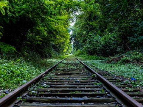
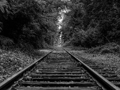
Допустим у нас есть две картинки, одна черно-белая другая цветная:
Сделаем так, чтобы при наведении курсора на черно-белое изображение отображалось цветное. Для этого исходную картинку сделаем фоном элемента div с помощью свойства background. А при наведнии на картинку курсора будем менять фоновую картинку с помощью все тех же псевдокласса hover и свойства background. Для реализации этого эффекта на html страницу добавляем элемент div с классом rotate1:
<div class=»cod»></div>
И добавляем следующие описания стилей:
div.rotate1 {
background: url (img/2.jpg); /* Путь к файлу с исходным рисунком */
width: 480px; /* Ширина рисунка */
height: 360px; /* Высота рисунка */
}
div.rotate1:hover {
background: url (img/1.jpg); /* Путь к файлу с заменяемым рисунком */
}
И результат:
Данный способ имеет один существенный недостаток. Так как второй рисунок загружается только при наведении курсора, то в случае если у пользователя медленный интернет, а размер файла с картинкой имеет большой размер, отображение картинки будет происходить с некоторой паузой. Поэтому ниже рассмотрим еще несколько способов подмены картинок при наведении курсора мыши.
Следующий способ будет основан на объединении двух картинок в один файл. Допустим нам нужно на страничку поместить кнопку, которая при наведении на нее курсора мыши меняла бы вид. Для этого два изображения объединяем в один файл и результирующая картинка будет выглядеть примерно так:

В этом случае смена одного рисунка на другой будет осуществляться путем сдвига фонового изображения по вертикали с помощью свойства background-position. Так как при клике по кнопке обычно происходит переход на другую страницу, то изображение вставим в элемент <a>. Тогда в html-страницу вставляем такой код:
<p align=»center»><a href=»#» class=»rotate2″></a></p>
А в css-файл такой:
a.rotate2 {
background: url (img/button.png); /* Путь к файлу с исходным рисунком */
display: block; /* Ссылка как блочный элемент */
width: 50px; /* Ширина рисунка в пикселах */
height: 30px; /* Высота рисунка */
}
a.rotate2:hover {
background-position: 0 -30px; /* Смещение фона */
}
Результат:
И последний на сегодня способ, это когда одно изображение размещается под другим с помощью css правила position: absolute. В этом случае помещаем в контейнер div два изображения:
<div class=»animate2″>
<img class=»first» src=»img/1.jpg» />
<img class=»second» src=»img/2.jpg» />
</div>
И добавим css-стилей:
.animate2{
position:relative;
margin:0 auto;/* устанваливаем блок div по центру страницы*/
width:480px; /* Ширина */
height: 360px; /* Высота */
}
.animate2 img {
position:absolute; /* абсолютное позиционирование*/
left: 0; /* выравниваем картинки по левому верхнему углу div-а*/
top: 0; /* выравниваем картинки по левому верхнему углу div-а */
}
После добавления правил css, картинки будут размещены друг под другом. Теперь управляя прозрачностью картинок с помощью свойства opacity в обычном состоянии будем показывать вторую картинку, а при наведении курсора первую. Для этого в обычном состоянии делаем картинку с классом first полностью прозрачной, а при наведении курсора наоборот: картинка с классом second будет полностью прозрачной, а с классом first не прозрачной:
.animate2 img.first { /* первая картинка полностью прозрачная */
opacity:0;
filter:alpha (opacity=0);
}
.animate2:hover img.first { /* при наведении курсора первая картинка становится не прозрачной */
opacity:1;
filter:alpha (opacity=100);
}
.animate2:hover img.second, .animate2 img.second:hover { /* а вторая при наведении курсора становится прозрачной */
opacity:0;
filter:alpha (opacity=0);
}
Результат:
Можно добиться плавности перехода добавив к последнему правилу свойство CSS transition:
.animate2:hover img.second, .animate2 img.second:hover {
opacity:0;
filter:alpha (opacity=0);
-moz-transition: all 2s ease;
-webkit-transition: all 2s ease;
-o-transition: all 2s ease;
transition: all 2s ease;
}
И результат:
А если добавить свойство transform:
.animate2:hover img.second, .animate2 img.second:hover {
opacity:0;
filter:alpha (opacity=0);
-moz-transform:scale (0, 1);
-webkit-transform:scale (0, 1);
-o-transform:scale (0, 1);
-ms-transform:scale (0, 1);
transform:scale (0, 1); /* уменьшаем ширину картинки до 0 */
}
Получится так:
Комбинируя различные CSS свойства можно добиться различных hover эффектов при смене картинок во время наведения курсора мыши. Эти и другие примеры я поместил на этой странице, там же можно скачать исходники. На этом все, до новых встреч.
Please take a look at this example of how it should look:

Please help me how to change image background color on hover, this is my code, as you can see in example above, color should be transparent
ul {
  list-style: none;
}

li {
  display: inline-block;
}

img {
  filter: brightness(50%);
  -webkit-filter: brightness(50%);
  -moz-filter: brightness(50%);
  -o-filter: brightness(50%);
  -ms-filter: brightness(50%);
  width: 246px;
  height: 180px;
}

a:hover img {
  background: blue;
}

.text {
  font-size: 30px;
  color: #fff;
  position: absolute;
  z-index: 1;
  top: 0;
  padding-left: 10px;
}
<div class="row">
<div class="col-lg-12">
<ul>
<li>
<div class="image">
<a href="#" title="Blog 7"><img src="http://mile.x3.rs/mile/hostel2hostel/img/bianca_capstick.png"></a>
</div>
<div class="text">
<p>Lorem Ipsum</p>
</div>
</li>
<li>
<div class="image">
<a href="#" title="Blog 8"><img src="http://mile.x3.rs/mile/hostel2hostel/img/coffe_keyboard.png"></a>
</div>
<div class="text">
<p>Lorem Ipsum</p>
</div>
</li>
<li>
<div class="image">
<a href="#" title="Blog 9"><img src="http://mile.x3.rs/mile/hostel2hostel/img/typing.png"></a>
</div>
<div class="text">
<p>Lorem Ipsum</p>
</div>
</li>
</ul>
</div>
</div>
Teepeemm
4,2815 gold badges34 silver badges57 bronze badges
asked Nov 29, 2015 at 18:00
Mile MijatovićMile Mijatović
2,7222 gold badges23 silver badges40 bronze badges
2
Use the alpha channel and a negative z-index
- First, you need to select the right element:
li:hover .image. -
Secondly, you need to use
rgbacolors to achieve transparency.li:hover .image{ background: rgba(0, 255, 255, 0.5); } -
Thirdly, push the actual images to the back:
img {
    position: relative;
    z-index: -1;
}
Working example:
answered Nov 29, 2015 at 22:55
0
Change background on a tag instead of img. Adjust color & opacity accordingly
a:hover {
     display:inline-block;
     background: #4AFFFF;
}
img:hover{
     opacity:0.5;
}
Instead of
a:hover img {
  background: blue;
}
To make it work on hovering over text use this code [li is parent of text and image both so it should work fine]
li:hover {
    background: #4AFFFF;
}
img:hover{
    opacity:0.5;
}
If you try this now you will see gap below images. Its only viewable on stackoverflow. When you will directly run this in browser you wont see any it.
I have checked with
Chrome, Firefox and Opearthere is notgapbelowimages
If for some reason you do see it. you can easily adjust it with margin/padding
answered Nov 29, 2015 at 22:34
SkyyySkyyy
1,5191 gold badge23 silver badges57 bronze badges
9
I was able to achieve the effect using two divs:
.a{
background-color:blue;width:100px; height:100px;}
.b{background-image:url("https://graph.facebook.com/1475846409390270/picture?type=large"); width:100px; height:100px;}
.b:hover{opacity:0.5;}


<a href="#"><div class="a"><div class="b"></div></div></a>
answered Nov 29, 2015 at 22:53
I have taken your code and edited it and produced a workable result from reading this article after a few minutes on Google:
https://css-tricks.com/tinted-images-multiple-backgrounds/
The result is done thus:
- Place the image in the CSS rather than as an
<img>element because as an element it will always be on top, or more fiddly layers will be required. - A downside of this is that a new set of CSS rules (copy/paste) will be required for each image but will each have a custom image associated (for each of your button links)
- The HTML has been simplified and all CSS is associated directly with the anchor link, the image is anchor link CSS rather than a child element.
- The actual colour change effect is caused by making a pseudo-gradient in the image, gradient being from- and to- the same colour so being uniform.
- I could not make this work this way without using the pseudo-gradient effect, ie using straight
rgba()values, on codepen.
My codepen: http://codepen.io/anon/pen/vNoxoZ
I strongly suspect there is a better way of doing this. But this appears to be what you are looking for.
A better way IS shown by adding an opacity value, as in Akash Kumar’s answer.
My Code:
    ul {
      list-style: none;
    }

    li {
      display: inline-block;
    }

    .anchorImage {
      filter: brightness(50%);
      -webkit-filter: brightness(50%);
      -moz-filter: brightness(50%);
      -o-filter: brightness(50%);
      -ms-filter: brightness(50%);
      width: 246px;
      height: 180px;
      display:block;
    }

    .image1 {
      background:url('http://mile.x3.rs/mile/hostel2hostel/img/bianca_capstick.png');

    }
    .image2 {
     background:url('http://mile.x3.rs/mile/hostel2hostel/img/coffe_keyboard.png');

    }
    .image3 {
         background:url('http://mile.x3.rs/mile/hostel2hostel/img/typing.png');
    }

    .image1:hover {
      background:
        /* top, transparent red, faked with gradient */
         linear-gradient(
          rgba(0, 0, 200, 0.45),
          rgba(0, 0, 200, 0.45)
        ),
        /* bottom, image */
        url('http://mile.x3.rs/mile/hostel2hostel/img/bianca_capstick.png');
    }
     .image2:hover {
      background:
        /* top, transparent red, faked with gradient */
         linear-gradient(
          rgba(0, 0, 200, 0.45),
          rgba(0, 0, 200, 0.45)
        ),
        /* bottom, image */
        url('http://mile.x3.rs/mile/hostel2hostel/img/coffe_keyboard.png');
    }
    .image3:hover {
      background:
        /* top, transparent red, faked with gradient */
         linear-gradient(
          rgba(0, 0, 200, 0.45),
          rgba(0, 0, 200, 0.45)
        ),
        /* bottom, image */
        url('http://mile.x3.rs/mile/hostel2hostel/img/typing.png');
    }
    .text {
      font-size: 30px;
      color: #fff;
      position: absolute;
      z-index: 1;
      top: 0;
      padding-left: 10px;
    }
<div class="row">
<div class="col-lg-12">
<ul>
<li>
<div class="image">
<a class='anchorImage image1' href="#" title="Blog 7"></a>
</div>
<div class="text">
<p>Lorem Ipsum one</p>
</div>
</li>
<li>
<div class="image">
<a href="#" title="Blog 8" class="anchorImage image2"></a>
</div>
<div class="text">
<p>Lorem Ipsum two</p>
</div>
</li>
<li>
<div class="image">
<a href="#" title="Blog 9" class="anchorImage image3"></a>
</div>
<div class="text">
<p>Lorem Ipsum three</p>
</div>
</li>
</ul>
</div>
</div>answered Nov 29, 2015 at 22:33
MartinMartin
21.7k10 gold badges65 silver badges127 bronze badges
First, you cannot change image background color with CSS (at least the basic CSS properties), it is the containers background color you can change and in HTML the image has a higher priority so the background color of the containing div, ul, li might change with your CSS rules but you will not be able to see it.
My opinion: I think the effect you want is an overlay on the image on hover. You can have an hidden div that will become visible with a slightly transparent property that will make it look like an overlay.
From the CSS styling, you might need some javascript
Amazingly you were so close to fixing it your way.
Here is the hack
img {
  filter: brightness(100%);
  -webkit-filter: brightness(100%);
  -moz-filter: brightness(100%);
  -o-filter: brightness(100%);
  -ms-filter: brightness(100%);
  width: 246px;
  height: 180px;
}

a:hover img {
  filter: brightness(50%);
  -webkit-filter: brightness(50%);
  -moz-filter: brightness(50%);
  -o-filter: brightness(50%);
  -ms-filter: brightness(50%);
}
instead of your a:hover img {background: blue;}
Note: the hover only affects the img property so if you hover over the text you might not see any overlay effect (you could edit the CSS to make that work though.)
answered Nov 30, 2015 at 1:29
ProdigyProdigy
3803 silver badges9 bronze badges
Did you try
a:hover img {
    background: blue;
    background: transparent;
}
Chris Loonam
5,7156 gold badges44 silver badges61 bronze badges
answered Nov 29, 2015 at 18:44
2
На многих сайтах есть блок, как например, наши клиенты. В этом блоке
обычно помещают товарные знаки фирм, которые по умолчанию имеет черно-белый цвет. Однако, если навести на них курсор мыши они приобретают первоначальный цвет.
Таким образом уменьшается цветовой шум страницы, что делает ее дизайн более согласованным.
Вот как можно добиться данного эффекта с помощью только лишь CSS:
HTML код:
<img class="grayscale-image" src="https://avatars.mds.yandex.net/get-pdb/2001933/86554d64-6d18-4c6a-b2c8-2587c956774a/orig" />
Код CSS:
/*

* у изображения с данным стилем цвет черно-белый

*/

.grayscale-image

{

    -webkit-transition: 3s;

    -moz-transition: 3s;

    -ms-transition: 3s;

    -o-transition: 3s;

    transition: 3s;

    -webkit-filter: grayscale(100%);

    filter: grayscale(100%);

}
/*
* при наведении курсора мыши применяем к изображению фильтр через css свойство filter
*/
.grayscale-image:hover
{
-webkit-transition: 3s;
-moz-transition: 3s;
-ms-transition: 3s;
-o-transition: 3s;
transition: 3s;
-webkit-filter: grayscale(0%);
filter: grayscale(0%);
}
Таким образом, данный стиль можно применять не только к изображениям в блоке наши клиенты, но и к блоку поделиться
там, где иконки социальных сетей. Обратите внимание, что в стилях мы указываем css свойства с вендорными префиксами, чтобы
эффект одинаково работал в различных браузерах.
-

Создано 26.11.2019 13:49:29
-
Михаил Русаков

Копирование материалов разрешается только с указанием автора (Михаил Русаков) и индексируемой прямой ссылкой на сайт (http://myrusakov.ru)!
Добавляйтесь ко мне в друзья ВКонтакте: http://vk.com/myrusakov.
Если Вы хотите дать оценку мне и моей работе, то напишите её в моей группе: http://vk.com/rusakovmy.
Если Вы не хотите пропустить новые материалы на сайте,
то Вы можете подписаться на обновления: Подписаться на обновления
Если у Вас остались какие-либо вопросы, либо у Вас есть желание высказаться по поводу этой статьи, то Вы можете оставить свой комментарий внизу страницы.
Если Вам понравился сайт, то разместите ссылку на него (у себя на сайте, на форуме, в контакте):
-
Кнопка:
Она выглядит вот так:
-
Текстовая ссылка:
Она выглядит вот так: Как создать свой сайт
- BB-код ссылки для форумов (например, можете поставить её в подписи):

На чтение 3 мин Просмотров 26.7к. Опубликовано 17.04.2021
Содержание
- В предыдущих сериях…
- Подключение через тег <img> в html
- Подключение фона в .css
- Описываем svg-графику inline
- Заключение
В предыдущих сериях…
В прошлой статье мы выяснили, в чем отличие растровых форматов изображения от векторных. Теперь будем работать с векторной графикой. Для начала, научимся подключать эти изображения разными способами.
Возьмем стандартную папку с проектом, в которой есть отдельная папка для изображений, отдельная — для файлов .css, а также файл .html
Подключение через тег <img> в html
Работаем как с обычной картинкой. Тег <img>, атрибут src, прописываем путь к файлу. Можно использовать любые атрибуты <img>, включая атрибут width.
HTML
<h2>Иконки</h2>
<img src="./img/calendar.svg" alt="Calendar" width="102">
Получаем результат.
Подключение фона в .css
Можно подключить svg-графику в качестве фона элемента. Часто используются фоновые паттерны. Это небольшой фрагмент, впоследствии повторяющийся и создающий орнамент.
Так выглядит наш паттерн:

Укажите в html нужный класс и пропишите свойства фона background-image в файле css. Используйте функцию url(), чтобы задать путь к файлу с изображением.
HTML
<h2>Фоновые изображения</h2>
<div class="block-bg"></div>
CSS
/* SVG фоновое изображение */
.block-bg {
    width: 600px;
    height: 200px;
    background-image: url('./../img/bg-zigzag.svg');
}
Вот, что у нас получилось:

Описываем svg-графику inline
Существуют специальные теги и атрибуты для описания графики прямо в коде. При этом, изображение становится интерактивным — мы можем, например, менять цвет, или размер по наведению на иконку.
Тег <svg> используется как контейнер для хранения SVG графики. При помощи тега <path> и его атрибутов создается фигура. Посмотрите, как выглядит иконка YouTube в inline формате.
HTML
<svg class="youtube-icon" xmlns="http://www.w3.org/2000/svg" viewBox="0 0 576 512">
   <path d="M549.655 124.083c-6.281-23.65-24.787-42.276-48.284-48.597C458.781 64 288 64 288 64S117.22 64 74.629 75.486c-23.497 6.322-42.003 24.947-48.284 48.597-11.412 42.867-11.412 132.305-11.412 132.305s0 89.438 11.412 132.305c6.281 23.65 24.787 41.5 48.284 47.821C117.22 448 288 448 288 448s170.78 0 213.371-11.486c23.497-6.321 42.003-24.171 48.284-47.821 11.412-42.867 11.412-132.305 11.412-132.305s0-89.438-11.412-132.305zm-317.51 213.508V175.185l142.739 81.205-142.739 81.201z"></path>
</svg>
Стилизуем в файле .css по классу youtube-icon.
Будем менять цвет иконки по наведению при помощи свойства fill.
CSS
/* SVG inline код. Смена цвета по ховеру */
.youtube-icon {
    width: 64px;
    height: 64px;
    fill: black;
}

.youtube-icon:hover {
    fill: red;
}
Взгляните на результат:

Заключение
- Мы разобрали 3 стандартных способа подключения SVG-графики на сайт: тег
<img>, свойства CSS, тег<svg>. - Узнали про то, как можно менять цвет SVG-иконки через CSS и свойство
fill. - В следующей статье продолжим работу с тегам
<svg>,<path>, разберем как можно ещё кастомизировать векторную графику.
Главная » Рецепты CSS » Три способа сделать так, чтобы картинка менялась при наведении курсора мыши
Многие веб-мастера на своих сайтах в меню или на кнопках используют такой эффект, когда картинки меняются при наведении на них курсора мышки. Если вас интересует, как осуществить такой эффект, то в этой статье, я расскажу о трех способах, с помощью которых можно сделать так, чтобы картинка менялась при наведении на нее курсора мыши.
Использую чистый CSS, без JavaScript и jQuery.
Способ №1 – использование двух картинок
Подготовьте два изображения. Они должны быть одинаковых размеров, но различными по цвету.

knopka-1.png

knopka-2.png
Теперь вставим эти две кнопки в файл:
<html>
 <head>
  <meta charset="utf-8">
  <title>Способ №1 - bloggood.ru</title>
  <style>
   a.rollover {
    background: url(knopka-1.png); /* рисунок, который увидим сразу  */
    display: block; /*  Рисунок как блочный элемент */
    width: 300px; /* Ширина рисунка */
    height: 100px; /*  Высота рисунка */
   }
   a.rollover:hover {
    background: url(knopka-2.png); /* заменяемый рисунок при наведении мыши  */
   }
  </style>
 </head>
 <body>
  <p><a href="#" class="rollover"> </a></p>
  </body>
</html>
[посмотреть пример] или [скачать исходник]
Способ №2 – использование одной картинки
Подготовьте одну картинку. Но на картинке должно быть два изображения кнопки разных по цвету.

knopka-3.png
Вы, наверное, задаете себе вопрос, как картинка будет меняться на другую, если она одна?! Легко, за счёт использования свойства background-position.
Замена одного изображения на другое происходит с помощью сдвига по вертикали. Вот и все чудеса! Смотрите на код:
<html>
 <head>
  <meta charset="utf-8">
  <title>Способ №2 - bloggood.ru</title>
  <style>
   a.rollover {
    background: url(knopka-3.png); /* рисунок, который увидим сразу  */
    display: block; /*  Рисунок как блочный элемент */
    width: 280px; /* Ширина рисунка */
    height: 70px; /*  Высота рисунка */
   }
   a.rollover:hover {
    background-position: 0 -70px; /* Смещение фона */
   }
  </style>
 </head>
 <body>
  <p><a href="#" class="rollover"> </a></p>
  </body>
</html>
[посмотреть пример] или [скачать исходник]
Способ №3 – использование одной картинки и CSS-эффект
Возьмите картинку из способа №1, например, «knopka-1.png». Здесь нам понадобится только одна картинка. При наведении на картинку мышкой сработает CSS-эффект. Смотрите на код:
<html>
 <head>
  <meta charset="utf-8">
  <title>Способ №3 - bloggood.ru</title>
  <style>
   a.rollover {
    background: url(knopka-1.png); /* рисунок, который увидим сразу  */
    display: block; /*  Рисунок как блочный элемент */
    width: 300px; /* Ширина рисунка */
    height: 100px; /*  Высота рисунка */
   }
   a.rollover:hover {
    -webkit-filter: grayscale(100%); /* css-эффект при наведении мыши  */
   }
  </style>
 </head>
 <body>
  <p><a href="#" class="rollover"> </a></p>
  </body>
</html>
[посмотреть пример] или [скачать исходник]
Вот такие вот пироги на сегодня!
Понравился пост? Помоги другим узнать об этой статье, кликни на кнопку социальных сетей ↓↓↓
Последние новости категории:
Похожие статьи
Популярные статьи:
Добавить комментарий
Метки: css