HTML CSS JS
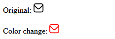
Как изменить цвет svg
Дата размещения статьи 25/09/2018 👁103682
Как изменить цвет svg
Изменим цвет svg картинки двумя способами: сначала используем свойство fill, затем mask-image.
Первый способ. Картинка должна быть inline SVG. Если так, тогда просто изменим цвет с помощью свойства fill
Цвет svg картинки изменяется с помощью CSS свойства fill — заливки.
See the Pen Inline svg by Nikolay (@Only-to-top) on CodePen.
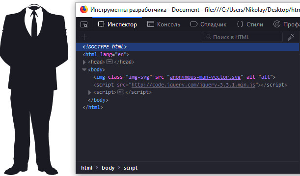
Если svg в вставлено в HTML в виде тега img, то нужно добавить следующий js-код:
$("img.img-svg").each(function () {
    var $img = $(this);
    var imgClass = $img.attr("class");
    var imgURL = $img.attr("src");
    $.get(imgURL, function (data) {
        var $svg = $(data).find("svg");
        if (typeof imgClass !== "undefined") {
            $svg = $svg.attr("class", imgClass + " replaced-svg");
        }
        $svg = $svg.removeAttr("xmlns:a");
        if (!$svg.attr("viewBox") && $svg.attr("height") && $svg.attr("width")) {
            $svg.attr("viewBox", "0 0 " + $svg.attr("height") + " " + $svg.attr("width"))
        }
        $img.replaceWith($svg);
    }, "xml");
});
В данном примере мы используем класс img-svg, который мы добавляем к изображению в HTML-странице, благодаря которому svg-картинка из img станет inline svg.
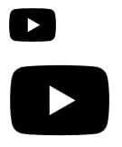
Изображение было в виде тега img:
Изображение стало inline svg:
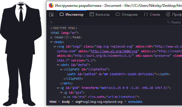
Теперь можем изменить цвет нашей svg картинки, используя свойство fill, как в первом примере.
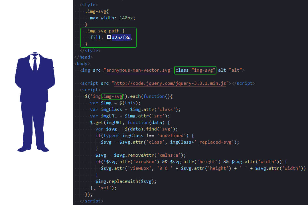
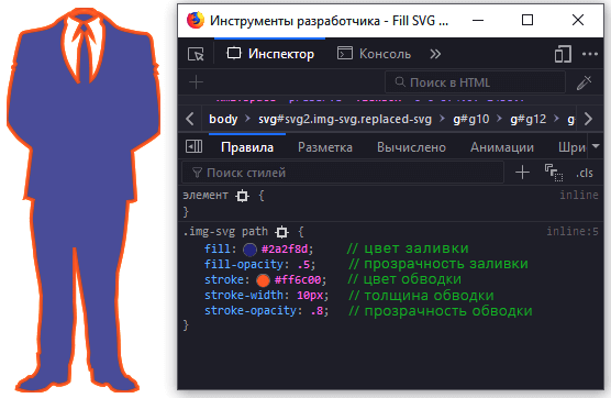
Какие ещё свойства можно применить к svg картинке
.img-svg path,
.img-svg polygon {
    fill-opacity: 0.5; /* прозрачность заливки */
    stroke: #ff6c00; /* цвет обводки */
    stroke-width: 10px; /* толщина обводки */
    stroke-opacity: 0.8; /* прозрачность обводки */
}
Это далеко не полный перечень свойств, которые можно использовать для работы с svg, это лишь самые часто используемые.
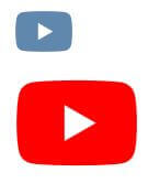
Второй способ. Реализуем с помощью свойства mask-image
В HTML создадим два элемента: div и ссылку:
<a href="#" class="link"></a>
<div class="div"></div>
Используем свойство mask-image чтобы задать фон для картинки и background-color чтобы задать цвет:
.link {
    width: 30px;
    height: 26px;
    background-color: #000;
    display: block;
    mask-image: url("img/youtube.svg");
}
.div {
    height: 55px;
    width: 62px;
    background-color: #000;
    mask-image: url("img/youtube.svg");
}
Пробуем изменить цвет:
Полезные ссылки
- Как вставить SVG на сайт.
- Анимация SVG.
Временная шкала Windows 10 Лучшие плагины для VS Code
Надеюсь, вам понравилась данная информация. Если вам интересна тема web-разработки,
то можете следить за выходом новых статей в Telegram.
- JavaScript: Работа с Массивами
- Наличие Динамически Добавленного Элемента
- Стилизация Input File
- Предзагрузка Картинок — Предварительная Загрузка Изображений на JavaScript
- Стилизация Скролла
- События Формы
2020 answer
CSS Filter works on all current browsers
To change any SVGs color
-
Add the SVG image using an
<img>tag.<img src="dotted-arrow.svg" class="filter-green"/> -
To filter to a specific color, use the following Codepen (click here to open the codepen) to convert a hexadecimal color code to a CSS filter:
For example, output for
#00EE00isfilter: invert(42%) sepia(93%) saturate(1352%) hue-rotate(87deg) brightness(119%) contrast(119%); -
Add the CSS
filterinto this class..filter-green{ filter: invert(48%) sepia(79%) saturate(2476%) hue-rotate(86deg) brightness(118%) contrast(119%); }
answered Nov 16, 2018 at 11:14
Manish MenariaManish Menaria
21.6k3 gold badges20 silver badges23 bronze badges
19
To change the color of any SVG, you can directly change the SVG code by opening the SVG file in any text editor. The code may look like the below code:
<?xml version="1.0" encoding="utf-8"?>
<!-- Generator: Adobe Illustrator 16.0.0, SVG Export Plug-In . SVG Version: 6.00 Build 0)  -->
<!DOCTYPE svg PUBLIC "-//W3C//DTD SVG 1.1//EN" "http://www.w3.org/Graphics/SVG/1.1/DTD/svg11.dtd">
<svg version="1.1" id="Layer_1" xmlns="http://www.w3.org/2000/svg" xmlns:xlink="http://www.w3.org/1999/xlink" x="0px" y="0px"
     width="500px" height="500px" viewBox="0 0 500 500" enable-background="new 0 0 500 500" xml:space="preserve">

    <g>
        <path d="M114.26,436.584L99.023,483h301.953l-15.237-46.416H114.26z M161.629,474.404h-49.592l9.594-29.225h69.223
                 C181.113,454.921,171.371,464.663,161.629,474.404z"/>

    /* Some more code goes on */
    </g>
</svg>
You can observe that there are some XML tags like path, circle, polygon, etc.. There you can add your own color with help of the style attribute. Look at the below example
<path fill="#AB7C94" d="M114.26,436.584L99.023,483h301.953l-15.237-46.416H114.26z M161.629,474.404h-49.592l9.594-29.225h69.223
                        C181.113,454.921,171.371,464.663,161.629,474.404z"/>
Add the style attribute to all the tags so that you can get your SVG of your required color.
As per Daniel’s comment, we can use fill attribute directly instead of fill element inside style attribute.
answered Dec 4, 2014 at 6:10
8
You can’t change the color of an image that way. If you load SVG as an image, you can’t change how it is displayed using CSS or JavaScript in the browser.
If you want to change your SVG image, you have to load it using <object>, <iframe> or using <svg> inline.
If you want to use the techniques in the page, you need the Modernizr library, where you can check for SVG support and conditionally display or not a fallback image. You can then inline your SVG and apply the styles you need.
See:
You can inline your SVG. Tag your fallback image with a class name (my-svg-alternate):
<svg width="96px" height="96px" viewBox="0 0 512 512" enable-background="new 0 0 512 512" xml:space="preserve">
<path id="time-3-icon" .../>
</svg>

<image class="my-svg-alternate" width="96" height="96" src="ppngfallback.png" />
And in CSS use the no-svg class from Modernizr (CDN: http://ajax.aspnetcdn.com/ajax/modernizr/modernizr-2.7.2.js ) to check for SVG support. If there isn’t any SVG support, the SVG block will be ignored and the image will be displayed, otherwise the image will be removed from the DOM tree (display: none):
.my-svg-alternate {
  display: none;
}
.no-svg .my-svg-alternate {
  display: block;
  width: 100px;
  height: 100px;
  background-image: url(image.png);
}
Then you can change the color of your inlined element:
#time-3-icon {
   fill: green;
}
answered Mar 7, 2014 at 14:39
helderdarochahelderdarocha
22.9k4 gold badges48 silver badges64 bronze badges
9
If you want to change the color dynamically:
-
Open the SVG in a code editor
-
Add or rewrite the attribute of
fillof every path tofill="currentColor" -
Now, that svg will take the color of your font color, so you can do something like:
svg {
    color : "red";
}
answered Dec 4, 2020 at 16:56
Mártin AlcaláMártin Alcalá
3,4401 gold badge7 silver badges13 bronze badges
12
Only SVG with path information. You can’t do that to the image… as the path you can change stroke and fill information and you are done. like Adobe Illustrator
So, via CSS you can overwrite the path fill value:
path { fill: orange; }
But if you want a more flexible way as you want to change it with a text when having some hovering effect going on, use:
path { fill: currentColor; }
body {
  background: #ddd;
  text-align: center;
  padding-top: 2em;
}

.parent {
  width: 320px;
  height: 50px;
  display: block;
  transition: all 0.3s;
  cursor: pointer;
  padding: 12px;
  box-sizing: border-box;
}

/***  desired colors for children  ***/
.parent{
  color: #000;
  background: #def;
}
.parent:hover{
  color: #fff;
  background: #85c1fc;
}

.parent span{
  font-size: 18px;
  margin-right: 8px;
  font-weight: bold;
  font-family: 'Helvetica';
  line-height: 26px;
  vertical-align: top;
}
.parent svg{
  max-height: 26px;
  width: auto;
  display: inline;
}

/****  magic trick  *****/
.parent svg path{
  fill: currentcolor;
}
<div class='parent'>
<span>TEXT WITH SVG</span>
<svg version="1.1" xmlns="http://www.w3.org/2000/svg" xmlns:xlink="http://www.w3.org/1999/xlink" width="128" height="128" viewBox="0 0 32 32">
<path d="M30.148 5.588c-2.934-3.42-7.288-5.588-12.148-5.588-8.837 0-16 7.163-16 16s7.163 16 16 16c4.86 0 9.213-2.167 12.148-5.588l-10.148-10.412 10.148-10.412zM22 3.769c1.232 0 2.231 0.999 2.231 2.231s-0.999 2.231-2.231 2.231-2.231-0.999-2.231-2.231c0-1.232 0.999-2.231 2.231-2.231z"></path>
</svg>
</div>
answered Apr 3, 2018 at 10:05
Biskrem MuhammadBiskrem Muhammad
3,7942 gold badges30 silver badges37 bronze badges
2
Solution 1 — Edit SVG to point to the currentColor
<svg>... fill: currentColor stroke: currentColor ...</svg>
Then you can control the color of the stroke and the fill from your CSS content:
svg {
  color: blue; /* Or any color of your choice. */
}
Pros and cons:
- Simple and uses conventional supported CSS.
Suitable if:
- You control the SVG
- SVG can be included inline in the HTML.
Solution 2 — CSS mask property
<i class="icon"></i>
  .icon {
    -webkit-mask-size: cover;
    mask-size: cover;
    -webkit-mask-image: url(https://url.of.svg/....svg);
    mask-image: url(https://url.of.svg/....svg);
    background-color: blue; /* Or any color of your choice. */
    width: 20px;
    height: 20px;
  }

}
Pros and cons
- Relatively easy to use
- Browser support for the
maskCSS property is partial.
Suitable if:
- SVG is external, and included via URL
- Meant to be used on modern known browsers.
Solution 3 — CSS Filter property — static color
If the color is known in advance, you can use https://codepen.io/sosuke/pen/Pjoqqp to find the filter needed to change your SVG to the desired color. For example, to convert the svg to #00f:
<img src="https://url.of.svg/....svg" class="icon">
.icon {
    filter: invert(8%) sepia(100%) saturate(6481%) hue-rotate(246deg) brightness(102%) contrast(143%);
}
If your original color isn’t black, prefix the list of filters with brightness(0) saturate(100%) to convert it first to black.
Pros and cons:
- There might be a small, nonsignificant difference between the result and the desired color.
Suitable if:
- Desired color is known in advance.
- External image
answered Aug 7, 2021 at 18:21
Ben CarpBen Carp
22.6k8 gold badges58 silver badges70 bronze badges
3
SVG mask on a box element with a background color will result:
body{ overflow:hidden; }

.icon {
  --size: 70px;
  display: inline-block;
  width: var(--size);
  height: var(--size);
  transition: .12s;

  -webkit-mask-size: cover;
  mask-size: cover;
}

.icon-bike {
  background: black;
  animation: 4s frames infinite linear;

  -webkit-mask-image: url(https://image.flaticon.com/icons/svg/89/89139.svg);
  mask-image: url(https://image.flaticon.com/icons/svg/89/89139.svg);
}

@keyframes frames {
  0% { transform:translatex(100vw) }
  25% { background: red; }
  75% { background: lime; }
  100% { transform:translatex(-100%) }
}
<i class="icon icon-bike" style="--size:150px"></i>Note — SVG masks are not supported in Internet Explorer browsers
answered Jun 19, 2019 at 14:15
vsyncvsync
113k55 gold badges297 silver badges382 bronze badges
3
The easiest way would be to create a font out of the SVG using a service like https://icomoon.io/app/#/select or such. Upload your SVG, click «generate font», include font files and CSS content into your side and just use and style it like any other text. I always use it like this because it makes styling much easier.
But as mentioned in the article commented by @CodeMouse92, icon fonts mess up screen readers (and are possibly bad for SEO). So rather stick to the SVGs.
answered Apr 16, 2015 at 14:55
Felix HagspielFelix Hagspiel
2,4142 gold badges24 silver badges41 bronze badges
2
You can try to color it with this css filter hack:
.colorize-pink {
  filter: brightness(0.5) sepia(1) hue-rotate(-70deg) saturate(5);
}

.colorize-navy {
  filter: brightness(0.2) sepia(1) hue-rotate(180deg) saturate(5);
}

.colorize-blue {
  filter: brightness(0.5) sepia(1) hue-rotate(140deg) saturate(6);
}
answered Aug 6, 2020 at 13:03
warfishwarfish
5654 silver badges20 bronze badges
To simply change the color of the SVG file:
Go to the SVG file and under styles, mention the color in fill:
<style>.cls-1{fill: #FFFFFF;}</style>
answered Apr 30, 2018 at 10:42
1
Target the path within the ‘svg’ tag:
<svg>
   <path>....
</svg>
You can do it inline, like:
<path fill="#ccc">
Or
svg{
   path{
        fill: #ccc
answered Feb 15, 2019 at 13:50
Uzair KhanUzair Khan
2,6827 gold badges27 silver badges47 bronze badges
To change the color of an SVG element, I have found out a way while inspecting the Google search box search icon below:
.search_icon {
  color: red;
  fill: currentColor;
  display: inline-block;
  width: 100px;
  height: 100px;
}
<span class="search_icon">
<svg focusable="false" xmlns="http://www.w3.org/2000/svg" viewBox="0 0 24 24"><path d="M15.5 14h-.79l-.28-.27A6.471 6.471 0 0 0 16 9.5 6.5 6.5 0 1 0 9.5 16c1.61 0 3.09-.59 4.23-1.57l.27.28v.79l5 4.99L20.49 19l-4.99-5zm-6 0C7.01 14 5 11.99 5 9.5S7.01 5 9.5 5 14 7.01 14 9.5 11.99 14 9.5 14z"></path></svg>
</span>I have used a span element with «display:inline-block», height, width and setting a particular style «color: red; fill: currentColor;» to that span tag which is inherited by the child svg element.
answered Feb 24, 2021 at 18:59
1
You can change SVG coloring with CSS if you use some tricks.
I wrote a small script for that.
- go through a list of elements which do have an SVG image
- load the SVG file as XML
- fetch only the SVG part
- change color of path
- replace src with the modified SVG image as an inline image
$('img.svg-changeable').each(function () {
  var $e = $(this);
  var imgURL = $e.prop('src');

  $.get(imgURL, function (data) {
    // Get the SVG tag, ignore the rest
    var $svg = $(data).find('svg');

    // Change the color
    $svg.find('path').attr('fill', '#000');

    $e.prop('src', "data:image/svg+xml;base64," + window.btoa($svg.prop('outerHTML')));
  });

});
The code above might not be working correctly. I’ve implemented this for elements with an SVG background image which works nearly similar to this.
But anyway, you have to modify this script to fit your case.
answered Apr 28, 2015 at 12:14
cydoccydoc
1791 silver badge5 bronze badges
2
-
Method 1
The easy and effect way:
Open your .svg file with any text editor
<svg version="1.1" id="Capa_1" xmlns="http://www.w3.org/2000/svg"
   xmlns:xlink="http://www.w3.org/1999/xlink" x="0px" y="0px"
   viewBox="0 0 477.526 477.526" style="enable-background:new 0 0 477.526 477.526;
   fill: rgb(109, 248, 248);" xml:space="preserve">
<svg />
Give an style attribute and fill that with color.
-
Another way
Fill with color in your shape. Here i have rect shape
fill="white".<svg width="800" height="600" xmlns="http://www.w3.org/2000/svg"> <g> <title>background</title> <rect fill="#fff" id="canvas_background" height="602" width="802" y="-1" x="-1"/> <g display="none" overflow="visible" y="0" x="0" height="100%" width="100%" id="canvasGrid"> <rect fill="url(#gridpattern)" stroke-width="0" y="0" x="0" height="100%" width="100%"/> </g> </g> </svg>
answered Jul 16, 2020 at 16:58
2022 Web Component <load-file> answer
This (8 line) native Web Component loads external content, and injects it into the DOM.
It is explained and documented in a DEV blog post: <load-file> Web Component.
Full source code:
customElements.define("load-file", class extends HTMLElement {

  // declare default connectedCallback as sync so await can be used
  async connectedCallback(
      // call connectedCallback with parameter to *replace* SVG (of <load-file> persists)
      src = this.getAttribute("src"),
    // attach a shadowRoot if none exists (prevents displaying error when moving Nodes)
    // declare as parameter to save 4 Bytes: 'let '
    shadowRoot = this.shadowRoot || this.attachShadow({mode:"open"})
  ) {
      // load SVG file from src="" async, parse to text, add to shadowRoot.innerHTML
    shadowRoot.innerHTML = await (await fetch(src)).text()

    // append optional <tag [shadowRoot]> Elements from inside <load-svg> after parsed <svg>
    shadowRoot.append(...this.querySelectorAll("[shadowRoot]"))

    // if "replaceWith" attribute
    // then replace <load-svg> with loaded content <load-svg>
    // childNodes instead of children to include #textNodes also
    this.hasAttribute("replaceWith") && this.replaceWith(...shadowRoot.childNodes)
  }
})
<load-file src="//load-file.github.io/heart.svg">
<!-- elements inside load-file are MOVED to shadowDOM -->
<style shadowRoot>
svg {
height: 180px; /* Stack Overflow subwindow height */
}
path:nth-child(2n+2) {
fill: GREEN; /* shadowDOM style does NOT style global DOM */
}
</style>
</load-file>
answered Feb 4, 2022 at 13:09
3
If the same SVG must be used multiple times with different colors, define the set of paths within a hidden SVG which serves as the master copy. Then place new instances which refer to the master path with their individual fills.
Note: This approach only works with inline <svg> tags. It will not work with <img> tags loading .svg files.
:root {
  fill: gray;
}

.hidden {
  display: none;
}

svg {
  width: 1em;
  height: 1em;
}
<svg viewBox="0 0 512 512" xmlns="http://www.w3.org/2000/svg" class="hidden">
<path id="s_fave" d="m379 21c-57 0-104 53-123 78-19-25-66-78-123-78-74 0-133 68-133 151 0 45 18 88 49 116 0.5 0.8 1 2 2 2l197 197c2 2 5 3 8 3s5-1 8-3l206-206c2-2 3-3 5-5 0.8-0.8 1-2 2-3 23-28 35-64 35-102 0-83-60-151-133-151z"/>
<path id="s_star" d="m511 196c-3-10-13-18-23-19l-148-13-58-137c-4-10-14-17-25-17-11 0-21 6-25 17l-58 137-148 13c-11 1-20 8-23 19-3 10-0.3 22 8 29l112 98-33 145c-2 11 2 22 11 28 5 3 10 5 16 5 5 0 10-1 14-4l127-76 127 76c9 6 21 5 30-1 9-6 13-17 11-28l-33-145 112-98c8-7 11-19 8-29z"/>
</svg>
<svg viewBox="0 0 512 512" xmlns="http://www.w3.org/2000/svg"><use href="#s_fave"></use></svg>
<svg viewBox="0 0 512 512" xmlns="http://www.w3.org/2000/svg"><use href="#s_star"></use></svg>
<svg viewBox="0 0 512 512" xmlns="http://www.w3.org/2000/svg"><use href="#s_fave" fill="red"></use></svg>
<svg viewBox="0 0 512 512" xmlns="http://www.w3.org/2000/svg"><use href="#s_star" fill="gold"></use></svg>
<svg viewBox="0 0 512 512" xmlns="http://www.w3.org/2000/svg"><use href="#s_fave" fill="purple"></use></svg>
<svg viewBox="0 0 512 512" xmlns="http://www.w3.org/2000/svg"><use href="#s_star" fill="silver"></use></svg>
<svg viewBox="0 0 512 512" xmlns="http://www.w3.org/2000/svg"><use href="#s_fave" fill="pink"></use></svg>
<svg viewBox="0 0 512 512" xmlns="http://www.w3.org/2000/svg"><use href="#s_star" fill="blue"></use></svg>answered Jan 16, 2022 at 11:13
OXiGENOXiGEN
1,76123 silver badges18 bronze badges
Here the fast and furious way 
body {
    background-color: #DEFF05;
}

svg {
    width: 30%;
    height: auto;
}

svg path {
    color: red;
    fill: currentcolor;
}
<svg xmlns="http://www.w3.org/2000/svg" version="1.1" id="Capa_1" x="0px" y="0px" viewBox="0 0 514.666 514.666"><path d="M514.666,210.489L257.333,99.353L0,210.489l45.933,19.837v123.939h30V243.282l33.052,14.274v107.678l4.807,4.453 c2.011,1.862,50.328,45.625,143.542,45.625c93.213,0,141.53-43.763,143.541-45.626l4.807-4.452V257.557L514.666,210.489z M257.333,132.031L439,210.489l-181.667,78.458L75.666,210.489L257.333,132.031z M375.681,351.432 c-13.205,9.572-53.167,33.881-118.348,33.881c-65.23,0-105.203-24.345-118.348-33.875v-80.925l118.348,51.112l118.348-51.111 V351.432z"></path></svg>
answered Feb 5, 2021 at 7:26
2
For example, in your HTML:
<body>
  <svg viewBox="" width="" height="">
    <path id="struct1" fill="#xxxxxx" d="M203.3,71.6c-.........."></path>
  </svg>
</body>
Use jQuery:
$("#struct1").css("fill", "<desired colour>");
answered Aug 27, 2019 at 7:18
Grv97Grv97
631 silver badge1 bronze badge
1
Check out this code. It works.
<div>
   <!-- YouTube -->
   <svg xmlns="http://www.w3.org/2000/svg" viewBox="0 0 576 512">
       <path fill="white"
           d="M549.655 124.083c-6.281-23.65-24.787-42.276-48.284-48.597C458.781 64 288 64 288 64S117.22 64 74.629 75.486c-23.497 6.322-42.003 24.947-48.284 48.597-11.412 42.867-11.412 132.305-11.412 132.305s0 89.438 11.412 132.305c6.281 23.65 24.787 41.5 48.284 47.821C117.22 448 288 448 288 448s170.78 0 213.371-11.486c23.497-6.321 42.003-24.171 48.284-47.821 11.412-42.867 11.412-132.305 11.412-132.305s0-89.438-11.412-132.305zm-317.51 213.508V175.185l142.739 81.205-142.739 81.201z" />
   </svg>

   <!-- Instagram -->
   <svg xmlns="http://www.w3.org/2000/svg" viewBox="0 0 448 512">
       <path fill="white"
           d="M224.1 141c-63.6 0-114.9 51.3-114.9 114.9s51.3 114.9 114.9 114.9S339 319.5 339 255.9 287.7 141 224.1 141zm0 189.6c-41.1 0-74.7-33.5-74.7-74.7s33.5-74.7 74.7-74.7 74.7 33.5 74.7 74.7-33.6 74.7-74.7 74.7zm146.4-194.3c0 14.9-12 26.8-26.8 26.8-14.9 0-26.8-12-26.8-26.8s12-26.8 26.8-26.8 26.8 12 26.8 26.8zm76.1 27.2c-1.7-35.9-9.9-67.7-36.2-93.9-26.2-26.2-58-34.4-93.9-36.2-37-2.1-147.9-2.1-184.9 0-35.8 1.7-67.6 9.9-93.9 36.1s-34.4 58-36.2 93.9c-2.1 37-2.1 147.9 0 184.9 1.7 35.9 9.9 67.7 36.2 93.9s58 34.4 93.9 36.2c37 2.1 147.9 2.1 184.9 0 35.9-1.7 67.7-9.9 93.9-36.2 26.2-26.2 34.4-58 36.2-93.9 2.1-37 2.1-147.8 0-184.8zM398.8 388c-7.8 19.6-22.9 34.7-42.6 42.6-29.5 11.7-99.5 9-132.1 9s-102.7 2.6-132.1-9c-19.6-7.8-34.7-22.9-42.6-42.6-11.7-29.5-9-99.5-9-132.1s-2.6-102.7 9-132.1c7.8-19.6 22.9-34.7 42.6-42.6 29.5-11.7 99.5-9 132.1-9s102.7-2.6 132.1 9c19.6 7.8 34.7 22.9 42.6 42.6 11.7 29.5 9 99.5 9 132.1s2.7 102.7-9 132.1z" />
   </svg>
</div>
CSS
svg {
   fill: white;
}
answered Nov 19, 2022 at 9:51
2
Use an svg <mask> element.
This is better than other solutions because:
- Closely matches your original code.
- Works in IE!
- The embedded image can still be an external, unmodified file.
- The image does not even have to be an SVG.
- Color is inherited from font-color, so easy to use alongside text.
- Color is a normal CSS color, not a strange combination of filters.
<svg style="color: green; width: 96px; height: 96px" viewBox="0 0 100 100" preserveAspectRatio="none">
<defs>
<mask id="fillMask" x="0" y="0" width="100" height="100">
<image xlink:href="https://svgur.com/i/AFM.svg" x="0" y="0" width="100" height="100" src="ppngfallback.png" />
</mask>
</defs>
<rect x="0" y="0" width="100" height="100" style="stroke: none; fill: currentColor" mask="url("#fillMask")" />
</svg>https://jsfiddle.net/jamiegl/5jaL0s1t/19/
answered Feb 18, 2021 at 21:37
JamieGLJamieGL
1,3032 gold badges9 silver badges12 bronze badges
1
If you want to do this to an inline SVG file, that is, for example, a background image in your CSS content:
background: url("data:image/svg+xml;charset=utf8,%3Csvg xmlns='http://www.w3.org/2000/svg' fill='rgba(31,159,215,1)' viewBox='...'/%3E%3C/svg%3E");Of course, replace the … with your inline image code.
answered Jun 7, 2018 at 20:24
There are some problems with Manish Menaria’s answer, if we convert white color it shows gray.
So I added some tweaks, and the below example specifically shows how to change the color in the material icon:
<mat-icon class="draft-white" svgIcon="draft" aria-hidden="false"></mat-icon>
.draft-white{
    filter: brightness(0) invert(1);
}
answered Aug 5, 2021 at 9:14
Shabeer MShabeer M
1503 silver badges9 bronze badges
You can use a font icon to use any CSS option in SVG
I was searching for a way to have any CSS options, like animation for SVG, and I ended up to generate a font icon with my SVG(s) and then used it inside a span (like Font Awesome), so any CSS option, like coloring, was available on it.
I used https://icomoon.io to convert my SVG image to a font icon. Then you can use it like Font Awesome or MaterialIcon inside HTML elements.
answered Dec 25, 2021 at 11:15
2
I found it a bit clumsy, but it is definitely a working way to dynamically change the color of an SVG included with <img> tag.
In the SVG file, you can add CSS content the following way:
<svg ...>
    <defs>
        <style>
            ...
        <style>
    <defs>
There you can use @media rules, with which the SVG can look outside itself for contextual circumstances. There’s an aspect-ratio media feature that applies to the SVG box (e.g., the <img> tag). You can create different contexts for the SVG by stretching the SVG box a little bit.
This way you can also make the favicon the same SVG that appears on the website, but with a different color. (In this case, no other SVG boxes should be square-shaped.)
/* img stretched horizontally (if SVG is square-shaped) */
@media (min-aspect-ratio: 1000/999) {
    path {
        fill: blue;
    }
}

/* img stretched vertically (if SVG is square-shaped) */
@media (max-aspect-ratio: 999/1000) {
    path {
        fill: green;
    }
}

/* img with exact sizes */
@media (aspect-ratio: 86/74) {
    path {
        fill: red;
    }
}

/* favicon with light browser theme */
@media (aspect-ratio: 1/1) and (prefers-color-scheme: light) {
    path {
        fill: black;
    }
}

/* favicon with dark browser theme */
@media (aspect-ratio: 1/1) and (prefers-color-scheme: dark) {
    path {
        fill: white;
    }
}
One very important thing
The SVG must contain viewBox information, so that the stretching does not affect the graphics. Example:
<svg xmlns="http://www.w3.org/2000/svg" width="300" height="300" viewBox="0 0 300 300">
answered Nov 28, 2022 at 14:53
Actually, there is a quite more flexible solution to this problem: writing a Web Component which will patch SVG as text at runtime. I also published in a gist with a link to JSFiddle.
👍 filter: invert(42%) sepia(93%) saturate(1352%) hue-rotate(87deg) brightness(119%) contrast(119%);
<html>

<head>
  <title>SVG with color</title>
</head>

<body>
  <script>
    (function () {
      const createSvg = (color = '#ff9933') => `
          <svg xmlns="http://www.w3.org/2000/svg" xmlns:xlink="http://www.w3.org/1999/xlink" version="1.1" width="76px" height="22px" viewBox="-0.5 -0.5 76 22">
            <defs/>
              <g>
                <ellipse cx="5" cy="10" rx="5" ry="5" fill="#ff9933" stroke="none" pointer-events="all"/>
                <ellipse cx="70" cy="10" rx="5" ry="5" fill="#ff9933" stroke="none" pointer-events="all"/>
                <path d="M 9.47 12.24 L 17.24 16.12 Q 25 20 30 13 L 32.5 9.5 Q 35 6 40 9 L 42.5 10.5 Q 45 12 50 6 L 52.5 3 Q 55 0 60.73 3.23 L 66.46 6.46" fill="none" stroke="#ff9933" stroke-miterlimit="10" pointer-events="stroke"/>
              </g>
          </svg>`.split('#ff9933').join(color);

      function SvgWithColor() {
        const div = Reflect.construct(HTMLElement, [], SvgWithColor);
        const color = div.hasAttribute('color') ? div.getAttribute('color') : 'cyan';
        div.innerHTML = createSvg(color);
        return div;
      }

      SvgWithColor.prototype = Object.create(HTMLElement.prototype);
      customElements.define('svg-with-color', SvgWithColor);

      document.body.innerHTML += `<svg-with-color
        color='magenta'
      ></svg-with-color>`;

    })();

  </script>
</body>

</html>
answered May 26, 2020 at 16:06
My answer would be this. But I’m not 100% sure if it works for everyone:
Select ‘svg’ and then ‘path’. And you can change ‘fill’ then.
.eye-icon-container {
    width: 33px;
    height: 33px;
    border-radius: 5px;
    display: flex;
    justify-content: center;
    align-items: center;

    :hover {
      background-color: #ddf0ff;
    }
    :active {
      background-color: #1d398d;
      svg {
        path {
          fill: #fff;
        }
      }
    }
  }
answered Nov 14, 2022 at 7:28
If you have a single-colour SVG with varying opacities that you simply want to tint to a different colour then there is another approach that can be used: the feFlood SVG filter.
This solution is not as straightforward as a single-line CSS, however:
- It works on SVGs inside of an
imgelement. - This doesn’t require editing the source SVG at all.
- It allows you to simply choose a target colour for the SVG and not worry about complex colour transforms, like
hue-rotate.
Here is an example:
<svg xmlns="http://www.w3.org/2000/svg" width="0" height="0">
  <defs>
    <filter id="recolourFilter" filterUnits="userSpaceOnUse">
      <feFlood flood-color="aquamarine" result="flood" />
      <feComposite in="flood" in2="SourceAlpha" operator="in" />
    </filter>
  </defs>
</svg>

<img style="filter: url(#recolourFilter);" width="300" src="https://upload.wikimedia.org/wikipedia/commons/6/6b/Bitmap_VS_SVG.svg" />
In the above example, we create an inline SVG to define the filters and then we apply it to the image. Inside of the <filter> block we first define the fill colour that we want via <feFlood> and then we create a composite image using the alpha channel of the source plus the flood colour. Finally, the filter is applied to the whole image via the filter CSS property on the img element.
I learned about this technique from this Smashing Magasine article. It’s a highly recommended read if you want to learn more about SVG filters.
A few additional things to note:
- This filter can be applied to any HTML element via the CSS
filterproperty. - The same filter can be reused multiple times on the same page.
- If you are using an inline SVG then the
<defs>block can form part of thesvgelement and the filter can still be applied to the whole SVG or on selective elements. This avoids needing a separate SVG element for the filters.
answered Sep 21, 2022 at 10:48
jens1101jens1101
5256 silver badges12 bronze badges
A good approach is to use a mixin to control stroke colour and fill colour. My ‘svg’s are used as icons.
@mixin icon($color, $hoverColor) {
    svg {
        fill: $color;

        circle, line, path {
            fill: $color
        }

        &:hover {
            fill: $hoverColor;

            circle, line, path {
                fill: $hoverColor;
            }
        }
    }
}
You can then do the following in your SCSS file:
.container {
    @include icon(white, blue);
}
answered Jun 25, 2020 at 11:55
omarjebariomarjebari
4,5172 gold badges34 silver badges30 bronze badges
You can use data-image for that. using data-image(data-URI) you can access SVG like inline.
Here is rollover effect using pure CSS and SVG.
I know it messy but you can do this way.
 .action-btn {
    background-size: 20px 20px;
    background-position: center center;
    background-repeat: no-repeat;
    border-width: 1px;
    border-style: solid;
    border-radius: 30px;
    height: 40px;
    width: 60px;
    display: inline-block;
 }

.delete {
     background-image: url("data:image/svg+xml;charset=UTF-8,%3csvg version='1.1' id='Capa_1' fill='#FB404B' xmlns='http://www.w3.org/2000/svg' xmlns:xlink='http://www.w3.org/1999/xlink' x='0px' y='0px' width='482.428px' height='482.429px' viewBox='0 0 482.428 482.429' style='enable-background:new 0 0 482.428 482.429;' xml:space='preserve'%3e%3cg%3e%3cg%3e%3cpath d='M381.163,57.799h-75.094C302.323,25.316,274.686,0,241.214,0c-33.471,0-61.104,25.315-64.85,57.799h-75.098 c-30.39,0-55.111,24.728-55.111,55.117v2.828c0,23.223,14.46,43.1,34.83,51.199v260.369c0,30.39,24.724,55.117,55.112,55.117 h210.236c30.389,0,55.111-24.729,55.111-55.117V166.944c20.369-8.1,34.83-27.977,34.83-51.199v-2.828 C436.274,82.527,411.551,57.799,381.163,57.799z M241.214,26.139c19.037,0,34.927,13.645,38.443,31.66h-76.879 C206.293,39.783,222.184,26.139,241.214,26.139z M375.305,427.312c0,15.978-13,28.979-28.973,28.979H136.096 c-15.973,0-28.973-13.002-28.973-28.979V170.861h268.182V427.312z M410.135,115.744c0,15.978-13,28.979-28.973,28.979H101.266 c-15.973,0-28.973-13.001-28.973-28.979v-2.828c0-15.978,13-28.979,28.973-28.979h279.897c15.973,0,28.973,13.001,28.973,28.979 V115.744z'/%3e%3cpath d='M171.144,422.863c7.218,0,13.069-5.853,13.069-13.068V262.641c0-7.216-5.852-13.07-13.069-13.07 c-7.217,0-13.069,5.854-13.069,13.07v147.154C158.074,417.012,163.926,422.863,171.144,422.863z'/%3e%3cpath d='M241.214,422.863c7.218,0,13.07-5.853,13.07-13.068V262.641c0-7.216-5.854-13.07-13.07-13.07 c-7.217,0-13.069,5.854-13.069,13.07v147.154C228.145,417.012,233.996,422.863,241.214,422.863z'/%3e%3cpath d='M311.284,422.863c7.217,0,13.068-5.853,13.068-13.068V262.641c0-7.216-5.852-13.07-13.068-13.07 c-7.219,0-13.07,5.854-13.07,13.07v147.154C298.213,417.012,304.067,422.863,311.284,422.863z'/%3e%3c/g%3e%3c/g%3e%3c/svg%3e ");
     border-color:#FB404B;

 }

 .delete:hover {
     background-image: url("data:image/svg+xml;charset=UTF-8,%3csvg version='1.1' id='Capa_1' fill='#fff' xmlns='http://www.w3.org/2000/svg' xmlns:xlink='http://www.w3.org/1999/xlink' x='0px' y='0px' width='482.428px' height='482.429px' viewBox='0 0 482.428 482.429' style='enable-background:new 0 0 482.428 482.429;' xml:space='preserve'%3e%3cg%3e%3cg%3e%3cpath d='M381.163,57.799h-75.094C302.323,25.316,274.686,0,241.214,0c-33.471,0-61.104,25.315-64.85,57.799h-75.098 c-30.39,0-55.111,24.728-55.111,55.117v2.828c0,23.223,14.46,43.1,34.83,51.199v260.369c0,30.39,24.724,55.117,55.112,55.117 h210.236c30.389,0,55.111-24.729,55.111-55.117V166.944c20.369-8.1,34.83-27.977,34.83-51.199v-2.828 C436.274,82.527,411.551,57.799,381.163,57.799z M241.214,26.139c19.037,0,34.927,13.645,38.443,31.66h-76.879 C206.293,39.783,222.184,26.139,241.214,26.139z M375.305,427.312c0,15.978-13,28.979-28.973,28.979H136.096 c-15.973,0-28.973-13.002-28.973-28.979V170.861h268.182V427.312z M410.135,115.744c0,15.978-13,28.979-28.973,28.979H101.266 c-15.973,0-28.973-13.001-28.973-28.979v-2.828c0-15.978,13-28.979,28.973-28.979h279.897c15.973,0,28.973,13.001,28.973,28.979 V115.744z'/%3e%3cpath d='M171.144,422.863c7.218,0,13.069-5.853,13.069-13.068V262.641c0-7.216-5.852-13.07-13.069-13.07 c-7.217,0-13.069,5.854-13.069,13.07v147.154C158.074,417.012,163.926,422.863,171.144,422.863z'/%3e%3cpath d='M241.214,422.863c7.218,0,13.07-5.853,13.07-13.068V262.641c0-7.216-5.854-13.07-13.07-13.07 c-7.217,0-13.069,5.854-13.069,13.07v147.154C228.145,417.012,233.996,422.863,241.214,422.863z'/%3e%3cpath d='M311.284,422.863c7.217,0,13.068-5.853,13.068-13.068V262.641c0-7.216-5.852-13.07-13.068-13.07 c-7.219,0-13.07,5.854-13.07,13.07v147.154C298.213,417.012,304.067,422.863,311.284,422.863z'/%3e%3c/g%3e%3c/g%3e%3c/svg%3e ");
     background-color: #FB404B;
    }
<a class="action-btn delete"> </a>You can use data-image for that. using data-image(data-URI) you can access SVG like inline.
Here is rollover effect using pure CSS and SVG.
I know it messy but you can do this way.
 .action-btn {
    background-size: 20px 20px;
    background-position: center center;
    background-repeat: no-repeat;
    border-width: 1px;
    border-style: solid;
    border-radius: 30px;
    height: 40px;
    width: 60px;
    display: inline-block;
 }

.delete {
     background-image: url("data:image/svg+xml;charset=UTF-8,%3csvg version='1.1' id='Capa_1' fill='#FB404B' xmlns='http://www.w3.org/2000/svg' xmlns:xlink='http://www.w3.org/1999/xlink' x='0px' y='0px' width='482.428px' height='482.429px' viewBox='0 0 482.428 482.429' style='enable-background:new 0 0 482.428 482.429;' xml:space='preserve'%3e%3cg%3e%3cg%3e%3cpath d='M381.163,57.799h-75.094C302.323,25.316,274.686,0,241.214,0c-33.471,0-61.104,25.315-64.85,57.799h-75.098 c-30.39,0-55.111,24.728-55.111,55.117v2.828c0,23.223,14.46,43.1,34.83,51.199v260.369c0,30.39,24.724,55.117,55.112,55.117 h210.236c30.389,0,55.111-24.729,55.111-55.117V166.944c20.369-8.1,34.83-27.977,34.83-51.199v-2.828 C436.274,82.527,411.551,57.799,381.163,57.799z M241.214,26.139c19.037,0,34.927,13.645,38.443,31.66h-76.879 C206.293,39.783,222.184,26.139,241.214,26.139z M375.305,427.312c0,15.978-13,28.979-28.973,28.979H136.096 c-15.973,0-28.973-13.002-28.973-28.979V170.861h268.182V427.312z M410.135,115.744c0,15.978-13,28.979-28.973,28.979H101.266 c-15.973,0-28.973-13.001-28.973-28.979v-2.828c0-15.978,13-28.979,28.973-28.979h279.897c15.973,0,28.973,13.001,28.973,28.979 V115.744z'/%3e%3cpath d='M171.144,422.863c7.218,0,13.069-5.853,13.069-13.068V262.641c0-7.216-5.852-13.07-13.069-13.07 c-7.217,0-13.069,5.854-13.069,13.07v147.154C158.074,417.012,163.926,422.863,171.144,422.863z'/%3e%3cpath d='M241.214,422.863c7.218,0,13.07-5.853,13.07-13.068V262.641c0-7.216-5.854-13.07-13.07-13.07 c-7.217,0-13.069,5.854-13.069,13.07v147.154C228.145,417.012,233.996,422.863,241.214,422.863z'/%3e%3cpath d='M311.284,422.863c7.217,0,13.068-5.853,13.068-13.068V262.641c0-7.216-5.852-13.07-13.068-13.07 c-7.219,0-13.07,5.854-13.07,13.07v147.154C298.213,417.012,304.067,422.863,311.284,422.863z'/%3e%3c/g%3e%3c/g%3e%3c/svg%3e ");
     border-color:#FB404B;

 }

 .delete:hover {
     background-image: url("data:image/svg+xml;charset=UTF-8,%3csvg version='1.1' id='Capa_1' fill='#fff' xmlns='http://www.w3.org/2000/svg' xmlns:xlink='http://www.w3.org/1999/xlink' x='0px' y='0px' width='482.428px' height='482.429px' viewBox='0 0 482.428 482.429' style='enable-background:new 0 0 482.428 482.429;' xml:space='preserve'%3e%3cg%3e%3cg%3e%3cpath d='M381.163,57.799h-75.094C302.323,25.316,274.686,0,241.214,0c-33.471,0-61.104,25.315-64.85,57.799h-75.098 c-30.39,0-55.111,24.728-55.111,55.117v2.828c0,23.223,14.46,43.1,34.83,51.199v260.369c0,30.39,24.724,55.117,55.112,55.117 h210.236c30.389,0,55.111-24.729,55.111-55.117V166.944c20.369-8.1,34.83-27.977,34.83-51.199v-2.828 C436.274,82.527,411.551,57.799,381.163,57.799z M241.214,26.139c19.037,0,34.927,13.645,38.443,31.66h-76.879 C206.293,39.783,222.184,26.139,241.214,26.139z M375.305,427.312c0,15.978-13,28.979-28.973,28.979H136.096 c-15.973,0-28.973-13.002-28.973-28.979V170.861h268.182V427.312z M410.135,115.744c0,15.978-13,28.979-28.973,28.979H101.266 c-15.973,0-28.973-13.001-28.973-28.979v-2.828c0-15.978,13-28.979,28.973-28.979h279.897c15.973,0,28.973,13.001,28.973,28.979 V115.744z'/%3e%3cpath d='M171.144,422.863c7.218,0,13.069-5.853,13.069-13.068V262.641c0-7.216-5.852-13.07-13.069-13.07 c-7.217,0-13.069,5.854-13.069,13.07v147.154C158.074,417.012,163.926,422.863,171.144,422.863z'/%3e%3cpath d='M241.214,422.863c7.218,0,13.07-5.853,13.07-13.068V262.641c0-7.216-5.854-13.07-13.07-13.07 c-7.217,0-13.069,5.854-13.069,13.07v147.154C228.145,417.012,233.996,422.863,241.214,422.863z'/%3e%3cpath d='M311.284,422.863c7.217,0,13.068-5.853,13.068-13.068V262.641c0-7.216-5.852-13.07-13.068-13.07 c-7.219,0-13.07,5.854-13.07,13.07v147.154C298.213,417.012,304.067,422.863,311.284,422.863z'/%3e%3c/g%3e%3c/g%3e%3c/svg%3e ");
     background-color: #FB404B;
    }
<a class="action-btn delete"> </a>Как изменить цвет svg картинки, сколько способов есть заменить цвет svg изображения с помощью css.
Если слабо представляете, что такое svg, то рекомендую ознакомиться.
Как изменить цвет у svg картинки в теге img
Один из способов вывести картинку в формате «.svg» — это вывод в стандартном теге картинки «img»:
<img src=»//dwweb.ru/__img/__svg/bell/bell_95.svg»>
Результат:

НО!
Проблема заключается в том, что стандартными способами управления цветом css — вы это сделать не сможете!
Можно попробовать наложить маски css на svg
И здесь опять НО! Не на все виды «svg» можно накладывать маску!
Итого вывод!
Изменить цвет в стандартном теге img цвет картинки svg — изменить нельзя!
Попробуем другим способом:
Изменение цвета картинки в теге svg
Наверное самый простой способ изменить цвет svg — это изменение в самом теге svg, для этого вам понадобится:
Svg код картинки:
<svg width=»25″ height=»25″> <path d=»M12 21.35l-1.45-1.32c-5.15-4.67-8.55-7.75-8.55-11.53 0-3.08 2.42-5.5 5.5-5.5 1.74 0 3.41.81 4.5 2.09 1.09-1.28 2.76-2.09 4.5-2.09 3.08 0 5.5 2.42 5.5 5.5 0 3.78-3.4 6.86-8.55 11.54l-1.45 1.31z»></svg>
Выведем его прямо здесь:
Внутрь тега «path» — добавляем цвет fill=»red»
fill=»red»
Весь код:
<svg width=»25″ height=»25″> <path d=»M12 21.35l-1.45-1.32c-5.15-4.67-8.55-7.75-8.55-11.53 0-3.08 2.42-5.5 5.5-5.5 1.74 0 3.41.81 4.5 2.09 1.09-1.28 2.76-2.09 4.5-2.09 3.08 0 5.5 2.42 5.5 5.5 0 3.78-3.4 6.86-8.55 11.54l-1.45 1.31z» fill=»red»/> </svg>
Пример изменения цвета svg .
Выведем выше приведенный код svg с измененным цветом:
Пример №2 изменения цвета svg .
Изменим цвет svg теперь в желтый :
<svg width=»25″ height=»25″> <path d=»M12 21.35l-1.45-1.32c-5.15-4.67-8.55-7.75-8.55-11.53 0-3.08 2.42-5.5 5.5-5.5 1.74 0 3.41.81 4.5 2.09 1.09-1.28 2.76-2.09 4.5-2.09 3.08 0 5.5 2.42 5.5 5.5 0 3.78-3.4 6.86-8.55 11.54l-1.45 1.31z»
fill=»yellow»
/> </svg>
Результат покраски картинки svg в желтый.
Как изменить цвет у svg картинки в теге div
Мы можем изменить цвет «svg» — если обернем наш svg в тег… напримерdiv, для этого вам понадобится:
Тег div
В тег помещаем все наши стили, с размером и задним фоном(background) который и будет красить наш svg:
width: 70px; height: 70px; display: inline-block; background: #FF0000;
Соберем весь код вместе:
Код изменения цвета svg используя тег div
<div style=»width: 70px; height: 70px;display: inline-block;background: #FF0000;-webkit-mask-image: url(//dwweb.ru/__img/__svg/bell/bell_95.svg);mask-image:url(//dwweb.ru/__img/__svg/bell/bell_95.svg);»></div>
Результат изменения цвета svg картинки.
Далее возьмем выше приведенный код с изменным цветом svg и разместим его прямо здесь, чтобы увидеть результат:
Как подобрать/изменить цвет svg через исследовать элемент?
Можно изменять и подбирать цвет обычным образом, через исследовать элемент по блоку, справа находим background, нажимаем, выбираем нужный цвет для «svg»
Нажмите, чтобы открыть в новом окне.

Новый цвет svg(пример)
вы подобрали новый цвет для svg, код получился:
<div style=»width: 70px; height: 70px;display: inline-block;background: #09ef05;-webkit-mask-image: url(//dwweb.ru/__img/__svg/bell/bell_95.svg);mask-image:url(//dwweb.ru/__img/__svg/bell/bell_95.svg);»></div>
Заносим код в стили и получаем svg другого цвета.
Выведем новый svg с новым цветом:
Изменение цвета svg с помощью mask-image
Изменим «цвет svg» с помощью mask-image, для этого вам понадобится:
Файл svg, который должен существовать физически:
Создадим новый div + добавим ему произвольный class
<div class=»example»></div>
С помощью стилей добавим с помощью «mask-image» наш svg:
.example{
width: 70px;
height: 70px;
display: inline-block;
background: #1607ff;
-webkit-mask-image: url(//dwweb.ru/__img/__svg/bell/bell_95.svg);
mask-image:url(//dwweb.ru/__img/__svg/bell/bell_95.svg);
}
Соберем весь код svg:
Код svg изменения цвета с помощью mask-image
<style>
.example{
width: 70px;
height: 70px;
display: inline-block;
background: #1607ff;
-webkit-mask-image: url(//dwweb.ru/__img/__svg/bell/bell_95.svg);
mask-image:url(//dwweb.ru/__img/__svg/bell/bell_95.svg);
}
</style>
<div class="example"></div>
Пример изменения цвета svg с помощью mask-image
Далее… нам остается только и всего-то …вывести данный код на страницу:
Изменение цвета svg используя use + symbol + fill
Рассмотрим еще один из способов покрасить svg будем использовать «use + symbol + fill» — для этого вам понадобится:
Любой svg:
<svg>
<path d=»M12 21.35l-1.45-1.32c-5.15-4.67-8.55-7.75-8.55-11.53 0-3.08 2.42-5.5 5.5-5.5 1.74 0 3.41.81 4.5 2.09 1.09-1.28 2.76-2.09 4.5-2.09 3.08 0 5.5 2.42 5.5 5.5 0 3.78-3.4 6.86-8.55 11.54l-1.45 1.31z»/>
</svg>
Выведем его прямо здесь:
Добавим в тег svg attribute style + position absolute(style=»position:absolute;left: 10000000000px;») — это значит… что нам не нужно чтобы данный код выводился где-то на странице, поэтому переместим его куда-то за пределы монитора…
<svg style=»position:absolute;left: 10000000000px;»>
Внутрь svg помещаем тег «symbol» + произвольный id:
<symbol id=»thebell»>
Соберем код нашего первого svg:
<svg style="position:absolute;left: 10000000000px;">
<symbol id="thebell">
<path d="M12 21.35l-1.45-1.32c-5.15-4.67-8.55-7.75-8.55-11.53 0-3.08 2.42-5.5 5.5-5.5 1.74 0 3.41.81 4.5 2.09 1.09-1.28 2.76-2.09 4.5-2.09 3.08 0 5.5 2.42 5.5 5.5 0 3.78-3.4 6.86-8.55 11.54l-1.45 1.31z"/>
</symbol>
</svg>
Что дальше?
Вы создали svg изображение к которому мы можем обратиться!
Далее:
Меняем цвет svg используя use + symbol + fill
Для этого вам опять понадобится проделать несколько манипуляций:
Снова создаем «svg» помещаем в первый тег произвольный class
<svg class=»block»>
Css:
Пропишем свойства для класса block: удалим все padding-и и margin-и, добавим высоту и ширину!
svg.block {
padding: unset;
display: block;
width: 25px;
height: 25px;
margin: unset;
}
Во внутрь нашего нового svg помещаем тег «use», где обращаемся к тому id, который в самом начале(в данном пункте первый svg)…:
+ добавим цвет с помощью
fill=»red»
:
<use xlink:href=»#thebell» fill=»red»>
Соберем код нашего нового покрашенного svg:
<svg class=»block»> <use xlink:href=»#thebell» fill=»red»></svg>
Выведем данный код прямо здесь:
Пример изменения цвета svg используя use + symbol + fill
Несколько примеров использования «use + symbol + fill».
Не забываем о первом svg в данном пункте… — он у нас где то слева за пределами монитора!
— <svg class=»block»><use xlink:href=»#thebell» fill=»red»></svg>
— <svg class=»block»><use xlink:href=»#thebell» fill=»orange»></svg>
— <svg class=»block»><use xlink:href=»#thebell» fill=»yellow»></svg>
— <svg class=»block»><use xlink:href=»#thebell» fill=»green»></svg>
— <svg class=»block»><use xlink:href=»#thebell» fill=»blue»></svg>
— <svg class=»block»><use xlink:href=»#thebell» fill=»indigo»></svg>
— <svg class=»block»><use xlink:href=»#thebell» fill=»violet»></svg>
— <svg class=»block»><use xlink:href=»#thebell» fill=»cyan»></svg>
🗓️ Обновлено: 09.08.2022
💬Комментариев:
0
👁️Просмотров: 15927
В этой статье рассмотрим несколько примеров, как задать цвет любому изображению в формате svg с использованием css-стилей.
Есть множество вариантов, как использовать SVG. От того, как вы применяете SVG и будет зависеть способы редактирования.
Давайте начнем с базы.
Основы
Что такое SVG?
SVG (Scalable Vector Graphic) — масштабируемая векторная графика. Это уникальный формат для изображений. В отличии от привычных нам форматов, в svg не используются пиксели. Здесь картинка строется на векторах. Это значит, что вы можете, например, масштабирать размер картинки до любых значений и при этом не терять качество.
Изображение svg можно вставить кодом прямо в файл html — это будет инлайновый вариант:
<div class="svg-inline">
  <svg enable-background="new 0 0 24 24" height="512" viewBox="0 0 24 24" width="512" xmlns="http://www.w3.org/2000/svg"><path d="m12 24c6.629 0 12-5.371 12-12s-5.371-12-12-12-12 5.371-12 12 5.371 12 12 12zm-6.509-12.26 11.57-4.461c.537-.194 1.006.131.832.943l.001-.001-1.97 9.281c-.146.658-.537.818-1.084.508l-3-2.211-1.447 1.394c-.16.16-.295.295-.605.295l.213-3.053 5.56-5.023c.242-.213-.054-.333-.373-.121l-6.871 4.326-2.962-.924c-.643-.204-.657-.643.136-.953z"/></svg>
</div>
А можно вставить через тег img:
<div class="svg-inline">
  <img src="img/icon.svg" alt="Svg" width="24">
</div>
Если заглянуть «под капот» и изучить код, который отвечает за отрисовку SVG, то можно выделить два свойства, которые отвечают за цвет — fill (заливка) и stroke (обводка). Их можно редактировать и тем самым менять цвет иконки.
Давайте выделим несколько методов, которые позволяют менять цвет SVG.
1. Меняем цвет с помощью свойства fill
Смотрите, у нас два квадрата — они идентичны, за исключением свойства fill. В одном случае мы залили квадрат красным цветом, в другом вообще не прописали это свойство.
Свойство fill можно применять к отдельному вектору в вашем изображении.
2. Меняем цвет в файле style.css
Или в любом другом файле css, который подключен к html.
Все легко и понятно. Мы обращаемся к тегу svg и с помощью свойства fill меняем цвет на тот, который нам нужен.
svg {
  fill: #5046e5;
}
Можете задать svg нужный класс и затем в css обратиться к элементу по этому классу:
<svg class="arrow-svg" width="24" height="24" viewBox="0 0 24 24">....arrow-svg {
fill: #5046e5;
}Это тоже будет работать.
ВАЖНО!
Такой метод будет работать, если вы вставите код svg прямо в файл html.
Если вставить svg, как картинку в тег img, то изменить цвет не получится. В таком случае подойдет вариант №1, который был описан выше.
3. Изменяем цвет с помощью инлайновых стилей
Мы можем прямо в файле svg прописать стили — с помощью <style></style>:
<svg
  width="120"
  height="120"
  viewBox="0 0 120 120"
  xmlns="http://www.w3.org/2000/svg">
  <style>
    rect {
      fill: red;
    }
  </style>
  <rect x="10" y="10" width="100" height="100"/>
</svg>
Внутри тега svg мы вставили обычные инлайновые стили. Обратите внимание, здесь мы обращаемся к тегу rect, но мы легко можем добавить класс нашему квадрату и обращаться к нему через класс:
<rect x="10" y="10" width="100" height="100" class="someclass" />Так же, с помощью инлайновых стилей можем менять цвет svg при наведении. Это должно быть вам знакомо.
<style>
  rect:hover {
    fill: red;
  }
</style>
Это же актуально и для метода №2.
Краткий вывод
Если вы используете инлайновый вариант вставки SVG в ваш код, то вы сможете с помощью CSS редактировать цвет изображения. Но если вы вставляете svg, как файл через img или как background-url, то добраться до свойств SVG с помощью CSS у вас не выйдет.
На этом все, если остались вопросы, то задавайте в комментариях. Мы отвечаем на все ваши вопросы.
На чтение 3 мин Просмотров 26.7к. Опубликовано 17.04.2021
Содержание
- В предыдущих сериях…
- Подключение через тег <img> в html
- Подключение фона в .css
- Описываем svg-графику inline
- Заключение
В предыдущих сериях…
В прошлой статье мы выяснили, в чем отличие растровых форматов изображения от векторных. Теперь будем работать с векторной графикой. Для начала, научимся подключать эти изображения разными способами.
Возьмем стандартную папку с проектом, в которой есть отдельная папка для изображений, отдельная — для файлов .css, а также файл .html
Подключение через тег <img> в html
Работаем как с обычной картинкой. Тег <img>, атрибут src, прописываем путь к файлу. Можно использовать любые атрибуты <img>, включая атрибут width.
HTML
<h2>Иконки</h2>
<img src="./img/calendar.svg" alt="Calendar" width="102">
Получаем результат.
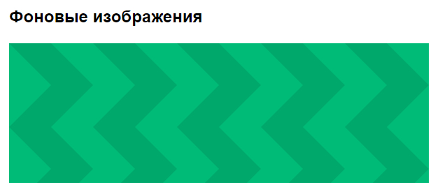
Подключение фона в .css
Можно подключить svg-графику в качестве фона элемента. Часто используются фоновые паттерны. Это небольшой фрагмент, впоследствии повторяющийся и создающий орнамент.
Так выглядит наш паттерн:

Укажите в html нужный класс и пропишите свойства фона background-image в файле css. Используйте функцию url(), чтобы задать путь к файлу с изображением.
HTML
<h2>Фоновые изображения</h2>
<div class="block-bg"></div>
CSS
/* SVG фоновое изображение */
.block-bg {
    width: 600px;
    height: 200px;
    background-image: url('./../img/bg-zigzag.svg');
}
Вот, что у нас получилось:
Описываем svg-графику inline
Существуют специальные теги и атрибуты для описания графики прямо в коде. При этом, изображение становится интерактивным — мы можем, например, менять цвет, или размер по наведению на иконку.
Тег <svg> используется как контейнер для хранения SVG графики. При помощи тега <path> и его атрибутов создается фигура. Посмотрите, как выглядит иконка YouTube в inline формате.
HTML
<svg class="youtube-icon" xmlns="http://www.w3.org/2000/svg" viewBox="0 0 576 512">
   <path d="M549.655 124.083c-6.281-23.65-24.787-42.276-48.284-48.597C458.781 64 288 64 288 64S117.22 64 74.629 75.486c-23.497 6.322-42.003 24.947-48.284 48.597-11.412 42.867-11.412 132.305-11.412 132.305s0 89.438 11.412 132.305c6.281 23.65 24.787 41.5 48.284 47.821C117.22 448 288 448 288 448s170.78 0 213.371-11.486c23.497-6.321 42.003-24.171 48.284-47.821 11.412-42.867 11.412-132.305 11.412-132.305s0-89.438-11.412-132.305zm-317.51 213.508V175.185l142.739 81.205-142.739 81.201z"></path>
</svg>
Стилизуем в файле .css по классу youtube-icon.
Будем менять цвет иконки по наведению при помощи свойства fill.
CSS
/* SVG inline код. Смена цвета по ховеру */
.youtube-icon {
    width: 64px;
    height: 64px;
    fill: black;
}

.youtube-icon:hover {
    fill: red;
}
Взгляните на результат:

Заключение
- Мы разобрали 3 стандартных способа подключения SVG-графики на сайт: тег
<img>, свойства CSS, тег<svg>. - Узнали про то, как можно менять цвет SVG-иконки через CSS и свойство
fill. - В следующей статье продолжим работу с тегам
<svg>,<path>, разберем как можно ещё кастомизировать векторную графику.
#База знаний
- 5 мар 2021
-

14
Узнаём про векторную графику, добавляем svg-картинки к HTML и творим всякое-разное с их цветом.

Автор статей по программированию. Преподаватель, ментор, выпускник Skillbox. Фрилансер, веб-разработчик
Помимо привычных растровых форматов (JPG, PNG, GIF), в веб-разработке широко применяют векторный — SVG.
SVG (сокращение от Scalable Vector Graphics — «масштабируемая векторная графика») — это вид графики, которую создают с помощью математического описания геометрических примитивов (линий, кругов, эллипсов, прямоугольников, кривых и так далее), которые и образуют все детали будущего изображения.
То есть в этом формате хранится не сама картинка, а инструкции для её построения по точкам и кривым. Они написаны на языке разметки SVG, расширяющем XML.
Прелесть SVG раскрывает масштабирование. Если увеличить растровое изображение сверх 100%-ного размера — проявляется пикселизация: отдельные точки превращаются в одноцветные блоки пикселей, границы областей становятся ступенчатыми, и в целом картинка выглядит негладко, некрасиво.
Если же увеличить векторное изображение — все его детали останутся чёткими, то есть их видимое разрешение не уменьшится. Поэтому svg-картинки отображаются на самых больших разрешениях без потери качества — и просто идеальны для адаптивных сайтов.
У svg-графики есть ещё одно достоинство. Её можно открывать как HTML или CSS и менять в любом редакторе кода, и даже на лету. Подробнее об этом ниже.
И наконец, при прочих равных SVG весит намного меньше растровых изображений.
Их мало. Во-первых, SVG не поддерживается очень старыми браузерами, а во-вторых, не используется для фотографий.
Есть три варианта добавления векторной графики. У каждого свои показания к применению.
Здесь всё так же, как и с растровой графикой:
<img src="img/icon.svg" alt="Иконка лупы">
Минус этого способа в том, что взаимодействовать с внутренними элементами SVG не получится. Файл будет как за стеклом: смотреть можно, а вот трогать нельзя.
Такой вариант подключения используется для контентных svg-изображений, которые менять внешне не требуется (вроде графиков, схем и логотипов).
Как и в случае с растровой графикой, SVG можно подключать через css-свойство background:
.icon {
      background-image: url("../img/icon.svg");
    }
Минус тут тот же самый, что и у предыдущего способа. Этот случай подходит для декоративных изображений (фоны, иконки и прочая мелочь), которые тоже внешне менять не нужно.
Вставлять svg-код прямо в html-файл — это третий способ. И для нас самый интересный. Он позволяет не просто отображать готовую графику, но и менять её (толщину элементов, заливку, обводку и так далее).
<svg>
    <rect x="10" y="10" width="100" height="100" />
</svg>
Такая вставка выручает, когда при взаимодействии с картинкой нужно её визуально модифицировать — например, перекрасить svg-иконку при наведении на неё курсора.
Напрямую на html-страницу (в теге <svg>) вставляют как контентные, так и декоративные изображения, а минус тут в том, что такие картинки не кешируются отдельно от страницы.
Верстальщику часто приходится обыгрывать реакцию иконки при наведении на неё мышки. В случае с svg-картинками можно просто менять их цвет.
Научимся это делать на примере иконки «ВКонтакте»:

Логотип сложный, поэтому svg-код, который его математически описывает, довольно длинный. Посмотрим, как это выглядит в HTML:
<a href="https://vk.com/" class=”vk”>
    <svg id="Bold" enable-background="new 0 0 24 24" height="512" viewBox="0 0 24 24" width="512"
      xmlns="http://www.w3.org/2000/svg">
      <path d="m19.915 13.028c-.388-.49-.277-.708 0-1.146.005-.005 3.208-4.431 3.538-5.932l.002-.001c.164-.547 0-.949-.793-.949h-2.624c-.668 0-.976.345-1.141.731 0 0-1.336 3.198-3.226 5.271-.61.599-.892.791-1.225.791-.164 0-.419-.192-.419-.739v-5.105c0-.656-.187-.949-.74-.949h-4.126c-.419
      0-.668.306-.668.591 0 .622.945.765 1.043 2.515v3.797c0 .832-.151.985-.486.985-.892
      0-3.057-3.211-4.34-6.886-.259-.713-.512-1.001-1.185-1.001h-2.625c-.749 0-.9.345-.9.731
      0 .682.892 4.073 4.148 8.553 2.17 3.058 5.226 4.715 8.006 4.715 1.671 0 1.875-.368 1.875-1.001
      0-2.922-.151-3.198.686-3.198.388 0 1.056.192 2.616 1.667 1.783 1.749 2.076 2.532 3.074
      2.532h2.624c.748 0 1.127-.368.909-1.094-.499-1.527-3.871-4.668-4.023-4.878z" />
    </svg>
  </a>
Да, это не ошибка, так в HTML вставляют небольшие svg-картинки. Для больших целесообразнее подключать отдельный файл, который будет кэшироваться браузером. Здесь мы не будем в это углубляться.
Обратите внимание на тег <path> (в переводе с английского «путь»). Он позволяет задать любую фигуру компактной строкой — описанием пути от начальной точки до конечной через промежуточные координаты.
Строка с данными задаётся атрибутом d тега <path>. Она содержит команды, которые закодированы набором букв и чисел. Буква представляет тип команды, а числа — её параметры (чаще всего координаты).
Теперь мы запросто добавим к ссылочному тегу <a> псевдокласс :hover и зададим через него новый цвет svg-изображения. Это делается в CSS с помощью свойства fill («заливка»).
.vk:hover svg {
      fill: red;
    }
Проверьте, как это работает: наведите курсор на иконку — например, в песочнице Codepen.
И ещё один нюанс. Заливка может быть задана атрибутом у <svg> (fill=»#000″). Тогда работать с ней через CSS не получится, так как css-стили не могут перебить правила, заданные атрибутами. В этом случае стоит просто вручную удалить этот атрибут у <svg>.
Итак, мы научились менять цвет svg-иконки через свойство fill, вставляя её напрямую в HTML. Заметьте, что такое нельзя сделать ни с помощью тега <img>, ни через свойство background.
Рассмотрим более сложную ситуацию — когда иконка состоит из нескольких простых svg-изображений. Например, примитивная лупа из прямоугольника и круга:

Код для кнопки с иконкой лупы будет таким:
<button class="btn-reset search">
            <svg width="26" height="26" viewBox="0 0 26 26" fill="none" xmlns="http://www.w3.org/2000/svg">
              <rect x="19.5138" y="18.5495" width="8" height="2" transform="rotate(45 19.5138 18.5495)"
              />
              <circle cx="11.5" cy="11.5" r="10.5" stroke-width="2" />
            </svg>
</button>
Проблема здесь в том, что внутри svg-иконки два разных тега:
- <rect> (прямоугольник — ручка лупы)
- и <circle> (круг — ободок лупы).
Сделать как в примере с «ВКонтакте» не получится, потому что прямоугольник в нашем случае имеет заливку (fill), а круг — обводку (stroke).
Чтобы при наведении менять цвет обоих, используем два селектора. Один будет менять заливку у палочки, второй — обводку у круга:
.search svg rect {
  fill: #000;
}

.search svg circle {
  stroke: #000;
}

.search:hover svg rect {
  fill: yellow;
}

.search:hover svg circle {
  stroke: yellow;
}
Как видите, при наведении на кнопку мы сперва нашли rect, потом circle, то есть разделили логику.
Делить код таким образом приходится нечасто, но помнить об этой возможности полезно.
Например, поучитесь работать с фоновыми картинками через CSS.

Учись бесплатно:
вебинары по программированию, маркетингу и дизайну.
Участвовать

Школа дронов для всех
Учим программировать беспилотники и управлять ими.
Узнать больше
In one of the previous articles, I have mentioned Best 5+ Free HTML Rich Text Editor to use but now in this article, I have provided few possible ways to change the color of SVG images using CSS or Javascript.
If you are using SVG image icons or SVG image logo and want to change the color of the image, then you can have an issue while changing its color, because if you will use CSS property like background-color or color for SVG files it will not work, so I have provided solutions to resolve this issue.
Change SVG color using CSS
Every SVG has XML file like structure so, it could be as below
<svg xmlns="http://www.w3.org/2000/svg" id="Outline" viewBox="0 0 24 24">
<path d="M19,1H5A5.006,5.006,0,0,0,0,6V18a5.006,5.006,0,0,0,5,5H19a5.006,5.006,0,0,0,5-5V6A5.006,5.006,0,0,0,19,1ZM5,3H19a3,3,0,0,1,2.78,1.887l-7.658,7.659a3.007,3.007,0,0,1-4.244,0L2.22,4.887A3,3,0,0,1,5,3ZM19,21H5a3,3,0,0,1-3-3V7.5L8.464,13.96a5.007,5.007,0,0,0,7.072,0L22,7.5V18A3,3,0,0,1,19,21Z"/>
</svg>
So, if you want to change SVG color, then you can directly target «path» element or «polygon» element of SVG structure and use CSS property «fill«
So, you can have CSS has below
svg path{
  fill:red
}
Output
Here is the complete Fiddle sample
But the above solution will only work when you have SVG with path information.
You can also open SVG in any Text Editor and then get to it’s XML as shown above and then in <path> tag use property «fill» to add change color, as shown below
<svg xmlns="http://www.w3.org/2000/svg" id="Outline" viewBox="0 0 24 24">
   <path fill="#AB7C94" d="M19,1H5A5.006,5.006,0,0,0,0,6V18a5.006,5.006,0,0,0,5,5H19a5.006,5.006,0,0,0,5-5V6A5.006,5.006,0,0,0,19,1ZM5,3H19a3,3,0,0,1,2.78,1.887l-7.658,7.659a3.007,3.007,0,0,1-4.244,0L2.22,4.887A3,3,0,0,1,5,3ZM19,21H5a3,3,0,0,1-3-3V7.5L8.464,13.96a5.007,5.007,0,0,0,7.072,0L22,7.5V18A3,3,0,0,1,19,21Z"/>
</svg>
Another way (Using SVG as background image)
You can also use SVG as a background image for an icon and then use CSS ‘mask’ property to fill it as Background.
Once you have set it as the background image, you can simply use ‘background-color’ CSS property to change image’s color
Example CSS
.icon {
  width: 48px;
  height: 48px;
  display: inline-block;

  -webkit-mask: url(https://s3-us-west-2.amazonaws.com/s.cdpn.io/18515/heart.svg) no-repeat 50% 50%;
  mask: url(https://s3-us-west-2.amazonaws.com/s.cdpn.io/18515/heart.svg) no-repeat 50% 50%;
  -webkit-mask-size: cover;
  mask-size: cover;
}

.icon-red { background-color: red; }
.icon-orange { background-color: orange; }
.icon-yellow { background-color: yellow; }
With Sample HTML
<i class="icon icon-red"></i>
<i class="icon icon-orange"></i>
<i class="icon icon-yellow"></i>
Gives output as below

Fiddle
Using Filter and SVG inside IMG tag
If you are using SVG with IMG tag, you can use CSS property ‘filter’ with saturation, which will change the color of the SVG image
Sample HTML
<img src="https://s3-us-west-2.amazonaws.com/s.cdpn.io/18515/heart.svg" class="colorize-orange ">CSS
.colorize-orange {
   -webkit-filter: hue-rotate(40deg) saturate(0.5) brightness(390%) saturate(4);
  filter: hue-rotate(40deg) saturate(0.5) brightness(390%) saturate(4);
}
Here is the fiddle
Using CSS Mask
We can also use CSS mask property to change SVG color
<i class="icon"></i>CSS
body{ overflow:hidden; }

.icon {
  --size: 70px;
  display: inline-block;
  width: var(--size);
  height: var(--size);
  transition: .12s;

  -webkit-mask-size: cover;
  mask-size: cover;
}

.icon-heart{
  background: black;
  animation: 4s frames infinite linear;

  -webkit-mask-image: url(https://s3-us-west-2.amazonaws.com/s.cdpn.io/18515/heart.svg);
  mask-image: url(https://s3-us-west-2.amazonaws.com/s.cdpn.io/18515/heart.svg);
}

@keyframes frames {
  0% { transform:translatex(100vw) }
  25% { background: red; }
  75% { background: lime; }
  100% { transform:translatex(-100%) }
}
Fiddle: https://jsfiddle.net/5hd0xfLj/
This approach can be useful if SVG is external, and included via URL.
That’s it, these are some 4 useful ways to change color of SVG using CSS.
You may also like to read:
Vertical Carousel (Bootstrap 4 and Bootstrap 3 With jQuery)
Useful CSS animation examples with code & animation basics
Top HTML and CSS interview questions
Creating Underline text in HTML (With or Without CSS)
Best HTML Editors for developers (Free)
Creating nested tables in HTML ( Example with code)