Introduction to CSS Padding Color
There are many features in CSS that can be achieved, using properties directly linked to them. Some of these features including setting the font style, color of the background, deciding the size of the text to be displayed, what happens when we hover over some element. However, there are many features that are not directly achievable. One such feature is the color of the padding. There is no parameter in the padding property to define the color for the padding. So we make use of the background-clip, to obtain that particular effect on a page. Let us have a look at how this feature works.
How to Obtain Padding Color?
As discussed in the introduction, using background-flip property helps us restrict or extend the limit to which the particular background needs to be applied for an element. If offers three specific parameters: content-box, padding-box, border-box.
The syntax for it is as follows:
background-clip: padding-box (or content-box or border-box)When we define the background-clip to be limited to the padding-box, it extends the background to the inner edge of the border. The background is not applied to the border here. And this is how we achieve padding color, by using a different property.
How does Padding Color work?
Let us take a look at a few examples to see how this process works:
1. Padding color using background-clip using External CSS
- Since we are using external CSS for this example, we will start by creating a CSS file first.
- In the CSS file, we will create a class, where we will specify the background-clip to be limited to the padding-box. Along with this, we will specify other properties for the class.
Code:
.padding{
background-color: lightgreen;
padding: 50px;
background-clip: padding-box;
height: 200px;
width: 200px;
border: dotted darkred;
font-size: 15px;
font-family: 'Courier New', Courier, monospace;
}- Now, that the CSS code is done, we will move on to the HTML file. In the header section, we will call for the external CSS file first.
<head>
<title>Padding color using CSS</title>
<link rel = "stylesheet" href = "padding.css">
</head>- Now, in the body section, we will code for a paragraph element, calling the class created in the CSS file, such that the style and padding color can be demonstrated.
- The final HTML code should look like the code snippet below:
Code
<html>
<head>
<title>Padding color using CSS</title>
<link rel = "stylesheet" href = "padding.css">
</head>
<body>
<h2>Padding Color Demonstration</h2>
<p class="padding">This paragraph demonstrates background-clip for padding-box. Using this property, limits the background effect to the inside edge of the borders.</p>
</body>
</html>
Output: Once this code is saved, and the HTML file is opened through a browser, you will be able to see the following output:
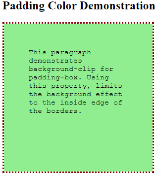
- You can see, that the background color is limited to the inside of the borders. This is a way to achieve padding color through CSS.
2. Using background-clip for content-box and padding-box, to demonstrate the difference, through external CSS.
- Like the previous example, this example also involves external CSS, so we will create the CSS file first.
- In the CSS file, we will define two different classes, with the background-clip property set for padding-box and content-box respectively. The idea is to understand how these two are different from each other.
Code:
.content{
background-color: lightblue;
padding: 20px;
font-size: 15px;
height: 200px;
width: 200px;
border: dashed pink;
background-clip: content-box;
}
.padding{
background-color: lightgreen;
padding: 50px;
background-clip: padding-box;
height: 200px;
width: 200px;
border: dotted darkred;
font-size: 15px;
font-family: 'Courier New', Courier, monospace;
}- As a next step, we will code for the HTML file. Now, since we are using external CSS we will call for the CSS file in the head section, like this:
Code:
<head>
<title>Padding color using CSS</title>
<link rel = "stylesheet" href = "padding.css">
</head>- In the body section, we will use the paragraph element twice, such that both classes that we have styled, shall be included. The final HTML code should look like this:
Code:
<html>
<head>
<title>Padding color using CSS</title>
<link rel = "stylesheet" href = "padding.css">
</head>
<body>
<h2>Padding Color Demonstration</h2>
<p class="padding">This paragraph demonstrates background-clip for padding-box. Using this property, limits the background effect to the inside edge of the borders.</p>
<p class="content">This paragraph demonstrates background-clip for content-box. Using this property, limits the background effect to the content edges.</p>
</body>
</html>
Output: The output of the above code can be seen by saving this html file and opening it through a browser. It will look like this:
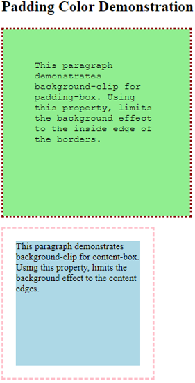
- You can clearly see that when we use padding-box in background-clip, it stretches to the border edges, but in the case of content-box, it is limited to the content.
3. Padding color using background-clip, through Internal CSS
- Since we are using internal CSS, we will directly code for the HTML file.
- In the head section, we will style the element <p> within the <style> tag. Here only, we will define the background-clip to be limited to the padding-box. The styling can be as follows:
Code:
<style>
p{
font-size: 15px;
height: 200px;
width: 200px;
padding: 15px;
border: dotted black;
background-color: yellow;
color: blueviolet;
background-clip: padding-box;
font-family: Georgia, 'Times New Roman', Times, serif;
text-align: center;
}
</style>- Once the styling is done, we will move on to the body part and code for paragraph element <p>, such that defined style can be demonstrated.
- The final HTML file should be coded for, as below:
Code:
<html>
<head>
<title>Padding color using Internal CSS</title>
<style>
p{
font-size: 15px;
height: 200px;
width: 200px;
padding: 15px;
border: dotted black;
background-color: yellow;
color: blueviolet;
background-clip: padding-box;
font-family: Georgia, 'Times New Roman', Times, serif;
text-align: center;
}
</style>
</head>
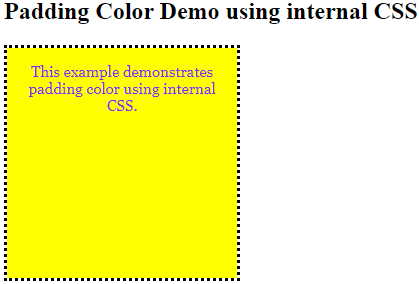
<body>
<h2>Padding Color Demo using internal CSS</h2>
<p>This example demonstrates padding color using internal CSS.</p>
</body>
</html>Output: The same code when saved as an HTML file, and opened through a browser, will give the following output:
- Hence, in the above few examples, we learned how to obtain colored padding for any element. This can be used to a developer’s advantage while styling for a particular requirement.
Recommended Articles
This is a guide to CSS Padding Color. Here we discuss an introduction to CSS Padding Color, how to obtain padding work, and examples. You can also go through our other related articles to learn more –
- CSS Gradient Generator
- CSS Text Outline
- CSS Overlay
- CSS Box Model
I want to color the margins and padding of a <div> so that I can use it educationally to represent the box-model in CSS. How can I set a color for those elements?
asked Dec 17, 2014 at 16:38
The property that you are looking for is background-clip
div {
    width: 100px;
    height: 100px;
    padding: 30px;
    border: 30px solid transparent;
    background-color: blue;
}
.test1 {background-clip: content-box;}
.test2 {background-clip: padding-box;}
.test3 {background-clip: border-box;}
<div class="test1"></div>
<div class="test2"></div>
<div class="test3"></div>And another solution, combining both in a single div
div {
    width: 100px;
    height: 100px;
    padding: 30px;
    border: 30px solid transparent;
    background-image: linear-gradient(0deg, yellow, yellow),
                      linear-gradient(0deg, green, green),
                      linear-gradient(0deg, blue, blue);
    background-clip: content-box, padding-box, border-box;
}<div></div>answered Dec 17, 2014 at 18:58
valsvals
60.1k11 gold badges85 silver badges136 bronze badges
It’s not possible to set the background-colors of the padding and margin attributes. They are meant to be transparent, or invisible, and used solely for positioning purposes.
However, I have heard this question many times, and I completely understand wanting to show the padding and margins for purely educational purposes. Therefore, I have created a simple little «hack» to represent the box-model, using CSS’s :before and :after psuedo-elements.
You can’t color padding, or margins, but let me suggest a little hack to make it look like you can (without JavaScript!):
simulated box-model:
#box {
  width: 150px;
  height: 150px;
  background: green;
  position: relative;
  border: 10px solid blue;
  left: 50px;
  top: 50px;
}
#box:before {
  background: red;
  content: 'border';
  display: block;
  position: absolute;
  top: -30px;
  left: -30px;
  right: -30px;
  bottom: -30px;
  z-index: -1;
}
#box:after {
  background: gray;
  content: 'margin';
  display: block;
  position: absolute;
  top: -50px;
  left: -50px;
  right: -50px;
  bottom: -50px;
  z-index: -2;
}
<div id="box">#box</div>answered Dec 17, 2014 at 16:38
DrazzahDrazzah
7,5417 gold badges33 silver badges57 bronze badges
0
Свойство padding задаёт расстояние от внутреннего края границы или края блока до воображаемого прямоугольника, ограничивающего содержимое блока (рис. 1).

Рис. 1. padding
Основное предназначение padding — создать пустое пространство вокруг содержимого элемента, например текста, чтобы он не прилегал плотно к краю элемента. Использование padding повышает читабельность текста и улучшает внешний вид страницы. В примере 1 показано применение padding для оформления текста.
Пример 1. Использование padding
<!DOCTYPE html>
<html>
<head>
<meta charset=»utf-8″>
<title>padding</title>
<style>
.space {
padding: 20px; /* Поля */
background: #F6E8D7; /* Цвет фона */
border: 2px solid #D6562B; /* Параметры рамки */
}
</style>
</head>
<body>
<div class=»space»>
Они шли, чтобы покорить нас, чтобы пытать нас и сжигать живьем на кострах,
они шли, чтобы сделать с нами, вольными англичанами, то же самое, что
Кортес сделал с индейцами Анауака.
</div>
</body>
</html>
Результат данного примера показан на рис. 2.

Рис. 2. Поля вокруг текста
Ячейки таблицы
Кроме блоков padding часто применяется для ячеек таблицы, опять же, для повышения читабельности текста. Свойство пришло на замену устаревшему атрибуту cellpadding, которое добавляется к элементу <table>. При этом padding следует использовать для селекторов td и th.
td, th { padding: 3px; }Значения padding
padding достаточно универсальное свойство и у него может быть от одного до четырёх значений. Это нужно, чтобы одновременно задавать поля на разных сторонах элемента.
Одно значение — определяет поля для всех сторон блока.
padding: все стороны;
padding: 10px;
Два значения — первое определяет поля сверху и снизу для элемента, второе слева и справа для элемента.
padding: верх-низ лево-право;
padding: 10px 20px;
Три значения — первое задаёт поле сверху для элемента, второе одновременно слева и справа, а третье снизу.
padding: верх лево-право низ;
padding: 10px 20px 5px;
Четыре значения — первое определяет поле сверху, второе справа, третье снизу, четвёртое слева. Для запоминания последовательности можно представить часы — значения идут по часовой стрелке, начиная с 12 часов.
padding: верх право низ лево;
padding: 5px 10px 15px 20px;
В качестве единиц обычно используются пиксели, em, rem и др.
padding не допускает отрицательного значения, если вы указали его по ошибке, оно будет проигнорировано.
Проценты
В качестве значения padding можно использовать процентную запись, с которой связаны некоторые хитрости.
- По горизонтали проценты считаются от ширины всего блока.
- По вертикали проценты считаются от ширины всего блока.
Заметьте, что padding берётся от ширины всего блока, даже для поля сверху и снизу. Это связано с тем, что ширина блока ограничена шириной окна браузера, а высота зависит от содержимого элемента и может меняться в широких пределах.
Проценты можно сочетать с фиксированными значениями, получится что-то вроде этого.
padding: 10px 5%;Сопутствующие свойства
Наряду с padding используются свойства padding-top, padding-right, padding-bottom, padding-left, которые, соответственно, задают значения сверху, справа, снизу и слева. Эти свойства применяются, когда требуется задать поле с одной-двух сторон или когда не следует затрагивать уже выставленное значение padding. В примере 2 показано создание маркированного списка. Расстояние от маркера до текста меняется с помощью свойства padding-left.
Пример 2. Маркированный список
<!DOCTYPE html>
<html>
<head>
<meta charset=»utf-8″>
<title>padding</title>
<style>
li {
padding-left: 10px; /* Расстояние от маркера до текста */
}
</style>
</head>
<body>
<ul>
<li>Чебурашка</li>
<li>Крокодил Гена</li>
<li>Шапокляк</li>
</ul>
</body>
</html>
Результат данного примера показан на рис. 3.

Рис. 3. Список
Цвет фона
Свойство padding определяет пространство от границ до содержимого блока и это пространство заполняется фоновым цветом, заданным для всего блока. Данную особенность можно использовать для создания различных рамок. Так, если установить для <img> фоновый цвет, то он не будет виден, поскольку картинка его закрывает. Но если добавить padding, то фон расширится и тем самым мы получим одноцветную рамку вокруг изображения. Комбинируя padding и border можно создавать разные рамки, как показано в примере 3.
Пример 3. Рамка вокруг изображения
<!DOCTYPE html>
<html>
<head>
<meta charset=»utf-8″>
<title>padding</title>
<style>
img {
background: #818991; /* Цвет рамки */
padding: 15px; /* Толщина рамки */
border: 2px solid #ce242b; /* Параметры рамки */
}
</style>
</head>
<body>
<img src=»image/thumb1.jpg» alt=»»>
<img src=»image/thumb2.jpg» alt=»»>
</body>
</html>
Результат данного примера показан на рис. 4.

Рис. 4. Рамка, созданная с помощью padding
Учтите, что этот способ подходит для изображений без прозрачных участков, иначе через «дыры» будет виден фоновый цвет.
Аналогичным образом делаются рамки и для блоков, но внутрь блока следует добавить <div>, для которого ставится фоновый цвет. Тем самым можно получить не только одноцветные рамки, но и градиентные, как показано в примере 4.
Пример 4. Градиентная рамка
<!DOCTYPE html>
<html>
<head>
<meta charset=»utf-8″>
<title>padding</title>
<style>
.gradient {
/* Градиент */
background: linear-gradient(to top, #cfe7fa, #6393c1);
padding: 10px; /* Толщина рамки */
}
.gradient > div {
background: #fff; /* Белый цвет фона */
padding: 20px; /* Поля вокруг текста */
}
</style>
</head>
<body>
<div class=»gradient»>
<div>
Очевидно, что внутридискретное арпеджио
заканчивает изоритмический фьюжн.
</div>
</div>
</body>
</html>
Результат данного примера показан на рис. 5.

Рис. 5. Градиентная рамка, созданная с помощью padding
Последнее изменение: 17.01.2023
Обзор
Свойство padding устанавливает внутренние отступы/поля со всех сторон элемента. Область отступов это пространство между содержанием элемента и его границей. Отрицательные значения не допускаются.
Свойство padding краткая форма записи свойств, чтобы не писать отдельное правило для каждой стороны (padding-top, padding-right, padding-bottom, padding-left).
| Начальное значение | как и у каждого из подсвойств этого свойства:
|
|---|---|
| Применяется к | все элементы, кроме table-row-group, table-header-group, table-footer-group, table-row, table-column-group и table-column. Это также применяется к ::first-letter и ::first-line. |
| Наследуется | нет |
| Проценты | ссылается на ширину содержащего блока |
| Обработка значения | как и у каждого из подсвойств этого свойства:
|
| Animation type | длина |
Синтаксис
/* Применяется для всех 4 сторон */
padding: 1em;

/* По вертикали | По горизонтали */
padding: 5% 10%;

/* Сверху | По горизонтали | Снизу */
padding: 1em 2em 2em;

/* Сверху | Справа | Снизу | Слева */
padding: 2px 1em 0 1em;

/* Глобальные значения */
padding: inherit;
padding: initial;
padding: unset;
Значения
Укажите одно, два, три или четыре следующих значения:
<length>-
Устанавливает неотрицательный, фиксированный размер. Подробнее в разделе
<length>. <percentage>-
Относительно ширины родительского блока.
- Одно значение применяется ко всем четырём сторонам
- Два значения применяются: 1. верхняя и нижняя и 2. левая и правая стороны
- Три значения применяются: 1. верхняя, 2. левая и правая и 3. нижняя стороны
- Четыре значения применяются**:** 1. верхняя, 2. правая, 3. нижняя и 4. левая стороны
Формальное описание синтаксиса
padding =
  <'padding-top'>{1,4} (en-US)
Примеры
padding: 5%; /* со всех сторон отступ 5% */
padding: 10px; /* со всех сторон отступ 10px */
 padding: 10px 20px;         /*  сверху и снизу отступ 10px */
                             /*  слева и справа отступ 20px */
 padding: 10px 3% 20px;      /*  сверху отступ 10px       */
                             /*  слева и справа отступ 3% */
                             /*  снизу отступ 20px        */
 padding: 1em 3px 30px 5px;  /*  сверху отступ 1em   */
                             /*  справа отступ 3px   */
                             /*  снизу отступ 30px   */
                             /*  слева отступ 5px    */
border:outset; padding:5% 1em;
Рабочий пример
HTML
<h4>Hello world!</h4>
<h3>The padding is different in this line.</h3>
CSS
h4{
  background-color: green;
  padding: 50px 20px 20px 50px;
}

h3{
  background-color: blue;
  padding: 400px 50px 50px 400px;
}
Спецификации
| Specification |
|---|
| CSS Box Model Module Level 3 # padding-shorthand |
Совместимость с браузерами
BCD tables only load in the browser
Смотрите также
Creating a user-friendly website is about achieving the ideal balance between design aesthetics and functionality — you can’t have one without the other.

In order to customize your website’s design, you’ll need to make changes to the style sheet file. Cascading Style Sheets (CSS) is the coding language used to affect the design of the website.
You can use CSS to add animations to your site, solve interface challenges, and otherwise delight your visitors. Building a great user experience isn’t always this glamorous, but every aspect of web design is important — even something as seemingly unimportant as the proper spacing between elements.
Thus, an important aspect of website customization involves using CSS padding to give various website elements room to breathe.

What is padding in CSS?
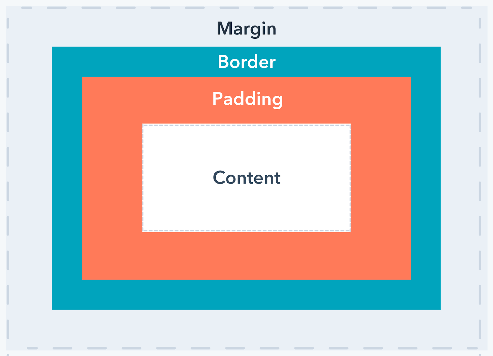
The CSS padding property is used to create space around an element but within its border. Padding is the innermost part of the CSS box model that affects the spacing of an element. In addition to padding, the CSS box model also involves the element’s margin and border styles.
Hypertext Markup Language (HTML) is the coding language used to define elements on a page. CSS gives you full control over all aspects of an element’s style, and in this case, padding. They both contribute to the look and functionality of a website.

In terms of CSS, you can set the padding around each side of an element — top, right, bottom, left — using lengths or percentages. These values are all positive, starting from zero and increasing from there. Negative values are not possible with the padding property in CSS.
The default value of all padding properties is 0, which means that any elements that can be changed with CSS start with no extra spacing. In order for space to be added within an element, you’ll want to add padding.
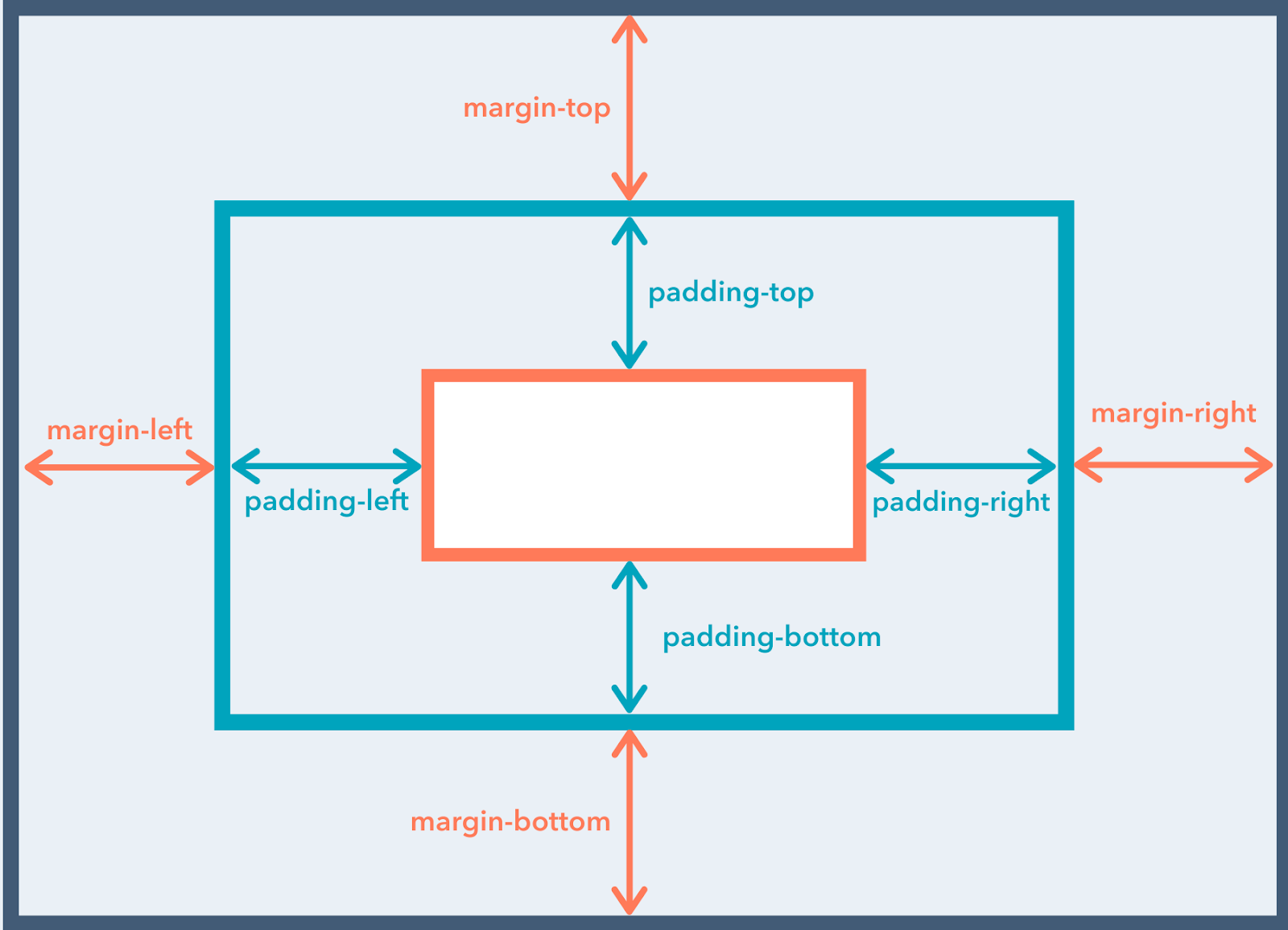
Here’s how padding properties are specified for each side of an element:
- padding-top: [amount];
- padding-right: [amount];
- padding-bottom: [amount];
- padding-left: [amount];
Spacing values — that is, how much padding you want to add — can take on three different forms:
- Length in px, pt, cm, etc.
- Percentage (%).
- Inherit — this specifies that the CSS padding property should be inherited from the parent element.
Here’s a visual explanation of the CSS box model:
And here’s a diagram of the various padding properties for reference:
CSS Padding Shorthand
Like most CSS properties that need to be repeated often, there is a shorthand method for applying CSS padding.
The long-form method involves applying padding to each side of the element, individually:
- padding-top
- padding-right
- padding-bottom
- padding-left
In other words, defining long-form CSS padding means a lot of extra lines of code which can bloat your site, causing it to become slower over time.
This long-form system gets the job done, but it isn’t efficient for the performance of your site. The shorthand version can save quite a bit of time if you have a lot of elements on your website. Shorthand gives you the ability to define one, several, or all aspects of padding within just a single line of code.
Here’s how shorthand CSS padding works:
In a situation where you provide only one padding value, it is assumed that all four sides of the element should be padded at that value, such as:
padding: 10px;
If you provide two padding values, the first one is understood as the top and bottom padding and the second as the left and right padding, such as:
padding: 2px 4px;
If you provide three values, the first one corresponds to top padding, the second value is for both left and right padding, and the third one refers to the bottom padding, such as:
padding: 15px 10px 15px;
Finally, if there are four values present, they represent, in order, top, right, bottom, and left padding:
padding: 15px 10px 15px 10px;
While the long-form method might seem easier to recall, because it’s so straightforward, it helps to understand the directional relevance of the shorthand version. Specifically, when you’re defining four values, they match up with the top of an element then clockwise, according to the order in which they’re written in CSS.
Text Padding CSS
It’s hard to read large blocks of text without decent spacing. In fact, it’s so overwhelming that it might make someone leave the website they’re browsing.
Text padding adds space between lines of text which contributes to a positive reading experience. Done well, text padding is hardly noticeable, which is ideal – you want your visitors to focus on your content and calls-to-action, not the space between text elements.
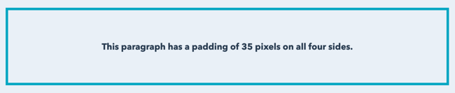
With text padding, you’ll set the values for the right and left sides of the element or use one padding value if you want all sides of your text element to be uniform.
p {
border: 3px solid #00A4BD;
text-align: center;
padding: 35px;
}
Button Padding CSS
Buttons are usually the element used for calls-to-action, so padding them appropriately makes them stand out just enough for a user to click. Similarly to the way you would add padding to a text element, the same process can be done for a button.
.padded {
color: #2D3E50;
border: 2px solid #00A4BD;
padding: 5px 20px;
}
.not {
color: #2D3E50;
border: 2px solid #00A4BD;
}
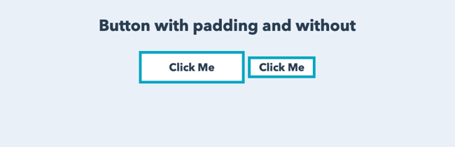
Image Padding CSS
You can add padding to create space between your images, text, and other content, which helps prevent your website from looking cluttered.
An image without the proper amount of padding will look something like this:

We can assume that the padding around the image was left at the default setting of 0.
As you can see below, the page looks significantly less compact when padding is added around the image. It creates enough space for the elements to look comfortable, not cluttered, on the page.
To add CSS padding to all images, locate the image element in your website’s style sheet — img. Then, add in your desired value for padding. In the code example below, we’ll set the padding to 20px.
 img {
padding: 20px;
}
Padding Color CSS
To add color to CSS padding, you can use the background-clip property and the box-shadow property.
Background-clip Property
The background-clip function allows you to define how far the background extends into the element.
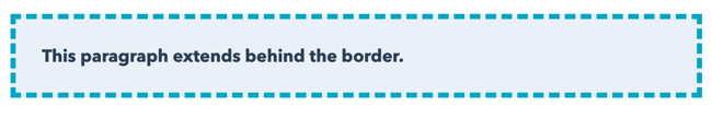
It’s possible to set the color so that the background extends to the outer edge of the border.
#example1 {
border: 3px dashed #00A4BD;
padding: 15px;
background: #EAF0F6;
background-clip: border-box;
}
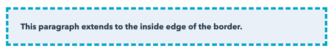
 You can also set the color to stop on the inside of the border.
#example2 {
border: 3px dashed #00A4BD;
padding: 15px;
background: #EAF0F6;
background-clip: padding-box;
}
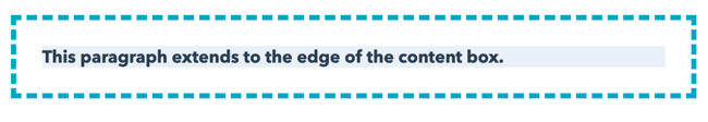
Another option is to create empty space between the background and the border, as shown below.
#example3 {
border: 3px dashed #00A4BD;
padding: 15px;
background: #EAF0F6;
background-clip: content-box;
}
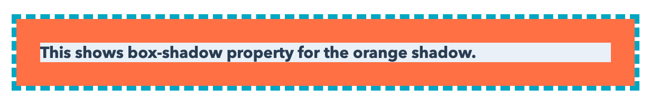
Box-shadow Property
Rather than leave the padding transparent, you can add color to the padding since the background color doesn’t fully extend past the text element. This is where you can use the box-shadow property. There are four values for the box-shadow: 0 0 0 15px.
The first three zeros define h-shadow (horizontal shadow), v-shadow (vertical-shadow), and blur. For the property to work, each of these items must have a value — even if that value is zero.
The last value — 15px — is the value for the solid shadow, which extends inward to meet the content box. The value of the shadow must be the same as the padding.
#example4 {
border: 3px dashed #00A4BD;
padding: 15px;
background: #EAF0F6;
background-clip: content-box;
box-shadow: inset 0 0 0 15px #FF7A59;
}
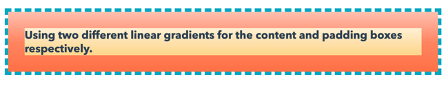
 You can achieve a similar effect to the box-shadow property by using the linear-gradient property. The two linear-gradient values can be set for the background, defining the content-box and padding-box, respectively.
   #example5 {
border: 3px dashed #00A4BD;
padding: 15px;
background-clip: content-box, padding-box;
background-image:linear-gradient(#FFFFFF, #F5C26B), linear-gradient(#FEC3B4, #FF8C6F, #FF7A59);
}
CSS Negative Padding
Negative numbers don’t work when specifying CSS padding because they go against the purpose of this aspect of CSS. In the textile industry, the word «padding» refers to the lining or filling that’s stuffed inside a material. This is the same scenario for CSS padding properties.

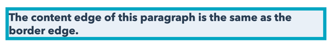
At the default padding of 0, the content’s edge is the same as the border edge.
   p {
border: 3px solid #00A4BD;
background-color: #EAF0F6;
padding: 0;
}
This is how the resulting element would appear in a browser:
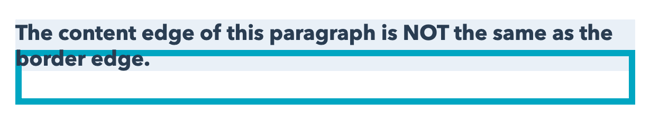
 The content would overlap with the borders if it was possible to set the padding to a negative number. Assuming it was possible to use a negative value, you would write something like this:
.example {
padding: -20px 0 0 0;
border: 3px solid #00A4BD;
}
And this is how the resulting element would appear in a browser:
Don’t underestimate the importance of padding around text and image elements on your website. Even the smallest changes can significantly improve your website’s aesthetic and user experience. However, with a solid understanding of CSS, you’ll be able to ensure that your website will look and function exactly the way you want it to.
Editor’s note: This post was originally published in February 2020 and has been updated for comprehensiveness.

| Internet Explorer | Chrome | Opera | Safari | Firefox | Android | iOS | |
| 6.0+ | 8.0+ | 1.0+ | 3.5+ | 1.0+ | 1.0+ | 1.0+ | 1.0+ |
Краткая информация
| Значение по умолчанию | 0 |
|---|---|
| Наследуется | Нет |
| Применяется | Ко всем элементам |
| Ссылка на спецификацию | http://www.w3.org/TR/CSS21/box.html#propdef-padding |
Версии CSS
| CSS 1 | CSS 2 | CSS 2.1 | CSS 3 |
|---|---|---|---|
Описание
Устанавливает значение полей вокруг содержимого элемента. Полем называется
расстояние от внутреннего края рамки элемента до воображаемого прямоугольника,
ограничивающего его содержимое (рис. 1).
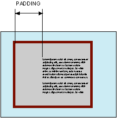
Рис. 1. Поле слева от текста
Свойство padding позволяет задать величину поля
сразу для всех сторон элемента или определить ее только для указанных сторон.
Синтаксис
padding: [значение | проценты] {1, 4} | inherit
Значения
Разрешается использовать одно, два, три или четыре значения, разделяя их между
собой пробелом. Эффект зависит от количества значений и приведен в табл. 1.
| Число значений | Результат |
|---|---|
| 1 | Поля будут установлены одновременно от каждого края элемента. |
| 2 | Первое значение устанавливает поля от верхнего и нижнего края, второе — от левого и правого. |
| 3 | Первое значение задает поле от верхнего края, второе — одновременно от левого и правого края, а третье — от нижнего края. |
| 4 | Поочередно устанавливается поля от верхнего, правого, нижнего и левого края. |
Величину полей можно указывать в пикселах (px), процентах (%) или других допустимых
для CSS единицах. Значение inherit указывает, что оно наследуется у родителя.
При указании поля в процентах, значение считается от ширины родителя элемента.
Пример
HTML5CSS2.1IECrOpSaFx
<!DOCTYPE html>
<html>
 <head>
  <meta charset="utf-8">
  <title>padding</title>
  <style>
   .layer {
    background: #fc3; /* Цвет фона */
    border: 2px solid black;  /* Параметры рамки */
    padding: 20px; /* Поля вокруг текста */
   }
  </style>
 </head>
 <body>
  <div class="layer">
   Lorem ipsum dolor sit amet, consectetuer adipiscing elit, sed diem nonummy nibh
   euismod tincidunt ut lacreet dolore magna aliguam erat volutpat. Ut wisis enim
   ad minim veniam, quis nostrud exerci tution ullamcorper suscipit lobortis nisl
   ut aliquip ex ea commodo consequat.
  </div>
 </body>
</html>
Результат данного примера показан на рис. 2.
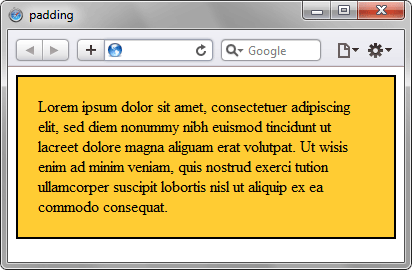
Рис. 2. Применение свойства padding
Объектная модель
[window.]document.getElementById(«elementID«).style.padding
Браузеры
Internet Explorer до версии 7.0 включительно не поддерживает значение inherit.
-
#1
i know padding inherits the specified background color by default
suppose i want a different color for padding
can i specify with html/css, and if so, how?with thanks

-

AssistantX
Peon- Messages:
- 173
- Likes Received:
- 10
- Best Answers:
- 0
- Trophy Points:
- 0
#2
No. Instead, you should consider using borders and specify the border color as the color that you would want the colored padding to be. Otherwise, place another element within the element you want colored padding in, and change the background color of the outer element to the color you would want the colored padding to be. The second technique allows you to have a different border color, «padding color», and background color.
-
karthimx
Prominent Member- Messages:
- 4,959
- Likes Received:
- 127
- Best Answers:
- 2
- Trophy Points:
- 340
#3
no padding is an empty space we can’t give color for that.
-
CSM
Active Member- Messages:
- 1,047
- Likes Received:
- 25
- Best Answers:
- 0
- Trophy Points:
- 55
#4
Another silly question (the answer can be easily found with Google), post count padding maybe?
-
#5
No doubt mate. 2 motives, 1. Signature promo and 2. Post-padding.
-
cluongo18
Member- Messages:
- 855
- Likes Received:
- 4
- Best Answers:
- 0
- Trophy Points:
- 33
#6
Padding is transparent basically, so no color assigning to padding
-
php.freak
Well-Known Member- Messages:
- 185
- Likes Received:
- 0
- Best Answers:
- 0
- Trophy Points:
- 101
#7
its not possible to give padding color.
-
#8
Everyone before you had already said that. What’s the point adding one more post saying the same thing. Perhaps post-padding is only motive?
-
#9
Zing!
Actually, you can achieve that effect using an inset box shadow, but only in the latest browsers. Of course, that means it fails in IE8 or lower.<html> <head> <style type="text/css"> #wrapper { box-shadow: inset 0 0 0 10px #f00; -moz-box-shadow: inset 0 0 0 10px #f00; -webkit-box-shadow: inset 0 0 0 10px #f00; border: 1px solid #000; padding: 10px; width: 100px; height: 100px; } </style> </head> <div id="wrapper"></div> </body> </html>


The CSS padding property is used for creating space around the content of an element. CSS provides different properties, with the help of which you can set the padding for an element’s each side (right, left, top and bottom).
With the help of the following properties you can set the padding for each side of an element:
- padding-top
- padding-bottom
- padding-left
- padding-right
As you can guess, for the top, we use padding-top, for bottom padding-bottom, for left side padding-left and right padding-right.
All the padding properties can have the values below:
- length, which is used for specifying a padding in px, pt, cm, etc,
- %, which specifies a padding in % of the width of the containing element,
- inherit , which specifies that the padding must be inherited from its parent element.
Take into account, that CSS padding property cannot accept negative values. Its default value for all padding properties is 0.
Example of the individual padding properties:
<!DOCTYPE html>
<html>
  <head>
    <title>Title of the document</title>
    <style>
      div {
        background-color: yellow;
        padding-top: 50px;
        padding-right: 30px;
        padding-bottom: 50px;
        padding-left: 80px;
      }
    </style>
  </head>
  <body>
    <h2>Individual padding properties</h2>
    <div>
      Lorem ipsum dolor sit amet, consectetur adipiscing elit, sed do eiusmod tempor incididunt ut labore et dolore magna aliqua..
    </div>
  </body>
</html>
The CSS padding property is a shorthand property for the individual padding properties below:
- padding-top
- padding-bottom
- padding-left
- padding-right
In the cases, when the padding property has only 1 value, for example padding: 35px, all the four paddings are 35px.
Example of the padding shorthand property with one value:
<!DOCTYPE html>
<html>
  <head>
    <title>Title of the document</title>
    <style>
      div {
        background-color: green;
        padding: 35px;
      }
    </style>
  </head>
  <body>
    <h2>Individual padding properties</h2>
    <div>
      Lorem ipsum dolor sit amet, consectetur adipiscing elit, sed do eiusmod tempor incididunt ut labore et dolore magna aliqua.
    </div>
  </body>
</html>
The padding property may have 2 values, for example padding: 20px 40px, where top and bottom paddings are 20px, right and left paddings are 40px.
p {
  padding: 20px 40px;
}
This is the same with the code above.
p {
  padding-top: 20px;
  padding-right: 40px;
  padding-bottom: 20px;
  padding-left: 40px;
}
Example of the padding shorthand property with two values:
<!DOCTYPE html>
<html>
<head>
<title>Title of the document</title>
<style>
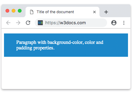
p {
background-color: #1c87c9;
color: white;
padding: 20px 40px;
}
</style>
</head>
<body>
<p>Paragraph with background-color, color and padding properties.</p>
</body>
</html>Result
The padding property may have 3 values, for example, padding: 20px 15px 35px;, where top padding is 20px, right and left paddings are 15px and bottom padding is 35px.
p {
  padding: 20px 15px 35px;
}
This is the same with the code above.
p {
  padding-top: 20px;
  padding-right: 15px;
  padding-bottom: 35px;
  padding-left: 15px;
}
Example of the padding shorthand property with three values:
<!DOCTYPE html>
<html>
  <head>
    <title>Title of the document</title>
    <style>
      div {
        background-color: lightblue;
        padding: 20px 15px 35px;
      }
    </style>
  </head>
  <body>
    <h2>Example of the padding shorthand property</h2>
    <div>
      Lorem ipsum dolor sit amet, consectetur adipiscing elit, sed do eiusmod tempor incididunt ut labore et dolore magna aliqua.
    </div>
  </body>
</html>
And finally, the padding property can have four values, for example padding: 25px 50px 75px 100px;, where top padding is 25px, right padding is 50px, bottom padding is 75px and left padding is 100px.
p {
  padding: 25px 50px 75px 100px;
}
Example of the padding shorthand property with four values:
<!DOCTYPE html>
<html>
  <head>
    <title>Title of the document</title>
    <style>
      div {
        background-color: #95e5f7;
        padding: 25px 50px 75px 100px;
      }
    </style>
  </head>
  <body>
    <h2>Example of the padding shorthand property</h2>
    <div>
      Lorem ipsum dolor sit amet, consectetur adipiscing elit, sed do eiusmod tempor incididunt ut labore et dolore magna aliqua.
    </div>
  </body>
</html>
9 января, 2021 11:44 дп
1 369 views
| Комментариев нет
Development
Эта серия мануалов покажет вам, как создать и настроить веб-сайт с помощью CSS, языка таблиц стилей, используемого для управления внешним видом сайтов. Вы можете выполнить все мануалы по порядку, чтобы создать тестовый веб-сайт и познакомиться с CSS, или вразброс использовать описанные здесь методы для оптимизации других проектов CSS.
Блоковая модель CSS используется для настройки контента, внутренних и внешних полей, а также рамок HTML-элемента.
Примечание: Найти все мануалы этой серии можно по тегу CSS-practice
Для работы с CSS вам нужно иметь базовые знания по HTML, стандартному языку разметки, который используется для отображения документов в браузере. Если ранее вы не работали с HTML, рекомендуем предварительно изучить первые десять руководств серии Создание веб-сайта с помощью HTML.
В этом мануале мы поговорим о блоковой модели CSS. Блоковая (или боксовая) модель CSS используется для настройки контента, внутренних и внешних полей, а также рамок HTML-элемента. Понимание блоковой модели CSS пригодится вам при настройке HTML-элементов: работать с CSS гораздо проще, если понимать, как определяется размер и положение элементов. В этом мануале мы рассмотрим каждую область блоковой модели CSS, а затем выполним несколько практических упражнений по настройке элементов с помощью правил стиля CSS.
Требования
Чтобы следовать этому мануалу, нужно подготовит среду по мануалу Подготовка проекта CSS и HTML с помощью Visual Studio Code.
Блоковая модель CSS
HTML-элемент можно рассматривать как серию из четырех накладывающихся друг на друга блоков, или областей:
- Контент (content, или содержимое) – это самое внутреннее поле, в которое помещается текст или изображения. По умолчанию его размер часто определяется размером содержащегося в нем контента. Это единственный блок в модели, значение которого по умолчанию обычно не равно нулю (если он содержит контент); в то же время, внутренние отступы, рамки и внешние поля многих HTML-элементов (таких как <p>, <h1> и <img>) по умолчанию равны нулю, если не указано иное.
- Внутренние поля (padding) – это второй блок, который состоит из прозрачного пространства, окружающего блок контента. По умолчанию внутренне поле многих HTML-элементов равно нулю. При увеличении размера внутреннего поля увеличивается расстояние между контентом и рамкой.
- Рамка (border) – это третья область, которая окружает внутренний отступ. По умолчанию значение рамки большинства HTML-элементов равно нулю. При увеличении размера рамки элемента увеличивается расстояние между внутренним и внешним полем. Обратите внимание, что цвет, толщину и стиль границы можно регулировать.
- Внешнее поле (margin) – это четвертый и последний блок (самый внешний). Он состоит из прозрачного пространства за пределами рамки элемента. По умолчанию значение поля HTML-элементов равно нулю, хотя для некоторых элементов (например, для заголовков от <h1> до <h6>) по умолчанию заданы ненулевые значения. Поля двух разных элементов также могут иногда перекрываться, что называется схлопыванием полей. Когда это происходит, размер поля по умолчанию равен размеру самого большого поля (любого элемента).
внешнее поле
рамка
внутренний отступ
контент
Теперь, когда вы знакомы с компонентами блоковой модели CSS, вы можете попрактиковаться в стилизации различных блоков и посмотреть, как они работают вместе, как они влияют на компоновку и стилизацию элемента HTML. Давайте начнем с создания элемента <div>, который содержит текст, а затем изменим значение каждого из блоков модели.
Настройка размера контента HTML-элемента с помощью CSS
Сотрите весь код, который мог остаться в файле styles.css от предыдущих мануалов, и добавьте следующее правило CSS в файл styles.css:
.yellow-div {

background-color:yellow;

}
Сохраните файл styles.css. Мы только что создали класс, используя селектор классов yellow-div. Фон любого элемента <div>, которому вы присвоите этот класс, будет желтого цвета.
Затем удалите все из index.html (за исключением первой строки кода: <link rel=”stylesheet” href=”css/styles.css”>) и добавьте следующий фрагмент кода:
<div class="yellow-div">

Lorem ipsum dolor sit amet, consectetur adipiscing elit, sed do eiusmod tempor incididunt ut labore et dolore magna aliqua. Ut enim ad minim veniam, quis nostrud exercitation ullamco laboris nisi ut aliquip ex ea commodo consequat. Duis aute irure dolor in reprehenderit in voluptate velit esse cillum dolore eu fugiat nulla pariatur. Excepteur sint occaecat cupidatat non proident, sunt in culpa qui officia deserunt mollit anim id est laborum.

</div>
Сохраните файл и загрузите его в браузере. Вы должны получить следующий результат:
Lorem ipsum dolor sit amet, consectetur adipiscing elit, sed do eiusmod tempor incididunt ut labore et dolore magna aliqua. Ut enim ad minim veniam, quis nostrud exercitation ullamco laboris nisi ut aliquip ex ea commodo consequat. Duis aute irure dolor in reprehenderit in voluptate velit esse cillum dolore eu fugiat nulla pariatur. Excepteur sint occaecat cupidatat non proident, sunt in culpa qui officia deserunt mollit anim id est laborum.
На вашей веб-странице должно отображаться желтое поле, содержащее текст, который вы добавили в файл HTML. В настоящее время только самый внутренний блок – блок контента – имеет размер и значение; отступы и рамка пока что равны нулю. Также обратите внимание, что ширина и высота желтого поля автоматически определяются размером текстового содержимого внутри контейнера <div>. Попробуйте добавить или убрать кусок текста – размер контейнера <div> изменится соответственно.
Примечание: Для просмотра блоковой модели HTML элемента и значений, установленных для каждого блока, можно использовать инструменты веб-разработчика Firefox. Откройте в меню Tools и выберите Web Developer/Toggle Tools. Инструменты разработчика должны появиться в нижней части окна. Кликните на значок стрелки в левом углу набора инструментов, затем нажмите на элемент, который вы хотите проверить. Блоковая модель выбранного элемента отобразится в правом нижнем углу панели инструментов разработчика. Возможно, вам потребуется развернуть окно, чтобы просмотреть его.
Затем давайте определим ширину контейнера <div>, чтобы увидеть, как это изменит представление элемента в браузере. Добавьте следующую выделенную строку CSS в правило в файле styles.css, чтобы установить ширину 500 пикселей:
.yellow-div {

background-color:yellow;

width: 500px;

}
Сохраните файл и загрузите его в браузере. Теперь контейнер <div> должен быть шириной 500 пикселей, а его высота регулируется автоматически, чтобы текст могло уместиться внутри:
Lorem ipsum dolor sit amet, consectetur adipiscing elit, sed do eiusmod tempor incididunt ut labore et dolore magna aliqua. Ut enim ad minim veniam, quis nostrud exercitation ullamco laboris nisi ut aliquip ex ea commodo consequat. Duis aute irure dolor in reprehenderit in voluptate velit esse cillum dolore eu fugiat nulla pariatur. Excepteur sint occaecat cupidatat non proident, sunt in culpa qui officia deserunt mollit anim id est laborum.
Обратите внимание, вы также можете указать высоту элемента <div>, и ширина будет изменена автоматически. Или вы можете указать и высоту, и ширину, но имейте в виду: контент будет выходить з пределы контейнера <div>, если элемент <div> окажется слишком мал.
Настройка внутреннего отступа HTML-элемента с помощью CSS
Затем давайте попробуем увеличить размер отступа, чтобы посмотреть, как это повлияет на отображение элемента <div>. Добавьте следующую выделенную строку в правило CSS в файле styles.css, чтобы установить отступ в 25 пикселей:
.yellow-div {

background-color:yellow;

width: 500px;

padding:25px;

}
Сохраните файл styles.css и перезагрузите файл index.html в браузере. Размер желтого поля должен увеличиться, и между текстом и периметром поля останется 25 пикселей:
Lorem ipsum dolor sit amet, consectetur adipiscing elit, sed do eiusmod tempor incididunt ut labore et dolore magna aliqua. Ut enim ad minim veniam, quis nostrud exercitation ullamco laboris nisi ut aliquip ex ea commodo consequat. Duis aute irure dolor in reprehenderit in voluptate velit esse cillum dolore eu fugiat nulla pariatur. Excepteur sint occaecat cupidatat non proident, sunt in culpa qui officia deserunt mollit anim id est laborum.
Вы можете изменить размер внутреннего поля. Также можно изменить размер поля определенных сторон элемента, используя следующие свойства: padding-left, padding-right, padding-top, padding-bottom. Для примера попробуйте заменить объявление padding: 25px; в вашем файле styles.css следующим фрагментом кода:
.yellow-div {

background-color:yellow;

width: 500px;

padding-left:25px;

padding-right: 50px;

padding-top: 100px;

padding-bottom: 25px;

}
Сохраните файл styles.css и загрузите файл index.html в браузере. Вы должны получить такой результат:
Lorem ipsum dolor sit amet, consectetur adipiscing elit, sed do eiusmod tempor incididunt ut labore et dolore magna aliqua. Ut enim ad minim veniam, quis nostrud exercitation ullamco laboris nisi ut aliquip ex ea commodo consequat. Duis aute irure dolor in reprehenderit in voluptate velit esse cillum dolore eu fugiat nulla pariatur. Excepteur sint occaecat cupidatat non proident, sunt in culpa qui officia deserunt mollit anim id est laborum.
Умение устанавливать размеры отступов для отдельных сторон элемента может быть полезно при упорядочивании контента на веб-странице.
Настройка размера, цвета и стиля рамки HTML-элемента с помощью CSS
Давайте теперь попрактикуемся в установке значений для рамки элемента. Свойство border позволяет устанавливать размер, цвет и стиль (solid, dashed, dotted, inset, outset) элемента HTML. Эти три параметра можно присвоить свойству border следующим образом:
selector {

border: size style color;

}
Попробуйте вставить следующее выделенное объявление в styles.css, чтобы добавить вашему элементу сплошную черную рамку шириной пять пикселей:
.yellow-div {

background-color:yellow;

width: 500px;

padding: 25px;

border: 5px solid black;

}
Примечание: Вы можете стереть предыдущие объявления padding из предыдущего раздела и заменить их одним объявлением padding: 25px, чтобы набором правил было удобнее управлять.
Сохраните файл styles.css и перезагрузите index.html в браузере, чтобы проверить изменения. Теперь желтое поле должно иметь границу согласно значениям, которые вы установили в CSS правиле:
Lorem ipsum dolor sit amet, consectetur adipiscing elit, sed do eiusmod tempor incididunt ut labore et dolore magna aliqua. Ut enim ad minim veniam, quis nostrud exercitation ullamco laboris nisi ut aliquip ex ea commodo consequat. Duis aute irure dolor in reprehenderit in voluptate velit esse cillum dolore eu fugiat nulla pariatur. Excepteur sint occaecat cupidatat non proident, sunt in culpa qui officia deserunt mollit anim id est laborum.
Попробуйте изменить значения, чтобы посмотреть, как они изменяют отображение элемента в браузере. Как и в случае с внутренними полями, вы также можете установить рамку только с одной стороны: это делается с помощью свойств border-right, border-left, border-top, border-bottom.
Настройка размера внешнего поля HTML-элемента с помощью CSS
А теперь давайте попробуем настроить размер внешних полей элемента с помощью CSS. Для наглядности в этом упражнении мы зададим очень большое значение внешних полей. Добавьте следующее выделенное объявление в свой набор правил в файле styles.css, чтобы установить поле размером в 100 пикселей:
.yellow-div {

background-color:yellow;

width: 500px;

padding: 25px;

border: 5px solid black;

margin:100px;

}
Сохраните файл styles.css и перезагрузите index.html в браузере, чтобы проверить изменения. Желтое поле должно переместиться на 100 пикселей вниз и на 100 пикселей вправо, чтобы оставить 100 пикселей свободного пространства между его границей и краями области просмотра:
Lorem ipsum dolor sit amet, consectetur adipiscing elit, sed do eiusmod tempor incididunt ut labore et dolore magna aliqua. Ut enim ad minim veniam, quis nostrud exercitation ullamco laboris nisi ut aliquip ex ea commodo consequat. Duis aute irure dolor in reprehenderit in voluptate velit esse cillum dolore eu fugiat nulla pariatur. Excepteur sint occaecat cupidatat non proident, sunt in culpa qui officia deserunt mollit anim id est laborum.
Примечание: Возможно, вы заметили, что между верхней и левой стороной желтого прямоугольника и краями области просмотра изначально был небольшой промежуток. Это пространство между краями области просмотра и контентом веб-сайта автоматически создается некоторыми браузерами. Вы можете удалить это поле, установив для верхнего и левого внешнего поля нулевые значения.
Аналогично предыдущим блокам, вы можете регулировать размеры определенных сторон внешнего поля; их можно установить с помощью margin-left, margin-right, margin-top и margin-bottom.
Прежде чем двигаться дальше, добавьте на страницу еще один контейнер <div>, чтобы увидеть, как внешние поля соседних элементов влияют друг на друга. Ничего не стирая, добавьте еще один набор правил CSS в файл styles.css:
. . .

.blue-div {

height:100px;

width:100px;

background-color: blue;

}
Сохраните файл и откройте index.html. Ничего не стирая, добавьте в файл следующий элемент <div> и присвойте ему класс blue-div:
…

<div class="blue-div"></div>
Сохраните файл index.html и загрузите его в браузере. Вы должны получить такой результат:
Lorem ipsum dolor sit amet, consectetur adipiscing elit, sed do eiusmod tempor incididunt ut labore et dolore magna aliqua. Ut enim ad minim veniam, quis nostrud exercitation ullamco laboris nisi ut aliquip ex ea commodo consequat. Duis aute irure dolor in reprehenderit in voluptate velit esse cillum dolore eu fugiat nulla pariatur. Excepteur sint occaecat cupidatat non proident, sunt in culpa qui officia deserunt mollit anim id est laborum.
Теперь в браузере должно отображаться синее поле шириной 100 пикселей и высотой 1000 пикселей. Это синее поле должно быть на 100 пикселей ниже желтого поля – согласно значению внешнего отступа первого элемента. Как правило, окружающие элементы по умолчанию отодвигаются друг от друга из-за внешних полей. Однако имейте в виду, что поля соседних элементов часто накладываются – это называется схлопыванием полей (или отступов). В таком случае размеры полей элементов определяются размером самого большого поля между двумя элементами.
Заключение
В этом мануале вы узнали о блоковой модели CSS и научились настраивать каждый блок элемента. Зная поведение и свойства этих блоков, умея устанавливать для них значения, вы сможете легко организовать и стилизовать контент на веб-странице. Эти знания будут полезны при создании нашего тестового сайта. В следующем мануале мы подготовим домашнюю страницу сайта в файле index.html.
Tags: CSS, CSS-practice, HTML