JavaFX Text, Font and Color Example Tutorial
In this tutorial, we will learn how to create text, adding font to text, adding color to text in the JavaFX application.
We can use javafx.scene.text.Text class to create text-based information on the interface of our JavaFX application. This class provides various methods to alter various properties of the text. We just need to instantiate this class to implement text in our application.
In this example, we will create a text information using Text class. Here, we are not setting the positions for the text therefore the text will be displayed to the center of the screen.
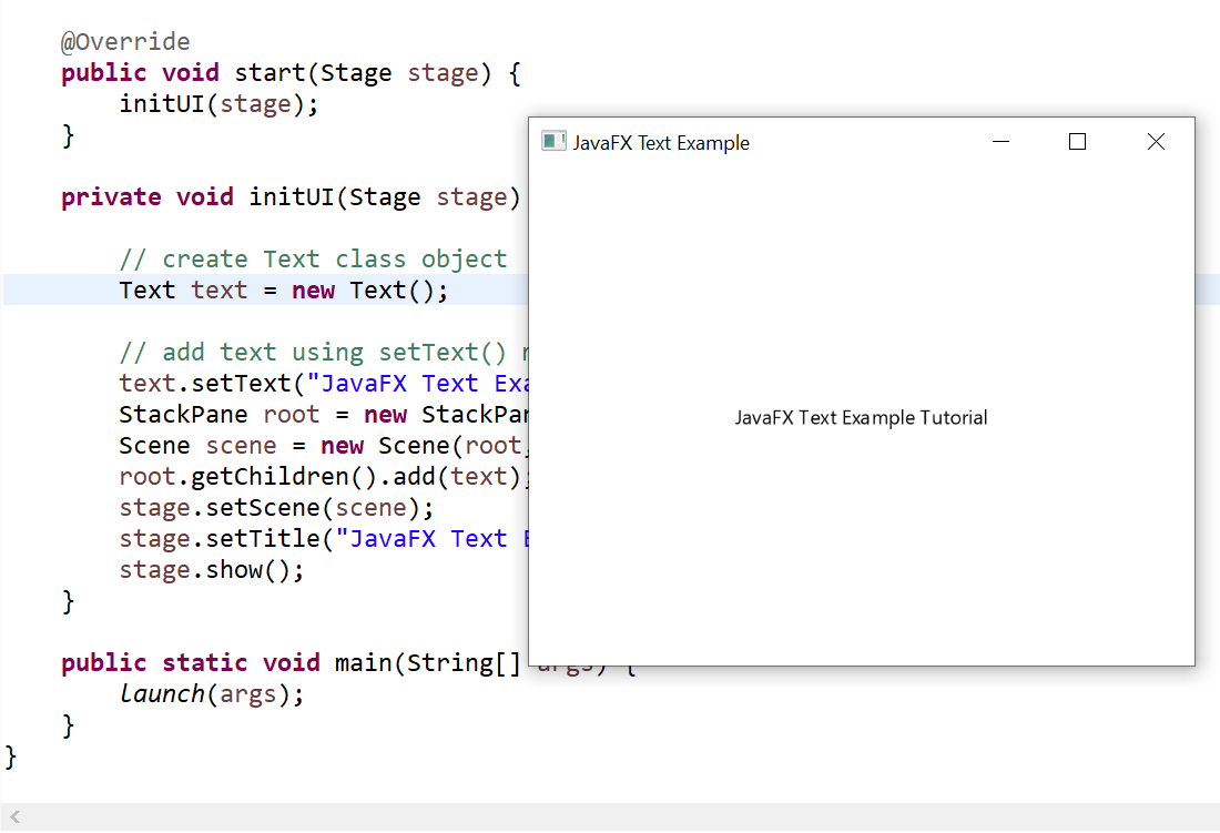
package com.javafx.examples;

import javafx.application.Application;

import javafx.scene.Scene;
import javafx.scene.layout.StackPane;
import javafx.scene.text.Text;
import javafx.stage.Stage;

public class JavaFXTextExample extends Application {

    @Override
    public void start(Stage stage) {
        initUI(stage);
    }

    private void initUI(Stage stage) {

        // create Text class object
        Text text = new Text();

        // add text using setText() method
        text.setText("JavaFX Text Example Tutorial");
        StackPane root = new StackPane();
        Scene scene = new Scene(root, 400, 300);
        root.getChildren().add(text);
        stage.setScene(scene);
        stage.setTitle("JavaFX Text Example");
        stage.show();
    }

    public static void main(String[] args) {
        launch(args);
    }
}
Output
2. JavaFX Text Font and Position
JavaFX enables us to apply various fonts to the text nodes. We just need to set the property font of the Text class by using the setter method setFont(). This method accepts the object of the Font class.
package com.javafx.examples;

import javafx.application.Application;
import javafx.scene.Group;
import javafx.scene.Scene;
import javafx.scene.text.Font;
import javafx.scene.text.FontPosture;
import javafx.scene.text.FontWeight;
import javafx.scene.text.Text;
import javafx.stage.Stage;

public class JavaFXTextFontExample extends Application {

    @Override
    public void start(Stage primaryStage) throws Exception {
        Text text = new Text();

        // position of text
        text.setX(100);
        text.setY(100);

        // font for text
        text.setFont(Font.font("Verdana", FontWeight.BOLD, FontPosture.REGULAR, 25));
        text.setText("Welcome to Java Guides");
        Group root = new Group();
        Scene scene = new Scene(root, 500, 400);
        root.getChildren().add(text);
        primaryStage.setScene(scene);
        primaryStage.setTitle("JavaFX Text Font Example");
        primaryStage.show();
    }

    public static void main(String[] args) {
        launch(args);
    }
}
The font family is «Verdana», font-weight is bold and font size is 25:
text.setFont(Font.font("Verdana", FontWeight.BOLD, FontPosture.REGULAR, 25));
- Family: it represents the family of the font. It is of string type and should be an appropriate font family present in the system.
- Weight: this Font class property is for the weight of the font. There are 9 values that can be used as the font-weight. The values are FontWeight.BLACK, BOLD, EXTRA_BOLD, EXTRA_LIGHT, LIGHT, MEDIUM, NORMAL, SEMI_BOLD, THIN.
- Posture: this Font class property represents the posture of the font. It can be either FontPosture.ITALIC or FontPosture.REGULAR.
- Size: this is a double type property. It is used to set the size of the font.
Output

3. Applying Stroke and Color to Text
JavaFX allows us to apply stroke and colors to the text.
The javafx.scene.text.Text class provides a method named setStroke() which accepts the Paint class object as an argument. Just pass the color which will be painted on the stroke. We can also set the width of the stroke by passing a width value of double type into setStrokeWidth() method.
To set the color of the Text, javafx.scene.text.Text class provides another method named setFill(). We just need to pass the color which is to be filled in the text.
The following example demonstrates applying stroke and color to text:
package com.javafx.examples;

import javafx.application.Application;
import javafx.scene.Group;
import javafx.scene.Scene;
import javafx.scene.paint.Color;
import javafx.scene.text.Font;
import javafx.scene.text.FontPosture;
import javafx.scene.text.FontWeight;
import javafx.scene.text.Text;
import javafx.stage.Stage;

public class JavaFXFontColorExample extends Application {
    @Override
    public void start(Stage primaryStage) throws Exception {
        // TODO Auto-generated method stub
        Text text = new Text();

        text.setX(100);
        text.setY(100);
        text.setFont(Font.font("Verdana", FontWeight.BOLD, FontPosture.REGULAR, 25));
        text.setFill(Color.BLUE); // setting color of the text to blue
        text.setStroke(Color.BLACK); // setting the stroke for the text
        text.setStrokeWidth(1); // setting stroke width to 2
        text.setText("Welcome to Java Guides");
        Group root = new Group();
        Scene scene = new Scene(root, 500, 200);
        root.getChildren().add(text);
        primaryStage.setScene(scene);
        primaryStage.setTitle("JavaFX Font Color Example");
        primaryStage.show();
    }

    public static void main(String[] args) {
        launch(args);

    }
}
Output

Related JavaFX Examples
- JavaFX Hello World Example Tutorial — In this tutorial, we will learn how to create our first JavaFX application.
- Registration Form Using JavaFX with MySQL Database — In this tutorial, we will learn how to create a Registration Form using JavaFX with database connectivity. Here we will use the MySQL database to store user data via JDBC API.
- Login Form Using JavaFX with MySQL Database — In this tutorial, we will learn how to create a Login Form using JavaFX with database connectivity.
- JavaFX Quit Button Example — Terminate Application — In this tutorial, we will learn how to stop or terminate the JavaFX application.
JavaFX
Free Spring Boot Tutorial | Full In-depth Course | Learn Spring Boot in 10 Hours
Watch this course on YouTube at Spring Boot Tutorial | Fee 10 Hours Full Course
Overview
In this tutorial, we show you how to change the color of TextField in JavaFX.

Way 1 — Using the CSS styles for TextField «-fx-text-fill: #color»
Edit Example.fxml file. Add style=»-fx-text-fill: #BA55D3;» to TextField.
<?xml version="1.0" encoding="UTF-8"?>

<?import javafx.scene.image.*?>
<?import java.lang.*?>
<?import java.util.*?>
<?import javafx.scene.*?>
<?import javafx.scene.control.*?>
<?import javafx.scene.layout.*?>

<AnchorPane id="AnchorPane" fx:id="main" prefHeight="400.0" prefWidth="600.0" style="-fx-background-color: #fff;" xmlns="http://javafx.com/javafx/8" xmlns:fx="http://javafx.com/fxml/1" fx:controller="com.jackrutorial.ExampleController">
   <children>
      <TextField fx:id="txtSearch" layoutX="149.0" layoutY="162.0" prefHeight="50.0" prefWidth="300.0" style="-fx-text-fill: #BA55D3;" />
   </children>
</AnchorPane>
Way 2 — Using the CSS styles for TextField «-fx-text-inner-color: #color»
Edit Example.fxml file. Add style=»-fx-text-inner-color: #BA55D3;» to TextField.
<?xml version="1.0" encoding="UTF-8"?>

<?import javafx.scene.image.*?>
<?import java.lang.*?>
<?import java.util.*?>
<?import javafx.scene.*?>
<?import javafx.scene.control.*?>
<?import javafx.scene.layout.*?>

<AnchorPane id="AnchorPane" fx:id="main" prefHeight="400.0" prefWidth="600.0" style="-fx-background-color: #fff;" xmlns="http://javafx.com/javafx/8" xmlns:fx="http://javafx.com/fxml/1" fx:controller="com.jackrutorial.ExampleController">
   <children>
      <TextField fx:id="txtSearch" layoutX="149.0" layoutY="162.0" prefHeight="50.0" prefWidth="300.0" style="-fx-text-inner-color: #BA55D3;" />
   </children>
</AnchorPane>
Way 3 — Using souce code set style for TextField
Using javafx.scene.control.TextField.setStyle
package com.jackrutorial;


import java.net.URL;
import java.util.ResourceBundle;
import javafx.fxml.FXML;
import javafx.fxml.Initializable;
import javafx.scene.control.TextField;

public class ExampleController implements Initializable {

    @FXML
    private TextField txtSearch;

    /**
     * Initializes the controller class.
     */
    @Override
    public void initialize(URL url, ResourceBundle rb) {

        txtSearch.setStyle("-fx-text-inner-color: #BA55D3;");
    }
}
Full Source code
Example.fxml
<?xml version="1.0" encoding="UTF-8"?>

<?import javafx.scene.image.*?>
<?import java.lang.*?>
<?import java.util.*?>
<?import javafx.scene.*?>
<?import javafx.scene.control.*?>
<?import javafx.scene.layout.*?>

<AnchorPane id="AnchorPane" fx:id="main" prefHeight="400.0" prefWidth="600.0" style="-fx-background-color: #fff;" xmlns="http://javafx.com/javafx/8" xmlns:fx="http://javafx.com/fxml/1" fx:controller="com.jackrutorial.ExampleController">
   <children>
      <TextField fx:id="txtSearch" layoutX="149.0" layoutY="162.0" prefHeight="50.0" prefWidth="300.0" />
   </children>
</AnchorPane>
ExampleController.java
package com.jackrutorial;


import java.net.URL;
import java.util.ResourceBundle;
import javafx.fxml.FXML;
import javafx.fxml.Initializable;
import javafx.scene.control.TextField;

public class ExampleController implements Initializable {

    @FXML
    private TextField txtSearch;

    /**
     * Initializes the controller class.
     */
    @Override
    public void initialize(URL url, ResourceBundle rb) {

        txtSearch.setStyle("-fx-text-inner-color: #BA55D3;");
        //or txtSearch.setStyle("-fx-text-fill: #BA55D3;");
    }
}
- Tweet
- Share
- Share
- Share
- Share
Contents
- Introduction
- CSS and the JavaFX Scene Graph
- Scene, Parent and SubScene Stylesheets
- Naming Conventions
- CSS Public API
- Inheritance
- @ Rules
- Examples
- Understanding Parser Warnings
- Limitations
- Types
- inherit
- <boolean>
- <string>
- <number> & <integer>
- <size>
- <length>
- <percentage>
- <angle>
- <duration>
- <point>
- <color-stop>
- <uri>
- <effect>
- <font>
- <paint>
- <color>
- Stage
- javafx.stage
- PopupWindow
- javafx.stage
- Nodes
- javafx.scene
- Group
- Node
- Parent
- Scene
- javafx.scene.image
- ImageView
- javafx.scene.layout
- AnchorPane
- BorderPane
- DialogPane
- FlowPane
- GridPane
- HBox
- Pane
- Region
- StackPane
- TilePane
- VBox
- javafx.scene.media
- MediaView
- javafx.scene.shape
- Shape
- Arc
- Circle
- CubicCurve
- Ellipse
- Line
- Path
- Polygon
- QuadCurve
- Rectangle
- SVGPath
- javafx.scene.text
- Text
- javafx.scene.web
- WebView
- javafx.scene
- Controls
- javafx.scene.control
- Accordion
- Button
- ButtonBase
- Cell
- CheckBox
- CheckMenuItem
- ChoiceBox
- ColorPicker
- ComboBox
- ContextMenu
- Control
- DatePicker
- HTMLEditor
- Hyperlink
- IndexedCell
- Label
- Labeled
- ListCell
- ListView
- Menu
- MenuBar
- MenuButton
- MenuItem
- Pagination
- PasswordField
- ProgressBar
- ProgressIndicator
- RadioButton
- RadioMenuItem
- ScrollBar
- ScrollPane
- Separator
- Spinner
- Slider
- SplitMenuButton
- SplitPane
- TabPane
- TableColumnHeader
- TableView
- TextArea
- TextInputControl
- TextField
- TitledPane
- ToggleButton
- ToolBar
- Tooltip
- TreeCell
- TreeTableCell
- TreeTableView
- TreeView
- WebView
- javafx.scene.control
- Charts
- javafx.scene.chart
- AreaChart
- Axis
- BarChart
- BubbleChart
- CategoryAxis
- Chart
- Legend
- LineChart
- NumberAxis
- PieChart
- ScatterChart
- ValueAxis
- XYChart
- javafx.scene.chart
- References
Introduction
Never has styling a Java UI been easier than with JavaFX and Cascading Style Sheets (CSS). Going from one
theme to another, or customizing the look of just one control, can all be done through CSS. To the novice,
this may be unfamiliar territory; but the learning curve is not that great. Give CSS styling a try and the
benefits will soon be apparent. You can also split the design and development workflow, or defer design
until later in the project. Up to the last minute changes, and even post-deployment changes, in the UI’s
look can be achieved through JavaFX CSS.
The structure of this document is as follows. First, there is a
description of all value types for JavaFX CSS properties.Where
appropriate, this includes a grammar for the syntax of values of that
type. Then, for each scene‑graph node that supports CSS styles, a table is
given that lists the properties that are supported, along with type and
semantic information. The pseudo‑classes for each class are also given.
The description of CSS properties continues for the controls. For each
control, the substructure of that control’s skin is given, along with the
style‑class names for the Region objects that implement that substructure.
CSS and the JavaFX Scene Graph
JavaFX Cascading Style Sheets (CSS) is based on the W3C CSS version 2.1 [1]
with some additions from current work on version 3 [2].
JavaFX CSS also has some extensions to CSS in support of specific JavaFX
features. The goal for JavaFX CSS is to allow web developers already
familiar with CSS for HTML to use CSS to customize and develop themes for
JavaFX controls and scene‑graph objects in a natural way.
JavaFX has a rich set of extensions to CSS in support of features such as
color derivation, property lookup, and multiple background colors and
borders for a single node. These features add significant new power for
developers and designers and are described in detail in this document.
To the extent possible, JavaFX CSS follows the W3C standards; however, with few exceptions, JavaFX
property names have been prefixed with a vendor extension of «-fx-«. Even if these properties seem to be
compatible with standard HTML CSS, JavaFX CSS processing assumes that the property values
make use of JavaFX CSS extensions.
CSS styles are applied to nodes in the JavaFX scene‑graph in a way
similar to the way CSS styles are applied to elements in the HTML DOM.
Styles are first applied to the parent, then to its children. The code is
written such that only those branches of the scene‑graph that might need
CSS reapplied are visited. A node is styled after it is added to the scene
graph. Styles are reapplied when there is a change to the node’s
pseudo‑class state, style‑class, id, inline style, or parent, or stylesheets
are added to or removed from the scene. Note that the Node must be in the
scene‑graph for CSS to be applied. The Node does not have
to be shown, but must have a non‑null value for its sceneProperty. See
applyCss for more details.
During a normal scene‑graph pulse, CSS styles are applied before the scene‑graph is
laid out and painted. Styles for events that trigger a pseudo‑class state change,
such as MouseEvent.MOUSE_ENTERED which triggers the «hover» state, are
applied on the next pulse following the event.
CSS selectors are used to match styles to scene‑graph
nodes.
The relationship of a Node to a CSS selector is as follows:
-
Node’s getTypeSelector method returns a
String which is analogous to a CSS Type
Selector.
By default, this method returns the simple name of the class. Note that the simple name of an inner class
or of an anonymous class may not be usable as a type selector. In such a case, this method should be
overridden to return
a meaningful value. -
Each node in the scene‑graph has a styleClass
property.
Note that a node may have more than one style‑class.
A Node’s styleClass is analogous to the class=»…» attribute that can
appear on HTML elements. See Class Selectors. -
Each node in the scene‑graph has an id variable, a
string. This is analogous to the id=»…» attribute that can appear HTML
elements. See ID Selectors.
JavaFX CSS also supports pseudo‑classes, but does not implement the full range of pseudo‑classes as
specified in Pseudo‑classes. The pseudo‑classes
supported by each Node type are given in the tables within this reference. Note that JavaFX does not currently
support structural pseudo‑classes.
Each node honors a set of properties that depends on the node’s JavaFX
class (as distinct from its styleClass). The properties honored by each
node class are shown in detail in tables later in this document. The
property value that is actually applied depends on the precedence of the
origin of the rule, as described above, as well as the specificity of the
rule’s selector as described in CSS 2 [1]
. Ultimately, a property value string is converted into a JavaFX value of
the appropriate type and is then assigned to an instance variable of the
JavaFX object.
Scene, Parent and SubScene Stylesheets
CSS styles can come from style sheets or inline styles. Style sheets are
loaded from the URLs specified in the
getStylesheets
property of the Scene object. If the scene‑graph contains a Control, a
default user agent style sheet is loaded. Inline styles are specified via
the Node setStyle API. Inline
styles are analogous to the style=»…» attribute of an HTML element.
Styles loaded from a Scene’s style sheets take precedence over selectors from
the user agent style sheet. Inline styles take precedence over
styles originating elsewhere. The precedence order of style selectors can be
modified using «!important» in a style declaration.
Beginning with JavaFX 2.1, the Parent class has a
getStylesheets property,
allowing style sheets to be set on a container. This allows for one branch
of of the scene‑graph to have a distinct set of styles. Any instance of
Parent can have style sheets. A child will take its styles from its own
inline styles, the style sheets of all its ancestors, and any style sheets
from the Scene.
Beginning with JavaFX 8u20, the Scene class has a
getUserAgentStylesheet property,
allowing a user‑style sheet to be set on a Scene. This allows a Scene
to have a set of user‑agent styles distinct from the platform default. When a user‑agent
stylesheet is set on a Scene, the user‑agent styles are used instead of the styles from the
platform default user‑agent stylesheet.
Beginning with JavaFX 8u20, the SubScene class has a
getUserAgentStylesheet property,
allowing a user‑style sheet to be set on a SubScene. This allows a SubScene
of the scene‑graph to have set of user‑agent styles distinct from the platform default
or from the Scene in which the SubScene is contained. When a user‑agent
stylesheet is set on a SubScene, the user‑agent styles are used instead of the styles from the
platform default user‑agent stylesheet or any user‑agent stylesheet set on the Scene.
It is important to note that styles from a stylesheet added to a Scene or Parent, do not affect
a SubScene which is a child or descendent of the Scene or Parent. Unless a user‑agent has
been set on the SubScene, the SubScene will get styles
from the a Scene’s user‑agent stylesheet or the platform user‑agent stylesheet.
The implementation allows designers to style an application by using style
sheets to override property values set from code. For example, a call to rectangle.setFill(Color.YELLOW)
can be overridden by an inline‑style or a style from an author stylesheet. This has implications for
the cascade; particularly, when does a style from a style sheet override a
value set from code? The JavaFX CSS implementation applies the following
order of precedence: a style from a user agent style sheet has lower
priority than a value set from code, which has lower priority than a Scene
or Parent style sheet. Inline styles have highest precedence. Style sheets
from a Parent instance are considered to be more specific than those styles
from Scene style sheets.
Naming Conventions
Naming conventions have been established for deriving CSS style‑class
names from JavaFX class names, and for deriving CSS property names from
JavaFX variable names. Note that this is only a naming convention; there
is no automatic name conversion. Most JavaFX names use «camel case,» that
is, mixed case names formed from compound words, where the initial letter
of each sub-word is capitalized. Most CSS names in the HTML world are all
lower case, with compound words separated by hyphens. The convention is
therefore to take JavaFX class names and form their corresponding CSS
style‑class name by separating the compound words with hyphens and
convering the letters to all lower case. For example, the JavaFX
ToggleButton class would have a style‑class of «toggle-button». The
convention for mapping JavaFX variable names to CSS property names is
similar, with the addition of the «-fx-» prefix. For example, the
blendMode variable would have a corresponding CSS property name of
«-fx-blend-mode».
CSS Public API
Beginning with JavaFX 8, public API is available for developers to create styleable properties and manage
pseudo-class state. Refer to javafx.css for details.
Inheritance
CSS also provides for certain properties to be inherited by default, or
to be inherited if the property value is ‘inherit’. If a value is
inherited, it is inherited from the computed value of the element’s parent
in the document tree. In JavaFX, inheritance is similar, except that
instead of elements in the document tree, inheritance occurs from parent
nodes in the scene‑graph.
The following properties inherit by default. Any property can be made to
inherit by giving it the value «inherit».
| Class | Property | CSS Property | Initial Value |
|---|---|---|---|
| javafx.scene.Node | cursor | -fx-cursor | javafx.scene.Cursor.DEFAULT |
| javafx.scene.text.Text | textAlignment | -fx-text-alignment | javafx.scene.text.TextAlignment.LEFT |
| javafx.scene.text.Font | font | -fx-font, -fx-font-family, -fx-font-size, -fx-font-weight, -fx-font-style | Font.DEFAULT (12px system) |
Within the hierarchy of JavaFX classes (for example, Rectangle is a
subclass of Shape, which in turn is a subclass of Node), the CSS
properties of an ancestor are also CSS properties of the descendant. This
means that a subclass will respond to the same set of properties as its
ancestor classes, and to additional properties it defines itself. So, a
Shape supports all the properties of Node plus several more, and Rectangle
supports all the properties of Shape plus a couple more. However, because
using a JavaFX class name as a type selector is an exact match, providing
style declarations for a Shape will not cause a Rectangle to use those
values (unless the .css value for the Rectangle’s property is «inherit»).
For font inheritance, the CSS engine looks only for the styles in the table above. When
looking for a font to inherit, the search
terminates at any node that has a Font property that was set by the user. The user-set font is
inherited provided there is not an author or an inline-style that applies specifically to that node.
In this case, the inherited font is created from the user-set font and any parts of the applicable
author or in-line style.
@ Rules
Beginning with JavaFX 8u20, the CSS
@import is also partially supported.
Only unconditional import is supported. In other words, the media‑type qualifier is not supported.
Also, the JavaFX CSS parser is non-compliant with regard to where an @import may appear within a stylesheet
(see At‑rules).
Users are cautioned that this will be fixed in a future release. Adherence to the W3C standard is strongly advised.
Since JavaFX 8, the implementation partially supports the CSS3 syntax to load a font from a URL using the
@font‑face rule:
This allows public resources for fonts to be used in a JavaFX application. For example, assume the URL
«http://font.samples/web?family=samples» returns the @font‑face rule given above. Then the
following code shows how the sample font could be used in a JavaFX application.
Or, the URL could be imported into a stylesheet with the @import rule.
Although the parser will parse the syntax, all @font‑face descriptors are ignored except for
the src descriptor. The src descriptor is expected to be a
<url>. The format hint is ignored.
Examples
Consider the following simple JavaFX application:
Scene scene = new Scene(new Group());
scene.getStylesheets().add(“test.css”);
Rectangle rect = new Rectangle(100,100);
rect.setLayoutX(50);
rect.setLayoutY(50);
rect.getStyleClass().add(«my-rect»);
((Group)scene.getRoot()).getChildren().add(rect);
Without any styles, this will display a plain black rectangle. If
test.css contains the following:
.my-rect { -fx-fill: red; }
the rectangle will be red instead of black:

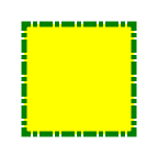
If test.css contains the following:
.my-rect {
-fx-fill: yellow;
-fx-stroke: green;
-fx-stroke-width: 5;
-fx-stroke-dash-array: 12 2 4 2;
-fx-stroke-dash-offset: 6;
-fx-stroke-line-cap: butt;
}
the result will be a yellow rectangle with a nicely dashed green border:
Understanding
Parser Warnings
When the JavaFX CSS parser encounters a syntax error, a warning message
is emitted which conveys as much information as is available to help
resolve the error. For example
WARNING: javafx.css.CssParser declaration
Expected ‘<percent>’ while parsing ‘-fx-background-color’ at ?[1,49]
The cryptic ‘?[1,49]‘ pertains to the
location of the error. The format of the location string is
<url>[line, position]
If the error is found while parsing a file, the file URL will be given.
If the error is from an inline style (as in the example above), the URL is
given as a question mark. The line and position give an offset into the
file or string where the token begins. Please note that the line and
position may not be accurate in releases prior to JavaFX 2.2.
Applications needing to detect errors from the parser can add a listener
to the errors property of javafx.css.CssParser.
Limitations
- While the JavaFX CSS parser will parse valid CSS syntax, it is not a
fully compliant CSS parser. One should not expect the parser to handle
syntax not specified in this document. - With the exception of @font‑face and @import, @-keyword statements are ignored.
- The <media-query-list> of the @import statement is not parsed.
- The structural pseudo‑classes are not supported.
- The «:active» and «:focus» dynamic pseudo‑classes are not supported.
However, Nodes do support the «:pressed» and
«:focused» pseudo‑classes, which are similar. - The «:link» and «:visited» pseudo‑classes are not supported in general.
However, Hyperlink objects can be styled, and
they support the «:visited» pseudo‑class. - JavaFX CSS does not support comma-separated series of font family names
in the -fx-font-family property. The optional line height parameter when
specifying fonts is not supported. There is no equivalent for the
font-variant property. - JavaFX CSS uses the HSB color model instead of the HSL color model.
- If a property of a node is initialized by calling the set method of the
property, the CSS implementation will see this as a user set value and the
value will not be overwritten by a style from a user agent style
sheet. - When parsing a URI,
the parser doesn’t handle URI escapes nor <hex-digit>[1,6] code points.
Types
inherit
Each property has a type, which determines what kind of value and the
syntax for specifying those values. In addition, each property may have a
specified value of ‘inherit’, which means that, for a given node, the
property takes the same computed value as the property for the node’s
parent. The ‘inherit’ value can be used on properties that are not
normally inherited.
If the ‘inherit’ value is set on the root element, the property is
assigned its initial value.
<boolean>
Boolean values can either have the string value of «true» or «false», the
values are case insensitive as all CSS is case insensitive.
<string>
Strings can either be written with double quotes or with single quotes.
Double quotes cannot occur inside double quotes, unless escaped (e.g., as
‘»‘ or as ’22’). Analogously for single quotes (e.g., «‘» or «27»).
«this is a ‘string'»
«this is a «string»»
‘this is a «string»‘
‘this is a ‘string»
A string cannot directly contain a newline. To include a newline in a
string, use an escape representing the line feed character in ISO-10646
(U+000A), such as «A» or «0000a». This character represents the generic
notion of «newline» in CSS. See the ‘content’ property for an example.
<number> &
<integer>
Some value types may have integer values (denoted by <integer>) or
real number values (denoted by <number>). Real numbers and integers
are specified in decimal notation only. An <integer> consists of one
or more digits «0» to «9». A <number> can either be an
<integer>, or it can be zero or more digits followed by a dot (.)
followed by one or more digits. Both integers and real numbers may be
preceded by a «-» or «+» to indicate the sign. -0 is equivalent to 0 and
is not a negative number.
[+|-]? [[0-9]+|[0-9]*».»[0-9]+]
Note that many properties that allow an integer or real number as a value
actually restrict the value to some range, often to a non-negative value.
<size>
A size is a <number>
with units of <length> or
<percentage>. If a unit
is not specified then ‘px’ is assumed.
<length>
<number>[ px | mm | cm |
in | pt | pc | em | ex ]?
No whitespace is allowed between the number and units if provided. Some
units are relative and others absolute.
Relative
- px: pixels, relative to the viewing device
- em: the ‘font-size’ of the relevant font
- ex: the ‘x-height’ of the relevant font
Absolute
- in: inches — 1 inch is equal to 2.54
centimeters. - cm: centimeters
- mm: millimeters
- pt: points — the points used by CSS 2.1 are
equal to 1/72nd of an inch. - pc: picas — 1 pica is equal to 12 points.
<percentage>
These are a percentage of some length, typically to the width or height
of a node.
<number>[ % ]
<angle>
An angle is a <number>
with one of the following units.
<number>[ deg | rad |
grad | turn ]
- deg: angle in degrees — all other angle units are
converted to degrees. - rad: angle in radians
- grad: angle in gradians
- turn: angle in turns
<duration>
A duration is a <number>
with second or millisecond units, or the value indefinite.
[<number>[ s | ms ]] | indefinite
- s: duration in seconds
- ms: duration in milliseconds. One second is 1000 milliseconds.
- indefinite: See Duration.INDEFINITE
See also W3C time units.
<point>
A point is an {x,y} coordinate.
[ [ <length> <length> ] | [
<percentage> | <percentage> ] ]
<color-stop>
Stops are per W3C
color-stop syntax.
[ <color>
[ <percentage> | <length>]?
]
In a series of <color-stop>, stop distance values must all be
<percentage> or <length>. Furthermore, if <length>
values are used, then the distance value for first and last stop in the
series must be specified. This restriction may be removed in a future
release.
«red, white 70%, blue» is valid since the
distance for red and blue is assumed to be 0% and 100%, respectively.
«red 10, white, blue 90» is valid. Because
distance for red and blue is 10 and 90, respectively, the distance for
white can be calculated.
«red, white 70, blue» is not valid
since distance units do not agree.
«red, white, blue» is valid. The stops are
distributed evenly between 0% and 100%.
<uri>
url ( [«‘]? <address> [«‘]? )
<address> is a hierarchical URI of the form [scheme:][//authority][path] (see [2]).
For example:
url(http://example.com/images/Duke.png)
url(/com/example/javafx/app/images/Duke.png)
If the <address> does not have a [scheme:] component, the <address>
is considered to be the [path] component only.
A leading ‘/’ character indicates that the [path] is relative to the
root of the classpath. If the the style appears in a stylesheet and
has no leading ‘/’ character, the path is relative to the base URI of
the stylesheet. If the style appears in an inline style, the path is
relative to the root of the classpath (regardless of whether or not
there is a leading ‘/’).
| Stylesheet URL | URL in Style | Resolves to |
|---|---|---|
| file:///some/path/build/classes/com/mycompany/myapp/mystyles.css | url(images/Duke.png) | file:///some/path/build/classes/com/mycompany/myapp/images/Duke.png |
| file:///some/path/build/classes/com/mycompany/myapp/mystyles.css | url(../images/Duke.png) | file:///some/path/build/classes/com/mycompany/images/Duke.png |
| jar:file:/some/path/build/myapp.jar!/com/mycompany/myapp/mystyles.css | url(images/Duke.png) | jar:file:/some/path/build/myapp.jar!/com/mycompany/myapp/images/Duke.png |
| Classpath | URL in Style | Resolved URL |
|---|---|---|
| file:///some/path/build/classes | url(/com/mycompany/resources/images/Duke.png) | file:///some/path/build/classes/com/mycompany/resources/images/Duke.png |
| file:///some/path/build/myapp.jar | url(/com/mycompany/resources/images/Duke.png) | jar:file:/some/path/build/myapp.jar!/com/mycompany/resources/images/Duke.png |
Note that for inline styles, leading dot-segments (e.g. ‘..’ or ‘.’) do resolve since the path is always
anchored at the root of the classpath.
As an example, the code snippet below creates a scene filled with a fictional ‘Duke.png’ image, located in an
‘image’ directory:
The same style would work equally as well from a stylesheet.
<effect>
JavaFX CSS currently supports the DropShadow and InnerShadow effects from
the JavaFX platform. See the class documentation in javafx.scene.effect
for further details about the semantics of the various effect parameters.
Drop Shadow
A high-level effect that renders a shadow of the given content behind the
content.
dropshadow( <blur-type> , <color>
, <number> , <number>
, <number> , <number>
)
<blur-type> = [
gaussian | one-pass-box | three-pass-box | two-pass-box ]
<color> The
shadow Color.
<number>
The radius of the shadow blur kernel. In the range [0.0 … 127.0],
typical value 10.
<number>
The spread of the shadow. The spread is the portion of the radius where
the contribution of the source material will be 100%. The remaining
portion of the radius will have a contribution controlled by the blur
kernel. A spread of 0.0 will result in a distribution of the shadow
determined entirely by the blur algorithm. A spread of 1.0 will result in
a solid growth outward of the source material opacity to the limit of the
radius with a very sharp cutoff to transparency at the radius. Values
should be in the range [0.0 … 1.0].
<number>
The shadow offset in the x direction, in pixels.
<number>
The shadow offset in the y direction, in pixels.
Inner Shadow
A high-level effect that renders a shadow inside the edges of the given
content.
innershadow( <blur-type> , <color>
, <number> , <number>
, <number> , <number>
)
<blur-type> = [
gaussian | one-pass-box | three-pass-box | two-pass-box ]
<color>
The shadow Color.
<number>
The radius of the shadow blur kernel. In the range [0.0 … 127.0],
typical value 10.
<number>
The choke of the shadow. The choke is the portion of the radius where the
contribution of the source material will be 100%. The remaining portion of
the radius will have a contribution controlled by the blur kernel. A choke
of 0.0 will result in a distribution of the shadow determined entirely by
the blur algorithm. A choke of 1.0 will result in a solid growth inward of
the shadow from the edges to the limit of the radius with a very sharp
cutoff to transparency inside the radius. Values should be in the range
[0.0 … 1.0].
<number>
The shadow offset in the x direction, in pixels.
<number>
The shadow offset in the y direction, in pixels.
<font>
JavaFX CSS supports the ability to specify fonts using separate family,
size, style, and weight properties, as well as the ability to specify a
font using a single shorthand property. There are four value types related
to fonts plus a shorthand property that encompasses all four properties.
The font-related types are as follows.
<font-family>The string name of the
font family. An actual font family name available on the system can be
used, or one of the following generic family names can be used:
- ‘serif’ (e.g., Times)
- ‘sans-serif’ (e.g., Helvetica)
- ‘cursive’ (e.g., Zapf-Chancery)
- ‘fantasy’ (e.g., Western)
- ‘monospace’ (e.g., Courier)
<font-size> The size of the font,
using the <size> syntax.
<font-style> The font’s style, using
the following syntax:
[ normal | italic | oblique ]
<font-weight> The font’s weight, using
the following syntax:
[ normal | bold | bolder | lighter | 100 | 200 | 300
| 400 | 500 | 600 | 700 | 800 | 900 ]
<font> This font shorthand property
can be used in place of the above properties. It uses the following
syntax:
[[ <font-style> || <font-weight> ]?
<font-size> <font-family> ]
Font Properties
Most classes that use text will support the following font properties. In
some cases a similar set of properties will be supported but with a
different prefix instead of «-fx-font».
| CSS Property | Values | Default | Comments |
|---|---|---|---|
| -fx-font | <font> | inherit | shorthand property for font-size, font-family, font-weight and font-style |
| -fx-font-family | <font-family> | inherit | |
| -fx-font-size | <font-size> | inherit | |
| -fx-font-style | <font-style> | inherit | |
| -fx-font-weight | <font-weight> | inherit |
<paint>
Paint values can either be a solid color specified in one of the color
syntaxes, they can be a linear or radial gradient, or an image-pattern.
<color> |
<linear-gradient> |
<radial-gradient> |
<image-pattern>
<repeating-image-pattern>
Linear Gradients
<linear-gradient>
linear-gradient( [ [from <point>
to <point>] | [ to
<side-or-corner>], ]? [ [ repeat | reflect ], ]? <color-stop>[,
<color-stop>]+)
where <side-or-corner> = [left | right] || [top | bottom]
Linear gradient creates a gradient going though all the stop colors along
the line between the «from» <point>
and the «to» <point>. If
the points are percentages, then they are relative to the size of the area
being filled. Percentage and length sizes can not be mixed in a single
gradient function.
If neither repeat nor reflect are given, then the CycleMethod defaults
«NO_CYCLE».
If neither [from <point> to <point>] nor [ to
<side-or-corner> ] are given, then the gradient direction defaults
to ‘to bottom’.
Stops are per W3C
color-stop syntax and are normalized accordingly.
This example will create a gradient from top left to bottom right of the
filled area with red at the top left corner and black at the bottom right.
linear-gradient(to bottom right, red, black)
This is equivalent to:
linear-gradient(from 0% 0% to 100% 100%, red 0%, black
100%)
This more complex example will create a 50px high bar at the top with a 3
color gradient with white underneath for the rest of the filled area.
linear-gradient(from 0px 0px to 0px 50px, gray, darkgray
50%, dimgray 99%, white)
The following syntax for linear gradient does not
conform to the CSS grammar and is deprecated in JavaFX 2.0. The JavaFX
2.0 CSS parser supports the syntax but this support may be removed in
later releases.
linear (<size>, <size>)
to (<size>, <size>) stops [ (<number>,<color>)
]+ [ repeat | reflect ]?
Radial Gradients
<radial-gradient>
radial-gradient([ focus-angle <angle>,
]? [ focus-distance <percentage>,
]? [ center <point>, ]?
radius [ <length> | <percentage>
] [ [ repeat | reflect ], ]? <color-stop>[,
<color-stop>]+)
Radial gradient creates a gradient going though all the stop colors radiating outward from
the center point
to the radius. If the center point is not given,
the center defaults to (0,0). Percentage values are relative to the size of the area
being filled. Percentage and length sizes can not be mixed in a single gradient function.
If neither repeat nor reflect are given, then the CycleMethod defaults
«NO_CYCLE».
Stops are per W3C
color-stop syntax and are normalized accordingly.
Following are examples of the use of radial-gradient:
radial-gradient(radius 100%, red, darkgray, black)
radial-gradient(focus-angle 45deg, focus-distance 20%,
center 25% 25%, radius 50%, reflect, gray, darkgray 75%, dimgray)
The following syntax for radial gradient does not
conform to the CSS grammar and is deprecated in JavaFX 2.0. The JavaFX
2.0 CSS parser supports the syntax but this support may be removed in
later releases.
radial [focus-angle <number>
| <number> ] ]? [ focus-distance <size> ]? [ center
<size,size> ]? <size> stops [ ( <number>,
<color> ) ]+ [ repeat | reflect ]?
Image Paint
<image-pattern>
image-pattern(<string>,
[<size>,
<size>,
<size>,
<size>[,
<boolean>]?]?)
The parameters, in order, are:
<string>
The URL of the image.
<size>
The x origin of the anchor rectangle.
<size>
The y origin of the anchor rectangle.
<size>
The width of the anchor rectangle.
<size>
The height of the anchor rectangle.
<boolean>
The proportional flag which indicates whether start and end locations are proportional or absolute
For a full explanation of the parameters, refer to the
ImagePattern javadoc.
Following are examples of the use of image-pattern:
image-pattern(«images/Duke.png»)
image-pattern(«images/Duke.png», 20%, 20%, 80%, 80%)
image-pattern(«images/Duke.png», 20%, 20%, 80%, 80%, true)
image-pattern(«images/Duke.png», 20, 20, 80, 80, false)
Related, there is the repeating-image-pattern function which is a shorthand
for producing tiled image based fills. It is equivalent to
image-pattern(«images/Duke.png», 0, 0, imageWidth, imageHeight, false)
repeating-image-pattern(<string>)
The only parameter is the uri of the image. Following is an example of the use of image-pattern:
repeating-image-pattern(«com/mycompany/myapp/images/Duke.png»)
<color>
<named-color> | <looked-up-color> |
<rgb-color> | <hsb-color> | <color-function>
Named Colors <named-color>
CSS supports a bunch of named constant colors. Named colors can be
specified with just their unquoted name for example:
.button {
-fx-background-color: red;
}
The named colors that are available in CSS are:
aliceblue = #f0f8ff
antiquewhite = #faebd7
aqua = #00ffff
aquamarine = #7fffd4
azure = #f0ffff
beige = #f5f5dc
bisque = #ffe4c4
black = #000000
blanchedalmond = #ffebcd
blue = #0000ff
blueviolet = #8a2be2
brown = #a52a2a
burlywood = #deb887
cadetblue = #5f9ea0
chartreuse = #7fff00
chocolate = #d2691e
coral = #ff7f50
cornflowerblue = #6495ed
cornsilk = #fff8dc
crimson = #dc143c
cyan = #00ffff
darkblue = #00008b
darkcyan = #008b8b
darkgoldenrod = #b8860b
darkgray = #a9a9a9
darkgreen = #006400
darkgrey = #a9a9a9
darkkhaki = #bdb76b
darkmagenta = #8b008b
darkolivegreen = #556b2f
darkorange = #ff8c00
darkorchid = #9932cc
darkred = #8b0000
darksalmon = #e9967a
darkseagreen = #8fbc8f
darkslateblue = #483d8b
darkslategray = #2f4f4f
darkslategrey = #2f4f4f
darkturquoise = #00ced1
darkviolet = #9400d3
deeppink = #ff1493
deepskyblue = #00bfff
dimgray = #696969
dimgrey = #696969
dodgerblue = #1e90ff
firebrick = #b22222
floralwhite = #fffaf0
forestgreen = #228b22
fuchsia = #ff00ff
gainsboro = #dcdcdc
ghostwhite = #f8f8ff
gold = #ffd700
goldenrod = #daa520
gray = #808080
green = #008000
greenyellow = #adff2f
grey = #808080
honeydew = #f0fff0
hotpink = #ff69b4
indianred = #cd5c5c
indigo = #4b0082
ivory = #fffff0
khaki = #f0e68c
lavender = #e6e6fa
lavenderblush = #fff0f5
lawngreen = #7cfc00
lemonchiffon = #fffacd
lightblue = #add8e6
lightcoral = #f08080
lightcyan = #e0ffff
lightgoldenrodyellow = #fafad2
lightgray = #d3d3d3
lightgreen = #90ee90
lightgrey = #d3d3d3
lightpink = #ffb6c1
lightsalmon = #ffa07a
lightseagreen = #20b2aa
lightskyblue = #87cefa
lightslategray = #778899
lightslategrey = #778899
lightsteelblue = #b0c4de
lightyellow = #ffffe0
lime = #00ff00
limegreen = #32cd32
linen = #faf0e6
magenta = #ff00ff
maroon = #800000
mediumaquamarine = #66cdaa
mediumblue = #0000cd
mediumorchid = #ba55d3
mediumpurple = #9370db
mediumseagreen = #3cb371
mediumslateblue = #7b68ee
mediumspringgreen = #00fa9a
mediumturquoise = #48d1cc
mediumvioletred = #c71585
midnightblue = #191970
mintcream = #f5fffa
mistyrose = #ffe4e1
moccasin = #ffe4b5
navajowhite = #ffdead
navy = #000080
oldlace = #fdf5e6
olive = #808000
olivedrab = #6b8e23
orange = #ffa500
orangered = #ff4500
orchid = #da70d6
palegoldenrod = #eee8aa
palegreen = #98fb98
paleturquoise = #afeeee
palevioletred = #db7093
papayawhip = #ffefd5
peachpuff = #ffdab9
peru = #cd853f
pink = #ffc0cb
plum = #dda0dd
powderblue = #b0e0e6
purple = #800080
red = #ff0000
rosybrown = #bc8f8f
royalblue = #4169e1
saddlebrown = #8b4513
salmon = #fa8072
sandybrown = #f4a460
seagreen = #2e8b57
seashell = #fff5ee
sienna = #a0522d
silver = #c0c0c0
skyblue = #87ceeb
slateblue = #6a5acd
slategray = #708090
slategrey = #708090
snow = #fffafa
springgreen = #00ff7f
steelblue = #4682b4
tan = #d2b48c
teal = #008080
thistle = #d8bfd8
tomato = #ff6347
turquoise = #40e0d0
violet = #ee82ee
wheat = #f5deb3
white = #ffffff
whitesmoke = #f5f5f5
yellow = #ffff00
yellowgreen = #9acd32
transparent = rgba(0,0,0,0)
Looked-up Colors <looked-up-color>
With looked-up colors you can refer to any other color property that is
set on the current node or any of its parents. This is a very powerful
feature, as it allows a generic palette of colors to be specified on the
scene then used thoughout the application. If you want to change one of
those palette colors you can do so at any level in the scene tree and it
will affect that node and all its decendents. Looked-up colors are not
looked up until they are applied, so they are live and react to any style
changes that might occur, such as replacing a palette color at runtime
with the «style» property on a node.
In the following example, all background color of all buttons uses the
looked up color «abc».
.root { abc: #f00 }
.button { -fx-background-color: abc }
RGB Colors <rgb-color>
The RGB color model is used in numerical color specifications. It has a
number of different supported forms.
#<digit><digit><digit>
|
#<digit><digit><digit><digit><digit><digit>
| rgb( <integer> , <integer>
, <integer> )
| rgb( <integer> %, <integer>%
, <integer>% )
| rgba( <integer> , <integer>
, <integer> , <number>
)
| rgba( <integer>% , <integer>%
, <integer> %, <number>
)
These examples all specify the same color for the text fill of a Label:
- .label { -fx-text-fill: #f00 } /* #rgb */
- .label { -fx-text-fill: #ff0000 } /* #rrggbb */
- .label { -fx-text-fill: rgb(255,0,0) }
- .label { -fx-text-fill: rgb(100%, 0%, 0%) }
- .label { -fx-text-fill: rgba(255,0,0,1) }
RGB Hex: The format of an RGB value in hexadecimal
notation is a ‘#’ immediately followed by either three or six
hexadecimal characters. The three-digit RGB notation (#rgb) is converted
into six-digit form (#rrggbb) by replicating digits, not by adding zeros.
For example, #fb0 expands to #ffbb00. This ensures that white (#ffffff)
can be specified with the short notation (#fff) and removes any
dependencies on the color depth of the display.
RGB Decimal or Percent: The format of an RGB value in
the functional notation is ‘rgb(’ followed by a
comma-separated list of three numerical values (either three decimal
integer values or three percentage values) followed by ‘)’.
The integer value 255 corresponds to 100%, and to F or FF in the
hexadecimal notation: rgb(255,255,255) = rgb(100%,100%,100%) = #FFF. White
space characters are allowed around the numerical values.
RGB + Alpha: This is an extension of the RGB color model
to include an ‘alpha’ value that specifies the opacity of a
color. This is accomplished via a functional syntax of the form rgba(…)
form that takes a fourth parameter which is the alpha value. The alpha
value must be a number in the range 0.0 (representing completely
transparent) and 1.0 (completely opaque). As with the rgb() function, the
red, green, and blue values may be decimal integers or percentages. The
following examples all specify the same color:
- .label { -fx-text-fill: rgb(255,0,0) } /* integer range 0 — 255*/
- .label { -fx-text-fill: rgba(255,0,0,1) /* the same, with explicit
opacity of 1 */ - .label { -fx-text-fill: rgb(100%,0%,0%) } /* float range 0.0% —
100.0% */ - .label { -fx-text-fill: rgba(100%,0%,0%,1) } /* the same, with
explicit opacity of 1 */
HSB Colors <hsb-color>
Colors can be specified using the HSB (sometimes called HSV) color model,
as follows:
hsb( <number>
, <number>% , <number>%
) | hsba( <number> , <number>%
, <number>% , <number>
)
The first number is hue, a number in the range 0 to 360
degrees. The second number is saturation, a percentage in the
range 0% to 100%. The third number is brightness, also a
percentage in the range 0% to 100%. The hsba(…) form takes a fourth
parameter at the end which is a alpha value in the range 0.0 to 1.0,
specifying completely transparent and completely opaque, respectively.
Color Functions <color-function>
JavaFX supports some color computation functions. These compute new
colors from input colors at the time the color style is applied. This
enables a color theme to be specified using a single base color and to
have variant colors computed from that base color. There are two color
functions: derive() and ladder().
<derive> | <ladder>
Derive <derive>
derive( <color>
, <number>% )
The derive function takes a color and computes a brighter or darker
version of that color. The second parameter is the brightness offset,
representing how much brighter or darker the derived color should be. Positive percentages indicate brighter colors
and negative percentages indicate darker colors. A value of -100% means
completely black, 0% means no change in brightness, and 100% means
completely white.
Ladder<ladder>
ladder(<color>
, <color-stop> [, <color-stop>]+)
The ladder function interpolates between colors. The effect is as if a
gradient is created using the stops provided, and then the brightness of
the provided <color> is
used to index a color value within that gradient. At 0% brightness, the
color at the 0.0 end of the gradient is used; at 100% brightness, the
color at the 1.0 end of the gradient is used; and at 50% brightness, the
color at 0.5, the midway point of the gradient, is used. Note that no
gradient is actually rendered. This is merely an interpolation function
that results in a single color.
Stops are per W3C
color-stop syntax and are normalized accordingly.
For example, you could use the following if you want the text color to be
black or white depending upon the brightness of the background.
background: white;
-fx-text-fill: ladder(background, white 49%, black 50%);
The resulting -fx-text-fill value will be black, because the background
(white) has a brightness of 100%, and the color at 1.0 on the gradient is
black. If we were to change the background color to black or dark grey,
the brightness would be less than 50%, giving an -fx-text-fill value of
white.
The following syntax for ladder does not
conform to the CSS grammar and is deprecated in JavaFX 2.0. The JavaFX
2.0 CSS parser supports the syntax but this support may be removed in
later releases.
ladder(<color>)
stops [ ( <number> , <color>
) ]+
Stage
Group
Style class: .root.popup
PopupWindow does not have any properties that can be styled by CSS, but a PopupWindow does have its own Scene.
Scene’s root gets the .root style-class by default. If the Scene is the root scene of a PopupWindow, then the
.popup style-class is also added. This allows the root scene of a PopupWindow to have distinct styles via
the CSS rule .root.popup { /* declarations */ }
Nodes
Group
Style class: empty by default
| CSS Property | Values | Default | Comments |
|---|---|---|---|
| Group extends Parent. Group does not add any additional CSS properties. | |||
| Also has all properties of Parent |
Node
Style class: empty by default
| CSS Property | Values | Default | Range | Comments |
|---|---|---|---|---|
| -fx-blend-mode | [ add | blue | color-burn | color-dodge | darken | difference | exclusion | green | hard-light | lighten | multiply | overlay | red | screen | soft-light | src-atop | src-in | src-out | src-over ] |
null | ||
| -fx-cursor | [ null | crosshair | default | hand | move | e-resize | h-resize | ne-resize | nw-resize | n-resize | se-resize | sw-resize | s-resize | w-resize | v-resize | text | wait ] | <url> |
null | inherits | |
| -fx-effect | <effect> | null | ||
| -fx-focus-traversable | <boolean> | false | The default value for controls is true, although there are some exceptions. See Controls for details. |
|
| -fx-view-order | <number> | 0 | This property is used to alter the rendering and picking order of a node within its parent without reordering the parent’s children list. The parent traverses its children in decreasing viewOrder order. |
|
| -fx-opacity | <number> | 1 | [0.0 … 1.0] | Opacity can be thought of conceptually as a postprocessing operation. Conceptually, after the node (including its descendants) is rendered into an RGBA offscreen image, the opacity setting specifies how to blend the offscreen rendering into the current composite rendering. |
| -fx-rotate | <number> | 0 | This is the angle of the rotation in degrees. Zero degrees is at 3 o’clock (directly to the right). Angle values are positive clockwise. Rotation is about the center. |
|
| -fx-scale-x | <number> | 1 | scale about the center | |
| -fx-scale-y | <number> | 1 | scale about the center | |
| -fx-scale-z | <number> | 1 | scale about the center | |
| -fx-translate-x | <number> | 0 | ||
| -fx-translate-y | <number> | 0 | ||
| -fx-translate-z | <number> | 0 | ||
| visibility | [ visible | hidden | collapse | inherit ] | true (i.e, visible) | See W3C visibility property |
Pseudo-classes
| CSS Pseudo-class | Comments |
|---|---|
| disabled | applies when the disabled variable is true |
| focused | applies when the focused variable is true |
| hover | applies when the hover variable is true |
| pressed | applies when the pressed variable is true |
| show-mnemonic | apples when the mnemonic affordance (typically an underscore) should be shown. |
Parent
Style
class: empty by default
| CSS Property | Values | Default | Comments |
|---|---|---|---|
| Parent extends Node. Parent does not add any additional CSS properties. | |||
| Also has all properties of Node |
Scene
Style class: not applicable
The Scene object has no settable CSS properties, nor does it have any
pseudo‑classes. However, the root node of the scene is assigned the style
class «root» (in addition to style classes already assigned to the node).
This is useful because the root node of Scene is the root container for
all active scene‑graph nodes. Thus, it can serve as a container for
properties that are inherited or looked up.
ImageView
Style class: image-view
| CSS Property | Values | Default | Comments |
|---|---|---|---|
| -fx-image | <uri> | null | Relative URLs are resolved against the URL of the stylesheet. |
| Also has all properties of Node |
AnchorPane
Style class: empty by default
| CSS Property | Values | Default | Comments |
|---|---|---|---|
| AnchorPane extends Pane and does not add any additional CSS properties. | |||
| Also has all properties of Pane |
BorderPane
Style class: empty by default
| CSS Property | Values | Default | Comments |
|---|---|---|---|
| BorderPane extends Pane and does not add any additional CSS properties. | |||
| Also has all properties of Pane |
DialogPane
Style class: dialog-pane
| CSS Property | Values | Default | Comments |
|---|---|---|---|
| -fx-graphic | <uri> | null | |
| Also has all properties of Pane |
Substructure
- header-panel — BoderPane
- graphic-container — StackPane
- content — Label
- button-bar — ButtonBar
FlowPane
Style class: empty by default
| CSS Property | Values | Default | Comments |
|---|---|---|---|
| -fx-hgap | <size> | 0 | |
| -fx-vgap | <size> | 0 | |
| -fx-alignment | [ top-left | top-center | top-right | center-left | center | center-right bottom-left | bottom-center | bottom-right | baseline-left | baseline-center | baseline-right ] |
top-left | |
| -fx-column-halignment | [ left | center | right ] | left | |
| -fx-row-valignment | [ top | center | baseline | bottom ] | center | |
| -fx-orientation | [ horizontal | vertical ] | horizontal | |
| Also has all properties of Pane |
GridPane
Style class: empty by default
| CSS Property | Values | Default | Comments | |
|---|---|---|---|---|
| -fx-hgap | <size> | 0 | ||
| -fx-vgap | <size> | 0 | ||
| -fx-alignment | [ top-left | top-center | top-right | center-left | center | center-right bottom-left | bottom-center | bottom-right | baseline-left | baseline-center | baseline-right ] |
top-left | ||
| -fx-grid-lines-visible | <boolean> | false | ||
| Also has all properties of Pane |
HBox
Style class: empty by default
| CSS Property | Values | Default | Comments |
|---|---|---|---|
| -fx-spacing | <size> | 0 | |
| -fx-alignment | [ top-left | top-center | top-right | center-left | center | center-right bottom-left | bottom-center | bottom-right | baseline-left | baseline-center | baseline-right ] |
top-left | |
| -fx-fill-height | <boolean> | true | |
| Also has all properties of Pane |
Pane
Style class: empty by default
| CSS Property | Values | Default | Comments |
|---|---|---|---|
| Pane extends Region to expose Region’s children. Pane does not add any additional CSS properties. | |||
| Also has all properties of Region |
Region
Style class: empty by default
A Region is a Node (extending from Parent) with backgrounds and borders
that are styleable via CSS. A Region is typically a rounded rectangle,
though this can be modified through CSS to be an arbitrary shape. Regions
can contain other Region objects (sub-regions) or they can contain
sub-controls. All Regions have the same set of CSS properties as described
below.
Each Region consists of several layers, painted from bottom to top, in
this order:
- background fills
- background images
- border strokes
- border images
- contents
The background and border mechanisms are patterned after the CSS 3 draft
backgrounds and borders module. See [4] for a
detailed description.
Background fills are specified with the properties -fx-background-color,
-fx-background-radius and -fx-background-insets.
The -fx-background-color property is a series of one or more
comma-separated <paint> values. The number of values in the series
determines the number of background rectangles that are painted.
Background rectangles are painted in the order specified using the given
<paint> value. Each background rectangle can have different radii
and insets. The -fx-background-radius and -fx-background-insets properties
are series of comma-separated values (or sets of values). The radius and
insets values used for a particular background are the found in the
corresponding position in the -fx-background-radius and
-fx-background-insets series. For example, suppose a series of three
values is given for the -fx-background-color property. A series of three
values should also be specified for the -fx-background-radius and
-fx-background-insets properties. The first background will be painted
using the first radius value and first insets value, the second background
will be painted with the second radius value and second insets value, and
so forth.
Note also that properties such as -fx-background-radius and
-fx-background-insets can contain a series of values or sets of
four values. A set of values is separated by whitespace, whereas the
values or sets-of-values in a series are separated by commas. For
-fx-background-radius, a single value indicates that the value should be
used for the radius of all four corners of the background rectangle. A set
of four values indicates that different radius values are to be used for
the top-left, top-right, bottom-right, and bottom-left corners, in that
order. Similarly, the -fx-background-insets property can also contain a
series of values or sets of values. A set of four values for
-fx-background-insets indicates that different insets are to be used for
the top, right, bottom, and left edges of the rectangle, in that order.
Background images are specified with the properties -fx-background-image,
-fx-background-repeat, -fx-background-position
and -fx-background-size. The number of
images in the series of -fx-background-image values determines the number
of background images that are painted. The -fx-background-repeat,
-fx-background-position, and -fx-background-size properties each can
contain a series of values. For each item in the -fx-background-image
series, the corresponding items in the -fx-background-repeat,
-fx-background-position, and -fx-background-size properties are applied to
that background image.
Stroked borders are specified with the properties -fx-border-color,
-fx-border-style, -fx-border-width,
-fx-border-radius and -fx-border-insets.
Each property contains a series of items. The maximum number of items in the -fx-
border-color or -fx-border-style property determines the number of border layers that are painted..
Each border in the series is painted using information from the
corresponding series item of the -fx-border-color, -fx-border-style, -fx-border-width,
-fx-border-radius, and -fx-border-insets properties. If there is no -fx-border-color, the default color is black.
if there is no -fx-border-style, the default style is solid.
Image borders are specified with the properties -fx-border-image-source,
-fx-border-image-repeat, -fx-border-image-slice,
-fx-border-image-width and -fx-border-image-insets.
Each property contains a series of items. The number of items in the
-fx-border-image-source property determines the number of images that are
painted. Each image in the series is painted using information from the
corresponding series items of the -fx-border-image-repeat,
-fx-border-image-slice, -fx-border-image-width, and
-fx-border-image-insets properties.
The region’s contents are a sequence of nodes, like any other container.
The contents are set programmatically and cannot be set via CSS.
| CSS Property | Values | Default | Comments |
|---|---|---|---|
| BACKGROUND FILLS (see CSS Backgrounds and Borders Module Level 3: Backgrounds) |
|||
| -fx-region-background | javafx.scene.layout.Background | null | This cannot be set directly from CSS but is created from the property values of -fx-background-color, -fx-background-image, -fx-background-insets, -fx-background-position, -fx-background-radius, -fx-background-repeat, -fx-background-size |
| -fx-background-color | <paint> [ , <paint> ]* |
transparent | A series of paint values separated by commas. |
| -fx-background-insets | <size> | <size> <size> <size> <size> [ , [ <size> | <size> <size> <size> <size>] ]* |
0 0 0 0 |
A series of size values or sets of four size values, separated by |
| -fx-background-radius | [<size>]{1,4} [ / [<size>]{1,4} ]? [ , [<size>]{1,4} [ / [<size>]{1,4} ]? ]* |
0 0 0 0 |
The same syntax and semenatics as CSS Backgrounds and Borders Module Level 3: Curve Radii Each comma-separated value or set of values in the series applies to the corresponding background color. |
| BACKGROUND IMAGES (see CSS Backgrounds and Borders Module Level 3: Background Image) |
|||
| -fx-background-image | <uri> [ , <uri> ]* |
null | A series of image URIs separated by commas. |
| -fx-background-position |
<bg-position> [ , <bg-position> ]* |
0% 0% |
A series of <bg-position> values separated by commas. Each |
| -fx-background-repeat | <repeat-style> [ , <repeat-style> ]* where <repeat-style> = repeat-x | repeat-y | [repeat | space | round | stretch | no-repeat]{1,2} |
repeat repeat |
A series of <repeat-style> values separated by commas. Each |
| -fx-background-size | <bg-size> [ , <bg-size> ]* <bg-size> = [ <size> | auto ]{1,2} | cover | contain | stretch |
auto auto |
A series of <bg-size> values separated by commas. Each |
| STROKED BORDERS (see CSS Backgrounds and Borders Module Level 3: Borders)
BORDER IMAGES (see CSS |
|||
| -fx-region-border | javafx.scene.layout.Border | null | This cannot be set directly from CSS but is created from the property values of -fx-border-color, -fx-border-insets, -fx-border-radius, -fx-border-style, -fx-border-width, -fx-border-image-insets, -fx-border-image-repeat, -fx-border-image-slice, -fx-border-image-source, -fx-border-image-width |
| -fx-border-color | <paint> | <paint> <paint> <paint> <paint> [ , [<paint> | <paint> <paint> <paint> <paint>] ]* |
null |
A series of paint values or sets of four paint values, separated |
| -fx-border-insets | <size> | <size> <size> <size> <size> [ , [ <size> | <size> <size> <size> <size>] ]* |
null |
A series of inset or sets of four inset values, separated by |
| -fx-border-radius | [<size>]{1,4} [ / [<size>]{1,4} ]? [ , [<size>]{1,4} [ / [<size>]{1,4} ]? ]* |
null |
Refer to CSS Backgrounds and Borders Module Level 3: Curve Radii. Each comma-separated value or set of values in the series applies to the corresponding border color. |
| -fx-border-style |
<border-style> [ , <border-style> ]* |
null |
A series of border style values, separated by commas. Each item The segments dash-style defines a sequence representing The optional phase parameter defines the point in the |
| -fx-border-width | <size> | <size> <size> <size> <size> [ , [ <size> | <size> <size> <size> <size>] ]* |
null |
A series of width or sets of four width values, separated by |
| -fx-border-image-source | <uri> [ , <uri> ]* |
null |
A series of image URIs, separated by commas. |
| -fx-border-image-insets | <size> | <size> <size> <size> <size> [ , [ <size> | <size> <size> <size> <size>] ]* |
0 0 0 0 |
A series of inset or sets of four inset values, separated by |
| -fx-border-image-repeat | <repeat-style> [ , <repeat-style> ]* where <repeat-style> = repeat-x | repeat-y | [repeat | space | round | no-repeat]{1,2} |
repeat repeat |
A series of repeat-style values, separated by commas. Each item |
| -fx-border-image-slice |
[<size> | <size> |
100% |
A series of image slice values or sets of four values, separated |
| -fx-border-image-width | <size> | <size> <size> <size> <size> [ , [ <size> | <size> <size> <size> <size>] ]* |
1 1 1 1 |
A series of width or sets of four width values, separated by |
| OTHER | |||
| -fx-padding | <size> | <size> <size> <size> <size> |
0 0 0 0 |
A sets of four padding values, separated by commas. For each item |
| -fx-position-shape | <boolean> | true | If true means the shape centered within the region’s width and height, otherwise the shape is positioned at its source position. Has no effect if a shape string is not specified. |
| -fx-scale-shape | <boolean> | true | If true means the shape is scaled to fit the size of the region, otherwise the shape is at its source size, and its position depends on the value of the position-shape property. Has no effect if a shape string is not specified. |
| -fx-shape | «<string>» | null | An SVG path string. By specifying a shape here the region takes on that shape instead of a rectangle or rounded rectangle. The syntax of this path string is specified in [3]. |
| -fx-snap-to-pixel | <boolean> | true | Defines whether this region rounds position/spacing and ceils size values to pixel boundaries when laying out its children. |
| -fx-region-background | null | This property is set by specifying -fx-background-color and/or -fx-background-image. Optionally, the properties -fx-background-insets, -fx-background-radius, -fx-background-position, -fx-background-repeat, and -fx-background-size may also be set. In order to set the Region background to null, specify the style «-fx-background-color: null; -fx-background-image: null;». There is no shorthand notation for -fx-region-background at this time. |
|
| -fx-region-border | null | This property is set by specifying -fx-border-color and/or -fx-border-image. Optionally -fx-border-insets, -fx-border-radius, -fx-border-style, -fx-border-width, -fx-border-image-insets, -fx-border-image-repeat, -fx-border-image-slice and -fx-border-image-width may be specified. In order to set the Region background to null, specify the style «-fx-border-color: null; -fx-border-image: null;». There is no shorthand notation for -fx-region-border at this time. |
|
| -fx-min-height, -fx-pref-height, -fx-max-height | <size> | -1 | Percentage values are not useful since the actual value would be computed from the width and/or height of the Regions’s parent before the parent is laid out. |
| -fx-min-width, -fx-pref-width, -fx-max-width | <size> | -1 | Percentage values are not useful since the actual value would be computed from the width and/or height of the Region’s parent before the parent is laid out. |
| Also has all properties of Parent |
StackPane
Style class: empty by default
| CSS Property | Values | Default | Comments |
|---|---|---|---|
| -fx-alignment | [ top-left | top-center | top-right | center-left | center | center-right bottom-left | bottom-center | bottom-right | baseline-left | baseline-center | baseline-right ] |
top-left | |
| Also has all properties of Pane |
TilePane
Style class: empty by default
| CSS Property | Values | Default | Comments |
|---|---|---|---|
| -fx-orientation | [ horizontal | vertical ] | horizontal | |
| -fx-pref-rows | <integer> | 5 | |
| -fx-pref-columns | <integer> | 5 | |
| -fx-pref-tile-width | <size> | -1 | |
| -fx-pref-tile-height | <size> | -1 | |
| -fx-hgap | <size> | 0 | |
| -fx-vgap | <size> | 0 | |
| -fx-alignment | [ top-left | top-center | top-right | center-left | center | center-right bottom-left | bottom-center | bottom-right | baseline-left | baseline-center | baseline-right ] |
top-left | |
| -fx-tile-alignment | [ top-left | top-center | top-right | center-left | center | center-right bottom-left | bottom-center | bottom-right | baseline-left | baseline-center | baseline-right ] |
center | |
| Also has all properties of Pane |
VBox
Style class: empty by default
| CSS Property | Values | Default | Comments |
|---|---|---|---|
| -fx-spacing | <size> | 0 | |
| -fx-alignment | [ top-left | top-center | top-right | center-left | center | center-right bottom-left | bottom-center | bottom-right | baseline-left | baseline-center | baseline-right ] |
top-left | |
| -fx-fill-width | <boolean> | true | |
| Also has all properties of Pane |
MediaView
Style class: media-view
Shape
Style class: empty by default
| CSS Property | Values | Default | Comments |
|---|---|---|---|
| -fx-fill | <paint> | BLACK | |
| -fx-smooth | <boolean> | true | |
| -fx-stroke | <paint> | null | |
| -fx-stroke-type | [ inside | outside | centered ] | centered | |
| -fx-stroke-dash-array | <size>[ <size>]+ |
see comment | The initial value is that of an empty array, effectively a solid line. |
| -fx-stroke-dash-offset | <number> | 0 | |
| -fx-stroke-line-cap | [ square | butt | round ] | square | |
| -fx-stroke-line-join | [ miter | bevel | round ] | miter | |
| -fx-stroke-miter-limit | <number> | 10 | |
| -fx-stroke-width | <size> | 1 | |
| Also has all properties of Node |
Arc
Style class: empty by default
The Arc node has all the properties of Shape and Node.
Circle
Style class: empty by default
The Circle node has all the properties of Shape and
Node.
CubicCurve
Style class: empty by default
The CubicCurve node has all the properties of Shape
and Node.
Ellipse
Style class: empty by default
The Ellipse node has all the properties of Shape
and Node.
Line
Style class: empty by default
| CSS Property | Values | Default | Comments |
|---|---|---|---|
| -fx-fill | <paint> | null | |
| -fx-stroke | <paint> | black | |
| Also has all properties of Shape |
Path
Style class: empty by default
| CSS Property | Values | Default | Comments |
|---|---|---|---|
| -fx-fill | <paint> | null | |
| -fx-stroke | <paint> | black | |
| Also has all properties of Shape |
Polygon
Style class: empty by default
The Polygon node has all the properties of Shape
and Node.
QuadCurve
Style class: empty by default
The QuadCurve node has all the properties of Shape
and Node.
Rectangle
Style class: empty by default
| CSS Property | Values | Default | Comments |
|---|---|---|---|
| -fx-arc-height | <size> | 0 | |
| -fx-arc-width | <size> | 0 | |
| Also has all properties of Shape |
SVGPath
Style class: empty by default
The SVGPath node has all the properties of Shape
and Node.
Text
Style class: empty by default
| CSS Property | Values | Default | Comments |
|---|---|---|---|
| -fx-font | <font> | Font.DEFAULT | inherits |
| -fx-font-smoothing-type | [ gray | lcd ] | gray | |
| -fx-strikethrough | <boolean> | false | |
| -fx-text-alignment | [ left | center | right | justify ] | left | inherits |
| -fx-text-origin | [ baseline | top | bottom ] | baseline | |
| -fx-underline | <boolean> | false | |
| Also has font properties and all properties of Shape |
WebView
Style class: web-view
| CSS Property | Values | Default | Comments |
|---|---|---|---|
| -fx-context-menu-enabled | <boolean> | true | |
| -fx-font-smoothing-type | [ gray | lcd ] | lcd | |
| -fx-font-scale | <number> | 1 | |
| -fx-min-width | <size> | 0 | |
| -fx-min-height | <size> | 0 | |
| -fx-pref-width | <size> | 800 | |
| -fx-pref-height | <size> | 600 | |
| -fx-max-width | <size> | Double.MAX_VALUE | |
| -fx-max-height | <size> | Double.MAX_VALUE | |
| Also has all properties of Parent |
Since JavaFX 2.0, the default skins for all controls support styling from
CSS. This is accomplished by building the skins from layout objects called
Regions. Most of the style properties for a control are provided by the
Region objects that comprise the control’s skin. Each Region object of the
skin’s substructure has its own style‑class so that it can be styled
specifically. The control itself will sometimes provide CSS properties in
addition to those provided by its Regions. Finally, controls may also
define pseudo‑classes such as «vertical» and «horizontal» in addition to
those defined by Node.
With the following exceptions, controls are focus traversable. This means that Control sets the initial value
of the focusTraversable property true; whereas in Node, the initial value of the focusTraversable property
is false. The following controls are not focus traversable by default: Accordion, Cell, Label, MenuBar,
ProgressBar, ProgressIndicator, ScrollBar, ScrollPane, Separator, SplitPane, ToolBar.
Accordion
Style class: accordion
The Accordion control has all the properties and pseudo‑classes of Control
Substructure
- first-titled-pane — the first TitledPane
Button
Style class: button
The Button control has all the properties of ButtonBase
Pseudo-classes
| CSS Pseudo-class | Comments |
|---|---|
| cancel | applies if this Button receives VK_ESC if the event is not otherwise consumed |
| default | applies if this Button receives VK_ENTER if the event is not otherwise consumed |
| Also has all pseudo‑classes of ButtonBase |
ButtonBase
The ButtonBase control has all the properties of Labeled
Pseudo-classes
| CSS Pseudo-class | Comments |
|---|---|
| armed | applies when the armed variable is true |
| Also has all pseudo‑classes of Labeled |
Cell
Style class: cell
| CSS Property | Values | Default | Comments |
|---|---|---|---|
| -fx-cell-size | <size> | 24 | The cell size. For vertical ListView or a TreeView or TableView this is the height, for a horizontal ListView this is the width. |
| The Cell control has all the properties of Labeled |
Pseudo-classes
| CSS Pseudo-class | Comments |
|---|---|
| empty | applies when the empty variable is true |
| filled | applies when the empty variable is false |
| selected | applies when the selected variable is true |
| Also has all pseudo‑classes of Labeled |
Substructure
- text — a Labeled
CheckBox
Style class: check-box
The CheckBox control has all the properties of ButtonBase
Pseudo-classes
| CSS Pseudo-class | Comments |
|---|---|
| selected | applies when the selected variable is true |
| determinate | applies when the indeterminate variable is false |
| indeterminate | applies when the indeterminate variable is true |
| Also has all pseudo‑classes of ButtonBase |
Substructure
- box — a StackPane
- mark — a StackPane
CheckMenuItem
Pseudo-classes
| CSS Pseudo-class | Comments |
|---|---|
| selected | applies if this item is selected |
ChoiceBox
Style class: choice-box
The ChoiceBox control has all the properties and pseudo‑classes of Control
Substructure
- open-button — Region
- arrow — Region
ColorPicker
Style class: color-picker
The ColorPicker control has all the properties and pseudo‑classes of ComboBoxBase
| CSS Property | Values | Default | Comments |
|---|---|---|---|
| -fx-color-label-visible | <boolean> | true | |
| Also has all properties of Control |
Substructure
- color display node — Label
- arrow-button — StackPane
- arrow — StackPane
ComboBox
Style class: combo-box
The ComboBox control has all the properties and pseudo‑classes of ComboBoxBase
Substructure
- list-cell — a ListCell instance used to show the selection in the
button area of a non-editable ComboBox - text-input — a TextField instance used to show the selection and
allow input in the button area of an editable ComboBox - combo-box-popup — a PopupControl that is displayed when the button is
pressed- list-view — a ListView
- list-cell — a ListCell
- list-view — a ListView
ComboBoxBase
Style class: combo-box-base
The ComboBoxBase control has all the properties of Control
Substructure
- arrow-button — a StackPane
- arrow — a StackPane
| CSS Pseudo-class | Comments |
|---|---|
| editable | applies when the editable variable is true |
| showing | applies when the showing variable is true |
| armed | applies when the armed variable is true |
ContextMenu
Style class: context-menu
The ContextMenu class has all the properties of PopupControl.
The selector for a ContextMenu may be made more specific by using the selector for the control from which the ContextMenu was shown.
For example,
.choice-box > .context-menu { … }
Substructure
- context-menu — a Region
- scroll-arrow — a StackPane
- menu-up-arrow — a StackPane
- scroll-arrow — a StackPane
- menu-down-arrow — a StackPane
- * — a VBox
- menu-item — a Region
- label — a Label
- left-container — a StackPane (for radio buttons and check boxes)
- right-container — a StackPane (for pull-right menus)
- arrow — a Region
- graphic-container — a StackPane (for MenuItem graphic)
- menu-item — a Region
- scroll-arrow — a StackPane
Control
The Control class has all the properties of Region
| CSS Property | Values | Default | Comments |
|---|---|---|---|
| -fx-skin | <string> | null | The class name of the Control’s Skin. |
| -fx-focus-traversable | <boolean> | true | Control sets the default value of the focusTraversable property to true. The default value of the focusTraversable property for the following controls is false: Accordion, Cell, Label, MenuBar, ProgressBar, ProgressIndicator, ScrollBar, ScrollPane, Separator, SplitPane, ToolBar. |
DatePicker
Style class: date-picker
The DatePicker control has all the properties and pseudo‑classes of ComboBoxBase
| CSS Property | Values | Default | Comments |
|---|---|---|---|
| -fx-show-week-numbers | <boolean> | true if the resource bundle property «DatePicker.showWeekNumbers» contains the country code. | |
| Also has all properties of Control |
Substructure
- date-picker-display-node — TextField
HTMLEditor
Style class: html-editor
The Hyperlink control has all the properties of Control.
Substructure
- grid — GridPane (contains WebView)
- top-toolbar — ToolBar
- html-editor-cut — ToggleButton
- html-editor-copy — ToggleButton
- html-editor-paste — ToggleButton
- html-editor-align-left — ToggleButton
- html-editor-align-right — ToggleButton
- html-editor-align-center — ToggleButton
- html-editor-align-justify — ToggleButton
- html-editor-outdent — ToggleButton
- html-editor-indent — ToggleButton
- html-editor-bullets — ToggleButton
- html-editor-numbers — ToggleButton
- web-view — WebView
- bottom-toolbar — ToolBar
- format-menu-button — ComboBox
- font-family-menu-button — ComboBox
- font-size-menu-button — ComboBox
- html-editor-bold — ToggleButton
- html-editor-italic — ToggleButton
- html-editor-underline — ToggleButton
- html-editor-strike — ToggleButton
- html-editor-hr — ToggleButton
- html-editor-foreground — ColorPicker
- html-editor-background — ColorPicker
- top-toolbar — ToolBar
Hyperlink
Style class: hyperlink
The Hyperlink control has all the properties of ButtonBase.
| CSS Property | Values | Default | Comments |
|---|---|---|---|
| -fx-cursor | [ null | crosshair | default | hand | move | e-resize | h-resize | ne-resize | nw-resize | n-resize | se-resize | sw-resize | s-resize | w-resize | v-resize | text | wait ] | <url> |
hand | inherits |
Pseudo-classes
| CSS Pseudo-class | Comments |
|---|---|
| visited | applies when the visited variable is true |
| Also has all pseudo‑classes of ButtonBase |
Substructure
- label — Label
IndexedCell
Style class: indexed-cell
The IndexedCell control has all the properties of Cell.
Pseudo-classes
| CSS Pseudo-class | Comments |
|---|---|
| even | applies if this cell’s index is even |
| odd | applies if this cell’s index is odd |
| Also has all pseudo‑classes of Cell |
Label
Style class: label
Label has all the properties and pseudo‑class state of Labeled
Labeled
| CSS Property | Values | Default | Comments |
|---|---|---|---|
| -fx-alignment | [ top-left | top-center | top-right | center-left | center | center-right bottom-left | bottom-center | bottom-right | baseline-left | baseline-center | baseline-right ] |
center-left | |
| -fx-text-alignment | [ left | center | right | justify ] | left | text-align from CSS spec maps to textAlignment in JavaFX |
| -fx-text-overrun | [ center-ellipsis | center-word-ellipsis | clip | ellipsis | leading-ellipsis | leading-word-ellipsis | word-ellipsis ] |
ellipsis | |
| -fx-wrap-text | <boolean> | false | |
| -fx-font | <font> | platform dependent | inherits The initial value is that of Font.getDefault() |
| -fx-underline | <boolean> | false | |
| -fx-graphic | <uri> | null | |
| -fx-content-display | [ top | right | bottom | left | center | right | graphic-only | text-only ] |
left | |
| -fx-graphic-text-gap | <size> | 4 | |
| -fx-label-padding | <size> | <size> <size> <size> <size> |
[0,0,0,0] | |
| -fx-text-fill | <paint> | black | |
| -fx-ellipsis-string | <string> | … | |
| Also has properties of Control |
ListCell
Style class: list-cell
The ListCell control has all the settable properties and pseudo‑classes
of IndexedCell.
ListView
Style class: list-view
| CSS Property | Values | Default | Comments |
|---|---|---|---|
| -fx-orientation | [ horizontal | vertical ] | vertical |
Pseudo-classes
| CSS Pseudo-class | Comments |
|---|---|
| horizontal | applies if this ListView is horizontal |
| vertical | applies if this ListView is vertical |
Substructure
- .list-view — the ListView<T>
- .virtual-flow — VirtualFlow
- .clipped-container — Region
- .sheet — Group
- .cell.indexed-cell.list-cell — ListCell<T>
- .scroll-bar — ScrollBar
- .sheet — Group
- .clipped-container — Region
- .virtual-flow — VirtualFlow
Menu
Style class: menu
Pseudo-classes
| CSS Pseudo-class | Comments |
|---|---|
| showing | applies if this Menu is showing |
| Also has all pseudo‑classes of Control |
MenuBar
Style class: menu-bar
| CSS Property | Values | Default | Comments |
|---|---|---|---|
| -fx-use-system-menu-bar | <boolean> | false | |
| Also has all properties of Control |
MenuBar has all the pseudo‑class states of Control
Substructure
- menu
MenuButton
Style class: menu-button
The MenuButton control has all the properties of ButtonBase
Pseudo-classes
| CSS Pseudo-class | Comments |
|---|---|
| openvertically | applies if the openVertically variable is true |
| showing | applies if the showing variable is true |
| Also has all pseudo‑classes of Node |
MenuItem
Style class: menu-item
Pagination
Style class: pagination
Pagination has all the pseudo‑class states of Control
| CSS Property | Values | Default | Comments |
|---|---|---|---|
| -fx-max-page-indicator-count | <number> | 10 | |
| -fx-arrows-visible | <boolean> | true | |
| -fx-tooltip-visible | <boolean> | false | When set to true, a tooltip which shows the page number is set on the page indicators. This property controls whether or not the tooltip is visible on the page indicators and does not affect the visibility of the tooltip set or installed on the Pagination control itself. |
| -fx-page-information-visible | <boolean> | true | |
| -fx-page-information-alignment | [ top | bottom | left | right ] | bottom | |
| Also has all properties of Control |
Substructure
- page — StackPane
- pagination-control — StackPane
- leftArrowButton — Button
- leftArrow — StackPane
- rightArrowButton — Button
- rightArrow — StackPane
- bullet-button — ToggleButton
- number-button — ToogleButton
- page-information — Label
- leftArrowButton — Button
PasswordField
Style class: password-field
The PasswordField control has all the properties of TextField
PopupControl
PopupControl is also a PopupWindow and as such, its root node has the
style-class .root.popup
ProgressBar
Style class: progress-bar
| CSS Property | Values | Default | Comments |
|---|---|---|---|
| -fx-indeterminate-bar-length | <number> | 60 | |
| -fx-indeterminate-bar-escape | <boolean> | true | |
| -fx-indeterminate-bar-flip | <boolean> | true | |
| -fx-indeterminate-bar-animation-time | <number> | 2.0 | |
| Also has all properties of Control |
Pseudo-classes
| CSS Pseudo-class | Comments |
|---|---|
| determinate | applies if the indeterminate variable is false |
| indetermindate | applies if the indeterminate variable is true |
| Also has all pseudo‑classes of Control |
Substructure
- track — StackPane
- bar — Region
ProgressIndicator
Style class: progress-indicator
| CSS Property | Values | Default | Comments |
|---|---|---|---|
| -fx-indeterminate-segment-count | <number> | 8 | |
| -fx-progress-color | <paint> | null | |
| -fx-spin-enabled | <boolean> | false | |
| Also has all properties of Control |
Pseudo-classes
| CSS Pseudo-class | Comments |
|---|---|
| determinate | applies if the indeterminate variable is false |
| indetermindate | applies if the indeterminate variable is true |
| Also has all pseudo‑classes of Control |
Substructure
- indicator — StackPane
- progress — StackPane
- percentage — Text
- tick — StackPane
RadioButton
Style class: radio-button
The RadioButton control has all the properties of ToggleButton
Substructure
- radio — Region
- dot — Region
- label — Label
RadioMenuItem
Pseudo-classes
| CSS Pseudo-class | Comments |
|---|---|
| selected | applies if this item is selected |
ScrollBar
Style class: scroll-bar
| CSS Property | Values | Default | Comments |
|---|---|---|---|
| -fx-orientation | [ horizontal | vertical ] | horizontal | |
| -fx-block-increment | <number> | 10 | |
| -fx-unit-increment | <number> | 1 |
Pseudo-classes
| CSS Pseudo-class | Comments |
|---|---|
| vertical | applies if this ScrollBar is vertical |
| horizontal | applies if this ScrollBar is horizontal |
| Also has all pseudo‑classes of Control |
Substructure
- decrement-button — StackPane
- decrement-arrow — StackPane
- track — StackPane
- thumb — StackPane
- increment-button — StackPane
- increment-arrow — StackPane
ScrollPane
Style class: scroll-pane
| CSS Property | Values | Default | Comments |
|---|---|---|---|
| -fx-fit-to-width | <boolean> | false | |
| -fx-fit-to-height | <boolean> | false | |
| -fx-pannable | <boolean> | false | |
| -fx-hbar-policy | [ never | always | as-needed ] | as-needed | |
| -fx-vbar-policy | [ never | always | as-needed ] | as-needed | |
| Also has all properties of Control |
Pseudo-classes
| CSS Pseudo-class | Comments |
|---|---|
| pannable | applies if this ScrollPane is pannable |
| fitToWidth | applies if this ScrollPane is fitToWidth |
| fitToHeight | applies if this ScrollPane is fitToHeight |
| Also has all pseudo‑classes of Control |
Substructure
- viewport — StackPane
- * — StackPane
-
- The ScrollPane’s content
- scroll-bar:vertical — ScrollBar
- scroll-bar:horizontall — ScrollBar
- corner — StackPane
Separator
Style class: separator
| CSS Property | Values | Default | Comments |
|---|---|---|---|
| -fx-orientation | [ horizontal | vertical ] | horizontal | |
| -fx-halignment | [ left | center | right ] | center | |
| -fx-valignment | [ top | center | baseline | bottom ] | center | |
| Also has all properties of Control |
Pseudo-classes
| CSS Pseudo-class | Comments |
|---|---|
| horizontal | applies if this Separator is horizontal |
| vertical | applies if this Separator is vertical |
| Also has all pseudo‑classes of Control |
Substructure
- line — Region
Spinner
Style class: spinner
Note that the default style class, «spinner», puts arrows on right, stacked vertically. The following
style classes can also be used in combination with the default style class in order to control the
layout of the Spinner.
| Style Class | Comment |
|---|---|
| arrows-on-right-horizontal | The arrows are placed on the right of the Spinner, pointing horizontally (i.e. left and right) |
| arrows-on-left-vertical | The arrows are placed on the left of the Spinner, pointing vertically (i.e. up and down) |
| arrows-on-left-horizontal | The arrows are placed on the left of the Spinner, pointing horizontally (i.e. left and right) |
| split-arrows-vertical | The arrows are placed above and beneath the spinner, stretching to take the entire width |
| split-arrows-horizontal | The decrement arrow is placed on the left of the Spinner, and the increment on the right |
| CSS Property | Values | Default | Comments |
|---|---|---|---|
| -fx-initial-delay | <duration> | 300ms | |
| -fx-repeat-delay | <duration> | 60ms | |
| Also has all properties of Control |
Pseudo-classes
| CSS Pseudo-class | Comments |
|---|---|
| Also has all pseudo‑classes of Control |
Substructure
- text-field — TextField
- increment-arrow-button — StackPane
- increment-arrow — Region
- decrement-arrow-button — StackPane
- decrement-arrow — Region
Slider
Style class: slider
| CSS Property | Values | Default | Comments |
|---|---|---|---|
| -fx-orientation | [ horizontal | vertical ] | horizontal | |
| -fx-show-tick-labels | <boolean> | false | |
| -fx-show-tick-marks | <boolean> | false | |
| -fx-major-tick-unit | <number> | 25 | |
| -fx-minor-tick-count | <integer> | 3 | |
| -fx-show-tick-labels | <boolean> | false | |
| -fx-snap-to-ticks | <boolean> | false | |
| -fx-block-increment | <integer> | 10 | |
| Also has all properties of Control |
Pseudo-classes
| CSS Pseudo-class | Comments |
|---|---|
| horizontal | applies if this Slider is horizontal |
| vertical | applies if this Slider is vertical |
| Also has all pseudo‑classes of Control |
Substructure
- axis — NumberAxis
- track — Region
- thumb — Region
SplitMenuButton
Style class: split-menu-button
| CSS Property | Values | Default | Comments |
|---|---|---|---|
| Also has all properties of MenuButton |
SplitPane
Style class: split-pane
| CSS Property | Values | Default | Comments |
|---|---|---|---|
| -fx-orientation | [ horizontal | vertical ] | horizontal | |
| Also has all properties of Control |
Pseudo-classes
| CSS Pseudo-class | Comments |
|---|---|
| horizontal | applies if this Slider is horizontal |
| vertical | applies if this Slider is vertical |
| Also has all pseudo‑classes of Control |
Substructure
- split-pane-divider — StackPane
- vertical-grabber — StackPane
- horizontal-grabber — StackPane
TabPane
Style class: tab-pane
Note: The styleclass is «tab-pane floating» if the TabPane is floating.
| CSS Property | Values | Default | Comments |
|---|---|---|---|
| -fx-tab-min-width | <integer> | 0 | |
| -fx-tab-max-width | <integer> | Double.MAX_VALUE | |
| -fx-tab-min-height | <integer> | 0 | |
| -fx-tab-max-height | <integer> | Double.MAX_VALUE | |
| -fx-open-tab-animation | [ grow | none ] | grow | ‘none’ disables Tab opening animation |
| -fx-close-tab-animation | [ grow | none ] | grow | ‘none’ disables Tab closing animation |
| Also has all properties of Control |
Pseudo-classes
| CSS Pseudo-class | Comments |
|---|---|
| top | applies if the side is top |
| right | applies if the side is rght |
| bottom | applies if the side is bottom |
| left | applies if the side is left |
| Also has all pseudo‑classes of Control |
Substructure
- tab-header-area — StackPane
- headers-region — StackPane
- tab-header-background — StackPane
- control-buttons-tab — StackPane
- tab-down-button — Pane
- arrow — StackPane
- tab-down-button — Pane
- tab — Tab
- tab-label — Label
- tab-close-button — StackPane
- tab-content-area — StackPane
TableColumnHeader
Style class: column-header
| CSS Property | Values | Default | Comments |
|---|---|---|---|
| -fx-size | <size> | 20 | The table column header size. |
| Also has all properties of Region |
Pseudo-classes
| CSS Pseudo-class | Comments |
|---|---|
| last-visible | applies if this is the last visible column in the table. |
| Also has all pseudo‑classes of Node |
Substructure
- column-resize-line — Region
- column-overlay — Region
- placeholder — StackPane
- column-header-background — StackPane
- nested-column-header
- column-header
- filler — Region
- show-hide-columns-button — StackPane
- show-hide-column-image — StackPane
- column-drag-header — StackPane
- label — Label
- nested-column-header
TableView
Style class: table-view
| CSS Property | Values | Default | Comments |
|---|---|---|---|
| -fx-fixed-cell-size | <size> | -1 | A value greater than zero sets the fixed cell size of the table. A value of zero or less disables fixed cell size. |
| Also has all properties of Control |
Pseudo-classes
| CSS Pseudo-class | Comments |
|---|---|
| cell-selection | applies if this TableView’s selection model is cell selection |
| row-selection | applies if this TableView’s selection model is row selection |
| Also has all pseudo‑classes of Node |
Substructure
- column-resize-line — Region
- column-overlay — Region
- placeholder — StackPane
- column-header-background — StackPane
- nested-column-header
- column-header
- filler — Region
- show-hide-columns-button — StackPane
- show-hide-column-image — StackPane
- column-drag-header — StackPane
- label — Label
- nested-column-header
- table-column — TableColumn
TextArea
Style class: text-area
| CSS Property | Values | Default | Comments |
|---|---|---|---|
| -fx-pref-column-count | number | 40 | |
| -fx-pref-row-count | number | 10 | |
| -fx-wrap-text | boolean | false | |
| Also has all properties of TextInputControl |
Substructure
- scroll-pane — ScrollPane
- content — Region
TextInputControl
| CSS Property | Values | Default | Comments |
|---|---|---|---|
| -fx-font | <font> | null | inherits |
| -fx-text-fill | <paint> | black | |
| -fx-prompt-text-fill | <paint> | gray | |
| -fx-highlight-fill | <paint> | dodgerblue | |
| -fx-highlight-text-fill | <paint> | white | |
| -fx-display-caret | <boolean> | true | |
| Also has Font Properties and all properties of Control |
Pseudo-classes
| CSS Pseudo-class | Comments |
|---|---|
| readonly | applies if this TextInputControl is not editable |
| Also has all pseudo‑classes of Control |
TextField
Style class: text-field
| CSS Property | Values | Default | Comments |
|---|---|---|---|
| -fx-alignment | [ top-left | top-center | top-right | center-left | center | center-right bottom-left | bottom-center | bottom-right | baseline-left | baseline-center | baseline-right ] |
center-left | |
| -fx-pref-column-count | number | 12 | |
| Also has all properties of TextInputControl |
TextField has all the pseudo‑class states of TextInputControl
TitledPane
| CSS Property | Values | Default | Comments |
|---|---|---|---|
| -fx-animated | <boolean> | true | |
| -fx-collapsible | <boolean> | true | |
| Also has Font Properties and all properties of Labeled |
Pseudo-classes
| CSS Pseudo-class | Comments |
|---|---|
| expanded | applies if this TitledPane is expanded |
| collapsed | applies if this TitledPane is collapsed |
| Also has all pseudo‑classes of Labeled |
Substructure
- title — HBox
- text — Label/li>
- arrow-button — StackPane/li>
- arrow — StackPane
- content — StackPane/li>
ToggleButton
Style class: toggle-button
The ToggleButton control has all the properties of ButtonBase.
Pseudo-classes
| CSS Pseudo-class | Comments |
|---|---|
| selected | applies if this ToggleButton is selected |
| Also has all pseudo‑classes of ButtonBase |
ToolBar
Style class: tool-bar
| CSS Property | Values | Default | Comments |
|---|---|---|---|
| -fx-orientation | [ horizontal | vertical ] | horizontal | |
| Also has all properties of Control |
Pseudo-classes
| CSS Pseudo-class | Comments |
|---|---|
| horizontal | applies if this ToolBar is horizontal |
| vertical | applies if this ToolBar is vertical |
| Also has all pseudo‑classes of Control |
Substructure
- tool-bar-overflow-button — StackPane
- arrow — StackPane
Tooltip
Style class: tooltip
| CSS Property | Values | Default | Comments |
|---|---|---|---|
| -fx-text-alignment | [ left | center | right | justify ] | left | |
| -fx-text-overrun | [ center-ellipsis | center-word-ellipsis | clip | ellipsis | leading-ellipsis | leading-word-ellipsis | word-ellipsis ] |
ellipsis | |
| -fx-wrap-text | <boolean> | false | |
| -fx-graphic | <uri> | null | |
| -fx-content-display | [ top | right | bottom | left | center | right | graphic-only | text-only ] |
left | |
| -fx-graphic-text-gap | <size> | 4 | |
| -fx-font | <font> | Font.DEFAULT | inherits |
| -fx-show-delay | <duration> | 1000ms | |
| -fx-show-duration | <duration> | 5000ms | |
| -fx-hide-delay | <duration> | 200ms |
Substructure
- label — Label
- page-corner — StackPane
TreeCell
Style class: tree-cell
| CSS Property | Values | Default | Comments |
|---|---|---|---|
| -fx-indent | <size> | 10 | The amout of space to multiply by the treeItem.level to get the left margin |
| Also has all properties of IndexedCell |
Pseudo-classes
| CSS Pseudo-class | Comments |
|---|---|
| expanded | applies if this cell is expanded |
| collapsed | applies if this cell is not expanded |
| Also has all pseudo‑classes of IndexedCell |
TreeTableCell
Style class: tree-table-cell
| CSS Property | Values | Default | Comments |
|---|---|---|---|
| Also has all properties of IndexedCell |
Pseudo-classes
| CSS Pseudo-class | Comments |
|---|---|
| last-visible | true if this is the last visible cell, typically the right-most cell in the TreeTableView |
| Also has all pseudo‑classes of IndexedCell |
TreeView
Style class: tree-table-view
| CSS Property | Values | Default | Comments |
|---|---|---|---|
| -fx-fixed-cell-size | <size> | Region.USE_COMPUTED_SIZE | If both -fx-cell-size and -fx-fixed-cell-size properties are specified in CSS, -fx-fixed-cell-size takes precedence. |
| Also has all properties and pseudo‑class state of Control |
TreeView
Style class: tree-view
| CSS Property | Values | Default | Comments |
|---|---|---|---|
| -fx-fixed-cell-size | <size> | Region.USE_COMPUTED_SIZE | If both -fx-cell-size and -fx-fixed-cell-size properties are specified in CSS, -fx-fixed-cell-size takes precedence. |
| Also has all properties and pseudo‑class state of Control |
Charts
AreaChart
| Style class | Comments | Properties |
|---|---|---|
| «chart-series-area-line series<i> default-color<j>» |
Where <i> is the index of the series and <j> is the series’ color index. |
Node |
| «chart-series-area-fill series<i> default-color<j>» |
Where <i> is the index of the series and <j> is the series’ color index. |
Path |
| «chart-area-symbol series<i> data<j> default-color<k>» |
Where <i> is the index of the series, <j> is the index of the data within the series, and <k> is the series’ color index |
Path |
| «chart-area-symbol series<i> area-legend-symbol default-color<j>» |
Where <i> is the index of the series and <j> is the series’ color index |
LegendItem |
| CSS Property | Values | Default | Comments |
|---|---|---|---|
| Has all properties of XYChart |
Axis
Style class: axis
| CSS Property | Values | Default | Comments |
|---|---|---|---|
| -fx-side | Side | null | |
| -fx-tick-length | <size> | 8 | |
| -fx-tick-label-font | <font> | 8 system | |
| -fx-tick-label-fill | <paint> | black | |
| -fx-tick-label-gap | <size> | 3 | |
| -fx-tick-mark-visible | <boolean> | true | |
| -fx-tick-labels-visible | <boolean> | true | |
| Has all properties of Region |
Substructure
- axis-label — Text
- axis-tick-mark — Path
BarChart
| Style class | Comments | Properties |
|---|---|---|
| «bar-chart» | ||
| «chart-bar series<i> data<j> default-color<k>» |
Where <i> is the index of the series, <j> is the index of the data within the series, and <k> is the series’ color index. If the data value is negative, the «negative» style class is added; e.g., .negative.chart-bar. |
Node |
| «chart-bar series<i> bar-legend-symbol default-color<j>» |
Where <i> is the index of the series and <j> is the series’ color index |
LegendItem |
| CSS Property | Values | Default | Comments |
|---|---|---|---|
| -fx-bar-gap | <number> | 4 | |
| -fx-category-gap | <number> | 10 | |
| Has all properties of XYChart |
BubbleChart
| Style class | Comments | Properties |
|---|---|---|
| «chart-bubble series<i> data<j> default-color<k>» |
Where <i> is the index of the series, <j> is the index of the data within the series, and <k> is the series’ color index |
Node |
| «chart-bubble series<i> bubble-legend-symbol default-color<j>» |
Where <i> is the index of the series and <j> is the series’ color index |
LegendItem |
| CSS Property | Values | Default | Comments |
|---|---|---|---|
| Has all properties of XYChart |
CategoryAxis
Style class: axis
| CSS Property | Values | Default | Comments |
|---|---|---|---|
| -fx-start-margin | <number> | 5 | The margin between the axis start and the first tick-mark |
| -fx-end-margin | <number> | 5 | The margin between the axis start and the first tick-mark |
| -fx-gap-start-and-end | <boolean> | true | If this is true then half the space between ticks is left at the start and end |
| Has all properties of Axis |
Chart
Style class: chart
| CSS Property | Values | Default | Comments |
|---|---|---|---|
| -fx-legend-side | Side | bottom | |
| -fx-legend-visible | <boolean> | true | |
| -fx-title-side | Side | top | |
| Has all properties of Region |
Substructure
- chart-title — Label
- chart-content — Pane
Legend
Style class: chart-legend
| CSS Property | Values | Default | Comments |
|---|---|---|---|
| Has all properties of Region |
Substructure
- chart-legend-item — Label
- chart-legend-item-symbol — Node (the Label’s graphic)
LineChart
| Style class | Comments | Properties |
|---|---|---|
| «chart-series-line series<i> default-color<j>» |
Where <i> is the index of the series and <j> is the series’ color index |
Node |
| «chart-line-symbol series<i> data<j> default-color<k>» |
Where <i> is the index of the series, <j> is the index of the data within the series, and <k> is the series’ color index |
Node |
| «chart-line-symbol series<i> default-color<j>» |
Where <i> is the index of the series and <j> is the series’ color index |
LegendItem |
| CSS Property | Values | Default | Comments |
|---|---|---|---|
| -fx-create-symbols | <boolean> | true | |
| Has all properties of XYChart |
NumberAxis
Style class: axis
| CSS Property | Values | Default | Comments |
|---|---|---|---|
| -fx-tick-unit | <number> | 5 | The value between each major tick mark in data units. |
| Has all properties of ValueAxis |
PieChart
| Style class | Comments | Properties |
|---|---|---|
| «chart-pie data<i> default-color<j>» |
Where <i> is the index of the data and <j> is the series’ color index. If the data value is negative, the «negative» style‑class is added; e.g., .negative.chart-pie. |
Node |
| «chart-pie-label-line;» | Path | |
| «chart-pie-label;» | Text | |
| «pie-legend-symbol <i–th data item’s style‑class>» |
Each item in the legend has the style‑class «pie-legend-symbol» plus the style‑class of the corresponding data item |
LegendItem |
| CSS Property | Values | Default | Comments |
|---|---|---|---|
| -fx-clockwise | <boolean> | true | |
| -fx-pie-label-visible | <boolean> | true | |
| -fx-label-line-length | <size> | 20 | |
| -fx-start-angle | <number> | 0 | |
| Has all properties of Chart |
ScatterChart
| Style class | Comments | Properties |
|---|---|---|
| «chart-symbol series<i> data<j> default-color<k>» |
Where <i> is the index of the series, <j> is the index of the data within the series, and <k> is the series’ color index |
Node |
| «chart-symbol series<i> data0 default-color0» | The LegendItem symbols are assigned the style‑class of the first symbol of the series. |
LegendItem |
| CSS Property | Values | Default | Comments |
|---|---|---|---|
| Has all properties of XYChart |
ValueAxis
Style class: axis
| CSS Property | Values | Default | Comments |
|---|---|---|---|
| -fx-minor-tick-length | <size> | 5 | |
| -fx-minor-tick-count | <size> | 5 | |
| -fx-minor-tick-visible | <boolean> | true | |
| Has all properties of Axis |
Substructure
- axis-minor-tick-mark — Path
XYChart
Style class: set by sub-type
| CSS Property | Values | Default | Comments |
|---|---|---|---|
| -fx-alternative-column-fill-visible | <boolean> | true | |
| -fx-alternative-row-fill-visible | <boolean> | true | |
| -fx-horizontal-grid-lines-visible | <boolean> | true | |
| -fx-horizontal-zero-line-visible | <boolean> | true | |
| -fx-vertical-grid-lines-visible | <boolean> | true | |
| -fx-vertical-zero-line-visible | <boolean> | true | |
| Has all properties of chart |
Substructure
- plot-content — Group
- chart-plot-background — Region
- chart-alternative-column-fill — Path
- chart-alternative-row-fill — Path
- chart-vertical-grid-lines — Path
- chart-horizontal-grid-lines — Path
- chart-vertical-zero-line — Line
- chart-horizontal-zero-line — Line
References
[1] CSS 2.1: http://www.w3.org/TR/CSS21/
[2] CSS 3 work in progress http://www.w3.org/Style/CSS/current-work
(May 2010).
[3] SVG Paths: http://www.w3.org/TR/SVG/paths.html
[4] CSS Backgrounds and Borders Module Level 3: http://www.w3.org/TR/css3-background/
[5] Uniform Resource Identifier (URI): Generic Syntax RFC-3986
Report a bug or suggest an enhancement
Copyright © 2008, 2018, Oracle and/or its affiliates. All rights reserved.

Textfield is a basic element of the JavaFX UI component. Through this component, we can take user input to the system.
We can style this Textfield by using a direct implementation of CSS property using the setStyle() method. You can also include these CSS properties by providing an external CSS file.
In this article, we will see how we can create a Textfield in JavaFX and provide color to the text of this Textfield. We also see an example with explanations regarding this topic to make it easier to understand.
Color Textfield Text in JavaFX
In our below example, we will create a Textfield and set the color of its text to red. The code for our example will be like the below.
import javafx.application.Application;
import javafx.scene.Scene;
import javafx.scene.control.*;
import javafx.scene.layout.StackPane;
import javafx.stage.Stage;

public class FXTextfield extends Application {

    public void start(Stage PrimaryStage)
    {
        PrimaryStage.setTitle("TextField text color"); // Providing a title to our application
                TextField txt = new TextField();  // Creating a text field
                StackPane stkpn = new StackPane(); // Creating a stackpane
                stkpn.getChildren().add(txt);  // Adding text field to the stackpane
                txt.setStyle("-fx-text-fill: red;");  // Setting the text color to red

        Scene scene = new Scene(stkpn, 200, 100); // Creating a scene with stackpane and dimention of  200x100
                PrimaryStage.setScene(scene);  // Creating the stage with the scene
                PrimaryStage.show(); // Visualizing the stage
    }

    public static void main(String args[])
    {
        launch(args); // Launching the application
    }
}
We have already commented on the purpose of each line. Now we discuss the core part of the topic here.
Through the line txt.setStyle("-fx-text-fill: red;");, we set the CSS property -fx-text-fill to be red. We used the method setStyle().
After compiling the above example code and running it in your environment, you will get the below output.
Alternative Way to Change the Textfield Text Color
JavaFX supports CSS that works with FXML. Now, when designing the User Interface with JavaFX GUI building tool like Scene Builder provided by Oracle, you can easily define the text color with the CSS property while developing the UI.
Also, you can add a CSS file on which you can add the below properties.
You can use the code below to include your CSS file in your code directly.
scene.getStylesheets().add("YourCSS.css")
Remember, if your IDE doesn’t support the automatic inclusion of Libraries and Packages. Then you may need to manually include these necessary Libraries and Packages before compiling.
Как и различные формы, вы также можете создать текстовый узел в JavaFX. Текстовый узел представлен классом с именем Text , который принадлежит пакету javafx.scene.text .
Этот класс содержит несколько свойств для создания текста в JavaFX и изменения его внешнего вида. Этот класс также наследует класс Shape, который принадлежит пакету javafx.scene.shape .
Поэтому в дополнение к свойствам текста, таким как шрифт, выравнивание, межстрочный интервал, текст и т. Д. Он также наследует основные свойства узла формы, такие как strokeFill, stroke, strokeWidth, strokeType и т. Д.
Создание текстового узла
Так как класс Text пакета javafx.scene.text представляет текстовый узел в JavaFX, вы можете создать текст, создав экземпляр этого класса следующим образом:
Text text = new Text();
Класс Text содержит свойство с именем text типа string, которое представляет текст, который должен быть создан.
После создания экземпляра класса Text вам необходимо установить значение для этого свойства с помощью метода setText (), как показано ниже.
String text = "Hello how are you"
Text.setText(text);
Вы также можете установить положение (источник) текста, указав значения для свойств x и y, используя их соответствующие методы установки, а именно setX () и setY (), как показано в следующем блоке кода:
text.setX(50);
text.setY(50);
пример
Следующая программа является примером, демонстрирующим, как создать текстовый узел в JavaFX. Сохраните этот код в файле с именем TextExample.java .
import javafx.application.Application;
import javafx.scene.Group;
import javafx.scene.Scene;
import javafx.stage.Stage;
import javafx.scene.text.Text;

public class TextExample extends Application {
   @Override
   public void start(Stage stage) {
      //Creating a Text object
      Text text = new Text();

      //Setting the text to be added.
      text.setText("Hello how are you");

      //setting the position of the text
      text.setX(50);
      text.setY(50);

      //Creating a Group object
      Group root = new Group(text);

      //Creating a scene object
      Scene scene = new Scene(root, 600, 300);

      //Setting title to the Stage
      stage.setTitle("Sample Application");

      //Adding scene to the stage
      stage.setScene(scene);

      //Displaying the contents of the stage
      stage.show();
   }
   public static void main(String args[]){
      launch(args);
   }
}
Скомпилируйте и выполните сохраненный файл Java из командной строки, используя следующие команды.
javac TextExample.java
java TextExample
При выполнении вышеупомянутая программа генерирует окно JavaFX, отображающее указанный текст следующим образом:
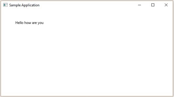
Положение и шрифт текста
По умолчанию текст, созданный текстовым классом, имеет шрифт…, размер… и черный цвет.
Вы можете изменить размер шрифта и цвет текста, используя метод setFont () . Этот метод принимает объект класса Font .
Класс с именем Font пакета javafx.scene.text используется для определения шрифта для текста. Этот класс содержит статический метод с именем font () .
Этот метод принимает четыре параметра, а именно –
-
family – это тип String, представляющий семейство шрифта, который мы хотим применить к тексту.
-
weight – это свойство представляет вес шрифта. Он принимает 9 значений: FontWeight.BLACK, FontWeight.BOLD, FontWeight.EXTRA_BOLD, FontWeight.EXTRA_LIGHT, LIGHT, MEDIUM, NORMAL, SEMI_BOLD, THIN .
-
осанка – это свойство представляет позу шрифта (обычный или курсив). Он принимает два значения FontPosture.REGULAR и FontPosture.ITALIC .
-
размер – это свойство типа double, и оно представляет размер шрифта.
family – это тип String, представляющий семейство шрифта, который мы хотим применить к тексту.
weight – это свойство представляет вес шрифта. Он принимает 9 значений: FontWeight.BLACK, FontWeight.BOLD, FontWeight.EXTRA_BOLD, FontWeight.EXTRA_LIGHT, LIGHT, MEDIUM, NORMAL, SEMI_BOLD, THIN .
осанка – это свойство представляет позу шрифта (обычный или курсив). Он принимает два значения FontPosture.REGULAR и FontPosture.ITALIC .
размер – это свойство типа double, и оно представляет размер шрифта.
Вы можете установить шрифт для текста, используя следующий метод –
text.setFont(Font.font("verdana", FontWeight.BOLD, FontPosture.REGULAR, 20));
пример
Следующая программа является примером, демонстрирующим, как установить шрифт текстового узла в JavaFX. Здесь мы устанавливаем шрифт Verdana, жирный шрифт, обычную позу и размер до 20.
Сохраните этот код в файле с именем TextFontExample.java .
import javafx.application.Application;
import javafx.scene.Group;
import javafx.scene.Scene;
import javafx.stage.Stage;
import javafx.scene.text.Font;
import javafx.scene.text.FontPosture;
import javafx.scene.text.FontWeight;
import javafx.scene.text.Text;

public class TextFontExample extends Application {
   @Override
   public void start(Stage stage) {
      //Creating a Text object
      Text text = new Text();

      //Setting font to the text
      text.setFont(Font.font("verdana", FontWeight.BOLD, FontPosture.REGULAR, 20));

      //setting the position of the text
      text.setX(50);
      text.setY(130);

      //Setting the text to be added.
      text.setText("Hi how are you");

      //Creating a Group object
      Group root = new Group(text);

      //Creating a scene object
      Scene scene = new Scene(root, 600, 300);

      //Setting title to the Stage
      stage.setTitle("Setting Font to the text");

      //Adding scene to the stage
      stage.setScene(scene);

      //Displaying the contents of the stage
      stage.show();
   }
   public static void main(String args[]){
      launch(args);
   }
}
Скомпилируйте и выполните сохраненный файл Java из командной строки, используя следующие команды.
javac TextFontExample.java
java TextFontExample
При выполнении вышеупомянутая программа генерирует окно JavaFX, отображающее текст с указанным шрифтом следующим образом:
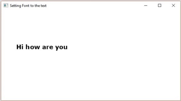
Инсульт и цвет
Класс Text также наследует класс Shape пакета. Поэтому вы можете использовать javafx.scene.shape, с помощью которого вы также можете установить обводку и цвет для текстового узла.
Вы можете установить цвет текста с помощью метода setFill () класса shape (унаследованного) следующим образом:
text.setFill(Color.BEIGE);
Точно так же вы можете установить цвет обводки текста, используя метод setStroke () . В то время как ширина обводки может быть установлена с помощью метода setStrokeWidth () следующим образом:
//Setting the color
text.setFill(Color.BROWN);

//Setting the Stroke
text.setStrokeWidth(2);

//Setting the stroke color
text.setStroke(Color.BLUE);
пример
Следующая программа представляет собой пример, который демонстрирует, как установить цвет, strokeWidth и strokeColor, текстового узла. В этом коде мы устанавливаем цвет обводки – синий, цвет текста – коричневый, а ширину обводки – 2.
Сохраните этот код в файле с именем StrokeExample.java .
import javafx.application.Application;
import javafx.scene.Group;
import javafx.scene.Scene;
import javafx.scene.paint.Color;
import javafx.stage.Stage;
import javafx.scene.text.Font;
import javafx.scene.text.FontPosture;
import javafx.scene.text.FontWeight;
import javafx.scene.text.Text;

public class StrokeExample extends Application {
   @Override
   public void start(Stage stage) {
      //Creating a Text object
      Text text = new Text();

      //Setting font to the text
      text.setFont(Font.font("verdana", FontWeight.BOLD, FontPosture.REGULAR, 50));

      //setting the position of the text
      text.setX(50);
      text.setY(130);

      //Setting the color
      text.setFill(Color.BROWN);

      //Setting the Stroke
      text.setStrokeWidth(2);

      // Setting the stroke color
      text.setStroke(Color.BLUE);

      //Setting the text to be added.
      text.setText("Hi how are you");

      //Creating a Group object
      Group root = new Group(text);

      //Creating a scene object
      Scene scene = new Scene(root, 600, 300);

      //Setting title to the Stage
      stage.setTitle("Setting font to the text");

      //Adding scene to the stage
      stage.setScene(scene);

      //Displaying the contents of the stage
      stage.show();
   }
   public static void main(String args[]){
      launch(args);
   }
}
Скомпилируйте и выполните сохраненный файл Java из командной строки, используя следующие команды.
javac StrokeExample.java
java StrokeExample
При выполнении вышеупомянутая программа генерирует окно JavaFX, отображающее текст с указанными атрибутами штриха и цвета следующим образом:
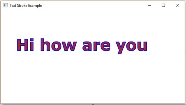
Применение украшений к тексту
Вы также можете применять украшения, такие как удар через; в этом случае строка проходит через текст. Вы можете подчеркнуть текст, используя методы класса Text .
Вы можете пролистать текст, используя метод setStrikethrough () . Это принимает логическое значение, передайте значение true этому методу, чтобы зачеркнуть текст, как показано в следующем поле кода –
//Striking through the text
text1.setStrikethrough(true);
Таким же образом вы можете подчеркнуть текст, передав значение true методу setUnderLine () следующим образом:
//underlining the text
text2.setUnderline(true);
пример
Следующая программа является примером, демонстрирующим, как применять украшения, такие как подчеркивание или зачеркивание, к тексту. Сохраните этот код в файле с именем DecorationsExample.java .
import javafx.application.Application;
import javafx.scene.Group;
import javafx.scene.Scene;
import javafx.stage.Stage;
import javafx.scene.text.Font;
import javafx.scene.text.FontPosture;
import javafx.scene.text.FontWeight;
import javafx.scene.text.Text;

public class DecorationsExample extends Application {
   @Override
   public void start(Stage stage) {
      //Creating a Text_Example object
      Text text1 = new Text("Hi how are you");

      //Setting font to the text
      text1.setFont(Font.font("verdana", FontWeight.BOLD, FontPosture.REGULAR, 20));

      //setting the position of the text
      text1.setX(50);
      text1.setY(75);

      //Striking through the text
      text1.setStrikethrough(true);

      //Creating a Text_Example object
      Text text2 = new Text("Welcome to Tutorialspoint");

      //Setting font to the text
      text2.setFont(Font.font("verdana", FontWeight.BOLD, FontPosture.REGULAR, 20));

      //setting the position of the text
      text2.setX(50);
      text2.setY(150);

      //underlining the text
      text2.setUnderline(true);

      //Creating a Group object
      Group root = new Group(text1, text2);

      //Creating a scene object
      Scene scene = new Scene(root, 600, 300);

      //Setting title to the Stage
      stage.setTitle("Decorations Example");

      //Adding scene to the stage
      stage.setScene(scene);

      //Displaying the contents of the stage
      stage.show();
   }
   public static void main(String args[]){
      launch(args);
   }
}
Скомпилируйте и выполните сохраненный файл Java из командной строки, используя следующие команды.
javac DecorationsExample.java
java DecorationsExample
При выполнении вышеупомянутая программа генерирует окно JavaFX, как показано ниже –