Как изменить цвет текста и фона в текстовом поле?
| Internet Explorer | Chrome | Opera | Safari | Firefox | Android | iOS |
| 3.0+ | 1.0+ | 4.0+ | 1.0+ | 1.0+ | 1.0+ | 1.0+ |
Задача
Установить цвет фона и текста для однострочного текстового поля формы.
Решение
Цвет фона элемента задается стилевым свойством background-color, а цвет текста с помощью color, эти свойства необходимо добавить к селектору INPUT. Поскольку тег <input> является универсальным, то он создает не только текстовое поле, но и другие элементы форм и чтобы определить стиль для конкретного поля можно воспользоваться классами, как показано в примере 1.
Пример 1. Цвет текста и фона в текстовом поле
HTML5CSS 2.1IECrOpSaFx
<!DOCTYPE html>
<html>
 <head>
  <meta charset="utf-8">
  <title>Цвет текста и фона</title>
  <style>
   .colortext {
    background-color: #ffe; /* Цвет фона */
    color: #930; /* Цвет текста */
   }
  </style>
 </head>
 <body>
  <form method="post" action="handler.php">
   <p><input type="text" class="colortext">
   <input type="submit" name="Submit" value="Послать"></p>
  </form>
 </body>
</html>
Результат примера показан на рис. 1.
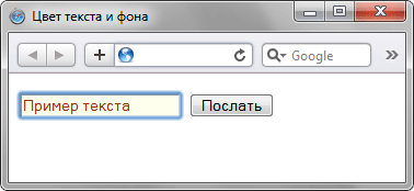
Рис. 1. Вид текстового поля после добавления к нему стилей
В данном примере добавляется новый класс с именем colortext, он добавляется к тегу <input> с помощью конструкции class=»textfield».
Аналогично можно определить стиль одновременно для всех текстовых полей, зная, что к тегу <input> в этом случае всегда добавляется атрибутtype. Используя запись INPUT[type=»text»] задаем стиль для всех элементов <input>, но стиль применяется только в том случае, когда значение атрибута type равно text (пример 2).
Пример 2. Использование селекторов атрибутов
XHTML 1.0CSS 2.1IECrOpSaFx
<!DOCTYPE html>
<html>
 <head>
  <meta charset="utf-8">
  <title>Цвет фона и текста в поле</title>
  <style>
   INPUT[type="text"] {
    background-color: navy;
    color: #ffe;
   }
  </style>
 </head>
 <body>
  <form method="post" action="handler.php">
   <p><input type="text">
   <input type="submit" name="Submit" value="Послать"></p>
  </form>
 </body>
</html> 
::-webkit-input-placeholder меняет, собственно, сам placeholder, как и input. А вот как изменить введенный пользователями текст в инпуте? Нужно использовать js?
-
Вопрос заданболее трёх лет назад
-
7600 просмотров
Комментировать
Пригласить эксперта
Ответы на вопрос 3

@userAlexander
Верстка наше все)
Пробовали задать разные размеры/цвет на инпут и плэйсхолдер?

Ну а в чем проблема если не хотите через :focus
Сделайте так<input id="color-placeholder" class="color-text">
#color-placeholder::-webkit-input-placeholder {тут стили например плэйсхолдера}
.color-text { тут цвет введенный пользователями текст! color: #DF289E;}
codepen.io/anon/pen/MKmEPP
Комментировать
Похожие вопросы
-
Показать ещё
Загружается…
10 февр. 2023, в 23:29
5000 руб./за проект
10 февр. 2023, в 23:26
6000 руб./за проект
10 февр. 2023, в 23:18
10000 руб./за проект
Минуточку внимания
I have created an input field for a log-in feature on the page however I have been trying to change the color of the text in the field using css. Is this possible. I have tried many routes however none seem to work so far. Below is the code for the email portion of the sign in.
 <input class="form-control ng-class:{'error':dashboard.showFormErrors && !dashboard.signinForm.email.$valid}"
               data-ng-model="signinController.signin.email"
               type="email"
               name="email"
               id="email"
               placeholder="Email"
               ng-minlength="2"
               ng-maxlength="3"
               required>
asked Jun 14, 2016 at 4:21
3
Yes, it is possible.
The CSS can target the input of type «email» or just this unique input.
Email input element:
input[type=email]{
    color: red;
}
Or specific id=»email»:
#email {
    color: red;
}
Here’s a snippet:
input[type=email] {
  color: red;
}
#email2 {
  color: green;
}
<input class="form-control ng-class:{'error':dashboard.showFormErrors && !dashboard.signinForm.email.$valid}"
data-ng-model="signinController.signin.email"
type="email"
name="email"
id="email"
placeholder="Email"
ng-minlength="2"
ng-maxlength="3"
required>
<input class="form-control ng-class:{'error':dashboard.showFormErrors && !dashboard.signinForm.email.$valid}"
data-ng-model="signinController.signin.email"
type="email"
name="email"
id="email2"
placeholder="Email"
ng-minlength="2"
ng-maxlength="3"
required>If this still isn’t working, you may have to use the «!important» attribute to override other CSS setters.
color: red !important;
answered Jun 14, 2016 at 4:42
StephenStephen
5668 silver badges19 bronze badges
I think you can do this in your css file :
#email{
  color:red;
}
You can give color of your choice.
answered Jun 14, 2016 at 4:26
Nakul KumarNakul Kumar
1742 silver badges11 bronze badges
Create a css class that holds the changes you want to do to the fields , and then affect the class to the input tags via ng-class directive.
In your code the syntax is wrong I think.. but that’s the idea.
answered Jun 14, 2016 at 4:23
You can apply the following code
input { color: red; }
answered Jun 14, 2016 at 4:32
SESNSESN
1,23514 silver badges21 bronze badges
Many of your suggestions work great. This is the route I used with css
input, select, textarea{
    color: #076000;
}

textarea:focus, input:focus {
    color: #076000;
}
answered Jun 14, 2016 at 17:23
NVANVA
1,6325 gold badges17 silver badges24 bronze badges
It is definitely possible that you can change your input’s text color with CSS and there are quite some ways to that depending upon the result you want to achieve.
For example, if you want to set your colour to blue and have it always stay blue, you can use the following code:
#email {
    color: blue; /* Or color: #0000ff */
}
Alternatively, if you want to change your text’s colour when your selected input has focus, you can use this instead:
#email:focus {
    color: blue; /* Or color: #0000ff */
}
You can also change your colour on hover, but this is not something that is used very often:
#email:hover {
    color: blue; /* Or color: #0000ff */
}
answered Jun 14, 2016 at 4:40
Angel PolitisAngel Politis
10.8k14 gold badges47 silver badges65 bronze badges
To change input color for different types of input use respective tag (with/without its pseudo state)
input, select, textarea {
    color: #000;
}
input:focus, input:active

/* etc... */

input[type=text] - will only select text fields
input[type=password] - will only select password fields
input[type=number] - will only select number fields
/* etc.. */

input[type=text]:focus
/* etc */
For placeholder styling
::-webkit-input-placeholder {
   color: red;
}

:-moz-placeholder { /* Firefox 18- */
   color: red;
}

::-moz-placeholder {  /* Firefox 19+ */
   color: red;
}

:-ms-input-placeholder {
   color: red;
}
answered Jun 14, 2016 at 5:07
4dgaurav4dgaurav
11.3k4 gold badges31 silver badges58 bronze badges
Chrome supports the placeholder attribute on input[type=text] elements (others probably do too).
But the following CSS doesn’t do anything to the placeholder’s value:
input[placeholder], [placeholder], *[placeholder] {
    color: red !important;
}
<input type="text" placeholder="Value">But Value will still remain grey instead of red.
Is there a way to change the color of the placeholder text?
8
Implementation
There are three different implementations: pseudo-elements, pseudo-classes, and nothing.
- WebKit, Blink (Safari, Google Chrome, Opera 15+) and Microsoft Edge are using a pseudo-element:
::-webkit-input-placeholder. [Ref] - Mozilla Firefox 4 to 18 is using a pseudo-class:
:-moz-placeholder(one colon). [Ref] - Mozilla Firefox 19+ is using a pseudo-element:
::-moz-placeholder, but the old selector will still work for a while. [Ref] - Internet Explorer 10 and 11 are using a pseudo-class:
:-ms-input-placeholder. [Ref] - April 2017: Most modern browsers support the simple pseudo-element
::placeholder[Ref]
Internet Explorer 9 and lower does not support the placeholder attribute at all, while Opera 12 and lower do not support any CSS selector for placeholders.
The discussion about the best implementation is still going on. Note the pseudo-elements act like real elements in the Shadow DOM. A padding on an input will not get the same background color as the pseudo-element.
CSS selectors
User agents are required to ignore a rule with an unknown selector. See Selectors Level 3:
a group of selectors containing an invalid selector is invalid.
So we need separate rules for each browser. Otherwise the whole group would be ignored by all browsers.
::-webkit-input-placeholder { /* WebKit, Blink, Edge */
    color:    #909;
}
:-moz-placeholder { /* Mozilla Firefox 4 to 18 */
   color:    #909;
   opacity:  1;
}
::-moz-placeholder { /* Mozilla Firefox 19+ */
   color:    #909;
   opacity:  1;
}
:-ms-input-placeholder { /* Internet Explorer 10-11 */
   color:    #909;
}
::-ms-input-placeholder { /* Microsoft Edge */
   color:    #909;
}

::placeholder { /* Most modern browsers support this now. */
   color:    #909;
}
<input placeholder="Stack Snippets are awesome!">Usage notes
- Be careful to avoid bad contrasts. Firefox’s placeholder appears to be defaulting with a reduced opacity, so needs to use
opacity: 1here. - Note that placeholder text is just cut off if it doesn’t fit – size your input elements in
emand test them with big minimum font size settings. Don’t forget translations: some languages need more room for the same word. - Browsers with HTML support for
placeholderbut without CSS support for that (like Opera) should be tested too. - Placeholders are no replacement for labels, so make sure you have a label, too
- Some browsers use additional default CSS for some
inputtypes (email,search). These might affect the rendering in unexpected ways. Use the properties-webkit-appearanceand-moz-appearanceto change that. Example:
    [type="search"] {
        -moz-appearance:    textfield;
        -webkit-appearance: textfield;
        appearance: textfield;
    }
Andy
4,0802 gold badges24 silver badges47 bronze badges
answered Apr 9, 2010 at 20:36
0
/* do not group these rules */
*::-webkit-input-placeholder {
    color: red;
}
*:-moz-placeholder {
    /* FF 4-18 */
    color: red;
    opacity: 1;
}
*::-moz-placeholder {
    /* FF 19+ */
    color: red;
    opacity: 1;
}
*:-ms-input-placeholder {
    /* IE 10+ */
    color: red;
}
*::-ms-input-placeholder {
    /* Microsoft Edge */
    color: red;
}
*::placeholder {
    /* modern browser */
    color: red;
}
<input placeholder="hello"/> <br />
<textarea placeholder="hello"></textarea>This will style all input and textarea placeholders.
Important Note: Do not group these rules. Instead, make a separate rule for every selector (one invalid selector in a group makes the whole group invalid).
0
You may also want to style textareas:
input::-webkit-input-placeholder,
textarea::-webkit-input-placeholder {
  color: #FF9900;
}

input:-moz-placeholder,
textarea:-moz-placeholder {
  color: #FF9900;
}
<textarea rows="4" cols="50" placeholder="Stack Snippets are nice!">
</textarea>0
For Bootstrap and Less users, there is a mixin .placeholder:
// Placeholder text
// -------------------------
.placeholder(@color: @placeholderText) {
  &:-moz-placeholder {
    color: @color;
  }
  &:-ms-input-placeholder {
    color: @color;
  }
  &::-webkit-input-placeholder {
    color: @color;
  }
}
answered Jun 6, 2013 at 8:47
EIIPIIEIIPII
1,7711 gold badge17 silver badges10 bronze badges
1
In addition to toscho’s answer I’ve noticed some webkit inconsistencies between Chrome 9-10 and Safari 5 with the CSS properties supported that are worth noting.
Specifically Chrome 9 and 10 do not support background-color, border, text-decoration and text-transform when styling the placeholder.
The full cross-browser comparison is here.
answered Feb 9, 2011 at 16:44
ajcwajcw
23.5k6 gold badges29 silver badges47 bronze badges
For Sass users:
// Create placeholder mixin
@mixin placeholder($color, $size:"") {
  &::-webkit-input-placeholder {
    color: $color;
    @if $size != "" {
      font-size: $size;
    }
  }
  &:-moz-placeholder {
    color: $color;
    @if $size != "" {
      font-size: $size;
    }
  }
  &::-moz-placeholder {
    color: $color;
    @if $size != "" {
      font-size: $size;
    }
  }
  &:-ms-input-placeholder {
    color: $color;
    @if $size != "" {
      font-size: $size;
    }
  }
}

// Use placeholder mixin (the size parameter is optional)
[placeholder] {
  @include placeholder(red, 10px);
}
0
This will work fine. DEMO HERE:
input::-webkit-input-placeholder,
textarea::-webkit-input-placeholder {
  color: #666;
}
input:-moz-placeholder,
textarea:-moz-placeholder {
  color: #666;
}
input::-moz-placeholder,
textarea::-moz-placeholder {
  color: #666;
}
input:-ms-input-placeholder,
textarea:-ms-input-placeholder {
  color: #666;
}
<input type="text" placeholder="Value" />answered Sep 14, 2013 at 12:52
Love TrivediLove Trivedi
3,8193 gold badges19 silver badges26 bronze badges
0
In Firefox and Internet Explorer, the normal input text color overrides the color property of placeholders. So, we need to
::-webkit-input-placeholder {
    color: red; text-overflow: ellipsis;
}
:-moz-placeholder {
    color: #acacac !important; text-overflow: ellipsis;
}
::-moz-placeholder {
    color: #acacac !important; text-overflow: ellipsis;
} /* For the future */
:-ms-input-placeholder {
    color: #acacac !important; text-overflow: ellipsis;
}
answered Feb 14, 2013 at 21:11
0
CSS provides the ::placeholder pseudo-element.
Note that the .placeholder mixin from Bootstrap is deprecated in favor of this.
Example:
input::placeholder { color: black; }
When using autoprefixer the above will be converted to the correct code for all browsers.
1
Cross-browser solution:
/* all elements */
::-webkit-input-placeholder { color:#f00; }
::-moz-placeholder { color:#f00; } /* firefox 19+ */
:-ms-input-placeholder { color:#f00; } /* ie */
input:-moz-placeholder { color:#f00; }

/* individual elements: webkit */
#field2::-webkit-input-placeholder { color:#00f; }
#field3::-webkit-input-placeholder { color:#090; background:lightgreen; text-transform:uppercase; }
#field4::-webkit-input-placeholder { font-style:italic; text-decoration:overline; letter-spacing:3px; color:#999; }

/* individual elements: mozilla */
#field2::-moz-placeholder { color:#00f; }
#field3::-moz-placeholder { color:#090; background:lightgreen; text-transform:uppercase; }
#field4::-moz-placeholder { font-style:italic; text-decoration:overline; letter-spacing:3px; color:#999; }
Credit: David Walsh
0
Now we have a standard way to apply CSS to an input’s placeholder : ::placeholder pseudo-element from this CSS Module Level 4 Draft.
1
I just realize something for Mozilla Firefox 19+ that the browser gives an opacity value for the placeholder, so the color will not be what you really want.
input::-webkit-input-placeholder, textarea::-webkit-input-placeholder {
    color: #eee; opacity:1;
}
input:-moz-placeholder, textarea:-moz-placeholder {
    color: #eee; opacity:1;
}
input::-moz-placeholder, textarea::-moz-placeholder {
    color: #eee; opacity:1;
}
input:-ms-input-placeholder, textarea:-ms-input-placeholder {
    color: #eee; opacity:1;
}
I overwrite the opacity for 1, so it will be good to go.
I don’t remember where I’ve found this code snippet on the Internet (it wasn’t written by me, don’t remember where I’ve found it, nor who wrote it).
$('[placeholder]').focus(function() {
        var input = $(this);
        if (input.val() == input.attr('placeholder')) {
            input.val('');
            input.removeClass('placeholder');
        }
    }).blur(function() {
        var input = $(this);
        if (input.val() == '' || input.val() == input.attr('placeholder')) {
            input.addClass('placeholder');
            input.val(input.attr('placeholder'));
        }
    }).blur();
    $('[placeholder]').parents('form').submit(function() {
        $(this).find('[placeholder]').each(function() {
            var input = $(this);
            if (input.val() == input.attr('placeholder')) {
                input.val('');
            }
        })
    });
Just load this JavaScript code and then edit your placeholder with CSS by calling this rule:
form .placeholder {
   color: #222;
   font-size: 25px;
   /* etc. */
}
answered Apr 14, 2013 at 2:28
Dragos RizescuDragos Rizescu
3,3405 gold badges31 silver badges42 bronze badges
2
For Bootstrap users, if you are using class="form-control", there may be a CSS specificity issue. You should get a higher priority:
.form-control::-webkit-input-placeholder {
    color: red;
}
//.. and other browsers
Or if you are using Less:
.form-control{
    .placeholder(red);
}
0
I think this code will work because a placeholder is needed only for input type text. So this one line CSS will be enough for your need:
input[type="text"]::-webkit-input-placeholder {
    color: red;
}
answered Jun 25, 2015 at 9:01
Alias VargheseAlias Varghese
2,0322 gold badges23 silver badges52 bronze badges
1
If you are using Bootstrap and couldn’t get this working then probably you missed the fact that Bootstrap itself adds these selectors. This is Bootstrap v3.3 we are talking about.
If you are trying to change the placeholder inside a .form-control CSS class then you should override it like this:
.form-control::-webkit-input-placeholder { /* WebKit, Blink, Edge */
    color:    #777;
}
.form-control:-moz-placeholder { /* Mozilla Firefox 4 to 18 */
    color:    #777;
    opacity:  1;
}
.form-control::-moz-placeholder { /* Mozilla Firefox 19+ */
    color:    #777;
    opacity:  1;
}
.form-control:-ms-input-placeholder { /* Internet Explorer 10-11 */
    color:    #777;
}
How about this
<input type="text" value="placeholder text" onfocus="this.style.color='#000';
    this.value='';" style="color: #f00;" />
No CSS or placeholder, but you get the same functionality.
answered Oct 8, 2012 at 19:21
user1729061user1729061
4873 silver badges4 bronze badges
4
This short and clean code:
::-webkit-input-placeholder {color: red;}
:-moz-placeholder           {color: red; /* For Firefox 18- */}
::-moz-placeholder          {color: red; /* For Firefox 19+ */}
:-ms-input-placeholder      {color: red;}
I have tried every combination here to change the color, on my mobile platform, and eventually it was:
-webkit-text-fill-color: red;
which did the trick.
1
Adding an actual very nice and simple possibility: CSS filters!
It will style everything, including the placeholder.
The following will set both input elements on the same palette, using the hue filter for color changes. It render very well now in browsers (except ie…)
input {
filter: sepia(100%) saturate(400%) grayscale(0) contrast(200%) hue-rotate(68deg) invert(18%);
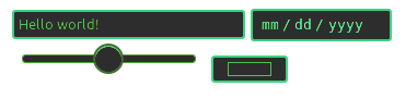
}<input placeholder="Hello world!" />
<input type="date" /><br>
<input type="range" />
<input type="color" />To allow users to change it dynamically, using an input type color for changes, or to find nuances, check out this snippet:
From: Codepen
function stylElem() {
  stylo.dataset.hue = ((parseInt(stylo.value.substring(1), 16))/46666).toFixed(0)
  Array.from(document.querySelectorAll('input, audio, video')).forEach(function(e){
      e.style.cssText += ";filter:sepia(100%) saturate(400%)grayscale(0)contrast(200%)hue-rotate("+ stylo.dataset.hue+"deg)invert("+(stylo.dataset.hue/3.6)+"%)"
  out.innerText = e.style.cssText
})()}

stylElem()
body {background: black; color: white}Choose a color!
<input type="color" id="stylo" oninput="stylElem()">
<br>
<div id="out"></div> <p>
<input placeholder="Hello world!" />
<input type="date" /><br>
<input type="range" />
<br>
<audio controls src="#"></audio> <br><br>
<video controls src="#"></video>Css filters docs: https://developer.mozilla.org/en-US/docs/Web/CSS/filter
0
For SASS/SCSS user using Bourbon, it has a built-in function.
//main.scss
@import 'bourbon';

input {
  width: 300px;

  @include placeholder {
    color: red;
  }
}
CSS Output, you can also grab this portion and paste into your code.
//main.css

input {
  width: 300px;
}

input::-webkit-input-placeholder {
  color: red;
}
input:-moz-placeholder {
  color: red;
}
input::-moz-placeholder {
  color: red;
}
input:-ms-input-placeholder {
  color: red;
}
try this code for different input element different style
your css selector::-webkit-input-placeholder { /*for webkit */
    color:#909090;
    opacity:1;
}
 your css selector:-moz-placeholder { /*for mozilla */
    color:#909090;
    opacity:1;
}
 your css selector:-ms-input-placeholder { /*for for internet exprolar */
   color:#909090;
   opacity:1;
}
example 1:
input[type="text"]::-webkit-input-placeholder { /*for webkit */
    color: red;
    opacity:1;
}
 input[type="text"]:-moz-placeholder { /*for mozilla */
    color: red;
    opacity:1;
}
 input[type="text"]:-ms-input-placeholder { /*for for internet exprolar */
   color: red;
   opacity:1;
}
example 2:
input[type="email"]::-webkit-input-placeholder { /*for webkit */
    color: gray;
    opacity:1;
}
 input[type="email"]:-moz-placeholder { /*for mozilla */
    color: gray;
    opacity:1;
}
 input[type="email"]:-ms-input-placeholder { /*for for internet exprolar */
   color: gray;
   }
This is fine for most of the modern browsers
input::placeholder{
  color: red; // css implementation
}
Just in case if you are using SCSS
input {
  &::placeholder {
    color: red; // scss
  }
}
Here is one more example:
.form-control::-webkit-input-placeholder {
  color: red;
  width: 250px;
}
h1 {
  color: red;
}
<div class="col-sm-4">
<input class="form-control" placeholder="Enter text here.." ng-model="Email" required/>
</div>You can change an HTML5 input’s placeholder color with CSS. If by chance, your CSS conflict, this code note working , you can use (!important) like below.
::-webkit-input-placeholder { /* WebKit, Blink, Edge */
    color:#909 !important;
}
:-moz-placeholder { /* Mozilla Firefox 4 to 18 */
   color:#909 !important;
   opacity:1 !important;
}
::-moz-placeholder { /* Mozilla Firefox 19+ */
   color:#909 !important;
   opacity:1 !important;
}
:-ms-input-placeholder { /* Internet Explorer 10-11 */
   color:#909 !important;
}
::-ms-input-placeholder { /* Microsoft Edge */
   color:#909 !important;
}

<input placeholder="Stack Snippets are awesome!">
Hope this will help.
OK, placeholders behave differently in different browsers, so you need using browser prefix in your CSS to make them identical, for example Firefox gives a transparency to placeholder by default, so need to add opacity 1 to your css, plus the color, it’s not a big concern most of the times, but good to have them consistent:
*::-webkit-input-placeholder { /* WebKit browsers */
    color:    #ccc;
}
*:-moz-placeholder { /* Mozilla Firefox <18 */
    color:    #ccc;
    opacity:  1;
}
*::-moz-placeholder { /* Mozilla Firefox 19+ */
    color:    #ccc;
    opacity:  1;
}
*:-ms-input-placeholder { /* Internet Explorer 10-11 */
    color:    #ccc;
}
You can use this for input and focus style:
input::-webkit-input-placeholder  { color:#666;}
input:-moz-placeholder  { color:#666;}
input::-moz-placeholder { color:#666;}
input:-ms-input-placeholder  { color:#666;}
/* focus */
input:focus::-webkit-input-placeholder { color:#eee; }
input:focus:-moz-placeholder { color:#eee } /* FF 4-18 */
input:focus::-moz-placeholder { color:#eee } /* FF 19+ */
input:focus:-ms-input-placeholder { color:#eee } /* IE 10+ */
The easiest way would be:
#yourInput::placeholder {
    color: red;/*As an example*/
}
/* if that would not work, you can always try styling the attribute itself: */
#myInput[placeholder] {
    color: red;
}
Here is the solution with CSS selectors
::-webkit-input-placeholder { /* WebKit, Blink, Edge */
    color:    #909;
}
:-moz-placeholder { /* Mozilla Firefox 4 to 18 */
   color:    #909;
   opacity:  1;
}
::-moz-placeholder { /* Mozilla Firefox 19+ */
   color:    #909;
   opacity:  1;
}
::-ms-input-placeholder { /* Microsoft Edge */
   color:    #909;
}
:-ms-input-placeholder { /* Internet Explorer 10-11 */
   color:    #909;
}
- WebKit, Blink (Safari, Google Chrome, Opera 15+) and Microsoft Edge are using a pseudo-element:
::-webkit-input-placeholder. - Mozilla Firefox 4 to 18 is using a pseudo-class:
:-moz-placeholder (one colon).
Mozilla Firefox 19+ is using a pseudo-element:
::-moz-placeholder, but the old selector will still work for a while. - Internet Explorer 10 and 11 are using a pseudo-class:
:-ms-input-placeholder. - Internet Explorer 9 and lower does not support the placeholder attribute at all, while Opera 12 and lower do not support any CSS selector for placeholders.
::placeholder{
  color: red;
}
<input type="text" placeholder="Value">Chrome supports the placeholder attribute on input[type=text] elements (others probably do too).
But the following CSS doesn’t do anything to the placeholder’s value:
input[placeholder], [placeholder], *[placeholder] {
    color: red !important;
}
<input type="text" placeholder="Value">But Value will still remain grey instead of red.
Is there a way to change the color of the placeholder text?
8
Implementation
There are three different implementations: pseudo-elements, pseudo-classes, and nothing.
- WebKit, Blink (Safari, Google Chrome, Opera 15+) and Microsoft Edge are using a pseudo-element:
::-webkit-input-placeholder. [Ref] - Mozilla Firefox 4 to 18 is using a pseudo-class:
:-moz-placeholder(one colon). [Ref] - Mozilla Firefox 19+ is using a pseudo-element:
::-moz-placeholder, but the old selector will still work for a while. [Ref] - Internet Explorer 10 and 11 are using a pseudo-class:
:-ms-input-placeholder. [Ref] - April 2017: Most modern browsers support the simple pseudo-element
::placeholder[Ref]
Internet Explorer 9 and lower does not support the placeholder attribute at all, while Opera 12 and lower do not support any CSS selector for placeholders.
The discussion about the best implementation is still going on. Note the pseudo-elements act like real elements in the Shadow DOM. A padding on an input will not get the same background color as the pseudo-element.
CSS selectors
User agents are required to ignore a rule with an unknown selector. See Selectors Level 3:
a group of selectors containing an invalid selector is invalid.
So we need separate rules for each browser. Otherwise the whole group would be ignored by all browsers.
::-webkit-input-placeholder { /* WebKit, Blink, Edge */
    color:    #909;
}
:-moz-placeholder { /* Mozilla Firefox 4 to 18 */
   color:    #909;
   opacity:  1;
}
::-moz-placeholder { /* Mozilla Firefox 19+ */
   color:    #909;
   opacity:  1;
}
:-ms-input-placeholder { /* Internet Explorer 10-11 */
   color:    #909;
}
::-ms-input-placeholder { /* Microsoft Edge */
   color:    #909;
}

::placeholder { /* Most modern browsers support this now. */
   color:    #909;
}
<input placeholder="Stack Snippets are awesome!">Usage notes
- Be careful to avoid bad contrasts. Firefox’s placeholder appears to be defaulting with a reduced opacity, so needs to use
opacity: 1here. - Note that placeholder text is just cut off if it doesn’t fit – size your input elements in
emand test them with big minimum font size settings. Don’t forget translations: some languages need more room for the same word. - Browsers with HTML support for
placeholderbut without CSS support for that (like Opera) should be tested too. - Placeholders are no replacement for labels, so make sure you have a label, too
- Some browsers use additional default CSS for some
inputtypes (email,search). These might affect the rendering in unexpected ways. Use the properties-webkit-appearanceand-moz-appearanceto change that. Example:
    [type="search"] {
        -moz-appearance:    textfield;
        -webkit-appearance: textfield;
        appearance: textfield;
    }
Andy
4,0802 gold badges24 silver badges47 bronze badges
answered Apr 9, 2010 at 20:36
0
/* do not group these rules */
*::-webkit-input-placeholder {
    color: red;
}
*:-moz-placeholder {
    /* FF 4-18 */
    color: red;
    opacity: 1;
}
*::-moz-placeholder {
    /* FF 19+ */
    color: red;
    opacity: 1;
}
*:-ms-input-placeholder {
    /* IE 10+ */
    color: red;
}
*::-ms-input-placeholder {
    /* Microsoft Edge */
    color: red;
}
*::placeholder {
    /* modern browser */
    color: red;
}
<input placeholder="hello"/> <br />
<textarea placeholder="hello"></textarea>This will style all input and textarea placeholders.
Important Note: Do not group these rules. Instead, make a separate rule for every selector (one invalid selector in a group makes the whole group invalid).
0
You may also want to style textareas:
input::-webkit-input-placeholder,
textarea::-webkit-input-placeholder {
  color: #FF9900;
}

input:-moz-placeholder,
textarea:-moz-placeholder {
  color: #FF9900;
}
<textarea rows="4" cols="50" placeholder="Stack Snippets are nice!">
</textarea>0
For Bootstrap and Less users, there is a mixin .placeholder:
// Placeholder text
// -------------------------
.placeholder(@color: @placeholderText) {
  &:-moz-placeholder {
    color: @color;
  }
  &:-ms-input-placeholder {
    color: @color;
  }
  &::-webkit-input-placeholder {
    color: @color;
  }
}
answered Jun 6, 2013 at 8:47
EIIPIIEIIPII
1,7711 gold badge17 silver badges10 bronze badges
1
In addition to toscho’s answer I’ve noticed some webkit inconsistencies between Chrome 9-10 and Safari 5 with the CSS properties supported that are worth noting.
Specifically Chrome 9 and 10 do not support background-color, border, text-decoration and text-transform when styling the placeholder.
The full cross-browser comparison is here.
answered Feb 9, 2011 at 16:44
ajcwajcw
23.5k6 gold badges29 silver badges47 bronze badges
For Sass users:
// Create placeholder mixin
@mixin placeholder($color, $size:"") {
  &::-webkit-input-placeholder {
    color: $color;
    @if $size != "" {
      font-size: $size;
    }
  }
  &:-moz-placeholder {
    color: $color;
    @if $size != "" {
      font-size: $size;
    }
  }
  &::-moz-placeholder {
    color: $color;
    @if $size != "" {
      font-size: $size;
    }
  }
  &:-ms-input-placeholder {
    color: $color;
    @if $size != "" {
      font-size: $size;
    }
  }
}

// Use placeholder mixin (the size parameter is optional)
[placeholder] {
  @include placeholder(red, 10px);
}
0
This will work fine. DEMO HERE:
input::-webkit-input-placeholder,
textarea::-webkit-input-placeholder {
  color: #666;
}
input:-moz-placeholder,
textarea:-moz-placeholder {
  color: #666;
}
input::-moz-placeholder,
textarea::-moz-placeholder {
  color: #666;
}
input:-ms-input-placeholder,
textarea:-ms-input-placeholder {
  color: #666;
}
<input type="text" placeholder="Value" />answered Sep 14, 2013 at 12:52
Love TrivediLove Trivedi
3,8193 gold badges19 silver badges26 bronze badges
0
In Firefox and Internet Explorer, the normal input text color overrides the color property of placeholders. So, we need to
::-webkit-input-placeholder {
    color: red; text-overflow: ellipsis;
}
:-moz-placeholder {
    color: #acacac !important; text-overflow: ellipsis;
}
::-moz-placeholder {
    color: #acacac !important; text-overflow: ellipsis;
} /* For the future */
:-ms-input-placeholder {
    color: #acacac !important; text-overflow: ellipsis;
}
answered Feb 14, 2013 at 21:11
0
CSS provides the ::placeholder pseudo-element.
Note that the .placeholder mixin from Bootstrap is deprecated in favor of this.
Example:
input::placeholder { color: black; }
When using autoprefixer the above will be converted to the correct code for all browsers.
1
Cross-browser solution:
/* all elements */
::-webkit-input-placeholder { color:#f00; }
::-moz-placeholder { color:#f00; } /* firefox 19+ */
:-ms-input-placeholder { color:#f00; } /* ie */
input:-moz-placeholder { color:#f00; }

/* individual elements: webkit */
#field2::-webkit-input-placeholder { color:#00f; }
#field3::-webkit-input-placeholder { color:#090; background:lightgreen; text-transform:uppercase; }
#field4::-webkit-input-placeholder { font-style:italic; text-decoration:overline; letter-spacing:3px; color:#999; }

/* individual elements: mozilla */
#field2::-moz-placeholder { color:#00f; }
#field3::-moz-placeholder { color:#090; background:lightgreen; text-transform:uppercase; }
#field4::-moz-placeholder { font-style:italic; text-decoration:overline; letter-spacing:3px; color:#999; }
Credit: David Walsh
0
Now we have a standard way to apply CSS to an input’s placeholder : ::placeholder pseudo-element from this CSS Module Level 4 Draft.
1
I just realize something for Mozilla Firefox 19+ that the browser gives an opacity value for the placeholder, so the color will not be what you really want.
input::-webkit-input-placeholder, textarea::-webkit-input-placeholder {
    color: #eee; opacity:1;
}
input:-moz-placeholder, textarea:-moz-placeholder {
    color: #eee; opacity:1;
}
input::-moz-placeholder, textarea::-moz-placeholder {
    color: #eee; opacity:1;
}
input:-ms-input-placeholder, textarea:-ms-input-placeholder {
    color: #eee; opacity:1;
}
I overwrite the opacity for 1, so it will be good to go.
I don’t remember where I’ve found this code snippet on the Internet (it wasn’t written by me, don’t remember where I’ve found it, nor who wrote it).
$('[placeholder]').focus(function() {
        var input = $(this);
        if (input.val() == input.attr('placeholder')) {
            input.val('');
            input.removeClass('placeholder');
        }
    }).blur(function() {
        var input = $(this);
        if (input.val() == '' || input.val() == input.attr('placeholder')) {
            input.addClass('placeholder');
            input.val(input.attr('placeholder'));
        }
    }).blur();
    $('[placeholder]').parents('form').submit(function() {
        $(this).find('[placeholder]').each(function() {
            var input = $(this);
            if (input.val() == input.attr('placeholder')) {
                input.val('');
            }
        })
    });
Just load this JavaScript code and then edit your placeholder with CSS by calling this rule:
form .placeholder {
   color: #222;
   font-size: 25px;
   /* etc. */
}
answered Apr 14, 2013 at 2:28
Dragos RizescuDragos Rizescu
3,3405 gold badges31 silver badges42 bronze badges
2
For Bootstrap users, if you are using class="form-control", there may be a CSS specificity issue. You should get a higher priority:
.form-control::-webkit-input-placeholder {
    color: red;
}
//.. and other browsers
Or if you are using Less:
.form-control{
    .placeholder(red);
}
0
I think this code will work because a placeholder is needed only for input type text. So this one line CSS will be enough for your need:
input[type="text"]::-webkit-input-placeholder {
    color: red;
}
answered Jun 25, 2015 at 9:01
Alias VargheseAlias Varghese
2,0322 gold badges23 silver badges52 bronze badges
1
If you are using Bootstrap and couldn’t get this working then probably you missed the fact that Bootstrap itself adds these selectors. This is Bootstrap v3.3 we are talking about.
If you are trying to change the placeholder inside a .form-control CSS class then you should override it like this:
.form-control::-webkit-input-placeholder { /* WebKit, Blink, Edge */
    color:    #777;
}
.form-control:-moz-placeholder { /* Mozilla Firefox 4 to 18 */
    color:    #777;
    opacity:  1;
}
.form-control::-moz-placeholder { /* Mozilla Firefox 19+ */
    color:    #777;
    opacity:  1;
}
.form-control:-ms-input-placeholder { /* Internet Explorer 10-11 */
    color:    #777;
}
How about this
<input type="text" value="placeholder text" onfocus="this.style.color='#000';
    this.value='';" style="color: #f00;" />
No CSS or placeholder, but you get the same functionality.
answered Oct 8, 2012 at 19:21
user1729061user1729061
4873 silver badges4 bronze badges
4
This short and clean code:
::-webkit-input-placeholder {color: red;}
:-moz-placeholder           {color: red; /* For Firefox 18- */}
::-moz-placeholder          {color: red; /* For Firefox 19+ */}
:-ms-input-placeholder      {color: red;}
I have tried every combination here to change the color, on my mobile platform, and eventually it was:
-webkit-text-fill-color: red;
which did the trick.
1
Adding an actual very nice and simple possibility: CSS filters!
It will style everything, including the placeholder.
The following will set both input elements on the same palette, using the hue filter for color changes. It render very well now in browsers (except ie…)
input {
  filter: sepia(100%) saturate(400%) grayscale(0) contrast(200%) hue-rotate(68deg) invert(18%);
}
<input placeholder="Hello world!" />
<input type="date" /><br>
<input type="range" />
<input type="color" />To allow users to change it dynamically, using an input type color for changes, or to find nuances, check out this snippet:
From: Codepen
function stylElem() {
  stylo.dataset.hue = ((parseInt(stylo.value.substring(1), 16))/46666).toFixed(0)
  Array.from(document.querySelectorAll('input, audio, video')).forEach(function(e){
      e.style.cssText += ";filter:sepia(100%) saturate(400%)grayscale(0)contrast(200%)hue-rotate("+ stylo.dataset.hue+"deg)invert("+(stylo.dataset.hue/3.6)+"%)"
  out.innerText = e.style.cssText
})()}

stylElem()
body {background: black; color: white}Choose a color!
<input type="color" id="stylo" oninput="stylElem()">
<br>
<div id="out"></div> <p>
<input placeholder="Hello world!" />
<input type="date" /><br>
<input type="range" />
<br>
<audio controls src="#"></audio> <br><br>
<video controls src="#"></video>Css filters docs: https://developer.mozilla.org/en-US/docs/Web/CSS/filter
0
For SASS/SCSS user using Bourbon, it has a built-in function.
//main.scss
@import 'bourbon';

input {
  width: 300px;

  @include placeholder {
    color: red;
  }
}
CSS Output, you can also grab this portion and paste into your code.
//main.css

input {
  width: 300px;
}

input::-webkit-input-placeholder {
  color: red;
}
input:-moz-placeholder {
  color: red;
}
input::-moz-placeholder {
  color: red;
}
input:-ms-input-placeholder {
  color: red;
}
try this code for different input element different style
your css selector::-webkit-input-placeholder { /*for webkit */
    color:#909090;
    opacity:1;
}
 your css selector:-moz-placeholder { /*for mozilla */
    color:#909090;
    opacity:1;
}
 your css selector:-ms-input-placeholder { /*for for internet exprolar */
   color:#909090;
   opacity:1;
}
example 1:
input[type="text"]::-webkit-input-placeholder { /*for webkit */
    color: red;
    opacity:1;
}
 input[type="text"]:-moz-placeholder { /*for mozilla */
    color: red;
    opacity:1;
}
 input[type="text"]:-ms-input-placeholder { /*for for internet exprolar */
   color: red;
   opacity:1;
}
example 2:
input[type="email"]::-webkit-input-placeholder { /*for webkit */
    color: gray;
    opacity:1;
}
 input[type="email"]:-moz-placeholder { /*for mozilla */
    color: gray;
    opacity:1;
}
 input[type="email"]:-ms-input-placeholder { /*for for internet exprolar */
   color: gray;
   }
This is fine for most of the modern browsers
input::placeholder{
  color: red; // css implementation
}
Just in case if you are using SCSS
input {
  &::placeholder {
    color: red; // scss
  }
}
Here is one more example:
.form-control::-webkit-input-placeholder {
  color: red;
  width: 250px;
}
h1 {
  color: red;
}
<div class="col-sm-4">
<input class="form-control" placeholder="Enter text here.." ng-model="Email" required/>
</div>You can change an HTML5 input’s placeholder color with CSS. If by chance, your CSS conflict, this code note working , you can use (!important) like below.
::-webkit-input-placeholder { /* WebKit, Blink, Edge */
    color:#909 !important;
}
:-moz-placeholder { /* Mozilla Firefox 4 to 18 */
   color:#909 !important;
   opacity:1 !important;
}
::-moz-placeholder { /* Mozilla Firefox 19+ */
   color:#909 !important;
   opacity:1 !important;
}
:-ms-input-placeholder { /* Internet Explorer 10-11 */
   color:#909 !important;
}
::-ms-input-placeholder { /* Microsoft Edge */
   color:#909 !important;
}

<input placeholder="Stack Snippets are awesome!">
Hope this will help.
OK, placeholders behave differently in different browsers, so you need using browser prefix in your CSS to make them identical, for example Firefox gives a transparency to placeholder by default, so need to add opacity 1 to your css, plus the color, it’s not a big concern most of the times, but good to have them consistent:
*::-webkit-input-placeholder { /* WebKit browsers */
    color:    #ccc;
}
*:-moz-placeholder { /* Mozilla Firefox <18 */
    color:    #ccc;
    opacity:  1;
}
*::-moz-placeholder { /* Mozilla Firefox 19+ */
    color:    #ccc;
    opacity:  1;
}
*:-ms-input-placeholder { /* Internet Explorer 10-11 */
    color:    #ccc;
}
You can use this for input and focus style:
input::-webkit-input-placeholder  { color:#666;}
input:-moz-placeholder  { color:#666;}
input::-moz-placeholder { color:#666;}
input:-ms-input-placeholder  { color:#666;}
/* focus */
input:focus::-webkit-input-placeholder { color:#eee; }
input:focus:-moz-placeholder { color:#eee } /* FF 4-18 */
input:focus::-moz-placeholder { color:#eee } /* FF 19+ */
input:focus:-ms-input-placeholder { color:#eee } /* IE 10+ */
The easiest way would be:
#yourInput::placeholder {
    color: red;/*As an example*/
}
/* if that would not work, you can always try styling the attribute itself: */
#myInput[placeholder] {
    color: red;
}
Here is the solution with CSS selectors
::-webkit-input-placeholder { /* WebKit, Blink, Edge */
    color:    #909;
}
:-moz-placeholder { /* Mozilla Firefox 4 to 18 */
   color:    #909;
   opacity:  1;
}
::-moz-placeholder { /* Mozilla Firefox 19+ */
   color:    #909;
   opacity:  1;
}
::-ms-input-placeholder { /* Microsoft Edge */
   color:    #909;
}
:-ms-input-placeholder { /* Internet Explorer 10-11 */
   color:    #909;
}
- WebKit, Blink (Safari, Google Chrome, Opera 15+) and Microsoft Edge are using a pseudo-element:
::-webkit-input-placeholder. - Mozilla Firefox 4 to 18 is using a pseudo-class:
:-moz-placeholder (one colon).
Mozilla Firefox 19+ is using a pseudo-element:
::-moz-placeholder, but the old selector will still work for a while. - Internet Explorer 10 and 11 are using a pseudo-class:
:-ms-input-placeholder. - Internet Explorer 9 and lower does not support the placeholder attribute at all, while Opera 12 and lower do not support any CSS selector for placeholders.
::placeholder{
  color: red;
}
<input type="text" placeholder="Value">


По умолчанию замещающий текст поля ввода <input> и <textarea> отображается светло-серым цветом, и стандартного CSS-свойства для его стилизации нет. Однако есть некоторые нестандартные псевдоэлементы и псевдоклассы, зависящие от браузера, которые можно использовать для настройки внешнего вида текста-заполнителя, как показано в следующем примере:
<!DOCTYPE html>
<html lang="en">
<head>
<meta charset="UTF-8">
<title>Styling Placeholder Text with CSS</title>
<style>
    ::-webkit-input-placeholder {
       color: orange;
    }
    :-moz-placeholder { /* Upto Firefox 18, Deprecated in Firefox 19  */
       color: orange;
    }
    ::-moz-placeholder {  /* Firefox 19+ */
       color: orange;
    }
    :-ms-input-placeholder {
       color: orange;
    }
</style>
</head>
<body>
    <form>
        <p><input type="text" placeholder="Пожалуйста, введите Ваше имя"><p>
        <p><textarea placeholder="Пожалуйста, введите свой комментарий" cols="30"></textarea><p>
    </form>
</body>
</html>
Читайте также
Похожие посты
Вы можете использовать CSS-свойство transition, чтобы плавно анимировать background-color элемента при наведении курсора мыши. Давайте посмотрим пример, чтобы понять, как это работает:
Поддержка старых версий IE — головная боль для разработчиков сайтов. В большинстве случаев вы не сможете избежать этого из-за требований проекта или из-за того, что ваш клиент все еще использует старую версию Internet Explorer. Каждая версия IE ведет себя несколько иначе, чем другие. Первое, что нам нужно, это определить отдельные таблицы стилей для разных версий…
По умолчанию, когда вы выделяете текст в браузере, он обычно выделяется синим цветом. Но вы можете отключить это выделение с помощью псевдоэлемента CSS ::selection. В настоящее время браузеры поддерживают только небольшое подмножество CSS-свойств для псевдоэлемента ::selection, например color, background-color и text-shadow. Вот пример:
При помощи CSS можно качественно улучшить внешний вид HTML форм:
Стилизация полей ввода
Для определения ширины поля ввода можно использовать свойство width:
Ваше имя
input {
  width: 100%;
}
В приведенном выше примере стили будут применяться ко всем элементам <input>. Если же вам нужно настроить стили для поля ввода определенного типа, то вы можете использовать селекторы атрибутов:
input[type=text]— выберет только текстовые поля вводаinput[type=password]— выберет только поля ввода паролейinput[type=number]— выберет только цифровые поля ввода- и так далее..
Промежутки у полей ввода
Чтобы добавить дополнительные промежутки внутри поля ввода, используйте свойство padding.
Когда в форме много полей ввода, идущих друг за другом, также может потребоваться использовать свойство margin, чтобы добавить дополнительные отступы снаружи поля ввода:
Ваше имя
Ваша фамилия
input[type=text] {
  width: 100%;
  padding: 12px 20px;
  margin: 8px 0;
  box-sizing: border-box;
}
Обратите внимание, что мы установили для свойства box-sizing значение border-box. Это сделано для того, чтобы промежутки и рамки включались в ширину и высоту элементов.
Поля ввода с рамкой
Чтобы изменить цвет и размер рамки поля ввода, используйте свойство border. Для добавления закругленных углов, используйте свойство border-radius:
Ваше имя
input[type=text] {
  border: 2px solid red;
  border-radius: 4px;
}
Если вы хотите, чтобы рамка была только снизу поля ввода, то используйте свойство border-bottom:
Ваше имя
input[type=text] {
  border: none;
  border-bottom: 2px solid red;
}
Цветные поля ввода
Чтобы добавить фоновый цвет для поля ввода, используйте свойство background-color. Чтобы изменить цвет текста в поле ввода, используйте свойство color:
input[type=text] {
  background-color: #3CBC8D;
  color: white;
}
Поля ввода в фокусе
По умолчанию, некоторые браузеры добавляют синюю внешнюю рамку вокруг поля ввода, когда оно получает фокус (пользователь кликает на него). Вы можете убрать такое поведение добавив для поля ввода свойство outline: none;.
Чтобы определить какой-нибудь свой стиль для поля ввода, находящегося в фокусе, используйте псевдокласс :focus:
input[type=text]:focus {
  background-color: lightblue;
}
input[type=text]:focus {
  border: 3px solid #555;
}
Поле ввода с иконкой/изображением
Если вы хотите внутри поля ввода разместить иконку, то используйте свойство background-image. Позиционировать ее можно при помощи свойства background-position. Также, обратите внимание, что мы добавляем большой отступ слева, чтобы зарезервировать место для иконки:
input[type=text] {
  background-color: white;
  background-image: url('searchicon.png');
  background-position: 10px 10px;
  background-repeat: no-repeat;
  padding-left: 40px;
}
Анимированное поле ввода
В следующем примере мы используем свойство transition, чтобы добавить анимацию на изменение ширины поля ввода, когда оно получает фокус:
input[type=text] {
  transition: width 0.4s ease-in-out;
}

input[type=text]:focus {
  width: 100%;
}
Стилизация области ввода
Чтобы запретить изменять размер области текстового ввода (отключить «захват» в левом нижнем углу), используйте свойство resize:
textarea {
  width: 100%;
  height: 150px;
  padding: 12px 20px;
  box-sizing: border-box;
  border: 2px solid #ccc;
  border-radius: 4px;
  background-color: #f8f8f8;
  resize: none;
}
Стилизация меню выбора
select {
  width: 100%;
  padding: 16px 20px;
  border: none;
  border-radius: 4px;
  background-color: #f1f1f1;
}
Стилизация кнопок ввода
input[type=button], input[type=submit], input[type=reset] {
  background-color: #04AA6D;
  border: none;
  color: white;
  padding: 16px 32px;
  text-decoration: none;
  margin: 4px 2px;
  cursor: pointer;
}
Чтобы ширина кнопки была во весь экран, используйте width: 100%;.
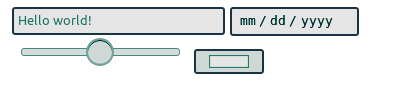
В этой статье рассмотрим различные варианты стилизации текстовых полей HTML-форм. Сначала создадим базовый вариант оформления input, а затем множество других, дополняя каждый из них небольшим количеством CSS.
Введение
Веб-формы являются неотъемлемой частью многих веб-сайтов. Они позволяют пользователю ввести те или иные данные, которые затем отправляются на сервер или обрабатываются на стороне клиента, например, для изменения интерфейса.
Веб-формы также часто называют HTML-формами. Их проектирование осуществляется с помощью элементов управления форм (текстовых полей, выпадающих списков, кнопок, чекбоксов и т.д.) и некоторых дополнительных элементов, которые используются для придание форме определённой структуры.
Стилизация формы выполняется через CSS. В этом руководстве остановимся и подробно рассмотрим различные варианты оформления её текстовых полей.
Исходные коды примеров расположены на GitHub в папке text-field проекта «ui-components».
Нормализация стилей
1. Настройка box-sizing.
Обычно хорошей практикой считается для всех элементов включая псевдоэлементы установить box-sizing: border-box:
*, *::before, *::after {
  box-sizing: border-box;
}
В этом случае браузер при рассчитывании ширины и высоты элементов будет включать в них поля (padding) и границы (border). Как правило, это сильно упрощает работу с размерами элементов, и избавляет нас от множества проблем при размещении контента.
2. Нормализация стилей <input>.
Для того чтобы <input> в разных браузерах отображался как можно более одинаково необходимо добавить следующее:
/* 1 – Изменим стили шрифтов */
/* 2 – Удалим margin в Firefox и Safari */
input[type="text"] {
  font-family: inherit; /* 1 */
  font-size: inherit; /* 1 */
  line-height: inherit; /* 1 */
  margin: 0; /* 2 */
}
Базовый вариант оформления input
Для удобного добавления к элементам стилей создадим следующую HTML-разметку:
<div class="text-field">
<label class="text-field__label" for="login">Логин</label>
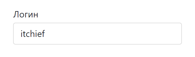
<input class="text-field__input" type="text" name="login" id="login" placeholder="Login" value="itchief">
</div>Т.е. добавим к <input> с type="text" класс text-field__input, к <label> – text-field__label, а затем обернём их в элемент <div> с классом text-field.
Теперь напишем стили для этих элементов. А также сразу включим в них стили для нормализации, чтобы не добавлять их отдельно:
/* установим отступ 1rem от нижнего края элемента */
.text-field {
  margin-bottom: 1rem;
}
/* стили для label */
.text-field__label {
  display: block;
  margin-bottom: 0.25rem;
}
/* стили для input */
.text-field__input {
  display: block;
  width: 100%;
  height: calc(2.25rem + 2px);
  padding: 0.375rem 0.75rem;
  font-family: inherit;
  font-size: 1rem;
  font-weight: 400;
  line-height: 1.5;
  color: #212529;
  background-color: #fff;
  background-clip: padding-box;
  border: 1px solid #bdbdbd;
  border-radius: 0.25rem;
  transition: border-color 0.15s ease-in-out, box-shadow 0.15s ease-in-out;
}
Примененные CSS свойства к элементу <input>, и то, что они делают:
display: block– устанавливает блочное отображение;width: 100%– занимает всю доступную ширину;height: calc(2.25rem + 2px)– высота элемента определяется путём сложения 2.25rem (font-size * line-height + padding-top + padding-bottom) и 2px (ширина верхней и нижней границы);margin: 0– убираетmarginотступы;padding: 0.375rem 0.75rem– внутренние поля: сверху и снизу – 0.375rem, а слева и справа – 0.75rem;font-family: inherit– чтобы шрифт был такой как у родительского элемента, а не тот который браузер по умолчанию назначает для<input>;font-size: 1rem– устанавливает явный размер шрифта, иначе будет браться из стилей браузера для<input>;font-weight: 400– задаёт начертание шрифта;line-height: 1.5– высота строки (1.5 * размер шрифта);color: #212529– цвет шрифта;background-color: #fff– цвет фона;background-clip: padding-box– указывает, что фон (фоновое изображение) нужно рисовать только до внешнего края отступа (под границей не выводить);border: 1px solid #bdbdbd– устанавливает границу, у которой: 1px (толщина), solid (тип линии) и#bdbdbd(цвет);border-radius: 0.25rem– радиус скругления углов;transition: border-color 0.15s ease-in-out, box-shadow 0.15s ease-in-out– выполняет изменение значений свойствborder-colorиbox-shadowс анимацией длительностью 0.15 секунд посредством временной функциейease-in-out.
В результате получили следующее оформление:
Посмотреть
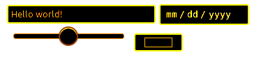
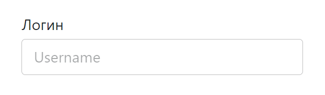
Стилизуем плейсхолдер. По умолчанию плейсхолдер отображается полупрозрачным или светло-серым цветом. Получить его можно с помощью ::placeholder. Оформим его следующим образом:
.text-field__input::placeholder {
  color: #212529;
  opacity: 0.4;
}
Посмотреть
Стили для <input> в состоянии фокуса (получить это состояние можно с помощью псевдокласса :focus):
.text-field__input:focus {
  color: #212529;
  background-color: #fff;
  border-color: #bdbdbd;
  outline: 0;
  box-shadow: 0 0 0 0.2rem rgba(158, 158, 158, 0.25);
}
Посмотреть
Оформление <input>, когда он находится в состоянии disabled и readonly:
<style>
.text-field__input:disabled,
.text-field__input[readonly] {
  background-color: #f5f5f5;
  opacity: 1;
}
</style>

<!-- disabled -->
<div class="text-field">
  <label for="firstname">Имя пользователя (disabled)</label>
  <input type="text" name="firstname" id="firstname" placeholder="Alaxander" disabled>
</div>
<!-- readonly -->
<div class="text-field">
  <label for="city">Город (readonly)</label>
  <input class="text-field__input" type="text" name="city" id="city" placeholder="Moscow" value="Moscow" readonly>
</div>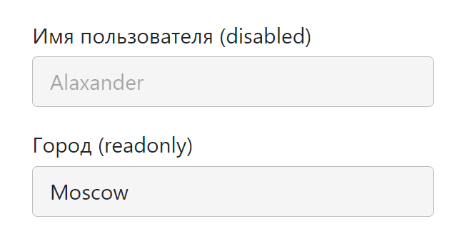
Посмотреть
Этот набор стилей будет у нас отправной точкой для создания других.
input с иконкой
Рассмотрим пример вставки в input иконки с помощью псевдоэлементов.
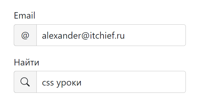
Для этого дополнительно обернём элемент <input> в <div> с классами text-field__icon text-field__icon_email:
<div class="text-field">
  <label class="text-field__label" for="email">Email</label>
  <div class="text-field__icon text-field__icon_email">
    <input class="text-field__input" type="email" placeholder="alexander@itchief.ru" value="alexander@itchief.ru">
  </div>
</div>
<div class="text-field">
  <label class="text-field__label" for="text">Найти</label>
  <div class="text-field__icon text-field__icon_search">
    <input class="text-field__input" type="text" placeholder="css" value="css уроки">
  </div>
</div>
Первый класс (text-field__icon) будем использовать для того, чтобы установить относительное позиционирование (position: relative). Это действие позволит нам разместить иконку в нужном месте относительно input, используя уже абсолютное позиционирование (position: absolute). Второй класс (text-field__icon_email) будет определять иконку, которую мы хотим вставить.
.text-field__icon {
  position: relative;
}
.text-field__icon::before {
  content: '';
  color: #bdbdbd;
  position: absolute;
  display: flex;
  align-items: center;
  top: 0;
  bottom: 0;
  left: 0.625rem;
  top: 50%;
  transform: translateY(-50%);
}
.text-field__icon .text-field__input {
  padding-left: 2rem;
}
/* email значок */
.text-field__icon_email::before {
  content: '@';
}
/* иконка лупы */
.text-field__icon_search::before {
  width: 1rem;
  background-image: url("data:image/svg+xml,%3Csvg xmlns='http://www.w3.org/2000/svg' width='16' height='16' fill='%23bdbdbd' viewBox='0 0 16 16'%3E%3Cpath d='M11.742 10.344a6.5 6.5 0 1 0-1.397 1.398h-.001c.03.04.062.078.098.115l3.85 3.85a1 1 0 0 0 1.415-1.414l-3.85-3.85a1.007 1.007 0 0 0-.115-.1zM12 6.5a5.5 5.5 0 1 1-11 0 5.5 5.5 0 0 1 11 0z'%3E%3C/path%3E%3C/svg%3E");
  background-repeat: no-repeat;
  background-position: center;
}
Посмотреть
Ещё один вариант оформления:
Посмотреть
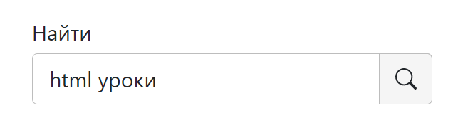
input с активной svg-иконкой
В этом примере поместим в input иконку, на которую можно нажать.
<div class="text-field">
  <label class="text-field__label" for="search">Найти</label>
  <div class="text-field__icon">
    <input class="text-field__input" type="search" name="search" id="search" placeholder="css" value="css уроки">
    <span class="text-field__aicon">
      <svg xmlns="http://www.w3.org/2000/svg" width="16" height="16" fill="currentColor" viewBox="0 0 16 16"><path d="M11.742 10.344a6.5 6.5 0 1 0-1.397 1.398h-.001c.03.04.062.078.098.115l3.85 3.85a1 1 0 0 0 1.415-1.414l-3.85-3.85a1.007 1.007 0 0 0-.115-.1zM12 6.5a5.5 5.5 0 1 1-11 0 5.5 5.5 0 0 1 11 0z" /></svg>
    </span>
  </div>
</div>
Для этого мы также как и в предыдущем примере обернули <input> в <div class="text-field__icon">...<div>. Саму svg-иконку обернули в <span> с классом text-field__aicon и поместили рядом с <input>.
Оформление выполнили так:
.text-field__icon {
  position: relative;
}
.text-field__icon input {
  padding-right: 2.5rem;
}
.text-field__aicon {
  position: absolute;
  display: flex;
  align-items: center;
  top: 0;
  bottom: 0;
  right: 0.875rem;
  width: 1rem;
  cursor: pointer;
  color: #bdbdbd;
  transition: color 0.15s ease-in-out;
}
.text-field__aicon:hover {
  color: #212529;
}
Посмотреть
Ещё пример вставки иконки в input:
Посмотреть
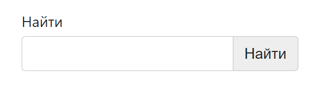
input с кнопкой
HTML-разметка input с кнопкой:
<div class="text-field">
  <label class="text-field__label" for="search">Найти</label>
  <div class="text-field__group">
    <input class="text-field__input" type="search" id="search" name="search">
    <button class="text-field__btn" type="button">Найти</button>
  </div>
</div>
Расположение кнопки справа от input выполним с помощью флексов:
.text-field__group {
  display: flex;
}
/* кнопка */
.text-field__btn {
  display: inline-block;
  font-weight: 400;
  line-height: 1.5;
  color: #212529;
  text-align: center;
  vertical-align: middle;
  cursor: pointer;
  -webkit-user-select: none;
  -moz-user-select: none;
  user-select: none;
  background-color: #eee;
  border: 1px solid #bdbdbd;
  padding: .375rem .75rem;
  font-size: 1rem;
  border-radius: .25rem;
  transition: background-color .15s ease-in-out;
}
.text-field__btn:hover {
  background-color: #bdbdbd;
}
.text-field__group .text-field__input {
  border-top-right-radius: 0;
  border-bottom-right-radius: 0;
  position: relative;
  z-index: 2;
}
.text-field__group .text-field__btn {
  position: relative;
  border-top-left-radius: 0;
  border-bottom-left-radius: 0;
  border-left-width: 0;
}
Посмотреть
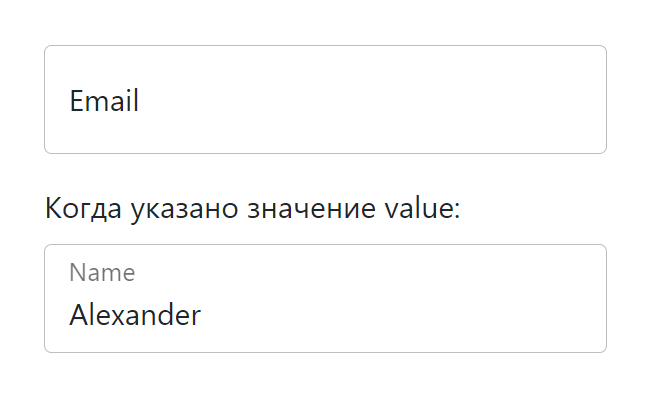
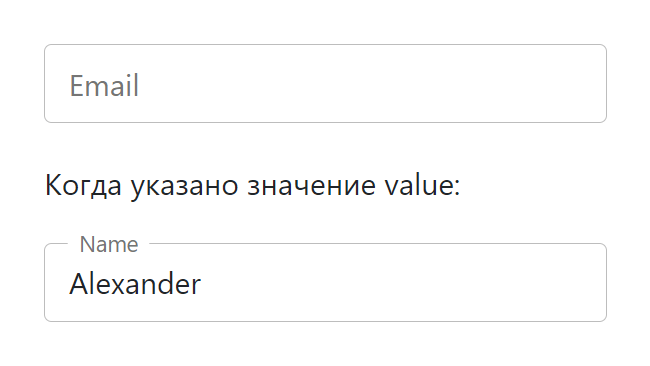
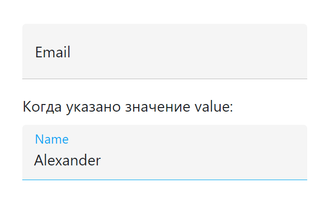
input с плавающим label
Разметка input с плавающим label:
<div class="text-field text-field_floating">
  <input class="text-field__input" type="email" id="email" placeholder="alexander@itchief.ru">
  <label class="text-field__label" for="email">Email</label>
</div>
<p>Когда указано значение value:</p>
<div class="text-field text-field_floating">
  <input class="text-field__input" type="name" id="name" value="Alexander">
  <label class="text-field__label" for="name">Name</label>
</div>
CSS код:
.text-field_floating {
  position: relative;
}
.text-field_floating .text-field__input {
  height: calc(3.5rem + 2px);
  line-height: 1.25;
  padding: 1rem 0.75rem;
}
.text-field_floating .text-field__label {
  position: absolute;
  top: 0;
  left: 0;
  height: 100%;
  padding: 1rem .75rem;
  pointer-events: none;
  border: 1px solid transparent;
  transform-origin: 0 0;
  transition: opacity .15s ease-in-out, transform .15s ease-in-out;
}
.text-field_floating .text-field__input::-moz-placeholder {
  color: transparent;
}
.text-field_floating .text-field__input::placeholder {
  color: transparent;
}
.text-field_floating .text-field__input:focus,
.text-field_floating .text-field__input:not(:placeholder-shown) {
  padding-top: 1.625rem;
  padding-bottom: .625rem;
}
.text-field_floating .text-field__input:focus~.text-field__label,
.text-field_floating .text-field__input:not(:placeholder-shown)~.text-field__label {
  opacity: .65;
  transform: scale(.85) translateY(-.75rem) translateX(.15rem);
}
Посмотреть
Ещё один вариант с «плавающей» меткой:
Посмотреть
Третий вариант:
Посмотреть
input со счётчиком символов
Пример в котором под input отображается количество набранных символов и максимальная длина:
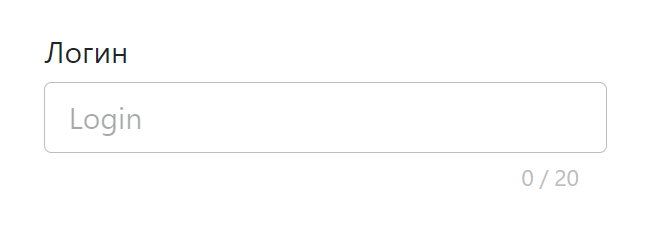
Посмотреть
Это выполняется посредством следующего кода:
<div class="text-field">
<label class="text-field__label" for="login">Логин</label>
<input class="text-field__input" type="text" name="login" id="login" placeholder="Login" maxlength="20" required>
<div class="text-field__counter"></div>
</div>
<script>
const elemLogin = document.querySelector('#login');
const elemCounter = elemLogin.nextElementSibling;
const maxLength = elemLogin.maxLength;
const updateCounter = (e) => {
const len = e ? e.target.value.length : 0;
elemCounter.textContent = `${len} / ${maxLength}`;
}
updateCounter();
elemLogin.addEventListener('keyup', updateCounter);
elemLogin.addEventListener('keydown', updateCounter);
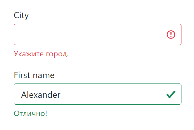
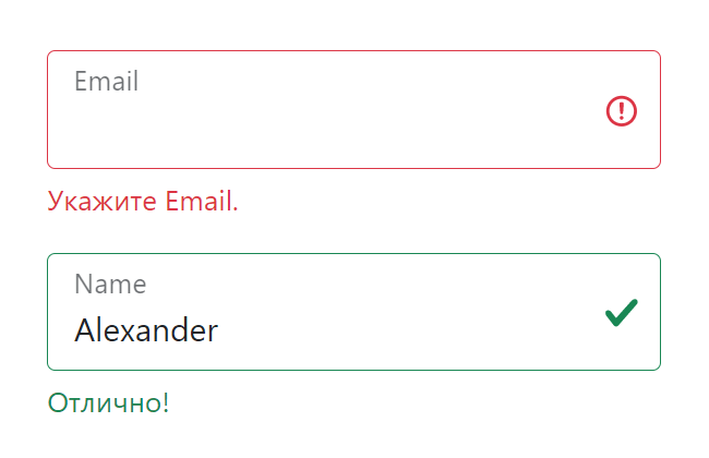
</script>Стили для отображения состояния валидации input
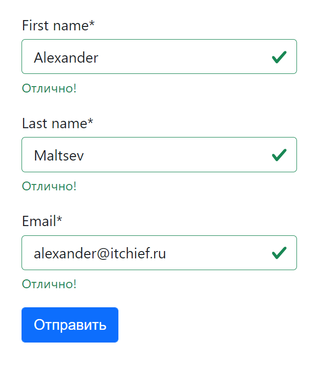
Применить стили в зависимости от состояния поля в CSS можно с помощью специальных псевдоклассов. Например, :valid позволяет выбрать валидные элементы, а :invalid — не валидные.
.text-field__input:invalid,
.text-field__input:valid {
border-color: #dc3545;
padding-right: 2.25rem;
background-image: url("data:image/svg+xml,%3csvg xmlns='http://www.w3.org/2000/svg' viewBox='0 0 12 12' width='12' height='12' fill='none' stroke='%23dc3545'%3e%3ccircle cx='6' cy='6' r='4.5'/%3e%3cpath stroke-linejoin='round' d='M5.8 3.6h.4L6 6.5z'/%3e%3ccircle cx='6' cy='8.2' r='.6' fill='%23dc3545' stroke='none'/%3e%3c/svg%3e");
background-repeat: no-repeat;
background-position: right 0.5625rem center;
background-size: 1.125rem 1.125rem;
}
.text-field__input:valid {
border-color: #198754;
background-image: url("data:image/svg+xml,%3csvg xmlns='http://www.w3.org/2000/svg' viewBox='0 0 8 8'%3e%3cpath fill='%23198754' d='M2.3 6.73L.6 4.53c-.4-1.04.46-1.4 1.1-.8l1.1 1.4 3.4-3.8c.6-.63 1.6-.27 1.2.7l-4 4.6c-.43.5-.8.4-1.1.1z'/%3e%3c/svg%3e");
}
.text-field__input:invalid:focus {
border-color: #dc3545;
box-shadow: 0 0 0 0.25rem rgba(220, 53, 69, 0.25);
}
.text-field__input:valid:focus {
border-color: #198754;
box-shadow: 0 0 0 0.25rem rgb(25 135 84 / 25%);
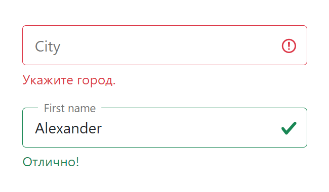
}Но, если вы хотите контролировать этот процесс и добавлять стили с помощью JavaScript, то тогда лучше это делать через классы. Например, использовать класс text-field__input_valid при успешной валидации, а
text-field__input_invalid — при не успешной. Их следует добавлять к <input>.
<div class="text-field">
  <label class="text-field__label" for="city">City</label>
  <!-- text-field__input_invalid -->
  <input class="text-field__input text-field__input_invalid" type="text" name="city" id="city">
  <div class="text-field__message">Укажите город.</div>
</div>
<div class="text-field">
  <label class="text-field__label" for="username">First name</label>
  <!-- text-field__input_valid -->
  <input class="text-field__input text-field__input_valid" type="text" name="firstname" id="firstname"
    value="Alexander">
  <div class="text-field__message">Отлично!</div>
</div>
Отображать сообщения пользователю или подсказки можно через <div class="text-field__message">...</div>.
Посмотреть
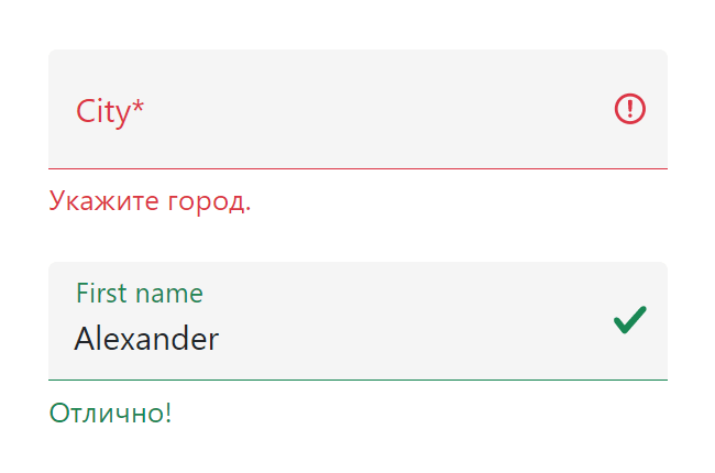
Для <input> с плавающим <label>:
Посмотреть
Посмотреть
Посмотреть
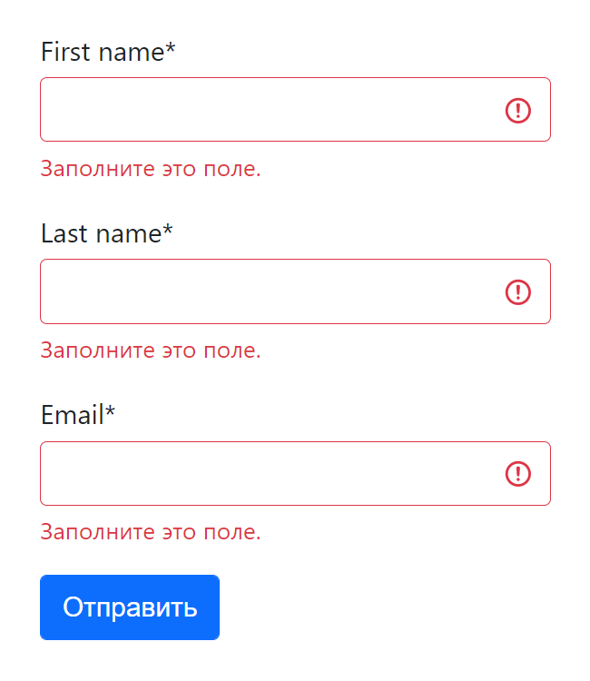
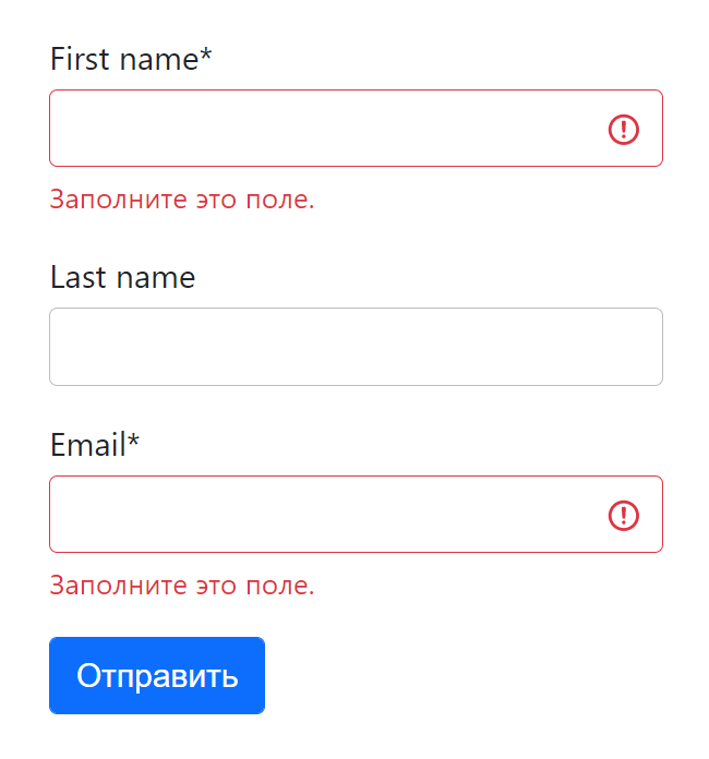
Пример валидации формы с помощью JavaScript
Валидацию элементов формы будем осуществлять с помощью функции checkValidity(). После этого, в зависимости от её результата, будем добавлять той или иной класс к <input>, а также сообщение (input.validationMessage) в элемент .text-field__message.
// input - переменная, содержащая элемент <input>
if (input.checkValidity()) {
  input.classList.add('text-field__input_valid');
  input.nextElementSibling.textContent = 'Отлично!';
} else {
  input.classList.add('text-field__input_invalid');
  input.nextElementSibling.textContent = input.validationMessage;
}
Т.к. мы будем сами отображать сообщения, то необходимо отключить стандартные подсказки браузера. Для этого к тегу <form> необходимо добавить атрибут novalidate:
<form id="form" action="#" novalidate>
  ...
</form>
Клиентская проверка формы после нажатия «Отправить»:
Посмотреть
Пример валидации формы в реальном времени:
Посмотреть
Отображение только ошибок:
Посмотреть