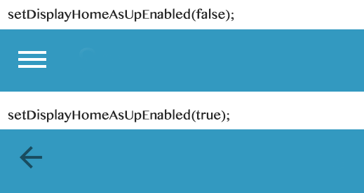
I am using a android.support.v7.widget.Toolbar and learned from this post how to change the color of the hamburger icon to white, but the up/back arrow remains a dark color when I call
setDisplayHomeAsUpEnabled(true);
How can I make the arrow white as well?
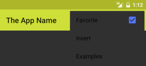
Here is what my toolbar looks like when I call setDisplayHomeAsUpEnabled():
…and here is the relevant portion of my styles.xml file:
<style name="AppTheme" parent="Theme.AppCompat.NoActionBar">
    <item name="colorPrimary">@color/primary</item>
    <item name="colorPrimaryDark">#194C5F</item>
    <item name="colorAccent">@color/accent</item>
    <item name="drawerArrowStyle">@style/WhiteDrawerIconStyle</item>
</style>

    <style name="WhiteDrawerIconStyle" parent="Widget.AppCompat.DrawerArrowToggle">
        <item name="spinBars">true</item>
        <item name="color">@android:color/white</item>
    </style>
asked Feb 20, 2015 at 2:49
5
I solved it by editing styles.xml:
<style name="ToolbarColoredBackArrow" parent="AppTheme">
    <item name="android:textColorSecondary">INSERT_COLOR_HERE</item>
</style>
…then referencing the style in the Toolbar definition in the activity:
<LinearLayout
    android:id="@+id/main_parent_view"
    android:layout_width="match_parent"
    android:layout_height="match_parent"
    android:orientation="vertical">

    <android.support.v7.widget.Toolbar
        xmlns:android="http://schemas.android.com/apk/res/android"
        xmlns:app="http://schemas.android.com/apk/res-auto"
        android:id="@+id/toolbar"
        app:theme="@style/ToolbarColoredBackArrow"
        app:popupTheme="@style/AppTheme"
        android:layout_width="match_parent"
        android:layout_height="wrap_content"
        android:minHeight="?attr/actionBarSize"
        android:background="?attr/colorPrimary"/>
answered Feb 20, 2015 at 15:00
Joshua WJoshua W
4,9435 gold badges23 silver badges30 bronze badges
7
Here is what you are looking for. But this also changes the color of radioButton etc. So you might want to use a theme for it.
<item name="colorControlNormal">@color/colorControlNormal</item>
answered Mar 28, 2015 at 16:25
osrlosrl
8,4598 gold badges35 silver badges57 bronze badges
2
I solved it programmatically using this code:
final Drawable upArrow = getResources().getDrawable(R.drawable.abc_ic_ab_back_mtrl_am_alpha);
upArrow.setColorFilter(Color.parseColor("#FFFFFF"), PorterDuff.Mode.SRC_ATOP);
getSupportActionBar().setHomeAsUpIndicator(upArrow);
Revision 1:
Starting from API 23 (Marshmallow) the drawable resource abc_ic_ab_back_mtrl_am_alpha is changed to abc_ic_ab_back_material.
answered Nov 1, 2015 at 19:06
PayToPwnPayToPwn
1,2381 gold badge16 silver badges29 bronze badges
3
This answer maybe too late, but here is how I do it.
Styling the toolbar will do the trick. Create toolbar.xml with following code.
<?xml version="1.0" encoding="utf-8"?>
<android.support.v7.widget.Toolbar
xmlns:android="http://schemas.android.com/apk/res/android"
xmlns:local="http://schemas.android.com/apk/res-auto"
android:id="@+id/toolbar"
android:layout_width="match_parent"
android:layout_height="wrap_content"
android:minHeight="?attr/actionBarSize"
android:background="?attr/colorPrimary"
android:layout_alignParentTop="true"
android:layout_gravity="bottom"
local:theme="@style/ThemeOverlay.AppCompat.Dark.ActionBar"
local:popupTheme="@style/ThemeOverlay.AppCompat.Light" />
and in the styles.xml
<style name="AppBaseTheme" parent="Theme.AppCompat.Light.NoActionBar">
    <!--
    -->
</style>

<!-- Application theme. -->
<style name="AppTheme" parent="AppBaseTheme">
    <item name="windowNoTitle">true</item>
    <item name="windowActionBar">false</item>
    <item name="colorPrimary">@color/colorPrimary</item>
    <item name="colorPrimaryDark">@color/colorPrimaryDark</item>
</style>
Finally, include the toolbar inside layout
<include
        android:id="@+id/toolbar"
        layout="@layout/toolbar" />
answered Jul 25, 2015 at 10:46
TussTuss
9251 gold badge8 silver badges14 bronze badges
1
Change your Toolbar Theme to ThemeOverlay.AppCompat.Dark
<?xml version="1.0" encoding="utf-8"?>
<android.support.v7.widget.Toolbar xmlns:android="http://schemas.android.com/apk/res/android"
    xmlns:app="http://schemas.android.com/apk/res-auto"
    android:id="@+id/navigation"
    android:layout_width="match_parent"
    android:layout_height="wrap_content"
    android:background="@color/colorPrimary"
    android:orientation="vertical"
    app:theme="@style/ThemeOverlay.AppCompat.Dark">

</android.support.v7.widget.Toolbar>
and set it in activty
mToolbar = (Toolbar) findViewById(R.id.navigation);
setSupportActionBar(mToolbar);
answered Jun 10, 2017 at 5:44
Mayank JainMayank Jain
2713 silver badges7 bronze badges
1
Here’s my solution:
toolbar.navigationIcon?.mutate()?.let {
  it.setTint(theColor)
  toolbar.navigationIcon = it
}
Or, if you want to use a nice function for it:
fun Toolbar.setNavigationIconColor(@ColorInt color: Int) = navigationIcon?.mutate()?.let {
    it.setTint(color)
    this.navigationIcon = it
}
Usage:
toolbar.setNavitationIconColor(someColor)
Jéwôm’
4,1314 gold badges37 silver badges71 bronze badges
answered Jan 8, 2020 at 8:22
android developerandroid developer
115k143 gold badges719 silver badges1244 bronze badges
3
   <!-- ToolBar -->
    <style name="ToolBarTheme.ToolBarStyle"    parent="ThemeOverlay.AppCompat.Dark.ActionBar">
        <item name="android:textColorPrimary">@android:color/white</item>
        <item name="android:textColor">@color/white</item>
        <item name="android:textColorPrimaryInverse">@color/white</item>
    </style>
Too late to post, this worked for me to change the color of the back button
answered May 3, 2016 at 23:17
sreekumarsreekumar
2,4191 gold badge20 silver badges27 bronze badges
1
Well there is a more easy way to do this
drawerToggle = new ActionBarDrawerToggle(this, drawer, toolbar, R.string.open_drawer, R.string.close_drawer);
arrow = drawerToggle.getDrawerArrowDrawable();
And then
arrow.setColor(getResources().getColor(R.color.blue);
answered Oct 16, 2017 at 6:12
KammaarKammaar
1,5711 gold badge13 silver badges12 bronze badges
0
Instead of style changes, just put these two lines of code to your activity.
getSupportActionBar().setDisplayHomeAsUpEnabled(true);
getSupportActionBar().setHomeAsUpIndicator(R.drawable.arrowleft);
Pang
9,365146 gold badges85 silver badges121 bronze badges
answered Dec 29, 2017 at 7:55
This code works for me:
public static Drawable changeBackArrowColor(Context context, int color) {
    String resName;
    int res;

    resName = Build.VERSION.SDK_INT >= 23 ? "abc_ic_ab_back_material" : "abc_ic_ab_back_mtrl_am_alpha";
    res = context.getResources().getIdentifier(resName, "drawable", context.getPackageName());

    final Drawable upArrow = context.getResources().getDrawable(res);
    upArrow.setColorFilter(color, PorterDuff.Mode.SRC_ATOP);

    return upArrow;
}

...

getSupportActionBar().setHomeAsUpIndicator(changeBackArrowColor(this, Color.rgb(50, 50, 50)));
supportInvalidateOptionsMenu();
Also, if you want to change the toolbar text color:
Spannable spannableString = new SpannableString(t);
spannableString.setSpan(new ForegroundColorSpan(Color.rgb(50, 50, 50)), 0, t.length(), Spannable.SPAN_EXCLUSIVE_EXCLUSIVE);
toolbar.setText(spannableString);
Working from API 19 through 25.
Paul Chu
1,2353 gold badges19 silver badges27 bronze badges
answered Apr 25, 2017 at 23:04
HermandroidHermandroid
2,0904 gold badges28 silver badges35 bronze badges
Try this:
Set the toolbar’s theme in your layout as follows
android:theme = "@android:style/ThemeOverlay.Material.Dark.ActionBar"
If you want further information
The curious case of the Overflow Icon Color
by Martin Bonnin
answered Jul 16, 2020 at 20:16
MorenoMoreno
1651 silver badge9 bronze badges
Instead of using older drawable id «abc_ic_ab_back_material«, use the new one abc_ic_ab_back_material in every api version. I have tested it in 19, 21, 27 and working fine with below code and configuration.
- minSdkVersion = 17
- targetSdkVersion = 26
-
compileSdkVersion = 27
public static Drawable changeBackArrowColor(Context context, int color) {
int res;
res = context.getResources().getIdentifier("abc_ic_ab_back_material", "drawable", context.getPackageName());
if (res == 0)
    return null;
final Drawable upArrow = ContextCompat.getDrawable(context, res);
upArrow.setColorFilter(ContextCompat.getColor(context, color), PorterDuff.Mode.SRC_ATOP);

return upArrow;
}
answered Oct 18, 2018 at 12:10
This is best and easier option.
getSupportActionBar().setHomeAsUpIndicator(R.drawable.ic_arrow_back_24);
answered Jun 24, 2022 at 18:08
2
You can set a custom toolbar item color dynamically by creating a custom toolbar class:
package view;

import android.app.Activity;
import android.content.Context;
import android.graphics.ColorFilter;
import android.graphics.PorterDuff;
import android.graphics.PorterDuffColorFilter;
import android.support.v7.internal.view.menu.ActionMenuItemView;
import android.support.v7.widget.ActionMenuView;
import android.support.v7.widget.Toolbar;
import android.util.AttributeSet;
import android.util.Log;
import android.view.View;
import android.view.ViewGroup;
import android.widget.AutoCompleteTextView;
import android.widget.EditText;
import android.widget.ImageButton;
import android.widget.ImageView;
import android.widget.TextView;

public class CustomToolbar extends Toolbar{

    public CustomToolbar(Context context, AttributeSet attrs, int defStyleAttr) {
        super(context, attrs, defStyleAttr);
        // TODO Auto-generated constructor stub
    }

    public CustomToolbar(Context context, AttributeSet attrs) {
        super(context, attrs);
        // TODO Auto-generated constructor stub
    }

    public CustomToolbar(Context context) {
        super(context);
        // TODO Auto-generated constructor stub
        ctxt = context;
    }

    int itemColor;
    Context ctxt;

    @Override
    protected void onLayout(boolean changed, int l, int t, int r, int b) {
        Log.d("LL", "onLayout");
        super.onLayout(changed, l, t, r, b);
        colorizeToolbar(this, itemColor, (Activity) ctxt);
    }

    public void setItemColor(int color){
        itemColor = color;
        colorizeToolbar(this, itemColor, (Activity) ctxt);
    }


    /**
     * Use this method to colorize toolbar icons to the desired target color
     * @param toolbarView toolbar view being colored
     * @param toolbarIconsColor the target color of toolbar icons
     * @param activity reference to activity needed to register observers
     */
    public static void colorizeToolbar(Toolbar toolbarView, int toolbarIconsColor, Activity activity) {
        final PorterDuffColorFilter colorFilter
                = new PorterDuffColorFilter(toolbarIconsColor, PorterDuff.Mode.SRC_IN);

        for(int i = 0; i < toolbarView.getChildCount(); i++) {
            final View v = toolbarView.getChildAt(i);

            doColorizing(v, colorFilter, toolbarIconsColor);
        }

      //Step 3: Changing the color of title and subtitle.
        toolbarView.setTitleTextColor(toolbarIconsColor);
        toolbarView.setSubtitleTextColor(toolbarIconsColor);
    }

    public static void doColorizing(View v, final ColorFilter colorFilter, int toolbarIconsColor){
        if(v instanceof ImageButton) {
            ((ImageButton)v).getDrawable().setAlpha(255);
            ((ImageButton)v).getDrawable().setColorFilter(colorFilter);
        }

        if(v instanceof ImageView) {
            ((ImageView)v).getDrawable().setAlpha(255);
            ((ImageView)v).getDrawable().setColorFilter(colorFilter);
        }

        if(v instanceof AutoCompleteTextView) {
            ((AutoCompleteTextView)v).setTextColor(toolbarIconsColor);
        }

        if(v instanceof TextView) {
            ((TextView)v).setTextColor(toolbarIconsColor);
        }

        if(v instanceof EditText) {
            ((EditText)v).setTextColor(toolbarIconsColor);
        }

        if (v instanceof ViewGroup){
            for (int lli =0; lli< ((ViewGroup)v).getChildCount(); lli ++){
                doColorizing(((ViewGroup)v).getChildAt(lli), colorFilter, toolbarIconsColor);
            }
        }

        if(v instanceof ActionMenuView) {
            for(int j = 0; j < ((ActionMenuView)v).getChildCount(); j++) {

                //Step 2: Changing the color of any ActionMenuViews - icons that
                //are not back button, nor text, nor overflow menu icon.
                final View innerView = ((ActionMenuView)v).getChildAt(j);

                if(innerView instanceof ActionMenuItemView) {
                    int drawablesCount = ((ActionMenuItemView)innerView).getCompoundDrawables().length;
                    for(int k = 0; k < drawablesCount; k++) {
                        if(((ActionMenuItemView)innerView).getCompoundDrawables()[k] != null) {
                            final int finalK = k;

                            //Important to set the color filter in seperate thread,
                            //by adding it to the message queue
                            //Won't work otherwise.
                            //Works fine for my case but needs more testing

                            ((ActionMenuItemView) innerView).getCompoundDrawables()[finalK].setColorFilter(colorFilter);

//                              innerView.post(new Runnable() {
//                                  @Override
//                                  public void run() {
//                                      ((ActionMenuItemView) innerView).getCompoundDrawables()[finalK].setColorFilter(colorFilter);
//                                  }
//                              });
                        }
                    }
                }
            }
        }
    }


}
then refer to it in your layout file. Now you can set a custom color using
toolbar.setItemColor(Color.Red);
Sources:
I found the information to do this here: How to dynamicaly change Android Toolbar icons color
and then I edited it, improved upon it, and posted it here: GitHub:AndroidDynamicToolbarItemColor
Light on Dark and Dark on Light.
Android’s has normal (dark) and light themes, though it’s actually the light themes which are normally show in examples of the new Material design.
The light theme expects your App Bar1 (Toolbar or ActionBar) to have a light background color, so it gives you a dark title and dark overflow menu icon (the three vertical dots):

The dark theme expects your App Bar to have a dark background color, so it gives you a white title and white overflow menu icon:
This is true of both the Holo themes and the new Material themes.
If you want to use the light theme but want your App Bar to have a dark background, or use a dark theme and want your toolbar to have a light background, things get awkward. Arguably this might be unwise design anyway, but there’s nothing in the Material design guidelines advising against it.
It’s fairly easy to change the ActionBar‘s text color, but changing the color of its overflow icon is harder. It seems normal to provide a whole new overflow icon for your app, replacing the standard one, just to get the right color.
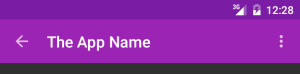
Android’s new Toolbar, which replaces ActionBar (with some awkward code), makes it easier to change the title text color and the color of the menu overflow icon (and the Up/Back icon). So now I finally have dark text and icons on my light background in the dark theme:
Toolbar theme and popupTheme
It took me ages to figure out how to do this, so hopefully the following explanation saves someone some time. I’d welcome any corrections.
My main theme derives from Theme.AppCompat (not Theme.AppCompat.Light), which is the dark Material theme for older devices, because I want most of the UI to be dark.
<style name="AppTheme" parent="AppTheme.Base" />
<!-- Base application theme.
     Defining this lets values-v21/styles.xml reuse it with changes. -->
</style>
<style name="AppTheme.Base" parent="Theme.AppCompat.NoActionBar">
  <!-- colorPrimary is used, for instance, for the default ActionBar
       (but not Toolbar) background.
        We specify the same color for the toolbar background in
        toolbar.xml.. -->
  <item name="colorPrimary">@color/color_primary</item>

  <!-- colorPrimaryDark is used for the status bar (with the
       battery, clock, etc). -->
  <item name="colorPrimaryDark">@color/color_primary_dark</item>

   <!-- colorAccent is used as the default value for
        colorControlActivated which is used to tint widgets. -->
  <item name="colorAccent">@color/color_accent</item>
</style>
(Update: I originally used Theme.AppCompat, manually setting windowActionBar to false, before learning of Theme.AppCompat.NoActionBar here, but I don’t notice any difference)
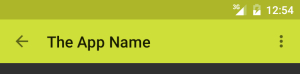
But that dark theme gives me light text and icons on the my light background of the App Bar:
I want to use a light color for the toolbar background even while using the dark theme. So I’ll need to make the text and icons on my toolbar dark instead of the default white from the light theme. Incidentally, the Material Design Color Palette page seems to agree with me, using dark title text on the Lime color I’ve chosen, but using white on almost all other colors.
So my Toolbar’s XML layout specifies a different theme (android:theme, or app:theme when using appcompat versions before 22.1.0), like so:
<android.support.v7.widget.Toolbar
  xmlns:android="http://schemas.android.com/apk/res/android"
  xmlns:app="http://schemas.android.com/apk/res-auto"
  android:id="@+id/toolbar"
  android:layout_width="match_parent"
  android:layout_height="wrap_content"
  android:background="@color/color_primary"
  android:theme="@style/GalaxyZooThemeToolbarDarkOverflow"
  app:popupTheme="@style/Theme.AppCompat.NoActionBar" />
That toolbar theme specifies a textColorPrimary and textColorSecondary to change the color of the title text and of the menu overflow button. You could just specify the standard Theme.AppCompat.Light.NoActionBar theme for the toolbar, to get the dark text and overflow icon, but I wanted to derive from my own theme and make only small changes, because I have no idea what else might be affected.
<style name="GalaxyZooThemeToolbarDarkOverflow" parent="Theme.AppCompat.NoActionBar">
  <!-- android:textColorPrimary is the  color of the title text
       in the Toolbar, in the Theme.AppCompat theme:  -->
  <item name="android:textColorPrimary">@color/abc_primary_text_material_light</item>

  <!-- android:textColorPrimaryInverse is the  color of the title
       text in the Toolbar, in the Theme.AppCompat.Light theme:  -->
  <!-- <item name="android:textColorPrimaryInverse">@color/abc_primary_text_material_light</item> -->

  <!-- android:actionMenuTextColor is the color of the text of
        action (menu) items in the Toolbar, at least in the
        Theme.AppCompat theme.
        For some reason, they already get the textColorPrimary
        when running on API 21, but not on older versions of
        Android, so this is only necessary to support older
        Android versions.-->
        <item name="actionMenuTextColor">@color/abc_primary_text_material_light</item>
  <!-- android:textColorSecondary is the color of the menu
       overflow icon (three vertical dots) -->
  <item name="android:textColorSecondary">@color/abc_secondary_text_material_light</item>

  <!-- This would set the toolbar's background color,
        but setting this also changes the popup menu's background,
        even if we define popupTheme for our <Toolbar> -->
  <!-- <item name="android:background">@color/color_primary</item> -->
</style>
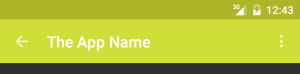
This gives me the dark text and icons in my App Bar while using the dark theme:
That’s actually gray rather than black, and the white icons are really off-white, so you might want to use a custom color to have real black or white standard icons:
<item name="android:textColorSecondary">@color/my_black_icon_color</item>
Notice that the <Toolbar> also uses popupTheme (app:popuptheme when using AppCompat, or android:popupTheme when targetting SDK >=21). Without this, the overflow menu’s appearance is affected by the Toolbar’s style, leading to dark text on a dark background:
By specifying the Toolbar’s popupTheme, we can make its menu use our normal theme instead:
[1] “App Bar” seems to be the new official terminology. It’s used here and some other places I can’t find now.
Also see my entry about changing the colors of your own action icons with Android 5.0’s drawable tinting feature.
Improve Article
Save Article
Improve Article
Save Article
In an Android app, the toolbar title present at the upper part of the application. Below is a sample image that shows you where the toolbar title is present.

In the above image, you may see that the color of the Toolbar Title is white which is by default. So in this article, you will learn how to change the text color of the Toolbar Title in an Android App. There are two ways to change the color of the Toolbar Title.
Method 1: By Adding Child TextView in the activity_main.xml file
In method 1 Just go to the activity_main.xml file and add a TextView in the toolbar widget with the text color attribute. The complete code for the activity_main.xml file is given below.
XML
<?xml version="1.0" encoding="utf-8"?>
<RelativeLayout
android:layout_width="match_parent"
android:layout_height="match_parent"
tools:context=".MainActivity">
<androidx.appcompat.widget.Toolbar
android:id="@+id/toolbar"
android:layout_width="match_parent"
android:layout_height="?attr/actionBarSize"
android:background="#0F9D58">
<TextView
android:id="@+id/custom_title"
android:layout_width="wrap_content"
android:layout_height="wrap_content"
android:text="GeeksForGeeks"
android:textColor="#D61010"
android:textSize="20sp"
android:textStyle="bold" />
</androidx.appcompat.widget.Toolbar>
</RelativeLayout>
Output UI:

Method 2: By Setting TextColor Programmatically
Step 1: Working with the activity_main.xml file
Go to the activity_main.xml file and refer to the following code. Below is the code for the activity_main.xml file.
XML
<?xml version="1.0" encoding="utf-8"?>
<RelativeLayout
android:layout_width="match_parent"
android:layout_height="match_parent"
tools:context=".MainActivity">
<androidx.appcompat.widget.Toolbar
android:id="@+id/toolbar"
android:layout_width="match_parent"
android:layout_height="?attr/actionBarSize"
android:background="#0F9D58">
</androidx.appcompat.widget.Toolbar>
</RelativeLayout>
Step 2: Changes in the themes.xml file
Go to the app > res > values > themes > themes.xml file and add the following line inside the <resources> tag.
<item name=”windowNoTitle”>true</item>
Step 3: Working with the MainActivity file
In the activity’s onCreate() method, call the activity’s setSupportActionBar() method, and pass the activity’s toolbar. This method sets the toolbar as the app bar for the activity. Add below codes in your Activity to set the text color to the Toolbar title. Below is the complete code for the MainActivity.java / MainActivity.kt file.
Java
import android.graphics.Color;
import android.os.Bundle;
import androidx.appcompat.app.AppCompatActivity;
import androidx.appcompat.widget.Toolbar;
public class MainActivity extends AppCompatActivity {
@Override
protected void onCreate(Bundle savedInstanceState) {
super.onCreate(savedInstanceState);
setContentView(R.layout.activity_main);
Toolbar toolbar = findViewById(R.id.toolbar);
toolbar.setTitleTextColor(Color.RED);
setSupportActionBar(toolbar);
}
}
Kotlin
import android.graphics.Color
import android.os.Bundle
import androidx.appcompat.app.AppCompatActivity
import androidx.appcompat.widget.Toolbar
class MainActivity : AppCompatActivity() {
override fun onCreate(savedInstanceState: Bundle?) {
super.onCreate(savedInstanceState)
setContentView(R.layout.activity_main)
val toolbar: Toolbar = findViewById(R.id.toolbar)
toolbar.setTitleTextColor(Color.RED)
setSupportActionBar(toolbar)
}
}
Output:

A toolbar is basically a form action bar that contains many interactive items. A toolbar supports a more focused feature than an action bar. The toolbar was added in Android Lollipop (API 21) and is the successor of the ActionBar. The toolbar is a ViewGroup that can be put anyplace in the XML layouts. Toolbar’s looks and behavior could be more efficiently customized than the ActionBar. Toolbars are more flexible than ActionBar. One can simply change its color, size, and position. We can also add labels, logos, navigation icons, and other views to it. In this article, we will see how we can customize the toolbar background using various methods. We will be seeing the following methods:
- Solid Color Background
- Custom Gradient Background
- Image Background
Note: Before adding a custom Toolbar in your app remove the default Actionbar in your android app by following this link.
Solid Color Background
This is the easiest method to add background to a toolbar. In this method, we use the background attribute to set a solid color. We can either enter the hex code of the color, or we can define a color in the values resource directory. Follow the below steps:
- Create a toolbar in the activity_main.xml file.
- Add a color value in the colors.xml file with a name.
- Add background attribute in the toolbar in activity_main.xml file with the name of the color created in colors.xml file.
Below is the code for the activity_main.xml file:
XML
<RelativeLayout
android:layout_width="match_parent"
android:layout_height="match_parent"
tools:context=".MainActivity">
<Toolbar
android:layout_width="match_parent"
android:layout_height="wrap_content"
android:background="@color/blue"
android:title="GeeksForGeeks" />
</RelativeLayout>
Below is the code for the colors.xml file.
XML
<?xml version="1.0" encoding="utf-8"?>
<resources>
<color name="colorPrimary">#6200EE</color>
<color name="blue">#3700B3</color>
<color name="colorAccent">#03DAC5</color>
</resources>
Output UI:

Custom Gradient Background
Gradient colors can be created with the help of two or more colors. XML offers us a cool way of creating our own gradient color that can use as a background in many places. Follow the below steps to create and set a gradient background –
- Create an XML file in the drawable folder in resources. (Go to the app > res > drawable > Right-click > New > Drawable Resource File and name the file as background)
- Create a shape within the item and then put the gradient tag.
- Add the following attributes:
- angle: This will set the angle at which the two colors will fade.
- startColor: The first color of the background.
- endColor: The second color of the background.
- type: This will set whether the fade will be linear or circular.
- Once the background XML is created set it in the background attribute in the activity_main.xml file.
Below is the code for the background.xml file.
XML
<?xml version="1.0" encoding="utf-8"?>
<item>
<shape>
<gradient
android:angle="90"
android:startColor="#2EDADA"
android:endColor="#22B9D3"
android:type="linear"/>
</shape>
</item>
</selector>
Below is the code for the activity_main.xml file:
XML
<RelativeLayout
android:layout_width="match_parent"
android:layout_height="match_parent"
tools:context=".MainActivity">
<Toolbar
android:layout_width="match_parent"
android:layout_height="wrap_content"
android:background="@drawable/background"
android:title="GeeksForGeeks" />
</RelativeLayout>
Output UI:

Image Background
We can also use images as the background instead of colors. For that again we will be using the background attribute in activity_main.xml. The only thing we need to keep in our mind is that the image’s dimensions should be of the same size as that of the toolbar because the background attribute crops to fit the image in the space. See the below steps:
- Add the image to the drawable folder in resources.
- Set the image in the drawable attribute of the toolbar in the activity_main.xml file.
- Make sure the image and the toolbar have the same dimensions.
Below is the code for the activity_main.xml file:
XML
Output UI:

A toolbar is basically a form action bar that contains many interactive items. A toolbar supports a more focused feature than an action bar. The toolbar was added in Android Lollipop (API 21) and is the successor of the ActionBar. The toolbar is a ViewGroup that can be put anyplace in the XML layouts. Toolbar’s looks and behavior could be more efficiently customized than the ActionBar. Toolbars are more flexible than ActionBar. One can simply change its color, size, and position. We can also add labels, logos, navigation icons, and other views to it. In this article, we will see how we can customize the toolbar background using various methods. We will be seeing the following methods:
- Solid Color Background
- Custom Gradient Background
- Image Background
Note: Before adding a custom Toolbar in your app remove the default Actionbar in your android app by following this link.
Solid Color Background
This is the easiest method to add background to a toolbar. In this method, we use the background attribute to set a solid color. We can either enter the hex code of the color, or we can define a color in the values resource directory. Follow the below steps:
- Create a toolbar in the activity_main.xml file.
- Add a color value in the colors.xml file with a name.
- Add background attribute in the toolbar in activity_main.xml file with the name of the color created in colors.xml file.
Below is the code for the activity_main.xml file:
XML
<RelativeLayout
android:layout_width="match_parent"
android:layout_height="match_parent"
tools:context=".MainActivity">
<Toolbar
android:layout_width="match_parent"
android:layout_height="wrap_content"
android:background="@color/blue"
android:title="GeeksForGeeks" />
</RelativeLayout>
Below is the code for the colors.xml file.
XML
<?xml version="1.0" encoding="utf-8"?>
<resources>
<color name="colorPrimary">#6200EE</color>
<color name="blue">#3700B3</color>
<color name="colorAccent">#03DAC5</color>
</resources>
Output UI:
Custom Gradient Background
Gradient colors can be created with the help of two or more colors. XML offers us a cool way of creating our own gradient color that can use as a background in many places. Follow the below steps to create and set a gradient background –
- Create an XML file in the drawable folder in resources. (Go to the app > res > drawable > Right-click > New > Drawable Resource File and name the file as background)
- Create a shape within the item and then put the gradient tag.
- Add the following attributes:
- angle: This will set the angle at which the two colors will fade.
- startColor: The first color of the background.
- endColor: The second color of the background.
- type: This will set whether the fade will be linear or circular.
- Once the background XML is created set it in the background attribute in the activity_main.xml file.
Below is the code for the background.xml file.
XML
<?xml version="1.0" encoding="utf-8"?>
<item>
<shape>
<gradient
android:angle="90"
android:startColor="#2EDADA"
android:endColor="#22B9D3"
android:type="linear"/>
</shape>
</item>
</selector>
Below is the code for the activity_main.xml file:
XML
<RelativeLayout
android:layout_width="match_parent"
android:layout_height="match_parent"
tools:context=".MainActivity">
<Toolbar
android:layout_width="match_parent"
android:layout_height="wrap_content"
android:background="@drawable/background"
android:title="GeeksForGeeks" />
</RelativeLayout>
Output UI:
Image Background
We can also use images as the background instead of colors. For that again we will be using the background attribute in activity_main.xml. The only thing we need to keep in our mind is that the image’s dimensions should be of the same size as that of the toolbar because the background attribute crops to fit the image in the space. See the below steps:
- Add the image to the drawable folder in resources.
- Set the image in the drawable attribute of the toolbar in the activity_main.xml file.
- Make sure the image and the toolbar have the same dimensions.
Below is the code for the activity_main.xml file:
XML
Output UI:
Всем привет. Не судите за дурацкие вопрос, я недавно начала разбираться в Android Studio и собственно, Java. Вроде все делаю как пишут, а не выходит каменный цветок.
Добавляю тулбар, он серого цвета, хотя в теме прописаны другие(в других местах colorPrimary работает). И на нем написано «android… Toolbar». Если я правильно поняла, должно быть название приложения? Короче, не могу ничего добавить внутрь и не могу изменить цвет. Почему? Уверена, что ответ какой то очень простой, где-то я что то не то написала, но никак не могу понять где. Помогите, пожалуйста.
AndroidManifest.xml
<?xml version="1.0" encoding="utf-8"?>
<manifest xmlns:android="http://schemas.android.com/apk/res/android"
    xmlns:tools="http://schemas.android.com/tools"
    package="com.eremeeva.dietcalculator" >

    <application
        android:allowBackup="true"
        android:icon="@mipmap/ic_launcher"
        android:label="@string/app_name"
        android:roundIcon="@mipmap/ic_launcher_round"
        android:supportsRtl="true"
        android:theme="@style/AppTheme"
        tools:ignore="GoogleAppIndexingWarning">

        <activity android:name=".MainActivity" >
            <intent-filter>
                <action android:name="android.intent.action.MAIN" />

                <category android:name="android.intent.category.LAUNCHER" />
            </intent-filter>
        </activity>

    </application>

</manifest>
toolbar.xml
<?xml version="1.0" encoding="utf-8"?>
<android.support.v7.widget.Toolbar
    xmlns:android="http://schemas.android.com/apk/res/android"
    android:layout_width="match_parent"
    android:layout_height="wrap_content"
    android:id="@+id/my_toolbar"
    android:minHeight="?attr/actionBarSize"
    android:background="@color/colorPrimary" />
styles.xml
<resources>

    <!-- Base application theme. -->
    <style name="AppTheme" parent="Theme.MaterialComponents.Light.NoActionBar">
        <!-- Customize your theme here. -->
        <item name="colorPrimary">@color/colorPrimary</item>
        <item name="colorPrimaryDark">@color/colorPrimaryDark</item>
        <item name="colorAccent">@color/colorAccent</item>
    </style>


</resources>
colors.xml
<?xml version="1.0" encoding="utf-8"?>
<resources>
    <color name="colorPrimary">#8F00AD</color>
    <color name="colorPrimaryDark">#8F00AD</color>
    <color name="colorAccent">#D81B60</color>
</resources>With the new Palette library and Material design, we’re able to create more color-aware applications, implementing color adaptable user interfaces.
TL;DR There’s a link to the ColorizeToolbarHelper class at the end of the article. It works out of the box.
Instead of using the same colors across the app, we’re can easily colorize the views, using leading colors of on screen visible pictures.
Here are examples of few views already colorized according to the leading image palette.

Todays article is focused on dynamic colorizing of Toolbar views (icons and textviews), so they fit the color scheme choosen by palette algorithms (Please follow this link to find out how to use Palette library).
As achieving this with use of Themes may turn impossible, we took different approach, where each toolbars child-view is colorized with ColorFilter. It’s achieved in 4 steps:
- Changing the color of back button (or open drawer button).
- Changing the color of any ActionMenuViews – icons that are not back button, nor text, nor overflow menu icon.
- Changing the color of title and subtitle.
- Changing the color of the Overflow Menu icon.
The following code is based on Compatibility libraries (Appcompat, and Palette) so it will work not only on Lollipop, but on all Android devices (as regular Appcompat based apps).
Let’s color it up!
To get all Toolbar views, we iterate through all it’s child views and colorize them separately. The loop code for it looks like this:
|
1 2 3 4 5 6 7 8 9 10 11 12 13 14 15 16 17 18 19 20 21 22 23 24 25 26 27 28 29 30 31 32 33 34 35 36 37 38 39 40 41 42 43 44 45 46 47 48 49 50 51 52 53 54 55 |
/** * Use this method to colorize toolbar icons to the desired target color * @param toolbarView toolbar view being colored * @param toolbarIconsColor the target color of toolbar icons * @param activity reference to activity needed to register observers */ public static void colorizeToolbar(Toolbar toolbarView, int toolbarIconsColor, Activity activity) { final PorterDuffColorFilter colorFilter = new PorterDuffColorFilter(toolbarIconsColor, PorterDuff.Mode.MULTIPLY); for(int i = 0; i < toolbarView.getChildCount(); i++) { final View v = toolbarView.getChildAt(i); //Step 1 : Changing the color of back button (or open drawer button). if(v instanceof ImageButton) { //Action Bar back button ((ImageButton)v).getDrawable().setColorFilter(colorFilter); } if(v instanceof ActionMenuView) { for(int j = 0; j < ((ActionMenuView)v).getChildCount(); j++) { //Step 2: Changing the color of any ActionMenuViews — icons that //are not back button, nor text, nor overflow menu icon. final View innerView = ((ActionMenuView)v).getChildAt(j); if(innerView instanceof ActionMenuItemView) { int drawablesCount = ((ActionMenuItemView)innerView).getCompoundDrawables().length; for(int k = 0; k < drawablesCount; k++) { if(((ActionMenuItemView)innerView).getCompoundDrawables()[k] != null) { final int finalK = k; //Important to set the color filter in seperate thread, //by adding it to the message queue //Won’t work otherwise. innerView.post(new Runnable() { @Override public void run() { ((ActionMenuItemView) innerView).getCompoundDrawables()[finalK].setColorFilter(colorFilter); } }); } } } } } //Step 3: Changing the color of title and subtitle. toolbarView.setTitleTextColor(toolbarIconsColor); toolbarView.setSubtitleTextColor(toolbarIconsColor); //Step 4: Changing the color of the Overflow Menu icon. setOverflowButtonColor(activity, colorFilter); } } |
The above code is pretty self explanatory, however to have it working, we need extra steps to colorize the overflow menu icon.
The Overflow Menu Icon
The following solution is taken from the StackOverflow thread : http://stackoverflow.com/questions/22046903/changing-the-android-overflow-menu-icon-programmatically/22106474#22106474
We reprint it here to have the whole working toolbar colorization feature at hand.
First we need to add the content description attribute to the overflow menu icon in styles.xml file. It can be any string, it’s just needed to find the proper view later in code by it’s description.
|
<!— Base application theme. —> <style name=»AppTheme» parent=»Theme.MyTheme»> <!— Customize your theme here. —> <item name=»android:actionOverflowButtonStyle»>@style/Widget.ActionButton.Overflow</item> </style> <style name=»Widget.ActionButton.Overflow» parent=»@android:style/Widget.Holo.ActionButton.Overflow»> <item name=»android:contentDescription»>@string/accessibility_overflow</item> </style> |
Second, we implement the method responsible for finding and colorizing the Overflow Icon:
|
1 2 3 4 5 6 7 8 9 10 11 12 13 14 15 16 17 18 19 20 21 22 23 24 25 |
/** * It’s important to set overflowDescription atribute in styles, so we can grab the reference * to the overflow icon. Check: res/values/styles.xml * @param activity * @param colorFilter */ private static void setOverflowButtonColor(final Activity activity, final PorterDuffColorFilter colorFilter) { final String overflowDescription = activity.getString(R.string.abc_action_menu_overflow_description); final ViewGroup decorView = (ViewGroup) activity.getWindow().getDecorView(); final ViewTreeObserver viewTreeObserver = decorView.getViewTreeObserver(); viewTreeObserver.addOnGlobalLayoutListener(new ViewTreeObserver.OnGlobalLayoutListener() { @Override public void onGlobalLayout() { final ArrayList<View> outViews = new ArrayList<View>(); decorView.findViewsWithText(outViews, overflowDescription, View.FIND_VIEWS_WITH_CONTENT_DESCRIPTION); if (outViews.isEmpty()) { return; } TintImageView overflow=(TintImageView) outViews.get(0); overflow.setColorFilter(colorFilter); removeOnGlobalLayoutListener(decorView,this); } }); } |
Third, we remove the global layout listeners, as they’re no longer needed.
|
private static void removeOnGlobalLayoutListener(View v, ViewTreeObserver.OnGlobalLayoutListener listener) { if (Build.VERSION.SDK_INT < Build.VERSION_CODES.JELLY_BEAN) { v.getViewTreeObserver().removeGlobalOnLayoutListener(listener); } else { v.getViewTreeObserver().removeOnGlobalLayoutListener(listener); } } |
And voilà, the Toolbar icons have they’re unique new colors! 
Toolbar background color
Just for the reference, to change the background color of a toolbar, we simply use the setBackgroundColor method on the reference to Toolbar object:
|
mToolbarView.setBackgroundColor(color); |
Full source code
Here’s a helper class that does all the job for you : ToolbarColorizeHelper on Gist
Just call in the fragments onResume method:
|
ToolbarColorizeHelper.colorizeToolbar(mToolbarView, mToolbarIconsColor, getActivity()); |
In the next episode, we will show you how to create header parallax effects. Stay tuned for more!
Overview
Toolbar was introduced in Android Lollipop, API 21 release and is the spiritual successor of the ActionBar. It’s a ViewGroup that can be placed anywhere in your XML layouts. Toolbar’s appearance and behavior can be more easily customized than the ActionBar.

Toolbar works well with apps targeted to API 21 and above. However, Android has updated the AppCompat support libraries so the Toolbar can be used on lower Android OS devices as well. In AppCompat, Toolbar is implemented in the androidx.appcompat.widget.Toolbar class.ura
There are two ways to use Toolbar:
- Use a
Toolbaras an Action Bar when you want to use the existing ActionBar facilities (such as menu inflation and selection,ActionBarDrawerToggle, and so on) but want to have more control over its appearance. - Use a standalone
Toolbarwhen you want to use the pattern in your app for situations that an Action Bar would not support; for example, showing multiple toolbars on the screen, spanning only part of the width, and so on.
Toolbar vs ActionBar
The Toolbar is a generalization of the ActionBar system. The key differences that distinguish the Toolbar from the ActionBar include:
-
Toolbaris aViewincluded in a layout like any otherView - As a regular
View, the toolbar is easier to position, animate and control - Multiple distinct
Toolbarelements can be defined within a single activity
Keep in mind that you can also configure any Toolbar as an Activity’s ActionBar, meaning that your standard options menu actions will be display within.
Note that the ActionBar continues to work and if all you need is a static bar at the top that can host icons and a back button, then you can safely continue to use ActionBar.
Using Toolbar as ActionBar
To use Toolbar as an ActionBar, first ensure the AndroidX support library is added to your application build.gradle (Module:app) file:
dependencies {
  ...
  implementation 'androidx.appcompat:appcompat:1.3.1'
}
Second, let’s disable the theme-provided ActionBar. The easiest way is to have your theme extend from Theme.AppCompat.NoActionBar (or the light variant) within the res/values/styles.xml file:
<resources>
  <!-- Base application theme. -->
  <style name="AppTheme" parent="Theme.AppCompat.Light.NoActionBar">
  </style>
</resources>
Now you need to add a Toolbar to your Activity layout file. One of the biggest advantages of using the Toolbar widget is that you can place the view anywhere within your layout. Below we place the toolbar at the top of a LinearLayout like the standard ActionBar:
<LinearLayout xmlns:android="http://schemas.android.com/apk/res/android"
    xmlns:app="http://schemas.android.com/apk/res-auto"
    android:layout_width="match_parent"
    android:layout_height="match_parent"
    android:fitsSystemWindows="true"
    android:orientation="vertical">

    <androidx.appcompat.widget.Toolbar
      android:id="@+id/toolbar"
      android:minHeight="?attr/actionBarSize"
      android:layout_width="match_parent"
      android:layout_height="wrap_content"
      app:titleTextColor="@android:color/white"
      android:background="?attr/colorPrimary">
    </androidx.appcompat.widget.Toolbar>

    <!-- Layout for content is here. This can be a RelativeLayout  -->

</LinearLayout>
Note: You’ll want to add android:fitsSystemWindows="true" (learn more) to the parent layout of the Toolbar to ensure that the height of the activity is calculated correctly.
As Toolbar is just a ViewGroup and can be styled and positioned like any other view. Note that this means if you are in a RelativeLayout, you need to ensure that all other views are positioned below the toolbar explicitly. The toolbar is not given any special treatment as a view.
Next, in your Activity or Fragment, set the Toolbar to act as the ActionBar by calling the setSupportActionBar(Toolbar) method:
Note: When using the support library, make sure that you are importing android.support.v7.widget.Toolbar and not android.widget.Toolbar.
import androidx.appcompat.app.AppCompatActivity;
import androidx.appcompat.widget.Toolbar;

public class MyActivity extends AppCompatActivity {
    @Override
    protected void onCreate(Bundle savedInstanceState) {
        super.onCreate(savedInstanceState);
        setContentView(R.layout.activity_my);

        // Find the toolbar view inside the activity layout
        Toolbar toolbar = (Toolbar) findViewById(R.id.toolbar);
        // Sets the Toolbar to act as the ActionBar for this Activity window.
        // Make sure the toolbar exists in the activity and is not null
        setSupportActionBar(toolbar);
    }

    // Menu icons are inflated just as they were with actionbar
    @Override
    public boolean onCreateOptionsMenu(Menu menu) {
        // Inflate the menu; this adds items to the action bar if it is present.
        getMenuInflater().inflate(R.menu.menu_main, menu);
        return true;
    }
}
Next, we need to make sure we have the action items listed within a menu resource file such as res/menu/menu_main.xml which is inflated above in onCreateOptionsMenu:
<menu xmlns:android="http://schemas.android.com/apk/res/android"
      xmlns:app="http://schemas.android.com/apk/res-auto">
    <item
        android:id="@+id/miCompose"
        android:icon="@drawable/ic_compose"
        app:showAsAction="ifRoom"
        android:title="Compose">
    </item>
    <item
        android:id="@+id/miProfile"
        android:icon="@drawable/ic_profile"
        app:showAsAction="ifRoom|withText"
        android:title="Profile">
    </item>
</menu>
For more details about action items in the Toolbar including how to setup click handling, refer to our ActionBar guide. The above code results in the toolbar fully replacing the ActionBar at the top:

From this point on, all menu items are displayed in your Toolbar, populated via the standard options menu callbacks.
Reusing the Toolbar
In many apps, the same toolbar can be used across multiple activities or in alternative layout resources for the same activity. In order to easily reuse the toolbar, we can leverage the layout include tag as follows. First, define your toolbar in a layout file in res/layout/toolbar_main.xml:
<androidx.appcompat.widget.Toolbar
    xmlns:android="http://schemas.android.com/apk/res/android"
    android:layout_width="match_parent"
    android:layout_height="wrap_content"
    android:background="?attr/colorPrimary"/>
Next, we can use the <include /> tag to load the toolbar into our activity layout XML:
<LinearLayout
    xmlns:android="http://schemas.android.com/apk/res/android"
    xmlns:tools="http://schemas.android.com/tools"
    android:layout_width="match_parent"
    android:layout_height="match_parent"
    android:fitsSystemWindows="true"
    android:orientation="vertical">

    <!-- Load the toolbar here -->
    <include
        layout="@layout/toolbar_main"
        android:layout_width="match_parent"
        android:layout_height="wrap_content"/>

    <!-- Rest of content for the activity -->

</LinearLayout>
and then access the Toolbar by the include id instead:
public class MyActivity extends AppCompatActivity {
    @Override
    protected void onCreate(Bundle savedInstanceState) {
        super.onCreate(savedInstanceState);
        setContentView(R.layout.activity_my);

        // Find the toolbar view inside the activity layout
        Toolbar toolbar = (Toolbar) findViewById(R.id.toolbar_main);
        // Sets the Toolbar to act as the ActionBar for this Activity window.
        // Make sure the toolbar exists in the activity and is not null
        setSupportActionBar(toolbar);
    }
This allows us to create a consistent navigation experience across activities or configuration changes.
Styling the Toolbar
The Toolbar can be customized in many ways leveraging various style properties including android:theme, app:titleTextAppearance, app:popupTheme. Each of these can be mapped to a style. Start with:
<androidx.appcompat.widget.Toolbar
    android:id="@+id/toolbar"
    android:layout_width="match_parent"
    android:layout_height="wrap_content"
    android:minHeight="?attr/actionBarSize"
    android:background="?attr/colorPrimary"
    android:theme="@style/ToolbarTheme"
    app:titleTextAppearance="@style/Toolbar.TitleText"
    app:popupTheme="@style/ThemeOverlay.AppCompat.Light"
/>
Now, we need to create the custom styles in res/values/styles.xml with:
<!-- Base application theme. -->
<style name="AppTheme" parent="Theme.AppCompat.Light.NoActionBar">
  <!-- Customize your theme here. -->
  <item name="colorPrimary">@color/colorPrimary</item>
  <item name="colorPrimaryDark">@color/colorPrimaryDark</item>
  <item name="colorAccent">@color/colorAccent</item>
</style>

<style name="ToolbarTheme" parent="@style/ThemeOverlay.AppCompat.Dark.ActionBar">
  <!-- android:textColorPrimary is the color of the title text in the Toolbar  -->
  <item name="android:textColorPrimary">@android:color/holo_blue_light</item>
  <!-- actionMenuTextColor is the color of the text of action (menu) items  -->
  <item name="actionMenuTextColor">@android:color/holo_green_light</item>
  <!-- Tints the input fields like checkboxes and text fields -->
  <item name="colorAccent">@color/cursorAccent</item>
  <!-- Applies to views in their normal state. -->
  <item name="colorControlNormal">@color/controlNormal</item>
  <!-- Applies to views in their activated state (i.e checked or switches) -->
  <item name="colorControlActivated">@color/controlActivated</item>
  <!-- Applied to framework control highlights (i.e ripples or list selectors) -->
  <item name="colorControlHighlight">@color/controlActivated</item>

  <!-- Enable these below if you want clicking icons to trigger a ripple effect -->
  <!--
  <item name="selectableItemBackground">?android:selectableItemBackground</item>
  <item name="selectableItemBackgroundBorderless">?android:selectableItemBackground</item>
  -->
</style>

<!-- This configures the styles for the title within the Toolbar  -->
<style name="Toolbar.TitleText" parent="TextAppearance.Widget.AppCompat.Toolbar.Title">
    <item name="android:textSize">21sp</item>
    <item name="android:textStyle">italic</item>
</style>
This results in:

Displaying an App Icon
In certain situations, we might want to display an app icon within the Toolbar. This can be done by adding this code into the Activity
// Find the toolbar view and set as ActionBar
Toolbar toolbar = (Toolbar) findViewById(R.id.toolbar);
setSupportActionBar(toolbar);
// ...
// Display icon in the toolbar
getSupportActionBar().setDisplayShowHomeEnabled(true);
getSupportActionBar().setLogo(R.mipmap.ic_launcher);
getSupportActionBar().setDisplayUseLogoEnabled(true);
Next, we need to remove the left inset margin that pushes the icon over too far to the left by adding app:contentInsetStart to the Toolbar:
<androidx.appcompat.widget.Toolbar
      android:id="@+id/toolbar"
      app:contentInsetLeft="0dp"
      app:contentInsetStart="0dp"
      ...
      >
</androidx.appcompat.widget.Toolbar>
With that the icon should properly display within the Toolbar as expected.
Custom Title View
A Toolbar is just a decorated ViewGroup and as a result, the title contained within can be completely customized by embedding a view within the Toolbar such as:
<androidx.appcompat.widget.Toolbar
    android:id="@+id/toolbar"
    android:minHeight="?attr/actionBarSize"
    android:layout_width="match_parent"
    android:layout_height="wrap_content"
    app:titleTextColor="@android:color/white"
    android:background="?attr/colorPrimary">

     <TextView
        android:id="@+id/toolbar_title"
        android:layout_width="wrap_content"
        android:layout_height="wrap_content"
        android:text="Toolbar Title"
        android:textColor="@android:color/white"
        style="@style/TextAppearance.AppCompat.Widget.ActionBar.Title"
        android:layout_gravity="center"
     />

</androidx.appcompat.widget.Toolbar>
This means that you can style the TextView like any other. You can access the TextView inside your activity with:
/* Inside the activity */
// Sets the Toolbar to act as the ActionBar for this Activity window.
Toolbar toolbar = (Toolbar) findViewById(R.id.toolbar);
setSupportActionBar(toolbar);
// Remove default title text
getSupportActionBar().setDisplayShowTitleEnabled(false);
// Get access to the custom title view
TextView mTitle = (TextView) toolbar.findViewById(R.id.toolbar_title);
Note that you must hide the default title using setDisplayShowTitleEnabled. This results in:

Translucent Status Bar
In certain cases, the status bar should be translucent such as:

To achieve this, first set these properties in your res/values/styles.xml within the main theme:
<item name="android:statusBarColor">@android:color/transparent</item>
<item name="android:navigationBarColor">@android:color/transparent</item>
<item name="android:windowTranslucentStatus">true</item>
<item name="android:windowTranslucentNavigation">true</item>
<item name="android:windowDrawsSystemBarBackgrounds">true</item>
The activity or root layout that will have a transparent status bar needs have the fitsSystemWindows property set in the layout XML:
<RelativeLayout
  android:fitsSystemWindows="true"
  ...
>
You should be all set. Refer to this stackoverflow post for more details.
Transparent Status Bar
If you want the status bar to be entirely transparent for KitKat and above, the easiest approach is to:
if (Build.VERSION.SDK_INT >= Build.VERSION_CODES.KITKAT) {
  Window w = getWindow(); // in Activity's onCreate() for instance
  w.setFlags(WindowManager.LayoutParams.FLAG_LAYOUT_NO_LIMITS, WindowManager.LayoutParams.FLAG_LAYOUT_NO_LIMITS);
}
and then add this style to your res/values/styles.xml within the main theme:
<item name="android:windowDrawsSystemBarBackgrounds">true</item>You should be all set. Refer to this stackoverflow post for more details.
Reacting to Scroll
We can configure the Toolbar to react and change as the page scrolls:
For example, we can have the toolbar hide when the user scrolls down on a list or expand as the user scrolls to the header. There are many effects that can be configured by using the CoordinatorLayout. First, we need to make sure we add the jetpack libraries to our app/build.gradle file:
dependencies {
    // ...
    implementation 'androidx.appcompat:appcompat:1.3.1'
    implementation 'androidx.recyclerview:recyclerview:1.2.1'
    implementation 'com.google.android.material:material:1.4.0'
}
Next, inside the activity layout XML such as res/layout/activity_main.xml, we need to setup our coordinated layout with a Toolbar and a scrolling container such as a RecyclerView:
<!-- CoordinatorLayout is used to create scrolling and "floating" effects within a layout -->
<!-- This is typically the root layout which wraps the app bar and content -->
<androidx.coordinatorlayout.widget.CoordinatorLayout
    android:id="@+id/main_content"
    xmlns:android="http://schemas.android.com/apk/res/android"
    xmlns:app="http://schemas.android.com/apk/res-auto"
    android:layout_width="match_parent"
    android:layout_height="match_parent">

    <!-- AppBarLayout is a wrapper for a Toolbar in order to apply scrolling effects. -->
    <!-- Note that AppBarLayout expects to be the first child nested within a CoordinatorLayout -->
    <com.google.android.material.appbar.AppBarLayout
        android:id="@+id/appBar"
        android:layout_width="match_parent"
        android:layout_height="wrap_content"
        android:theme="@style/ThemeOverlay.AppCompat.ActionBar">

        <!-- Toolbar is the actual app bar with text and the action items -->
        <androidx.appcompat.widget.Toolbar
            android:id="@+id/toolbar"
            android:layout_width="match_parent"
            android:layout_height="?attr/actionBarSize"
            android:background="?attr/colorPrimary"
            app:layout_scrollFlags="scroll|enterAlways" />
    </com.google.android.material.appbar.AppBarLayout>

    <!-- This could also be included from another file using the include tag -->
    <!-- i.e `res/layout/content_main.xml` -->
    <!-- `app:layout_behavior` is set to a pre-defined standard scrolling behavior -->
    <androidx.recyclerview.widget.RecyclerView
        android:id="@+id/my_recycler_view"
        android:layout_width="match_parent"
        android:layout_height="match_parent"
        android:clipToPadding="false"
        app:layout_behavior="@string/appbar_scrolling_view_behavior" />

</androidx.coordinatorlayout.widget.CoordinatorLayout>
Of course, the RecyclerView could also be replaced with a FrameLayout which could then allow for fragments to be loaded instead:
<androidx.coordinatorlayout.widget.CoordinatorLayout
    android:id="@+id/main_content"
    xmlns:android="http://schemas.android.com/apk/res/android"
    xmlns:app="http://schemas.android.com/apk/res-auto"
    android:layout_width="match_parent"
    android:layout_height="match_parent">

    <!-- AppBarLayout and Toolbar as outlined in previous snippet! -->

    <!-- FrameLayout can be used to insert fragments to display the content of the screen -->
    <!-- `app:layout_behavior` is set to a pre-defined behavior for scrolling -->
    <FrameLayout
        android:id="@+id/content"
        android:layout_width="match_parent"
        android:layout_height="match_parent"
        app:layout_behavior="@string/appbar_scrolling_view_behavior"
    />

</androidx.coordinatorlayout.widget.CoordinatorLayout>
This type of layout results in the following:

Refer to the guide on CoordinatorLayout and AppBarLayout for additional explanation and specifics. For troubleshooting, refer to this troubleshooting guide.
Advanced Scrolling Behavior for Toolbar
The proper way of reacting to simple scroll behavior is leveraging the CoordinatorLayout built into the Design Support Library as shown in the previous section. However, there are a few other relevant resources around reacting to scrolling events with a more manual approach:
-
Hiding or Showing Toolbar on Scroll — Great guide on an alternate strategy not requiring the
CoordinatorLayoutto replicate the behavior of the «Google Play Music» app. Sample code can be found here. -
Hiding or Showing Toolbar using CoordinatorLayout — Great guide that outlines how to use
CoordinatorLayoutto hide the Toolbar and the FAB when the user scrolls.
With these methods, your app can replicate any scrolling behaviors seen in common apps with varying levels of difficulty not captured with the method shown above.