- CSS кнопка вверх
- Крупные кнопки-изображения
Простая HTML кнопка для сайта
Есть несколько типов input для создания кнопки и тег button [ type=»button | reset | submit» ]. Внешне и функционально они абсолютно одинаковы.
<input type="button" value="input"/>
<button type="button">button</button>
Когда использовать тег button?
- button имеет открывающий и закрывающий тег, а значит он может содержать дочерние теги,
- когда текст на кнопке один, а значение value при клике должно передаваться другое.
Как сделать кнопку на CSS
Из ссылки, тега span или div можно сделать с помощью CSS очень даже симпатичную кнопку.
Посмотреть описание
<a href="#" class="knopka">кнопка</a>
Создание кнопки: «А нужно ли изменять вид кнопки при наведении или делать кнопку с эффектом нажатия?»
Динамические эффекты реализуются благодаря псевдоклассам:
- :hover — при наведении. С появлением сенсорных экранов необходимость в :hover отпала. Для остальных же нужно как минимум изменение вида курсора мышки, чтобы дать понять, что элемент не является декорацией.
- :active — в момент нажатия кнопки. Когда на странице тут же что-то явно происходит, например, переход по ссылке, загрузка модального окна, появляется значок обработки формы, то :active можно опустить.
- :focus — пока кнопка в фокусе, то есть когда пользователь нажал на кнопку, но ещё не щёлкнул курсором мышки в другое место окна браузера. Без :focus невозможно объединить visibility: hidden; и transition. Если слишком быстро убрать мышку, то элемент повиснет в «половинном» состоянии, например, ссылка будет прозрачна, но по ней можно делать переход.
Надо признать, что сложнее всего придумать как будет вести себя кнопка во время нажатия.
Код кнопки для сайта
Иногда самый простой внешний вид может выглядеть более стильно, чем навороченная с крутыми эффектами кнопка. Взгляните, как она тут [cssdeck.com] смотрится.
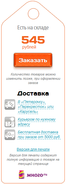
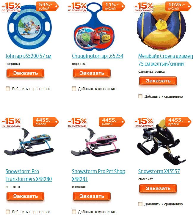
Добавить в корзину
<a href="#" class="button7">кнопка</a>
<a href="#" class="button7">кнопка</a>
Как у Сбербанка
<a href="#" class="button24">кнопка</a>
Кнопка с градиентом
Градиенты плохо поддаются анимации, плавной смене цвета фона. Что же делать? Ответ: box-shadow [перейдите по ссылке, там есть суперская форма входа].
Купить
<a href="#" class="button10">кнопка</a>
А вот всякие перемещения работают на ура.
Забронировать
<a href="#" class="button12" tabindex="0">кнопка</a>
Довольно популярно разделение кнопки на два цвета
Положить в корзину
<a href="#" class="button25">кнопка</a>
Красивые кнопки CSS
10 999 р.
<a href="#" class="button11">кнопка</a>
Как у Google
<a href="#" class="button15">кнопка</a>
<a href="#" class="button17" tabindex="0">кнопка</a>
Заказать
<a href="#" class="button21">Заказать</a>
<a href="#" class="button28">Установить</a>
Кнопки «Скачать» CSS
Скачать
бесплатно первые 30 дней Автор
<a href="#" class="button13">Скачать
бесплатно первые 30 дней</a>
скачать
<a href="#" class="button14">Скачать</a>
Стилизация кнопок с помощью CSS
Анимированная кнопка: «свечение текста»
<input type="button" class="button4" value="Купить">
<input type="button" class="knopka01" value="запись">
Стиль кнопок с бликами
Глянцевая кнопка
<a href="#" class="button1">кнопка</a>
<a href="#" class="button9">кнопка</a>
Заказать билеты
<a href="#" class="knopka01">кнопка</a>
<a href="#" class="button5" data-twitter>twitter</a>
<a href="#" class="button16">кнопка</a>
<a href="#" class="button18" tabindex="0">кнопка</a>
1 2 3
<a href="#" class="button27">1</a>
Объёмная кнопка CSS
Объёмная
<a href="#" class="button19">кнопка</a>
кнопка Автор
<a href="#" class="button">кнопка</a>
сделать
заказ Автор
<a href="#" class="button20">Объёмная</a>
положить в корзину
<a href="#" class="button23">Объёмная</a>
Вдавленная кнопка
Оформить
<a href="#" class="button22">Заказать</a>
Выпуклая кнопка HTML
<a href="#" class="boxShadow4">Заказать</a>
Круглые CSS кнопки
<a href="#" class="button29"></a>
+
<a href="#" class="button30">+</a>
Анимированная кнопка CSS
Анимированное заполнение происходит так (тут нет лишнего кода, связанного с кнопкой). Другие интересные эффекты загрузки можно найти тут [tympanus.net].
<a href="#" class="button26" tabindex="0"><span></span></a>
<a href="#" class="button31" tabindex="0"></a>
3d кнопка CSS
<a href="#" class="button2" tabindex="0">кнопка</a>
Оформление кнопок
Кнопки сайта следует выполнять в едином стиле, чтобы не оставалось сомнений, что если здесь нажать, то произойдёт какое-то действо.
Кнопка с главным действием должна выделяться из общего содержания, быть контрастной. Тут главное не переусердствовать. Так, например, у интернет магазина e5 это приятно для глаза:
А тут с оранжевым явный перебор, даже на изображении сложно остановить взгляд:
Именно поэтому у Google второстепенные кнопки сначала плоские, а после наведения мышки обретают объём.
Также нужно победить желание сделать кнопку величиной со слона, чтобы не стать объектом баннерной слепоты.
In this article you’ll see how to style a button using CSS.
My goal here is mostly to showcase how different CSS rules and styles are applied and used. We won’t see much design inspiration nor will we discuss ideas for styling.
Instead, this will be more of an overview of how the styles themselves work, what properties are commonly used, and how they can be combined.
You’ll first see how to create a button in HTML. Then you’ll learn how to override the default styles of buttons. Lastly, you’ll get a glimpse of how to style buttons for their three different states.
Here’s an Interactive Scrim of CSS Button Style
Table of Contents
- Create a button in HTML
- Change default styling of buttons
- Change the background color
- Change text color
- Change the border style
- Change the size
- Style button states
- Style hover state
- Style focus state
- Style active state
- Conclusion
Let’s get started!
How to Create a Button in HTML
To create a button, use the <button> element.
This is a more accessible and semantic option compared to using a generic container which is created with the <div> element.
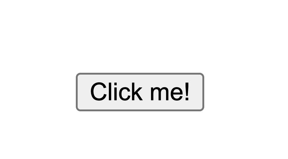
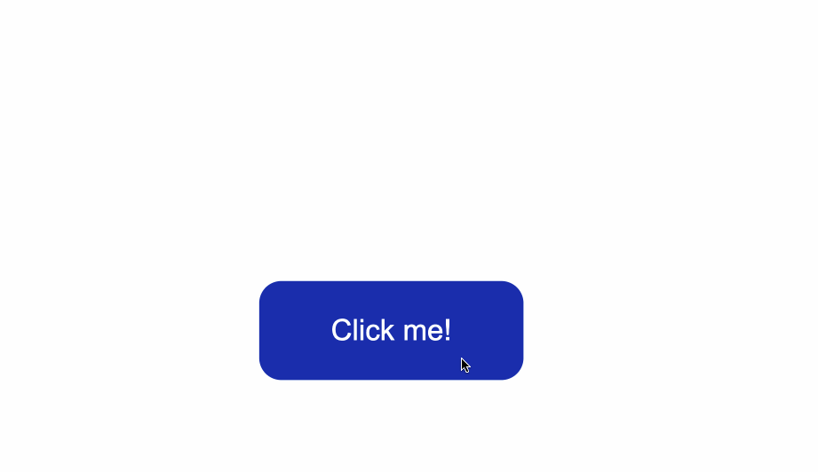
In the index.html file below, I’ve created the basic structure for a webpage and added a single button:
<!DOCTYPE html>
<html lang="en">
<head>
    <meta charset="UTF-8">
    <meta http-equiv="X-UA-Compatible" content="IE=edge">
    <meta name="viewport" content="width=device-width, initial-scale=1.0">
    <link rel="stylesheet" href="style.css">
    <title>CSS Button Style</title>
</head>
<body>
    <button type="button" class="button">Click me!</button>
</body>
</html>
Let’s break down the line <button type="button" class="button">Click me!</button>:
- You first add the button element, which consists of an opening
<button>and closing</button>tag. - The
type="button"attribute in the opening<button>tag explicitly creates a clickable button. Since this particular button is not used for submitting a form, it is useful for semantic reasons to add it in order to make the code clearer and not trigger any unwanted actions. - The
class="button"attribute will be used to style the button in a separate CSS file. The valuebuttoncould be any other name you choose. For example you could have usedclass="btn". - The text
Click me!is the visible text inside the button.
Any styles that will be applied to the button will go inside a spearate style.css file.
You can apply the styles to the HTML content by linking the two files together. You do this with the <link rel="stylesheet" href="style.css"> tag which was used in index.html.
In the style.css file, I’ve added some styling which only centers the button in the middle of the browser window.
Notice that the class="button" is used with the .button selector. This is a way to apply styles directly to the button.
* {
    box-sizing: border-box;
}

body {
    display:flex;
    justify-content: center;
    align-items: center;
    margin:50px auto;
}

.button {
    position: absolute;
    top:50%
}
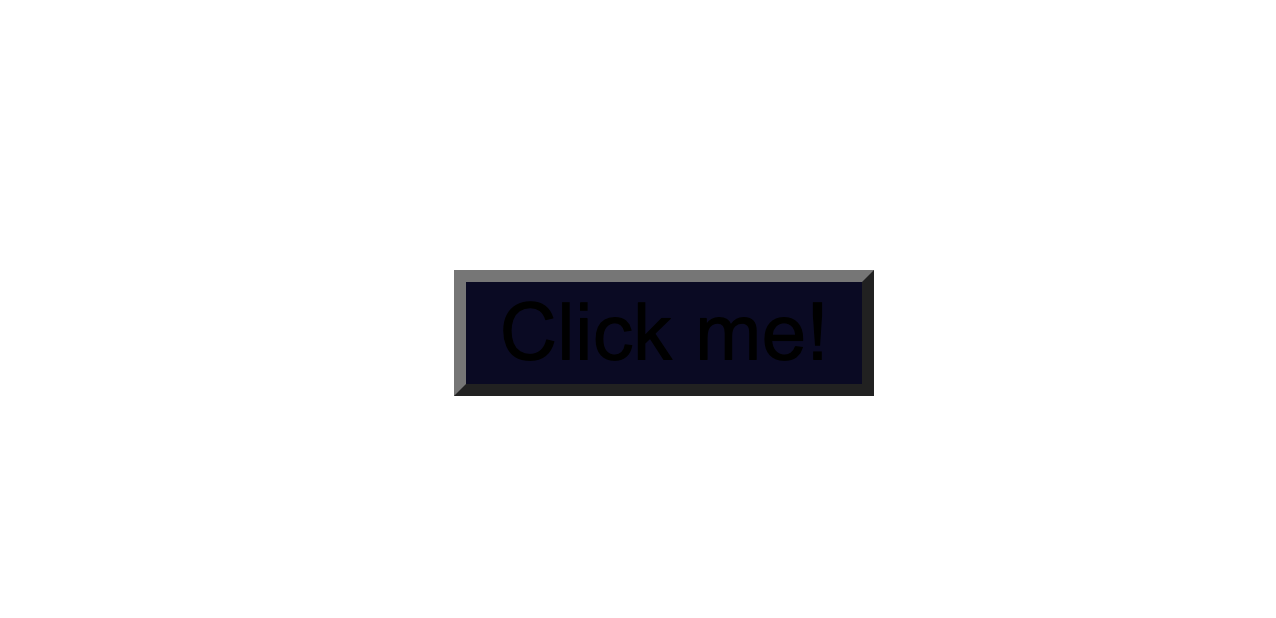
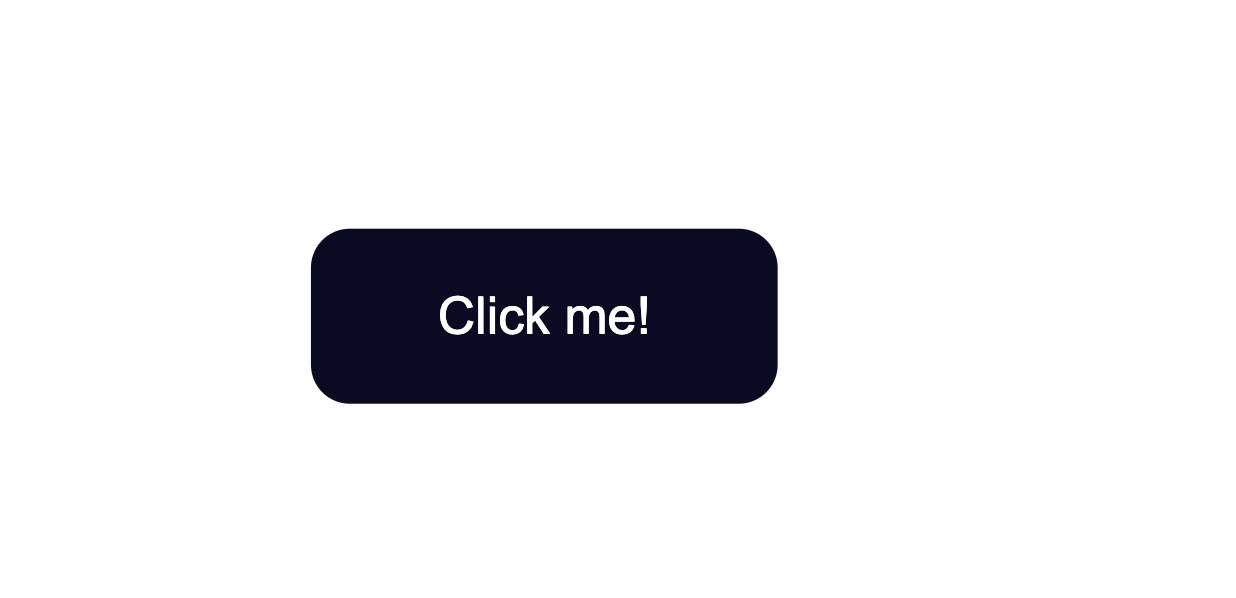
The code from above will result in the following:
The default styling of buttons will vary depending on the browser you’re using.
This is an example of how the native styles for buttons look on the Google Chrome browser.
How to Change the Default Styling of Buttons
How to Change the Background Color of Buttons
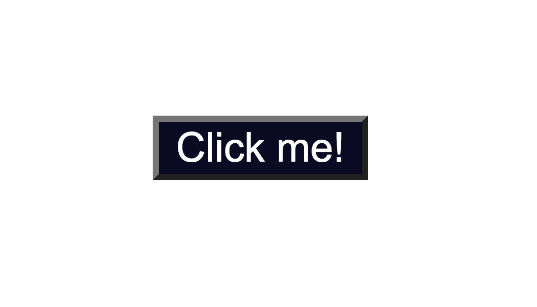
To change the background color of the button, use the CSS background-color property and give it a value of a color of your taste.
In the .button selector, you use background-color:#0a0a23; to change the background color of the button.
.button {
    position: absolute;
    top:50%;
    background-color:#0a0a23;
}
How to Change the Text Color of Buttons
The default color of text is black, so when you add a dark background color you will notice that the text has disappeared.
Another thing to make sure of is that there is enough contrast between the button’s background color and text color. This helps make the text more readable and easy on the eyes.
Next, use the color property to change the color of text:
.button {
    position: absolute;
    top:50%;
    background-color:#0a0a23;
    color: #fff;
}
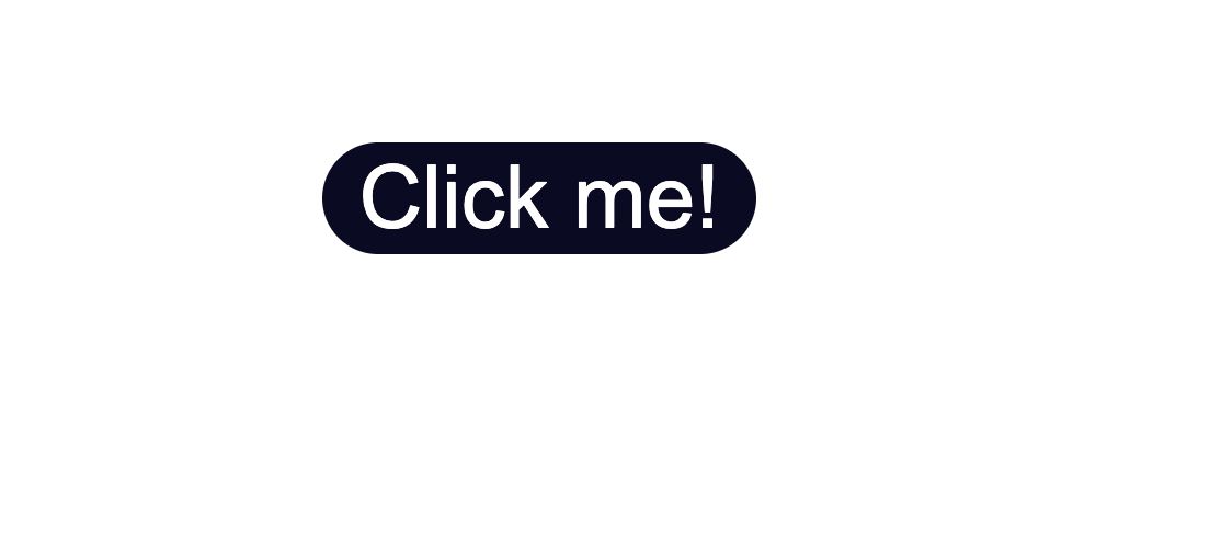
How to Change the Border Style of Buttons
Notice the grey around the edges of the button? That is the default color of the button’s borders.
One way to fix this is to use the border-color property. You set the value to be the same as the value of background-color. This makes sure the borders have the same color as the background of the button.
Another way would be to remove the border around the button entirely by using border:none;.
.button {
  position: absolute;
  top:50%;
  background-color:#0a0a23;
  color: #fff;
  border:none;
}

Next, you can also round-up the edges of the button by using the border-radius property, like so:
.button {
    position: absolute;
    top:50%;
    background-color:#0a0a23;
    color: #fff;
    border:none;
    border-radius:10px;
  }
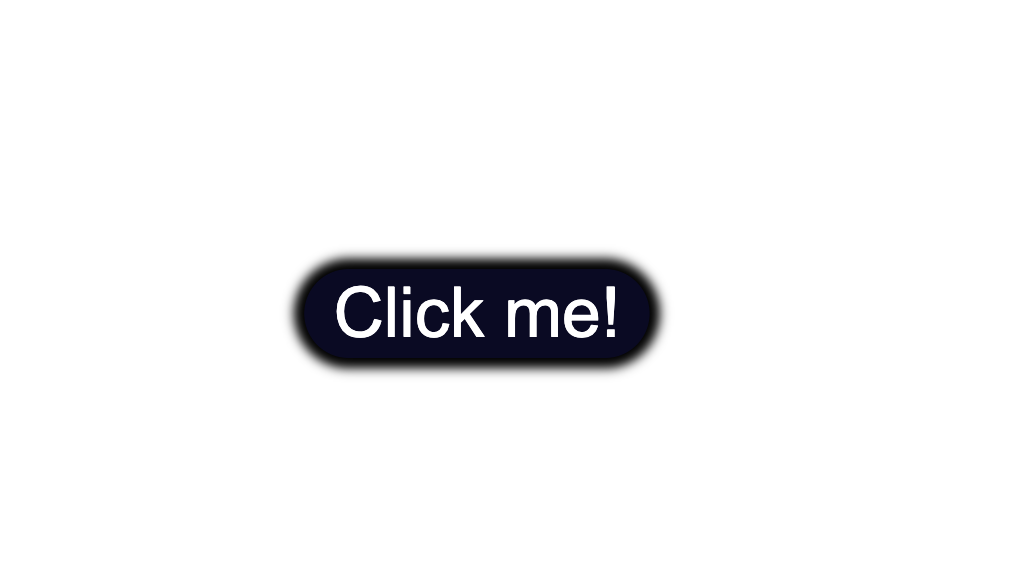
You could also add a slight dark shadow effect around the button by using the box-shadow property:
 position: absolute;
    top:50%;
    background-color:#0a0a23;
    color: #fff;
    border:none;
    border-radius:10px;
    box-shadow: 0px 0px 2px 2px rgb(0,0,0);
How to Change the Size of Buttons
The way to create more space inside the button’s borders is to increase the padding of the button.
Below I added a value of 15px for the top, bottom, right, and left padding of the button.
I also set a minimum height and width, with the min-height and min-width properties respectively. Buttons need to be large enough for all different kind of devices.
.button {
    position: absolute;
    top:50%;
    background-color:#0a0a23;
    color: #fff;
    border:none;
    border-radius:10px;
    padding:15px;
    min-height:30px;
    min-width: 120px;
  }
How to Style Button States
Buttons have three different states:
:hover:focus:active
It’s best that the three states are styled differently and don’t share the same styles.
In the following sections I’ll give a brief explanation on what each one of the states mean and what triggers them. You’ll also see some ways you can style the button for each separate state.
Here’s an interactive scrim about styling button states:
How to Style :hover States
The :hover state becomes present when a user hovers over a button, by bringing their mouse or trackpad over it, without selecting it or clicking on it.
To change the button’s styles when you hover over it, use the :hover CSS
pseudoclass selector.
A common change to make with :hover is switching the background-color of the button.
To make the change less sudden, pair :hover with the transition property.
The transition property will help make the transition from no state to a :hover state much smoother.
The change of background color will happen a bit slower than it would without the transition property. This will also help make the end result less jarring for the user.
.button:hover {
      background-color:#002ead;
      transition: 0.7s;
  }
In the example above, I used a Hex color code value to make the background color a lighter shade for when I hover over the button.
With the help of the transition property I also caused a delay of 0.7s when the transition from no state to a :hover state happens. This caused a slower transition from the original #0a0a23 background color to the #002ead background color.

Keep in mind that the :hover pseudoclass does not work for mobile device screens and mobile apps. Choose to use hover effects only for desktop web applications and not touch screens.
How to Style :focus States
The :focus state takes effect for keyboard users — specifically it will activate when you focus on a button by hitting the Tab key (⇥).
If you’re following along, when you focus on the button after pressing the Tab key, you’ll see the following:
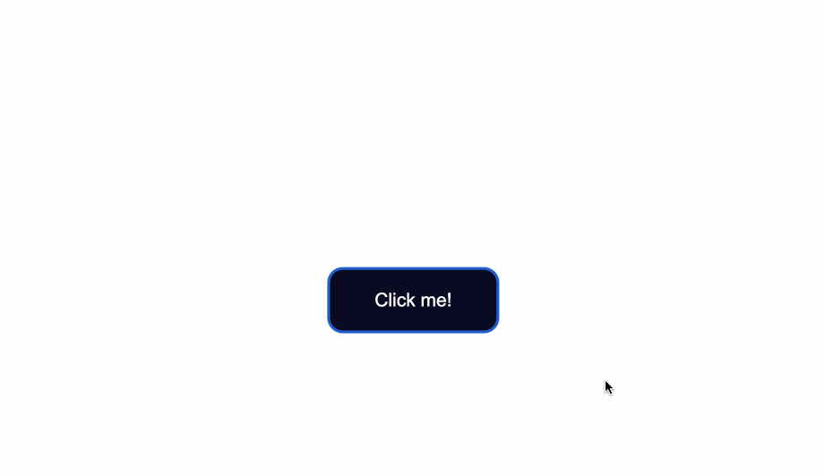
Notice the slight light blue outline around the button when it’s gained focus?
Browsers have default styling for the :focus pseudoclass, for accessibility keyboard navigation purposes. It’s not a good idea to remove that outline altogether.
You can however create custom styles for it and make it easily detectable.
A way to do so is by setting the outline color to first be transparent.
Following that, you can maintain the outline-style to solid. Lastly, using the box-shadow property, you can add a color of your liking for when the element is focused on:
 .button:focus {
    outline-color: transparent;
    outline-style:solid;
    box-shadow: 0 0 0 4px #5a01a7;
}
You can also again pair these styles with the transition property, depending on the effect you want to achieve:
  .button:focus {
    outline-color: transparent;
    outline-style:solid;
    box-shadow: 0 0 0 4px #5a01a7;
    transition: 0.7s;
}
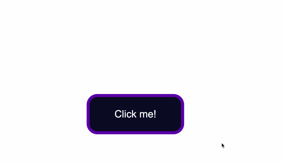
How to Style for the :active State
The :active state gets activated when you click on the button by either clicking the computer’s mouse or pressing down on the laptop’s trackpad.
That being said, look at what happens when I click the button after I’ve applied and kept the styles for the :hover and :focus states:
The :hover state styles are applied before clicking when I hover over the button.
The :focus state styles are applied also, because when a button is clicked it also gains a :focus state alongside an :active one.
However, keep in mind that they are not the same thing.
:focus state is when an element is being focused on and :active is when a user clicks on an element by holding and pressing down on it.
To change the style for when a user clicks a button, apply styles to the :active CSS pseudoselector.
In this case, I’ve changed the background color of the button when a user clicks on it
.button:active {
    background-color: #ffbf00;
}

Conclusion
And there you have it! You now know the basics of how to style a button with CSS.
We went over how to change the background color and text color of buttons as well as how to style buttons for their different states.
To learn more about web design, check out freeCodeCamp’s Responsive Web Design Certification. In the interactive lessons, you’ll learn HTML and CSS by building 15 practice projects and 5 certification projects.
Note that the above cert is still in beta — if you want the latest stable version, check here.
Thanks for reading and happy coding!
Learn to code for free. freeCodeCamp’s open source curriculum has helped more than 40,000 people get jobs as developers. Get started
In this article you’ll see how to style a button using CSS.
My goal here is mostly to showcase how different CSS rules and styles are applied and used. We won’t see much design inspiration nor will we discuss ideas for styling.
Instead, this will be more of an overview of how the styles themselves work, what properties are commonly used, and how they can be combined.
You’ll first see how to create a button in HTML. Then you’ll learn how to override the default styles of buttons. Lastly, you’ll get a glimpse of how to style buttons for their three different states.
Here’s an Interactive Scrim of CSS Button Style
Table of Contents
- Create a button in HTML
- Change default styling of buttons
- Change the background color
- Change text color
- Change the border style
- Change the size
- Style button states
- Style hover state
- Style focus state
- Style active state
- Conclusion
Let’s get started!
How to Create a Button in HTML
To create a button, use the <button> element.
This is a more accessible and semantic option compared to using a generic container which is created with the <div> element.
In the index.html file below, I’ve created the basic structure for a webpage and added a single button:
<!DOCTYPE html>
<html lang="en">
<head>
    <meta charset="UTF-8">
    <meta http-equiv="X-UA-Compatible" content="IE=edge">
    <meta name="viewport" content="width=device-width, initial-scale=1.0">
    <link rel="stylesheet" href="style.css">
    <title>CSS Button Style</title>
</head>
<body>
    <button type="button" class="button">Click me!</button>
</body>
</html>
Let’s break down the line <button type="button" class="button">Click me!</button>:
- You first add the button element, which consists of an opening
<button>and closing</button>tag. - The
type="button"attribute in the opening<button>tag explicitly creates a clickable button. Since this particular button is not used for submitting a form, it is useful for semantic reasons to add it in order to make the code clearer and not trigger any unwanted actions. - The
class="button"attribute will be used to style the button in a separate CSS file. The valuebuttoncould be any other name you choose. For example you could have usedclass="btn". - The text
Click me!is the visible text inside the button.
Any styles that will be applied to the button will go inside a spearate style.css file.
You can apply the styles to the HTML content by linking the two files together. You do this with the <link rel="stylesheet" href="style.css"> tag which was used in index.html.
In the style.css file, I’ve added some styling which only centers the button in the middle of the browser window.
Notice that the class="button" is used with the .button selector. This is a way to apply styles directly to the button.
* {
    box-sizing: border-box;
}

body {
    display:flex;
    justify-content: center;
    align-items: center;
    margin:50px auto;
}

.button {
    position: absolute;
    top:50%
}
The code from above will result in the following:
The default styling of buttons will vary depending on the browser you’re using.
This is an example of how the native styles for buttons look on the Google Chrome browser.
How to Change the Default Styling of Buttons
How to Change the Background Color of Buttons
To change the background color of the button, use the CSS background-color property and give it a value of a color of your taste.
In the .button selector, you use background-color:#0a0a23; to change the background color of the button.
.button {
    position: absolute;
    top:50%;
    background-color:#0a0a23;
}
How to Change the Text Color of Buttons
The default color of text is black, so when you add a dark background color you will notice that the text has disappeared.
Another thing to make sure of is that there is enough contrast between the button’s background color and text color. This helps make the text more readable and easy on the eyes.
Next, use the color property to change the color of text:
.button {
    position: absolute;
    top:50%;
    background-color:#0a0a23;
    color: #fff;
}
How to Change the Border Style of Buttons
Notice the grey around the edges of the button? That is the default color of the button’s borders.
One way to fix this is to use the border-color property. You set the value to be the same as the value of background-color. This makes sure the borders have the same color as the background of the button.
Another way would be to remove the border around the button entirely by using border:none;.
.button {
  position: absolute;
  top:50%;
  background-color:#0a0a23;
  color: #fff;
  border:none;
}
Next, you can also round-up the edges of the button by using the border-radius property, like so:
.button {
    position: absolute;
    top:50%;
    background-color:#0a0a23;
    color: #fff;
    border:none;
    border-radius:10px;
  }
You could also add a slight dark shadow effect around the button by using the box-shadow property:
 position: absolute;
    top:50%;
    background-color:#0a0a23;
    color: #fff;
    border:none;
    border-radius:10px;
    box-shadow: 0px 0px 2px 2px rgb(0,0,0);
How to Change the Size of Buttons
The way to create more space inside the button’s borders is to increase the padding of the button.
Below I added a value of 15px for the top, bottom, right, and left padding of the button.
I also set a minimum height and width, with the min-height and min-width properties respectively. Buttons need to be large enough for all different kind of devices.
.button {
    position: absolute;
    top:50%;
    background-color:#0a0a23;
    color: #fff;
    border:none;
    border-radius:10px;
    padding:15px;
    min-height:30px;
    min-width: 120px;
  }
How to Style Button States
Buttons have three different states:
:hover:focus:active
It’s best that the three states are styled differently and don’t share the same styles.
In the following sections I’ll give a brief explanation on what each one of the states mean and what triggers them. You’ll also see some ways you can style the button for each separate state.
Here’s an interactive scrim about styling button states:
How to Style :hover States
The :hover state becomes present when a user hovers over a button, by bringing their mouse or trackpad over it, without selecting it or clicking on it.
To change the button’s styles when you hover over it, use the :hover CSS
pseudoclass selector.
A common change to make with :hover is switching the background-color of the button.
To make the change less sudden, pair :hover with the transition property.
The transition property will help make the transition from no state to a :hover state much smoother.
The change of background color will happen a bit slower than it would without the transition property. This will also help make the end result less jarring for the user.
.button:hover {
      background-color:#002ead;
      transition: 0.7s;
  }
In the example above, I used a Hex color code value to make the background color a lighter shade for when I hover over the button.
With the help of the transition property I also caused a delay of 0.7s when the transition from no state to a :hover state happens. This caused a slower transition from the original #0a0a23 background color to the #002ead background color.
Keep in mind that the :hover pseudoclass does not work for mobile device screens and mobile apps. Choose to use hover effects only for desktop web applications and not touch screens.
How to Style :focus States
The :focus state takes effect for keyboard users — specifically it will activate when you focus on a button by hitting the Tab key (⇥).
If you’re following along, when you focus on the button after pressing the Tab key, you’ll see the following:
Notice the slight light blue outline around the button when it’s gained focus?
Browsers have default styling for the :focus pseudoclass, for accessibility keyboard navigation purposes. It’s not a good idea to remove that outline altogether.
You can however create custom styles for it and make it easily detectable.
A way to do so is by setting the outline color to first be transparent.
Following that, you can maintain the outline-style to solid. Lastly, using the box-shadow property, you can add a color of your liking for when the element is focused on:
 .button:focus {
    outline-color: transparent;
    outline-style:solid;
    box-shadow: 0 0 0 4px #5a01a7;
}
You can also again pair these styles with the transition property, depending on the effect you want to achieve:
  .button:focus {
    outline-color: transparent;
    outline-style:solid;
    box-shadow: 0 0 0 4px #5a01a7;
    transition: 0.7s;
}
How to Style for the :active State
The :active state gets activated when you click on the button by either clicking the computer’s mouse or pressing down on the laptop’s trackpad.
That being said, look at what happens when I click the button after I’ve applied and kept the styles for the :hover and :focus states:
The :hover state styles are applied before clicking when I hover over the button.
The :focus state styles are applied also, because when a button is clicked it also gains a :focus state alongside an :active one.
However, keep in mind that they are not the same thing.
:focus state is when an element is being focused on and :active is when a user clicks on an element by holding and pressing down on it.
To change the style for when a user clicks a button, apply styles to the :active CSS pseudoselector.
In this case, I’ve changed the background color of the button when a user clicks on it
.button:active {
    background-color: #ffbf00;
}
Conclusion
And there you have it! You now know the basics of how to style a button with CSS.
We went over how to change the background color and text color of buttons as well as how to style buttons for their different states.
To learn more about web design, check out freeCodeCamp’s Responsive Web Design Certification. In the interactive lessons, you’ll learn HTML and CSS by building 15 practice projects and 5 certification projects.
Note that the above cert is still in beta — if you want the latest stable version, check here.
Thanks for reading and happy coding!
Learn to code for free. freeCodeCamp’s open source curriculum has helped more than 40,000 people get jobs as developers. Get started
Тег <button> используется для создания интерактивных кнопок на веб-странице. В отличие от одинарного тега <input> (с атрибутом type=”button”), при помощи которого также можно создавать кнопки, содержимым тега <button> может быть как текст, так и изображение.
Если вы хотите создать кнопку в HTML форме, используйте элемент <input>, так как браузеры по-разному отображают содержимое тега <button>.
Содержимое тега пишется между открывающим <button> и закрывающим </button> тегами.
Пример
<!DOCTYPE html>
<html>
   <head>
       <title>Заголовок документа</title>
   </head>
   <body>
	<h1>Вот наша кнопка..</h1>
	<button type="button">Нажать</button>
   </body>
</html>
Результат

К тегу <button> можно применять CSS стили для изменения внешнего вида кнопки, ее размера, цвета, шрифта текста и т.д.
Пример
<!DOCTYPE html>
<html>
  <head>
    <title>Заголовок документа</title>
  </head>
  <body>
    Обычная кнопка
    <button type="button">Добавить в корзину</button>
    <hr />
    Кнопка с красным текстом
    <button type="button" style="color: red;"><b>Книга HTML</b></button>
    <hr />
    Кнопка с увеличенным размером шрифта
    <button type="button" style="font: bold 14px Arial;">Загрузить книгу </button><br />
  </body>
</html>
Результат

У тега <button> нет обязательных атрибутов, однако мы рекомендуем всегда использовать атрибут type=”button”, если тег используется в качестве обычной кнопки.
Тег <button> поддерживает глобальные атрибуты и атрибуты событий.
Приветствую! В этой статье хочу поговорить про кнопки, на мой взгляд один из важнейших элементов в дизайне сайтов и приложений. Ведь, в большинстве случаев, кнопки нужны для того, чтобы заставить пользователя выполнить какое-либо действие (подписаться на рассылку, добавить товар в корзину, оставить комментарий, заказать обратный звонок и т.д.), которое можно так или иначе монетизировать. Мы же здесь не просто так собрались 
Итак из этой статьи вы узнаете:
- Для чего нужны кнопки и какие функции они выполняют
- Какие бывают кнопки и в чем их различия
- Как сделать кнопку в HTML
- Как сделать красивую кнопку в HTML и CSS
Также в конце статьи вас ждет небольшой бонус, который пригодится каждому сайтостроителю.
Но давайте по порядку…
Для чего нужны кнопки на сайте?
Ответ напрашивается сам собой: “Для того, чтобы их нажимали!”. И, действительно, выделяющаяся симпатичная кнопка привлекает гораздо больше внимания чем тусклая и унылая ссылка. С другой стороны, если вся страница заполнена разномастными кнопками, которые, переливаясь и моргая, требуют внимания пользователя, он, скорее всего, не поняв, что от него требуется, не нажмет ни на одну и просто закроет вкладку.
Поэтому использовать кнопки надо “экономно”, в идеале не больше 1-2 в видимой области экрана. При этом пользователю должно быть максимально понятно, что произойдет, если он нажмет на кнопку.
Какие бывают кнопки?
В моем представлении кнопки бываю двух типов, для каждого из них я использую соответствующие HTML-теги:
Кнопки-ссылки нужны для привлечения внимания к ссылке. Побуждают пользователя перейти на какую-либо страницу, например, страницу регистрации. Для них я использую тег <a>.
Кнопки-действия нужны для совершения какого-либо действия на странице (отправка формы, открытие модального окна и т.д.). Для этого можно использовать теги <input> или <button>. Я предпочитаю второй вариант, т.к. он гораздо более гибкий в настройке.
Хотя оба этих типа могут выглядеть одинаково (при помощи CSS), принципиальное их отличие в том, что важнейшим атрибутом тега <a> является href (цель ссылки), без которого этот тег даже не воспринимается браузером как ссылка и курсор при наведении на него не меняется на pointer. Это поведение, конечно, можно изменить при помощи “костылей”
a {
  cursor: pointer;
}
или
<a href="#">Кнопка</a>В то же время атрибут href является невалидным для тега <button>, поэтому его не стоит использовать в качестве кнопки-ссылки. Опять же, можно сделать кнопку ссылкой, придумав какие-нибудь “костыли” типа
<button onClick="javascript:window.location.href='http://example.com';"></button>Но зачем это нужно. Все гораздо проще и понятнее.
Если кнопка нужна для перехода на страницу — используем
<a>, во всех остальных случаях —<button>
Как сделать кнопку в HTML?
Итак, как я уже сказал, кнопки можно добавлять при помощи трех тегов <a>, <button> и <input>. Каждый из этих тегов имеет свои особенности и атрибуты и используется для разных целей.
Сделать кнопку-ссылку при помощи тега <a>, по сути, сводится к описанию его стилей в CSS. О стилях поговорим чуть позже.
<a class="button" href="http://example.com" target="_blank">Перейти на сайт</a>Тег <button> используется для создания кнопок, при нажатии на которые должны происходить какие-либо действия, например отправка формы, очистка формы, открытие модального окна, загрузка изображения и т.д.
<button class="button">Выполнить действие</button>Основными атрибутами таких кнопок являются:
type: button | submit | reset
Тип кнопки. Это необязательный параметр, и его можно пропустить. Если кнопка находится внутри формы и атрибут type отсутствует, браузер посчитает, что тип кнопки — submit и попытается отправить форму обработчику.
form
Несмотря на слухи, которые ходят в интернете, о том, что тег <button> должен располагаться только внутри тегов <form>, на самом деле это не так  Если вдруг по какой-то причине Вам нужно или хочется поместить свою кнопку вне формы, которую она должна отправлять/сбрасывать/еще-что-то-делать, просто используйте атрибут
 form со значением соответствующим атрибуту id этой формы.
Кроме того, у тега button могут быть следующие атрибуты:
autofocus— Автоматически устанавливает фокус браузера на кнопке при загрузке страницыdisabled— Кнопка заблокирована и нажатие на нее не выполняет никаких действийformaction(только для типа submit) — адрес обработчика формы, на который отправляются данные из формыformenctype(только для типа submit) — Тип отправляемых данных. Может бытьapplication/x-www-form-urlencoded,multipart/form-data,text/plainformmethod(только для типа submit) — HTTP-метод, при помощи которого пересылаются данные. Может бытьgetилиpostformnovalidate(только для типа submit) — Отключает автоматическую валидацию введенных данныхformtarget(только для типа submit) — Указывает на то, как выводится результат обработки формы. Может быть_blank,_self,_parent,_topили значение атрибутаnameфреймаname— Имя кнопки (можно использовать если, например, в форме есть несколько кнопок, которые ее отправляют, и обработчику нужно знать, какая из них нажата)value— Значение кнопки (смысл примерно тот же, что и с name)
Совет: используйте только быстрый и надёжный хостинг для своих сайтов, например Beget.com
Как сделать красивую кнопку в HTML и CSS?
У каждого из нас свое представление о красоте: кто-то считает красивым закат на берегу моря, а кто-то — Ниссан Жук. О вкусах, как говорится, не спорят.
В моем представлении красивая кнопка — это кнопка, которая обладает следующими качествами:
Является интерактивной (т.е. реагирует на взаимодействие с ней пользователем). Отличительной чертой кнопок, является то, что их можно нажимать, следовательно у кнопки должно быть несколько состояний: дефолтное (состояние «покоя»), нажатое и «ховер» (при наведение курсора)
Выделяется на фоне других элементов. Посетители вашего сайта в основном бегло сканируют страницу в поисках нужной им информации. Если вам нужно, чтобы они нажимали на кнопки, сделайте их максимально заметными, контрастными. Главное не перестарайтесь.
Выглядит привычно и современно. Ваши посетители постоянно взаимодействуют с интерфейсами других сайтов и приложений. Поэтому они привыкли, что кнопки выглядят именно так, а не иначе. Если, в попытке привлечь их внимание, вы будете изобретать велосипед, пользователи могут просто не понять, что это кнопка.
Кроме того, тренды в дизайне интерфейсов и технологии их создания постоянно меняются, и за ними нужно успевать.
Если вы хотите узнать как сделать кнопку объемной или с эффектом «стекляшечности», как сделать картинку кнопкой и т.д. — почитайте статьи по дизайну интерфейсов за 2005-2009 гг.
Еще одним пунктом я бы добавил, расположение кнопки в привычных для посетителей местах (например, кнопки входа/регистрации в правом верхнем углу, или кнопка отправки формы под формой). Но это уже больше относится к дизайну всей страницы.
Итак, давайте для начала сделаем две обычные кнопки, одна из которых должна открывать модальное окно (кнопка-действие — <button>) с формой для входа, а вторая — вести на страницу регистрации (кнопка-ссылка — <a>). При этом обе кнопки будут выполнены в одной стилистике.
<button id="login" class="button blue">
  <i class="fa fa-unlock"></i>
  <span>Войти</span>
</button>

<a id="register" class="button purple" href="/register">
  <i class="fa fa-user-plus"></i>
  <span>Зарегистрироваться</span>
</a>
Для вывода иконок в кнопках, да и, в общем-то, везде я использую замечательный шрифт FontAwesome, а для текста — бесплатный шрифт Roboto, с которым одинаково хорошо смотрятся как кириллические, так и латинские символы.
@import url('https://cdnjs.cloudflare.com/ajax/libs/font-awesome/5.9.0/css/all.min.css');
@import url('https://fonts.googleapis.com/css?family=Roboto');
.button {
/* Сбрасываем дефолтные стили */
border: none;
outline: none;
display: inline-block;
text-align: center;
text-decoration: none;
cursor: pointer;
font-size: 16px;
/* Можно также использовать любые встроенные и кастомные шрифты, например, отсюда */
font-family: Roboto, Verdana, Tahoma, sans;
/* Тут можно поэкспериментировать */
padding: 12px 16px;
border-radius: 100px;
color: #fff;
}
.button i {
margin-right: 4px;
}
.button + .button {
margin-left: 6px;
}
.button.blue {
background: #2196F3;
}
.button.purple {
background: #9b59b6;
}Теперь добавим интерактивности: при наведении кнопки будут слегка подсвечиваться, а при нажатии затемняться (как бы утапливаться).
.button:hover {
  box-shadow: 0 1px 3px rgba(0, 0, 0, 0.2);
}
.button:hover.blue {
  background: #39a1f4;
}
.button:hover.purple {
  background: #a66bbe;
}
.button:active {
  box-shadow: inset 0 1px 3px rgba(0, 0, 0, 0.2);
  text-shadow: 0 1px 3px rgba(0, 0, 0, 0.2);
}
.button:active.blue {
  background: #0d8aee;
}
.button:active.purple {
  background: #8f4bab;
}
Вот и все! Две симпатичные кнопки готовы.
При наличии желания и времени можно их дополнить плавными анимированными переходами. Вот несколько примеров:
А теперь обещанный бонус для тех кто дочитал этот пост до конца.
Красивая анимированная кнопка наверх для сайта
HTML
<div id="scroll-top">
<button><span data-hover="Наверх"><i class="fa fa-arrow-up"></i></span></button>
</div>
CSS
#scroll-top {
  position: fixed;
  bottom: 48px;
  right: 48px;
}

#scroll-top button {
  position: relative;
  overflow: hidden;
  height: 48px;
  width: 48px;
  border: none;
  outline: none;
  cursor: pointer;
  color: rgba(0, 0, 0, 0.3);
  font-size: 16px;
  background: #21c984;
  transition: width 0.5s;
  border-radius: 100px;
  box-shadow: 0 10px 20px rgba(0, 0, 0, 0.19), 0 6px 6px rgba(0, 0, 0, 0.23);
}

#scroll-top button span {
  display: inline-block;
  transition: opacity 0.3s ease 0s, transform 0.5s ease 0s;
  line-height: 48px;
  font-size: 20px;
  width: 100%;
}

#scroll-top button span::before {
  width: 100%;
  position: absolute;
  left: 0px;
  top: 200%;
  opacity: 0;
  content: attr(data-hover);
  -webkit-transform: translate3d(0, 0, 0);
  -moz-transform: translate3d(0, 0, 0);
  transform: translate3d(0, 0, 0);
  color: #fff;
  font-size: 16px;
  text-transform: uppercase;
}

#scroll-top:hover button {
  width: 120px;
  background: #9b59b6;
}

#scroll-top:hover button span {
  -webkit-transform: translateY(-200%);
  -moz-transform: translateY(-200%);
  transform: translateY(-200%);
}

#scroll-top:hover button span:before {
  opacity: 1;
}

#scroll-top button:active {
  background: #21c984;
}
JS (jQuery)
jQuery(document).ready(function($) {
  $("#scroll-top > button").on("click", function(e) {
    var body = $("html, body");
    body.stop().animate({ scrollTop: 0 }, 500, "swing");
  });
});
В итоге должно получиться что-то похожее на это
Надеюсь, эта статья была для вас полезна. Буду рад ответить на ваши вопросы в комментариях.
Узнайте, как стиль кнопок с помощью CSS.
Основные стили кнопок
Пример
.button {
background-color: #4CAF50; /* Green */
border: none;
color: white;
padding: 15px 32px;
text-align: center;
text-decoration: none;
display: inline-block;
font-size: 16px;
}
Цвета кнопок
Используйте свойство background-color для изменения цвета фона кнопки:
Пример
.button1 {background-color: #4CAF50;} /* Green */
.button2
{background-color: #008CBA;} /* Blue */
.button3 {background-color:
#f44336;} /* Red */
.button4 {background-color: #e7e7e7; color: black;} /* Gray */
.button5
{background-color: #555555;} /* Black */
Размеры кнопок
Используйте свойство font-size для изменения размера шрифта кнопки:
Пример
.button1 {font-size: 10px;}
.button2 {font-size: 12px;}
.button3
{font-size: 16px;}
.button4 {font-size: 20px;}
.button5 {font-size: 24px;}
Используйте свойство padding для изменения заполнения кнопки:
Пример
.button1 {padding: 10px
24px;}
.button2 {padding: 12px 28px;}
.button3 {padding: 14px 40px;}
.button4 {padding: 32px 16px;}
.button5 {padding: 16px;}
Закругленные кнопки
Используйте свойство border-radius для добавления скругленных углов к кнопке:
Пример
.button1 {border-radius: 2px;}
.button2 {border-radius: 4px;}
.button3
{border-radius: 8px;}
.button4 {border-radius: 12px;}
.button5 {border-radius: 50%;}
Цветные границы кнопок
Используйте свойство border, чтобы добавить цветную рамку к кнопке:
Пример
.button1 {
background-color: white;
color: black;
border: 2px solid #4CAF50; /* Green */
}
…
Наведите кнопки
Используйте селектор :hover для изменения стиля кнопки при наведении на нее указателя мыши.
Совет: Используйте свойство transition-duration для определения скорости эффекта «Hover»:
Пример
.button {
-webkit-transition-duration: 0.4s; /* Safari */
transition-duration: 0.4s;
}
.button:hover {
background-color: #4CAF50; /* Green */
color: white;
}
…
Кнопки теней
Use the box-shadow property to add shadows to a button:
Пример
.button1 {
box-shadow: 0 8px 16px 0 rgba(0,0,0,0.2), 0 6px 20px 0
rgba(0,0,0,0.19);
}
.button2:hover {
box-shadow: 0 12px
16px 0 rgba(0,0,0,0.24), 0 17px 50px 0 rgba(0,0,0,0.19);
}
Отключенные кнопки
Используйте свойство opacity для добавления прозрачности к кнопке (создает «отключенный» вид).
Совет: Вы также можете добавить свойство cursor со значением «not-allowed», которое будет отображать «нет парковки знак» при наведении указателя мыши на кнопку:
Пример
.disabled {
opacity: 0.6;
cursor: not-allowed;
}
Ширина кнопки
По умолчанию размер кнопки определяется по ее текстовому содержимому (так же широко, как и ее содержимое). Используйте свойство width для изменения ширины кнопки:
Пример
.button1 {width: 250px;}
.button2 {width: 50%;}
.button3 {width:
100%;}
Группы кнопок
Удалите поля и добавьте float:left к каждой кнопке, чтобы создать группу кнопок:
Пример
.button {
float: left;
}
Группа кнопок на границе
Используйте свойство border для создания группы кнопок с рамками:
Пример
.button {
float: left;
border: 1px
solid green;
}
Вертикальная группа кнопок
Используйте display:block вместо float:left для группирования кнопок ниже друг друга, вместо того, чтобы бок о бок:
Пример
.button {
display: block;
}
Кнопка на картинке

Анимированные кнопки
Пример
Добавить стрелку на наведении:
Пример
Добавить «нажатия» эффект на кнопку:
Пример
Исчезать при наведении:
Пример
Добавить эффект «рябь» при щелчке:
Стилизация ссылок и кнопок на примере разных сайтов с поддержкой разными состояний – наведение курсора, нажатие, попадание в фокус и заблокированное состояние элемента.
1
Скругленная кнопка
<a class="btn" href="##">Link</a>
<input class="btn" type="button" value="Input">
<button class="btn">Button</button>
<button class="btn" disabled>Disabled</button>
HTML
.btn {
	display: inline-block;
	box-sizing: border-box;
	padding: 0 25px;
	margin: 0 15px 15px 0;
	outline: none;
	border: 1px solid #fff;
	border-radius: 50px;
	height: 46px;
	line-height: 46px;
	font-size: 14px;
	font-weight: 600;
	text-decoration: none;
	color: #444;
	background-color: #fff;
	box-shadow: 0 4px 6px rgb(65 132 144 / 10%), 0 1px 3px rgb(0 0 0 / 8%);
	cursor: pointer;
	user-select: none;
	appearance: none;
	touch-action: manipulation;
	vertical-align: top;
	transition: box-shadow 0.2s;
}
.btn:focus-visible {
	border: 1px solid #4c51f9;
	outline: none;
}
.btn:hover {
	transition: all 0.2s;
	box-shadow: 0 7px 14px rgb(65 132 144 / 10%), 0 3px 6px rgb(0 0 0 / 8%);
}
.btn:active {
	background-color: #808080;
}
.btn:disabled {
	background-color: #eee;
	border-color: #eee;
	color: #444;
	cursor: not-allowed;
}
CSS
Результат:
2
Двойная рамка
<a class="btn" href="##"><span>Link</span></a>
<button class="btn"><span>Button</span></button>
<button class="btn" disabled><span>Disabled</span></button>
HTML
.btn {
	display: inline-block;
	box-sizing: border-box;
	padding: 1px;
	margin: 0 15px 15px 0;
	outline: none;
	border: 1px solid #F18230;
	border-radius: 25px;
	height: 46px;
	line-height: 0;
	font-size: 14px;
	font-weight: 500;
	text-decoration: none;
	color: #fff;
	background-color: #fff;
	position: relative;
	overflow: hidden;
	vertical-align: top;
	cursor: pointer;
	user-select: none;
	appearance: none;
	touch-action: manipulation;
}
.btn span {
	display: block;
	box-sizing: border-box;
	padding: 0 25px;
	height: 42px;
	line-height: 38px;
	border: 1px solid #F18230;
	border-radius: 25px;
	font-size: 14px;
	color: #FFFFFF;
	background: linear-gradient(180deg, rgba(255, 255, 255, 0.25) 0%, rgba(255, 255, 255, 0) 100%), #F18230;
	text-align: center;
	font-weight: 600;
}
.btn:focus-visible {
	box-shadow: 0 0 0 3px lightskyblue;
}
.btn:hover span {
	background-color: #fba768
}
.btn:active span {
	background-color: #c17237 !important;
}
.btn:disabled {
	opacity: 0.65;
	pointer-events: none;
}
CSS
Результат:
3
Yahoo
<a class="btn" href="##">Link</a>
<input class="btn" type="button" value="Input">
<button class="btn">Button</button>
<button class="btn" disabled>Disabled</button>
HTML
.btn {
	display: inline-block;
	box-sizing: border-box;
	padding: 0 20px;
	margin: 0 15px 15px 0;
	outline: none;
	border: none;
	border-radius: 4px;
	height: 32px;
	line-height: 32px;
	font-size: 14px;
	font-weight: 500;
	text-decoration: none;
	color: #fff;
	background-color: #3775dd;
	box-shadow: 0 2px #21487f;
	cursor: pointer;
	user-select: none;
	appearance: none;
	touch-action: manipulation;
	vertical-align: top;
}
.btn:hover {
	background-color: #002fed;
}
.btn:active {
	background-color: #2f599e !important;
}
.btn:focus-visible {
	box-shadow: 0 0 0 3px lightskyblue;
}
.btn:disabled {
	background-color: #6c87b5;
	pointer-events: none;
}
CSS
Результат:
4
<a class="btn" href="##">Link</a>
<button class="btn">Button</button>
<button class="btn" disabled>Disabled</button>
HTML
const buttons = document.querySelectorAll(".btn");
buttons.forEach((button) => {
	button.onclick = function(e){
		let x = e.clientX - e.target.offsetLeft;
		let y = e.clientY - e.target.offsetTop;
		let ripple = document.createElement("span");
		ripple.style.left = `${x}px`;
		ripple.style.top = `${y}px`;
		this.appendChild(ripple);
		setTimeout(function(){
			ripple.remove();
		}, 600);
	}
});
JS
.btn {
	display: inline-block;
	box-sizing: border-box;
	padding: 0 15px;
	margin: 0 15px 15px 0;
	outline: none;
	border: none;
	border-radius: 4px;
	height: 36px;
	line-height: 36px;
	font-size: 14px;
	font-weight: 500;
	text-decoration: none;
	color: #fff;
	background-color: #1a73e8;
	position: relative;
	overflow:hidden;
	vertical-align: top;
	cursor: pointer;
	user-select: none;
	appearance: none;
	touch-action: manipulation;
	z-index: 1;
}
.btn span{
	position: absolute;
	background: #fff;
	transform: translate(-50%, -50%);
	border-radius: 50%;
	pointer-events: none;
	animation: btn_ripples 0.6s linear infinite;
}
@keyframes btn_ripples {
	0% {
		width: 0px;
		height: 0px;
		opacity: 0.5;
	}
	100% {
		width: 1000px;
		height: 1000px;
		opacity: 0;
	}
}
.btn:hover {
	box-shadow: 0 1px 2px 0 rgb(26 115 232 / 45%), 0 1px 3px 1px rgb(26 115 232 / 30%);
	background-color: #297be6;
}
.btn:active {
	box-shadow: 0 1px 2px 0 rgb(26 115 232 / 45%), 0 2px 6px 2px rgb(26 115 232 / 30%);
	background-color: #1a73e8 !important;
}
.btn:focus-visible {
	box-shadow: 0 0 0 3px lightskyblue;
}
.btn:disabled {
	pointer-events: none;
	opacity: 0.65;
}
CSS
Результат:
5
<a class="btn" href="##">Link</a>
<input class="btn" type="button" value="Input">
<button class="btn">Button</button>
<button class="btn" disabled>Disabled</button>

<a class="btn-2" href="##">Link</a>
<input class="btn-2" type="button" value="Input">
<button class="btn-2">Button</button>
<button class="btn-2" disabled>Disabled</button>
HTML
.btn {
	display: inline-block;
	box-sizing: border-box;
	padding: 0 24px;
	margin: 0 15px 15px 0;
	outline: none;
	border: none;
	border-radius: 3px;
	height: 37px;
	line-height: 37px;
	font-size: 14px;
	text-transform: uppercase;
	font-weight: normal;
	text-decoration: none;
	color: #07bc4c;
	background-color: #fff;
	cursor: pointer;
	user-select: none;
	appearance: none;
	touch-action: manipulation;
	transition: box-shadow .18s ease-out,background .18s ease-out,color .18s ease-out;
}
.btn:focus-visible {
	box-shadow: 0 0 0 3px lightskyblue;
}
.btn:hover {
	box-shadow: 0 1px 1px 0  #cfcfcf, 0 2px 5px 0  #cfcfcf;
}
.btn:active {
	background-color: #efefef !important;
}
.btn:disabled {
	background-color: #eee;
	color: #444;
	pointer-events: none;
}

.btn-2 {
	display: inline-block;
	box-sizing: border-box;
	padding: 0 24px;
	margin: 0 15px 15px 0;
	outline: none;
	border: none;
	border-radius: 3px;
	height: 37px;
	line-height: 37px;
	font-size: 14px;
	text-transform: uppercase;
	font-weight: normal;
	text-decoration: none;
	color: #fff;
	background-color: #05cd51;
	cursor: pointer;
	user-select: none;
	appearance: none;
	touch-action: manipulation;
	transition: box-shadow .18s ease-out,background .18s ease-out,color .18s ease-out;
}
.btn-2:focus-visible {
	box-shadow: 0 0 0 3px lightskyblue;
}
.btn-2:hover {
	box-shadow: 0 1px 1px 0  #cfcfcf, 0 2px 5px 0  #cfcfcf;
}
.btn-2:active {
	background-color: #058c38 !important;
}
.btn-2:disabled {
	background-color: #aed2bc;
	color: #444;
	pointer-events: none;
}
CSS
Результат:
6
<a class="btn" href="##">Link</a>
<input class="btn" type="button" value="Input">
<button class="btn">Button</button>
<button class="btn" disabled>Disabled</button>
HTML
.btn {
	display: inline-block;
	box-sizing: border-box;
	padding: 0 20px;
	margin: 0 15px 15px 0;
	outline: none;
	border: none;
	border-radius: 6px;
	height: 40px;
	line-height: 40px;
	font-size: 17px;
	font-weight: 600;
	text-decoration: none;
	color: #385898;
	background-color: #e7f3ff;
	cursor: pointer;
	user-select: none;
	appearance: none;
	touch-action: manipulation;
}
.btn:focus-visible {
	box-shadow: 0 0 0 2px #666;
}
.btn:hover {
	background-color: #DBE7F2;
}
.btn:active {
	transform: scale(0.96);
}
.btn:disabled {
	pointer-events: none;
	opacity: 0.65;
}
CSS
Результат:
7
Вконтакте
<a class="btn" href="##">Link</a>
<input class="btn" type="button" value="Input">
<button class="btn">Button</button>
<button class="btn" disabled>Disabled</button>

<a class="btn-2" href="##">Link</a>
<input class="btn-2" type="button" value="Input">
<button class="btn-2">Button</button>
<button class="btn-2" disabled>Disabled</button>
HTML
.btn {
	display: inline-block;
	box-sizing: border-box;
	padding: 0 16px;
	margin: 0 15px 15px 0;
	outline: none;
	border: none;
	border-radius: 4px;
	height: 30px;
	line-height: 30px;
	font-size: 12.5px;
	font-weight: normal;
	text-decoration: none;
	vertical-align: top;
	color: #55677d;
	background-color: #dfe6ed;
	cursor: pointer;
	user-select: none;
	appearance: none;
	touch-action: manipulation;
	overflow: hidden;
}
.btn:focus-visible {
	box-shadow: 0 0 0 3px lightskyblue;
}
.btn:hover {
	opacity: 0.88;
}
.btn:active {
	line-height: 32px;
}
.btn:disabled {
	pointer-events: none;
	opacity: 0.65;
}

.btn-2 {
	display: inline-block;
	box-sizing: border-box;
	padding: 0 16px;
	margin: 0 15px 15px 0;
	outline: none;
	border: none;
	border-radius: 4px;
	height: 30px;
	line-height: 30px;
	font-size: 12.5px;
	font-weight: normal;
	text-decoration: none;
	vertical-align: top;
	color: #fff;
	background-color: #5181b8;
	cursor: pointer;
	user-select: none;
	appearance: none;
	touch-action: manipulation;
	overflow: hidden;
}
.btn-2:focus-visible {
	box-shadow: 0 0 0 3px lightskyblue;
}
.btn-2:hover {
	opacity: 0.88;
}
.btn-2:active {
	line-height: 32px;
}
.btn-2:disabled {
	pointer-events: none;
	opacity: 0.65;
}
CSS
Результат:
8
Habr
<a class="btn" href="##">Link</a>
<input class="btn" type="button" value="Input">
<button class="btn">Button</button>
<button class="btn" disabled>Disabled</button>

<a class="btn-2" href="##">Link</a>
<input class="btn-2" type="button" value="Input">
<button class="btn-2">Button</button>
<button class="btn-2" disabled>Disabled</button>
HTML
.btn {
	display: inline-block;
	box-sizing: border-box;
	padding: 0 13px;
	margin: 0 15px 15px 0;
	outline: none;
	border: 1px solid #a4afba;
	border-radius: 3px;
	height: 32px;
	line-height: 32px;
	font-size: 14px;
	font-weight: 500;
	text-decoration: none;
	color: #838a92;
	background-color: #fff;
	cursor: pointer;
	user-select: none;
	appearance: none;
	touch-action: manipulation;
}
.btn:focus-visible {
	box-shadow: 0 0 0 3px lightskyblue;
}
.btn:hover {
	border-color: #65a3be;
	color: #4e879c;
}
.btn:active {
	border-color: #78a2b7 !important;
	color: #3a728b !important;
}
.btn:disabled {
	background-color: #eee;
	color: #444;
	pointer-events: none;
}

.btn-2 {
	display: inline-block;
	box-sizing: border-box;
	padding: 0 13px;
	margin: 0 15px 15px 0;
	outline: none;
	border: 1px solid transparent;
	border-radius: 3px;
	height: 32px;
	line-height: 32px;
	font-size: 14px;
	font-weight: 500;
	text-decoration: none;
	color: #fff;
	background-color: #65a3be;
	cursor: pointer;
	user-select: none;
	appearance: none;
	touch-action: manipulation;
}
.btn-2:focus-visible {
	box-shadow: 0 0 0 3px lightskyblue;
}
.btn-2:hover {
	border-color: transparent;
	background-color: #4986a1;
	color: #fff;
}
.btn-2:active {
	border-color: #6f9cbc !important;
	background-color: #367089 !important;
}
.btn-2:disabled {
	background-color: #558cb7;
	color: #fff;
	pointer-events: none;
}
CSS
Результат:
9
Bootstrap
<a class="btn" href="##">Link</a>
<input class="btn" type="button" value="Input">
<button class="btn">Button</button>
<button class="btn" disabled>Disabled</button>

<a class="btn-2" href="##">Link</a>
<input class="btn-2" type="button" value="Input">
<button class="btn-2">Button</button>
<button class="btn-2" disabled>Disabled</button>
HTML
.btn {
	display: inline-block;
	box-sizing: border-box;
	padding: 0 15px;
	margin: 0 15px 15px 0;
	outline: none;
	border: 1px solid #6c757d;
	border-radius: 5px;
	height: 38px;
	line-height: 38px;
	font-size: 14px;
	font-weight: 600;
	text-decoration: none;
	color: #6c757d;
	background-color: #fff;
	cursor: pointer;
	user-select: none;
	appearance: none;
	touch-action: manipulation;
}
.btn:focus {
	box-shadow: 0 0 0 3px rgb(108 117 125 / 50%);
}
.btn:hover {
	color: #fff;
	background-color: #6c757d;
	border-color: #6c757d;
}
.btn:active {
	color: #fff;
	background-color: #6c757d;
	border-color: #6c757d;
}
.btn:disabled {
	pointer-events: none;
	opacity: 0.65;
}

.btn-2 {
	display: inline-block;
	box-sizing: border-box;
	padding: 0 15px;
	margin: 0 15px 15px 0;
	outline: none;
	border: 1px solid #7952b3;
	border-radius: 5px;
	height: 38px;
	line-height: 38px;
	font-size: 14px;
	font-weight: 600;
	text-decoration: none;
	color: #fff;
	background-color: #7952b3;
	cursor: pointer;
	user-select: none;
	appearance: none;
	touch-action: manipulation;
}
.btn-2:focus {
	box-shadow: 0 0 0 3px rgb(121 82 179 / 25%);
}
.btn-2:hover {
	background-color: #61428f;
	border-color: #61428f;
}
.btn-2:active {
	background-color: #61428f !important;
	border-color: #61428f !important;
}
.btn-2:disabled {
	pointer-events: none;
	opacity: 0.65;
}
CSS
Результат:
10
<a class="btn" href="##">Link</a>
<button class="btn">Button</button>
<button class="btn" disabled>Disabled</button>
HTML
body {
	padding: 15px 0;
}
.btn {
	text-decoration: none;
	color: #6b5770;
	background-image: linear-gradient(90deg, #fd7f34, #bd155b);
	display: inline-block;
	padding: 14px 30px;
	border: 1px solid;
	position: relative;
	z-index: 0;
	border-radius: 5px;
	box-sizing: border-box;
	margin: 0 15px 15px 0;
	outline: none;
	cursor: pointer;
	user-select: none;
	appearance: none;
	touch-action: manipulation;
}
.btn:before {
	content: '';
	position: absolute;
	left: -2px;
	top: -2px;
	width: calc(100% + 4px);
	height: calc(100% + 4px);
	background: linear-gradient(90deg, #fd7f34, #bd155b);
	z-index: -2;
	transition: .4s;
	border-radius: 5px;
}
.btn:after {
	content: '';
	position: absolute;
	left: 0;
	top: 0;
	width: 100%;
	height: 100%;
	background: linear-gradient(90deg, #fff, #fff);
	z-index: -1;
	transition: .4s;
	border-radius: 4px;
}
.btn:hover {
	color: #fff;
	transition: .3s;
}
.btn:hover:after {
	background: linear-gradient(90deg, #fd7f34, #bd155b);
}
.btn:active:after {
	background: linear-gradient(90deg, #d96d2d, #760f3a);
}
.btn:focus-visible {
	box-shadow: 0 0 0 3px #fd7f34;
}
.btn:disabled {
	pointer-events: none;
}
.btn:disabled:before {
	filter: grayscale(100%);
}
CSS