Sublime Text 3 — один из самых распространенных текстовых редакторов для программистов. Он предоставляет своим пользователям уникальные возможности, которых нет больше нигде. Одни из самых главных достоинств — кроссплатформенность и расширяемость.
Здесь можно настроить все — от внешнего вида до компонентов программы (плагинов). Но и уровень настройки у Sublime Text соответствующий — как редактор для программистов, он настраивается через исходный код, что под силу не каждому. В этой статье мы рассмотрим как выполняется настройка Sublime Text 3.

Для Sublime Text с первых же версий возможности были гораздо выше, чем у других редакторов. Шутка ли — полностью настраиваемый интерфейс, возможность настроить поведение программы, а не просто вводить текст? Что уж говорить о плагинах — код, написанный на Python, позволяет пользователю управлять редактором так, как укротитель змей, играя на магической дудочке, заставляет гигантского удава трепетать перед ним. Однако, как бы нам ни было жаль, именно это и отпугивает новичков — будучи не в состоянии настроить редактор, они перестают им пользоваться.
Настройка Sublime Text 3
Сначала поговорим про внешний вид, а затем перейдем к настройке горячих клавиш и плагинов.
1. Внешний вид Sublime Text
Итак, пора запустить Sublime Text (статья про установку — тут). Многим дизайн программы нравится, другим же — нет. И сейчас перед вами встает уникальная возможность поменять интерфейс до неузнаваемости!
Самый простой с виду способ — выбрать тему через настройки. Для этого идем в меню «Preferences» -> «Color Scheme» и выбираем нужную вам тему. Но это способ лишь поменяет расцветку редактора, и ничего более.
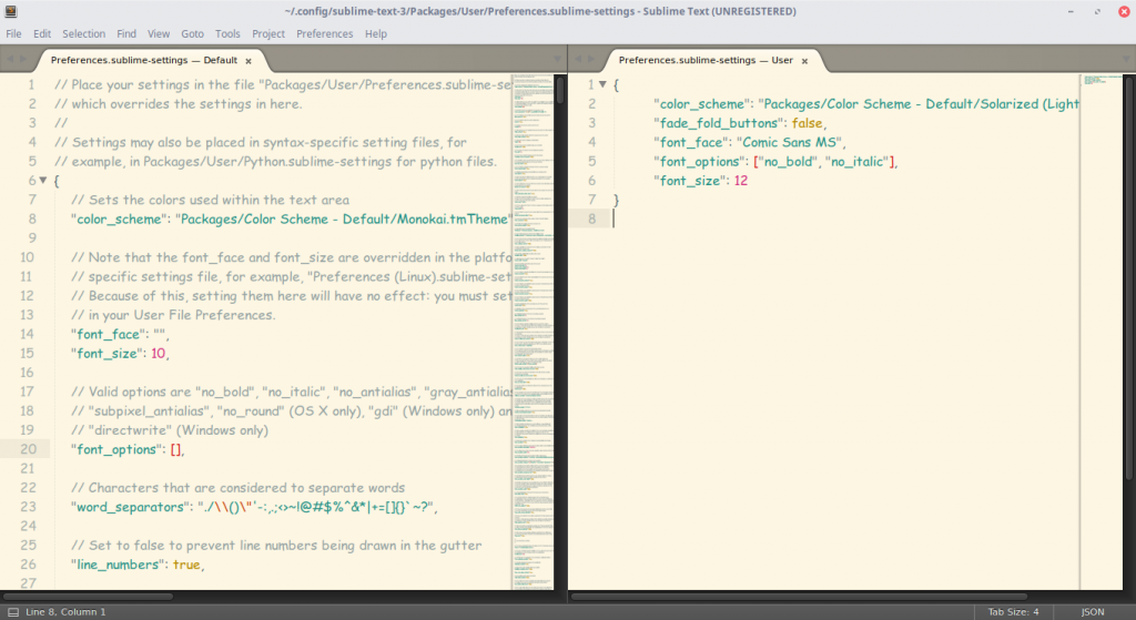
Другой, более сложный, но верный вариант — разобраться с файлом настроек. Чтобы открыть его, перейдите в меню «Preferences» -> «Settings». И вот, перед вами не что иное, как громада текста. Но не все так сложно, как кажется! Слева — настройки по умолчанию, их трогать не надо. Их можно взять за пример. А вот справа нужно разместить свои настройки — взять, скопировать нужную строку и поменять ее значение. Основные настройки:
- «color_scheme» — цветовая тема. Можно выбрать из существующих, а можно скачать в папку Packages/Color Scheme — Default/.
- «font_face» — шрифт текста. Важно, чтобы он был в системе. Чтобы посмотреть список доступных шрифтов, откройте любой текстовый редактор, к примеру, Lible Office Writer.
- «font_size» — размер шрифта, устанавливающийся дробным или целочисленным значением.
- «font_options» — дополнительные опции шрифта типа «no_bold», «no_italic».
- «word_separators» — разделители слов.
- «line_numbers» — настройка нумерации строк.
- «gutter» — отображать ли «канавку» (в ней располагаются номера строк и закладки).
- «margin» — длина отступа от «канавки».
- «fold_buttons» — если навести курсор на «канавку», то будут видны треугольные стрелки, позволяющие скрыть или показать фрагмент кода между фигурными скобками. Их тут можно отключить или включить.
- «fade_fold_buttons» — если поставить значение false, то треугольные кнопки не будут скрываться.
Вот пример действия настроек (не забудьте сохранить файл):
Вы можете поэкспериментировать здесь сами. А мы идем дальше.
2. Настройка сочетаний клавиш
Да-да, вы не ослышались! Любой может настроить сочетания по-своему, присвоив им другие значения. Чтобы открыть файл, перейдите в «Preferences» -> «Key Bindings».
Перед нами снова два файла, один из которых — настройки по умолчанию, а другой — ваши персональные настройки. Чтобы поменять сочетание, необходимо скопировать одну или несколько строк, заключенных между фигурными скобками. Вот пример моего файла:
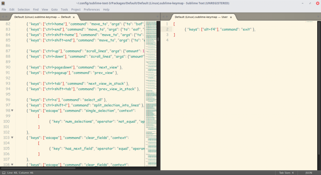
Конечно, это ничего не меняет (это сочетание клавиш для закрытия любого приложения), однако данный файл является лишь примером.
Ну вот и все, Sublime Text стал таким, каким он вам нужен и вы знаете как настроить Sublime Text 3. А сейчас пора двигаться дальше — к установке плагинов.
3. Установка Package Control
Как уже говорилось ранее, редактор имеет возможность добавления плагинов, будь то собственные или скачанные с сайта разработчика. Однако, несмотря ни на что, установка плагинов вручную не очень удобна, и поэтому нужно скачать и установить дополнительный компонент.
Package Control — предназначен для более быстрой и удобной установки плагинов. Он позволяет устанавливать их через визуализированный интерфейс, а не через код.
Для начала установим Package Control с официального сайта. Это не значит, что мы его будем скачивать!
- Скопируем текст из соответствующего текстового поля (в зависимости от версии Sublime Text).
- С помощью сочетания клавиш «Ctrl + ~» вызываем встроенную в редактор консоль (да-да, есть и такое!).
- Вставляем скопированный код в текстовое поле и ждем успешной установки.
- Перезапускаем редактор.
Package Control установлен! Теперь пора разобраться с тем, как им пользоваться.
4. Работа с плагинами в Package Control
Чтобы запустить Package Control, необходимо набрать сочетание клавиш «Ctrl + Shift + P» и из списка выбрать элемент Package Control: Install Package.
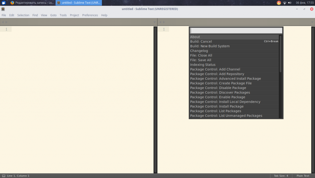
И перед нами долгожданная установка плагинов! Теперь есть возможность быстрого их поиска и выбора, а если выбрать другие команды для Package Control, то можно и удалять, и изменять элементы редактора. Теперь надо потренироваться на установке. Уставноим Material Theme и выполним настройки темы sublime text 3.
- Запускаем установщик плагинов.
- Набираем в поле поиска Material Theme.
- Нажимаем и ждем, внизу должна появиться надпись «Installing package Material Theme». В процессе установки будет запрошено добавление еще одного плагина, разрешаем.
Чтобы применить тему, необходимо перейти в меню «Preferences» -> «Color Scheme» -> «Material Theme» -> «schemes», а далее — тема, которая вам больше всего понравится.
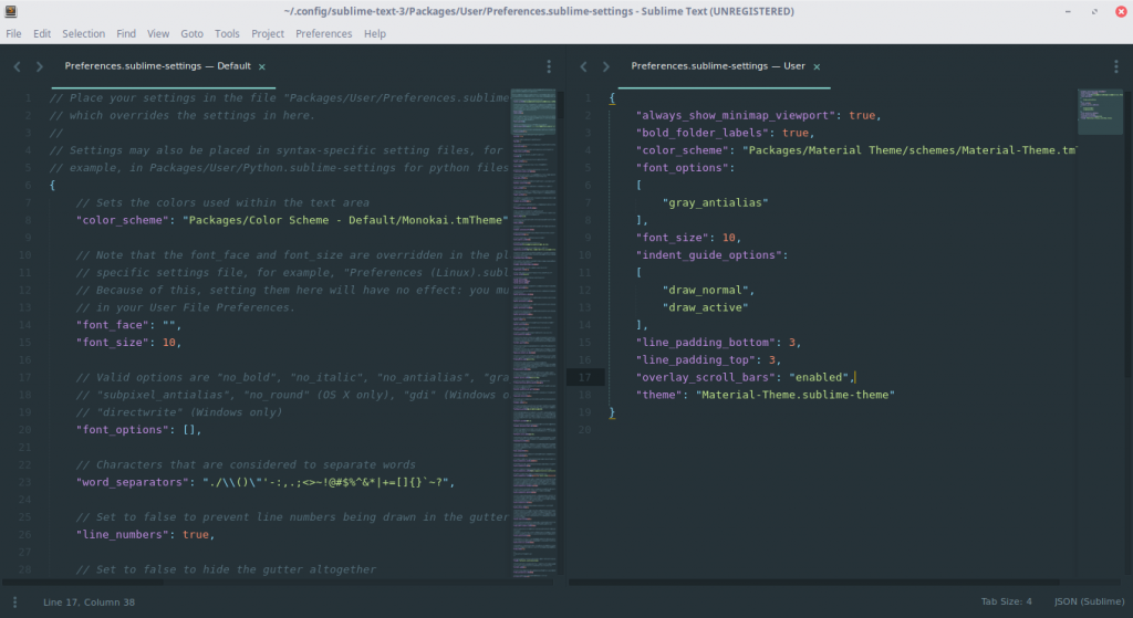
Однако это еще не все. Несмотря на установку темы в качестве плагина, она активируется не до конца. Чтобы исправить это, зайдите в файл настроек и допишите следующий текст:
"theme": "Material-Theme.sublime-theme",

"color_scheme": "Packages/Material Theme/schemes/Material-Theme.tmTheme",

"overlay_scroll_bars": "enabled",

"line_padding_top": 3,

"line_padding_bottom": 3,

// On retina Mac

"font_options": [ "gray_antialias" ],

"always_show_minimap_viewport": true,

"bold_folder_labels": true,

// Highlight active indent

"indent_guide_options": [ "draw_normal", "draw_active" ]
Вид редактора после применения к нему темы:
Неплохо, да? Настройка Sublime Text 3 почти завершена. А сейчас пора установить что-нибудь более существенное. Давайте ознакомимся с самыми популярными плагинами для Sublime Text.
Топ 5 плагинов для Sublime Text 3
1. Emmet
Emmet — плагин, позволяющий сделать отображение кода более удобным. Здесь используются сочетания клавиш. К примеру, «html + tab» создает каркас документа, а «div.wrapper + tab» превратится в полноценный код:
<div class="wrapper"></div>
2. JavaScript & NodeJS Snippets
Этот плагин представляет собой коллекцию сокращений снипсетов для JavaScript. Длина набираемого текста с помощью подсказок правда уменьшается! К примеру, вместо набора «document.querySelector(‘selector’);» можно просто набрать «qs + Tab».
3. Advanced New File
Зачем искать место для нового файла в неудобном дереве каталога? Данный плагин позволит быстро и эффекстивно ввести нужные данные, и файл будет создан буквально за пару нажатий клавиш!
4. Git

Название этого плагина говорит само за себя: вы сможете выполнять все необходимые действия в рамках Git’а, не выходя из редактора!
5. GitGutter
Этот плагин позволит пользователю не только обращаться с обычными командами Git, но и работать с изменением версий: отлавливать их, просматривать, сравнивать — и все в режиме реального времени.
Выводы
Как писать код — дело каждого. Но есть удобные вещи, которые доступны всем, и нет смысла от них отказываться! Такие редакторы, как Sublime Text, особенно важны веб-разработчикам. А пока вы можете настроить редактор под себя сами — пусть это станет ВАШ собственный Sublime Text, в который вы вложили частичку собственной души. Удачи!

Статья распространяется под лицензией Creative Commons ShareAlike 4.0 при копировании материала ссылка на источник обязательна .
The look of the Sublime Text interface is controlled by themes. The term theme
refers strictly to the look of the UI – buttons, select lists, the sidebar,
tabs and so forth. The highlighting of source code, markup and prose is
controlled by a color scheme.
The theme engine for Sublime Text is based on raster graphics. PNGs are used to
prevent texture degradation and provide full alpha control. Each element in the
UI can have up to four layers of textures or fills applied, with properties to
control opacity and padding. The properties set on each element can be
conditionally changed based on user interaction and settings.
Sublime Text themes are implemented via the .sublime-theme format. It is
a JSON format that specifies rules for matching elements and modifying their
appearance.
-
Format
-
Terminology
-
General Information
-
Inheritance
-
Variables
-
Colors
-
Font Sizes
-
Attributes
-
Settings
-
Properties
-
Elements
-
Deprecated
-
Obsolete
-
Customization
Format🔗
A .sublime-theme file contains a single JSON document. The document
should be an object containing a key “rules” with the value of 3179
an array of rules. An optional key “variables” with an object
containing variable/value pairs may be added. 3179
The following is an example of a .sublime-theme file, showing the
format. A complete theme will have many more rules to cover all elements used in
the UI.
[
    // Set up the textures for a button
    {
        "class": "button_control",
        "layer0.tint": "#000",
        "layer0.opacity": 1.0,
        "layer1.texture": "Theme - Example/textures/button_background.png",
        "layer1.inner_margin": 4,
        "layer1.opacity": 1.0,
        "layer2.texture": "Theme - Example/textures/button_highlight.png",
        "layer2.inner_margin": 4,
        "layer2.opacity": 0.0,
        "content_margin": [4, 8, 4, 8]
    },
    // Show the highlight texture when the button is hovered
    {
        "class": "button_control",
        "attributes": ["hover"],
        "layer2.opacity": 1.0
    },
    // Basic text label style
    {
        "class": "label_control",
        "fg": [240, 240, 240],
        "font.bold": true
    },
    // Brighten labels contained in a button on hover
    {
        "class": "label_control",
        "parents": [{"class": "button_control", "attributes": ["hover"]}],
        "fg": [255, 255, 255]
    }
]
Terminology🔗
The primary contents of a theme is an array of rules. Each rule object
contains a "class" key used to match to an element. In addition to the
"class", matching can be further restricted by specifying "attributes",
"settings", "parents" and "platforms" keys. Properties affect the
look or behavior of the element.
- Variables allow reusing values throughout different rules. Variables may
-
contain any type of syntax, but may only be referenced by top-level keys
in a rule.
3179
Most elements have a single class name, although a few have more than one to
allow for both generic, and specific styling. For example, the
popup_control class can be used to set styles for the auto complete and
HTML popups, however popup_control auto_complete_popup may be used to
target just the auto complete popup. Multiple "class" values are separated
by a space. When a rule specified multiple class names, all must be present on
the element for the rule to be applied.
"attributes" are set by Sublime Text, and indicate the state of user
interaction, or other information about the nature of an element. The value is
an array of strings. Examples include "hover", "pressed"
and "dirty".
"settings" uses values from .sublime-settings files to filter rules.
This allowing theme authors to give users the ability to tweak a theme. Themes
may define their own settings, but there are a handful of “default” settings
that should be supported if possible. See Settings for more details.
The value for the "settings" key may be one of:
-
array of strings
Each string is the name of boolean settings. To check for a
false
value, prefix the setting name with a!.Example:
["bold_folder_labels", "!always_show_minimap_viewport"]. -
object
Each key is the name of a setting. A value may be a boolean, string, or array
of strings. If an array of strings is used, the setting will be matched if
any of the strings in the array matches the user’s value. When comparing to a
string, the user’s setting will be coerced to an empty string when not set.Example:
{"bold_folder_labels": true, "file_tab_style": "rounded"}.
The "parents" key is an array of objects specifying the "class" and
"attributes" that must be matched in a parent element. Note that the
parents must be ordered from furthest to closest parent.
The "platforms" key is an array of strings specifying the what operating
systems to apply the rule to. Valid options
include "osx", "windows" and "linux".
Properties refer to all other keys in the JSON objects. Some properties are
available on all elements, while others are specific to an individual element.
General Information🔗
The follow sections discuss information about images and how to specify styles.
Specificity🔗
Unlike CSS, a Sublime Text theme does not do specificity matching when applying
rules to elements. All rules are tested, in order, against each element.
Subsequent rules that match will override properties from previous rules.
Texture Images🔗
All textures in a theme are specified using PNG images. Each texture should be
saved at “normal” DPI, where each pixel in the file will be mapped to one
device pixel. All file paths in the theme definition should reference the
normal DPI version.
A second version of each texture should also be included at double the DPI, with
@2x added to the filename right before the extension. Sublime Text will
automatically use the @2x version when being displayed on a high-DPI
screen. :since:<It is also possible to specify @3x variants of textures for
screens running at 300% scale or higher <3167>>.
SVG images are not currently supported.
Dimensions🔗
Integer units in a theme referring to dimensions are always specified in
device-independent pixels (DIP). Sublime Text automatically handles scaling UI
elements based on the screen density.
Padding & Margins🔗
Padding and margin may be specified in one of three ways:
-
A single integer value – the same value is applied to the left, top, right and
bottom -
An array of two integers – the first value is applied to the left and right,
while the second value is applied to the top and bottom -
An array of four integers – the values are applied, in order, to the left,
top, right and bottom
Inheritance🔗
A theme may extend another theme, appending rules and overriding variables. To
extend a theme, add a top-level key "extends" to the JSON object, with a
string value of the base theme.
{
    "extends": "Default.sublime-theme",
    "rules":
    [
        {
            "class": "label_control",
            "parents": [{"class": "button_control", "attributes": ["hover"]}],
            "fg": "red"
        }
    ]
}
The resulting list of rules will start with the base theme rules followed by the
extending theme rules. Any variables from the extending theme will override
variables with the same name in the base theme. Variable overrides will affect
rules both in the base theme and the extending theme.
3179
Variables🔗
Reusable variables may be defined by a JSON object under the top-level key
"variables". Variable names are strings, however the value may be a string,
number, boolean, array or object. Using a variable requires specifying a string
in the format var(example_variable_name).
{
    "variables":
    {
        "light_gray": "rgb(240, 240, 240)"
    },
    "rules":
    [
        {
            "class": "label_control",
            "fg": "var(light_gray)"
        }
    ]
}
Variables may be used as the value for any properties, but
the variable must be the entire value, it may not be embedded within another
variable. The only exception to this rule is that variables may be used as the
base color for the CSS color() mod function.
3179
Colors🔗
Colors may be specified by CSS or legacy color syntax:
CSS Color Syntax🔗
Since Sublime Text build 3177, colors in themes may now be specified using CSS
syntax, as supported by minihtml Reference. This includes support for hex, rgb(),
hsl(), variables and the color mod function. Additionally, all
Predefined Variables that are derived from the color
scheme are available for use.
The color white, as hex
The color white, using rgb() functional notation
50% opacity white, using hsl() functional notation
The closest color to red, as defined in the color scheme
50% opacity of the closest color to red, as defined in the color scheme
color(var(--redish) a(0.5)
3179
Legacy Color Syntax🔗
Prior to supporting CSS syntax for colors, themes were only able to specify
colors using the following formats, which are now deprecated.
RGB🔗
Colors in the RGB color space are specified via an array of 3 or 4 numbers, with
the first three being integers ranging from 0 to 255
representing the components red, green and blue. The optional fourth number is
a float ranging from 0.0 to 1.0 that controls the opacity of
the color.
The color white, with full opacity
The color blue, with 50% opacity
HSL🔗
Colors may also be specified using the HSL color space by creating an array of 4
elements, with the first being the string "hsl". The second element is
an integer from 0 to 360 specifying the hue. The third is an
integer from 0 to 100 specifying the saturation, and the fourth
is an integer from 0 to 100 specifying the lightness.
A dark magenta, with full opacity
A float from 0.0 to 1.0 may be added as a fifth element to
control the opacity.
A bright teal, with 50% opacity
["hsl", 180, 100, 75, 0.5]
Derived Colors🔗
It is also possible to derive colors from the current global color scheme.
Colors in this format are specified using arrays with specific formats. In all
cases, the first element is the base color, which may
be "foreground", "background" or "accent".
Change Opacity of Base Color🔗
To change the opacity of a base color, specify an array of 2 elements, the first
being the base color name and the second being a float from 0.0
to 1.0. The opacity will be set to the float value.
The color scheme foreground, at 90% opacity
De-saturate Base Color🔗
To de-saturate a base color, specify an array with 3 elements. The first is the
name of the base color, the second is the string "grayscale", and the
third is an integer from 0 to 100 which specifies what
percentage of the saturation (in HSL color space) of the existing color should
be retained. A value of 100 means no change, whereas a value
of 0 would cause the color to be completely de-saturated.
The color scheme foreground, with the saturation adjusted to 1/4 of the
original value.
["foreground", "grayscale", 25]
Tint Base Color🔗
5 and 6-element derived colors allow blending a color into the base color. A
5-element colors uses an RGBA color, whereas a 6-element uses an HSLA. In both
cases, the last element, which normally represents the opacity, controls how
much of the secondary color is blended into the base.
The color scheme background, lightened with white
["background", 255, 255, 255, 0.1]
The color scheme accent, tinted with dark red
["accent", "hsl", 0, 100, 30, 0.2]
Colors derived from the color scheme will always be based on the global color
scheme, and will not reflect view-specific color schemes. Certain view-specific
controls in the UI have tinting properties that allow using the view-specific
color scheme colors.
Font Sizes🔗
Font sizes may be specified in the formats:
Numeric🔗
An integer or float to specify the size of the font in pixels.
Examples: 12, 13.5.
CSS Format🔗
A string of a px or rem CSS font size.
Examples: 12px, 1.`2rem
The rem size is based on the global setting font_size for most
elements. Elements that use a different root font size will specify in the
description.
4050
Attributes🔗
Attributes are specified as an array of strings. Each string is an attribute
name. To check for the absence of an attribute, prepend a ! to the name.
The following attributes are common to all elements:
-
hover -
Set whenever the user’s mouse is hovered over an element.
Luminosity🔗
Although not available on all elements, many have attributes set based on the
approximate luminosity of the current color scheme. Most elements have the
attributes set based on the global color scheme. Tabs and the tab background,
however, have the attributes based on the color scheme specific to the selected
view.
The attributes are assigned based on the V value of the background color,
when represented as HSV colors.
-
file_light -
Vfrom0.60—1.00
-
file_medium -
Vfrom0.30—0.59
-
file_medium_dark -
Vfrom0.10—0.29
-
file_dark -
Vfrom0.00—0.09
Settings🔗
Certain Sublime Text settings are design to influence the UI. Themes should
respect these settings and change elements based on them.
- «overlay_scroll_bars»🔗
-
This should affect the style of the scroll bars – generally they should be
semi-transparent and theoverlayproperty of the
scroll_area_controlshould be set totrue.
- «always_show_minimap_viewport»🔗
-
If the current viewport area should be highlighted on the minimap even when
the user is not hovering over the minimap.
- «bold_folder_labels»🔗
-
If folder names in the side bar should have the
font.boldproperty set totrue.
- «mouse_wheel_switches_tabs»🔗
-
This is used to control mouse wheel behavior of tabs on Linux. It should be
combined with checking for!enable_tab_scrollingto change the
mouse_wheel_switchproperty of thetabset_control
tofalse.
- «highlight_modified_tabs»🔗
-
If the tabs of modified files should be highlighted. This setting should be
checked in addition to thedirtyattribute.
- «show_tab_close_buttons»🔗
-
If tabs should have close buttons.
- «inactive_sheet_dimming»🔗
-
If sheets other than the one with the attribute
highlightedshould be
visually de-emphasized usingbackground_modifier.
4095
Properties🔗
The "rules" key of a .sublime-theme file is a JSON array of of
objects describing how UI elements should be styled. Every element in the UI
supports the following keys:
-
layer0.* -
The bottom-most texture layer for the element.
-
layer1.* -
The second texture layer for the element.
-
layer2.* -
The third texture layer for the element.
-
layer3.* -
The fourth texture layer for the element.
-
hit_test_level -
A float value setting the required opacity of a pixel for a click to be
considering a “hit”.
Layer Properties🔗
Every element in the UI supports up to four texture layers for displaying fill
colors and raster graphics. Each layer has dotted sub-keys in the format
layer#.sub-key. Valid sub-keys include:
-
layer#.opacity -
A float value from
0.0to1.0that controls the master
opacity of the layer.Example:
0.9
-
layer#.tint -
A color value of a fill color to apply to the layer.
Example:
[255, 0, 0, 127]
-
layer#.texture -
A string of the file path to a PNG image, relative to the Packages/
folder.Example:
"Theme - Default/arrow_right.png"
-
layer#.inner_margin -
Texture images are stretched to fit the element by slicing into a grid of 9
using four lines. See padding & margins for valid formats with which to
specify the margin used to make the slices.Example:
[5, 2, 5, 2]
-
layer#.draw_center -
A boolean that controls if the center rectangle of the 9-grid created via
layer#.inner_marginshould be drawn. This is an optimization that
allows skipping an unused section of texture.Example:
false
-
layer#.repeat -
A boolean that controls if the texture should be repeated instead of
stretched.Example:
false
Value Animation🔗
Properties specified by floats may be animated over time. Instead of providing a
single numeric value, the animation is specified with an object including
details of the animation. Value animation is primarily useful for changing
opacity over time. The object keys are:
-
target -
A float value from
0.0to1.0that controls the destination
value.Example:
1.0
-
speed -
A float value of
1.0or greater that controls the relative length of
time the animation takes.Example:
1.5
-
interpolation -
An optional string that allow specifying the use of smoothstep function
instead of the default linear function.Default:
"linear"Example:
"smoothstep"
Texture Animation🔗
The layer#.texture sub-key may be an object to specify an animation based on
two or more PNG images. The object keys are:
-
keyframes -
An array of strings of the paths to PNG images, in order
Example:
["Theme - Default/spinner.png", "Theme - Default/spinner1.png"]
-
loop -
An optional boolean that controls if the animation should repeat
Default:
falseExample:
true
-
frame_time -
An optional float specifying how long each frame should be
displayed.1.0represents 1 second.Default:
0.0333(30 fps)Example:
0.0166(60 fps)
Texture Tinting Properties🔗
Certain elements have an available tint value set by the background of current
color scheme. The tint can be modified and applied to a layer#.texture
image.
-
tint_index -
Controls which layer the tint is applied to. Must be an integer
from0to3.
-
tint_modifier -
An array of four integers in the range
0to255. The first
three are blended into the RGB values from the tint color with the fourth
value specifying how much of these RGB modifier values to apply.
Font Properties🔗
Certain textual elements allow setting the following font properties:
-
font.face -
The name of the font face.
-
font.size -
The font size.
-
font.bold -
A boolean, if the font should be bold.
-
font.italic -
A boolean, if the font should be italic.
-
color -
A color value to use for the text — the
fgproperty is an
alias for this for backwards compatibility.
-
shadow_color -
A color value to use for the text shadow.
-
shadow_offset -
A 2-element array containing the X and Y offsets of the shadow
-
A float from
0.0to1.0that is multiplied against the
opacity of thecolorandshadow_colorproperties.
Filter Label Properties🔗
Labels used in the quick panel have color control based on selection and
matching:
-
fg -
A color value for unselected, unmatched text.
-
match_fg -
A color value for unselected, matched text.
-
bg -
A color value for the background of an unselected row.
-
selected_fg -
A color value for selected, unmatched text.
-
selected_match_fg -
A color value for selected, matched text.
-
bg -
A color value for the background of a selected row.
-
font.face -
The name of the font face.
-
font.size -
The font size.
Data Table Properties🔗
Row-based tables of data provide the following properties:
-
dark_content -
If the background is dark – used to set the
darkattribute for
scrollbars.
-
row_padding -
Padding added to each row, in one of the formats described in Padding &
Margins.
Styled Label Properties🔗
Certain labels allow for additional control over their appearance. They support
the properties:
-
border_color -
A color value for the border of the label.
-
background_color -
A color value for the background of the label.
Elements🔗
The following is an exhaustive list of the elements that comprise the Sublime
Text UI, along with supported attributes and properties:
-
Windows
-
Side Bar
-
Tabs
-
Quick Panel
-
Views
-
Auto Complete
-
Panels
-
Status Bar
-
Dialogs
-
Scroll Bars
-
Inputs
-
Buttons
-
Labels
-
Tool Tips
Windows🔗
-
title_bar -
- Attributes
-
Luminosity
- Properties
-
-
fg -
A color value to use for the window title text – Mac 10.10
or newer only.
-
bg -
A color value to use for the title bar background – Mac
10.10 or newer only.
-
The OS style to use for the title
bar —"system","dark"(Mac/Linux only)
or"light"(Mac only).Default:
"system"
-
-
window -
This element can not be styled directly, however it can be used in a
"parents"key. The luminosity attributes are set based on the global
color scheme.- Attributes
-
Luminosity
-
edit_window -
This element contains the main editor window, and is intended for use in a
"parents"key.
-
switch_project_window -
This element contains the Switch Project window, and is intended for use in
a"parents"key.
Side Bar🔗
-
sidebar_container -
The primary sidebar container that handles scrolling.
- Properties
-
-
content_margin -
The margin around the
sidebar_tree.
-
-
sidebar_tree -
A tree control containing multiple
tree_rows.- Properties
-
-
indent -
An integer amount to indent each level of the tree structure.
-
indent_offset -
An additional indent applied to every row, for the sake of positioning
disclosure_button_controlandclose_button.
-
indent_top_level -
A boolean if top-level rows in the tree should be indented.
-
spacer_rows -
A boolean controlling if a blank row should be added between the Open
Files and Folders sections of the sidebar, when both are visible..
-
-
tree_row -
A row may contain a header, open file, folder or file.
- Attributes
-
-
selectable -
When a row is selectable.
-
selected -
When an selectable row is selected.
-
expandable -
When a row is expandable.
-
expanded -
When an expandable row is expanded.
-
-
sidebar_heading -
One of the “Open Files”, “Group #” or “Folders” headings in the sidebar.
- Properties
-
font properties
-
The case modification to use for the heading —
"upper",
"lower"or"title".Default:
"upper"
-
-
The container holding information about a file or folder in the sidebar.
Contains different controls based on which section of the sidebar it is
within.Within the Open Files section, this control will contain a
sidebar_labelwith the file name, plus possibly avcs_status_badge.Within the Folders section, this control will contain a folder or file
icon (eithericon_folder,icon_folder_loading,icon_folder_dup
oricon_file_type), asidebar_labelwith the file or folder name,
plus possibly avcs_status_badge.- Attributes
-
-
ignored -
Files: when a file is ignored.
Folders: when the entire folder is ignored.
-
untracked -
Files: when a file is new or not recognized.
Folders: when a folder contains one or more untracked files.
-
modified -
Files: when a file has been changed on disk.
Folders: when a folder contains one or more modified files.
-
missing -
Folders: when one or more of a folder‘s files is no longer on disk.
-
added -
Files: when a new file has been newly added to the index.
Folders: when a folder contains one or more added files.
-
staged -
Files: when a modified file has been added to the index.
Folders: when a folder contains one or more staged files.
-
deleted -
Folders: when one or more of a folder‘s files has been added to the
index for removal.
-
unmerged -
Files: when a file is in a conflict state and needs to be resolved.
Folders: when a folder contains one or more unmerged files.
-
- Properties
-
-
content_margin -
The margin around the contained controls.
-
spacing -
An integer number of pixels between each contained control.
-
-
sidebar_label -
Names of open files, folder names and filenames.
- Properties
-
font properties
-
close_button -
A button to the left of each file in the Open Files section.
- Properties
-
-
content_margin -
For buttons, the margin specifies the dimensions.
-
-
disclosure_button_control -
An expand/collapse icon present in all
tree_rows that can be expanded- Properties
-
-
content_margin -
For buttons, the margin specifies the dimensions.
-
-
icon_folder -
Used for a folder once the contents have been fully enumerated.
- Properties
-
-
content_margin -
For icons, the margin specifies the dimensions.
-
-
icon_folder_loading -
Used for a folder while the contents are being enumerated
- Properties
-
-
content_margin -
For icons, the margin specifies the dimensions.
-
-
icon_folder_dup -
Used for a folder that has been scanned previously in the sidebar. This is
necessary to prevent a possibly infinite list of files due to recursive
symlinks.- Properties
-
-
content_margin -
For icons, the margin specifies the dimensions.
-
-
icon_file_type -
The icon for a file. The
layer0.textureshould not be set since it is
determined dynamically based on theiconsetting provided
by .tmPreferences files.- Properties
-
-
content_margin -
For icons, the margin specifies the dimensions.
-
-
An icon contained within
file_system_entrythat is used to display the
status of a file or folder with regards to a Git repository it is contained
in. This icon will only be shown if the settingshow_git_status
istrue, the file is contained within a Git repository, and the
file has some sort of special state within the repository. A file that is
not shown viagit statusand is not ignored via a .gitignore
rule will have no icon.- Attributes
-
-
ignored -
Files: when a file is ignored.
Folders: when the entire folder is ignored.
-
untracked -
Files: when a file is new or not recognized.
Folders: when a folder contains one or more untracked files.
-
modified -
Files: when a file has been changed on disk.
Folders: when a folder contains one or more modified files.
-
missing -
Folders: when one or more of a folder‘s files is no longer on disk.
-
added -
Files: when a new file has been newly added to the index.
Folders: when a folder contains one or more added files.
-
staged -
Files: when a modified file has been added to the index.
Folders: when a folder contains one or more staged files.
-
deleted -
Folders: when one or more of a folder‘s files has been added to the
index for removal.
-
unmerged -
Files: when a file is in a conflict state and needs to be resolved.
Folders: when a folder contains one or more unmerged files.
-
- Properties
-
-
content_margin -
For icons, the margin specifies the dimensions.
-
Tabs🔗
-
tabset_control -
- Attributes
-
Luminosity
- Properties
-
texture tinting properties
-
content_margin -
The margin around the
tab_controls.
-
tab_overlap -
How many DIPs the tabs should overlap.
-
tab_width -
Default tab width when space is available.
-
tab_min_width -
The minimum tab width before tab scrolling occurs.
-
tab_height -
The height of the tabs in DIPs.
-
mouse_wheel_switch -
If the mouse wheel should switch tabs – this should only be set to
trueif the settingenable_tab_scrollingisfalse.
-
-
tab_control -
- Attributes
-
Luminosity
-
dirty -
When the associated view has unsaved changed.
-
selected -
When the associated view is the active view in its group.
-
transient -
When the associate view is a preview and not fully opened.
-
When the tab is for the sheet with input focus.
-
When the tab is the left-most tab in the tabset.
-
When the tab is the right-most tab in the tabset.
-
When the tab is part of a sheet multi-selection.
-
When the tab is to the left of a selected tab.
-
When the tab is to the left of a hovered tab.
-
When the tab is to the right of a selected tab.
-
When the tab is to the right of a hovered tab.
-
When the tab is overhanging to the left of its sheet, which can occur
during sheet multi-selection.
-
When the tab is overhanging to the right of its sheet, which can occur
during sheet multi-selection.
-
- Properties
-
texture tinting properties
-
content_margin -
The margin around the
tab_label.
-
max_margin_trim -
How much of the left and right
content_marginmay be removed when
tab space is extremely limited.
-
accent_tint_index -
Controls which layer the accent tint is applied to. Must be an integer
from0to3. The accent color is specified by the color
scheme.
-
accent_tint_modifier -
An array of four integers in the range
0to255. The
first three are blended into the RGB values from the accent tint color
with the fourth value specifying how much of these RGB modifier values
to apply.
-
-
tab_label -
- Attributes
-
-
transient -
When the associate view is a preview and not fully opened
-
- Properties
-
font properties
-
tab_close_button -
- Properties
-
-
content_margin -
For buttons, the margin specifies the dimensions.
-
accent_tint_index -
Controls which layer the accent tint is applied to. Must be an integer
from0to3. The accent color is specified by the color
scheme.
-
accent_tint_modifier -
An array of four integers in the range
0to255. The
first three are blended into the RGB values from the accent tint color
with the fourth value specifying how much of these RGB modifier values
to apply.
-
-
scroll_tabs_left_button -
- Properties
-
-
content_margin -
For buttons, the margin specifies the dimensions.
-
-
scroll_tabs_right_button -
- Properties
-
-
content_margin -
For buttons, the margin specifies the dimensions.
-
-
show_tabs_dropdown_button -
- Properties
-
-
content_margin -
For buttons, the margin specifies the dimensions.
-
-
- Attributes
-
-
left_overhang -
When the tab is overhanging to the left of its sheet, which can occur
during sheet multi-selection.
-
right_overhang -
When the tab is overhanging to the right of its sheet, which can occur
during sheet multi-selection.
-
- Properties
-
texture tinting properties
Quick Panel🔗
The quick panel is used for the various Goto functionality, the command palette
and is available for use by plugins.
-
overlay_control -
The container for the quick panel, including the input and data table.
- Specializations
-
To allow for targeting the
overlay_controlwhen the quick panel
is being used for specific functionality, the following multi-class
selectors are available:-
overlay_control goto_file -
The Goto File quick panel.
-
overlay_control goto_symbol -
The Goto Symbol quick panel.
-
overlay_control goto_symbol_in_project -
The Goto Symbol in Project quick panel.
-
overlay_control goto_line -
The Goto Line quick panel.
-
overlay_control goto_word -
The Goto Anything quick panel, filtering by word.
-
overlay_control command_palette -
The Command Palette.
-
- Properties
-
-
content_margin -
The margin around the
quick_panel.
-
4050
-
quick_panel -
The data table displayed below the input. Normally the height is dynamic so
the layers will not be visible, however the Switch Project window will use
layers for the blank space below the filtered options.- Properties
-
data table properties
-
mini_quick_panel_row -
A non-file row in
quick_panel. Contains onequick_panel_labelfor
each line of text in the row.- Attributes
-
-
selected -
When the row is selected.
-
-
quick_panel_row -
A Goto Anything file row in
quick_panel. Also used in the Switch Project
window.Contains
quick_panel_labelwith the filename, and
quick_panel_path_labelfor the file path.- Attributes
-
-
selected -
When the row is selected.
-
-
A spacing-only container to control the spacing between
quick_panel_labelandquick_panel_path_labelcontrols when a row
has one or more detail lines.- Properties
-
-
spacing -
An integer number of pixels between each line of text,
-
-
A container shown to the left of the symbols in the Goto Symbol and Goto
Symbol in Project quick panels. It contains thekind_labeland is used
to indicate the kind of the symbol.This element is also used in
auto_completeto show the kind of the item
being inserted. A"parents"key should be used to distinguish the two
uses.The element
kind_containeris always paired with a second class name
indicating the general category the kind belongs to. The categories for
usage in the quick panel are as follows:- Specializations
-
-
kind_container kind_ambiguous -
When the kind of the item is unknown – no color.
-
kind_container kind_keyword -
When the item is a keyword – typically pink.
-
kind_container kind_type -
When the item is a data type, class, struct, interface, enum, trait,
etc – typically purple.
-
kind_container kind_function -
When the item is a function, method, constructor or subroutine –
typically red.
-
kind_container kind_namespace -
When the item is a namespace or module – typically blue.
-
kind_container kind_navigation -
When the item is a definition, label or section – typically yellow.
-
kind_container kind_markup -
When the item is a markup component, including HTML tags and CSS
selectors – typically orange.
-
kind_container kind_variable -
When the item is a variable, member, attribute, constant or parameter –
typically cyan.
-
kind_container kind_snippet -
When the item is a snippet – typically green.
-
kind_container kind_color_redish -
When the plugin author wants to display red.
-
kind_container kind_color_orangish -
When the plugin author wants to display orange.
-
kind_container kind_color_yellowish -
When the plugin author wants to display yellow.
-
kind_container kind_color_greenish -
When the plugin author wants to display green.
-
kind_container kind_color_cyanish -
When the plugin author wants to display cyan.
-
kind_container kind_color_bluish -
When the plugin author wants to display blue.
-
kind_container kind_color_purplish -
When the plugin author wants to display purple.
-
kind_container kind_color_pinkish -
When the plugin author wants to display pink.
-
kind_container kind_color_dark -
When the plugin author wants to display a dark background.
-
kind_container kind_color_light -
When the plugin author wants to display a light background.
-
- Properties
-
-
content_margin -
A margin that is added around the
kind_label.
-
-
A label showing a single unicode character, contained within the
kind_container.This element is also used in
auto_completeto show the kind of the item
being inserted. A"parents"key should be used to distinguish the two
uses.- Properties
-
font properties
-
A container around the
quick_panel_labelwhen showing the Goto Symbol or
Goto Symbol in Project symbol lists.- Properties
-
-
content_margin -
A margin that is added around the
quick_panel_label.
-
-
quick_panel_label -
Filenames in
quick_panel_rowand all text inmini_quick_panel_row.- Properties
-
filter label properties
-
quick_panel_path_label -
File paths in
quick_panel_row.- Properties
-
filter label properties
-
quick_panel_label key_binding -
Key bindings show to the right-hand side of
quick_panel_row.- Properties
-
filter label properties
4073
-
quick_panel_label hint -
Annotations show to the right-hand side of
quick_panel_row.- Properties
-
filter label properties
4073
-
quick_panel_detail_label -
Detail rows in
quick_panel_row.- Properties
-
-
color -
A color value to use for the text.
-
link_color -
A color value to use for links.
-
monospace_color -
A color value to use for monospace text.
-
monospace_background_color -
A color value to use for the background of monospace text.
-
4083
Sheets🔗
-
A sheet can have text, image or HTML contents
- Attributes
-
Luminosity
-
When the sheet has input focus.
-
- Properties
-
-
background_modifier -
A string with a space-separated list of adjusters that are supported by
the color() mod function. Used for implementing
inactive sheet dimming.
-
Views🔗
-
text_area_control -
This element can not be styled directly since that is controlled by the
color scheme, however it can be used in a"parents"key.- Attributes
-
Luminosity
-
grid_layout_control -
The borders displayed between views when multiple groups are visible.
- Properties
-
-
border_color -
A color value to use for the border.
-
border_size -
An integer of the border size in DIPs.
-
-
minimap_control -
Control over the display of the viewport projection on the minimap.
- Properties
-
-
viewport_color -
A color value to fill the viewport projection with.
-
viewport_opacity -
A float from
0.0to1.0specifying the opacity of the
viewport projection.
-
-
fold_button_control -
Code folding buttons in the gutter.
- Attributes
-
-
expanded -
When a section of code is unfolded.
-
- Properties
-
-
content_margin -
For buttons, the margin specifies the dimensions.
-
-
A wrapper around popup windows that allows controlling the shadow.
-
popup_control html_popup -
The primary container for the HTML popups used by Show Definitions and
third-party packages. The tint of the scroll bar will be set to the
background color of the HTML document.
-
popup_control annotation_popup -
The primary container for the annotations added to the right-hand side of
the editor pane by build systems and third-party packages.
4050
-
annotation_close_button -
The close button shown at the left edge of
annotation_popup.- Properties
-
-
content_margin -
For buttons, the margin specifies the dimensions.
-
4050
Auto Complete🔗
-
popup_control auto_complete_popup -
The primary container for the auto complete popup.
-
auto_complete -
The data table for completion data. The tint is set based on the background
color of the color scheme applied to the view the popup is displayed in.- Properties
-
data table properties
texture tinting properties
-
table_row -
A row in
auto_complete.- Attributes
-
-
selected -
When the user has highlighted a completion.
-
-
A container shown to the left of an auto complete item, which contains the
kind_labeland is used to indicate the kind of the item.This element is also used in the
quick_panelfor Goto Symbol and Goto
Symbol in Project. A"parents"key should be used to distinguish the two
uses.The element
kind_containeris always paired with a second class name
indicating the general category the kind belongs to. The categories for
usage in the auto complete window are as follows:- Specializations
-
-
kind_container kind_ambiguous -
When the kind of the item is unknown – no color.
-
kind_container kind_keyword -
When the item is a keyword – typically pink.
-
kind_container kind_type -
When the item is a data type, class, struct, interface, enum, trait,
etc – typically purple.
-
kind_container kind_function -
When the item is a function, method, constructor or subroutine –
typically red.
-
kind_container kind_namespace -
When the item is a namespace or module – typically blue.
-
kind_container kind_navigation -
When the item is a definition, label or section – typically yellow.
-
kind_container kind_markup -
When the item is a markup component, including HTML tags and CSS
selectors – typically orange.
-
kind_container kind_variable -
When the item is a variable, member, attribute, constant or parameter –
typically cyan.
-
kind_container kind_snippet -
When the item is a snippet – typically green.
-
- Properties
-
-
content_margin -
A margin that is added around the
kind_label.
-
-
A label showing a single unicode character, contained within the
kind_container.This element is also used in the
quick_panelfor Goto Symbol and Goto
Symbol in Project. Aparentskey should be used to distinguish the two
uses.- Properties
-
font properties
The
remroot font size is based on the font size of the editor control
the auto complete window is being shown for.
-
A container around the
auto_complete_label.- Properties
-
-
content_margin -
A margin that is added around the
auto_complete_label.
-
-
auto_complete_label -
Text in a
table_row.- Properties
-
filter label properties
-
fg_blend -
A boolean controlling if the
fg,match_fg,selected_fg, and
selected_match_fgvalues should be blended onto the foreground
color from the color scheme of the current view.
-
-
auto_complete_label auto_complete_hint -
The “annotation” hint displayed at the right-hand-side of a
table_row.- Properties
-
font properties
The
remroot font size is based on the font size of the editor
control the auto complete window is being shown for.-
fg_blend -
A boolean controlling if the
colorvalue should be blended onto the
foreground color from the color scheme of the current view.
-
4073
-
auto_complete_detail_pane -
A detail pane displayed below the list of auto complete items, containing
theauto_complete_infospacer, withauto_complete_kind_name_label
andauto_complete_detailsinside.- Properties
-
-
content_margin -
A margin that is added around the child controls.
-
4050
-
Provides spacing between
auto_complete_kind_name_labeland
auto_complete_details.- Properties
-
-
spacing -
An integer number of pixels between each contained control.
-
-
auto_complete_kind_name_label -
A label used to display the name of the auto complete kind.
- Properties
-
font properties
The
remroot font size is based on the font size of the editor
control the auto complete window is being shown for.styled label properties
4050
-
auto_complete_details -
A single-line HTML control used to display the details of the auto complete
item.- Properties
-
-
font.face -
The name of the font face.
-
font.size -
The font size — the
remroot font size is based on
the font size of the editor control the auto complete window is being
shown for.
-
color -
A color value to use for the text.
-
link_color -
A color value to use for links.
-
monospace_color -
A color value to use for monospace text.
-
monospace_background_color -
A color value to use for the background of monospace text.
-
4050
Panels🔗
-
panel_control find_panel -
The container for the Find and Incremental Find panels.
- Properties
-
-
content_margin -
The margin around the panel contents.
-
-
panel_control replace_panel -
The container for the Replace panel.
- Properties
-
-
content_margin -
The margin around the panel contents.
-
-
panel_control find_in_files_panel -
The container for the Find in Files panel.
- Properties
-
-
content_margin -
The margin around the panel contents.
-
-
panel_control input_panel -
The container for the input panel, which is available via the API and used
for things like file renaming.- Properties
-
-
content_margin -
The margin around the panel contents.
-
-
panel_control console_panel -
The container for the Console.
- Properties
-
-
content_margin -
The margin around the panel contents.
-
-
panel_control output_panel -
The container for the output panel, which is available via the API and used
for build results.- Properties
-
-
content_margin -
The margin around the panel contents.
-
-
panel_control switch_project_panel -
The container for the input in the Switch Project window.
- Properties
-
-
content_margin -
The margin around the panel contents.
-
-
panel_grid_control -
The layout grid used to position inputs on the various panels.
- Properties
-
-
inside_spacing -
An integer padding to place between each cell of the grid.
-
outside_vspacing -
An integer padding to place above and below the grid.
-
outside_hspacing -
An integer padding to place to the left and right of the grid.
-
-
panel_close_button -
The button to close the open panel
- Properties
-
-
content_margin -
For buttons, the margin specifies the dimensions.
-
Status Bar🔗
-
status_bar -
- Attributes
-
-
panel_visible -
When a panel is displayed above the status bar
-
- Properties
-
-
content_margin -
The margin around the
sidebar_button_control,
status_containerandstatus_buttonss.
-
-
panel_button_control -
The panel switcher button on the left side of the status bar.
- Properties
-
-
content_margin -
For buttons, the margin specifies the dimensions.
-
<4050
-
sidebar_button_control -
The sidebar/panel switcher button on the left side of the status bar.
- Properties
-
-
content_margin -
For buttons, the margin specifies the dimensions.
-
4050
-
status_container -
The area that contains the current status message.
- Properties
-
-
content_margin -
The margin around the status message.
-
-
status_button -
The status buttons that display, and allow changing, the indentation,
syntax, encoding and line endings.- Properties
-
-
content_margin -
For buttons, the margin specifies the dimensions.
-
min_size -
An array of two integers specifying the minimum width and height of a
button, in DIPs.
-
-
The container holding the
vcs_branch_icon,label_controlwith the
current branch name, andvcs_changes_annotationcontrol.- Properties
-
-
content_margin -
The margin around the contained controls.
-
spacing -
An integer number of pixels between each contained control.
-
-
An icon shown to the left of the current branch name.
- Properties
-
-
content_margin -
For icons, the margin specifies the dimensions.
-
-
vcs_changes_annotation -
Displays the number of files that have been added, modified or deleted.
- Properties
-
font properties
styled label properties
3181
Dialogs🔗
-
dialog -
The Indexer Status and Update windows both use this class for the window
background.
-
progress_bar_control -
The progress bar container. The progress bar is displayed in the Update
window used for updates on Mac and Windows.
-
progress_gauge_control -
The bar representing the progress completed so far.
- Properties
-
-
content_margin -
The margin specifies the height of the bar.
-
Scroll Bars🔗
-
scroll_area_control -
The scroll area contains the element being scrolled, along with the bar,
track and puck.- Attributes
-
-
When the control can be scrolled vertically.
-
When the control can be scrolled horizontally.
-
- Properties
-
-
content_margin -
A margin that is added around the content being
scrolled.
-
overlay -
Sets the scroll bars to be rendered on top of the content.
-
left_shadow -
A color value to use when drawing a shadow to indicate the
area can be scrolled to the left.
-
left_shadow_size -
An integer of the width of the shadow to draw when the area can be
scrolled to the left.
-
top_shadow -
A color value to use when drawing a shadow to indicate the
area can be scrolled to the top.
-
top_shadow_size -
An integer of the height of the shadow to draw when the area can be
scrolled to the top.
-
right_shadow -
A color value to use when drawing a shadow to indicate the
area can be scrolled to the right.
-
right_shadow_size -
An integer of the width of the shadow to draw when the area can be
scrolled to the right.
-
bottom_shadow -
A color value to use when drawing a shadow to indicate the
area can be scrolled to the bottom.
-
bottom_shadow_size -
An integer of the height of the shadow to draw when the area can be
scrolled to the bottom.
-
-
scroll_bar_control -
The scroll bar contains the scroll track. The tint is set based on the
background color of the element being scrolled.- Attributes
-
-
dark -
When the scroll area content is dark, necessitating a light scroll bar.
-
horizontal -
When the scroll bar should be horizontal instead of vertical.
-
- Properties
-
texture tinting properties
-
content_margin -
A margin that is added around the scroll track.
-
-
scroll_track_control -
The track that the puck runs along. The tint is set based on the background
color of the element being scrolled.- Attributes
-
-
dark -
When the scroll area content is dark, necessitating a light scroll bar.
-
horizontal -
When the scroll bar should be horizontal instead of vertical.
-
- Properties
-
texture tinting properties
-
scroll_corner_control -
The dead space in the bottom right of a
scroll_area_controlwhen both
the vertical and horizontal scroll bars are being shown.- Attributes
-
-
dark -
When the scroll area content is dark, necessitating a light scroll bar.
-
- Properties
-
texture tinting properties
-
puck_control -
The scroll puck, or handle. The tint is set based on the background color of
the element being scrolled.- Attributes
-
-
dark -
When the scroll area content is dark, necessitating a light scroll bar.
-
horizontal -
When the scroll bar should be horizontal instead of vertical.
-
- Properties
-
texture tinting properties
Inputs🔗
-
text_line_control -
The text input used by the Quick Panel, Find, Replace, Find in Files and
Input panels.- Properties
-
-
content_margin -
The margin around the text.
-
color_scheme_tint -
A color value to use to tint the background of the color scheme.
-
color_scheme_tint_2 -
A color value to use to add a secondary tint to the
background of the color scheme.
-
-
dropdown_button_control -
The button to close the open panel.
- Properties
-
-
content_margin -
For buttons, the margin specifies the dimensions.
-
Buttons🔗
-
button_control -
Text buttons.
- Attributes
-
-
pressed -
Set when a button is pressed down.
-
- Properties
-
-
min_size -
An array of two integers specifying the minimum width and height of a
button, in DIPs.
-
-
icon_button_group -
A grid controlling the spacing of related icon buttons.
- Properties
-
no layer support
-
spacing -
An integer number of pixels between each button in the group.
-
-
icon_button_control -
- Small icon-based buttons in the Find, Find in Files,
-
and Replace panels
- Attributes
-
-
selected -
When an icon button is toggled on.
-
left -
When the button is the left-most button in a group.
-
right -
When the button is the right-most button in a group.
-
-
icon_regex -
The button to enable regex mode in the Find, Find in Files and Replace
panels.- Properties
-
-
content_margin -
For icons, the margin specifies the dimensions.
-
-
icon_case -
The button to enable case-sensitive mode in the Find, Find in Files and
Replace panels.- Properties
-
-
content_margin -
For icons, the margin specifies the dimensions.
-
-
icon_whole_word -
The button to enable whole-word mode in the Find, Find in Files and Replace
panels.- Properties
-
-
content_margin -
For icons, the margin specifies the dimensions.
-
-
icon_wrap -
The button to enable search wrapping when using the Find and Replace
panels.- Properties
-
-
content_margin -
For icons, the margin specifies the dimensions.
-
-
icon_in_selection -
The button to only search in the selection when using the Find and Replace
panels.- Properties
-
-
content_margin -
For icons, the margin specifies the dimensions.
-
-
icon_highlight -
The button to enable highlighting all matches in the Find and Replace
panels.- Properties
-
-
content_margin -
For icons, the margin specifies the dimensions.
-
-
icon_preserve_case -
The button to enable preserve-case mode when using the Replace panel.
- Properties
-
-
content_margin -
For icons, the margin specifies the dimensions.
-
-
icon_context -
The button to show context around matches when using the Find in Files
panel.- Properties
-
-
content_margin -
For icons, the margin specifies the dimensions.
-
-
icon_use_buffer -
The button to display results in a buffer, instead of an output panel, when
using the Find in Files panel.- Properties
-
-
content_margin -
For icons, the margin specifies the dimensions.
-
-
The button to toggle using .gitignore to filter files in the Find in
Files panel.- Properties
-
-
content_margin -
For icons, the margin specifies the dimensions.
-
Labels🔗
-
label_control -
Labels are shown in the Find, Replace, Find in File and Input panels.
Additionally, labels are used in the Update window, on textual buttons and
for the text in thestatus_container.Targeting specific labels can be accomplished by using the
"parents"
key.- Properties
-
font properties
-
title_label_control -
The title label is used in the About window.
- Properties
-
font properties
Tool Tips🔗
-
tool_tip_control -
Tool tips shown when hovering over tabs and buttons.
- Properties
-
-
content_margin -
The margin around the tool tip text.
-
-
tool_tip_label_control -
Text shown in a tool tip
- Properties
-
font properties
Deprecated🔗
Color Values🔗
Before build 3127, the only way to specify opacity in colors was by using a
4-element array containing all integers from 0 to 255. The
fourth element controlled the opacity, such that 0 was fully
transparent and 255 was fully opaque. The preferred format is now to
use a float from 0.0 to 1.0.
Obsolete🔗
As the UI of Sublime Text has adapted over time, certain elements and properties
are no longer applicable or supported.
Elements🔗
The panel_button_control element was removed from the status bar and
replaced by sidebar_button_control.
4050
The sheet_container_control element is never visible to users in recent
versions of Sublime Text.
An element named icon_reverse used to exist in the find panel to control if
searching would move forward or backwards in the view. This is now controlled
by the Find and Find Prev buttons.
The element named quick_panel_score_label is no longer present in the Goto
Anything quick panel.
Properties🔗
The blur property used to be supported to blur the pixel data behind an
element, however it is not currently supported for implementation reasons.
Customization🔗
Users can customize a theme by creating a file with new rules that will be
appended to the original theme definition.
To create a user-specific customization of a theme, create a new file with the
same filename as the theme, but save it in the Packages/User/
directory.
For example, to customize the Default theme, create a file
named Packages/User/Default.sublime-theme. Adding the following rules
to that file will increase the size of the text in the sidebar.
[
    {
        "class": "sidebar_heading",
        "font.size": 15,
    },
    {
        "class": "sidebar_label",
        "font.size": 14
    }
]
Привет, друзья! По многочисленным просьбам обновил руководство по быстрой настройке редактора кода Sublime Text 3, установке необходимых для верстки плагинов и создании своего пресета настроек для быстрого старта на новом рабочем месте.

Вам наверняка знакома ситуация, когда на новом рабочем месте необходимо быстро установить и настроить Sublime Text для работы над новыми проектами. Как правило, тонкая настройка Sublime Text занимает много времени и выполнять ее каждый раз не практично и долго.
Сегодня мы рассмотрим максимально быструю настройку Sublime Text, самые популярные среди верстальщиков плагины для ускорения верски и установим одну из лучших и комфортных тем оформления редактора One Dark Material Theme.
По умолчанию Sublime Text выглядит довольно печально:
Установка Package Control в Sublime Text
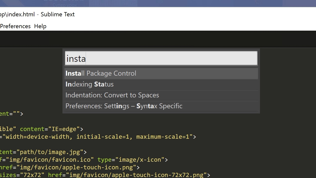
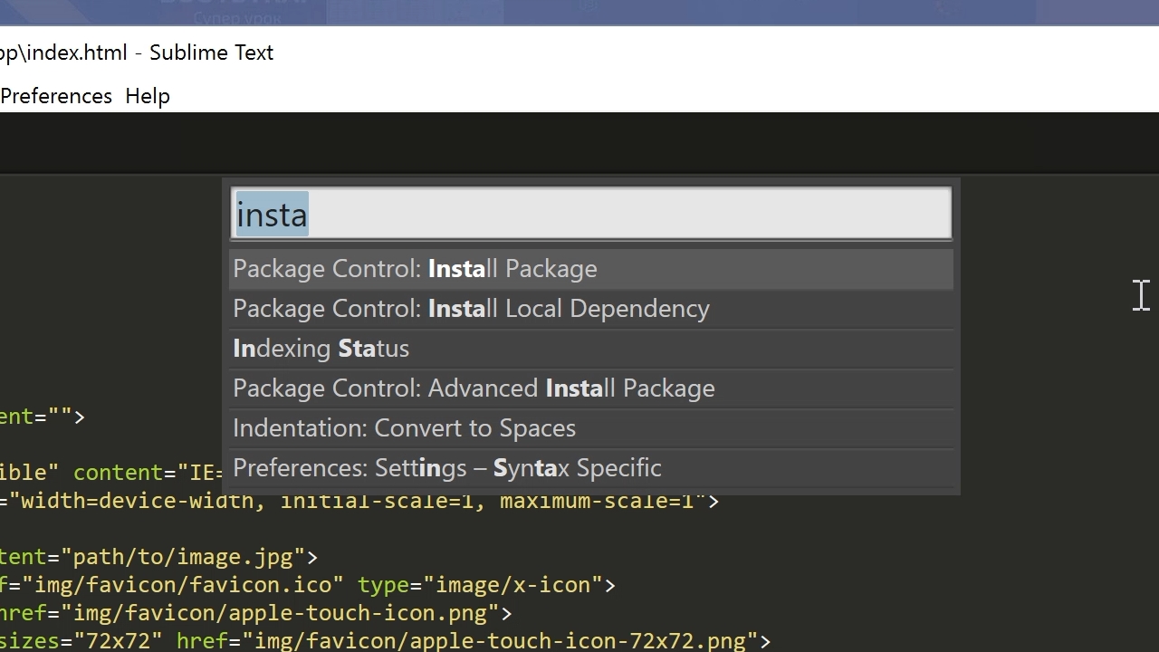
Для начала необходимо настроить Package Control. Для этого нажимаем хоткей Ctrl+Shift+P. Во всплывающем окне набираем Install Package Control и выбираем соответствующий пунк. Через несколько секунд Package Control будет установлен, о чем вы получите соответствующее уведомление.
Если вы пользователь MacOS, необходимо нажать на клавиатуре Cmd+Shift+P.
Package Control необходим для того, чтобы вы могли устанавливать дополнения и плагины в Sublime Text 3 из репозитория пакетов.
Установка плагинов в Sublime Text
Далее необходимо установить нужные для работы плагины. Мы рассмотрим установку самых популярных среди верстальщиков плагины, которые значительно упрощают разработку. Вы также можете поэкспериментировать с другими плагинами в Package Control, может быть вам понравятся и другие из огромного количества доступных пакетов.
Для установки плагинов в Sublime Text через Package Control необходимо вызвать меню, как мы это делали ранее: Ctrl+Shift+P. Затем вводим команду «Install Package» и выбираем нужный пакет из списка.
Самые популярные плагины для Sublime Text:
- Emmet — ускоряет написание HTML и CSS кода до скорости света. Урок по Emmet
- AutoFileName — дополняет код при написании путей до файлов в верстке;
- Gist — подключает в Sublime Text возможность использовать сервис сниппетов кода GitHub Gist. Урок по Gist;
- Sass — плагин для подсветки Sass синтаксиса в Sass и Scss файлах. Раскрывает Emmet в Sass файлах.
- terminus — плагин встроенного терминала Sublime Text.
- W3CValidators — мощный набор валидаторов для HTML разметки, CSS, SVG и т.д.
Установка внешнего оформления Sublime Text
Мне очень нравится тема оформления One Dark Material Theme и подсветка кода соответствующей цветовой гаммой. Это наиболее сбалансированные, достаточно контрастные, но не слишком резкие цвета для комфортной работы в редакторе.
Дя установки цветового оформления One Dark нам необходимо доустановить следующие пакеты через Package Control:
- One Dark Color Scheme — цветовая схема для подсветки кода;
- One Dark Material — Theme — тема оформления UI Sublime Text.
Установка плагина вручную
Некоторые плагины более не обновляются в Package Control или просто там не фигурируют. Кое-какие из этих плагинов имеют жизненную необходимость при работе с кодом и их приходится устанавливать вручную.
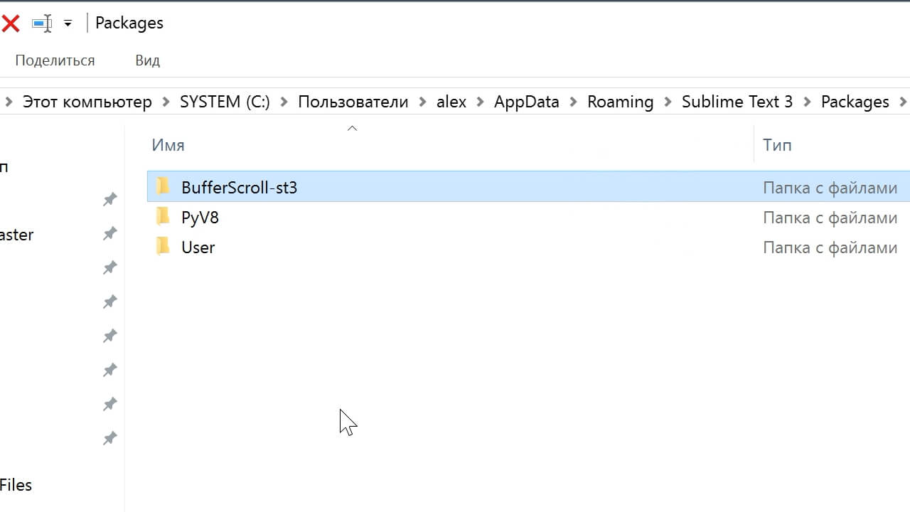
Один из таких плагинов BufferScroll — потрясающий плагин, который при повторном открытии документа устанавливает курсор на том месте, на котором вы закончили редактирование в прошлый раз, тем самым сокращая время на поиск нужной позиции для продолжения работы.
Для установки BufferScroll вручную, скачайте его и распакуйте в любое удобное место на вашем диске. Далее в Sublime Text выбираем пункт меню Preferences > Browse Packeges. Откроется папка пользовательских данных на вашем диске. Скопируйте сюда папку, содержащую файлы Buffer Scroll и перезапуститие Sublime Text. Теперь плагин работает.

Тонкая настройка редактора, пресет моих настроек
Переходим к настройкам Sublime Text.
Предтавляю мой пресет настроек, который я всегда использую для стартовой настройки редактора Sublime Text на новом рабочем месте или после переустановки системы. Вы можете использовать данный пресет в вашем редакторе и кастомизировать его при необходимости:
Keymap (Windows Users):
[
	{ "keys": ["alt+shift+f"], "command": "reindent" },
]

Settings:
{
	"show_definitions": false,
	"auto_complete": false,
	"bold_folder_labels": true,
	"color_scheme": "Packages/One Dark Material - Theme/schemes/OneDark.tmTheme",
	"fold_buttons": false,
	"font_size": 13,
	"highlight_line": true,
	"indent_guide_options":
	[
		"draw_normal",
		"draw_active"
	],
	"line_padding_bottom": 2,
	"line_padding_top": 2,
	"margin": 2,
	"material_theme_compact_sidebar": true,
	"material_theme_compact_panel": true,
	"material_theme_small_statusbar": true,
	"material_theme_small_tab": true,
	"tab_size": 2,
	"theme": "OneDarkMaterial.sublime-theme",
	"word_wrap": "false",
}
Код пресета для пользовательских настроек (Preferences.sublime-settings | Preferences > Settings) — отдельно:
{
	"show_definitions": false,
	"auto_complete": false,
	"bold_folder_labels": true,
	"color_scheme": "Packages/One Dark Material - Theme/schemes/OneDark.tmTheme",
	"fold_buttons": false,
	"font_size": 13,
	"highlight_line": true,
	"indent_guide_options":
	[
		"draw_normal",
		"draw_active"
	],
	"line_padding_bottom": 2,
	"line_padding_top": 2,
	"margin": 2,
	"material_theme_compact_sidebar": true,
	"material_theme_compact_panel": true,
	"material_theme_small_statusbar": true,
	"material_theme_small_tab": true,
	"tab_size": 2,
	"theme": "OneDarkMaterial.sublime-theme",
	"word_wrap": "false",
}
Код пресета для пользовательских клавиатурных сокращений (Default (Windows).sublime-keymap | Preferences > Key Bindings) — отдельно:
[
	{ "keys": ["alt+shift+f"], "command": "reindent" },
]
Теперь при выделении и по нажатию Alt+Shift+F ваш код будет автоматически выравниваться отступами с соответствующей иерархией вложенности элементов.
Разместив данные сниппеты в соответствующих файлах настроек вы получите полностью готовый к рабое, настроенный Sublime Text или можете настроить редактор под себя. В настройках есть два поля — левое с дефолтными настройками и правое с пользовательскими. В дефолтных настройках вы можете увидеть подсказки к каждому свойству и применить его в правой части скопировав и установив свое значение.
Узнать какое свойство за что отвечает довольно просто — все свойства имеют интуитивно понятные наименования на английском языке. Любое свойство из большого обилия доступных настроек можно просто перевести на русский язык и понять, что оно означает.
Для того, чтобы сделать бэкап всех ваших настроек и быстро развернуть Sublime Text на другом рабочем месте, достаточно скопировать папку
«C:Users{Ваш пользователь}AppDataRoamingSublime Text 3»
в потаенное резервное место на вашем диске или на флешку, а затем разместить у другого юзера или на другом компьютере в этой-же директории под пользователем.
Также дополнительно на ваше усмотрение можно отключить миникарту справа и скрыть меню. Это можно сделать перейдя в меню View > Hide Minimap и View > Hide Menu. Показать меню можно нажатием клавишы Ctrl на клавиатуре.
Премиум уроки от WebDesign Master
Другие уроки по теме «Инструменты»
- Настройка VS Code для верстки
- Simple Starter — простой стартер для верстки | Материалы урока
- Windows 11: Делаем вкладки в проводнике. Настройка QTTabBar от А до Я
- Хостинг от А до Я: Сайты, базы, домены, SSL, SSH, sFTP, перенос, деплой, секреты, лайфхаки
- Gulp 4 — Актуальное и исчерпывающее руководство для самых маленьких
- Актуальный способ установки и настройки окружения Windows WSL 2 (Windows Subsystem for Linux)
Практически все параметры Sublime Text настраиваются вручную через файлы конфигурации. Это не самый удобный способ на свете, но зато очень гибкий. При желании, например, можно задать настройки для конкретного типа файлов или для отдельного проекта.
Для того, чтобы увидеть все доступные параметры, выберите пункт меню . В окне редактора откроется файл, который физически располагается тут: Packages/Default/Preferences.sublime-settings. Редактировать значения в нем крайне нежелательно, так как при следующем обновлении они скорее всего будут перезаписаны.
Основные настройки
Если вы хотите изменить какой-либо из параметров, откройте пользовательский файл настроек и скопируйте в него необходимый параметр. Например:
{
«tab_size»: 4,
«translate_tabs_to_spaces»: false
}
Отдельные настройки для каждого языка
Кроме этого, можно задать специфичные настройки для каждого языка. Откройте какой-нибудь файл для редактирования, а затем выберите пункт меню . Редактор сам создаст нужный файл настроек. Таким образом, например, можно задать цветовую схему для каждого типа файлов.

Настройки для проектов
Если вы используете проекты, то для них тоже можно переопределить некоторые параметры.
Подробнее на странице описания работы с проектами.
Настройка отвлеченного режима
Настройки отвлеченного режима из меню .
Параметры и горячие клавиши
Большинство опций, доступных в меню, переключаются сочетанием горячих клавиш. Но если нужный вам параметр такового не имеет, его можно задать самому. Для этого используется команда toggle_setting. Выберите пункт меню . Вставьте, например, следующий код:
[
{
«keys»: [«alt+w»],
«command»: «toggle_setting»,
«args»:
{
«setting»: «word_wrap»
}
}
]
Теперь, в текущем файле, при кажом нажатии altw будет включаться или отключаться перенос слов.
Если необходимо задать параметр со значением, используйте команду set_setting. Вставьте, например, следующий код:
[
{
«keys»: [«ctrl+k», «ctrl+c»],
«command»: «set_setting»,
«args»:
{
«setting»: «color_scheme»,
«value»: «Packages/Color Scheme — Default/Cobalt.tmTheme»
}
}
]
Теперь, при последовательном нажатии двух сочетаний клавиш ctrlk, ctrlc в текущем файле подсветка синтаксиса переключится на тему Cobalt.
Приоритет файлов настроек
При конфигурации редактора следует иметь ввиду порядок, в котором файлы настроек переопределяют друг друга:
- Packages/Default/Preferences.sublime-settings
- Packages/Default/Preferences (<platform>).sublime-settings
- Packages/User/Preferences.sublime-settings
- <Project Settings>
- Packages/<syntax>/<syntax>.sublime-settings
- Packages/User/<syntax>.sublime-settings
- <Buffer Specific Settings>
Решение проблем
Так как одни и те же настройки могут быть заданы в различных местах, бывает полезно определить, какое значение имеет тот или иной параметр в текущем файле. Например, для параметра font_face, откройте консоль и наберите:
view.settings().get(‘font_face’)
Переходим на сайт редактора Sublime Text https://www.sublimetext.com/
Находим вкладку Download.
Выбираем Windows 64 bit и скачиваем инсталлятор Sublime Text Build 3211 x64 Setup.exe.
Запускаем инсталлятор. Нажимаем Запустить.

В следующем окне видим стандартный путь для установки программы. Нажимаем Next.

Далее инсталлятор предлагает включить запуск программы в контекстное меню, т.е. при нажатии на файл правой кнопкой мыши в контекстном меню мы будем видеть SublimeText для открытия файла. Это очень удобно. Поэтому устанавливаем флажок Add to explorer context menu и нажимаем кнопку Next.

В следующем окне нажимаем Install.

По окончании установки нажимаем Finish.
После этого запускаем программу, щелкнув по ярлыку на рабочем столе.

Программа платная, но разработчики не ограничивают ее использование ни по функциональным возможностям, ни по времени.
Отличие бесплатной версии от платной в том, что в шапке программы присутствует надпись UNREGISTERED

И иногда появляется окно, предлагающее зарегистрировать и оплатить программу. Можно нажать Отмена и работать дальше.

Настройка внешнего вида программы Sublime Text. Настройка цветовых схем
Сначала отобразим боковую панель. Для этого надо выполнить команду Yiew – Side Bar – Show Side Bar

Слева откроется панель, в которой будут отображаться файлы и папки верстки.

Можно перетащить папку с файлами на левую панель.

Настроим цветовую схему программы и кода. Для этого откроем файл с кодом html и перейдем по команде Preference – Color Scheme…

Открывается окно с предустановленными цветовыми схемами

При выборе любой из схем, изменяется цветовое оформление окна программы Sublime Text.
Можно установить дополнительные цветовые схемы, которые можно найти на сайте с дополнениями SublimeText — https://packagecontrol.io/ в разделе https://packagecontrol.io/browse/labels/color%20scheme
Для того, чтобы подгружать в программу дополнительные цветовые схемы, необходимо сначала установить установщик.
Для этого переходим в меню Tools – Command Palette…

Появится окно с полем поиска.

В поле поиска вводим install, пока не появится Install Package Control и нажимаем на него.

Через некоторое время появится окно об успешной установке Package Control.

Снова вызываем команду меню Tools – Command Palette…, в поле вводим install, пока не появится Package Control: Install Package и нажимаем на него.

Через некоторое время появится окно со списком доступных дополнений.

В поле поиска вводим название темы Base 16 Color Scheme.

Нажимаем на этот пункт и ждем установки.
После установки переходим к смене схем. Выполняем команду Preferences – Color Scheme.

И видим, что в списке появилось гораздо больше цветовых схем.

Наберем в строке поиска Ocean и выбираем эту тему.

Видим, что цветовое оформление изменилось.

Методом перебора Вы можете подобрать для себя другую понравившуюся цветовую схему.
После этого выберем команду Preference – Theme…

И в появившемся окне щелкнем по Adaptive.sublime-theme.

После этого левая панель программы и окружение также стали темными.

Сделаем еще дополнительные настройки. Выполним команду Prefernce — Settings

Откроется новое окно, разделенное на две части. В левой части прописаны настройки по умолчанию. Их изменить нельзя, их можно только переопределить в правой части. Каждая следующая настройка должна отделяться запятой.

В правом окне уже прописаны некоторые настройки цветовой схемы.
Внесите запись «margin»: 0, //Убираем отступ
И сохраните файл командой File – Save. Весь код немного подвинулся влево.

Чтобы увеличить или уменьшить размер шрифта в окне программы, достаточно зажать клавишу Ctrl и крутить колесико. Чтобы вернуться к настройкам по умолчанию, надо выполнить команду Preference – Font – Reset

Пропишем еще несколько настроек:
“tab_size”: 3, //Размер табуляции – т.е. насколько сместится курсор влево при нажатии клавиши Tab
«word_wrap»: «true», //Перенос строк всегда

Закройте это окно.
Продолжим настраивать окно программы. Часто в ходе верстки необходимо отображать два файла: html и css. Для этого необходимо разделить окно программы на две части. Сделать это можно командой Yiew – Layout – Columns: 2

Теперь мы можем расположить два файла с кодом рядом.

Синтаксис имеет определенную подсветку для каждого языка. Чтобы увидеть весь список языков и синтаксисов, надо нажать в правом нижнем углу программы на пиктограмму языка. Например, для файла html в правом нижнем углу будет запись HTML, для файла css соответственно запись CSS. Надо щелкнуть по этой записи и появится весь доступный список.

Но, чтобы синтаксис подсвечивался должны быть установлены соответствующие схемы.
Установим дополнительные схемы подсветки синтаксиса.
Например, для файлов SCSS в программе нет предустановленной подсветки синтаксиса. Если мы откроем файл SCSS, то увидим только белый цвет.

Выбираем команду меню Tools – Command Palette…, далее вводим install и выбираем Package Control: Install Package.

Вводим SCSS.

После установки в левом нижнем углу окна программы появится запись об успешной установке, но запись быстро исчезнет. Можно проверить, что синтаксис SCSS появился в общем списке. Т.е. в правом нижнем углу вызываем список и видим SCSS в конце списка.

Установка необходимых плагинов
Auto File Name – необходим для того, чтобы Sublime Text автоматически прописывал пути к файлам, например, к картинкам.
Выполняем знакомую нам команду Tools – Command Palette…, далее вводим install и выбираем Package Control: Install Package и затем AutoFileName.

После установки этого плагина в коде можно видеть содержимое папки, например, img и выбрать соответствующий файл.

Bracket Highlighter – плагин подсветки начальных и конечных элементов, например открывающего и закрывающего тегов, начальной и конечной кавычки, открывающей и закрывающей скобки и т.д.

Color Highlighter – показывает образец цвета в коде. Например, на рисунке ниже рядом с записью color: #f00 появился желтый квадрат (образец цвета). Так работает плагин Color Highlighter.

Дополнительные настройки плагина можно сделать, выполнив команду Tools – Color Highlighter

Emmet – позволяет с помощью сокращений писать команды кода.
Например, чтобы написать такой код <div class=”main”></div> необходимо в редакторе набрать только имя класса и нажать клавишу Tab. Т.е. надо записать .main и нажать Tab
После установки необходимо перезапустить программу.
Список сокращений Emmet можно посмотреть по ссылке https://webdesign-master.ru/blog/html-css/2.html
Goto Css Declaration – навигация в коде. Например, чтобы найти блок стилей для какого-либо класса в большом файле css, необходимо в html файле установить курсор на имя этого класса и нажать горячую клавишу. После этого в файле css курсор автоматически переместится в соответствующий блок стилей.
Чтобы создать горячую клавишу, необходимо после установки плагина выполнить команду Preferences – Key Bindings.

После этого появится экран из двух окон. В левом окне предустановленные настройки, которые нельзя изменить, но можно переопределить в правом окне.
Например, сделаем следующую запись
[
{
«keys»: [«ctrl+q»], «command»: «goto_css_declaration»,
«args»: {«goto»: «next»}
}
]

Тогда переход из html файла на нужный класс в таблице стилей css будет по нажатию клавиш ctrl+q. Не забываем, что в html-файле курсор должен стоять на имени класса, который ищем в таблице стилей.
eCSStractor – плагин позволяет извлекать селекторы sass из html-кода.
Выберите в меню программы Preferences – Package Settings – eCSStractor – Key Bindings – User. Наберите следующий код.

Выберите в меню программы Preferences – Package Settings – eCSStractor – Settings – User. Наберите следующий код.

Теперь можно извлекать селекторы, соответствующие методолигии БЭМ, прямо из HTML кода сочетанием клавиш Ctrl+`(ё).
Tag – позволяет извлекать css селекторы из выделенного фрагмента html-кода.
Устанавливает плагин вручную. Сначала скачайте сам плагин здесь. Затем распакуйте в папку по следующему адресу
C;UsersТвое имя пользователяAppDataRroamingSublime Text 3 Packages

После этого надо перезапустить Sublime Text.
Теперь надо добавить горячую клавишу. Заходим Preferences – Key Bindings. Если была предыдущая запись, новую пишем через запятую. Введите следующий код.

Весь наш файл с учетом предыдущих установок и настроек выглядит следующим образом. У Вас он может выглядеть по-другому. Главное обратите внимание на то, что записи разделяются запятыми (строки 5 и 9).

Таким образом:
Ссылки для редактора Sublime Text:
Сайт программы — https://sublimetext.com/
Дополнения — https://packagecontrol.io/
Цветовые схемы — https://packagecontrol.io/browse/labels/color%20scheme
Необходимые плагины:
AutoFileName – необходим для того, чтобы Sublime Text автоматически прописывал пути к файлам, например, к картинкам.
BracketHighlighter – плагин подсветки начальных и конечных элементов, например открывающего и закрывающего тегов, начальной и конечной кавычки, открывающей и закрывающей скобки и т.д.
ColorHighlighter – показывает образец цвета в коде. Например, на рисунке ниже рядом с записью color: #f00 появился желтый квадрат (образец цвета).
Emmet – позволяет с помощью сокращений писать команды кода. https://emmet.io/
Ссылка на справочник сокращений плагина Emmet – https://webdesign-master.ru/blog/html-css/2.html
Goto-CSS-Declaration – навигация в коде. Чтобы найти блок стилей для какого-либо класса в большом файле css, необходимо в html файле установить курсор на имя этого класса и нажать горячую клавишу. После этого в файле css курсор автоматически переместится в соответствующий блок стилей.
eCSStractor – плагин позволяет извлекать селекторы sass из html-кода. https://packagecontrol.io/packages/eCSStractor
Tag – позволяет извлекать селекторы css из выделенного фрагмента html-кода.Tag.zip Путь для распаковки плагина — C:Users Твое имя пользователя AppDataRoamingSublime Text 3Packages
а также цветовую схему Base16 Color Scheme и подсветку синтаксиса SASS.
Просмотреть все установленные плагины в Sublime Text можно командой Preferences – Package Settings

Sublime Text насчитывает тысячи расширений и настроек, чтобы сделать персонализированный редактор кода вашей мечты. Я вам расскажу о некоторых настройках, плагинах, темах и цветовых схемах, которые помогут сделать ваш опыт программирования приятнее. Они не только сделают ваш экран красивее, но и сделают вас лучшим программистом!
Настройки
Sublime Text «из коробки» предлагает огромное количество настроек, визуально меняющих редактор, но большинство по умолчанию отключены. Вот несколько, без которых я не представляю свой редактор.
Важно: Для того, чтобы редактировать настройки Sublime Text найдите в меню Sublime Text 2 > Preferences > Settings — Default и выберите нужные.


Найдите настройки, которые вы хотите изменить и добавьте их в User Settings чтобы они не удалились при обновлении редактора.


Более подробно об основах работы с Sublime Text вы можете прочитать в статье Installation and Base Settings.
Шрифты и отступы
Выбор правильного шрифта и отступов это одни из самых «личных» настроек для вашего кода. Для начала, выберите подходящий шрифт, предпочтительно моноширинный. Вот некоторые:
- Source Code Pro
- Consolas
- Monaco
- Inconsolata
- Anonymous Pro
После того, как вы выбрали шрифт, убедитесь, что он установлен у вас на компьюетере. Затем добавьте его в настройки и измените размер и отступы, например, как здесь:
“font_face”: “Inconsolata";

"font_size": 18;

"line_padding_bottom": 1,

"line_padding_top": 1,
highlight_line
Эта настройка подсвечивает строку, на которой находится курсор другим цветом (зависит от цветовой схемы). Возможность видеть на какой строке вы сейчас находитесь помогает сконцентрироваться на текущей задаче, легко и быстро перемещаться по строкам, а также находить активную строку после переключения из другой программы.
"highlight_line": true,
highlight_modified_tabs
Эта настройка подсветит вкладки с измененными файлами, чтобы привлечь к ним дополнительное внимание.
"highlight_modified_tabs": true,
fade_fold_buttons
А вы знали, что Sublime Text позволяет сворачивать фрагменты кода? Я знал, но все время забывал об этом, из-за этой настройки. Выключите ее и стрелочки никогда больше не будут исчезать.
"fade_fold_buttons": false,
word_wrap
Горизонтальный скроллинг раздражает всех без исключения. С включенной настройкой word_wrap текст не выходит за рамки текущего экрана и тем самым предотвращает горизонтальный скроллинг.
"word_wrap": true,
bold_folder_labels
В саблайме есть несколько отличных настроек, чтобы расставить акценты в боковой панели. Начнем с bold_folder_labels, которая выделит все директории жирным.
"bold_folder_labels": true,
Показывать открытые файлы в боковой панели
Странно, но это нельзя установить в конфигурационном файле. Вместо этого нужно выбрать такую настройку в меню:
View → Side Bar → Show Open Files
Выровнять боковую панель
Это не то чтобы настройка, скорее подсказка. Вы можете дважды нажать на границу между боковой колонкой и основной частью редактора – тогда боковая панель подстроится под ширину контента.


Плагины
Плагины могут быть невероятно полезными, потому что они привносят дополнительный функционал. Я настоятельно рекоммендую использовать Package Control, чтобы работать с плагинами.
BracketHighlighter
Bracket highlighter это плагин, который подсвечивает парные теги и скобки (да ладно!) Но и тем не менее, это очень полезный инструмент, который показывает вам начало и конец той части кода, в которой находится курсор. Тип скобки отображается сбоку в виде разных иконок.


Git Gutter
Один из моих любимых плагинов. Git gutter это простой плагин, который отображает иконки около номеров строк, которые показывают было ли что-то добавлено, изменено или удалено по сравнению с вашим git-проектом.


SublimeLinter
Этот плагин добавляет проверку орфографии налету. Используя исчерпывающую документацию и огромный список правил SublimeLinter, вы убедитесь, что ваш код не содержит ошибок.


Темы и цветовые схемы
Самая гибкая персонализация в Sublime Text возможна с помощью тем и цветовых схем. На данный момент существуют сотни различных вариантов и каждую неделю появляются новые. Вот несколько стоящих.
Тема: Soda
Soda стала самой популярной темой и самым лучшим примером кастомизации среди любителей Sublime Text. Существует огромное количество форков этого проекта. Soda предлагает несколько дополнительных настроек, вся графика оптимизирована под retina-экраны, также существуют темный и светлый варианты.


Тема: Flatland
Если вы являетесь поклонником плоского дизайна, тогда Flatland это ваш вариант. Эта тема упрощает внешний вид всех элементов и позволяет менять некоторые настройки, например вид вкладок и боковой панели.
Тема: Spacegray
Моя любимая тема, в том числе набирающая популярность на GitHub – Spacegray. Эта тема может похвастаться уникальными цветами и невероятно минималистичным интерфейсом.


Цветовая схема: Solarized
Довольно-таки известный проект Solarized доступен и для Sublime Text. Этот проект позиционируется как «аккуратные и точные цвета для машин и людей» и использует большое количество положений из теории цвета.
Цветовая схема: Base16
Base16 – это еще одна популярная цветовая схема с большим количеством настроек (я в данный момент использую именно ее).
Вывод
Как же много всего еще стоит рассмотреть! Не забудьте, что имеет смысл переработать очень много разных элементов Sublime Text в процессе кастомизации. Не верьте мне на слово, поизучайте GitHub и Package Control, попробуйте какие-нибудь другие настройки и вы поймете, что вам больше подходит. Не забывайте периодически «подкручивать» что-нибудь, чтобы ваш навык программирования не стоял на месте.
А какие настройки, шрифты, плагины, темы или цветовые схемы подошли вам? Напишите в комментариях и поделитесь с теми, кому по вашему мнению будет не лишним это узнать!