In this article you’ll see how to style a button using CSS.
My goal here is mostly to showcase how different CSS rules and styles are applied and used. We won’t see much design inspiration nor will we discuss ideas for styling.
Instead, this will be more of an overview of how the styles themselves work, what properties are commonly used, and how they can be combined.
You’ll first see how to create a button in HTML. Then you’ll learn how to override the default styles of buttons. Lastly, you’ll get a glimpse of how to style buttons for their three different states.
Here’s an Interactive Scrim of CSS Button Style
Table of Contents
- Create a button in HTML
- Change default styling of buttons
- Change the background color
- Change text color
- Change the border style
- Change the size
- Style button states
- Style hover state
- Style focus state
- Style active state
- Conclusion
Let’s get started!
How to Create a Button in HTML
To create a button, use the <button> element.
This is a more accessible and semantic option compared to using a generic container which is created with the <div> element.
In the index.html file below, I’ve created the basic structure for a webpage and added a single button:
<!DOCTYPE html>
<html lang="en">
<head>
    <meta charset="UTF-8">
    <meta http-equiv="X-UA-Compatible" content="IE=edge">
    <meta name="viewport" content="width=device-width, initial-scale=1.0">
    <link rel="stylesheet" href="style.css">
    <title>CSS Button Style</title>
</head>
<body>
    <button type="button" class="button">Click me!</button>
</body>
</html>
Let’s break down the line <button type="button" class="button">Click me!</button>:
- You first add the button element, which consists of an opening
<button>and closing</button>tag. - The
type="button"attribute in the opening<button>tag explicitly creates a clickable button. Since this particular button is not used for submitting a form, it is useful for semantic reasons to add it in order to make the code clearer and not trigger any unwanted actions. - The
class="button"attribute will be used to style the button in a separate CSS file. The valuebuttoncould be any other name you choose. For example you could have usedclass="btn". - The text
Click me!is the visible text inside the button.
Any styles that will be applied to the button will go inside a spearate style.css file.
You can apply the styles to the HTML content by linking the two files together. You do this with the <link rel="stylesheet" href="style.css"> tag which was used in index.html.
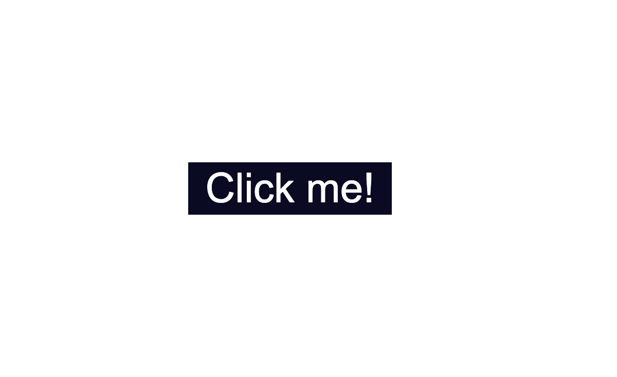
In the style.css file, I’ve added some styling which only centers the button in the middle of the browser window.
Notice that the class="button" is used with the .button selector. This is a way to apply styles directly to the button.
* {
    box-sizing: border-box;
}

body {
    display:flex;
    justify-content: center;
    align-items: center;
    margin:50px auto;
}

.button {
    position: absolute;
    top:50%
}
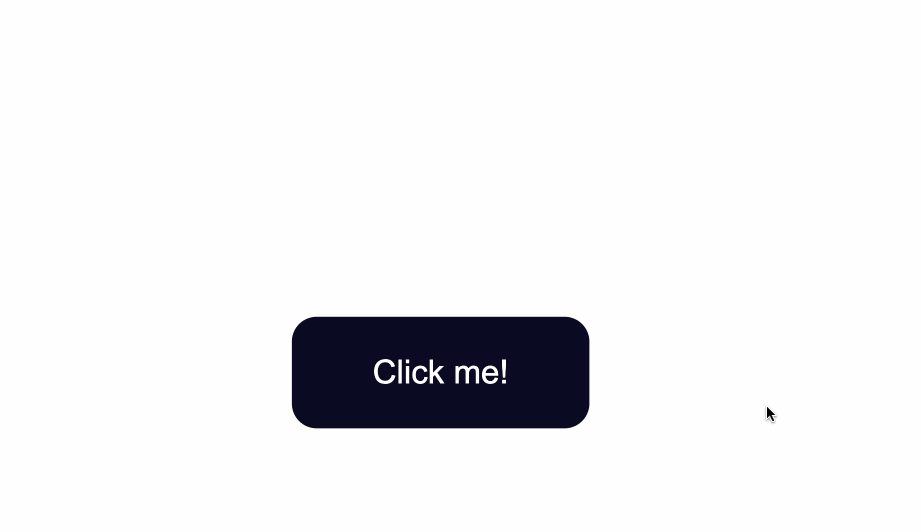
The code from above will result in the following:
The default styling of buttons will vary depending on the browser you’re using.
This is an example of how the native styles for buttons look on the Google Chrome browser.
How to Change the Default Styling of Buttons
How to Change the Background Color of Buttons
To change the background color of the button, use the CSS background-color property and give it a value of a color of your taste.
In the .button selector, you use background-color:#0a0a23; to change the background color of the button.
.button {
    position: absolute;
    top:50%;
    background-color:#0a0a23;
}
How to Change the Text Color of Buttons
The default color of text is black, so when you add a dark background color you will notice that the text has disappeared.
Another thing to make sure of is that there is enough contrast between the button’s background color and text color. This helps make the text more readable and easy on the eyes.
Next, use the color property to change the color of text:
.button {
    position: absolute;
    top:50%;
    background-color:#0a0a23;
    color: #fff;
}
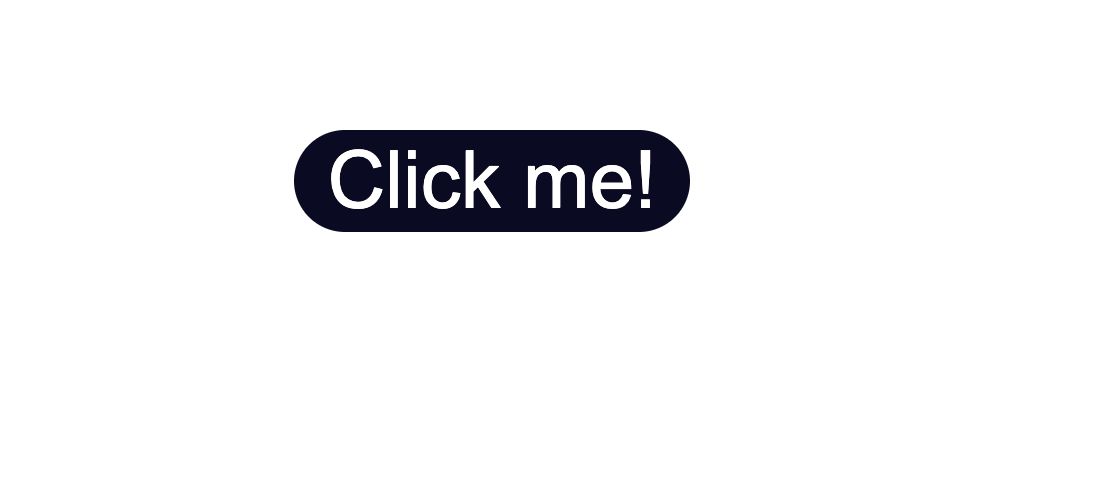
How to Change the Border Style of Buttons
Notice the grey around the edges of the button? That is the default color of the button’s borders.
One way to fix this is to use the border-color property. You set the value to be the same as the value of background-color. This makes sure the borders have the same color as the background of the button.
Another way would be to remove the border around the button entirely by using border:none;.
.button {
  position: absolute;
  top:50%;
  background-color:#0a0a23;
  color: #fff;
  border:none;
}
Next, you can also round-up the edges of the button by using the border-radius property, like so:
.button {
    position: absolute;
    top:50%;
    background-color:#0a0a23;
    color: #fff;
    border:none;
    border-radius:10px;
  }
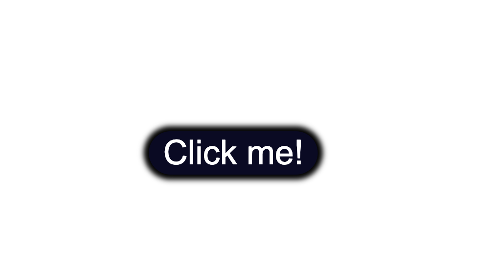
You could also add a slight dark shadow effect around the button by using the box-shadow property:
 position: absolute;
    top:50%;
    background-color:#0a0a23;
    color: #fff;
    border:none;
    border-radius:10px;
    box-shadow: 0px 0px 2px 2px rgb(0,0,0);
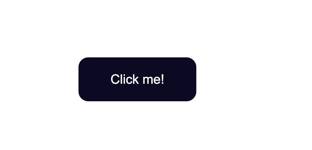
How to Change the Size of Buttons
The way to create more space inside the button’s borders is to increase the padding of the button.
Below I added a value of 15px for the top, bottom, right, and left padding of the button.
I also set a minimum height and width, with the min-height and min-width properties respectively. Buttons need to be large enough for all different kind of devices.
.button {
    position: absolute;
    top:50%;
    background-color:#0a0a23;
    color: #fff;
    border:none;
    border-radius:10px;
    padding:15px;
    min-height:30px;
    min-width: 120px;
  }
How to Style Button States
Buttons have three different states:
:hover:focus:active
It’s best that the three states are styled differently and don’t share the same styles.
In the following sections I’ll give a brief explanation on what each one of the states mean and what triggers them. You’ll also see some ways you can style the button for each separate state.
Here’s an interactive scrim about styling button states:
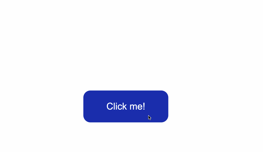
How to Style :hover States
The :hover state becomes present when a user hovers over a button, by bringing their mouse or trackpad over it, without selecting it or clicking on it.
To change the button’s styles when you hover over it, use the :hover CSS
pseudoclass selector.
A common change to make with :hover is switching the background-color of the button.
To make the change less sudden, pair :hover with the transition property.
The transition property will help make the transition from no state to a :hover state much smoother.
The change of background color will happen a bit slower than it would without the transition property. This will also help make the end result less jarring for the user.
.button:hover {
      background-color:#002ead;
      transition: 0.7s;
  }
In the example above, I used a Hex color code value to make the background color a lighter shade for when I hover over the button.
With the help of the transition property I also caused a delay of 0.7s when the transition from no state to a :hover state happens. This caused a slower transition from the original #0a0a23 background color to the #002ead background color.

Keep in mind that the :hover pseudoclass does not work for mobile device screens and mobile apps. Choose to use hover effects only for desktop web applications and not touch screens.
How to Style :focus States
The :focus state takes effect for keyboard users — specifically it will activate when you focus on a button by hitting the Tab key (⇥).
If you’re following along, when you focus on the button after pressing the Tab key, you’ll see the following:
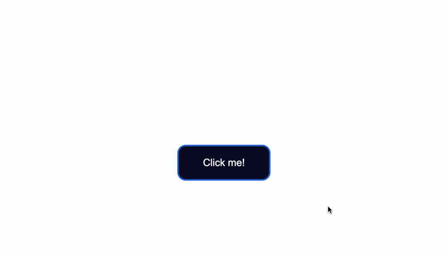
Notice the slight light blue outline around the button when it’s gained focus?
Browsers have default styling for the :focus pseudoclass, for accessibility keyboard navigation purposes. It’s not a good idea to remove that outline altogether.
You can however create custom styles for it and make it easily detectable.
A way to do so is by setting the outline color to first be transparent.
Following that, you can maintain the outline-style to solid. Lastly, using the box-shadow property, you can add a color of your liking for when the element is focused on:
 .button:focus {
    outline-color: transparent;
    outline-style:solid;
    box-shadow: 0 0 0 4px #5a01a7;
}
You can also again pair these styles with the transition property, depending on the effect you want to achieve:
  .button:focus {
    outline-color: transparent;
    outline-style:solid;
    box-shadow: 0 0 0 4px #5a01a7;
    transition: 0.7s;
}
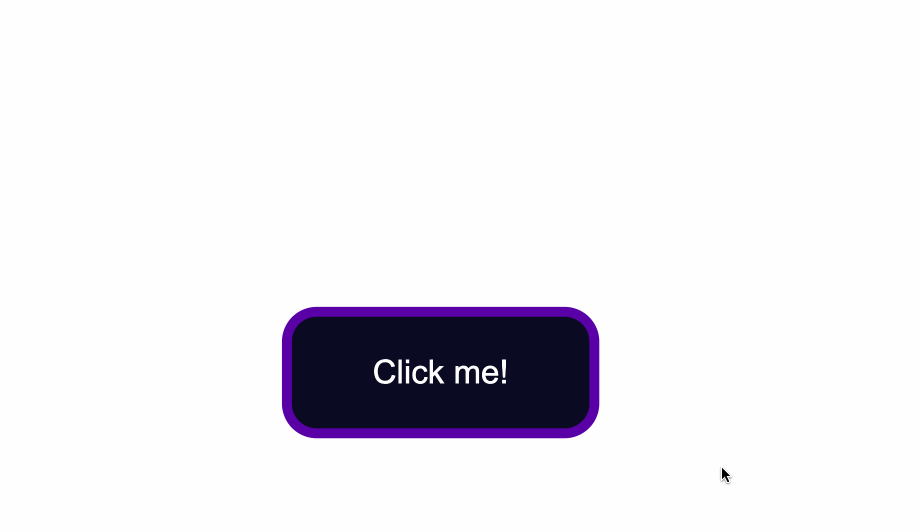
How to Style for the :active State
The :active state gets activated when you click on the button by either clicking the computer’s mouse or pressing down on the laptop’s trackpad.
That being said, look at what happens when I click the button after I’ve applied and kept the styles for the :hover and :focus states:
The :hover state styles are applied before clicking when I hover over the button.
The :focus state styles are applied also, because when a button is clicked it also gains a :focus state alongside an :active one.
However, keep in mind that they are not the same thing.
:focus state is when an element is being focused on and :active is when a user clicks on an element by holding and pressing down on it.
To change the style for when a user clicks a button, apply styles to the :active CSS pseudoselector.
In this case, I’ve changed the background color of the button when a user clicks on it
.button:active {
    background-color: #ffbf00;
}

Conclusion
And there you have it! You now know the basics of how to style a button with CSS.
We went over how to change the background color and text color of buttons as well as how to style buttons for their different states.
To learn more about web design, check out freeCodeCamp’s Responsive Web Design Certification. In the interactive lessons, you’ll learn HTML and CSS by building 15 practice projects and 5 certification projects.
Note that the above cert is still in beta — if you want the latest stable version, check here.
Thanks for reading and happy coding!
Learn to code for free. freeCodeCamp’s open source curriculum has helped more than 40,000 people get jobs as developers. Get started
In this article you’ll see how to style a button using CSS.
My goal here is mostly to showcase how different CSS rules and styles are applied and used. We won’t see much design inspiration nor will we discuss ideas for styling.
Instead, this will be more of an overview of how the styles themselves work, what properties are commonly used, and how they can be combined.
You’ll first see how to create a button in HTML. Then you’ll learn how to override the default styles of buttons. Lastly, you’ll get a glimpse of how to style buttons for their three different states.
Here’s an Interactive Scrim of CSS Button Style
Table of Contents
- Create a button in HTML
- Change default styling of buttons
- Change the background color
- Change text color
- Change the border style
- Change the size
- Style button states
- Style hover state
- Style focus state
- Style active state
- Conclusion
Let’s get started!
How to Create a Button in HTML
To create a button, use the <button> element.
This is a more accessible and semantic option compared to using a generic container which is created with the <div> element.
In the index.html file below, I’ve created the basic structure for a webpage and added a single button:
<!DOCTYPE html>
<html lang="en">
<head>
    <meta charset="UTF-8">
    <meta http-equiv="X-UA-Compatible" content="IE=edge">
    <meta name="viewport" content="width=device-width, initial-scale=1.0">
    <link rel="stylesheet" href="style.css">
    <title>CSS Button Style</title>
</head>
<body>
    <button type="button" class="button">Click me!</button>
</body>
</html>
Let’s break down the line <button type="button" class="button">Click me!</button>:
- You first add the button element, which consists of an opening
<button>and closing</button>tag. - The
type="button"attribute in the opening<button>tag explicitly creates a clickable button. Since this particular button is not used for submitting a form, it is useful for semantic reasons to add it in order to make the code clearer and not trigger any unwanted actions. - The
class="button"attribute will be used to style the button in a separate CSS file. The valuebuttoncould be any other name you choose. For example you could have usedclass="btn". - The text
Click me!is the visible text inside the button.
Any styles that will be applied to the button will go inside a spearate style.css file.
You can apply the styles to the HTML content by linking the two files together. You do this with the <link rel="stylesheet" href="style.css"> tag which was used in index.html.
In the style.css file, I’ve added some styling which only centers the button in the middle of the browser window.
Notice that the class="button" is used with the .button selector. This is a way to apply styles directly to the button.
* {
    box-sizing: border-box;
}

body {
    display:flex;
    justify-content: center;
    align-items: center;
    margin:50px auto;
}

.button {
    position: absolute;
    top:50%
}
The code from above will result in the following:
The default styling of buttons will vary depending on the browser you’re using.
This is an example of how the native styles for buttons look on the Google Chrome browser.
How to Change the Default Styling of Buttons
How to Change the Background Color of Buttons
To change the background color of the button, use the CSS background-color property and give it a value of a color of your taste.
In the .button selector, you use background-color:#0a0a23; to change the background color of the button.
.button {
    position: absolute;
    top:50%;
    background-color:#0a0a23;
}
How to Change the Text Color of Buttons
The default color of text is black, so when you add a dark background color you will notice that the text has disappeared.
Another thing to make sure of is that there is enough contrast between the button’s background color and text color. This helps make the text more readable and easy on the eyes.
Next, use the color property to change the color of text:
.button {
    position: absolute;
    top:50%;
    background-color:#0a0a23;
    color: #fff;
}
How to Change the Border Style of Buttons
Notice the grey around the edges of the button? That is the default color of the button’s borders.
One way to fix this is to use the border-color property. You set the value to be the same as the value of background-color. This makes sure the borders have the same color as the background of the button.
Another way would be to remove the border around the button entirely by using border:none;.
.button {
  position: absolute;
  top:50%;
  background-color:#0a0a23;
  color: #fff;
  border:none;
}
Next, you can also round-up the edges of the button by using the border-radius property, like so:
.button {
    position: absolute;
    top:50%;
    background-color:#0a0a23;
    color: #fff;
    border:none;
    border-radius:10px;
  }
You could also add a slight dark shadow effect around the button by using the box-shadow property:
 position: absolute;
    top:50%;
    background-color:#0a0a23;
    color: #fff;
    border:none;
    border-radius:10px;
    box-shadow: 0px 0px 2px 2px rgb(0,0,0);
How to Change the Size of Buttons
The way to create more space inside the button’s borders is to increase the padding of the button.
Below I added a value of 15px for the top, bottom, right, and left padding of the button.
I also set a minimum height and width, with the min-height and min-width properties respectively. Buttons need to be large enough for all different kind of devices.
.button {
    position: absolute;
    top:50%;
    background-color:#0a0a23;
    color: #fff;
    border:none;
    border-radius:10px;
    padding:15px;
    min-height:30px;
    min-width: 120px;
  }
How to Style Button States
Buttons have three different states:
:hover:focus:active
It’s best that the three states are styled differently and don’t share the same styles.
In the following sections I’ll give a brief explanation on what each one of the states mean and what triggers them. You’ll also see some ways you can style the button for each separate state.
Here’s an interactive scrim about styling button states:
How to Style :hover States
The :hover state becomes present when a user hovers over a button, by bringing their mouse or trackpad over it, without selecting it or clicking on it.
To change the button’s styles when you hover over it, use the :hover CSS
pseudoclass selector.
A common change to make with :hover is switching the background-color of the button.
To make the change less sudden, pair :hover with the transition property.
The transition property will help make the transition from no state to a :hover state much smoother.
The change of background color will happen a bit slower than it would without the transition property. This will also help make the end result less jarring for the user.
.button:hover {
      background-color:#002ead;
      transition: 0.7s;
  }
In the example above, I used a Hex color code value to make the background color a lighter shade for when I hover over the button.
With the help of the transition property I also caused a delay of 0.7s when the transition from no state to a :hover state happens. This caused a slower transition from the original #0a0a23 background color to the #002ead background color.
Keep in mind that the :hover pseudoclass does not work for mobile device screens and mobile apps. Choose to use hover effects only for desktop web applications and not touch screens.
How to Style :focus States
The :focus state takes effect for keyboard users — specifically it will activate when you focus on a button by hitting the Tab key (⇥).
If you’re following along, when you focus on the button after pressing the Tab key, you’ll see the following:
Notice the slight light blue outline around the button when it’s gained focus?
Browsers have default styling for the :focus pseudoclass, for accessibility keyboard navigation purposes. It’s not a good idea to remove that outline altogether.
You can however create custom styles for it and make it easily detectable.
A way to do so is by setting the outline color to first be transparent.
Following that, you can maintain the outline-style to solid. Lastly, using the box-shadow property, you can add a color of your liking for when the element is focused on:
 .button:focus {
    outline-color: transparent;
    outline-style:solid;
    box-shadow: 0 0 0 4px #5a01a7;
}
You can also again pair these styles with the transition property, depending on the effect you want to achieve:
  .button:focus {
    outline-color: transparent;
    outline-style:solid;
    box-shadow: 0 0 0 4px #5a01a7;
    transition: 0.7s;
}
How to Style for the :active State
The :active state gets activated when you click on the button by either clicking the computer’s mouse or pressing down on the laptop’s trackpad.
That being said, look at what happens when I click the button after I’ve applied and kept the styles for the :hover and :focus states:
The :hover state styles are applied before clicking when I hover over the button.
The :focus state styles are applied also, because when a button is clicked it also gains a :focus state alongside an :active one.
However, keep in mind that they are not the same thing.
:focus state is when an element is being focused on and :active is when a user clicks on an element by holding and pressing down on it.
To change the style for when a user clicks a button, apply styles to the :active CSS pseudoselector.
In this case, I’ve changed the background color of the button when a user clicks on it
.button:active {
    background-color: #ffbf00;
}
Conclusion
And there you have it! You now know the basics of how to style a button with CSS.
We went over how to change the background color and text color of buttons as well as how to style buttons for their different states.
To learn more about web design, check out freeCodeCamp’s Responsive Web Design Certification. In the interactive lessons, you’ll learn HTML and CSS by building 15 practice projects and 5 certification projects.
Note that the above cert is still in beta — if you want the latest stable version, check here.
Thanks for reading and happy coding!
Learn to code for free. freeCodeCamp’s open source curriculum has helped more than 40,000 people get jobs as developers. Get started
Тег <button> используется для создания интерактивных кнопок на веб-странице. В отличие от одинарного тега <input> (с атрибутом type=”button”), при помощи которого также можно создавать кнопки, содержимым тега <button> может быть как текст, так и изображение.
Если вы хотите создать кнопку в HTML форме, используйте элемент <input>, так как браузеры по-разному отображают содержимое тега <button>.
Содержимое тега пишется между открывающим <button> и закрывающим </button> тегами.
Пример
<!DOCTYPE html>
<html>
   <head>
       <title>Заголовок документа</title>
   </head>
   <body>
	<h1>Вот наша кнопка..</h1>
	<button type="button">Нажать</button>
   </body>
</html>
Результат

К тегу <button> можно применять CSS стили для изменения внешнего вида кнопки, ее размера, цвета, шрифта текста и т.д.
Пример
<!DOCTYPE html>
<html>
  <head>
    <title>Заголовок документа</title>
  </head>
  <body>
    Обычная кнопка
    <button type="button">Добавить в корзину</button>
    <hr />
    Кнопка с красным текстом
    <button type="button" style="color: red;"><b>Книга HTML</b></button>
    <hr />
    Кнопка с увеличенным размером шрифта
    <button type="button" style="font: bold 14px Arial;">Загрузить книгу </button><br />
  </body>
</html>
Результат

У тега <button> нет обязательных атрибутов, однако мы рекомендуем всегда использовать атрибут type=”button”, если тег используется в качестве обычной кнопки.
Тег <button> поддерживает глобальные атрибуты и атрибуты событий.
The <button> HTML element is an interactive element activated by a user with a mouse, keyboard, finger, voice command, or other assistive technology. Once activated, it then performs an action, such as submitting a form or opening a dialog.
By default, HTML buttons are presented in a style resembling the platform the user agent runs on, but you can change buttons’ appearance with CSS.
Try it
Attributes
This element’s attributes include the global attributes.
autofocus-
This Boolean attribute specifies that the button should have input focus when the page loads. Only one element in a document can have this attribute.
autocomplete
Non-standard
-
This attribute on a
<button>is nonstandard and Firefox-specific. Unlike other browsers, Firefox persists the dynamic disabled state of a<button>across page loads. Settingautocomplete="off"on the button disables this feature; see bug 654072. disabled-
This Boolean attribute prevents the user from interacting with the button: it cannot be pressed or focused.
Firefox, unlike other browsers, persists the dynamic disabled state of a
<button>across page loads. Use theautocompleteattribute to control this feature. form-
The
<form>element to associate the button with (its form owner). The value of this attribute must be theidof a<form>in the same document. (If this attribute is not set, the<button>is associated with its ancestor<form>element, if any.)This attribute lets you associate
<button>elements to<form>s anywhere in the document, not just inside a<form>. It can also override an ancestor<form>element. formaction-
The URL that processes the information submitted by the button. Overrides the
actionattribute of the button’s form owner. Does nothing if there is no form owner. formenctype-
If the button is a submit button (it’s inside/associated with a
<form>and doesn’t havetype="button"), specifies how to encode the form data that is submitted. Possible values:application/x-www-form-urlencoded: The default if the attribute is not used.multipart/form-data: Used to submit<input>elements with theirtypeattributes set tofile.text/plain: Specified as a debugging aid; shouldn’t be used for real form submission.
If this attribute is specified, it overrides the
enctypeattribute of the button’s form owner. formmethod-
If the button is a submit button (it’s inside/associated with a
<form>and doesn’t havetype="button"), this attribute specifies the HTTP method used to submit the form. Possible values:post: The data from the form are included in the body of the HTTP request when sent to the server. Use when the form contains information that shouldn’t be public, like login credentials.get: The form data are appended to the form’sactionURL, with a?as a separator, and the resulting URL is sent to the server. Use this method when the form has no side effects, like search forms.
If specified, this attribute overrides the
methodattribute of the button’s form owner. formnovalidate-
If the button is a submit button, this Boolean attribute specifies that the form is not to be validated when it is submitted. If this attribute is specified, it overrides the
novalidateattribute of the button’s form owner.This attribute is also available on
<input type="image">and<input type="submit">elements. formtarget-
If the button is a submit button, this attribute is an author-defined name or standardized, underscore-prefixed keyword indicating where to display the response from submitting the form. This is the
nameof, or keyword for, a browsing context (a tab, window, or<iframe>). If this attribute is specified, it overrides thetargetattribute of the button’s form owner. The following keywords have special meanings:_self: Load the response into the same browsing context as the current one. This is the default if the attribute is not specified._blank: Load the response into a new unnamed browsing context — usually a new tab or window, depending on the user’s browser settings._parent: Load the response into the parent browsing context of the current one. If there is no parent, this option behaves the same way as_self._top: Load the response into the top-level browsing context (that is, the browsing context that is an ancestor of the current one, and has no parent). If there is no parent, this option behaves the same way as_self.
name-
The name of the button, submitted as a pair with the button’s
valueas part of the form data, when that button is used to submit the form. type-
The default behavior of the button. Possible values are:
submit: The button submits the form data to the server. This is the default if the attribute is not specified for buttons associated with a<form>, or if the attribute is an empty or invalid value.reset: The button resets all the controls to their initial values, like <input type=»reset»>. (This behavior tends to annoy users.)button: The button has no default behavior, and does nothing when pressed by default. It can have client-side scripts listen to the element’s events, which are triggered when the events occur.
value-
Defines the value associated with the button’s
namewhen it’s submitted with the form data. This value is passed to the server in params when the form is submitted using this button.
Notes
A submit button with the attribute formaction set, but without an associated form does nothing. You have to set a form owner, either by wrapping it in a <form> or set the attribute form to the id of the form.
<button> elements are much easier to style than <input> elements. You can add inner HTML content (think <i>, <br>, or even <img>), and use ::after and ::before pseudo-elements for complex rendering.
If your buttons are not for submitting form data to a server, be sure to set their type attribute to button. Otherwise they will try to submit form data and to load the (nonexistent) response, possibly destroying the current state of the document.
While <button type="button"> has no default behavior, event handlers can be scripted to trigger behaviors. An activated button can perform programmable actions using JavaScript, such as removing an item from a list.
Example
<button name="button">Press me</button>
Accessibility concerns
Icon buttons
Buttons that only show an icon to represent do not have an accessible name. Accessible names provide information for assistive technology, such as screen readers, to access when they parse the document and generate an accessibility tree. Assistive technology then uses the accessibility tree to navigate and manipulate page content.
To give an icon button an accessible name, put text in the <button> element that concisely describes the button’s functionality.
Example
<button name="favorite">
  <svg aria-hidden="true" viewBox="0 0 10 10">
    <path d="M7 9L5 8 3 9V6L1 4h3l1-3 1 3h3L7 6z" />
  </svg>
  Add to favorites
</button>
If you want to visually hide the button’s text, an accessible way to do so is to use a combination of CSS properties to remove it visually from the screen, but keep it parsable by assistive technology.
However, it is worth noting that leaving the button text visually apparent can aid people who may not be familiar with the icon’s meaning or understand the button’s purpose. This is especially relevant for people who are not technologically sophisticated, or who may have different cultural interpretations for the icon the button uses.
- What is an accessible name? | The Paciello Group
- MDN Understanding WCAG, Guideline 4.1 explanations
- Understanding Success Criterion 4.1.2 | W3C Understanding WCAG 2.0
Size and Proximity
Size
Interactive elements such as buttons should provide an area large enough that it is easy to activate them. This helps a variety of people, including people with motor control issues and people using non-precise forms of input such as a stylus or fingers. A minimum interactive size of 44×44 CSS pixels is recommended.
- Understanding Success Criterion 2.5.5: Target Size | W3C Understanding WCAG 2.1
- Target Size and 2.5.5 | Adrian Roselli
- Quick test: Large touch targets — The A11Y Project
Proximity
Large amounts of interactive content — including buttons — placed in close visual proximity to each other should have space separating them. This spacing is beneficial for people who are experiencing motor control issues, who may accidentally activate the wrong interactive content.
Spacing may be created using CSS properties such as margin.
- Hand tremors and the giant-button-problem — Axess Lab
ARIA state information
To describe the state of a button the correct ARIA attribute to use is aria-pressed and not aria-checked or aria-selected. To find out more read the information about the ARIA button role.
Firefox
Firefox will add a small dotted border on a focused button. This border is declared through CSS in the browser stylesheet, but you can override it to add your own focused style using button::-moz-focus-inner { }.
If overridden, it is important to ensure that the state change when focus is moved to the button is high enough that people experiencing low vision conditions will be able to perceive it.
Color contrast ratio is determined by comparing the luminosity of the button text and background color values compared to the background the button is placed on. In order to meet current Web Content Accessibility Guidelines (WCAG), a ratio of 4.5:1 is required for text content and 3:1 for large text. (Large text is defined as 18.66px and bold or larger, or 24px or larger.)
- WebAIM: Color Contrast Checker
- MDN Understanding WCAG, Guideline 1.4 explanations
- Understanding Success Criterion 1.4.3 | W3C Understanding WCAG 2.0
Clicking and focus
Whether clicking on a <button> or <input> button types causes it to (by default) become focused varies by browser and OS. Most browsers do give focus to a button being clicked, but Safari does not, by design.
Technical summary
| Content categories |
Flow content, phrasing content, Interactive content, listed, labelable, and submittable form-associated element, palpable content. |
|---|---|
| Permitted content |
Phrasing content but there must be no Interactive content |
| Tag omission | None, both the starting and ending tag are mandatory. |
| Permitted parents |
Any element that accepts phrasing content. |
| Implicit ARIA role | button |
| Permitted ARIA roles |
checkbox, combobox,link, menuitem,menuitemcheckbox,menuitemradio, option,radio, switch,tab
|
| DOM interface | HTMLButtonElement |
Specifications
| Specification |
|---|
| HTML Standard # the-button-element |
Browser compatibility
BCD tables only load in the browser
Для создания кнопок используется тег <button>. Внутри него размещается текст или изображение, которые будут отображаться на кнопке. Например:
<button type="button">Я кнопка</button>Чтобы задать кнопке имя, тип или состояние, нужно добавить атрибуты: name, disabled и type.
Атрибут name задаёт имя кнопки. Может использоваться для идентификации элемента в скриптах.
<button type="button" name="popup-button">Я кнопка</button>Атрибут disabled блокирует доступ к кнопке.
<button type="button" disabled>Я заблокированная кнопка</button>Атрибут type определяет тип кнопки. Ему задают одно из трёх значений:
button — значение по умолчанию. Означает, что элемент — обычная кнопка. Она может добавлять товары в корзину или избранное, переключать слайдеры или закрывать всплывающие окна.
submit задаётся кнопкам для отправки формы. Когда пользователь нажимает на кнопку с таким типом, браузер отправляет данные формы на сервер.
reset добавляется кнопкам сброса формы. Когда пользователь нажимает на такую кнопку, браузер возвращает значения всех полей формы к изначальным.
Полный список атрибутов
Иногда на сайте встречаются элементы вроде кнопок «Перейти в каталог», «Читать далее» или кнопок соцсетей. На самом деле это ссылки. Их создают с помощью <a href="">Какой-то текст</a> и затем стилизуют так, чтобы они стали похожими на кнопки.
А как же input?
Создать кнопку можно и с помощью тега <input>, если указать ему тип button:
<input tupe="button" value="Я тоже кнопка"> Это рабочий способ. О нём надо знать, ведь вы можете встретить его в проектах. Но самим так делать не стоит. У кнопок, созданных на инпуте, есть ограничения: сложно управлять размерами и положением изображений, а также нет псевдоэлементов. Поэтому оставьте <input> для создания элементов формы, таких как текстовые поля, радиокнопки или чекбоксы. А кнопки верстайте с помощью <button>.
Как сделать кнопку с иконкой
Посмотрим три способа создания кнопки с иконкой.
С помощью тега <img>
Способ подойдёт для контентных изображений.
<button type="button">
  <img src="icon.svg" alt="Иконка" width="20" height="20">
</button> 
Так вы можете добавлять кнопки с эмодзи, лайками, дизлайками или чем-то ещё. Иконке нужно обязательно задавать размеры, чтобы кнопка зарезервировала место и не прыгала, когда загрузится иконка.
Добавить инлайн-SVG в разметку
Способ подойдёт, если изображение меняет состояния, как здесь:
Код простой: пишем тег <button> и добавляем в него код SVG-изображения.
<button type="button">
  <svg width="30" height="30">
    <path d="..."/>
  </svg>
  Просто кнопка
</button>
Вставить фоном в CSS
Способ подойдёт, если иконка играет декоративную роль и не меняется при наведении или клике на кнопку. Например, в таких случаях:

Как добавить иконку в кнопку:
<button type="button">
  <span class="icon-button"></span>
  Текст кнопки
</button>
.icon-button {
background-image: url("../images/icon.svg");
background-size: 90px 97px;
}Какой способ выбрать — зависит от ваших задач и особенностей проекта. Вы также можете использовать разные методы в рамках одного проекта. Например, часть кнопок сделать со встроенным в разметку SVG, а часть — с фоновым изображением.
Материалы по теме
- Что такое ссылки и как их ставить
- Как сделать картинку ссылкой
- Шаблон HTML-формы
- Как использовать ссылки mailto: и tel:
Узнайте, как стиль кнопок с помощью CSS.
Основные стили кнопок
Пример
.button {
background-color: #4CAF50; /* Green */
border: none;
color: white;
padding: 15px 32px;
text-align: center;
text-decoration: none;
display: inline-block;
font-size: 16px;
}
Цвета кнопок
Используйте свойство background-color для изменения цвета фона кнопки:
Пример
.button1 {background-color: #4CAF50;} /* Green */
.button2
{background-color: #008CBA;} /* Blue */
.button3 {background-color:
#f44336;} /* Red */
.button4 {background-color: #e7e7e7; color: black;} /* Gray */
.button5
{background-color: #555555;} /* Black */
Размеры кнопок
Используйте свойство font-size для изменения размера шрифта кнопки:
Пример
.button1 {font-size: 10px;}
.button2 {font-size: 12px;}
.button3
{font-size: 16px;}
.button4 {font-size: 20px;}
.button5 {font-size: 24px;}
Используйте свойство padding для изменения заполнения кнопки:
Пример
.button1 {padding: 10px
24px;}
.button2 {padding: 12px 28px;}
.button3 {padding: 14px 40px;}
.button4 {padding: 32px 16px;}
.button5 {padding: 16px;}
Закругленные кнопки
Используйте свойство border-radius для добавления скругленных углов к кнопке:
Пример
.button1 {border-radius: 2px;}
.button2 {border-radius: 4px;}
.button3
{border-radius: 8px;}
.button4 {border-radius: 12px;}
.button5 {border-radius: 50%;}
Цветные границы кнопок
Используйте свойство border, чтобы добавить цветную рамку к кнопке:
Пример
.button1 {
background-color: white;
color: black;
border: 2px solid #4CAF50; /* Green */
}
…
Наведите кнопки
Используйте селектор :hover для изменения стиля кнопки при наведении на нее указателя мыши.
Совет: Используйте свойство transition-duration для определения скорости эффекта «Hover»:
Пример
.button {
-webkit-transition-duration: 0.4s; /* Safari */
transition-duration: 0.4s;
}
.button:hover {
background-color: #4CAF50; /* Green */
color: white;
}
…
Кнопки теней
Use the box-shadow property to add shadows to a button:
Пример
.button1 {
box-shadow: 0 8px 16px 0 rgba(0,0,0,0.2), 0 6px 20px 0
rgba(0,0,0,0.19);
}
.button2:hover {
box-shadow: 0 12px
16px 0 rgba(0,0,0,0.24), 0 17px 50px 0 rgba(0,0,0,0.19);
}
Отключенные кнопки
Используйте свойство opacity для добавления прозрачности к кнопке (создает «отключенный» вид).
Совет: Вы также можете добавить свойство cursor со значением «not-allowed», которое будет отображать «нет парковки знак» при наведении указателя мыши на кнопку:
Пример
.disabled {
opacity: 0.6;
cursor: not-allowed;
}
Ширина кнопки
По умолчанию размер кнопки определяется по ее текстовому содержимому (так же широко, как и ее содержимое). Используйте свойство width для изменения ширины кнопки:
Пример
.button1 {width: 250px;}
.button2 {width: 50%;}
.button3 {width:
100%;}
Группы кнопок
Удалите поля и добавьте float:left к каждой кнопке, чтобы создать группу кнопок:
Пример
.button {
float: left;
}
Группа кнопок на границе
Используйте свойство border для создания группы кнопок с рамками:
Пример
.button {
float: left;
border: 1px
solid green;
}
Вертикальная группа кнопок
Используйте display:block вместо float:left для группирования кнопок ниже друг друга, вместо того, чтобы бок о бок:
Пример
.button {
display: block;
}
Кнопка на картинке

Анимированные кнопки
Пример
Добавить стрелку на наведении:
Пример
Добавить «нажатия» эффект на кнопку:
Пример
Исчезать при наведении:
Пример
Добавить эффект «рябь» при щелчке: