Это функция браузера, которая не описана в стандартах. Браузеры вольны реализовывать масштабирование так, как захочется левой пятке архитектора браузера, а также учитывать предпочтения юзера в настройках.
Так как «уникальные» для браузеров фичи признаны Вселенским Злом™, то из жабоскрипта масштабирование недоступно.
Масштабирование может быть реализовано самим сайтом с помощью возможностей CSS.
Правильный способ
Использовать относительные размеры для шрифтов (%, em и др.), в корне страницы менять размер базового шрифта.
Для остальных элементов можно добавить дополнительные стили и опять же в зависимости от класса корня менять размер. Для картинок будет разумно округлять масштаб до «круглых» чисел вроде 50%, 33% и т. п.
Жёсткий способ
Использовать стандартное свойство CSS transform. Можно добавить в корень документа стиль transform: scale(N%), тогда отмасштабируется вся страница. Учтите, что за качество и производительность никто не отвечает.
Чтобы сохранить ширину страницы, её можно менять в соответствии с масштабом (помножить на обратное число, собственно).
Костыльный способ
Ипользовать нестандартное свойство CSS zoom. Опять же в корень можно добавить zoom: N%. Поддержка не гарантируется, работает не во всех браузерах.
Пример правильного способа:
$(function() {
  var fontSize = 12;
  var imgScales = { small: 0.25, normal: 0.50, large: 1.00 }

  function setFontSize(fontSize) {
    var zoomLevel = 'normal';
    if (fontSize <= 9)
      zoomLevel = 'small';
    else if (fontSize >= 15)
      zoomLevel = 'large';
    var imgScale = imgScales[zoomLevel];
    $('#root').css('font-size', fontSize + 'pt');
    $('#root').removeClass('zoom-small zoom-normal zoom-large');
    $('#root').addClass('zoom-' + zoomLevel);
    $('img.scalable').each(function() {
      $(this).css('width', this.naturalWidth * imgScale);
      $(this).css('height', this.naturalHeight * imgScale);
    });
  }
  $('#plus').on('click', function() {
    setFontSize(++fontSize);
  });
  $('#minus').on('click', function() {
    setFontSize(--fontSize);
  });
});
#root {
font: 12pt sans-serif;
width: 500px;
background: lightskyblue;
}
p {
font-size: 1em;
}
h1 {
font-size: 1.5em;
}<script src="https://ajax.googleapis.com/ajax/libs/jquery/2.1.1/jquery.min.js"></script>
<p>
<button id="plus">+</button>
<button id="minus">−</button>
</p>
<div id="root" class="zoom-normal">
<h1>Lorem Ipsum</h1>
<p>
<img class="scalable" src="http://i.imgur.com/n9t1rYZ.gif" style="float: right; width: 100px"/>
Lorem ipsum dolor sit amet, consectetur adipiscing elit, sed do eiusmod tempor incididunt ut labore et dolore magna aliqua. Ut enim ad minim veniam, quis nostrud exercitation ullamco laboris nisi ut aliquip ex ea commodo consequat. Duis aute irure
dolor in reprehenderit in voluptate velit esse cillum dolore eu fugiat nulla pariatur. Excepteur sint occaecat cupidatat non proident, sunt in culpa qui officia deserunt mollit anim id est laborum. Lorem ipsum dolor sit amet, consectetur adipiscing
elit, sed do eiusmod tempor incididunt ut labore et dolore magna aliqua. Ut enim ad minim veniam, quis nostrud exercitation ullamco laboris nisi ut aliquip ex ea commodo consequat. Duis aute irure dolor in reprehenderit in voluptate velit esse cillum
dolore eu fugiat nulla pariatur. Excepteur sint occaecat cupidatat non proident, sunt in culpa qui officia deserunt mollit anim id est laborum.
</p>
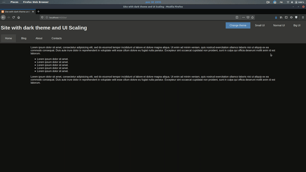
</div>Using Firefox, you can enlarge an entire web page by simply pressing CTRL +. What this does is proportionally enlarge the entire web page (fonts, images, etc).
How can I replicate the same functionality using simply CSS?
Is there something like page-size: 150% (which would increase the entire page portions by x%?)
asked Jul 20, 2009 at 22:19
6
You might be able to use the CSS zoom property — supported in IE 5.5+, Opera, and Safari 4, and Chrome
Can I use: css Zoom
Firefox is the only major browser that does not support Zoom (bugzilla item here) but you could use the «proprietary» -moz-transform property in Firefox 3.5.
So you could use:
div.zoomed {
    zoom: 3;
    -moz-transform: scale(3);
    -moz-transform-origin: 0 0;
}
maxshuty
8,93313 gold badges58 silver badges75 bronze badges
answered Jul 20, 2009 at 23:29
Jon GallowayJon Galloway
52k25 gold badges123 silver badges193 bronze badges
11
This is a rather late answer, but you can use
body {
   transform: scale(1.1);
   transform-origin: 0 0;
   // add prefixed versions too.
}
to zoom the page by 110%.
Although the zoom style is there, Firefox still does not support it sadly.
Also, this is slightly different than your zoom. The css transform works like an image zoom, so it will enlarge your page but not cause reflow, etc.
Edit updated the transform origin.
answered Jul 1, 2013 at 16:08
kumarharshkumarharsh
18.6k8 gold badges71 silver badges100 bronze badges
10
If your CSS is constructed completely around ex or em units, then this might be possible and feasible. You’d just need to declare font-size: 150% in your style for body or html. This should cause every other lengths to scale proportionally. You can’t scale images this way, though, unless they get a style too.
But that’s a very big if on most sites, anyway.
answered Jul 20, 2009 at 22:27
JoeyJoey
339k84 gold badges681 silver badges680 bronze badges
3
Scale is not the best option
It will need some other adjustments, like margins paddings etc ..
but the right option is
zoom: 75%
answered Oct 22, 2020 at 0:45
SystemXSystemX
4614 silver badges9 bronze badges
5
I have the following code that scales the entire page through CSS properties. The important thing is to set body.style.width to the inverse of the zoom to avoid horizontal scrolling. You must also set transform-origin to top left to keep the top left of the document at the top left of the window.
        var zoom = 1;
        var width = 100;

        function bigger() {
            zoom = zoom + 0.1;
            width = 100 / zoom;
            document.body.style.transformOrigin = "left top";
            document.body.style.transform = "scale(" + zoom + ")";
            document.body.style.width = width + "%";
        }
        function smaller() {
            zoom = zoom - 0.1;
            width = 100 / zoom;
            document.body.style.transformOrigin = "left top";
            document.body.style.transform = "scale(" + zoom + ")";
            document.body.style.width = width + "%";
        }
answered Jan 2, 2020 at 12:38
Ags1Ags1
6091 gold badge9 silver badges18 bronze badges
1
As Johannes says — not enough rep to comment directly on his answer — you can indeed do this as long as all elements’ «dimensions are specified as a multiple of the font’s size. Meaning, everything where you used %, em or ex units». Although I think % are based on containing element, not font-size.
And you wouldn’t normally use these relative units for images, given they are composed of pixels, but there’s a trick which makes this a lot more practical.
If you define body{font-size: 62.5%}; then 1em will be equivalent to 10px. As far as I know this works across all main browsers.
Then you can specify your (e.g.) 100px square images with width: 10em; height: 10em; and assuming Firefox’s scaling is set to default, the images will be their natural size.
Make body{font-size: 125%}; and everything — including images — wil be double original size.
answered Jul 21, 2009 at 9:02
e100e100
1,5932 gold badges13 silver badges21 bronze badges
3
For Cross-Browser Compatibility :
Example Goes Below :
<html><body class="entire-webpage"></body></html>


.entire-webpage{
        zoom: 2;
        -moz-transform: scale(2);/* Firefox Property */
        -moz-transform-origin: 0 0;
        -o-transform: scale(2);/* Opera Property */
        -o-transform-origin: 0 0;
        -webkit-transform: scale(2);/* Safari Property */
        -webkit-transform-origin: 0 0;
        transform: scale(2); /* Standard Property */
        transform-origin: 0 0;  /* Standard Property */
    }
answered Oct 7, 2020 at 23:43
SaumyajitSaumyajit
6407 silver badges9 bronze badges
With this code 1em or 100% will equal to 1% of the body height
document.body.style.fontSize = ((window.innerHeight/100)*6.25)+"%"
answered Jul 15, 2011 at 15:00
 * {
transform: scale(1.1, 1.1)
}
this will transform every element on the page
answered Jul 24, 2019 at 7:18
1
Jon Tan has done this with his site — http://jontangerine.com/
Everything including images has been declared in ems. Everything. This is how the desired effect is achieved. Text zoom and screen zoom yield almost the exact same result.
answered Jul 21, 2009 at 23:13
Andy FordAndy Ford
8,3503 gold badges26 silver badges35 bronze badges
CSS will not be able to zoom on demand, but if you couple CSS with JS, you could change some values to make a page look bigger.
However, as it has been said, this feature is standard nowadays in modern browsers: no need to replicate it. As a matter of fact, replicating it will slow down your website (more things to load, more JS or CSS to parse or execute and apply, etc.)
answered Jul 22, 2009 at 11:05
T0xicCodeT0xicCode
4,3872 gold badges35 silver badges50 bronze badges
1
you have to set the zoom property in style.
Now interesting part is how to calculate it.
This is what I did.
let zoom = Number((window.innerWidth / window.screen.width).toFixed(3));
document.firstElementChild.style.zoom = zoom;
this will calculate the ratio of current window width to actual device width.
Then set that value to top level html element zoom property.
Top level html element can be accessed using document.firstElementChild
You can put this code inside window.onresize function to make the whole page zoom accordingly.
set the height of main wrapper div to 100% to prevent white space on zoom.
answered Oct 13, 2021 at 18:19
Ronn WilderRonn Wilder
1,1387 silver badges12 bronze badges
Using Firefox, you can enlarge an entire web page by simply pressing CTRL +. What this does is proportionally enlarge the entire web page (fonts, images, etc).
How can I replicate the same functionality using simply CSS?
Is there something like page-size: 150% (which would increase the entire page portions by x%?)
asked Jul 20, 2009 at 22:19
6
You might be able to use the CSS zoom property — supported in IE 5.5+, Opera, and Safari 4, and Chrome
Can I use: css Zoom
Firefox is the only major browser that does not support Zoom (bugzilla item here) but you could use the «proprietary» -moz-transform property in Firefox 3.5.
So you could use:
div.zoomed {
    zoom: 3;
    -moz-transform: scale(3);
    -moz-transform-origin: 0 0;
}
maxshuty
8,93313 gold badges58 silver badges75 bronze badges
answered Jul 20, 2009 at 23:29
Jon GallowayJon Galloway
52k25 gold badges123 silver badges193 bronze badges
11
This is a rather late answer, but you can use
body {
   transform: scale(1.1);
   transform-origin: 0 0;
   // add prefixed versions too.
}
to zoom the page by 110%.
Although the zoom style is there, Firefox still does not support it sadly.
Also, this is slightly different than your zoom. The css transform works like an image zoom, so it will enlarge your page but not cause reflow, etc.
Edit updated the transform origin.
answered Jul 1, 2013 at 16:08
kumarharshkumarharsh
18.6k8 gold badges71 silver badges100 bronze badges
10
If your CSS is constructed completely around ex or em units, then this might be possible and feasible. You’d just need to declare font-size: 150% in your style for body or html. This should cause every other lengths to scale proportionally. You can’t scale images this way, though, unless they get a style too.
But that’s a very big if on most sites, anyway.
answered Jul 20, 2009 at 22:27
JoeyJoey
339k84 gold badges681 silver badges680 bronze badges
3
Scale is not the best option
It will need some other adjustments, like margins paddings etc ..
but the right option is
zoom: 75%
answered Oct 22, 2020 at 0:45
SystemXSystemX
4614 silver badges9 bronze badges
5
I have the following code that scales the entire page through CSS properties. The important thing is to set body.style.width to the inverse of the zoom to avoid horizontal scrolling. You must also set transform-origin to top left to keep the top left of the document at the top left of the window.
        var zoom = 1;
        var width = 100;

        function bigger() {
            zoom = zoom + 0.1;
            width = 100 / zoom;
            document.body.style.transformOrigin = "left top";
            document.body.style.transform = "scale(" + zoom + ")";
            document.body.style.width = width + "%";
        }
        function smaller() {
            zoom = zoom - 0.1;
            width = 100 / zoom;
            document.body.style.transformOrigin = "left top";
            document.body.style.transform = "scale(" + zoom + ")";
            document.body.style.width = width + "%";
        }
answered Jan 2, 2020 at 12:38
Ags1Ags1
6091 gold badge9 silver badges18 bronze badges
1
As Johannes says — not enough rep to comment directly on his answer — you can indeed do this as long as all elements’ «dimensions are specified as a multiple of the font’s size. Meaning, everything where you used %, em or ex units». Although I think % are based on containing element, not font-size.
And you wouldn’t normally use these relative units for images, given they are composed of pixels, but there’s a trick which makes this a lot more practical.
If you define body{font-size: 62.5%}; then 1em will be equivalent to 10px. As far as I know this works across all main browsers.
Then you can specify your (e.g.) 100px square images with width: 10em; height: 10em; and assuming Firefox’s scaling is set to default, the images will be their natural size.
Make body{font-size: 125%}; and everything — including images — wil be double original size.
answered Jul 21, 2009 at 9:02
e100e100
1,5932 gold badges13 silver badges21 bronze badges
3
For Cross-Browser Compatibility :
Example Goes Below :
<html><body class="entire-webpage"></body></html>


.entire-webpage{
        zoom: 2;
        -moz-transform: scale(2);/* Firefox Property */
        -moz-transform-origin: 0 0;
        -o-transform: scale(2);/* Opera Property */
        -o-transform-origin: 0 0;
        -webkit-transform: scale(2);/* Safari Property */
        -webkit-transform-origin: 0 0;
        transform: scale(2); /* Standard Property */
        transform-origin: 0 0;  /* Standard Property */
    }
answered Oct 7, 2020 at 23:43
SaumyajitSaumyajit
6407 silver badges9 bronze badges
With this code 1em or 100% will equal to 1% of the body height
document.body.style.fontSize = ((window.innerHeight/100)*6.25)+"%"
answered Jul 15, 2011 at 15:00
 * {
transform: scale(1.1, 1.1)
}
this will transform every element on the page
answered Jul 24, 2019 at 7:18
1
Jon Tan has done this with his site — http://jontangerine.com/
Everything including images has been declared in ems. Everything. This is how the desired effect is achieved. Text zoom and screen zoom yield almost the exact same result.
answered Jul 21, 2009 at 23:13
Andy FordAndy Ford
8,3503 gold badges26 silver badges35 bronze badges
CSS will not be able to zoom on demand, but if you couple CSS with JS, you could change some values to make a page look bigger.
However, as it has been said, this feature is standard nowadays in modern browsers: no need to replicate it. As a matter of fact, replicating it will slow down your website (more things to load, more JS or CSS to parse or execute and apply, etc.)
answered Jul 22, 2009 at 11:05
T0xicCodeT0xicCode
4,3872 gold badges35 silver badges50 bronze badges
1
you have to set the zoom property in style.
Now interesting part is how to calculate it.
This is what I did.
let zoom = Number((window.innerWidth / window.screen.width).toFixed(3));
document.firstElementChild.style.zoom = zoom;
this will calculate the ratio of current window width to actual device width.
Then set that value to top level html element zoom property.
Top level html element can be accessed using document.firstElementChild
You can put this code inside window.onresize function to make the whole page zoom accordingly.
set the height of main wrapper div to 100% to prevent white space on zoom.
answered Oct 13, 2021 at 18:19
Ronn WilderRonn Wilder
1,1387 silver badges12 bronze badges
#Руководства
- 10 фев 2020
-

18
Как адаптировать сайт под разные разрешения
Рассказываем и показываем, как создавать удобные сайты, которые будут хорошо выглядеть на разных мониторах.
vlada_maestro / shutterstock

Пишет о программировании, в свободное время создаёт игры. Мечтает открыть свою студию и выпускать ламповые RPG.
Многие разработчики слишком ленивы, чтобы хоть как-то адаптировать свой сайт: одни проверяют всё только под свой браузер, а другие игнорируют мобильные устройства.
Но чаще всего можно заметить, что сайты плохо адаптированы под разные мониторы и разрешения. Например, вот как выглядит «ВКонтакте» на FullHD-мониторе:
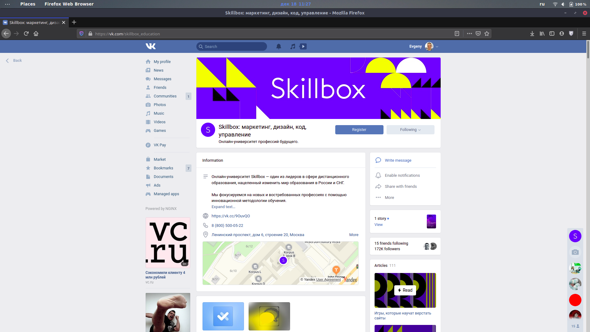
Шрифт очень маленький, а контент размещается только на небольшой части экрана. Чтобы комфортно пользоваться им, нужно менять масштаб страницы:

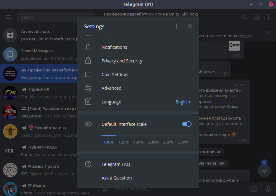
Встроенных настроек для этого нет, в отличие, например, от Telegram:
Такая адаптация — что-то вроде кибертолерантности. Мы должны заботиться об удобстве посетителей наших сайтов, какими бы устройствами, мониторами и браузерами (только не Internet Explorer) они ни пользовались. Поэтому в этой статье мы расскажем, как адаптировать сайт под разные разрешения.
За основу возьмём сайт из статьи про добавление тёмной темы. Читать её не обязательно, но там подробнее объясняется часть с PHP-скриптами. Также вы можете посмотреть исходный код этого сайта на GitHub.
Прежде всего нужно быть уверенным, что ваш сайт не сломается, если пользователь изменит разрешение на 1 пиксель (как это бывает в MS Word). Для этого везде, где только можно, размеры нужно указывать в процентах.
Также при создании сайта полезно помещать его в оболочку (wrapper): она растягивается на весь экран, а сам сайт будет масштабироваться относительно оболочки.
<body>
    <div class="wrapper">
   	 Ваш сайт здесь
    </div>
</body>
Сам контент, не считая хэдера и футера, не стоит растягивать на всю страницу:
Тут ширина блока с текстом составляет 80% страницы. Если бы не это ограничение, чтение мелкого шрифта с больших мониторов превратилось бы в разминку шеи:

Также вы можете указать максимальную ширину в пикселях:
width: 80%;
max-width: 720px;
Тогда при любом размере монитора читать будет более-менее комфортно.
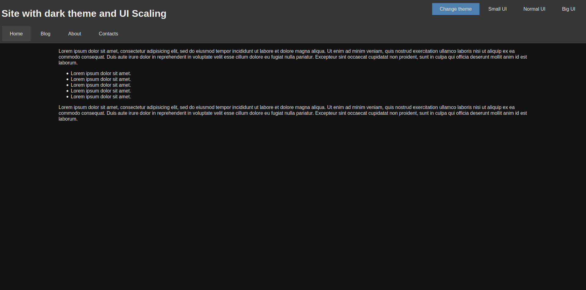
Как и в случае с тёмной темой, можно подготовить несколько файлов стилей, каждый из которых будет содержать разные размеры для элементов страницы. Начнём со стиля для средних мониторов — normal.css:
body, html
{
	font-size: 16px !important;
}

.nav__item
{
	padding: 15px 25px !important;
	margin: 2px !important;
}

.main__content
{
	width: 80% !important;
	margin: 0 auto !important;
}

.ui-button
{
	padding: 10px 25px !important;
}
Кроме него будут созданы ещё два файла: small.css и big.css. Они добавляются с помощью отдельного элемента link:
<link rel="stylesheet" type="text/css" href="styles/<?php echo $_SESSION["scale"]; ?>.css" id="scale-link">
Теперь нужно сделать так, чтобы пользователь мог выбрать, какой масштаб ему подходит. Для этого добавляем кнопки:
<div class="hover-panel">
    <div class="hover-panel__content">
   	 <div class="ui-button theme-button" id="theme-button">Change theme</div>
   	 <div class="ui-button" id="small-button">Small UI</div>
   	 <div class="ui-button" id="normal-button">Normal UI</div>
   	 <div class="ui-button" id="big-button">Big UI</div>
    </div>
</div>
И остаётся только подключить скрипт, который будет переключать файл стилей:
var btns =
{
    small: document.getElementById("small-button"),
    normal: document.getElementById("normal-button"),
    big: document.getElementById("big-button")
};
var link = document.getElementById("scale-link");

btns.small.addEventListener("click", function () { ChangeScale("small"); });
btns.normal.addEventListener("click", function () { ChangeScale("normal"); });
btns.big.addEventListener("click", function () { ChangeScale("big"); });

function ChangeScale(size)
{
    link.setAttribute("href", "styles/" + size + ".css");

    SaveScale(size);
}

function SaveScale(size)
{
    var Request = new XMLHttpRequest();
    Request.open("GET", "./scales.php?size=" + size, true);
    Request.send();
}
Кроме переключения стиля, скрипт ещё и сохраняет выбор пользователя в его браузере, чтобы при повторной загрузке страницы подключался именно этот файл. Для этого используется следующий PHP-код:
<?php
session_start();

if(isset($_GET["size"]))
{
    $size = $_GET["size"];

    if($size == "small" || $size == "normal" || $size == "big")
    {
   	 $_SESSION["scale"] = $size;
    }
}

?>
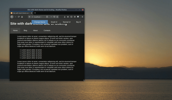
Можно посмотреть, как это будет выглядеть:
Обратите внимание, что блок с текстом для небольших экранов стал шире — это не тот случай, когда пустота красит страницу.
С помощью JavaScript мы можем проверить размер окна браузера пользователя и подключить тот файл стилей, который лучше подойдёт для страницы такого размера. Вот пример такого кода:
window.addEventListener("resize", AutoScale); //Масштабируем страницу при растягивании окна

AutoScale(); //Масштабируем страницу после загрузки

function AutoScale()
{
    let width = window.innerWidth; //Ширина окна
    //Если вы хотите проверять по размеру экрана, то вам нужно свойство window.screen.width

    if(width > 1280)
    {
   	 ChangeScale("big");
    }
    else if(width <= 1280 && width > 720)
    {
   	 ChangeScale("normal");
    }
    else if(width < 720)
    {
   	 ChangeScale("small");
    }
}
В результате страница будет масштабироваться автоматически.
Мы сможем отказаться от адаптации сайтов под разные мониторы только тогда, когда человечество откажется от мониторов. Ну а пока придётся мириться с тем, что существует огромное количество разрешений:
Не говоря уже о том, что на мобильных устройствах эти разрешения тоже воспринимаются по-разному.

Учись бесплатно:
вебинары по программированию, маркетингу и дизайну.
Участвовать

Школа дронов для всех
Учим программировать беспилотники и управлять ими.
Узнать больше
Перед началом статьи хочу сказать, что еще больше полезной и нужной информации вы найдете в нашем Telegram-канале. Подпишитесь, мне будет очень приятно.
Сегодня я поделюсь с вами одним трюком, с которым я столкнулся, работая с CSS. С его помощью можно динамически масштабировать любой HTML-элемент, а заодно устранить многие причины, по которым раньше приходилось писать медиа-запросы.
Прежде всего, я хотел бы отдать должное Майку Ритмюллеру за то, что он изначально придумал эту функцию, и Джеффу Грэму из CSS-Tricks за расширение её функциональности. Я ни в коем случае не ставлю себе в заслугу создание этой функции. Я только хочу пропеть ей хвалу.
Итак, давайте приступим к применению стилей.
Формула
В CSS по умолчанию присутствует возможность применять базовые математические операции с помощью функции calc(). Благодаря ей мы можем решить любое простое математическое уравнение и установить полученный результат в качестве свойства CSS, которому требуется численное значение. calc() может применяться везде: от font-size до width и box-shadow… .
В CSS также есть средство измерения, которое вычисляет viewport height и viewport width окна браузера:vh и vw соответственно. 100vh обозначает всю высоту окна браузера, а 100vw — всю ширину. Разница между 100% и 100vh/100vw в том, что 100% устанавливается относительно селектора, внутри которого происходит определение, в то время как значение 100vh/100vw — абсолютное для окна браузера. Это различие важно.
Объяснив этот момент с calc() и 100vh/100vw, пропущу несколько шагов и перейду прямо к формуле.
Она позволяет динамически масштабировать любое свойство с числовым значением, основанным на ширине или высоте браузера:
calc([min size]px + ([max size] — [min size]) * ((100vw — [min vw width]px) / ([max vw width] — [min vw width])))
Хорошо… Давайте разбираться.
Во-первых, взглянем на правую часть уравнения:
[min size]px
Нам нужно установить минимальный размер для элемента element, так, чтобы любой element, который мы хотим масштабировать, не был равен 0px. Если мы хотим, чтобы элемент был размером не менее 25px, то можем подставить это значение в первую часть calc():
[min size]px = 25px
Нам важна левая часть:
([max size] — [min size]) * ((100vw — [min vw width]px) / ([max vw width] — [min vw width])))
Разберёмся с ней:
([max size] — [min size])
Здесь мы устанавливаем диапазон через минимальный и максимальный размер, который хочется видеть у элемента, и эта разность будет действовать как множитель. Если нужно, чтобы размер элемента находился в пределах между 25px и 50px, мы можем подставить сюда такие значения:
([max size] — [min size]) = (50 — 25)
Третья часть сложнее всего:
((100vw — [min vw width]px) / ([max vw width] — [min vw width]))
Здесь мы можем задать диапазон через минимальное и максимальное ожидаемое разрешение браузера. На десктопе я всегда, исходя из опыта, беру 1920px (горизонтальное разрешение для 1080p) и 500px (самое маленькое разрешение, до которого возможно масштабировать в Chrome без инструментов разработчика).
Подставим эти значения, и крайняя слева часть уравнения примет следующий вид:
((100vw — [min vw width]px) / ([max vw width] — [min vw width])) = ((100vw — 500px) / (1920–500)))
Это создаёт соотношение, основанное на величине значения свойства viewport (окна просмотра) браузера. Всё, что выходит за пределы диапазона между 500px и 1920px, будет масштабироваться вверх или вниз, но с линейной скоростью. Мы также можем написать медиа-запрос для мобильных устройств или сверхшироких мониторов или записать эти исключения в саму функцию calc().
Давайте начнём упрощать: подставим в функцию некоторые числа и посмотрим на неё в действии. Мы можем заменить 100vw любым разрешением, чтобы увидеть соотношение, которое устанавливаем для размера нашего element:
((1920px — 500px) / (1920–500)) = 1
((1565px — 500px) / (1920–500)) = 0.75
((1210px — 500px) / (1920–500)) = 0.5
((855px — 500px) / (1920–500)) = 0.25
((500px — 500px) / (1920–500)) = 0
Если затем взять множитель размера элемента, заданный ранее, и умножить на это соотношение, то в итоге получится динамическое значение размера нашего элемента, основанное на размере viewport:
(50–25) * ((1920px — 500px) / (1920–500)) = 25px
(50–25) * ((1565px — 500px) / (1920–500)) = 18.75px
(50–25) * ((1210px — 500px) / (1920–500)) = 12.5px
(50–25) * ((855px — 500px) / (1920–500)) = 6.25px
(50–25) * ((500px — 500px) / (1920–500)) = 0px
Наконец, если мы затем добавим минимальный размер элемента к этому множителю, то получим окончательный размер элемента:
25 + (50–25) * ((1920px — 500px) / (1920–500)) = 50px
25 + (50–25) * ((1565px — 500px) / (1920–500)) = 43.75px
25 + (50–25) * ((1210px — 500px) / (1920–500)) = 37.5px
25 + (50–25) * ((855px — 500px) / (1920–500)) = 31.25px
25 + (50–25) * ((500px — 500px) / (1920–500)) = 25px
Итак, если мы хотим, чтобы элемент был равен 25px, когда ширина браузера равна 500px, и 50px, когда ширина браузера равна 1920px, вся функция будет выглядеть следующим образом:
calc(25px + (50–25) * ((100vw — 500px) / (1920–500)))
Запутанно? Ещё как.
Полезно? Очень.
Что получаем в итоге:
calc([min size]px + ([max size] — [min size]) * ((100vw — [min vw width]px) / ([max vw width] — [min vw width])))
Теперь перейдём к примерам.
Предварительная настройка
У меня есть очень простая настройка “скелета” HTML с импортом CSS-файла:
В index.html:
<!DOCTYPE html>
<html lang=’en’>
<head>
<title>Dynamic Scaling Example</title>
<meta charset=’UTF-8′>
<meta name=’viewport’ content=’width=device-width, initial-scale=1.0′>
<meta http-equiv=’X-UA=Compatible’ content=’ie=edge’>
<link rel=»stylesheet» href=»css/main.css»>
</head>
<body>
<h1>Here Be Headline</h1>
<div class=»square»>
<h2>
Here Be Subheader
</h2>
<p>
Lorem ipsum dolor sit amet, consectetur adipiscing elit, sed do eiusmod tempor incididunt ut labore et dolore magna aliqua.
Ut enim ad minim veniam, quis nostrud exercitation ullamco laboris nisi ut aliquip ex ea commodo consequat.
Duis aute irure dolor in reprehenderit in voluptate velit esse cillum dolore eu fugiat nulla pariatur.
Excepteur sint occaecat cupidatat non proident, sunt in culpa qui officia deserunt mollit anim id est laborum.
</p>
<div class=»small_square»>
<h3>
Here Be Subsubheader
</h3>
<p>
Sed ut perspiciatis unde omnis iste natus error sit voluptatem accusantium doloremque laudantium, eaque ipsa quae ab illo inventore veritatis.
Nemo enim ipsam voluptatem quia voluptas sit aspernatur aut odit aut fugit, sed quia consequuntur magni dolores eos qui ratione voluptatem sequi nesciunt.
Neque porro quisquam est, qui dolorem ipsum quia dolor sit amet, sed quia non numquam eius modi tempora incidunt ut labore et dolore magnam aliquam quaerat voluptatem.
</p>
</div>
</div>
</body>
</html>
В main.css:
body {
align-content: center;
align-items: center;
background: white;
display: flex;
flex-direction: column;
flex-wrap: nowrap;
height: 100vh;
justify-content: flex-start;
margin: 0px;
width: 100vw;
}
h1 {
background: lightgrey;
}
.square {
background: darkgreen;
}
.square h2 {
background: green;
}
.square p {
background: lightgreen;
}
.small_square {
background: blue;
}
.small_square h3 {
background: lightblue;
}
.small_square p {
background: cyan;
}
В хроме это выглядит так:
Ширина
Давайте для начала поиграем с шириной width у square и small_square с помощью нашей новой причудливой функции масштабирования.
Допустим, нам нужно, чтобы ширина square была равна максимум 1500px и минимум 250px.
В main.css:
body {
align-content: center;
align-items: center;
background: white;
display: flex;
flex-direction: column;
flex-wrap: nowrap;
height: 100vh;
justify-content: flex-start;
margin: 0px;
width: 100vw;
}
h1 {
background: lightgrey;
}
.square {
background: darkgreen;
width: calc(250px + (1500 — 250) * ((100vw — 500px) / (1920 — 500)));
}
.square h2 {
background: green;
}
.square p {
background: lightgreen;
}
.small_square {
background: blue;
}
.small_square h3 {
background: lightblue;
}
.small_square p {
background: cyan;
}
В хроме:
Также настроим small_square на ширину максимум 1000px и минимум 100px.
В main.css:
body {
align-content: center;
align-items: center;
background: white;
display: flex;
flex-direction: column;
flex-wrap: nowrap;
height: 100vh;
justify-content: flex-start;
margin: 0px;
width: 100vw;
}
h1 {
background: lightgrey;
}
.square {
background: darkgreen;
width: calc(250px + (1500 — 250) * ((100vw — 500px) / (1920 — 500)));
}
.square h2 {
background: green;
}
.square p {
background: lightgreen;
}
.small_square {
background: blue;
margin: 0 auto;
width: calc(100px + (1000 — 100) * ((100vw — 500px) / (1920 — 500)));
}
.small_square h3 {
background: lightblue;
}
.small_square p {
background: cyan;
}
В хроме:
Шапка
В main.css:
body {
align-content: center;
align-items: center;
background: white;
display: flex;
flex-direction: column;
flex-wrap: nowrap;
height: 100vh;
justify-content: flex-start;
margin: 0px;
text-align: center;
width: 100vw;
}
h1 {
background: lightgrey;
margin: 0 auto;
width: calc(250px + (500 — 250) * ((100vw — 500px) / (1920 — 500)));
}
.square {
background: darkgreen;
width: calc(250px + (1500 — 250) * ((100vw — 500px) / (1920 — 500)));
}
.square h2 {
background: green;
margin: 0 auto;
width: calc(200px + (400 — 200) * ((100vw — 500px) / (1920 — 500)));
}
.square p {
background: lightgreen;
}
.small_square {
background: blue;
margin: 0 auto;
width: calc(100px + (1000 — 100) * ((100vw — 500px) / (1920 — 500)));
}
.small_square h3 {
background: lightblue;
margin: 0 auto;
width: calc(50px + (100 — 50) * ((100vw — 500px) / (1920 — 500)));
}
.small_square p {
background: cyan;
}
В хроме:
Поля/отступы
В main.css:
body {
align-content: center;
align-items: center;
background: white;
display: flex;
flex-direction: column;
flex-wrap: nowrap;
height: 100vh;
justify-content: flex-start;
margin: 0px;
text-align: center;
width: 100vw;
}
h1 {
background: lightgrey;
margin: calc(5px + (30 — 5) * ((100vw — 500px) / (1920 — 500))) auto;
width: calc(250px + (500 — 250) * ((100vw — 500px) / (1920 — 500)));
}
.square {
background: darkgreen;
width: calc(250px + (1500 — 250) * ((100vw — 500px) / (1920 — 500)));
}
.square h2 {
background: green;
margin: calc(5px + (20 — 5) * ((100vw — 500px) / (1920 — 500))) auto;
width: calc(200px + (400 — 200) * ((100vw — 500px) / (1920 — 500)));
}
.square p {
background: lightgreen;
margin: calc(5px + (20 — 5) * ((100vw — 500px) / (1920 — 500)));
padding: calc(4px + (16 — 4) * ((100vw — 500px) / (1920 — 500)));
}
.small_square {
background: blue;
margin: 0 auto;
width: calc(100px + (1000 — 100) * ((100vw — 500px) / (1920 — 500)));
}
.small_square h3 {
background: lightblue;
margin: calc(5px + (10 — 5) * ((100vw — 500px) / (1920 — 500))) auto;
width: calc(50px + (100 — 50) * ((100vw — 500px) / (1920 — 500)));
}
.small_square p {
background: cyan;
margin: calc(3px + (18 — 3) * ((100vw — 500px) / (1920 — 500)));
padding: calc(1px + (8 — 1) * ((100vw — 500px) / (1920 — 500)));
}
Размер шрифта
В main.css:
body {
align-content: center;
align-items: center;
background: white;
display: flex;
flex-direction: column;
flex-wrap: nowrap;
height: 100vh;
justify-content: flex-start;
margin: 0px;
text-align: center;
width: 100vw;
}
h1 {
background: lightgrey;
font-size: calc(15px + (30 — 15) * ((100vw — 500px) / (1920 — 500)));
margin: calc(5px + (30 — 5) * ((100vw — 500px) / (1920 — 500))) auto;
width: calc(250px + (500 — 250) * ((100vw — 500px) / (1920 — 500)));
}
.square {
background: darkgreen;
width: calc(250px + (1500 — 250) * ((100vw — 500px) / (1920 — 500)));
}
.square h2 {
background: green;
font-size: calc(10px + (20 — 10) * ((100vw — 500px) / (1920 — 500)));
margin: calc(5px + (20 — 5) * ((100vw — 500px) / (1920 — 500))) auto;
width: calc(200px + (400 — 200) * ((100vw — 500px) / (1920 — 500)));
}
.square p {
background: lightgreen;
font-size: calc(12px + (24 — 12) * ((100vw — 500px) / (1920 — 500)));
margin: calc(5px + (20 — 5) * ((100vw — 500px) / (1920 — 500)));
padding: calc(4px + (16 — 4) * ((100vw — 500px) / (1920 — 500)));
}
.small_square {
background: blue;
margin: 0 auto;
width: calc(100px + (1000 — 100) * ((100vw — 500px) / (1920 — 500)));
}
.small_square h3 {
background: lightblue;
font-size: calc(5px + (15 — 5) * ((100vw — 500px) / (1920 — 500)));
margin: calc(5px + (10 — 5) * ((100vw — 500px) / (1920 — 500))) auto;
width: calc(50px + (100 — 50) * ((100vw — 500px) / (1920 — 500)));
}
.small_square p {
background: cyan;
font-size: calc(8px + (16 —  * ((100vw — 500px) / (1920 — 500)));
margin: calc(3px + (18 — 3) * ((100vw — 500px) / (1920 — 500)));
padding: calc(1px + (8 — 1) * ((100vw — 500px) / (1920 — 500)));
}
В хроме:
Радиус границы
В main.css:
body {
align-content: center;
align-items: center;
background: white;
display: flex;
flex-direction: column;
flex-wrap: nowrap;
height: 100vh;
justify-content: flex-start;
margin: 0px;
text-align: center;
width: 100vw;
}
h1 {
background: lightgrey;
font-size: calc(15px + (30 — 15) * ((100vw — 500px) / (1920 — 500)));
margin: calc(5px + (30 — 5) * ((100vw — 500px) / (1920 — 500))) auto;
width: calc(250px + (500 — 250) * ((100vw — 500px) / (1920 — 500)));
}
.square {
background: darkgreen;
border-radius: calc(1px + (50 — 1) * ((100vw — 500px) / (1920 — 500)));
width: calc(250px + (1500 — 250) * ((100vw — 500px) / (1920 — 500)));
}
.square h2 {
background: green;
font-size: calc(10px + (20 — 10) * ((100vw — 500px) / (1920 — 500)));
margin: calc(5px + (20 — 5) * ((100vw — 500px) / (1920 — 500))) auto;
width: calc(200px + (400 — 200) * ((100vw — 500px) / (1920 — 500)));
}
.square p {
background: lightgreen;
border-radius: calc(5px + (50 — 5) * ((100vw — 500px) / (1920 — 500)));
font-size: calc(12px + (24 — 12) * ((100vw — 500px) / (1920 — 500)));
margin: calc(5px + (20 — 5) * ((100vw — 500px) / (1920 — 500)));
padding: calc(4px + (16 — 4) * ((100vw — 500px) / (1920 — 500)));
}
.small_square {
background: blue;
border-radius: calc(10px + (50 — 10) * ((100vw — 500px) / (1920 — 500))) calc(5px + (40 — 5) * ((100vw — 500px) / (1920 — 500)));
margin: 0 auto;
width: calc(100px + (1000 — 100) * ((100vw — 500px) / (1920 — 500)));
}
.small_square h3 {
background: lightblue;
font-size: calc(5px + (15 — 5) * ((100vw — 500px) / (1920 — 500)));
margin: calc(5px + (10 — 5) * ((100vw — 500px) / (1920 — 500))) auto;
width: calc(50px + (100 — 50) * ((100vw — 500px) / (1920 — 500)));
}
.small_square p {
background: cyan;
font-size: calc(8px + (16 — * ((100vw — 500px) / (1920 — 500)));
margin: calc(3px + (18 — 3) * ((100vw — 500px) / (1920 — 500)));
padding: calc(1px + (8 — 1) * ((100vw — 500px) / (1920 — 500)));
}
В Хроме:
Тень элемента/текста
В main.css:
body {
align-content: center;
align-items: center;
background: white;
display: flex;
flex-direction: column;
flex-wrap: nowrap;
height: 100vh;
justify-content: flex-start;
margin: 0px;
text-align: center;
width: 100vw;
}
h1 {
background: lightgrey;
box-shadow: 0 0 calc(8px + (35 — * ((100vw — 500px) / (1920 — 500))) 0px rgba(0, 0, 0, 1);
font-size: calc(15px + (30 — 15) * ((100vw — 500px) / (1920 — 500)));
margin: calc(5px + (30 — 5) * ((100vw — 500px) / (1920 — 500))) auto;
text-shadow: 1px 1px calc(3px + (12 — 3) * ((100vw — 500px) / (1920 — 500))) red;
width: calc(250px + (500 — 250) * ((100vw — 500px) / (1920 — 500)));
}
.square {
background: darkgreen;
border-radius: calc(1px + (50 — 1) * ((100vw — 500px) / (1920 — 500)));
box-shadow: 0 0 calc(10px + (40 — 10) * ((100vw — 500px) / (1920 — 500))) 0px rgba(0, 0, 0, 1);
width: calc(250px + (1500 — 250) * ((100vw — 500px) / (1920 — 500)));
}
.square h2 {
background: green;
box-shadow: 0 0 calc(10px + (45 — 10) * ((100vw — 500px) / (1920 — 500))) 0px rgba(0, 0, 0, 1);
font-size: calc(10px + (20 — 10) * ((100vw — 500px) / (1920 — 500)));
margin: calc(5px + (20 — 5) * ((100vw — 500px) / (1920 — 500))) auto;
text-shadow: 1px 1px calc(5px + (8 — 5) * ((100vw — 500px) / (1920 — 500))) cyan;
width: calc(100px + (400 — 100) * ((100vw — 500px) / (1920 — 500)));
}
.square p {
background: lightgreen;
border-radius: calc(5px + (50 — 5) * ((100vw — 500px) / (1920 — 500)));
box-shadow: 0 0 calc(10px + (45 — 10) * ((100vw — 500px) / (1920 — 500))) 0px rgba(0, 0, 0, 1);
font-size: calc(12px + (24 — 12) * ((100vw — 500px) / (1920 — 500)));
margin: calc(5px + (20 — 5) * ((100vw — 500px) / (1920 — 500))) auto;
padding: calc(4px + (16 — 4) * ((100vw — 500px) / (1920 — 500)));
width: calc(100px + (1200 — 100) * ((100vw — 500px) / (1920 — 500)));
}
.small_square {
background: blue;
border-radius: calc(10px + (50 — 10) * ((100vw — 500px) / (1920 — 500))) calc(5px + (40 — 5) * ((100vw — 500px) / (1920 — 500)));
box-shadow: 0 0 calc(8px + (32 — * ((100vw — 500px) / (1920 — 500))) 0px rgba(0, 0, 0, 1);
margin: 0 auto;
width: calc(100px + (1000 — 100) * ((100vw — 500px) / (1920 — 500)));
}
.small_square h3 {
background: lightblue;
font-size: calc(5px + (15 — 5) * ((100vw — 500px) / (1920 — 500)));
margin: calc(5px + (10 — 5) * ((100vw — 500px) / (1920 — 500))) auto;
text-shadow: 1px 1px calc(5px + (15 — 5) * ((100vw — 500px) / (1920 — 500))) yellow;
width: calc(50px + (100 — 50) * ((100vw — 500px) / (1920 — 500)));
}
.small_square p {
background: cyan;
font-size: calc(8px + (16 — * ((100vw — 500px) / (1920 — 500)));
margin: calc(3px + (18 — 3) * ((100vw — 500px) / (1920 — 500))) auto;
padding: calc(1px + (8 — 1) * ((100vw — 500px) / (1920 — 500)));
width: calc(100px + (800 — 100) * ((100vw — 500px) / (1920 — 500)));
}
В хроме:
Вы можете применить функцию calc() практически где угодно с любыми из селекторов, для которых требуется числовое значение. Она очень гибкая.
Миссия завершена
Функция calc() изменила мою жизнь, и мне показалось, что она достойна статьи. После знакомства с ней мне пришлось полностью переосмыслить подход к адаптивному веб-дизайну, и эффект оказался ещё более мощным, как только я начал погружаться в SCSS (но это уже совсем другая история).
Всё зашло настолько далеко, что я начал применять эту функцию везде и сделал весь свой проект Spacebar Smasher полностью отзывчивым без единого медиа-запроса. С помощью этой calc() мне удалось также добавить специфичную разметку для мобильных устройств. Я даже не знаю, как её теперь называть.
В одном из более поздних проектов я дал этой функции имя calcSize, так что, быть может, такое название подойдёт лучше.
Как бы там ни было, надеюсь, вы извлекли отсюда некоторую полезную информацию. Пусть все ваши функции вернут true, а все ваши запросы вернутся с кодом 200.
|
0 / 0 / 0 Регистрация: 01.02.2016 Сообщений: 10 |
|
|
1 |
|
Масштаб сайта01.02.2016, 19:50. Показов 18256. Ответов 18
Привет, помогите плз, вот сайт http://metalltrade48.com/ , на 24 дюймовом мониторе при масштабе праузе 100% выглядит нормально, на мониторе 14 дюймов сайт перекашивает (типо он переходит в мобильную версию). Если на 14 дюймовом мониторе уменьшить масштаб браузера до 90% то сайт становится нормально. Вопрос: как сделать, что бы сайт при 100% масштабе браузера на 14` мониторе выглядел нормально? min-with:100% уменьшал — просто обрезаются края сайта, но масштаб не меняется, так же ставил в коде где стоит min-with:1500px на min-with:1280px — не помогает, на 14` сайт так же в мобильной версии, а на 24` его чуть сдвигает влево. Добавлено через 17 минут
__________________
0 |

|
Programming Эксперт 94731 / 64177 / 26122 Регистрация: 12.04.2006 Сообщений: 116,782 |
01.02.2016, 19:50 |
|
18 |
|
vuchastyi 16 / 16 / 8 Регистрация: 05.04.2015 Сообщений: 104 |
||||
|
02.02.2016, 04:08 |
2 |
|||
|
Используйте правило @media как у меня в примере ниже. В данном примере задаётся ширина для body для устройств у которых разрешение не выше 321пикселя(телефоны и т.д.). Выбираете нужное разрешение, задаёте параметры, все рады
0 |
")
|
0 / 0 / 0 Регистрация: 01.02.2016 Сообщений: 10 |
|
|
02.02.2016, 06:54 [ТС] |
3 |
|
А в какую строку это вписать?
0 |
|
16 / 16 / 8 Регистрация: 05.04.2015 Сообщений: 104 |
|
|
02.02.2016, 17:54 |
4 |
|
NewerNight, это вписывается в файл style.css. Строка желательно в конец, чтобы потом не искать где вы его вставили, я бы сделал так)
0 |
|
0 / 0 / 0 Регистрация: 01.02.2016 Сообщений: 10 |
|
|
02.02.2016, 18:32 [ТС] |
5 |
|
Добавлено через 1 минуту
это вписывается в файл style.css. Строка желательно в конец, чтобы потом не искать где вы его вставили, я бы сделал так) В смысли в css шаблона — tenplate.css? если туда, то ничего не изменилось, прописал в конце.
0 |

|
16 / 16 / 8 Регистрация: 05.04.2015 Сообщений: 104 |
|
|
02.02.2016, 18:38 |
6 |
|
Давайте разложим всё по полочкам, у вас есть глобальный файл template.css в котором указаны стили (для body, html, div, p, …). Если я правильно понял, то это верная информация. Теперь давайте выясним может у вас есть какая-то навигация на сайте(для того чтобы показать как это работает)? Или скиньте сюда сайт дело пойдёт быстрее. Я вам сразу дам готовое решение.
0 |
|
0 / 0 / 0 Регистрация: 01.02.2016 Сообщений: 10 |
|
|
02.02.2016, 18:46 [ТС] |
7 |
|
Давайте разложим всё по полочкам, у вас есть глобальный файл template.css в котором указаны стили (для body, html, div, p, …). Если я правильно понял, то это верная информация. Теперь давайте выясним может у вас есть какая-то навигация на сайте(для того чтобы показать как это работает)? Или скиньте сюда сайт дело пойдёт быстрее. Я вам сразу дам готовое решение. Так в начале темы сайт же написан) http://metalltrade48.com/
0 |
|
vuchastyi 16 / 16 / 8 Регистрация: 05.04.2015 Сообщений: 104 |
||||
|
02.02.2016, 19:02 |
8 |
|||
|
NewerNight, для начала вставьте, в самом начале страницы (файла index.html, index.php, не знаю как он у вас называется, так как сайт на Joomla)
Добавлено через 5 минут
0 |
|
0 / 0 / 0 Регистрация: 01.02.2016 Сообщений: 10 |
|
|
02.02.2016, 19:09 [ТС] |
9 |
|
NewerNight, для начала вставьте, в самом начале страницы (файла index.html, index.php, не знаю как он у вас называется, так как сайт на Joomla) Вставил Добавлено через 4 минуты
0 |
|
16 / 16 / 8 Регистрация: 05.04.2015 Сообщений: 104 |
|
|
02.02.2016, 19:15 |
10 |
|
NewerNight, Во-первых, вы не вставили, или вставили но не туда. Во-вторых Я посмотрел у вас все div полностью всё указано в пикселях. Если вы хотите чтобы у вас сайт был адаптивным, на всех девайсах выглядел красиво, то указывайте размеры в процентах. В третьих здесь прийдётся полностью переделывать сайт, я намекаю на то, что вам нужно посмотреть пару уроков введя в поиске «Адаптивный сайт CSS» вам выдаст ну просто неизмеримое количество всяких видео с тем как люди показывают как настроить свой сайт под любое устройство и да, если вы хотите чтобы на телефонах он тоже отображался красиво, сделайте валидацию (Когда человек заходит на сайт с телефона его перебрасывает на мобильную версию сайта). Но для начала начните с Адаптивности в CSS. Добавлено через 54 секунды
0 |
|
0 / 0 / 0 Регистрация: 01.02.2016 Сообщений: 10 |
|
|
02.02.2016, 19:17 [ТС] |
11 |
|
Я пробовал выставлять всё в процентах — не помогло. И при том что началось с того, что я чуть передвинул обратный звонок в шапке сайт, до этого всё было гуд, потом я пытался его двигать, вообще удалять, отключать другие блоки модулей, ничего не помогает, что случилось не понятно
0 |
|
16 / 16 / 8 Регистрация: 05.04.2015 Сообщений: 104 |
|
|
02.02.2016, 19:26 |
12 |
|
NewerNight, Joomla — это класс, если вы делаете сайт для себя рекомендую вообще не использовать CMS (система управления содержимым). У меня все сайты написаны на мною лично написанном коде вот содержимое моей папки public_html (основной папки)
0 |
|
0 / 0 / 0 Регистрация: 01.02.2016 Сообщений: 10 |
|
|
02.02.2016, 19:48 [ТС] |
13 |
|
блин помощь нужна в данном примере, что заново сайт можно сделать, это прям КЭП завещал)
0 |
|
vuchastyi 16 / 16 / 8 Регистрация: 05.04.2015 Сообщений: 104 |
||||
|
02.02.2016, 20:43 |
14 |
|||
|
NewerNight, вообще есть одна идея, вот вы когда добавили то фото (с заказать обратный звонок) на страницу, добавьте ещё пару стилей:
Ну а вообще это всё дело делается через css3 @media правило. Других вариантов по крайней мере я не знаю. Добавлено через 10 минут
1 |
|
0 / 0 / 0 Регистрация: 01.02.2016 Сообщений: 10 |
|
|
02.02.2016, 21:21 [ТС] |
15 |
|
ого, а что нужно было прописать и где?) Добавлено через 5 минут
0 |
|
16 / 16 / 8 Регистрация: 05.04.2015 Сообщений: 104 |
|
|
02.02.2016, 21:38 |
16 |
|
NewerNight, скажите точное разрешение экрана вашего ноутбука и компьютера (там где у вас 24 дюйма)
0 |
|
0 / 0 / 0 Регистрация: 01.02.2016 Сообщений: 10 |
|
|
02.02.2016, 22:00 [ТС] |
17 |
|
24 дюйма 1920×1080, на нём сайт норм отображается, его начинает косить точно так же как и на ноуте, если сделать увеличение бараузера 150%. На ноуте 1366×768, сайт кривит, если уменьшить браузер 90% то норм отображается.
0 |
|
16 / 16 / 8 Регистрация: 05.04.2015 Сообщений: 104 |
|
|
02.02.2016, 22:09 |
18 |
|
NewerNight, хммм знаете, очень сложно делать что-то когда я этого не вижу у меня монитор 1024х768 и у меня сайт отображается великолепно. Попробуйте увеличить сайт, следите за картинкой где написано Отдел Продаж и номера телефонов, я исправил только её, я вам дам код, а дальше сами экспериментируйте) И подскажу как и что сделать. Вот ссылка ещё раз. Если вы есть в вк напишите мне, мне проще общаться там где сообщения обновляются без перезагрузки страницы) Мой вк.
0 |
|
0 / 0 / 0 Регистрация: 01.02.2016 Сообщений: 10 |
|
|
02.02.2016, 22:31 [ТС] |
19 |
|
0 |