Изменение направления текста
- Назад
- Обзор: Building blocks
- Далее
Многие свойства и значения, с которыми мы столкнулись до сих пор при изучении CSS, были привязаны к физическим размерам нашего экрана. Мы создаём границы, например, сверху, справа, снизу и слева от коробки.Эти физические размеры очень точно соответствуют контенту, который просматривается по горизонтали, и по умолчанию Интернет имеет тенденцию поддерживать языки с письмом слева направо (например, английский или французский) лучше, чем языки с письмом справа налево (например, арабский).
Однако в последние годы CSS развивался чтобы лучше поддерживать разную направленность контента, включая контент с направлением справа налево, а также контент сверху вниз (например, в японском языке) — эти разные направления называются режимами письма. По мере того, как вы продвигаетесь в обучении и начинаете работать с макетом, понимание режимов письма будет вам очень полезно, поэтому мы сейчас и познакомимся с ними.
| Prerequisites: | Basic computer literacy, basic software installed, basic knowledge of working with files, HTML basics (study Introduction to HTML), and an idea of how CSS works (study CSS first steps.) |
|---|---|
| Цель: | Понять важность режимов письма для современного CSS. |
Какие бывают режимы письма?
Режим письма в CSS определяет, идёт ли текст по горизонтали или по вертикали. Свойство writing-mode позволяет нам переключаться из одного режима письма в другой. Для этого вам не обязательно работать на языке, который использует режим вертикального письма — вы также можете изменить режим письма частей вашего макета для творческих целей.
В приведённом ниже примере заголовок отображается с использованием writing-mode: vertical-rl. Теперь текст идёт вертикально. Вертикальный текст часто используется в графическом дизайне и может быть способом добавить более интересный вид вашему веб-дизайну.
Три возможных значения свойства writing-mode:
horizontal-tb: Направление потока блока сверху вниз. Предложения идут горизонтально.vertical-rl: Направление потока блоков справа налево. Предложения идут вертикально.vertical-lr: Направление потока блока слева направо. Предложения идут вертикально.
Таким образом, свойство writing-mode на самом деле устанавливает направление, в котором элементы уровня блока отображаются на странице — сверху вниз, справа налево или слева направо. Это затем определяет направление движения текста в предложениях.
Writing modes and block and inline layout
We have already discussed block and inline layout, and the fact that some things display as block elements and others as inline elements. As we have seen described above, block and inline is tied to the writing mode of the document, and not the physical screen. Blocks are only displayed from the top to the bottom of the page if you are using a writing mode that displays text horizontally, such as English.
If we look at an example this will become clearer. In this next example I have two boxes that contain a heading and a paragraph. The first uses writing-mode: horizontal-tb, a writing mode that is written horizontally and from the top of the page to the bottom. The second uses writing-mode: vertical-rl; this is a writing mode that is written vertically and from right to left.
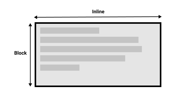
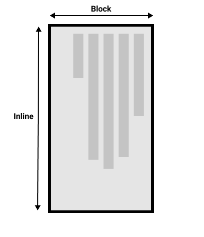
When we switch the writing mode, we are changing which direction is block and which is inline. In a horizontal-tb writing mode the block direction runs from top to bottom; in a vertical-rl writing mode the block direction runs right-to-left horizontally. So the block dimension is always the direction blocks are displayed on the page in the writing mode in use. The inline dimension is always the direction a sentence flows.
This figure shows the two dimensions when in a horizontal writing mode.
This figure shows the two dimensions in a vertical writing mode.
Once you start to look at CSS layout, and in particular the newer layout methods, this idea of block and inline becomes very important. We will revisit it later on.
Direction
In addition to writing mode we also have text direction. As mentioned above, some languages such as Arabic are written horizontally, but right-to-left. This is not something you are likely to use in a creative sense — if you simply want to line something up on the right there are other ways to do so — however it is important to understand this as part of the nature of CSS. The web is not just for languages that are displayed left-to-right!
Due to the fact that writing mode and direction of text can change, newer CSS layout methods do not refer to left and right, and top and bottom. Instead they will talk about start and end along with this idea of inline and block. Don’t worry too much about that right now, but keep these ideas in mind as you start to look at layout; you will find it really helpful in your understanding of CSS.
Logical properties and values
The reason to talk about writing modes and direction at this point in your learning however, is because of the fact we have already looked at a lot of properties which are tied to the physical dimensions of the screen, and make most sense when in a horizontal writing mode.
Let’s take a look at our two boxes again — one with a horizontal-tb writing mode and one with vertical-rl. I have given both of these boxes a width. You can see that when the box is in the vertical writing mode, it still has a width, and this is causing the text to overflow.
What we really want in this scenario, is to essentially swap height and width along with the writing mode. When we’re in a vertical writing mode we want the box to expand in the block dimension just like it does in the horizontal mode.
To make this easier, CSS has recently developed a set of mapped properties. These essentially replace physical properties — things like width and height — with logical, or flow relative versions.
The property mapped to width when in a horizontal writing mode is called inline-size — it refers to the size in the inline dimension. The property for height is named block-size and is the size in the block dimension. You can see how this works in the example below where we have replaced width with inline-size.
Logical margin, border, and padding properties
In the last two lessons we have learned about the CSS box model, and CSS borders. In the margin, border, and padding properties you will find many instances of physical properties, for example margin-top, padding-left, and border-bottom. In the same way that we have mappings for width and height there are mappings for these properties.
The margin-top property is mapped to margin-block-start (en-US) — this will always refer to the margin at the start of the block dimension.
The padding-left property maps to padding-inline-start (en-US), the padding that is applied to the start of the inline direction. This will be where sentences start in that writing mode. The border-bottom property maps to border-block-end (en-US), which is the border at the end of the block dimension.
You can see a comparison between physical and logical properties below.
If you change the writing mode of the boxes by switching the writing-mode property on .box to vertical-rl, you will see how the physical properties stay tied to their physical direction, whereas the logical properties switch with the writing mode.
You can also see that the <h2> (en-US) has a black border-bottom. Can you work out how to make that bottom border always go below the text in both writing modes?
There are a huge number of properties when you consider all of the individual border longhands, and you can see all of the mapped properties on the MDN page for Logical Properties and Values (en-US).
Logical values
We have so far looked at logical property names. There are also some properties that take physical values of top, right, bottom, and left. These values also have mappings, to logical values — block-start, inline-end, block-end, and inline-start.
For example, you can float an image left to cause text to wrap round the image. You could replace left with inline-start as shown in the example below.
Change the writing mode on this example to vertical-rl to see what happens to the image. Change inline-start to inline-end to change the float.
Here we are also using logical margin values to ensure the margin is in the correct place no matter what the writing mode is.
Should you use physical or logical properties?
The logical properties and values are newer than their physical equivalents, and therefore have only recently been implemented in browsers. You can check any property page on MDN to see how far back the browser support goes. If you are not using multiple writing modes then for now you might prefer to use the physical versions. However, ultimately we expect that people will transition to the logical versions for most things, as they make a lot of sense once you start also dealing with layout methods such as flexbox and grid.
Summary
The concepts explained in this lesson are becoming increasingly important in CSS. An understanding of the block and inline direction — and how text flow changes with a change in writing mode — will be very useful going forward. It will help you in understanding CSS even if you never use a writing mode other than a horizontal one.
In the next module we will take a good look at overflow in CSS.
- Назад
- Обзор: Building blocks
- Далее
In this module
Направление текста
Мы привыкли читать тексты слева направо, для нас это кажется привычным и естественным. В то же время есть языки, где писать надо справа налево, например, в арабском письме. Кроме того изредка возникают задачи, когда текст надо повернуть, отразить или ещё как-то представить непривычным образом. Гугл так пошутил на первое апреля и показал оборотную сторону своего поисковика (рис. 1).

Рис. 1. Google. Вид сзади
Слава CSS, задавать направление текста весьма легко и это делается буквально парой свойств, так что можно экспериментировать вволю.
В примере 1 показаны классы для изменения направления текста.
Пример 1. Варианты изменения текста
<!DOCTYPE HTML>
<html>
 <head>
  <meta charset="utf-8">
  <title>Текст</title>
  <style>
   .t1 { /*Справа налево */
    unicode-bidi: bidi-override;
    direction: rtl;
   }
   .t2 {
    transform: rotateY(180deg); /* Отражение по горизонтали */
   }
   .t3 {
    transform: rotateX(180deg); /* Отражение по вертикали */
   }
   .t4 { /* Поворот каждой буквы */
    transform: rotateY(180deg);
    unicode-bidi: bidi-override;
    direction: rtl;
   }
  </style>
 </head>
 <body>
  <p>Алиса в Зазеркалье</p>
  <p class="t1">Алиса в Зазеркалье</p>
  <p class="t2">Алиса в Зазеркалье</p>
  <p class="t3">Алиса в Зазеркалье</p>
  <p class="t4">Алиса в Зазеркалье</p>
  </body>
</html>
Результат данного примера показан на рис. 2.
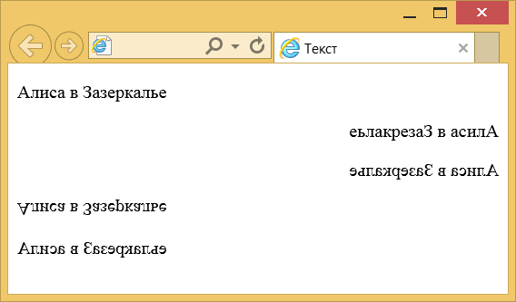
Рис. 2. Направление текста
Для отображения текста справа налево применяются два свойства: unicode-bidi и direction. Эта комбинация нужна для иностранных языков вроде арабского, где текст читается именно справа налево.
Остальные варианты в примере получаются с помощью трансформации, в частности, поворота по оси X и Y. Вместо поворота также можно использовать функцию масштабирования со значением -1. Варианты ниже для текстового абзаца дают одинаковый результат.
transform: rotateY(180deg);
transform: scaleX(-1);
Аналогично работает и поворот вокруг оси X, вместо функции rotateX(180deg) допустимо написать scaleY(-1), получим один и тот же результат.
Интересный эффект можно получить сочетая трансформацию и свойства для отображения текста справа налево (класс t4 в примере). Текст выводится как обычно — слева направо, но при этом каждая буква в нём поворачивается.
Честно говоря, пока не могу придумать, где и как на практике использовать подобные эффекты. Всё это выглядит забавно, может использоваться в качестве шутки, но практической пользы на мой взгляд не имеет. А вы что думаете по этому поводу?
Устанавливает направление текста на странице — по горизонтали или вертикали.
Краткая информация
| Значение по умолчанию | horizontal-tb |
|---|---|
| Наследуется | Да |
| Применяется | Ко всем элементам, за исключением ячеек и строк таблицы |
| Анимируется | Нет |
Синтаксис
writing-mode: horizontal-tb | vertical-rl | vertical-lrСинтаксис
| Описание | Пример | |
|---|---|---|
| <тип> | Указывает тип значения. | <размер> |
| A && B | Значения должны выводиться в указанном порядке. | <размер> && <цвет> |
| A | B | Указывает, что надо выбрать только одно значение из предложенных (A или B). | normal | small-caps |
| A || B | Каждое значение может использоваться самостоятельно или совместно с другими в произвольном порядке. | width || count |
| [ ] | Группирует значения. | [ crop || cross ] |
| * | Повторять ноль или больше раз. | [,<время>]* |
| + | Повторять один или больше раз. | <число>+ |
| ? | Указанный тип, слово или группа не является обязательным. | inset? |
| {A, B} | Повторять не менее A, но не более B раз. | <радиус>{1,4} |
| # | Повторять один или больше раз через запятую. | <время># |
Значения
- horizontal-tb
- Устанавливает направление текста по горизонтали слева направо и сверху вниз.
- vertical-rl
- Задаёт направление текста по вертикали сверху вниз и справа налево.
- vertical-lr
- Задаёт направление текста по вертикали сверху вниз и слева направо.
Песочница
horizontal-tbvertical-rlvertical-lr
div {
  writing-mode: {{ playgroundValue }};
}
Пример
<!DOCTYPE html>
<html>
<head>
<meta charset=»utf-8″>
<title>writing-mode</title>
</head>
<body>
<table>
<tbody>
<tr>
<th>horizontal-tb</th>
<th>vertical-rl</th>
<th>vertical-lr</th>
</tr>
<tr>
<td><p style=»writing-mode: horizontal-tb»>Образец текста</p></td>
<td><p style=»writing-mode: vertical-rl»>Образец текста</p></td>
<td><p style=»writing-mode: vertical-lr»>Образец текста</p></td>
</tr>
</tbody>
</table>
</body>
</html>
Объектная модель
Объект.style.writingMode
Примечание
Internet Explorer 6 поддерживает нестандартные значения lr-tb и tb-rl, Internet Explorer 7 поддерживает значения lr-tb, rl-tb, tb-rl, bt-rl.
Chrome до версии 48, Opera до версии 35, Safari и Android поддерживают свойство -webkit-writing-mode.
Спецификация
| Спецификация | Статус |
|---|---|
| CSS Writing Modes Level 3 | Возможная рекомендация |
Спецификация
Каждая спецификация проходит несколько стадий одобрения.
- Recommendation (Рекомендация) — спецификация одобрена W3C и рекомендована как стандарт.
- Candidate Recommendation (Возможная рекомендация) — группа, отвечающая за стандарт, удовлетворена, как он соответствует своим целям, но требуется помощь сообщества разработчиков по реализации стандарта.
- Proposed Recommendation (Предлагаемая рекомендация) — на этом этапе документ представлен на рассмотрение Консультативного совета W3C для окончательного утверждения.
- Working Draft (Рабочий проект) — более зрелая версия черновика после обсуждения и внесения поправок для рассмотрения сообществом.
- Editor’s draft (Редакторский черновик) — черновая версия стандарта после внесения правок редакторами проекта.
- Draft (Черновик спецификации) — первая черновая версия стандарта.
Браузеры
| 6 | 12 | 8 | 48 | 15 | 35 | 5.1 | 11 | 41 |
| 3 | 76 | 41 | 37 | 5 | 11 |
Браузеры
В таблице браузеров применяются следующие обозначения.
- — элемент полностью поддерживается браузером;
- — элемент браузером не воспринимается и игнорируется;
- — при работе возможно появление различных ошибок, либо элемент поддерживается с оговорками.
Число указывает версию браузреа, начиная с которой элемент поддерживается.
См. также

От автора: свойство CSS writing mode устанавливает горизонтальное и вертикальное направление написание текста. Хотя оно предназначено для целей мультиязычности, но может быть использовано для дизайна.
Основы
Свойство CSS writing-mode устанавливает направление содержимого как по горизонтали, так и по вертикали.
|
writing-mode: horizontal-tb; |
Допустимые значения:

Практический курс по верстке адаптивного сайта с нуля!
Изучите курс и узнайте, как верстать современные сайты на HTML5 и CSS3
Узнать подробнее
horizontal-tb — Контент размещается горизонтально слева направо, вертикально сверху вниз. Значение по умолчанию.
vertical-rl — Контент размещается вертикально сверху вниз, горизонтально справа налево.
vertical-lr — Контент размещается вертикально сверху вниз, горизонтально слева направо.
Пример 1
Простой пример для начала.
Два дива:
|
<div class=«v-block»>Post</div><div class=«h-block»>Modernism</div> |
В div v-block свойство writing-mode имеет значение vertical-rl.
|
.v-block { font: 46px/1 ‘Open Sans Condensed’, sans-serif; text-transform: uppercase; letter-spacing: 2px; color: #333; writing-mode: vertical-rl; } .h-block { font: 46px/1 ‘Open Sans Condensed’, sans-serif; text-transform: uppercase; letter-spacing: 2px; color: #333; padding: 5px 0 0 3px; } |
Практический курс по верстке адаптивного сайта с нуля!
Изучите курс и узнайте, как верстать современные сайты на HTML5 и CSS3
Узнать подробнее
Пример 2
Еще один прстой пример.
Опять же, два div, но обратите внимание на направление текста v-block справа налево. CSS такой же, как и выше.
|
<div class=«v-block»>Post<br>Modernist</div><div class=«h-block»>Thought</div> |
Пример 3
А теперь мы добавим преобразование со значением rotate.
Мы используем базовый контейнер flexbox для объединения.
|
<div class=«w-container»> <div class=«w-block-1»>A Guide to</div><div class=«w-block-2»>Post<br>Modernist</div> </div> <div class=«w-block-3»>Thought</div> |
Свойство transform в w-block-2 имеет значение rotate, а такжн большое поле.
|
1 2 3 4 5 6 7 8 9 10 11 12 13 14 15 16 17 18 19 20 21 22 23 24 25 26 27 28 29 |
.w-container { display: flex; } .w-block-1 { font: 46px/1 ‘Open Sans Condensed’, sans-serif; text-transform: uppercase; letter-spacing: 2px; color: #333; writing-mode: vertical-rl; } .w-block-2 { font: 46px/1 ‘Open Sans Condensed’, sans-serif; text-transform: uppercase; letter-spacing: 2px; color: #333; transform: rotate(-30deg); padding: 84px 0 0 7px; } .w-block-3 { font: 46px/1 ‘Open Sans Condensed’, sans-serif; text-transform: uppercase; letter-spacing: 2px; color: #333; padding: 7px 0 0 3px; } |
Writing-mode работает в Edge 12+, Chrome 48+, Firefox 41+, Safari 11+, iOS Safari 11+, Chrome для Android 70+, браузере Android 67+, Firefox для Android 63 и Opera 35+.
Источник: //www.tipue.com/
Редакция: Команда webformyself.
Практический курс по верстке адаптивного сайта с нуля!
Изучите курс и узнайте, как верстать современные сайты на HTML5 и CSS3
Узнать подробнее

PSD to HTML
Практика верстки сайта на CSS Grid с нуля
Смотреть