Preview:
http://jsfiddle.net/h4qka9td/
*,*:after,*:before {
  -webkit-box-sizing: border-box;
  -moz-box-sizing: border-box;
  box-sizing: border-box;
  padding: 0;
  margin: 0;
}

.switch {
  margin: 50px auto;
  position: relative;
}

.switch label {
  width: 100%;
  height: 100%;
  position: relative;
  display: block;
}

.switch input {
  top: 0;
  right: 0;
  bottom: 0;
  left: 0;
  opacity: 0;
  z-index: 100;
  position: absolute;
  width: 100%;
  height: 100%;
  cursor: pointer;
}

/* DEMO 3 */

.switch.demo3 {
  width: 180px;
  height: 50px;
}

.switch.demo3 label {
  display: block;
  width: 100%;
  height: 100%;
  background: #a5a39d;
  border-radius: 40px;
  box-shadow:
      inset 0 3px 8px 1px rgba(0,0,0,0.2),
      0 1px 0 rgba(255,255,255,0.5);
}

.switch.demo3 label:after {
  content: "";
  position: absolute;
  z-index: -1;
  top: -8px; right: -8px; bottom: -8px; left: -8px;
  border-radius: inherit;
  background: #ababab;
  background: -moz-linear-gradient(#f2f2f2, #ababab);
  background: -ms-linear-gradient(#f2f2f2, #ababab);
  background: -o-linear-gradient(#f2f2f2, #ababab);
  background: -webkit-gradient(linear, 0 0, 0 100%, from(#f2f2f2), to(#ababab));
  background: -webkit-linear-gradient(#f2f2f2, #ababab);
  background: linear-gradient(#f2f2f2, #ababab);
  box-shadow: 0 0 10px rgba(0,0,0,0.3),
        0 1px 1px rgba(0,0,0,0.25);
}

.switch.demo3 label:before {
  content: "";
  position: absolute;
  z-index: -1;
  top: -18px; right: -18px; bottom: -18px; left: -18px;
  border-radius: inherit;
  background: #eee;
  background: -moz-linear-gradient(#e5e7e6, #eee);
  background: -ms-linear-gradient(#e5e7e6, #eee);
  background: -o-linear-gradient(#e5e7e6, #eee);
  background: -webkit-gradient(linear, 0 0, 0 100%, from(#e5e7e6), to(#eee));
  background: -webkit-linear-gradient(#e5e7e6, #eee);
  background: linear-gradient(#e5e7e6, #eee);
  box-shadow:
      0 1px 0 rgba(255,255,255,0.5);
  -webkit-filter: blur(1px);
  -moz-filter: blur(1px);
  -ms-filter: blur(1px);
  -o-filter: blur(1px);
  filter: blur(1px);
}

.switch.demo3 label i {
  display: block;
  height: 100%;
  width: 60%;
  border-radius: inherit;
  background: silver;
  position: absolute;
  z-index: 2;
  right: 40%;
  top: 0;
  background: #b2ac9e;
  background: -moz-linear-gradient(#f7f2f6, #b2ac9e);
  background: -ms-linear-gradient(#f7f2f6, #b2ac9e);
  background: -o-linear-gradient(#f7f2f6, #b2ac9e);
  background: -webkit-gradient(linear, 0 0, 0 100%, from(#f7f2f6), to(#b2ac9e));
  background: -webkit-linear-gradient(#f7f2f6, #b2ac9e);
  background: linear-gradient(#f7f2f6, #b2ac9e);
  box-shadow:
      inset 0 1px 0 white,
      0 0 8px rgba(0,0,0,0.3),
      0 5px 5px rgba(0,0,0,0.2);
}

.switch.demo3 label i:after {
  content: "";
  position: absolute;
  left: 15%;
  top: 25%;
  width: 70%;
  height: 50%;
  background: #d2cbc3;
  background: -moz-linear-gradient(#cbc7bc, #d2cbc3);
  background: -ms-linear-gradient(#cbc7bc, #d2cbc3);
  background: -o-linear-gradient(#cbc7bc, #d2cbc3);
  background: -webkit-gradient(linear, 0 0, 0 100%, from(#cbc7bc), to(#d2cbc3));
  background: -webkit-linear-gradient(#cbc7bc, #d2cbc3);
  background: linear-gradient(#cbc7bc, #d2cbc3);
  border-radius: inherit;
}

.switch.demo3 label i:before {
  content: "off";
  text-transform: uppercase;
  font-style: normal;
  font-weight: bold;
  color: rgba(0,0,0,0.4);
  text-shadow: 0 1px 0 #bcb8ae, 0 -1px 0 #97958e;
  font-family: Helvetica, Arial, sans-serif;
  font-size: 24px;
  position: absolute;
  top: 50%;
  margin-top: -12px;
  right: -50%;
}

.switch.demo3 input:checked ~ label {
  background: #9abb82;
}

.switch.demo3 input:checked ~ label i {
  right: -1%;
}

.switch.demo3 input:checked ~ label i:before {
  content: "on";
  right: 115%;
  color: #82a06a;
  text-shadow:
    0 1px 0 #afcb9b,
    0 -1px 0 #6b8659;
}
<div class="switch demo3">
<input type="checkbox">
<label><i></i>
</label>
</div>
<div class="switch demo3">
<input type="checkbox" checked>
<label><i></i>
</label>
</div>Improve Article
Save Article
Improve Article
Save Article
The checkbox is an HTML element which is used to take input from the user.
Method 1: The checkbox size can be set by using height and width property. The height property sets the height of checkbox and width property sets the width of the checkbox.
Syntax:
input./*checkbox class name*/ {
    width : /*desired width*/;
    height : /*desired height*/;
}
Example:
<!DOCTYPE html>
<html>
<head>
<title>
Set checkbox size
</title>
<style>
input.largerCheckbox {
width: 40px;
height: 40px;
}
</style>
</head>
<body>
<input type="checkbox" class="defaultCheckbox"
name="checkBox1" checked>
<input type="checkbox" class="largerCheckbox"
name="checkBox2" checked>
</body>
</html>
Output:
Note: This works well for Google Chrome, Microsoft Edge and Internet Explorer. In Mozilla Firefox the clickable checkbox area is as specified but it displays a checkbox of the default size.
Method 2: An alternate solution that works for Mozilla Firefox as well is by using transform property.
Syntax:
input./*checkbox class name*/ {
    transform : scale(/*desired magnification*/);
}
Example:
<!DOCTYPE html>
<html>
<head>
<title>
Set the size of checkbox
</title>
<style>
input.largerCheckbox {
transform : scale(10);
}
body {
text-align:center;
margin-top:100px;
}
</style>
</head>
<body>
<input type="checkbox" class="largerCheckbox"
name="checkBox2" checked>
</body>
</html>
Output:
This method has a few drawbacks. The checkbox has to be positioned carefully to keep it within the browser window or prevent it from overlapping with other elements. Also, in some browsers, the checkbox may appear pixelated for larger sizes.
HTML is the foundation of webpages, is used for webpage development by structuring websites and web apps.You can learn HTML from the ground up by following this HTML Tutorial and HTML Examples.
CSS is the foundation of webpages, is used for webpage development by styling websites and web apps.You can learn CSS from the ground up by following this CSS Tutorial and CSS Examples.
Is there a way to adjust the dimension of an <input type="checkbox" />
I already tried it using style="width:30px; height:50px;" approach, but it didn’t work.
Any ideas? Is this even possible?
T. Zengerink
4,2175 gold badges30 silver badges32 bronze badges
asked Oct 12, 2010 at 5:48
No, i don’t think there’s a way of doing it by only using html / css.
You could just make an overlay (div) which is positioned right over the checkbox and makes it visible. Using this overlay you could add an own checkbox graphic and change it’s image (=it’s visible value) whenever the user clicks on the image. Furhtermore you’ll then have to update the real checkbox’s value manually to assure that the form can be send containing the checkbox’s form value.
This technique is often used by RIA frameworks like QooxDoo, ExtJS, etc.
here you’ll find a really nice example of how to use the described technique.
answered Oct 12, 2010 at 5:50
dhhdhh
4,2648 gold badges44 silver badges59 bronze badges
0
Yes, it is possible.
You can change the size of a checkbox using the scale function of the transform CSS property, which can magnify or shrink the check box.
Firefox 16.0+ and Internet Explorer 10.0+ support direct invocation of the transform property while older versions and Webkit-based browsers (Chrome, Safari) require their own prefixes (more on browser compatibility).
Simple example:
<style type="text/css">
  input[type="checkbox"] {
    /* Double-sized Checkboxes */
    transform: scale(2);         /* FF 16+, IE 10+ */
    -webkit-transform: scale(2); /* Chrome, Safari 3.5+, Opera 15+ */

    -ms-transform: scale(2);     /* legacy: IE 9+ */
    -moz-transform: scale(2);    /* legacy: FF 3.5+ */
    -o-transform: scale(2);      /* legacy: Opera 10.5 */
  }
</style>

...

<form>
  <input type="checkbox" />
</form>
Adam Katz
13.5k3 gold badges66 silver badges82 bronze badges
answered Oct 11, 2013 at 6:10
Shoaib ChikateShoaib Chikate
8,50512 gold badges46 silver badges70 bronze badges
A checkbox is displayed as a ticked (checked) square box when enabled. Checkboxes are used to allow a user to select among a number of options. The difference between checkboxes and radio buttons is that you can select all the provided options simultaneously when a checkbox is used, while in the case of radio buttons, only one option can be selected.
In this snippet, we will learn how to to change the size of a checkbox. Here, two methods are presented.
You can set the checkbox size by using the CSS width and height properties. Use the height property to set the height of the checkbox and the width property to set the width of the checkbox.
Your code will look like this:
input./*checkbox class name*/ {
  width: /*preferred width*/;
  height: /*preferred height*/;
}
Now let’s see an example to understand how to do it.
Example of setting the size of a checkbox with the width and height properties:
<!DOCTYPE html>
<html>
  <head>
    <title>Title of the document</title>
    <style>
      input.larger {
        width: 50px;
        height: 50px;
      }
    </style>
  </head>
  <body>
    <h2>Checkbox size example</h2>
    <p>Default checkbox size:</p>
    <input type="checkbox" name="checkBox1" checked>
    <p>A larger checkbox:</p>
    <input type="checkbox" class="larger" name="checkBox2" checked>
  </body>
</html>
Result
Default checkbox size:
A larger checkbox:
It works well in Google Chrome, Microsoft Edge. But in Mozilla Firefox the clickable checkbox area is as defined, but it shows a default size checkbox.
An alternative approach that also works for Mozilla Firefox is to use the CSS transform property. This method works well for Chrome as well.
The code syntax will be like this:
input./*checkbox class name*/ {
  transform: scale(/*preferred magnification*/);
}
There are some disadvantages to using this method. To keep it within the browser window or prevent it from overlapping with other elements, the checkbox should be located accurately. In some browsers, the checkbox can appear pixelated for larger sizes.
Example of setting the size of a checkbox with the transform property:
<!DOCTYPE html>
<html>
  <head>
    <title>Title of the document</title>
    <style>
      input.larger {
        transform: scale(5);
        margin: 30px;
      }
    </style>
  </head>
  <body>
    <p>Default checkbox size:</p>
    <input type="checkbox" name="checkBox1" checked>
    <p>A larger checkbox:</p>
    <input type="checkbox" class="larger" name="checkBox2" checked>
  </body>
</html>В этой статье подробно разберём процесс кастомной стилизации чекбоксов и радиокнопок с помощью CSS.
Как осуществляется создание кастомного чекбокса или переключателя
Данный процесс осуществляется посредством скрытия стандартного элемента и создания с помощью CSS другого «поддельного», такого как мы хотим.
Но как же это будет работать, если стандартный input скрыть? Это можно выполнить благодаря тому, что в HTML переключить состояние checked можно не только с помощью самого элемента input, но и посредством связанного с ним label.
В HTML связывание label с input выполняется одним из 2 способов:
1. Посредством помещения элемента input в label:
<label>
  <input type="checkbox" name="happy" value="yes">Happy
</label>
2. Посредством задания элементу input атрибута id, а label – for с таким же значением как у id.
<input type="checkbox" id="happy" name="happy" value="yes">
<label for="happy">Happy</label>
В этой статье мы подробно разберём шаги по кастомизации checkbox и radio, в которых label с input свяжем по 2 варианту. Создание «поддельного» чекбокса выполним с использованием псевдоэлемента ::before, который поместим в label. При этом никакие дополнительные элементы в разметку добавлять не будем.
Создание стильного чекбокса
Процесс замены стандартного вида чекбокса на кастомный осуществим посредством выполнения следующей последовательности шагов.
Шаг 1. Создадим разметку.
<input type="checkbox" class="custom-checkbox" id="happy" name="happy" value="yes">
<label for="happy">Happy</label>
При создании разметки очень важно соблюдать последовательность расположения элементов. Это необходимо, потому что в зависимости от того, как они расположены мы будем составлять выражения для выбора элементов в CSS и назначать им стили.
В этом примере элемент label расположен после input. Связь label с input осуществляется посредством соответствия значения for элемента label с id элемента input.
В примере к элементу input добавлен класс custom-checkbox. Данный класс мы будем использовать при составлении селекторов и тем самым с помощью него определять элементы к которым следует добавить стилизованный чекбокс вместо обычного. Т.е. его присутствие или отсутствие будет определять с каким чекбоксом (со стандартным или поддельным) будет выводится элемент input с type="checkbox".
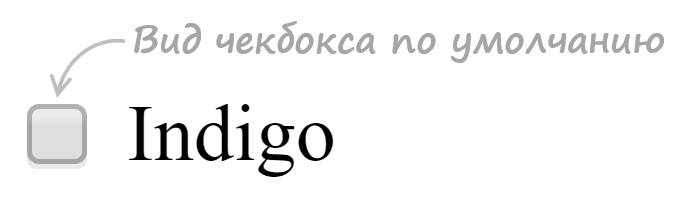
Шаг 2. Напишем стили для скрытия стандартного элемента input.
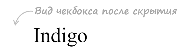
.custom-checkbox {
  position: absolute;
  z-index: -1;
  opacity: 0;
}
Мы не будем использовать display: none, а установим ему стили, с помощью которых уберём его из потока (position: absolute), поместим его ниже существующих элементов (z-index: -1), а также сделаем его полностью прозрачным (opacity: 0). Зачем это нужно? Это нам необходимо для того, чтобы мы могли получить состояние фокуса, а затем стилизовать «подделный» checkbox или radio, когда он будет находиться в нём.
Шаг 3. Создадим поддельный чекбокс.
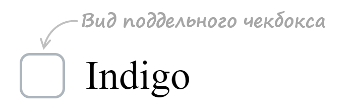
.custom-checkbox+label {
  display: inline-flex;
  align-items: center;
  user-select: none;
}
.custom-checkbox+label::before {
  content: '';
  display: inline-block;
  width: 1em;
  height: 1em;
  flex-shrink: 0;
  flex-grow: 0;
  border: 1px solid #adb5bd;
  border-radius: 0.25em;
  margin-right: 0.5em;
  background-repeat: no-repeat;
  background-position: center center;
  background-size: 50% 50%;
}
Создание «поддельного» чекбокса выполним с помощью псевдоэлемента ::before. Посредством CSS зададим ему размеры (в данном случае 1emx1em), а затем нарисуем его с помощью border: 1px solid #adb5bd. Свойства начинающие со слова background будут определять положение самого флажка (когда checkbox будет в состоянии checked).
Первое правило необходимо для вертикального центрирования флажка и надписи к нему. Это действие в примере выполнено через CSS Flexbox.
Шаг 4. Создадим стили при нахождении элемента в состоянии checked.
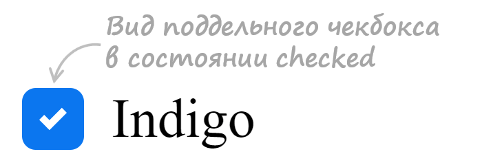
.custom-checkbox:checked+label::before {
  border-color: #0b76ef;
  background-color: #0b76ef;
  background-image: url("data:image/svg+xml,%3csvg xmlns='http://www.w3.org/2000/svg' viewBox='0 0 8 8'%3e%3cpath fill='%23fff' d='M6.564.75l-3.59 3.612-1.538-1.55L0 4.26 2.974 7.25 8 2.193z'/%3e%3c/svg%3e");
}
В этом коде при получении элементом состояния checked применим к псевдоэлементу ::before находящемуся в label стили, посредством которых установим цвет границы, цвет фону и фоновую картинку (флажок) в формате svg.
Шаг 5. Добавим код для стилизации чекбокса при нахождении его в состояниях hover, active, focus и disabled.
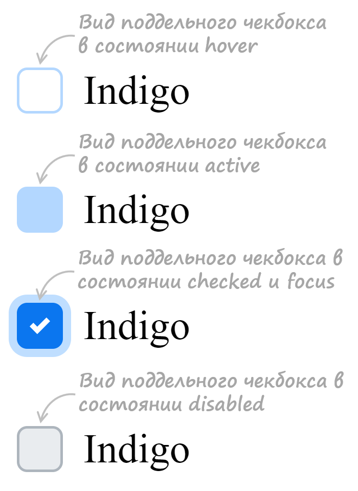
/* стили при наведении курсора на checkbox */
.custom-checkbox:not(:disabled):not(:checked)+label:hover::before {
  border-color: #b3d7ff;
}
/* стили для активного состояния чекбокса (при нажатии на него) */
.custom-checkbox:not(:disabled):active+label::before {
  background-color: #b3d7ff;
  border-color: #b3d7ff;
}
/* стили для чекбокса, находящегося в фокусе */
.custom-checkbox:focus+label::before {
  box-shadow: 0 0 0 0.2rem rgba(0, 123, 255, 0.25);
}
/* стили для чекбокса, находящегося в фокусе и не находящегося в состоянии checked */
.custom-checkbox:focus:not(:checked)+label::before {
  border-color: #80bdff;
}
/* стили для чекбокса, находящегося в состоянии disabled */
.custom-checkbox:disabled+label::before {
  background-color: #e9ecef;
}
Открыть пример
Разработка кастомного переключателя
Стилизация переключателя (input с type="radio") выполняется аналогично, т.е. посредством тех же шагов которые мы применяли при кастомизации чекбокса.
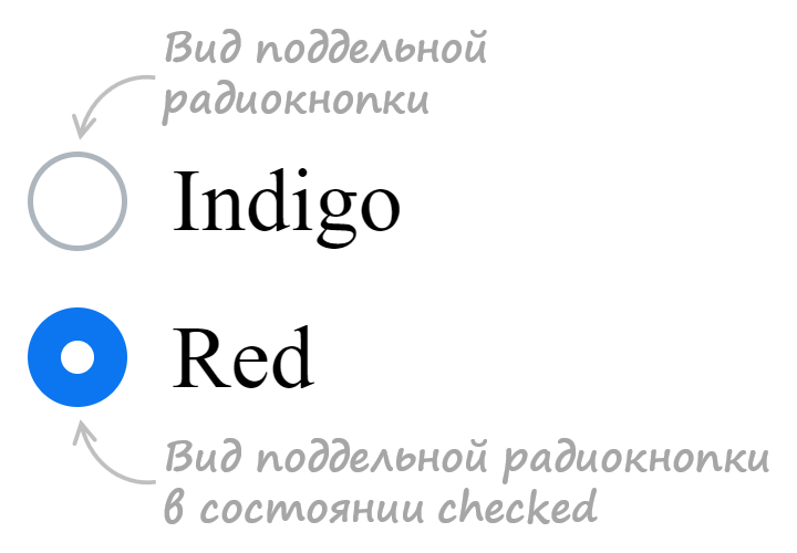
Итоговый набор стилей для кастомного оформления input с type="radio":
<style>
  /* для элемента input c type="radio" */
  .custom-radio {
    position: absolute;
    z-index: -1;
    opacity: 0;
  }
  /* для элемента label связанного с .custom-radio */
  .custom-radio+label {
    display: inline-flex;
    align-items: center;
    user-select: none;
  }
  /* создание в label псевдоэлемента  before со следующими стилями */
  .custom-radio+label::before {
    content: '';
    display: inline-block;
    width: 1em;
    height: 1em;
    flex-shrink: 0;
    flex-grow: 0;
    border: 1px solid #adb5bd;
    border-radius: 50%;
    margin-right: 0.5em;
    background-repeat: no-repeat;
    background-position: center center;
    background-size: 50% 50%;
  }
  /* стили при наведении курсора на радио */
  .custom-radio:not(:disabled):not(:checked)+label:hover::before {
    border-color: #b3d7ff;
  }
  /* стили для активной радиокнопки (при нажатии на неё) */
  .custom-radio:not(:disabled):active+label::before {
    background-color: #b3d7ff;
    border-color: #b3d7ff;
  }
  /* стили для радиокнопки, находящейся в фокусе */
  .custom-radio:focus+label::before {
    box-shadow: 0 0 0 0.2rem rgba(0, 123, 255, 0.25);
  }
  /* стили для радиокнопки, находящейся в фокусе и не находящейся в состоянии checked */
  .custom-radio:focus:not(:checked)+label::before {
    border-color: #80bdff;
  }
  /* стили для радиокнопки, находящейся в состоянии checked */
  .custom-radio:checked+label::before {
    border-color: #0b76ef;
    background-color: #0b76ef;
    background-image: url("data:image/svg+xml,%3csvg xmlns='http://www.w3.org/2000/svg' viewBox='-4 -4 8 8'%3e%3ccircle r='3' fill='%23fff'/%3e%3c/svg%3e");
  }
  /* стили для радиокнопки, находящейся в состоянии disabled */
  .custom-radio:disabled+label::before {
    background-color: #e9ecef;
  }
</style>

<input class="custom-radio" name="color" type="radio" id="color-green" value="green">
<label for="color-green">Green</label>
Открыть пример
Ещё примеры по кастомизации checkbox и label
В этом разделе представлены следующие примеры:
- оформление чекбокса, когда input расположен в label
- оформление переключателя, когда input расположен в label
1. Стилизация checkbox, когда input расположен в label.
HTML разметка:
<label class="custom-checkbox">
  <input type="checkbox" value="value-1">
  <span>Indigo</span>
</label>
CSS код:
/* для элемента input c type="checkbox" */
.custom-checkbox>input {
  position: absolute;
  z-index: -1;
  opacity: 0;
}

/* для элемента label, связанного с .custom-checkbox */
.custom-checkbox>span {
  display: inline-flex;
  align-items: center;
  user-select: none;
}

/* создание в label псевдоэлемента before со следующими стилями */
.custom-checkbox>span::before {
  content: '';
  display: inline-block;
  width: 1em;
  height: 1em;
  flex-shrink: 0;
  flex-grow: 0;
  border: 1px solid #adb5bd;
  border-radius: 0.25em;
  margin-right: 0.5em;
  background-repeat: no-repeat;
  background-position: center center;
  background-size: 50% 50%;
}

/* стили при наведении курсора на checkbox */
.custom-checkbox>input:not(:disabled):not(:checked)+span:hover::before {
  border-color: #b3d7ff;
}

/* стили для активного чекбокса (при нажатии на него) */
.custom-checkbox>input:not(:disabled):active+span::before {
  background-color: #b3d7ff;
  border-color: #b3d7ff;
}

/* стили для чекбокса, находящегося в фокусе */
.custom-checkbox>input:focus+span::before {
  box-shadow: 0 0 0 0.2rem rgba(0, 123, 255, 0.25);
}

/* стили для чекбокса, находящегося в фокусе и не находящегося в состоянии checked */
.custom-checkbox>input:focus:not(:checked)+span::before {
  border-color: #80bdff;
}

/* стили для чекбокса, находящегося в состоянии checked */
.custom-checkbox>input:checked+span::before {
  border-color: #0b76ef;
  background-color: #0b76ef;
  background-image: url("data:image/svg+xml,%3csvg xmlns='http://www.w3.org/2000/svg' viewBox='0 0 8 8'%3e%3cpath fill='%23fff' d='M6.564.75l-3.59 3.612-1.538-1.55L0 4.26 2.974 7.25 8 2.193z'/%3e%3c/svg%3e");
}

/* стили для чекбокса, находящегося в состоянии disabled */
.custom-checkbox>input:disabled+span::before {
  background-color: #e9ecef;
}
Открыть пример
2. Стилизация radio, когда input расположен в label.
HTML разметка:
<label class="custom-radio">
  <input type="radio" name="color" value="indigo">
  <span>Indigo</span>
</label>
CSS код:
/* для элемента input c type="radio" */
.custom-radio>input {
  position: absolute;
  z-index: -1;
  opacity: 0;
}

/* для элемента label связанного с .custom-radio */
.custom-radio>span {
  display: inline-flex;
  align-items: center;
  user-select: none;
}

/* создание в label псевдоэлемента  before со следующими стилями */
.custom-radio>span::before {
  content: '';
  display: inline-block;
  width: 1em;
  height: 1em;
  flex-shrink: 0;
  flex-grow: 0;
  border: 1px solid #adb5bd;
  border-radius: 50%;
  margin-right: 0.5em;
  background-repeat: no-repeat;
  background-position: center center;
  background-size: 50% 50%;
}

/* стили при наведении курсора на радио */
.custom-radio>input:not(:disabled):not(:checked)+span:hover::before {
  border-color: #b3d7ff;
}

/* стили для активной радиокнопки (при нажатии на неё) */
.custom-radio>input:not(:disabled):active+span::before {
  background-color: #b3d7ff;
  border-color: #b3d7ff;
}

/* стили для радиокнопки, находящейся в фокусе */
.custom-radio>input:focus+span::before {
  box-shadow: 0 0 0 0.2rem rgba(0, 123, 255, 0.25);
}

/* стили для радиокнопки, находящейся в фокусе и не находящейся в состоянии checked */
.custom-radio>input:focus:not(:checked)+span::before {
  border-color: #80bdff;
}

/* стили для радиокнопки, находящейся в состоянии checked */
.custom-radio>input:checked+span::before {
  border-color: #0b76ef;
  background-color: #0b76ef;
  background-image: url("data:image/svg+xml,%3csvg xmlns='http://www.w3.org/2000/svg' viewBox='-4 -4 8 8'%3e%3ccircle r='3' fill='%23fff'/%3e%3c/svg%3e");
}

/* стили для радиокнопки, находящейся в состоянии disabled */
.custom-radio>input:disabled+span::before {
  background-color: #e9ecef;
}
Открыть пример