In this short recipe we’ll learn how to correctly set the size of a Seaborn chart in Jupyter notebooks/Lab.
Well first go a head and load a csv file into a Pandas DataFrame and then explain how to resize it so it fits your screen for clarity and readability.
Use plt figsize to resize your Seaborn chart
We’ll first go ahead and import data into our Dataframe
#Python3
import seaborn as sns
import pandas as pd
import matplotlib.pyplot as plt
sns.set_style('whitegrid')

#load the data into Pandas
deliveries = pd.read_csv('../../data/del_tips.csv')
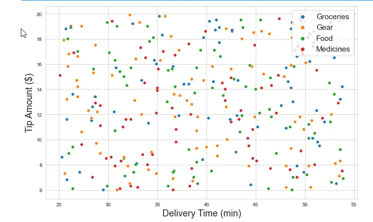
Now let’s go ahead and create a simple scatter chart
scatter = sns.scatterplot(x = 'time_to_deliver', y ='del_tip_amount', data=deliveries, hue='type')
scatter.set_xlabel('Delivery Time (min)');
scatter.set_ylabel ('Tip Amount ($)');
How to make our Seaborn chart bigger?
Our chart is pretty small and not fully legible, hence it needs to be resized.
Resize scatter chart using figsize parameter
Let’s re-do this chart, this time, we’ll use the object oriented approach to create also a figure, that we can later resize.
fig, scatter = plt.subplots(figsize = (11,7))
scatter = sns.scatterplot(x = 'time_to_deliver', y ='del_tip_amount', data=deliveries, hue='type', )
scatter.set_xlabel('Delivery Time (min)', fontsize = 18)
scatter.set_ylabel ('Tip Amount ($)', fontsize = 18)
scatter.legend(loc='upper right', fontsize = 15);
Here’s the much nicer scatter chart in our Jupyter notebook (note i have tweaked the axes labels font size and the legend fonts and location).
Using rcParams
Instead of setting the size of your individual plots, you can simply use the runtime configuration of Matplotlib to set a common figsize value for all your notebooks charts. Here’s how to set it. Make sure that you have imported Matplotlib beforehahnd. Otherwise, you’ll get the name ‘plt’ is not defined error.
import matplotlib.pyplot as plt
plt.rcParams['figure.figsize'] = (11,7)
Changing Seaborn heatmap size
Using similar technique, you can also reset an heatmap
Here’s a simple snippet of the code you might want to use:
fig, heat = plt.subplots(figsize = (11,7))
heat = sns.heatmap(subset, annot=True, fmt= ',.2f' )
The above mentioned procedures work for other Seaborn charts such as line, barplots etc’.
Seaborn plot size not changing?
If setting your figsize correctly as per one of the methods above doesn’t do the tricvk, i would recommend that you save, close and re-open Jupyter Notebooks.
If you are just starting out with Data Visualization, you might also want to look into our tutorial on defining axis limits in Seaborn.

Есть два способа изменить размер фигуры морского графика в Python.
Первый метод можно использовать для изменения размера графиков «на уровне осей», таких как графики sns.scatterplot() или sns.boxplot() :
sns.set (rc={" figure.figsize ":( 3 , 4 )}) #width=3, #height=4
Второй метод можно использовать для изменения размера графиков «уровня фигур», таких как графики sns.lmplot() и sns.catplot() или sns.jointplot() .
Этот метод требует, чтобы вы указали высоту и аспект (отношение ширины к высоте) в аргументах диаграммы:
sns.lmplot (data=df, x=" var1", y=" var2",
 height= 6 , aspect= 1.5 ) #height=6, width=1.5 times larger than height
В следующих примерах показано, как использовать оба этих метода на практике.
Метод 1: изменение размера графиков на уровне осей
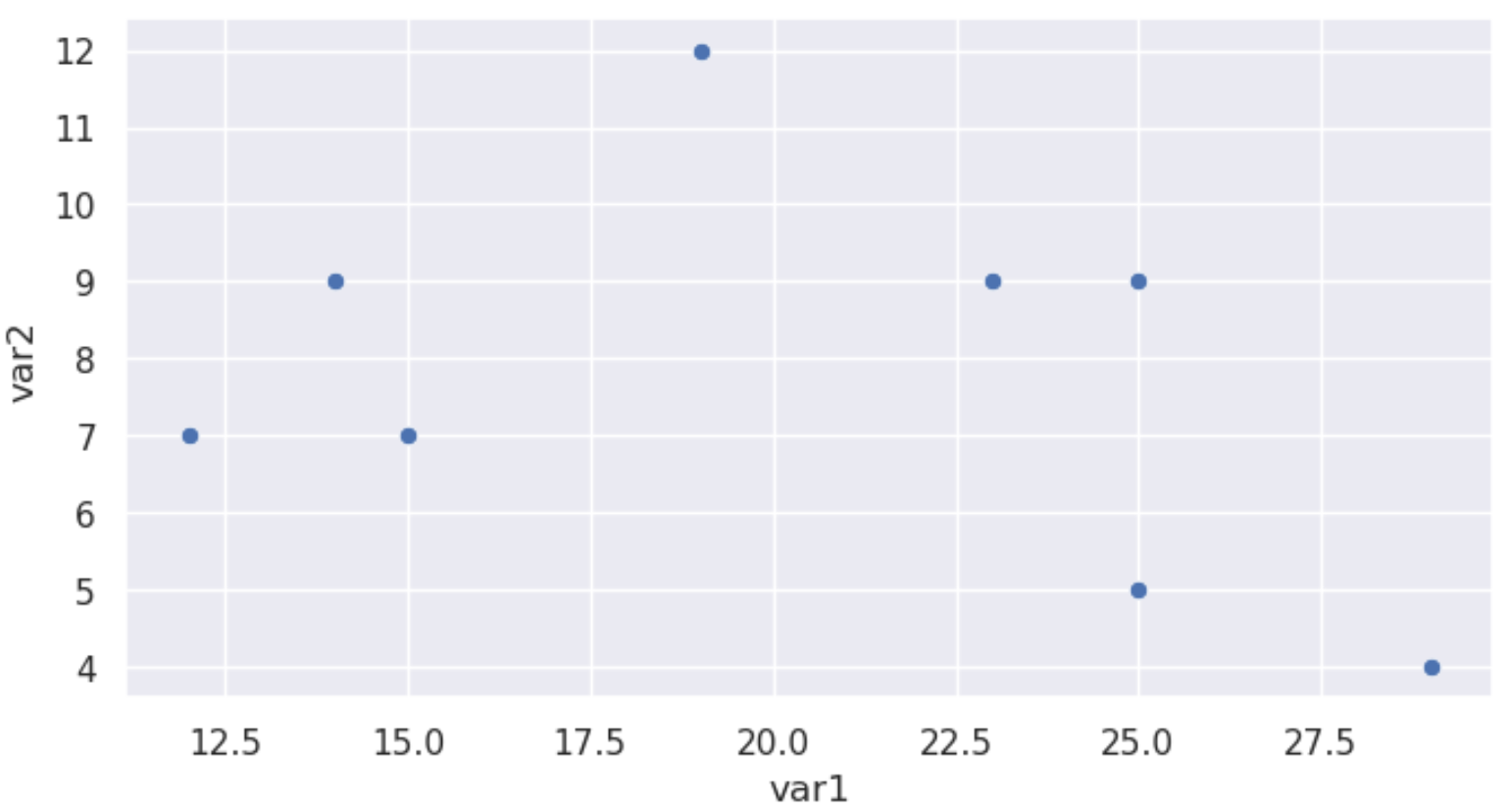
В следующем коде показано, как создать диаграмму рассеяния с шириной 8 и высотой 4:
import pandas as pd
import seaborn as sns
#create data
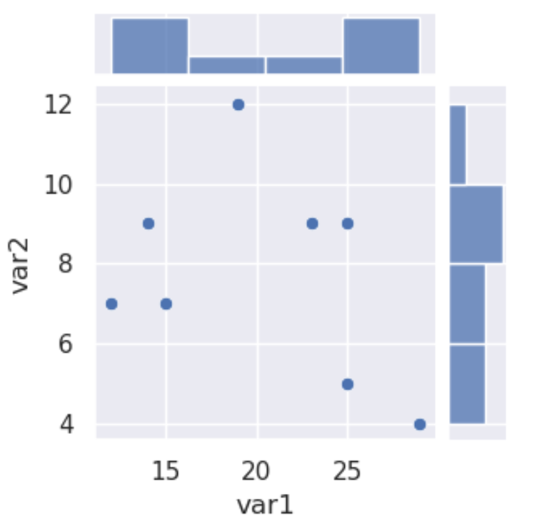
df = pd.DataFrame({" var1 ": [25, 12, 15, 14, 19, 23, 25, 29],
" var2 ": [5, 7, 7, 9, 12, 9, 9, 4],
" var3 ": [11, 8, 10, 6, 6, 5, 9, 12]})
#define figure size
sns.set (rc={" figure.figsize ":( 8 , 4 )}) #width=8, height=4
#display scatterplot
sns.scatterplot(data=df, x=" var1", y=" var2 ")
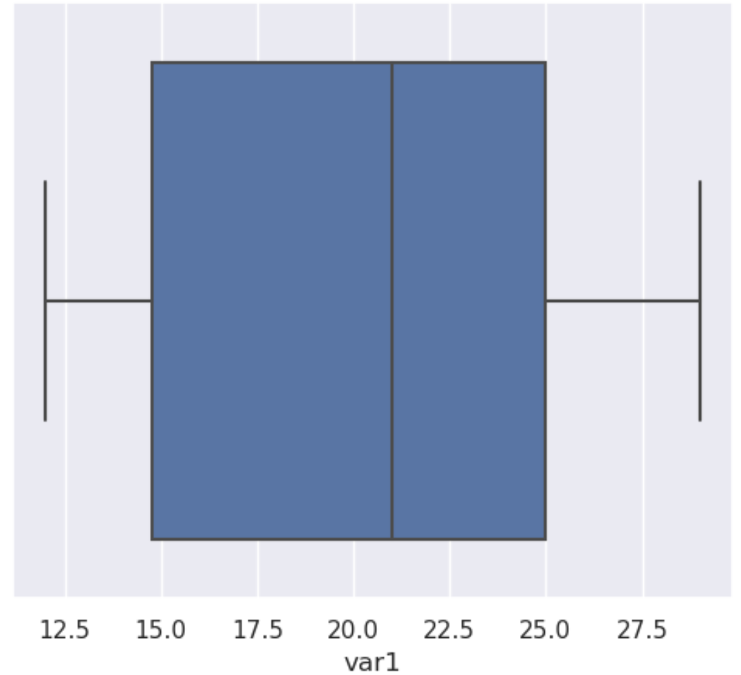
А следующий код показывает, как создать коробку с изображением моря шириной 6 и высотой 5:
#define figure size
sns.set (rc={" figure.figsize ":( 6 , 5 )}) #width=6, height=5

#display scatterplot
sns.boxplot(data=df[" var1 "])
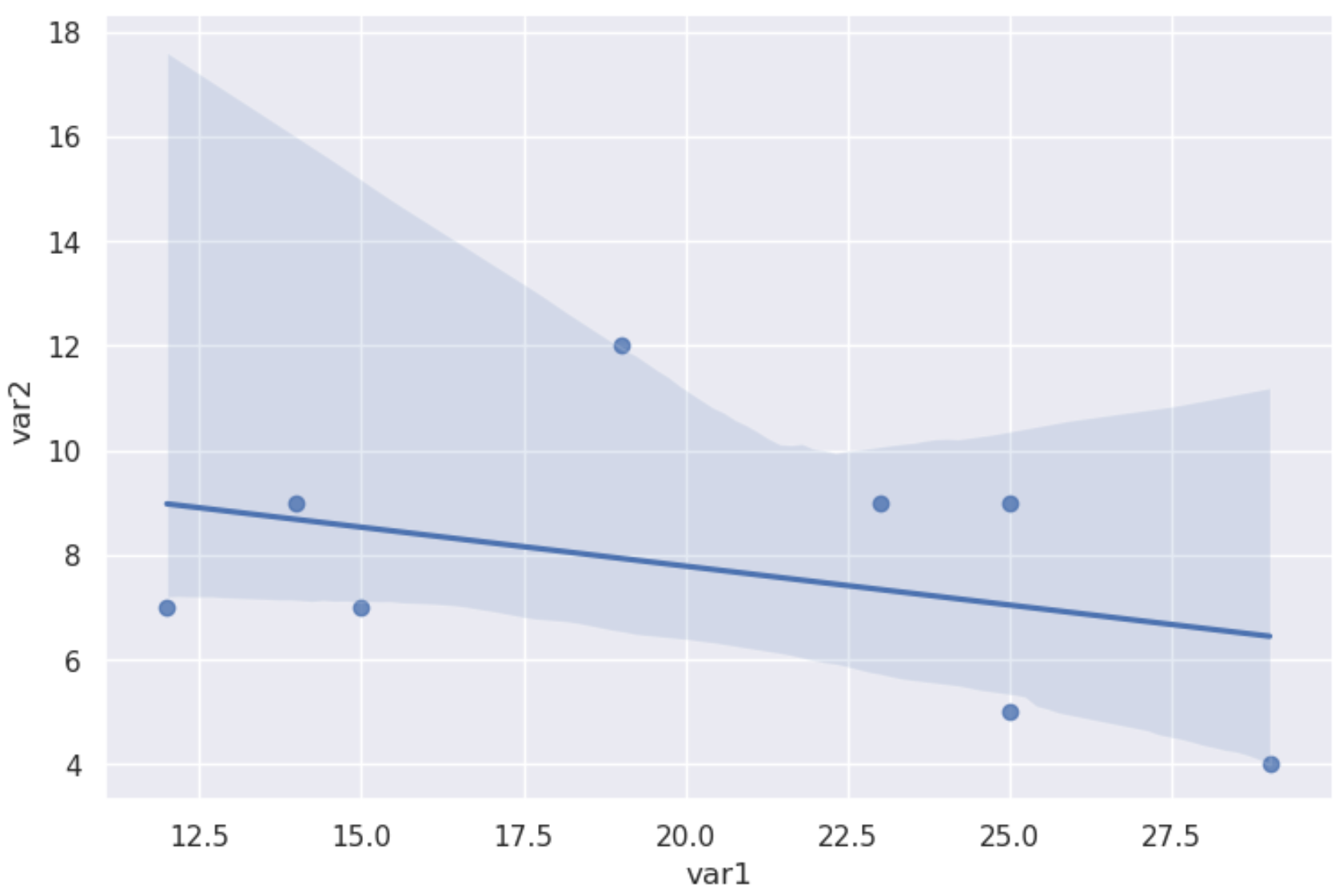
Метод 2: изменить размер графиков на уровне фигур
Для графиков на уровне фигур (таких как sns.lmplot, sns.catplot, sns.jointplot и т. д.) необходимо указать высоту и ширину в самой диаграмме.
В следующем коде показано, как создать морской lmplot с высотой 5 и шириной в 1,5 раза больше, чем высота:
import pandas as pd
import seaborn as sns

#create data
df = pd.DataFrame({" var1 ": [25, 12, 15, 14, 19, 23, 25, 29],
 " var2 ": [5, 7, 7, 9, 12, 9, 9, 4],
 " var3 ": [11, 8, 10, 6, 6, 5, 9, 12]})

#create lmplot
sns.lmplot (data=df, x=" var1", y=" var2",
 height= 5 , aspect= 1.5 ) #height=5, width=1.5 times larger than height
А следующий код показывает, как создать совместный участок моря с высотой 3,5. Поскольку совместный график по умолчанию квадратный, нам не нужно указывать значение аспекта:
sns.jointplot (data=df, x=" var1", y=" var2", height= 3.5 )
Ознакомьтесь сдокументацией Seaborn для подробного объяснения разницы между функциями на уровне фигур и на уровне осей.
Дополнительные ресурсы
Как добавить название к участкам Seaborn
Как изменить метки осей на графике Seaborn
Как изменить положение легенды в Seaborn
In this short tutorial, we will learn how to change Seaborn plot size. For many reasons, we may need to either increase the size or decrease the size, of our plots created with Seaborn. For example, if we are planning on presenting the data on a conference poster, we may want to increase the size of the plot.
How to Make Seaborn Plot Bigger
Now, if we only to increase Seaborn plot size we can use matplotlib and pyplot. Here’s how to make the plot bigger:
Code language: Python (python)
import matplotlib.pyplot as plt fig = plt.gcf() # Change seaborn plot size fig.set_size_inches(12, 8)
Note, that we use the set_size_inches() method to make the Seaborn plot bigger.
When do We Need to Change the Size of a Plot?
One example, for instance, when we might want to change the size of a plot could be when we are going to communicate the results from our data analysis. In this case, we may compile the descriptive statistics, data visualization, and results from data analysis into a report, or manuscript for scientific publication.
Here, we may need to change the size so it fits the way we want to communicate our results. Note, for scientific publication (or printing, in general) we may want to also save the figures as high-resolution images.
What is Seaborn?
First, before learning how to install Seaborn, we are briefly going to discuss what this Python package is. This Python package is, obviously, a package for data visualization in Python. Furthermore, it is based on matplotlib and provides us with a high-level interface for creating beautiful and informative statistical graphics. It is easier to use compared to Matplotlib and, using Seaborn, we can create a number of commonly used data visualizations in Python.
How do you Increase Figsize in Seaborn?
Now, whether you want to increase, or decrease, the figure size in Seaborn you can use matplotlib.
fig = plt.gcf()
fig.set_size_inches(x, y)
. Note, this code needs to be put above where you create the Seaborn plot.
How to Install Python Packages
Now, if we want to install python packages we can use both conda and pip. Conda is the package manager for the Anaconda Python distribution and pip is a package manager that comes with the installation of Python. Both of these methods are quite easy to use: conda install -c anaconda seaborn and pip -m install seaborn will both install Seaborn and it’s dependencies using conda and pip, respectively. Here’s more information about how to install Python packages using Pip and Conda.
Changing the Size of Seaborn Plots
In this section, we are going to learn several methods for changing the size of plots created with Seaborn. First, we need to install the Python packages needed. Second, we are going to create a couple of different plots (e.g., a scatter plot, a histogram, a violin plot). Finally, when we have our different plots we are going to learn how to increase, and decrease, the size of the plot and then save it to high-resolution images.
- Nine data visualization techniques you should know in Python
How to Change the Size of a Seaborn Scatter Plot
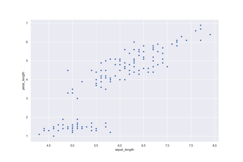
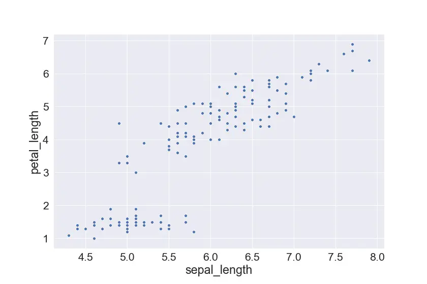
In the first example, we are going to increase the size of a scatter plot created with Seaborn’s scatterplot method. First, however, we need some data. Conveniently, Seaborn has some example datasets that we can use when plotting. Here, we are going to use the Iris dataset and we use the method load_dataset to load this into a Pandas dataframe.
import seaborn as sns iris_df = sns.load_dataset('iris') iris_df.head()Code language: Python (python)
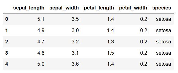
In the code chunk above, we first import seaborn as sns, we load the dataset, and, finally, we print the first five rows of the dataframe. Now that we have our data to plot using Python, we can go one and create a scatter plot:
Code language: Python (python)
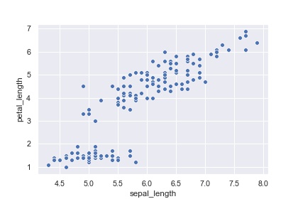
%matplotlib inline sns.scatterplot(x='sepal_length', y='petal_length', data=iris_df)
Code language: Python (python)
import matplotlib.pyplot as plt fig = plt.gcf() # Change seaborn plot size fig.set_size_inches(12, 8) sns.scatterplot(x='sepal_length', y='petal_length', data=iris_df)
- There’s more in-depth information on how to create a scatter plot in Seaborn in an earlier Python data visualization post.
- If we need to explore relationship between many numerical variables at the same time we can use Pandas to create a scatter matrix with correlation plots, as well as histograms, for instance.
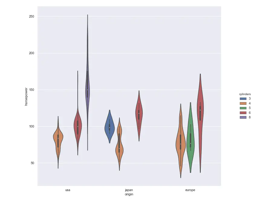
How to Change the Size of a Seaborn Catplot
In this section, we are going to create a violin plot using the method catplot. Now, we are going to load another dataset (mpg). This is, again, done using the load_dataset method:
Code language: Python (python)
mpg_df = sns.load_dataset('mpg') mpg_df.head()
Now, when working with the catplot method we cannot change the size in the same manner as when creating a scatter plot.
Code language: Python (python)
g = sns.catplot(data=cc_df, x='origin', kind="violin", y='horsepower', hue='cylinders') g.fig.set_figwidth(12) g.fig.set_figheight(10)
Now, as you may understand now, Seaborn can create a lot of different types of datavisualization. For instance, with the sns.lineplot method we can create line plots (e.g., visualize time-series data).
Changing the Font Size on a Seaborn Plot
As can be seen in all the example plots, in which we’ve changed Seaborn plot size, the fonts are now relatively small. We can change the fonts using the set method and the font_scale argument. Again, we are going to use the iris dataset so we may need to load it again.
In this example, we are going to create a scatter plot, again, and change the scale of the font size. That is, we are changing the size of the scatter plot using Matplotlib Pyplot, gcf(), and the set_size_inches() method:
Code language: Python (python)
iris_df = sns.load_dataset('iris') fig = plt.gcf() # Changing Seaborn Plot size fig.set_size_inches(12, 8) # Setting the font scale sns.set(font_scale=2) sns.scatterplot(x='sepal_length', y='petal_length', data=iris_df)
Saving Seaborn Plots
Finally, we are going to learn how to save our Seaborn plots, that we have changed the size of, as image files. This is accomplished using the savefig method from Pyplot and we can save it as a number of different file types (e.g., jpeg, png, eps, pdf). In this section, we are going to save a scatter plot as jpeg and EPS. Note, EPS will enable us to save the file in high-resolution and we can use the files e.g. when submitting to scientific journals.
Saving a Seaborn Plot as JPEG
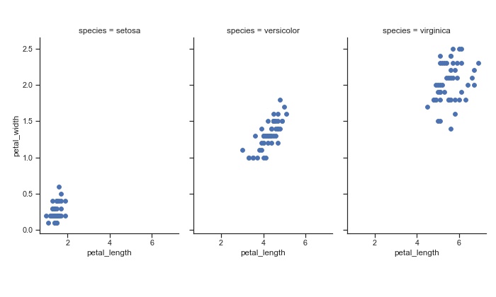
In this section, we are going to use Pyplot savefig to save a scatter plot as a JPEG. First, we create 3 scatter plots by species and, as previously, we change the size of the plot. Note, we use the FacetGrid class, here, to create three columns for each species.
import matplotlib.pyplot as plt import seaborn as sns iris_df = sns.load_dataset('iris') sns.set(style="ticks") g = sns.FacetGrid(iris_df, col="species") g = g.map(plt.scatter, "petal_length", "petal_width") g.fig.set_figheight(6) g.fig.set_figwidth(10) plt.savefig('our_plot_name.jpg', format='jpeg', dpi=70)Code language: Python (python)
In the code chunk above, we save the plot in the final line of code. Here, the first argument is the filename (and path), we want it to be a jpeg and, thus, provide the string “jpeg” to the argument format. Finally, we added 70 dpi for the resolution. Note, dpi can be changed so that we get print-ready Figures.
Saving a Seaborn Plot as EPS
In this last code chunk, we are creating the same plot as above. Note, however, how we changed the format argument to “eps” (Encapsulated Postscript) and the dpi to 300. This way we get our Seaborn plot in vector graphic format and in high-resolution:
Code language: Python (python)
import matplotlib.pyplot as plt import seaborn as sns iris_df = sns.load_dataset('iris') sns.set(style="ticks") g = sns.FacetGrid(iris_df, col="species") g = g.map(plt.scatter, "petal_length", "petal_width") plt.savefig('our_plot_name.eps', format='eps', dpi=300)
For a more detailed post about saving Seaborn plots, see how to save Seaborn plots as PNG, PDF, PNG, TIFF, and SVG.
Conclusion
In this post, we have learned how to change the size of the plots, change the size of the font, and how to save our plots as JPEG and EPS files. More specifically, here we have learned how to specify the size of Seaborn scatter plots, violin plots (catplot), and FacetGrids.
Comment below, if there are any questions or suggestions to this post (e.g., if some techniques do not work for a particular data visualization technique).
- Introduction
- Drawing a figure using pandas
- Drawing a figure using matplotlib
- Drawing a figure with seaborn
- Printing a figure
TL;DR
- if you’re using
plot()on a pandas Series or Dataframe, use thefigsizekeyword - if you’re using matplotlib directly, use
matplotlib.pyplot.figurewith thefigsizekeyword - if you’re using a seaborn function that draws a single plot, use
matplotlib.pyplot.figurewith thefigsizekeyword - if you’re using a seaborn function that draws multiple plots, use the
heightandaspectkeyword arguments
Introduction
Setting figure sizes is one of those things that feels like it should be very straightforward. However, it still manages to show up on the first page of stackoverflow questions for both matplotlib and seaborn. Part of the confusion arises because there are so many ways to do the same thing — this highly upvoted question has six suggested solutions:
- manually create an
Axesobject with the desired size - pass some configuration paramteters to
seabornso that the size you want is the default - call a method on the figure once it’s been created
- pass
hightandaspectkeywords to theseabornplotting function - use the
matplotlib.pyplotinterface and call thefigure()function - use the
matplotlib.pyplotinterface to get the current figure then set its size using a method
each of which will work in some circumstances but not others!
Tip: For a full overview of the difference between figure and axis level charts, checkout the chapters on styles and small multiples in the Drawing from Data book.
Drawing a figure using pandas
Let’s jump in. As an example we’ll use the olympic medal dataset, which we can load directly from a URL::
import pandas as pd

data = pd.read_csv("https://raw.githubusercontent.com/mojones/binders/master/olympics.csv", sep="t")
data
| City | Year | Sport | … | Medal | Country | Int Olympic Committee code | |
|---|---|---|---|---|---|---|---|
| 0 | Athens | 1896 | Aquatics | … | Gold | Hungary | HUN |
| 1 | Athens | 1896 | Aquatics | … | Silver | Austria | AUT |
| 2 | Athens | 1896 | Aquatics | … | Bronze | Greece | GRE |
| 3 | Athens | 1896 | Aquatics | … | Gold | Greece | GRE |
| 4 | Athens | 1896 | Aquatics | … | Silver | Greece | GRE |
| … | … | … | … | … | … | … | … |
| 29211 | Beijing | 2008 | Wrestling | … | Silver | Germany | GER |
| 29212 | Beijing | 2008 | Wrestling | … | Bronze | Lithuania | LTU |
| 29213 | Beijing | 2008 | Wrestling | … | Bronze | Armenia | ARM |
| 29214 | Beijing | 2008 | Wrestling | … | Gold | Cuba | CUB |
| 29215 | Beijing | 2008 | Wrestling | … | Silver | Russia | RUS |
29216 rows × 12 columns
For our first figure, we’ll count how many medals have been won in total by each country, then take the top thirty:
data['Country'].value_counts().head(30)
United States     4335
Soviet Union      2049
United Kingdom    1594
France            1314
Italy             1228
                  ...
Spain              377
Switzerland        376
Brazil             372
Bulgaria           331
Czechoslovakia     329
Name: Country, Length: 30, dtype: int64
And turn it into a bar chart:
data['Country'].value_counts().head(30).plot(kind='barh')
Ignoring other asthetic aspects of the plot, it’s obvious that we need to change the size — or rather the shape. Part of the confusion over sizes in plotting is that sometimes we need to just make the chart bigger or smaller, and sometimes we need to make it thinner or fatter. If we just scaled up this plot so that it was big enough to read the names on the vertical axis, then it would also be very wide. We can set the size by adding a figsize keyword argument to our pandas plot() function. The value has to be a tuple of sizes — it’s actually the horizontal and vertical size in inches, but for most purposes we can think of them as arbirary units.
Here’s what happens if we make the plot bigger, but keep the original shape:
data['Country'].value_counts().head(30).plot(kind='barh', figsize=(20,10))
And here’s a version that keeps the large vertical size but shrinks the chart horizontally so it doesn’t take up so much space:
data['Country'].value_counts().head(30).plot(kind='barh', figsize=(6,10))
Drawing a figure using matplotlib
OK, but what if we aren’t using pandas’ convenient plot() method but drawing the chart using matplotlib directly? Let’s look at the number of medals awarded in each year:
plt.plot(data['Year'].value_counts().sort_index())
[<matplotlib.lines.Line2D at 0x7fb1bd16de20>]
This time, we’ll say that we want to make the plot longer in the horizontal direction, to better see the pattern over time. If we search the documentation for the matplotlib plot() funtion, we won’t find any mention of size or shape. This actually makes sense in the design of matplotlib — plots don’t really have a size, figures do. So to change it we have to call the figure() function:
import matplotlib.pyplot as plt

plt.figure(figsize=(15,4))
plt.plot(data['Year'].value_counts().sort_index())
[<matplotlib.lines.Line2D at 0x7fb1bd5f3dc0>]
Notice that with the figure() function we have to call it before we make the call to plot(), otherwise it won’t take effect:
plt.plot(data['Year'].value_counts().sort_index())

# no effect, the plot has already been drawn
plt.figure(figsize=(15,4))
<Figure size 1080x288 with 0 Axes>
<Figure size 1080x288 with 0 Axes>
Drawing a figure with seaborn
OK, now what if we’re using seaborn rather than matplotlib? Well, happily the same technique will work. We know from our first plot which countries have won the most medals overall, but now let’s look at how this varies by year. We’ll create a summary table to show the number of medals per year for all countries that have won at least 500 medals total.
(ignore this panda stuff if it seems confusing, and just look at the final table)
summary = (
    data
    .groupby('Country')
    .filter(lambda x : len(x) > 500)
    .groupby(['Country', 'Year'])
    .size()
    .to_frame('medal count')
    .reset_index()
)

# wrap long country names
summary['Country'] = summary['Country'].str.replace(' ', 'n')
summary
| Country | Year | medal count | |
|---|---|---|---|
| 0 | Australia | 1896 | 2 |
| 1 | Australia | 1900 | 5 |
| 2 | Australia | 1920 | 6 |
| 3 | Australia | 1924 | 10 |
| 4 | Australia | 1928 | 4 |
| … | … | … | … |
| 309 | UnitednStates | 1992 | 224 |
| 310 | UnitednStates | 1996 | 260 |
| 311 | UnitednStates | 2000 | 248 |
| 312 | UnitednStates | 2004 | 264 |
| 313 | UnitednStates | 2008 | 315 |
314 rows × 3 columns
Now we can do a box plot to show the distribution of yearly medal totals for each country:
import seaborn as sns

sns.boxplot(
    data=summary,
    x='Country',
    y='medal count',
    color='red')
<AxesSubplot:xlabel='Country', ylabel='medal count'>
This is hard to read because of all the names, so let’s space them out a bit:
plt.figure(figsize=(20,5))

sns.boxplot(
    data=summary,
    x='Country',
    y='medal count',
    color='red')
<AxesSubplot:xlabel='Country', ylabel='medal count'>
Now we come to the final complication; let’s say we want to look at the distributions of the different medal types separately. We’ll make a new summary table — again, ignore the pandas stuff if it’s confusing, and just look at the final table:
summary_by_medal = (
    data
    .groupby('Country')
    .filter(lambda x : len(x) > 500)
    .groupby(['Country', 'Year', 'Medal'])
    .size()
    .to_frame('medal count')
    .reset_index()
)

summary_by_medal['Country'] = summary_by_medal['Country'].str.replace(' ', 'n')

summary_by_medal
| Country | Year | Medal | medal count | |
|---|---|---|---|---|
| 0 | Australia | 1896 | Gold | 2 |
| 1 | Australia | 1900 | Bronze | 3 |
| 2 | Australia | 1900 | Gold | 2 |
| 3 | Australia | 1920 | Bronze | 1 |
| 4 | Australia | 1920 | Silver | 5 |
| … | … | … | … | … |
| 881 | UnitednStates | 2004 | Gold | 116 |
| 882 | UnitednStates | 2004 | Silver | 75 |
| 883 | UnitednStates | 2008 | Bronze | 81 |
| 884 | UnitednStates | 2008 | Gold | 125 |
| 885 | UnitednStates | 2008 | Silver | 109 |
886 rows × 4 columns
Now we will switch from boxplot() to the higher level catplot(), as this makes it easy to switch between different plot types. But notice that now our call to plt.figure() gets ignored:
plt.figure(figsize=(20,5))

sns.catplot(
    data=summary_by_medal,
    x='Country',
    y='medal count',
    hue='Medal',
    kind='box'
)
<seaborn.axisgrid.FacetGrid at 0x7fb1bcc23ac0>
<Figure size 1440x360 with 0 Axes>
The reason for this is that the higher level plotting functions in seaborn (what the documentation calls Figure-level interfaces) have a different way of managing size, largely due to the fact that the often produce multiple subplots. To set the size when using catplot() or relplot() (also pairplot(), lmplot() and jointplot()), use the height keyword to control the size and the aspect keyword to control the shape:
sns.catplot(
    data=summary_by_medal,
    x='Country',
    y='medal count',
    hue='Medal',
    kind='box',
    height=5, # make the plot 5 units high
    aspect=3) # height should be three times width
<seaborn.axisgrid.FacetGrid at 0x7fb1bc40d850>
Because we often end up drawing small multiples with catplot() and relplot(), being able to control the shape separately from the size is very convenient. The height and aspect keywords apply to each subplot separately, not to the figure as a whole. So if we put each medal on a separate row rather than using hue, we’ll end up with three subplots, so we’ll want to set the height to be smaller, but the aspect ratio to be bigger:
sns.catplot(
    data=summary_by_medal,
    x='Country',
    y='medal count',
    row='Medal',
    kind='box',
    height=3,
    aspect=4,
    color='blue')
<seaborn.axisgrid.FacetGrid at 0x7fb1bc04edf0>
Printing a figure
Finally, a word about printing. If the reason that you need to change the size of a plot, rather than the shape, is because you need to print it, then don’t worry about the size — get the shape that you want, then use savefig() to make the plot in SVG format:
plt.savefig('medals.svg')
<Figure size 432x288 with 0 Axes>
This will give you a plot in Scalable Vector Graphics format, which stores the actual lines and shapes of the chart so that you can print it at any size — even a giant poster — and it will look sharp. As a nice bonus, you can also edit individual bits of the chart using a graphical SVG editor (Inkscape is free and powerful, though takes a bit of effort to learn).
- Use the
seaborn.set()Function to Change the Size of a Seaborn Plot - Use the
rcParamsFunction to Change the Size of a Seaborn Plot - Use the
matplotlib.pyplot.figure()Function to Change the Size of a Seaborn Plot - Use the
matplotlib.pyplot.gcf()Function to Alter the Size of a Seaborn Plot - Use the
heightandaspectParameters to Alter the Size of a Seaborn Plot

Usually, plots and figures have some default size, or their dimensions are determined automatically by the compiler.
In this tutorial, we will discuss how to change the size of a seaborn plot in Python.
Use the seaborn.set() Function to Change the Size of a Seaborn Plot
The seaborn.set() function is used to control the theme and configurations of the seaborn plot.
The rc parameter of the function can be used to control the size of the final figure. We will pass a dictionary as the value to this parameter with the key as figure.figsize and the required dimensions as the value.
See the following code.
import pandas as pd
import matplotlib.pyplot as plt
import seaborn as sns

df = pd.DataFrame({"Day 1": [7,1,5,6,3,10,5,8],
                 "Day 2" : [1,2,8,4,3,9,5,2]})

sns.set(rc = {'figure.figsize':(15,8)})
p = sns.lineplot(data = df)
Use the rcParams Function to Change the Size of a Seaborn Plot
Similar to the seaborn.set() function, the rcParams in the matplotlin.pyplot module is used to control the style of the plot. We can use the figure.figsize parameter here to change the size of the figure.
For example,
import pandas as pd
import matplotlib.pyplot as plt
import seaborn as sns

df = pd.DataFrame({"Day 1": [7,1,5,6,3,10,5,8],
                 "Day 2" : [1,2,8,4,3,9,5,2]})

from matplotlib import rcParams

rcParams['figure.figsize'] = 15,8
p = sns.lineplot(data = df)
Use the matplotlib.pyplot.figure() Function to Change the Size of a Seaborn Plot
The matplotlib.pyplot.figure() function is used to activate a figure. We can use it before plotting the required seaborn plot. To change the size of the plot, we can use the figsize parameter and give it the desired value for height and width.
For example,
import pandas as pd
import matplotlib.pyplot as plt
import seaborn as sns

df = pd.DataFrame({"Day 1": [7,1,5,6,3,10,5,8],
                 "Day 2" : [1,2,8,4,3,9,5,2]})


plt.figure(figsize = (15,8))
p = sns.lineplot(data = df)
Use the matplotlib.pyplot.gcf() Function to Alter the Size of a Seaborn Plot
The matplotlib.pyplot.gcf() function is used to get an instance of the current figure. We can use the set_size_inches() method with this instance to alter the final size of the plot.
This method works for Facetgrid type objects also.
For example,
import pandas as pd
import matplotlib.pyplot as plt
import seaborn as sns

df = pd.DataFrame({"Day 1": [7,1,5,6,3,10,5,8],
                 "Day 2" : [1,2,8,4,3,9,5,2]})


p = sns.lineplot(data = df)
plt.gcf().set_size_inches(15, 8)
Use the height and aspect Parameters to Alter the Size of a Seaborn Plot
Different plots in the seaborn module like lmplot, catplot, factorplot, jointplot already have the parameters height and aspect to control the size of the plotted figure.
The following code shows how to use these parameters.
import pandas as pd
import matplotlib.pyplot as plt
import seaborn as sns

df = pd.DataFrame({"Day 1": [7,1,5,6,3,10,5,8],
                 "Day 2" : [1,2,8,4,3,9,5,2]})


p = sns.factorplot(data = df,height=8, aspect=15/8)
Method 1: Specifying figsize
import matplotlib.pyplot as plt
fig = plt.figure(figsize=(24, 12))
ax = plt.axes()
plt.sca(ax)
plt.scatter(x =[1,2,3,4,5],y=[1,2,3,4,5])
Note that the size gets applied in inches.
sca set the current axes.
Method 2: Using set_size_inches
import matplotlib.pyplot as plt
plt.scatter(x =[1,2,3,4,5],y=[1,2,3,4,5])
fig = plt.gcf()
fig.set_size_inches(24, 12)
gcf stands for get current figure
Method 3: Using rcParams
This can be used when you want to avoid using the figure environment. Please note that the rc settings are global to the matplotlib package and making changes here will affect all plots (future ones as well), until you restart the kernel.
import matplotlib.pyplot as plt
plt.rcParams["figure.figsize"] = (24,12)
plt.scatter(x =[1,2,3,4,5],y=[1,2,3,4,5])
Here as well, the sizes are in inches.
Seaborn
Method 1: Using matplotlib axes
import matplotlib.pyplot as plt
import seaborn as sns
fig = plt.figure(figsize=(24, 12))
ax = plt.axes()
sns.scatterplot(x =[1,2,3,4,5],y=[1,2,3,4,5], ax=ax)
This works for axes-level functions in Seaborn.
Method 2: Using rc
import seaborn as sns
sns.set(rc={'figure.figsize':(24,12)})
sns.scatterplot(x =[1,2,3,4,5],y=[1,2,3,4,5])
Again, this is a global setting and will affect all future plots, unless you restart the kernel.
Method 3: Using height and aspect ratio
This works for figure-level functions in seaborn.
import pandas as pd
import seaborn as sns

df = pd.read_csv('myfile.csv')
sns.pairplot(df,height = 12, aspect = 24/12)
Plotly
Method 1: Function Arguments in Plotly Express
import plotly.express as px
fig = px.scatter(x =[1,2,3,4,5],y=[1,2,3,4,5], width=2400, height=1200)
fig.show()
Please note that instead of inches, the width and height are specified in pixels here.
Method 2: Using update_layout with Plotly Express
import plotly.express as px
fig = px.scatter(x =[1,2,3,4,5],y=[1,2,3,4,5])
fig.update_layout(
    width=2400,
    height=1200
)
fig.show()
Method 3: Using update_layout with Plotly Graph Objects
import plotly.graph_objects as go

fig = go.Figure()

fig.add_trace(go.Scatter(
    x=[1,2,3,4,5],
    y=[1,2,3,4,5]
))

fig.update_layout(
    width=2400,
    height=1200)

fig.show()
If you are interested in data science and visualization using Python, you may find this course by Jose Portilla on Udemy to be very helpful. It has been the foundation course in Python for me and several of my colleagues.
You are also encouraged to check out further posts on Python on iotespresso.com.