Если для элемента <img> не задать атрибуты width и height, то браузер самостоятельно определит ширину и высоту изображения после загрузки файла и покажет его в исходном размере. Рисунок в формате SVG браузеры, за исключением IE, выводят на всю доступную ширину.
Изменение масштаба и пропорций изображения делается как через атрибуты <img>, так и через стили.
Использование атрибутов
Любую картинку можно как увеличивать, так и уменьшать в размерах, задавая значение высоты или ширины в пикселях или процентах от размера родителя. Если установлена только ширина или высота, то вторая величина вычисляется автоматически исходя из пропорций картинки. Два заданных значения могут исказить пропорции, особенно если они заданы неверно. В примере 1 показаны разные варианты задания размеров в пикселях.
Пример 1. Размеры в пикселях
<!DOCTYPE html>
<html>
<head>
<meta charset=»utf-8″>
<title>Изображения</title>
</head>
<body>
<img src=»image/redcat.jpg» alt=»Размеры не заданы»>
<img src=»image/redcat.jpg» alt=»Задана ширина» width=»400″>
<img src=»image/redcat.jpg» alt=»Задана ширина и высота» width=»400″ height=»400″>
</body>
</html>
В примере использовалась одна и та же фотография, для первого <img> размеры явно не указаны, поэтому браузер добавил изображение в исходном виде. Для второй фотографии указана ширина 400 пикселей, что привело к уменьшению её размеров при сохранении пропорций. Третья фотография искажена, поскольку задана одинаковая ширина и высота, притом, что исходное изображение не квадратное (рис. 1).

Рис. 1. Размеры фотографии
Аналогичным образом задаются размеры в процентах от ширины родительского элемента, таким образом можно установить картинку на всю ширину окна браузера. В примере 2 показано добавление трёх фотографий в ряд, ширина которых привязана к ширине окна.
Пример 2. Размеры в процентах
<!DOCTYPE html>
<html>
<head>
<meta charset=»utf-8″>
<title>Изображения</title>
<style>
figure {
width: 27%; /* Ширина */
float: left; /* Выстраиваем элементы по горизонтали */
margin: 0 0 0 3.5%; /* Отступ слева */
background: #f0f0f0; /* Цвет фона */
border-radius: 5px; /* Радиус скругления */
padding: 2%; /* Поля */
}
figure:first-child {
margin-left: 0; /* Убираем отступ для первого элемента */
}
</style>
</head>
<body>
<figure>
<img src=»image/redcat.jpg» alt=»Рыжая кошка» width=»100%»>
</figure>
<figure>
<img src=»image/redcat.jpg» alt=»Рыжая кошка» width=»100%»>
</figure>
<figure>
<img src=»image/redcat.jpg» alt=»Рыжая кошка» width=»100%»>
</figure>
</body>
</html>
В данном примере все размеры заданы в процентах, так что приходится пользоваться математикой, чтобы суммарная ширина не получилась больше 100%. Ширину каждого элемента <figure> устанавливаем как 27%, к ней добавляется поле слева и справа по 2%, итого каждый элемент занимает 31%, а всего 31х3=93%. Оставшиеся 100-93=7% делим пополам, в итоге 7/2=3.5% — столько получается ширина промежутка между блоками. Для первого <figure> отступ слева нам не нужен, поэтому его убираем через свойство margin-left. Результат данного примера показан на рис. 2.

Рис. 2. Масштабирование фотографий
Масштабирование через стили
Стили удобно задействовать, когда нужно массово задать одинаковые размеры для множества изображений, тогда не придётся указывать индивидуальные размеры для каждой картинки через width и height. Но если у вас большое количество иллюстраций разного размера, то стили здесь никак не помогут. Они пригодятся, например, для иконок одинаковой ширины и высоты или когда размеры задаются в процентах, как это показано выше. В примере 3 приведён стиль для изменения размеров всех изображений внутри элемента <figure>.
Пример 3. Размеры через стили
figure img {
 width: 100%; /* Ширина в процентах */
}
Когда для одного элемента одновременно указывается атрибут width и стилевое свойство width, то стили имеют приоритет выше.
Интерполяция
Предположим, что у нас есть растровая картинка размером 200х200 пикселей и мы увеличиваем её пропорционально по ширине в два раза. Площадь изображения и общее количество пикселей вырастет при этом в четыре раза. Новые пиксели добавляются браузером самостоятельно исходя из набора уже имеющихся. Способ получения этих новых пикселей называется интерполяцией изображения. Надо понимать, что качество очень сильно зависит от самого изображения, масштаба и алгоритма, но обычно результат получается хуже оригинала.
Похожее происходит и при уменьшении изображения, только браузеру уже приходится не добавлять, а выбрасывать часть пикселей.
Алгоритм интерполяции заложен в браузер и может быть изменён с помощью свойства image-rendering. К сожалению, браузеры пока слабо поддерживают это свойство, поэтому приходится указывать несколько разных значений. В примере 4 показано изменение алгоритма, чтобы переходы цветов не размывались, а оставались чёткими. В браузерах Chrome и Opera пример пока не работает, ожидается что поддержка свойства появится в новых версиях.
Пример 4. Изменение алгоритма интерполяции
<!DOCTYPE html>
<html>
<head>
<meta charset=»utf-8″>
<title>Изображения</title>
<style>
img { border: 1px solid #ccc; }
.edge {
image-rendering: -moz-crisp-edges; /* Firefox */
-ms-interpolation-mode: nearest-neighbor; /* IE */
image-rendering: crisp-edges; /* Стандартное свойство */
}
</style>
</head>
<body>
<img src=»image/russia.png» alt=»Флаг России» width=»200″>
<img src=»image/russia.png» alt=»Флаг России» width=»200″ class=»edge»>
</body>
</html>
Результат данного примера показан на рис. 3. Для левой картинки применяется алгоритм, заданный по умолчанию; для правой — метод интерполяции по ближайшим точкам.

Рис. 3. Вид картинок после увеличения масштаба
Вписывание картинки в область
Порой изображения необходимо вписать в область заданных размеров, например, для создания слайдшоу — плавной смены нескольких фотографий. Есть два основных способа. Первый метод простой и работает во всех браузерах. Задаём желаемые размеры области и скрываем всё, что в неё не помещается с помощью свойства overflow со значением hidden (пример 5).
Пример 5. Использование overflow
<!DOCTYPE html>
<html>
<head>
<meta charset=»utf-8″>
<title>Изображения</title>
<style>
figure {
width: 100%; /* Ширина области */
height: 400px; /* Высота области */
margin: 0; /* Обнуляем отступы */
overflow: hidden; /* Прячем всё за пределами */
min-width: 600px; /* Минимальная ширина */
}
figure img {
width: 100%; /* Ширина изображений */
margin: -10% 0 0 0; /* Сдвигаем вверх */
}
</style>
</head>
<body>
<figure>
<img src=»image/redcat.jpg» alt=»Рыжая кошка»>
</figure>
</body>
</html>
Результат примера показан на рис. 4. Область имеет высоту 400 пикселей и занимает всю доступную ей ширину. Для фотографии внутри <figure> устанавливаем ширину 100% и сдвигаем её чуть вверх, чтобы она лучше выглядела. Поскольку высота области фиксирована, то при уменьшении окна браузера до некоторого предела высота фотографии окажется меньше 400 пикселей и под ней появится пустое пространство. Поэтому вводим свойство min-width чтобы этого избежать.

Рис. 4. Фотография внутри области заданных размеров
Второй способ не так универсален, поскольку свойство object-fit не поддерживается в IE, а Firefox его понимает только с версии 36. Зато object-fit позволяет более аккуратно вписать изображение в заданную область. В примере 6 показан стиль для этого. Задействовано значение cover, оно увеличивает или уменьшает изображение так, чтобы оно всегда полностью заполняла всю область.
Пример 6. Использование object-fit
figure {
 width: 100%; /* Ширина области */
 height: 400px; /* Высота области */
 margin: 0; /* Обнуляем отступы */
}
figure img {
 width: 100%; /* Ширина изображений */
 height: 100%; /* Высота изображении */
 object-fit: cover; /* Вписываем фотографию в область */
}
См. также
Последнее изменение: 11.03.2020
If your image doesn’t fit the layout, you can resize it in the HTML. One of the simplest ways to resize an image in the HTML is using the height and width attributes on the img tag. These values specify the height and width of the image element. The values are set in px i.e. CSS pixels.
For example, the original image is 640×960.
https://ik.imagekit.io/ikmedia/women-dress-2.jpg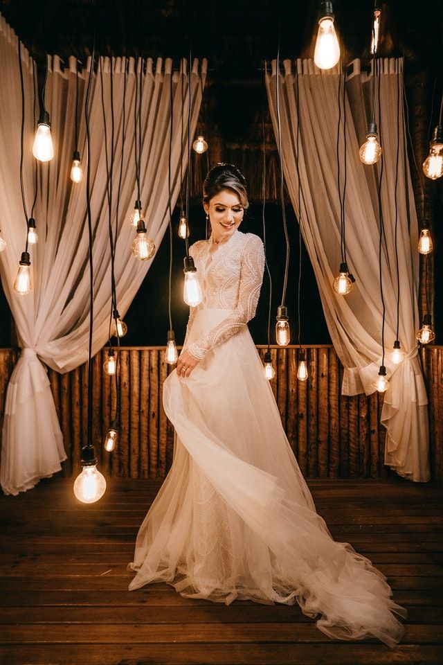
We can render it with a height of 500 pixels and a width of 400 pixels
<img src="https://ik.imagekit.io/ikmedia/women-dress-2.jpg"
     width="400"
     height="500" />
If the image element’s required height and width don’t match the image’s actual dimensions, then the browser downscales (or upscale) the image. The exact algorithm used by the browser for scaling can vary and depends on the underlying hardware and OS.
There are a couple of downsides of client-side image resizing, mainly poor image quality and slower image rendering. To overcome this, you should serve already resized images from the server. You can use Thumbor or a free image CDN like ImageKit.io to resize images dynamically using URL parameters.
Resizing an image in CSS
You can also specify the height and width in CSS.
img {
  width: 400px,
  height: 300px
}
Preserving the aspect ratio while resizing images
When you specify both height and width, the image might lose its aspect ratio. You can preserve the aspect ratio by specifying only width and setting height to auto using CSS property.
img {
  width: 400px,
  height: auto
}
This will render a 400px wide image. The height is adjusted accordingly to preserve the aspect ratio of the original image. You can also specify the height attribute and set width as auto, but most layouts are generally width constrained and not height.
Responsive image which adjusts based on available width
You can specify the width in percentage instead of an absolute number to make it responsive. By setting width to 100%, the image will scale up if required to match the parent element’s width. It might result in a blurred image as the image can be scaled up to be larger than its original size.
img {
  width: 100%;
  height: auto;
}
Alternatively, you can use the max-width property. By setting
max-width:100%;the image will scale down if it has to, but never scale up to be larger than its original size.
img {
  max-width: 100%;
  height: auto;
}
How to resize & crop image to fit an element area?
So far, we have discussed how to resize an image by specifying height or width or both of them.
When you specify both height and width, the image is forced to fit the requested dimension. It could change the original aspect ratio. At times, you want to preserve the aspect ratio while the image covers the whole area even if some part of the image is cropped. To achieve this, you can use:
- Background image
object-fitcss property
Resizing background image
background-image is a very powerful CSS property that allows you to insert images on elements other than img. You can control the resizing and cropping of the image using the following CSS attributes-
background-size— Size of the imagebackground-position— Starting position of a background image
background-size
By default, the background image is rendered at its original full size. You can override this by setting the height and width using the background-size CSS property. You can scale the image upward or downward as you wish.
<style>
.background {
  background-image: url("/image.jpg");
  background-size: 150px;
  width: 300px;
  height: 300px;
  border: solid 2px red;
}
</style>

<div class="background">
</div>
Possible values of background-size:
auto— Renders the image at full sizelength— Sets the width and height of the background image. The first value sets the width, and the second value sets the height. If only one value is given, the second is set toauto. For example,100px 100pxor50px.percentage— Sets the width and height of the background image in percent of the parent element. The first value sets the width, and the second value sets the height. If only one value is given, the second is set toauto. For example,100% 100%or50%.
It also has 2 special values contain and cover:
background-size:containscontains — It preserves the original aspect ratio of the image, but the image is resized so that it is fully visible. The longest of either the height or width will fit in the given dimensions, regardless of the size of the containing box.
<style>
.background {
  background-image: url("/image.jpg");
  background-size: contains;
  width: 300px;
  height: 300px;
  border: solid 2px red;
}
</style>

<div class="background">
</div>
background-size:covercover — It preserves the original aspect ratio but resizes the image to cover the entire container, even if it has to upscale the image or crop it.
<style>
.background {
  background-image: url("/image.jpg");
  background-size: cover;
  width: 300px;
  height: 300px;
  border: solid 2px red;
}
</style>

<div class="background">
</div>
object-fit CSS property
You can use the object-fit CSS property on the img element to specify how the image should be resized & cropped to fit the container. Before this CSS property was introduced, we had to resort to using a background image.
Along with inherit, initial, and unset, there are 5 more possible values for object-fit:
contain: It preserves the original aspect ratio of the image, but the image is resized so that it is fully visible. The longest of either the height or width will fit in the given dimensions, regardless of the size of the containing box.cover: It preserves the original aspect ratio but resizes the image to cover the entire container, even if it has to upscale the image or crop it.fill: This is the default value. The image will fill its given area, even if it means losing its aspect ratio.none: The image is not resized at all, and the original image size fills the given area.scale-down: The smaller of either contain or none.
You can use object-position to control the starting position of the image in case a cropped part of the image is being rendered.
Let’s understand these with examples.
The following image’s original width is 1280px and height is 854px. Here it is stretching to maximum available width using max-width: 100%.
<img src="https://ik.imagekit.io/ikmedia/backlit.jpg"
     style="max-width: 100%;" />
object-fit:contains
<img src="https://ik.imagekit.io/ikmedia/backlit.jpg"
	 style="object-fit:contain;
            width:200px;
            height:300px;
            border: solid 1px #CCC"/>
The original aspect ratio of the image is same, but the image is resized so that it is fully visible. We have added 1px border around the image to showcase this.
object-fit:cover
<img src="https://ik.imagekit.io/ikmedia/backlit.jpg"
	 style="object-fit:cover;
            width:200px;
            height:300px;
            border: solid 1px #CCC"/>
The original aspect ratio is preserved but to cover the whole area image is clipped from the left and right side.
object-fit:fill
<img src="https://ik.imagekit.io/ikmedia/backlit.jpg"
	 style="object-fit:fill;
            width:200px;
            height:300px;
            border: solid 1px #CCC"/>
Image is forced to fit into a 200px wide container with height 300px, the original aspect ratio is not preserved.
object-fit:none
<img src="https://ik.imagekit.io/ikmedia/backlit.jpg"
	 style="object-fit:none;
            width:200px;
            height:300px;
            border: solid 1px #CCC"/>
object-fit:scale-down
<img src="https://ik.imagekit.io/ikmedia/backlit.jpg"
	 style="object-fit:scale-down;
            width:200px;
            height:300px;
            border: solid 1px #CCC"/>
object-fit:cover and object-position:right
<img src="https://ik.imagekit.io/ikmedia/backlit.jpg"
	 style="object-fit:cover;
     		object-position: right;
            width:200px;
            height:300px;
            border: solid 1px #CCC"/>
Downsides of client-side image resizing
There are certain downsides of client-side resizing that you should keep in mind.
1. Slow image rendering
Since the full-sized image is loaded anyway before resizing happens in the browser, it takes more time to finish downloading and finally rendering. This means that if you have a large, 1.5 megabyte, 1024×682 photograph that you are displaying at 400px in width, the whole 1.5-megabyte image is downloaded by the visitor before the browser resizes it down to 400px.
You can see this download time on the network panel, as shown in the screenshot below.
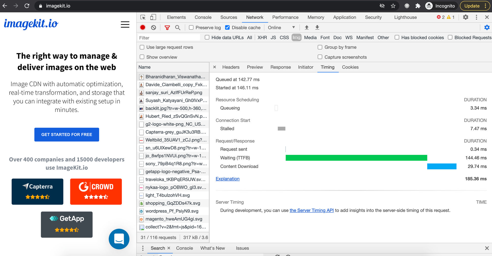
On the other hand, if you resize the image on the server using some program or an image CDN, then the browser doesn’t have to load a large amount of data and waste time decoding & rendering it.
With ImageKit.io, you can easily resize an image using URL parameters. For example —
Original image
https://ik.imagekit.io/ikmedia/women-dress-2.jpg
400px wide image with aspect ratio preserved
https://ik.imagekit.io/ikmedia/women-dress-2.jpg?tr=w-400
2. Poor image quality
The exact scaling algorithm used by the browser can vary, and its performance depends upon underlying hardware and OS. When a relatively bigger image is resized to fit a smaller container, the final image could be noticeably blurry.
There is a tradeoff between speed and quality. The final choice depends upon the browser. Firefox 3.0 and later versions use a bilinear resampling algorithm, which is tuned for high quality rather than speed. But this could vary.
You can use the image-rendering CSS property, which defines how the browser should render an image if it is scaled up or down from its original dimensions.
/* Keyword values */
image-rendering: auto;
image-rendering: crisp-edges;
image-rendering: pixelated;

/* Global values */
image-rendering: inherit;
image-rendering: initial;
image-rendering: unset;
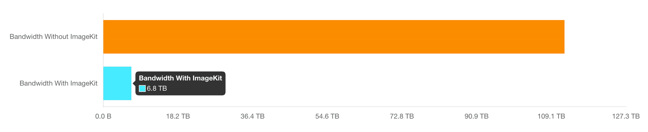
3. Bandwidth wastage
Since the full-sized image is being loaded anyway, it results in wastage of bandwidth, which could have been saved. Data transfer is not cheap. In addition to increasing your bandwidth bills, it also costs your users real money.
If you are using an image CDN, you can further reduce your bandwidth consumption by serving images in next-gen formats e.g. WebP or AVIF.
The user friendly dashboard will also show you how much bandwidth you have saved so far
4. Increased memory and processing requirements on client devices
Resizing large images to fit a smaller container is expensive and can be painful on low-end devices where both memory and processing power is limited. This slows down the whole web page and degrades the user experience.
Summary
When implementing web pages, images need to fit the layout perfectly. Here is what you need to remember to be able to implement responsive designs:
- Avoid client-side (browser) resizing at all if you can. This means serve correctly sized images from the server. It results in less bandwidth usage, faster image loading, and higher image quality. There are many open-source image processing libraries if you want to implement it yourself. Or better, you can use a free image CDN which will provide all these features and much more with a few lines of code.
- Never upscale a raster image i.e. JPEG, PNG, WebP, or AVIF images, should never be upscaled as it will result in a blurred output.
- You should use the SVG format for icons and graphics if required in multiple dimensions in the design.
- While resizing, if you want to preserve the aspect ratio of original images — Only specify one of
widthandheightand set the other toauto. - If you want the image to fit the entire container while preserving the aspect ratio, even if some part is cropped or the image is upscaled — Use the
object-fitCSS property or set a background image using thebackground-imageCSS property. - Control the starting position of the image using
object-positionwhile usingobject-fit. In background images, usebackground-position.
I have been trying for a couple of days now to configure my thumbnail gallery so all the images appear the same height and width. However, when I change the CSS code to,
max-height: 150px;
max-width: 200px;
width: 120px;
height: 120px;
I get images that are all the same size, but the aspect ratio is stretched, ruining the images. Is there not a way to resize the image container and not the image instead? Allowing me to keep the aspect ratio, but resize the image still. (I don’t mind if I cut off some of the image.)
asked Mar 28, 2013 at 15:21
This is a known problem with CSS resizing. Unless all images have the same proportion, you have no way to do this via CSS.
The best approach would be to have a container, and resize one of the dimensions (always the same) of the images. In my example I resized the width.
If the container has a specified dimension (in my example the width), when telling the image to have the width at 100%, it will make it the full width of the container. The auto at the height will make the image have the height proportional to the new width.
Example:
HTML:
<div class="container">
    <img src="something.png" />
</div>

<div class="container">
    <img src="something2.png" />
</div>
CSS:
.container {
    width: 200px;
    height: 120px;
}

/* Resize images */
.container img {
    width: 100%;
    height: auto;
}
answered Mar 28, 2013 at 15:27
jackJoejackJoe
11k8 gold badges48 silver badges64 bronze badges
You need to fix one side (for example, height) and set the other to auto.
For example,
 height: 120px;
 width: auto;
That would scale the image based on one side only. If you find cropping the image acceptable, you can just set
overflow: hidden;
to the parent element, which would crop out anything that would otherwise exceed its size.
answered Mar 28, 2013 at 15:23
2
You can use the object-fit CSS 3 property. Something like:
<!doctype html>
<html>

<head>
  <meta charset='utf-8'>
  <style>
    .holder {
      display: inline;
    }
    .holder img {
      max-height: 200px;
      max-width: 200px;
      object-fit: cover;
    }
  </style>
</head>

<body>
  <div class='holder'>
    <img src='meld.png'>
  </div>
  <div class='holder'>
    <img src='twiddla.png'>
  </div>
  <div class='holder'>
    <img src='meld.png'>
  </div>
</body>

</html>
It is not exactly your answer, though, because it doesn’t stretch the container. But it behaves like the gallery and you can keep styling the img itself.
Another drawback of this solution is still a poor support of the CSS 3 property. More details are available here: CSS 3 Object-fit Polyfill. A jQuery solution can be found there as well.
answered Jul 8, 2013 at 5:23
dmitry_romanovdmitry_romanov
4,9481 gold badge30 silver badges36 bronze badges
4
To make images adjustable/flexible you could use this:
/* fit images to container */
.container img {
    max-width: 100%;
    height: auto;
}
answered Apr 30, 2014 at 17:08
StanislavStanislav
8932 gold badges9 silver badges14 bronze badges
If you don’t want to stretch the image, fit it into a div container without overflow and center it by adjusting its margin if needed.
- The image will not get cropped
- The aspect ratio will also remain the same.
HTML
<div id="app">
    <div id="container">
      <img src="#" alt="something">
    </div>
    <div id="container">
      <img src="#" alt="something">
    </div>
    <div id="container">
      <img src="#" alt="something">
    </div>
</div>
CSS
div#container {
    height: 200px;
    width: 200px;
    border: 1px solid black;
    margin: 4px;
}
img {
    max-width: 100%;
    max-height: 100%;
    display: block;
    margin: 0 auto;
}
answered Mar 13, 2020 at 21:31
transform: scale(0.5);
Example:
<div>Normal</div>
<div class="scaled">Scaled</div>
div {
  width: 80px;
  height: 80px;
  background-color: skyblue;
}

.scaled {
  transform: scale(0.7); /* Equal to scaleX(0.7) scaleY(0.7) */
  background-color: pink;
}
See scale().
answered Aug 12, 2020 at 20:49
MahmoudMahmoud
8,8491 gold badge36 silver badges45 bronze badges
Put it as a background on your holder e.g.
<div style="background:url(path/to/image/myimage.jpg) center center; width:120px; height 120px;">
</div>
This will center your image inside a 120×120 div chopping off any excess of the image
answered Mar 28, 2013 at 15:27
DickieBoyDickieBoy
4,8161 gold badge28 silver badges46 bronze badges
This helps me to make the image 150% with ease.
.img-popup img {
  transform: scale(1.5);
}
answered Sep 21, 2020 at 17:33
Gerald HGerald H
3963 silver badges12 bronze badges
Now this should be more as a last resort, but you could simply do math. For example, lets say that you have an image with a width of 595 and height of 300. You would create a unit rate by doing 300/595 = 0.504. Then, you would plug in a width that you would like to change the image to (1000px). 1000 x 0.504 = 504. This means that the height of the image should be 504 if the width is 1000 if you want to keep it proportional.
answered Apr 22, 2022 at 20:00
If you know the aspect ratio, you can use padding-bottom with percentage to set the height depending on the width of the diff.
<div>
   <div style="padding-bottom: 33%;">
      I have 33% height of my parents width
   </div>
</div>
answered Jan 13, 2016 at 20:59
recoreco
4591 gold badge6 silver badges13 bronze badges
Этот урок посвящен теме как вставить картинку в HTML и какие стили CSS наиболее часто применяются для изображений. Здесь мы рассмотрим все основные вопросы касаемо вставки и отображения картинки в веб-документе. А также рассмотрим причины почему у некоторых пользователей не отображается картинка в HTML.
Содержание:
- Как вставить картинку в HTML
- Как изменить размер картинки в HTML
- Как указать путь к файлу изображения
- Как сделать картинку ссылкой
- Как поставить на фон картинку
- Как установить размер картинки в CSS
- Как сделать картинку адаптивной
- Как разместить текст на картинке
- Как выровнять картинку по центру веб-страницы
- Как сделать обтекание картинки текстом
- Как выстроить картинки в ряд
- Как изменить размер картинки при наведении на неё курсора мыши
- Почему не отображается картинка в HTML
В HTML изображения в графическом формате (GIF, JPEG, PNG, APNG, SVG, BMP, ICO) добавляются на веб-страницу с помощью тега <img> через атрибут src, в котором указывается адрес картинки. То есть атрибут src является обязательным для элемента <img>. Без него этот тег не используют.
Ещё одним обязательным атрибутом элемента <img> является alt. Этот атрибут используют на тот случай, если по какой-либо причине, браузер не сможет отобразить картинку. При его использовании, в месте отображения картинки на экран будет выведен указанный вами текст.
В таблице ниже представлены атрибуты тега <img>, которые используются наиболее часто. Но на самом деле их намного больше, ведь для элемента <img> доступны все универсальные атрибуты и события.
Таблица. Основные атрибуты элемента <img>
| Атрибут | Описание | Пример |
| alt | Добавляет альтернативный текст для изображения. Этот текст выводится в месте появления изображения до его загрузки, или если картинка не может быть загружена (Например, при отключенной графике, или указан неверный путь к изображению). | <img src=»/D-Nik-Webmaster.jpg» alt=»Здесь должна быть картинка»> |
| height | Высота изображения в пикселях (px). Если задать высоту изображения и при этом не указывать ширину, то картинка будет сжата пропорционально. | <img src=»/D-Nik-Webmaster.jpg» height=»300″> |
| src | Задает путь к изображению. | <img src=»/D-Nik-Webmaster.jpg»> |
| sizes | Задаёт размер изображения в зависимости от параметров отображения (размеры изображения для разных макетов страницы). Работает только при заданном атрибуте srcset. Значением атрибута является одна или несколько строк, указанных через запятую. В качестве значений можно использовать единицы em, ex, ch, rem, vw, vh, vmin, vmax, cm, mm, q, in, pc, pt, px, но не проценты. |
sizes=» (max-width: 20em) 30vw, (max-width: 30em) 60vw, (max-width: 40em) 90vw» Здесь vw — это ширина в процентах от области просмотра. |
| srcset | Создаёт список источников для изображения, которые будут выбраны, исходя из разрешения экрана. Может использоваться вместе с атрибутом src, или вместо него. Значением этого атрибута является одна или несколько строк, разделенных запятой. |
srcset=» Здесь w — дескриптор ширины, который представляет собой целое положительное число, за которым следует w. |
| width | Ширина изображения. Если задать ширину изображения и при этом не указывать высоту, то картинка будет сжата пропорционально. | <img src=»/D-Nik-Webmaster.jpg» width=»300″> |
HTML картинка. Примеры
Как добавить картинку в HTML?
Как уже говорилось, чтобы добавить картинку в HTML нужно использовать тег <img> и его обязательные атрибуты src и alt. Также, поскольку тег <img> – это строчный элемент, то его рекомендуется располагать внутри какого-нибудь блочного элемента. Например, <p> или <div>.
<p><img src="/D-Nik-Webmaster.jpg" alt="Здесь должна быть картинка"></p>Как изменить размер картинки в HTML?
Чтобы изменить размер изображения используют атрибуты height (задаёт высоту картинки) и width (задаёт ширину картинки). Эти атрибуты можно указывать как вместе, так и по отдельности.
Если нужно пропорционально сжать картинку, то указывается только один атрибут (height, или width). Если же нужно чётко обозначить и высоту, и ширину картинки, то используют оба атрибута одновременно (height и width).
<p><img src="/D-Nik-Webmaster.jpg" height="300" width="300"></p>Как указать путь к файлу изображения в HTML?
Адрес ссылки на файл изображения может быть абсолютным и относительным.
Абсолютный путь показывает точное местонахождение файла, а относительный показывает путь к файлу относительно какой-либо «отправной точки».
Примеры:
https://site/img/D-Nik-Webmaster.jpg – это абсолютный адрес файла D-Nik-Webmaster.jpg так как путь к нему указан полностью.
/img/D-Nik-Webmaster.jpg – это относительный путь от корневого каталога. Знак «/» в самом начале указывает на то, что это корень каталога и выше по директории подниматься нельзя. Если файл index.html (HTML-документ) находится в каталоге site, то этот каталог будет корневым («отправной точкой»).
../img/D-Nik-Webmaster.jpg – это относительный путь от документа. Две точки в самом начале означают, что вам нужно подняться на один каталог вверх. Таким образом, если смотреть на наш пример, то нужно подняться на 1 директорию вверх, найти там папку img, а в ней найти файл D-Nik-Webmaster.jpg.
../../D-Nik-Webmaster.jpg – указывает путь к файлу, но только с поднятием на 2 директории вверх.
Как сделать картинку ссылкой в HTML
Для того, чтобы сделать картинку ссылкой в HTML нужно содержимое элемента <img> обрамить в тег <a>.
<p><a href="https://d-nik.pro"><img src="/D-Nik-Webmaster.jpg" alt="Картинка тут"></a></p>Картинка CSS. Примеры
Использование CSS (каскадных таблиц стилей) даёт возможность более гибко, более удобно и эффективно, настраивать отображение картинок на веб-странице. Поэтому даже для того, чтобы задать ширину и высоту изображений многие веб-мастера часто используют именно каскадные таблицы стилей.
Давайте рассмотрим несколько самых распространённых примеров оформления изображений на веб-странице с помощью CSS.
Как поставить на фон картинку в HTML?
Чтобы установить изображение в качестве фона нужно задать селектору body свойство background, или background-image.
Например:
<!DOCTYPE html>
<html lang="ru">
<head>
    <meta charset="UTF-8">
    <meta name="viewport" content="width=device-width, initial-scale=1.0">

    <style>
        body{
            background: url('img/bg.jpg'); /* путь к файлу изображения, которое будет использоваться в качестве фона */
        }
    </style>

    <title>Как поставить на фон картинку в HTML</title>
</head>
<body>
    <p>Здесь будет написан какой-нибудь текст</p>
</body>
</html>
Как установить размер картинки в CSS
Чтобы задать размер картинки в CSS нужно использовать свойства width (ширина) и height (высота). Например:
- Давайте создадим новый класс imgsize.
- Для элементов этого класса пропишем свойство width равным 350px.
- Присвоим картинке созданный ранее класс imgsize.
Таким образом, ширина картинки будет равна 350px, а высота уменьшится пропорционально. Если нужно установить фиксированную ширину и высоту картинки, то можно добавить свойство height (Например, height:350px).
Пример кода:
<!DOCTYPE html>
<html lang="ru">
<head>
    <meta charset="UTF-8">
    <meta http-equiv="X-UA-Compatible" content="IE=edge">
    <meta name="viewport" content="width=device-width, initial-scale=1.0">

    <style>
        .imgsize{
            width: 350px; /* ширина картинки будет 350px*/
            height:350px  /* высота картинки будет 350px*/
        }
    </style>

    <title>Как вставить картинку в HTML</title>
</head>
<body>
    <p><img class="imgsize" src="/img/bg.jpg" alt="Картинка">Здесь будет написан какой-нибудь текст</p>
</body>
</html>
Как сделать картинку адаптивной
Адаптивность картинки – это возможность изображения одинаково отображаться на разных типах устройств с различными характеристиками. Например, на компьютерах с разным разрешением экрана монитора, ноутбуках с разным разрешением дисплея, планшетах, телефонах и т.д.
Самый простой способ сделать одинаковое отображение картинки на всех устройствах – это использовать следующие правила:
img {
  width: 100%;
  height: auto;
}
Как разместить текст на картинке
<!DOCTYPE html>
<html lang="ru">
<head>
    <meta charset="UTF-8">
    <meta http-equiv="X-UA-Compatible" content="IE=edge">
    <meta name="viewport" content="width=device-width, initial-scale=1.0">

	<style>
	/* Картинку и текст помещаем в контейнер */
	.container {
		position: relative;
		text-align: center;
		color: white;
	}
	/* Стили для текста */
		.text-block {
		position: absolute;
		bottom: 8px;
		left: 16px;
	}
	</style>

    <title>Как вставить картинку в HTML</title>
</head>
<body>
	<div class="container">
		<img src="/img/bg.jpg" alt="Картинка" style="width:100%;">
		<div class="text-block">Это наш текст</div>
	</div>
</body>
</html>
Как выровнять картинку по центру веб-страницы
Способ №1
Самый простой способ выровнять картинку по центру – это присвоить ей класс, сделать картинку блоком и задать ей автоматическое выравнивание с правой и левой части.
<!DOCTYPE html>
<html lang="ru">
<head>
    <meta charset="UTF-8">
    <meta http-equiv="X-UA-Compatible" content="IE=edge">
    <meta name="viewport" content="width=device-width, initial-scale=1.0">

	<style>
	/* Способ 1 */
	.center-img {
		display: block;
		margin: 0 auto;
	}
	</style>

    <title>Как вставить картинку в HTML</title>
</head>
<body>
		<img class="center-img" src="/img/logo.jpg" alt="Картинка">
</body>
</html>
Способ №2
Помещаем картинку в блок <div> или параграф <p>, присваиваем класс этому блоку (или параграфу), и устанавливаем правило выравнивание текста по центру.
<!DOCTYPE html>
<html lang="ru">
<head>
    <meta charset="UTF-8">
    <meta http-equiv="X-UA-Compatible" content="IE=edge">
    <meta name="viewport" content="width=device-width, initial-scale=1.0">

	<style>
	/* Способ 1 */
	.pull-center {
		text-align:center;
	}
	</style>

    <title>Как вставить картинку в HTML</title>
</head>
<body>
	<div class="pull-center">
		<img src="/img/logo.jpg" alt="Картинка">
	</div>
</body>
</html>
Как сделать обтекание картинки текстом
Выровнять изображение по левому, или по правому краю веб-страницы (или какого-нибудь блока, контейнера) можно с помощью свойства float.
Таким образом, чтобы сделать обтекание картинки текстом слева или справа нужно прописать следующие правила:
<!DOCTYPE html>
<html lang="ru">
<head>
    <meta charset="UTF-8">
    <meta http-equiv="X-UA-Compatible" content="IE=edge">
    <meta name="viewport" content="width=device-width, initial-scale=1.0">

	<style>
	.leftimg {
                 float:left; /* Выравнивание по левому краю */
                 margin: 0 10px 10px 0; /* Отступы вокруг картинки */
              }
              .rightimg  {
                float: right; /* Выравнивание по правому краю  */
                margin: 0 0 10px 10px; /* Отступы вокруг картинки */
              }
	</style>

    <title>Как вставить картинку в HTML</title>
</head>
<body>
	<h2>Пример выравнивания картинки по левому краю и обтекания её текстом справа</h2>
	<p><img src="/img/logo.jpg" alt="Картинка 1" width="120px" height="120px" class="leftimg">
    Если ты сейчас читаешь мою книгу, или просматриваешь этот материал на сайте www.d-nik.pro, значит, тебя интересует создание сайтов для начинающих с нуля. И так как HTML является самой важной составляющей каждой веб-страницы в интернете, изучение мы начнем именно с этого языка.</p>
	<p>Здесь хочу отметить, что HTML не является языком программирования. Это язык гипертекстовой разметки. Поэтому, в ходе прочтения данной книги, термин «язык HTML» будет встречаться тебе очень часто, но нужно понимать, что на HTML не программируют.</p>
	<p>Главная задача HTML – отобразить в окне браузера определенные данные. С помощью этого языка веб-разработчики выводят на странице сайта такие элементы как: ссылки, кнопки, поля для ввода текста, таблицы, картинки, видео, статьи и прочее.</p>
    <h2>Пример выравнивания картинки по правому краю и обтекания её текстом слева</h2>
	<p><img src="/img/logo.jpg" alt="Картинка 2" width="120px" height="120px" class="rightimg">
    Но с помощью HTML нельзя произвести никаких вычислительных операций (Например, сложить два числа, или произвести их умножение и т.д.).</p>
	<p>Отсюда и вывод. Задача языка программирования – обработка данных. А задача HTML – отображение данных. Вот поэтому HTML и не является языком программирования.</p>
	<p>Хотя, как и любой другой язык программирования, HTML имеет свой синтаксис, семантику и лексику. И знание HTML позволяет создавать сайты с нуля. Даже на чистом HTML (без использования CSS и JavaScript) можно создать вполне приличный одностраничный сайт. Хотя конечно же сделать это используя все вместе (HTML, CSS и JavaScript) будет намного проще.</p>
	<p>Но я считаю, что для того, чтобы научиться создавать свои собственные сайты с нуля, нужно знать основы-основ – а это как раз и есть язык HTML.</p>
</body>
</html>
Как выстроить картинки в ряд
Чтобы выстроить картинки по горизонтали в один ряд, нужно поместить их в блок <div> или параграф <p>, присвоить класс этому блоку (или параграфу), и установить следующие правила:
.img-line {
		border: 2px solid #55c5e9; /* Рамка вокруг фотографии */
		padding: 15px; /* Расстояние от картинки до рамки */
		background: #666; /* Цвет фона */
		margin-right: 10px; /* Отступ справа */
		margin-bottom: 10px; /* Отступ снизу */
    }
Весь код будет выглядеть так:
<!DOCTYPE html>
<html lang="ru">
<head>
    <meta charset="UTF-8">
    <meta http-equiv="X-UA-Compatible" content="IE=edge">
    <meta name="viewport" content="width=device-width, initial-scale=1.0">

	<style>
	.img-line {
		border: 2px solid #55c5e9; /* Рамка вокруг фотографии */
		padding: 15px; /* Расстояние от картинки до рамки */
		background: #666; /* Цвет фона */
		margin-right: 10px; /* Отступ справа */
		margin-bottom: 10px; /* Отступ снизу */
    }
	</style>

    <title>Как вставить картинку в HTML</title>
</head>
<body>
	<p class="img-line">
	<img src="/img/logo.jpg" alt="Картинка 1" width="120px" height="120px">
	<img src="/img/logo.jpg" alt="Картинка 2" width="120px" height="120px">
	<img src="/img/logo.jpg" alt="Картинка 3" width="120px" height="120px">
	</p>
</body>
</html>
Как изменить размер картинки при наведении на неё курсора мыши
Изображение можно масштабировать (изменять его размер), вращать, сдвигать, или наклонять с помощью свойства transform. А для регулирования скорости анимации используется свойство transition.
Например, если нам нужно, чтобы картинка увеличивалась (или уменьшалась) при наведении на неё курсора мыши, то нужно создать класс, присвоить его изображению и прописать следующие правила CSS:
<!DOCTYPE html>
<html lang="ru">
<head>
    <meta charset="UTF-8">
    <meta http-equiv="X-UA-Compatible" content="IE=edge">
    <meta name="viewport" content="width=device-width, initial-scale=1.0">

	<style>
	.img-scale {
		transition: 1s; /* Время эффекта */
    }
	.img-scale:hover {
		transform: scale(1.2); /* Увеличиваем масштаб */
    }
	</style>

    <title>Как вставить картинку в HTML</title>
</head>
<body>
	<img src="/img/logo.jpg" alt="Картинка" class="img-scale">
</body>
</html>
Если нужно увеличить изображение, не увеличивая при этом размеры картинки, то картинку надо поместить в блок <div>. Для этого блока задать свойство display со значением inline-block, чтобы <div> стал размером с изображение; а также задать свойство overflow со значением hidden, чтобы всё пряталось за пределами блока <div>.
<!DOCTYPE html>
<html lang="ru">
<head>
    <meta charset="UTF-8">
    <meta http-equiv="X-UA-Compatible" content="IE=edge">
    <meta name="viewport" content="width=device-width, initial-scale=1.0">

	<style>
	.img-scale {
    display: inline-block; /* Строчно-блочный элемент */
    overflow: hidden; /* Скрываем всё за контуром */
   }
   .img-scale img {
    transition: 1s; /* Время эффекта */
    display: block; /* Убираем небольшой отступ снизу */
   }
   .img-scale img:hover {
    transform: scale(1.2); /* Увеличиваем масштаб */
   }
	</style>

    <title>Как вставить картинку в HTML</title>
</head>
<body>
	<div class="img-scale">
	<img src="/img/logo.jpg" alt="Картинка">
	</div>
</body>
</html>
Почему не отображается картинка в HTML?
Причин почему картинка не отображается на веб-странице может быть несколько:
- Неверный адрес файла. Чаще всего, картинка на сайте не показывается из-за того, что в HTML коде указан не верный путь к файлу изображения. Особенно внимательным нужно быть при составлении относительного пути к файлу. О том, как указать этот путь правильно мы уже говорили ранее. Поэтому повторяться не будем.
- Несовпадение регистра, или неправильное имя файла. С неправильным именем файла думаю всё понятно. Если картинка не отображается, то первым делом проверьте правильно ли вы написали имя файла этого изображения. Также, указывая путь к файлу, обязательно нужно соблюдать регистр букв (маленькие буквы писать маленькими, большие — большими). Ведь если в качестве операционной системы веб-сервера выступает Unix-подобная система, то она различает регистр символов. Поэтому файлы logo.jpg и Logo.jpg (или loGo.jpg) эта система будет распознавать как два абсолютно разных файла. Вот почему я рекомендую постоянно писать имена файлов соблюдая регистр букв.
- Разница добавления картинок в HTML-документ на локальном компьютере и веб-сервере. У многих пользователей на веб-сервере, путь /img/logo.jpg отлично работает. А вот на локальном компьютере путь к картинке нужно писать без слеша в самом начале – img/logo.jpg. Cимвол слэш (/) перед именем файла или папки говорит о том, что отсчет должен вестись от корня сайта. Соответственно, путь /img/logo.jpg следует понимать так: в корне сайта находится папка с именем img, а в ней располагается файл logo.jpg. А вот на локальном компьютере браузер будет интерпретировать такой путь как c:/img/logo.jpg, что является ошибкой. Ведь такой папки у нас нет.
One of the main parts of responsive web design is resizing the image automatically to fit the width of its container. Since nowadays people use different kinds of desktops, our web pages must be appropriate for all types of screens.
So, let’s learn three ways of resizing images and making responsive images with only HTML and CSS.
Apply the width and height
attributes for your <img> tag to define the width and height of the image. See an example below.
Example of resizing an image proportionally with the width and height attributes:
<!DOCTYPE html>
<html>
  <head>
    <title>Title of the document</title>
  </head>
  <body>
    <p>Resized image:</p>
    <img src="/uploads/media/default/0001/01/25acddb3da54207bc6beb5838f65f022feaa81d7.jpeg" alt="Aleq" width="160" height="145" />
    <p>Original image size:</p>
    <img src="/uploads/media/default/0001/01/25acddb3da54207bc6beb5838f65f022feaa81d7.jpeg" alt="Aleq" />
  </body>
</html>
Result
Resized image:

Original image size:
While resizing an image, the aspect ratio (the viewable area and display shape) should be preserved. Otherwise, the image can get distorted and lose its quality.
Another way of resizing images is using the CSS width and height properties. Set the width
property to a percentage value and the height to «auto». The image is going to be responsive (it will scale up and down).
Example of resizing an image proportionally with the width and height properties:
<!DOCTYPE html>
<html>
  <head>
    <title>Responsive Resized Image</title>
    <style>
      img {
        width: 100%;
        height: auto;
      }
    </style>
  </head>
  <body>
    <h2>Responsive Resized Image</h2>
    <p>Resize the browser to see the responsive effect:</p>
    <img src="/uploads/media/default/0001/03/5bfad15a7fd24d448a48605baf52655a5bbe5a71.jpeg" alt="New York" />
  </body>
</html>
Note that the image could be scaled more than the original size. In several cases, a better option is to use the max-width property alternatively.
There is a better way for resizing images responsively. If the max-width property is set to 100%, the image will scale down if it has to, but never scale up to be larger than its original size.
The trick is to use height: auto; to override any already present height attribute on the image.
Example of adding a responsive resized image with the max-width property:
<!DOCTYPE html>
<html>
  <head>
    <title>Responsive Resized Image with max-width</title>
    <style>
      img {
        max-width: 100%;
        height: auto;
      }
    </style>
  </head>
  <body>
    <h2>Responsive Resized Image with max-width</h2>
    <p>Resize the browser to see the responsive effect:</p>
    <img src="/uploads/media/default/0001/03/5bfad15a7fd24d448a48605baf52655a5bbe5a71.jpeg" alt="New York" />
  </body>
</html>
Let’s see another live web page example with the same method.
Example of resizing an image proportionally using the max-width property:
<!DOCTYPE html>
<html>
  <head>
    <title>Responsive Resized Image in a Web Page</title>
    <style>
      * {
        box-sizing: border-box;
      }
      html {
        font-family: "Lucida Sans", sans-serif;
      }
      img {
        width: 100%;
        height: auto;
      }
      .row:after {
        content: "";
        clear: both;
        display: table;
      }
      .menu,
      .content {
        float: left;
        padding: 15px;
        width: 100%;
      }
      @media only screen and (min-width: 600px) {
        .menu {
          width: 25%;
        }
        .content {
          width: 75%;
        }
      }
      @media only screen and (min-width: 768px) {
        .menu {
          width: 20%;
        }
        .content {
          width: 79%;
        }
      }
      .header {
        background-color: #1c87c9;
        color: #ffffff;
        padding: 10px;
        text-align: center;
      }
      .menu ul {
        list-style-type: none;
        margin: 0;
        padding: 0;
      }
      .menu li {
        padding: 8px;
        margin-bottom: 7px;
        background-color: #666666;
        color: #ffffff;
        box-shadow: 0 1px 3px rgba(0, 0, 0, 0.12), 0 1px 2px rgba(0, 0, 0, 0.24);
      }
      .menu li:hover {
        background-color: #1c87c9;
      }
      .footer {
        background-color: #1c87c9;
        color: #ffffff;
        text-align: center;
        font-size: 12px;
        padding: 15px;
      }
    </style>
  </head>
  <body>
    <div class="header">
      <h1>W3DOCS</h1>
    </div>
    <div class="row">
      <div class="menu">
        <ul>
          <li>Books</li>
          <li>Snippets</li>
          <li>Quizzes</li>
          <li>Tools</li>
        </ul>
      </div>
      <div class="content">
        <h2>About Us</h2>
        <p>
          W3docs provides free learning materials for programming languages like HTML, CSS, Java Script, PHP etc.
        </p>
        <p>
          It was founded in 2012 and has been increasingly gaining popularity and spreading among both beginners and professionals who want to enhance their programming skills.
        </p>
        <img src="/uploads/media/default/0001/02/8070c999efd1a155ad843379a5508d16f544aeaf.jpeg" alt="Team Work" />
      </div>
    </div>
    <div class="footer">
      <p>
        Resize the browser window to see how the content respond to the resizing.
      </p>
    </div>
  </body>
</html>I have a large image. I want to display it on its on own a web page, and when doing this without any CSS it fills the whole page and is too big to display at once (scroll bars appear). I want to scale it down so it fits the height of the user’s screen (not the width). I’ve found solutions but these stretch the image to fit the whole of the screen — I don’t want this as it ruins the aspect ratio.
Basically, I want to resize an image while keeping the aspect ratio. How do I do this?
asked Sep 7, 2012 at 15:07
3
Just set the width to auto:
img {
   width: auto;
   max-height: 100%;
}
Here’s the fiddle: http://jsfiddle.net/6Y5Zp/
answered Sep 7, 2012 at 15:09
Joseph SilberJoseph Silber
211k59 gold badges359 silver badges290 bronze badges
4
here is the sample one
div{
   width: 200px;
   height:200px;
   border:solid
 }

img{
    width: 100%;
    height: 100%;
    object-fit: contain;
    }
<div>
<img src="https://upload.wikimedia.org/wikipedia/meta/0/08/Wikipedia-logo-v2_1x.png">
</div>answered Feb 22, 2015 at 11:21
AKHIL PAKHIL P
1,2411 gold badge9 silver badges5 bronze badges
2
You can use a div with background-image and set background-size: contain:
div.image{
    background-image: url("your/url/here");
    background-size:contain;
    background-repeat:no-repeat;
    background-position:center;
}
Now you can just set your div size to whatever you want and not only will the image keep its aspect ratio it will also be centralized both vertically and horizontally. Just don’t forget to set the sizes on the css since divs don’t have the width/height attribute on the tag itself.
The background-size property is ie>=9 only though.
answered May 30, 2013 at 13:59
HoffmannHoffmann
14.2k16 gold badges74 silver badges90 bronze badges
I think you need to paste a class inside the image you want to show like this
< image class="image" >
and this is the class
.image


 text align: center
 max width:pixels you want
 max height pixels you want
but make sure that both are the same quantity
that way wont get out of the screen in height and width.
or you can play with the width and the height
Radim Köhler
122k47 gold badges238 silver badges334 bronze badges
answered Jun 5, 2013 at 2:56
I have a large image. I want to display it on its on own a web page, and when doing this without any CSS it fills the whole page and is too big to display at once (scroll bars appear). I want to scale it down so it fits the height of the user’s screen (not the width). I’ve found solutions but these stretch the image to fit the whole of the screen — I don’t want this as it ruins the aspect ratio.
Basically, I want to resize an image while keeping the aspect ratio. How do I do this?
asked Sep 7, 2012 at 15:07
3
Just set the width to auto:
img {
   width: auto;
   max-height: 100%;
}
Here’s the fiddle: http://jsfiddle.net/6Y5Zp/
answered Sep 7, 2012 at 15:09
Joseph SilberJoseph Silber
211k59 gold badges359 silver badges290 bronze badges
4
here is the sample one
div{
   width: 200px;
   height:200px;
   border:solid
 }

img{
    width: 100%;
    height: 100%;
    object-fit: contain;
    }
<div>
<img src="https://upload.wikimedia.org/wikipedia/meta/0/08/Wikipedia-logo-v2_1x.png">
</div>answered Feb 22, 2015 at 11:21
AKHIL PAKHIL P
1,2411 gold badge9 silver badges5 bronze badges
2
You can use a div with background-image and set background-size: contain:
div.image{
    background-image: url("your/url/here");
    background-size:contain;
    background-repeat:no-repeat;
    background-position:center;
}
Now you can just set your div size to whatever you want and not only will the image keep its aspect ratio it will also be centralized both vertically and horizontally. Just don’t forget to set the sizes on the css since divs don’t have the width/height attribute on the tag itself.
The background-size property is ie>=9 only though.
answered May 30, 2013 at 13:59
HoffmannHoffmann
14.2k16 gold badges74 silver badges90 bronze badges
I think you need to paste a class inside the image you want to show like this
< image class="image" >
and this is the class
.image


 text align: center
 max width:pixels you want
 max height pixels you want
but make sure that both are the same quantity
that way wont get out of the screen in height and width.
or you can play with the width and the height
Radim Köhler
122k47 gold badges238 silver badges334 bronze badges
answered Jun 5, 2013 at 2:56