Курсор
Описание
The cursor CSS property specifies the mouse cursor displayed when the mouse pointer is over an element.
| Начальное значение | auto |
|---|---|
| Применяется к | все элементы |
| Наследуется | да |
| Обработка значения | как указано, но с абсолютными значениями url |
| Animation type | discrete |
Синтаксис
/* Применение ключевых значений */
cursor: pointer;
cursor: auto;

/* Использование URL и координат */
cursor:  url(cursor1.png) 4 12, auto;
cursor:  url(cursor2.png) 2 2, pointer;

/* Глобальные значения */
cursor: inherit;
cursor: initial;
cursor: unset;
Значения
<url>-
Ссылка или разделённый запятыми список ссылок:
url(…), url(…), …, указывающие на файл изображения. Дополнительные ссылки могут быть предоставлены в качестве запасных значений, на случай если изображение по основной ссылке не поддерживается в качестве курсора. Запасное значение, не являющееся ссылкой (одно или несколько ключевых слов) должно находиться в конце списка значений. See Using URL values for the cursor property for more details. <x><y>
Экспериментальная возможность
-
Необязательные значения х- и у- координат. Два безразмерных неотрицательных числа меньше 32.
- Ключевые слова
-
Наведите курсор на картинку, чтобы увидеть пример в действии:
Категория Значение Вид Описание Основные autoБраузер самостоятельно определяет значение курсора в зависимости от
свойств элемента, на который наведена мышь.
Например: при наведении
на текст отобразит курсорtext.default
Основной курсор платформы, обычно стрелочка. noneКурсор не отображается. Ссылки и статусы выполнения задач context-menu
Доступно контекстное меню. help
Доступна вспомогательная информация. pointer
Указатель, обозначающий ссылку, обычно указующая рука. progress
Программа занята, но пользователь может взаимодействовать с интерфейсом
(в отличие отwait).wait
Программа занята (песочные часы). Выделение cell
Указывает на возможность выбора клетки или клеток таблицы. crosshair
Крестик, часто используемый для обозначения выбора на битовой карте. text
Значок выбора текста. vertical-text
Значок выбора вертикального текста. «Захвати и перенеси» alias
Будет создана ссылка внутри страницы. copy
Указывает на возможность копирования. move
Указывает на возможность перемещения объекта.
no-drop
Указывает на невозможность «сбрасывания» объекта.
В Windows и Mac
OSX то же самое что иnot-allowed.not-allowed
Указатель невозможности выполнения действия. Изменение размера, прокручивание (скроллинг) all-scroll
Указатель возможности перемещения по странице в любом направлении.
в
Windows то же самое чтоmove.col-resize
Объект может быть раздвинут/сдвинут горизонтально. Обычно две
вертикальные черты со стрелочками в разные стороны.row-resize
Объект может быть раздвинут/сдвинут вертикально. Две горизонтальные
черты с вертикальными стрелочками.n-resize
Грань или грани могут быть перемещены. Например
se-resizeиспользуется для обозначения перемещения с
юго-востока. В некоторых системах то же самое что двунаправленное
изменение.e-resize
s-resize
w-resize
ne-resize
nw-resize
se-resize
sw-resize
ew-resize
Двунаправленное изменение размера. ns-resize
nesw-resize
nwse-resize
Масштабирование zoom-in
Приближение или уменьшение.
zoom-out
Захват grab
Указывает на возможность схватить и переместить объект.
grabbing
Формальный синтаксис
Примеры
.foo {
  cursor: crosshair;
}

/* use prefixed-value if "zoom-in" isn't supported */
.bar {
  cursor: -webkit-zoom-in;
  cursor: zoom-in;
}

/* standard cursor value as fallback for url() must be provided (doesn't work without) */
.baz {
  cursor: url(hyper.cur), auto;
}
Спецификации
| Specification |
|---|
| CSS Basic User Interface Module Level 4 # cursor |
Совместимость с браузерами
BCD tables only load in the browser
Смотрите также
За вид курсора отвечает CSS свойство «cursor». Им можно задать вид из предопределённых названий курсоров, так и вывести курсор из файла.
1
Стандартные курсоры
Вид курсора можно задать с помощью значения – названия, например курсор со знаком вопроса:
body {
	cursor: help;
}
CSS
Полный список значений cursor
| Значение | Windows | MacOS | Описание |
|---|---|---|---|
auto |
Браузер самостоятельно определяет значение курсора в зависимости от свойств элемента | ||
default |
 |
 |
Основной курсор |
none |
– | – | Курсор не отображается |
context-menu |
 |
 |
Доступно контекстное меню |
help |
 |
 |
Доступна вспомогательная информация |
pointer |
 |
 |
Указатель, обозначающий ссылку |
progress |
 |
 |
Программа занята, но пользователь может взаимодействовать с интерфейсом |
wait |
 |
 |
Программа занята |
cell |
 |
 |
Указывает на возможность выбора клетки таблицы |
crosshair |
 |
 |
Крестик, часто используемый для обозначения выбора на битовой карте |
text |
 |
 |
Значок выбора текста |
vertical-text |
 |
 |
Значок выбора вертикального текста |
alias |
 |
 |
Будет создана ссылка внутри страницы |
copy |
 |
 |
Указывает на возможность копирования |
move |
 |
 |
Указывает на возможность перемещения объекта |
no-drop |
 |
 |
Указывает на невозможность «сбрасывания» объекта |
not-allowed |
 |
 |
Указатель невозможности выполнения действия |
all-scroll |
 |
 |
Указатель возможности перемещения по странице в любом направлении |
col-resize |
 |
 |
Объект может быть раздвинут/сдвинут горизонтально |
row-resize |
 |
 |
Объект может быть раздвинут/сдвинут вертикально |
n-resize |
 |
 |
Грань, которая может быть перемещена |
e-resize |
 |
 |
|
s-resize |
 |
 |
|
w-resize |
 |
 |
|
ne-resize |
 |
 |
|
nw-resize |
 |
 |
|
se-resize |
 |
 |
|
sw-resize |
 |
 |
|
ew-resize |
 |
 |
Двунаправленное изменение размера |
ns-resize |
 |
 |
|
nesw-resize |
 |
 |
|
nwse-resize |
 |
 |
|
zoom-in |
 |
 |
Приближение или уменьшение |
zoom-out |
 |
 |
|
grab |
 |
 |
Указывает на возможность схватить и переместить объект |
grabbing |
 |
 |
Браузеры на мобильных устройствах не поддерживают свойство cursor, но при этом в jQuery событие clik не сработает если у элемента нет свойства cursor: pointer.
2
Установка своего курсора
Все браузеры дают возможность установить элементу свой курсор из файла по URL, например:
body {
	cursor: url('/pointer.cur') 4 1;
}
CSS
Вторым параметром задаются координаты активной точки, в которой регистрируется нажатие мыши. По умолчанию это левый верхний угол (0,0).
Пример в действии:
Кроссбраузерность
Так как, у браузеров разная поддержка форматов фалов курсора:
- Internet Explorer в качестве формата файла курсора поддерживает CUR и ANI.
- Firefox, Chrome, Safari поддерживают форматы CUR, PNG, GIF, JPG.
У свойства cursor имеется возможность указать несколько курсоров, в приоритете будет первый в списке поддерживаемый формат.
body {
	cursor:
		url('/pointer.png') 4 1,
		url('/pointer.cur') 4 1,
		pointer;
}
CSS
In this quick tip, we’ll learn how to customize the cursor appearance with CSS. We’ll be changing our cursor into arrows to make navigating a slideshow easier. To better understand it, we’ll walk through two separate examples.
Note: the goal of this article isn’t to exhaustively cover the cursor property’s syntax. For a more thorough examination, be sure to check out the resources at the end of the tutorial.
Example #1
For the first example, we’ll discuss how to change the cursor image depending on the mouse position.
Here’s the demo we’re going to build in action:
1. The HTML
We start with a simple image:
1 |
<img src="IMG_SRC" alt=""> |
2. The CSS
Next, we define two CSS classes which hold the cursor images:
1 |
.cursor-prev { |
2 |
cursor: url(cursor-prev.cur), auto; /*IE & Edge*/ |
3 |
cursor: url(cursor-prev.svg) 16 16, auto; /*Rest browsers*/ |
4 |
}
|
5 |
|
6 |
.cursor-next { |
7 |
cursor: url(cursor-next.cur), auto; /*IE & Edge*/ |
8 |
cursor: url(cursor-next.svg) 16 16, auto; /*Rest browsers*/ |
9 |
}
|
Notice that for each rule we specify two cursor declarations. The first declaration of each rule targets Microsoft’s browsers, while the second one targets other browsers. All values point to an image, with the auto keyword value as a fallback.
It’s worth mentioning that we can specify more than one custom URL or image. A browser will try to load them based on the order defined in the values. In other words, initially it will try to load the first image. If that image isn’t available for some reason, it will try to load the second one, and so on. Finally, if none of the images exist, the fallback keyword will be used.
Before we move on, let’s highlight a few current limitations (also according to my tests) and explain why we set two separate declarations:
- Microsoft’s browsers only support CUR and ANI as formats.
- Microsoft’s browsers don’t allow for setting the origin of the cursor image. If that happens, the cursor image and the rest of the property are ignored. In our case, for the non-Microsoft browsers, we set the image origin to the center (images are 32×32).
3. The JavaScript
When all page assets are ready, the init function is executed.
Inside that function, we first retrieve the image width.
Next, each time we hover over the image, we do the following things:
- Get the X coordinate of the mouse pointer relative to the image—not relative to the browser window.
- Remove all classes from the image.
- Add the appropriate class to the image depending on the mouse position. If the mouse position exceeds the half image width, we add the
cursor-nextclass, otherwise thecursor-prevclass is added.
The code responsible for all this behavior is as follows:
1 |
window.addEventListener("load", init); |
2 |
|
3 |
function init() { |
4 |
const img = document.querySelector("img"); |
5 |
const {width} = img.getBoundingClientRect(); |
6 |
const halfImgWidth = width / 2; |
7 |
|
8 |
img.addEventListener("mousemove", function(e) { |
9 |
const xPos = e.pageX - img.offsetLeft; |
10 |
this.classList.remove("cursor-prev", "cursor-next"); |
11 |
if (xPos > halfImgWidth) { |
12 |
this.classList.add("cursor-next"); |
13 |
} else { |
14 |
this.classList.add("cursor-prev"); |
15 |
}
|
16 |
});
|
17 |
}
|
Example #2
For the second example, we’ll use the demo built in a previous post. Take a look:
Here, the position and appearance of the navigation arrows look like this:


Let’s customize them to make for easier navigation. Each of the arrows should cover half of the carousel width, and their height should be equal to the carousel height. Plus, we’ll take advantage of the cursor property to set the arrows’ icons.


Here’s the required CSS:
1 |
.owl-carousel .owl-nav [class*=owl-] { |
2 |
position: absolute; |
3 |
top: 0; |
4 |
bottom: 0; |
5 |
width: 50%; |
6 |
margin: 0; |
7 |
}
|
8 |
|
9 |
.owl-carousel .owl-nav .owl-prev { |
10 |
left: 0; |
11 |
cursor: url(cursor-prev.cur), move; |
12 |
cursor: url(cursor-prev.svg) 16 16, move; |
13 |
}
|
14 |
|
15 |
.owl-carousel .owl-nav .owl-next { |
16 |
right: 0; |
17 |
cursor: url(cursor-next.cur), move; |
18 |
cursor: url(cursor-next.svg) 16 16, move; |
19 |
}
|
20 |
|
21 |
.owl-carousel .owl-nav svg { |
22 |
display: none; |
23 |
}
|
Notice that the cursor images come from our previous example. The only difference is that we specify the move keyword value as a fallback in case the associated image cannot be loaded.
Here’s the result:
Your Challenge (Should You Choose to Accept It)
This technique works well in our example, apart from one thing. The navigation arrows are stacked above the slides’ text, preventing us from being able to click the call-to-action buttons.
Normally, a simple fix could be to add a positive z-index to that text (and give it position: relative). However, this solution won’t work because the text and arrows are in different stacking contexts (use the browser inspector to see it).
Again, that problem occurs for our demo. In your projects, your structure may differ (e.g. you have only images or the text is underneath the image) and you may not face that issue. Additionally, you’ll probably use another carousel with a different markup.
In any case, a way to solve that issue is via JavaScript. So, each time the custom cursor is within the boundaries of the target button/text, the associated arrow receives a negative z-index or disappears.
Try to figure out this fix yourself, and post your solution in the comments!
Conclusion
In this quick tip, we covered how to manipulate the cursor appearance with CSS. As we saw, this can be challenging as not all browsers support the same syntax, but by adding styles to the cursor, we’re able to enhance the user experience.
Further Reading
- The definition of the
cursorproperty in the CSS Basic User Interface Module Level 3 (CSS3 UI) - Using URL values for the cursor property
- How to Make Multi-Preview Thumbnails With JavaScript Mouse Events
Did you find this post useful?
George Martsoukos
George is a freelance web developer and an enthusiast writer for some of the largest web development magazines in the world (Tuts+, SitePoint, LottieFiles, Scotch, Awwwards). He loves anything related to the Web and he is addicted to learning new technologies every day.
cursor
Свойство CSS cursor устанавливает курсор мыши, если он есть, для отображения, когда указатель мыши находится над элементом.
Настройка курсора должна информировать пользователей об операциях мыши, которые можно выполнять в текущем местоположении, включая: выделение текста, активацию справки или контекстных меню, копирование содержимого, изменение размера таблиц и т. д. Вы можете указать либо тип курсора, используя ключевое слово, либо загрузить определенный значок для использования (с необязательными резервными изображениями и обязательным ключевым словом в качестве окончательного резерва).
Try it
Syntax
cursor: auto;
cursor: pointer;

cursor: zoom-out;


cursor: url(hand.cur), pointer;


cursor: url(cursor_1.png) 4 12, auto;
cursor: url(cursor_2.png) 2 2, pointer;


cursor: url(cursor_1.svg) 4 5, url(cursor_2.svg),  url(cursor_n.cur) 5 5, progress;


cursor: inherit;
cursor: initial;
cursor: revert;
cursor: revert-layer;
cursor: unset;
Свойство cursor задается как ноль или более значений <url> , разделенных запятыми, за которыми следует одно обязательное значение ключевого слова. Каждый <url> должен указывать на файл изображения. Браузер попытается загрузить первое указанное изображение, вернувшись к следующему, если не может, и вернется к значению ключевого слова, если изображения не могут быть загружены (или если ни одно из них не было указано).
За каждым <url> может дополнительно следовать пара чисел, разделенных пробелами, которые устанавливают координаты <x> <y> точки доступа курсора относительно левого верхнего угла изображения.
Values
-
<url>Optional -
url()или разделенный запятыми список urlurl(), url(), …, указывающий на файл изображения. В качестве запасных вариантов может быть предоставлено более одногоurl()на случай, если некоторые типы изображений курсора не поддерживаются. Резервный вариант без URL (одно или несколько значений ключевого слова) должен быть в конце списка резервных вариантов. -
<x><y>Optional -
Необязательные x-и y-координаты,указывающие на «горячую точку» курсора;точная позиция в курсоре,на которую указывают.
Числа указаны в единицах пикселей изображения. Они относятся к верхнему левому углу изображения, что соответствует «
00», и фиксируются в границах изображения курсора. Если эти значения не указаны, они могут быть прочитаны из самого файла, в противном случае по умолчанию они будут в верхнем левом углу изображения. keyword-
Необходимо указать значение ключевого слова , указывающее либо тип используемого курсора, либо резервный курсор, который следует использовать, если все указанные значки не загружаются.
Доступные ключевые слова перечислены в таблице ниже. Кроме
none, что означает отсутствие курсора, есть изображение, показывающее, как раньше отображались курсоры. Вы можете навести указатель мыши на строки таблицы, чтобы увидеть влияние различных значений ключевых слов курсора на ваш браузер сегодня.Category Keyword Example Description General autoUA будет определять курсор для отображения на основе текущего контекста. Например, эквивалент textпри наведении текста.defaultКурсор по умолчанию,зависящий от платформы.Обычно это стрелка. noneКурсор не выводится. Ссылки и статус context-menuДоступно контекстное меню. helpСправочная информация доступна. pointerКурсор-это указатель,указывающий на ссылку.Обычно это изображение указывающей руки. progressПрограмма занята в фоновом режиме, но пользователь все равно может взаимодействовать с интерфейсом (в отличие от wait).waitПрограмма занята, и пользователь не может взаимодействовать с интерфейсом (в отличие от progress). Иногда изображение песочных часов или часов.Selection cellМожно выбрать ячейку таблицы или набор ячеек. crosshairКросс-курсор,часто используемый для указания выделения в растровой карте. textТекст может быть выделен.Обычно это форма I-луча. vertical-textМожно выбрать вертикальный текст.Обычно это форма бокового I-образного луча. Перетаскивания aliasНеобходимо создать псевдоним или ярлык. copyЧто-то нужно скопировать. moveЧто-то нужно переместить. no-dropЭлемент не может быть уронен в текущем местоположении.
ошибка 275173 : в Windows и macOSno-dropна удаление аналогичен запрету наnot-allowed.not-allowedЗапрошенные действия не будут осуществлены. grabЧто-то можно схватить (перетащить,чтобы переместить). grabbingЧто-то схватили (перетащили,чтобы переместить). Изменение размера и прокрутка all-scrollЧто-то можно прокрутить в любом направлении (панорамированием).
ошибка 275174 : В Windows,all-scroll— то же самое, что иmove.col-resizeЭлемент/столбец может быть изменен по горизонтали.Часто визуализируется как стрелки,указывающие влево и вправо с вертикальной полосой,разделяющей их. row-resizeЭлемент/ряд может быть изменен по вертикали.Часто визуализируется как стрелки,указывающие вверх и вниз с горизонтальной полосой,разделяющей их. n-resizeНекоторый край должен быть перемещен. Например, курсор se-resizeиспользуется, когда движение начинается с юго-восточного угла поля.
В некоторых средах отображается эквивалентный двунаправленный курсор изменения размера. Например,n-resizeиs-resizeтакие же, какns-resize.e-resizes-resizew-resizene-resizenw-resizese-resizesw-resizeew-resizeДвунаправленный курсор изменения размера. ns-resizenesw-resizenwse-resizeZooming zoom-inЧто-то можно увеличить (увеличить)или уменьшить.
zoom-out
Formal definition
Formal syntax
cursor = [ [ <url> | <url-set> ] [ <x> <y> ]? ]#? [ auto | default | none | context-menu | help | pointer | progress | wait | cell | crosshair | text | vertical-text | alias | copy | move | no-drop | not-allowed | grab | grabbing | e-resize | n-resize | ne-resize | nw-resize | s-resize | se-resize | sw-resize | w-resize | ew-resize | ns-resize | nesw-resize | nwse-resize | col-resize | row-resize | all-scroll | zoom-in | zoom-out ]
Usage notes
Ограничения на размер значков
Хотя спецификация не ограничивает размер изображения cursor пользовательские агенты обычно ограничивают их, чтобы избежать потенциального неправильного использования. Например, в Firefox и Chromium изображения курсора по умолчанию ограничены размером 128×128 пикселей, но рекомендуется ограничить размер изображения курсора до 32×32 пикселей. Изменения курсора с использованием изображений, размер которых превышает максимально поддерживаемый размер пользовательского агента, обычно просто игнорируются.
Поддерживаемые форматы файлов изображений
Спецификация требует от пользовательских агентов поддерживать файлы PNG, файлы SVG v1.1 в безопасном статическом режиме, которые содержат натуральный размер, и любые другие форматы файлов неанимированных изображений, которые они поддерживают для изображений с другими свойствами. Настольные браузеры также широко поддерживают формат файлов .cur .
Спецификация также указывает, что пользовательские агенты должны также поддерживать файлы SVG v1.1 в безопасном анимированном режиме, которые содержат естественный размер, наряду с любыми другими форматами файлов анимированных изображений, которые они поддерживают для изображений в других свойствах. Пользовательские агенты могут поддерживать как статические, так и анимированные изображения SVG, которые не имеют естественного размера.
Other notes
Изменения курсора,пересекающие области панелей инструментов,обычно блокируются во избежание подмены.
Examples
Настройка типов курсора
.foo {
  cursor: crosshair;
}

.bar {
  cursor: zoom-in;
}


.baz {
  cursor: url("hyper.cur"), auto;
}
Specifications
Browser compatibility
| Desktop | Mobile | |||||||||||
|---|---|---|---|---|---|---|---|---|---|---|---|---|
| Chrome | Edge | Firefox | Internet Explorer | Opera | Safari | WebView Android | Chrome Android | Firefox для Android | Opera Android | Safari на IOS | Samsung Internet | |
cursor |
1 |
12 |
1 Начиная с Firefox 67,максимальный размер,разрешенный для пользовательских курсоров,составляет 32×32 пикселя в связи с тем,что курсоры неправомерно используются некоторыми вредоносными сайтами. |
4 В Internet Explorer 11, когда |
7 |
1.2 |
No |
18 |
95 |
14 |
1 |
1.0 |
alias |
1 |
12 |
1.5 |
10 |
10.6 |
3 |
No |
18 |
95 |
14 |
1 |
1.0 |
all-scroll |
1 |
12 |
1.5 |
6 |
10.6 |
3 |
No |
18 |
95 |
14 |
1 |
1.0 |
auto |
1 |
12 |
1 |
4 |
7 |
1.2 |
No |
18 |
95 |
14 |
1 |
1.0 |
bidirectional_resize |
1 |
12 |
1.5 |
10 |
10.6 |
3 |
No |
18 |
95 |
14 |
1 |
1.0 |
cell |
1 |
12 |
1.5 |
10 |
10.6 |
3 |
No |
18 |
95 |
14 |
1 |
1.0 |
col-resize |
1 |
12 |
1.5 |
6 |
10.6 |
3 |
No |
18 |
95 |
14 |
1 |
1.0 |
context-menu |
1 Этот курсор поддерживается только на MacOS и Linux. |
12 |
1.5 Этот курсор поддерживается только на MacOS и Linux. |
10 |
10.6 |
3 |
No |
18 Этот курсор поддерживается только на MacOS и Linux. |
95 |
14 Этот курсор поддерживается только на MacOS и Linux. |
1 |
1.0 Этот курсор поддерживается только на MacOS и Linux. |
copy |
1 |
12 |
1.5 |
10 |
10.6 |
3 |
No |
18 |
95 |
14 |
1 |
1.0 |
crosshair |
1 |
12 |
1 |
4 |
7 |
1.2 |
No |
18 |
95 |
14 |
1 |
1.0 |
default |
1 |
12 |
1 |
4 |
7 |
1.2 |
No |
18 |
95 |
14 |
1 |
1.0 |
grab |
68 Chrome также продолжает поддерживать префиксные версии. 1 В Chrome 22 добавлена поддержка Windows. |
14 |
27 1.5 |
No |
55 Opera также продолжает поддерживать версии с префиксами. 15 В Opera 22 добавлена поддержка Windows. |
11 4 |
No |
68 Chrome также продолжает поддерживать префиксные версии. 18 В Chrome 22 добавлена поддержка Windows. |
95 |
48 Opera также продолжает поддерживать версии с префиксами. 14 В Opera 22 добавлена поддержка Windows. |
1 |
10.0 1.0 |
help |
1 |
12 |
1 |
4 |
7 |
1.2 |
No |
18 |
95 |
14 |
1 |
1.0 |
inherit |
1 |
12 |
1 |
8 |
9 |
1.2 |
No |
18 |
95 |
14 |
1 |
1.0 |
move |
1 |
12 |
1 |
4 |
7 |
1.2 |
No |
18 |
95 |
14 |
1 |
1.0 |
no-drop |
1 |
12 |
1.5 |
6 |
10.6 |
3 |
No |
18 |
95 |
14 |
1 |
1.0 |
none |
5 |
12 |
3 |
9 |
15 |
5 |
No |
18 |
95 |
14 |
4.2 |
1.0 |
not-allowed |
1 |
12 |
1.5 |
6 |
10.6 |
3 |
No |
18 |
95 |
14 |
1 |
1.0 |
pointer |
1 |
12 |
1 |
6 |
7 |
1.2 |
No |
18 |
95 |
14 |
1 |
1.0 |
progress |
1 |
12 |
1 |
6 |
7 |
1.2 |
No |
18 |
95 |
14 |
1 |
1.0 |
row-resize |
1 |
12 |
1.5 |
6 |
10.6 |
3 |
No |
18 |
95 |
14 |
1 |
1.0 |
text |
1 |
12 |
1 |
4 |
7 |
1.2 |
No |
18 |
95 |
14 |
1 |
1.0 |
unidirectional_resize |
1 |
12 |
1 |
4 |
7 |
1.2 |
No |
18 |
95 |
14 |
1 |
1.0 |
url |
1 |
12 |
1.5 Firefox 4 добавил поддержку макросов. |
6 |
15 |
3 |
No |
18 |
95 |
14 |
1 |
1.0 |
url_positioning_syntax |
1 |
79 |
1.5 Firefox 4 добавил поддержку макросов. |
No |
15 |
3 |
No |
18 |
95 |
14 |
1 |
1.0 |
vertical-text |
1 |
12 |
1.5 |
No |
10.6 |
3 |
No |
18 |
95 |
14 |
1 |
1.0 |
wait |
1 |
12 |
1 |
4 |
7 |
1.2 |
No |
18 |
95 |
14 |
1 |
1.0 |
zoom |
37 1 |
12 |
24 1 |
No |
24 15-23 |
9 3 |
No |
37 18 |
95 |
24 14-24 |
1 |
3.0 1.0 |
See also
pointer-events-
url()function
CSS
-
Пользовательские свойства CSS для каскадных переменных
CSS Custom Properties for Cascading Variables-это модуль,который позволяет создавать и использовать более и Последнее изменение:17 августа 2022 года,авторский коллектив MDN
-
режимы записи CSS
CSS Writing Modes-это модуль,определяющий различные международные режимы,такие как «слева направо» (например.
-
<custom-ident>
Тип данных CSS <custom-ident> обозначает произвольную определяемую пользователем строку, используемую в качестве идентификатора.
-
Descendant combinator
Комбинатор потомков,обычно представленный одним символом пробела,объединяет два селектора таким образом,что элементы,совпадающие со вторым,выбираются,если они
Contents
- 18.1 Cursors: the ‘cursor’ property
- 18.2 System Colors
- 18.3 User preferences for fonts
- 18.4 Dynamic outlines: the ‘outline’ property
- 18.4.1 Outlines and the focus
- 18.5 Magnification
18.1 Cursors: the ‘cursor’ property
- ‘cursor’
-
Value: [ [<uri> ,]* [ auto | crosshair | default | pointer | move | e-resize
| ne-resize | nw-resize | n-resize | se-resize | sw-resize | s-resize
| w-resize | text | wait | help | progress ] ] | inheritInitial: auto Applies to: all elements Inherited: yes Percentages: N/A Media: visual, interactive Computed value: as specified, except with any relative URLs converted to absolute
This property specifies the type of cursor to be displayed for the
pointing device. Values have the following meanings:
- auto
- The UA determines the cursor to display based on the current
context. - crosshair
- A simple crosshair (e.g., short line segments resembling a «+» sign).
- default
- The platform-dependent default cursor. Often rendered as an arrow.
- pointer
- The cursor is a pointer that indicates a link.
- move
- Indicates something is to be moved.
- e-resize, ne-resize, nw-resize, n-resize, se-resize,
sw-resize, s-resize, w-resize - Indicate that some edge is to be moved. For example, the
‘se-resize’ cursor is used when the movement starts from the
south-east corner of the box. - text
- Indicates text that may be selected. Often rendered as an I-beam.
- wait
- Indicates that the program is busy and the user should
wait. Often rendered as a watch or hourglass. - progress
- A progress indicator. The program is performing some processing,
but is different from ‘wait’ in that the user may still interact with the program.
Often rendered as a spinning beach ball,
or an arrow with a watch or hourglass. - help
- Help is available for the object under the cursor. Often rendered
as a question mark or a balloon. - <uri>
- The user agent retrieves the cursor from the resource
designated by the URI. If the user agent cannot handle
the first cursor of a list of cursors, it should attempt
to handle the second, etc. If the user agent cannot handle
any user-defined cursor, it must use the generic cursor
at the end of the list.
Intrinsic sizes for cursors are calculated as for background images, except
that a UA-defined rectangle is used in place of the rectangle that
establishes the coordinate system for the ‘background-image’ property.
This UA-defined rectangle should be based on the size of a typical
cursor on the UA’s operating system. If the resulting cursor size does
not fit within this rectangle, the UA may proportionally scale the
resulting cursor down until it fits within the rectangle.
:link,:visited { cursor: url(example.svg#linkcursor), url(hyper.cur), pointer }
This example sets the cursor on all hyperlinks (whether visited or not)
to an external SVG cursor.
User agents that do not support SVG cursors would simply skip to the
next value and attempt to use the «hyper.cur» cursor.
If that cursor format was also not supported, the UA would skip to the next value and simply render the ‘pointer’ cursor.
18.2 System Colors
Note.
The System Colors are deprecated in the CSS3 Color Module [CSS3COLOR].
In addition to being able to assign pre-defined color values to text, backgrounds, etc., CSS2 introduced a set of named color values that allows authors to specify colors in a manner that integrates them into the operating system’s graphic environment.
For systems that do not have a corresponding value, the
specified value should be mapped to the nearest system value, or to a default color.
The following lists additional values for color-related CSS properties and their general meaning. Any color property (e.g., ‘color’ or ‘background-color’) can take
one of the following names. Although these are case-insensitive, it is
recommended that the mixed capitalization shown below be used, to
make the names more legible.
- ActiveBorder
- Active window border.
- ActiveCaption
- Active window caption.
- AppWorkspace
- Background color of multiple document interface.
- Background
- Desktop background.
- ButtonFace
- Face color for three-dimensional display elements.
- ButtonHighlight
- Highlight color for three-dimensional display elements (for
edges facing away from the light source). - ButtonShadow
- Shadow color for three-dimensional display elements.
- ButtonText
- Text on push buttons.
- CaptionText
- Text in caption, size box, and scrollbar arrow box.
- GrayText
- Grayed (disabled) text. This color is set to #000 if
the current display driver does not support a solid gray color. - Highlight
- Item(s) selected in a control.
- HighlightText
- Text of item(s) selected in a control.
- InactiveBorder
- Inactive window border.
- InactiveCaption
- Inactive window caption.
- InactiveCaptionText
- Color of text in an inactive caption.
- InfoBackground
- Background color for tooltip controls.
- InfoText
- Text color for tooltip controls.
- Menu
- Menu background.
- MenuText
- Text in menus.
- Scrollbar
- Scroll bar gray area.
- ThreeDDarkShadow
- Dark shadow for three-dimensional display elements.
- ThreeDFace
- Face color for three-dimensional display elements.
- ThreeDHighlight
- Highlight color for three-dimensional display elements.
- ThreeDLightShadow
- Light color for three-dimensional display elements
(for edges facing the light source). - ThreeDShadow
- Dark shadow for three-dimensional display elements.
- Window
- Window background.
- WindowFrame
- Window frame.
- WindowText
- Text in windows.
For example, to set the foreground and background colors of a paragraph
to the same foreground and background colors of the user’s window,
write the following:
p { color: WindowText; background-color: Window }
18.3 User preferences for fonts
As for colors, authors may specify fonts in a way that makes use of
a user’s system resources. Please consult the ‘font’ property for details.
18.4 Dynamic outlines: the ‘outline’ property
At times, style sheet authors may want to create outlines around
visual objects such as buttons, active form fields, image maps, etc.,
to make them stand out. CSS 2.1 outlines differ from borders in the following
ways:
- Outlines do not take up space.
- Outlines may be non-rectangular.
The outline properties control the style of these dynamic outlines.
The outline created with the outline properties is drawn «over» a
box, i.e., the outline is always on top, and does not influence the
position or size of the box, or of any other boxes. Therefore,
displaying or suppressing outlines does not cause reflow or overflow.
The outline may be drawn starting just outside the border edge.
Outlines may be non-rectangular. For example, if the element is
broken across several lines, the outline is the minimum outline that
encloses all the element’s boxes. In contrast to borders, the outline is not
open at the line box’s end or start, but is always fully connected if possible.
The ‘outline-width’
property accepts the same values as ‘border-width’.
The ‘outline-style’
property accepts the same values as ‘border-style’,
except that ‘hidden’ is not a legal outline style.
The ‘outline-color’
accepts all colors, as well as the keyword ‘invert’. ‘Invert’ is expected to
perform a color inversion on the pixels on the screen. This is a
common trick to ensure the focus border is visible, regardless of
color background.
Conformant UAs may ignore the ‘invert’ value on platforms that do not
support color inversion of the pixels on the screen. If the UA does not
support the ‘invert’ value then the initial value of the ‘outline-color’
property is the value of the ‘color’ property, similar to the initial value
of the ‘border-top-color’ property.
The ‘outline’ property is a
shorthand property, and sets all three of ‘outline-style’, ‘outline-width’, and ‘outline-color’.
Note.
The outline is the same on all sides. In
contrast to borders, there is no ‘outline-top’ or ‘outline-left’
property.
This specification does not define how multiple overlapping
outlines are drawn, or how outlines are drawn for boxes that are
partially obscured behind other elements.
Note.
Since the outline does not affect formatting (i.e., no
space is left for it in the box model), it may well overlap
other elements on the page.
Here’s an example of drawing a
thick outline around a BUTTON element:
button { outline : thick solid}
Scripts may be used to dynamically change the width
of the outline, without provoking a reflow.
18.4.1 Outlines and the focus
Graphical user interfaces may use outlines around elements to tell
the user which element on the page has the focus. These outlines are in addition
to any borders, and switching outlines on and off should not cause
the document to reflow. The focus is the subject of user interaction
in a document (e.g., for entering text, selecting a button,
etc.). User agents supporting the interactive media group
must keep track of where the focus lies and must also represent the
focus. This may be done by using dynamic outlines in conjunction with
the :focus pseudo-class.
For example, to draw a thick black line around an element when it
has the focus, and a thick red line when it is active, the following
rules can be used:
:focus  { outline: thick solid black }
:active { outline: thick solid red }
18.5 Magnification
The CSS working group considers that the magnification of a
document or portions of a document should not be specified through
style sheets. User agents may support such magnification in different ways
(e.g., larger images, louder sounds, etc.)
When magnifying a page, UAs should preserve the relationships
between positioned elements. For example, a comic strip may be
composed of images with overlaid text elements. When magnifying this
page, a user agent should keep the text within the comic strip balloon.
| Internet Explorer | Chrome | Opera | Safari | Firefox | Android | iOS | |
| 6.0 | 1.0+ | 7.0+ | 15.0+ | 3.0+ | 1.5+ | 1.0+ | 1.0+ |
Краткая информация
| Значение по умолчанию | auto |
|---|---|
| Наследуется | Да |
| Применяется | Ко всем элементам |
| Ссылка на спецификацию | http://www.w3.org/TR/CSS21/ui.html#cursor-props |
Версии CSS
| CSS 1 | CSS 2 | CSS 2.1 | CSS 3 |
|---|---|---|---|
Описание
Устанавливает форму курсора, когда он находится в пределах элемента. Вид курсора
зависит от операционной системы и установленных параметров.
Прежде чем воспользоваться возможностью переделать вид курсора, решите, а
будет ли он использоваться к месту. Многих пользователей подобные изменения
могут ввести в заблуждение, когда, например, вместо традиционной руки, появляющейся
при наведении на ссылку, возникает нечто другое. В большинстве случаев, лучше
оставить все как есть.
Синтаксис
cursor: [url(‘путь к курсору’),] | [ auto | crosshair | default | e-resize | help | move
| n-resize | ne-resize | nw-resize | pointer | progress | s-resize | se-resize
| sw-resize | text | w-resize | wait | inherit ]
Значения
- url
- Позволяет установить свой собственный
курсор, для этого нужно указать путь к файлу с курсором. - auto
- Вид курсора по умолчанию для текущего элемента.
- inherit
- Наследует значение родителя.
Остальные допустимые значения приведены в табл. 1.
| Вид | Значение | Тест | Пример |
|---|---|---|---|
 |
default | P {cursor: default} | |
 |
crosshair | P {cursor: crosshair} | |
 |
help | P {cursor: help} | |
 |
move | P {cursor: move} | |
 |
pointer | P {cursor: pointer} | |
 |
progress | P {cursor: progress} | |
 |
text | P {cursor: text} | |
 |
wait | P {cursor: wait} | |
 |
n-resize | P {cursor: n-resize} | |
 |
ne-resize | P {cursor: ne-resize} | |
 |
e-resize | P {cursor :e-resize} | |
 |
se-resize | P {cursor: se-resize} | |
 |
s-resize | P {cursor: s-resize} | |
 |
sw-resize | P {cursor: sw-resize} | |
 |
w-resize | P {cursor: w-resize} | |
 |
nw-resize | P {cursor :nw-resize} |
В зависимости от операционной системы и ее настроек вид курсора может отличаться
от приведенных в таблице.
При добавлении курсора из файла синтаксис несколько видоизменится.
cursor: url(‘путь к курсору1’), url(‘путь к курсору2’), …, <ключевое слово>
Через запятую допускается указывать несколько значений url, в этом случае браузер попытается открыть первый файл с курсором и если это по каким-либо причинам не получится, перейдет к следующему файлу. Список обязательно заканчивается ключевым словом, например, auto или pointer, допустимые значения перечислены выше.
Пример 1
HTML5CSS2.1IECrOpSaFx
<!DOCTYPE html>
<html>
 <head>
  <meta charset="utf-8">
  <title>cursor</title>
  <style>
   .cross { cursor: crosshair; }
   .help { cursor: help; }
  </style>
 </head>
 <body>
  <p class="cross">На этом тексте курсор мыши примет вид перекрестья.</p>
  <p>
   <a href="help.html" class="help">СПРАВКА 1</a><br />
   <a href="help.html" class="help">СПРАВКА 2</a><br />
   <a href="help.html" class="help">СПРАВКА 3</a>
  </p>
 </body>
</html>
Результат данного примера показан на рис. 1.
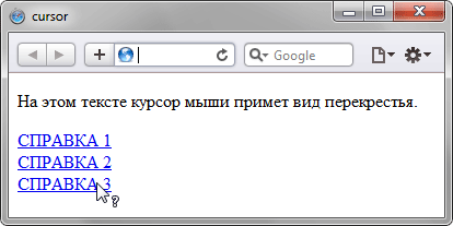
Рис. 1. Применение свойства cursor
Пример 2
HTML5CSS2.1IECrOpSaFx
<!DOCTYPE html>
<html>
 <head>
  <meta charset="utf-8">
  <title>cursor</title>
  <style>
   a { cursor: url(images/sniper.cur), pointer; }
  </style>
 </head>
 <body>
  <p>Обычный текст</p>
  <p><a href="1.html">Ссылка 1</a> <a href="2.html">Ссылка 2</a>
   <a href="3.html">Ссылка 3</a></p>
 </body>
</html>
Объектная модель
[window.]document.getElementById(«elementID«).style.cursor
Браузеры
Некоторые браузеры поддерживают дополнительные формы курсоров. Например, Internet
Explorer и Opera работает со значением hand, которое является
аналогом значения pointer. Кроме того, в
браузерах Safari, Chrome и Firefox будут действовать следующие значения: all-scroll,
col-resize, no-drop,
not-allowed, row-resize,
vertical-text. Учтите, что указанные значения не входят в спецификацию CSS 2.1, но соответствуют спецификации CSS3 (кроме hand).
Internet Explorer в качестве формата файла курсора поддерживает CUR и ANI. Firefox, Chrome, Safari поддерживают форматы CUR, PNG, GIF, JPG.
Opera не работает с файлами курсора.