Стилизация списков
- Назад
- Обзор: Styling text
- Далее
Списки, по-большому счету, ведут себя также как любой другой текст, но существуют некоторые специфичные настройки CSS, о которых вы должны знать. В этой статье они все описываются.
| Требования: | Базовая компьютерная грамотность, основы HTML (изучите Введение в HTML), основы CSS (изучите Введение в CSS), CSS основы по тексту и шрифтам. |
|---|---|
| Цель: | Познакомиться с лучшими практиками и свойствами по стилизации списков. |
Пример простого списка
Для начала, давайте взглянем на пример простого списка. В данной статье мы рассмотрим ненумерованный, нумерованный и описательный списки — все они имеют аналогичные свойства стилизации, но некоторые имеют свои специальные свойства. Не стилизованный пример доступен на Github (проверьте также источник кода.)
HTML для нашего примера списка представлен ниже:
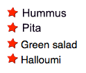
<h2>Shopping (unordered) list</h2>
<p>Paragraph for reference, paragraph for reference, paragraph for reference,
paragraph for reference, paragraph for reference, paragraph for reference.</p>
<ul>
<li>Hummus</li>
<li>Pita</li>
<li>Green salad</li>
<li>Halloumi</li>
</ul>
<h2>Recipe (ordered) list</h2>
<p>Paragraph for reference, paragraph for reference, paragraph for reference,
paragraph for reference, paragraph for reference, paragraph for reference.</p>
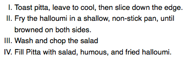
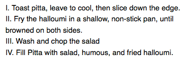
<ol>
<li>Toast pita, leave to cool, then slice down the edge.</li>
<li>Fry the halloumi in a shallow, non-stick pan, until browned on both sides.</li>
<li>Wash and chop the salad.</li>
<li>Fill pita with salad, hummus, and fried halloumi.</li>
</ol>
<h2>Ingredient description list</h2>
<p>Paragraph for reference, paragraph for reference, paragraph for reference,
paragraph for reference, paragraph for reference, paragraph for reference.</p>
<dl>
<dt>Hummus</dt>
<dd>A thick dip/sauce generally made from chick peas blended with tahini, lemon juice, salt, garlic, and other ingredients.</dd>
<dt>Pita</dt>
<dd>A soft, slightly leavened flatbread.</dd>
<dt>Halloumi</dt>
<dd>A semi-hard, unripened, brined cheese with a higher-than-usual melting point, usually made from goat/sheep milk.</dd>
<dt>Green salad</dt>
<dd>That green healthy stuff that many of us just use to garnish kebabs.</dd>
</dl>
Если вы перейдёте к живому примеру прямо сейчас и изучите элемент списка используя инструменты разработчика браузера, то вы заметите несколько стилей установленных по умолчанию:
- Элементы
<ul>и<ol>имеют верхний и нижнийmarginпо16px(1em) иpadding-left40px(2.5em.) - Объекты списка (элементы
<li>) не имеют заданных значений по умолчанию для интервалов. - Элемент
<dl>имеет верхний и нижнийmarginпо16px(1em), но padding не задан. - Элементы
<dd>имеютmargin-left40px(2.5em.) - Элементы
<p>которые мы включили для ссылок (сноски) имеют верхний и нижнийmarginпо16px(1em), точно так же, как и различные типы списков.
Управление интервалами списков
При оформлении списков, вам необходимо настроить их стили так, чтоб они сохраняли то же вертикальное расстояние, что и окружающие их элементы (такие как параграфы и изображения; иногда называемые вертикальным ритмом) и то же расстояние по горизонтали как и между собой (посмотреть законченный стилизированный пример на Github, а также найти исходный код.)
CSS, используемый для оформления текста и интервалов, выглядит следующим образом:
/* Базовые стили */

html {
  font-family: Helvetica, Arial, sans-serif;
  font-size: 10px;
}

h2 {
  font-size: 2rem;
}

ul,ol,dl,p {
  font-size: 1.5rem;
}

li, p {
  line-height: 1.5;
}

/* Задаём стили для списка описаний */


dd, dt {
  line-height: 1.5;
}

dt {
  font-weight: bold;
}

dd {
  margin-bottom: 1.5rem;
}
- Первое правило устанавливает шрифт сайта и основной размер шрифта 10px. Они наследуются всеми на этой странице.
- Правила 2 и 3 задают относительные размеры шрифтов заголовков, различных типов списков (их наследуют дочерние элементы списков) и параграфов. Это значит, что каждый параграф и список будут иметь одинаковый размер шрифта, а также верхний и нижний интервалы, помогая сохранить согласованность вертикального ритма.
- Правило 4 задаёт одинаковую высоту
line-heightв параграфах и пунктах списка — так, что параграфы и каждый отдельный пункт списка будут иметь те же интервалы между строками. Это также поможет сохранить согласованность вертикального ритма. - Правила 5 и 6 применяются к списку описаний — мы задаём одинаковую высоту
line-heightмежду терминами и описаниями списке описаний как мы это делали с параграфами и пунктами списка. И снова, согласованность хорошая! Мы также делаем описание терминов жирным шрифтом, чтобы они визуально выделялись легче.
Стили специфичные для списков
Теперь, рассмотрев общие методы интервалов для списков, давайте изучим некоторые специфичные спискам свойства. Существует три свойства, с которых вам надо начать знакомство, которые могут быть установлены для элементов <ul> или <ol>:
list-style-type(en-US): задаёт тип маркеров для использования в списке, например, квадратные или круглые маркеры для неупорядоченного списка, или цифры, буквы или римские цифры для упорядоченного списка.list-style-position(en-US): управляет будет ли маркер появляется внутри пунктов списка или вне их перед началом каждого элемента.list-style-image: позволяет вам использовать пользовательские изображения в качестве маркеров, а не просто квадрат или круг.
Стили маркеров
Как указано выше, свойство list-style-type (en-US) позволяет вам устанавливать какой тип маркера использовать в качестве точек маркера. В нашем примере мы установили использование заглавных римских цифр в упорядоченном списке:
ol {
  list-style-type: upper-roman;
}
Это даёт нам следующий вид:
Вы можете найти гораздо больше опций, заглянув на справочную страницу list-style-type (en-US).
Позиция маркера
Свойство list-style-position (en-US) устанавливает будет ли появляться маркер внутри пунктов списка или снаружи перед началом каждого пункта. Значение по умолчанию — outside, которое заставляет маркеры находится снаружи пунктов списка, как видно выше.
Если вы установите значение на inside, то маркеры будут находиться внутри строк:
ol {
  list-style-type: upper-roman;
  list-style-position: inside;
}
Использование пользовательского изображения как маркер
Свойство list-style-image позволяет вам использовать пользовательское изображение в качестве вашего маркера. Синтаксис довольно прост:
ul {
  list-style-image: url(star.svg);
}
Однако это свойство немного ограничено с точки зрения управления позициями, размерами (и т.д.) маркеров. Вам лучше использовать семейство свойств background, о которых вы узнаете намного больше в модуле Styling boxes. А пока вот вам образец для дегустации!
В нашем законченном примере мы оформили неупорядоченный список следующим образом (поверх того, что вы уже видели выше):
ul {
  padding-left: 2rem;
  list-style-type: none;
}

ul li {
  padding-left: 2rem;
  background-image: url(star.svg);
  background-position: 0 0;
  background-size: 1.6rem 1.6rem;
  background-repeat: no-repeat;
}
Мы сделали следующее:
- Установили
padding-leftэлемента<ul>с40pxпо умолчанию на20px, затем установили то же самое количество в пунктах списка. Это для того, чтобы все пункты списка продолжали выравниваться с порядком пунктов списка и описаний списка описаний, но пункты списка имеют некоторый padding для фоновых изображений чтобы сидеть внутри. Если бы мы не сделали этого, то фоновые изображения накладывались бы с текстом пунктов списка, что выглядело бы неряшливо. - Установили
list-style-type(en-US) наnone, для того чтобы маркеры не появлялись по умолчанию. Мы собираемся использовать свойстваbackgroundдля управления маркерами. - Вставили маркер в каждый пункт неупорядоченного списка. Соответствующие свойства, следующие:
background-image: Указывает путь к файлу изображения, который вы хотите использовать в качестве маркера.background-position: Определяет где в фоне выбранного элемента появится изображение — в данном случае мы говорим0 0, что значит что маркер будет появляться в самом верху слева каждого пункта списка.background-size: Задаёт размер фонового изображения. В идеале мы хотим, чтоб маркеры были того же размера что и пункты списка (или самую малость меньше или крупнее). Мы используем размер1.6rem(16px), что очень хорошо сочетается с отступом (padding)20px, который мы позволили разместить внутри маркера — 16px плюс 4px интервала между маркером и текстом пункта списка работают хорошо.background-repeat: По умолчанию, фоновые изображения повторяются пока не заполнят доступное фоновое пространство. Мы хотим всего лишь одну копию вставленного изображения в каждом случае, поэтому мы установили значениеno-repeat.
Это даёт нам следующий результат:
короткая запись list-style
Эти три свойства упомянутые выше могут все быть заданы, используя лишь одну короткую запись свойства, list-style (en-US). Например, следующий CSS:
ul {
  list-style-type: square;
  list-style-image: url(example.png);
  list-style-position: inside;
}
Может быть заменён этим:
ul {
  list-style: square url(example.png) inside;
}
Значения могут быть перечислены в любом порядке, и вы можете использовать одно, два и все три (значения по умолчанию, использованные для свойств, которые не включены — disc, none, и outside). Если указаны и type и image, тип используется в качестве запасного варианта, если изображение по какой-либо причине не может быть загружено.
Контроль счета списка
Иногда вам может понадобиться вести счёт в упорядоченном списке по-другому — например начинать с цифры отличной от 1, или считать в обратном порядке, или вести счёт с шагом больше 1. HTML и CSS имеют несколько инструментов которые помогут с этим.
start
Атрибут start позволит вам начать счёт списка с цифры отличной от 1. Например:
<ol start="4">
  <li>Toast pita, leave to cool, then slice down the edge.</li>
  <li>Fry the halloumi in a shallow, non-stick pan, until browned on both sides.</li>
  <li>Wash and chop the salad.</li>
  <li>Fill pita with salad, hummus, and fried halloumi.</li>
</ol>
что даст вам такой результат:
reversed
Атрибут reversed начнёт отсчёт по убыванию вместо возрастания. Например:
<ol start="4" reversed>
  <li>Toast pita, leave to cool, then slice down the edge.</li>
  <li>Fry the halloumi in a shallow, non-stick pan, until browned on both sides.</li>
  <li>Wash and chop the salad.</li>
  <li>Fill pita with salad, hummus, and fried halloumi.</li>
</ol>
что даст вам такой результат:
Примечание: Обратите внимание: Если пунктов в списке в обратном списке больше, чем значение атрибута start, счёт продолжится до нуля и далее отрицательные значения.
value
Атрибут value позволит вам установить специфичные цифровые значения к пунктам списка. Например:
<ol>
  <li value="2">Toast pita, leave to cool, then slice down the edge.</li>
  <li value="4">Fry the halloumi in a shallow, non-stick pan, until browned on both sides.</li>
  <li value="6">Wash and chop the salad.</li>
  <li value="8">Fill pita with salad, hummus, and fried halloumi.</li>
</ol>
что даст вам такой результат:
Примечание: Обратите внимание: Даже если вы используете нечисловой list-style-type (en-US), вам всё равно надо использовать эквивалентное цифровое значение в атрибуте value.
Активное изучение: Стилизация вложенного списка
В этой сессии активного изучения, мы хотим, чтобы вы взяли всё что вы выучили выше и попробовали стилизовать вложенный список. Мы предоставили вам HTML и хотим, чтобы вы:
- Задали неупорядоченному списку квадратные маркеры.
- Задали пунктам неупорядоченного и упорядоченного списка 1,5 межстрочный интервал их размера шрифта.
- Задали упорядоченному списку маркеры в виде строчных букв.
- Не стесняйтесь играться с примерами списков столько сколько вам нравится, экспериментируя с типами маркеров, интервалами или со всем что вы найдёте.
Если вы допустите ошибку, вы всегда можете сделать сброс используя кнопку Reset. Если вы застрянете, нажмите кнопку Show solution чтобы посмотреть возможный ответ.
<div class="body-wrapper" style="font-family: 'Open Sans Light',Helvetica,Arial,sans-serif;">
  <h2>HTML Input</h2>
  <textarea id="code" class="html-input" style="width: 90%;height: 10em;padding: 10px;border: 1px solid #0095dd;"><ul>
  <li>First, light the candle.</li>
  <li>Next, open the box.</li>
  <li>Finally, place the three magic items in the box, in this exact order, to complete the spell:
    <ol>
      <li>The book of spells</li>
      <li>The shiny rod</li>
      <li>The goblin statue</li>
    </ol>
  </li>
</ul></textarea>

  <h2>CSS Input</h2>
  <textarea id="code" class="css-input" style="width: 90%;height: 10em;padding: 10px;border: 1px solid #0095dd;"></textarea>

  <h2>Output</h2>
  <div class="output" style="width: 90%;height: 12em;padding: 10px;border: 1px solid #0095dd;overflow: auto;"></div>
  <div class="controls">
    <input id="reset" type="button" value="Reset" style="margin: 10px 10px 0 0;">
    <input id="solution" type="button" value="Show solution" style="margin: 10px 0 0 10px;">
  </div>
</div>
var htmlInput = document.querySelector(".html-input");
var cssInput = document.querySelector(".css-input");
var reset = document.getElementById("reset");
var htmlCode = htmlInput.value;
var cssCode = cssInput.value;
var output = document.querySelector(".output");
var solution = document.getElementById("solution");

var styleElem = document.createElement('style');
var headElem = document.querySelector('head');
headElem.appendChild(styleElem);

function drawOutput() {
  output.innerHTML = htmlInput.value;
  styleElem.textContent = cssInput.value;
}

reset.addEventListener("click", function() {
  htmlInput.value = htmlCode;
  cssInput.value = cssCode;
  drawOutput();
});

solution.addEventListener("click", function() {
  htmlInput.value = htmlCode;
  cssInput.value = 'ul {n  list-style-type: square;n}nnul li, ol li {n  line-height: 1.5;n}nnol {n  list-style-type: lower-alphan}';
  drawOutput();
});

htmlInput.addEventListener("input", drawOutput);
cssInput.addEventListener("input", drawOutput);
window.addEventListener("load", drawOutput);
Смотрите также
Счётчики CSS предоставляют расширенные инструменты для настройки счета и оформления списков, но они довольно сложные. Мы рекомендуем изучить это, если вы захотите размяться. Смотрите:
@counter-stylecounter-increment(en-US)counter-reset(en-US)
Заключение
В плане стилизации списки сравнительно легко освоить, как только вы освоите несколько связанных базовых принципов и специфичные свойства. В следующей статье мы перейдём к методам стилизации ссылок.
- Назад
- Обзор: Styling text
- Далее
В этом модуле

От автора: теперь легко настроить цвет, размер или тип числа или маркера при использовании <ul> или <ol>. Благодаря Igalia, спонсируемой Bloomberg, мы наконец-то можем убрать хаки для стилей списков. Судите сами!

Благодаря CSS ::marker мы можем изменять содержимое и некоторые стили маркеров и чисел.
Совместимость с браузерами
Когда выйдет Chromium 86, ::marker будет поддерживаться в Firefox для настольных компьютеров и Android, Safari для настольных ПК и iOS Safari, а также в браузерах для настольных ПК и Android на базе Chromium. См. обновления в таблице совместимости браузеров MDN.
Псевдо-элементы
Рассмотрим следующий маркированный список HTML:

Практический курс по верстке адаптивного сайта с нуля!
Изучите курс и узнайте, как верстать современные сайты на HTML5 и CSS3
Узнать подробнее
|
<ul> <li>Lorem ipsum dolor sit amet consectetur adipisicing elit</li> <li>Dolores quaerat illo totam porro</li> <li>Quidem aliquid perferendis voluptates</li> <li>Ipsa adipisci fugit assumenda dicta voluptates nihil reprehenderit consequatur alias facilis rem</li> <li>Fuga</li> </ul> |
В результате получается следующий неожиданный рендеринг:
Точка в начале каждого элемента li является произвольной! Браузер рисует и создает за вас сгенерированную рамку маркера.
Сегодня мы рады поговорить о псевдо-элементе ::marker, который дает возможность стилизовать элемент маркера, который браузеры создают за вас.
Важно: псевдо-элемент представляет в документе элемент, отличный от тех, которые существуют в дереве документа. Например, вы можете выбрать первую строку абзаца с помощью псевдо-элемента p::first-line, даже если нет HTML-элемента, обертывающего эту строку текста.
Создание маркера
Блок псевдо-элемента маркера ::marker автоматически создается внутри каждого элемента списка перед фактическим содержимым и псевдо-элементом ::before.
|
li::before { content: «::before»; background: lightgray; border-radius: 1ch; padding-inline: 1ch; margin-inline-end: 1ch; } |
Обычно элементы списка являются элементами HTML li, но другие элементы также могут стать элементами списка с помощью display: list-item.
|
<dl> <dt>Lorem</dt> <dd>Lorem ipsum dolor sit amet consectetur adipisicing elit</dd> <dd>Dolores quaerat illo totam porro</dd> <dt>Ipsum</dt> <dd>Quidem aliquid perferendis voluptates</dd> </dl> |
|
dd { display: list-item; list-style-type: «your smile»; padding-inline-start: 1ch; } |
Стилизация маркера
До ::marker списки не могли быть стилизованы с помощью list-style-type и list-style-image, чтобы изменить символ элемента списка с помощью 1 строки CSS:
|
li { list-style-image: url(/right-arrow.svg); /* OR */ list-style-type: ‘your icon’; padding-inline-start: 1ch; } |
Это удобно, но нам нужно больше. А как насчет изменения цвета, размера, интервала и т. д.!? Вот где на помощь приходит ::marker. Он позволяет индивидуально и глобально выбирать эти псевдо-элементы из CSS:
|
li::marker { color: hotpink; } li:first-child::marker { font-size: 5rem; } |
Внимание: Если в приведенном выше списке нет розовых маркеров, значит ::marker не поддерживается вашим браузером.
Свойство list-style-type дает очень ограниченные возможности для стилизации. Псевдо-элемент ::marker означает, что можно настроить таргетинг самого маркера и применить стили непосредственно к нему. Это дает гораздо больший контроль.
Тем не менее, вы не можете использовать все свойства CSS для ::marker. Список разрешенных и запрещенных свойств четко указан в спецификации. Если вы попробуете что-то интересное с этим псевдо-элементом, и это не сработает, приведенный ниже список является вашим руководством по тому, что можно и что нельзя сделать с помощью CSS.
Допустимые свойства CSS для ::marker
animation-*
Практический курс по верстке адаптивного сайта с нуля!
Изучите курс и узнайте, как верстать современные сайты на HTML5 и CSS3
Узнать подробнее
transition-*
color
direction
font-*
content
unicode-bidi
white-space
Изменение содержимого ::marker выполняется с помощью content вместо list-style-type. В следующем примере для первого элемента используется стиль list-style-type, а для второго — ::marker. Свойства в первом случае применяются ко всему элементу списка, а не только к маркеру, что означает, что текст анимируется так же, как и маркер. При использовании ::marker мы можем выбирать только блок маркера, а не текст.
Также обратите внимание на то, что отключенное свойство background не действует.
Стили списков
|
li:nth-child(1) { list-style-type: ‘?’; font-size: 2rem; background: hsl(200 20% 88%); animation: color-change 3s ease-in-out infinite; } |
Стили маркеров
|
li:nth-child(2)::marker { content: ‘!’; font-size: 2rem; background: hsl(200 20% 88%); animation: color-change 3s ease-in-out infinite; } |
Проблемы!
В Chromium white-space работает только с внутренними маркерами. Для маркеров, расположенных снаружи регулятор стиля всегда задает white-space: pre, чтобы сохранить свободное пространство.
Изменение содержимого маркера
Вот несколько способов стилизации маркеров.
Изменение всех маркеров списка
|
li { list-style-type: «smile»; } /* OR */ li::marker { content: «smile»; } |
Изменение только одного маркера списка
|
li:last-child::marker { content: «smile»; } |
Замена маркера списка на SVG
|
li::marker { content: url(/heart.svg); content: url(#heart); content: url(«data:image/svg+xml;charset=UTF-8,<svg xmlns=’//www.w3.org/2000/svg’ version=’1.1′ height=’24’ width=’24’><path d=’M12 21.35l-1.45-1.32C5.4 15.36 2 12.28 2 8.5 2 5.42 4.42 3 7.5 3c1.74 0 3.41.81 4.5 2.09C13.09 3.81 14.76 3 16.5 3 19.58 3 22 5.42 22 8.5c0 3.78-3.4 6.86-8.55 11.54L12 21.35z’ fill=’none’ stroke=’hotpink’ stroke-width=’3’/></svg>»); } |
Изменение нумерованных списков
А что насчет ol? Маркер в элементе нумерованного списка по умолчанию является числом, а не маркером. В CSS они называются счетчиками, и они довольно мощные. У них даже есть свойства для установки и сброса в начале и в конце числа или переключения их на римские цифры. Можем ли мы это стилизовать? Да, и мы даже можем использовать значение содержимого маркера для создания собственного представления нумерации.
|
li::marker { content: counter(list—item) «› «; color: hotpink; } |
Отладка
Chrome DevTools готов помочь вам проверить, отладить и изменить стили, применяемые к псевдо-элементам ::marker.

Автор: Adam Argyle, Oriol Brufau
Источник: //web.dev
Редакция: Команда webformyself.
Практический курс по верстке адаптивного сайта с нуля!
Изучите курс и узнайте, как верстать современные сайты на HTML5 и CSS3
Узнать подробнее

Верстка. Быстрый старт
Практический курс по верстке адаптивного сайта с нуля!
Смотреть
Как изменить маркер списка

По умолчанию маркером списка ul, служит простая черная точка. Я знаю, что многие начинающие верстальщики, используют маркированные списки для разметки меню навигации, предварительно обнулив в CSS значение селектора ul.
Давайте рассмотрим на примере, что я имею ввиду.
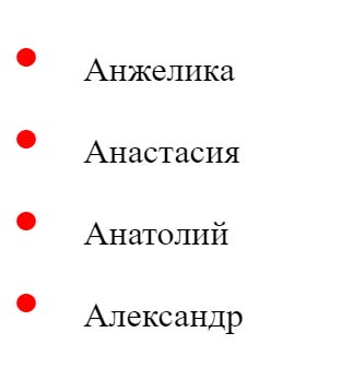
HTML разметка базового маркированного списка:
<ul>

  <li>Анжелика</li>

  <li>Анастасия</li>

  <li>Анатолий</li>

  <li>Александр</li>

</ul>
На странице, вы увидите следующее.

Как верстают меню навигации без точек? Просто в стилях прописывают следующую строчку.
ul {

  list-style: none;

}
Однако сегодня мы не будем ограничиваться версткой меню, а будем использовать маркированные списки по их прямому назначению, гибко настраивая под стиль вашего сайта, делая это разными способами.
Меняем цвет маркера списка (1-ый способ)
Удалим дефолтные черные точки.
ul {

  list-style: none;

}
А взамен, поставим другие точки, поставив псевдоэлемент before перед всеми пунктами списка. Вместо точек, добавим значение свойства content «2022» , это CSS код точки, взятый из таблицы Юникода. Дальше к этим точкам, можно применять нужные стили.
ul li::before {

  content: "2022"; /* юникод точки */

  color: orange; /* Менять цвет */

  font-weight: bold; /* Менять жирность */

  display: inline-block; /* Расстояние между точкой и текстом */

  width: 1em; /* Задать значение расстояния */

}
Пример с заменой цвета маркеров списка

Меняем цвет маркера списка (2-ой способ)
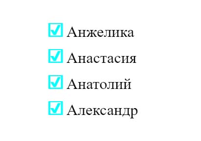
Все спецсимволы Юникода имеют альтернативный HTML-код и могут вставляться напрямую в HTML разметку, между тегами span. Для разнообразия, мы используем в качестве маркера спецсимвол – ☑ галочка в квадрате.
<ul>

  <li><span>☑</span>Анжелика</li>

  <li><span>☑</span>Анастасия</li>

  <li><span>☑</span>Анатолий</li>

  <li><span>☑</span>Александр</li>

</ul>
CSS-код
ul {

  list-style: none;

}
span {
color: cyan;
font-weight: bold;
display: inline-block;
width: 1em;
font-size: 20px;
}
Второй способ изменения маркера списка, мне понравился больше. Он позволяет увеличить размер маркера (font-size), не задевая межстрочный интервал, чего нельзя сказать о первом способе.
В первом способе вместе с увеличением размера маркера, становиться больше и межстрочный интервал.
Символы вместо иконок
На сегодняшний день, самый легкий способ вставки иконки-гамбургера в меню сайта – это вставка символа Юникода Trigram for Heaven — ☰.
<a href="#">☰</a>
Если вы нашли в таблице Юникода, нужный символ, то для вставки его на сайт, не нужно подключать библиотеку Font Awesome.
Вместо маркера картинка
И это ещё не все, маркированный список можно сделать картинками. Это классический пример для верстальщика, как сверстать ту часть макета, где дизайнер сам нарисовал иконки, что наиболее вероятно.
ul {

  list-style: none;

}

ul li {

  background: url(images/icon_star.gif) no-repeat 0 5px;

}
В стилях, иконки нужно вставлять, как фон, без повтора и подобрать нужные значения для выравнивания.
Альтернативный способ:
ul {

  list-style-image: url(images/icon_star.gif);

}
Для внедрения символов Юникода, кодировка страницы должна быть обязательно UTF-8.
В HTML файле:
<meta charset="utf-8"/>
В отдельном CSS файле:
@charset 'utf-8';
Если вы только присматриваетесь к профессии верстальщика, то наиболее оптимальным решением будет, начинать своё обучение с верстки лендингов, начните с этого видеокурса «О создании лендинга под ключ».
-

Создано 28.11.2018 10:13:07
-
Михаил Русаков

Копирование материалов разрешается только с указанием автора (Михаил Русаков) и индексируемой прямой ссылкой на сайт (http://myrusakov.ru)!
Добавляйтесь ко мне в друзья ВКонтакте: http://vk.com/myrusakov.
Если Вы хотите дать оценку мне и моей работе, то напишите её в моей группе: http://vk.com/rusakovmy.
Если Вы не хотите пропустить новые материалы на сайте,
то Вы можете подписаться на обновления: Подписаться на обновления
Если у Вас остались какие-либо вопросы, либо у Вас есть желание высказаться по поводу этой статьи, то Вы можете оставить свой комментарий внизу страницы.
Если Вам понравился сайт, то разместите ссылку на него (у себя на сайте, на форуме, в контакте):
-
Кнопка:
Она выглядит вот так:
-
Текстовая ссылка:
Она выглядит вот так: Как создать свой сайт
- BB-код ссылки для форумов (например, можете поставить её в подписи):

1. Introduction
This specification defines the ::marker pseudo-element,
the list-item display type that generates markers,
and several properties controlling the placement and styling of markers.
It also defines counters,
which are special numerical objects
often used to generate the default contents of markers.
For instance, the following example illustrates
how markers can be used to add parentheses around each numbered list item:
<style>
li::marker { content: "(" counter(list-item, lower-roman) ")"; }
li { display: list-item; }
</style>
<ol>
  <li>This is the first item.
  <li>This is the second item.
  <li>This is the third item.
</ol>
It should produce something like this:
  (i) This is the first item.
 (ii) This is the second item.
(iii) This is the third item.
Note: Note that this example is far more verbose than is usually needed in HTML,
as the UA default style sheet takes care of most of the necessary styling.
With descendant selectors and child selectors,
it’s possible to specify different marker types depending on the depth of embedded lists.
1.1. Value Definitions
This specification follows the CSS property definition conventions from [CSS2] using the value definition syntax from [CSS-VALUES-3].
Value types not defined in this specification are defined in CSS Values & Units [CSS-VALUES-3].
Combination with other CSS modules may expand the definitions of these value types.
In addition to the property-specific values listed in their definitions,
all properties defined in this specification
also accept the CSS-wide keywords as their property value.
For readability they have not been repeated explicitly.
2. Declaring a List Item
A list item is any element with its display property set to list-item. List items generate ::marker pseudo-elements;
no other elements do.
Additionally, list items automatically increment an implied list-item counter (see § 4.6 The Implicit list-item Counter).
3. Markers
The defining feature of the list item display type is its marker,
a symbol or ordinal that helps denote the beginning of each list item in a list.
In the CSS layout model, list item markers are represented by
a marker box associated with each list item.
The contents of this marker can be controlled with
the list-style-type and list-style-image properties on the list item and by assigning properties to its ::marker pseudo-element.
3.1. The ::marker Pseudo-Element
The marker box is generated by
the ::marker pseudo-element of a list item as the list item’s first child,
before the ::before pseudo-element
(if it exists on the element).
It is filled with content
as defined in § 3.2 Generating Marker Contents.
In this example, markers are used to number paragraphs that are designated as «notes»:
<style>
p { margin-left: 12 em; }
p.note {
  display: list-item;
  counter-increment: note-counter;
}
p.note::marker {
  content: "Note " counter(note-counter) ":";
}
</style>
<p>This is the first paragraph in this document.
<p class="note">This is a very short document.
<p>This is the end.
It should render something like this:
        This is the first paragraph
        in this document.

Note 1: This is a very short
        document.

        This is the end.
By using the ::marker pseudo-element,
a list’s markers can be styled
independently from the text of the list item itself:
<style>
p { margin-left: 8em } /* Make space for counters */
li { list-style-type: lower-roman; }
li::marker { color: blue; font-weight:bold; }
</style>
<p>This is a long preceding paragraph ...
<ol>
  <li>This is the first item.
  <li>This is the second item.
  <li>This is the third item.
</ol>
<p>This is a long following paragraph ...
The preceding document should render something like this:
       This is a long preceding
       paragraph ...

  i.   This is the first item.
 ii.   This is the second item.
iii.   This is the third item.

       This is a long following
       paragraph ...
Previously the only way to style a marker was through inheritance;
one had to put the desired marker styling on the list item,
and then revert that on a wrapper element around the list item’s actual contents.
Marker boxes only exist for list items:
on any other element,
the ::marker pseudo-element’s content property must compute to none,
which suppresses its creation.
3.1.1. Properties Applying to ::marker
All properties can be set on a ::marker pseudo-element
and will have a computed value;
however,
only the following CSS properties
actually apply to a marker box:
- the text-combine-upright, unicode-bidi, and direction properties (see [CSS-WRITING-MODES-3])
- the content property (see § 3.2 Generating Marker Contents, below)
- all animation and transition properties (see [CSS-ANIMATIONS-1] and [CSS-TRANSITIONS-1])
It is expected that future specifications will extend this list of properties;
however at the moment outside marker box layout is not fully defined,
so only these properties are allowed.
Other properties must not have an effect on the marker box when set in the author origin of the cascade.
UAs may either treat such properties as not applying,
or enforce their value by setting a user-agent origin !important rule.
However, inheritable properties that apply to text
can be set on the ::marker pseudo-element:
these will inherit to and take effect on its text contents.
UAs must add the following rule to their default style sheet:
::marker, ::before::marker, ::after::marker {
  unicode-bidi: isolate;
  font-variant-numeric: tabular-nums;
  white-space: pre;
  text-transform: none;
}
Note: Although the ::marker pseudo-element can represent
the marker box of a ::before or ::after pseudo-element,
the compound selector ::marker,
which expands to *::marker [SELECTORS-4],
will not select these markers—an originating element that is a pseudo-element needs to be explicitly specified in the selector,
e.g. ::before::marker.
white-space: pre doesn’t have quite the right behavior; text-space-collapse: preserve-spaces + text-space-trim: discard-after might be closer to what’s needed here.
See discussion in Issue 4448 and Issue 4891.
3.2. Generating Marker Contents
The contents of a marker box are determined by the first of these conditions that is true:
- content on the ::marker itself is not normal
- The contents of the marker box are determined as defined by the content property,
exactly as for ::before. - list-style-image on the originating element defines a marker image
- The ‘marker box contains
an anonymous inline replaced element representing the specified marker image,
followed by a text run consisting of a single space (U+0020 SPACE). - list-style-type on the originating element defines a marker string
- The marker box contains
a text run consisting of the specified marker string. - otherwise
- The marker box has no contents
and ::marker does not generate a box.
Additionally, the UA may transform into spaces or discard
any preserved forced line breaks.
3.3. Image Markers: the list-style-image property
| Name: | list-style-image |
|---|---|
| Value: | <image> | none |
| Initial: | none |
| Applies to: | list items |
| Inherited: | yes |
| Percentages: | n/a |
| Computed value: | the keyword noneor the computed <image> |
| Canonical order: | per grammar |
| Animation type: | discrete |
Specifies the marker image,
which is used to fill the list item’s marker when its content is normal.
The values are as follows:
- <image>
- If the <image> represents a valid image,
specifies the element’s marker image as the <image>.
Otherwise,
the element has no marker image. - none
- The element has no marker image.
The following example sets the marker at the beginning of each list item to
be the image «ellipse.png».
li { list-style-image: url("http://www.example.com/ellipse.png") }
3.4. Text-based Markers: the list-style-type property
| Name: | list-style-type |
|---|---|
| Value: | <counter-style> | <string> | none |
| Initial: | disc |
| Applies to: | list items |
| Inherited: | yes |
| Percentages: | n/a |
| Computed value: | specified value |
| Canonical order: | per grammar |
| Animation type: | discrete |
Specifies the marker string,
which is used to fill the list item’s marker when its content value is normal and there is no marker image.
The values are as follows:
- <counter-style>
-
Specifies the element’s marker string as
the value of the list-item counter
represented using the specified <counter-style>.Specifically,
the marker string is
the result of generating a counter representation of the list-item counter value
using the specified <counter-style>,
prefixed by the prefix of the <counter-style>,
and followed by the suffix of the <counter-style>.
If the specified <counter-style> does not exist, decimal is assumed. - <string>
- The element’s marker string is the specified <string>.
- none
- The element has no marker string.
The following examples illustrate how to set markers to various values:
ul { list-style-type: "★"; }
/* Sets the marker to a "star" character */

p.note {
  display: list-item;
  list-style-type: "Note: ";
  list-style-position: inside;
}
/* Gives note paragraphs a marker consisting of the string "Note: " */

ol { list-style-type: upper-roman; }
/* Sets all ordered lists to use the upper-roman counter-style
   (defined in the Counter Styles specification [[CSS-COUNTER-STYLES]]) */

ul { list-style-type: symbols(cyclic '○' '●'); }
/* Sets all unordered list items to alternate between empty and
   filled circles for their markers. */

ul { list-style-type: none; }
/* Suppresses the marker entirely, unless list-style-image is specified
   with a valid image. */
3.5. Positioning Markers: The list-style-position property
| Name: | list-style-position |
|---|---|
| Value: | inside | outside |
| Initial: | outside |
| Applies to: | list items |
| Inherited: | yes |
| Percentages: | n/a |
| Computed value: | keyword, but see prose |
| Canonical order: | per grammar |
| Animation type: | discrete |
This property dictates whether the ::marker is rendered inline,
or positioned just outside of the list item.
The values are as follows:
- inside
- No special effect.
(The ::marker is an inline element at the start of the list item’s contents.) - outside
-
If the list item is a block container:
the marker box is a block container and is placed outside the principal block box;
however, the position of the list-item marker adjacent to floats is undefined.
CSS does not specify the precise location of the marker box
or its position in the painting order,
but does require that it be placed on the inline-start side of the box,
using the writing mode of the box indicated by marker-side.
The marker box is fixed with respect to the principal block box’s border
and does not scroll with the principal box’s content.
A UA may hide the marker if the element’s overflow is other than visible.
(This allowance may change in the future.)
The size or contents of the marker box may affect
the height of the principal block box
and/or the height of its first line box,
and in some cases may cause the creation of a new line box;
this interaction is also not defined.This is handwavey nonsense from CSS2, and needs a real definition.
If the list item is an inline box:
this value is equivalent to inside.Alternatively, outside could lay out the marker as a previous sibling of the principal inline box.
For example:
<style>
  ul.compact { list-style: inside; }
  ul         { list-style: outside; }
</style>
<ul class=compact>
  <li>first "inside" list item comes first</li>
  <li>second "inside" list item comes first</li>
</ul>
<hr>
<ul>
  <li>first "outside" list item comes first</li>
  <li>second "outside" list item comes first</li>
</ul>
The above example may be formatted as:
  * first "inside" list
  item comes first
  * second "inside" list
  item comes second

========================

* first "outside" list
  item comes first
* second "outside" list
  item comes second
3.6. Styling Markers: the list-style shorthand property
| Name: | list-style |
|---|---|
| Value: | <‘list-style-position’> || <‘list-style-image’> || <‘list-style-type’> |
| Initial: | see individual properties |
| Applies to: | list items |
| Inherited: | see individual properties |
| Percentages: | see individual properties |
| Computed value: | see individual properties |
| Animation type: | see individual properties |
| Canonical order: | per grammar |
The list-style property is a shorthand notation
for setting the three properties list-style-type, list-style-image, and list-style-position at the same place in the style sheet.
For example:
ul { list-style: upper-roman inside }  /* Any UL */
ul ul { list-style: circle outside } /* Any UL child of a UL */
Using a value of none in the shorthand is potentially ambiguous,
as none is a valid value for both list-style-image and list-style-type.
To resolve this ambiguity,
a value of none in the shorthand must be applied to whichever of the two properties aren’t otherwise set by the shorthand.
list-style: none disc;
/* Sets the image to "none" and the type to "disc". */

list-style: none url(bullet.png);
/* Sets the image to "url(bullet.png)" and the type to "none". */

list-style: none;
/* Sets both image and type to "none". */

list-style: none disc url(bullet.png);
/* Syntax error */
Note: The <counter-style> values of list-style-type can also create grammatical ambiguities.
As such values are ultimately <custom-ident> values,
the parsing rules in [CSS-VALUES-3] apply.
Although authors may specify list-style information directly on list item elements
(e.g., li in HTML),
they should do so with care.
Consider the following rules:
ol.alpha li { list-style: lower-alpha; }
ul li       { list-style: disc; }
The above won’t work as expected.
If you nest a ul into an ol class=alpha,
the first rule’s specificity will make the ul’s list items use the lower-alpha style.
ol.alpha > li { list-style: lower-alpha; }
ul > li       { list-style: disc; }
These work as intended.
ol.alpha { list-style: lower-alpha; }
ul       { list-style: disc; }
These are even better,
since inheritance will transfer the list-style value to the list items.
3.7. The marker-side property
| Name: | marker-side |
|---|---|
| Value: | match-self | match-parent |
| Initial: | match-self |
| Applies to: | list items |
| Inherited: | yes |
| Percentages: | n/a |
| Computed value: | specified keyword |
| Canonical order: | per grammar |
| Animation type: | discrete |
The marker-side property specifies
whether an outside marker box is positioned
based on the directionality of the list item itself (i.e. its originating element)
or the directionality of the list container (i.e. the originating element’s parent).
In the first case, the position of the marker can vary across items in the same list,
based on the directionality assigned to each list item individually;
in the second case they will all align on the same side,
as determined by the directionality assigned to the list as a whole.
- match-self
- The marker box is positioned
using the directionality of the ::marker’s originating element. - match-parent
- The marker box is positioned
using the directionality of the ::marker’s originating element’s parent element.
By default, elements or ::marker pseudo-elements
position themselves according to their list item’s directionality.
However, if the list item is grouped with several other list items which may have different directionality
(for example, multiple <li>s with different «dir» attributes in an <ol> in HTML),
it is sometimes more useful to have all the markers line up on one side,
so the author can specify a single «gutter» on that side
and be assured that all the markers will lie in that gutter and be visible.
Both of the following example renderings are generated from the following HTML,
with the only difference being the value of marker-side on the list:
<ul>
  <li>english one
  <li dir=rtl>OWT WERBEH
  <li>english three
  <li dir=rtl>RUOF WERBEH
</ul>
| match-self | match-parent |
|---|---|
* english one
     OWT WERBEH *
* english three
    RUOF WERBEH *
|
* english one * OWT WERBEH * english three * RUOF WERBEH |
For this order punctuation inside the marker correctly,
it would also need to take the direction value of the parent. <https://github.com/w3c/csswg-drafts/issues/4202>
There are issues open on renaming the keywords and on merging with list-style-position.
4. Automatic Numbering With Counters
A counter is a special numeric tracker
used, among other things, to automatically number list items in CSS.
Every element has a collection of zero or more counters,
which are inherited through the document tree in a way similar to inherited property values. Counters have a name and creator,
which identify the counter,
and an integer value.
They are created and manipulated with
the counter properties counter-increment, counter-set and counter-reset,
and used with the counter() and counters() functional notations.
Counters are referred to in CSS syntax
using the <counter-name> type,
which represents their name as a <custom-ident>.
A <counter-name> name cannot match the keyword none;
such an identifier is invalid as a <counter-name>.
Resolving counter values on a given element is a multi-step process:
-
Existing counters are inherited from previous elements.
-
New counters are instantiated (counter-reset).
-
Counter values are incremented (counter-increment).
-
Counter values are explicitly set (counter-set).
-
Counter values are used (counter()/counters()).
UAs may have implementation-specific limits
on the maximum or minimum value of a counter.
If a counter reset, set, or increment
would push the value outside of that range,
the value must be clamped to that range.
4.1. Creating Counters: the counter-reset property
| Name: | counter-reset |
|---|---|
| Value: | [ <counter-name> <integer>? ]+ | none |
| Initial: | none |
| Applies to: | all elements |
| Inherited: | no |
| Percentages: | n/a |
| Computed value: | the keyword none or a list, each item an identifier paired with an integer |
| Canonical order: | per grammar |
| Animation type: | by computed value type |
User Agents are expected to support this property on all media, including non-visual ones.
The counter-reset property instantiates new counters on an element
and sets them to the specified integer values.
Its values are defined as follows:
- none
- This element does not create any new counters.
- <counter-name> <integer>?
- Instantiates a counter of the given <counter-name> with a starting value of the given <integer>,
defaulting to 0.
Note that counter properties follow the cascading rules as normal.
Thus, due to cascading, the following style sheet:
h1 { counter-reset: section -1 }
h1 { counter-reset: imagenum 99 }
will only reset imagenum.
To reset both counters,
they have to be specified together:
H1 { counter-reset: section -1 imagenum 99 }
The same principles apply to the counter-set and counter-increment properties.
See [css-cascade-4].
If multiple instances of the same <counter-name> occur in the property value,
only the last one is honored.
4.2. Manipulating Counter Values: the counter-increment and counter-set properties
| Name: | counter-increment |
|---|---|
| Value: | [ <counter-name> <integer>? ]+ | none |
| Initial: | none |
| Applies to: | all elements |
| Inherited: | no |
| Percentages: | n/a |
| Computed value: | the keyword none or a list, each item an identifier paired with an integer |
| Canonical order: | per grammar |
| Animation type: | by computed value type |
User Agents are expected to support this property on all media, including non-visual ones.
| Name: | counter-set |
|---|---|
| Value: | [ <counter-name> <integer>? ]+ | none |
| Initial: | none |
| Applies to: | all elements |
| Inherited: | no |
| Percentages: | n/a |
| Computed value: | the keyword none or a list, each item an identifier paired with an integer |
| Canonical order: | per grammar |
| Animation type: | by computed value type |
User Agents are expected to support this property on all media, including non-visual ones.
The counter-increment and counter-set properties
manipulate the value of existing counters.
They only instantiate new counters
if there is no counter of the given name on the element yet.
Their values are defined as follows:
- none
- This element does not alter the value of any counters.
- <counter-name> <integer>?
-
Sets (for counter-set) or increments (for counter-increment)
the value of the named counter on the element
to/by the specified <integer>.
If the <integer> is omitted,
it defaults to 1 (for counter-increment)
or 0 (for counter-set).If there is not currently a counter of the given name on the element,
the element instantiates a new counter of the given name
with a starting value of 0 before setting or incrementing its value.
This example shows a way to number chapters and sections with «Chapter 1», «1.1», «1.2», etc.
h1::before {
    content: "Chapter " counter(chapter) ". ";
    counter-increment: chapter;  /* Add 1 to chapter */
    counter-reset: section;      /* Set section to 0 */
}
h2::before {
    content: counter(chapter) "." counter(section) " ";
    counter-increment: section;
}
If multiple instances of the same <counter-name> occur in the property value,
they are all processed, in order.
Thus increments will compound,
but only the last set value will take effect.
4.3. Nested Counters and Scope
Counters are “self-nesting”; instantiating a new counter on an element
which inherited an identically-named counter from its parent
creates a new counter of the same name,
nested inside the existing counter.
This is important for situations like lists in HTML,
where lists can be nested inside lists to arbitrary depth:
it would be impossible to define uniquely named counters for each level.
The counter() function only retrieves the innermost counter of a given name on the element,
whereas the counters() function uses all counters of a given name that contain the element.
The scope of a counter therefore
starts at the first element in the document that instantiates that counter
and includes the element’s descendants and its following siblings with their descendants.
However, it does not include any elements in the scope of a counter with the same name
created by a counter-reset on a later sibling of the element,
allowing such explicit counter instantiations
to obscure those earlier siblings.
See § 4.4 Creating and Inheriting Counters for the exact rules governing the scope of counters and their values.
The following code numbers nested list items.
The result is very similar to that of setting display:list-item and list-style: inside on the LI element:
ol { counter-reset: item }
li { display: block }
li::before { content: counter(item) ". "; counter-increment: item }
In this example,
an ol will create a counter,
and all children of the ol will refer to that counter.
If we denote the nth instance of the item counter by itemn,
then the following HTML fragment will use the indicated counters.
<ol> item0 is created, set to 0
<li> item0 is incremented to 1
<li> item0 is incremented to 2
<ol> item1 is created, set to 0, nested in item0
<li> item1 is incremented to 1
<li> item1 is incremented to 2
<li> item1 is incremented to 3
<ol> item2 is created, set to 0, nested in item1
<li> item2 is incremented to 1
</ol>
<li> item1 is incremented to 4
<ol> item3 is created, set to 0, nested in item1
<li> item3 is incremented to 1
</ol>
<li> item1 is incremented to 5
</ol>
<li> item0 is incremented to 3
<li> item0 is incremented to 4
</ol>
<ol> item4 is created, set to 0
<li> item4 is incremented to 1
<li> item4 is incremented to 2
</ol>
4.4. Creating and Inheriting Counters
Each element or pseudo-element in a document has
a (possibly empty) set of counters in the scope of that element,
either through inheritance from another element
or through instantiation on the element directly.
These counters are represented as a CSS counters set,
which is a set whose values are each a tuple of:
a string (representing a counter’s name),
an element (representing the counter’s creator),
and an integer (representing the counter’s value).
The latest counter of a given name in that set
represents the innermost counter of that name.
4.4.1. Inheriting Counters
An element inherits its initial set of counters
from its parent and preceding sibling.
It then takes the values for those counters
from the values of the matching counters
on its preceding element in tree order (which might be its parent,
its preceding sibling,
or a descendant of its previous sibling).
To inherit counters into an element:
-
If element is the root of its document tree,
the element has an initially-empty CSS counters set.
Return. -
Let element counters,
representing element’s own CSS counters set,
be a copy of the CSS counters set of element’s parent element. -
Let sibling counters be the CSS counters set of element’s preceding sibling (if it has one),
or an empty CSS counters set otherwise.For each counter of sibling counters,
if element counters does not already contain a counter with the same name,
append a copy of counter to element counters. -
Let value source be the CSS counters set of the element immediately preceding element in tree order.
For each source counter of value source,
if element counters contains a counter with the same name and creator,
then set the the value of that counter
to source counter’s value.
Take the following code as an example:
<ul style='counter-reset: example 0;'>
  <li id='foo' style='counter-increment: example;'>
    foo
    <div id='bar' style='counter-increment: example;'>bar</div>
  </li>
  <li id='baz'>
    baz
  </li>
</ul>
Recall that tree order turns a document tree into an ordered list,
where an element comes before its children,
and its children come before its next sibling.
In other words,
for a language like HTML,
it’s the order in which the parser encounters start tags as it reads the document.
In here, the ul element establishes a new counter named example,
and sets its value to 0.
The #foo element, being the first child of the ul,
inherits this counter.
Its parent is also its immediately preceding element in tree order,
so it inherits the value 0 with it,
and then immediately increments the value to 1.
The same happens with the #bar element.
It inherits the example counter from #foo,
and inherits the value 1 from it as well
and increments it to 2.
However, the #baz element is a bit different.
It inherits the example counter from the #foo element,
its previous sibling.
However, rather than inheriting the value 1 from #foo along with the counter,
in inherits the value 2 from #bar, the previous element in tree order.
This behavior allows a single counter to be used throughout a document,
continuously incrementing,
without the author having to worry about the nested structure of their document.
Note: Counter inheritance, like regular CSS inheritance,
operates on the “flattened element tree”
in the context of the [DOM].
4.4.2. Instantiating Counters
Counters are instantiated when named in counter-reset,
and also when not otherwise present if named in counter-increment, counter-set, or the counter() or counters() notations.
(Newly instantiated counters replace identically-named counters originating from previous siblings,
but are added in addition to identically-named counters originating from ancestor elements,
see § 4.3 Nested Counters and Scope.)
To instantiate a counter of a given name on an element with a starting value:
-
Let counters be element’s CSS counters set.
-
Let innermost counter be the last counter in counters with the name name.
If innermost counter’s originating element
is element or a previous sibling of element, remove innermost counter from counters. -
Append a new counter to counters with name name,
originating element element,
and initial value value
4.5. Counters in elements that do not generate boxes
An element that does not generate a box
(for example, an element with display set to none, or a pseudo-element with content set to none)
cannot set, reset, or increment a counter.
The counter properties are still valid on such an element,
but they must have no effect.
For example, with the following style sheet,
H2s with class «secret» do not increment count2.
h2 { counter-increment: count2; }
h2.secret { display: none; }
Note: Other methods of “hiding” elements,
such as setting visibility to hidden,
still cause the element to generate a box,
and so are not excepted here.
Whether a replaced element’s descendants
(such as HTML option,
or SVG rect)
can set, reset, or increment a counter
is undefined.
Note: The behavior on replaced element descendants is currently undefined
due to a lack of interoperability across implementations.
4.6. The Implicit list-item Counter
In addition to any explicitly defined counters that authors write in their styles, list items automatically increment
a special list-item counter,
which is used when generating the default marker string on list items (see list-style-type).
Specifically,
unless the counter-increment property explicitly specifies
a different increment for the list-item counter,
it must be incremented by 1 on every list item,
at the same time that counters are normally incremented
(exactly as if the list item had list-item 1 appended to their counter-increment value,
including side-effects such as possibly instantiating a new counter, etc).
This does not affect the specified or computed values of counter-increment.
Because each list item automatically increments
the list-item counter by 1,
consecutive list items with a numeric list-style-type will be consecutively numbered by default—even if the author sets counter-increment to another value
such as counter-increment: itemnumber or even none.
This protects the automatic list-item counter
from inadvertently being overridden
by declarations intended to address other counters.
However, since the automatic list-item increment does not happen
if the list item’s counter-increment explicitly mentions the list-item counter, li { counter-increment: list-item 2; } will increment list-item by 2 as specified,
not by 3 as would happen
if list-item 1 were unconditionally appended.
This also allows to turn off the automatic list-item counter increment,
by overriding it explicitly, e.g. counter-increment: list-item 0;.
In all other respects, the list-item counter behaves like any other counter and can be used and manipulated by authors
to adjust list item styling
or for other purposes.
In the following example,
the list is modified to count by twos:
ol.evens > li { counter-increment: list-item 2; }
A three-item list would be rendered as
2. First Item
4. Second Item
6. Third Item
UAs and host languages should ensure
that the list-item counter values
by default
reflect the underlying numeric value dictated by host language semantics
when setting up list item styling
in their UA style sheet and presentational hint style mappings.
See, e.g. Appendix A: Sample Style Sheet For HTML.
In the following example,
the content property is used to create tiered numbering
that hooks into the list-item counter,
and thus respects any numbering changes inflicted through HTML:
ol > li::marker { content: counters(list-item,'.') '.'; }
Nested lists using this rule would be rendered like
1. First top-level item
5. Second top-level item, value=5
   5.3. First second-level item, list start=3
   5.4. Second second-level item, list start=3
        5.4.4. First third-level item in reversed list
        5.4.3. Second third-level item in reversed list
        5.4.2. Third third-level item in reversed list
        5.4.1. Fourth third-level item in reversed list
   5.5. Third second-level item, list start=3
6. Third top-level item
given markup such as
<ol>
  <li>First top-level item
  <li value=5>Second top-level item, value=5
    <ol start=3>
      <li>First second-level item, list start=3
      <li>Second second-level item, list start=3
        <ol reversed>
          <li>First third-level item in reversed list
          <li>Second third-level item in reversed list
          <li>Third third-level item in reversed list
          <li>Fourth third-level item in reversed list
        </ol>
    </ol>
  <li>Third second-level item, list start=3
  <li>Third top-level item
</ol>
4.7. Outputting Counters: the counter() and counters() functions
Counters have no visible effect by themselves,
but their values can be used
with the counter() and counters() functions,
whose used values represent counter values as strings or images.
They are defined as follows:
<counter> = <counter()> | <counters()>
counter()  =  counter( <counter-name>, <counter-style>? )
counters() = counters( <counter-name>, <string>, <counter-style>? )
where <counter-style> specifies the counter style for generating a representation of the named counter(s)
as defined in [css-counter-styles-3] and
- counter()
- Represents the value of the innermost counter in the element’s CSS counters set named <counter-name> using the counter style named <counter-style>.
- counters()
- Represents the values of all the counters in the element’s CSS counters set named <counter-name> using the counter style named <counter-style>,
sorted in outermost-first to innermost-last order
and joined by the specified <string>.
In both cases,
if the <counter-style> argument is omitted it defaults to decimal.
If no counter named <counter-name> exists
on an element where counter() or counters() is used,
one is first instantiated with a starting value of 0.
H1::before        { content: counter(chno, upper-latin) ". " }
/* Generates headings like "A. A History of Discontent" */

H2::before        { content: counter(section, upper-roman) " - " }
/* Generates headings like "II - The Discontent Part" */

BLOCKQUOTE::after { content: " [" counter(bq, decimal) "]" }
/* Generates blockquotes that end like "... [3]" */

DIV.note::before  { content: counter(notecntr, disc) " " }
/* Simply generates a bullet before every div.note */

P::before         { content: counter(p, none) }
/* inserts nothing */
The following example shows a simple use of the counters() function:
<ul>
  <li>one</li>
  <li>two
    <ul>
      <li>nested one</li>
      <li>nested two</li>
    </ul>
  </li>
  <li>three</li>
</ul>
<style>
li::marker { content: '(' counters(list-item,'.') ') '; }
</style>
The preceding document should render something like this:
(1) one
(2) two
   (2.1) nested one
   (2.2) nested two
(3) three
Because counters inherit to siblings as well,
they can be used to number headings and subheadings,
which aren’t nested within each other.
Unfortunately,
this prevents the use of counters() as counters from siblings don’t nest,
but one can create multiple counters and manually concatenate them instead:
<h1>First H1</h1>
...
<h2>First H2 in H1</h2>
...
<h2>Second H2 in H1</h2>
...
<h3>First H3 in H2</h3>
...
<h1>Second H1</h1>
...
<h2>First H2 in H1</h2>
...
<style>
body { counter-reset: h1 h2 h3; }
h1   { counter-increment: h1; counter-reset: h2 h3;}
h2   { counter-increment: h2; counter-reset:    h3; }
h3   { counter-increment: h3; }
h1::before { content: counter(h1,upper-alpha) ' '; }
h2::before { content: counter(h1,upper-alpha) '.'
                      counter(h2,decimal) ' '; }
h3::before { content: counter(h1,upper-alpha) '.'
                      counter(h2,decimal) '.'
                      counter(h3,lower-roman) ' '; }
</style>
The preceding document should render something like this:
A First H1
...
A.1 First H2 in H1
...
A.2 Second H2 in H1
...
A.2.i First H3 in H2
...
B Second H1
...
B.1 First H2 in H1
...
Counters are sometimes useful for things other than printing markers.
In general, they provide the ability to number elements in sequence,
which can be useful for other properties to reference.
For example, using order to put an element between two other specific elements
currently requires you to explicitly put order on every element before and/or after the desired insertion point.
If you can set the order value of everything to a counter, tho,
you can more easily insert an element into an arbitrary spot between two others.
Other use-cases involve nested or sibling elements with transforms that are meant to be slightly different from each other.
Today you have to use a preprocessor to do this in a reasonable way,
but a counter would make it work well in «plain» CSS.
(You can built up successive values in the nested case today
by using custom properties and stacking up nested calc()s,
but this is a *little bit* clumsy,
and doesn’t work for siblings.)
Suggestion is to add a counter-value(<counter-name>) function,
which returns the value of the named counter as an integer,
rather than returning a string.
See Issue 1026.
Appendix A: Sample Style Sheet For HTML
This section is informative, not normative.
The [HTML] Rendering chapter
defines the normative default properties that apply to HTML lists;
this sample style sheet is provided to illustrate the CSS features
using familiar markup conventions.
Discussion of how to support ol[reversed] list numbering in CSS is ongoing.
See, e.g. Issue 4181.
/* Set up list items */
li {
  display: list-item; /* implies 'counter-increment: list-item' */
}

/* Set up ol and ul so that they scope the list-item counter */
ol, ul {
  counter-reset: list-item;
}

/* Default list style types for lists */
ol { list-style-type: decimal; }
ul { list-style-type: toggle(disc, circle, square); }

/* The type attribute on ol and ul elements */
ul[type="disc"]   { list-style-type: disc;   }
ul[type="circle"] { list-style-type: circle; }
ul[type="square"] { list-style-type: square; }
ol[type="1"] { list-style-type: decimal;     }
ol[type="a"] { list-style-type: lower-alpha; }
ol[type="A"] { list-style-type: upper-alpha; }
ol[type="i"] { list-style-type: lower-roman; }
ol[type="I"] { list-style-type: upper-roman; }

/* The start attribute on ol elements */
ol[start] {
  counter-reset: list-item calc(attr(start integer, 1) - 1);
}

/* The value attribute on li elements */
li[value] {
  counter-set: list-item attr(value integer, 1);
}


/* Box Model Rules */
ol, ul {
  display: block;
  margin-block: 1em;
  marker-side: match-parent;
  padding-inline-start: 40px;
}
ol ol, ol ul, ul ul, ul ol {
  margin-block: 0;
}

li {
  text-align: match-parent;
}
Acknowledgments
This specification is made possible by input from
Aharon Lanin,
Arron Eicholz,
Brad Kemper,
David Baron,
Emilio Cobos Álvarez,
Mats Palmgren,
Oriol Brufau,
Simon Sapin,
Xidorn Quan
Changes
This section documents the changes since previous publications.
Changes since the 9 July 2020 WD
- Clarified properties that apply to ::marker boxes
vs. to the contents of ::marker boxes.
(Issue 4568) - Added text-transform: none to the UA default style sheet for ::marker.
(Issue 4206) - Changed counter inheritance to take from the parent first,
and only take from the sibling if it’s a new counter.
(Issue 5477)
Changes since the 17 August 2019 WD
- Specified that outside list markers block containers.
(Their outer display type remains undefined.) - Stole list of properties applying to ::marker from [CSS-PSEUDO-4] and added animations, transitions, and white-space.
- Added white-space: pre to UA default style sheet for ::marker.
(Issue 4448)
Note, however, that the exact white space processing behavior of marker boxes
is still being worked out.
Changes since the 25 April 2019 WD
- Rewrote the § 4 Automatic Numbering With Counters section for better precision, editorial clarity, and synchronization with CSS2.
Changes since the 20 March 2014 WD
- Use <custom-ident> consistently for counter names.
- Dropped position: marker (marker positioning is now mostly undefined, as in CSS2).
- Completely rewrote chapter on markers to tighten it up,
align with current expectations, and make editorial improvements. - Pulled the list-item counter definition
into its own section, added examples, and made some clarifications. - Renamed values of marker-side to match conventions from box/text alignment.
- Defined that counter-set is applied after counter-increment rather than before.
(Issue 3810) - Established the canonical order of list-style serialization
to put <‘list-style-type’> last.
(Issue 2624)
Changes From CSS Level 2
As described in the introduction section,
there are significant changes in this module when compared to CSS2.1.
- The ::marker pseudo-element has been introduced to allow styling of the list marker directly.
- list-style-type now accepts a <string> as well as the extended <counter-style> values from [css-counter-styles-3]..
- The list-item predefined counter identifier has been introduced.
- The counter-set property has been added.
- Allowed for inline-level list items, as introduced in [CSS-DISPLAY-3].
Conformance requirements are expressed with a combination of
descriptive assertions and RFC 2119 terminology. The key words “MUST”,
“MUST NOT”, “REQUIRED”, “SHALL”, “SHALL NOT”, “SHOULD”, “SHOULD NOT”,
“RECOMMENDED”, “MAY”, and “OPTIONAL” in the normative parts of this
document are to be interpreted as described in RFC 2119.
However, for readability, these words do not appear in all uppercase
letters in this specification.
All of the text of this specification is normative except sections
explicitly marked as non-normative, examples, and notes. [RFC2119]
Examples in this specification are introduced with the words “for example”
or are set apart from the normative text with class="example",
like this:
Informative notes begin with the word “Note” and are set apart from the
normative text with class="note", like this:
Note, this is an informative note.
Advisements are normative sections styled to evoke special attention and are
set apart from other normative text with <strong class="advisement">, like
this: UAs MUST provide an accessible alternative.
A style sheet is conformant to this specification
if all of its statements that use syntax defined in this module are valid
according to the generic CSS grammar and the individual grammars of each
feature defined in this module.
A renderer is conformant to this specification
if, in addition to interpreting the style sheet as defined by the
appropriate specifications, it supports all the features defined
by this specification by parsing them correctly
and rendering the document accordingly. However, the inability of a
UA to correctly render a document due to limitations of the device
does not make the UA non-conformant. (For example, a UA is not
required to render color on a monochrome monitor.)
An authoring tool is conformant to this specification
if it writes style sheets that are syntactically correct according to the
generic CSS grammar and the individual grammars of each feature in
this module, and meet all other conformance requirements of style sheets
as described in this module.
So that authors can exploit the forward-compatible parsing rules to
assign fallback values, CSS renderers must treat as invalid (and ignore
as appropriate) any at-rules, properties, property values, keywords,
and other syntactic constructs for which they have no usable level of
support. In particular, user agents must not selectively
ignore unsupported component values and honor supported values in a single
multi-value property declaration: if any value is considered invalid
(as unsupported values must be), CSS requires that the entire declaration
be ignored.
Once a specification reaches the Candidate Recommendation stage,
non-experimental implementations are possible, and implementors should
release an unprefixed implementation of any CR-level feature they
can demonstrate to be correctly implemented according to spec.
To establish and maintain the interoperability of CSS across
implementations, the CSS Working Group requests that non-experimental
CSS renderers submit an implementation report (and, if necessary, the
testcases used for that implementation report) to the W3C before
releasing an unprefixed implementation of any CSS features. Testcases
submitted to W3C are subject to review and correction by the CSS
Working Group.
- Изменение и удаление маркеров
- Замена маркеров картинками
- Отступ списка
Возможности свойств CSS для стилизации списков
- Изменение вида стандартного маркера для нумерованных списков
- Установка типа маркера для маркированных списков
- Установка изображения вместо маркера для элементов списка
С помощью HTML-тегов можно создать два типа списков, имеющих маркеры: нумерованные и маркированные. По умолчанию большинство браузеров отображает маркеры маркированных списков в виде окружности, а маркеры нумерованных в виде чисел, идущих по порядку. CSS предоставляет возможность изменения внешнего вида стандартных маркеров. Далее будут продемонстрированы примеры с различными видами маркеров, с помощью которых, вы сможете изменить внешний вид своих списков.
Изменение и удаление маркеров
Для изменения стандартного внешнего вида маркера в CSS используется свойство list-style-type, в качестве значения задается тот вид маркера, на который вы хотите заменить стандартный.
Пример, демонстрирующий некоторые виды маркеров для нумерованных списков:
- Кликните на значение свойства list-style-type
- Наблюдайте за сменой маркеров
- Используйте для своих списков наиболее подходящие маркеры
ol#myList {
list-style-type: decimal;
}
Для маркированных списков существует всего три вида маркеров, которые можно задать с помощью значений circle, disk и squred:
<!DOCTYPE html>
<html>
  <head>
    <meta charset="utf-8">
    <title>Название документа</title>
    <style>
      .class1 { list-style-type: circle; }
      .class2 { list-style-type: disc; }
      .class3 { list-style-type: square; }
    </style>
  </head>

  <body>
    <ul class="class1">
      <li>Кофе</li><li>Чай</li>
    </ul>
    <ul class="class2">
      <li>Кофе</li><li>Чай</li>
    </ul>
    <ul class="class3">
      <li>Кофе</li><li>Чай</li>
    </ul>
  </body>
</html>
Попробовать »
С помощью значения none можно удалить маркеры у пунктов в списке, но отступ слева при этом все равно останется:
<!DOCTYPE html>
<html>
  <head>
    <meta charset="utf-8">
    <title>Название документа</title>
    <style>
      ul { list-style-type: none; }
	  ol { list-style-type: none; }
    </style>
  </head>

  <body>
    <ul>
      <li>Кофе</li><li>Чай</li>
    </ul>
	<ol>
      <li>Кофе</li><li>Чай</li>
    </ol>
  </body>
</html>
Попробовать »
Замена маркеров картинками
Если вам не подходит ни один из предлагаемых по умолчанию маркеров, то CSS предоставляет возможность заменить их любой картинкой, в этом вам поможет свойство list-style-image, в значении которого нужно прописать путь к выбранному изображению.
Примите во внимание тот факт, что изображение не будет автоматически масштабироваться под список и будет отображено собственным размером, поэтому придется подбирать изображение подходящее по размеру или редактировать существующее, уменьшив или увеличив его до нужного:
<!DOCTYPE html>
<html>
  <head>
    <meta charset="utf-8">
    <title>Название документа</title>
    <style>
      ul { list-style-image: url('sqpurple.gif'); }
      ol { list-style-image: url('donald.gif'); }
    </style>
  </head>

  <body>
    <ul>
      <li>Кофе</li><li>Чай</li>
    </ul>
    <ol>
      <li>Кофе</li><li>Чай</li>
    </ol>
  </body>
</html>
Попробовать »
Отступ списка
При удалении маркеров у пунктов списка можно также удалить или уменьшить размер левого отступа, устанавливаемый браузером по умолчанию. Для полного удаления отступа нужно будет воспользоваться свойством padding-left, которое позволяет регулировать внутренний отступ:
<!DOCTYPE html>
<html>
  <head>
    <meta charset="utf-8">
    <title>Название документа</title>
    <style>
      ul {
	    list-style-type: none;
        padding-left: 0;
	  }
	  ol { padding-left: 0;	}
    </style>
  </head>

  <body>
    <ul>
      <li>Кофе</li><li>Чай</li>
    </ul>
	<ol>
      <li>Кофе</li><li>Чай</li>
    </ol>
  </body>
</html>
Попробовать »
В примере мы полностью убрали отступ с левой стороны, поэтому пункты списка теперь вплотную прилегают к краю окна браузера. И как видно из примера маркированный список отображается именно так, как и было задумано, но в нумерованном списке пропали маркеры. Причина кроется в самих маркерах — по умолчанию маркеры не являются частью содержимого пунктов списка, поэтому если убрать левый отступ они не сдвигаются вместе с содержимым элементов <li>, а просто скрываются за краем окна браузера.
Свойство list-style-position указывает, должен ли маркер располагаться внутри или снаружи пунктов списка. Данное свойство может принимать два значения:
- outside — маркер располагается слева от содержимого (является значением по умолчанию)
- inside — маркер располагается внутри пункта списка вместе с содержимым
Теперь можно переписать предыдущий пример так, чтоб отступ с левой стороны был убран, но маркеры при этом не уезжали за край браузера:
<!DOCTYPE html>
<html>
  <head>
    <meta charset="utf-8">
    <title>Название документа</title>
    <style>
	  li { border: 1px solid red; }
      .class1 { list-style-position: outside; }
      .class2 { list-style-position: inside; }
      .class3 {
	    list-style-position: inside;
		padding-left: 0;
	  }
    </style>
  </head>

  <body>
    <ul class="class1">
      <li>Кофе</li><li>Чай</li>
    </ul>
    <ul class="class2">
      <li>Кофе</li><li>Чай</li>
    </ul>
    <ul class="class3">
      <li>Кофе</li><li>Чай</li>
    </ul>
  </body>
</html>
Попробовать »
В примере к каждому пункту списка была добавлена рамка, чтобы визуально показать границы пунктов списка.
В этой статье учебника речь пойдет о работе со списками в CSS, вы научитесь изменять тип маркера, расположение маркера относительно элемента списка, создавать собственные маркеры и даже изменять цвет маркера.
Думаю, вы уже знаете, что в HTML 5 применяется два основных вида списков (если не брать в расчет списки описаний и элементы меню):
- нумерованный (упорядоченный) список – HTML элемент <ol>
- маркированный (неупорядоченные) список – HTML элемент <ul>
CSS предоставляет нам широкие возможности форматирования внешнего вида этих списков, давайте рассмотрим основные из них.
Изменение типа маркера
Первое свойство, которое хотелось бы рассмотреть это свойство list-style-type, оно задает тип маркера элемента списка.
Меню навигации, к примеру, часто составляется из обычных маркированных списков (HTML элемент <ul>), по умолчанию маркер которых, отображается в форме закрашенного круга, чтобы его убрать необходимо, воспользоваться CSS свойством list-style-type со значением none:
ul {
list-style-type : none; /* убираем маркер у списка */
}
Для маркированных (неупорядоченных) списков (HTML элемент <ul>) предусмотрено три типа маркеров: в форме закрашенного кружка (disc — это значение по умолчанию), маркер в форме полого круга (сircle) и в форме квадрата (square), а для нумерованных (упорядоченных) списков (элемент <ol>) все оставшиеся варианты. Полный перечень размещен в следующей таблице:
| Значение | Описание |
|---|---|
none
|
Маркер не отображается. |
disc
|
Маркер в форме закрашенного кружка. Это значение по умолчанию. |
armenian
|
Числовой маркер (традиционная Армянская нумерация). |
circle
|
Маркер в форме круга. |
cjk-ideographic
|
Простые идеографические числа. |
decimal
|
Числовой маркер (десятеричные арабские числа, начинающихся с 1). |
decimal-leading-zero
|
Числовой маркер (десятеричные арабские числа, начинающихся с 1 и дополненные начальным нулем — 01, 02, 03…). |
georgian
|
Числовой маркер (традиционная Грузинская нумерация — an, ban, gan, …, he, tan, in, in-an…). |
hebrew
|
Числовой маркер (традиционная Еврейская нумерация.). |
hiragana
|
Числовой маркер (японская слоговая азбука Хирагана — a, i, u, e, o, ka, ki…). |
hiragana-iroha
|
Числовой маркер (японская слоговая азбука Хирагана ироха — i, ro, ha, ni, ho, he, to, …). |
katakana
|
Числовой маркер (японская слоговая азбука Катакана — A, I, U, E, O, KA, KI, …). |
katakana-iroha
|
Числовой маркер (японская слоговая азбука Катакана ироха — I, RO, HA, NI, HO, HE, TO, …). |
lower-alpha
|
Буквы ascii нижнего регистра (a, b, c, d…z). |
lower-greek
|
Строчные греческие буквы (α, β, γ, δ, и т.д.). |
lower-latin
|
Строчные латинские буквы (a, b, c, d,…z). |
lower-roman
|
Римские числа в нижнем регистре (i, ii, iii, iv, v и т.д.). |
square
|
Маркер в форме квадрата. |
upper-alpha
|
Буквы ascii верхнего регистра (A, B, C, D,…Z). |
upper-latin
|
Заглавные латинские буквы (A, B, C, D,…Z). |
upper-roman
|
Римские цифры в верхнем регистре (I, II, III, IV, V и т.д.). |
Обращаю Ваше внимание, что значения hebrew, cjk-ideographic, hiragana, hiragana-iroha, katakana, katakana-iroha не поддерживаются браузером Internet Explorer.
Давайте рассмотрим пример использования свойства list-style-type в тексте:
<!DOCTYPE html>
<html>
<head>
	<title>Пример использования свойства list-style-type</title>
<style>
.test {
list-style-type : lower-roman; /* устанавливаем тип маркера - римские числа в нижнем регистре  */
color : orange; /* обратите внимание, что текст цвета соответствует цвету маркера */
}
.test2 {
list-style-type : circle; /* устанавливаем тип маркера в форме круга */
color : IndianRed; /* обратите внимание, что текст цвета соответствует цвету маркера */
}
</style>
</head>
	<body>
		<ul> /* список со значением типа маркера по умолчанию (disc).  */
			<li>Элемент списка</li>
			<li>Элемент списка</li>
			<li>Элемент списка</li>
		</ul>
		<ol class = "test"> /* нумерованный список с типом маркера lower-roman  */
			<li>Элемент списка</li>
			<li>Элемент списка</li>
			<li>Элемент списка</li>
		</ol>
		<ul class = "test2"> /* маркированный список с типом маркера circle  */
			<li>Элемент списка</li>
			<li>Элемент списка</li>
			<li>Элемент списка</li>
		</ul>
	</body>
</html>
В данном примере мы создали два стиля, первый устанавливает тип маркера — римские числа в нижнем регистре (значение lower-roman), мы его применили к нумерованном списку (HTML элемент <ol>), а к маркированному списку (HTML элемент <ul>) мы применили стиль, который устанавливает тип маркера в форме полого круга (значение circle).
Результат нашего примера:
.")
Обращаю Ваше внимание, что вы можете применить свойство list-style-type даже к отдельно взятому элементу списка (HTML элемент <li>), чтобы установить свой тип маркера, либо создать стили, которые будет применять определённый маркер к чётным, либо нечетным элементам списка, как рассмотрено в следующем примере:
<!DOCTYPE html>
<html>
<head>
	<title>Пример чередования стилей свойства list-style-type</title>
<style>
li:nth-child(even) { /* четное чередование стиля */
list-style-type : none;
color : red;
}
li:nth-child(odd) { /* нечетное чередование стиля */
list-style-type : square;
color : green;
}
</style>
</head>
	<body>
		<ul>
			<li>Элемент списка</li>
			<li>Элемент списка</li>
			<li>Элемент списка</li>
			<li>Элемент списка</li>
			<li>Элемент списка</li>
			<li>Элемент списка</li>
			<li>Элемент списка</li>
			<li>Элемент списка</li>
		</ul>
	</body>
</html>
В этом примере мы стилизовали все нечетные элементы списка — указали тип маркера квадрат, а цвет текста указали зеленый. Четные элементы списка получили следующий стиль: красный цвет текста и отсутствие маркера.
Результат нашего примера:

Расположение маркера относительно элемента списка
С помощью CSS свойства list-style-position вы можете определить расположение маркера, либо цифры относительно элемента списка. Для того, чтобы расположить маркер (цифру) внутри элемента списка вместе с содержимым, то необходимо использовать значение inside, а для того, чтобы расположить за границей элемента списка необходимо использовать значение outside.
Давайте для наглядности рассмотрим пример, в котором помимимо свойства list-style-position используем еще одно новое свойство, которое позволит нам установить границы элемента.
<!DOCTYPE html>
<html>
<head>
	<title>Пример использования свойства list-style-position</title>
<style>
li {
border : 1px solid orange; /* устанавливаем сплошную границу размером 1px оранжевого цвета для всех элементов списка*/
}
.test {
list-style-position : outside; /* указываем, что маркер располагается слева от текста за границей элемента списка */
background-color : khaki; /* устанавливаем цвет заднего фона */
}
.test2 {
list-style-position : inside; /* указываем, что маркер располагается слева от текста внутри элемента вместе с содержимым */
background-color : khaki; /* устанавливаем цвет заднего фона */
}
</style>
</head>
	<body>
		<ul class = "test">
			<li>Элемент списка</li>
			<li>Элемент списка</li>
			<li>Элемент списка</li>
		</ul>
		<ol class = "test2">
			<li>Элемент списка</li>
			<li>Элемент списка</li>
			<li>Элемент списка</li>
		</ol>
	</body>
</html>
В данном примере для маркированного списка (HTML элемент <ul>) мы расположили маркер внутри элемента списка вместе с содержимым, использовав свойство list-style-position со значение outside, а для нумерованного списка (HTML элемент <ol>) разместили цифру слева от текста внутри элемента вместе с содержимым (свойство list-style-position со значение inside).
Универсальное свойство border, которое позволяет установить границу для всех элементов списка, мы использовали для лучшего понимания работы свойства list-style-position. Работа с границами элементов в скором времени будет подробно рассмотрена в учебнике в статье «Границы элемента в CSS».
Результат нашего примера:
.")
Создание собственных маркеров
Рано или поздно перед Вами встанет необходимость создать маркеры списка со своим дизайном, благодаря CSS свойству list-style-image мы это желание сможем реализовать в Вашем проекте.
Синтаксис свойства следующий:
ol {
list-style-image : url('images/primer.png'); /* указываем относительный путь к изображению */
}
ul {
list-style-image : url('http://basicweb.ru/images/mini5.png'); /* указываем абсолютный путь к изображению */
}
Значение в скобках соответствует пути к изображению, которое вы планируете использовать в роли маркера. Путь к изображению может быть как абсолютный, так и относительный. При указании относительного пути, важным моментом является то, что его необходимо указывать относительно размещения таблицы стилей, а не страницы.
Если вы планируете оформить собственные маркеры, то вам придется использовать программу для редактирования графики, либо воспользоваться уже готовыми наборами. Обратите внимание на такой момент, который может произойти, даже если Вы все сделали правильно, изображение может не загрузиться на страницу, в этом случае необходимо отредактировать изображение таким образом, чтобы его фон стал прозрачным.
Давайте рассмотрим пример использования собственных маркеров в документе:
<!DOCTYPE html>
<html>
<head>
	<title>Пример использования CSS свойства list-style-image</title>
.test {
list-style-image : url('http://basicweb.ru/images/mini5.png'); /* указываем абсолютный путь к изображению, которое будет использовано в качестве маркера */
}
</style>
</head>
	<body>
		<ul class = "test">
			<li>Элемент списка</li>
			<li>Элемент списка</li>
			<li>Элемент списка</li>
		</ul>
	</body>
</html>
В данном примере мы указываем абсолютный путь к изображению, которое будет использовано в качестве маркера.
Результат нашего примера:
.")
Изменение цвета маркера в CSS
В завершении этой статьи давайте рассмотрим продвинутый способ изменения цвета маркера без изменения цвета элемента, с использованием CSS свойства content и ранее рассмотренного псевдоэлемента :before:
<!DOCTYPE html>
<html>
<head>
	<title>Пример изменения цвета маркера</title>
<style>
ul {
list-style : none; /* убираем маркеры у маркированного списка */
}
li:before {/* Псевдоэлемент :before добавляет содержимое, указанное в свойстве content перед каждым элементом <li> */
content : "•"; /* вставляем содержимое, которое выглядит как маркер */
padding-right : 10px; /* устанавливаем правый внутренний отступ элемента. */
color : orange; /* устанавливаем цвет шрифта */
}
</style>
</head>
	<body>
		<ul>
			<li>Элемент списка</li>
			<li>Элемент списка</li>
			<li>Элемент списка</li>
		</ul>
	</body>
</html>
Суть этого способа заключается в том, что мы перед каждым элементом списка (HTML элемент <li>) вставляем псевдоэлементом (:before) сгенерированный контент (CSS свойство content), который идентичен по внешнему виду маркеру в маркированном списке (HTML элемент <ul>), только уже необходимого для нашей задачи цвета.
Обращаю Ваше внимание, что в данном примере использовано свойство padding-right, которое нам позволило сделать внутренний отступ справа в каждом элементе списка (HTML элемент <li>). Если в данном случае не применять это свойство, то маркер будет находится в упор к тексту, что зрительно некрасиво.
Работа с внутренними и внешними отступами элементов будет подробно рассмотрена в следующей статье учебника «Блочная и строчная модель в CSS».

Вопросы и задачи по теме
Перед тем как перейти к изучению следующей темы пройдите практические задания:
- Для выполнения задания вам понадобится скачать архив и скопировать содержимое архива (два HTML файла и изображение) в любую папку на вашем жестком диске:

- Используя полученные знания составьте следующие HTML страницы:
Практическое задание № 18. Продвинутое задание:
Практическое задание № 19.


Если у Вас возникают трудности при выполнении практического задания, Вы всегда можете открыть пример в отдельном окне и проинспектировать страницу, чтобы понять какой код CSS был использован.