In this tutorial, you’ll learn how to change the plot and figure sizes in Matplotlib. Data visualization is a valuable tool to help you communicate your data. Being able to customize exactly how your plots are sized gives you the flexibility to produce your desired results. This allows you to produce print-ready visualizations.
By the end of this tutorial, you’ll have learned:
- How to change the plot and figure size using measurements in inches
- How to set the DPI of a plot and figure
- How to change the size of a plot by a factor of its size
Loading a Sample Plot
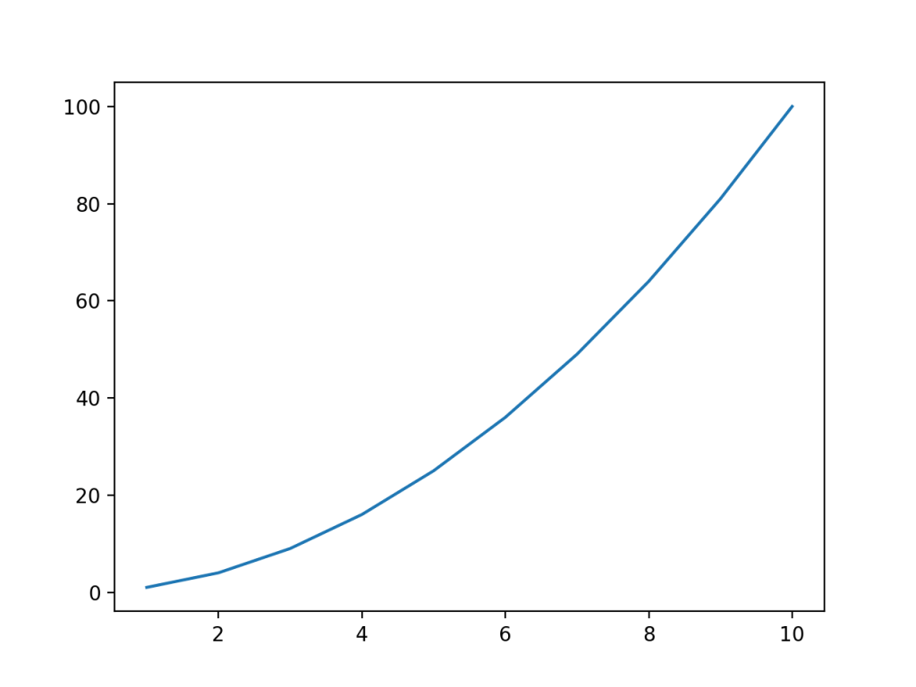
To follow along with this tutorial line by line, copy and paste the code below into your favourite code editor. We’ll be using a simple plot for this tutorial, in order to really focus on how to change the figure size of your plot in Matplotlib.
# Loading a Sample Plot
import matplotlib.pyplot as plt
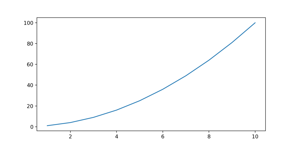
x = range(1, 11)
y = [i**2 for i in x]
plt.plot(x, y)
plt.show()This returns the following image:
Let’s break down what we did here:
- We loaded the
pyplotmodule asplt - We defined
xvalues as the values from 1 through 10 - We then used a Python list comprehension to define the
yvalues as the square of eachxvalue - We then passed these variables into the
plt.plot()function - Finally, we used the
.show()method to display the visualization
Changing Plot Size in Matplotlib Using figsize
One of the simplest and most expressive ways of changing the plot size in Matplotlib is to use the figsize= argument. As the name of the argument indicates, this is applied to a Matplotlib figure. Because of this, we first need to instantiate a figure in which to host our plot.
Let’s take a look at how we can do this:
# Changing the figure size using figsize=
import matplotlib.pyplot as plt

x = range(1, 11)
y = [i**2 for i in x]

plt.figure(figsize=(5, 5))
plt.plot(x, y)
plt.show()
This returns the following image:
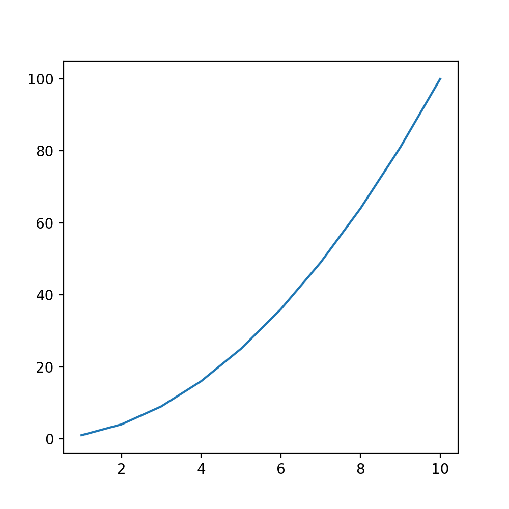
In the code above, we accessed the Figure that was created by default. In the code above, we assigned the figsize= parameter in order to specify the size of the figure we want to use. We passed in a tuple containing the width and the length in inches.
If you’re more accustomed to working with centimeters, you first need to convert the measurement to centimeters. This can be done by multiplying a value in inches by 2.54 to calculate it in centimeters.
Setting the DPI of a Matplotlib Figure
Matplotlib allows you to prepare print-friendly reports. In order to finely tune your printable reports, you can also control the DPI of the charts your produce. By default, Matplotlib uses a DPI of 100 pixels per inch. In order to mofidy this, you can use the dpi= parameter on the figure object.
Let’s change our DPI to 200 pixels per inch:
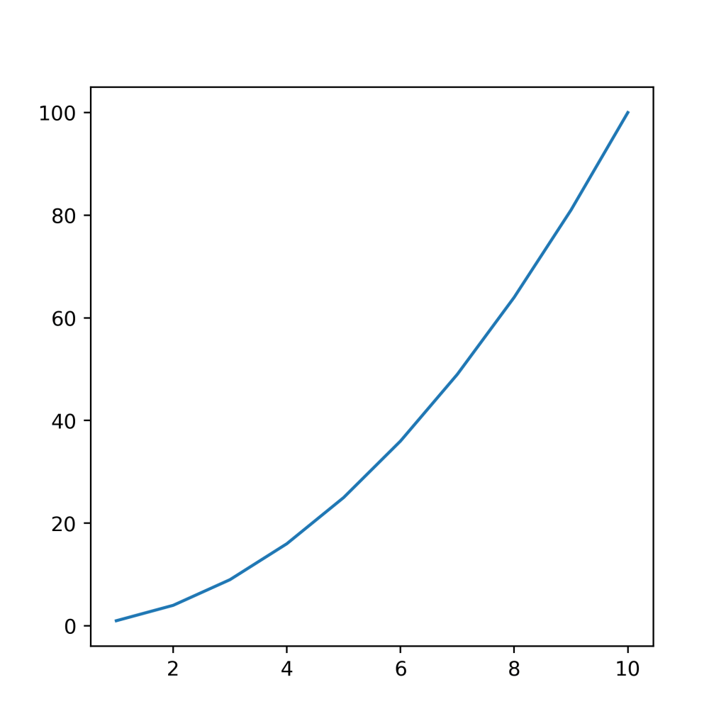
# Changing the DPI of a Matplotlib Chart
import matplotlib.pyplot as plt

x = range(1, 11)
y = [i**2 for i in x]

plt.figure(figsize=(5, 5), dpi=200)
plt.plot(x, y)
plt.show()
This returns the following image:
In the next section, you’ll learn how to use Matplotlib to set width and height individually.
Changing Plot Size in Matplotlib Using set_figheight and set_figwidth
Matplotlib also provides ways to more explicitly define the height and width individually, using the set_fightheight() and set_figwidth() functions. While the previous section showed you how to change the size in one argument, these functions give you the control to modify these parameters individually.
Let’s see how we can use these functions to modify the size of our plot in Matplotlib:
# Using Figure Functions to Change Matplotlib Chart Size
import matplotlib.pyplot as plt

x = range(1, 11)
y = [i**2 for i in x]

# Create a figure
fig = plt.figure()

# Set the width and height
fig.set_figwidth(4)
fig.set_figheight(6)

# Create an axes
ax = fig.add_subplot(1, 1, 1)
ax.plot(x, y)
plt.show()
This returns the following image:
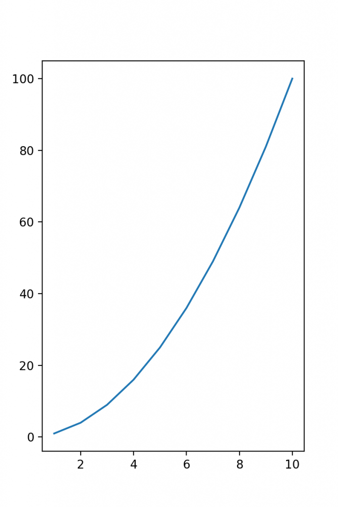
Let’s break down what we did here:
- We declared a figure object
- We then used the
set_figwidth()andset_figheight()functions to control the figure size - We then declared a subplot axes and added our plot
In the next section, you’ll learn how to use the rcParams in Matplotlib to change plot sizes.
Changing Plot Size in Matplotlib Using rcParams
We can change the figure size in Matplotlib globally using the rcParams available. This allows you to produce multiple visualizations and only modify the size a single time. This can be very valuable when you want to generate multiple plots and need them all to be the same size.
Let’s see how we can use rcParams to control the figure size in Matplotlib:
# Using rcParams to Change Figure Size in Matplotlib
import matplotlib.pyplot as plt

x = range(1, 11)
y = [i**2 for i in x]

plt.rcParams['figure.figsize'] = (8, 4)
plt.plot(x, y)
plt.show()
This returns the following image:
In the code above, we accessed the rcParams dictionary key for figure.figsize in order to pass in a tuple that contained the width and height of the figure.
Conclusion
In this tutorial, you learned how to change the figure size of a Matplotlib plot. You learned how to change the size of a plot using the figsize= parameter. Then, you learned how to use the figure object functions, set_figheight() and set_figwidth() functions to change the size of a Matplotlib plot. Finally, you learned how to use rcParams to change the size of a Matplotlib chart. You also learned how to control the DPI of a Matplotlib visualization.
Additional Resources
To learn more about related topics, check out the tutorials below:
- Plotting in Python with Matplotlib
- Matplotlib Scatter Charts – Learn all you need to know
- Matplotlib Bar Charts – Learn all you need to know
- Matplotlib Line Charts – Learn all you need to know
Introduction
Matplotlib is one of the most widely used data visualization libraries in Python. Much of Matplotlib’s popularity comes from its customization options — you can tweak just about any element from its hierarchy of objects.
In this tutorial, we’ll take a look at how to change a figure size in Matplotlib.
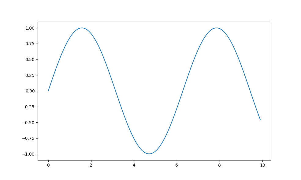
Creating a Plot
Let’s first create a simple plot in a figure:
import matplotlib.pyplot as plt
import numpy as np
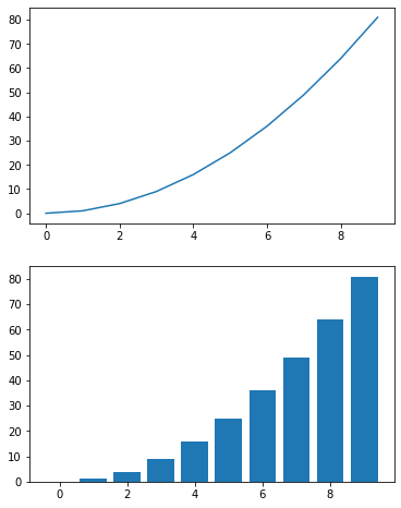
x = np.arange(0, 10, 0.1)
y = np.sin(x)
plt.plot(x, y)
plt.show()
Here, we’ve plotted a sine function, starting at 0 and ending at 10 with a step of 0.1. Running this code yields:
The Figure object, if not explicitly created, is created by default and contains all the elements we can and cannot see. Changing the size of the Figure will in turn change the size of the observable elements too.
Let’s take a look at how we can change the figure size.
Change Figure Size in Matplotlib
Set the figsize Argument
First off, the easiest way to change the size of a figure is to use the figsize argument. You can use this argument either in Pyplot’s initialization or on an existing Figure object.
Let’s first modify it during initialization:
import matplotlib.pyplot as plt
import numpy as np

x = np.arange(0, 10, 0.1)
y = np.sin(x)

plt.figure(figsize=(3, 3))
plt.plot(x, y)
plt.show()
Here, we’ve accessed the Figure instance that was created by default and passed the figsize argument. Note that the size is defined in inches, not pixels. This will result in a figure that’s 3in by 3in in size:
Matplotlib/PyPlot don’t currently support metric sizes, though, it’s easy to write a helper function to convert between the two:
def cm_to_inch(value):
    return value/2.54
And then adjust the size of the plot like this:
plt.figure(figsize=(cm_to_inch(15),cm_to_inch(10)))
This would create a plot with the size of 15cm by 10cm:
Alternatively, if you’re creating a Figure object for your plot, you can assign the size at that time:
import matplotlib.pyplot as plt
import numpy as np

x = np.arange(0, 10, 0.1)
y = np.sin(x)
z = np.cos(x)

fig = plt.figure(figsize=(8, 6))

# Adds subplot on position 1
ax = fig.add_subplot(121)
# Adds subplot on position 2
ax2 = fig.add_subplot(122)

ax.plot(x, y)
ax2.plot(x, z)
plt.show()
Here, we’ve explicitly assigned the return value of the figure() function to a Figure object. Then, we can add axes to this figure to create multiple subplots and plot on them.
Check out our hands-on, practical guide to learning Git, with best-practices, industry-accepted standards, and included cheat sheet. Stop Googling Git commands and actually learn it!
We’ve used the add_subplot() function, which accepts a series of numerical values. The first number specifies how many rows you want to add to the figure, the second number specifies how many columns you want to add, and the third number specifies the number of the plot that you want to add.
This means that if you in passed in 111 into the add_subplots() function, one new subplot would be added to the figure. Meanwhile, if you used the numbers 221, the resulting plot would have four axes with two columns and two rows — and the subplot you’re forming is in the 1st position.
This code results in:
Set the Height and Width of a Figure in Matplotlib
Instead of the figsize argument, we can also set the height and width of a figure. These can be done either via the set() function with the figheight and figwidth argument, or via the set_figheight() and set_figwidth() functions.
The former allows you to write one line for multiple arguments while the latter provides you with code that’s more readable.
Let’s go with the second option:
import matplotlib.pyplot as plt
import numpy as np

x = np.arange(0, 10, 0.1)
y = np.sin(x)
z = np.cos(x)

fig = plt.figure()

fig.set_figheight(5)
fig.set_figwidth(10)

# Adds subplot on position 1
ax = fig.add_subplot(121)
# Adds subplot on position 2
ax2 = fig.add_subplot(122)

ax.plot(x, y)
ax2.plot(x, z)
plt.show()
This code results in:
Finally, you can also use the set_size_inches() function as well:
fig = plt.figure()

fig.set_size_inches(10, 5)

# Adds subplot on position 1
ax = fig.add_subplot(121)
# Adds subplot on position 2
ax2 = fig.add_subplot(122)

ax.plot(x, y)
ax2.plot(x, z)
plt.show()
And this performs the same as setting the figsize argument or using the two functions:
Conclusion
In this tutorial, we’ve gone over several ways to change the size of a figure in Matplotlib.
If you’re interested in Data Visualization and don’t know where to start, make sure to check out our book on Data Visualization in Python.
If you’re interested in Data Visualization and don’t know where to start, make sure to check out our bundle of books on Data Visualization in Python:
Data Visualization in Python with Matplotlib and Pandas is a book designed to take absolute beginners to Pandas and Matplotlib, with basic Python knowledge, and allow them to build a strong foundation for advanced work with theses libraries — from simple plots to animated 3D plots with interactive buttons.
It serves as an in-depth, guide that’ll teach you everything you need to know about Pandas and Matplotlib, including how to construct plot types that aren’t built into the library itself.
Data Visualization in Python, a book for beginner to intermediate Python developers, guides you through simple data manipulation with Pandas, cover core plotting libraries like Matplotlib and Seaborn, and show you how to take advantage of declarative and experimental libraries like Altair. More specifically, over the span of 11 chapters this book covers 9 Python libraries: Pandas, Matplotlib, Seaborn, Bokeh, Altair, Plotly, GGPlot, GeoPandas, and VisPy.
It serves as a unique, practical guide to Data Visualization, in a plethora of tools you might use in your career.
Today in this article we shall study resize the plots and subplots using Matplotlib. We all know that for Data Visualization purposes, Python is the best option. It has a set of modules that run on almost every system. So, in this small tutorial, our task is to brush up on the knowledge regarding the same. Let’s do this!
Basics of Plotting
Plotting basically means the formation of various graphical visualizations for a given data frame. There are various types in it:
- Bar plots: A 2D representation of each data item with respect to some entity on the x-y scale.
- Scatter plots: Plotting of small dots that represent data points on the x-y axis.
- Histogram
- Pie chart etc
There are various other techniques that are in use in data science and computing tasks.
To learn more about plotting, check this tutorial on plotting in Matplotlib.
What are subplots?
Subplotting is a distributive technique of data visualization where several plots are included in one diagram. This makes our presentation more beautiful and easy to understand the distribution of various data points along with distinct entities.
Read more about subplots in Matplotlib.
Python setup for plotting
- Programming environment: Python 3.8.5
- IDE: Jupyter notebooks
- Library/package: Matplotlib, Numpy
Create Plots to Resize in Matplotlib
Let’s jump to create a few plots that we can later resize.
Code:
from matplotlib import pyplot as plt
import numpy as np

x = np.linspace(0, 10, 100)
y = 4 + 2*np.sin(2*x)

fig, axs = plt.subplots()
plt.xlabel("time")
plt.ylabel("amplitude")
plt.title("y = sin(x)")
axs.plot(x, y, linewidth = 3.0)
axs.set(xlim=(0, 8), xticks=np.arange(1, 8),
       ylim=(0, 8), yticks=np.arange(1, 8))

plt.show()
Output:
This is just a simple plot for the sine wave that shows the amplitude movement when time increases linearly. Now, we shall see the subplots that make things more simple.
For a practice play, I am leaving codes for cos(x) and tan(x). See, if the code works or not.
Code for cos(x):
from matplotlib import pyplot as plt
import numpy as np

x = np.linspace(0, 10, 100)
y = 4 + 2*np.cos(2*x)

fig, axs = plt.subplots()
plt.xlabel("time")
plt.ylabel("amplitude")
plt.title("y = cos(x)")
axs.plot(x, y, linewidth = 3.0)
axs.set(xlim=(0, 8), xticks=np.arange(1, 8),
       ylim=(0, 8), yticks=np.arange(1, 8))

plt.show()
Output:
Code for tan(x):
from matplotlib import pyplot as plt
import numpy as np

x = np.linspace(0, 10, 100)
y = 4 + 2*np.tan(2*x)

fig, axs = plt.subplots()
plt.xlabel("time")
plt.ylabel("amplitude")
plt.title("y = tan(x)")
axs.plot(x, y, linewidth = 3.0)
axs.set(xlim=(0, 8), xticks=np.arange(1, 8),
            ylim=(0, 8), yticks=np.arange(1, 8))

plt.show()
Output:
The figures in Matplotlib are having a predefined size layout. So, when we need to change their size then the plot class has a figure function. This function is responsible for making the view more relative to the screen. The user has the full right to edit the dimensions of the plot. We shall understand this with an example:
Code:
import random
from matplotlib import pyplot as plt

plt.figure(figsize = (5, 5))
x = []
y = []
plt.xlabel("X values")
plt.ylabel("Y values")
plt.title("A simple graph")
N = 50
for i in range(N):
    x.append(random.randint(0, 10))
    y.append(random.randint(0, 10))

plt.bar(x, y, color = "pink")
plt.show()
Output:
Explanation:
- In this code the first two lines of code import the pyplot and random libraries.
- In the second line of code, we use the figure() function. In that, the figsize parameter takes a tuple of the height and width of the plot layout.
- This helps us decide how much height we are giving.
- The random function inserts random values from ranges 1 to 10 in each of the two lists x, y.
- Then call the bar() function to create bar plots.
Resizing Plots in Matplotlib
This library is for creating subplots on a single axis or multiple axes. We can implement various bar plots on it. It helps to create common layouts for statistical data presentation.
Using figsize
Code example:
from matplotlib import pyplot as plt
import numpy as np

N = 5
menMeans = (20, 35, 30, 35, -27)
womenMeans = (25, 32, 34, 20, -25)
menStd = (2, 3, 4, 1, 2)
womenStd = (3, 5, 2, 3, 3)
ind = np.arange(N)    # the x locations for the groups
width = 0.35       # the width of the bars: can also be len(x) sequence

fig, ax = plt.subplots(figsize = (6, 6))

p1 = ax.bar(ind, menMeans, width, yerr=menStd, label='Men')
p2 = ax.bar(ind, womenMeans, width,
            bottom=menMeans, yerr=womenStd, label='Women')

ax.axhline(0, color='grey', linewidth=0.8)
ax.set_ylabel('Scores')
ax.set_title('Scores by group and gender')
ax.legend()

# Label with label_type 'center' instead of the default 'edge'
ax.bar_label(p1, label_type='center')
ax.bar_label(p2, label_type='center')
ax.bar_label(p2)

plt.show()
Output:
Explanation:
- The first two lines are import statements for modules.
- Then we define two tuples for men and women distribution values.
- To divide the graph the standard divisions are menStd and womenStd.
- Then the width of each bar is set to 0.35.
- We create two objects fig and ax of plt.subplot() function.
- This function has one parameter figsize. It takes a tuple of two elements depicting the resolution of the display image (width, height).
- Then we assign two variables p1 and p2 and call the bar() method using the ax instance.
- Then lastly just assign the labels to x-y axes and finally plot them.
Categorical plotting using subplots
The categorical data – information with labels plotting is also possible with matplotlib’s subplot. We can use the figsize parameter here to divide the plots into many sections.
Example:
from matplotlib import pyplot as plt

data = {'tiger': 10, 'giraffe': 15, 'lion': 5, 'deers': 20}
names = list(data.keys())
values = list(data.values())

fig, axs = plt.subplots(1, 3, figsize=(9, 3), sharey=True)
axs[0].bar(names, values)
axs[1].scatter(names, values)
axs[2].plot(names, values)
fig.suptitle('Categorical Plotting of presence of all the animals in a zoo')
Output:
Explanation:
- At first, we create a dictionary of all the key-value pairs.
- Then we create a list of all the keys and a separate list of all the values.
- After that create a simple instance of the subplots() class.
- To write the necessary parameters, we give 1 at first to declare the number of rows. 3 to declare the number of columns. Thus, there are three plots on a single column
- Here, figsize is equal to (9, 3).
- Then we place each plot on the axes. Using the list functionality,
- ax[0] = bar graph
- ax[1] = scatter plot
- ax[2] = a simple line graph
- These show the presence of all the animals in a zoo.
Conclusion
So, here we learned how we can make things easier using subplots. Using the figsize parameter saves space and time for data visualization. So, I hope this is helpful. More to come on this topic. Till then keep coding.

When creating plots using Matplotlib, you get a default figure size of 6.4 for the width and 4.8 for the height (in inches).
In this article, you’ll learn how to change the plot size using the following:
- The
figsize()attribute. - The
set_figwidth()method. - The
set_figheight()method. - The
rcParamsparameter.
Let’s get started!
As stated in the previous section, the default parameters (in inches) for Matplotlib plots are 6.4 wide and 4.8 high. Here’s a code example:
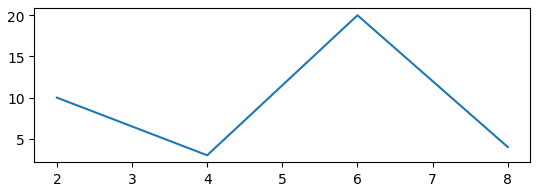
import matplotlib.pyplot as plt
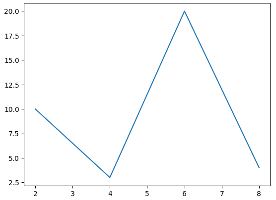
x = [2,4,6,8]
y = [10,3,20,4]
plt.plot(x,y)
plt.show()In the code above, we first imported matplotlib. We then created two lists — x and y — with values to be plotted.
Using plt.plot(), we plotted list x on the x-axis and list y on the y-axis: plt.plot(x,y).
Lastly, the plt.show() displays the plot. Here’s what the plot would look like with the default figure size parameters:
We can change the size of the plot above using the figsize() attribute of the figure() function.
The figsize() attribute takes in two parameters — one for the width and the other for the height.
Here’s what the syntax looks like:
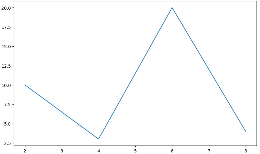
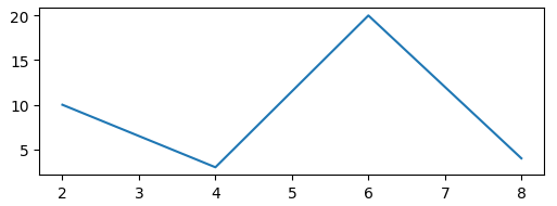
figure(figsize=(WIDTH_SIZE,HEIGHT_SIZE))Here’s a code example:
import matplotlib.pyplot as plt

x = [2,4,6,8]
y = [10,3,20,4]

plt.figure(figsize=(10,6))
plt.plot(x,y)

plt.show()
We’ve added one new line of code: plt.figure(figsize=(10,6)). This will modify/change the width and height of the plot.
Here’s what the plot would look like:
How to Change Plot Width in Matplotlib with set_figwidth()
You can use the set_figwidth() method to change the width of a plot.
We’ll pass in the value the width should be changed to as a parameter to the method.
This method will not change the default or preset value of the plot’s height.
Here’s a code example:
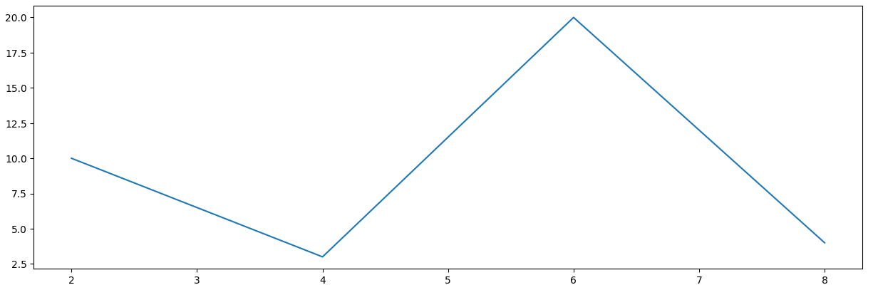
import matplotlib.pyplot as plt

x = [2,4,6,8]
y = [10,3,20,4]

plt.figure().set_figwidth(15)
plt.plot(x,y)

plt.show()
Using the set_figwidth() method, we set the width of the plot to 10. Here’s what the plot would look like:
How to Change Plot Height in Matplotlib with set_figheight()
You can use the set_figheight() method to change the height of a plot.
This method will not change the default or preset value of the plot’s width.
Here’s a code example:
import matplotlib.pyplot as plt

x = [2,4,6,8]
y = [10,3,20,4]

plt.figure().set_figheight(2)
plt.plot(x,y)

plt.show()
Using the set_figheight() in the example above, we set the plot’s height to 2. Here’s what the plot would look like:
How to Change Default Plot Size in Matplotlib with rcParams
You can override the default plot size in Matplotlib using the rcParams parameter.
This is useful when you want all your plots to follow a particular size. This means you don’t have to change the size of every plot you create.
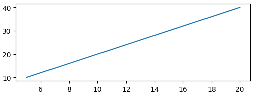
Here’s an example with two plots:
import matplotlib.pyplot as plt

x = [2,4,6,8]
y = [10,3,20,4]

plt.rcParams['figure.figsize'] = [4, 4]
plt.plot(x,y)

plt.show()
a = [5,10,15,20]
b = [10,20,30,40]
plt.plot(a,b)Using the figure.figsize parameter, we set the default width and height to 4: plt.rcParams['figure.figsize'] = [4, 4]. These parameters will change the default width and height of the two plots.
Here are the plots:
Summary
In this article, we talked about the different ways you can change the size of a plot in Matplotlib.
We saw code examples and visual representation of the plots. This helped us understand how each method can be used to change the size of a plot.
We discussed the following methods used in changing the plot size in Matplotlib:
- The
figsize()attribute can be used when you want to change the default size of a specific plot. - The
set_figwidth()method can be used to change only the width of a plot. - The
set_figheight()method can be used to change only the height of a plot. - The
rcParamsparameter can be used when want to override the default plot size for all your plots. Unlike the thefigsize()attribute that targets a specific plot, thercParamsparameter targets all the plots in a project.
Happy coding!
Learn to code for free. freeCodeCamp’s open source curriculum has helped more than 40,000 people get jobs as developers. Get started
In this Python Matplotlib tutorial, we’ll discuss the Matplotlib increase plot size in python. Here we will cover different examples related to the increase of the plot size using matplotlib. Moreover, we’ll also cover the following topics:
- Matplotlib increase plot size
- Matplotlib increase plot size jupyter
- Matplotlib increase plot size subplots
- Matplotlib pyplot set_size_inches
- Pandas matplotlib increase plot size
- Matplotlib change figure size and dpi
- Matplotlib plot change point size
- Matplotlib set plot size in pixels
- Matplotlib change default plot size
- Matplotlib change bar plot size
- Matplotlib change scatter plot size
- Matplotlib set plot window size
- Matplotlib change figure size fig ax
- Matplotlib set plot size in centimeter
Plots are a great method to graphically depict data and summarise it in a visually attractive way. However, if not plotted properly, it appears to be complex.
In matplotlib, we have several libraries for the representation of data. While creating plots in matplotlib, it is important for us to correct their size, so that we properly visualize all the features of the plot.
Also, check: Matplotlib plot a line
Matplotlib increase plot size jupyter
In this section, we’ll learn to increase the size of the plot using matplotlib in a jupyter notebook.
The syntax is given below:
matplotlib.pyplot.rcParams["figure.figsize"]The above syntax is used to increase the width and height of the plot in inches. By default, the width is 6.4 and the height is 4.8.
Let’s see examples:
Example #1
Here we’ll see an example to increase the size of the plot in the jupyter notebook.
# Import Library

import matplotlib.pyplot as plt

# Increase size of plot in jupyter

plt.rcParams["figure.figsize"] = (8,5.5)

# Define Data

x = [2, 4, 6, 8]
y = [5, 10, 15, 20]

# Plot

plt.plot(x, y, '-.')

# Display

plt.show()- Firstly, import the matplotlib.pyplot library
- Next, to increase the size of the plot in the jupyter notebook use plt.rcParams[“figure.figsize”] method and set width and height of the plot.
- Then, define the data coordinates used for plotting.
- To plot a graph, use the plot() function and also set the style of the line to dot-dash.
- To display the plot, on the user’s screen use the show() function.

Example #2
The source code below elaborates the process of increasing size in a jupyter notebook using matplotlib.
# Import Library

import matplotlib.pyplot as plt
import numpy as np

# Increase size of plot in jupyter

plt.rcParams["figure.figsize"] = (10,6)

# Define Data

x = np.linspace(0, 10, 1000)
y = np.sin(x)

# Plot

plt.plot(x, y)

# Display

plt.show()
Here we define data coordinates by using linspace() function and sin() function of numpy module.

Read: What is matplotlib inline
Matplotlib increase plot size subplots
Here we’ll learn to increase the plot size of subplots using matplotlib. There are two ways to increase the size of subplots.
- Set one size for all subplots
- Set individual sizes for subplots
Set one size for all subplots
Here we’ll see examples where we set one size for all the subplots.
The following is the syntax:
fig, ax = plt.subplots(nrows , ncols , figsize=(width,height))Example #1
Here is the example where we increase the same size for all the subplots.
# Import necessary libraries

import matplotlib.pyplot as plt
import numpy as np

# Set one size for all subplot

fig, ax = plt.subplots(2, 2, figsize=(10,8))

# Preparing the data to subplots

x = np.linspace(0,10,100)
y1 = x ** 2
y2 = x ** 4
y3 = x ** 6
y4 = x ** 8

# Plot

ax[0, 0].plot(x, y1, color='r')
ax[0, 1].plot(x, y2, color='k', linestyle=':')
ax[1, 0].plot(x, y3, color='y', linestyle='-.')
ax[1, 1].plot(x, y4, color='c',linestyle='--')

# Display

plt.show()- Import necessary libraries, such as matplotlib.pyplot, and numpy.
- Then create subplots with 2 rows and 2 columns, using the subplots() function.
- To set one size for all subplots, use the figsize() function with width and height parameters.
- Define data coordinates used for plotting.
- To plot the subplots, use the plot() function with axes.
- To set different linestyles of the plotted lines, use linestyle parameter.
- To visualize the subplots, use the show() function.

Example #2
Let’s see one more example to set the same size for all the subplots to understand the concept more clearly.
# Import necessary libraries

import matplotlib.pyplot as plt
import numpy as np

# Change the figure size

plt.figure(figsize=[15,14])

# Preparing the data to subplots

x = np.linspace(0, 10, 1000)
y1 = np.sin(x)
y2 = np.cos(x)

# Plot the subplots

# Plot 1

plt.subplot(2, 2, 1)
plt.plot(x, y1, color='g')

# Plot 2

plt.subplot(2, 2, 2)
plt.plot(x, y2, color='k')

# Display


plt.show()- To define data coordinates, we use linspace(), sin() and cos() functions of numpy.
- Here we increase the size of all subplots, using the figure() method and we pass the figsize() as a parameter and set the width and height of the subplots.

Set individual sizes for subplots
Here we’ll see different examples where we set individual sizes for subplots using matplotlib.
The following is the syntax:
fig, ax = plt.subplots(nrows, ncols, gridspec_kw=
                       {'width_ratios': [3, 1],
                        'height_ratios’: [3, 3]})
Example:
The source code below elaborates the process of increasing the size of the individual subplots.
# Import Library

import matplotlib.pyplot as plt

# Define subplots

fig, ax = plt.subplots(1, 2,
                      gridspec_kw={'width_ratios': [8,15]})

# Define data

x = [1, 2, 3, 4, 5]
y1 = [7, 13, 24, 26, 32]
y2 = [2, 4, 6, 8, 10]

# Create subplots

ax[0].plot(x, y1, color='red', linestyle=':')
ax[1].plot(x, y2, color='blue', linestyle='--')

# Adjust padding

plt.tight_layout()

# Display

plt.show()- Import matplotlib.pyplot library.
- Then create subplots with 1 row and 2 columns, using the subplots() function.
- To set the individual sizes for subplots, use gridspec_kw() method. The gridpec_kw is a dictionary with keywords that can be used to change the size of each grid.
- Next, define data coordinates to plot data.
- To plot a line chart, use plot() function.
- To auto adjust padding, use tight_layout() function.
- To visualize the subplots, use show() function.

Example #2
The process of increasing the size of specific subplots is explained in the source code below.
# Import Library

import matplotlib.pyplot as plt

# Define subplots

fig, ax = plt.subplots(1, 2, gridspec_kw={'width_ratios':
                       [10,4]})

# Define data

x = np.arange(0, 30, 0.2)
y1 = np.cos(x)
y2 = np.sin(x)

# Create subplots

ax[0].plot(x, y1, color='red', linestyle=':')
ax[1].plot(x, y2, color='blue', linestyle='--')

# Adjust padding

plt.tight_layout()

# Display


plt.show()
To plot a data, we define data coordinates, by using arange(), cos() and sin() functions of numpy.

Read: Matplotlib plot bar chart
Matplotlib pyplot set_size_inches
In matplotlib, to set the figure size in inches, use the set_size_inches() method of the figure module.
The following is the syntax:
matplotlib.figure.Figure.set_size_inches(w, h)Here w represents the width and h represents the height.
Let’s see different examples:
Example #1
Here is an example to increase the plot size by using the set_size_inches method.
# Import Libraries

import matplotlib.pyplot as plt

# Create figure

fig = plt.figure()

# Figure size

fig.set_size_inches(6.5, 6)

# Define Data Coordinates

x = [10, 20, 30, 40, 50]
y = [25, 25, 25, 25, 25]

# Plot

plt.plot(x, y, '--')
plt.plot(y, x)

# Display

plt.show() - Import matplotlib.pyplot library.
- Next, create a new figure by using the figure() function.
- To set the figure size in inches, use the set_size_inches() function and pass the width and the height as a parameter, and set their value to 6.5 and 6 respectively.
- Then, define the x and y data coordinates used for plotting.
- To plot the line chart, use the plot() function.

Example #2
Here we create a line chart using x and y coordinates (define by arange and sin function). We set the width of the plot to 12 and the height to 10 inches by using the set_size_inches function.
# Import Libraries

import matplotlib.pyplot as plt
import numpy as np

# Create figure

fig = plt.figure()

# Figure size

fig.set_size_inches(12,10)

# Define Data Coordinates

x = np.arange(0,4*np.pi,0.1)
y = np.sin(4*x)

# Plot

plt.plot(x, y, '--')

# Display

plt.show()
Here we define x and y data coordinates by using arange(), pi, and sin() function of numpy.

Read: Matplotlib subplots_adjust
Pandas matplotlib increase plot size
In Pandas, the figsize parameter of the plot() method of the matplotlib module can be used to change the size of a plot bypassing required dimensions as a tuple. It is used to calculate the size of a figure object.
The following is the syntax:
figsize=(width, height)Width and height must be in inches.
Let’s see different examples:
Example #1
In this example, we’ll create a pie chart using pandas dataframe and increase the size of the plot.
# Import Library

import pandas as pd

# Creat pandas dataframe

df = pd.DataFrame({'Owner': [50, 15, 8, 20, 12]},
                  index=['Dog', 'Cat', 'Rabbit',
                         'Parrot','Fish'])

# Plot

df.plot.pie(y='Owner', figsize=(8,8))

# Display

plt.show()- Import the pandas module.
- After this, create a pandas dataframe with an index.
- To plot a pie chart, use df.plot.pie() function.
- To increase the size of the plot, pass the figsize() parameter along with dimensions.

Example #2
We’ll make a line chart with a pandas dataframe and increase the plot size in this example.
# Import libraries

import pandas as pd
import matplotlib.pyplot as plt

# Data

data = {'Year': [2021, 2020, 2019, 2018, 2017, 2016, 2015,
                2014],
        'Birth_Rate': [17.377, 22.807, 26.170, 18.020, 34.532,
                       18.636, 37.718, 19.252]
}

# Create DataFrame

df = pd.DataFrame(data,columns=['Year','Birth_Rate'])

# Line Plot

df.plot(x ='Year', y='Birth_Rate', kind = 'line',
        figsize=(8,6))

# Display

plt.show()- Create a dataframe in pandas using the DataFrame() method.
- Next, plot the DataFrame using df.plot() function.
- Here we set the kind parameter to the line in order to plot the line chart.
- To increase the size of the plot, pass the figsize() parameter along with dimensions.

Read: Matplotlib set y axis range
Matplotlib change figure size and dpi
Here we’ll learn to change the figure size and the resolution of the figure using matplotlib module.
The following is the syntax:
matplotlib.pyplot.figure(figsize=(w,h), dpi)Let’s see examples related to this:
Example #1
In this example, we plot a line chart and change its size and resolution.
# Import Libraries

import matplotlib.pyplot as plt
from matplotlib.pyplot import figure

# Set fig size and dpi

figure(figsize=(8,6), dpi=250)

# Define Data

x = range(0,12)

# Plot

plt.plot(x)

# Display

plt.show()- First use matplotlib.pyplot.figure to create a new figure or activate one that already exists.
- The method takes a figsize argument, which is used to specify the figure’s width and height (in inches).
- Then, enter a dpi value that corresponds to the figure’s resolution in dots-per-inch.

Example #2
Here we’ll see one more example related to the change in size and resolution of the figure to understand the concept more clearly.
# Import Libraries

import matplotlib.pyplot as plt
from matplotlib.pyplot import figure
import numpy as np

# Set fig size and dpi

figure(figsize=(6,4), dpi=150)

# Define Data

x = np.random.randint(450,size=(80))

# Plot

plt.plot(x)

# Display

plt.show()- To define data coordinates, here we use random.randint() method of numpy.
- Here we set the width, height, and dpi of the figure to 6, 4, and 150 respectively.

Read: Matplotlib update plot in loop
Matplotlib plot change point size
Here we’ll learn how to change marker size in matplotlib with different examples.
The following is the syntax:
matplotlib.pyplot.scatter(x , y , s)Here x and y specify the data coordinates and s specify the size of the marker.
Example #1
Here we’ll see an example where we set a single size for all the points.
# Import Library

import matplotlib.pyplot as plt

# Define Data

A = [6, 7, 2, 5, 4, 8]
B = [12, 14, 17, 20, 22, 27]

# Scatter Plot and set size

plt.scatter(A, B, s=80)

# Display

plt.show()- Import matplotlib.pyplot library.
- Next, define A and B data coordinates.
- To plot a scatter graph, use the scatter() function.
- To set the same size to all points, use s as an argument and set the size.
- To visualize the pot, use the show() function.

Example #2
Here we’ll see an example where we set different sizes for each point
# Import Library

import matplotlib.pyplot as plt

# Define Data

x = [6, 7, 2, 5, 4, 8]
y = [12, 14, 17, 20, 22, 27]

# Define Size

sizes = [20, 55, 85, 150, 250, 9]

# Scatter Plot and set size

plt.scatter(x, y, s=sizes)

# Display

plt.show()- Import matplotlib.pyplot library.
- Next, define data coordinates.
- Then, define different sizes for each point.
- To plot a scatter graph, use the scatter() function and set the size pass s parameter.
- To display the plot, use the show() function.

Example #3
Here we’ll see an example where we define the point size for each point in the plot.
# Import Library

import matplotlib.pyplot as plt

# Define Data

x = [2, 4, 6, 8, 10, 12, 14, 16]
y = [4, 8, 12, 16, 20, 24, 28, 32]

# Define Size

sizes = [3**n for n in range(len(x))]

# Scatter Plot and set size

plt.scatter(x, y, s=sizes, color='red')

# Display

plt.show()- Import matplotlib.pyplot library for data visualization.
- Define data coordinates.
- Create a function to define the point sizes to use for each point in the plot.
- To plot a scatter graph, use the scatter() function.

Read: Matplotlib Pie Chart Tutorial
Matplotlib set plot size in pixels
Here we’ll see examples where we convert inches to pixels and plot the graph using matplotlib module.
Example #1
In the below example we’ll change the plot size by using the pixel conversion method.
# Import Libraries

import matplotlib.pyplot as plt
from matplotlib.pyplot import figure
import numpy as np

px = 1/plt.rcParams["figure.dpi"]

# Set fig size in Pixel

figure(figsize=(600 * px , 450 * px))

# Define Data

x = np.random.randint(800,size=(120))

# Plot

plt.plot(x)

# Display


plt.show()- Import necessary libraries such as matplotlib.pyplot, figure, and numpy.
- Then use, default pixels values, rcParams[‘figure.dpi’] to set values to px.
- Now, set figsize in pixels.
- Then, define the data coordinates for plotting.
- To plot the line chart, use the plot() function.
- To display the plot, use the show() function.
Example #2
Here we change the plot size in pixels by using the dpi argument.
# Import Libraries

import matplotlib.pyplot as plt
from matplotlib.pyplot import figure

# Set fig size and dpi

figure(dpi=100)

# Define Data Coordinates

water_quantity = [17, 27, 14, 22, 16, 6]

# Add labels

water_uses = ['Shower', 'Toilet', 'Leaks', 'Clothes Wsher',
              'Faucet', 'Other']

# Colors

colors =['salmon','palegreen','skyblue','plum','pink','silver']

# Plot

plt.pie(water_quantity, colors=colors)

# Add legend

plt.legend(labels=water_uses, fontsize=18, loc='upper center',
           bbox_to_anchor=(0.5, -0.04), ncol=2)

# Display

plt.show() - Here we use, the dpi parameter to set the plot in pixels with the figure() function.
- Next, we define data coordinates, labels, and colors for pie chart creation,
- To plot a pie chart, we use the pie() function.
- To add a legend to a plot, we use the legend() function.
Read: Matplotlib scatter plot color
Matplotlib change default plot size
In Matplotlib, the dictionary object rcParams contains the properties. The figure size could be used as the key figure’s value in figsize in rcParams, which represents the size of a figure.
To change the size by default, we use plt.rcParams. It is acceptable when we placed it before or after plt.plot. Any figure made using the same scripts will be assigned the same figure size.
Let’s see examples:
Example #1
Here we’ll set the default, size of the figure to 7 by 7.
# Import Library

import matplotlib.pyplot as plt

# Default plot size

plt.rcParams["figure.figsize"] = (7,7)

# Plot


plt.plot([[5, 6], [9, 10], [1, 2], [1, 2]])

# Show


plt.show()- Import matplotlib.pyplot library.
- To set default plot size, use plt.rcParams[“figure.figsize”].
- To plot a chart, use the plot() function.

Read: Matplotlib Plot NumPy Array
Matplotlib change bar plot size
Here we’ll learn the different ways to change the size of the bar plot using the matplotlib module with the help of examples.
Example #1
Here we’ll use the figsize() method to change the bar plot size.
# Import Library

import matplotlib.pyplot as plt

# Change size

plt.figure(figsize=(9,7))

# Define Data

pets = ['Rabbit', 'Dog', 'Cat', 'Goldfish', 'Parrot']
no_of_people = [4, 8, 11, 6, 5]

# Plot bar chart

plt.bar(pets, no_of_people)

# Display

plt.show()- Import matplotlib.pyplot library.
- To change the figure size, use figsize argument and set the width and the height of the plot.
- Next, we define the data coordinates.
- To plot a bar chart, use the bar() function.
- To display the chart, use the show() function.

Example #2
In this example, we’ll change the size of the bar chart by using rcParams.
# Import Library

import matplotlib.pyplot as plt

# Change size

plt.rcParams['figure.figsize']=(8,6.5)

# Define Data

school_suppiles = ['Pencil', 'Scale', 'Pen', 'Sharpner',
                   'Eraser']
no_of_suppiles = [8, 3, 2, 5, 4]

# Plot bar chart

plt.bar(school_suppiles, no_of_suppiles)

# Display

plt.show()
Here we use the default method, to change the size of bar plots i.e. by using plt.rcParams[‘figure.figsize’].

Read: Matplotlib set_xticklabels
Matplotlib change scatter plot size
Here we’ll learn the different ways to change the size of the scatter plot using the matplotlib module with the help of examples.
Example #1
Here we’ll learn to change the size of scatter plot by using figsize.
# Import Library

import matplotlib.pyplot as plt

# Set size

plt.figure(figsize=(8,5))

# Define Dataset

x1 = [45, 58, 29, 83, 95, 20,
      98, 27]

y1 = [31, 75, 8, 29, 79, 55,
      43, 72]

x2 = [23, 41, 25, 64, 3, 15,
      39, 66]

y2 = [26, 34, 38,
      20, 56, 2, 47, 15]


# Plot Scatter Graph

plt.scatter(x1, y1, c ="cyan",
            marker ="s",
            edgecolor ="black",
            s = 50)

plt.scatter(x2, y2, c ="yellow",
            linewidths = 2,
            marker ="^",
            edgecolor ="red",
            s = 200)

# Display


plt.show()- Import matplotlib.pyplot library.
- To set figure size, use the figsize parameter and set the width and height of the figure.
- Define datasets to plot to scatter graph.
- To plot a scatter plot, use the scatter method.
- To add extra features to the plot, pass color, size, marker, edgecolor, marker as a parameter.

Example #2
In this example, we use the set_size_inches method change the size of the scatter plot.
# Import Libraries

import matplotlib.pyplot as plt
import numpy as np

# Create figure

fig = plt.figure()

# Figure size

fig.set_size_inches(6,8)

# Define Data

x = np.linspace(0, 10, 100)
y = np.sin(x)

# Plot

plt.scatter(x, y)

# Display


plt.show()- Import necessary libraries such as matplotlib.pyplot and numpy.
- Then create a new figure by using the figure() method.
- To set the size of the scatter plot, use the set_size_inches() method and pass width and height.
- To define data coordinates, use linspace() and sin() methods.
- To plot a scatter graph, use the scatter() function.

Read: Matplotlib tight_layout – Helpful tutorial
Matplotlib change figure size fig ax
We can easily change the height and the width of the plot by using the set_figheight and the set_figwidth method of the matplotlib module.
Let’s see examples related to this concept:
Example #1
Here we set the width of the plot, by using the set_figwidth method.
# Import Library

import numpy as np
import matplotlib.pyplot as plt

# Set width

fig = plt.figure()
fig.set_figwidth(8)

# Data Coordinates

x = np.arange(2, 8)
y = np.array([5, 8, 6, 20, 18, 30])

# Plot

plt.plot(x, y, linestyle='--')

# Display

plt.show()- First import necessary libraries, such as numpy and matplotlib.pyplot.
- Next, use the set_figwidth() method to change the width of the plot.
- To define data coordinates, use arange() and array() methods of numpy.
- To plot a line graph with a dashed line style, use the plot() function with linestyle parameter.

Example #2
Here we set the height of the plot, by using the set_figheight method.
# Import Library

import numpy as np
import matplotlib.pyplot as plt

# Set height

fig = plt.figure()
fig.set_figheight(8)

# Data Coordinates

x = np.arange(2, 8)
y = np.array([5, 8, 6, 20, 18, 30])

# Plot

plt.plot(x, y, linestyle='--')

# Display

plt.show()- First import necessary libraries, such as numpy and matplotlib.pyplot.
- Next, use the set_figheight() method to change the height of the plot.
- To define data coordinates, use arange() and array() methods of numpy.

Read: Matplotlib x-axis label
Matplotlib set plot size in centimeter
In matplotlib by default, the figure size is in inches. Here we’ll learn to set plot size in centimeter with the help of an example.
Example:
# Import Library

import numpy as np
import matplotlib.pyplot as plt

# Set Size

cm = 1/2.54
plt.figure(figsize=(15*cm, 11*cm))

# Data Coordinates

x = np.arange(2, 8)
y = x * 2 + 6

# Plot

plt.plot(x, y)

# Display

plt.show()- Import numpy library.
- Next, import the matplotlib library.
- Set figure size by conversion inches to centimeters.
- Define data coordinates x and y.
- To plot a line chart, we use the plot() function.

You may also like to read the following Matplotlib tutorials.
- Matplotlib scatter plot legend
- Matplotlib multiple bar chart
- Stacked Bar Chart Matplotlib
- Matplotlib multiple plots
- Draw vertical line matplotlib
In this Python tutorial, we have discussed the “Matplotlib increase plot size” and we have also covered some examples related to it. These are the following topics that we have discussed in this tutorial.
- Matplotlib increase plot size
- Matplotlib increase plot size jupyter
- Matplotlib increase plot size subplots
- Matplotlib pyplot set_size_inches
- Pandas matplotlib increase plot size
- Matplotlib change figure size and dpi
- Matplotlib plot change point size
- Matplotlib set plot size in pixels
- Matplotlib change default plot size
- Matplotlib change bar plot size
- Matplotlib change scatter plot size
- Matplotlib set plot window size
- Matplotlib change figure size fig ax
- Matplotlib set plot size in centimeter

Python is one of the most popular languages in the United States of America. I have been working with Python for a long time and I have expertise in working with various libraries on Tkinter, Pandas, NumPy, Turtle, Django, Matplotlib, Tensorflow, Scipy, Scikit-Learn, etc… I have experience in working with various clients in countries like United States, Canada, United Kingdom, Australia, New Zealand, etc. Check out my profile.
Have you recently started working on graphs and plots using the matplotlib library and don’t know how to change the size of the figures according to your will? Don’t worry. In this article, we will help you manage the size of the plots as you like. If you have not explored the world of matplotlib until now, you can start from here. So, let us learn how to use the matplotlib figsize attribute to adjust the size of the graph.
Matplotlib Figsize is a method used to change the dimension of your matplotlib window. Currently, the window is generated of 6.4×4.8 inches by default. Using this module, you can change it at any size.
What is Figsize in Python?
Matplotlib Figsize is a method from the pyplot class which allows you to change the dimensions of the graph. As every dimension in generated graphs is adjusted by the library, it can be quite difficult to visualize data in a proper format. As a result, the figsize method is very useful to customize the dimensions as well as layouts of the graphs.
We can make the figure taller in size, broader by changing the size in inches.
To make a plot or a graph using matplotlib, we first have to install it in our system using pip install matplotlib.
Also, figsize is an attribute of figure() class of pyplot submodule of matplotlib library. So, the syntax is something like this-
matplotlib.pyplot.figure(figsize=(float,float))
Parameters-
- Width – Here, we have to input the width in inches. The default width is 6. To broaden the plot, set the width greater than 1. And to make the graph less broad, set the width less than 6.
- Height – Here, we have to input the height of the graph. The default value is 4. To increase the length, set the height greater than 4, and to decrease the height set the height less than 4.
What is default Figsize Matplotlib?
In Matplotlib all the diagrams are created at a default size of 6.4 x 4.8 inches. This size can be changed by using the Figsize method of the respective figure. This parameter is governed under the rcParams attribute of the figure. By using Figsize, you can change both of these values.
The default figure size values are stored as a list of two float objects. For example, rcParams[“figure. figsize”] will be equal to [6.4, 4.8] in a programmatic way.
What is rcParams figure Figsize?
rcParams is a dictionary attribute in Matplotlib figure class that allows you to customize the look of your graph. This attribute is responsible for carrying data of figure size, figure DPI, figure facecolor, and figure edgecolor. All of these are initialized to default values of [6.4, 4.8], 100, ‘w’, and ‘w’ respectively.
Figsize is a key in rcParams which changes the figure size of your data visualization. As of now, you cannot change the rcParams directly, but you can use different methods like figsize to do it.
What are Matplotlib Figsize Units?
Matplotlib have general way of keeping all the distances in inches. For figsize too, the units are measured in inches by default. if you want a to use a different unit for the figsize, you can achieve it by creating a converting function. Following example explains a way to initialize the Figsize in centimeters (cm) –
Code –
import matplotlib.pyplot as plt
import numpy as np

def cm_to_inch(value):
    return value/2.54

x = np.arange(0, 10, 0.1)
y = np.sin(x)

plt.figure(figsize=(cm_to_inch(25), cm_to_inch(15)))
plt.plot(x, y)
plt.show()
Output –
Explanation –
We first start by importing the matplotlib library. Then we create an array of x-axis whose value ranges from 0 to 10 at 0.1 intervals. np.sin() function generates a sine wave function values. The function cm_to_inch() converts all the values of centimeters to inches and initializes the dimensions of the figure.
Changing the Height and Width of the Graph
Both height and width can be changed by the figure.figsize() method. Following example demonstrates the figures with default size and after them are the customized figures of different dimensions.
Graph with Default Size
Let us first know how to make a graph without setting any specific size and see if it is our desirable size or not.
We will create a simple plot by creating our own data.
import matplotlib.pyplot as plt
x=[1,2,3,4,5,6,7,8,9]
y=[i**2 for i in x]
plt.plot(x,y)
plt.title("Plot of Default Size")
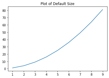
Changing the Height using Matplotlib Figsize
Suppose we have a pandas data frame that contains information about some sports and how many people play those sports. Something like this-
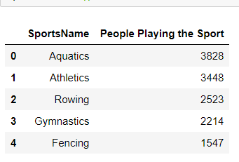
We want to make a bar chart from it, let us first make a graph with the default size. I have made that data frame in the form of an array to make the task easy.
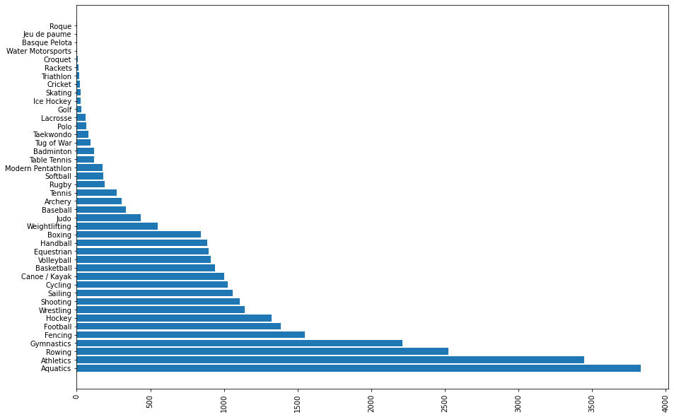
# import the pyplot submodule of matplotlib library
# and rename it as plt
import matplotlib.pyplot as plt

# name of the sports
sports_name=['Aquatics', 'Athletics', 'Rowing', 'Gymnastics', 'Fencing', 'Football','Hockey', 'Wrestling', 'Shooting', 'Sailing', 'Cycling','Canoe / Kayak', 'Basketball', 'Volleyball', 'Equestrian', 'Handball','Boxing', 'Weightlifting', 'Judo', 'Baseball', 'Archery', 'Tennis','Rugby', 'Softball', 'Modern Pentathlon', 'Table Tennis', 'Badminton','Tug of War', 'Taekwondo', 'Polo', 'Lacrosse', 'Golf', 'Ice Hockey','Skating', 'Cricket', 'Triathlon', 'Rackets', 'Croquet','Water Motorsports', 'Basque Pelota', 'Jeu de paume', 'Roque']

# These are people which play the respective sport
people_playing_the_sports=[3828, 3448, 2523, 2214, 1547, 1387, 1325,140,105,1061,1025,1002,940,910,894,886,842,548,435,335,305,272,192,180,174,120,120,94,80,66,59,30,27,27,24,18,10,8,5,4,3,3]

# To create a bar graph use bar function of pyplot
plt.bar(sports_name,people_playing_the_sports)
# Rotate the name of sports by 90 degree in x-axis
plt.xticks(rotation=90)
# show the graph
plt.show()
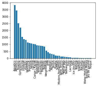
We can see that due to a lack of space, the graph is too untidy. For a better-looking graph, we need to change the width of the graph. Let us see how we will do that.
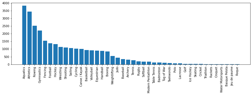
import matplotlib.pyplot as plt
people_playing_the_sports=[3828, 3448, 2523, 2214, 1547, 1387, 1325,1140,105,1061,1025,1002,940,910,894,886,842,548,435,335,305,272,192,180,174,120,120,94,80,66,59,30,27,27,24,18,10,8,5,4,3,3]

sports_name=['Aquatics', 'Athletics', 'Rowing', 'Gymnastics', 'Fencing', 'Football','Hockey', 'Wrestling', 'Shooting', 'Sailing', 'Cycling','Canoe / Kayak', 'Basketball', 'Volleyball', 'Equestrian', 'Handball','Boxing', 'Weightlifting', 'Judo', 'Baseball', 'Archery', 'Tennis','Rugby', 'Softball', 'Modern Pentathlon', 'Table Tennis', 'Badminton','Tug of War', 'Taekwondo', 'Polo', 'Lacrosse', 'Golf', 'Ice Hockey',
'Skating', 'Cricket', 'Triathlon', 'Rackets', 'Croquet',
'Water Motorsports', 'Basque Pelota', 'Jeu de paume', 'Roque']

# Increase the width
plt.figure(figsize=(15,4))
plt.bar(Sports,people_playing_the_sports)
plt.xticks(rotation=90)
plt.show()
Isn’t it a lot better now? Just changing the size of the graph has made such a huge impact and now we can understand the graph a lot better.
Changing the Height of the Graph using Matplotlib Figsize
Suppose we have created the same bar chart horizontally, the default height would look untidy, right? Let us see how we can increase the height of the graph.
import matplotlib.pyplot as plt

people_playing_the_sports=[3828, 3448, 2523, 2214, 1547, 1387, 1325,1140,1105,1061,1025,1002,940,910,894,886,842,548,435,335,305,272,192,180,174,120,120,94,80,66,59,30,27,
27,24,18,10,8,5,4,3,3]

sports_name=['Aquatics', 'Athletics', 'Rowing', 'Gymnastics', 'Fencing', 'Football','Hockey', 'Wrestling', 'Shooting', 'Sailing', 'Cycling','Canoe / Kayak', 'Basketball', 'Volleyball', 'Equestrian', 'Handball','Boxing', 'Weightlifting', 'Judo', 'Baseball', 'Archery', 'Tennis','Rugby', 'Softball', 'Modern Pentathlon', 'Table Tennis', 'Badminton','Tug of War', 'Taekwondo', 'Polo', 'Lacrosse', 'Golf', 'Ice Hockey',
'Skating', 'Cricket', 'Triathlon', 'Rackets', 'Croquet',
'Water Motorsports', 'Basque Pelota', 'Jeu de paume', 'Roque']

# Increase the width and the height
plt.figure(figsize=(15,10))
plt.barh(Sports,people_playing_the_sports)
plt.xticks(rotation=90)
plt.show()
Explanation –
Firstly, we start by importing the matplotlib library. then we declared the players playing the sports and sports name in the list. Then by initializing the matplotlib figure by using a parameter of figsize, we can create a bigger-sized output. In our case, we’ve initialized it to 15 x 10 inches. As you can observe from the output, the data is widely spaced and it’s larger than the default dimensions.
Changing the figsize of the Matplotlib Subplots
We can also create subplots using matplotlib. In subplots, we create multiple subplots in a single figure. The more the number of subplots in a figure, the size of the subplot keeps changing. We can change the size of the figure and whatever size we give will be divided into subplots.
import matplotlib.pyplot as plt
# make subplots with 2 rows and 1 column.
# We If there were 3 rows, we would have done-fig, (ax1,ax2,ax3)
fig, (ax1,ax2) = plt.subplots(nrows=2,ncols=1,figsize=(6,8))
y=[i*i for i in range(10)]
#plotting for 1st subplot
ax1.plot(range(10),y)
#plotting for 2nd subplot
ax2.bar(range(10),y)
Matplotlib Figsize Not Working Error
Sometimes, we may get an error- ‘matplotlib figsize not working’. This happens when we first plot the graph and then set the figsize.
import matplotlib.pyplot as plt
technologies=['Data Science', 'Cyber Security', 'Web Development', 'Android Development', 'Data Analyst']
number_of_students=[78,49,112,129,59]

# Wrong way-
plt.bar(technologies,number_of_students)
plt.figure(figsize=(10,5))
plt.xticks(rotation=90)
plt.show()


# Correct way
plt.figure(figsize=(10,5))
plt.bar(technologies,number_of_students)
plt.xticks(rotation=90)
plt.show()
This is the common mistake that new programmers can do in using this method. Always remember that you can only set the figsize before the initialization of the graph. If the graph is already initialized, you cannot change the dimensions of the figure. Make sure that you place plt.figure() before your plt.bar() to avoid this error.
How to Set the Figure Size in Pixels
We can also set the figure size of the graph or chart according to the monitor, we can use dpi of our monitor to do so. You can detect the dpi of your monitor by search on the internet. There are multiple tools to do so.
# the dpi of my monitor is 120
my_dpi=120
# make a figure with the follwing figsize
plt.figure(figsize=(400/my_dpi, 300/my_dpi), dpi=my_dpi)
plt.bar([1,2,3,4,5],[5,4,3,2,1],align="center")
plt.show()
Must Read:
- How to Convert String to Lowercase in
- How to Calculate Square Root
- User Input | Input () Function | Keyboard Input
- Best Book to Learn Python
Conclusion
We have seen that how changing the width and height can result in making the graph a lot better to understand and create insights. We can do this using the matplotlib figsize attribute of figure() function of the matplotlib library.
Try to run the programs on your side and let us know if you have any queries.
Happy Coding!