Это функция браузера, которая не описана в стандартах. Браузеры вольны реализовывать масштабирование так, как захочется левой пятке архитектора браузера, а также учитывать предпочтения юзера в настройках.
Так как «уникальные» для браузеров фичи признаны Вселенским Злом™, то из жабоскрипта масштабирование недоступно.
Масштабирование может быть реализовано самим сайтом с помощью возможностей CSS.
Правильный способ
Использовать относительные размеры для шрифтов (%, em и др.), в корне страницы менять размер базового шрифта.
Для остальных элементов можно добавить дополнительные стили и опять же в зависимости от класса корня менять размер. Для картинок будет разумно округлять масштаб до «круглых» чисел вроде 50%, 33% и т. п.
Жёсткий способ
Использовать стандартное свойство CSS transform. Можно добавить в корень документа стиль transform: scale(N%), тогда отмасштабируется вся страница. Учтите, что за качество и производительность никто не отвечает.
Чтобы сохранить ширину страницы, её можно менять в соответствии с масштабом (помножить на обратное число, собственно).
Костыльный способ
Ипользовать нестандартное свойство CSS zoom. Опять же в корень можно добавить zoom: N%. Поддержка не гарантируется, работает не во всех браузерах.
Пример правильного способа:
$(function() {
  var fontSize = 12;
  var imgScales = { small: 0.25, normal: 0.50, large: 1.00 }

  function setFontSize(fontSize) {
    var zoomLevel = 'normal';
    if (fontSize <= 9)
      zoomLevel = 'small';
    else if (fontSize >= 15)
      zoomLevel = 'large';
    var imgScale = imgScales[zoomLevel];
    $('#root').css('font-size', fontSize + 'pt');
    $('#root').removeClass('zoom-small zoom-normal zoom-large');
    $('#root').addClass('zoom-' + zoomLevel);
    $('img.scalable').each(function() {
      $(this).css('width', this.naturalWidth * imgScale);
      $(this).css('height', this.naturalHeight * imgScale);
    });
  }
  $('#plus').on('click', function() {
    setFontSize(++fontSize);
  });
  $('#minus').on('click', function() {
    setFontSize(--fontSize);
  });
});
#root {
font: 12pt sans-serif;
width: 500px;
background: lightskyblue;
}
p {
font-size: 1em;
}
h1 {
font-size: 1.5em;
}<script src="https://ajax.googleapis.com/ajax/libs/jquery/2.1.1/jquery.min.js"></script>
<p>
<button id="plus">+</button>
<button id="minus">−</button>
</p>
<div id="root" class="zoom-normal">
<h1>Lorem Ipsum</h1>
<p>
<img class="scalable" src="http://i.imgur.com/n9t1rYZ.gif" style="float: right; width: 100px"/>
Lorem ipsum dolor sit amet, consectetur adipiscing elit, sed do eiusmod tempor incididunt ut labore et dolore magna aliqua. Ut enim ad minim veniam, quis nostrud exercitation ullamco laboris nisi ut aliquip ex ea commodo consequat. Duis aute irure
dolor in reprehenderit in voluptate velit esse cillum dolore eu fugiat nulla pariatur. Excepteur sint occaecat cupidatat non proident, sunt in culpa qui officia deserunt mollit anim id est laborum. Lorem ipsum dolor sit amet, consectetur adipiscing
elit, sed do eiusmod tempor incididunt ut labore et dolore magna aliqua. Ut enim ad minim veniam, quis nostrud exercitation ullamco laboris nisi ut aliquip ex ea commodo consequat. Duis aute irure dolor in reprehenderit in voluptate velit esse cillum
dolore eu fugiat nulla pariatur. Excepteur sint occaecat cupidatat non proident, sunt in culpa qui officia deserunt mollit anim id est laborum.
</p>
</div>Using Firefox, you can enlarge an entire web page by simply pressing CTRL +. What this does is proportionally enlarge the entire web page (fonts, images, etc).
How can I replicate the same functionality using simply CSS?
Is there something like page-size: 150% (which would increase the entire page portions by x%?)
asked Jul 20, 2009 at 22:19
6
You might be able to use the CSS zoom property — supported in IE 5.5+, Opera, and Safari 4, and Chrome
Can I use: css Zoom
Firefox is the only major browser that does not support Zoom (bugzilla item here) but you could use the «proprietary» -moz-transform property in Firefox 3.5.
So you could use:
div.zoomed {
    zoom: 3;
    -moz-transform: scale(3);
    -moz-transform-origin: 0 0;
}
maxshuty
8,93313 gold badges58 silver badges75 bronze badges
answered Jul 20, 2009 at 23:29
Jon GallowayJon Galloway
52k25 gold badges123 silver badges193 bronze badges
11
This is a rather late answer, but you can use
body {
   transform: scale(1.1);
   transform-origin: 0 0;
   // add prefixed versions too.
}
to zoom the page by 110%.
Although the zoom style is there, Firefox still does not support it sadly.
Also, this is slightly different than your zoom. The css transform works like an image zoom, so it will enlarge your page but not cause reflow, etc.
Edit updated the transform origin.
answered Jul 1, 2013 at 16:08
kumarharshkumarharsh
18.6k8 gold badges71 silver badges100 bronze badges
10
If your CSS is constructed completely around ex or em units, then this might be possible and feasible. You’d just need to declare font-size: 150% in your style for body or html. This should cause every other lengths to scale proportionally. You can’t scale images this way, though, unless they get a style too.
But that’s a very big if on most sites, anyway.
answered Jul 20, 2009 at 22:27
JoeyJoey
339k84 gold badges681 silver badges680 bronze badges
3
Scale is not the best option
It will need some other adjustments, like margins paddings etc ..
but the right option is
zoom: 75%
answered Oct 22, 2020 at 0:45
SystemXSystemX
4614 silver badges9 bronze badges
5
I have the following code that scales the entire page through CSS properties. The important thing is to set body.style.width to the inverse of the zoom to avoid horizontal scrolling. You must also set transform-origin to top left to keep the top left of the document at the top left of the window.
        var zoom = 1;
        var width = 100;

        function bigger() {
            zoom = zoom + 0.1;
            width = 100 / zoom;
            document.body.style.transformOrigin = "left top";
            document.body.style.transform = "scale(" + zoom + ")";
            document.body.style.width = width + "%";
        }
        function smaller() {
            zoom = zoom - 0.1;
            width = 100 / zoom;
            document.body.style.transformOrigin = "left top";
            document.body.style.transform = "scale(" + zoom + ")";
            document.body.style.width = width + "%";
        }
answered Jan 2, 2020 at 12:38
Ags1Ags1
6091 gold badge9 silver badges18 bronze badges
1
As Johannes says — not enough rep to comment directly on his answer — you can indeed do this as long as all elements’ «dimensions are specified as a multiple of the font’s size. Meaning, everything where you used %, em or ex units». Although I think % are based on containing element, not font-size.
And you wouldn’t normally use these relative units for images, given they are composed of pixels, but there’s a trick which makes this a lot more practical.
If you define body{font-size: 62.5%}; then 1em will be equivalent to 10px. As far as I know this works across all main browsers.
Then you can specify your (e.g.) 100px square images with width: 10em; height: 10em; and assuming Firefox’s scaling is set to default, the images will be their natural size.
Make body{font-size: 125%}; and everything — including images — wil be double original size.
answered Jul 21, 2009 at 9:02
e100e100
1,5932 gold badges13 silver badges21 bronze badges
3
For Cross-Browser Compatibility :
Example Goes Below :
<html><body class="entire-webpage"></body></html>


.entire-webpage{
        zoom: 2;
        -moz-transform: scale(2);/* Firefox Property */
        -moz-transform-origin: 0 0;
        -o-transform: scale(2);/* Opera Property */
        -o-transform-origin: 0 0;
        -webkit-transform: scale(2);/* Safari Property */
        -webkit-transform-origin: 0 0;
        transform: scale(2); /* Standard Property */
        transform-origin: 0 0;  /* Standard Property */
    }
answered Oct 7, 2020 at 23:43
SaumyajitSaumyajit
6407 silver badges9 bronze badges
With this code 1em or 100% will equal to 1% of the body height
document.body.style.fontSize = ((window.innerHeight/100)*6.25)+"%"
answered Jul 15, 2011 at 15:00
 * {
transform: scale(1.1, 1.1)
}
this will transform every element on the page
answered Jul 24, 2019 at 7:18
1
Jon Tan has done this with his site — http://jontangerine.com/
Everything including images has been declared in ems. Everything. This is how the desired effect is achieved. Text zoom and screen zoom yield almost the exact same result.
answered Jul 21, 2009 at 23:13
Andy FordAndy Ford
8,3503 gold badges26 silver badges35 bronze badges
CSS will not be able to zoom on demand, but if you couple CSS with JS, you could change some values to make a page look bigger.
However, as it has been said, this feature is standard nowadays in modern browsers: no need to replicate it. As a matter of fact, replicating it will slow down your website (more things to load, more JS or CSS to parse or execute and apply, etc.)
answered Jul 22, 2009 at 11:05
T0xicCodeT0xicCode
4,3872 gold badges35 silver badges50 bronze badges
1
you have to set the zoom property in style.
Now interesting part is how to calculate it.
This is what I did.
let zoom = Number((window.innerWidth / window.screen.width).toFixed(3));
document.firstElementChild.style.zoom = zoom;
this will calculate the ratio of current window width to actual device width.
Then set that value to top level html element zoom property.
Top level html element can be accessed using document.firstElementChild
You can put this code inside window.onresize function to make the whole page zoom accordingly.
set the height of main wrapper div to 100% to prevent white space on zoom.
answered Oct 13, 2021 at 18:19
Ronn WilderRonn Wilder
1,1387 silver badges12 bronze badges
Using Firefox, you can enlarge an entire web page by simply pressing CTRL +. What this does is proportionally enlarge the entire web page (fonts, images, etc).
How can I replicate the same functionality using simply CSS?
Is there something like page-size: 150% (which would increase the entire page portions by x%?)
asked Jul 20, 2009 at 22:19
6
You might be able to use the CSS zoom property — supported in IE 5.5+, Opera, and Safari 4, and Chrome
Can I use: css Zoom
Firefox is the only major browser that does not support Zoom (bugzilla item here) but you could use the «proprietary» -moz-transform property in Firefox 3.5.
So you could use:
div.zoomed {
    zoom: 3;
    -moz-transform: scale(3);
    -moz-transform-origin: 0 0;
}
maxshuty
8,93313 gold badges58 silver badges75 bronze badges
answered Jul 20, 2009 at 23:29
Jon GallowayJon Galloway
52k25 gold badges123 silver badges193 bronze badges
11
This is a rather late answer, but you can use
body {
   transform: scale(1.1);
   transform-origin: 0 0;
   // add prefixed versions too.
}
to zoom the page by 110%.
Although the zoom style is there, Firefox still does not support it sadly.
Also, this is slightly different than your zoom. The css transform works like an image zoom, so it will enlarge your page but not cause reflow, etc.
Edit updated the transform origin.
answered Jul 1, 2013 at 16:08
kumarharshkumarharsh
18.6k8 gold badges71 silver badges100 bronze badges
10
If your CSS is constructed completely around ex or em units, then this might be possible and feasible. You’d just need to declare font-size: 150% in your style for body or html. This should cause every other lengths to scale proportionally. You can’t scale images this way, though, unless they get a style too.
But that’s a very big if on most sites, anyway.
answered Jul 20, 2009 at 22:27
JoeyJoey
339k84 gold badges681 silver badges680 bronze badges
3
Scale is not the best option
It will need some other adjustments, like margins paddings etc ..
but the right option is
zoom: 75%
answered Oct 22, 2020 at 0:45
SystemXSystemX
4614 silver badges9 bronze badges
5
I have the following code that scales the entire page through CSS properties. The important thing is to set body.style.width to the inverse of the zoom to avoid horizontal scrolling. You must also set transform-origin to top left to keep the top left of the document at the top left of the window.
        var zoom = 1;
        var width = 100;

        function bigger() {
            zoom = zoom + 0.1;
            width = 100 / zoom;
            document.body.style.transformOrigin = "left top";
            document.body.style.transform = "scale(" + zoom + ")";
            document.body.style.width = width + "%";
        }
        function smaller() {
            zoom = zoom - 0.1;
            width = 100 / zoom;
            document.body.style.transformOrigin = "left top";
            document.body.style.transform = "scale(" + zoom + ")";
            document.body.style.width = width + "%";
        }
answered Jan 2, 2020 at 12:38
Ags1Ags1
6091 gold badge9 silver badges18 bronze badges
1
As Johannes says — not enough rep to comment directly on his answer — you can indeed do this as long as all elements’ «dimensions are specified as a multiple of the font’s size. Meaning, everything where you used %, em or ex units». Although I think % are based on containing element, not font-size.
And you wouldn’t normally use these relative units for images, given they are composed of pixels, but there’s a trick which makes this a lot more practical.
If you define body{font-size: 62.5%}; then 1em will be equivalent to 10px. As far as I know this works across all main browsers.
Then you can specify your (e.g.) 100px square images with width: 10em; height: 10em; and assuming Firefox’s scaling is set to default, the images will be their natural size.
Make body{font-size: 125%}; and everything — including images — wil be double original size.
answered Jul 21, 2009 at 9:02
e100e100
1,5932 gold badges13 silver badges21 bronze badges
3
For Cross-Browser Compatibility :
Example Goes Below :
<html><body class="entire-webpage"></body></html>


.entire-webpage{
        zoom: 2;
        -moz-transform: scale(2);/* Firefox Property */
        -moz-transform-origin: 0 0;
        -o-transform: scale(2);/* Opera Property */
        -o-transform-origin: 0 0;
        -webkit-transform: scale(2);/* Safari Property */
        -webkit-transform-origin: 0 0;
        transform: scale(2); /* Standard Property */
        transform-origin: 0 0;  /* Standard Property */
    }
answered Oct 7, 2020 at 23:43
SaumyajitSaumyajit
6407 silver badges9 bronze badges
With this code 1em or 100% will equal to 1% of the body height
document.body.style.fontSize = ((window.innerHeight/100)*6.25)+"%"
answered Jul 15, 2011 at 15:00
 * {
transform: scale(1.1, 1.1)
}
this will transform every element on the page
answered Jul 24, 2019 at 7:18
1
Jon Tan has done this with his site — http://jontangerine.com/
Everything including images has been declared in ems. Everything. This is how the desired effect is achieved. Text zoom and screen zoom yield almost the exact same result.
answered Jul 21, 2009 at 23:13
Andy FordAndy Ford
8,3503 gold badges26 silver badges35 bronze badges
CSS will not be able to zoom on demand, but if you couple CSS with JS, you could change some values to make a page look bigger.
However, as it has been said, this feature is standard nowadays in modern browsers: no need to replicate it. As a matter of fact, replicating it will slow down your website (more things to load, more JS or CSS to parse or execute and apply, etc.)
answered Jul 22, 2009 at 11:05
T0xicCodeT0xicCode
4,3872 gold badges35 silver badges50 bronze badges
1
you have to set the zoom property in style.
Now interesting part is how to calculate it.
This is what I did.
let zoom = Number((window.innerWidth / window.screen.width).toFixed(3));
document.firstElementChild.style.zoom = zoom;
this will calculate the ratio of current window width to actual device width.
Then set that value to top level html element zoom property.
Top level html element can be accessed using document.firstElementChild
You can put this code inside window.onresize function to make the whole page zoom accordingly.
set the height of main wrapper div to 100% to prevent white space on zoom.
answered Oct 13, 2021 at 18:19
Ronn WilderRonn Wilder
1,1387 silver badges12 bronze badges

CSS is difficult but also forgiving. And this forgiveness allows us to haphazardly throw styles into our CSS.
Our page still loads. There is no «crash».
When it comes to page width and height, do you know what to set on the HTML element? How about the body element?
Do you just slap the styles into both elements and hope for the best?
If you do, you’re not alone.
The answers to those questions are not intuitive.
I’m 100% guilty of applying styles to both elements in the past without considering exactly which property should be applied to which element. 🤦♂️
It is not uncommon to see CSS properties applied to both the HTML and body elements like this:
html, body {
     min-height: 100%;
}
Does It Matter?
Yes, yes it does.
The above style definition creates a problem:
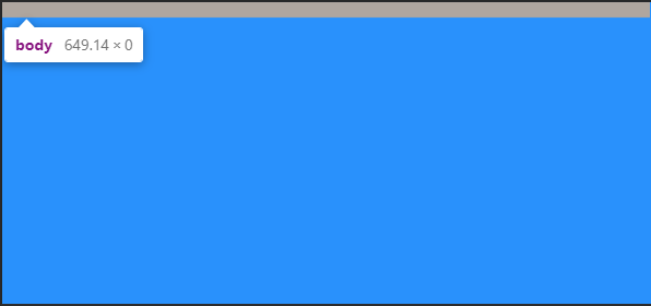
Setting min-height to 100% on both elements does not allow the body element to fill the page like you might expect. If you check the computed style values in dev tools, the body element has a height of zero.
Meanwhile, the HTML element has a height equal to the visible part of the page in the browser.
Look at the following screenshot from Chrome Dev Tools:
Why Does This Happen?
Using a percentage as a size value requires the element to reference a parent to base that percentage on.
The HTML element references the viewport which has a height value equal to the visible viewport height. However, we only set a min-height on the HTML element… NOT a height property value.
Therefore, the body element has no parent height value to reference when deciding what 100% is equal to.
If you started out with enough content to fill the body of the page, you might not have noticed this issue.
And to make it more difficult to notice, if you set a background-color on both elements or even on just one of them, the viewport is full of that color. This gives the impression the body element is as tall as the viewport.
It’s not. It’s still at zero.
The image above is taken from a page with the following CSS:
html, body {
    min-height: 100%;
}
body { background-color: dodgerblue; }
Reverse-inheritance?
In a strange twist, the HTML element assumes the background-color of the body element if you don’t set a separate background-color on the html element.
So What is the Ideal Height Setting for a Full Responsive Page?
For years, the answer was the following:
html {
    height: 100%;
}
body {
    min-height: 100%;
}
This allows the HTML element to reference the parent viewport and have a height value equal to 100% of the viewport value.
With the HTML element receiving a height value, the min-height value assigned to the body element gives it an initial height that matches the HTML element.
This also allows the body to to grow taller if the content outgrows the visible page.
The only drawback is the HTML element does not grow beyond the height of the visible viewport. However, allowing the body element to outgrow the HTML element has been considered acceptable.
The Modern Solution is Simplified
body { min-height: 100vh; }
This example uses vh (viewport height) units to allow the body to set a minimum height value based upon the full height of the viewport.
Like the previously discussed background-color, if we do not set a height value for the HTML element, it will assume the same value for height that is given to the body element.
Therefore, this solution avoids the HTML element overflow present in the previous solution and both elements grow with your content!
The use of vh units did cause some mobile browser issues in the past, but it appears that Chrome and Safari are consistent with viewport units now.
Page Height May Cause a Horizontal Scrollbar
Wait, what?
Shouldn’t this say «Page Width»?
Nope.
In another strange series of events, your page height may activate the horizontal scrollbar in your browser.
When your page content grows taller than the viewport height, the vertical scrollbar on the right is activated. This can cause your page to instantly have a horizontal scrollbar as well.
So What is the Fix?
You may sleep better knowing it starts with a page width setting.
This problem arises when any element — not just the HTML or body element — is set to 100vw (viewport width) units.
The viewport units do not account for the approximate 10 pixels that the vertical scrollbar takes up.
Therefore, when the vertical scrollbar activates you also get a horizontal scrollbar.
Maybe just don’t.
Not setting a width on the HTML and body elements will default to the full size of the screen. If you do set a width value other than auto, consider utilizing a CSS reset first.
Remember, by default the body element has 8px of margin on all sides.
A CSS reset removes this. Otherwise, setting the width to 100% before removing the margins will cause the body element to overflow. Here’s the CSS reset I use:
* {
    margin: 0;
    padding: 0;
    box-sizing: border-box;
}
How to Set Width to Your Preference
While it may not always be necessary to set a width, I usually do.
It may simply be a habit.
If you set the width to 100% on the body element you will have a full page width. This is essentially equivalent to not setting a width value and allowing the default.
If you want to use the body element as a smaller container and let the HTML element fill the page, you could set a max-width value on the body.
Here’s an example:
html { background-color: #000; }
body {
    min-height: 100vh;
    max-width: 400px;
    background-color: papayawhip;
    margin: 0 auto;
}
Conclusion
With no height value provided for the HTML element, setting the height and/or min-height of the body element to 100% results in no height (before you add content).
However, with no width value provided for the HTML element, setting the width of the body element to 100% results in full page width.
This can be counterintuitive and confusing.
For a responsive full page height, set the body element min-height to 100vh.
If you set a page width, choose 100% over 100vw to avoid surprise horizontal scrollbars.
I’ll leave you with a tutorial from my YouTube channel demonstrating the CSS height and width settings for an HTML page that is full screen size and grows with the content it contains:
Do you have a different way of setting the CSS width and height that you prefer?
Let me know your method!
Learn to code for free. freeCodeCamp’s open source curriculum has helped more than 40,000 people get jobs as developers. Get started
Using Firefox, you can enlarge an entire web page by simply pressing CTRL +. What this does is proportionally enlarge the entire web page (fonts, images, etc).
How can I replicate the same functionality using simply CSS?
Is there something like page-size: 150% (which would increase the entire page portions by x%?)
asked Jul 20, 2009 at 22:19
6
You might be able to use the CSS zoom property — supported in IE 5.5+, Opera, and Safari 4, and Chrome
Can I use: css Zoom
Firefox is the only major browser that does not support Zoom (bugzilla item here) but you could use the «proprietary» -moz-transform property in Firefox 3.5.
So you could use:
div.zoomed {
    zoom: 3;
    -moz-transform: scale(3);
    -moz-transform-origin: 0 0;
}
maxshuty
8,93313 gold badges58 silver badges75 bronze badges
answered Jul 20, 2009 at 23:29
Jon GallowayJon Galloway
52k25 gold badges123 silver badges193 bronze badges
11
This is a rather late answer, but you can use
body {
   transform: scale(1.1);
   transform-origin: 0 0;
   // add prefixed versions too.
}
to zoom the page by 110%.
Although the zoom style is there, Firefox still does not support it sadly.
Also, this is slightly different than your zoom. The css transform works like an image zoom, so it will enlarge your page but not cause reflow, etc.
Edit updated the transform origin.
answered Jul 1, 2013 at 16:08
kumarharshkumarharsh
18.6k8 gold badges71 silver badges100 bronze badges
10
If your CSS is constructed completely around ex or em units, then this might be possible and feasible. You’d just need to declare font-size: 150% in your style for body or html. This should cause every other lengths to scale proportionally. You can’t scale images this way, though, unless they get a style too.
But that’s a very big if on most sites, anyway.
answered Jul 20, 2009 at 22:27
JoeyJoey
339k84 gold badges681 silver badges680 bronze badges
3
Scale is not the best option
It will need some other adjustments, like margins paddings etc ..
but the right option is
zoom: 75%
answered Oct 22, 2020 at 0:45
SystemXSystemX
4614 silver badges9 bronze badges
5
I have the following code that scales the entire page through CSS properties. The important thing is to set body.style.width to the inverse of the zoom to avoid horizontal scrolling. You must also set transform-origin to top left to keep the top left of the document at the top left of the window.
        var zoom = 1;
        var width = 100;

        function bigger() {
            zoom = zoom + 0.1;
            width = 100 / zoom;
            document.body.style.transformOrigin = "left top";
            document.body.style.transform = "scale(" + zoom + ")";
            document.body.style.width = width + "%";
        }
        function smaller() {
            zoom = zoom - 0.1;
            width = 100 / zoom;
            document.body.style.transformOrigin = "left top";
            document.body.style.transform = "scale(" + zoom + ")";
            document.body.style.width = width + "%";
        }
answered Jan 2, 2020 at 12:38
Ags1Ags1
6091 gold badge9 silver badges18 bronze badges
1
As Johannes says — not enough rep to comment directly on his answer — you can indeed do this as long as all elements’ «dimensions are specified as a multiple of the font’s size. Meaning, everything where you used %, em or ex units». Although I think % are based on containing element, not font-size.
And you wouldn’t normally use these relative units for images, given they are composed of pixels, but there’s a trick which makes this a lot more practical.
If you define body{font-size: 62.5%}; then 1em will be equivalent to 10px. As far as I know this works across all main browsers.
Then you can specify your (e.g.) 100px square images with width: 10em; height: 10em; and assuming Firefox’s scaling is set to default, the images will be their natural size.
Make body{font-size: 125%}; and everything — including images — wil be double original size.
answered Jul 21, 2009 at 9:02
e100e100
1,5932 gold badges13 silver badges21 bronze badges
3
For Cross-Browser Compatibility :
Example Goes Below :
<html><body class="entire-webpage"></body></html>


.entire-webpage{
        zoom: 2;
        -moz-transform: scale(2);/* Firefox Property */
        -moz-transform-origin: 0 0;
        -o-transform: scale(2);/* Opera Property */
        -o-transform-origin: 0 0;
        -webkit-transform: scale(2);/* Safari Property */
        -webkit-transform-origin: 0 0;
        transform: scale(2); /* Standard Property */
        transform-origin: 0 0;  /* Standard Property */
    }
answered Oct 7, 2020 at 23:43
SaumyajitSaumyajit
6407 silver badges9 bronze badges
With this code 1em or 100% will equal to 1% of the body height
document.body.style.fontSize = ((window.innerHeight/100)*6.25)+"%"
answered Jul 15, 2011 at 15:00
 * {
transform: scale(1.1, 1.1)
}
this will transform every element on the page
answered Jul 24, 2019 at 7:18
1
Jon Tan has done this with his site — http://jontangerine.com/
Everything including images has been declared in ems. Everything. This is how the desired effect is achieved. Text zoom and screen zoom yield almost the exact same result.
answered Jul 21, 2009 at 23:13
Andy FordAndy Ford
8,3503 gold badges26 silver badges35 bronze badges
CSS will not be able to zoom on demand, but if you couple CSS with JS, you could change some values to make a page look bigger.
However, as it has been said, this feature is standard nowadays in modern browsers: no need to replicate it. As a matter of fact, replicating it will slow down your website (more things to load, more JS or CSS to parse or execute and apply, etc.)
answered Jul 22, 2009 at 11:05
T0xicCodeT0xicCode
4,3872 gold badges35 silver badges50 bronze badges
1
you have to set the zoom property in style.
Now interesting part is how to calculate it.
This is what I did.
let zoom = Number((window.innerWidth / window.screen.width).toFixed(3));
document.firstElementChild.style.zoom = zoom;
this will calculate the ratio of current window width to actual device width.
Then set that value to top level html element zoom property.
Top level html element can be accessed using document.firstElementChild
You can put this code inside window.onresize function to make the whole page zoom accordingly.
set the height of main wrapper div to 100% to prevent white space on zoom.
answered Oct 13, 2021 at 18:19
Ronn WilderRonn Wilder
1,1387 silver badges12 bronze badges
#Руководства
- 10 фев 2020
-

18
Как адаптировать сайт под разные разрешения
Рассказываем и показываем, как создавать удобные сайты, которые будут хорошо выглядеть на разных мониторах.
vlada_maestro / shutterstock

Пишет о программировании, в свободное время создаёт игры. Мечтает открыть свою студию и выпускать ламповые RPG.
Многие разработчики слишком ленивы, чтобы хоть как-то адаптировать свой сайт: одни проверяют всё только под свой браузер, а другие игнорируют мобильные устройства.
Но чаще всего можно заметить, что сайты плохо адаптированы под разные мониторы и разрешения. Например, вот как выглядит «ВКонтакте» на FullHD-мониторе:

Шрифт очень маленький, а контент размещается только на небольшой части экрана. Чтобы комфортно пользоваться им, нужно менять масштаб страницы:

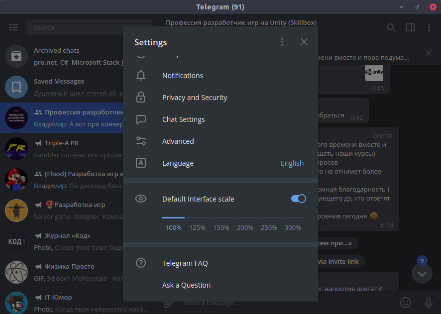
Встроенных настроек для этого нет, в отличие, например, от Telegram:
Такая адаптация — что-то вроде кибертолерантности. Мы должны заботиться об удобстве посетителей наших сайтов, какими бы устройствами, мониторами и браузерами (только не Internet Explorer) они ни пользовались. Поэтому в этой статье мы расскажем, как адаптировать сайт под разные разрешения.
За основу возьмём сайт из статьи про добавление тёмной темы. Читать её не обязательно, но там подробнее объясняется часть с PHP-скриптами. Также вы можете посмотреть исходный код этого сайта на GitHub.
Прежде всего нужно быть уверенным, что ваш сайт не сломается, если пользователь изменит разрешение на 1 пиксель (как это бывает в MS Word). Для этого везде, где только можно, размеры нужно указывать в процентах.
Также при создании сайта полезно помещать его в оболочку (wrapper): она растягивается на весь экран, а сам сайт будет масштабироваться относительно оболочки.
<body>
    <div class="wrapper">
   	 Ваш сайт здесь
    </div>
</body>
Сам контент, не считая хэдера и футера, не стоит растягивать на всю страницу:
Тут ширина блока с текстом составляет 80% страницы. Если бы не это ограничение, чтение мелкого шрифта с больших мониторов превратилось бы в разминку шеи:

Также вы можете указать максимальную ширину в пикселях:
width: 80%;
max-width: 720px;
Тогда при любом размере монитора читать будет более-менее комфортно.
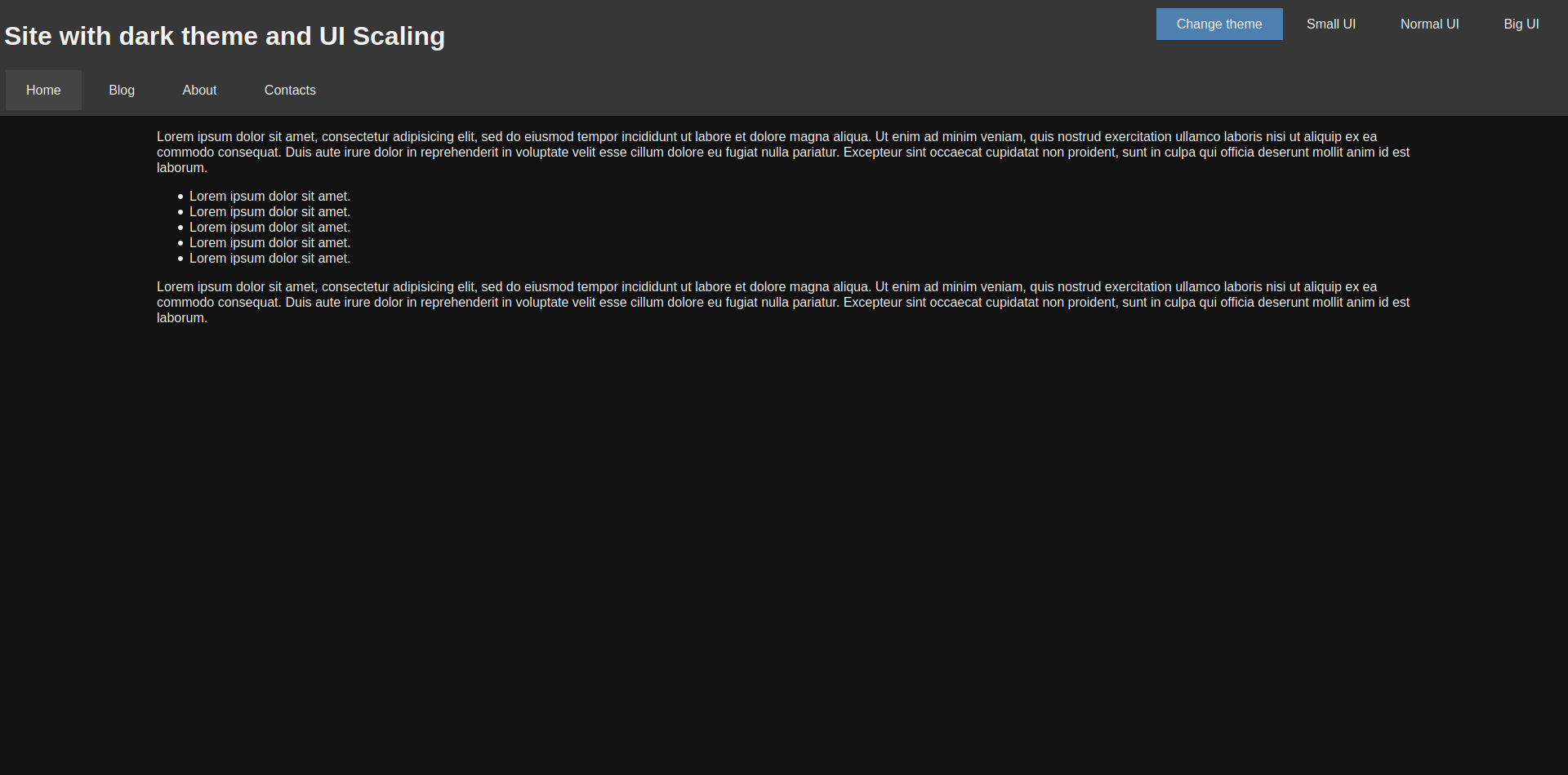
Как и в случае с тёмной темой, можно подготовить несколько файлов стилей, каждый из которых будет содержать разные размеры для элементов страницы. Начнём со стиля для средних мониторов — normal.css:
body, html
{
	font-size: 16px !important;
}

.nav__item
{
	padding: 15px 25px !important;
	margin: 2px !important;
}

.main__content
{
	width: 80% !important;
	margin: 0 auto !important;
}

.ui-button
{
	padding: 10px 25px !important;
}
Кроме него будут созданы ещё два файла: small.css и big.css. Они добавляются с помощью отдельного элемента link:
<link rel="stylesheet" type="text/css" href="styles/<?php echo $_SESSION["scale"]; ?>.css" id="scale-link">
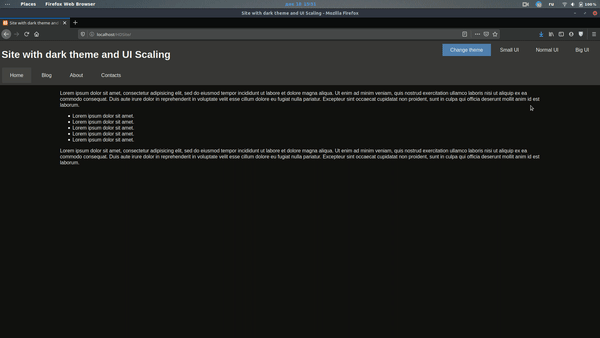
Теперь нужно сделать так, чтобы пользователь мог выбрать, какой масштаб ему подходит. Для этого добавляем кнопки:
<div class="hover-panel">
    <div class="hover-panel__content">
   	 <div class="ui-button theme-button" id="theme-button">Change theme</div>
   	 <div class="ui-button" id="small-button">Small UI</div>
   	 <div class="ui-button" id="normal-button">Normal UI</div>
   	 <div class="ui-button" id="big-button">Big UI</div>
    </div>
</div>
И остаётся только подключить скрипт, который будет переключать файл стилей:
var btns =
{
    small: document.getElementById("small-button"),
    normal: document.getElementById("normal-button"),
    big: document.getElementById("big-button")
};
var link = document.getElementById("scale-link");

btns.small.addEventListener("click", function () { ChangeScale("small"); });
btns.normal.addEventListener("click", function () { ChangeScale("normal"); });
btns.big.addEventListener("click", function () { ChangeScale("big"); });

function ChangeScale(size)
{
    link.setAttribute("href", "styles/" + size + ".css");

    SaveScale(size);
}

function SaveScale(size)
{
    var Request = new XMLHttpRequest();
    Request.open("GET", "./scales.php?size=" + size, true);
    Request.send();
}
Кроме переключения стиля, скрипт ещё и сохраняет выбор пользователя в его браузере, чтобы при повторной загрузке страницы подключался именно этот файл. Для этого используется следующий PHP-код:
<?php
session_start();

if(isset($_GET["size"]))
{
    $size = $_GET["size"];

    if($size == "small" || $size == "normal" || $size == "big")
    {
   	 $_SESSION["scale"] = $size;
    }
}

?>
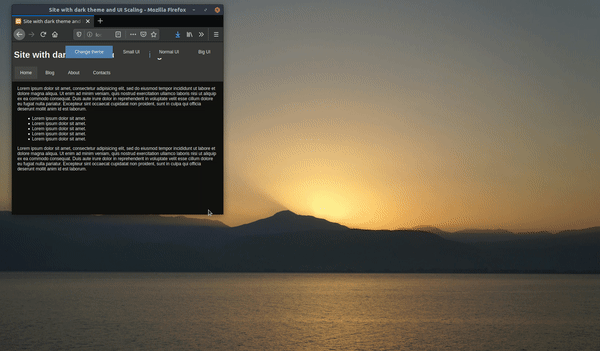
Можно посмотреть, как это будет выглядеть:
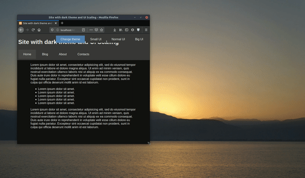
Обратите внимание, что блок с текстом для небольших экранов стал шире — это не тот случай, когда пустота красит страницу.
С помощью JavaScript мы можем проверить размер окна браузера пользователя и подключить тот файл стилей, который лучше подойдёт для страницы такого размера. Вот пример такого кода:
window.addEventListener("resize", AutoScale); //Масштабируем страницу при растягивании окна

AutoScale(); //Масштабируем страницу после загрузки

function AutoScale()
{
    let width = window.innerWidth; //Ширина окна
    //Если вы хотите проверять по размеру экрана, то вам нужно свойство window.screen.width

    if(width > 1280)
    {
   	 ChangeScale("big");
    }
    else if(width <= 1280 && width > 720)
    {
   	 ChangeScale("normal");
    }
    else if(width < 720)
    {
   	 ChangeScale("small");
    }
}
В результате страница будет масштабироваться автоматически.
Мы сможем отказаться от адаптации сайтов под разные мониторы только тогда, когда человечество откажется от мониторов. Ну а пока придётся мириться с тем, что существует огромное количество разрешений:
Не говоря уже о том, что на мобильных устройствах эти разрешения тоже воспринимаются по-разному.

Учись бесплатно:
вебинары по программированию, маркетингу и дизайну.
Участвовать

Школа дронов для всех
Учим программировать беспилотники и управлять ими.
Узнать больше
- Назад
- Обзор: Building blocks
- Далее
В предыдущих уроках вы познакомились с некоторыми способами изменения размеров элементов на веб-странице с помощью CSS. Понимание того, насколько велики будут различные элементы в вашем дизайне — важно, и в этом уроке мы подведем итог по различным способам задания размеров элементов с помощью CSS и расскажем о некоторых терминах, связанных с размерами, которые помогут вам в будущем.
| Необходимые условия: | Базовая компьютерная грамотность, Установка базового ПО, базовые знания работы с файлами, основы HTML (Введение в HTML), и общее представление о том, как работает CSS (Введение в CSS.) |
|---|---|
| Цель: | Изучить различные способы задания размеров объектов в CSS. |
Размер по умолчанию или внутренний размер
Элементы HTML имеют размеры по умолчанию, заданные до того, как на них повлияет какое-либо правило CSS. Простой пример — изображение. Изображение имеет ширину и высоту, определенные в файле изображения. Этот размер называется — внутренний размер, он исходит из самого изображения.
Если вы разместите изображение на странице и не измените его высоту и ширину, используя атрибуты тега <img> или CSS, оно будет отображаться с использованием этого внутреннего размера. В примере ниже, мы установили для изображения рамку, чтобы вы могли видеть размер файла.
С другой стороны, пустой <div> не имеет собственного размера. Если вы добавите <div> в свой HTML-код без содержимого, а затем установите для него рамку, как мы это делали с изображением, вы увидите линию на странице. Это схлопнувшиеся границы элемента — содержимое, которое могло бы удерживать ее в открытом состоянии, отсутствует. В нашем примере ниже эта граница растягивается на всю ширину контейнера, потому что это элемент блочный, поведение которого должно быть вам знакомо. У него нет высоты, потому что нет содержимого.
В приведенном выше примере попробуйте добавить текст внутри пустого элемента. Этот текст теперь становится охваченным границами, потому что высота элемента определяется содержимым. Следовательно, размер этого <div> устанавливается размером содержимого. Как и в предыдущем примере, этот размер является внутренним размером — размер элемента определяется размером его содержимого.
Присваивание определенного размера
Конечно, мы можем задать элементам нашей страницы определенный размер. Размер, который присваивается элементу (содержимое, которого затем должно соответствовать этому размеру), называется внешним размером. Возьмите наш <div> из примера выше и установите ему специальные значения width и height и теперь он будет иметь эти размеры, независимо от того, какого размера содержимое в него помещается. Как мы узнали в нашем предыдущем уроке о переполнении, заданная высота блока может вызвать переполнение содержимого, если размер содержимого больше, чем внутреннее пространство элемента.
Из-за этой проблемы перекрытия, жестко задавать высоту элементов с помощью длины или процентного соотношения — это то, что нужно делать с большой осторожностью.
Использование процентного соотношения
Во многих отношениях проценты действуют как единицы длины, и, как мы обсуждали в уроке, посвященном значениям и единицам, они часто могут использоваться как взаимозаменяемые с длиной. При использовании процентов вы должны знать, от чего этот процент рассчитывается. В случае блока внутри другого блока, если вы зададите дочернему блоку процентную ширину, это будет процент от ширины родительского контейнера.
Это потому, что проценты рассчитываются в зависимости от размера содержащего элемент блока. Если процентное соотношение не применяется, наш <div> будет занимать 100% доступного пространства, так как это элемент блочного типа. Если мы зададим ему ширину в процентах, он займет процент от пространства, которое он обычно заполняет.
Margins и paddings в процентах
Если вы установите margins и padding в процентах, вы можете заметить странное поведение. В приведенном ниже примере у нас есть блок. Мы присвоили внутреннему блоку margin 10% и padding 10%. Padding и margin сверху и снизу имеют тот же размер, что и margins слева и справа.
Например, вы можете ожидать, что процентное значение верхнего и нижнего margins будет в процентах от высоты элемента, а процентное левое и правое margins — в процентах от ширины элемента. Тем не менее, это не так!
При использовании margins и padding, заданных в процентах, значение рассчитывается на основе inline размера блока — следовательно, ширины при работе с горизонтальным языком. В нашем примере все поля и отступы составляют 10% width. Это означает, что вы будете иметь margins и padding одинакового размера по всему полю. Этот факт стоит запомнить, если вы действительно пользуетесь процентами.
Минимальные и максимальные размеры
Помимо возможности установить фиксированный размер, мы можем использовать CSS чтобы задать элементу минимальный или максимальный размер. Если у вас есть блок, который может содержать разное количество содержимого, и вы хотите, чтобы он всегда был определенной минимальной высоты, вы можете установить для него свойство min-height. Блок всегда будет минимальной заданной высоты, пока содержимого не станет больше, чем места в блоке.
В приведенном ниже примере вы можете увидеть два блока, обоим задали минимальную высоту в 150 пикселей. Блок слева имеет высоту 150 пикселей несмотря на то что в нем нет текста. В блоке справа есть контент, которому нужно больше места, чем минимальная заданная высота, поэтому он увеличился.
Это очень полезно при работе с переменным объемом контента, избегая при этом переполнения.
Часто max-width применяют для уменьшения масштаба изображений, если недостаточно места для их отображения.
Например, если бы вы установили width: 100% для изображения, а его внутренняя ширина была меньше, чем его контейнер, изображение было бы вынуждено растягиваться и становиться больше, в результате чего оно выглядело бы пикселизированным.
Если бы вы вместо этого применили max-width: 100%, и внутренняя ширина изображения была бы меньше, чем его контейнер, изображение не будет принудительно растягиваться и становиться больше, что предотвращает пикселизацию.
В приведенном ниже примере мы использовали одно и то же изображение трижды. Первому изображению было задано width: 100% и оно находится в контейнере, который больше его ширины, поэтому он растягивается до ширины контейнера. Второму изображению задано max-width: 100%, изображение достигло 100% своей ширины не растягивается, чтобы заполнить контейнер. Третье поле снова содержит то же изображение, также с max-width: 100% в этом случае вы можете увидеть, как он уменьшилось, чтобы поместиться в контейнер.
Этот метод используется для создания отзывчивых изображений, чтобы при просмотре на меньшем устройстве они соответствующим образом уменьшались. Однако вам не следует использовать эту технику для загрузки действительно больших изображений с последующим их уменьшением в браузере. Изображения должны иметь соответствующий размер, чтобы быть не больше, чем они должны быть для самого большого размера, отображаемого в дизайне. Загрузка слишком больших изображений замедлит работу вашего сайта и может стоить пользователям больше денег, если они используют лимитированное соединение.
Единицы вьюпорта
Вьюпо́рт — это видимая область вашей страницы в браузере, который вы используете для просмотра сайта. В CSS у нас есть единицы измерения, которые относятся к размеру вьюпорта — vw единицы ширины вьюпорта и vh высоты вьюпорта. Используя эти единицы измерения, вы можете изменять размер чего-либо относительно вьюпорта пользователя.
1vh равен 1% от высоты вьюпорта и 1vw равен 1% ширины вьюпорта. Вы можете использовать эти единицы измерения для размеров блоков, а также текста. В приведенном ниже примере у нас есть блок размером 20vh и 20vw. В блоке есть буква A, которой присвоено значение font-size 10vh.
Если вы измените величину vh и vw — это изменит размер блока или шрифт; изменение размера вьюпорта также изменит их размеры, поскольку они имеют размер заданный относительно вьюпорта. Чтобы увидеть изменение примера при изменении размера вьюпорта, вам нужно будет загрузить пример в новое окно браузера, размер которого можно изменить (поскольку встроенное приложение <iframe>, содержащее показанный выше пример, является его окном просмотра). Откройте пример, измените размер окна браузера и посмотрите, что происходит с размером поля и текста.
Размеры объектов задаваемые в соответствии с вьюпортом могут быть полезны в ваших проектах. Например, если вы хотите, чтобы основная секция отображалась перед остальным контентом, установите для этой части страницы высоту 100vh, это приведет к выталкиванию остального контента ниже видимой области, что означает, что он появится только после того, как страницу прокрутят вниз.
Проверьте свои навыки!
В этой статье мы рассмотрели многое, но можете ли вы вспомнить самую важную информацию? Вы можете найти дополнительные тесты, чтобы убедиться, что вы сохранили эту информацию, прежде чем двигаться дальше — см. Проверка своих навыков: задание размеров (en-US).
Заключение
Этот урок дал вам краткое изложение некоторых ключевых проблем, с которыми вы можете столкнуться при определении размеров объектов в Интернете. Когда вы перейдете к CSS раскладке, изменение размеров станет очень важным для освоения различных методов раскладки, поэтому перед тем, как двигаться дальше, стоит разобраться в концепциях.
- Назад
- Обзор: Building blocks
- Далее