Приветствую вас на сайте Impuls-Web!
Добавляя на страницы сайта какой-то текст, мы обязательно сталкиваемся с необходимостью оформления текста в соответствии с общим дизайном. Одним из основных параметров, влияющих на читабельность и восприятие текста, является его размер.
В этой статье я хочу с вами поговорить о том, как можно изменить размер текста css-свойствами, и какие единицы измерения можно для этого использовать.

Для изменения параметров в таблице стилей css существует специализированное свойство font-size, используя которое можно задать размер текста css-стилями в любых, удобных для вас единицах измерения. При этом можно использовать абсолютные и относительные единицу измерения.
Пример:
|
.font-s{ font-size:20px; } |
Размер текста CSS
При указании параметра в абсолютных единицах, его величина не будет меняться относительно значения родительского элемента.
К таким единицам измерения относятся:
- px (пиксель)
- pt (пункт)
- pc (пика)
Кроме этого можно использовать ключевые слова:
- xx-small
- x-small
- small
- medium
- large
- x-large
- xx-large
Наиболее распространённой абсолютной единицей измерения шрифта является пиксель (px). Все остальные единицы используются редко, но при желании вы можете использовать и их.
При использовании относительных единиц, таких как: %, em, rem, размер шрифта в CSS будет рассчитываться относительно родительского элемента.
То есть при изменении шрифта родительского элемента шрифт в блоке будет так же увеличиваться или уменьшаться.
Например:
font-size: 2em;
Также расчёт размера шрифта может осуществляться относительно ширины или высоты области просмотра.
Для этого можно воспользоваться такими единицами измерения как:
- 1vw – 1% от ширины области просмотра
- 1vh – 1% от высоты области просмотра
- 1vmin — 1% от меньшей стороны окна браузера
- 1vmax — 1% от большей стороны окна браузера
Кроме того, так же можно указать размер шрифта CSS ключевым словом в относительном выражении: larger, smaller.
Например:
font-size: larger;
При использовании такого CSS-свойства шрифт будет более крупным чем в родительском блоке.
При использовании smaller – шрифт будет меньше чем родительском блоке.
Как изменить размер текста в HTML
Если вам нужно выделить одно слово или фрагмент текста, то, конечно же, это проще всего сделать в html-коде, используя атрибут style.
Вот так это будет выглядеть на примере:
|
Меняем размер <span style=«font-size:18px;»>шрифта</span> в CSS |
Меняем размер шрифта в CSS
Теперь, зная возможности данного css-свойства, вы можете использовать его в зависимости от ситуации, и добиться именно того результата, который вам нужен.
Например, относительными единицами можно воспользоваться при адаптации под мобильные устройства, и текст будет уменьшаться при уменьшении ширины экрана. Это намного удобнее, чем для разных разрешений задавать размер шрифта css-свойствами в пикселях.

На этом я, пожалуй, сегодня закончу. Если вам что-то не понятно или у вас остались вопросы, не стесняйтесь и задавайте их в комментариях.
Не забудьте поделиться статьей в социальных сетях и подписаться на мою рассылку. Увидимся в следующих статьях!
С уважением Юлия Гусарь
Описание
CSS Свойство font-size определяет размер шрифта. Это свойство также используется для вычисления размера em, ex и других относительных единиц. Подробнее: <length>.
Интерактивный пример
Синтаксис
/* значения в <абсолютных размерах> */
font-size: xx-small;
font-size: x-small;
font-size: small;
font-size: medium;
font-size: large;
font-size: x-large;
font-size: xx-large;

/* значения в <относительных размерах> */
font-size: larger;
font-size: smaller;

/* <значения длины> */
font-size: 12px;
font-size: 0.8em;

/* <процентные значения> */
font-size: 80%;

/* Глобальные значения */
font-size: inherit;
font-size: initial;
font-size: unset;
Свойство font-size устанавливается одним из следующих способов:
- Ключевым словом из перечня абсолютных значений или относительных значений
- Как
<значение длины>или<процентное значение>, по отношению к размеру родительского элемента.
Значения
xx-small, x-small, small, medium, large, x-large, xx-large-
Набор ключевых слов абсолютных значений, по отношению к пользовательскому размеру шрифта по умолчанию (им считается
medium— среднее). larger, smaller-
Больше (larger) или меньше (smaller). Ключевые слова для относительного размера. Шрифт будет больше или меньше по отношению в размеру шрифта родительского элемента.Примерно на такое же соотношение, которое используется в ключевых словах абсолютного размера выше.
<length>-
Положительное значение длины
<length>. Для большинства единиц измерения, зависимых от шрифта (таких какemиex), размер шрифта будет зависеть от размера шрифта родительских элементов.Для единиц измерения, зависимых от шрифта, которые зависят от корневых единиц (таких какrem), размер шрифта будет коррелироваться по отношению к шрифту, используемому корневым элементом<html>(root). <процентные значения>-
Положительное процентное
<percentage>значение по отношению к размеру шрифта родительского элемента.
Примечание: Для обеспечения максимальной совместимости обычно лучше использовать значения, относящиеся к размеру шрифта пользователя по умолчанию.
Формальный синтаксис
Возможные подходы
Существуют разные способы задания размера шрифта. С помощью ключевых слов или с помощью числовых значений для размера пикселей или размера ems. Выберите подходящий метод в зависимости от потребностей конкретной веб-страницы.
Ключевые слова
Keywords are a good way to set the size of fonts on the web. By setting a keyword font size on the body element, you can set relative font-sizing everywhere else on the page, giving you the ability to easily scale the font up or down on the entire page accordingly.
Pixels
Setting the font size in pixel values (px) is a good choice when you need pixel accuracy. A px value is static. This is an OS-independent and cross-browser way of literally telling the browsers to render the letters at exactly the number of pixels in height that you specified. The results may vary slightly across browsers, as they may use different algorithms to achieve a similar effect.
Font sizing settings can also be used in combination. For example, if a parent element is set to 16px and its child element is set to larger, the child element displays larger than the parent element in the page.
Примечание: Defining font sizes in pixel is not accessible, because the user cannot change the font size from the browser. (For example, users with limited vision may wish to set the font size much larger than the size chosen by a web designer.) Therefore, avoid using pixels for font sizes if you wish to create an inclusive design.
Ems
Another way of setting the font size is with em values. The size of an em value is dynamic. When defining the font-size property, an em is equal to the size of the font that applies to the parent of the element in question. If you haven’t set the font size anywhere on the page, then it is the browser default, which is probably 16px. So, by default 1em = 16px, and 2em = 32px. If you set a font-size of 20px on the body element, then 1em = 20px and 2em = 40px. Note that the value 2 is essentially a multiplier of the current em size.
In order to calculate the em equivalent for any pixel value required, you can use this formula:
em = desired element pixel value / parent element font-size in pixels
For example, suppose the font-size of the body of the page is set to 1em, with the browser standard of 1em = 16px; if the font-size you want is 12px, then you should specify 0.75em (because 12/16 = 0.75). Similarly, if you want a font size of 10px, then specify 0.625em (10/16 = 0.625); for 22px, specify 1.375em (22/16).
A popular technique to use throughout the document is to set the the font-size of the body to 62.5% (that is 62.5% of the default of 16px), which equates to 10px, or 0.625em. Now you can set the font-size for any elements using em units, with an easy-to-remember conversion, by dividing the px value by 10. This way 6px = 0.6em, 8px = 0.8em, 12px = 1.2em, 14px = 1.4em, 16px = 1.6em. For example:
body {
  font-size: 62.5%; /* font-size 1em = 10px on default browser settings */
}
span {
  font-size: 1.6em; /* 1.6em = 16px */
}
The em is a very useful unit in CSS, since it automatically adapts its length relative to the font that the reader chooses to use.
One important fact to keep in mind: em values compound. Take the following HTML and apply it with the previous CSS above:
<div>
<span>Outer <span>inner</span> outer</span>
</div>
The result is:
Assuming that the browser’s default font-size is 16px, the words «outer» would be rendered at 16px, but the word «inner» would be rendered at 25.6px. This is because the inner span’s font-size is 1.6 em which is relative to its parent’s font-size, which is in turn relative to its parent’s font-size. This is often called compounding.
Rems
rem values were invented in order to sidestep the compounding problem. rem values are relative to the root html element, not the parent element. In other words, it lets you specify a font size in a relative fashion without being affected by the size of the parent, thereby eliminating compounding.
The CSS below is nearly identical to the previous example. The only exception is that the unit has been changed to rem.
html {
  font-size: 62.5%; /* font-size 1em = 10px on default browser settings */
}
span {
  font-size: 1.6rem;
}
Then we apply this CSS to the same HTML, which looks like this:
<span>Outer <span>inner</span> outer</span>
In this example, the words «outer inner outer» are all displayed at 16px (assuming that the browser’s font-size has been left at the default value of 16px).
Примеры
Пример 1
/* Set paragraph text to be very large. */
p { font-size: xx-large }

/* Set h1 (level 1 heading) text to be 2.5 times the size
 * of the text around it. */
h1 { font-size: 250% }

/* Sets text enclosed within span tag to be 16px */
span { font-size: 16px; }
Пример 2
.small {
  font-size: xx-small;
}
.larger {
  font-size: larger;
}
.point {
  font-size: 24pt;
}
.percent {
  font-size: 200%;
}
<h1 class="small">Small H1</h1>
<h1 class="larger">Larger H1</h1>
<h1 class="point">24 point H1</h1>
<h1 class="percent">200% H1</h1>
Live Sample
Примечание
em and ex units on the font-size property are relative to the parent element’s font size (unlike all other properties, where they’re relative to the font size on the element). This means em units and percentages do the same thing for font-size.
Спецификации
| Specification |
|---|
| CSS Fonts Module Level 4 # font-size-prop |
Совместимость браузеров
BCD tables only load in the browser
When you add text to your HTML file with an HTML tag, you won’t always want the text to remain the default size. You’ll want to be able to adjust how the text displays in the browser.
In this article, you will learn how to change the text size with an HTML tag.
Before you proceed, it is essential to know that there is only one way we can do this: through CSS’s font-size property. We can use the font-size property through inline, internal, or external styling.
In the past, we could adjust text size within our HTML tag without using CSS. But that was before HTML5. Then we added text using the <font> tag, which can take in an attribute of size as seen below:
<font size="5">
    Hello World
</font>
This size attribute can take in value from 1-7 in which the text size increases from 1 to 7. But like I said, this has long been depreciated, and most people don’t even know it existed.
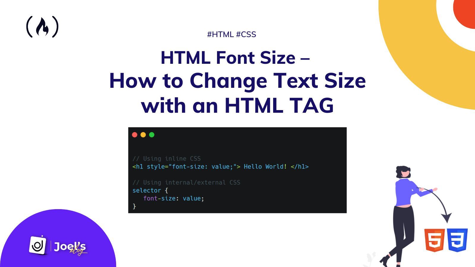
In case you are in a rush to see how you can change the size of your text, then here it is:
// Using inline CSS
<h1 style="font-size: value;"> Hello World! </h1>

// Using internal/external CSS
selector {
    font-size: value;
}
Suppose you are not in a rush. Let’s briefly dive right in.
How to Change Text Size With Inline CSS
Inline CSS allows you to apply styles to specific HTML elements. This means we are putting CSS into an HTML tag directly. We use the style attribute, which now holds all our styling.
<h1 style="...">Hello World!</h1>
We use the font-size property alongside our value to change the text size using inline CSS. This value can use any of your preferred CSS units such as em, px, rem, and so on.
<h1 style="font-size:4em; "> Hello World! </h1>
<p style="font-size:14px; "> Any text whose font we want to change </p>
A perfect syntax would be:
<TEXT-TAG style="font-size:value;"> ... </TEXT-TAG>
How to Change Text Size With Internal or External CSS
The approach you use to change text size in internal and external CSS styling is similar, since you use a selector. The general syntax for this is:
selector {
    font-size: value;
}
The selector can either be our HTML tag or maybe a class or an ID. For example:
// HTML
<p> Any text whose font we want to change </p>

// CSS
p {
    font-size: 14px;
}
Or we could use a class:
// HTML
<p class="my-paragraph" > Any text whose font we want to change </p>

// CSS
.my-paragraph {
    font-size: 14px;
}
Wrapping Up
In this article, you learned how to change the font/text size of an HTML element using CSS. You also saw how developers did it before the introduction of HTML5.
Also, keep in mind that it’s always better to style your HTML elements using internal or external styling, as it offers a lot of flexibility compared to inline styling.
For example, you can make use of one CSS class for all your p tags rather than having to add inline styles to all your p tag elements.
Using inline styles is not considered best practice because it results in a lot of repetition – you cannot reuse the styles elsewhere. To learn more, you can read my article on Inline Style in HTML.
I hope this tutorial gives you the knowledge to change the size of your HTML text so you can make it look better.
Have fun coding!
Learn to code for free. freeCodeCamp’s open source curriculum has helped more than 40,000 people get jobs as developers. Get started
When you want to draw attention to a piece of text on a page, few things are more effective than increasing the font size. And to do that, you’ll need to understand the CSS font-size property.

The size of your fonts draws the reader’s eye and establish a visual hierarchy. You’ll notice in this blog post that the title (<h1>) has the largest font size. Next, the heading elements (<h2>, <h3>, and <h4>) decrease in size until we reach the <p> elements beneath them.
Say you want to shrink or enlarge the default heading sizes, or you want to change the font size of other elements on the page. In that case, you can change the font size in CSS.

In this post, we’ll show you how to use the CSS font-size property, including:
- using an absolute-size unit
- using a relative-size unit
- using length value (like pixels, rems, or rems)
- using a percentage value
- using vw units to make font size responsive
font-size is the CSS property that controls the size of text on a webpage. There are several values you can use to define the font-size property. The example below includes different values and units you can use in CSS. The one you choose will depend on the needs and goals of your site.
See the Pen font-size: different values by HubSpot (@hubspot) on CodePen.
Let’s take a closer look at these values and discuss the pros and cons of each.
Absolute-size keyword
element { font-size: small; }
Absolute-size keywords are based on the default font size. Most commonly, the default font size is medium (which translates to 16 pixels or 1 em) though it can differ by browser and font family. Note that in HTML the default font size is 16 pixels.
The absolute-size keywords are:
- xx-small
- x-small
- small
- medium
- large
- x-large
- xx-large
- xxx-large
Here’s how each one looks in a browser:
See the Pen font-size: absolute size by HubSpot (@hubspot) on CodePen.
Absolute-size keywords make it easy to set text to a specified size and create a font hierarchy for your page.
However, they do not allow a user to change the text size in all browsers, which makes it a poor choice for accessibility. To be more inclusive of all users, try relative-size keywords instead.
Relative-size keyword
element { font-size: larger; }
Relative-size keywords set the font larger or smaller relative to the parent element’s font size. Relative sizes are roughly based on the ratio of the absolute-size keywords described above.
So, if a parent element has a font-size of large, a child element with a font-size of smaller will look as if it’s font size were medium. Let’s look at the code of this hypothetical.
See the Pen font-size: relative size by HubSpot (@hubspot) on CodePen.
Relative-size keywords make it easy to set text size relative to surrounding elements. Their advantage over absolute-size keywords is that they allow users to change the text size in all browsers, which makes it a good choice for accessibility.
Length
There are a few length values you can assign to the font-size property. Here, we’ll focus on the three most common: pixels, em units, and rem units.
Pixels
element { font-size: 32px; }
Using pixels (px) as your length lets you set fontsize with precision, regardless of the browser a visitor is using. It specifies exactly the number of pixels in height that you want a browser to render your text.
See the Pen font-size: px by HubSpot (@hubspot) on CodePen.
However, the fixed nature of pixels is also a drawback. They’re not optimized for all devices — CSS-Tricks found that websites on the iPad mini render the same as websites on the iPad, for example — and they’re not an accessible length value.
Because users cannot change the font size in some browsers, there are more inclusive and responsive options you can use, like em and rem. We’ll discuss those next.
Ems
element { font-size: 2em; }
The em unit sets the font size relative to the font size of the parent element. So, giving text a font-size of 2em will make this text twice the size of its surrounding text.
Setting font size in em units is ideal for an inclusive design. Since ems are a relative unit, users can adjust the text size in all browsers.
The only drawback is that ems compound. So, say a <span> element with a font size of 2em contains another <span> element. The nested <span> element would be twice the size, or 4em. See the code below.
See the Pen font-size: em by HubSpot (@hubspot) on CodePen.
Fortunately, the rem unit solves this compounding problem.
Rems
element { font-size: 2rem; }
Rems are a relative unit like ems, but they don’t compound. That’s because ems are font-relative units, meaning the font size is relative to the parent element’s font size, while rems are root-based. This means that font size is relative to the size of the font used by the <html> element, also called the root element.
Say I set the font size of the root element to 12px so that any text in the document that isn’t modified by CSS will be 12 pixels. But, I also want to change the font size of a <div> element that’s similar to the one mentioned in the example above. Let’s look at the code for that below.
See the Pen font-size: rem by HubSpot (@hubspot) on CodePen.
Notice how the nested <span> element is the same font size as the other <span> element.
For more guidance on when to use the px unit versus the rem unit, check out this helpful explainer video:
Percentage
element { font-size: 110%; }
A percentage value sets the font size of an element relative to the parent element’s font size.
Say a <div> element that’s set to 36px contains two <p> elements. The font-size of the first paragraph is set to 50% and the second paragraph is set to 200%. The first <p> element will be 18 pixels and the second will be 27 pixels. Here’s how that code looks in action:
See the Pen font-size: percentage by HubSpot (@hubspot) on CodePen.
Responsive Text
The property values described above all have one thing in common: They are not responsive. If you’d like to set your font size to be responsive for all devices and displays, you can use the viewport width unit, shortened to vw.
element { font-size: 10vw; }
The vw unit is another relative unit. However, it’s not relative to a parent element or root element, but to the width of the viewport. To be exact, 1 vw is equal to 1% of the viewport. Meaning, if the viewport is 100 pixels wide, 1vw equals 1 pixel.
Say I want the font size of my paragraph to be 10% of the width of the browser window. Here’s what the code looks like:
See the Pen font-size: vw by HubSpot (@hubspot) on CodePen.
And here’s what the text looks like when we resize the viewport:
.gif?width=650&height=442&name=css%20font%20size%20(update).gif)
Max Font Size in CSS
When setting your font size in vm units, be careful that your text doesn’t get too big on large screens. Unfortunately, CSS doesn’t have “max font size” property, but you can prevent your font from getting too big by using media queries.
You just have to use the media query at a certain screen size breakpoint and force the font size back into a set pixel value. Say I want to force my font size back to 30px when the viewport exceeds 1000px. Here’s what the code looks like:
See the Pen font-size: vw with media query by HubSpot (@hubspot) on CodePen.
And here’s what the text looks like when we resize the viewport:
-1.gif?width=650&height=338&name=css%20font%20size%20(update)-1.gif)
Controlling Font Size
Changing font size in CSS is complex when compared to the ease of changing font size in Google Docs or Microsoft Word — but it can be mastered with some practice in HTML and CSS.
Editor’s note: This post was originally published in May 2020 and has been updated for comprehensiveness.

| Internet Explorer | Chrome | Opera | Safari | Firefox | Android | iOS | |
| 6.0+ | 8.0+ | 1.0+ | 3.5+ | 1.0+ | 1.0+ | 1.0+ | 1.0+ |
Краткая информация
| Значение по умолчанию | medium |
|---|---|
| Наследуется | Да |
| Применяется | Ко всем элементам |
| Ссылка на спецификацию | http://www.w3.org/TR/CSS21/fonts.html#propdef-font-size |
Версии CSS
| CSS 1 | CSS 2 | CSS 2.1 | CSS 3 |
|---|---|---|---|
Описание
Определяет размер шрифта элемента. Размер может быть установлен несколькими
способами. Набор констант (xx-small, x-small, small,
medium, large, x-large, xx-large) задает размер, который называется абсолютным.
По правде говоря, они не совсем абсолютны, поскольку зависят от настроек браузера
и операционной системы.
Другой набор констант (larger, smaller)
устанавливает относительные размеры шрифта. Поскольку размер унаследован от
родительского элемента, эти относительные размеры применяются к родительскому
элементу, чтобы определить размер шрифта текущего элемента.
В конечном итоге, размер шрифта сильно зависит от значения свойства font-size у родителя элемента.
Сам размер шрифта определяется как высота от базовой линии до верхней границы кегельной площадки, как показано на рис. 1.
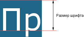
Рис. 1. Размер шрифта
Синтаксис
font-size: абсолютный размер | относительный размер | значение | проценты | inherit
Значения
Для задания абсолютного размера используются следующие значения: xx-small,
x-small, small, medium,
large, x-large, xx-large.
Их соответствие с размером шрифта в HTML приведено в табл. 1.
| CSS | xx-small | x-small | small | medium | large | x-large | xx-large | |
|---|---|---|---|---|---|---|---|---|
| HTML | 1 | 2 | 3 | 4 | 5 | 6 | 7 |
Относительный размер шрифта задается значениями larger и smaller.
Также разрешается использовать любые допустимые единицы CSS: em
(высота шрифта элемента), ex (высота символа х),
пункты (pt), пикселы (px),
проценты (%) и др. За 100% берется размер шрифта
родительского элемента. Отрицательные значения не допускаются.
- inherit
- Наследует значение родителя.
Пример
HTML5CSS2.1IECrOpSaFx
<!DOCTYPE html>
<html>
 <head>
  <meta charset="utf-8">
  <title>font-size</title>
  <style>
   h1 {
    font-family: 'Times New Roman', Times, serif; /* Гарнитура текста */
    font-size: 250%; /* Размер шрифта в процентах */
   }
   p {
    font-family: Verdana, Arial, Helvetica, sans-serif;
    font-size: 11pt; /* Размер шрифта в пунктах */
   }
  </style>
 </head>
 <body>
  <h1>Duis te feugifacilisi</h1>
  <p>Lorem ipsum dolor sit amet, consectetuer adipiscing elit, sed diem
  nonummy nibh euismod tincidunt ut lacreet dolore magna aliguam erat volutpat.
  Ut wisis enim ad minim veniam, quis nostrud exerci tution ullamcorper suscipit
  lobortis nisl ut aliquip ex ea commodo consequat.</p>
 </body>
</html>
Результат данного примера показан на рис. 1.
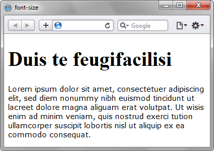
Рис. 2. Применение свойства font-size
Объектная модель
[window.]document.getElementById(«elementID«).style.fontSize
Браузеры
Internet Explorer до версии 7.0 включительно не поддерживает значение inherit.
Продолжаем говорить о размерах в CSS. Мы уже разбирали пиксели, проценты и зависимость от окна браузера, а теперь посмотрим на особенности размеров шрифтов.
Коротко о том, что уже было: пиксели и высота экрана
Самый простой способ задать размер чего-нибудь на веб-странице — указать его в пикселях:
font-size: 16px;
Также можно указать размер в виде пропорций от ширины или высоты браузера. Например, чтобы размер шрифта был 1/10 от высоты окна. Необычно, но может быть интересно:
font-size: 10vh;
Проценты и шрифты
Ещё есть проценты, но с ними сложнее: нужно знать размеры родительского элемента, чтобы процентам было от чего отталкиваться. Например, если мы просто напишем font-size: 50%;, то браузер сделает так:
- Поищет в стилях, есть ли где-то точное указание размеров шрифта для этого или родительского элемента.
- Если есть — возьмёт 50 процентов от них.
- Если нет — возьмёт стандартный размер шрифта для этого элемента из своих настроек и уже от них посчитает 50%.
<!DOCTYPE html>
<html lang="ru">
<head>
	<meta charset="utf-8">
	<title>Размеры шрифтов</title>

	<style type="text/css">
		/*задаём общие параметры для всей страницы*/
		body {
		  text-align: center;
		  margin: 10;
		  font-family: Verdana, Arial, sans-serif;
		  font-size: 40px;
		}

	</style>

</head>
<body>

	<p>Привет, это журнал «Код»!</p>

</body>
</html>
Теперь добавим отдельный стиль для абзаца и в нём укажем, что размер текста должен быть 50%:
p {

  font-size: 50%;

}

А вот что будет, если мы удалим размер в пикселях из стиля body{} и дадим браузеру самому разобраться с размером:

Так как мы не задали точные размеры, то браузер взял какой-то свой размер абзаца по умолчанию и посчитал 50% от этого стандартного размера. Получилось мелко и нечитаемо.
Em — относительный размер шрифта
Если неохота считать проценты или нужно, чтобы шрифт точно был в 2 раза больше или в 0,7 раз меньше обычного шрифта, используют em. Это то же самое, что проценты: font-size: 100% — это как font-size:1em .
<!DOCTYPE html>
<html lang="ru">
<head>
	<meta charset="utf-8">
	<title>Размеры шрифтов</title>

	<style type="text/css">
		/*задаём общие параметры для всей страницы*/
		body {
		  text-align: center;
		  margin: 10;
		  font-family: Verdana, Arial, sans-serif;
		  font-size: 20px;
		}
	</style>

</head>
<body>
	<!-- текст с основным размером шрифта -->
	<p>Привет, это журнал «Код»!</p>
	<!-- эта строка будет иметь шрифт в 2 раза больше -->
	<p style="font-size: 2em;">А это — статья про размеры шрифтов</p>
	<!-- а эта — в 0,7 раза меньше, чем основной шрифт-->
	<p style="font-size: 0.7em;">И здесь всё постоянно меняется</p>

</body>
</html>
Так же, как и с процентами, em — это относительные значения. Всё зависит от родительского элемента. В этом примере родительским элементом был общий размер для всей страницы, заданный в body{}. Но что, если мы вложим с помощью блоков абзацы друг в друга?
<!DOCTYPE html>
<html lang="ru">
<head>
	<meta charset="utf-8">
	<title>Размеры шрифтов</title>

	<style type="text/css">
		/*задаём общие параметры для всей страницы*/
		body {
		  text-align: center;
		  margin: 10;
		  font-family: Verdana, Arial, sans-serif;
		  font-size: 20px;
		}
	</style>

</head>
<body>
	<div>
		<!-- текст с основным размером шрифта -->
		<p>Привет, это журнал «Код»!</p>
		<!-- меняем размер текста относительно предыдущего блока -->
		<div style="font-size: 2em;">
			<!-- эта строка будет иметь шрифт в 2 раза больше предыдущего блока -->
			<p>Делаем шрифт побольше предыдущего</p>
			<!-- снова меняем размер текста, но уже относительно предыдущего блока -->
			<div  style="font-size: 0.7em;">
				<!-- эта строка будет в 0,7 раза меньше, чем в предыдущем блоке-->
				<p>А этот — поменьше своего предыдущего</p>
			</div>
		</div>
	</div>
</body>
</html>
Размеры в эмах удобно использовать для вёрстки разных иерархических элементов, где каждый вложенный уровень должен по размеру быть меньше предыдущего. Чтобы каждый раз не считать размеры вручную, можно использовать одно и то же значение в em — а браузер сам уменьшит шрифт пропорционально вложенности.
👉 Em считается относительно текущего размера шрифта и пересчитывается при изменении размеров родительского шрифта. Это можно использовать для адаптивной вёрстки.
Кроме em есть ещё rem — она считает размеры шрифта только относительно тех, которые заданы в блоке стилей html{}. Если этого блока нет или в нём ничего не написано — rem посчитает размер шрифта от стандартного значения в браузере. Отличие от em в том, что даже при вложенности друг в друга все значения будут считаться не относительно предыдущего блока, а относительно значения в html{}.
Межстрочный интервал
Помимо размера самих букв у текста есть параметр межстрочного интервала — это расстояние между нижними краями текста на каждой строке.
Стандартное значение межстрочного интервала — normal. Это значит, что браузер спросит у шрифта, какое межстрочное расстояние тот предпочитает. Вам ни о чём думать не нужно:
p {font-size: 1em; line-height: normal}
Интересно, что вся строка выше в целом бессмысленна, потому что она говорит браузеру «у текста абзацев должен быть стандартный размер и стандартный межстрочный интервал». На что браузер справедливо скажет: «Да я и так бы их сделал стандартными, не учи меня жить».
Иногда мы используем нестандартные шрифты, в которых браузер не знает стандартного межстрочного интервала. Или он его знает, но нас этот интервал не устраивает. Тогда интервал можно задать во всех тех же единицах: пикселях, емах, процентах.
p {line-height: 22px;}
p {line-height: 1.3em;}
p {line-height: 130%;}
Как адаптировать размер текста под размер экрана
Допустим, дизайнер поручил нам сделать так, чтобы заголовки на странице меняли размер в зависимости от ширины экрана. Если экран широкий, то и заголовок должен быть большим. Если экран узкий — пусть будет компактным.
Самый прямолинейный способ это сделать — задать размер в единицах vw. Например, 1vw — это 1% ширины экрана; 10vw — 10% ширины экрана. Если экран шириной 1000 пикселей, то 20vw — это 200 пикселей.
Звучит неплохо, но может плохо выглядеть: смартфоны обычно очень узкие, а экраны компьютеров очень широкие, и разница в размере шрифта будет в 5–6 раз. И если, например, основной текст фиксированного размера, а заголовки должны менять размер, то на широких экранах заголовки будут мельче, чем основной текст.
<!DOCTYPE html>
<html lang="ru">
<head>
	<meta charset="utf-8">
	<title>Размеры шрифтов</title>

	<style type="text/css">
		/*задаём общие параметры для всей страницы*/
		body {
		  text-align: center;
		  margin: 10;
		  font-family: Verdana, Arial, sans-serif;
		}
		h2 {
		  /*заголовок будет фиксированного размера*/
		  font-size: 40px;
		}
		p {
		  /*а размер текста будет зависеть от ширины экрана*/
		  font-size: 5vw;
		}
	</style>

</head>`
<body>
	<div>
		<!-- заголовок, размер которого зависит от размера экрана -->
		<h2>Привет, это журнал «Код»!</h2>

		<!-- основной текст, который не зависит от размера экрана -->
		<p>Этот текст зависит от ширины экрана. Чем больше ширина — тем больше размер этого текста</p>
</body>
</html>

Второй вариант — использовать медиазапросы. Мы расскажем о них подробно в другой статье, а пока кратко: это когда мы можем накатывать разные стили на документ в зависимости от того, как этот документ отображается. Можно сказать: «Если экран шире 500 пикселей, используй вот такой размер шрифта; если шире 1000 пикселей — сякой; а если это не веб-страница, а версия для печати — вообще используй другой шрифт и размер».
Тогда мы можем просто задать размеры стандартных экранов смартфонов и прописать нужные размеры текста для каждого, и всё будет выглядеть идеально.
@media screen and (min-width: 601px) { h2 {font-size: 110px;}}
@media screen and (max-width: 600px) { h2 {font-size: 40px;}}

Вёрстка:
Кирилл Климентьев
In HTML, the font you choose will play a major role in the look and feel of your web pages.
You get to pick the font’s color, weight, size, and so on. And all these features make your websites and apps look better and more presentable to the user.
With the font-size property in CSS, you can change how big or small the text is on the web page. You can use this property in any type of CSS you are writing – external, internal, or inline.
In this article, I will show you how to change the size of the text with the font-size property in inline CSS.
What is inline CSS?
Inline CSS is one of the three different ways you can use to style any HTML element.
Instead of targeting the element with a class or id attribute, or the element itself as the selector and styling it with that, you put all the CSS styles in the opening tag.
In addition, you have to make sure all the properties and values of your stylings are inside the style attribute. This style attribute is one of the numerous attributes accepted by all HTML tags.
In the example below, I change the background color of the text to crimson, the text color to #f1f1f1 (light-grey), and the font-weight to bold with inline CSS.
<p style="background-color: crimson; color: #f1f1f1; font-weight: bold">
      Hello Campers...
</p>
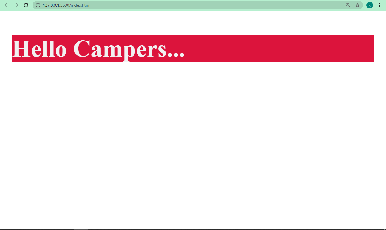
By the way, my browser is zoomed-in to a level of 400% which is why everything appears so big. I didn’t apply any additional styles to accomplish that 
To change the size of your text with inline CSS, you have to do it with the style attribute. You type in the font-size property, and then assign it a value.
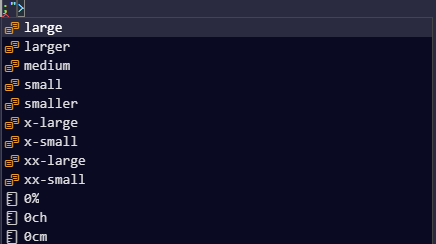
There are built-in values such as large, larger, medium, small, x-large, and so on:
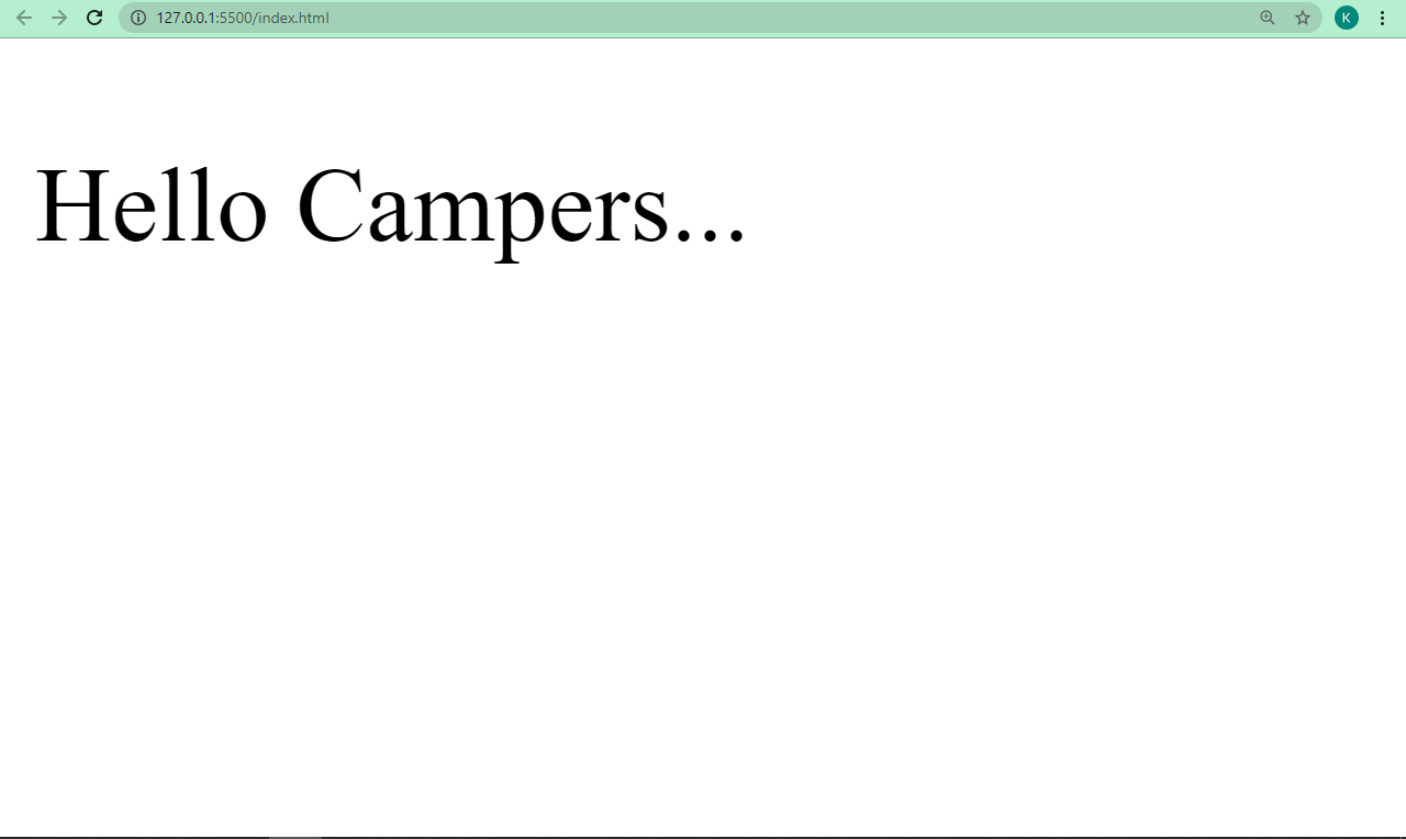
In the code snippet below, I change the size of the “Hello Campers…” text to x-large, one of the built-in values of the font-size property.
<p style="font-size: x-large">Hello Campers...</p>
You can also set the value of the font-size property using a number with any unit such as pixels (px), rem, or em.
It’s better to go with numbered values because they give you more freedom to pick any font size you want.
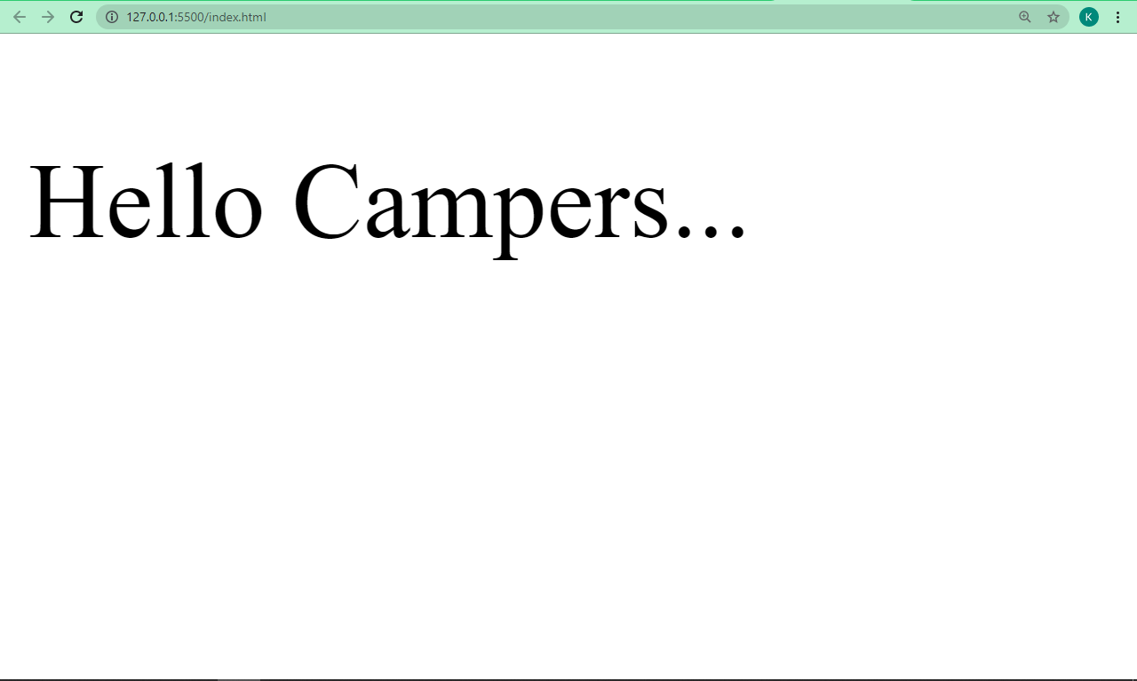
In the code snippet below, I changed the size of the text to 30px with inline CSS:
<p style="font-size: 30px">Hello Campers...</p>
Conclusion
In this article, you learned how to change text size with inline CSS and the font-size property. You also saw how you can assign values to the font-size property.
Just a heads up, though: inline CSS is great for styling, but you should not rely heavily on it as it makes your HTML hard to read, especially if you are working in a team. You don’t want to be the only one who will be able to read your own code.
Be aware that it also overrides any styling set with internal or external styling. You should use external style or internal style instead, as they make your HTML and CSS codes separate, which is better for readability.
While assigning values to the font-size property, it is better to assign the values in rem units instead of px, for example. This is because when you use rem, the browser will be able to make font size adjustments as the user zooms in or out, which won’t happen when you use px.
Thank you for reading, and keep coding.
Learn to code for free. freeCodeCamp’s open source curriculum has helped more than 40,000 people get jobs as developers. Get started
In HTML, the font you choose will play a major role in the look and feel of your web pages.
You get to pick the font’s color, weight, size, and so on. And all these features make your websites and apps look better and more presentable to the user.
With the font-size property in CSS, you can change how big or small the text is on the web page. You can use this property in any type of CSS you are writing – external, internal, or inline.
In this article, I will show you how to change the size of the text with the font-size property in inline CSS.
What is inline CSS?
Inline CSS is one of the three different ways you can use to style any HTML element.
Instead of targeting the element with a class or id attribute, or the element itself as the selector and styling it with that, you put all the CSS styles in the opening tag.
In addition, you have to make sure all the properties and values of your stylings are inside the style attribute. This style attribute is one of the numerous attributes accepted by all HTML tags.
In the example below, I change the background color of the text to crimson, the text color to #f1f1f1 (light-grey), and the font-weight to bold with inline CSS.
<p style="background-color: crimson; color: #f1f1f1; font-weight: bold">
      Hello Campers...
</p>
By the way, my browser is zoomed-in to a level of 400% which is why everything appears so big. I didn’t apply any additional styles to accomplish that
To change the size of your text with inline CSS, you have to do it with the style attribute. You type in the font-size property, and then assign it a value.
There are built-in values such as large, larger, medium, small, x-large, and so on:
In the code snippet below, I change the size of the “Hello Campers…” text to x-large, one of the built-in values of the font-size property.
<p style="font-size: x-large">Hello Campers...</p>
You can also set the value of the font-size property using a number with any unit such as pixels (px), rem, or em.
It’s better to go with numbered values because they give you more freedom to pick any font size you want.
In the code snippet below, I changed the size of the text to 30px with inline CSS:
<p style="font-size: 30px">Hello Campers...</p>
Conclusion
In this article, you learned how to change text size with inline CSS and the font-size property. You also saw how you can assign values to the font-size property.
Just a heads up, though: inline CSS is great for styling, but you should not rely heavily on it as it makes your HTML hard to read, especially if you are working in a team. You don’t want to be the only one who will be able to read your own code.
Be aware that it also overrides any styling set with internal or external styling. You should use external style or internal style instead, as they make your HTML and CSS codes separate, which is better for readability.
While assigning values to the font-size property, it is better to assign the values in rem units instead of px, for example. This is because when you use rem, the browser will be able to make font size adjustments as the user zooms in or out, which won’t happen when you use px.
Thank you for reading, and keep coding.
Learn to code for free. freeCodeCamp’s open source curriculum has helped more than 40,000 people get jobs as developers. Get started

Серёжа СыроежкинКопирайтер
Размер шрифта на сайте можно задать как при помощи HTML, так и с помощью CSS. Рассмотрим оба варианта.
Задание размера шрифта с помощью HTML
Размер шрифта на странице можно определить при помощи тега font HTML. В статье Цвет шрифта HTML мы уже рассматривали тег font и его атрибуты. Одним из атрибутов этого тега является size, который и позволяет установить размер шрифта. Применяется он следующим образом:
Конструктор сайтов <font size="7">"Нубекс"</font>Size может принимать значения от 1 до 7 (по умолчанию равен 3, что соответствует 13,5 пунктам для шрифта Times New Roman). Другой вариант задания атрибута – “+1” или “-1”. Это означает, что размер будет изменен относительно базового на 1 пункт больше или меньше, соответственно.
Приведенный способ довольно прост в использовании и незаменим при необходимости изменения размера шрифта небольшого куска текста. В остальных случаях рекомендуется определять стиль текста с помощью CSS.
Устанавливаем размер шрифта при помощи CSS
В CSS для изменения размера шрифта применяется свойство font-size, которое применяется следующим образом:
<html>
 <head>
  <title>Меняем размер шрифта при помощи CSS</title>
   <style>
	.nubex {
	font-size: 14px;
	}
   </style>
 </head>
 <body>
	<div class="nubex">Шрифты HTML-блока div класса nubex получают размер 14px при помощи свойства font size.</div>
 </body>
</html>
В приведенном примере размер шрифта устанавливается в пикселях. Но существуют и другие способы задания размера:
- large, small, medium — задают абсолютный размер (маленький, средний, большой). Также могут применяться значения экстра-маленький (x-small, xx-small), экстра-большой (x-large, xx-large).
- larger, smaller — задают относительный размер (меньше или больше относительно родительского элемента).
- 100% — задается относительный размер (в процентах относительно родительского). Например:
h1 {
	font-size: 180%;
}
Это означает, что размер тега H1 будет составлять 180% от базового размера шрифта.
- Другие варианты задания относительного размера:
- 5ex — означает, что размер составит 5 высот буквы x от базового шрифта;
- 14pt — 14 пунктов;
- 22px — 22 пикселя;
- 1vw — 1% от ширины окна браузера;
- 1vh — 1% от высоты окна браузера;