4 min read
TextField is a widely used widget in Flutter. You may use it to create a simple form or just use it to allow users to enter a message in a chat app. It serves as the primary widget to get the user’s input. Sometimes you may need to change its height and width to match your design and provide a good user experience. So in this tutorial, we’ll learn how to set height and width of TextField in Flutter.
Here’s what we’ll try to achieve:

Here’s what we’ll cover:
- The Problem
- Changing TextField Height
- Changing Font Size
- Adding Content Padding
- Adding MaxLines and MinLines
- Changing TextField Width
The Problem
When you add the TextField to your page, the default height is set to allow only one line of text, and width is set as long as its parent allows. That means if you wrap the TextField inside the Column widget, TextField’s width is set to full width horizontally and height is set based on the font size (till one line). If the text entered is long enough, the width and height remain the same and TextField starts showing the new characters at the end of the TextField.
TextField Code:
TextField(
  decoration: InputDecoration(
    labelText: 'Enter Name',
    border: OutlineInputBorder(),
  ),
),
Output:

Changing TextField Height
TextField’s height can be changed in 3 ways that are based on your requirement. You can use the Font Size and Content Padding to increase the height and allow a single-line text or use the MaxLines-MinLines property to increase the overall height of the TextField as new text is entered.
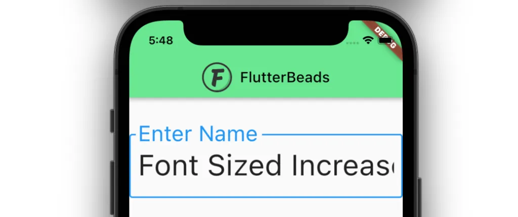
Changing Font Size
If you want to allow only single-line text and change the TextField height, then simply changing the Font Size can help you.
To change the TextField height by changing the Font Size:
Step 1: Inside the TextField, Add the style parameter and assign the TextStyle().
Step 2: Inside the TextStyle(), Add the fontSize parameter and set the appropriate value.
Step 3: Run the app.
Code Example:
TextField(
  decoration: InputDecoration(
    labelText: 'Enter Name',
    border: OutlineInputBorder(),
  ),
  style: TextStyle(fontSize: 40), // <-- SEE HERE
)
Output:
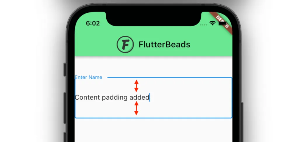
Adding Content Padding
If you notice carefully in the above solution you will find that the size of the placeholder text also changed. i.e Enter Name. If you want to increase the height without changing the font size you can opt for adding Content Padding.
To change the TextField height by changing the Content Padding:
Step 1: Inside the TextField, Add the decoration parameter and assign the InputDecoration().
Step 2: Inside the InputDecoration(), Add the contentPadding parameter and assign the EdgeInsets.symmetric(vertical: 40).
Step 3: Run the app.
Code Example:
TextField(
  decoration: InputDecoration(
    labelText: 'Enter Name',
    border: OutlineInputBorder(),
    contentPadding: EdgeInsets.symmetric(vertical: 40), // <-- SEE HERE
  ),
)
Output:
Adding MaxLines and MinLines
If you want to increase the height of the TextField when the long text is entered, you can use the MaxLines and MinLines property.
Note: Setting the MinLines to 1 will show the TextField as regular and setting the MaxLines to 5 will increase the height till the fifth line of the TextField and setting it to null, will make the height grow infinitely.
To change the TextField height by adding the MaxLines and MinLines:
Step 1: Inside the TextField, Add the maxLines parameter and assign the value as 5.
Step 2: Inside the TextField, Add the minLines parameter and assign the value as 1.
Step 3: Run the app.
Code Example:
TextField(
  decoration: InputDecoration(
    labelText: 'Enter Name',
    border: OutlineInputBorder(),
  ),
  maxLines: 5, // <-- SEE HERE
  minLines: 1, // <-- SEE HERE
)
Output:

Changing TextField Width
To change the TextField width, you can simply wrap your TextField inside the SizedBox widget and give the appropriate width value.
Here’s how you do it:
Step 1: Wrap your TextField inside the SizedBox widget.
Step 2: Inside the SizedBox, Add the width parameter and assign the appropriate value.
Step 3: Run the app.
Code Example:
SizedBox( // <-- SEE HERE
  width: 200,
  child: TextField(
    decoration: InputDecoration(
      labelText: 'Enter Name',
      border: OutlineInputBorder(),
    ),
  ),
),
Output:

Conclusion
In this tutorial, we learned how to set height and width of TextField in Flutter. To change the height of the TextField we saw different approaches such as changing font size, adding content padding, and adding the maxLines and minLines property while keeping the same font size.
Would you like to check other interesting Flutter tutorials?
This article shows you how to set the width, height, and inner padding of a TextField widget in Flutter.
Setting the width of a TextField
You can set the width of a TextField exactly as you want by wrapping it inside a Container, a SizedBox, or a ContrainedBox widget.
Note that the height of the parent widget will not affect the height of the text field inside it.
The height of a TextField widget depends on multiple factors and we’ll talk about that in a later section of this tutorial.
Example
Screenshot:
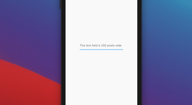
The code:
Widget build(BuildContext context) {
    return Scaffold(
      appBar: AppBar(
        title: const Text('Kindacode.com'),
      ),
      body: const Center(
        child: SizedBox(
          width: 250,
          child: TextField(
            decoration: InputDecoration(
              hintText: 'This text field is 250 pixels wide',
            ),
          ),
        ),
      ),
    );
  }
Another example
Screenshot:
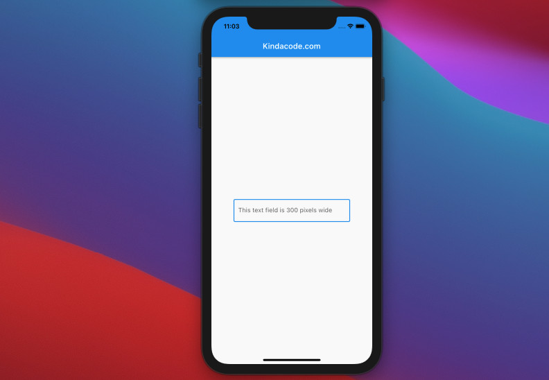
The code:
// main.dart
import 'package:flutter/material.dart';

void main() {
  runApp(const MyApp());
}

class MyApp extends StatelessWidget {
  const MyApp({Key? key}) : super(key: key);

  @override
  Widget build(BuildContext context) {
    return const MaterialApp(
      // Remove the debug banner
      debugShowCheckedModeBanner: false,
      title: 'Kindacode.com',
      home: HomePage(),
    );
  }
}

class HomePage extends StatelessWidget {
  const HomePage({Key? key}) : super(key: key);

  @override
  Widget build(BuildContext context) {
    return Scaffold(
      appBar: AppBar(
        title: const Text('Kindacode.com'),
      ),
      body: Center(
        child: ConstrainedBox(
          constraints: const BoxConstraints.tightFor(width: 300),
          child: const TextField(
            decoration: InputDecoration(
              hintText: 'This text field is 300 pixels wide',
              border: OutlineInputBorder(),
            ),
          ),
        ),
      ),
    );
  }
}
TextField Inner Padding
You can set the inner padding of a TextField by using the contentPadding property of the InputDecoration class.
Example
Screenshot:
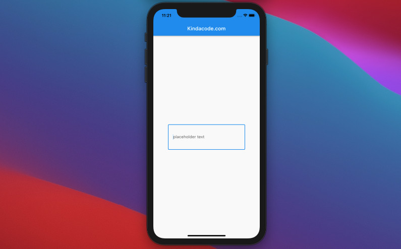
The code:
Widget build(BuildContext context) {
    return Scaffold(
      appBar: AppBar(
        title: const Text('Kindacode.com'),
      ),
      body: const Center(
        child: SizedBox(
          width: 300,
          child: TextField(
            decoration: InputDecoration(
              hintText: 'placeholder text',
              contentPadding:
                  EdgeInsets.symmetric(vertical: 40, horizontal: 20),
              border: OutlineInputBorder(),
            ),
          ),
        ),
      ),
    );
  }
Adjusting the height of a TextField
The height of a TextField depends on its inner padding, font size, and line height.
The font size can be set by manipulating the fontSize property of the TextStyle class.
The line height can be adjusted by using the height property of the TextStyle class. When height is non-null, the line height of the span of text will be a multiple of fontSize and be exactly fontSize * height logical pixels tall.
Words can be long and confusing. The following example will help you understand better.
Example
Screenshot:
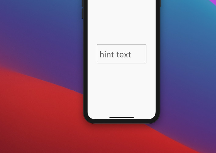
The code:
Widget build(BuildContext context) {
    return Scaffold(
      appBar: AppBar(
        title: const Text('Kindacode.com'),
      ),
      body: const Center(
        child: SizedBox(
          width: 300,
          child: TextField(
            style: TextStyle(fontSize: 50, height: 1.5),
            decoration: InputDecoration(
              hintText: 'hint text',
              contentPadding:
                  EdgeInsets.symmetric(vertical: 20, horizontal: 15),
              border: OutlineInputBorder(),
            ),
          ),
        ),
      ),
    );
  }
Final Words
You’ve learned how to adjust the width, height, and inner padding of a TextFeild widget. If you’d like to learn more about Flutter, take a look at the following articles:
- Understanding Typedefs (Type Aliases) in Dart and Flutter
- Flutter and Firestore Database: CRUD example
- Flutter TextField: Styling labelText, hintText, and errorText
- Most Popular Packages for State Management in Flutter
- Flutter: Make a TextField Read-Only or Disabled
- Flutter & Hive Database: CRUD Example
You can also check out our Flutter category page or Dart category page for the latest tutorials and examples.
Text fields allow users to type text into an app.
They are used to build forms,
send messages, create search experiences, and more.
In this recipe, explore how to create and style text fields.
Flutter provides two text fields:
TextField and TextFormField.
TextField
TextField is the most commonly used text input widget.
By default, a TextField is decorated with an underline.
You can add a label, icon, inline hint text, and error text by supplying an
InputDecoration as the decoration
property of the TextField.
To remove the decoration entirely (including the
underline and the space reserved for the label),
set the decoration to null.
TextField(
  decoration: InputDecoration(
    border: OutlineInputBorder(),
    hintText: 'Enter a search term',
  ),
),
To retrieve the value when it changes,
see the Handle changes to a text field recipe.
TextFormField
TextFormField wraps a TextField and integrates it
with the enclosing Form.
This provides additional functionality,
such as validation and integration with other
FormField widgets.
TextFormField(
  decoration: const InputDecoration(
    border: UnderlineInputBorder(),
    labelText: 'Enter your username',
  ),
),
Interactive example
import 'package:flutter/material.dart';

void main() => runApp(const MyApp());

class MyApp extends StatelessWidget {
  const MyApp({super.key});

  @override
  Widget build(BuildContext context) {
    const appTitle = 'Form Styling Demo';
    return MaterialApp(
      title: appTitle,
      home: Scaffold(
        appBar: AppBar(
          title: const Text(appTitle),
        ),
        body: const MyCustomForm(),
      ),
    );
  }
}

class MyCustomForm extends StatelessWidget {
  const MyCustomForm({super.key});

  @override
  Widget build(BuildContext context) {
    return Column(
      crossAxisAlignment: CrossAxisAlignment.start,
      children: <Widget>[
        const Padding(
          padding: EdgeInsets.symmetric(horizontal: 8, vertical: 16),
          child: TextField(
            decoration: InputDecoration(
              border: OutlineInputBorder(),
              hintText: 'Enter a search term',
            ),
          ),
        ),
        Padding(
          padding: const EdgeInsets.symmetric(horizontal: 8, vertical: 16),
          child: TextFormField(
            decoration: const InputDecoration(
              border: UnderlineInputBorder(),
              labelText: 'Enter your username',
            ),
          ),
        ),
      ],
    );
  }
}
For more information on input validation, see the
Building a form with validation recipe.
What is the TextField field?
The most popular text input widget that enables users to import keyboard inputs into an app is TextField in Flutter.
An input element called a TextField or TextBox stores alphanumeric information such as name, password, address, etc. It is a GUI control element that lets users enter text using programmable code.
The problem faces in TextField
When you add a TextField to your page, its default width and height are configured to cover the maximum lines of text its parent enabled.
By default, the TextField height is dependent on the text font size, And its width is your device’s screen width.
Checkout the latest guide on how to use hexadecimal color strings in Flutter?
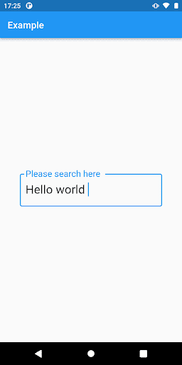
Set the height of TextField
There are three different ways to adjust the height of a TextField. You can use the MaxLines-MinLines property to increase TextField’s total height when new text is input, and you can use the Font Size and Content Padding to increase the height and enable single-line content.
Change the font size to increase TextField’s height.
In TextField there is a property style:TextStyle();
Inside the textstyle there is a property called font size. Then give the appropriate font size.
TextField(
 decoration: InputDecoration(
   border: OutlineInputBorder(),
   labelText: 'Please search here ',
 ),
 style: TextStyle(fontSize: 25),
),
Enter fullscreen mode
Exit fullscreen mode
Output:
Add padding of text to increase TextField’s height
In InputDecoration() there is a property called contentPadding:
TextField(
 decoration: InputDecoration(
     labelText: 'Please search here ',
     contentPadding: EdgeInsets.all(25),
   border: OutlineInputBorder(),
 ),
 style: TextStyle(fontSize: 25),
),
Enter fullscreen mode
Exit fullscreen mode
Output

Maxine’s-MinLines property to increase TextField’s height
If you want to increase the height of the TextField with the extended text entered, you can use the MaxLines and MinLines properties.
TextField(
 decoration: InputDecoration(
   labelText: 'Please search here ',
   contentPadding: EdgeInsets.all(8),
   border: OutlineInputBorder(),
 ),
 style: TextStyle(fontSize: 25),
 maxLines: 3,
 minLines: 2,
),
Enter fullscreen mode
Exit fullscreen mode
Output

Changing TextField Width
To set the TextField width, you can wrap your TextField inside the SizedBox widget and give the width.
SizedBox(
 width: 250,
 child: TextField(
   decoration: InputDecoration(
     labelText: 'Please search here ',
     contentPadding: EdgeInsets.all(8),
     border: OutlineInputBorder(),
   ),
   style: TextStyle(fontSize: 25),
   maxLines: 3,
   minLines: 2,
 ),
),
Enter fullscreen mode
Exit fullscreen mode
Output

Conclusion
So, far we have learned that how you can change height and width in Flutter with the help of the TextField widget. We learned a use of TextField widget that is specially using to set a height and width of the text field where user fill their input.
Timeless DEV post…
Git Concepts I Wish I Knew Years Ago
The most used technology by developers is not Javascript.
It’s not Python or HTML.
It hardly even gets mentioned in interviews or listed as a pre-requisite for jobs.
I’m talking about Git and version control of course.
Read next

How to download Youtube Music and Videos with Python
Shittu Olumide — Feb 7

Deployment with Next.js
Paula Marín S — Jan 30

Cap X: El mal entendido rol del arquitecto de software, El libro negro del programador. 💻
Cristian Fernando — Jan 21

Cypress Tutorial For Beginners : Part 4 ( Cypress Download File )
Pramod Dutta — Jan 17
Once unpublished, all posts by kuldeeptarapara will become hidden and only accessible to themselves.
If kuldeeptarapara is not suspended, they can still re-publish their posts from their dashboard.
Note:
Once unpublished, this post will become invisible to the public and only accessible to Kuldeep Tarapara.
They can still re-publish the post if they are not suspended.
Thanks for keeping DEV Community 👩💻👨💻 safe. Here is what you can do to flag kuldeeptarapara:
Make all posts by kuldeeptarapara less visible
kuldeeptarapara consistently posts content that violates DEV Community 👩💻👨💻’s
code of conduct because it is harassing, offensive or spammy.


the default textfield height is too big(the padding of top and bottom too big), i want little size, how can i implementation it?
i known InputDecoration.collapsed can remove the space, but it can’t use prefix and suffix.
AlexYegorov-UOS and CodeBytes1 reacted with laugh emoji
MaHi177 reacted with eyes emoji
Please add the output of flutter doctor -v.
zoechi
added this to the
Goals milestone
Feb 12, 2019
Add it to a Container and adjust the height of Container according to Your requirement
osamabinishrat, mevos19, louia, whutlichao, zainhasib, SumeetMathews, lucasdidur, TheRedPanda17, qieting, AlejandroEndo, and 17 more reacted with thumbs down emoji
yangjm reacted with hooray emoji
HusamAamer, tapizquent, qieting, and easazade reacted with confused emoji
joshuachinemezu, HusamAamer, and yangjm reacted with heart emoji
There’s work underway to make textfield height more configurable: #27205
TextField(
maxLines: 5,
),
AlexYegorov-UOS, yuriboeira11tx, sidharthsankar, passionDev0, reverie-ss, mfarizon, ValLR, christian-muertz, kazimad, ramzieus, and 3 more reacted with confused emoji
reverie-ss and spiderion reacted with heart emoji
Container(
Width:32,
child:textfield(
)
)
AlexYegorov-UOS, jacobokoenig, yuriboeira11tx, LaksamanaGuntur, joyin5344, fysoul17, christian-muertz, furaiev, and easazade reacted with confused emoji
Use contentPadding:
TextField(
decoration: InputDecoration(
contentPadding: EdgeInsets.all(8.0),//here your padding
border: OutlineInputBorder(…………
saputraiqbal, ciriousjoker, and neliousness reacted with hooray emoji
osamabinishrat, MaHi177, Panacea-Soft, Choxmi, and pravinargents reacted with heart emoji
jeeali reacted with rocket emoji
Add it to a Container and adjust the height of Container according to Your requirement
It’s not work
Inside the TextFormField
decoration: InputDecoration(
hintText: ‘Email’,
contentPadding: new EdgeInsets.symmetric(vertical: 25.0, horizontal: 10.0),
border: OutlineInputBorder(borderRadius: BorderRadius.circular(32.0)),
),
Use contentPadding:
TextField(
decoration: InputDecoration(
contentPadding: EdgeInsets.all(8.0),//here your padding
border: OutlineInputBorder(…………
This is actually a working solution, thanks!
Restricting a TextField with a container (as a couple of commenters advised before) has a huge drawback in case of TextFormField with validation, the textfield won’t grow if validation fails and that will look really ugly. But using decoration is the correct way to do it
You can control the height using these two properties together in your InputDecoration. For example, if contentPadding is set to EdgeInsets.all(0), the TextField will have no padding at all around the text and will be «short».
InputDecoration(
  isDense: true,
  contentPadding: EdgeInsets.all(10)
)
VictorCamargo, Azzawie, and2long, topex-psy, 3bugs, Yaolegol, and easazade reacted with hooray emoji
moohammed-gaber, gitfornncn, aupous, thanhit93, eddie-kwon, phuongthuan, gonharry, Monrocq, VictorCamargo, Yaolegol, and easazade reacted with heart emoji
VictorCamargo, Yaolegol, and easazade reacted with rocket emoji
You can control the height using these two properties together in your
InputDecoration. For example, ifcontentPaddingis set toEdgeInsets.all(0), theTextFieldwill have no padding at all around the text and will be «short».InputDecoration( isDense: true, contentPadding: EdgeInsets.all(10) )
it worked thx
TextField(
expands: true,
will expand the textField to its Container Height
This thread has been automatically locked since there has not been any recent activity after it was closed. If you are still experiencing a similar issue, please open a new bug, including the output of flutter doctor -v and a minimal reproduction of the issue.
lock
bot
locked and limited conversation to collaborators
Apr 25, 2020
Most modern applications require some type of input from a user. Whether it be a signup, login, or feedback form, learning how to implement a text field is an important skill to master as a developer.
In Flutter, there are two types of text field widgets that we can use to get user input. One is TextField and the other one is TextFormField, a slightly more advanced version of TextField. TextFormField provides more functionalities than TextField, such as build form validation and the ability to set initial text value directly.
If your text field requires only one or two inputs from the user, I suggest using the TextField widget. Otherwise if you want to create a larger form with multiple input fields and validation, it’s better to go with the TextFormField widget.
Creating a basic TextField
Creating a basic TextField widget is straightforward. Apply the TextField widget inside your widget tree where you want it to appear. This will add a default TextField with default styling:
TextField(
    )
Creating a basic TextFormField
You can add TextFormField in the same manner as TextField. There is no visual difference between these two widgets:
TextFormField(
    )
Styling a text field
Styling a text field to personalize your application is easily done by setting InputDecoration to the decoration property of the TextField/TextFormField widget:
     TextField(
            decoration: InputDecoration(
              filled: true,
              fillColor: Colors.blueAccent,
              border: OutlineInputBorder(
                borderSide: BorderSide.none,
                borderRadius: BorderRadius.circular(50)
              ),
            ),
          )
You must set the filled value to true if you want to apply a background color to your text field. Otherwise, the background color will not be affected.

Changing text color
Text color can be changed using the style property of the TextField widget. You can also change the cursor color by setting the color to the cursorColor property:
        TextField(
              cursorColor: Colors.black,
              style: TextStyle(
                color: Colors.white
              ),
              decoration: InputDecoration(
                filled: true,
                fillColor: Colors.blueAccent,
                border: OutlineInputBorder(
                  borderSide: BorderSide.none,
                  borderRadius: BorderRadius.circular(50)
                ),
              ),
            )

Adding hint text
Hint text is used to give users an idea about the input values that are accepted by the text field. You can use the hintText property to add a hint to the text field which will disappear when you begin typing. The default color is grey, but you can add hintStyle to change the text styling:
    TextField(
        decoration: InputDecoration(
          hintStyle: TextStyle(color: Colors.blue),
          hintText: "Enter your name"
        ),
      )

Adding multi-line support
By default, TextField shows as a single line. But we can specify the maximum number of lines to be supported via the maxLines property. This will not limit the number of lines you can add, it only shows the specified number of lines at a time. If you want to expand the field based on the amount of input text, you can set null to the maxLines property:
        TextField(
          maxLines: 5,
        ),

Reading input value
Reading the user’s input is the most important feature of your text field. In Flutter, this can be done using TextEditingController.
First, create a TextEditingController and set it as a controller property of your TextField widget.
In this example, I have added an extra Button and Text widget which will show the added text when you click the “Show Text” button.
When you press the button, it will set the textController value to the displayText variable. displayText has been set as the text of the Text widget, so when you press “Show Text” you can see the input text appear:
class _TextFormState extends State<TextFormSample> {
  TextEditingController textController = TextEditingController();
  String displayText = "";

  @override
  Widget build(BuildContext context) {
    return Column(
      children: [
        TextField(
          controller: textController,
          maxLines: null,
        ),
        ElevatedButton(onPressed: (){
          setState(() {
            displayText = textController.text;
          });
        }, child: Text("Show Text")),
        Text(displayText,style: TextStyle(fontSize: 20),)
      ],
    );
  }
}

Pre-populating text
Pre-populating values when loading the text field will be useful in scenarios like profile updates and login screens. The TextField widget itself doesn’t have a property to set an initial value, but this can be done using TextEditingController.
Create a TextEditingController, set a value to the text property of the constructor, and it will populate to the widget when it loads the first time:
  TextEditingController textController = TextEditingController(text: "Initial Text");

  @override
    Widget build(BuildContext context) {
      return Center(
        child: TextField(
          controller: textController,
        ),
      );
    }
Then use the initialValue property in TextFormField to create your pre-populated text:
        TextFormField(
          initialValue: "Initial Text",
        )
Changing keyboards based on input type
You may have seen applications show different keyboard layouts for different input types, like number pads for phone numbers or an “@” button for emails. This can be done in Flutter via the keyboardType property. It accepts TextInputType with multiple options like number, date, phone, name, and email address:
     TextField(
        keyboardType: TextInputType.number,
      )


Converting a normal text field to a password field
By setting the obscureText property to true you can convert a plain text field to a password field, which masks the input values.
The default of this property will show dots to mask password characters. But you can change this by setting the obscuringCharacter value to anything you’d like; here, I chose asterisks:
     TextField(
        obscureText: true,
        obscuringCharacter: "*",
      )

Restricting the number of characters
The maxLength property accepts integer values to specify the maximum number of characters accepted by the particular field. After adding this property, if users enter a value with more characters than specified in maxLength, it will block the input automatically:
     TextField(
        maxLength: 2,
      )

Restricting and allowing input values
Utilizing validation in your text field to restrict certain characters or digits is a must to reduce user errors.
Flutter’s inputFormatter property allows you to set an array of filters to the TextField widget. It will accept two types:
- Allowing specific characters, which can be set using
FilteringTextInputFormatter.allow() - Denying specific characters, which can be set using
FilteringTextInputFormatter.deny()
The following is an example of what your code might look like if you’re denying certain characters:
TextField(
        inputFormatters: [FilteringTextInputFormatter.deny(RegExp("[0-9]+"))],
      )
If a user enters a denied character, the text field will not display an error to the user. It simply blocks or allows specified characters based on the input.
However, adding error messages with validation is simple, which is what we are going to talk about next.
Validating input with error messages
Applying an error message to TextField and TextFormField is slightly different because of the availability of certain properties. Let’s take a look at how you can validate input with error messages in each of these widgets.
Input validation error messages in TextField
There is no direct property to add an error message in TextField. But you can set an errorText property in InputDecoration based on the validated value.
In the following example, I determine if the input value is empty and a number, and change the isANumber value to true or false based on the result. Based on the isANumber value you can set the error text, as I did here with “Please enter a number”:
class _LoginFormState extends State<LoginForm> {

  TextEditingController textController = TextEditingController();
  RegExp digitValidator  = RegExp("[0-9]+");
  bool isANumber = true;
  @override
  Widget build(BuildContext context) {
    return Center(
      child:
      TextField(
        onChanged: (inputValue){
          if(inputValue.isEmpty || digitValidator.hasMatch(inputValue)){
            setValidator(true);
          } else{
            setValidator(false);
          }
        },

        decoration: InputDecoration(
          errorText: isANumber ? null : "Please enter a number"
        ),
      ),
    );
  }
  void setValidator(valid){
    setState(() {
      isANumber = valid;
    });
  }
}

You can easily customize error text color by setting TextStyle to the errorStyle property.
You can change the border color using the focusedErrorBorder and errorBorder properties. errorBorder will be shown when there is no focus on the field. Therefore, be sure to set both of those properties when changing the border color:
TextField(
        onChanged: (inputValue){
          if(inputValue.isEmpty || digitValidator.hasMatch(inputValue)){
            setValidator(true);
          } else{
            setValidator(false);
          }
        },

        decoration: InputDecoration(
          errorText: isANumber ? null : "Please enter a number",
          errorStyle: TextStyle(color: Colors.purpleAccent),
          focusedErrorBorder: UnderlineInputBorder(borderSide: BorderSide(color: Colors.purpleAccent)),
          errorBorder: UnderlineInputBorder(borderSide: BorderSide(color: Colors.purpleAccent))
        ),
      )

Input validation error messages in TextFormField
The main difference between TextFormField and TextField is that the TextFormField widget uses the Form widget, which can contain multiple TextField widgets.
In Flutter, creating a validated Form with TextFormField is simple.
More great articles from LogRocket:
- Don’t miss a moment with The Replay, a curated newsletter from LogRocket
- Learn how LogRocket’s Galileo cuts through the noise to proactively resolve issues in your app
- Use React’s useEffect to optimize your application’s performance
- Switch between multiple versions of Node
- Discover how to animate your React app with AnimXYZ
- Explore Tauri, a new framework for building binaries
- Compare NestJS vs. Express.js
First, create a Form widget and add two TextFormField widgets with a button (I used ElevatedButton) and Text.
The important thing to remember when creating a Form widget is that you must first create a GlobalKey which is required to access the Form. After creating a GlobalKey, you can set that key to the key property of the Form widget.
TextFormField contains a property called a validator. You can access field values in the validator callback function and validate differently based on the returned value. For the first text field, we will check whether it is empty, or whether the value is a digit using a regular expression. If that condition fails you can return an error message for that particular field.
In the onPressed event, you can check the form validity using the GlobalKey object and change the isValidForm value to true or false to show a message in the below Text widget:
class _NumberFormState extends State<NumberForm> {

  var _numberForm = GlobalKey<FormState>();
  RegExp _digitRegex = RegExp("[0-9]+");
  bool isValidForm = false;
  @override
  Widget build(BuildContext context) {
    return Center(
      child: Form(
        key: _numberForm,
        child:
        Column(
          children: [
            TextFormField(
              validator: (inputValue){
                if(inputValue.isEmpty || !_digitRegex.hasMatch(inputValue)){
                  return "Please enter number";
                }
                return null;
              },
            ),
            TextFormField(
              validator: (inputValue){
                if(inputValue.isEmpty){
                  return "Please Fill before";
                }
                return null;
              },
            ),
            ElevatedButton(
              onPressed: (){
                if(_numberForm.currentState.validate()){
                    setState(() {
                      isValidForm = true;
                    });
                } else{
                  setState(() {
                      isValidForm = false;
                    });
                }
            }, child: Text("Check Number")),
            Text( isValidForm ? "Nice" : "Please Fix error and Submit ")
          ],
        )),
    );
  }
}

Conclusion
I hope this article gave you a better idea about how to customize and use different properties in Flutter’s TextField and TextFormField widgets.
Cut through the noise of traditional error reporting with LogRocket
LogRocket is a digital experience analytics solution that shields you from the hundreds of false-positive errors alerts to just a few truly important items. LogRocket tells you the most impactful bugs and UX issues actually impacting users in your applications.
Then, use session replay with deep technical telemetry to see exactly what the user saw and what caused the problem, as if you were looking over their shoulder.
LogRocket automatically aggregates client side errors, JS exceptions, frontend performance metrics, and user interactions. Then LogRocket uses machine learning to tell you which problems are affecting the most users and provides the context you need to fix it.
Focus on the bugs that matter — try LogRocket today.
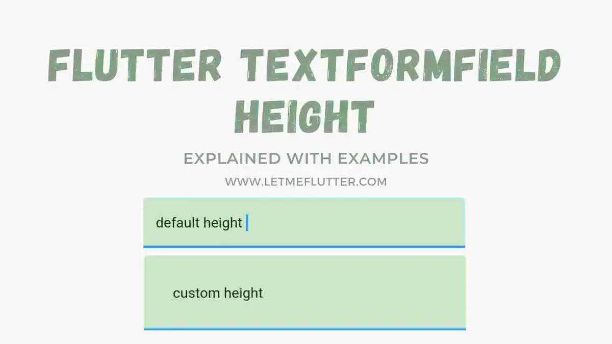
In this tutorial, we’ll learn how to properly customize Flutter textformfield height by using practical Flutter code examples.
Outline
- Introduction: Flutter Textformfield Height
- Default Flutter Textformfield Height
- Using isDense
- Using isCollapsed
- Changing Flutter Textformfield Height Using Content Padding
- Custom Flutter Textformfield Height Source Code
- Conclusion
Introduction: Flutter Textformfield Height
Flutter textformfield height, as the name suggests, it is the height of the Flutter textformfield means the vertical space that the Flutter textformfield will cover. Let’s now set our Flutter textformfield height using a practical Flutter code.
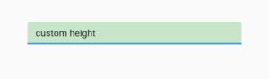
Let’s see the default Flutter textformfield height. For that, we have to implement a simple Flutter textformfield. See the below code:
 TextFormField(
           decoration: InputDecoration(
                  filled: true,
                  fillColor: Colors.green.shade100
                                      ),
           )
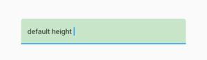
In the above code, I have used the filled and fill color constructor of the input decoration class to give our Flutter textformfield a background color so you can see clearly the default height of Flutter textformfield. We can see the default Flutter textformfield height in the above image.
Using isDense
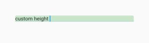
Using is dense constructor of the input decoration class minimize the vertical space of the Flutter textformfield which means Flutter textformfield with less height. Is dense takes a Boolean value, by default it is false, making it true will decrease the Flutter textformfield height as seen in the below image.
Using isCollapsed
Is collapsed constructor of the input decoration class also takes a Boolean value, it makes the Flutter textformfield height same with the input, by default it is false, making it true will trigger its effect on Flutter textformfield height as seen in the below image.
isCollapsed: true
Changing Flutter Textformfield Height Using Content Padding
Let’s see how we can change the Flutter textformfield height with custom value. For that you have to use the content padding constructor of the input decoration class. See the code below for this:
contentPadding: EdgeInsets.all(28)
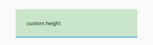
As you can see in the above code that we have used the content padding constructor and passed edge in sets all with value 30 to it which means having a padding of 30 from all four dimensions. In the image above, you can see that the height of Flutter textformfield is now increased. So in this way you can customize the Flutter textformfield height.
Congrats for making it to the end, now you have a complete idea of how to change the height of Flutter textformfield widget.
The source code of Flutter textformfield with custom height is given in the next section.
Custom Flutter Textformfield Height Source Code
import 'package:flutter/material.dart';
void main() {
  runApp(const MyApp());
}
class MyApp extends StatelessWidget {
  const MyApp({Key? key}) : super(key: key);
  @override
  Widget build(BuildContext context) {
    return MaterialApp(
      debugShowCheckedModeBanner: false,
      home: Homepage(),
    );
  }
}
class Homepage extends StatefulWidget {
  @override
  State<Homepage> createState() => _HomepageState();
}
class _HomepageState extends State<Homepage> {
  @override
  Widget build(BuildContext context) {
    return SafeArea(
        child: Scaffold(
      body: Center(
          child: Padding(
              padding: EdgeInsets.symmetric(horizontal: 40),
              child: Column(
                mainAxisAlignment: MainAxisAlignment.center,
                children: [
                  TextField(
                    decoration: InputDecoration(
                        contentPadding: EdgeInsets.all(28),
                        filled: true,
                        fillColor: Colors.green.shade100),
                  )
                ],
              ))),
    ));
  }
}
Conclusion
To conclude this tutorial, now you’ve a detailed and in-depth practical knowledge of how to customize Flutter textformfield height. I’d love to have your feedback on this post.
I’d also love to see you visit my other tutorials on Flutter app development and Python programming as well. Thank you for reading this post.
You might also like:
Flutter Textformfield
Tags:change flutter textformfield height, custom height flutter textformfield, flutter textformfield, flutter textformfield change height, flutter textformfield content padding, flutter textformfield custom height, flutter textformfield customization, flutter textformfield decoration, flutter textformfield height, flutter textformfield height change, flutter textformfield height expand, flutter textformfield is collapsed, flutter textformfield is dense, flutter textformfield vertical height, height custom flutter textformfield, height flutter textformfield, how to change flutter textformfield height, make flutter textformfield height big, textformfield height