CSS Height That Works in Both Modern and Legacy Browsers
Most of the other solutions posted here will not work well in legacy browsers! And some of the code people posted will cause a nasty overflow of text beyond 100% height in modern browsers where text flows past background colors, which is bad design! So please try my code solution instead.
The CSS code below should support flexible web page height settings correctly in all known browsers, past and present:
html {
    height: 100%; /* Fallback CSS for IE 4-6 and older browsers. Note: Without this setting, body below cannot achieve 100% height. */
    height: 100vh;/* Overrides 100% height in modern HTML5 browsers and uses the viewport's height. Only works in modern HTML5 browsers */
}

body {
    height: auto; /* Allows content to grow beyond the page without overflow */
    width: auto; /* Allows content to grow beyond the page without overflow */
    min-height: 100%; /* Starts web page with 100% height. Fallback for IE 4-6 and older browsers */
    min-height: 100vh;/* Starts web page with 100% height. Uses the viewport's height. Only works in modern HTML5 browsers */
    overflow-y: scroll;/* Optional: Adds an empty scrollbar to the right margin in case content grows vertically, creating a scrollbar.  Allows for better width calculations, as the browser pre-calculates width before scrollbar appears, avoiding page content shifting.*/
    margin: 0;
    padding: 0;
    background:yellow;/* FOR TESTING: Next add a large block of text or content to your page and make sure this background color always fills the screen as your content scrolls off the page. If so, this works. You have 100% height with flexible content! */
}
NOTES ON THE CODE ABOVE
In many older, as well as newer browsers, if you do not set 100% height on the <html> selector, body will never achieve 100% height! So that is critical here.
The new viewport units («vh») are redundant on the body selector and not necessary as long as you have set html selector to a height of either 100% or 100vh. The reason is the body always derives its values from the html parent. The exception is a few very old browsers from the past, so its best to set some height value for the body.
Some modern browsers using the body selector will not know how to inherit the viewport height directly. So again, always set your html selector to 100% height! You can still use «vh» units in body to bypass the parent html value and get its property dimensions directly from the viewport in most modern browsers, however. But again, its optional if the parent or root html selector has 100% height, which body will always inherit correctly.
Notice I’ve set body to height:auto, not height:100%. This collapses the body element around content initially so it can grow as content grows. You do NOT want to set body height and width to 100%, or specific values as that limits content to the body’s current visual dimensions, not its scrollable dimensions. Anytime you assign body height:100%, as soon as content text moves beyond the browser’s height, it will overflow the container and thus any backgrounds assigned to the original viewport height, creating an ugly visual! height:auto is your best friend in CSS!
But you still want body to default to 100% height, right? That is where min-height:100% works wonders! It will not only allow your body element to default to 100% height, but this works in even the oldest browsers! But best of all, it allows your background to fill 100% and yet stretch farther down as content with height:auto grows vertically.
Using overflow:auto properties are not needed if you set height:auto on the body. That tells the page to let content expand height to any dimension necessary, even beyond the viewport’s height, if it needs to and content grows longer than the viewport page display. It will not break out of the body dimensions. And it does allow scrolling as needed. overflow-y:scroll allows you to add an empty scrollbar to the right of the page content by default in every web browser. The scrollbar only appear inside the scroll bar area if content extends beyond 100% height of the viewport. This allows your page width, and any margins or paddings to be calculated by the browser beforehand and stop the pages from shifting as users view pages that scroll and those that do not. I use this trick often as it sets the page width perfectly for all scenarios and your web pages will never shift and load lightning fast!
I believe height:auto is the default on body in most UA browser style sheets. So understand most browsers default to that value, anyway.
Adding min-height:100% gives you the default height you want body to have and then allows the page dimensions to fill the viewport without content breaking out of the body. This works only because html has derived its 100% height based on the viewport.
The two CRITICAL pieces here are not the units, like % or vh, but making sure the root element, or html, is set to 100% of the viewport height. Second, its important that body have a min-height:100% or min-height:100vh so it starts out filling the viewport height, whatever that may be. Nothing else beyond that is needed.
STYLING HEIGHT FOR LEGACY BROWSERS
Notice I have added «fallback» properties for height and min-height, as many browsers pre-2010 do not support «vh» viewport units. It’s fun to pretend everyone in the web world uses the latest and greatest but the reality is many legacy browsers are still around today in big corporate networks and many still use antiquated browsers that do not understand those new units. One of the things we forget is many very old browsers do not know how to fill the the viewport height correctly. Sadly, those legacy browsers simply had to have height:100% on both the html element and the body as by default they both collapsed height by default. If you did not do that, browser background colors and other weird visuals would flow up under content that did not fill the viewport. The example above should solve all that for you and still work in newer browsers.
Before modern HTML5 browsers (post-2010) we solved that by simply setting height:100% on both the html and body selectors, or just min-height:100% on the body. So either solution allows the code above to work in over 20+ years of legacy web browsers rather than a few created the past couple of years. In old Netscape 4 series or IE 4-5, using min-height:100% instead of height:100% on the body selector could still cause height to collapse in those very old browsers and cause text to overflow background colors. But that would be the one issue I could see with this solution.
Using my CSS solution, you now allow your website to be viewed correctly in 99.99% of browsers, past and present rather than just 60%-80% of browsers built the past few years.
Good Luck!

CSS is difficult but also forgiving. And this forgiveness allows us to haphazardly throw styles into our CSS.
Our page still loads. There is no «crash».
When it comes to page width and height, do you know what to set on the HTML element? How about the body element?
Do you just slap the styles into both elements and hope for the best?
If you do, you’re not alone.
The answers to those questions are not intuitive.
I’m 100% guilty of applying styles to both elements in the past without considering exactly which property should be applied to which element. 🤦♂️
It is not uncommon to see CSS properties applied to both the HTML and body elements like this:
html, body {
     min-height: 100%;
}
Does It Matter?
Yes, yes it does.
The above style definition creates a problem:
Setting min-height to 100% on both elements does not allow the body element to fill the page like you might expect. If you check the computed style values in dev tools, the body element has a height of zero.
Meanwhile, the HTML element has a height equal to the visible part of the page in the browser.
Look at the following screenshot from Chrome Dev Tools:
Why Does This Happen?
Using a percentage as a size value requires the element to reference a parent to base that percentage on.
The HTML element references the viewport which has a height value equal to the visible viewport height. However, we only set a min-height on the HTML element… NOT a height property value.
Therefore, the body element has no parent height value to reference when deciding what 100% is equal to.
If you started out with enough content to fill the body of the page, you might not have noticed this issue.
And to make it more difficult to notice, if you set a background-color on both elements or even on just one of them, the viewport is full of that color. This gives the impression the body element is as tall as the viewport.
It’s not. It’s still at zero.
The image above is taken from a page with the following CSS:
html, body {
    min-height: 100%;
}
body { background-color: dodgerblue; }
Reverse-inheritance?
In a strange twist, the HTML element assumes the background-color of the body element if you don’t set a separate background-color on the html element.
So What is the Ideal Height Setting for a Full Responsive Page?
For years, the answer was the following:
html {
    height: 100%;
}
body {
    min-height: 100%;
}
This allows the HTML element to reference the parent viewport and have a height value equal to 100% of the viewport value.
With the HTML element receiving a height value, the min-height value assigned to the body element gives it an initial height that matches the HTML element.
This also allows the body to to grow taller if the content outgrows the visible page.
The only drawback is the HTML element does not grow beyond the height of the visible viewport. However, allowing the body element to outgrow the HTML element has been considered acceptable.
The Modern Solution is Simplified
body { min-height: 100vh; }
This example uses vh (viewport height) units to allow the body to set a minimum height value based upon the full height of the viewport.
Like the previously discussed background-color, if we do not set a height value for the HTML element, it will assume the same value for height that is given to the body element.
Therefore, this solution avoids the HTML element overflow present in the previous solution and both elements grow with your content!
The use of vh units did cause some mobile browser issues in the past, but it appears that Chrome and Safari are consistent with viewport units now.
Page Height May Cause a Horizontal Scrollbar
Wait, what?
Shouldn’t this say «Page Width»?
Nope.
In another strange series of events, your page height may activate the horizontal scrollbar in your browser.
When your page content grows taller than the viewport height, the vertical scrollbar on the right is activated. This can cause your page to instantly have a horizontal scrollbar as well.
So What is the Fix?
You may sleep better knowing it starts with a page width setting.
This problem arises when any element — not just the HTML or body element — is set to 100vw (viewport width) units.
The viewport units do not account for the approximate 10 pixels that the vertical scrollbar takes up.
Therefore, when the vertical scrollbar activates you also get a horizontal scrollbar.
Maybe just don’t.
Not setting a width on the HTML and body elements will default to the full size of the screen. If you do set a width value other than auto, consider utilizing a CSS reset first.
Remember, by default the body element has 8px of margin on all sides.
A CSS reset removes this. Otherwise, setting the width to 100% before removing the margins will cause the body element to overflow. Here’s the CSS reset I use:
* {
    margin: 0;
    padding: 0;
    box-sizing: border-box;
}
How to Set Width to Your Preference
While it may not always be necessary to set a width, I usually do.
It may simply be a habit.
If you set the width to 100% on the body element you will have a full page width. This is essentially equivalent to not setting a width value and allowing the default.
If you want to use the body element as a smaller container and let the HTML element fill the page, you could set a max-width value on the body.
Here’s an example:
html { background-color: #000; }
body {
    min-height: 100vh;
    max-width: 400px;
    background-color: papayawhip;
    margin: 0 auto;
}
Conclusion
With no height value provided for the HTML element, setting the height and/or min-height of the body element to 100% results in no height (before you add content).
However, with no width value provided for the HTML element, setting the width of the body element to 100% results in full page width.
This can be counterintuitive and confusing.
For a responsive full page height, set the body element min-height to 100vh.
If you set a page width, choose 100% over 100vw to avoid surprise horizontal scrollbars.
I’ll leave you with a tutorial from my YouTube channel demonstrating the CSS height and width settings for an HTML page that is full screen size and grows with the content it contains:
Do you have a different way of setting the CSS width and height that you prefer?
Let me know your method!
Learn to code for free. freeCodeCamp’s open source curriculum has helped more than 40,000 people get jobs as developers. Get started
|
phpk 27 / 41 / 13 Регистрация: 15.05.2013 Сообщений: 1,313 |
||||
|
1 |
||||
|
06.12.2014, 16:33. Показов 22085. Ответов 7 Метки нет (Все метки)
Что означает, если указать в CSS свойство:
Приведите пожалуйста наглядный пример, в каких случаях это необходимо
__________________
0 |

|
2960 / 2578 / 1068 Регистрация: 15.12.2012 Сообщений: 9,733 Записей в блоге: 11 |
|
|
06.12.2014, 17:54 |
2 |
|
Решениеphpk, это указывает на то что Ваш сайт будет отображаться на всю ширину и высоту окна браузера… Иногда когда сайты верстаются на определённое разрешение, к примеру 1000px — если задать данную ширину для body — тогда тело Вашего сайт относительно окна браузера будет иметь ширину 1000px…
1 |
 Сообщение было отмечено Fedor92 как решение
|
phpk 27 / 41 / 13 Регистрация: 15.05.2013 Сообщений: 1,313 |
||||
|
06.12.2014, 18:12 [ТС] |
3 |
|||
|
phpk, это указывает на то что Ваш сайт будет отображаться на всю ширину и высоту окна браузера… Вот код, который якобы должен показывать блок test с шириной в 1000px на всё окно браузера.
0 |

|
2960 / 2578 / 1068 Регистрация: 15.12.2012 Сообщений: 9,733 Записей в блоге: 11 |
|
|
06.12.2014, 18:25 |
4 |
|
Добавлено через 3 минуты
0 |
") html(по умолчанию 100% на 100%) — нельзя задать фикс. размеры, а вот body — можно и нужно это делать…
html(по умолчанию 100% на 100%) — нельзя задать фикс. размеры, а вот body — можно и нужно это делать…|
phpk 27 / 41 / 13 Регистрация: 15.05.2013 Сообщений: 1,313 |
||||
|
06.12.2014, 18:36 [ТС] |
5 |
|||
|
Ну так Вы не только же body задаёте границу, но и тегу html убрал html, всё-равно видно фон
0 |

|
Fedor92
2960 / 2578 / 1068 Регистрация: 15.12.2012 Сообщений: 9,733 Записей в блоге: 11 |
||||||||
|
06.12.2014, 18:46 |
6 |
|||||||
|
А вот это уже загадка века почему фон применяемый к body заливает весь html целиком… Если вы выделите границы блоков с помощью свойства
для body и свойства
green для блока увидите расположение body… Причём, если мне память не изменяет подобные вещи происходят, если задавать в качестве фона именно цвет…
1 |
|
27 / 41 / 13 Регистрация: 15.05.2013 Сообщений: 1,313 |
|
|
06.12.2014, 18:51 [ТС] |
7 |
|
ещё хотел уточнить насчёт min-width: 200px; в 18-й строке.
0 |
|
2960 / 2578 / 1068 Регистрация: 15.12.2012 Сообщений: 9,733 Записей в блоге: 11 |
|
|
06.12.2014, 18:56 |
8 |
|
Ну так при масштабировании размер блоков не меняется… Меняется их масштаб… Данное свойство указыват на то, что минимальная ширина Вашего блока составляет 200px…
1 |
|
IT_Exp Эксперт 87844 / 49110 / 22898 Регистрация: 17.06.2006 Сообщений: 92,604 |
06.12.2014, 18:56 |
|
Помогаю со студенческими работами здесь Из-за min-width , который на wrapper находится, высота body,html не на всю высоту браузера Как установить для всех Cells определенную высоту и ширину? Как заделать ширину (а не высоту) html’ного списка?
Искать еще темы с ответами Или воспользуйтесь поиском по форуму: 8 |
Размеры элементов
Последнее обновление: 30.09.2021

Размеры элементов задаются с помощью свойств width (ширина) и height (высота).
Значение по умолчанию для этих свойств — auto, то есть браузер сам определяет ширину и высоту элемента.
Можно также явно задать размеры с помощью единиц измерения (пикселей, em) или с помощью процентов:
width: 150px;
width: 75%;
height: 15em;
Пиксели определяют точные ширину и высоту. Единица измерения em зависит от высоты шрифта в элементе. Если
размер шрифта элемента, к примеру, равен 16 пикселей, то 1 em для этого элемента будет равен 16 пикселям.
То есть если у элемента установить ширину в 15em, то фактически она составит 15 * 16 = 230 пикселей.
Если же у элемента не определен размер шрифта, то он будет взят из унаследованных параметров или значений по умолчанию.
Процентные значения для свойства width вычисляются на основании ширины элемента-контейнера. Если, к примеру,
ширина элемента body на веб-странице составляет 1000 пикселей, а вложенный в него элемент <div> имеет ширину 75%,
то фактическая ширина этого блока <div> составляет 1000 * 0.75 = 750 пикселей.
Если пользователь изменит размер окна браузера, то ширина элемента body и соответственно ширина вложенного в него блока div тоже изменится.
Процентные значения для свойства height работают аналогично свойству width, только теперь высота вычисляется по высоте элемента-контейнера.
Например:
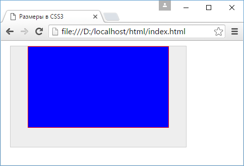
<!DOCTYPE html>
<html>
    <head>
        <meta charset="utf-8">
        <title>Размеры в CSS3</title>
        <style>
		div.outer{
			width: 75%;
			height: 200px;
			margin: 10px;
			border: 1px solid #ccc;
			background-color: #eee;
		}
		div.inner{

			width: 80%;
			height: 80%;
			margin: auto;
			border: 1px solid red;
			background-color: blue;
		}
        </style>
    </head>
    <body>
		<div class="outer">
			<div class="inner"></div>
		</div>
	</body>
</html>
В то же время фактические размеры элемента могут в итоге отличаться от тех, которые установлены в свойствах width и height. Например:
<!DOCTYPE html>
<html>
    <head>
        <meta charset="utf-8">
        <title>Размеры в CSS3</title>
        <style>
		div.outer{
			width: 200px;
			height: 100px;
			margin: 10px;
			padding: 10px;
			border: 5px solid #ccc;
			background-color: #eee;
		}
        </style>
    </head>
    <body>
		<div class="outer">
			Определение фактического размера в CSS 3
		</div>
	</body>
</html>
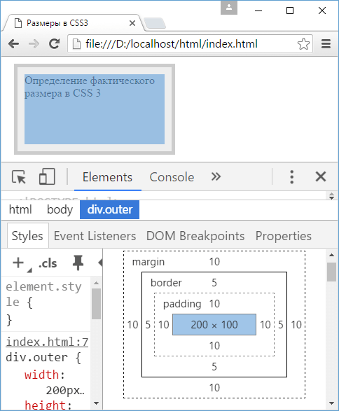
Как видно на скриншоте, в реальности значение свойства width — 200px — определяет только ширину внутреннего содержимого элемента,
а под блок самого элемента будет выделяться пространство, ширина которого равна ширине внутреннего содержимого (свойство width) +
внутренние отступы (свойство padding) + ширина границы (свойство border-width) + внешние отступы (свойство margin). То есть элемент будет иметь ширину в
230 пикселей, а ширина блока элемента с учетом внешних отступов составит 250 пикселей.
Подобные расчеты следует учитывать при определении размеров элементов.
С помощью дополнительного набора свойств можно установить минимальные и максимальные размеры:
-
min-width: минимальная ширина
-
max-width: максимальная ширина
-
min-height: минимальная высота
-
max-height: максимальная высота
min-width: 200px;
width:50%;
max-width: 300px;
В данном случае ширина элемента равна 50% ширины элемента-контейнера, однако при этом не может быть меньше 200 пикселей и больше 300 пикселей.
Переопределение ширины блока
Свойство box-sizing позволяет переопределить установленные размеры элементов. Оно может принимать одно из следующих значений:
-
content-box: значение свойства по умолчанию, при котором браузер для определения реальных ширины и высоты элементов
добавляет берет соответственно значения свойствwidthиheightэлемента. Например:
width: 200px;
height: 100px;
margin: 10px;
padding: 10px;
border: 5px solid #ccc;
background-color: #eee;
box-sizing: content-box;
В данном случае элемент будет иметь ширину в 200 пикселей и высоту в 100 пиксей.
padding-box: указывает веб-браузеру, что ширина и высота элемента должны включать внутренние отступы как часть своего значения. Например, пусть у нас есть следующий стиль:
width: 200px;
height: 100px;
margin: 10px;
padding: 10px;
border: 5px solid #ccc;
background-color: #eee;
box-sizing: padding-box;
Здесь реальная ширина внутреннего содержимого блока будет равна 200px (width) — 10px (padding-left) — 10px (padding-right) = 180px.
Стоит отметить, что большинство современных браузеров не поддерживают данное свойство.
border-box: указывает веб-браузеру, что ширина и высота элемента должны включать внутренние отступы и границы как часть своего значения.
Например, пусть у нас есть следующий стиль:
width: 200px;
height: 100px;
margin: 10px;
padding: 10px;
border: 5px solid #ccc;
background-color: #eee;
box-sizing: border-box;
Здесь реальная ширина внутреннего содержимого блока будет равна 200px (width) — 10px (padding-left) — 10px (padding-right) — 5px (border-left-width)
— 5px (border-right-width) = 170px.
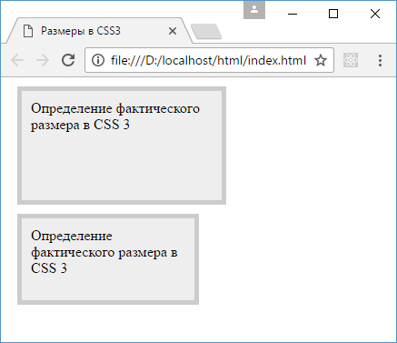
Например, определим два блока, которые отличаются только значением свойства box-sizing:
<!DOCTYPE html>
<html>
    <head>
        <meta charset="utf-8">
        <title>Размеры в CSS3</title>
        <style>
		div{
			width: 200px;
            height: 100px;
            margin: 10px;
            padding: 10px;
            border: 5px solid #ccc;
            background-color: #eee;
		}
        div.outer1{
			box-sizing: content-box;
        }
		div.outer2{
			box-sizing: border-box;
        }
        </style>
    </head>
    <body>
        <div class="outer1">
            Определение фактического размера в CSS 3
        </div>
		<div class="outer2">
            Определение фактического размера в CSS 3
        </div>
    </body>
</html>
В первом случае при определении размеров блока к свойствам width и height будут добавляться толщина границы, а также внутренние и внешние отступы, поэтому
первый блок будет иметь большие размеры:
Введение
Устройства пользователей в наши дни отличаются широким разнообразием: телевизоры, смартфоны, планшеты и даже часы — с каждого из устройств пользователь может захотеть выйти в сеть. А если добавить сюда разные браузеры, которые можно установить на устройство, то получатся тысячи комбинаций того, как можно попасть на ваш сайт.
Вот и я, в ходе работы над своим сайтом портфолио, тестировал его в разных браузерах и наткнулся на проблему.
Проблема
При указании свойства min-width: 320px для тега body в Firefox, контент, при достижении минимальной ширины, не начинает пропорционально уменьшаться как в Chrome (рис 1), а просто выходит за экран. (рис 2)
")
Демонстрация правильной работы min-width: 320 для body в Chrome 105
(После 320px начинает пропорционально уменьшаться)")
Демонстрация неправильной работы min-width: 320px для body в Firefox 103 (После 320px появляется горизонтальный скролл)
Зачем решать эту проблему?
Допустим, у меня сломался основной смартфон, а в запасе только Samsung Galaxy Mini с шириной экрана в 240px и с браузером Firefox. На таких устройствах, треть контента сайта будет выходить за viewport, что приведет к появлению горизонтального скролла, а это не удобно.
Также поддержка ширины в менее чем 320px, может быть полезна для браузеров в которых есть функция боковых веб-панелей (например Vivaldi).
Поддержка min-width для body в других браузерах
В ходе тестирования в других браузерах, оказалось, что Safari (проверялось на Safari 15) также имеет данную проблему. (рис 3)
")
Демонстрация работы неправильной работы min-width: 320px для body в Safari 15 (После 320px появляется горизонтальный скролл)
В принципе, свойство min-width для body без проблем работает на всех браузерах с движком Chromium. По крайней мере, кроме Chrome, все работает как положено в последних версиях Edge (105), Vivaldi (5.4), Opera (90.0.4480) и Yandex (102).
Решение
Сначала, я попробовал решить данную проблему путем добавления свойства min-width, не только к тегу body, но и к тегу html и обертке контента div class="wrapper", увы, данный способ не сработал.
В связи с этим, я написал функцию, которая уменьшает контент при достижении определенной ширины экрана. Она сравнивает ширину контента страницы с доступной шириной окна (viewport), а затем уменьшает страницу так, чтобы эти значения оставались равны.
При этом, масштабирование страницы является не только визуальным как в случае с transform: scale(), но и влияет на размеры. Если не влиять на ширину, контент будет выглядеть хорошо, но горизонтальный скролл останется. (рис 4)
 не меняя размеры (Контент выглядит хорошо, но скролл остается)")
Демонстрация того, что будет происходить в старых версиях Firefox, если использовать transform: scale() не меняя размеры (Контент выглядит хорошо, но скролл остается)
Да, для масштабирования с изменением размера существует CSS свойство zoom, которое не только масштабирует элемент как свойство transform: scale(), но и пропорционально меняет его размеры, влияя на окружение. К сожалению, в Firefox свойство zoom не поддерживается (Can I Use Zoom). И именно поэтому для масштабирования применяется связка свойств transform: scale() и width.
CSS свойства применяются к тегу html, так как на теге body установлено свойство min-width и свойство width не будет работать.
Ниже приведен пример работы функции. (рис 5)
")
Демонстрация правильной работы min-width: 320px для body в Firefox с созданной функцией (Контент масштабируется, скролла нет)
О том как использовать функцию
Для начала, зайдите на репозиторий GitHub: https://github.com/fazdendev/adaptive-body-min-width
Затем, скопируйте код из function.js к себе в проект и вызовите функцию.
adaptiveSizePageScaleInit(300)
В качестве аргумента передайте в неё ширину окна браузера, при котором функция должна запускаться (по умолчанию 320). Очень важно, чтобы значение body min-width было равно значению переданному в функцию.
Если вы хотите, чтобы функция запускалась только в определенных браузерах уберите вызов функции adaptiveSizePageScaleInit(), после чего скопируйте функцию вызова кода в определённых браузерах.
startOnSpecificBrowserInit()
Замените строку «НЕОБХОДИМЫЙБРАУЗЕР» из условия кросс браузерной функции нужным вариантом из списка: «other», «msEdge», «chrEdge», «opera«, «сhrome», «ie», «firefox», «safari».
Условие, в котором нужно менять строку:if (browser == "НЕОБХОДИМЫЙБРАУЗЕР") {adaptiveSizePageScaleInit()}
Заключение
Я надеюсь, что эта статья была вам полезна!
В будущем, я добавлю функции возможность брать значение body min-width из CSS, так чтобы вам не пришлось задавать переменную вручную.
Если у вас есть какие вопросы или предложения по решению данной проблемы, я буду рад обратной связи.
Ну а на этом все, хорошего вам дня!)
-
#1
У меня один из старых сайтов «резиновый» и на современных широких мониторах смотрится плохо. Решил исправить «малой кровью» и ограничить максимальную ширину body в css, как везде советуют:
body
{
max-width: 900px;
width:expression(document.body.clientWidth > 900? «900px» : «auto»);
}
Но при этом страницы прилепляются к левому краю монитора, правая часть остаётся пустой, некрасиво. Можно ли как-то средствами css указать, что надо выводить по центру?

-
#2
можно, надо прописать магический фикс, под видом
margin: 0 auto;

HEm
Сетевой бобер
-
#3
резиновый, растягивающийся до 900 пикселов? жуть, сайт из 90-х годов чтоли? 10 лет назад, насколько я помню, у всех уже на компьютерных мониторах стояло разрешение 1024х768
HEm
Сетевой бобер
-
#5
экспрешн вылез наверное по причине того, что в основе брался вариант ограничивающий минимальную ширину, там он имеет смысл
-
#6
Там, судя по выражению, как раз максимальная ширина определяется.
HEm
Сетевой бобер
-
#7
maxWidth was introduced in Windows Internet Explorer 7.
это для ие6 костыль
-
#8
Это я в курсе, что для IE6, нахрена он там нужен?)))
PS: Кто там на 6м осле? Поднимите руки, подняли? Теперь выйдите из зала)
PPS: С тем же успехом можно было и на JS это впилить ^_^
-
#9
можно, надо прописать магический фикс, под видом
margin: 0 auto;
Отлично! Даже в IE6 заработало. Вот как я сделал, может кому-то ещё пригодится:
body
{
max-width: 900px;
margin: 0 auto;
width:expression((document.documentElement.clientWidth > 900)?’900px’:’auto’);
}
-
#10
Это я в курсе, что для IE6, нахрена он там нужен?)))
PS: Кто там на 6м осле? Поднимите руки, подняли? Теперь выйдите из зала)
Я считаю, что клиент всегда прав, стараюсь под него подстраиваться и не напрягать его.
Я смотрел по логам сайта — примерно десяток постоянных посетителей используют IE6.
-
#11
Игорёк
Поддерживая IE6, ты увеличиваешь свою отрицательную карму, это ведет к горю, горе к печали, печаль ведет к гневу, а гнев — на темную сторону силы.

-
#12
c0dex, ходят слухи, что деньги пользователей IE6 ничем не хуже денег пользователей других браузеров. Напротив, покупательская способность у этих пользователей часто выше (i.e. корпоративные пользователи)
-
#13
флоппик
Ходят слухи, что это дикий гемор, поддерживать ту 10ку пользователей, при куче остальных, если эти 10 тормозят применение новых технологий и заставляют тебя сделать все через жопу. Это когда можно все сделать быстрее и без всяких хаков. Намек понятен, про что я писал?
-
#14
флоппик
если эти 10 тормозят применение новых технологий и заставляют тебя сделать все через жопу
Ну как бы деньги платят за работу, а не за «новые технологии» и комфорт разработчика.
-
#15
Сейчас тебе за поддержку IE6 думаю зарядят до бабла)
Ну и во вторых ты читай полностью, никто не будет заморачиваться ради 10 человек, при нормальной аудитории с другими браузерами.
Стоит выбрать, либо ты делаешь красиво и удобно большей массе, либо меньше плюшков (или с гораздо большим гемором), но для динозавров. Для меня ответ очевиден.
-
#16
IE7 — 3.4 %
IE6 — 1.2 %
ссылка
скоро 7 не останется. не говоря о 6
-
#17
Semen
Просто есть очень
упоротые
упертые люди, которые в своих уютных конторках, с ленивыми админами, до сих пор сидят на ie6. Да, я знаю, что там все сложно и долго меняется, но до тех пор пока их вот так будут поддерживать, они и с места не сдвинутся.
-
#18
Мы уже больше года не пишем/дописываем под IE6, жалоб не было.
-
#19
IE7 — 3.4 %
IE6 — 1.2 %
скоро 7 не останется. не говоря о 6
ну и что? и копеечка не лишняя,
мне не трудно пару строчек написать

-
#20
Пользователям ие6 (да и пожалуй ие7) можно уже предлагать заюзать google frame.
Я тут недавно смотрел — он вполне себе уже работает, и вроде как даже без админских прав ставится.
- Назад
- Обзор: Building blocks
- Далее
В предыдущих уроках вы познакомились с некоторыми способами изменения размеров элементов на веб-странице с помощью CSS. Понимание того, насколько велики будут различные элементы в вашем дизайне — важно, и в этом уроке мы подведем итог по различным способам задания размеров элементов с помощью CSS и расскажем о некоторых терминах, связанных с размерами, которые помогут вам в будущем.
| Необходимые условия: | Базовая компьютерная грамотность, Установка базового ПО, базовые знания работы с файлами, основы HTML (Введение в HTML), и общее представление о том, как работает CSS (Введение в CSS.) |
|---|---|
| Цель: | Изучить различные способы задания размеров объектов в CSS. |
Размер по умолчанию или внутренний размер
Элементы HTML имеют размеры по умолчанию, заданные до того, как на них повлияет какое-либо правило CSS. Простой пример — изображение. Изображение имеет ширину и высоту, определенные в файле изображения. Этот размер называется — внутренний размер, он исходит из самого изображения.
Если вы разместите изображение на странице и не измените его высоту и ширину, используя атрибуты тега <img> или CSS, оно будет отображаться с использованием этого внутреннего размера. В примере ниже, мы установили для изображения рамку, чтобы вы могли видеть размер файла.
С другой стороны, пустой <div> не имеет собственного размера. Если вы добавите <div> в свой HTML-код без содержимого, а затем установите для него рамку, как мы это делали с изображением, вы увидите линию на странице. Это схлопнувшиеся границы элемента — содержимое, которое могло бы удерживать ее в открытом состоянии, отсутствует. В нашем примере ниже эта граница растягивается на всю ширину контейнера, потому что это элемент блочный, поведение которого должно быть вам знакомо. У него нет высоты, потому что нет содержимого.
В приведенном выше примере попробуйте добавить текст внутри пустого элемента. Этот текст теперь становится охваченным границами, потому что высота элемента определяется содержимым. Следовательно, размер этого <div> устанавливается размером содержимого. Как и в предыдущем примере, этот размер является внутренним размером — размер элемента определяется размером его содержимого.
Присваивание определенного размера
Конечно, мы можем задать элементам нашей страницы определенный размер. Размер, который присваивается элементу (содержимое, которого затем должно соответствовать этому размеру), называется внешним размером. Возьмите наш <div> из примера выше и установите ему специальные значения width и height и теперь он будет иметь эти размеры, независимо от того, какого размера содержимое в него помещается. Как мы узнали в нашем предыдущем уроке о переполнении, заданная высота блока может вызвать переполнение содержимого, если размер содержимого больше, чем внутреннее пространство элемента.
Из-за этой проблемы перекрытия, жестко задавать высоту элементов с помощью длины или процентного соотношения — это то, что нужно делать с большой осторожностью.
Использование процентного соотношения
Во многих отношениях проценты действуют как единицы длины, и, как мы обсуждали в уроке, посвященном значениям и единицам, они часто могут использоваться как взаимозаменяемые с длиной. При использовании процентов вы должны знать, от чего этот процент рассчитывается. В случае блока внутри другого блока, если вы зададите дочернему блоку процентную ширину, это будет процент от ширины родительского контейнера.
Это потому, что проценты рассчитываются в зависимости от размера содержащего элемент блока. Если процентное соотношение не применяется, наш <div> будет занимать 100% доступного пространства, так как это элемент блочного типа. Если мы зададим ему ширину в процентах, он займет процент от пространства, которое он обычно заполняет.
Margins и paddings в процентах
Если вы установите margins и padding в процентах, вы можете заметить странное поведение. В приведенном ниже примере у нас есть блок. Мы присвоили внутреннему блоку margin 10% и padding 10%. Padding и margin сверху и снизу имеют тот же размер, что и margins слева и справа.
Например, вы можете ожидать, что процентное значение верхнего и нижнего margins будет в процентах от высоты элемента, а процентное левое и правое margins — в процентах от ширины элемента. Тем не менее, это не так!
При использовании margins и padding, заданных в процентах, значение рассчитывается на основе inline размера блока — следовательно, ширины при работе с горизонтальным языком. В нашем примере все поля и отступы составляют 10% width. Это означает, что вы будете иметь margins и padding одинакового размера по всему полю. Этот факт стоит запомнить, если вы действительно пользуетесь процентами.
Минимальные и максимальные размеры
Помимо возможности установить фиксированный размер, мы можем использовать CSS чтобы задать элементу минимальный или максимальный размер. Если у вас есть блок, который может содержать разное количество содержимого, и вы хотите, чтобы он всегда был определенной минимальной высоты, вы можете установить для него свойство min-height. Блок всегда будет минимальной заданной высоты, пока содержимого не станет больше, чем места в блоке.
В приведенном ниже примере вы можете увидеть два блока, обоим задали минимальную высоту в 150 пикселей. Блок слева имеет высоту 150 пикселей несмотря на то что в нем нет текста. В блоке справа есть контент, которому нужно больше места, чем минимальная заданная высота, поэтому он увеличился.
Это очень полезно при работе с переменным объемом контента, избегая при этом переполнения.
Часто max-width применяют для уменьшения масштаба изображений, если недостаточно места для их отображения.
Например, если бы вы установили width: 100% для изображения, а его внутренняя ширина была меньше, чем его контейнер, изображение было бы вынуждено растягиваться и становиться больше, в результате чего оно выглядело бы пикселизированным.
Если бы вы вместо этого применили max-width: 100%, и внутренняя ширина изображения была бы меньше, чем его контейнер, изображение не будет принудительно растягиваться и становиться больше, что предотвращает пикселизацию.
В приведенном ниже примере мы использовали одно и то же изображение трижды. Первому изображению было задано width: 100% и оно находится в контейнере, который больше его ширины, поэтому он растягивается до ширины контейнера. Второму изображению задано max-width: 100%, изображение достигло 100% своей ширины не растягивается, чтобы заполнить контейнер. Третье поле снова содержит то же изображение, также с max-width: 100% в этом случае вы можете увидеть, как он уменьшилось, чтобы поместиться в контейнер.
Этот метод используется для создания отзывчивых изображений, чтобы при просмотре на меньшем устройстве они соответствующим образом уменьшались. Однако вам не следует использовать эту технику для загрузки действительно больших изображений с последующим их уменьшением в браузере. Изображения должны иметь соответствующий размер, чтобы быть не больше, чем они должны быть для самого большого размера, отображаемого в дизайне. Загрузка слишком больших изображений замедлит работу вашего сайта и может стоить пользователям больше денег, если они используют лимитированное соединение.
Единицы вьюпорта
Вьюпо́рт — это видимая область вашей страницы в браузере, который вы используете для просмотра сайта. В CSS у нас есть единицы измерения, которые относятся к размеру вьюпорта — vw единицы ширины вьюпорта и vh высоты вьюпорта. Используя эти единицы измерения, вы можете изменять размер чего-либо относительно вьюпорта пользователя.
1vh равен 1% от высоты вьюпорта и 1vw равен 1% ширины вьюпорта. Вы можете использовать эти единицы измерения для размеров блоков, а также текста. В приведенном ниже примере у нас есть блок размером 20vh и 20vw. В блоке есть буква A, которой присвоено значение font-size 10vh.
Если вы измените величину vh и vw — это изменит размер блока или шрифт; изменение размера вьюпорта также изменит их размеры, поскольку они имеют размер заданный относительно вьюпорта. Чтобы увидеть изменение примера при изменении размера вьюпорта, вам нужно будет загрузить пример в новое окно браузера, размер которого можно изменить (поскольку встроенное приложение <iframe>, содержащее показанный выше пример, является его окном просмотра). Откройте пример, измените размер окна браузера и посмотрите, что происходит с размером поля и текста.
Размеры объектов задаваемые в соответствии с вьюпортом могут быть полезны в ваших проектах. Например, если вы хотите, чтобы основная секция отображалась перед остальным контентом, установите для этой части страницы высоту 100vh, это приведет к выталкиванию остального контента ниже видимой области, что означает, что он появится только после того, как страницу прокрутят вниз.
Проверьте свои навыки!
В этой статье мы рассмотрели многое, но можете ли вы вспомнить самую важную информацию? Вы можете найти дополнительные тесты, чтобы убедиться, что вы сохранили эту информацию, прежде чем двигаться дальше — см. Проверка своих навыков: задание размеров (en-US).
Заключение
Этот урок дал вам краткое изложение некоторых ключевых проблем, с которыми вы можете столкнуться при определении размеров объектов в Интернете. Когда вы перейдете к CSS раскладке, изменение размеров станет очень важным для освоения различных методов раскладки, поэтому перед тем, как двигаться дальше, стоит разобраться в концепциях.
- Назад
- Обзор: Building blocks
- Далее