In this article you’ll see how to style a button using CSS.
My goal here is mostly to showcase how different CSS rules and styles are applied and used. We won’t see much design inspiration nor will we discuss ideas for styling.
Instead, this will be more of an overview of how the styles themselves work, what properties are commonly used, and how they can be combined.
You’ll first see how to create a button in HTML. Then you’ll learn how to override the default styles of buttons. Lastly, you’ll get a glimpse of how to style buttons for their three different states.
Here’s an Interactive Scrim of CSS Button Style
Table of Contents
- Create a button in HTML
- Change default styling of buttons
- Change the background color
- Change text color
- Change the border style
- Change the size
- Style button states
- Style hover state
- Style focus state
- Style active state
- Conclusion
Let’s get started!
How to Create a Button in HTML
To create a button, use the <button> element.
This is a more accessible and semantic option compared to using a generic container which is created with the <div> element.
In the index.html file below, I’ve created the basic structure for a webpage and added a single button:
<!DOCTYPE html>
<html lang="en">
<head>
    <meta charset="UTF-8">
    <meta http-equiv="X-UA-Compatible" content="IE=edge">
    <meta name="viewport" content="width=device-width, initial-scale=1.0">
    <link rel="stylesheet" href="style.css">
    <title>CSS Button Style</title>
</head>
<body>
    <button type="button" class="button">Click me!</button>
</body>
</html>
Let’s break down the line <button type="button" class="button">Click me!</button>:
- You first add the button element, which consists of an opening
<button>and closing</button>tag. - The
type="button"attribute in the opening<button>tag explicitly creates a clickable button. Since this particular button is not used for submitting a form, it is useful for semantic reasons to add it in order to make the code clearer and not trigger any unwanted actions. - The
class="button"attribute will be used to style the button in a separate CSS file. The valuebuttoncould be any other name you choose. For example you could have usedclass="btn". - The text
Click me!is the visible text inside the button.
Any styles that will be applied to the button will go inside a spearate style.css file.
You can apply the styles to the HTML content by linking the two files together. You do this with the <link rel="stylesheet" href="style.css"> tag which was used in index.html.
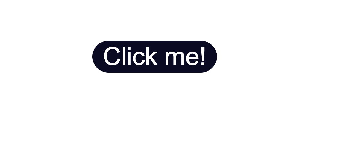
In the style.css file, I’ve added some styling which only centers the button in the middle of the browser window.
Notice that the class="button" is used with the .button selector. This is a way to apply styles directly to the button.
* {
    box-sizing: border-box;
}

body {
    display:flex;
    justify-content: center;
    align-items: center;
    margin:50px auto;
}

.button {
    position: absolute;
    top:50%
}
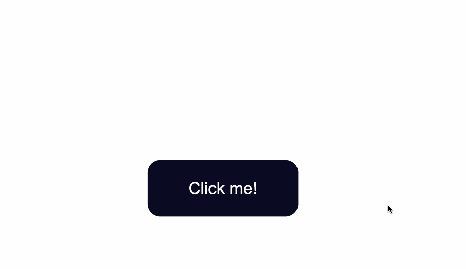
The code from above will result in the following:
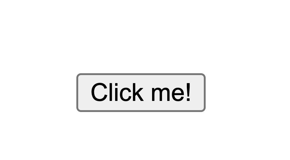
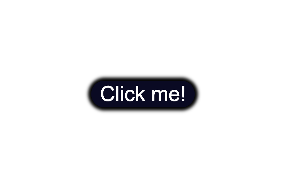
The default styling of buttons will vary depending on the browser you’re using.
This is an example of how the native styles for buttons look on the Google Chrome browser.
How to Change the Default Styling of Buttons
How to Change the Background Color of Buttons
To change the background color of the button, use the CSS background-color property and give it a value of a color of your taste.
In the .button selector, you use background-color:#0a0a23; to change the background color of the button.
.button {
    position: absolute;
    top:50%;
    background-color:#0a0a23;
}
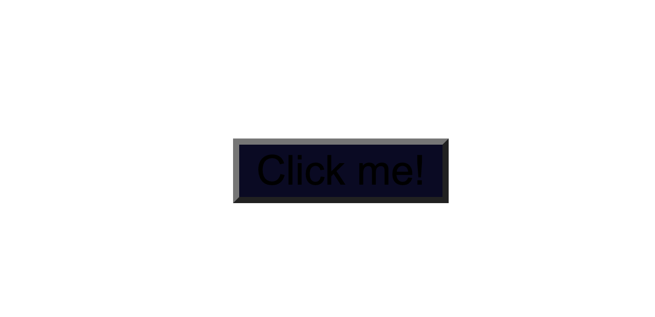
How to Change the Text Color of Buttons
The default color of text is black, so when you add a dark background color you will notice that the text has disappeared.
Another thing to make sure of is that there is enough contrast between the button’s background color and text color. This helps make the text more readable and easy on the eyes.
Next, use the color property to change the color of text:
.button {
    position: absolute;
    top:50%;
    background-color:#0a0a23;
    color: #fff;
}
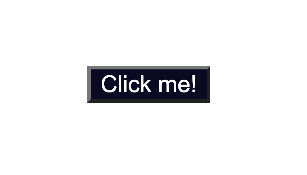
How to Change the Border Style of Buttons
Notice the grey around the edges of the button? That is the default color of the button’s borders.
One way to fix this is to use the border-color property. You set the value to be the same as the value of background-color. This makes sure the borders have the same color as the background of the button.
Another way would be to remove the border around the button entirely by using border:none;.
.button {
  position: absolute;
  top:50%;
  background-color:#0a0a23;
  color: #fff;
  border:none;
}

Next, you can also round-up the edges of the button by using the border-radius property, like so:
.button {
    position: absolute;
    top:50%;
    background-color:#0a0a23;
    color: #fff;
    border:none;
    border-radius:10px;
  }
You could also add a slight dark shadow effect around the button by using the box-shadow property:
 position: absolute;
    top:50%;
    background-color:#0a0a23;
    color: #fff;
    border:none;
    border-radius:10px;
    box-shadow: 0px 0px 2px 2px rgb(0,0,0);
How to Change the Size of Buttons
The way to create more space inside the button’s borders is to increase the padding of the button.
Below I added a value of 15px for the top, bottom, right, and left padding of the button.
I also set a minimum height and width, with the min-height and min-width properties respectively. Buttons need to be large enough for all different kind of devices.
.button {
    position: absolute;
    top:50%;
    background-color:#0a0a23;
    color: #fff;
    border:none;
    border-radius:10px;
    padding:15px;
    min-height:30px;
    min-width: 120px;
  }
How to Style Button States
Buttons have three different states:
:hover:focus:active
It’s best that the three states are styled differently and don’t share the same styles.
In the following sections I’ll give a brief explanation on what each one of the states mean and what triggers them. You’ll also see some ways you can style the button for each separate state.
Here’s an interactive scrim about styling button states:
How to Style :hover States
The :hover state becomes present when a user hovers over a button, by bringing their mouse or trackpad over it, without selecting it or clicking on it.
To change the button’s styles when you hover over it, use the :hover CSS
pseudoclass selector.
A common change to make with :hover is switching the background-color of the button.
To make the change less sudden, pair :hover with the transition property.
The transition property will help make the transition from no state to a :hover state much smoother.
The change of background color will happen a bit slower than it would without the transition property. This will also help make the end result less jarring for the user.
.button:hover {
      background-color:#002ead;
      transition: 0.7s;
  }
In the example above, I used a Hex color code value to make the background color a lighter shade for when I hover over the button.
With the help of the transition property I also caused a delay of 0.7s when the transition from no state to a :hover state happens. This caused a slower transition from the original #0a0a23 background color to the #002ead background color.

Keep in mind that the :hover pseudoclass does not work for mobile device screens and mobile apps. Choose to use hover effects only for desktop web applications and not touch screens.
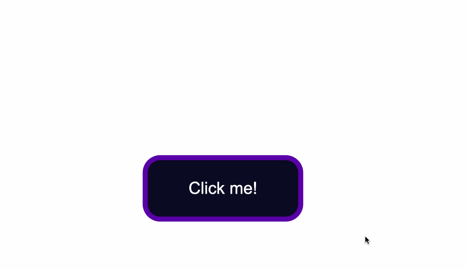
How to Style :focus States
The :focus state takes effect for keyboard users — specifically it will activate when you focus on a button by hitting the Tab key (⇥).
If you’re following along, when you focus on the button after pressing the Tab key, you’ll see the following:
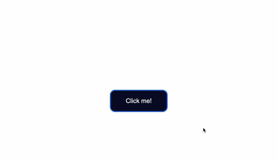
Notice the slight light blue outline around the button when it’s gained focus?
Browsers have default styling for the :focus pseudoclass, for accessibility keyboard navigation purposes. It’s not a good idea to remove that outline altogether.
You can however create custom styles for it and make it easily detectable.
A way to do so is by setting the outline color to first be transparent.
Following that, you can maintain the outline-style to solid. Lastly, using the box-shadow property, you can add a color of your liking for when the element is focused on:
 .button:focus {
    outline-color: transparent;
    outline-style:solid;
    box-shadow: 0 0 0 4px #5a01a7;
}
You can also again pair these styles with the transition property, depending on the effect you want to achieve:
  .button:focus {
    outline-color: transparent;
    outline-style:solid;
    box-shadow: 0 0 0 4px #5a01a7;
    transition: 0.7s;
}
How to Style for the :active State
The :active state gets activated when you click on the button by either clicking the computer’s mouse or pressing down on the laptop’s trackpad.
That being said, look at what happens when I click the button after I’ve applied and kept the styles for the :hover and :focus states:
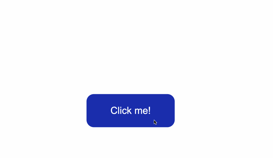
The :hover state styles are applied before clicking when I hover over the button.
The :focus state styles are applied also, because when a button is clicked it also gains a :focus state alongside an :active one.
However, keep in mind that they are not the same thing.
:focus state is when an element is being focused on and :active is when a user clicks on an element by holding and pressing down on it.
To change the style for when a user clicks a button, apply styles to the :active CSS pseudoselector.
In this case, I’ve changed the background color of the button when a user clicks on it
.button:active {
    background-color: #ffbf00;
}

Conclusion
And there you have it! You now know the basics of how to style a button with CSS.
We went over how to change the background color and text color of buttons as well as how to style buttons for their different states.
To learn more about web design, check out freeCodeCamp’s Responsive Web Design Certification. In the interactive lessons, you’ll learn HTML and CSS by building 15 practice projects and 5 certification projects.
Note that the above cert is still in beta — if you want the latest stable version, check here.
Thanks for reading and happy coding!
Learn to code for free. freeCodeCamp’s open source curriculum has helped more than 40,000 people get jobs as developers. Get started
In this article you’ll see how to style a button using CSS.
My goal here is mostly to showcase how different CSS rules and styles are applied and used. We won’t see much design inspiration nor will we discuss ideas for styling.
Instead, this will be more of an overview of how the styles themselves work, what properties are commonly used, and how they can be combined.
You’ll first see how to create a button in HTML. Then you’ll learn how to override the default styles of buttons. Lastly, you’ll get a glimpse of how to style buttons for their three different states.
Here’s an Interactive Scrim of CSS Button Style
Table of Contents
- Create a button in HTML
- Change default styling of buttons
- Change the background color
- Change text color
- Change the border style
- Change the size
- Style button states
- Style hover state
- Style focus state
- Style active state
- Conclusion
Let’s get started!
How to Create a Button in HTML
To create a button, use the <button> element.
This is a more accessible and semantic option compared to using a generic container which is created with the <div> element.
In the index.html file below, I’ve created the basic structure for a webpage and added a single button:
<!DOCTYPE html>
<html lang="en">
<head>
    <meta charset="UTF-8">
    <meta http-equiv="X-UA-Compatible" content="IE=edge">
    <meta name="viewport" content="width=device-width, initial-scale=1.0">
    <link rel="stylesheet" href="style.css">
    <title>CSS Button Style</title>
</head>
<body>
    <button type="button" class="button">Click me!</button>
</body>
</html>
Let’s break down the line <button type="button" class="button">Click me!</button>:
- You first add the button element, which consists of an opening
<button>and closing</button>tag. - The
type="button"attribute in the opening<button>tag explicitly creates a clickable button. Since this particular button is not used for submitting a form, it is useful for semantic reasons to add it in order to make the code clearer and not trigger any unwanted actions. - The
class="button"attribute will be used to style the button in a separate CSS file. The valuebuttoncould be any other name you choose. For example you could have usedclass="btn". - The text
Click me!is the visible text inside the button.
Any styles that will be applied to the button will go inside a spearate style.css file.
You can apply the styles to the HTML content by linking the two files together. You do this with the <link rel="stylesheet" href="style.css"> tag which was used in index.html.
In the style.css file, I’ve added some styling which only centers the button in the middle of the browser window.
Notice that the class="button" is used with the .button selector. This is a way to apply styles directly to the button.
* {
    box-sizing: border-box;
}

body {
    display:flex;
    justify-content: center;
    align-items: center;
    margin:50px auto;
}

.button {
    position: absolute;
    top:50%
}
The code from above will result in the following:
The default styling of buttons will vary depending on the browser you’re using.
This is an example of how the native styles for buttons look on the Google Chrome browser.
How to Change the Default Styling of Buttons
How to Change the Background Color of Buttons
To change the background color of the button, use the CSS background-color property and give it a value of a color of your taste.
In the .button selector, you use background-color:#0a0a23; to change the background color of the button.
.button {
    position: absolute;
    top:50%;
    background-color:#0a0a23;
}
How to Change the Text Color of Buttons
The default color of text is black, so when you add a dark background color you will notice that the text has disappeared.
Another thing to make sure of is that there is enough contrast between the button’s background color and text color. This helps make the text more readable and easy on the eyes.
Next, use the color property to change the color of text:
.button {
    position: absolute;
    top:50%;
    background-color:#0a0a23;
    color: #fff;
}
How to Change the Border Style of Buttons
Notice the grey around the edges of the button? That is the default color of the button’s borders.
One way to fix this is to use the border-color property. You set the value to be the same as the value of background-color. This makes sure the borders have the same color as the background of the button.
Another way would be to remove the border around the button entirely by using border:none;.
.button {
  position: absolute;
  top:50%;
  background-color:#0a0a23;
  color: #fff;
  border:none;
}
Next, you can also round-up the edges of the button by using the border-radius property, like so:
.button {
    position: absolute;
    top:50%;
    background-color:#0a0a23;
    color: #fff;
    border:none;
    border-radius:10px;
  }
You could also add a slight dark shadow effect around the button by using the box-shadow property:
 position: absolute;
    top:50%;
    background-color:#0a0a23;
    color: #fff;
    border:none;
    border-radius:10px;
    box-shadow: 0px 0px 2px 2px rgb(0,0,0);
How to Change the Size of Buttons
The way to create more space inside the button’s borders is to increase the padding of the button.
Below I added a value of 15px for the top, bottom, right, and left padding of the button.
I also set a minimum height and width, with the min-height and min-width properties respectively. Buttons need to be large enough for all different kind of devices.
.button {
    position: absolute;
    top:50%;
    background-color:#0a0a23;
    color: #fff;
    border:none;
    border-radius:10px;
    padding:15px;
    min-height:30px;
    min-width: 120px;
  }
How to Style Button States
Buttons have three different states:
:hover:focus:active
It’s best that the three states are styled differently and don’t share the same styles.
In the following sections I’ll give a brief explanation on what each one of the states mean and what triggers them. You’ll also see some ways you can style the button for each separate state.
Here’s an interactive scrim about styling button states:
How to Style :hover States
The :hover state becomes present when a user hovers over a button, by bringing their mouse or trackpad over it, without selecting it or clicking on it.
To change the button’s styles when you hover over it, use the :hover CSS
pseudoclass selector.
A common change to make with :hover is switching the background-color of the button.
To make the change less sudden, pair :hover with the transition property.
The transition property will help make the transition from no state to a :hover state much smoother.
The change of background color will happen a bit slower than it would without the transition property. This will also help make the end result less jarring for the user.
.button:hover {
      background-color:#002ead;
      transition: 0.7s;
  }
In the example above, I used a Hex color code value to make the background color a lighter shade for when I hover over the button.
With the help of the transition property I also caused a delay of 0.7s when the transition from no state to a :hover state happens. This caused a slower transition from the original #0a0a23 background color to the #002ead background color.
Keep in mind that the :hover pseudoclass does not work for mobile device screens and mobile apps. Choose to use hover effects only for desktop web applications and not touch screens.
How to Style :focus States
The :focus state takes effect for keyboard users — specifically it will activate when you focus on a button by hitting the Tab key (⇥).
If you’re following along, when you focus on the button after pressing the Tab key, you’ll see the following:
Notice the slight light blue outline around the button when it’s gained focus?
Browsers have default styling for the :focus pseudoclass, for accessibility keyboard navigation purposes. It’s not a good idea to remove that outline altogether.
You can however create custom styles for it and make it easily detectable.
A way to do so is by setting the outline color to first be transparent.
Following that, you can maintain the outline-style to solid. Lastly, using the box-shadow property, you can add a color of your liking for when the element is focused on:
 .button:focus {
    outline-color: transparent;
    outline-style:solid;
    box-shadow: 0 0 0 4px #5a01a7;
}
You can also again pair these styles with the transition property, depending on the effect you want to achieve:
  .button:focus {
    outline-color: transparent;
    outline-style:solid;
    box-shadow: 0 0 0 4px #5a01a7;
    transition: 0.7s;
}
How to Style for the :active State
The :active state gets activated when you click on the button by either clicking the computer’s mouse or pressing down on the laptop’s trackpad.
That being said, look at what happens when I click the button after I’ve applied and kept the styles for the :hover and :focus states:
The :hover state styles are applied before clicking when I hover over the button.
The :focus state styles are applied also, because when a button is clicked it also gains a :focus state alongside an :active one.
However, keep in mind that they are not the same thing.
:focus state is when an element is being focused on and :active is when a user clicks on an element by holding and pressing down on it.
To change the style for when a user clicks a button, apply styles to the :active CSS pseudoselector.
In this case, I’ve changed the background color of the button when a user clicks on it
.button:active {
    background-color: #ffbf00;
}
Conclusion
And there you have it! You now know the basics of how to style a button with CSS.
We went over how to change the background color and text color of buttons as well as how to style buttons for their different states.
To learn more about web design, check out freeCodeCamp’s Responsive Web Design Certification. In the interactive lessons, you’ll learn HTML and CSS by building 15 practice projects and 5 certification projects.
Note that the above cert is still in beta — if you want the latest stable version, check here.
Thanks for reading and happy coding!
Learn to code for free. freeCodeCamp’s open source curriculum has helped more than 40,000 people get jobs as developers. Get started
I have a «button» that I wish to use all throughout my site, but depending on where in the site the button is, I want it to display at different sizes.
In my HTML I have tried (but its not working):
<div class="button" width="60" height="100">This is a button</div>
And the matching CSS:
.button {
  background-color: #000000;
  color: #FFFFFF;
  float: right;
  padding: 10px;
  border-radius: 10px;
  -moz-border-radius: 10px;
  -webkit-border-radius: 10px;
}
I assumed that if each time I call this class I can just pass in a size and hey-presto!….but not….
By adding the width and height as I call the button class seems to do nothing to the size of it. Does anyone know how I can do this? And if I put the width and height in the CSS then the button will be the same size everywhere.
Kosh
6,0372 gold badges35 silver badges67 bronze badges
asked Jul 27, 2012 at 14:04
1
You should not use «width» and «height» attributes directly, use the style attribute like style="some css here" if you want to use inline styling:
<div class="button" style="width:60px;height:30px;">This is a button</div>
Note, however, that inline styling should generally be avoided since it makes maintenance and style updates a nightmare. Personally, if I had a button styling like yours but also wanted to apply different sizes, I would work with multiple css classes for sizing, like this:
   .button {
        background-color: #000000;
        color: #FFFFFF;
        padding: 10px;
        border-radius: 10px;
        -moz-border-radius: 10px;
        -webkit-border-radius: 10px;
        margin:10px
    }

    .small-btn {
        width: 50px;
        height: 25px;
    }

    .medium-btn {
        width: 70px;
        height: 30px;
    }

    .big-btn {
        width: 90px;
        height: 40px;
    }
<div class="button big-btn">This is a big button</div>
<div class="button medium-btn">This is a medium button</div>
<div class="button small-btn">This is a small button</div>
jsFiddle example
Using this way of defining styles removes all style information from your HTML markup, which in will make it easier down the road if you want to change the size of all small buttons — you’ll only have to change them once in the CSS.
answered Jul 27, 2012 at 14:07
Anders ArpiAnders Arpi
8,2273 gold badges33 silver badges49 bronze badges
3
If you want to call a different size for the button inline, you would probably do it like this:
<div class="button" style="width:60px;height:100px;">This is a button</div>
Or, a better way to have different sizes (say there will be 3 standard sizes for the button) would be to have classes just for size.
For example, you would call your button like this:
<div class="button small">This is a button</div>
And in your CSS
.button.small { width: 60px; height: 100px; }
and just create classes for each size you wish to have. That way you still have the perks of using a stylesheet in case say, you want to change the size of all the small buttons at once.
answered Jul 27, 2012 at 14:10
1
Another alternative is that you are allowed to have multiple classes in a tag. Consider:
 <div class="button big">This is a big button</div>
 <div class="button small">This is a small button</div>
And the CSS:
 .button {
     /* all your common button styles */
 }

 .big {
     height: 60px;
     width: 100px;
 }
 .small {
     height: 40px;
     width: 70px;
 }
and so on.
answered Jul 27, 2012 at 14:12
cobaltduckcobaltduck
1,5985 gold badges25 silver badges51 bronze badges
3
Use inline styles:
<div class="button" style="width:60px;height:100px;">This is a button</div>
Fiddle
bugwheels94
30k3 gold badges37 silver badges60 bronze badges
answered Jul 27, 2012 at 14:06
TurnipTurnip
35.4k15 gold badges88 silver badges109 bronze badges
1
try this one out resizeable button
<button type="submit me" style="height: 25px; width: 100px">submit me</button>
answered Aug 7, 2014 at 8:35
3
Узнайте, как стиль кнопок с помощью CSS.
Основные стили кнопок
Пример
.button {
background-color: #4CAF50; /* Green */
border: none;
color: white;
padding: 15px 32px;
text-align: center;
text-decoration: none;
display: inline-block;
font-size: 16px;
}
Цвета кнопок
Используйте свойство background-color для изменения цвета фона кнопки:
Пример
.button1 {background-color: #4CAF50;} /* Green */
.button2
{background-color: #008CBA;} /* Blue */
.button3 {background-color:
#f44336;} /* Red */
.button4 {background-color: #e7e7e7; color: black;} /* Gray */
.button5
{background-color: #555555;} /* Black */
Размеры кнопок
Используйте свойство font-size для изменения размера шрифта кнопки:
Пример
.button1 {font-size: 10px;}
.button2 {font-size: 12px;}
.button3
{font-size: 16px;}
.button4 {font-size: 20px;}
.button5 {font-size: 24px;}
Используйте свойство padding для изменения заполнения кнопки:
Пример
.button1 {padding: 10px
24px;}
.button2 {padding: 12px 28px;}
.button3 {padding: 14px 40px;}
.button4 {padding: 32px 16px;}
.button5 {padding: 16px;}
Закругленные кнопки
Используйте свойство border-radius для добавления скругленных углов к кнопке:
Пример
.button1 {border-radius: 2px;}
.button2 {border-radius: 4px;}
.button3
{border-radius: 8px;}
.button4 {border-radius: 12px;}
.button5 {border-radius: 50%;}
Цветные границы кнопок
Используйте свойство border, чтобы добавить цветную рамку к кнопке:
Пример
.button1 {
background-color: white;
color: black;
border: 2px solid #4CAF50; /* Green */
}
…
Наведите кнопки
Используйте селектор :hover для изменения стиля кнопки при наведении на нее указателя мыши.
Совет: Используйте свойство transition-duration для определения скорости эффекта «Hover»:
Пример
.button {
-webkit-transition-duration: 0.4s; /* Safari */
transition-duration: 0.4s;
}
.button:hover {
background-color: #4CAF50; /* Green */
color: white;
}
…
Кнопки теней
Use the box-shadow property to add shadows to a button:
Пример
.button1 {
box-shadow: 0 8px 16px 0 rgba(0,0,0,0.2), 0 6px 20px 0
rgba(0,0,0,0.19);
}
.button2:hover {
box-shadow: 0 12px
16px 0 rgba(0,0,0,0.24), 0 17px 50px 0 rgba(0,0,0,0.19);
}
Отключенные кнопки
Используйте свойство opacity для добавления прозрачности к кнопке (создает «отключенный» вид).
Совет: Вы также можете добавить свойство cursor со значением «not-allowed», которое будет отображать «нет парковки знак» при наведении указателя мыши на кнопку:
Пример
.disabled {
opacity: 0.6;
cursor: not-allowed;
}
Ширина кнопки
По умолчанию размер кнопки определяется по ее текстовому содержимому (так же широко, как и ее содержимое). Используйте свойство width для изменения ширины кнопки:
Пример
.button1 {width: 250px;}
.button2 {width: 50%;}
.button3 {width:
100%;}
Группы кнопок
Удалите поля и добавьте float:left к каждой кнопке, чтобы создать группу кнопок:
Пример
.button {
float: left;
}
Группа кнопок на границе
Используйте свойство border для создания группы кнопок с рамками:
Пример
.button {
float: left;
border: 1px
solid green;
}
Вертикальная группа кнопок
Используйте display:block вместо float:left для группирования кнопок ниже друг друга, вместо того, чтобы бок о бок:
Пример
.button {
display: block;
}
Кнопка на картинке

Анимированные кнопки
Пример
Добавить стрелку на наведении:
Пример
Добавить «нажатия» эффект на кнопку:
Пример
Исчезать при наведении:
Пример
Добавить эффект «рябь» при щелчке:
Тег <button> используется для создания интерактивных кнопок на веб-странице. В отличие от одинарного тега <input> (с атрибутом type=”button”), при помощи которого также можно создавать кнопки, содержимым тега <button> может быть как текст, так и изображение.
Если вы хотите создать кнопку в HTML форме, используйте элемент <input>, так как браузеры по-разному отображают содержимое тега <button>.
Содержимое тега пишется между открывающим <button> и закрывающим </button> тегами.
Пример
<!DOCTYPE html>
<html>
   <head>
       <title>Заголовок документа</title>
   </head>
   <body>
	<h1>Вот наша кнопка..</h1>
	<button type="button">Нажать</button>
   </body>
</html>
Результат

К тегу <button> можно применять CSS стили для изменения внешнего вида кнопки, ее размера, цвета, шрифта текста и т.д.
Пример
<!DOCTYPE html>
<html>
  <head>
    <title>Заголовок документа</title>
  </head>
  <body>
    Обычная кнопка
    <button type="button">Добавить в корзину</button>
    <hr />
    Кнопка с красным текстом
    <button type="button" style="color: red;"><b>Книга HTML</b></button>
    <hr />
    Кнопка с увеличенным размером шрифта
    <button type="button" style="font: bold 14px Arial;">Загрузить книгу </button><br />
  </body>
</html>
Результат

У тега <button> нет обязательных атрибутов, однако мы рекомендуем всегда использовать атрибут type=”button”, если тег используется в качестве обычной кнопки.
Тег <button> поддерживает глобальные атрибуты и атрибуты событий.
Мы тут рассказывали про размеры текста в вёрстке. Но что, если задавать размеры не только текста, но вообще всего? В CSS это делается так же легко, как и в случае с текстом.
Как задаются размеры
У большинства элементов в CSS есть такие параметры для работы с размером:
height, width — высота и ширина;
max-height, max-width — высота и ширина, больше которых элемент не может быть (а меньше — может);
min-height, min-width — минимальная высота и ширина;
margin — размер поля вокруг элемента. Другие элементы не должны влезать в это поле;
padding — отступы внутри элемента, например, если внутри будет написан текст.
Например, нам нужно нарисовать кнопку, внутри которой будет текст. Описание стиля кнопки может быть таким:
.button{

    width:75%;

    max-width:600px;

    min-width:300px;

    padding: 15px 15px 19px 15px;

    margin: 20px auto 50px auto;

    }
Перевод: кнопка должна занимать от 300 до 600 пикселей в ширину, а в этом диапазоне быть 75% ширины от содержащего ее контейнера; внутри кнопки отступи сверху 15 пикселей, справа 15, снизу 19, слева 15 (по часовой стрелке). Саму кнопку от ближайшего элемента сверху отодвинь на 20 пикселей, слева и справа отодвинь одинаково, чтобы она встала по центру, а снизу отступи еще 50 пикселей до следующего элемента.
Запись в стиле padding: 15px 15px 19px 15px — это короткий способ задать отступы по часовой стрелке. Первое значение — отступ сверху, второе — справа, третье — снизу, четвёртое — слева. Вместо короткой записи можно ещё так:
padding-top: 15px;
padding-right: 15px;
padding-bottom: 19px;
padding-left:15px;
Но так обычно не пишут, потому что много текста.
Размеры в пикселях — жёстко, но точно
Самый простой способ задать размер элемента — указать его в пикселях. Например, если нам нужна ширина элемента 100 пикселей, то можно написать:
width: 100px;
В пикселях можно задавать размеры почти чему угодно, потому что пиксели есть везде:
- HTML-вёрстка предполагает, что содержимое будет отображаться на каком-то экране;
- у каждого экрана, даже у виртуального, есть размер в пикселях по высоте и ширине экрана;
- получается, браузер всегда сможет понять, сколько пикселей какую часть экрана занимают, и от этого он нарисует элемент нужного нам размера.
С пикселями есть только одна проблема: так как размеры и плотность пикселей на разных экранах разные, то может получиться так:
- на экране 5-дюймового телефона с разрешением 1920 на 1080 пикселей баннер шириной 200 пикселей получит размер в 5 сантиметров;
- а на мониторе с диагональю 24 дюйма, но с тем же разрешением 1920 на 1080 те же 200 пикселей будут иметь длину 10 сантиметров.
Чтобы было нагляднее, сделаем тестовую страницу с тремя блоками одинаковой высоты, но с шириной 100 пикселей.
<html lang="ru" >
<head>
  <meta charset="UTF-8">
  <title>Единицы измерения</title>
  <style type="text/css">
  	div{
  		/* у блоков будет единая высота */
  		height: 100px;
  		/* и становиться они будут друг за другом в один ряд */
  		float: left;
  	}
  	/* у блоков будет одинаковая ширина, но разный цвет фона */
  	.div1{
  		width: 100px;
  		background: red;
  	}
  	.div2{
  		width: 100px;
  		background: green;
  	}
  	.div3{
  		width: 100px;
  		background: blue;
  	}
  </style>

</head>
<body>
	<!-- первый блок -->
	<div class="div1"></div>
	<!-- второй блок -->
	<div class="div2"></div>
	<!-- третий блок -->
	<div class="div3"></div>

</body>
</html>

Справедливости ради, браузеры понимают эту проблему, поэтому умеют пересчитывать пиксели так, чтобы сайты не ломались. Например, если у вас есть современный экран с разрешением 288 точек на дюйм и тут же рядом старый экран с разрешением 72 точки на дюйм, то браузер поймёт, что надо пересчитать одни пиксели в другие. Если поставить два сайта рядом на этих экранах, они будут не один в один, но похожи.
В зависимости от размеров экрана — гибко, но надо перепроверять на разных экранах
Чтобы не зависеть от размера пикселей, а масштабировать элементы в зависимости от размера экрана, придумали другие единицы измерения:
- vh — это 1% от высоты окна;
- vw — это 1% от ширины окна.
Получается, программисту уже не надо думать, сколько пикселей надо сделать картинку, чтобы она занимала половину ширины экрана на разных экранах. Вместо этого достаточно указать так:
width: 50vw;
В этом случае браузер сделает так:
- Посмотрит, что за единица измерения — vw, значит нужна ширина экрана.
- Узнает, какой ширины в пикселях окно, в котором открывается эта страница.
- Поделит её на 100, чтобы узнать размер одного vw в пикселях.
- Умножит это значиние на 50, чтобы понять размер в пикселях нужного нам элемента.
- Установит это значение в пикселях при вёрстке.
- Если в процессе просмотра у браузера поменяется размер экрана — он сам всё пересчитает и отрисует заново.
Используем страницу из предыдущего раздела и немного переделаем её — установим такой размер блоков:
- первый блок — 10vw
- второй блок — 20vw
- третий — 50vw
<html lang="ru" >
<head>
  <meta charset="UTF-8">
  <title>Единицы измерения</title>
  <style type="text/css">
  	div{
  		/* у блоков будет единая высота */
  		height: 100px;
  		/* и становиться они будут друг за другом в один ряд */
  		float: left;
  	}
  	/* задаём ширину относительно ширины экрана */
  	.div1{
  		width: 10vw;
  		background: red;
  	}
  	.div2{
  		width: 20vw;
  		background: green;
  	}
  	.div3{
  		width: 50vw;
  		background: blue;
  	}
  </style>

</head>
<body>
	<!-- первый блок -->
	<div class="div1"></div>
	<!-- второй блок -->
	<div class="div2"></div>
	<!-- третий блок -->
	<div class="div3"></div>
</body>
</html>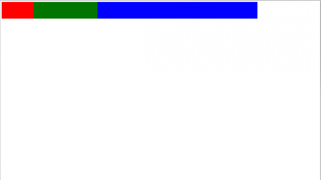
Если нам нужно, чтобы блоки по высоте занимали всю высоту экрана, то для этого достаточно указать в стилях div такой параметр:
height: 100vh;

Ещё есть vmin и vmax, которые работают так:
- vmin находит минимальное значение из пары (vh, vw);
- а vmax находит максимальное значение из пары (vh, vw).
Это нужно, например, для адаптивной вёрстки, когда вам требуется привязаться к короткой стороне экрана и в зависимости от её размеров построить всю остальную страницу.
Проценты — очень гибко, но всегда нужен родительский элемент
Кажется, что vh и vw — это и есть те самые проценты от ширины экрана и что можно обойтись без обычных процентов. Но на самом деле просто проценты в вёрстке тоже используются, но с одним важным моментом:
👉 Чтобы использовать проценты, нужен родительский элемент, от которого эти проценты будут считаться.
Родительский элемент — тот, внутри которого находятся другие наши элементы. Например, мы хотим сделать на странице блок шириной 500 пикселей:
<div style="width: 500px;">

</div>
У этого блока есть точный размер, который браузер может взять или посчитать. Теперь внутри этого блока мы легко можем расположить свои блоки в тех же процентах, что и в предыдущем примере:
- первый блок — 10%;
- второй блок — 20%;
- третий — 50%.
<html lang="ru" >
<head>
  <meta charset="UTF-8">
  <title>Единицы измерения</title>
  <style type="text/css">
  	div{
  		/* у блоков будет единая высота */
  		height: 100vh;
  		/* и становиться они будут друг за другом в один ряд */
  		float: left;
  	}
  	/* задаём ширину в процентах относительно родителя */
  	.div1{
  		width: 10%;
  		background: red;
  	}
  	.div2{
  		width: 20%;
  		background: green;
  	}
  	.div3{
  		width: 50%;
  		background: blue;
  	}
  </style>

</head>
<body>
	<div style="width: 500px;">
		<!-- первый блок -->
		<div class="div1"></div>
		<!-- второй блок -->
		<div class="div2"></div>
		<!-- третий блок -->
		<div class="div3"></div>
	</div>
</body>
</html>
Если мы явно не указали размер родительского элемента, то браузер постарается угадать его или посчитать самостоятельно. Но получится это не всегда.
Нужно ли в этом разбираться?
Вообще в современном мире взрослые фронтендеры верстают с помощью css-grid и готовых верстальных фреймворков: в них все размеры стандартизированы и прописаны под капотом, а верстальщики просто говорят «большое», «среднее», «сбоку», «на три четверти», «на всю ширину» и т. д. А уже как это интерпретировать и какие конкретно там размеры — этим занимается фреймворк.
Но знать полезно.
Вёрстка:
Кирилл Климентьев
Кнопки являются одним из самых понятных и интуитивных элементов интерфейса. По их виду сразу становится понятно, что единственное действие, которое с ними можно производить — это нажимать на них. За счёт этой особенности кнопки часто применяются в формах, особенно при их отправке и очистке.
Кнопку на веб-странице можно создать двумя способами — с помощью элемента <input> или <button>.
Рассмотрим вначале добавление кнопки через <input> и его синтаксис.
<input type="button" атрибуты>Атрибуты кнопки перечислены в табл. 1.
| Атрибут | Описание |
|---|---|
| name | Имя кнопки; предназначено для того, чтобы обработчик формы мог его идентифицировать. |
| value | Значение кнопки и одновременно надпись на ней. |
Создание кнопки показано в примере 1.
Пример 1. Добавление кнопки
<!DOCTYPE html>
<html>
<head>
<meta charset=»utf-8″>
<title>Кнопка</title>
</head>
<body>
<form>
<p><input type=»button» value=» Нажми меня нежно «></p>
</form>
</body>
</html>
Пробелы в надписи на кнопке, в отличие от обычного текста в HTML, учитываются, поэтому можно ставить любое количество пробелов, которые в итоге влияют на ширину кнопки. Результат примера показан на рис. 1.

Рис. 1. Вид кнопки
Второй способ создания кнопки основан на использовании элемента <button>. Он по своему действию напоминает результат, получаемый с помощью <input>. Но в отличие от него предлагает расширенные возможности по созданию кнопок. Например, на подобной кнопке можно размещать любые элементы HTML, включая изображения и таблицы. На рис. 2 показаны разные виды кнопок, полученные с помощью <button>.

Рис. 2. Кнопки, созданные с помощью <button>
Синтаксис создания такой кнопки следующий.
<button атрибуты>Надпись на кнопке</button>Атрибуты перечислены в табл. 1, но в отличие от кнопки <input> атрибут value определяет только отправляемое на сервер значение, а не надпись на кнопке. Если требуется вывести на кнопке изображение, то элемент <img> добавляется внутрь <button>, как показано в примере 2.
Пример 2. Рисунок на кнопке
<!DOCTYPE html>
<html>
<head>
<meta charset=»utf-8″>
<title>Кнопка</title>
</head>
<body>
<form>
<p><button>Кнопка с текстом</button>
<button>
<img src=»image/umbrella.gif» alt=»» style=»vertical-align:middle»>
Кнопка с рисунком
</button></p>
</form>
</body>
</html>
В данном примере показано создание обычной кнопки с текстом, а также кнопки с одновременным использованием текста и рисунка. Размер кнопки зависит от содержимого контейнера <button>, но пробелы игнорируются, поэтому простым увеличением их количества, как в случае использования <input>, ширину кнопки изменить не удастся.
Кнопка Submit
Для отправки данных на сервер предназначена специальная кнопка Submit. Её вид ничем не отличается от обычных кнопок, но при нажатии на нее происходит выполнение серверной программы, указанной атрибутом action элемента <form>. Эта программа, называемая еще обработчиком формы, получает данные введённые пользователем в полях формы, производит с ними необходимые манипуляции, после чего возвращает результат в виде HTML-документа. Что именно делает обработчик, зависит от автора сайта, например, подобная технология применяется при создании опросов, форумов, тестов и многих других вещей.
Синтаксис создания кнопки Submit зависит от используемого элемента <input> или <button>.
<input type="submit" атрибуты>
<button type="submit">Надпись на кнопке</button>
Атрибуты те же, что и у рядовых кнопок (пример 3).
Пример 3. Отправка данных на сервер
<!DOCTYPE html>
<html>
<head>
<meta charset=»utf-8″>
<title>Кнопка</title>
</head>
<body>
<form>
<p><input name=»login»></p>
<p><input type=»submit»></p>
</form>
</body>
</html>
Атрибут name для этого типа кнопки можно не писать. Если не указать значение value, то браузер самостоятельно добавит текст, он различается в зависимости от браузера. Так, Firefox пишет «Отправить запрос», IE — «Подача запроса», Opera и Chrome — «Отправить». Сам текст надписи никак на функционал кнопки не влияет.
Кнопка Reset
При нажатии на кнопку Reset данные формы возвращаются в первоначальное значение. Как правило, эту кнопку применяют для очистки введённой в полях формы информации. Для больших форм от использования кнопки Reset лучше вообще отказаться, чтобы по ошибке на неё не нажать, ведь тогда придётся заполнять форму заново.
Синтаксис создания указанной кнопки прост и похож на другие кнопки.
<input type="reset" атрибуты>
<button type="reset">Надпись на кнопке</button>
В примере 4 показана форма с одним текстовым полем, которое уже содержит предварительно введённый текст с помощью атрибута value элемента <input>. После изменения текста и нажатия на кнопку «Очистить», значение поля будет восстановлено и в нём снова появится надпись «Введите текст».
Пример 4. Кнопка для очистки формы
<!DOCTYPE html>
<html>
<head>
<meta charset=»utf-8″>
<title>Кнопка</title>
</head>
<body>
<form>
<p><input value=»Введите текст»></p>
<p><input type=»submit» value=»Отправить»>
<input type=»reset» value=»Очистить»></p>
</form>
</body>
</html>
Значение кнопки Reset никогда не пересылается на сервер. Если надпись на кнопке не писать, иными словами, не задавать атрибут value, на кнопке по умолчанию будет добавлен текст «Очистить».
Цветные кнопки
Вид и цвет кнопок зависит от операционной системы и браузера. Тем не менее можно изменить цвет кнопок по своему усмотрению, воспользовавшись стилями. Для этого требуется только добавить к кнопке свойство background, как показано в примере 5. Дополнительно можно поменять цвет текста и другие параметры. Помните про одну особенность — как только вы меняете цвет фона, кнопка становится приподнятой, поэтому для «плоских» кнопок надо добавить ещё рамку, пусть даже прозрачную.
Пример 5. Вид кнопок
<!DOCTYPE html>
<html>
<head>
<meta charset=»utf-8″>
<title>Кнопка</title>
<style>
.btn {
background: #5d8f76; /* Цвет фона */
color: #fff; /* Цвет текста */
padding: 7px 12px; /* Поля */
margin-bottom: 1em; /* Отступ снизу */
}
.btn:hover {
background: #1e6550; /* Цвет фона при наведении курсора */
}
.btn-flat {
border: 1px transparent; /* Прозрачная рамка */
}
.btn-round {
border-radius: 20px; /* Радиус скругления */
}
</style>
</head>
<body>
<form>
<p><input type=»button» value=»Исходная кнопка»>
<input type=»button» class=»btn» value=»Цветная кнопка»>
<input type=»button» class=»btn btn-flat» value=»Плоская кнопка»>
<input type=»button» class=»btn btn-flat btn-round» value=»Кнопка со скруглёнными уголками»></p>
</form>
</body>
</html>
Результат данного примера показан на рис. 3.

Рис. 3. Изменение вида кнопок
См. также
Последнее изменение: 11.03.2020
Статья, в которой познакомимся с процессом создания кнопок с помощью 3 или 4 версии фреймворка Bootstrap. Кроме этого рассмотрим плагин Bootstrap и научимся использовать его методы на практике.
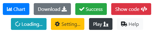
Дефолтные кнопки
Кнопки — это один из самых распространённых элементов в дизайне сайтов и приложений. В большинстве случаев кнопки применяются для того, чтобы привлечь внимание посетителя сайта к действиям, которые они выполняют. Кнопки используются в HTML формах, диалоговых окнах, меню и во многих других местах веб-страниц.
Для оформления элемента в виде кнопки обычно используется <button>, а также ссылки <a href.
Хорошей практикой является использование ссылок <a href для создания переходов между страницами, а <button> — для выполнения различных действий на странице.
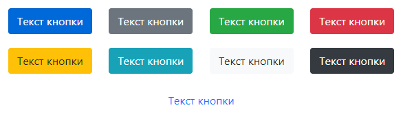
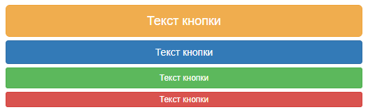
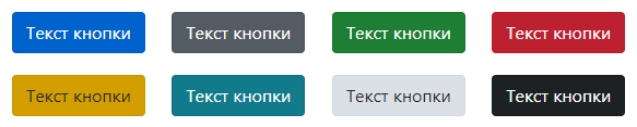
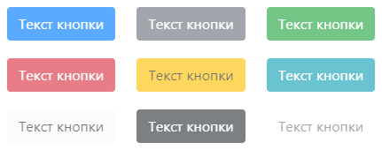
Создание дефолтной Bootstrap кнопки осуществляется посредством добавления к тегу базового класса btn и класса с темой (например, btn-primary).
<-- Bootstrap v4 и v5 -->
<button type="button" class="btn btn-primary">Primary</button>
<button type="button" class="btn btn-secondary">Secondary</button>
<button type="button" class="btn btn-success">Success</button>
<button type="button" class="btn btn-danger">Danger</button>
<button type="button" class="btn btn-warning">Warning</button>
<button type="button" class="btn btn-info">Info</button>
<button type="button" class="btn btn-light">Light</button>
<button type="button" class="btn btn-dark">Dark</button>

<button type="button" class="btn btn-link">Link</button>
В Bootstrap 3 нет темы secondary, light и dark, но есть default.
Кнопки Bootstrap v3
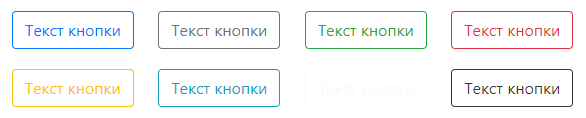
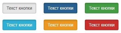
Outline кнопки (только Bootstrap ?пеж4)
Создание бутстрап кнопки с контуром (без фона) необходимо добавить к элементы классы btn и btn-outline-*:
<button type="button" class="btn btn-outline-primary">Primary</button>
<button type="button" class="btn btn-outline-secondary">Secondary</button>
<button type="button" class="btn btn-outline-success">Success</button>
<button type="button" class="btn btn-outline-danger">Danger</button>
<button type="button" class="btn btn-outline-warning">Warning</button>
<button type="button" class="btn btn-outline-info">Info</button>
<button type="button" class="btn btn-outline-light">Light</button>
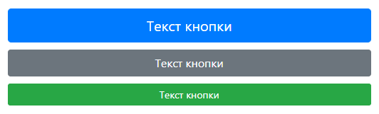
<button type="button" class="btn btn-outline-dark">Dark</button>Изменение размера кнопки
Для увеличения или уменьшения размера кнопки, к ней нужно дополнительно добавить класс btn-{size}. Вместо {size} необходимо указать lg, sm или xs (только в Bootstrap 3).
Класс btn-lg предназначен для создания большой кнопки, sm — маленькой и xs — очень маленькой.
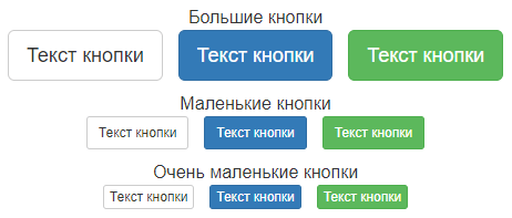
<!-- Bootstrap 3 -->
<!-- Большая кнопка -->
<button type="button" class="btn btn-default btn-lg">Текст кнопки</button>
<!-- Маленькая кнопка -->
<button type="button" class="btn btn-default btn-sm">Текст кнопки</button>
<!-- Очень маленькая кнопка -->
<button type="button" class="btn btn-default btn-xs">Текст кнопки</button>
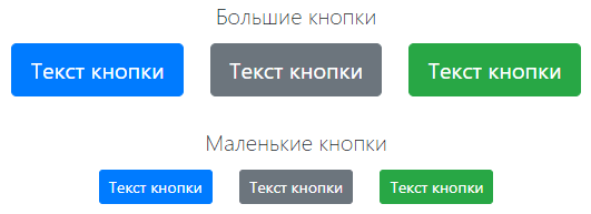
<!-- Bootstrap 4 -->
<!-- Большие кнопки -->
<button type="button" class="btn btn-primary btn-lg">Текст кнопки</button>
<button type="button" class="btn btn-secondary btn-lg">Текст кнопки</button>
<!-- Маленькие кнопки -->
<button type="button" class="btn btn-primary btn-sm">Текст кнопки</button>
<button type="button" class="btn btn-secondary btn-sm">Текст кнопки</button>
Кнопка, занимающая всю ширину родительского элемента
Создание кнопки с шириной равной ширине родительского элемента осуществляется с помощью класса btn-block.
<!-- Bootstrap 3 -->
<button type="button" class="btn btn-warning btn-lg btn-block">Текст кнопки</button>
<button type="button" class="btn btn-primary btn btn-block">Текст кнопки</button>
<button type="button" class="btn btn-success btn-sm btn-block">Текст кнопки</button>
<button type="button" class="btn btn-danger btn-xs btn-block">Текст кнопки</button>
<!-- Bootstrap 4 -->
<button type="button" class="btn btn-primary btn-lg btn-block">Текст кнопки</button>
<button type="button" class="btn btn-secondary btn-block">Текст кнопки</button>
<button type="button" class="btn btn-success btn-sm btn-block">Текст кнопки</button>
Активное состояние кнопки
Если необходимо отображать кнопку нажатой (с более тёмным фоном и рамкой), то к ней необходимо добавить класс active.
Для поддержки вспомогательных технологий к кнопке нужно добавить атрибут aria-pressed=»true».
<!-- Bootstrap 3 -->
<a href="#" class="btn btn-primary active" role="button" aria-pressed="true">Текст кнопки</a>
<!-- Bootstrap 4 -->
<a href="#" class="btn btn-primary active" role="button" aria-pressed="true">Текст кнопки</a>
Неактивное состояние кнопки
Если необходимо отключить возможность нажатия на кнопку, то её необходимо перевести в неактивное состояние.
Для элемента button это действие осуществляется посредством добавления к нему атрибута disabled.
<!-- Bootstrap 3 -->
<button type="button" class="btn btn-primary" disabled>Текст кнопки</button>
<!-- Bootstrap 4 -->
<button type="button" class="btn btn-primary" disabled>Текст кнопки</button>
Для отключения функциональности кнопки, созданной с помощью элемента a, необходимо выполнить немного другое действие, а именно добавить к ней класс disabled.
Класс disabled отключает возможность клика по кнопке посредством установки ей (элементу a) CSS-свойства pointer-events со значением none.
Для обеспечения поддержки вспомогательных технологий, таких как программ чтения с экрана, к кнопке (элементу a) необходимо добавить атрибут aria-disabled = «true».
<!-- Bootstrap 3 -->
<a href="#" class="btn btn-primary disabled" tabindex="-1" role="button" aria-disabled="true">Текст кнопки</a>
<!-- Bootstrap 4 -->
<a href="#" class="btn btn-primary disabled" tabindex="-1" role="button" aria-disabled="true">Текст кнопки</a>
Плагин Buttons
Компонент «Buttons» включает в себя не только CSS, но JavaScript. Данный код (buttons.js) добавляет на страницу функционал, предназначенный для управления состоянием кнопок, как отдельных, так и находящихся в группах.
Использование кнопки в качестве переключателя
Для создания кнопки-переключателя добавьте к ней атрибут data-toggle=»button». После этого при нажатии на кнопку она будет переключаться из обычного состояния в активное и наоборот.
Если кнопка изначально должна находиться в активном состоянии, то к ней необходимо добавить класс active и aria-pressed=»true».
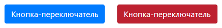
<!-- Bootstrap 3 -->
<button type="button" class="btn btn-primary" data-toggle="button" aria-pressed="false" autocomplete="off">
    Кнопка-переключатель
</button>
<a href="#" class="btn btn-danger" data-toggle="button" aria-pressed="false" role="button">
    Кнопка-переключатель
</a>
<!-- Bootstrap 4 -->
<button type="button" class="btn btn-primary" data-toggle="button" aria-pressed="false" autocomplete="off">
    Кнопка-переключатель
</button>
<a href="#" class="btn btn-danger" data-toggle="button" aria-pressed="false" role="button">
    Кнопка-переключатель
</a>
Checkbox и radio кнопки
CSS-стили Buttons можно применить и к другим HTML элементам, таким как к label, чтобы создать checkbox или radio кнопки.
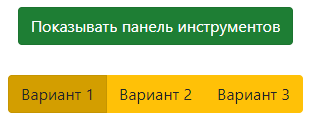
<!-- Bootstrap 3 -->

<!-- Checkbox -->
<div class="btn-group" data-toggle="buttons">
    <label class="btn btn-success active">
        <input type="checkbox" checked autocomplete="off"> Показывать панель инструментов
    </label>
</div>

<!-- Radio buttons -->
<div class="btn-group" data-toggle="buttons">
    <label class="btn btn-warning active">
        <input type="radio" name="options" id="option1" autocomplete="off" checked> Вариант 1
    </label>
    <label class="btn btn-warning">
        <input type="radio" name="options" id="option2" autocomplete="off"> Вариант 2
    </label>
    <label class="btn btn-warning">
        <input type="radio" name="options" id="option3" autocomplete="off"> Вариант 3
    </label>
</div>
<!-- Bootstrap 4 -->
<!-- Checkbox -->
<div class="btn-group-toggle" data-toggle="buttons">
    <label class="btn btn-success active">
        <input type="checkbox" checked autocomplete="off"> Показывать панель инструментов
    </label>
</div>

<!-- Radio buttons -->
<div class="btn-group btn-group-toggle" data-toggle="buttons">
    <label class="btn btn-warning active">
        <input type="radio" name="options" id="option1" autocomplete="off" checked> Вариант 1
    </label>
    <label class="btn btn-warning">
        <input type="radio" name="options" id="option2" autocomplete="off"> Вариант 2
    </label>
    <label class="btn btn-warning">
        <input type="radio" name="options" id="option3" autocomplete="off"> Вариант 3
    </label>
</div>
Атрибут data-toggle=»buttons» предназначен для JavaScript. Он используется в его коде в качестве селектора для выбора элементов, к которым необходимо добавить поведение «переключения».
Состояние кнопок обновляется через событие click. Если необходимо использовать какой-то другой способ для обновления состояния checkbox или radio кнопок, то его нужно написать самостоятельно.
Класс btn-group-toggle (Bootstrap 4) предназначен для стилизации элементов input внутри группы.
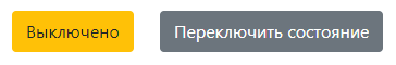
Методы плагина Buttons
В Bootstrap 3 и 4 версии имеется метод $().button('toggle'). Он предназначен для программного переключения состояния одной или нескольких кнопок.
Например, создадим 2 кнопки, и с помощью одной кнопки будем переключать состояние другой:
<!-- Bootstrap 4 -->
<button type="button" id="toggle" class="btn btn-warning" autocomplete="off">
    Выключено
</button>
<button type="button" id="toggleState" class="btn btn-secondary" autocomplete="off">
    Переключить состояние
</button>
...
<script>
    $('#toggleState').on('click', function () {
        var toggleBtn = $('#toggle');
        toggleBtn.button('toggle');
        toggleBtn.hasClass('active') ? toggleBtn.text('Включено') : toggleBtn.text('Выключено');
    });
</script>
В Bootstrap 3 кроме вышеприведённого метода имеются ещё 2:
- $().button(‘string’) — изменяет текст кнопки на значение, хранящееся в атрибуте data-string-text (имя атрибута составляется путём сложения строки data-, строкового значения, переданного в функцию button, например string и строки -text);
- $().button(‘reset’) — заменяет текст на изначальный.
Пример работы с методами $().button('complete') и $().button('reset').
<!-- Bootstrap 3 -->
<button type="button" id="download" data-complete-text="Скачать ещё раз" class="btn btn-primary" autocomplete="off">
  Скачать
</button>
<button type="button" id="reset" class="btn btn-danger" autocomplete="off">
  Сбросить
</button>
...
<script>
    $('#download').on('click', function () {
        $(this).button('complete');
    });
    $('#reset').on('click', function () {
        $('#download').button('reset');
    });
</script>
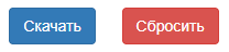
Этот пример состоит из 2 кнопок.
При нажатии на первую кнопку её текст изменяется на значение атрибута data-complete-text. Это действие выполняется с помощью метода $().button('complete').
При нажатии на вторую кнопку текст первой кнопки заменяется на изначальный. Осуществляется это посредством метода $().button('reset').
Выравнивание кнопки по центру
Кнопка в Bootstrap 3 и 4 по умолчанию отображается как inline-block. Это обстоятельство и определяет способы, с помощью которых её можно выровнять по центру.
Первый способ — это обернуть кнопку элементом, который показывается в документе как блочный (т.е. у которого CSS-свойство display, равно значению block), и добавить к нему класс text-center.
Второй способ — это изменить отображение кнопки на блочное и добавить к ней стили margin-left: auto и margin-right: auto. В Boostrap 3 — это действие можно выполнить с помощью класса center-block, а в Bootstrap 4 — посредством классов d-block и mx-auto.
<!-- Bootstrap 3 -->
<!-- 1 Способ -->
<div class="text-center">
    <button type="button" class="btn btn-primary">Текст кнопки</button>
</div>
<!-- 2 Способ -->
<button type="button" class="btn btn-primary center-block">Текст кнопки</button>
<!-- Bootstrap 4 -->
<!-- 1 Способ -->
<div class="text-center">
    <button type="button" class="btn btn-primary">Текст кнопки</button>
</div>
<!-- 2 Способ -->
<button type="button" class="btn btn-primary d-block mx-auto">Текст кнопки</button>
Выравнивание кнопки по левому или правому краю
Способы выравнивания кнопки по левому или правому краю в Bootstrap 3 и 4 показаны в нижеприведенных примерах.
<!-- Bootstrap 3 -->
<!-- 1 Способ -->
<!-- Оборачивание кнопки с помощью элемента, например, div (который должен отображаться в документе как блочный) и добления к нему класса text-left или text-right -->
<!-- Выравнивание кнопки по левому краю -->
<div class="text-left">
    <button type="button" class="btn btn-primary">Текст кнопки</button>
</div>
<!-- Выравнивание кнопки по правому краю -->
<div class="text-right">
    <button type="button" class="btn btn-primary">Текст кнопки</button>
</div>
<!-- 2 Способ -->
<!-- Изменение типа отображения кнопки на блочный и добавления к ней CSS margin-left: auto или margin-right: auto. -->
<!-- Выравнивание кнопки по левому краю -->
<button type="button" class="btn btn-primary" style="display: block; margin-right: auto;">Текст кнопки</button>
<!-- Выравнивание кнопки по правому краю -->
<button type="button" class="btn btn-primary" style="display: block; margin-left: auto;">Текст кнопки</button>
<!-- Bootstrap 4 -->
<!-- 1 Способ -->
<!-- Оборачивание кнопки с помощью элемента, например, div (который должен отображаться в документе как блочный) и добления к нему класса text-left или text-right -->
<!-- Выравнивание кнопки по левому краю -->
<div class="text-left">
    <button type="button" class="btn btn-primary">Текст кнопки</button>
</div>
<!-- Выравнивание кнопки по правому краю -->
<div class="text-right">
    <button type="button" class="btn btn-primary">Текст кнопки</button>
</div>
<!-- 2 Способ -->
<!-- Изменение типа отображения кнопки на блочный и добавления к ней CSS margin-left: auto или margin-right: auto. В Bootstrap 4 это можно выполнить с помощью классов d-block, mr-auto и ml-auto -->
<!-- Выравнивание кнопки по левому краю -->
<button type="button" class="btn btn-primary d-block mr-auto">Текст кнопки</button>
<!-- Выравнивание кнопки по правому краю -->
<button type="button" class="btn btn-primary d-block ml-auto">Текст кнопки</button>
Как создать круглую кнопку
Для создания круглой кнопки необходимо установить с помощью CSS ей одинаковую ширину и высоту. Радиус скругления в этом случае нужно задать, равный половине ширины или высоты.

<style>
/* CSS */
.btn-circle {
    width: 38px;
    height: 38px;
    border-radius: 19px;
    text-align: center;
    padding-left: 0;
    padding-right: 0;
    font-size: 16px;
}
</style>
...
<!-- HTML -->
<button type="button" class="btn btn-primary btn-circle"><i class="fas fa-map"></i></button>
Если необходимо содержимое кнопки расположить на нескольких строчках (например, иконку на одной, а текст на другой), то значение CSS свойства white-space необходимо сбросить или другими словами восстановить ему значение по умолчанию.
<style>
/* CSS */
.btn-circle {
    width: 70px;
    height: 70px;
    border-radius: 35px;
    text-align: center;
    padding-left: 0;
    padding-right: 0;
    font-size: 16px;
    white-space: normal; /* восстанавливаем свойству значение по умолчанию */
}
</style>
...
<!-- HTML -->
<button type="button" class="btn btn-primary btn-circle"><i class="fas fa-map"></i></button>
Как создать кнопку с иконкой
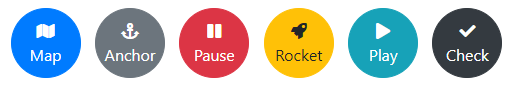
1 вариант.
<style>
/* CSS */
.btn-rounded {
    border-radius: 19px;
    padding-top: 3px;
    padding-bottom: 3px;
    padding-left: 3px;
}
</style>
...
<!-- HTML -->
<button type="button" class="btn btn-primary btn-rounded"><i class="fas fa-map text-primary rounded-circle bg-white mr-1" style="padding: 7px 6px;"></i> Map</button>
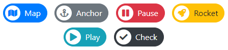
2 вариант.
<style>
/* CSS */
.btn-icon {
    padding-top: 0;
    padding-bottom: 0;
}
.btn > .icon {
    position: relative;
    left: -.75rem;
    display: inline-block;
    padding: .375rem .75rem;
    background: rgba(0, 0, 0, 0.15);
    border-radius: .25rem 0 0 .25rem;
}
</style>
...
<!-- HTML -->
<button type="button" class="btn btn-secondary btn-icon">
    <span class="icon"><i class="fas fa-download"></i></span>Download
</button>
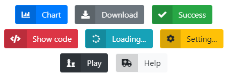
3 вариант.
<!-- HTML -->
<button type="button" class="btn btn-secondary">
    Download <i class="fas fa-download"></i>
</button>