Настройка полосы прокрутки (scrollbar) в основных браузерах была трудна и неприятна примерно до сентября 2018 года, когда был выпущен рабочий проект W3C CSS Scrollbars, который выглядит как реальный способ устранить трудности стилизации скроллбаров.
На протяжении многих лет появлялись различные способы сделать это. Microsoft Internet Explorer был одним из первых, кто предоставил CSS API для скроллбаров, но многие разработчики были настолько разочарованы реализацией, что создавали собственные решения с помощью JavaScript.
Однако, JavaScript-решения тоже не во всём идеальны, например им трудно эмулировать высокопроизводительное поведение, допустим, прокрутку с инерцией или прокрутку больших документов.
Перенесемся в настоящее время, теперь, когда Internet Explorer вытесняется Microsoft Edge, это сводится к двум подходам:
- Chrome/Edge/Safari используют
-webkit-scrollbar - Firefox использует новую спецификацию CSS Scrollbars API (т.е.
scrollbar-colorиscrollbar-width).
Давайте посмотрим на некоторые примеры кода!
Скроллбары в Chrome/Edge/Safari
В Chrome/Edge/Safari для стилизации прокрутки доступны css-свойства с вендорным префиксом -webkit-scrollbar.
body::-webkit-scrollbar {
  width: 12px;               /* ширина scrollbar */
}
body::-webkit-scrollbar-track {
  background: orange;        /* цвет дорожки */
}
body::-webkit-scrollbar-thumb {
  background-color: blue;    /* цвет плашки */
  border-radius: 20px;       /* закругления плашки */
  border: 3px solid orange;  /* padding вокруг плашки */
}
Есть хорошие новости… И плохие новости…
Хорошие новости! Этот код прекрасно работает в последних выпусках Chrome/Edge/Safari!
Плохие новости. К сожалению, W3C официально отказалась от этой спецификации, поэтому можем ожидать в ближайшие годы её постепенное устаревание.
Скроллбары в Firefox
Firefox — чемпион в использовании новых стандартов W3C, они всегда готовы попробовать новые API. Таким образом, новые функции CSS Scrollbars уже доступны в обычных выпусках Firefox:
body {
  scrollbar-width: thin;          /* "auto" или "thin"  */
  scrollbar-color: blue orange;   /* плашка скролла и дорожка */
}
Здесь легко заметить несколько различий по сравнению с устаревшей спецификацией --webkit-scrollbar.
Во-первых, это лаконичный css-код! А во-вторых, в нём отсутствуют такие функции, как создание отступов и скруглений для плашки скролла. Поскольку спецификация всё ещё меняется, эти недостающие функции могут быть в неё включены.
Дальше-то, что?
Как стилизовать полосы прокрутки, с учётом отсутствия единого авторитетного API? Надо просто объединить оба подхода!
/* W3C standard
   сейчас только для Firefox */
* {
  scrollbar-width: thin;
  scrollbar-color: blue orange;
}

/* для Chrome/Edge/Safari */
*::-webkit-scrollbar {
  height: 12px;
  width: 12px;
}
*::-webkit-scrollbar-track {
  background: orange;
}
*::-webkit-scrollbar-thumb {
  background-color: blue;
  border-radius: 5px;
  border: 3px solid orange;
}
Когда --webkit-scrollbar устареет, можете спокойно вернуться к новому стандарту CSS Scrollbars.
See this code CSS scrollbar on x.xhtml.ru.
Вариант с использованием настраиваемых CSS-свойств (CSS-переменные). В этом случае появляется возможность управлять настройками CSS-свойств полосы прокрутки из Javascript, например, для управления темами:
See this code Styling scrollbars with CSS on x.xhtml.ru.
Ещё можно поэкспериментировать с CSS-градиентом, но этот вариант только для Webkit-браузеров:
See this code Styling scrollbars with CSS-gradient on x.xhtml.ru.
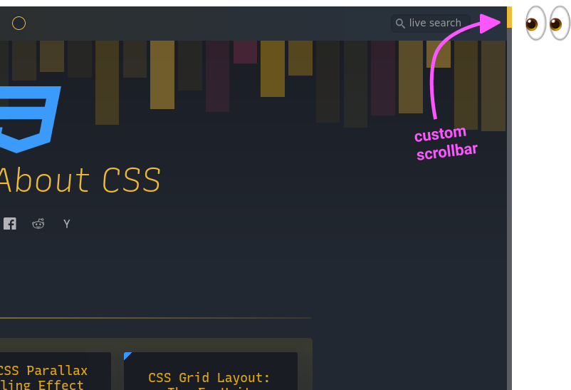
Custom Scrollbars In CSS

От автора: в наши дни пользовательские полосы прокрутки становятся все более популярными, и я хочу рассмотреть эту тему. Есть разные причины для настройки полосы прокрутки. Например, полоса прокрутки по умолчанию может сделать пользовательский интерфейс приложения несовместимым с различными операционными системами, и поэтому нам нужно использовать единый стиль полосы прокрутки.
Мне всегда было интересно узнать, как настроить полосу прокрутки в CSS, но у меня не было возможности сделать это. В этой статье я воспользуюсь такой возможностью, узнаю больше о полосах прокрутки и задокументирую свои открытия.
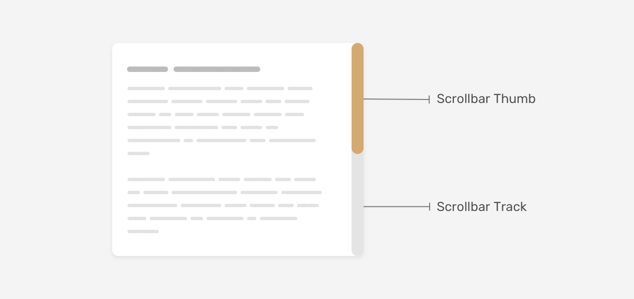
Вступление
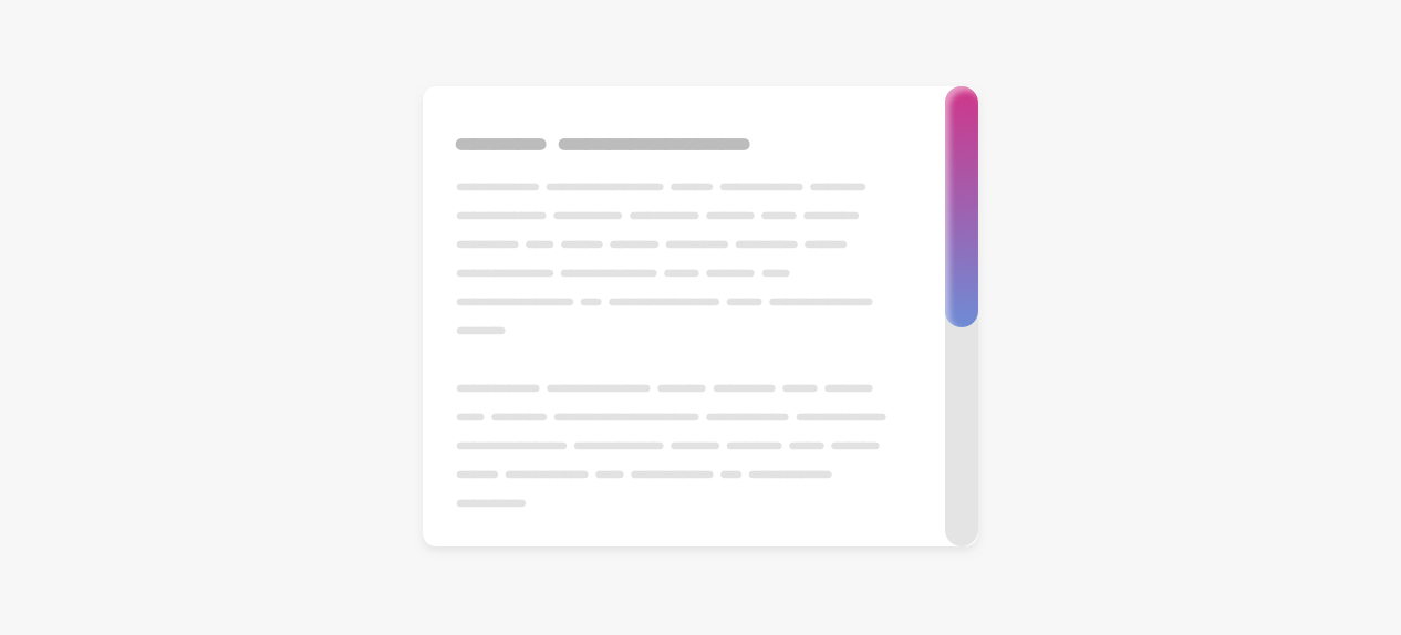
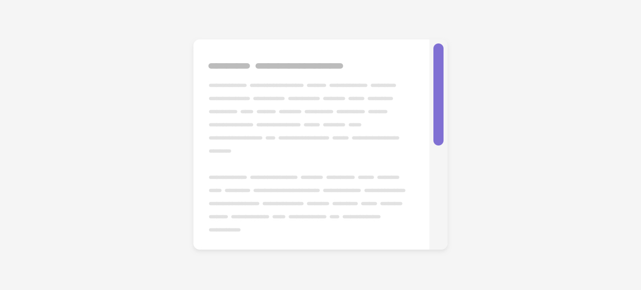
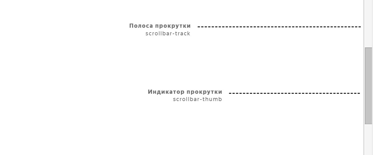
Первое, что я хочу объяснить, — это компоненты или части полосы прокрутки. Полоса прокрутки содержит дорожку и ползунок. Вот наглядное изображение, которое их показывает:

Практический курс по верстке адаптивного сайта с нуля!
Изучите курс и узнайте, как верстать современные сайты на HTML5 и CSS3
Узнать подробнее
Дорожка — это основа полосы прокрутки, а ползунок — это то, что пользователь перетаскивает для прокрутки страницы или раздела.
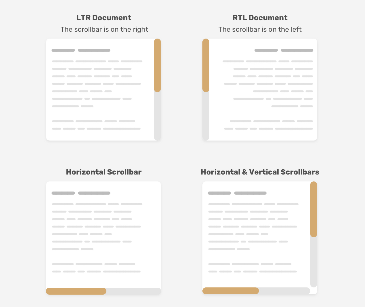
Следует иметь в виду одну важную вещь: полоса прокрутки может работать горизонтально или вертикально, в зависимости от дизайна. Кроме того, она может измениться при работе с многоязычным веб-сайтом, который работает как слева направо (LTR), так и справа налево (RTL).
Настройка дизайна долосы прокрутки
Раньше пользовательская полоса прокрутки использовалась только для webkit, поэтому, она не использовались в Firefox и IE. Сейчас, у нас есть новый синтаксис, который работает только в Firefox и упростит нам жизнь, когда он будет полностью поддерживаться. Я пройдусь по старому синтаксису Webkit, а затем по новому.
Старый синтаксис
Ширина полосы прокрутки
Во-первых, нам нужно определить размер полосы прокрутки. Это может быть ширина вертикальных полос прокрутки и высота горизонтальных.
|
.section::-webkit-scrollbar { width: 10px; } |
С этим набором мы можем стилизовать саму полосу прокрутки.
Дорожка полосы прокрутки
Это основа полосы прокрутки. Мы можем стилизовать ее, добавив цвета фона, тени, радиус границы.
|
.section::-webkit-scrollbar-track { background-color: darkgrey; } |
Ползунок полосы прокрутки
Когда у нас есть готовая основа полосы прокрутки, нам нужно стилизовать ползунок полосы прокрутки. Это важно, поскольку пользователь будет перетаскивать этот ползунок, для взаимодействия с полосой прокрутки.
|
.section::-webkit-scrollbar-thumb { box-shadow: inset 0 0 6px rgba(0, 0, 0, 0.3); } |
Тем самым мы рассмотрели старый способ стилизации пользовательской полосы прокрутки в CSS. Давайте исследуем новый синтаксис.
Новый синтаксис
Ширина полосы прокрутки
Как было сказано раньше, это определение ширины полосы прокрутки и наиболее важные для нас значения: auto и thin. К сожалению, мы не можем определить конкретное число, как в синтаксисе webkit.
|
.section { scrollbar-width: thin; } |
Цвет полосы прокрутки
С помощью этого свойства мы можем определить цвет как для дорожки полосы прокрутки, так и для ползунка как парные значения.
|
.section { scrollbar-color: #6969dd #e0e0e0; scrollbar-width: thin; } |
Этот новый синтаксис очень прост, но он ограничен. Мы можем применять только сплошные цвета. Мы не можем добавлять тени, градиенты, закругленные края или что-то подобное. Нам разрешено настраивать только цвета.
Определение области пользовательской полосы прокрутки
Важно знать, где настроить полосу прокрутки. Вы хотите, чтобы стиль был универсальным и работал для всех полос прокрутки на веб-сайте? Или вы хотите настроить ее только для определенных разделов?
Со старым синтаксисом мы можем писать селекторы, не прикрепляя их к элементу, и они будут применяться ко всем прокручиваемым элементам.
|
::-webkit-scrollbar { width: 10px; } ::-webkit-scrollbar-track { background-color: darkgrey; } ::-webkit-scrollbar-thumb { box-shadow: inset 0 0 6px rgba(0, 0, 0, 0.3); } |
Однако, если вы хотите настроить только определенный раздел, вам нужно добавить элемент перед селекторами.
|
.section::-webkit-scrollbar { width: 10px; } .section::-webkit-scrollbar-track { background-color: darkgrey; } .section::-webkit-scrollbar-thumb { box-shadow: inset 0 0 6px rgba(0, 0, 0, 0.3); } |
Настройка нового синтаксиса почти такая же. Я заметил, что если вам нужен общий стиль, его следует применять к тегу html, а не к body.
|
html { scrollbar-color: #6969dd #e0e0e0; scrollbar-width: thin; } |
Я попытался добавить вышеуказанное для тега body, но это не сработало, как ожидалось. Теперь, когда мы знаем, как работают старый и новый синтаксис, давайте приступим к настройке некоторых дизайнов полос прокрутки.
Настройка дизайна полосы прокрутки
Пример 1
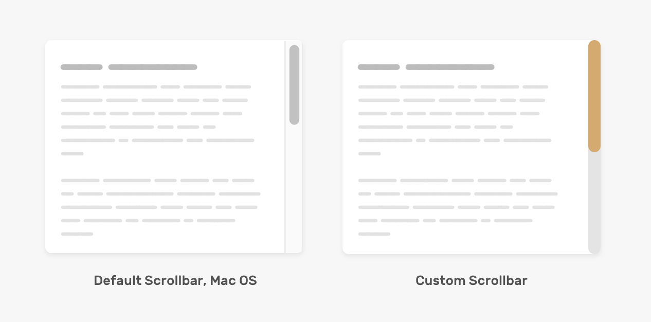
Прежде чем погрузиться в настройку полосы прокрутки, стоит поговорить о стиле по умолчанию в Mac OS. Вот как это выглядит:
Дорожка полосы прокрутки имеет границу слева и справа со сплошным цветом фона.
Ползунок полосы прокрутки закруглен и имеет пространство вокруг него с левой и правой сторон.
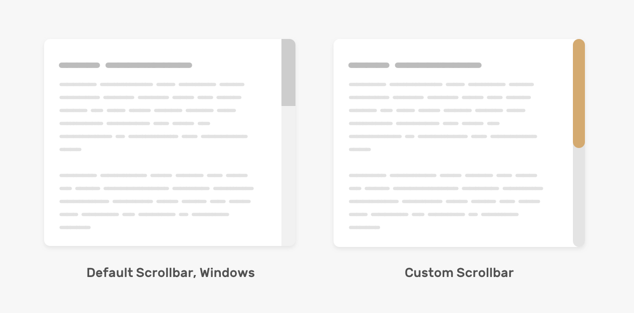
Для окон все немного иначе.
Вот как мы можем настроить полосу прокрутки на основе макета выше.
|
.section::-webkit-scrollbar { width: 16px; } .section::-webkit-scrollbar-track { background-color: #e4e4e4; border-radius: 100px; } .section::-webkit-scrollbar-thumb { background-color: #d4aa70; border-radius: 100px; } |
Необходимо добавить border-radius как для дорожки, так и для бегунка, поскольку это не сработает c ::webkit-scrollbar.
С новым синтаксисом мы не можем настраивать ширину полосы прокрутки, остается только изменить цвет фона дорожки и ползунка.
Практический курс по верстке адаптивного сайта с нуля!
Изучите курс и узнайте, как верстать современные сайты на HTML5 и CSS3
Узнать подробнее
|
.section { scrollbar-color: #D4AA70 #e4e4e4; } |
Примечание: следующие примеры работают только с синтаксисом webkit. Для реального проекта вы можете добавить как webkit, так и новый синтаксис.
Пример 2
В этом примере дизайн немного сложнее, так как он содержит градиенты и тени. Это выполнимо? Да, мы можем применить внутренние тени и градиенты, чтобы имитировать этот эффект. Посмотрим как!
|
.section::-webkit-scrollbar-thumb { background-image: linear-gradient(180deg, #D0368A 0%, #708AD4 99%); box-shadow: inset 2px 2px 5px 0 rgba(#fff, 0.5); border-radius: 100px; } |
Пример 3
Мы также можем добавить границы для ползунка и полосы, что может помочь нам с некоторыми сложными дизайнами.

|
.section::-webkit-scrollbar-thumb { border-radius: 100px; background: #8070D4; border: 6px solid rgba(0,0,0,0.2); } |
Основываясь на том же примере, мы можем установить верхнюю и нижнюю границы равными нулю и получить интересный эффект для ползунка. Обратите внимание на маленькие элементы вверху и внизу ползунка.

Пример 4
В этом примере мы хотим, чтобы ползунок полосы прокрутки имел смещение со всех сторон. Поскольку невозможно использовать padding со свойствами полосы прокрутки, нам нужно обойти это, используя границы CSS и background-clip.
По умолчанию, когда у элемента есть фон и рамка, браузер обрезает border-box. Рассмотрим следующий пример:

|
.button { min-width: 100px; border: solid 6px #000; box-sizing: border-box; background-color: #5749d2; } |
У нас есть кнопка с черной рамкой толщиной 6рх. Предположим, что для box-sizing установлено значение border-box, граница будет включена в размер кнопки. В результате граница появляется над фоном.
Теперь, когда мы применяем background-clip:content-box, фон будет появляться только вокруг содержимого.
|
.button { min-width: 100px; border: solid 6px #000; box-sizing: border-box; background-color: #5749d2; background-clip: content-box; } |

Надеюсь, идея понятна. Вернемся к ползунку полосы прокрутки. Чтобы имитировать эффект, нам нужно добавить следующее:
|
.section::-webkit-scrollbar-thumb { border: 5px solid transparent; border-radius: 100px; background-color: #8070d4; background-clip: content-box; } |
И мы закончили.
Мы изучили, как настроить различные дизайны полос прокрутки. Для Firefox мы можем использовать новый синтаксис, но опять же, он ограничен только толщиной и сплошными цветами.
Можно ли добавить эффекты наведения?
Да, мы можем добавить эффект наведения курсора на ползунок полосы прокрутки для старого и нового синтаксиса.
|
/* Old Syntax */ .section::-webkit-scrollbar-thumb:hover { background-color: #5749d2; } /* New Syntax */ .section { scrollbar-color: #d4aa70 #e4e4e4; transition: scrollbar-color 0.3s ease-out; } .section:hover { scrollbar-color: #5749d2; } |
В новом синтаксисе мы можем добавлять переходы, а в старом — нет. Для меня это не имеет большого значения.
Показываем полосу прокрутки, когда это необходимо
Создание прокручиваемого элемента возможно путем добавления значения, отличного от visible для свойства overflow. Рекомендуется использовать ключевое слово auto, поскольку оно будет отображать полосу прокрутки только в том случае, если содержимое превышает его контейнер.

|
.section { overflow-y: auto; } |
Проблемы доступности
При настройке дизайна полосы прокрутки помните, что между ползунком и полосой прокрутки должен быть хороший контраст, чтобы пользователь мог легко заметить ето. Рассмотрим следующий «плохой» пример пользовательской полосы прокрутки.

Цвет ползунка едва заметен. Это не очень хорошо для пользователя, если будет использоваться прокрутка с помощью ползунка.
Спасибо за чтение!
Автор: Ahmad Shadeed
Источник: ishadeed.com
Редакция: Команда webformyself.
Читайте нас в Telegram, VK, Яндекс.Дзен
Практический курс по верстке адаптивного сайта с нуля!
Изучите курс и узнайте, как верстать современные сайты на HTML5 и CSS3
Узнать подробнее

Верстка. Быстрый старт
Практический курс по верстке адаптивного сайта с нуля!
Смотреть
Стилизованные полосы прокрутки становятся популярными, думаю, вы
уже сталкивались с такими сайтами, которые имеют уникальный
скроллбар (к примеру, наш сайт). Есть два способа реализации этой задачи:
с помощью CSS3 или используя jQuery плагин. Мы будем использовать наиболее простой —
напишем CSS стили.

Примечание: стилизовать полосу прокрутки через -webkit префикс возможно только
в браузерах, использующих механизм рендеринга Webkit (и Blink). То есть в
Firefox и IE этот способ не сработает.
Часто бывает необходимо убрать или скрыть скроллбар css совсем. Для начала, давайте рассмотрим как это сделать.
Скрыть полосу прокрутки можно как у отдельного элемента на странице, так и у всей страницы целиком.
Сделать это не сложно, достаточно написать следующее свойство:
CSS
/*Убрать полосу прокрутки у элемента*/
.element::-webkit-scrollbar {
  width: 0;
}

/*Убрать полосу прокрутки для всей страницы*/
::-webkit-scrollbar {
  width: 0;
}
Теперь давайте рассмотрим базовую структуру полосы прокрутки:
-webkit-scrollbar состоит различных псевдо-элементов.
- ::-webkit-scrollbar — это фон самого скроллбара.
- ::-webkit-scrollbar-button — кнопки направления на полосе прокрутки.
- ::-webkit-scrollbar-track — пустое пространство под индикатором прокрутки.
- ::-webkit-scrollbar-thumb — индикатор прокрутки, перетаскиваемый элемент.
Проверим как все это работает. Чтобы попробовать изменить скроллбар css, создадим пустой HTML документ.
Вам необходимо добавить style.css ваш HTML файл. В разметку добавим div с id element, имеющий полосу прокрутки,
чтобы применить на него наши стили.
HTML
<!DOCTYPE html>
<html lang="en">
<head>
  <meta charset="UTF-8">
  <meta name="viewport" content="width=device-width, initial-scale=1.0">
  <meta http-equiv="X-UA-Compatible" content="ie=edge">
  <title>Document</title>
  <link type="text/css" rel="stylesheet" href="style.css">
</head>
<body>
  <div id="element">
      <div class="overflow"></div>
  </div>
</body>
</html>
Для того, чтобы у элемента div появилась полоса прокрутки, добавим следующие свойства.
CSS
#element {
  overflow-y: scroll;
  background-color: #ffffff;
  width: 200px;
  height: 200px;
}

.overflow {
  min-height: 400px;
}
Теперь давайте используем псевдоэлемент для создания пользовательского скроллбара.
Заменим ширину по умолчанию на новую — в 7 пикселей. Затем, добавим цвет полосы через свойство
background-color: #f9f9fd.
Если вы хотите изменить ширину скролла всей страницы, а не отдельного элемента,
то используйте ::-webkit-scrollbar без дополнительных селекторов.
CSS
#element::-webkit-scrollbar {
    width: 7px;
    background-color: #f9f9fd;
}
Мы уже знаем, что скроллбар состоит из полосы, кнопки и индикатора прокрутки.
Используем псевдо элемент ::-webkit-scrollbar-thumb, для того
чтобы стилизовать индикатор.
CSS
#element::-webkit-scrollbar-thumb {
    background-color: #223c50;
}
Добавим свойство box-shadow полосе, чтобы добавить скроллбару контрастность.
Подобрать подходящую тень можно в нашем box-shadow генераторе.
CSS
#element::-webkit-scrollbar-track {
    -webkit-box-shadow: 5px 5px 5px -5px rgba(34, 60, 80, 0.2) inset;
    background-color: #f9f9fd;
}
В заключении: вот еще несколько вариантов, которые вы можете использовать на своем сайте.
Пример 1
#element::-webkit-scrollbar {
  width: 10px;
  background-color: #f9f9fd;
}

#element::-webkit-scrollbar-thumb {
  border-radius: 10px;
  background-color: #18aaaa;
}

#element::-webkit-scrollbar-track {
  -webkit-box-shadow: inset 0 0 6px rgba(0,0,0,0.2);
  border-radius: 10px;
  background-color: #f9f9fd;
}
Пример 2
#element::-webkit-scrollbar {
  width: 10px;
}

#element::-webkit-scrollbar-track {
  -webkit-box-shadow: 5px 5px 5px -5px rgba(34, 60, 80, 0.2) inset;
  background-color: #f9f9fd;
}

#element::-webkit-scrollbar-thumb {
  background-color: #f2bf93;
  background-image: -webkit-linear-gradient(45deg,rgba(255, 255, 255, .25) 25%,
                    transparent 25%,
                    transparent 50%,
                    rgba(255, 255, 255, .25) 50%,
                    rgba(255, 255, 255, .25) 75%,
                    transparent 75%,
                    transparent);
}
Пример 3
#element::-webkit-scrollbar {
  width: 10px;
}

#element::-webkit-scrollbar-track {
  -webkit-box-shadow: 5px 5px 5px -5px rgba(34, 60, 80, 0.2) inset;
  background-color: #f9f9fd;
}

#element::-webkit-scrollbar-thumb {
  background-color: #356184;
  background-image: -webkit-gradient(linear, 0 0, 0 100%,
                    color-stop(.5, rgba(255, 255, 255, .25)),
                    color-stop(.5, transparent), to(transparent));
}
В четвертом примере мы используем градиент. Настроить его можно в CSS генераторе градиента.
Пример 4
#element::-webkit-scrollbar {
  width: 10px;
}

#element::-webkit-scrollbar-track {
  -webkit-box-shadow: 5px 5px 5px -5px rgba(34, 60, 80, 0.2) inset;
  background-color: #f9f9fd;
  border-radius: 10px;
}

#element::-webkit-scrollbar-thumb {
  border-radius: 10px;
  background: linear-gradient(180deg, #00c6fb, #005bea);
}
HTML CSS JS
Стилизация Скролла
Дата размещения статьи 31/01/2020 👁61885
Стилизация Скролла
Стилизация Скролла
Сегодня будем стилизовать скролл с помощью CSS для webkit браузеров (Google Chrome / Safari / Opera / Яндекс.Браузер) и Mozilla Firefox. А так же рассмотрим изменение скролла при помощи плагина mCustomScrollbar.
Содержание:
- стилизация скролла для Firefox;
- стилизация скролла для остальных браузеров;
- кроссбраузерная стилизация с помощью плагина mCustomScrollbar;
- добавление скролла (принудительно);
- скрыть скролл, но оставить возможность прокрутки;
- CSS Scroll Snap;
- Scroll Snap Type;
- Scroll Snap Align;
- Scroll Snap со стрелками;
- примеры использования.
Стилизация скролла для Mozilla Firefox
Чтобы изменить скролл в Firefox, используйте следующий код.
html, body {
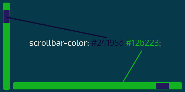
scrollbar-color: #458245 #714826; /* «цвет ползунка» «цвет полосы скроллбара» */
scrollbar-width: auto | thin | none; /* толщина */
}Первое значение scrollbar-color изменяет цвет ползунка, второе — цвет скроллбара.
Значения scrollbar-width изменят толщину (ширину — для вертикального скроллбара, высоту — для горизонтального):
- auto — толщина скролла по умолчанию;
- thin — более тонкий вариант скролла;
- none — скрыть скролл.
Пример. Обратите внимание, данный пример предназначен для просмотра в Firefox.
Выберите цвет скроллбара
Выберите цвет ползунка скроллбара
Выберите толщину скролла
Какой-то контент. Текст, изображения или что-то ещё.
Стилизация скролла для webkit браузеров
Чтобы стилизовать скролл для Google Chrome, Яндекс.Браузер, Safari и Opera используйте следующие CSS свойства.
/* полоса прокрутки (скроллбар) */
::-webkit-scrollbar {
    width: 24px; /* ширина для вертикального скролла */
    height: 8px; /* высота для горизонтального скролла */
    background-color: #143861;
}

/* ползунок скроллбара */
::-webkit-scrollbar-thumb {
    background-color: #843465;
    border-radius: 9em;
    box-shadow: inset 1px 1px 10px #f3faf7;
}

::-webkit-scrollbar-thumb:hover {
    background-color: #253861;
}

/* Стрелки */

::-webkit-scrollbar-button:vertical:start:decrement {
    background: linear-gradient(120deg, #02141a 40%, rgba(0, 0, 0, 0) 41%),
        linear-gradient(240deg, #02141a 40%, rgba(0, 0, 0, 0) 41%),
        linear-gradient(0deg, #02141a 30%, rgba(0, 0, 0, 0) 31%);
    background-color: #f6f8f4;
}

::-webkit-scrollbar-button:vertical:end:increment {
    background:
        linear-gradient(300deg, #02141a 40%, rgba(0, 0, 0, 0) 41%),
        linear-gradient(60deg, #02141a 40%, rgba(0, 0, 0, 0) 41%),
        linear-gradient(180deg, #02141a 30%, rgba(0, 0, 0, 0) 31%);
    background-color: #f6f8f4;
}

::-webkit-scrollbar-button:horizontal:start:decrement {
    background:
        linear-gradient(30deg, #02141a 40%, rgba(0, 0, 0, 0) 41%),
        linear-gradient(150deg, #02141a 40%, rgba(0, 0, 0, 0) 41%),
        linear-gradient(270deg, #02141a 30%, rgba(0, 0, 0, 0) 31%);
    background-color: #f6f8f4;
}

::-webkit-scrollbar-button:horizontal:end:increment {
    background:
        linear-gradient(210deg, #02141a 40%, rgba(0, 0, 0, 0) 41%),
        linear-gradient(330deg, #02141a 40%, rgba(0, 0, 0, 0) 41%),
        linear-gradient(90deg, #02141a 30%, rgba(0, 0, 0, 0) 31%);
    background-color: #f6f8f4;
}
Теперь рассмотрим, как кроссбраузерно стилизовать скролл при помощи плагина mCustomScrollbar.
Сначала скачайте архив и извлеките к себе в проект файлы:
- jquery.mCustomScrollbar.min.css
- jquery.mCustomScrollbar.concat.min.js
- mCSB_buttons.png
Затем подключите jQuery и файлы плагина.
Или же можете подключить все файлы через CDN jsdelivr:
<script src="https://ajax.googleapis.com/ajax/libs/jquery/3.4.1/jquery.min.js" crossorigin="anonymous"></script>
<link rel="stylesheet" href="//cdn.jsdelivr.net/jquery.mcustomscrollbar/3.0.6/jquery.mCustomScrollbar.min.css">
<script src="//cdn.jsdelivr.net/jquery.mcustomscrollbar/3.0.6/jquery.mCustomScrollbar.concat.min.js"></script>
Инициализация
Инициализация через JavaScript
(function ($) {
    $(window).on("load", function () {
        $(".mycustom-scroll").mCustomScrollbar();
    });
})(jQuery);
Инициализация в HTML
<div class="mycustom-scroll" data-mcs-theme="3d-dark">
    <!-- Ваш контент -->
</div>
Настройки
$(".mycustom-scroll").mCustomScrollbar({
    axis: "y",              // вертикальный скролл
    theme: "rounded-dark",  // тема
    scrollInertia: "330",   // продолжительность прокрутки, значение в миллисекундах
    setHeight: "100%",      // высота блока (переписывает CSS)
    mouseWheel: {
        deltaFactor: 300    // кол-во пикселей на одну прокрутку колёсика мыши
    }
});
Темы mCustomScrollbar
Выбрать подходящую тему можно здесь.
Если же готовых тем недостаточно, то можете проинспектировать нужный элемент скролла и стилизовать как вам это необходимо.
Чтобы принудительно добавить скролл для блока, необходимо ограничить его по высоте/ширине и добавить overflow:
- overflow-y: auto; — для создания вертикального скролла (+ max-height);
- overflow-x: auto; — для создания горизонтального скролла (+ max-width).
При создании горизонтального скролла для текстового блока может понадобится добавление следующего css: white-space: nowrap;.
Скроем скролл, но оставим возможность прокрутки блока.
.el {
    scrollbar-width: none; /* firefox */
}
.el::-webkit-scrollbar { /* webkit */
    width: 0;
    height: 0;
}
Позволяет прокручивать не попиксельно, а целыми блоками. Базовое использование.
<div class="parent-container">
    <div class="children"></div>
    <div class="children"></div>
    <div class="children"></div>
    <div class="children"></div>
</div>
.parent-container {
display: flex;
overflow-x: auto;
scroll-snap-type: x proximity;
}
.children {
scroll-snap-align: start;
}Scroll Snap Type
Пример с горизонтальным Scroll Snap:
Вертикальный Scroll Snap.
.parent-container {
    overflow-y: auto;
    scroll-snap-type: x proximity;
}

.children {
    scroll-snap-align: start;
}
Scroll Snap Align
Свойство Scroll Snap Align применяется к дочерним элементам контейнера, которые будем скролить. Мы можем указать какая сторона дочернего элемента будет прижата к родительскому блоку.
Примеры по оси X:
.parent-container {
    display: flex;
    overflow-x: auto;
    scroll-snap-type: x proximity;
}
.children {
    scroll-snap-align: start; /* start/center/end */
}
Примеры по оси Y:
.parent-container {
    overflow-y: auto;
    scroll-snap-type: y proximity;
}
.children {
    scroll-snap-align: start; /* start/center/end */
}
Примеры использования Scroll Snap
Ниже приведены примеры использования Scroll Snap для реальных проектов.
Горизонтальный слайдер
.parent-container {
    display: flex;
    overflow-x: auto;
    scroll-snap-type: x mandatory;
}

.children {
    scroll-snap-align: center;
}
Полноэкранная вертикальная прокрутка секций
.parent-container {
    scroll-snap-type: y mandatory;
}

.children {
    height: 100vh;
    width: 100vw;
    scroll-snap-align: start;
}
Полноэкранная горизонтальная прокрутка секций
.parent-container {
    display: flex;
    overflow-x: auto;
    scroll-snap-type: x proximity;
}

.children {
    height: 100vh;
    width: 100vw;
    scroll-snap-align: start;
}
Scroll Snap с навигацией
Реализуем Scroll Snap с навигацией, добавим стрелки для прокрутки.
Структура:
<div class="testimonials">
<div class="scroller">
<div class="item">1</div>
<div class="item">2</div>
<div class="item">3</div>
</div>
<span class="btn prev"><</span>
<span class="btn next">></span>
</div>JavaScript:
const testimonials = document.querySelector(".testimonials");
const scroller = testimonials.querySelector(".scroller");
const nextBtn = testimonials.querySelector(".btn.next");
const prevBtn = testimonials.querySelector(".btn.prev");
const itemWidth = testimonials.querySelector(".item").clientWidth;

nextBtn.addEventListener("click", scrollToNextItem);
prevBtn.addEventListener("click", scrollToPrevItem);

function scrollToNextItem() {
    if (scroller.scrollLeft < (scroller.scrollWidth - itemWidth)) {
        // Позиция прокрутки не в начале последнего элемента
        scroller.scrollBy({ left: itemWidth, top: 0, behavior: "smooth" });
    } else {
        // Достигнут последний элемент
        // Вернёмся к первому элементу, установив положение прокрутки на 0
        scroller.scrollTo({ left: 0, top: 0, behavior: "smooth" });
    }
}

function scrollToPrevItem() {
    if (scroller.scrollLeft != 0) {
        // Позиция прокрутки не в начале первого элемента
        scroller.scrollBy({ left: -itemWidth, top: 0, behavior: "smooth" });
    } else {
        // Это первый элемент (отзыв)
        // Перейдём к последнему элементу, установив положение прокрутки на ширину «.scroller»
        scroller.scrollTo({ left: scroller.scrollWidth, top: 0, behavior: "smooth" });
    }
}События Формы Отзывы в WordPress без Плагинов
Надеюсь, вам понравилась данная информация. Если вам интересна тема web-разработки,
то можете следить за выходом новых статей в Telegram.
- JavaScript: Работа с Массивами
- Наличие Динамически Добавленного Элемента
- Стилизация Input File
- Предзагрузка Картинок — Предварительная Загрузка Изображений на JavaScript
- События Формы
- Checkbox Checked — Проверка Состояния Чекбокса ✔️
This is what Google has used in some of its applications for a long time now. See in the code that, if you apply next classes, they somehow hide the scrollbar in Chrome, but it still works.
.testg{ border:1px solid black;  max-height:150px;  overflow-y: scroll; overflow-x: hidden; width: 250px;}
.content{ height: 700px}

/* The google css code for scrollbars */
::-webkit-scrollbar {
    height: 16px;
    overflow: visible;
    width: 16px
}
::-webkit-scrollbar-button {
    height: 0;
    width: 0
}
::-webkit-scrollbar-track {
    background-clip: padding-box;
    border: solid transparent;
    border-width: 0 0 0 7px
}
::-webkit-scrollbar-track:horizontal {
    border-width: 7px 0 0
}
::-webkit-scrollbar-track:hover {
    background-color: rgba(0, 0, 0, .05);
    box-shadow: inset 1px 0 0 rgba(0, 0, 0, .1)
}
::-webkit-scrollbar-track:horizontal:hover {
    box-shadow: inset 0 1px 0 rgba(0, 0, 0, .1)
}
::-webkit-scrollbar-track:active {
    background-color: rgba(0, 0, 0, .05);
    box-shadow: inset 1px 0 0 rgba(0, 0, 0, .14), inset -1px 0 0 rgba(0, 0, 0, .07)
}
::-webkit-scrollbar-track:horizontal:active {
    box-shadow: inset 0 1px 0 rgba(0, 0, 0, .14), inset 0 -1px 0 rgba(0, 0, 0, .07)
}
.jfk-scrollbar-dark::-webkit-scrollbar-track:hover {
    background-color: rgba(255, 255, 255, .1);
    box-shadow: inset 1px 0 0 rgba(255, 255, 255, .2)
}
.jfk-scrollbar-dark::-webkit-scrollbar-track:horizontal:hover {
    box-shadow: inset 0 1px 0 rgba(255, 255, 255, .2)
}
.jfk-scrollbar-dark::-webkit-scrollbar-track:active {
    background-color: rgba(255, 255, 255, .1);
    box-shadow: inset 1px 0 0 rgba(255, 255, 255, .25), inset -1px 0 0 rgba(255, 255, 255, .15)
}
.jfk-scrollbar-dark::-webkit-scrollbar-track:horizontal:active {
    box-shadow: inset 0 1px 0 rgba(255, 255, 255, .25), inset 0 -1px 0 rgba(255, 255, 255, .15)
}
::-webkit-scrollbar-thumb {
    background-color: rgba(0, 0, 0, .2);
    background-clip: padding-box;
    border: solid transparent;
    border-width: 0 0 0 7px;
    min-height: 28px;
    padding: 100px 0 0;
    box-shadow: inset 1px 1px 0 rgba(0, 0, 0, .1), inset 0 -1px 0 rgba(0, 0, 0, .07)
}
::-webkit-scrollbar-thumb:horizontal {
    border-width: 7px 0 0;
    padding: 0 0 0 100px;
    box-shadow: inset 1px 1px 0 rgba(0, 0, 0, .1), inset -1px 0 0 rgba(0, 0, 0, .07)
}
::-webkit-scrollbar-thumb:hover {
    background-color: rgba(0, 0, 0, .4);
    box-shadow: inset 1px 1px 1px rgba(0, 0, 0, .25)
}
::-webkit-scrollbar-thumb:active {
    background-color: rgba(0, 0, 0, 0.5);
    box-shadow: inset 1px 1px 3px rgba(0, 0, 0, 0.35)
}
.jfk-scrollbar-dark::-webkit-scrollbar-thumb {
    background-color: rgba(255, 255, 255, .3);
    box-shadow: inset 1px 1px 0 rgba(255, 255, 255, .15), inset 0 -1px 0 rgba(255, 255, 255, .1)
}
.jfk-scrollbar-dark::-webkit-scrollbar-thumb:horizontal {
    box-shadow: inset 1px 1px 0 rgba(255, 255, 255, .15), inset -1px 0 0 rgba(255, 255, 255, .1)
}
.jfk-scrollbar-dark::-webkit-scrollbar-thumb:hover {
    background-color: rgba(255, 255, 255, .6);
    box-shadow: inset 1px 1px 1px rgba(255, 255, 255, .37)
}
.jfk-scrollbar-dark::-webkit-scrollbar-thumb:active {
    background-color: rgba(255, 255, 255, .75);
    box-shadow: inset 1px 1px 3px rgba(255, 255, 255, .5)
}
.jfk-scrollbar-borderless::-webkit-scrollbar-track {
    border-width: 0 1px 0 6px
}
.jfk-scrollbar-borderless::-webkit-scrollbar-track:horizontal {
    border-width: 6px 0 1px
}
.jfk-scrollbar-borderless::-webkit-scrollbar-track:hover {
    background-color: rgba(0, 0, 0, .035);
    box-shadow: inset 1px 1px 0 rgba(0, 0, 0, .14), inset -1px -1px 0 rgba(0, 0, 0, .07)
}
.jfk-scrollbar-borderless.jfk-scrollbar-dark::-webkit-scrollbar-track:hover {
    background-color: rgba(255, 255, 255, .07);
    box-shadow: inset 1px 1px 0 rgba(255, 255, 255, .25), inset -1px -1px 0 rgba(255, 255, 255, .15)
}
.jfk-scrollbar-borderless::-webkit-scrollbar-thumb {
    border-width: 0 1px 0 6px
}
.jfk-scrollbar-borderless::-webkit-scrollbar-thumb:horizontal {
    border-width: 6px 0 1px
}
::-webkit-scrollbar-corner {
    background: transparent
}
body::-webkit-scrollbar-track-piece {
    background-clip: padding-box;
    background-color: #f5f5f5;
    border: solid #fff;
    border-width: 0 0 0 3px;
    box-shadow: inset 1px 0 0 rgba(0, 0, 0, .14), inset -1px 0 0 rgba(0, 0, 0, .07)
}
body::-webkit-scrollbar-track-piece:horizontal {
    border-width: 3px 0 0;
    box-shadow: inset 0 1px 0 rgba(0, 0, 0, .14), inset 0 -1px 0 rgba(0, 0, 0, .07)
}
body::-webkit-scrollbar-thumb {
    border-width: 1px 1px 1px 5px
}
body::-webkit-scrollbar-thumb:horizontal {
    border-width: 5px 1px 1px
}
body::-webkit-scrollbar-corner {
    background-clip: padding-box;
    background-color: #f5f5f5;
    border: solid #fff;
    border-width: 3px 0 0 3px;
    box-shadow: inset 1px 1px 0 rgba(0, 0, 0, .14)
}
.jfk-scrollbar::-webkit-scrollbar {
    height: 16px;
    overflow: visible;
    width: 16px
}
.jfk-scrollbar::-webkit-scrollbar-button {
    height: 0;
    width: 0
}
.jfk-scrollbar::-webkit-scrollbar-track {
    background-clip: padding-box;
    border: solid transparent;
    border-width: 0 0 0 7px
}
.jfk-scrollbar::-webkit-scrollbar-track:horizontal {
    border-width: 7px 0 0
}
.jfk-scrollbar::-webkit-scrollbar-track:hover {
    background-color: rgba(0, 0, 0, .05);
    box-shadow: inset 1px 0 0 rgba(0, 0, 0, .1)
}
.jfk-scrollbar::-webkit-scrollbar-track:horizontal:hover {
    box-shadow: inset 0 1px 0 rgba(0, 0, 0, .1)
}
.jfk-scrollbar::-webkit-scrollbar-track:active {
    background-color: rgba(0, 0, 0, .05);
    box-shadow: inset 1px 0 0 rgba(0, 0, 0, .14), inset -1px 0 0 rgba(0, 0, 0, .07)
}
.jfk-scrollbar::-webkit-scrollbar-track:horizontal:active {
    box-shadow: inset 0 1px 0 rgba(0, 0, 0, .14), inset 0 -1px 0 rgba(0, 0, 0, .07)
}
.jfk-scrollbar-dark.jfk-scrollbar::-webkit-scrollbar-track:hover {
    background-color: rgba(255, 255, 255, .1);
    box-shadow: inset 1px 0 0 rgba(255, 255, 255, .2)
}
.jfk-scrollbar-dark.jfk-scrollbar::-webkit-scrollbar-track:horizontal:hover {
    box-shadow: inset 0 1px 0 rgba(255, 255, 255, .2)
}
.jfk-scrollbar-dark.jfk-scrollbar::-webkit-scrollbar-track:active {
    background-color: rgba(255, 255, 255, .1);
    box-shadow: inset 1px 0 0 rgba(255, 255, 255, .25), inset -1px 0 0 rgba(255, 255, 255, .15)
}
.jfk-scrollbar-dark.jfk-scrollbar::-webkit-scrollbar-track:horizontal:active {
    box-shadow: inset 0 1px 0 rgba(255, 255, 255, .25), inset 0 -1px 0 rgba(255, 255, 255, .15)
}
.jfk-scrollbar::-webkit-scrollbar-thumb {
    background-color: rgba(0, 0, 0, .2);
    background-clip: padding-box;
    border: solid transparent;
    border-width: 0 0 0 7px;
    min-height: 28px;
    padding: 100px 0 0;
    box-shadow: inset 1px 1px 0 rgba(0, 0, 0, .1), inset 0 -1px 0 rgba(0, 0, 0, .07)
}
.jfk-scrollbar::-webkit-scrollbar-thumb:horizontal {
    border-width: 7px 0 0;
    padding: 0 0 0 100px;
    box-shadow: inset 1px 1px 0 rgba(0, 0, 0, .1), inset -1px 0 0 rgba(0, 0, 0, .07)
}
.jfk-scrollbar::-webkit-scrollbar-thumb:hover {
    background-color: rgba(0, 0, 0, .4);
    box-shadow: inset 1px 1px 1px rgba(0, 0, 0, .25)
}
.jfk-scrollbar::-webkit-scrollbar-thumb:active {
    background-color: rgba(0, 0, 0, 0.5);
    box-shadow: inset 1px 1px 3px rgba(0, 0, 0, 0.35)
}
.jfk-scrollbar-dark.jfk-scrollbar::-webkit-scrollbar-thumb {
    background-color: rgba(255, 255, 255, .3);
    box-shadow: inset 1px 1px 0 rgba(255, 255, 255, .15), inset 0 -1px 0 rgba(255, 255, 255, .1)
}
.jfk-scrollbar-dark.jfk-scrollbar::-webkit-scrollbar-thumb:horizontal {
    box-shadow: inset 1px 1px 0 rgba(255, 255, 255, .15), inset -1px 0 0 rgba(255, 255, 255, .1)
}
.jfk-scrollbar-dark.jfk-scrollbar::-webkit-scrollbar-thumb:hover {
    background-color: rgba(255, 255, 255, .6);
    box-shadow: inset 1px 1px 1px rgba(255, 255, 255, .37)
}
.jfk-scrollbar-dark.jfk-scrollbar::-webkit-scrollbar-thumb:active {
    background-color: rgba(255, 255, 255, .75);
    box-shadow: inset 1px 1px 3px rgba(255, 255, 255, .5)
}
.jfk-scrollbar-borderless.jfk-scrollbar::-webkit-scrollbar-track {
    border-width: 0 1px 0 6px
}
.jfk-scrollbar-borderless.jfk-scrollbar::-webkit-scrollbar-track:horizontal {
    border-width: 6px 0 1px
}
.jfk-scrollbar-borderless.jfk-scrollbar::-webkit-scrollbar-track:hover {
    background-color: rgba(0, 0, 0, .035);
    box-shadow: inset 1px 1px 0 rgba(0, 0, 0, .14), inset -1px -1px 0 rgba(0, 0, 0, .07)
}
.jfk-scrollbar-borderless.jfk-scrollbar-dark.jfk-scrollbar::-webkit-scrollbar-track:hover {
    background-color: rgba(255, 255, 255, .07);
    box-shadow: inset 1px 1px 0 rgba(255, 255, 255, .25), inset -1px -1px 0 rgba(255, 255, 255, .15)
}
.jfk-scrollbar-borderless.jfk-scrollbar::-webkit-scrollbar-thumb {
    border-width: 0 1px 0 6px
}
.jfk-scrollbar-borderless.jfk-scrollbar::-webkit-scrollbar-thumb:horizontal {
    border-width: 6px 0 1px
}
.jfk-scrollbar::-webkit-scrollbar-corner {
    background: transparent
}
body.jfk-scrollbar::-webkit-scrollbar-track-piece {
    background-clip: padding-box;
    background-color: #f5f5f5;
    border: solid #fff;
    border-width: 0 0 0 3px;
    box-shadow: inset 1px 0 0 rgba(0, 0, 0, .14), inset -1px 0 0 rgba(0, 0, 0, .07)
}
body.jfk-scrollbar::-webkit-scrollbar-track-piece:horizontal {
    border-width: 3px 0 0;
    box-shadow: inset 0 1px 0 rgba(0, 0, 0, .14), inset 0 -1px 0 rgba(0, 0, 0, .07)
}
body.jfk-scrollbar::-webkit-scrollbar-thumb {
    border-width: 1px 1px 1px 5px
}
body.jfk-scrollbar::-webkit-scrollbar-thumb:horizontal {
    border-width: 5px 1px 1px
}
body.jfk-scrollbar::-webkit-scrollbar-corner {
    background-clip: padding-box;
    background-color: #f5f5f5;
    border: solid #fff;
    border-width: 3px 0 0 3px;
    box-shadow: inset 1px 1px 0 rgba(0, 0, 0, .14)
}
<div class="testg">
<div class="content">
Look Ma' my scrollbars doesn't have arrows <br /><br />
content, content, content <br /> content, content, content <br /> content, content, content s<br /> content, content, content <br/> content, content, content <br/> content, content, content d<br/> content, content, content <br/>
</div>
</div>
<br/>
<div class="testg jfk-scrollbar jfk-scrollbar-borderless jfk-scrollbar-dark">
<div class="content">
Look Ma' my scrollbars dissapear in chrome<br /><br />
content, content, content <br /> content, content, content <br /> content, content, content s<br /> content, content, content <br/> content, content, content <br/> content, content, content d<br/> content, content, content <br/>
</div>
</div>I just found it useful to remove the arrows from the scrollbars. As of 2015 it’s been used in Google Maps when searching for places in the list of results in its material design UI.
Have you ever visited a website with a custom scrollbar and wondered how they did it? After reading this article you will understand just about everything there is to know about customizing and styling scrollbars using CSS.
In this tutorial you will:
- Learn the native CSS properties available for styling a scrollbar in the browser
- Create four unique scrollbars using CSS
- Learn about some external libraries that give cross-browser support for custom scrollbars
Video Tutorial
If you prefer video tutorials to reading, you can watch instead. You can also use the video to leave comments/questions and post links to your own custom scrollbars using something like CodePen so others can see your work.
Before jumping into the code, I think it’s worth looking at some potential tradeoffs that come with creating a custom scrollbar for your website or app.
The upside is that it can give your website a chance to standout compared to the millions of websites using the browser default scrollbar. Anything that can make your website even a little bit more memorable to visitors will benefit you long term.
On the other hand, many UI designers believe that you should never interfere with «standardized» UI components like the scrollbar. If you modify your scrollbar too much, it may confuse people using your website or app.
If you are doing this for your own personal website you probably don’t need to worry about it as long as you like how it looks.
On the other hand if you are thinking about implementing a custom scrollbar at work or some project where you want to make money, you should try A/B testing and make a data driven decision based on the results.
At the end of the day most of us are writing code to drive revenue for a business, so you always need to keep that in mind.
Getting Started
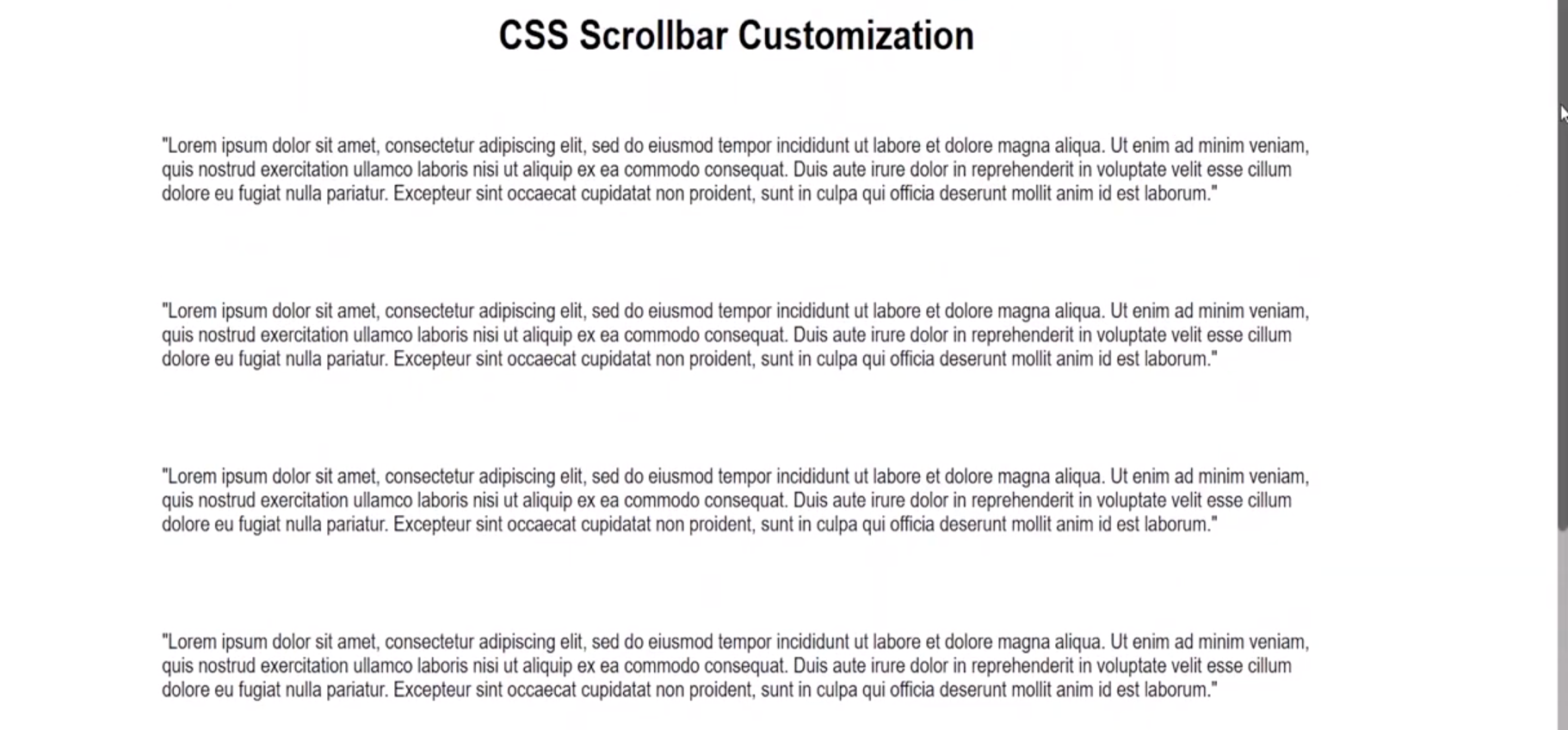
The first thing you need to do is create a basic layout so the page is large enough to actually show a scrollbar in your web browser:
<!DOCTYPE html>
<html lang="en">
<head>
<meta charset="UTF-8">
<meta http-equiv="X-UA-Compatible" content="IE=edge">
<meta name="viewport" content="width=device-width, initial-scale=1.0">
<link rel='stylesheet' href="styles.css">
<title>Document</title>
</head>
<body>
<div class="container">
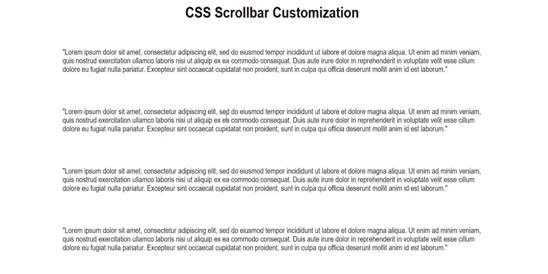
<h1>CSS Scrollbar Customization</h1>
<p class="para">
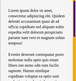
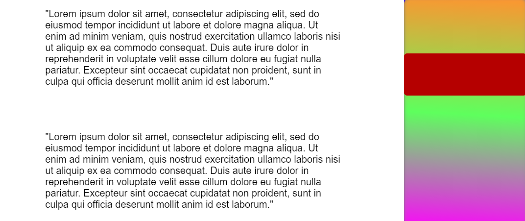
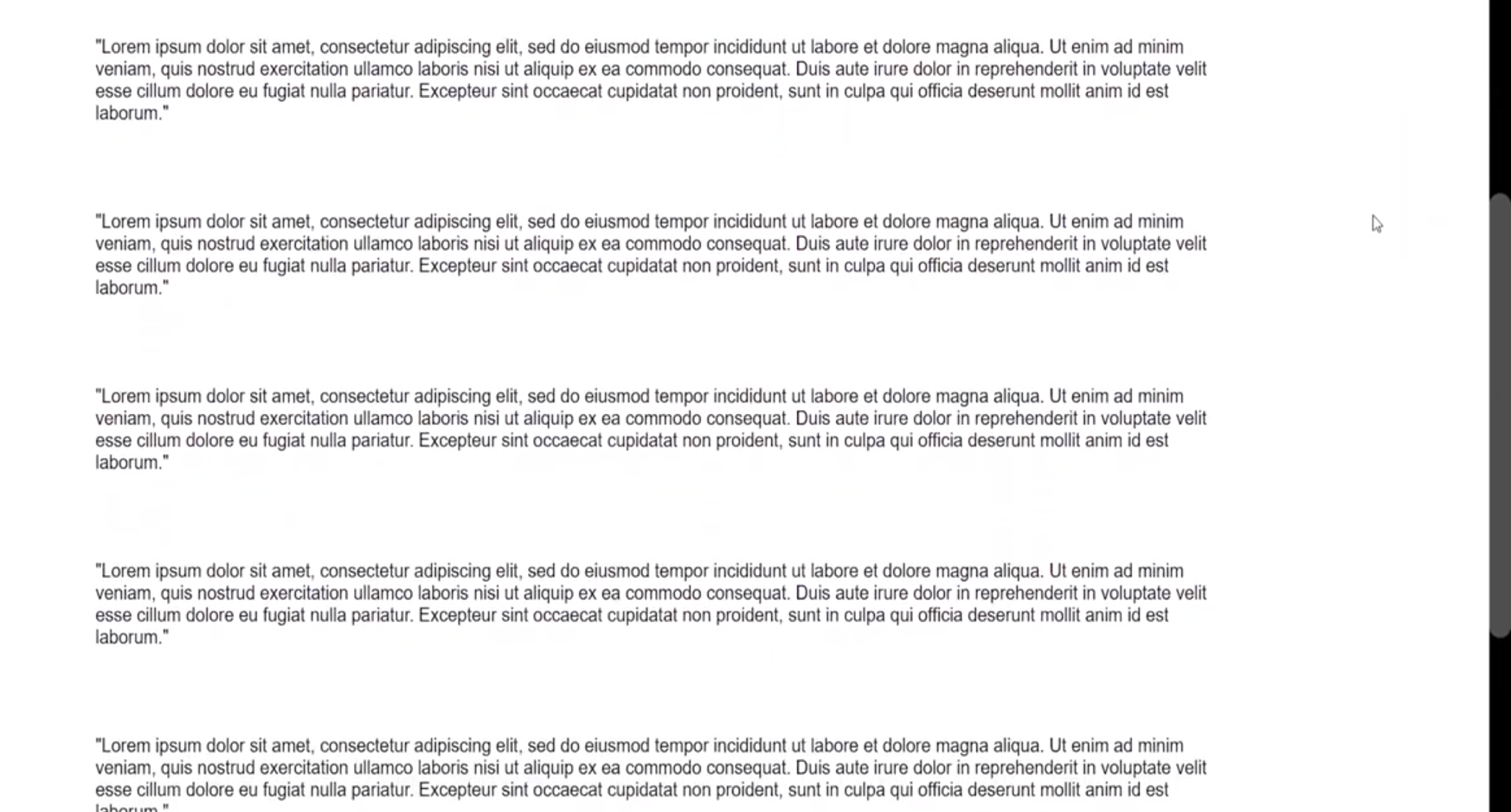
"Lorem ipsum dolor sit amet, consectetur adipiscing elit, sed do eiusmod tempor incididunt ut labore et dolore magna aliqua. Ut enim ad minim veniam, quis nostrud exercitation ullamco laboris nisi ut aliquip ex ea commodo consequat. Duis aute irure dolor in reprehenderit in voluptate velit esse cillum dolore eu fugiat nulla pariatur. Excepteur sint occaecat cupidatat non proident, sunt in culpa qui officia deserunt mollit anim id est laborum."
</p>
<p class="para">
"Lorem ipsum dolor sit amet, consectetur adipiscing elit, sed do eiusmod tempor incididunt ut labore et dolore magna aliqua. Ut enim ad minim veniam, quis nostrud exercitation ullamco laboris nisi ut aliquip ex ea commodo consequat. Duis aute irure dolor in reprehenderit in voluptate velit esse cillum dolore eu fugiat nulla pariatur. Excepteur sint occaecat cupidatat non proident, sunt in culpa qui officia deserunt mollit anim id est laborum."
</p>
</div>
</body>
</html>Nothing fancy here, just a basic div container with the class name container for our layout, a header for a title, and a bunch of paragraphs with the class name para to fill out our page.
Here’s the CSS to make things look a little fancier:
body {
    font-family: Arial, Helvetica, sans-serif;
    margin: 0;

  }
  .para {
    font-size: 16px;
    padding: 20px;
    width: 70%;
  }

  .container {
    display: flex;
    flex-direction: column;
    justify-content: center;
    align-items: center;
  }
Your page should look something like this:
With our setup out of the way, we can jump into the fun part of the tutorial. The first part of this section will be learning the various CSS properties available to use for styling.
In the second part we’ll implement four different types of scrollbars to give you some ideas for making your own scrollbars.
CSS properties available for styling scrollbars
Unfortunately we still don’t have any standardized cross-browser support for styling scrollbars with CSS. Firefox and Webkit-based browsers like Chrome, Edge, and Safari have different properties for styling.
This tutorial will mainly focus on Webkit browsers, because they offer more options for styling, but we will briefly cover Firefox as well.
Webkit CSS styling properties for scrollbars
::-webkit-scrollbar– the entire scrollbar::-webkit-scrollbar-track– the entire progress bar area of the scrollbar::-webkit-scrollbar-thumb– the draggable section of the scrollbar
The below properties are available but are less commonly used:
::-webkit-scrollbar-button– the up/down buttons at each end of the scrollbar::-webkit-scrollbar-track-piece– part of scrollbar not covered by the thumb::-webkit-scrollbar-corner– bottom corner where horizontal and vertical scrollbars meet
Firefox CSS styling properties for scrollbars
There are currently two available CSS properties for styling scrollbars in Firefox
scrollbar-width– controls width of scrollbar, with only two options available beingautoorthinscrollbar-color– takes two colors which are used for the coloring of the thumb and track of the scrollbar in that order
Now that you know your options for customizing scrollbars, let’s put it into practice with some examples.
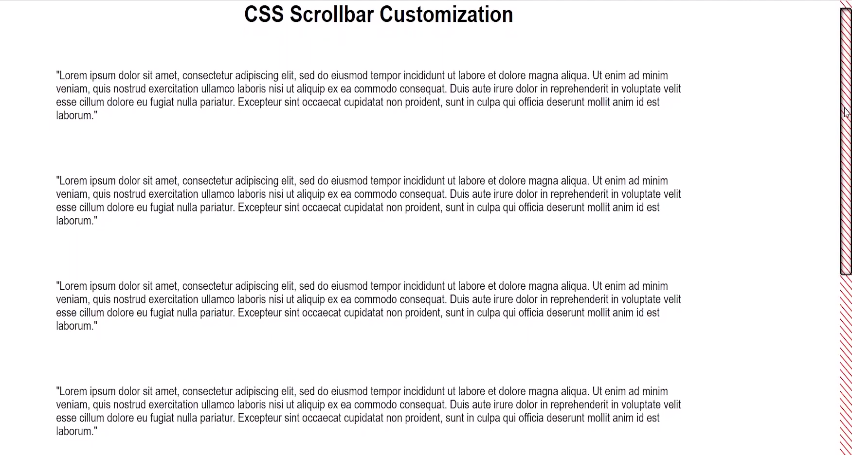
Dark Theme Scrollbar
Dark theme websites are all the rage right now. Sticking with the default browser scrollbar could come off as jarring to users because it doesn’t fit all that well with a dark themed website.
Let’s use our newfound knowledge of CSS to create a dark theme scrollbar with a rounded border inspired by CSS Tricks’ website:
html::-webkit-scrollbar {
      width: 20px;
   }

html::-webkit-scrollbar-track {
    background-color: black;
  }

html::-webkit-scrollbar-thumb {
    background: #4e4e4e;
    border-radius: 25px;
  }
The result is a little hard to see in the screenshot, but the track is black and the thumb is a darkish gray color.
Minimalist Scrollbar
For this example you’ll be making a minimalist scrollbar. This type of scrollbar would work well if you are going for a simple, elegant style for your website.
The most important thing to note is that you have the ability to use hover and active pseudo-elements from CSS to further style your scrollbar. In this case the scrollbar will turn a darker gray when you hover and drag on the thumb.
html::-webkit-scrollbar {
    width: 10px;
  }

html::-webkit-scrollbar-track {
    background: rgb(179, 177, 177);
    border-radius: 10px;
}

html::-webkit-scrollbar-thumb {
    background: rgb(136, 136, 136);
    border-radius: 10px;
  }

html::-webkit-scrollbar-thumb:hover {
    background: rgb(100, 100, 100);
    border-radius: 10px;
  }

html::-webkit-scrollbar-thumb:active {
    background: rgb(68, 68, 68);
    border-radius: 10px;
  }
The result:
Patterned Scrollbar
In this section, the focus is on using a repeating linear gradient to create a pattern effect on our scrollbar track. The same could be done for the scrollbar thumb as well.
Another thing to notice is that you can style the scrollbar thumb with a border, which you can use to create a number of cool effects. In this case I made the background color of the thumb transparent so that you can see the scrollbar track pattern as we scroll.
html::-webkit-scrollbar {
   	width: 20px;
  }
html::-webkit-scrollbar-track {
  	background-image: repeating-linear-gradient(45deg, red 0, red 1px, transparent 0, transparent 50%);
  	background-size: 10px 10px;
	}
html::-webkit-scrollbar-thumb {
    background: transparent;
    border-radius: 5px;
    border: 2px solid black;
    box-shadow: inset 1px 1px 5px black ;
   }
The result:
«Animated» Gradient Scrollbar
This example uses a linear gradient and a trick with box shadow to make it look like the scrollbar is changing color as you move up and down the page. What’s really happening is that the background of the scrollbar track is being revealed beneath the thumb.
It works because the box-shadow takes up all the space of the scrollbar except for where the thumb is. Because the thumb is transparent the gradient color of the background shows through.
html::-webkit-scrollbar {
    width: 20px;
  }

html::-webkit-scrollbar-track {
    background:  linear-gradient(0deg, rgba(255, 0, 0, 1) 0%, rgba(7, 0, 211, 1) 100%);
  }

html::-webkit-scrollbar-thumb {
    background: transparent;
    box-shadow: 0px 0px 0px 100vh black;
  }
The result:
There are clearly some problems with creating custom scrollbars. The first would be the lack of cross-browser support. Other issues would be the lack of ability to add transitions or animations to the scrollbar and the fact your custom scrollbar won’t appear on mobile devices.
An alternative is hiding the default scrollbar and using a library, but this may effect performance when used as main scrollbar for your page. And there are other potential usability issues because these libraries rely on JavaScript to imitate the native scrollbar behavior.
Below I’ll go over two popular open-source libraries for making scrollbars.
SimpleBar Library
Grsmto/simplebar
Custom scrollbars vanilla javascript library with native scroll, done simple, lightweight, easy to use and cross-browser. — Grsmto/simplebar
 GrsmtoGitHub

As the name tells you, SimpleBar is all about making it easy to create custom scrollbars. The only real downside here is that it doesn’t support usage as the main scrollbar for your website or for table, text area, or select HTML elements.
The main purpose of SimpleBar would be for creating custom scrollbars for things like dynamic chat applications or any other type of internal page element where you want scrolling.
Overlay Scrollbars Library
KingSora/OverlayScrollbars
A javascript scrollbar plugin which hides native scrollbars, provides custom styleable overlay scrollbars and keeps the native functionality and feeling. — KingSora/OverlayScrollbars
KingSoraGitHub
Overlay Scrollbars is very similar to SimpleBar but has the added benefit of supporting the HTML body element. This means that you can use it for the main scrollbar of your website in addition to all the other features you would expect like cross-browser and mobile support.
Conclusion
Hopefully this article gave you a solid understanding of how styling CSS scrollbars works.
If you have any questions you can leave a comment on the YouTube video and I’ll try to help you out. Also feel free to leave links to your own designs so other people can check them out.
Link to GitHub repo: https://github.com/renaissanceengineer/css-scrollbar-tutorial
Learn to code for free. freeCodeCamp’s open source curriculum has helped more than 40,000 people get jobs as developers. Get started
Sometimes we want to create custom scrollbars in CSS for our website to make it stand out from the competition. But it seems a little complicated to style a scrollbar. Because we have to face some issues in the process while creating custom scrollbars.
In this article, I will show you how you can create custom scrollbars for your website using pure CSS. I will discuss all the complications that you might face and how you can solve them.
There are a few major problems that you will face while styling your website scrollbar.
- We can not select scrollbars easily.
- There are different types of scrollbars.
- All Browsers don’t support the same CSS selectors.
- Different browsers show scrollbars in different styles.
- Sometimes scrollbars show up in unexpected positions.
- It might hamper user experience if we don’t follow some good practices.
There are many more problems we will discuss in this article. Because of these obstacles we often don’t want to style our scrollbars.
Also Read: How to Style HTML <textarea> with CSS (Quick Hacks)
Browser’s default scrollbars are just fine. It is not compulsory that we have to create a custom design scrollbar. All I want to say is that if you want, you can do this.
How do you create custom scrollbars in CSS?
First, we need to know the different parts of a scrollbar. Because we have to style different parts separately.
We will add two sets to style for supporting multiple browsers. Because styling scrollbars in Firefox is different than other browsers.
We can also show our scrollbar when we need them. Otherwise, we can hide it to provide more space for our website users.
Finally, we also need to follow some good techniques so that our scrollbar increases the user experience.
There are two types of scrollbars we see on a web page.
- Vertical Scrollbar.
- Horizontial scrollbar.
Normally, horizontal scrollbars are used in a specific section. For example, if you want to show a list of posts, you might want to display them horizontally. Because if you display a large number of blog posts vertically it might take huge space and users have to scroll for a long time.
To solve this problem, you can show those posts horizontally and the browser will add a horizontal scrollbar when your content crosses the available space on the user device.
And we all know about the vertical scrollbars. It appears on the right side of almost every web page.
We can also use vertical scrollbars in a specific section. For example, if you set a fixed height for a section on your page and add overflow: auto; then browsers will show a vertical scrollbar if the content inside that section is more than the fixed height.
When we see a scrollbar on a web page, we see a few parts. There are two arrow buttons up and down for the vertical scrollbar. There are also two arrow buttons left and right for the horizontal scrollbar.

Other than these buttons, there are two other components. One is thumb another is the thack.
- Scrollbar Track.
- Scrollbar Thumb.
- Arrow Buttons (Up and down/Left and right).
The thumb is the portion that we can move and show us the position where we are on a page.
On the other hand, the track is the portion behind the thumb that works as background for the thumb. We move the thumb inside the track.
We will customize all of these components in this article.
As I said before, you have to add two sets of styles for supporting all browsers. First, I will show you how you can customize your scrollbar in browsers other than Firefox.
In the next section, you will see the styles that work only in Firefox.
You can style your horizontal and vertical scrollbars together. The same styles will be applied to both.
But if you need different styles for horizontal and vertical you can do that too.
To style, both scrollbars together add the following code to your stylesheet.
          ::-webkit-scrollbar {
    width: 1.4vw;
    height: 3.3vh;
}

::-webkit-scrollbar-track {
    background-color: #f5f5f5;
    border-radius: 10px;
    margin-top: 3px;
    margin-bottom: 3px;
    box-shadow: inset 0 0 6px rgba(0, 0, 0, 0.3);
}

::-webkit-scrollbar-thumb {
    border-radius: 10px;
    background-color: #f90;
    background-image: -webkit-linear-gradient(
        45deg,
        rgba(255, 255, 255, 0.2) 25%,
        transparent 25%,
        transparent 50%,
        rgba(255, 255, 255, 0.2) 50%,
        rgba(255, 255, 255, 0.2) 75%,
        transparent 75%,
        transparent
    );
}

::-webkit-scrollbar-thumb:hover {
    background-color: #ec8f02;
}
Here, I have used 3 pseudo-elements to add style to the scrollbar.
::-webkit-scrollbar— It affects the entire scrollbar.::-webkit-scrollbar-thumb— It affects the draggable scrolling handle that we can move.::-webkit-scrollbar-track— It affects the space where we move the scrolling handle.
You might think if ::-webkit-scrollbar works for the entire scrollbar then why you will use the other two. The problem is that all CSS properties don’t work inside ::-webkit-scrollbar element.
For example, I have used border-radius property in ::-webkit-scrollbar-track because border-radius property does not work inside ::-webkit-scrollbar element.
Here, margin-top and margin-bottom properties inside ::-webkit-scrollbar-track will only work for vertical scrollbars and if you add margin-left and margin-right, these properties will only work for horizontal scrollbars.
I have set width and height properties inside ::-webkit-scrollbar because I need this for the entire scrollbar.
Why do you use width and height at the same time?
the width property only works for vertical scrollbars and height property only works for horizontal scrollbars.
When you set width it will increase the size of the vertical scrollbars and height will increase the size of the horizontal scrollbars.
I have used viewport width (vw) and viewport height (vh) CSS units for width and height properties respectively. Because if you use pixel (px) unit here then scrollbar size will increase and decrease when you zoom in or out your web page.
I don’t want that. I want a fixed-size scrollbar on my page so that it does not change its size when users zoom in or out of my web page.
Style Horizontal Scrollbars
The above code adds style to both types of scrollbars. If you want to customize only your horizontal scrollbars then this is the solution for you.
Usually, a horizontal scrollbar is added to a specific section. You can use the CSS class or id of that section with those pseudo-elements to apply style only for that section.
For example, if your section that is showing a horizontal scrollbar has .products class, then you can select that section this way:
.products::-webkit-scrollbar.products::-webkit-scrollbar-track.products::-webkit-scrollbar-thumb
Everything else is the same. You can use CSS properties in the same way mentioned earlier.
The difference is that this time style will only apply to the scrollbar in .products class section.
Style Vertical Scrollbars
Similarly, if you want to customize the main vertical scrollbar on your web page, you can use body or html tags with those pseudo-elements.
body::-webkit-scrollbarbody::-webkit-scrollbar-trackbody::-webkit-scrollbar-thumb
OR
html::-webkit-scrollbarhtml::-webkit-scrollbar-trackhtml::-webkit-scrollbar-thumb
Both work in a similar way. When you use this way, styles will be applied only to the main vertical scrollbar, not to the other scrollbars on the web page.
When you add the above code to your stylesheet you will notice there are no arrow buttons. If you don’t want to use those buttons then the first example will be fine for you.
But if you want to include arrow buttons with your custom scrollbars then you can use the code mentioned below.
          ::-webkit-scrollbar {
    width: 1.4vw;
    height: 3.3vh;
}

::-webkit-scrollbar-track {
    background-color: #f5f5f5;
    box-shadow: inset 0 0 6px rgba(0, 0, 0, 0.3);
}

::-webkit-scrollbar-thumb {
    background-color: #f90;
    background-image: -webkit-linear-gradient(
        45deg,
        rgba(255, 255, 255, 0.2) 25%,
        transparent 25%,
        transparent 50%,
        rgba(255, 255, 255, 0.2) 50%,
        rgba(255, 255, 255, 0.2) 75%,
        transparent 75%,
        transparent
    );
}

::-webkit-scrollbar-thumb:hover {
    background-color: #ec8f02;
}
In this example, I have changed some styles from the first one. This piece of code will customize the main scrollbar. This is the base style for our scrollbar.
          /* Buttons */
::-webkit-scrollbar-button:single-button {
    background-color: #ece4e4;
    display: block;
    background-size: 10px;
    background-repeat: no-repeat;
}

::-webkit-scrollbar-button:single-button:hover {
    background-color: #d0cbcb;
}
The above code will set the base style for our buttons. Here you can add general styles like background.
To add style to arrow buttons we have to use ::-webkit-scrollbar-button pseudo-element along with other pseudo-classes.
:single-button:horizontal:vertical:decrement:increment
Now I will customize the arrow buttons.
Style Arrow Buttons in Horizontal Scrollbars
To style arrow buttons in horizontal scrollbars, you have to use :horizontal pseudo-class.
Now to add style to the left side arrow button of a horizontal scrollbar you need to use :decrement with :horizontal pseudo-class.
Then for the right side arrow button, you can use :increment with :horizontal pseudo-class.
Here for each button, I am setting the width, height, background-position, and background-image CSS properties.
I have added SVG icons as the background image.
          /* Left */
::-webkit-scrollbar-button:single-button:horizontal:decrement {
    height: 12px;
    width: 15px;
    background-position: 4px 5px;
    background-image: url("data:image/svg+xml;utf8,<svg xmlns='http://www.w3.org/2000/svg' width='100' height='100' fill='rgb(112, 112, 112)'><polygon points='0,50 50,100 50,0'/></svg>");
}

::-webkit-scrollbar-button:single-button:horizontal:decrement:active {
    background-image: url("data:image/svg+xml;utf8,<svg xmlns='http://www.w3.org/2000/svg' width='100' height='100' fill='rgb(128, 128, 128)'><polygon points='0,50 50,100 50,0'/></svg>");
}

/* Right */
::-webkit-scrollbar-button:single-button:horizontal:increment {
    height: 12px;
    width: 15px;
    background-position: 5px 5px;
    background-image: url("data:image/svg+xml;utf8,<svg xmlns='http://www.w3.org/2000/svg' width='100' height='100' fill='rgb(96, 96, 96)'><polygon points='0,0 0,100 50,50'/></svg>");
}

::-webkit-scrollbar-button:single-button:horizontal:increment:active {
    background-image: url("data:image/svg+xml;utf8,<svg xmlns='http://www.w3.org/2000/svg' width='100' height='100' fill='rgb(128, 128, 128)'><polygon points='0,0 0,100 50,50'/></svg>");
}
Style Arrow Buttons in Vertical Scrollbars
For vertical scrollbar arrow buttons, you have to use :vertical pseudo-class to add custom styles.
Two other pseudo-classes are used :decrement and :increment with :vertical for up and down arrow buttons respectively.
In this case, you can also add SVG icons and other CSS properties.
          /* Up */
::-webkit-scrollbar-button:single-button:vertical:decrement {
    height: 14px;
    width: 16px;
    background-position: center 4px;
    background-image: url("data:image/svg+xml;utf8,<svg xmlns='http://www.w3.org/2000/svg' width='100' height='100' fill='rgb(96, 96, 96)'><polygon points='50,00 0,50 100,50'/></svg>");
}

::-webkit-scrollbar-button:single-button:vertical:decrement:active {
    background-image: url("data:image/svg+xml;utf8,<svg xmlns='http://www.w3.org/2000/svg' width='100' height='100' fill='rgb(128, 128, 128)'><polygon points='50,00 0,50 100,50'/></svg>");
}

/* Down */
::-webkit-scrollbar-button:single-button:vertical:increment {
    height: 14px;
    width: 16px;
    background-position: center 5px;
    background-image: url("data:image/svg+xml;utf8,<svg xmlns='http://www.w3.org/2000/svg' width='100' height='100' fill='rgb(96, 96, 96)'><polygon points='0,0 100,0 50,50'/></svg>");
}

::-webkit-scrollbar-button:single-button:vertical:increment:active {
    background-image: url("data:image/svg+xml;utf8,<svg xmlns='http://www.w3.org/2000/svg' width='100' height='100' fill='rgb(128, 128, 128)'><polygon points='0,0 100,0 50,50'/></svg>");
}
For customization in Firefox, we have limited options. Firefox supports two CSS properties to add custom style to its scrollbars.
scrollbar-width— This property allows us to set the width or thickness of the scrollbar. It accepts three values: auto, thin, and none. Here,autois the default value,thinmakes the scrollbar thinner than the default andnoneremoves the scrollbar from the web page.scrollbar-color— This property allows us to set the color for the thumb and track of the scrollbar. It acceptsautoas its value.autois the default value. But you can pass two valid color names like red, blue, etc or you can pass two color codes like #FC9901, #F5F5F5.
In scrollbar-color property, first color name, or color code applies to the thumb of the scrollbar that we can move. The second color name or color code applies to the track of the scrollbar where we move the thumb.
Note: Whenever we use these two properties, we must use them on the root element.

You already know that we can add styles for our scrollbars in two ways. First, in the global scope that will apply to all scrollbars on the page. Second, we add style to a specific section on the page.
In order to add this to the global scope, you can follow the code below.
          * {
    scrollbar-width: thin;
    scrollbar-color: #f90 #f5f5f5;;
}
Here, I am selecting * it means everything. When you apply these properties using * then it works properly for all scrollbars.
I have tried to use html or body instead but they don’t work properly. When I have used html then scrollbar-color works for all scrollbars but scrollbar-width works only in the vertical scrollbar.
          html {
    scrollbar-width: thin;
    scrollbar-color: #f90 #f5f5f5;
}
When I have used body the vertical scrollbar has no effect and in the horizontal scrollbar, only scrollbar-color works but scrollbar-width property does not work. So it is best to use these properties with * selector for the global scope.
          body {
    scrollbar-width: thin;
    scrollbar-color: #f90 #f5f5f5;
}
In order to use them for a specific section, you have to put them in the root element of that section.
What do I mean by the root element?
If you have a section where you display a list of products and in this section, you want to apply style for the scrollbar. For this section, the element in which all the products are present, you must apply these properties to that element.
          <div class="products">
    <div class="single-product">
        <div class="accomodation_item text-center">
            <div class="hotel_img">
                <img src="image/room1.jpg" alt="">
                <a href="#" class="btn theme_btn button_hover">Book Now</a>
            </div>
            <a href="#">
                <h4 class="sec_h4">Double Deluxe Room</h4>
            </a>
        </div>
    </div>
</div>
In the above example, you can see all the products are inside a div that has a class of .products so we have to add those CSS properties in this class to add style to the scrollbar.
          .products {
    width: 300px;
    height: 100px;
    overflow-y: auto;
    scrollbar-width: auto;
    scrollbar-color: #f90 #f5f5f5;
}
When you set thin for scrollbar-width property, it removes the arrow buttons and the scrollbar becomes very thin. It becomes very difficult to use.
But if you just use scrollbar-color property without scrollbar-width then it gets the default thickness along with the color. I think it looks better and provides a better user experience.

By the way, if you have to use the scrollbar-width property for any reason, then set it to auto not thin. When you set its value auto, it output the same result.
You can add the hover effect to your scrollbar thumb using :hover CSS pseudo-class.
          /* Works on Chrome, Edge, and Safari */
::-webkit-scrollbar-thumb:hover {
    background-color: #ec8f02;
}

/* Works on Firefox */
.products {
    width: 300px;
    height: 100px;
    overflow-y: auto;
    scrollbar-width: auto;
    scrollbar-color: #f90 #f5f5f5;
    transition: scrollbar-color 0.3s ease-out;
}

.products:hover {
    scrollbar-color: #ec8f02 #f5f5f5;
}
For Chrome and other browsers, apply :hover to the ::-webkit-scrollbar-thumb pseudo-element. You can also use it for a specific section.
For Firefox, you can add the hover effect to a section scrollbar. In this case, you also can apply transition property for your hover but for ::-webkit-scrollbar-thumb it is not possible.
You can make a section scrollable by adding an overflow property. This property accepts 4 values. These are: visible, scroll, auto, and hidden. Here visible is the default value.
visible— It means the content in the section will show outside if there is not enough space but there will be no scrollbar.scroll— It means there will a scrollbar to see the rest of the content. But in this case, if the content is less user does not need a scrollbar still scrollbar will stay.auto— It means a user will see a scrollbar if the content needs more space than the original section but if the content is less then the scrollbar will not show up.- hidden — It means there will be no scrollbar. If the section has more content, the user can not see the rest of the content.
So, you can see that if you use the value auto, the scrollbar in a section will show up conditionally. If that section has more content and needs more space, the scrollbar will show up. Otherwise, users will not get any scrollbar.
          .products {
    overflow-y: auto;
}
After we know how you can create custom scrollbars for your web page, you should follow some techniques. Because if you don’t follow those good practices, it might damage the user experience.
- Scrollbar width should not be too thin or too thick.
- Add a scrollbar to a section if it is absolutely necessary. Otherwise, try to avoid it.
- If you have to add a scrollbar, always show important information above the fold.
- There should be proper contrast between the colors of the scrollbar thumb and track.
- Hide and show scrollbar automatically. If the content is less then hide the scrollbar. Otherwise shows it.
Let’s check the browser support for the properties that we have seen so far. All the -webkit- versions are supported in most browsers like Chrome, Safari, Edge, Opera, Android, etc.

You can check by yourself by clicking the links below.
::-webkit-scrollbar— Check browser support::-webkit-scrollbar-track— Check browser support::-webkit-scrollbar-thumb— Check browser support::-webkit-scrollbar-button— Check browser support
For Firefox, there are two CSS properties. If you check their support, you will find they are supported only in Firefox browsers.
You can check their browser support here.
scrollbar-color— Check browser supportscrollbar-width— Check browser support
For WebKit browsers, you can use the following pseudo-elements to customize various parts of the scrollbar.
::-webkit-scrollbaris used to add style to the entire scrollbar, like background.- ::-webkit-scrollbar-button is used to customize the arrow buttons in the scrollbars.
- ::-webkit-scrollbar-thumb is used to add style to the draggable element in the scrollbar that moves when someone scrolls the page.
::-webkit-scrollbar-trackis the progress bar where the thumb moves up and down or left and right.::-webkit-scrollbar-track-pieceis the part of the track that is not covered by the draggable element (thumb).::-webkit-scrollbar-corneris the corner part where both horizontal and vertical scrollbars meet. This is normally the bottom-right corner of a browser window.::-webkit-resizeris the draggable resizing handle that appears above the scrollbar corner at the bottom corner of some elements
For the Firefox browser, you can use these two CSS properties to customize the scrollbars.
scrollbar-coloris used to add color to the thumb and track of the scrollbar.scrollbar-widthis used to add width to the scrollbar withauto,noneandthinvalues.
Conclusion
In this article, I have discussed all the elements that a scrollbar has, how you can customize them, their browser support, etc.
You also know what are the best practices you need to follow while customizing scrollbars on your web page. You can do all of these just using CSS.
I hope that now you have a clear idea of how to create custom scrollbars in CSS for any web page.