В этой статье подробно разберём процесс кастомной стилизации чекбоксов и радиокнопок с помощью CSS.
Как осуществляется создание кастомного чекбокса или переключателя
Данный процесс осуществляется посредством скрытия стандартного элемента и создания с помощью CSS другого «поддельного», такого как мы хотим.
Но как же это будет работать, если стандартный input скрыть? Это можно выполнить благодаря тому, что в HTML переключить состояние checked можно не только с помощью самого элемента input, но и посредством связанного с ним label.
В HTML связывание label с input выполняется одним из 2 способов:
1. Посредством помещения элемента input в label:
<label>
  <input type="checkbox" name="happy" value="yes">Happy
</label>
2. Посредством задания элементу input атрибута id, а label – for с таким же значением как у id.
<input type="checkbox" id="happy" name="happy" value="yes">
<label for="happy">Happy</label>
В этой статье мы подробно разберём шаги по кастомизации checkbox и radio, в которых label с input свяжем по 2 варианту. Создание «поддельного» чекбокса выполним с использованием псевдоэлемента ::before, который поместим в label. При этом никакие дополнительные элементы в разметку добавлять не будем.
Создание стильного чекбокса
Процесс замены стандартного вида чекбокса на кастомный осуществим посредством выполнения следующей последовательности шагов.
Шаг 1. Создадим разметку.
<input type="checkbox" class="custom-checkbox" id="happy" name="happy" value="yes">
<label for="happy">Happy</label>
При создании разметки очень важно соблюдать последовательность расположения элементов. Это необходимо, потому что в зависимости от того, как они расположены мы будем составлять выражения для выбора элементов в CSS и назначать им стили.
В этом примере элемент label расположен после input. Связь label с input осуществляется посредством соответствия значения for элемента label с id элемента input.
В примере к элементу input добавлен класс custom-checkbox. Данный класс мы будем использовать при составлении селекторов и тем самым с помощью него определять элементы к которым следует добавить стилизованный чекбокс вместо обычного. Т.е. его присутствие или отсутствие будет определять с каким чекбоксом (со стандартным или поддельным) будет выводится элемент input с type="checkbox".
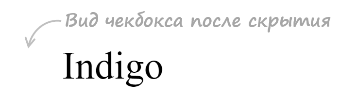
Шаг 2. Напишем стили для скрытия стандартного элемента input.
.custom-checkbox {
  position: absolute;
  z-index: -1;
  opacity: 0;
}
Мы не будем использовать display: none, а установим ему стили, с помощью которых уберём его из потока (position: absolute), поместим его ниже существующих элементов (z-index: -1), а также сделаем его полностью прозрачным (opacity: 0). Зачем это нужно? Это нам необходимо для того, чтобы мы могли получить состояние фокуса, а затем стилизовать «подделный» checkbox или radio, когда он будет находиться в нём.
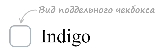
Шаг 3. Создадим поддельный чекбокс.
.custom-checkbox+label {
  display: inline-flex;
  align-items: center;
  user-select: none;
}
.custom-checkbox+label::before {
  content: '';
  display: inline-block;
  width: 1em;
  height: 1em;
  flex-shrink: 0;
  flex-grow: 0;
  border: 1px solid #adb5bd;
  border-radius: 0.25em;
  margin-right: 0.5em;
  background-repeat: no-repeat;
  background-position: center center;
  background-size: 50% 50%;
}
Создание «поддельного» чекбокса выполним с помощью псевдоэлемента ::before. Посредством CSS зададим ему размеры (в данном случае 1emx1em), а затем нарисуем его с помощью border: 1px solid #adb5bd. Свойства начинающие со слова background будут определять положение самого флажка (когда checkbox будет в состоянии checked).
Первое правило необходимо для вертикального центрирования флажка и надписи к нему. Это действие в примере выполнено через CSS Flexbox.
Шаг 4. Создадим стили при нахождении элемента в состоянии checked.
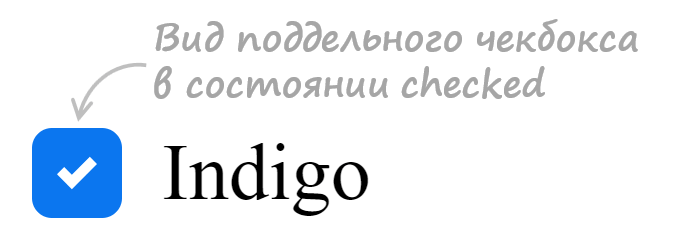
.custom-checkbox:checked+label::before {
  border-color: #0b76ef;
  background-color: #0b76ef;
  background-image: url("data:image/svg+xml,%3csvg xmlns='http://www.w3.org/2000/svg' viewBox='0 0 8 8'%3e%3cpath fill='%23fff' d='M6.564.75l-3.59 3.612-1.538-1.55L0 4.26 2.974 7.25 8 2.193z'/%3e%3c/svg%3e");
}
В этом коде при получении элементом состояния checked применим к псевдоэлементу ::before находящемуся в label стили, посредством которых установим цвет границы, цвет фону и фоновую картинку (флажок) в формате svg.
Шаг 5. Добавим код для стилизации чекбокса при нахождении его в состояниях hover, active, focus и disabled.
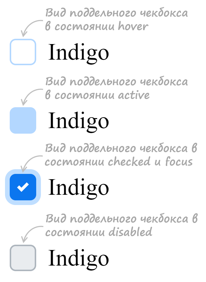
/* стили при наведении курсора на checkbox */
.custom-checkbox:not(:disabled):not(:checked)+label:hover::before {
  border-color: #b3d7ff;
}
/* стили для активного состояния чекбокса (при нажатии на него) */
.custom-checkbox:not(:disabled):active+label::before {
  background-color: #b3d7ff;
  border-color: #b3d7ff;
}
/* стили для чекбокса, находящегося в фокусе */
.custom-checkbox:focus+label::before {
  box-shadow: 0 0 0 0.2rem rgba(0, 123, 255, 0.25);
}
/* стили для чекбокса, находящегося в фокусе и не находящегося в состоянии checked */
.custom-checkbox:focus:not(:checked)+label::before {
  border-color: #80bdff;
}
/* стили для чекбокса, находящегося в состоянии disabled */
.custom-checkbox:disabled+label::before {
  background-color: #e9ecef;
}
Открыть пример
Разработка кастомного переключателя
Стилизация переключателя (input с type="radio") выполняется аналогично, т.е. посредством тех же шагов которые мы применяли при кастомизации чекбокса.
Итоговый набор стилей для кастомного оформления input с type="radio":
<style>
/* для элемента input c type="radio" */
.custom-radio {
position: absolute;
z-index: -1;
opacity: 0;
}
/* для элемента label связанного с .custom-radio */
.custom-radio+label {
display: inline-flex;
align-items: center;
user-select: none;
}
/* создание в label псевдоэлемента before со следующими стилями */
.custom-radio+label::before {
content: '';
display: inline-block;
width: 1em;
height: 1em;
flex-shrink: 0;
flex-grow: 0;
border: 1px solid #adb5bd;
border-radius: 50%;
margin-right: 0.5em;
background-repeat: no-repeat;
background-position: center center;
background-size: 50% 50%;
}
/* стили при наведении курсора на радио */
.custom-radio:not(:disabled):not(:checked)+label:hover::before {
border-color: #b3d7ff;
}
/* стили для активной радиокнопки (при нажатии на неё) */
.custom-radio:not(:disabled):active+label::before {
background-color: #b3d7ff;
border-color: #b3d7ff;
}
/* стили для радиокнопки, находящейся в фокусе */
.custom-radio:focus+label::before {
box-shadow: 0 0 0 0.2rem rgba(0, 123, 255, 0.25);
}
/* стили для радиокнопки, находящейся в фокусе и не находящейся в состоянии checked */
.custom-radio:focus:not(:checked)+label::before {
border-color: #80bdff;
}
/* стили для радиокнопки, находящейся в состоянии checked */
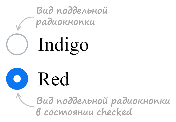
.custom-radio:checked+label::before {
border-color: #0b76ef;
background-color: #0b76ef;
background-image: url("data:image/svg+xml,%3csvg xmlns='http://www.w3.org/2000/svg' viewBox='-4 -4 8 8'%3e%3ccircle r='3' fill='%23fff'/%3e%3c/svg%3e");
}
/* стили для радиокнопки, находящейся в состоянии disabled */
.custom-radio:disabled+label::before {
background-color: #e9ecef;
}
</style>
<input class="custom-radio" name="color" type="radio" id="color-green" value="green">
<label for="color-green">Green</label>
Открыть пример
Ещё примеры по кастомизации checkbox и label
В этом разделе представлены следующие примеры:
- оформление чекбокса, когда input расположен в label
- оформление переключателя, когда input расположен в label
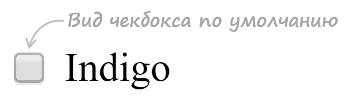
1. Стилизация checkbox, когда input расположен в label.
HTML разметка:
<label class="custom-checkbox">
  <input type="checkbox" value="value-1">
  <span>Indigo</span>
</label>
CSS код:
/* для элемента input c type="checkbox" */
.custom-checkbox>input {
  position: absolute;
  z-index: -1;
  opacity: 0;
}

/* для элемента label, связанного с .custom-checkbox */
.custom-checkbox>span {
  display: inline-flex;
  align-items: center;
  user-select: none;
}

/* создание в label псевдоэлемента before со следующими стилями */
.custom-checkbox>span::before {
  content: '';
  display: inline-block;
  width: 1em;
  height: 1em;
  flex-shrink: 0;
  flex-grow: 0;
  border: 1px solid #adb5bd;
  border-radius: 0.25em;
  margin-right: 0.5em;
  background-repeat: no-repeat;
  background-position: center center;
  background-size: 50% 50%;
}

/* стили при наведении курсора на checkbox */
.custom-checkbox>input:not(:disabled):not(:checked)+span:hover::before {
  border-color: #b3d7ff;
}

/* стили для активного чекбокса (при нажатии на него) */
.custom-checkbox>input:not(:disabled):active+span::before {
  background-color: #b3d7ff;
  border-color: #b3d7ff;
}

/* стили для чекбокса, находящегося в фокусе */
.custom-checkbox>input:focus+span::before {
  box-shadow: 0 0 0 0.2rem rgba(0, 123, 255, 0.25);
}

/* стили для чекбокса, находящегося в фокусе и не находящегося в состоянии checked */
.custom-checkbox>input:focus:not(:checked)+span::before {
  border-color: #80bdff;
}

/* стили для чекбокса, находящегося в состоянии checked */
.custom-checkbox>input:checked+span::before {
  border-color: #0b76ef;
  background-color: #0b76ef;
  background-image: url("data:image/svg+xml,%3csvg xmlns='http://www.w3.org/2000/svg' viewBox='0 0 8 8'%3e%3cpath fill='%23fff' d='M6.564.75l-3.59 3.612-1.538-1.55L0 4.26 2.974 7.25 8 2.193z'/%3e%3c/svg%3e");
}

/* стили для чекбокса, находящегося в состоянии disabled */
.custom-checkbox>input:disabled+span::before {
  background-color: #e9ecef;
}
Открыть пример
2. Стилизация radio, когда input расположен в label.
HTML разметка:
<label class="custom-radio">
  <input type="radio" name="color" value="indigo">
  <span>Indigo</span>
</label>
CSS код:
/* для элемента input c type="radio" */
.custom-radio>input {
  position: absolute;
  z-index: -1;
  opacity: 0;
}

/* для элемента label связанного с .custom-radio */
.custom-radio>span {
  display: inline-flex;
  align-items: center;
  user-select: none;
}

/* создание в label псевдоэлемента  before со следующими стилями */
.custom-radio>span::before {
  content: '';
  display: inline-block;
  width: 1em;
  height: 1em;
  flex-shrink: 0;
  flex-grow: 0;
  border: 1px solid #adb5bd;
  border-radius: 50%;
  margin-right: 0.5em;
  background-repeat: no-repeat;
  background-position: center center;
  background-size: 50% 50%;
}

/* стили при наведении курсора на радио */
.custom-radio>input:not(:disabled):not(:checked)+span:hover::before {
  border-color: #b3d7ff;
}

/* стили для активной радиокнопки (при нажатии на неё) */
.custom-radio>input:not(:disabled):active+span::before {
  background-color: #b3d7ff;
  border-color: #b3d7ff;
}

/* стили для радиокнопки, находящейся в фокусе */
.custom-radio>input:focus+span::before {
  box-shadow: 0 0 0 0.2rem rgba(0, 123, 255, 0.25);
}

/* стили для радиокнопки, находящейся в фокусе и не находящейся в состоянии checked */
.custom-radio>input:focus:not(:checked)+span::before {
  border-color: #80bdff;
}

/* стили для радиокнопки, находящейся в состоянии checked */
.custom-radio>input:checked+span::before {
  border-color: #0b76ef;
  background-color: #0b76ef;
  background-image: url("data:image/svg+xml,%3csvg xmlns='http://www.w3.org/2000/svg' viewBox='-4 -4 8 8'%3e%3ccircle r='3' fill='%23fff'/%3e%3c/svg%3e");
}

/* стили для радиокнопки, находящейся в состоянии disabled */
.custom-radio>input:disabled+span::before {
  background-color: #e9ecef;
}
Открыть пример
Yikes! All these workarounds have led me to the conclusion that the HTML checkbox kind of sucks if you want to style it.
As a forewarning, this isn’t a CSS implementation. I just thought I’d share the workaround I came up with in case anyone else might find it useful.
I used the HTML5 canvas element.
The upside to this is that you don’t have to use external images and can probably save some bandwidth.
The downside is that if a browser for some reason can’t render it correctly, then there’s no fallback. Though whether this remains an issue in 2017 is debatable.
Update
I found the old code quite ugly, so I decided to give it a rewrite.
Object.prototype.create = function(args){
    var retobj = Object.create(this);

    retobj.constructor(args || null);

    return retobj;
}

var Checkbox = Object.seal({
    width: 0,
    height: 0,
    state: 0,
    document: null,
    parent: null,
    canvas: null,
    ctx: null,

    /*
     * args:
     * name      default             desc.
     *
     * width     15                  width
     * height    15                  height
     * document  window.document     explicit document reference
     * target    this.document.body  target element to insert checkbox into
     */
    constructor: function(args){
        if(args === null)
            args = {};

        this.width = args.width || 15;
        this.height = args.height || 15;
        this.document = args.document || window.document;
        this.parent = args.target || this.document.body;
        this.canvas = this.document.createElement("canvas");
        this.ctx = this.canvas.getContext('2d');

        this.canvas.width = this.width;
        this.canvas.height = this.height;
        this.canvas.addEventListener("click", this.ev_click(this), false);
        this.parent.appendChild(this.canvas);
        this.draw();
    },

    ev_click: function(self){
        return function(unused){
            self.state = !self.state;
            self.draw();
        }
    },

    draw_rect: function(color, offset){
        this.ctx.fillStyle = color;
        this.ctx.fillRect(offset, offset,
                this.width - offset * 2, this.height - offset * 2);
    },

    draw: function(){
        this.draw_rect("#CCCCCC", 0);
        this.draw_rect("#FFFFFF", 1);

        if(this.is_checked())
            this.draw_rect("#000000", 2);
    },

    is_checked: function(){
        return !!this.state;
    }
});
Here’s a working demo.
The new version uses prototypes and differential inheritance to create an efficient system for creating checkboxes. To create a checkbox:
var my_checkbox = Checkbox.create();
This will immediately add the checkbox to the DOM and hook up the events. To query whether a checkbox is checked:
my_checkbox.is_checked(); // True if checked, else false
Also important to note is that I got rid of the loop.
Update 2
Something I neglected to mention in the last update is that using the canvas has more advantages than just making a checkbox that looks however you want it to look. You could also create multi-state checkboxes, if you wanted to.
Object.prototype.create = function(args){
    var retobj = Object.create(this);

    retobj.constructor(args || null);

    return retobj;
}

Object.prototype.extend = function(newobj){
    var oldobj = Object.create(this);

    for(prop in newobj)
        oldobj[prop] = newobj[prop];

    return Object.seal(oldobj);
}

var Checkbox = Object.seal({
    width: 0,
    height: 0,
    state: 0,
    document: null,
    parent: null,
    canvas: null,
    ctx: null,

    /*
     * args:
     * name      default             desc.
     *
     * width     15                  width
     * height    15                  height
     * document  window.document     explicit document reference
     * target    this.document.body  target element to insert checkbox into
     */
    constructor: function(args){
        if(args === null)
            args = {};

        this.width = args.width || 15;
        this.height = args.height || 15;
        this.document = args.document || window.document;
        this.parent = args.target || this.document.body;
        this.canvas = this.document.createElement("canvas");
        this.ctx = this.canvas.getContext('2d');

        this.canvas.width = this.width;
        this.canvas.height = this.height;
        this.canvas.addEventListener("click", this.ev_click(this), false);
        this.parent.appendChild(this.canvas);
        this.draw();
    },

    ev_click: function(self){
        return function(unused){
            self.state = !self.state;
            self.draw();
        }
    },

    draw_rect: function(color, offsetx, offsety){
        this.ctx.fillStyle = color;
        this.ctx.fillRect(offsetx, offsety,
                this.width - offsetx * 2, this.height - offsety * 2);
    },

    draw: function(){
        this.draw_rect("#CCCCCC", 0, 0);
        this.draw_rect("#FFFFFF", 1, 1);
        this.draw_state();
    },

    draw_state: function(){
        if(this.is_checked())
            this.draw_rect("#000000", 2, 2);
    },

    is_checked: function(){
        return this.state == 1;
    }
});

var Checkbox3 = Checkbox.extend({
    ev_click: function(self){
        return function(unused){
            self.state = (self.state + 1) % 3;
            self.draw();
        }
    },

    draw_state: function(){
        if(this.is_checked())
            this.draw_rect("#000000", 2, 2);

        if(this.is_partial())
            this.draw_rect("#000000", 2, (this.height - 2) / 2);
    },

    is_partial: function(){
        return this.state == 2;
    }
});
I modified slightly the Checkbox used in the last snippet so that it is more generic, making it possible to «extend» it with a checkbox that has 3 states. Here’s a demo. As you can see, it already has more functionality than the built-in checkbox.
Something to consider when you’re choosing between JavaScript and CSS.
Old, poorly-designed code
Working Demo
First, set up a canvas
var canvas = document.createElement('canvas'),
    ctx = canvas.getContext('2d'),
    checked = 0; // The state of the checkbox
canvas.width = canvas.height = 15; // Set the width and height of the canvas
document.body.appendChild(canvas);
document.body.appendChild(document.createTextNode(' Togglable Option'));
Next, devise a way to have the canvas update itself.
(function loop(){
  // Draws a border
  ctx.fillStyle = '#ccc';
  ctx.fillRect(0,0,15,15);
  ctx.fillStyle = '#fff';
  ctx.fillRect(1, 1, 13, 13);
  // Fills in canvas if checked
  if(checked){
    ctx.fillStyle = '#000';
    ctx.fillRect(2, 2, 11, 11);
  }
  setTimeout(loop, 1000/10); // Refresh 10 times per second
})();
The last part is to make it interactive. Luckily, it’s pretty simple:
canvas.onclick = function(){
  checked = !checked;
}
This is where you might have problems in IE, due to their weird event handling model in JavaScript.
I hope this helps someone; it definitely suited my needs.

Оформление элементов формы — это старая проблема. Ситуация несомненно улучшается, но финала пока не видно. С появлением псевдо-контейнеров :after и :before стало возможным без дополнительных элементов и скриптов кастомизировать элемент INPUT:CHECKBOX.
|
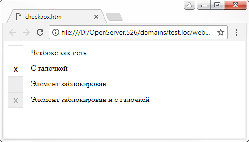
<input type=«checkbox» id=«checkbox-id» /> <label for=«checkbox-id»>Чекбокс как есть</label> |
В разных браузерах этот элемент будет выглядеть по разному. Chrome, Opera, IE, Yandex и прочие — будут по мере сил и фантазии разработчиков выводить checkbox с собственным оформлением.

Квадрат и галочку нельзя изменить стандартными стилями вроде:
|
// это работать не будет input[type=«checkbox»] { border: 1px solid #f00; background: #f00; border—radius: 5; } |
Поэтому стоит задача полностью заменить вывод стандартного элемента на свой, и мы сделаем это, используя только CSS.
План действий такой:
- Скрываем вывод чек-бокса;
- Формируем нужный внешний вид чекбокса в псевдо — элементе label:before;
- Дополнительные стили формируют внешний вид текущего статуса.
Важно, чтобы элемент Label был связан с чекбокс (через параметр for), тогда нажатие на метку передаётся на связанный элемент, и все работает как нужно без дополнительных скриптов.
|
1 2 3 4 5 6 7 8 9 10 11 12 13 14 15 16 17 18 19 20 21 22 23 24 25 26 27 28 29 30 31 32 33 34 35 36 37 38 39 40 41 42 43 |
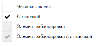
/* прячем input checkbox */ input[type=«checkbox»] { display: none; } /* стили для метки */ label { color: #000; cursor: default; font—weight: normal; line—height: 30px; padding: 10px 0; vertical—align: middle; } /* формируем внешний вид чекбокса в псевдоэлементе before */ label:before { content: » «; color: #000; display: inline—block; font: 20px/30px Arial; margin—right: 15px; position: relative; text—align: center; text—indent: 0px; width: 30px; height: 30px; background: #FFF; border: 1px solid #e3e3e3; border—image: initial; vertical—align: middle; } /* вариации внешнего вида в зав-ти от статуса checkbox */ /* checked */ input:checked + label:before { content: «x»; } /* disabled */ input:disabled + label:before { background: #eee; color: #aaa; } |
Теперь внешний вид становится везде одинаковым и выглядит вот так:
Как видите для вывода галочки я использовал просто символ «x» из шрифта Arial. Далее вы можете сами решать как выглядит контейнер и галочка.
Я к примеру использую шрифт awesome, в котором есть литера галочки.
Вот тот же CSS с использованием FontAwesome:
|
1 2 3 4 5 6 7 8 9 10 11 12 13 14 15 16 17 18 19 20 21 22 23 24 25 26 27 28 29 30 31 32 33 34 35 36 37 38 39 40 |
input[type=«checkbox»] { display: none; } label { color: #000; cursor: default; font—weight: normal; line—height: 30px; padding: 10px 0; vertical—align: middle; } label:before { content: » «; color: #000; display: inline—block; /* шрифт Awesome*/ font: 20px/30px FontAwesome; margin—right: 15px; position: relative; text—align: center; text—indent: 0px; width: 30px; height: 30px; background: #FFF; border: 1px solid #e3e3e3; border—image: initial; vertical—align: middle; } input:checked + label:before { /* глифон — галочка */ content: «f00c»; } input:disabled + label:before { background: #eee; color: #aaa; } |
Так выглядит checkbox с галочкой из набора иконок Awesome.
Написать комментарий
Данная запись опубликована в 27.12.2017 17:23 и размещена в Танцы с CSS.
Вы можете перейти в конец страницы и оставить ваш комментарий.
Мало букафф? Читайте есчо !
Прогресс бары, анимация загрузки…
Январь 11, 2019 г.
Сайт, где вы найдете конструкторы анимации прогресс баров — loading.io. Я бы сказал налетай, подешевело, но всё абсолютно даром.
Основная особенность …
Читать
Как запретить растягивание textarea
Февраль 27, 2017 г.
Тэг TextArea — незаменимое поле ввода для текста. Современные браузеры по-умолчанию позволяют пользователям изменять размеры, растягивать его за правый …
Читать
Несколько примеров как изменить внешний вид чекбоксов с помощью CSS, изображений и немного JS.
1
Метод «Checkbox Hack»
Основан на связи <label> и помещенного в него инпута, т.е. по клику на него, инпут будет менять свое состояние.
<label>
	<input type="checkbox">
	Checkbox
</label>
HTML
Стоит заменить что в некоторых старых браузерах (например Safari) такой приём не работает и требует добавление атрибутов for у <label> и id у чекбокса.
<label for="element">
	<input type="checkbox" id="element">
	Checkbox
</label>
HTML
В зависимости от состояния чекбокса :checked, :disabled и :focus, следующему за ним элементу, например <span>, можно задавать стили с помощью селектора «+».
<label>
	<input type="checkbox">
	<span>Checkbox</span>
</label>
HTML
/* Dafault */
label input[type=checkbox] + span {
	...
}

/* Focus */
label input[type=checkbox]:focus + span {
	...
}

/* Checked */
label input[type=checkbox]:checked + span {
	...
}

/* Disabled */
label input[type=checkbox]:disabled + span {
	...
}
label input[type=checkbox]:disabled:checked + span {
	...
}
CSS
Сам чекбокс скрывается, но без использования display: none, что бы оставить функциональность фокуса.
label input[type=checkbox] {
	position: absolute;
	z-index: -1;
	opacity: 0;
	display: block;
	width: 0;
	height: 0;
}
CSS
По умолчанию, фокус появляется при клике на элемент, что не очень и нужно. Оставить выделение при фокусе только при нажатии клавиши Tab можно с помощью JQuery, добавляя класс focused родительскому элементу.
$(window).keyup(function(e){
	var target = $('label input[type=checkbox]:focus');
	if (e.keyCode == 9 && $(target).length){
		$(target).parent().addClass('focused');
	}
});

$('label input[type=checkbox]').focusout(function(){
	$(this).parent().removeClass('focused');
});
JS
Пример №1
В первом примере понадобятся два изображения (обычный и отмеченный), для ускорения прорисовки можно использовать спрайты, но тогда не сделать плавную смену при переключении (transition background).
HTML-разметка:
<label class="checkbox-other">
	<input type="checkbox" checked>
	<span>Checkbox #1</span>
</label>

<label class="checkbox-other">
	<input type="checkbox">
	<span>Checkbox #2</span>
</label>

<label class="checkbox-other">
	<input type="checkbox" disabled>
	<span>Checkbox #3</span>
</label>

<label class="checkbox-other">
	<input type="checkbox" checked disabled>
	<span>Checkbox #4</span>
</label>
HTML
Фокус по клавише Tab:
$(window).keyup(function(e){
	var target = $('.checkbox-other input:focus');
	if (e.keyCode == 9 && $(target).length){
		$(target).parent().addClass('focused');
	}
});

$('.checkbox-other input').focusout(function(){
	$(this).parent().removeClass('focused');
});
JS
CSS-стили:
.checkbox-other {
	display: block;
	margin: 0 0 10px 0;
	cursor: pointer;
	user-select: none;
	position: relative;
}
.checkbox-other input[type=checkbox] {
	position: absolute;
	z-index: -1;
	opacity: 0;
	display: block;
	width: 0;
	height: 0;
}
.checkbox-other span {
	display: inline-block;
	position: relative;
	padding: 0 0 0 35px;
	line-height: 22px;
}
.checkbox-other span:before {
	content: "";
	display: inline-block;
	width: 22px;
	height: 22px;
	position: absolute;
	left: 0;
	top: 0;
	transition: background 0.3s ease;
	background: url(/checkbox-1.png) 0 0 no-repeat;
}

/* Checked */
.checkbox-other input[type=checkbox]:checked + span:before {
	background-image: url(/checkbox-2.png);
}

/* Focus */
.focused span:before {
	box-shadow: 0 0 0 0.2rem rgba(0,123,255,.25);
}

/* Hover */
.checkbox-other span:hover:before {
	filter: brightness(110%);
}

/* Active */
.checkbox-other span:active:before {
	filter: brightness(80%);
}

/* Disabled */
.checkbox-other input[type=checkbox]:disabled + span {
	color: #666;
	cursor: default;
}
.checkbox-other input[type=checkbox]:disabled + span:before {
	filter: grayscale(100%);
	opacity: 0.6;
}
CSS
Результат:
Пример №2
Подходит для случаев, когда галка выходит за края элемента. HTML-разметка и JS-код остается прежними.
.checkbox-other {
	display: block;
	margin: 0 0 10px 0;
	cursor: pointer;
	user-select: none;
	position: relative;
}
.checkbox-other input[type=checkbox] {
	position: absolute;
	z-index: -1;
	opacity: 0;
	display: block;
	width: 0;
	height: 0;
}
.checkbox-other span {
	display: inline-block;
	position: relative;
	padding: 0 0 0 35px;
	line-height: 22px;
}
.checkbox-other span:before {
	content: "";
	display: inline-block;
	width: 22px;
	height: 22px;
	position: absolute;
	left: 0;
	top: 0;
	background: url(/checkbox-3.png) 0 0 no-repeat;
}

/* Checked */
.checkbox-other input[type=checkbox] + span:after {
	content: "";
	opacity: 0;
	transition: opacity 0.3s ease;
}
.checkbox-other input[type=checkbox]:checked + span:after {
	display: inline-block;
	width: 22px;
	height: 22px;
	position: absolute;
	left: 4px;
	top: -5px;
	background: url(/checkbox-4.png) 0 0 no-repeat;
	opacity: 1;
}

/* Focus */
.focused span:before {
	box-shadow: 0 0 0 0.2rem rgba(0,123,255,.25);
}

/* Hover */
.checkbox-other span:hover:after {
	filter: brightness(110%);
}

/* Active */
.checkbox-other span:active:before,
.checkbox-other span:active:after {
	filter: brightness(80%);
}

/* Disabled */
.checkbox-other input[type=checkbox]:disabled + span {
	color: #666;
	cursor: default;
}
.checkbox-other input[type=checkbox]:disabled + span:before,
.checkbox-other input[type=checkbox]:disabled + span:after {
	filter: grayscale(100%);
	opacity: 0.6;
}
CSS
Результат:
Пример №3
Вариант с использованием символа галочки – ✓ или эмоджи ✔.
.checkbox-other {
	display: block;
	margin: 0 0 10px 0;
	line-height: 22px;
	cursor: pointer;
	user-select: none;
	position: relative;
}
.checkbox-other input[type=checkbox] {
	position: absolute;
	z-index: -1;
	opacity: 0;
	display: block;
	width: 0;
	height: 0;
}
.checkbox-other span {
	display: inline-block;
	position: relative;
	padding: 0 0 0 35px;
	line-height: 22px;
}
.checkbox-other span:before {
	content: "";
	display: inline-block;
	width: 20px;
	height: 20px;
	position: absolute;
	left: 0;
	top: 0;
	border: 1px solid #2B7335;
	box-shadow: inset 0 0 3px #8a8a8a;
}

/* Checked */
.checkbox-other input[type=checkbox] + span:after {
	content: "";
	opacity: 0;
	transition: opacity 0.3s ease;
}
.checkbox-other input[type=checkbox]:checked + span:after {
	content: "✓";
	color: green;
	font-size: 30px;
	font-weight: 900;
	position: absolute;
	left: 2px;
	top: -2px;
	opacity: 1;
}

/* Focus */
.focused span:before {
	box-shadow: 0 0 0 0.2rem rgba(0,123,255,.25);
}

/* Hover */
.checkbox-other span:hover:after {
	filter: brightness(110%);
}

/* Active */
.checkbox-other span:active:before,
.checkbox-other span:active:after {
	filter: brightness(80%);
}

/* Disabled */
.checkbox-other input[type=checkbox]:disabled + span {
	color: #666;
	cursor: default;
}
.checkbox-other input[type=checkbox]:disabled + span:before,
.checkbox-other input[type=checkbox]:disabled + span:after {
	filter: grayscale(100%);
	opacity: 0.6;
}
CSS
2
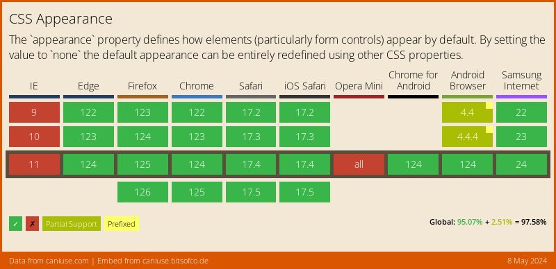
CSS свойство appearance
Пока нестандартезированое свойство -webkit-appearance: none отключает стандартное оформление элемнта формы, но сохраняет его функциональность, тем самым появляется возможность задать ему любые стили, но без псевдосвойст :before и :after. Полное описание на developer.mozilla.org.
<label class="checkbox-other">
	<input type="checkbox" checked> Checkbox #1
</label>

<label class="checkbox-other">
	<input type="checkbox"> Checkbox #2
</label>

<label class="checkbox-other">
	<input type="checkbox" disabled> Checkbox #3
</label>

<label class="checkbox-other">
	<input type="checkbox" checked disabled> Checkbox #4
</label>
HTML
.checkbox-other {
	display: block;
	margin: 0 0 10px 0;
	line-height: 22px;
}
.checkbox-other input[type=checkbox] {
	-webkit-appearance: none;
	-moz-appearance: none;
	display: inline-block;
	width: 22px;
	height: 22px;
	margin: 0 5px 0 0;
	padding: 0;
	vertical-align: top;
	outline: none;
	transition: background 0.3s ease;
	background: url(/checkbox-1.png) 0 0 no-repeat;
	cursor: pointer;
}

/* Checked */
.checkbox-other input[type=checkbox]:checked {
	background-image: url(/checkbox-2.png);
}

/* Focus */
.focused input[type=checkbox] {
	box-shadow: 0 0 0 0.2rem rgba(0,123,255,.25);
}

/* Hover */
.checkbox-other input[type=checkbox]:hover {
	filter: brightness(110%);
}

/* Active */
.checkbox-other input[type=checkbox]:active {
	filter: brightness(80%);
}

/* Disabled */
.checkbox-other input[type=checkbox]:disabled {
	color: #666;
	cursor: default;
}
.checkbox-other input[type=checkbox]:disabled {
	filter: grayscale(100%);
	opacity: 0.6;
}
CSS
Свойство appearance поддерживается всеми современными брузерами. В старых брауезерах, чекбокбокс будет выводится как обычный.
22.04.2020, обновлено 21.02.2021
Другие публикации
Мини JQuery плагин позволяет отметить или снять одним кликом чекбоксы в таблицах и отметить чекбокс по клику на сроку…
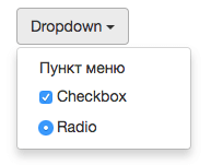
Проблема в том что если вставить чекбокс, радиокнопку в меню dropdowns Bootstrap и кликнув по ним, меню сразу…
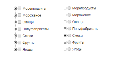
В данном примере описано как вывести многоуровневый список checkbox и radio button из БД с помощью PHP функций…
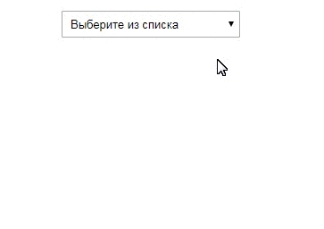
Селект с множественным выбором (select multiple) весьма не удобен, при выборе часто забываешь нажимать сtrl и все сбрасывается. В место него можно использовать чекбоксы в выпадающем списке.
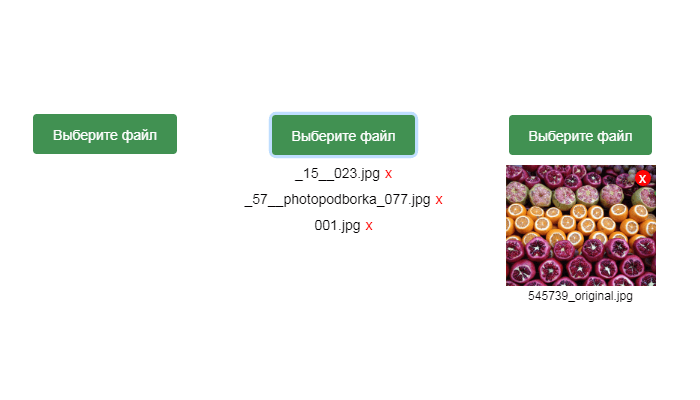
Примеры изменения вида стандартного поля для загрузки файлов input type file с помощью CSS и JS.
Если добавить атрибут contenteditable к элементу, его содержимое становится доступно для редактирования пользователю, а…
Наверняка вы задумались о том, как можно изменить стандартный вид флажков (чекбоксов), чтобы они выглядели привлекательней с учетом дизайна вашего сайта или задач одной конкретной страницы. В этой статье вы найдете ряд практических примеров, которые помогут вам стилизовать элементы <input type="checkbox">. Для начала разберем пример, который имеет вид переключателя. Давайте посмотрим, как можно стилизовать флажки на примере, который в html-разметке содержит только <input type="checkbox"> и <label>:
|
<input type=«checkbox» id=«demo1» checked> <label for=«demo1» data—on—label=«Вкл.» data—off—label=«Выкл.»></label> <input type=«checkbox» id=«demo2»> <label for=«demo2» data—on—label=«Да» data—off—label=«Нет»></label> |
Сам пример в действии:
Теперь рассмотрим CSS-стили:
|
1 2 3 4 5 6 7 8 9 10 11 12 13 14 15 16 17 18 19 20 21 22 23 24 25 26 27 28 29 30 31 32 33 34 35 36 37 38 39 40 41 42 43 44 45 46 47 48 49 50 51 52 53 |
label { margin: 2em;} input { display: none;} input+label, input+label::before, input+label::after { -webkit-transition: all .2s; transition: all .2s; } input+label { display: inline-block; position: relative; width: 130px; height: 50px; border-radius: 25px; cursor: pointer; } input+label::before { display: block; content: attr(data-off-label); position: absolute; top: 15px; right: 10px; color: #fff; font-family: Arial, sans-serif; font-size: 18px; } input+label::after { content: »; position: absolute; top: 2px; left: 2px; width: 44px; height: 44px; background-color: #fff; border-radius: 50%; } input:checked+label::before { content: attr(data-on-label); left: 14px; right: auto; color: #fff; } input:checked+label::after { left: 83px; background-color: #f7f7f7; } #demo1+label { background-color: #ccc; } #demo1+label::before { color: #999; } #demo1:checked+label { background-color: #3498db; } #demo1:checked+label::before { color: #fff; } #demo2+label { background-color: #e74c3c; } #demo2:checked+label { background-color: #1abc9c; } |
Если проанализировать код CSS, то видно, что элемент input мы прячем (свойство display: none), а все остальные стили прописаны для элемента label, а также псевдоэлементов label::before и label::after. Изменения внешнего вида также осуществляются для псевдокласса :checked, который имеет смысл использовать для флажков и радио-кнопок.
Еще ряд похожих вариантов с анимацией вам предлагает Himalaya Singh в своем примере.
See the Pen Pure CSS Toggle Buttons | ON-OFF Switches by Himalaya Singh (@himalayasingh) on CodePen.18892
И еще один пример:
See the Pen Simple CSS Checkbox by Tristan White (@triss90) on CodePen.18892
Примеры стилизации флажков с ресурса codepen.io
Как работает стилизация
В этом примере видно, где расположен флажок, который обычно скрывается с помощью свойства display: none, и как стилизованы label. Откройте вкладку CSS и проанализируйте код.
See the Pen [Pure CSS] Delightful Checkbox Animation by Dylan Raga (@dylanraga) on CodePen.18892
Простое решение для флажков и переключателей от Jon Kantner.
See the Pen CSS Checkboxes and Radio Buttons by Jon Kantner (@jkantner) on CodePen.18892
Близкие к стандартным варианты флажков, переключателей и выпадающих списков от Kenan Yusuf
See the Pen Completely CSS: Custom checkboxes, radio buttons and select boxes by Kenan Yusuf (@KenanYusuf) on CodePen.18892
Зачеркивание при выборе флажка с анимацией
See the Pen Animated Fill and Strikethrough Checkboxes by Jon Kantner (@jkantner) on CodePen.18892
Несколько интересных решений для флажков и переключателей от Brad Bodine
See the Pen CSS3 Checkbox Styles by Brad Bodine (@bbodine1) on CodePen.18892
Несколько похожих переключений состояний чекбокса от Olivia Ng
See the Pen Toggles by Elen (@ambassador)
on CodePen.0
Разные виды переключателей от Mauricio Allende
See the Pen Pure CSS toggle buttons by Elen (@ambassador) on CodePen.0
Анимированное переключение состояний флажка в виде пилюли
See the Pen Pill Switch 💊 by Elen (@ambassador) on CodePen.18892
Круглая кнопка с анимацией от mandycodestoo
See the Pen 100dayscss-66 by @mandycodestoo (@mandycodestoo) on CodePen.18892
Анимация текста флажков и радио-кнопок от Raúl Barrera
See the Pen Pure CSS Fancy Checkbox/Radio by Raúl Barrera (@raubaca) on CodePen.18892
Подсветка текста label + анимация выбора чекбокса от Adam Quinlan
See the Pen chippy checkbox inputs by Adam Quinlan (@quinlo) on CodePen.18892
Анимированные флажки с изменением цвета на основе css-переменных от Stas Melnikov
See the Pen #CodePenChallenge | Pure CSS Checkboxes by Stas Melnikov (@melnik909) on CodePen.18892
Анимация флажков с переворотом
See the Pen Flip checkbox by Elen (@ambassador) on CodePen.18892
Анимация флажков и переключателей в стиле Material Design от Matt Sisto
See the Pen CSS «Ripple/Wave» checkbox and radio button by Matt Sisto (@msisto) on CodePen.18892
Перекатывающийся шарик от Jon Kantner
Вариант 1
See the Pen Toy Toggle Switch by Jon Kantner (@jkantner) on CodePen.18892
Вариант 2 со скрепкой
See the Pen Paper Clip Toggle Switch by Jon Kantner (@jkantner) on CodePen.18892
Карандаш для отметки выбора флажка
Еще один вариант анимации от Jon Kantner, но с появлением карандаша. Отличное решение для тестов, например.
See the Pen Pencil and Paper Checkboxes by Jon Kantner (@jkantner) on CodePen.18892
Меняем цветовую схему переключателем
Автор Jon Kantner предлагает вашему вниманию вариант кода, при котором клик на чекбоксе меняет цвет фона.
Вариант 1
See the Pen Toggle Switch with Rolling Label by Jon Kantner (@jkantner) on CodePen.18892
Вариант 2
See the Pen Light/Dark Mode Toggle With Curtain Effect by Jon Kantner (@jkantner) on CodePen.18892
Переключатель энергии
See the Pen Blocky Toggle Switch by Jon Kantner (@jkantner) on CodePen.18892
Реализация аккордеона на чистом CSS с использованием чекбоксов от Alex Bergin
See the Pen CSS + HTML only Accordion Element by Alex Bergin (@abergin) on CodePen.18892
Переключатель цены от Aniruddha Banerjee
See the Pen Pricing Card Design by Aniruddha Banerjee (@imanirudh1) on CodePen.0
Выбор группы иконок от Håvard Brynjulfsen
See the Pen Checkbox group styled as tiles by Håvard Brynjulfsen (@havardob) on CodePen.0
Использование переключателя для показа скрытого контента
Скрытый checkbox нужен для отображения блока с информацией, которая не видна изначально. Автор Lisi.
See the Pen Expand Information by Lisi (@lisilinhart)on CodePen.0
Сложные примеры
Оказывается, флажки (чекбоксы) можно стилизовать так, что пользователи вряд ли догадаются о том, что используют именно эти элементы.
Шестеренки в переключателе с анимацией
Автор leimapapa
See the Pen ⚙️ Giant Gear Toggle ⚙️ by leimapapa (@leimapapa) on CodePen.0
Флажок-выключатель
Отличная стилизация <input type="checkbox"> в виде выключателя с внутренней подсветкой от Yoav Kadosh.
See the Pen Realistic Red Switch (Pure CSS) by Yoav Kadosh (@ykadosh) on CodePen.18892
Лампа-переключатель
Вариант попроще внешне от Jon Kantner, но в коде вы найдете очень меого правил.
See the Pen Light Bulb Toggle Switch by Jon Kantner (@jkantner) on CodePen.18892
Флажок-переключатель
Настоящий переключатель от Jon Kantner. Здесь использован не только CSS, но и JS-код.
See the Pen Skeuomorphic Lever Checkbox by Jon Kantner (@jkantner) on CodePen.18892
Еще один вариант 3D-переключателя
Автор Yoav Kadosh
See the Pen 3D Orange Switch (Pure CSS) by Yoav Kadosh (@ykadosh) on CodePen.0
3D-трансформации с анимацией
Глядя на этот пример, понимаешь, что стилизация переключателей — это наименьшее из того, что сделал автор Ivan Grozdic . Отличный вариант для туристического сайта в плане выбора услуг.
See the Pen Pricing — pure css — #16 by Ivan Grozdic (@ig_design) on CodePen.18892
Пример генератора пароля с использованием флажков
See the Pen Random Password Generator — HTML | CSS | JS by Sikriti Dakua (@dev_loop) on CodePen.18892
ToDo List (список дел) от Will Boyd
Интересно то, что при отметке чекбокса вы получаете список дел с подсчетом сделанных и несделанных заданий на основе только лишь CSS, совсем без JavaScript-кода, за счет использования свойства counter-increment и свойства order Flexbox-модели.
See the Pen Checkbox Trickery: To-Do List by Will Boyd (@lonekorean) on CodePen.18892
И еще один ToDo List от Daniel Ramos
Только CSS, без JavaScript
See the Pen To do List + CSS by Daniel Ramos (@DanielRamos) on CodePen.0
Бонус. Невключаемый чекбох
Для тех, кто дочитал до конца — бонус — чекбокс, который нельзя оставить включенным, так как вы рассердите мишку. Он даже рычать умеет и хмурить брови. Наслаждайтесь ))) Написано на React. Автор Jhey.
See the Pen Impossible Checkbox v2 🐻 by Jhey (@jh3y)
on CodePen.0
Просмотров: 10 685
Yikes! All these workarounds have led me to the conclusion that the HTML checkbox kind of sucks if you want to style it.
As a forewarning, this isn’t a CSS implementation. I just thought I’d share the workaround I came up with in case anyone else might find it useful.
I used the HTML5 canvas element.
The upside to this is that you don’t have to use external images and can probably save some bandwidth.
The downside is that if a browser for some reason can’t render it correctly, then there’s no fallback. Though whether this remains an issue in 2017 is debatable.
Update
I found the old code quite ugly, so I decided to give it a rewrite.
Object.prototype.create = function(args){
    var retobj = Object.create(this);

    retobj.constructor(args || null);

    return retobj;
}

var Checkbox = Object.seal({
    width: 0,
    height: 0,
    state: 0,
    document: null,
    parent: null,
    canvas: null,
    ctx: null,

    /*
     * args:
     * name      default             desc.
     *
     * width     15                  width
     * height    15                  height
     * document  window.document     explicit document reference
     * target    this.document.body  target element to insert checkbox into
     */
    constructor: function(args){
        if(args === null)
            args = {};

        this.width = args.width || 15;
        this.height = args.height || 15;
        this.document = args.document || window.document;
        this.parent = args.target || this.document.body;
        this.canvas = this.document.createElement("canvas");
        this.ctx = this.canvas.getContext('2d');

        this.canvas.width = this.width;
        this.canvas.height = this.height;
        this.canvas.addEventListener("click", this.ev_click(this), false);
        this.parent.appendChild(this.canvas);
        this.draw();
    },

    ev_click: function(self){
        return function(unused){
            self.state = !self.state;
            self.draw();
        }
    },

    draw_rect: function(color, offset){
        this.ctx.fillStyle = color;
        this.ctx.fillRect(offset, offset,
                this.width - offset * 2, this.height - offset * 2);
    },

    draw: function(){
        this.draw_rect("#CCCCCC", 0);
        this.draw_rect("#FFFFFF", 1);

        if(this.is_checked())
            this.draw_rect("#000000", 2);
    },

    is_checked: function(){
        return !!this.state;
    }
});
Here’s a working demo.
The new version uses prototypes and differential inheritance to create an efficient system for creating checkboxes. To create a checkbox:
var my_checkbox = Checkbox.create();
This will immediately add the checkbox to the DOM and hook up the events. To query whether a checkbox is checked:
my_checkbox.is_checked(); // True if checked, else false
Also important to note is that I got rid of the loop.
Update 2
Something I neglected to mention in the last update is that using the canvas has more advantages than just making a checkbox that looks however you want it to look. You could also create multi-state checkboxes, if you wanted to.
Object.prototype.create = function(args){
    var retobj = Object.create(this);

    retobj.constructor(args || null);

    return retobj;
}

Object.prototype.extend = function(newobj){
    var oldobj = Object.create(this);

    for(prop in newobj)
        oldobj[prop] = newobj[prop];

    return Object.seal(oldobj);
}

var Checkbox = Object.seal({
    width: 0,
    height: 0,
    state: 0,
    document: null,
    parent: null,
    canvas: null,
    ctx: null,

    /*
     * args:
     * name      default             desc.
     *
     * width     15                  width
     * height    15                  height
     * document  window.document     explicit document reference
     * target    this.document.body  target element to insert checkbox into
     */
    constructor: function(args){
        if(args === null)
            args = {};

        this.width = args.width || 15;
        this.height = args.height || 15;
        this.document = args.document || window.document;
        this.parent = args.target || this.document.body;
        this.canvas = this.document.createElement("canvas");
        this.ctx = this.canvas.getContext('2d');

        this.canvas.width = this.width;
        this.canvas.height = this.height;
        this.canvas.addEventListener("click", this.ev_click(this), false);
        this.parent.appendChild(this.canvas);
        this.draw();
    },

    ev_click: function(self){
        return function(unused){
            self.state = !self.state;
            self.draw();
        }
    },

    draw_rect: function(color, offsetx, offsety){
        this.ctx.fillStyle = color;
        this.ctx.fillRect(offsetx, offsety,
                this.width - offsetx * 2, this.height - offsety * 2);
    },

    draw: function(){
        this.draw_rect("#CCCCCC", 0, 0);
        this.draw_rect("#FFFFFF", 1, 1);
        this.draw_state();
    },

    draw_state: function(){
        if(this.is_checked())
            this.draw_rect("#000000", 2, 2);
    },

    is_checked: function(){
        return this.state == 1;
    }
});

var Checkbox3 = Checkbox.extend({
    ev_click: function(self){
        return function(unused){
            self.state = (self.state + 1) % 3;
            self.draw();
        }
    },

    draw_state: function(){
        if(this.is_checked())
            this.draw_rect("#000000", 2, 2);

        if(this.is_partial())
            this.draw_rect("#000000", 2, (this.height - 2) / 2);
    },

    is_partial: function(){
        return this.state == 2;
    }
});
I modified slightly the Checkbox used in the last snippet so that it is more generic, making it possible to «extend» it with a checkbox that has 3 states. Here’s a demo. As you can see, it already has more functionality than the built-in checkbox.
Something to consider when you’re choosing between JavaScript and CSS.
Old, poorly-designed code
Working Demo
First, set up a canvas
var canvas = document.createElement('canvas'),
    ctx = canvas.getContext('2d'),
    checked = 0; // The state of the checkbox
canvas.width = canvas.height = 15; // Set the width and height of the canvas
document.body.appendChild(canvas);
document.body.appendChild(document.createTextNode(' Togglable Option'));
Next, devise a way to have the canvas update itself.
(function loop(){
  // Draws a border
  ctx.fillStyle = '#ccc';
  ctx.fillRect(0,0,15,15);
  ctx.fillStyle = '#fff';
  ctx.fillRect(1, 1, 13, 13);
  // Fills in canvas if checked
  if(checked){
    ctx.fillStyle = '#000';
    ctx.fillRect(2, 2, 11, 11);
  }
  setTimeout(loop, 1000/10); // Refresh 10 times per second
})();
The last part is to make it interactive. Luckily, it’s pretty simple:
canvas.onclick = function(){
  checked = !checked;
}
This is where you might have problems in IE, due to their weird event handling model in JavaScript.
I hope this helps someone; it definitely suited my needs.