Несколько примеров изменения вида радио кнопок на чистом CSS. Единственное неудобство метода в том, что приходится указывать уникальные id.
1
Стандартные элементы
Понадобятся всего два изображения, которые можно объединить в спрайт. Состояния заблокированного элемента и при наведении можно сделать CSS фильтрами.
<div class="form_radio">
	<input id="radio-1" type="radio" name="radio" value="1" checked>
	<label for="radio-1">Radio button 1</label>
</div>

<div class="form_radio">
	<input id="radio-2" type="radio" name="radio" value="2">
	<label for="radio-2">Radio button 2</label>
</div>

<div class="form_radio">
	<input id="radio-3" type="radio" name="radio" value="3">
	<label for="radio-3">Radio button 3</label>
</div>

<div class="form_radio">
	<input id="radio-4" type="radio" name="radio" value="4" disabled>
	<label for="radio-4">Radio disabled</label>
</div>
HTML
.form_radio {
	margin-bottom: 10px;
}
.form_radio input[type=radio] {
	display: none;
}
.form_radio label {
	display: inline-block;
	cursor: pointer;
	position: relative;
	padding-left: 25px;
	margin-right: 0;
	line-height: 18px;
	user-select: none;
}
.form_radio label:before {
	content: "";
	display: inline-block;
	width: 17px;
	height: 18px;
	position: absolute;
	left: 0;
	bottom: 1px;
	background: url(/img/radio-1.png) 0 0 no-repeat;
}

/* Checked */
.form_radio input[type=radio]:checked + label:before {
	background: url(/img/radio-2.png) 0 0 no-repeat;
}

/* Hover */
.form_radio label:hover:before {
	filter: brightness(120%);
}

/* Disabled */
.form_radio input[type=radio]:disabled + label:before {
	filter: grayscale(100%);
}
CSS
2
Radio в виде кнопок
<div class="form_radio_btn">
	<input id="radio-1" type="radio" name="radio" value="1" checked>
	<label for="radio-1">Radio button 1</label>
</div>

<div class="form_radio_btn">
	<input id="radio-2" type="radio" name="radio" value="2">
	<label for="radio-2">Radio button 2</label>
</div>

<div class="form_radio_btn">
	<input id="radio-3" type="radio" name="radio" value="3">
	<label for="radio-3">Radio button 3</label>
</div>

<div class="form_radio_btn">
	<input id="radio-4" type="radio" name="radio" value="4" disabled>
	<label for="radio-4">Disabled</label>
</div>
HTML
.form_radio_btn {
	display: inline-block;
	margin-right: 10px;
}
.form_radio_btn input[type=radio] {
	display: none;
}
.form_radio_btn label {
	display: inline-block;
	cursor: pointer;
	padding: 0px 15px;
	line-height: 34px;
	border: 1px solid #999;
	border-radius: 6px;
	user-select: none;
}

/* Checked */
.form_radio_btn input[type=radio]:checked + label {
	background: #ffe0a6;
}

/* Hover */
.form_radio_btn label:hover {
	color: #666;
}

/* Disabled */
.form_radio_btn input[type=radio]:disabled + label {
	background: #efefef;
	color: #666;
}
CSS
3
Группа кнопок
<div class="form_radio_group">
	<div class="form_radio_group-item">
		<input id="radio-1" type="radio" name="radio" value="1" checked>
		<label for="radio-1">Radio button 1</label>
	</div>
	<div class="form_radio_group-item">
		<input id="radio-2" type="radio" name="radio" value="2">
		<label for="radio-2">Radio button 2</label>
	</div>
	<div class="form_radio_group-item">
		<input id="radio-3" type="radio" name="radio" value="3">
		<label for="radio-3">Radio button 3</label>
	</div>
	<div class="form_radio_group-item">
		<input id="radio-4" type="radio" name="radio" value="4" disabled>
		<label for="radio-4">Disabled</label>
	</div>
</div>
HTML
.form_radio_group {
	display: inline-block;
	overflow: hidden;
}
.form_radio_group-item {
	display: inline-block;
	float: left;
}
.form_radio_group input[type=radio] {
	display: none;
}
.form_radio_group label {
	display: inline-block;
	cursor: pointer;
	padding: 0px 15px;
	line-height: 34px;
	border: 1px solid #999;
	border-right: none;
	user-select: none;
}

.form_radio_group .form_radio_group-item:first-child label {
	border-radius: 6px 0 0 6px;
}
.form_radio_group .form_radio_group-item:last-child label {
	border-radius: 0 6px 6px 0;
	border-right: 1px solid #999;
}

/* Checked */
.form_radio_group input[type=radio]:checked + label {
	background: #ffe0a6;
}

/* Hover */
.form_radio_group label:hover {
	color: #666;
}

/* Disabled */
.form_radio_group input[type=radio]:disabled + label {
	background: #efefef;
	color: #666;
}
CSS
4
Переключатель
<div class="form_toggle">
	<div class="form_toggle-item item-1">
		<input id="fid-1" type="radio" name="radio" value="off" checked>
		<label for="fid-1">OFF</label>
	</div>
	<div class="form_toggle-item item-2">
		<input id="fid-2" type="radio" name="radio" value="on">
		<label for="fid-2">ON</label>
	</div>
</div>
HTML
.form_toggle {
	display: inline-block;
	overflow: hidden;
}
.form_toggle-item {
	float: left;
	display: inline-block;
}
.form_toggle-item input[type=radio] {
	display: none;
}
.form_toggle-item label {
	display: inline-block;
	padding: 0px 15px;
	line-height: 34px;
	border: 1px solid #999;
	border-right: none;
	cursor: pointer;
	user-select: none;
}

.form_toggle .item-1 label {
	border-radius: 6px 0 0 6px;
}
.form_toggle .item-2 label {
	border-radius: 0 6px 6px 0;
	border-right: 1px solid #999;
}

/* Checked */
.form_toggle .item-1 input[type=radio]:checked + label {
	background: #ffc5c5;
}
.form_toggle .item-2 input[type=radio]:checked + label {
	background: #bbffbb;
}
CSS
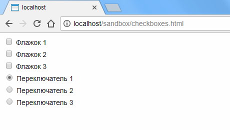
При создании CSS стилей для HTML форм, разработчики часто сталкиваются с невозможностью непосредственно менять внешний вид элементов флажков (checkboxes) и переключателей (radio buttons). Рассмотрим как можно обойти это ограничение при помощи инструментария CSS3 и без использования какого-либо кода JavaScript.
Итак, для начала добавим несколько обычных флажков и переключателей на форму:
/* Мои флажки */

<div>
<input type="checkbox" id="cb1"> <label for="cb1">Флажок 1</label>
</div>

<div>
<input type="checkbox" id="cb2"> <label for="cb2">Флажок 2</label>
</div>

<div>
<input type="checkbox" id="cb3"> <label for="cb3">Флажок 3</label>
</div>

/* Мои переключатели */

<div>
<input type="radio" name="rb" id="rb1" checked> <label for="rb1">Переключатель 1</label>
</div>

<div>
<input type="radio" name="rb" id="rb2"> <label for="rb2">Переключатель 2</label>
</div>

<div>
<input type="radio" name="rb" id="rb3"> <label for="rb3">Переключатель 3</label>
</div>
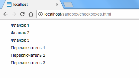
Перенесем стандартное отображение элементов за область видимости и добавим отступы к соседствующим меткам:
input[type="checkbox"]:checked,
input[type="checkbox"]:not(:checked),
input[type="radio"]:checked,
input[type="radio"]:not(:checked)
{
    position: absolute;
    left: -9999px;
}

input[type="checkbox"]:checked + label,
input[type="checkbox"]:not(:checked) + label,
input[type="radio"]:checked + label,
input[type="radio"]:not(:checked) + label {
    display: inline-block;
    position: relative;
    padding-left: 28px;
    line-height: 20px;
    cursor: pointer;
}
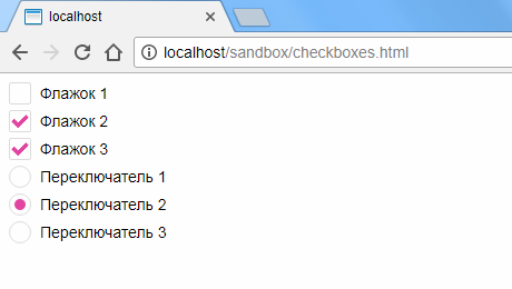
Перед метками добавим стилизованные контейнеры для наших пользовательских элементов. Для флажков это будут квадраты с немного закругленными для красоты краями, а для переключателей — просто небольшие круги:
input[type="checkbox"]:checked + label:before,
input[type="checkbox"]:not(:checked) + label:before,
input[type="radio"]:checked + label:before,
input[type="radio"]:not(:checked) + label:before {
    content: "";
    position: absolute;
    left: 0px;
    top: 0px;
    width: 18px;
    height: 18px;
    border: 1px solid #dddddd;
    background-color: #ffffff;
}

input[type="checkbox"]:checked + label:before,
input[type="checkbox"]:not(:checked) + label:before {
    border-radius: 2px;
}

input[type="radio"]:checked + label:before,
input[type="radio"]:not(:checked) + label:before {
    border-radius: 100%;
}

Теперь добавим индикаторы выбора. Для флажков это будут галки, для переключателей — заполненные цветом круги меньшего размера, чем сам контейнер. Для большего эффекта зададим также небольшую анимацию:
input[type="checkbox"]:checked + label:after,
input[type="checkbox"]:not(:checked) + label:after,
input[type="radio"]:checked + label:after,
input[type="radio"]:not(:checked) + label:after {
    content: "";
    position: absolute;
    -webkit-transition: all 0.2s ease;
    -moz-transition: all 0.2s ease;
    -o-transition: all 0.2s ease;
    transition: all 0.2s ease;
}

input[type="checkbox"]:checked + label:after,
input[type="checkbox"]:not(:checked) + label:after {
    left: 3px;
    top: 4px;
    width: 10px;
    height: 5px;
    border-radius: 1px;
    border-left: 4px solid #e145a3;
    border-bottom: 4px solid #e145a3;
    -webkit-transform: rotate(-45deg);
    -moz-transform: rotate(-45deg);
    -o-transform: rotate(-45deg);
    -ms-transform: rotate(-45deg);
    transform: rotate(-45deg);
}

input[type="radio"]:checked + label:after,
input[type="radio"]:not(:checked) + label:after {
    left: 5px;
    top: 5px;
    width: 10px;
    height: 10px;
    border-radius: 100%;
    background-color: #e145a3;
}

Чтобы изобразить знак галки, мы поворачиваем небольшой прямоугольник, две стороны которого окрашены в цвет, на 45 градусов против часовой стрелки.
Обратите внимание, что селекторы :before и :after позволяют добавлять содержание непосредственно до и после содержимого самой метки. Так как для меток мы задали относительное позиционирование (position: relative), то можем задавать контекстное абсолютное позиционирование для их содержимого.
Осталось скрыть индикаторы выбора, когда элемент не выбран, и, соответственно, отображать их, когда элемент находится в выбранном состоянии:
input[type="checkbox"]:not(:checked) + label:after,
input[type="radio"]:not(:checked) + label:after {
    opacity: 0;
}

input[type="checkbox"]:checked + label:after,
input[type="radio"]:checked + label:after {
    opacity: 1;
}
Добавим, что описанное здесь решение работает во всех современных версиях браузеров Chrome, Firefox, Safari, Opera, а также, начиная с версии 9, и в Internet Explorer.
Полностью CSS определения можно загрузить здесь.
В этой статье подробно разберём процесс кастомной стилизации чекбоксов и радиокнопок с помощью CSS.
Как осуществляется создание кастомного чекбокса или переключателя
Данный процесс осуществляется посредством скрытия стандартного элемента и создания с помощью CSS другого «поддельного», такого как мы хотим.
Но как же это будет работать, если стандартный input скрыть? Это можно выполнить благодаря тому, что в HTML переключить состояние checked можно не только с помощью самого элемента input, но и посредством связанного с ним label.
В HTML связывание label с input выполняется одним из 2 способов:
1. Посредством помещения элемента input в label:
<label>
  <input type="checkbox" name="happy" value="yes">Happy
</label>
2. Посредством задания элементу input атрибута id, а label – for с таким же значением как у id.
<input type="checkbox" id="happy" name="happy" value="yes">
<label for="happy">Happy</label>
В этой статье мы подробно разберём шаги по кастомизации checkbox и radio, в которых label с input свяжем по 2 варианту. Создание «поддельного» чекбокса выполним с использованием псевдоэлемента ::before, который поместим в label. При этом никакие дополнительные элементы в разметку добавлять не будем.
Создание стильного чекбокса
Процесс замены стандартного вида чекбокса на кастомный осуществим посредством выполнения следующей последовательности шагов.
Шаг 1. Создадим разметку.
<input type="checkbox" class="custom-checkbox" id="happy" name="happy" value="yes">
<label for="happy">Happy</label>
При создании разметки очень важно соблюдать последовательность расположения элементов. Это необходимо, потому что в зависимости от того, как они расположены мы будем составлять выражения для выбора элементов в CSS и назначать им стили.
В этом примере элемент label расположен после input. Связь label с input осуществляется посредством соответствия значения for элемента label с id элемента input.
В примере к элементу input добавлен класс custom-checkbox. Данный класс мы будем использовать при составлении селекторов и тем самым с помощью него определять элементы к которым следует добавить стилизованный чекбокс вместо обычного. Т.е. его присутствие или отсутствие будет определять с каким чекбоксом (со стандартным или поддельным) будет выводится элемент input с type="checkbox".
Шаг 2. Напишем стили для скрытия стандартного элемента input.
.custom-checkbox {
  position: absolute;
  z-index: -1;
  opacity: 0;
}
Мы не будем использовать display: none, а установим ему стили, с помощью которых уберём его из потока (position: absolute), поместим его ниже существующих элементов (z-index: -1), а также сделаем его полностью прозрачным (opacity: 0). Зачем это нужно? Это нам необходимо для того, чтобы мы могли получить состояние фокуса, а затем стилизовать «подделный» checkbox или radio, когда он будет находиться в нём.
Шаг 3. Создадим поддельный чекбокс.
.custom-checkbox+label {
  display: inline-flex;
  align-items: center;
  user-select: none;
}
.custom-checkbox+label::before {
  content: '';
  display: inline-block;
  width: 1em;
  height: 1em;
  flex-shrink: 0;
  flex-grow: 0;
  border: 1px solid #adb5bd;
  border-radius: 0.25em;
  margin-right: 0.5em;
  background-repeat: no-repeat;
  background-position: center center;
  background-size: 50% 50%;
}
Создание «поддельного» чекбокса выполним с помощью псевдоэлемента ::before. Посредством CSS зададим ему размеры (в данном случае 1emx1em), а затем нарисуем его с помощью border: 1px solid #adb5bd. Свойства начинающие со слова background будут определять положение самого флажка (когда checkbox будет в состоянии checked).
Первое правило необходимо для вертикального центрирования флажка и надписи к нему. Это действие в примере выполнено через CSS Flexbox.
Шаг 4. Создадим стили при нахождении элемента в состоянии checked.
.custom-checkbox:checked+label::before {
  border-color: #0b76ef;
  background-color: #0b76ef;
  background-image: url("data:image/svg+xml,%3csvg xmlns='http://www.w3.org/2000/svg' viewBox='0 0 8 8'%3e%3cpath fill='%23fff' d='M6.564.75l-3.59 3.612-1.538-1.55L0 4.26 2.974 7.25 8 2.193z'/%3e%3c/svg%3e");
}
В этом коде при получении элементом состояния checked применим к псевдоэлементу ::before находящемуся в label стили, посредством которых установим цвет границы, цвет фону и фоновую картинку (флажок) в формате svg.
Шаг 5. Добавим код для стилизации чекбокса при нахождении его в состояниях hover, active, focus и disabled.
/* стили при наведении курсора на checkbox */
.custom-checkbox:not(:disabled):not(:checked)+label:hover::before {
  border-color: #b3d7ff;
}
/* стили для активного состояния чекбокса (при нажатии на него) */
.custom-checkbox:not(:disabled):active+label::before {
  background-color: #b3d7ff;
  border-color: #b3d7ff;
}
/* стили для чекбокса, находящегося в фокусе */
.custom-checkbox:focus+label::before {
  box-shadow: 0 0 0 0.2rem rgba(0, 123, 255, 0.25);
}
/* стили для чекбокса, находящегося в фокусе и не находящегося в состоянии checked */
.custom-checkbox:focus:not(:checked)+label::before {
  border-color: #80bdff;
}
/* стили для чекбокса, находящегося в состоянии disabled */
.custom-checkbox:disabled+label::before {
  background-color: #e9ecef;
}
Открыть пример
Разработка кастомного переключателя
Стилизация переключателя (input с type="radio") выполняется аналогично, т.е. посредством тех же шагов которые мы применяли при кастомизации чекбокса.
Итоговый набор стилей для кастомного оформления input с type="radio":
<style>
  /* для элемента input c type="radio" */
  .custom-radio {
    position: absolute;
    z-index: -1;
    opacity: 0;
  }
  /* для элемента label связанного с .custom-radio */
  .custom-radio+label {
    display: inline-flex;
    align-items: center;
    user-select: none;
  }
  /* создание в label псевдоэлемента  before со следующими стилями */
  .custom-radio+label::before {
    content: '';
    display: inline-block;
    width: 1em;
    height: 1em;
    flex-shrink: 0;
    flex-grow: 0;
    border: 1px solid #adb5bd;
    border-radius: 50%;
    margin-right: 0.5em;
    background-repeat: no-repeat;
    background-position: center center;
    background-size: 50% 50%;
  }
  /* стили при наведении курсора на радио */
  .custom-radio:not(:disabled):not(:checked)+label:hover::before {
    border-color: #b3d7ff;
  }
  /* стили для активной радиокнопки (при нажатии на неё) */
  .custom-radio:not(:disabled):active+label::before {
    background-color: #b3d7ff;
    border-color: #b3d7ff;
  }
  /* стили для радиокнопки, находящейся в фокусе */
  .custom-radio:focus+label::before {
    box-shadow: 0 0 0 0.2rem rgba(0, 123, 255, 0.25);
  }
  /* стили для радиокнопки, находящейся в фокусе и не находящейся в состоянии checked */
  .custom-radio:focus:not(:checked)+label::before {
    border-color: #80bdff;
  }
  /* стили для радиокнопки, находящейся в состоянии checked */
  .custom-radio:checked+label::before {
    border-color: #0b76ef;
    background-color: #0b76ef;
    background-image: url("data:image/svg+xml,%3csvg xmlns='http://www.w3.org/2000/svg' viewBox='-4 -4 8 8'%3e%3ccircle r='3' fill='%23fff'/%3e%3c/svg%3e");
  }
  /* стили для радиокнопки, находящейся в состоянии disabled */
  .custom-radio:disabled+label::before {
    background-color: #e9ecef;
  }
</style>

<input class="custom-radio" name="color" type="radio" id="color-green" value="green">
<label for="color-green">Green</label>
Открыть пример
Ещё примеры по кастомизации checkbox и label
В этом разделе представлены следующие примеры:
- оформление чекбокса, когда input расположен в label
- оформление переключателя, когда input расположен в label
1. Стилизация checkbox, когда input расположен в label.
HTML разметка:
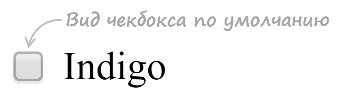
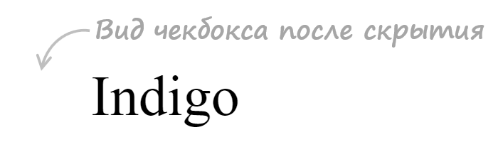
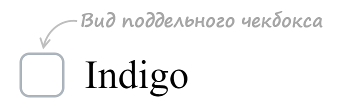
<label class="custom-checkbox">
  <input type="checkbox" value="value-1">
  <span>Indigo</span>
</label>
CSS код:
/* для элемента input c type="checkbox" */
.custom-checkbox>input {
position: absolute;
z-index: -1;
opacity: 0;
}
/* для элемента label, связанного с .custom-checkbox */
.custom-checkbox>span {
display: inline-flex;
align-items: center;
user-select: none;
}
/* создание в label псевдоэлемента before со следующими стилями */
.custom-checkbox>span::before {
content: '';
display: inline-block;
width: 1em;
height: 1em;
flex-shrink: 0;
flex-grow: 0;
border: 1px solid #adb5bd;
border-radius: 0.25em;
margin-right: 0.5em;
background-repeat: no-repeat;
background-position: center center;
background-size: 50% 50%;
}
/* стили при наведении курсора на checkbox */
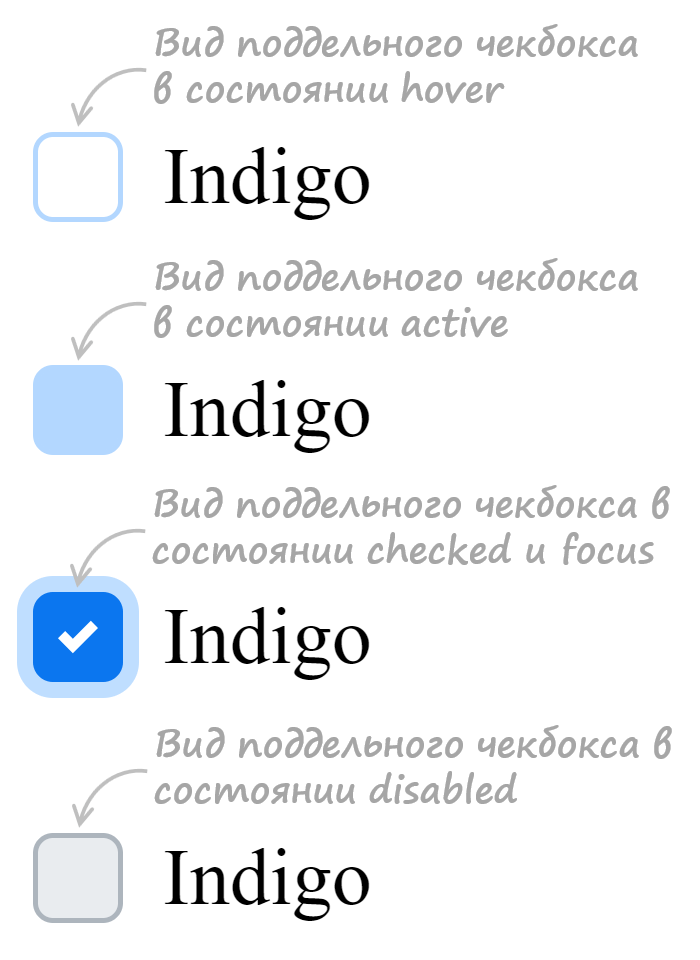
.custom-checkbox>input:not(:disabled):not(:checked)+span:hover::before {
border-color: #b3d7ff;
}
/* стили для активного чекбокса (при нажатии на него) */
.custom-checkbox>input:not(:disabled):active+span::before {
background-color: #b3d7ff;
border-color: #b3d7ff;
}
/* стили для чекбокса, находящегося в фокусе */
.custom-checkbox>input:focus+span::before {
box-shadow: 0 0 0 0.2rem rgba(0, 123, 255, 0.25);
}
/* стили для чекбокса, находящегося в фокусе и не находящегося в состоянии checked */
.custom-checkbox>input:focus:not(:checked)+span::before {
border-color: #80bdff;
}
/* стили для чекбокса, находящегося в состоянии checked */
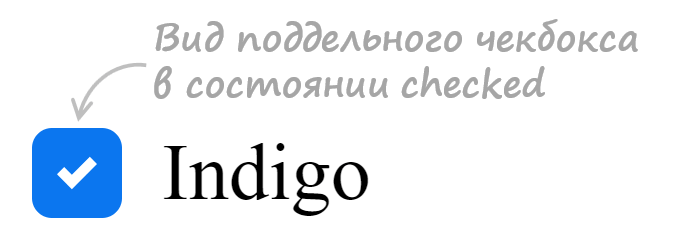
.custom-checkbox>input:checked+span::before {
border-color: #0b76ef;
background-color: #0b76ef;
background-image: url("data:image/svg+xml,%3csvg xmlns='http://www.w3.org/2000/svg' viewBox='0 0 8 8'%3e%3cpath fill='%23fff' d='M6.564.75l-3.59 3.612-1.538-1.55L0 4.26 2.974 7.25 8 2.193z'/%3e%3c/svg%3e");
}
/* стили для чекбокса, находящегося в состоянии disabled */
.custom-checkbox>input:disabled+span::before {
background-color: #e9ecef;
}
Открыть пример
2. Стилизация radio, когда input расположен в label.
HTML разметка:
<label class="custom-radio">
  <input type="radio" name="color" value="indigo">
  <span>Indigo</span>
</label>
CSS код:
/* для элемента input c type="radio" */
.custom-radio>input {
  position: absolute;
  z-index: -1;
  opacity: 0;
}

/* для элемента label связанного с .custom-radio */
.custom-radio>span {
  display: inline-flex;
  align-items: center;
  user-select: none;
}

/* создание в label псевдоэлемента  before со следующими стилями */
.custom-radio>span::before {
  content: '';
  display: inline-block;
  width: 1em;
  height: 1em;
  flex-shrink: 0;
  flex-grow: 0;
  border: 1px solid #adb5bd;
  border-radius: 50%;
  margin-right: 0.5em;
  background-repeat: no-repeat;
  background-position: center center;
  background-size: 50% 50%;
}

/* стили при наведении курсора на радио */
.custom-radio>input:not(:disabled):not(:checked)+span:hover::before {
  border-color: #b3d7ff;
}

/* стили для активной радиокнопки (при нажатии на неё) */
.custom-radio>input:not(:disabled):active+span::before {
  background-color: #b3d7ff;
  border-color: #b3d7ff;
}

/* стили для радиокнопки, находящейся в фокусе */
.custom-radio>input:focus+span::before {
  box-shadow: 0 0 0 0.2rem rgba(0, 123, 255, 0.25);
}

/* стили для радиокнопки, находящейся в фокусе и не находящейся в состоянии checked */
.custom-radio>input:focus:not(:checked)+span::before {
  border-color: #80bdff;
}

/* стили для радиокнопки, находящейся в состоянии checked */
.custom-radio>input:checked+span::before {
  border-color: #0b76ef;
  background-color: #0b76ef;
  background-image: url("data:image/svg+xml,%3csvg xmlns='http://www.w3.org/2000/svg' viewBox='-4 -4 8 8'%3e%3ccircle r='3' fill='%23fff'/%3e%3c/svg%3e");
}

/* стили для радиокнопки, находящейся в состоянии disabled */
.custom-radio>input:disabled+span::before {
  background-color: #e9ecef;
}
Открыть пример
Благодаря CSS3, мы можем добиться практически любого нужного нам на экране эффекта. В этом уроке рассмотрим, каким образом можем стилизовать чекбоксы и радио кнопки.


Существует 2 типа элементов форм, которые очень трудно стилизовать под себя (особенно задать один стиль для всех платформ) — Windows, OS X, Linux по-своему отображают данные элементы.

Итак, начинаем!
HTML код
начнём мы с создания html документа со следующей структурой:
Радио кнопки
<div class="radio">
	<input id="male" type="radio" name="gender" value="male">
	<label for="male">Male</label>
	<input id="female" type="radio" name="gender" value="female">
	<label for="female">Female</label>
</div>
Чекбоксы
<div class="checkbox">
	<input id="check1" type="checkbox" name="check" value="check1">
	<label for="check1">Checkbox No. 1</label>
	<br>
	<input id="check2" type="checkbox" name="check" value="check2">
	<label for="check2">Checkbox No. 2</label>
</div>
CSS
С html структурой мы закончили. Теперь давайте посмотрим, каким образом мы можем стилизовать элементы <input>. Первым делом возьмёмся за радио элементы. Отображение позаимствуем с дизайна OS:

Стилизуем радиокнопки
В первую очередь, мы меняем иконку курсора на pointer (появляется рука с пальцем), для того чтобы пользователь понимал, что данный элемент кликабилен:
label {
	display: inline-block;
	cursor: pointer;
	position: relative;
	padding-left: 25px;
	margin-right: 15px;
	font-size: 13px;
}
Затем спрячем радио кнопку по её атрибуту:
input[type=radio] {
	display: none;
}
Заменяем скрытый элемент псевдо классом :before.
label:before {
	content: "";
	display: inline-block;

	width: 16px;
	height: 16px;

	margin-right: 10px;
	position: absolute;
	left: 0;
	bottom: 1px;
	background-color: #aaa;
	box-shadow: inset 0px 2px 3px 0px rgba(0, 0, 0, .3), 0px 1px 0px 0px rgba(255, 255, 255, .8);
}
Такой же стиль мы применим и к чекбоксу. Разница только в том, что для радио кнопки нам нужно сформировать окружность. Добиться подобного эффекта мы можем, воспользовавшись border-radius и задав радиус в половину ширины и высоты элемента.
.radio label:before {
	border-radius: 8px;
}
На данном этапе наши элементы должны выглядеть вот так:

Теперь нам нужно добавить мелкие кружочки в основной круг при клике по кнопке. Для этого воспользуемся псевдо-элементом CSS3 :checked, и в качестве контента запишем HTML символ круга • •, но для того чтобы всё отображалось так, как нам нужно, данное значение нужно преобразовать для CSS. Для этого можем воспользоваться сервисом Entity Conversion Tool
input[type=radio]:checked + label:before {
    content: "2022";
    color: #f3f3f3;
    font-size: 30px;
    text-align: center;
    line-height: 18px;
}
Теперь когда мы нажмём на радио кнопку, в основном сером круге должен появиться маленький белый кружок.

Стилизуем чекбоксы
Теперь давайте займёмся оформление чекбоксов. Для начала снова спрячем элемент:
input[type=checkbox] {
	display: none;
}
Поскольку мы убираем стандартное отображение чекбокса при помощи псевдо-элемента :before, просто добавим рамку:
.checkbox label:before {
	border-radius: 3px;
}
Затем добавим символ “галочка”, который появится при клике по чекбоксу. Сделаем это по аналогии с радиокругом. На этот раз нам понадобится преобразовать HTML символ ? ✓.
input[type=checkbox]:checked + label:before {
	content: "2713";
	text-shadow: 1px 1px 1px rgba(0, 0, 0, .2);
	font-size: 15px;
	color: #f3f3f3;
	text-align: center;
    line-height: 15px;
}
В итоге, вот что у нас должно получиться:

Итоги
В этом уроке мы рассмотрели способ, который вы можете использовать для нужного вам отображения радио кнопок и чекбоксов. Поскольку мы использовали CSS3, то данная техника будет работать только в браузерах, которые поддерживают эту технологию. Для того чтобы добиться подобных результатов в более старых браузерах, можете воспользоваться соответствующим jQuery плагином.
I builded another fork of @klewis’ code sample to demonstrate some playing with pure css and gradients by using :before/:after pseudo elements and a hidden radio input button.

HTML:
sample radio buttons:
<div style="background:lightgrey;">
    <span class="radio-item">
        <input type="radio" id="ritema" name="ritem" class="true" value="ropt1" checked="checked">
        <label for="ritema">True</label>
    </span>

    <span class="radio-item">
        <input type="radio" id="ritemb" name="ritem" class="false" value="ropt2">
        <label for="ritemb">False</label>
    </span>
</div>
:
CSS:
.radio-item input[type='radio'] {
    visibility: hidden;
    width: 20px;
    height: 20px;
    margin: 0 5px 0 5px;
    padding: 0;
}
    .radio-item input[type=radio]:before {
        position: relative;
        margin: 4px -25px -4px 0;
        display: inline-block;
        visibility: visible;
        width: 20px;
        height: 20px;
        border-radius: 10px;
        border: 2px inset rgba(150,150,150,0.75);
        background: radial-gradient(ellipse at top left, rgb(255,255,255) 0%, rgb(250,250,250) 5%, rgb(230,230,230) 95%, rgb(225,225,225) 100%);
        content: "";
    }
        .radio-item input[type=radio]:checked:after {
            position: relative;
            top: 0;
            left: 9px;
            display: inline-block;
            visibility: visible;
            border-radius: 6px;
            width: 12px;
            height: 12px;
            background: radial-gradient(ellipse at top left, rgb(245,255,200) 0%, rgb(225,250,100) 5%, rgb(75,175,0) 95%, rgb(25,100,0) 100%);
            content: "";
        }
            .radio-item input[type=radio].true:checked:after {
                background: radial-gradient(ellipse at top left, rgb(245,255,200) 0%, rgb(225,250,100) 5%, rgb(75,175,0) 95%, rgb(25,100,0) 100%);
            }
            .radio-item input[type=radio].false:checked:after {
                background: radial-gradient(ellipse at top left, rgb(255,225,200) 0%, rgb(250,200,150) 5%, rgb(200,25,0) 95%, rgb(100,25,0) 100%);
            }
.radio-item label {
    display: inline-block;
    height: 25px;
    line-height: 25px;
    margin: 0;
    padding: 0;
}
preview:
https://www.codeply.com/p/y47T4ylfib
Радио-кнопки подразумевают, что вы выбираете один элемент из некоторого количества, поэтому элемент <input type="radio"> получил название переключателя в отличие от флажков, которые подразумевают множественный выбор. Браузеры довольно неплохо отображают радиокнопки по умолчанию.
Выбор 1
Выбор 2
Выбор 2
Однако, вам может понадобится как-то стилизовать эти элементы для своего сайта.
Как правило, стилизация радио-кнопок основана на использовании такого элемента, как label, клик на котором приводит к выбору определенного переключателя, с которым <label> связан с помощью атрибута for, в котором указывается id переключателя. Второй вариант — это когда в разметке радио-переключатель находится внутри элемента label.
Простой пример
See the Pen CSS Radio Buttons by Tristan White (@triss90) on CodePen.18892
Радио-кнопки, похожие на флажки
Если вы хотите стилизовать переключатели в виде флажков — пример от Andrew Vereshchak — как раз то, что нужно.
See the Pen Toggle radio intput with the label by Andrew Vereshchak (@multum) on CodePen.18892
Переключатели с изменением цвета и иконки
Здесь автор Andrew использовал абсолютное позиционирование для отдельного блока с классом .switch, в который входят 2 <label> и <span>. Также здесь не обошлось без псевдоэлемента ::after и псевдокласса :checked.
See the Pen Awesome Toggle Button by Andrew (@theawesomecoder61) on CodePen.18892
Разноцветные радио-кнопки
В этом примере от Dronca Raul каждый переключатель имеет свой цвет и галочку внутри при щелчке на элементе.
See the Pen Custom Radio Buttons by Dronca Raul (@rauldronca) on CodePen.18892
Используем переключатели для выбора цвета
В этом примере тема цветов для переключателей продолжается. Здесь мы не только прячем элемент <input type="radio"> с помощью CSS, но и изменяем фоновый цвет элемента с id="output" на тот, который указан в качестве value для <input> и фона для span-элемента, вло женного в <label>.
See the Pen Radio Color Picker by Elen (@ambassador) on CodePen.18892
Переключатели Да-Нет-Возможно
Еще одно цветовое решение от Matthew Blode.
See the Pen Flat Radio — Yes/No by Matthew Blode (@mblode) on CodePen.18892
Переключатель макета
Этот пример от Naoya очень удобен для демонстрации макетов с разной шириной. Интересно, что радио-кнопки, а точнее заменяющие их элементы label выглядят как … ссылки с подчеркиванием выбранного (псевдокласс :checked) в данный момент элемента.
See the Pen CSS Switch Layout by Naoya (@nxworld) on CodePen.18892
Вкладки-переключатели с анимацией
See the Pen Sliding tabs | CSS transitions only by Håvard Brynjulfsen (@havardob) on CodePen.0
Переключатель для света
Автор Ryan Mulligan
See the Pen Isometric Light Switch by Elen (@ambassador)
on CodePen.0
Выбор блюд
В этом примере от Kris Hedstrom радио-кнопки в какой-то степени похожи на чекбоксы (флажки) — они отмечают ваш выбор в виде галочки.
See the Pen Snacks? Flat radio button inputs… by Kris Hedstrom (@kristofferh) on CodePen.18892
Варианты переключателей с иконками для выбора инструментов, цены и др.
Автор Ivan Grozdic
See the Pen Checkboxes and radios (dark/light) — pure css — #06 by Ivan Grozdic (@ig_design)on CodePen.0
Использование радио-кнопок для выставления рейтинга в виде звездочек
Автор Stas Melnikov
See the Pen Pure CSS Rating via CSS Custom Properties as API by Stas Melnikov (@melnik909) on CodePen.18892
Анимация при переключении выбора
Несколько примеров, в которых использована анимация при переключении между радио-кнопками.
Автор: Tommaso Poletti
See the Pen Jelly Radio Button by Tommaso Poletti (@tomma5o) on CodePen.18892
Простые переключения с эффектом вдавливания от Pamela Dayne
See the Pen Just very simple radio buttons by Pamela Dayne (@pamdayne) on CodePen.18892
Переключение с перепрыгиванием от Jon Kantner
See the Pen Radio Hopping by Jon Kantner (@jkantner)
on CodePen.0
Автор Liam использовал для анимации JS-код.
See the Pen Bulgy radios by Liam (@liamj) on CodePen.18892
Интересное решение с радио-кнопками на темном фоне от Andrej Sharapov
See the Pen Animated SVG radio buttons by Andrej Sharapov (@andrejsharapov) on CodePen.18892
Анимация и стили как для радио-кнопок, так и для флажков от WILDER TAYPE.
See the Pen Ripple animation on input type radio and Checkbox by WILDER TAYPE (@wilder_taype) on CodePen.18892
Использование маски
See the Pen Underground radios by Mikael Ainalem (@ainalem) on CodePen.18892
«Текущая» кнопка
See the Pen Liquid Radio Button by Tamino Martinius (@Zaku) on CodePen.18892
Замечательное решение для переключения кнопок меню
See the Pen Material Radio Button by CODEARMADA (@montechristos) on CodePen.18892
Последовательное и быстрое заполнение кнопки
See the Pen Input Radio by Andreas Storm (@avstorm) on CodePen.18892
Выбираем кредитную карту вместе с Dean
See the Pen Recreation: Card theme switcher by Dean (@visualcookie) on CodePen.18892
Перепрыгивающий шарик от Jon Kantner
Вариант 1
See the Pen Radio Buttons With Marble and Wood by Jon Kantner (@jkantner) on CodePen.18892
Вариант 2
See the Pen Rolling Radio Buttons by Jon Kantner (@jkantner) on CodePen.18892
Вариант 3 от web-tiki
See the Pen CSS only input radio select concept by web-tiki (@web-tiki) on CodePen.18892
Переключатели в виде блоков с иконками
Автор Gabriel Ferreira предлагает использовать переключатели в виде блоков с анимированными иконками. Это можно сделать не только для Front-End/Back-End, но и для любых других текстов.
See the Pen Radio Button Big Square [Just CSS] by Gabriel Ferreira (@gabrielferreira) on CodePen.18892
Переключатель мужчина-женщина
See the Pen Radio button styling by Morten Olsen (@morten-olsen) on CodePen.18892
Соединительные линии, ведущие к радио-кнопкам
See the Pen Radio Button Circuit by LukasOe (@lukasoe) on CodePen.18892
Переключатели с отметкой в верхнем углу блока
При клике на блоке выбор отмечается сменой цвета и галочкой в круге от Rosa.
See the Pen Checkout Form by Rosa (@RRoberts) on CodePen.18892
Радио-кнопки как переключатели для радио от Jon Kantner
Вариант 1
See the Pen Literal Radio Buttons by Jon Kantner (@jkantner) on CodePen.18892
Вариант 2
See the Pen Literal Radio Buttons (Neumorphic Version) by Jon Kantner (@jkantner) on CodePen.18892
Радио-кнопки для вкладок (табов)
Ronny Siikaluoma предлагает вам использовать радио-кнопки для формирования отзывчивых (адаптивных) вкладок. Заметьте, без всякого JavaScript.
See the Pen Responsive Tabs with Pure CSS by Ronny Siikaluoma (@siiron) on CodePen.18892
Еще один вариант вкладок от Tristan White
See the Pen Tabs (checkbox-hack) by Tristan White (@triss90) on CodePen.18892
Выбор билетов с ценой и временем от Dannie Vinther
See the Pen Choose Ticket [a11y] by Dannie Vinther (@dannievinther) on CodePen.18892
Социальные кнопки
В этом примере от Aron использованы не только радио-кнопки, но и флажки (чекбоксы). При клике на элемент вы увидите pop-up окно с названием выбранной компании или соцсети.
See the Pen Pure CSS Option ( radio & checkbox ) No JS by Aron (@Aoyue) on CodePen.18892
Переключение иконок Google maps
See the Pen Google maps radio buttons CSS only by Elias Meire (@eliasmeire) on CodePen.18892
Переключение цветовых блоков
В этом примере от Ivan Grozdic элементы label выглядят и работают как ссылки, но без JavaScript, сортируя цветовые блоки.
See the Pen Content filter v2 — pure css — #09 by Ivan Grozdic (@ig_design) on CodePen.18892
Использование радио-кнопок для фильтации по категориям
Автор примера от ресурса Envato Tuts+ предлагают css-код, который без JavaScript служит для фильтрации категорий портфолио.
See the Pen
Build a Filtering Component in Pure CSS by Envato Tuts+ (@tutsplus)
on CodePen.0
Просмотров: 6 747
Using a combination of the following properties, we can create custom, accessible, cross-browser, theme-able, scalable radio buttons in pure CSS:
currentColorfor theme-abilityemunits for relative sizingappearance: nonefor full restyling access- CSS grid layout to align the input and label
Head’s up: A lot of these styles overlap with the episode on custom checkbox styles which you might be interested in reading next!
Now available: my egghead video course Accessible Cross-Browser CSS Form Styling. You’ll learn to take the techniques described in this tutorial to the next level by creating a themable form design system to extend across your projects.
Radio Button HTML
There are two appropriate ways to layout radio buttons in HTML.
The first wraps the input within the label. This implicitly associates the label with the input that its labeling, and also increases the hit area to select the radio.
<label>
  <input type="radio" name="radio" />
  Radio label text
</label>
The second is to have the input and label be siblings and use the for attribute set to the value of the radio’s id to create the association.
<input type="radio" name="radio" id="radio1" />
<label for="radio1">Radio label text</label>
Our technique will work with either setup, although we’re going to select the wrapping label method to prevent including an extra div.
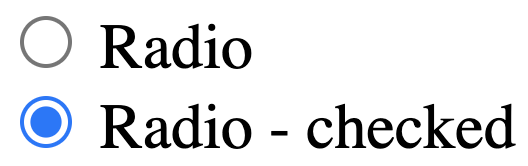
The base HTML for our demo including classes and two radios — necessary to test :checked vs. un-checked states — is the following:
<label class="form-control">
  <input type="radio" name="radio" />
  Radio
</label><label class="form-control">
  <input type="radio" name="radio" />
  Radio - checked
</label>
For groups of radio buttons, it is also necessary to provide the same name attribute.
Here’s how the native HTML elements in Chrome appear:
Common Issues with Native Radio Buttons
The primary issue that causes developers to seek a custom styling solution for radio buttons is the variance in their appearance between browsers which is increased when including mobile browsers as well.
As an example, here are radio buttons as shown on Mac versions of Firefox (left), Chrome (middle), and Safari (right):

Our solution will accomplish the following goals:
- scale with the
font-sizeprovided to thelabel - gain the same color as provided to the label for ease of theme-ability
- achieve a consistent, cross-browser design style, including
:focusstate - maintain keyboard and color contrast accessibility
If your primary goal is modifying the
:checkedstate color, you may be interested in learning more about the upcomingaccent-colorproperty from Michelle Barker’s overview.
Theme Variable and box-sizing Reset
There are two base CSS rules that must be placed first in our cascade.
First, we create a custom variable called --color which we will use as a simple way to easily theme our radio buttons.
:root {
  --form-control-color: rebeccapurple;
}
Next, we use the universal selector to reset the box-sizing method used to border-box. This means that padding and border will be included in the calculation of any elements computed final size instead of increasing the computed size beyond any set dimensions.
*,
*:before,
*:after {
  box-sizing: border-box;
}
Label Styles
Our label uses the class of .form-control. The base styles we’ll include here are font styles. Recall from earlier that the font-size will not yet have an effect on the visual size of the radio input.
CSS for «.form-control font styles»
.form-control {
  font-family: system-ui, sans-serif;
  font-size: 2rem;
  font-weight: bold;
  line-height: 1.1;
}
We’re using an abnormally large font-size just to emphasize the visual changes for purposes of the tutorial demo.
Our label is also the layout container for our design, and we’re going to set it up to use CSS grid layout to take advantage of gap.
CSS for «.form-control grid layout»
.form-control {
  font-family: system-ui, sans-serif;
  font-size: 2rem;
  font-weight: bold;
  line-height: 1.1;
  display: grid;
  grid-template-columns: 1em auto;
  gap: 0.5em;
}
Custom Radio Button Style
Ok, this is the part you came here for!
The original version of this tutorial demonstrated use of extra elements to achieve the desired effect. Thanks to improved support of
appearance: noneand with appreciation to Scott O’Hara’s post on styling radio buttons and checkboxes, we can rely on pseudo elements instead!
Step 1: Hide the Native Radio Input
We need to hide the native radio input, but keep it technically accessible to enable proper keyboard interaction and also to maintain access to the :focus state.
To accomplish this, we only need to set appearance: none. This removes nearly all inherited browser styles and gives us access to styling the input’s pseudo elements. Notice we have two additional properties to complete the reset.
CSS for «hiding the native radio input»
input[type="radio"] {
  /* Add if not using autoprefixer */
  -webkit-appearance: none;
  appearance: none;
  /* For iOS < 15 to remove gradient background */
  background-color: #fff;
  /* Not removed via appearance */
  margin: 0;
}
Worried about support? This combination of using
appearance: noneand the ability to style the input’s pseudo elements has been supported since 2017 in Chrome, Safari, and Firefox, and in Edge since their switch to Chromium in May 2020.
Step 2: Custom Unchecked Radio Styles
For our custom radio, we’ll update box styles on the base input element. This includes inheriting the font styles to ensure the use of em produces the desired sizing outcome, as well as using currentColor to inherit any update on the label’s color.
We use em for the width, height, and border-width value to maintain the relative appearance. Good ole border-radius: 50% finishes the expected appearance by rendering the element as a circle.
CSS for «custom unchecked radio styles»
input[type="radio"] {
  appearance: none;
  background-color: #fff;
  margin: 0;
  font: inherit;
  color: currentColor;
  width: 1.15em;
  height: 1.15em;
  border: 0.15em solid currentColor;
  border-radius: 50%;
}

.form-control + .form-control {
  margin-top: 1em;
}
Finally, we slid in a little style to provide some space between our radios by applying margin-top with the help of the adjacent sibling combinator;
Step 3: Improve Input vs. Label Alignment
If you’ve worked with grid or flexbox, your instinct right now might be to apply align-items: center to optically tune the alignment of the input in relation to the label text.
But what if the label is long enough to become broken across multiple lines? In that case, alignment along horizontal center may be undesirable.
Instead, let’s make adjustments so the input stays horizontally centered in relation to the first line of the label text.
On our input, we’ll use transform to nudge the element up. This is a bit of a magic number, but as a starting point this value is half the size of the applied border.
CSS for «improve input vs. label alignment»
input[type="radio"] {
  appearance: none;
  background-color: #fff;
  margin: 0;
  font: inherit;
  color: currentColor;
  width: 1.15em;
  height: 1.15em;
  border: 0.15em solid currentColor;
  border-radius: 50%;
  transform: translateY(-0.075em);
}
And with that our alignment is complete and functional for both single-line and multi-line labels.
Step 4: The :checked State
It’s now time to bring in our ::before pseudo element which will be styled in order to represent the :checked state.
The
:checkednaming convention may be a little confusing here, but it is a CSS selector that is available for both radio buttons and checkboxes.
We first need to change the display behavior of the input to use grid:
input[type="radio"] {
  /* ...existing styles */  display: grid;
  place-content: center;
}
This is the quickest way to align the :before to the horizontal and vertical center of our custom control.
Then, we create the :before element, including a transition and using transform hide it with scale(0):
input[type="radio"]::before {
  content: "";
  width: 0.65em;
  height: 0.65em;
  border-radius: 50%;
  transform: scale(0);
  transition: 120ms transform ease-in-out;
  box-shadow: inset 1em 1em var(--form-control-color);
}
Use of box-shadow instead of background-color will enable the state of the radio to be visible when printed (h/t Alvaro Montoro).
Finally, when the input is :checked, we make it visible with scale(1) with a nicely animated result thanks to the transition. Be sure to click between the radios to see the animation!
CSS for «:checked state styles»
input[type="radio"] {
/* ...existing styles */
display: grid;
place-content: center;
}input[type="radio"]::before {
content: "";
width: 0.65em;
height: 0.65em;
border-radius: 50%;
transform: scale(0);
transition: 120ms transform ease-in-out;
box-shadow: inset 1em 1em var(--form-control-color);
}
input[type="radio"]:checked::before {
transform: scale(1);
}
High Contrast Themes and Forced Colors
One more state we need to ensure our radio responds to is what you may hear referred to as «Windows High Contrast Mode» (WHCM). In this mode, the user’s operating system swaps out color-related properties for a reduced palette which is an incoming part of the CSS spec called «forced-colors».
In this mode, our box-shadow is completely removed, leaving these users without an indicator of the checked state.
Fortunately, resolving this involves adding just one extra property. We’ll provide a background-color, which is normally removed in forced-colors mode, but will be retained if we use one of the defined forced colors. In this case, we’re selecting CanvasText which will match the regular body text color.
Due to the style stacking order, our box-shadow that we’ve themed for use in regular mode is actually visuallly placed over the background-color, meaning we can use both without any further modifications.
CSS for «supporting forced-colors»
input[type="radio"]::before {
  /* ...existing styles */  /* Windows High Contrast Mode */
  background-color: CanvasText;
}
Step 5: The :focus State
Depending on your browser, you may already be seeing some kind of a focus style provided as an outline. We’ll add just a tiny bit of customization to make it match our input’s color, and provide some space from the input by using outline-offset.
This is a simplification from the earlier version of this tutorial which used box-shadow. Now, evergreen browsers all support outline which follows border-radius, removing an excuse not to just use the outline!
Remember:
:focusis a temporary state, but it’s very important that it is highly visible to ensure the accessibility of your form controls and other interactive elements.
CSS for «:focus state styles»
input[type="radio"]:focus {
  outline: max(2px, 0.15em) solid currentColor;
  outline-offset: max(2px, 0.15em);
}
And with that, the essential styles for a custom radio button are complete! 🎉
Experimental: Using :focus-within to Style the Label Text
Since the label is not a sibling of the native input, we can’t use the :focus state of the input to style it.
An upcoming pseudo selector is :focus-within, and one feature is that it can apply styles to elements that contain an element which has received focus.
The ModernCSS episode on a pure CSS accessible dropdown navigation menu also covered
:focus-within.
For now, any critial usage of :focus-within requires a polyfill, so the following styles should be considered an enhancement and not relied on as the only way to provide a visual indication of focus.
We’ll test for focus by adding a rule for :focus-within on the label (.form-control). This means when the native input — which is a child and therefore «within» the label — receives focus, we can style any element within the label while focus is active.
CSS for «experimental :focus-within styles»
.form-control:focus-within {
  color: var(--form-control-color);
}
Demo
Here is the solution altogether in a CodePen that you can fork and experiment with further.
By Stephanie Eckles (@5t3ph)
Check out the custom checkbox styling to also learn how to extend styles to the :disabled state, and see how to work with clip-path as a :checked indicator.
Styling native radio input elements cross-browser is a bit more painful than it should be. Over the years, lots and lots of blogs have discussed this topic and provided various styling workarounds. Most solutions involve showing additional pseudo elements such as
[type=radio]:checked::before,
[type=checkbox]:checked::before {
  content: "";
  width: 14px;
  height: 14px;
  background-color: #ffa500;
  position: absolute;
  top: 2px;
  left: 2px;
}
Modern CSS to the rescue
With some simple and modern CSS, we can now style radio button input elements even easier. Below are three different options, each having its pros and cons. You can try out the different options in the CodePen below.
See the Pen
Styled radio buttons by Bryntum (@bryntum)
on CodePen.
Using accent-color
The CSS property accent-color styles some native elements by changing their accent color. This property is widely supported in 2022. But it is not fully supported and most browsers only started supporting it in 2021.
body {
  accent-color: red;
}
Pros
- Simple to use
Cons
- Low stylability
- Not fully supported
Using box-shadow
Both the box-shadow and the outline solutions are accomplished by hiding the native appearance of the element. And then with a combination of background, border and an outer circle, we create a new appearance which will is easier to style.
input {

  /* The native appearance is hidden */
  appearance: none;
  -webkit-appearance: none;

  /* For a circular appearance we need a border-radius. */
  border-radius: 50%;

  /* The background will be the radio dot's color. */
  background: #FF572233;

  /* The border will be the spacing between the dot and the outer circle */
  border: 3px solid #FFF;

  /* And by creating a box-shadow with no offset and no blur, we have an outer circle */
  box-shadow: 0 0 0 1px #FF5722;
}
Note that in some cases the box-shadow can be clipped by it’s container. In these cases, a margin can be a good solution.
Pros
- Full support
- High stylability
Cons
- Scales badly in some environments.
Using outline
The outline solution applies the same technique as the box-shadow solution, but creates the outer circle using the outline property instead. Outline is widely supported, but not in combination with border-radius which does not work as expected in Safari.
Note that the outline is the browser’s default focus style. When changing the outline style, you should always have accessibility in mind.
input {
  appearance: none;
  -webkit-appearance: none;
  border-radius: 50%;
  background: #e8e8e8;
  border: 3px solid #FFF;

  /* The outline will be the outer circle */
  outline: 1px solid #999;
}
Pros
- Scales better than box-shadow
- High stylability
- Does not affect layout
Cons
- No Safari support.
Which one to choose?
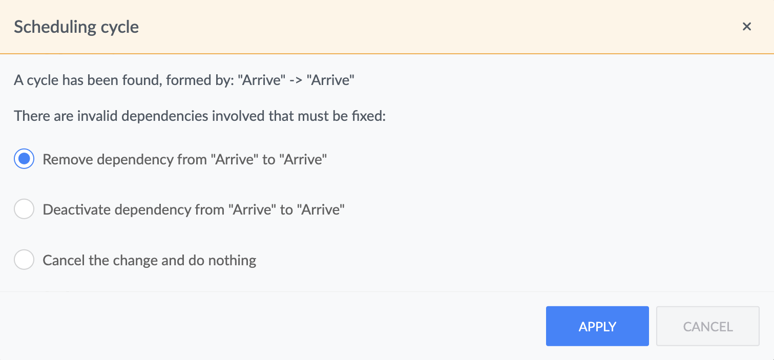
In the upcoming 5.1 release, we at Bryntum decided to use the `box-shadow` option in our Radio button widget. It provides a reliable cross-browser appearance and it is compatible with a bit older browsers. You can see this in action in our conflict resolution dialog in the Scheduler Pro.

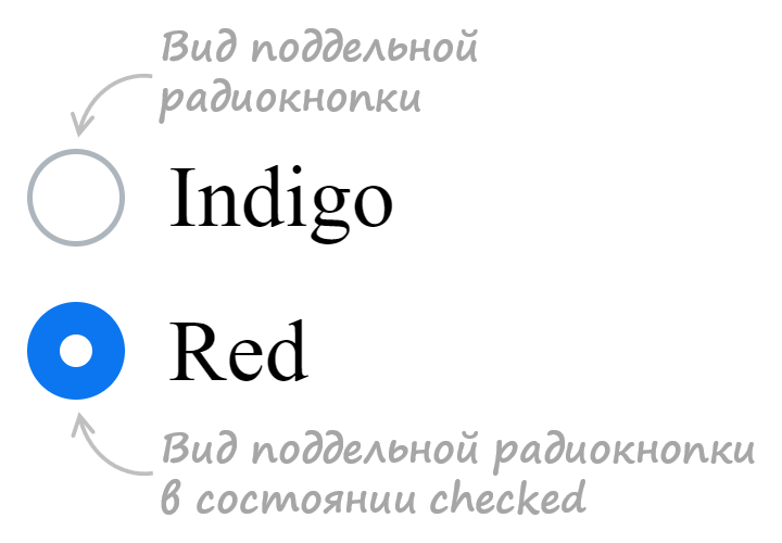
На этом уроке вы узнаете, как стилизовать стандартные радио кнопки под свой дизайн, с помощью HTML и CSS. На сайтах радио кнопки чаще всего используются в формах, когда пользователю предоставляется сделать выбор в рамках указанных вариантов.
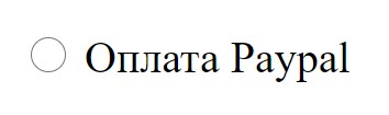
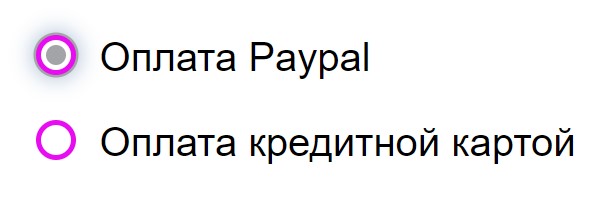
Изображаем настоящую радиокнопку на HTML
Отрисовывается радиокнопка с помощью тега input с типом radio. Обычно в комплекте с кнопкой идет label — привязанная к кнопке метка в виде текста. Когда мы кликаем по тексту, то радиокнопка становится выбранной, необязательно целиться в сам кругляш.
<div class="form-group">

    <label>

        <input type="radio">

        Оплата Paypal

    </label>

</div>
Вот так выглядит стандартная кнопка в браузере Google Chrome. В других браузерах её внешний вид будет отличаться. Но по любому нам нужно учиться стилизовать радиокнопки, чтобы не впадать в панику, беря заказы на верстку. Элементы форм есть практически на всех сайтах.
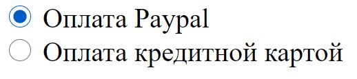
Чтобы было из чего выбирать, создадим вторую радиокнопку. Обе кнопки будет объединять атрибут name с одинаковым значением — payment. У объединенных радиокнопок в группу по атрибуту name, можно будет выбрать только одну. Общий класс form-group задает отступы между кнопками. А класс real-radio-btn скрывает реальную радиокнопку. Выбранная радиокнопка передает на сервер значение, чтобы было понятно, что именно выбрал пользователь. Поэтому пропишем каждой радиокнопке свое уникальное значения value.
<div class="form-group">

    <label>

        <input type="radio" name="payment" value="paypal" class="real-radio-btn">

        Оплата Paypal

    </label>

</div>

<div class="form-group">

    <label>

        <input type="radio" name="payment" value="card" class="real-radio-btn">

        Оплата кредитной картой

    </label>

</div>
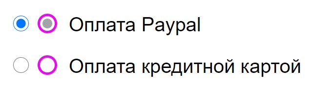
Кастомная радиокнопка
Идея кастомизации реальной кнопки заключается в ее сокрытии и создании рядом новой кастомной радио кнопки. По другому никак, с помощью CSS нельзя изменить внешний вид инпута. Кастомная радиокнопка будет выполнять маскировочно-декоративную роль для реальной кнопки.
HTML код кастомной кнопки мы разместим следующей строчкой под инпутом.
<span class="custom-radio-btn"></span>
Теперь у нас есть реальная и кастомная радиокнопки, но чтобы что-то изменилось необходимо задействовать CSS стили. Кастомная кнопка состоит из внешнего и внутреннего круга. Чтобы не создавать лишнего тега, нарисуем внутренний круг с использованием псевдоэлемента before.
/* Рисуем внешний круг радиокнопки*/


.custom-radio-btn {

    position: relative; /* Родительский элемент*/

    display: inline-block; /* Для применения рамок, размеров*/

    width: 16px;

    height: 16px;

    background: #fff;

    border: 2px solid #e80cf0; /* Толщина, стиль, цвет рамки*/

    border-radius: 50%; /* Получение круга*/

    vertical-align: text-top; /* Выравнивание кнопки по центру*/

    margin-right: 5px; /* Отступ между кнопкой и меткой*/

}
/* Рисуем внутренний круг */
.custom-radio-btn::before {
content: '';
display: inline-block;
width: 8px;
height: 8px;
background: #a3a4a7;
border-radius: 50%;
/* Выравниваем по центру относительно внешнего круга */
position: absolute;
left: 50%;
top: 50%;
transform: translate(-50%, -50%) scale(0);
/* Плавный переход трансформации масштабирования */
transition: 0.2s ease-in;
}
Как работает механизм checked у кастомной кнопки
Кастомная кнопка сама по себе не может быть выбрана, если мы кликнем по ней или по тексту. Когда мы кликаем по тексту, то выбирается реальная кнопка, только кастомная кнопка об этом не знает. Формируем сложный селектор из реальной кнопки и соседней. Селектор с оператором (+) как раз создаст зависимость появления внутреннего круга от состояния реальной кнопки. Если реальная кнопка находится в состоянии checked, значит выполняется свойство трансформации для кастомного внутреннего круга.
.real-radio-btn:checked + .custom-radio-btn::before {

    transform: translate(-50%, -50%) scale(1);

}
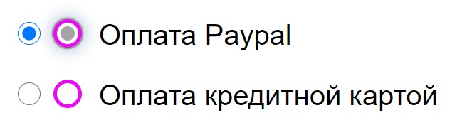
Скрываем реальную радио кнопку
Нельзя использовать свойство display: none, тогда не будет работать табуляция (клавиша tab).
.real-radio-btn {

/* Скрываем реальную радио кнопку*/

    width: 0;

    height: 0;

    position: absolute;

    opacity: 0;

    z-index: -1;

}
Без хороших знаний HTML|CSS будет трудно освоить профессию верстальщика. Мой видеокурс в короткие сроки научит верстать вас сайты любой сложности.
Посмотрите демо на CodePen
-

Создано 01.01.2021 10:06:40
-
Михаил Русаков

Копирование материалов разрешается только с указанием автора (Михаил Русаков) и индексируемой прямой ссылкой на сайт (http://myrusakov.ru)!
Добавляйтесь ко мне в друзья ВКонтакте: http://vk.com/myrusakov.
Если Вы хотите дать оценку мне и моей работе, то напишите её в моей группе: http://vk.com/rusakovmy.
Если Вы не хотите пропустить новые материалы на сайте,
то Вы можете подписаться на обновления: Подписаться на обновления
Если у Вас остались какие-либо вопросы, либо у Вас есть желание высказаться по поводу этой статьи, то Вы можете оставить свой комментарий внизу страницы.
Если Вам понравился сайт, то разместите ссылку на него (у себя на сайте, на форуме, в контакте):
-
Кнопка:
Она выглядит вот так:
-
Текстовая ссылка:
Она выглядит вот так: Как создать свой сайт
- BB-код ссылки для форумов (например, можете поставить её в подписи):

Атрибут type тега <input> со значением radio обычно используется для создания группы радиокнопок (переключателей), описывающих набор взаимосвязанных параметров. Одновременно пользователь может выбрать лишь одну радиокнопку из предложенных. Радиокнопки обычно отображаются как небольшие кружки, которые заполняются или подсвечиваются при наведении.
<input type="radio" id="radioButton">
Исходный код к данному интерактивному примеру находиться на GitHub репозитории. Если вы желаете внести свой вклад в проект интерактивных примеров, то склонируйте удалённый репозиторий https://github.com/mdn/interactive-examples и отправьте нам запрос на включение сделанных вами изменений «pull request».
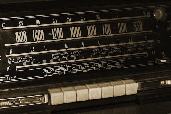
Радиокнопки называются так потому, что выглядят и функционируют в схожей манере с кнопками старомодных радиоприёмников, подобных представленному ниже.
Примечание: Чекбоксы (en-US) похожи на радиокнопки, но с одним важным отличием: радиокнопки предназначены для выбора одного значения из предложенных, в то время как чекбоксы позволяют «включать» и «выключать» значения. Если существует несколько элементов управления, то с помощью радиокнопок пользователь сможет выбрать лишь один из них, а чекбоксы позволят выбрать несколько значений одновременно.
| Value | Строка DOM отображающая значение радиокнопки |
|---|---|
| События | change (en-US) и input (en-US) |
| Универсальные атрибуты | checked |
| Атрибуты IDL | checked и value |
| Методы | select() (en-US) |
Атрибут value
Атрибут value — это строка DOM, содержащая значение радиокнопки. Это значение никогда не показывается пользователю его веб-браузером. Атрибут value используется для того, чтобы точно определить какая из радиокнопок была выбрана пользователем.
Создание группы радиокнопок
Группа радиокнопок определяется путём присвоения каждой радиокнопке в данной группе одного и того же значения атрибута (name). Выбор любой радиокнопки в этой группе автоматически отменяет выбор другой радиокнопки в той же группе.
Вы можете создать любое количество групп радиокнопок, если каждой из этих групп будет присвоено своё уникальное значение атрибута name.
Например, если в вашей форме необходимо запросить предпочитаемый способ контакта с пользователем, то вы можете создать три радиокнопки с name= "contact" , но с разными value = "email", value ="phone" и value = "mail" соответственно. Пользователь не видит атрибуты name и value (если только вы не добавляете код для их отображения).
HTML будет выглядеть следующим образом:
<form>
  <p>Please select your preferred contact method:</p>
  <div>
    <input type="radio" id="contactChoice1"
     name="contact" value="email">
    <label for="contactChoice1">Email</label>

    <input type="radio" id="contactChoice2"
     name="contact" value="phone">
    <label for="contactChoice2">Phone</label>

    <input type="radio" id="contactChoice3"
     name="contact" value="mail">
    <label for="contactChoice3">Mail</label>
  </div>
  <div>
    <button type="submit">Submit</button>
  </div>
</form>
Здесь вы видите три радиокнопки, каждая из которых имеет атрибут name со значением "contact" и уникальный атрибут value, который однозначно идентифицирует эту радиокнопку в данной группе. Каждой радиокнопке присвоен уникальный id, связанный с тегом <label> через атрибут for для установления связи между конкретной меткой и конкретной радиокнопкой.
Вы можете опробовать этот код здесь:
Представление данных группы радиокнопок
Когда представленная выше форма отправляется на сервер с информацией о выбранной радиокнопке, то её данные включают запись в виде «contact=name». Например, если пользователь кликает на радиокнопку «Phone», а затем отправляет форму на сервер, данные формы будут включать в себя строку "contact=phone".
Если вы пренебрежёте атрибутом value в вашем HTML, то отправленные данные просто присвоят данной группе значение "on". То есть, если пользователь кликнет на радиокнопку «Phone» и отправит форму, итоговые данные отобразятся как "contact=on" и будут абсолютно бесполезны. Поэтому никогда не забывайте указывать атрибут value!
Примечание: Если в отправленной форме не была выбрана ни одна радиокнопка, то группа радиокнопок вообще не будет включать в себя никакие данные, так как отсутствуют значения для отправки.
Поскольку отправлять пустую форму в большинстве случаев не имеет никакого смысла, то разумно оставлять одну радиокнопку активированной по умолчанию с помощью атрибута "checked". Смотрите здесь Selecting a radio button by default.
Давайте добавим немного кода в наш пример для того, чтобы изучить данные, полученные из этой формы. HTML изменяется путём добавления блока <pre> для вывода данных формы.
<form>
  <p>Please select your preferred contact method:</p>
  <div>
    <input type="radio" id="contactChoice1"
           name="contact" value="email">
    <label for="contactChoice1">Email</label>
    <input type="radio" id="contactChoice2"
           name="contact" value="phone">
    <label for="contactChoice2">Phone</label>
    <input type="radio" id="contactChoice3"
           name="contact" value="mail">
    <label for="contactChoice3">Mail</label>
  </div>
  <div>
    <button type="submit">Submit</button>
  </div>
</form>
<pre id="log">
</pre>
Затем добавим немного JavaScript. Установим обработчик события submit (en-US), которая будет отправляться при клике пользователя на кнопку «Отправить»:
var form = document.querySelector("form");
var log = document.querySelector("#log");

form.addEventListener("submit", function(event) {
  var data = new FormData(form);
  var output = "";
  for (const entry of data) {
    output = entry[0] + "=" + entry[1] + "r";
  };
  log.innerText = output;
  event.preventDefault();
}, false);
Опробуйте этот пример и убедитесь, что для группы радиокнопок "contact" будет только один результат.
Использование радиокнопок
Мы уже осветили основные моменты работы с радиокнопками выше. Давайте рассмотрим другие распространённые функции и методы, связанные с использованием радиокнопок, о которых вам нужно знать.
Выбор радиокнопки по умолчанию
Чтобы установить радиокнопку как выбранную по умолчанию, вам необходимо подключить атрибут checked, как показано ниже в немного изменённой версии предыдущего примера.
<form>
  <p>Please select your preferred contact method:</p>
  <div>
    <input type="radio" id="contactChoice1"
     name="contact" value="email" checked>
    <label for="contactChoice1">Email</label>

    <input type="radio" id="contactChoice2"
     name="contact" value="phone">
    <label for="contactChoice2">Phone</label>

    <input type="radio" id="contactChoice3"
     name="contact" value="mail">
    <label for="contactChoice3">Mail</label>
  </div>
  <div>
    <button type="submit">Submit</button>
  </div>
</form>
В данном случае первая радиокнопка будет выбрана по умолчанию.
Примечание: Если вы устанавливаете атрибут checked более чем на одну кнопку, то стоит иметь в виду, что каждый последующий атрибут checked отменяет предыдущий, то есть как отмеченная будет выбрана последняя радиокнопка с атрибутом checked. Это происходит потому, что в каждой группе радиокнопок одновременно может быть выбрана только одна кнопка, и браузер автоматически отменяет другие выбранные до этого радиокнопки.
Providing a bigger hit area for your radio buttons
В примерах, представленных выше, вы могли заметить, что можно выбрать радиокнопку, кликнув как на соединённый с ней элемент <label>, так и на саму кнопку. Это действительно полезная функция HTML-форм, которая облегчает пользователям выбор нужной опции, особенно на устройствах с небольшим экраном, таких как смартфоны. Помимо специальных возможностей, это другая веская причина для правильного использования элементов <label> в ваших формах.
Валидация формы
Радиокнопки не участвуют в проверке ограничений, так как у них нет реальных значений для ограничения.
Установка стилей радиокнопок
Следующий пример отображает немного более проработанную версию примера, который мы использовали на протяжении всей статьи, с некоторыми дополнительными стилями и с лучшей семантикой, установленной с помощью специализированных элементов.
HTML будет выглядеть следующим образом:
<form>
  <fieldset>
    <legend>Please select your preferred contact method:</legend>
    <div>
      <input type="radio" id="contactChoice1"
       name="contact" value="email" checked>
      <label for="contactChoice1">Email</label>

      <input type="radio" id="contactChoice2"
       name="contact" value="phone">
      <label for="contactChoice2">Phone</label>

      <input type="radio" id="contactChoice3"
       name="contact" value="mail">
      <label for="contactChoice3">Mail</label>
    </div>
    <div>
      <button type="submit">Submit</button>
    </div>
  </fieldset>
</form>
Здесь не так много нового, кроме дополнения в виде элементов <fieldset> и <legend>, которые позволяют сгруппировать элементы форм между собой функционально и семантически.
CSS будет выглядеть так:
html {
  font-family: sans-serif;
}

div:first-of-type {
  display: flex;
  align-items: flex-start;
  margin-bottom: 5px;
}

label {
  margin-right: 15px;
  line-height: 32px;
}

input {
  -webkit-appearance: none;
  -moz-appearance: none;
  appearance: none;

  border-radius: 50%;
  width: 16px;
  height: 16px;

  border: 2px solid #999;
  transition: 0.2s all linear;
  outline: none;
  margin-right: 5px;

  position: relative;
  top: 4px;
}

input:checked {
  border: 6px solid black;
}

button,
legend {
  color: white;
  background-color: black;
  padding: 5px 10px;
  border-radius: 0;
  border: 0;
  font-size: 14px;
}

button:hover,
button:focus {
  color: #999;
}

button:active {
  background-color: white;
  color: black;
  outline: 1px solid black;
}
Самым примечательным здесь является использование свойства appearance с использованием префиксов некоторых браузеров. По умолчанию радиокнопки (и чекбоксы) уже имеют собственные стили в каждой операционной системе. Придав свойству appearance значение none, вы можете отменить все «родные» настройки стилей операционной системы и создать свои собственные. Здесь мы использовали свойства border и border-radius, а также свойство transition для создания хорошо анимированного выбора радиокнопок. Заметьте также, что псевдокласс :checked используется для указания стилей внешнего вида кнопок при их выборе.
Стоит иметь в виду, что свойство appearance неплохо работает для создания простых стилей, но имеет тенденцию вести себя несколько непоследовательно в некоторых браузерах и полностью не работает в Internet Explorer. Тщательно проверяйте как работает ваш сайт в каждом браузере!
Обратите внимание, что при клике на радиокнопку, на предыдущей выбранной кнопке появляется мягкий эффект угасания. Кроме того, стиль и окраска легенды и кнопки «Submit» имеет сильный контраст с остальным текстом. Возможно, это не совсем тот эффект, который вы хотели бы видеть в своём реальном веб-приложении, но этот пример хорошо отображает возможности CSS.
Спецификации
| Specification |
|---|
| HTML Standard # radio-button-state-(type=radio) |
Совместимость с браузерами
BCD tables only load in the browser
Смотрите также
<input>and theHTMLInputElementinterface that implements it.RadioNodeList: the interface that describes a list of radio buttons