В статье представлено несколько трюков, которые вы, возможно, не знали и которые вы найдёте полезными в своих разработках.
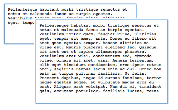
1. Изображение в качестве фона, которое пропадает при вводе текста.
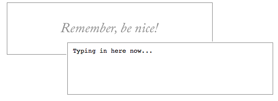
Вы можете добавить фоновое изображение также, как и в любой другой элемент. В этом случае стиль по умолчанию для textarea изменяется, а именно бордер толщиной в 1px изменяется на скошенную границу. Исправляется это явным указанием бордера.
textarea {
	background	: url(images/benice.png) center center no-repeat;
	border		: 1px solid #888;
}
Фоновое изображение может повлиять на читаемость текста. Поэтому фоновое изображение надо убирать при получении фокуса и возвращать его, если textarea осталась без текста. Например, используя jQuery это можно сделать таким образом:
$('textarea')
	.focus(function() {
		$(this).css("background", "none");
	})
	.blur(function() {
		if ($(this)[0].value == '') {
			$(this).css("background", "url(images/benice.png) center center no-repeat");
		}
	});
2. Placeholder в HTML5
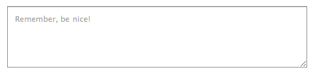
В HTML5 появился новый атрибут, называемый placeholder. Значение этого атрибута показывается в текстовом элементе и исчезает при получении фокуса, а также в случае когда в элементе введён текст.
<textarea placeholder="Remember, be nice!" cols="30" rows="5"></textarea>HTML5 placeholder поддерживается в следующих браузерах: Safari 5, Mobile Safari, Chrome 6, и Firefox 4 alpha.
3. Placeholder, HTML5 с поддержкой старых браузеров используя jQuery
Самый простой способ проверить поддерживается ли атрибут браузером это проверить с помощью javaScript:
function elementSupportsAttribute(element, attribute) {
	var test = document.createElement(element);
	return (attribute in test);
};
Затем можно написать код, который будет срабатывать если браузер не поддерживает атрибут placeholder.
if (!elementSupportsAttribute('textarea', 'placeholder')) {
	// Если браузер не поддерживает атрибут, то выполняется код jQuery
	$("#example-three")
		.data("originalText", $("#example-three").text())
		.css("color", "#999")
		.focus(function() {
		var $el = $(this);
		if (this.value == $el.data("originalText")) {
			this.value = "";
		}
	})
	.blur(function() {
		if (this.value == "") {
			this.value = $(this).data("originalText");
		}
	});
} else {
	// Если же браузер поддерживает HTML5, то просто используем эту возможность
	$("#example-three")
		.attr("placeholder", $("#example-three").text())
		.text("");
}
4. Удаляем обводку textarea
Браузеры на движках webkit, а также в FireFox 3.6, обводят textarea, когда он находится в фокусе. Удалить эту обводку можно используя css-свойство outline для webkit-браузеров. Для FireFox используется свойство -moz-appearance, либо можно просто установить элементу бордер или фон.
textarea {
	outline: none;
	-moz-appearance: none;
	border: 1px solid #999; /* указание этого свойства также удалит обводку в FireFox */
}
5. Запрет изменения размера
Webkit-браузеры добавляют к textarea визуальный элемент в правом нижнем углу, который позволяет изменять размер текстовой области. Если вы хотите убрать эту возможность, то вам необходимо использовать следующее css-свойство:
textarea {
	resize: none;
}
6. Добавление возможности изменения размера
jQuery UI позволяет добавить возможность изменения размера для textarea. Это работает для всех браузеров, а для webkit-браузеров подменяет стандартное поведение. Для того, чтобы использовать эту возможность, необходимо подключить jquery.ui и написать следующий код:
$("textarea").resizable();7. Изменение размера под содержимое
James Padolsey написал удобный jQuery-скрипт который позволяет автоматически изменять размер textarea под его содержимое. Похоже что этого плагина больше нет, но можно использовать например вот этот. Плагин содержит много настроек, но самый простой способ его использовать это:
$('textarea').autoResize();8. Nowrap
Чтобы не переносить слова на новые строки, для всех элементов используется css-свойство white-space, которое не работает с textarea. Для textarea необходимо использовать атрибут wrap.
<textarea wrap="off" cols="30" rows="5"></textarea>9. Удаляем скролл-бары в IE
IE показывает вертикальный скролл-бар для всех textarea. Вы можете их спрятать используя overflow: hidden, но в таком случае он не будет показываться при увеличении контента. Поэтому правильнее использовать следующий подход:
textarea {
	overflow: auto;
}
В этом случае скролл-бар не будет отображаться когда в textarea помещается весь текст, но выведется в случае необходимости.
Примеры к статье вы можете посмотреть здесь.
Styling a <textarea> is not the same as styling an HTML <input> because both have different types of usages. We use <textarea> when we need to write multiple lines of text.
That’s why sometimes it seems difficult to style a <textarea> and also does not match with other <input> boxes. Textarea also has some extra things to handle and customize like, scrollbar, font, and placeholder, we can resize the textarea, etc.
In this article, you will learn how you can style HTML <textarea> very easily. You will get detailed information about this topic.
How to Style Textarea Placeholder

You can use many attributes with this <textarea> tag. For example, title, cols, rows, wrap, etc. You will find a list of attributes that <textarea> accepts at the end of this article.
In order to, add a placeholder like any other <input> tag you have to use placeholder attribute in <textarea>.
<textarea placeholder="Enter your message..." cols="25" rows="5"></textarea>
To add style to the placeholder in <textarea> you can use the following code. We select ::placeholder in the CSS file to add any style to the placeholder.
          /* Modern Browsers */
textarea::placeholder {
    font-size: 1rem;
    color: #9c9c9c;
    font-family: 'Roboto', sans-serif;
}

/* WebKit, Edge */
textarea::-webkit-input-placeholder {
    font-size: 1rem;
    color: #9c9c9c;
    font-family: 'Roboto', sans-serif;
}

/* Firefox 4-18 */
textarea:-moz-placeholder {
    font-size: 1rem;
    color: #9c9c9c;
    font-family: 'Roboto', sans-serif;
}

/* Firefox 19+ */
textarea::-moz-placeholder {
    font-size: 1rem;
    color: #9c9c9c;
    font-family: 'Roboto', sans-serif;
}

/* IE 10-11 */
textarea:-ms-input-placeholder {
    font-size: 1rem;
    color: #9c9c9c;
    font-family: 'Roboto', sans-serif;
}

/* Edge */
textarea::-ms-input-placeholder {
    font-size: 1rem;
    color: #9c9c9c;
    font-family: 'Roboto', sans-serif;
}
Most of the modern browsers support just ::placehoder but to support other browsers we can use other versions like, -ms-, -moz-, -webkit- etc.
In the demo, I have used font-size, color, and font-family but you can use any CSS style you want. From now on you can customize your textarea placeholder according to your need.
Also Read: Async VS Defer — When & How to Use Async Defer in HTML Script Tag

You can style text inside textarea similarly as you can do with any other HTML inputs. You can also use any CSS property like font-size, font-family, color, etc.
To add the fonts to your website Google Fonts would be a great choice because they provide a lot of options and this is absolutely free. When someone writes text inside <textarea> then the text will use that font.
          textarea {
    font-size: 1rem;
    line-height: 1.5em;
    font-family: 'Roboto';
}
How to Add Default Text in Textarea
You can add default text in your <textarea> input. This text will be shown automatically inside textarea input box. Users can change that or completely replace it with their own text.
This is especially helpful if users have to write a similar type of text all the time. In this case, you can set a default text and users will edit the default text. It will save them time.
To add default text in textarea input you just have to place your text in between the opening tag <textarea> and closing </textarea>. It is done.
<textarea>This is the default text. User will see this text automatically.</textarea>
Remove Resize Handler in Textarea

By default, browsers add resize handler in <textarea> to the bottom right corner. You can click and drag to increase or decrease the size of the textarea input.
If you don’t need this feature, you can disable this with just one line of CSS.
          textarea {
    resize: none;
}
How to Resize Textarea Vertically

If you don’t want to remove the resize handler completely then you have other options as well. You can allow your users to resize the <textarea> vertically.
If you add the following CSS property then users will be able to resize your textarea only vertically.
          textarea {
    resize: vertical;
}
How to Resize Textarea Horizontally

On the other hand, if you don’t want to change the size of your <textarea> vertically but horizontally, you can do that too.
Following CSS property will make your textarea horizontally resizable.
          textarea {
    resize: horizontal;
}
How to Remove The Glow Around Textarea
In most browsers, when you focus or write inside the <textarea> a glow or border appears. Some people like it but some don’t.
If this glow border does not fit with your design and you want to remove it, you can do that.
          textarea {
    outline: none;
}
You can also apply this style using :focus pseudo-class as well both work the same.
          textarea:focus {
    outline: none;
}
Textarea Nowrap

Normally we use white-space: nowrap; to prevent text from wrapping. In this way, you can write in an input box as long as you want without any line breaks. The browser will show a horizontal scrollbar.
You can customize this default scrollbar if you want. I will show you how you can style textarea scrollbar in the next sections.
When you press Enter, you move to the next line. But this CSS property does not work with <textarea>. To get a similar result, you have to use the wrap="off" attribute in your <textarea> input.
<textarea wrap='off' placeholder='Enter your message...'></textarea>
How to Make Textarea Responsive
You can make the <textarea> responsive in many ways. As you have seen, you can control resize handler in textarea.
You can also apply width, height, min-width, max-width, min-height and max-height properties to make it responsive.
          textarea {
    width: 100%;
    max-width: 900px;
}
In the above code, we have set width: 100%; so by default textarea will take the full area. But max-width: 900px; means textarea will not be bigger than 900px.
If screen size increases, textarea size will increase up to 900px not more than that. It is also helpful if you set resize: horizontal;.
Users can resize textarea input but when you set max-width: 900px; users will be able to increase the textarea up to 900px. You can also set min-width if you want. Then users will not be able to decrease the size more than that.
          textarea {
    height: 300px;
    min-height: 200px;
    max-height: 500px;
}
It also works a similar way when you use the height property. Here default height of the <textarea> will be 300px.
But when you set resize: vertical; then users will be able to increase its height up to 500px and decrease its height up to 200px.
How to Style Scrollbar in Textarea

When we add height to the <textarea> and users write multiple lines of text then the browser shows a default scrollbar. Scrollbar may come horizontally and vertically.
If you don’t like the default look of those, you can style them according to your need. You can change their color, width, background, etc. And you don’t have to do this separately. You can customize both of them at the same time.
          textarea::-webkit-scrollbar {
    width: 15px;
    background-color: #f5f5f5;
    box-shadow: inset 0 0 2px rgba(0, 0, 0, 0.1);
    -moz-box-shadow: inset 0 0 2px rgba(0, 0, 0, 0.1);
    -webkit-box-shadow: inset 0 0 2px rgba(0, 0, 0, 0.1);
}

textarea::-webkit-scrollbar-thumb {
    border-radius: 10px;
    background-color: #249de4;
    box-shadow: inset 0 0 6px rgba(0, 0, 0, 0.1);
    -moz-box-shadow: inset 0 0 6px rgba(0, 0, 0, 0.1);
    -webkit-box-shadow: inset 0 0 6px rgba(0, 0, 0, 0.1);
    -webkit-border-radius: 10px;
    -moz-border-radius: 10px;
    -ms-border-radius: 10px;
    -o-border-radius: 10px;
}
This will add a custom scrollbar to your <textarea> input on both sides. Here, textarea::-webkit-scrollbar will style the background of the scrollbar and textarea::-webkit-scrollbar-thumb will style the scrollbar thumb, the part that moves.
But the above code will not work on the Firefox browser. Don’t worry you have another option.
          textarea {
    scrollbar-width: thin;
    scrollbar-color: #249de4 #f5f5f5;
}
You should add this code along with the above code then users will be able to see a custom scrollbar in both Chrome and Firefox browsers.
Firefox does not provide much customization options as Chrome does. You can not set a custom width for the scrollbar. The property scrollbar-width accepts only 3 values auto, thin, and none.
Here, auto is the default value and none will remove your scrollbar in the Firefox browser. This is also an experimental technology. So I would suggest you not use this part on your main website.
If you want to know more about scrollbars, you can follow our ultimate guide on scrollbar customization.
Also read: Ultimate Guide to Create Custom Scrollbars in CSS
But you can use 1st part textarea::-webkit-scrollbar and textarea::-webkit-scrollbar-thumb, this will work just fine.
Internet Explorer adds a vertical scrollbar by default in the textarea even if there is no text in it. It does not look good.
You can hide the default scrollbar using overflow: hidden; property. But the problem is you don’t get any scrollbar at all when a user writes multiple lines of text. So, it is not an ideal solution.
Therefore, we should use overflow: auto; this to remove the default scrollbar and it appears when needed.
          textarea {
    overflow: auto;
}
All HTML Textarea Attributes
Here is the list of attributes that you can use in the HTML <textarea> tag.
| Attribute | Value | Description |
| autofocus | autofocus | It is a boolean attribute. Specifies that a textarea should automatically get focused when the page loads. |
| autocomplete | off/on | This attribute indicates whether the browser should automatically complete the value. |
| cols | number | The default value is 20. Specifies the visible width of the textarea. |
| rows | number | It specifies the number of the visible text line in the textarea. |
| disabled | disabled | It is a boolean attribute. It makes the textarea disabled. |
| form | form_id | The value of this attribute should be id of any form element in the same document. It specifies to which form this textarea belongs. |
| maxlength | number | It specifies the maximum number of characters a user can enter. |
| minlength | number | It specifies the minimum number of characters a user should enter. |
| name | text | It specifies a name for the textarea. It helps to get the data after form submission. |
| placeholder | text | It specifies a short hint to the user of what should be entered in the textarea. |
| readonly | readonly | It is a boolean attribute. Specifies that users only can read the input value. The value of a readonly input is still submitted with the form. |
| required | required | This attribute specifies that the user must enter a value before submitting the form. |
| spellcheck | true/false | This attribute specifies whether the browser/OS should check its spelling and grammar or not. |
| wrap | soft/hard/off | The default value is soft. It indicates how the text in a textarea should be wrapped while submitting the form. |
Conclusion
In this article, we have seen multiple ways how you can style your HTML textarea. I hope from now on you will be able to customize your textarea input according to your need.
Тег <textarea> используется для определения области, где пользователь может вводить многострочный текст. В отличие от тега <input>, где перенос строки в текстовом поле невозможен, в теге <textarea> допускаются переносы, они сохраняются при отправке данных на сервер.
Между открывающим <textarea> и закрывающим </textarea> тегами можно поместить любой текст, который будет отображаться моноширинным начертанием. В текстовое поле можно вводить любое количество символов.
Содержимое элемента заключается между открывающим (<textarea>) и закрывающим (</textarea>) тегами.
Для определения размера текстового поля можно использовать атрибуты cols и rows, или же использовать CSS свойстваheight
и width. А с помощью CSS свойства resize можно запретить изменение размера текстового поля.
Пример
<!DOCTYPE html>
<html>
  <head>
    <title>Заголовок документа</title>
  </head>
  <body>
    <form>
      <textarea name="comment" rows="12" cols="35">Написать комментарий автору.</textarea><br>
      <input type="submit" name="submitInfo" value="Отправить">
    </form>
  </body>
</html>
Результат

В этом примере мы определили текстовую область тегом <textarea>, присвоили ей имя “comment”, использовав атрибут name; задали высоту строк (12 символов) атрибутом rows и указали ширину поля атрибутом cols (35 символов). Мы также разместили внутри формы кнопку, при нажатии на которую введенная информация отправляется на сервер.
Пример
<!DOCTYPE html>
<html>
  <head>
    <title>Заголовок документа</title>
    <style>
      .comment {
        width: 60%;
        height: 100px;
        padding: 10px;
        outline: 0;
        border: 3px solid #1c87c9;
        background: #d0e2bc;
        line-height: 20px;
      }
    </style>
  </head>
  <body>
    <form>
      <p>Пример с использованием CSS стилей</p>
      <textarea class="comment"> Написать комментарий автору.</textarea>
      <br>
      <input type="submit" name="submitInfo" value="Отправить">
    </form>
  </body>
</html>
Результат

В этом примере мы использовали CSS стили для визуального оформления текстового поля.
Тег <textarea> поддерживает также глобальные атрибуты и атрибуты событий.
We’re going to create custom form input and textarea styles that have a near-identical appearance across the top browsers. We’ll specifically style the input types of text, date, and file, and style the readonly and disabled states.
Read on to learn how to:
- reset input styles
- use
hslfor theming of input states - ensure all states meet contrast requirements
- retain a perceivable
:focusstate for Windows High Contrast mode
Now available: my egghead video course Accessible Cross-Browser CSS Form Styling. You’ll learn to take the techniques described in this tutorial to the next level by creating a themable form design system to extend across your projects.
This is the fourth installment in the Modern CSS form field mini-series. Check out episodes 18-20 to learn how to style other common form field types including radio buttons, checkboxes, and selects.
Common Issues with Native Input Styles
There is a bit more parity between text input styles than we saw with radios, checkboxes, and selects, but inconsistencies nonetheless.
Here’s a screenshot of the unstyled inputs we’re going to address today across (from left) Chrome, Safari, and Firefox.

We will be looking to unify the initial appearance across browsers and common field types.
The
datefield is unique in that Chrome and Firefox provide formatting and a popup calendar to select from, while Safari offers no comparable functionality. We cannot create this in CSS either, so our goal here is to get as far as we can with creating a similar initial appearance. Check out the caniuse for date/time inputs.
Base HTML
We’re covering a lot of field types, so check the CodePen for the full list. But here is the essential HTML for a text input and a textarea.
<label for="text-input">Text Input</label>
<input class="input" id="text-input" type="text" /><label for="textarea">Textarea</label>
<textarea class="input" id="textarea"></textarea>
To allow simplifying our styles and preparing to work with the cascade, we’ve only added one CSS class — input — which is placed directly on the text input and textarea.
The label is not part of our styling exercise, but its included as a general requirement, notably with the for attribute having the value of the id on the input.
Create CSS Variables for Theming
For the tutorial, we’re going to try a bit different technique for theming by using hsl values.
We’ll set a grey for the border, and then break down a blue color to be used in our :focus state into its hsl values, including: h for «hue», s for «saturation», and l for «lightness».
:root {
  --input-border: #8b8a8b;
  --input-focus-h: 245;
  --input-focus-s: 100%;
  --input-focus-l: 42%;
}
Each of the tutorials for our form fields has incorporated a bit different method for theming, which can all be extracted and used beyond just forms!
Accessible Contrast
As per all user interface elements, the input border needs to have at least 3:1 contrast against it’s surroundings.
And, the :focus state needs to have 3:1 contrast against the unfocused state if it involves something like changing the border color or, according to the WCAG 2.2 draft, a thickness greater than or equal to 2px.
The draft for WCAG 2.2 makes some slight adjustments to :focus requirements, and I encourage you to review them.
Reset Styles
As is included in all my tutorials as a modern best practice, we add the following reset first:
*,
*::before,
*::after {
  box-sizing: border-box;
}
As seen in the initial state of the fields across browsers, some standout differences were in border type, background color, and font properties.
Interestingly, font-size and font-family do not inherit from the document like typography elements do, so we need to explicitly set them as part of our reset.
Also of note, an input’s font-size should compute to at least 16px to avoid zooming being triggered upon interaction in mobile Safari. We can typically assume 1rem equals 16px, but we’ll explicitly set it as a fallback and then use the newer CSS function max to set 16px as the minimum in case it’s smaller than 1em (h/t to Dan Burzo for this idea).
.input {
  font-size: 16px;
  font-size: max(16px, 1em);
  font-family: inherit;
  padding: 0.25em 0.5em;
  background-color: #fff;
  border: 2px solid var(--input-border);
  border-radius: 4px;
}
We set our border to use the theme variable, and also created a slightly rounded corner.
After this update, we’re already looking pretty good:

It may be difficult to notice in that screenshot, but another difference is the height of each field. Here’s a comparison of the text input to the file input to better see this difference:

Let’s address this with the following which we are applying to our .input class as long as it is not placed on a textarea:
.input:not(textarea) {
  line-height: 1;
  height: 2.25rem;
}
We included line-height: 1 since when it’s not a textarea it’s impossible for an input to be multiline. We also set our height in rem due to considerations of specifically the file input type. If you know you will not be using a file input type, you could use em here instead for flexibility in creating various sized inputs.
But, critically, we’ve lost differentiation between editable and disabled input types. We also want to define readonly with more of a hint that it’s also un-editable, but still interactive. And we have a bit more work to do to smooth over the file input type. And, we want to create our themed :focus state.
File Input CSS
Let’s take another look at just our file input across Chrome, Safari, and Firefox:

We cannot style the button created by the browser, or change the prompt text, but the reset we provided so far did do a bit of work to allow our custom font to be used.
We’ll make one more adjustment to downsize the font just a bit as when viewed with other field types the inherited button seems quite large, and font-size is our only remaining option to address it. From doing that, we need to adjust the top padding since we set our padding up to be based on em.
input[type="file"] {
  font-size: 0.9em;
  padding-top: 0.35rem;
}
If you were expecting a fancier solution, there are plenty of folx who have covered those. My goal here was to provide you a baseline that you can then build from.
readonly CSS Style
While not in use often, the readonly attribute prevents additional user input, although the value can be selected, and it is still discoverable by assistive tech.
Let’s add some styles to enable more of a hint that this field is essentially a placeholder for a previously entered value.
To do this, we’ll target any .input that also has the [readonly] attriute. Attribute selectors are a very handy method with wide application, and definitely worth adding to (or updating your awareness of) in your CSS toolbox.
.input[readonly] {
  border-style: dotted;
  cursor: not-allowed;
  color: #777;
}
In addition to swapping for a dotted border, we’ve also assigned it the not-allowed cursor and enforced a medium-grey text color.
As seen in the following gif, the user cannot interact with the field except to highlight/copy the value.

Disabled Input and Textarea Style
Similar to readonly, we’ll use an attribute selector to update the style for disabled fields. We are attaching it to the .input class so it applies on textareas as well as our other input types.
We’ll make use of our CSS variable to update the border color to a muted grey, and the field background to a very light grey. We’ll also again apply the not-allowed cursor as just an extra hint that the field is not interactive.
.input[disabled] {
  --input-border: #ccc;  background-color: #eee;
  cursor: not-allowed;
}
And here is the result for both a text input and a textarea:

Accessibility Note:
disabledfields are not necessarily discoverable by assistive tech since they are not focusable. They also are not required to meet even the typical 3:1 contrast threshold for user interface elements, but we’ve kept with user expectations by setting them to shades of grey.
Textarea Styles
Our textarea is really close, but there’s one property I want to mention since it’s unique to the inherent behavior of textareas.
That property is resize, which allows you to specify which direction the textarea can be resized, or if it even can at all.
While you definitely should allow the textarea to retain the resize function under general circumstances, you can limit it to just vertical resizing to prevent layout breakage from a user dragging it really wide, for example.
We’ll apply this property by scoping our .input class to when it’s applied on a textarea:
textarea.input {
  resize: vertical;
}
Try it out in the final CodePen demo!
:focus State Styles
Ok, we’ve completed the initial styles for our inputs and the textarea, but we need to handle for a very important state: :focus.
We’re going to go for a combo effect that changes the border color to a value that meets 3:1 contrast against the unfocused state, but also adds a box-shadow for a bit of extra highlighting.
And here’s why we defined our theme color of the focus state in hsl: it means we can create a variant of the border color by updating just the lightness value.
First, we define the border color by constructing the full hsl value from the individual CSS variable values:
.input:focus {
  border-color: hsl(var(--input-focus-h), var(--input-focus-s), var(--input-focus-l));
}
Then, we add in the box-shadow which will only use blur to create essentially a double-border effect. calc() is acceptable to use inside hsla, so we use it to lighten the original value by 40%, and also allow just a bit of alpha transparency:
.input:focus {
  /* ...existing styles */
  box-shadow: 0 0 0 3px hsla(var(--input-focus-h), var(--input-focus-s), calc(var(--input-focus-l) +
          40%), 0.8);
}
Note that we’ve now added a new context for our contrast, which is the :focus border vs. the :focus box-shadow, so ensure the computed difference for your chosen colors is at least 3:1 if using this method.
Optionally, jump back up to the .input rule and add a transition to animate the box-shadow:
.input {
  /* ...existing styles */
  transition: 180ms box-shadow ease-in-out;
}
Finally, we don’t want to forget Windows High Contrast mode which will not see the box-shadow or be able to detect the border color change. So, we include a transparent outline for those users:
.input:focus {
  outline: 3px solid transparent;
}
We also use this technique in the episode covering button styles.
Here’s a gif demo of focusing into the text input:

And here’s the appearance for the readonly field, since it has a different border-style:

In the CodePen HTML, there is a comment with an example of using an inline style to define an updated visual such as for an error state. Again, keep in mind that we are lightening the provided --input-focus-l value by 40%, and the focused border color must be at least 3:1 contrast against the unfocused color, so consider that when you alter the CSS variable values.
Input Mode and Autocomplete
There are two aditional attributes that can help improve the user experience, particularly on mobile, in addition to using the correct input type (ex: email).
The first is defining the inputmode, which provides an altered keyboard or keypad that better matches the expected data. Read up on available inputmode values on MDN >
Second is autocomplete which has far more options than on or off. For example, I always appreciate that on iPhone when Google sends me a confirmation code by text the keyboard «just knows» what that value is. Turns out, that’s thanks to autocomplete="one-time-code"!
Check out the full list of autocomplete values that allow you to hint at the value expected and really boost the user experience of your forms for users that make use of auto-filling values.
Demo
First, here’s a final look at our solution across (from left) Chrome, Safari, and Firefox. The file input still sticks out a bit when viewed side by side, but in the flow of a form on an individual browser it’s definitely acceptable.

Here is the solution with all the field types we covered represented.
By Stephanie Eckles (@5t3ph)
| title | slug | page-type | tags | browser-compat | |||||||
|---|---|---|---|---|---|---|---|---|---|---|---|
|
<textarea>: The Textarea element |
Web/HTML/Element/textarea |
html-element |
|
html.elements.textarea |
{{HTMLSidebar}}
The <textarea> HTML element represents a multi-line plain-text editing control, useful when you want to allow users to enter a sizeable amount of free-form text, for example a comment on a review or feedback form.
{{EmbedInteractiveExample(«pages/tabbed/textarea.html», «tabbed-standard»)}}
The above example demonstrates a number of features of <textarea>:
- An
idattribute to allow the<textarea>to be associated with a {{htmlelement(«label»)}} element for accessibility purposes - A
nameattribute to set the name of the associated data point submitted to the server when the form is submitted. rowsandcolsattributes to allow you to specify an exact size for the<textarea>to take. Setting these is a good idea for consistency, as browser defaults can differ.- Default content entered between the opening and closing tags.
<textarea>does not support thevalueattribute.
The <textarea> element also accepts several attributes common to form <input>s, such as autocomplete, autofocus, disabled, placeholder, readonly, and required.
Attributes
This element includes the global attributes.
-
{{htmlattrdef(«autocomplete»)}}
-
: This attribute indicates whether the value of the control can be automatically completed by the browser. Possible values are:
off: The user must explicitly enter a value into this field for every use, or the document provides its own auto-completion method; the browser does not automatically complete the entry.on: The browser can automatically complete the value based on values that the user has entered during previous uses.
If the
autocompleteattribute is not specified on a<textarea>element, then the browser uses theautocompleteattribute value of the<textarea>element’s form owner. The form owner is either the {{HTMLElement(«form»)}} element that this<textarea>element is a descendant of or the form element whoseidis specified by theformattribute of the input element. For more information, see the {{htmlattrxref(«autocomplete», «form»)}} attribute in {{HTMLElement(«form»)}}.
-
-
{{ htmlattrdef(«autocorrect») }} {{non-standard_inline}}
-
: A string which indicates whether to activate automatic spelling correction and processing of text substitutions (if any are configured) while the user is editing this
textarea. Permitted values are:on- : Enable automatic spelling correction and text substitutions.
off- : Disable automatic spelling correction and text substitutions.
-
-
{{ htmlattrdef(«autofocus») }}
- : This Boolean attribute lets you specify that a form control should have input focus when the page loads. Only one form-associated element in a document can have this attribute specified.
-
{{ htmlattrdef(«cols») }}
- : The visible width of the text control, in average character widths. If it is specified, it must be a positive integer. If it is not specified, the default value is
20.
- : The visible width of the text control, in average character widths. If it is specified, it must be a positive integer. If it is not specified, the default value is
-
{{ htmlattrdef(«disabled») }}
- : This Boolean attribute indicates that the user cannot interact with the control. If this attribute is not specified, the control inherits its setting from the containing element, for example {{ HTMLElement(«fieldset») }}; if there is no containing element when the
disabledattribute is set, the control is enabled.
- : This Boolean attribute indicates that the user cannot interact with the control. If this attribute is not specified, the control inherits its setting from the containing element, for example {{ HTMLElement(«fieldset») }}; if there is no containing element when the
-
{{ htmlattrdef(«form») }}
- : The form element that the
<textarea>element is associated with (its «form owner»). The value of the attribute must be theidof a form element in the same document. If this attribute is not specified, the<textarea>element must be a descendant of a form element. This attribute enables you to place<textarea>elements anywhere within a document, not just as descendants of form elements.
- : The form element that the
-
{{ htmlattrdef(«maxlength») }}
- : The maximum number of characters (UTF-16 code units) that the user can enter. If this value isn’t specified, the user can enter an unlimited number of characters.
-
{{ htmlattrdef(«minlength») }}
- : The minimum number of characters (UTF-16 code units) required that the user should enter.
-
{{ htmlattrdef(«name») }}
- : The name of the control.
-
{{ htmlattrdef(«placeholder») }}
-
: A hint to the user of what can be entered in the control. Carriage returns or line-feeds within the placeholder text must be treated as line breaks when rendering the hint.
Note: Placeholders should only be used to show an example of the type of data that should be entered into a form; they are not a substitute for a proper {{HTMLElement(«label»)}} element tied to the input. See
<input>labels for a full explanation.
-
-
{{ htmlattrdef(«readonly») }}
- : This Boolean attribute indicates that the user cannot modify the value of the control. Unlike the
disabledattribute, thereadonlyattribute does not prevent the user from clicking or selecting in the control. The value of a read-only control is still submitted with the form.
- : This Boolean attribute indicates that the user cannot modify the value of the control. Unlike the
-
{{ htmlattrdef(«required») }}
- : This attribute specifies that the user must fill in a value before submitting a form.
-
{{ htmlattrdef(«rows») }}
- : The number of visible text lines for the control. If it is specified, it must be a positive integer. If it is not specified, the default value is 2.
-
{{ htmlattrdef(«spellcheck») }}
-
: Specifies whether the
<textarea>is subject to spell checking by the underlying browser/OS. The value can be:true: Indicates that the element needs to have its spelling and grammar checked.default: Indicates that the element is to act according to a default behavior, possibly based on the parent element’s ownspellcheckvalue.false: Indicates that the element should not be spell checked.
-
-
{{ htmlattrdef(«wrap») }}
-
: Indicates how the control should wrap the value for form submission. Possible values are:
hard: The browser automatically inserts line breaks (CR+LF) so that each line is no longer than the width of the control; thecolsattribute must be specified for this to take effectsoft: The browser ensures that all line breaks in the entered value are aCR+LFpair, but no additional line breaks are added to the value.off{{non-standard_inline}}: Likesoftbut changes appearance towhite-space: preso line segments exceedingcolsare not wrapped and the<textarea>becomes horizontally scrollable.
If this attribute is not specified,
softis its default value.
-
Styling with CSS
<textarea> is a replaced element — it has intrinsic dimensions, like a raster image. By default, its {{cssxref(«display»)}} value is inline-block. Compared to other form elements it is relatively easy to style, with its box model, fonts, color scheme, etc. being easily manipulable using regular CSS.
Styling HTML forms provides some useful tips on styling <textarea>s.
Baseline inconsistency
The HTML specification doesn’t define where the baseline of a <textarea> is, so different browsers set it to different positions. For Gecko, the <textarea> baseline is set on the baseline of the first line of the textarea, on another browser it may be set on the bottom of the <textarea> box. Don’t use {{cssxref(«vertical-align»)}}: baseline on it; the behavior is unpredictable.
Controlling whether a textarea is resizable
In most browsers, <textarea>s are resizable — you’ll notice the drag handle in the right-hand corner, which can be used to alter the size of the element on the page. This is controlled by the {{ cssxref(«resize») }} CSS property — resizing is enabled by default, but you can explicitly disable it using a resize value of none:
textarea {
  resize: none;
}
Styling valid and invalid values
Valid and invalid values of a <textarea> element (e.g. those within, and outside the bounds set by minlength, maxlength, or required) can be highlighted using the {{cssxref(«:valid»)}} and {{cssxref(«:invalid»)}} pseudo-classes. For example, to give your textarea a different border depending on whether it is valid or invalid:
textarea:invalid {
  border: 2px dashed red;
}

textarea:valid {
  border: 2px solid lime;
}
Examples
Basic example
The following example shows a very simple textarea, with a set numbers of rows and columns and some default content.
<textarea name="textarea" rows="10" cols="50">Write something here</textarea>
{{ EmbedLiveSample(‘Basic_example’,’600′,’150′) }}
Example using «minlength» and «maxlength»
This example has a minimum and maximum number of characters — of 10 and 20 respectively. Try it and see.
<textarea name="textarea" rows="5" cols="30" minlength="10" maxlength="20">
Write something here…
</textarea>
{{ EmbedLiveSample(‘Example using «minlength» and «maxlength»‘,’600′,’80’) }}
Note that minlength doesn’t stop the user from removing characters so that the number entered goes past the minimum, but it does make the value entered into the <textarea> invalid. Also note that even if you have a minlength value set (3, for example), an empty <textarea> is still considered valid unless you also have the required attribute set.
Example using «placeholder»
This example has a placeholder set. Notice how it disappears when you start typing into the box.
<textarea
  name="textarea"
  rows="5"
  cols="30"
  placeholder="Comment text."></textarea>
{{ EmbedLiveSample(‘Example using «placeholder»‘,’600′,’80’) }}
Note: Placeholders should only be used to show an example of the type of data that should be entered into a form; they are not a substitute for a proper {{HTMLElement(«label»)}} element tied to the input. See
<input>labels for a full explanation.
Disabled and readonly
This example shows two <textarea>s — one of which is disabled, and one of which is readonly. Have a play with both and you’ll see the difference in behavior — the disabled element is not selectable in any way (and its value is not submitted), whereas the readonly element is selectable and its contents copyable (and its value is submitted); you just can’t edit the contents.
Note: In browsers other than Firefox, such as chrome, the
disabledtextarea content may be selectable and copyable.
<textarea name="textarea" rows="5" cols="30" disabled>
I am a disabled textarea.
</textarea>
<textarea name="textarea" rows="5" cols="30" readonly>
I am a read-only textarea.
</textarea>
{{ EmbedLiveSample(‘Disabled_and_readonly’,’600′,’80’) }}
Technical summary
| Content categories |
Flow content, phrasing content, Interactive content, listed, labelable, resettable, and submittable form-associated element. |
|---|---|
| Permitted content | Text |
| Tag omission | {{no_tag_omission}} |
| Permitted parents |
Any element that accepts phrasing content. |
| Implicit ARIA role |
textbox
|
| Permitted ARIA roles | No role permitted |
| DOM interface | {{domxref(«HTMLTextAreaElement»)}} |
Specifications
{{Specifications}}
Browser compatibility
{{Compat}}
See also
Other form-related elements:
- {{ HTMLElement(«form») }}
- {{ HTMLElement(«button») }}
- {{ HTMLElement(«datalist») }}
- {{ HTMLElement(«legend») }}
- {{ HTMLElement(«label») }}
- {{ HTMLElement(«select») }}
- {{ HTMLElement(«optgroup») }}
- {{ HTMLElement(«option») }}
- {{ HTMLElement(«input») }}
- {{ HTMLElement(«keygen») }}
- {{ HTMLElement(«fieldset») }}
- {{ HTMLElement(«output») }}
- {{ HTMLElement(«progress») }}
- {{ HTMLElement(«meter») }}
- Назад (en-US)
- Обзор: Forms
- Далее (en-US)
В этой статье Вы узнает, как использовать CSS с HTML-формами, чтобы сделать их (надеюсь) более красивыми. Удивительно, но это может быть немного сложнее. По историческим и техническим причинам виджеты форм плохо сочетаются с CSS. Из-за этих трудностей многие разработчики предпочитают создавать свои собственные HTML-виджеты, чтобы получить контроль над своим внешним видом. Однако в современных браузерах веб-дизайнеры все больше контролируют дизайн элементов формы. Давайте приступим!
Почему так сложно стилизовать виджеты форм с помощью CSS?
На заре Интернета, примерно в 1995 году, в HTML 2 были добавлены элементы управления формой. Из-за сложности виджетов форм разработчики решили полагаться на базовую операционную систему для управления ими и их рендеринга.
Несколько лет спустя был создан CSS, и то, что было технической необходимостью, то есть использование собственных виджетов для реализации элементов управления формой, стало требованием к стилю. В первые дни CSS, стилизация элементов управления формы не была приоритетом.
Поскольку пользователи привыкли к внешнему виду своих соответствующих платформ, поставщики браузеров неохотно делают элементы управления формами стилевыми; и по сей день все ещё чрезвычайно трудно перестроить все элементы управления, чтобы сделать их стилизованными.
Даже сегодня ни один браузер полностью не реализует CSS 2.1. Однако со временем поставщики браузеров улучшили свою поддержку CSS для элементов формы, и, несмотря на плохую репутацию в отношении удобства использования, теперь вы можете использовать CSS для стилизации HTML форм (en-US).
Не все виджеты созданы равными, когда задействован CSS
В настоящее время некоторые трудности остаются при использовании CSS с формами. Эти проблемы можно разделить на три категории:
Хорошая
Некоторые элементы могут быть стилизованы с небольшим количеством проблем на разных платформах. К ним относятся следующие структурные элементы:
<form><fieldset><label><output>
Сюда также входят все виджеты текстового поля (как однострочные, так и многострочные) и кнопки.
Плохая
Некоторые элементы редко могут быть стилизованы, и могут потребовать некоторых сложных уловок, иногда требующих углублённых знаний CSS3.
Они включают в себя элемент <legend>, но его нельзя правильно расположить на всех платформах. Флажки и переключатели также не могут быть стилизованы напрямую, однако, благодаря CSS3 вы можете обойти это. Контент placeholder не может быть стилизован каким-либо стандартным способом, однако все браузеры, которые его реализуют, также реализуют собственные псевдо-элементы CSS или псевдоклассы, которые позволяют его стилизовать.
Мы опишем, как обрабатывать эти более конкретные случаи, в статье «Расширенные стили для HTML-форм». (en-US)
The ugly
Some elements simply can’t be styled using CSS. These include: all advanced user interface widgets, such as range, color, or date controls; and all the dropdown widgets, including <select>, <option>, <optgroup> and <datalist> elements. The file picker widget is also known not to be stylable at all. The new <progress> and <meter> elements also fall in this category.
The main issue with all these widgets, comes from the fact that they have a very complex structure, and CSS is not currently expressive enough to style all the subtle parts of those widgets. If you want to customize those widgets, you have to rely on JavaScript to build a DOM tree you’ll be able to style. We explore how to do this in the article How to build custom form widgets (en-US).
Basic styling
To style elements that are easy to style (en-US) with CSS, you shouldn’t face any difficulties, since they mostly behave like any other HTML element. However, the user-agent style sheet of every browser can be a little inconsistent, so there are a few tricks that can help you style them in an easier way.
Search fields
Search boxes are the only kind of text fields that can be a little tricky to style. On WebKit based browsers (Chrome, Safari, etc.), you’ll have to tweak it with the -webkit-appearance proprietary property. We discuss this property further in the article: Advanced styling for HTML forms (en-US).
Example
<form>
  <input type="search">
</form>
input[type=search] {
  border: 1px dotted #999;
  border-radius: 0;

  -webkit-appearance: none;
}

As you can see on this screenshot of the search field on Chrome, the two fields have a border set as in our example. The first field is rendered without using the -webkit-appearance property, whereas the second is rendered using -webkit-appearance:none. This difference is noticeable.
Fonts and text
CSS font and text features can be used easily with any widget (and yes, you can use @font-face with form widgets). However, browsers’ behaviors are often inconsistent. By default, some widgets do not inherit font-family and font-size from their parents. Many browsers use the system default appearance instead. To make your forms’ appearance consistent with the rest of your content, you can add the following rules to your stylesheet:
button, input, select, textarea {
  font-family : inherit;
  font-size   : 100%;
}
The screenshot below shows the difference; on the left is the default rendering of the element in Firefox on Mac OS X, with the platform’s default font style in use. On the right are the same elements, with our font harmonization style rules applied.

There’s a lot of debate as to whether forms look better using the system default styles, or customized styles designed to match your content. This decision is yours to make, as the designer of your site, or Web application.
Box model
All text fields have complete support for every property related to the CSS box model (width, height, padding, margin, and border). As before, however, browsers rely on the system default styles when displaying these widgets. It’s up to you to define how you wish to blend them into your content. If you want to keep the native look and feel of the widgets, you’ll face a little difficulty if you want to give them a consistent size.
This is because each widget has their own rules for border, padding and margin. So if you want to give the same size to several different widgets, you have to use the box-sizing property:
input, textarea, select, button {
  width : 150px;
  margin: 0;

  -webkit-box-sizing: border-box; /* For legacy WebKit based browsers */
     -moz-box-sizing: border-box; /* For legacy (Firefox <29) Gecko based browsers */
          box-sizing: border-box;
}

In the screenshot above, the left column is built without box-sizing, while the right column uses this property with the value border-box. Notice how this lets us ensure that all of the elements occupy the same amount of space, despite the platform’s default rules for each kind of widget.
Positioning
Positioning of HTML form widgets is generally not a problem; however, there are two elements you should take special note of:
legend
The <legend> element is okay to style, except for positioning. In every browser, the <legend> element is positioned on top of the top border of its <fieldset> parent. There is absolutely no way to change it to be positioned within the HTML flow, away from the top border. You can, however, position it absolutely or relatively, using the position property. But otherwise it is part of the fieldset border.
Because the <legend> element is very important for accessibility reasons, it will be spoken by assistive technologies as part of the label of each form element inside the fieldset, it’s quite often paired with a title, and then hidden in an accessible way. For example:
HTML
<fieldset>
  <legend>Hi!</legend>
  <h1>Hello</h1>
</fieldset>
CSS
legend {
  width: 1px;
  height: 1px;
  overflow: hidden;
}
textarea
By default, all browsers consider the <textarea> (en-US) element to be an inline block, aligned to the text bottom line. This is rarely what we actually want to see. To change from inline-block to block, it’s pretty easy to use the display property. But if you want to use it inline, it’s common to change the vertical alignment:
textarea {
  vertical-align: top;
}
Example
Let’s look at a concrete example of how to style an HTML form. This will help make a lot of these ideas clearer. We will build the following «postcard» contact form:

If you want to follow along with this example, make a local copy of our postcard-start.html file, and follow the below instructions.
The HTML
The HTML is only slightly more involved than the example we used in the first article of this guide (en-US); it just has a few extra IDs and a title.
<form>
  <h1>to: Mozilla</h1>

  <div id="from">
    <label for="name">from:</label>
    <input type="text" id="name" name="user_name">
  </div>

  <div id="reply">
    <label for="mail">reply:</label>
    <input type="email" id="mail" name="user_email">
  </div>

  <div id="message">
    <label for="msg">Your message:</label>
    <textarea id="msg" name="user_message"></textarea>
  </div>

  <div class="button">
    <button type="submit">Send your message</button>
  </div>
</form>
Add the above code into the body of your HTML.
Organizing your assets
This is where the fun begins! Before we start coding, we need three additional assets:
- The postcard background — download this image and save it in the same directory as your working HTML file.
- A typewriter font: The «Secret Typewriter» font from fontsquirrel.com — download the TTF file into the same directory as above.
- A handdrawn font: The «Journal» font from fontsquirrel.com — download the TTF file into the same directory as above.
Your fonts need some more processing before you start:
- Go to the fontsquirrel Webfont Generator.
- Using the form, upload both your font files and generate a webfont kit. Download the kit to your computer.
- Unzip the provided zip file.
- Inside the unzipped contents you will find two
.wofffiles and two.woff2files. Copy these four files into a directory called fonts, in the same directory as before. We are using two different files for each font to maximise browser compatibility; see our Web fonts article for a lot more information.
The CSS
Now we can dig into the CSS for the example. Add all the code blocks shown below inside the <style> element, one after another.
First, we prepare the ground by defining our @font-face rules, all the basics on the <body> element, and the <form> element:
@font-face {
    font-family: 'handwriting';
    src: url('fonts/journal-webfont.woff2') format('woff2'),
         url('fonts/journal-webfont.woff') format('woff');
    font-weight: normal;
    font-style: normal;
}

@font-face {
    font-family: 'typewriter';
    src: url('fonts/veteran_typewriter-webfont.woff2') format('woff2'),
         url('fonts/veteran_typewriter-webfont.woff') format('woff');
    font-weight: normal;
    font-style: normal;
}

body {
  font  : 21px sans-serif;

  padding : 2em;
  margin  : 0;

  background : #222;
}

form {
  position: relative;

  width  : 740px;
  height : 498px;
  margin : 0 auto;

  background: #FFF url(background.jpg);
}
Now we can position our elements, including the title and all the form elements:
h1 {
  position : absolute;
  left : 415px;
  top  : 185px;

  font : 1em "typewriter", sans-serif;
}

#from {
  position: absolute;
  left : 398px;
  top  : 235px;
}

#reply {
  position: absolute;
  left : 390px;
  top  : 285px;
}

#message {
  position: absolute;
  left : 20px;
  top  : 70px;
}
That’s where we start working on the form elements themselves. First, let’s ensure that the <label>s are given the right font:
label {
  font : .8em "typewriter", sans-serif;
}
The text fields require some common rules. Simply put, we remove their borders and backgrounds, and redefine their padding and margin:
input, textarea {
  font    : .9em/1.5em "handwriting", sans-serif;

  border  : none;
  padding : 0 10px;
  margin  : 0;
  width   : 240px;

  background: none;
}
When one of these fields gains focus, we highlight them with a light grey, transparent, background. Note that it’s important to add the outline (en-US) property, in order to remove the default focus highlight added by some browsers:
input:focus, textarea:focus {
  background   : rgba(0,0,0,.1);
  border-radius: 5px;
  outline      : none;
}
Now that our text fields are complete, we need to adjust the display of the single and multiple line text fields to match, since they won’t typically look the same using the defaults.
The single-line text field needs some tweaks to render nicely in Internet Explorer. Internet Explorer does not define the height of the fields based on the natural height of the font (which is the behavior of all other browsers). To fix this, we need to add an explicit height to the field, as follows:
input {
    height: 2.5em; /* for IE */
    vertical-align: middle; /* This is optional but it makes legacy IEs look better */
}
<textarea> (en-US) elements default to being rendered as a block element. The two important things here are the resize (en-US) and overflow properties. Because our design is a fixed-size design, we will use the resize property to prevent users from resizing our multi-line text field. The overflow property is used to make the field render more consistently across browsers. Some browsers default to the value auto, while some default to the value scroll. In our case, it’s better to be sure every one will use auto:
textarea {
  display : block;

  padding : 10px;
  margin  : 10px 0 0 -10px;
  width   : 340px;
  height  : 360px;

  resize  : none;
  overflow: auto;
}
The <button> element is really convenient with CSS; you can do whatever you want, even using pseudo-elements (en-US):
button {
  position     : absolute;
  left         : 440px;
  top          : 360px;

  padding      : 5px;

  font         : bold .6em sans-serif;
  border       : 2px solid #333;
  border-radius: 5px;
  background   : none;

  cursor       : pointer;

-webkit-transform: rotate(-1.5deg);
   -moz-transform: rotate(-1.5deg);
    -ms-transform: rotate(-1.5deg);
     -o-transform: rotate(-1.5deg);
        transform: rotate(-1.5deg);
}

button:after {
  content: " >>>";
}

button:hover,
button:focus {
  outline   : none;
  background: #000;
  color   : #FFF;
}
And voila!
Примечание: If your example does not work quite like you expected and you want to check it against our version, you can find it on GitHub — see it running live (also see the source code).
Conclusion
As you can see, as long as we want to build forms with just text fields and buttons, it’s easy to style them using CSS. If you want to know more of the little CSS tricks that can make your life easier when working with form widgets, take a look at the form part of the normalize.css project.
In the next article (en-US), we will see how to handle form widgets which fall in the «bad» and «ugly» categories.
- Назад (en-US)
- Обзор: Forms
- Далее (en-US)