Developers have a thing for dark mode. When it comes to productivity, we purposefully dim and change the color scheme of our IDEs and code editors from the standard stark white to an inverted contrast. We do this, in part, to save our eyes from the glaring screen and decrease the potential strain.
But not all dark themes are made equal. There’s more to it than just inverting the color scheme from white to black. The way functions, classes, modules, and parts of your code get highlighted can also determine your overall productivity over time. The right color scheme can help you quickly scan and pick up anomalies in your code.
What are Visual Studio 2019 Themes?
Themes are switchable skins that let you configure the color scheme and font for your Visual Studio editor. The marketplace currently has over 5000 themes available and covers both Visual Studio 2019 and Visual Studio Code, each created to visually optimize how code is displayed. This is done through pre-configurations of how functions, modules, classes, and parts of code are colored.
Quick tutorial – how to install a Visual Studio theme
The perk of using Visual Studio 2019 over Visual Studio Code is that you can sync your settings across devices, in addition to having tools that directly integrate with Azure services. This means that your theme configuration gets to go with you, even if you’re not on your usual work machine.
The easiest way to install a Visual Studio theme is to navigate over to the Extensions option in the menu bar and select Manage Extensions.

The next step is to select Visual Studio Marketplace under Online on the left panel.

Once done, search for the theme you want and select it in the search results.

After you’ve downloaded your theme, close VS2019 down and it will begin installing the theme and create a prompt that looks something like this:


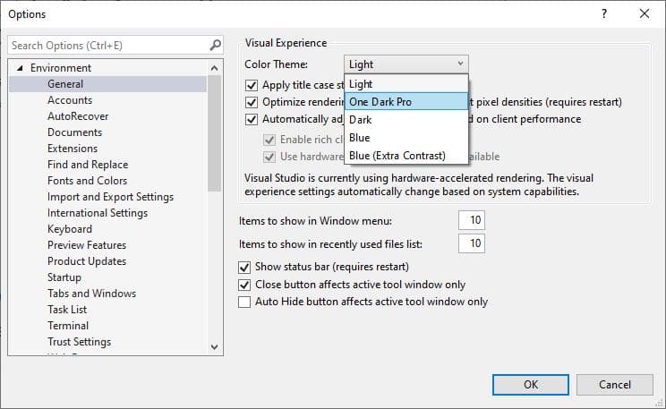
After you’ve done this, open up Visual Studio 2019 again and navigate over to your Options panel located under the Tools tab. Select Color Theme option and select the theme you want to apply.


That’s basically it for installing and switching between themes in Visual Studio. Without further ado, let’s get into reviewing the top VS Code themes.
With Visual Studio Code being one of the most popular code editors on the market, Visual Studio 2019 gets the perks of a shared marketplace and community size. When it comes to themes, there is an abundance of them available. But which one should you choose? Here is a list of the top 11 Visual Studio themes that other developers are using.
Top 11 Visual Studio themes
1. One Dark Pro
Beyond the standard Visual Studio dark mode, One Dark Pro ranks as one of the most installed themes for Visual Studio.
Created by binaryify, it has been downloaded over 91k times and ports Atom’s original iconic One Dark theme over for Visual Studio 2019.
A special feature of One Dark Pro is that the highlighting syntax supports markdown preview – which can come in handy for writing documentation. Markdown is not for everyone and being able to differentiate the different stylings can make life easier.

2. Midnight Spruce Pine
Midnight Spruce Pine is a dark theme that merges the best parts of Tim Macharia’s Pine Gap Dark theme and VS Code Ayu Mirage. It runs on a yellow highlight for methods and a blue theme for variables, functions, and classes. This makes it easy to follow and scan code based on hierarchy and its scoped locations.

3. Atom One Dark Theme
Atom One Dark Theme is another VS Code theme that takes from Atom‘s original One Dark theme. It is an alternative to One Dark Pro and proves to be popular based on the 2.5 million downloads.

4. Goodnight Theme
Goodnight theme is a dark theme for Visual Studio that’s optimized for C#, JSON, XML, and Razor. Methods are highlighted in yellow while arrays are in nicely contrasted aqua green. The most important value in Goodnight Theme are variables, where the contrast between the dark background is at its maximum through white highlighting.
5. Midnight Deep
Midnight Deep is a VS2019 theme for developers that love their dark themes with the maximum contrast effect. The solid black background ensures that this is possible and makes a fantastic theme for low-light situations. If you’re the kind of developer that loves to work through the night or sit under a lot of artificial light, Midnight Deep might just be the Visual Studio theme for you.

6. Night Owl
Night Owl is a nifty little dark theme that’s more than just inverting the colors. The creator of Night Owl made sure to include people with colorblindness and those working in low-light environments into the color scheme consideration.

7. Monokai Night
Monokai Night is a color palette that’s chosen for its functionality and aesthetics. It was originally created in 2006 by Wimer Hazenberg and was adopted as the original theme for Sublime Text.
If you’re a Sublime Text user, then Monokai Night brings familiarity to Visual Studio.

8. Voyager Theme
Released in 2020 and inspired by Jetbrains, the Voyager theme embraces text highlighting against a dark background with orange, green, light yellow, and white palettes. The contrast against the off-black background increases based on the importance of type in the code. For example, comments are readable but not jumping out at us unless we go searching for them. However, classes have maximum contrast for easy scannability and tracking.

9. Pine Gap Dark
Pine Gap Dark is a VS2019 theme that’s inspired by the color palettes of Ayu Mirage with a mustard yellow highlight to make your tabs pop. This theme is great for JavaScript, CSS/SCSS, C#, and JSON and was created using Microsoft’s Visual Studio Color Theme Designer.

10. MonokaiVS
MonokaiVS theme merges two popular themes together to form one epic theme. One Monokai takes the best bits from One Dark theme and color principles from Monokai to visually optimize the code output on Visual Studio.

11. Midnight Lights
If black isn’t your kind of color scheme, Midnight Lights hits the dark mode mood with something a little different. The deep dark blue background gives off the nighttime vibe. It also gives an ambiance glow through its various shades of blue for classes and functions whilst highlighting with maximum contrast for new methods and variables.

Wrapping up
When it comes to coding, dark mode is more than just dark mode. It is the thing that makes our code visually easier to track and trace, in addition to making it visually appealing.
Most dark themes follow the same format – highest contrast for the most important pieces of information. Based on the theme creator’s preferences, it can mean the difference between a function and class vs variables and arrays as the highlighted element.
Tabnine
Tabnine is an intelligent, AI-driven code completion tool that can cut your coding time, reduce mistakes, and make best practice suggestions.
Get Started
Visual Studio 2019 is one of the best developer-friendly Integrated Development Environment (IDE) developed and maintained by Microsoft. Visual Studio can be used to develop a plethora of different applications such as Console Applications, Windows applications, Web applications, Next-generation Internet of Things, Machine Learning applications, and many more.
Visual Studio 2019 Editions
The current version at the time of writing in Visual Studio 2019 and is available in three editions
- Community Edition: It is a free version and can be downloaded and used by any individual without worrying about licensing issues.
- Professional Edition: It is a commercial version and is used by an individual or small organization having less than 250 installations or having an annual revenue of 1 Million Dollars or less.
- Enterprise Edition: It is also a commercial version and is used by large organizations, the enterprise version contains additional features like IntelliTrace, .NET Memory Dump Analyzer, Snapshot Debugger, Live Unit Testing, Code Coverage, Xamarin Inspector and Profiler compared to its peer versions.
Click the link to download Visual Studio 2019 here
How to change the Pre-Installed Visual Studio 2019 theme
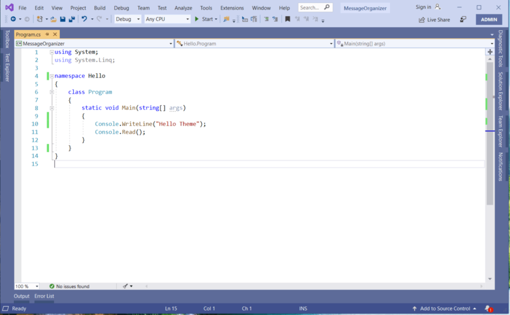
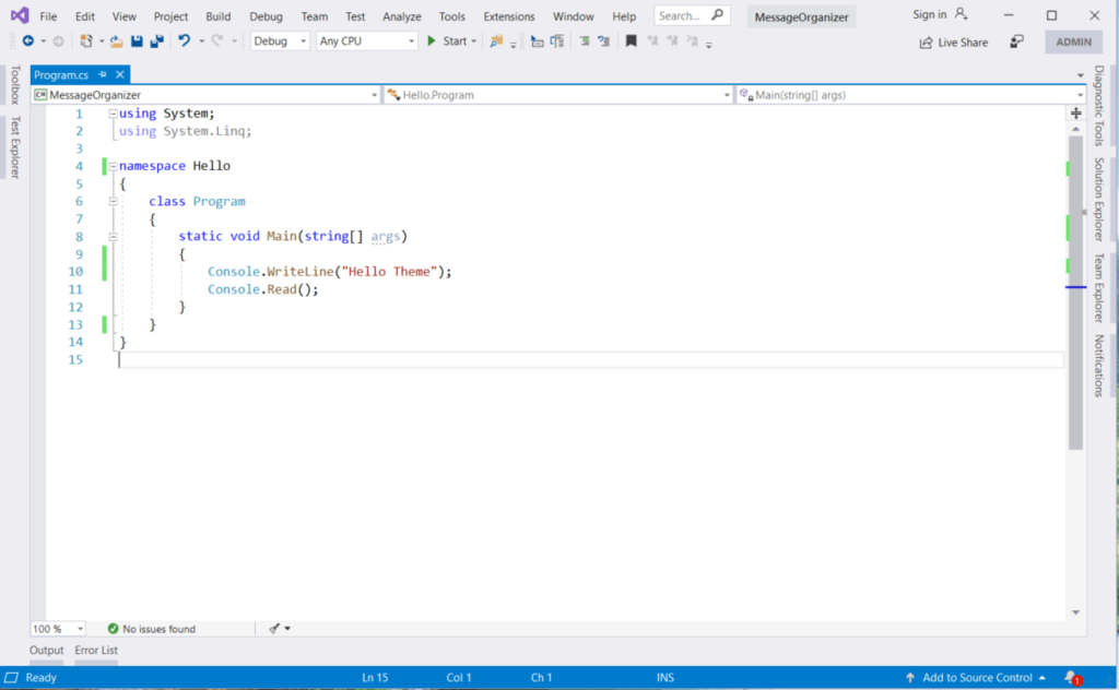
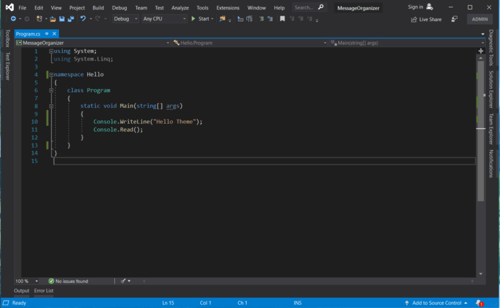
Visual Studio 2019 comes with 4 pre-installed themes they are: Blue, Light, Dark, and Blue with Extra Contrast. In order to change the theme the user needs to open Visual Studio Options Dialog, this can be done in the following two ways given below, and from the Dialog, the user can select the Color Theme of his choice.
- Press Control + Q and type “Themes” in the text box and select “Change environment color themes” from the given option. This will open the Options Dialog.
2. Open the Tools menu and select Options, this will open the Options Dialog, then select Environment node in it, and select “Color Theme” of your choice and click Ok.
Snapshot of pre-built themes
1. Blue Theme
2. Light Color
3. Dark Color
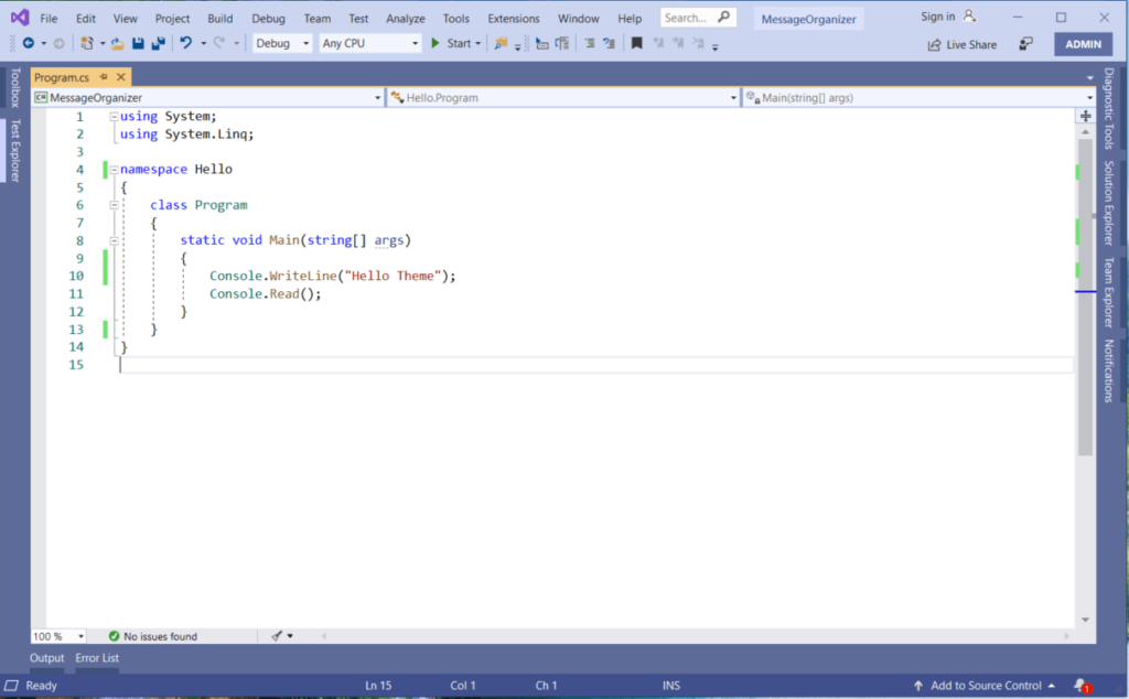
Video Tutorial – Change and Import Themes
Installing External Themes from Visual Studio Marketplace
Apart from the pre-installed them, if you want to install an external theme, you can install it directly from Visual Studio using the Visual Studio Marketplace following the simple steps below
Step-1: Select Extensions Menu and Manage Extensions
This will open an “Manage Extensions Dialog“
Step-2: Select Visual Studio Marketplace under Online Node
Step-3: Search for Themes and select the theme you want.
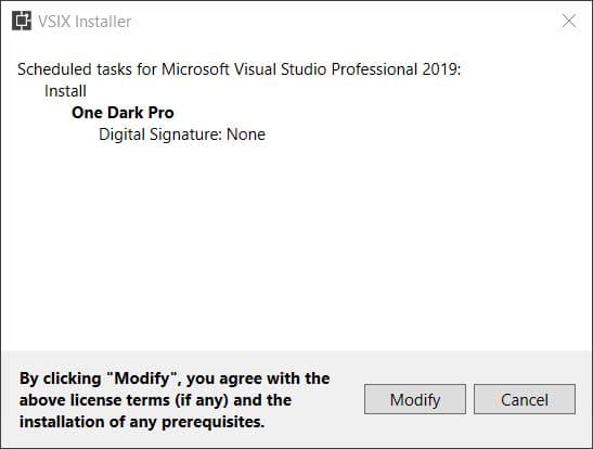
Select the theme (I have selected One Dark Pro theme) you want and then click on the download button. After you download the theme, Visual Studio will schedule the installation on restart. Just restart Visual Studio, this will open the VSIX installer dialog click on the “Modify” button to install the theme.
Step-4: Select the installed theme and apply
After successful installation, the theme will be available in the “Color Theme” options, select the installed one and click OK to apply changes.
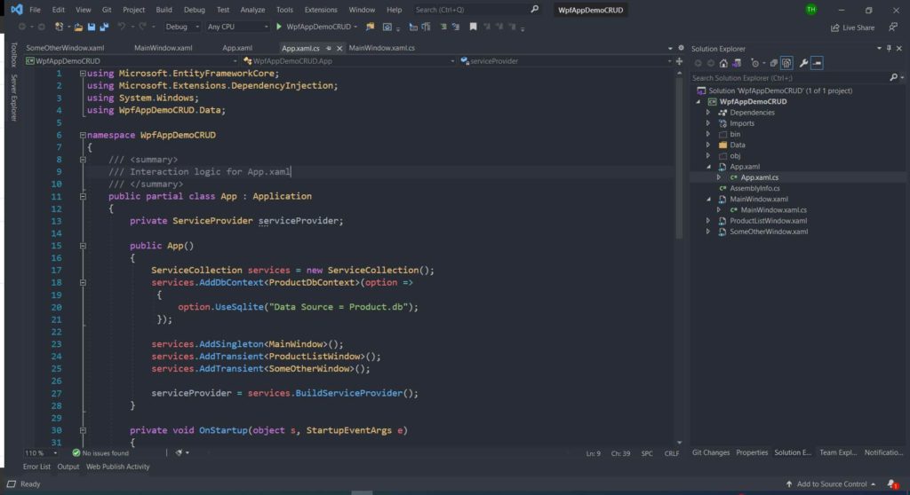
Step-5: Applied Theme Visual Changes
Curious user can create a new theme or modify existing Visual Themes using “Color Theme Editor” provided by Microsoft DevLabs [download here] or can download “Color Themes” Microsoft DevLabs [download here]
Visit Studio Styles to check 4000+ Color Themes for Visual Studio
I hope you find the post on how to change the Visual Studio 2019 Theme helpful. Thanks for visiting. Cheers!!!
[Further Readings: How to create an ASP NET Core MVC Web Application using dotnet-cli | How to create an ASP.NET Core Web Application using dotnet-cli | How to create a dotnet core NUnit Test Project using dotnet-cli | How to create a dotnet core xUnit Test Project using dotnet-cli | How to create a dotnet core MSTest Project using dotnet-cli | How to create dotnet core WinForms Application using dotnet-cli | How to create a dotnet core WPF application using dotnet-cli | How to create a dotnet core console app using dotnet-cli | Top 7 Web Frameworks to Learn and Focus on in 2021 | Singleton Design Pattern in C# | Introduction to Design Patterns ]
4.2 5 votes
Article Rating
| title | description | titleSuffix | ms.date | ms.topic | ms.custom | helpviewer_keywords | ms.assetid | author | ms.author | manager | ms.technology | ms.workload | ||
|---|---|---|---|---|---|---|---|---|---|---|---|---|---|---|
|
Change themes, fonts, text, and contrast for accessibility |
Learn how to change Visual Studio color themes, font colors, text sizes, extra-contrast colors, and more for ease of use and accessibility concerns. |
04/15/2022 |
how-to |
contperf-fy22q3 |
|
60d91ba1-244b-4c43-847f-60b744f1352a |
TerryGLee |
tglee |
jmartens |
vs-ide-general |
multiple |
How to: Change fonts, colors, and themes in Visual Studio
[!INCLUDE Visual Studio]
::: moniker range=»>=vs-2022″
You can change the fonts and the colors in Visual Studio in several ways. For example, you can change the default dark theme (also referred to as «dark mode») to a light theme, a blue theme, an extra-contrast theme, or a theme that matches your system settings. You can also change the default font and text size in both the IDE and the code editor.
[!TIP]
See the We’ve upgraded the UI in Visual Studio 2022 blog post to learn more about the subtle color contrast ratio adjustments and a new Cascadia Code font we’ve added to make Visual Studio more accessible for everyone.
::: moniker-end
::: moniker range=»<=vs-2019″
You can change the fonts and the colors in Visual Studio in many ways. For example, you can change the default blue color theme to the dark theme (also referred to as «dark mode»). You can also select an extra-contrast theme if that best suits your needs. And, you can change the default font and text size in both the IDE and the code editor.
::: moniker-end
Change the color theme
Here’s how to change the color theme of the IDE frame and the tool windows in Visual Studio.
::: moniker range=»>=vs-2022″
-
On the menu bar, choose Tools > Options.
-
In the options list, choose Environment > General.
-
In the Color theme list, choose either the default Dark theme, the Light theme, the Blue theme, or the Blue (Extra Contrast) theme.
You can also choose to use the theme that Windows uses by selecting Use system setting.
:::image type=»content» source=»media/vs-2022/fonts-colors-theme.png» alt-text=»Screenshot of the Options dialog box where you can change the color theme.»:::
[!NOTE]
When you change a color theme, text in the IDE reverts to the default or previously customized fonts and sizes for that theme.[!TIP]
Want even more themes to choose from? Check out the wide range of custom themes on the Visual Studio Marketplace. And to see examples of new Visual Studio 2022 custom themes based on VS Code, take a look at the Introducing a collection of new Visual Studio themes blog post.
::: moniker-end
::: moniker range=»<=vs-2019″
-
On the menu bar, choose Tools > Options.
-
In the options list, choose Environment > General.
-
In the Color theme list, choose either the default Blue theme, the Light theme, the Dark theme, or the Blue (Extra Contrast) theme.
[!NOTE]
When you change a color theme, text in the IDE reverts to the default or previously customized fonts and sizes for that theme.[!TIP]
You can create and edit your own Visual Studio themes by using an extension. Choose from either of the following two options, depending on the version of Visual Studio you’re using:- Color Theme Designer for Visual Studio 2019.
- Color Theme Editor for Visual Studio 2017
::: moniker-end
Change fonts and text size
You can change the font and text size for all the IDE frame and tool windows, or for only certain windows or text elements. You can also change the font and text size in the editor, too.
To change the font and text size in the IDE
::: moniker range=»>=vs-2022″
-
On the menu bar, choose Tools > Options.
-
In the options list, choose Environment > Fonts and Colors.
-
In the Show settings for list, choose Environment.
[!NOTE]
If you want to change the font for tool windows only, in the Show settings for list, choose All Text Tool Windows. -
Modify the Font and Size options to change the font and text size for the IDE.
-
Select the appropriate item in Display items, and then modify the Item foreground and Item background options.
::: moniker-end
::: moniker range=»<=vs-2019″
-
On the menu bar, choose Tools > Options.
-
In the options list, choose Environment > Fonts and Colors.
-
In the Show settings for list, choose Environment.
[!NOTE]
If you want to change the font for tool windows only, in the Show settings for list, choose All Text Tool Windows. -
Modify the Font and Size options to change the font and text size for the IDE.
-
Select the appropriate item in Display items, and then modify the Item foreground and Item background options.
::: moniker-end
To change the font and text size in the editor
::: moniker range=»>=vs-2022″
-
On the menu bar, choose Tools > Options.
-
In the options list, choose Environment > Fonts and Colors.
-
In Show settings for list, select Text Editor.
-
Modify the Font and Size options to change the font and text size for the editor.
-
Select the appropriate item in Display items, and then modify the Item foreground and Item background options.
::: moniker-end
::: moniker range=»<=vs-2019″
-
On the menu bar, choose Tools > Options.
-
In the options list, choose Environment > Fonts and Colors.
-
In Show settings for list, select Text Editor.
-
Modify the Font and Size options to change the font and text size for the editor.
-
Select the appropriate item in Display items, and then modify the Item foreground and Item background options.
::: moniker-end
For more information about how to change fonts and colors for accessibility, see the Set accessibility options section of this page. And, for details about all the user interface (UI) elements where you can change font and color schemes, see the Fonts and Colors, Environment, Options Dialog Box page.
Set language-specific editor options
You can make a variety of changes to the code editor to suit your programming language of choice. For example, you can change brace formatting in C# to appear inline or on a new line, and more. To learn how to customize the code editor, see Set language-specific editor options.
Set accessibility options
::: moniker range=»vs-2022″
In a neurodiverse world, we want to support our different learners and low-vision users by offering the following font options and color themes:
- You can use the Cascadia Code font, which adds more weight to the proportions of letters, numerals, and characters to help disambiguate them. Cascadia Code also includes coding ligatures.
- You can choose to use a high-contrast color theme for all the apps and UI on a computer, or an extra-contrast color theme for Visual Studio only.
Use the Cascadia Code font
The new Cascadia Code font includes Cascade Mono, which is the default font in Visual Studio 2022. Not only are both of these fonts easier to read, but the Cascadia Code font also includes coding ligatures that turn a sequence of characters into a glyph. Coding ligatures, or glyphs, make it easier for people to cognitively associate the meaning behind them.
The following screenshot shows an example of the default Cascadia Mono font and lists a series of characters, to include mathematical symbols, that you might find yourself using while you code.
:::image type=»content» source=»media/vs-2022/cascadia-mono-font.png» alt-text=»Screenshot of an example of the Cascadia Mono font in the Editor.»:::
The following screenshot shows an example of the Cascadia Code font, where the same series of characters shown previously are now converted to coding ligatures, or glyphs.
:::image type=»content» source=»media/vs-2022/cascadia-code-font.png» alt-text=»Screenshot of an example of the Cascadia Code font in the Editor.»:::
Notice that the last line of text in the Cascadia Code screenshot shows how the space between duplicate characters is reduced, which also makes them easier to read.
Here’s how to toggle between the Cascadia fonts:
-
Go to Tools > Options > Environment > Fonts and colors.
-
From the Font dropdown list, select either the Cascadia Code font or the Cascadia Mono font you want, and then select OK.
:::image type=»content» source=»media/vs-2022/cascadia-font-options.png» alt-text=»Screenshot of the Cascadia fonts available from the Options dialog box.»:::
::: moniker-end
::: moniker range=»<=vs-2019″
There are color theme options for you if you experience low vision. You can use a high-contrast option for all the apps and UI on a computer, or an extra contrast option for Visual Studio only.
::: moniker-end
Use Windows high contrast
Use either of the following procedures to toggle the Windows high contrast option:
-
In Windows or in any Microsoft application, press the Left Alt+Left Shift+PrtScn keys.
-
In Windows, choose Start > Settings > Ease of Access. Then, under the Vision section in Windows 10 and later, choose High contrast.
[!WARNING]
The Windows high contrast setting affects all applications and UI on the computer.
Use Visual Studio extra contrast
Use the following procedures to toggle the Visual Studio extra contrast option:
-
On the menu bar in Visual Studio, choose Tools > Options, and then, in the options list, choose Environment > General.
-
In the Color theme drop-down list, choose the Blue (Extra Contrast) theme, and then choose OK.
[!TIP]
If there is an accessibility option for colors or fonts that you think might be useful but isn’t currently available in Visual Studio, please let us know by selecting Suggest a feature in the Visual Studio Developer Community. For more information about this forum and how it works, see the Suggest a feature page.
More accessibility features in Visual Studio
Visual Studio also includes features to help people who have limited dexterity to write. For example, Visual Studio supports Dvorak keyboard layouts, which make the most frequently typed characters more accessible.
You can also customize the default keyboard shortcuts available with Visual Studio. For more information, see the following pages:
- Identify and customize keyboard shortcuts
- How to use the keyboard exclusively
- Keyboard shortcuts in Visual Studio
Visual Studio also includes auto-completion for methods and parameters; for more information, see IntelliSense in Visual Studio.
There are more ways to customize Visual Studio to be more accessible to you. For example, you can change the behavior of pop-up windows, text-based tool windows, toolbar buttons, margin indicators, and more.
[!NOTE]
The dialog boxes and menu commands you see might differ from those described here, which can vary depending on your active settings or edition. To change your settings, choose Import and Export Settings on the Tools menu. For more information, see Reset settings.
Change the behavior of pop-up windows
Visual Studio displays pop-up windows in the editor. These pop-up windows include information that makes coding easier, such as parameters to complete a function or statement. The pop-up windows can also be helpful if you have difficulty typing. However, some users might find that they interfere with focus in the code editor, which can be problematic.
Here’s how to turn off the pop-up windows:
-
From the Tools menu, choose Options.
-
Choose Text Editor > All Languages > General.
-
Clear the Auto list members and Parameter information checkboxes.
You can rearrange the windows in the integrated development environment (IDE) to best suit the way you work. You can dock, float, hide, or automatically hide each tool window. For more information about how to change window layouts, see Customize window layouts.
Change the settings of text-based tool windows
You can change the settings for text-based tool windows, such as the Command window, Immediate window, and Output window by using Tools > Options > Environment > Fonts and Colors.
When you select [All Text Tool Windows] in the Show settings for drop-down list, the default setting is listed as Default in the Item foreground and Item background drop-down lists. Choose the Custom button to change these settings.
You can also change the settings for how text is displayed in the editor. Here’s how.
-
From the Tools menu, choose Options.
-
Choose Environment > Fonts and Colors.
-
Select an option on the Show settings for drop-down menu.
To change the font size for text in an editor, choose Text Editor.
To change the font size for text in text-based tool windows, choose [All Text Tool Windows].
To change the font size for ToolTip text in an editor, choose Editor Tooltip.
To change the font size for text in statement completion pop-ups, choose Statement Completion.
-
From Display items, select Plain Text.
-
In Font, select a new font type.
-
In Size, select a new font size.
[!TIP]
To reset the text size for text-based tool windows and editors, choose Use Defaults. -
Choose OK.
Change the colors for text, margin indicators, white space, and code elements
You can choose to change the default colors for text, margin indicators, white space, and code elements in the editor. Here’s how.
-
From the Tools menu, choose Options.
-
In the Environment folder, choose Fonts and Colors.
-
In Show settings for, choose Text Editor.
-
From Display items, select an item whose display you need to change, such as Plain Text, Indicator Margin, Visible White Space, HTML Attribute Name, or XML Attribute.
-
Select display settings from the following options: Item foreground, Item background, and Bold.
-
Choose OK.
[!TIP]
To use high contrast colors for all application windows on your operating system, press Left Alt+Left Shift+PrtScn. If Visual Studio is open, close and then reopen it to fully implement high contrast colors.
Add text to toolbar buttons or modify the text
To improve toolbar usability and accessibility, you can add text to toolbar buttons.
To assign text to toolbar buttons
-
From the Tools menu, choose Customize.
-
In the Customize dialog box, select the Commands tab.
-
Select Toolbar, and then choose the toolbar name that contains the button you intend to display text for.
-
In the list, select the command you intend to change.
-
Choose Modify Selection.
-
Choose Image and Text.
To modify the displayed text in a button
-
Re-select Modify Selection.
-
Adjacent to In Name, insert provide a new caption for the selected button.
Accessibility support
For more information about features, products, and services that make Windows more accessible for people with disabilities, see Accessibility products and services from Microsoft. And, for more information about how to obtain more accessible formats of documentation for Microsoft products, see the Documentation in alternative formats section of the Accessibility products and services from Microsoft page.
The accessibility information included on this page might apply only to users who license Microsoft products in the United States. If you obtained this product outside of the United States, visit the Microsoft Accessibility website for a list of Microsoft support services telephone numbers and addresses. You can contact your subsidiary to find out whether the type of products and services described on this page are available in your area. Information about accessibility is also available in other languages.
See also
- Features of the Visual Studio code editor
- Personalize the Visual Studio IDE and the editor
Color Themes
Color themes let you modify the colors in Visual Studio Code’s user interface to suit your preferences and work environment.
Selecting the Color Theme
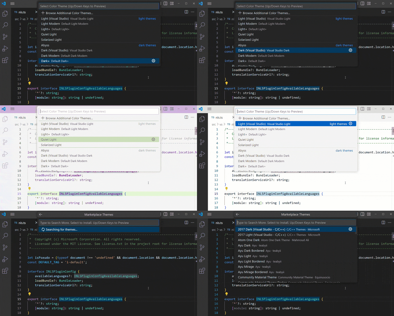
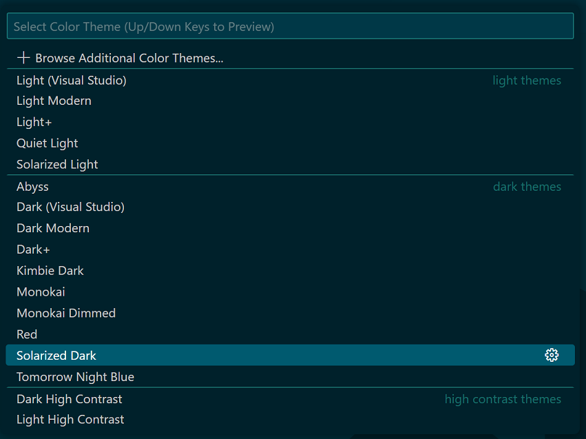
- In VS Code, open the Color Theme picker with File > Preferences > Theme > Color Theme. (Code > Preferences > Theme > Color Theme on macOS).
- You can also use the keyboard shortcut ⌘K ⌘T (Windows, Linux Ctrl+K Ctrl+T) to display the picker.
- Use the cursor keys to preview the colors of the theme.
- Select the theme you want and press Enter.
The active color theme is stored in your user settings (keyboard shortcut ⌘, (Windows, Linux Ctrl+,)).
  // Specifies the color theme used in the workbench.
  "workbench.colorTheme": "Default Dark+"
Tip: By default, the theme is stored in your user settings and applies globally to all workspaces. You can also configure a workspace specific theme. To do so, set a theme in the Workspace settings.
Color Themes from the Marketplace
There are several out-of-the-box color themes in VS Code for you to try.
Many more themes have been uploaded to the VS Code Extension Marketplace by the community. If you find one you want to use, install it and restart VS Code and the new theme will be available.
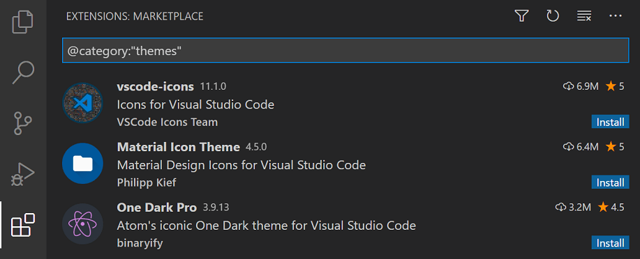
You can search for themes in the Extensions view (⇧⌘X (Windows, Linux Ctrl+Shift+X)) search box using the @category:"themes" filter.
Auto switch based on OS color scheme
Windows and macOS support light and dark color schemes. There is a setting, window.autoDetectColorScheme, that instructs VS Code to listen to changes to the OS’s color scheme and switch to a matching theme accordingly.
To customize the themes that are used when a color scheme changes, you can set the preferred light, dark, and high contrast themes with the settings:
workbench.preferredLightColorTheme— defaults to «Default Light+»workbench.preferredDarkColorTheme— defaults to «Default Dark+»workbench.preferredHighContrastColorTheme— defaults to «Default High Contrast»workbench.preferredHighContrastLightColorTheme— defaults to «Default High Contrast Light»
Customizing a Color Theme
Workbench colors
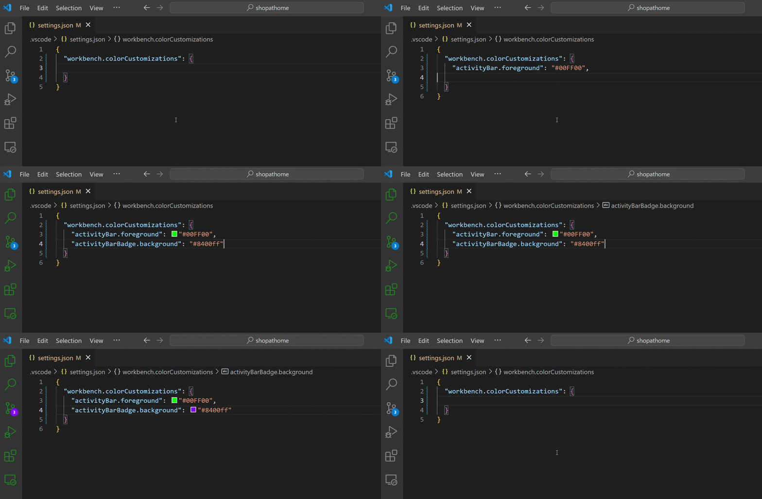
You can customize your active color theme with the workbench.colorCustomizations and editor.tokenColorCustomizations user settings.
To set the colors of VS Code UI elements such as list & trees (File Explorer, suggestions widget), diff editor, Activity Bar, notifications, scroll bar, split view, buttons, and more, use workbench.colorCustomizations.
You can use IntelliSense while setting workbench.colorCustomizations values or, for a list of all customizable colors, see the Theme Color Reference.
To customize a specific theme only, use the following syntax:
"workbench.colorCustomizations": {
    "[Monokai]": {
        "sideBar.background": "#347890"
    }
}
If a customization applies to more than one themes, you can name multiple themes or use * as wildcard at the beginning and the end of the name:
"workbench.colorCustomizations": {
    "[Abyss][Red]": {
        "activityBar.background": "#ff0000"
    },
    "[Monokai*]": {
        "activityBar.background": "#ff0000"
    }
}
Editor syntax highlighting
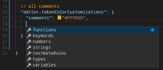
To tune the editor’s syntax highlighting colors, use editor.tokenColorCustomizations in your user settings settings.json file:
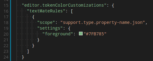
A pre-configured set of syntax tokens (‘comments’, ‘strings’, …) is available for the most common constructs. If you want more, you can do so by directly specifying TextMate theme color rules:
Note: Directly configuring TextMate rules is an advanced skill as you need to understand on how TextMate grammars work. Go to the Color Theme guide for more information.
Again, to customize specific themes, you can do this in one of the following ways:
"editor.tokenColorCustomizations": {
    "[Monokai]": {
        "comments": "#229977"
    },
    "[*Dark*]": {
        "variables": "#229977"
    },
    "[Abyss][Red]": {
        "keywords": "#f00"
    }
}
Editor semantic highlighting
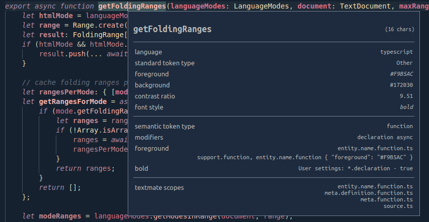
Some languages (currently: TypeScript, JavaScript, Java) provide semantic tokens. Semantic tokens are based on the language service’s symbol understanding and are more accurate than the syntax tokens coming from the TextMate grammars that are driven by regular expressions. The semantic highlighting that is computed from the semantic tokens goes on top of syntax highlighting and can correct and enrich the highlighting as seen in the following example:
The «Tomorrow Night Blue» color theme without semantic highlighting:
The «Tomorrow Night Blue» color theme with semantic highlighting:
Notice the color differences based on language service symbol understanding:
- line 10:
languageModesis colored as a parameter. - line 11:
RangeandPositionare colored as classes anddocumentas a parameter. - line 13:
getFoldingRangesis colored as a function.
The settings editor.semanticHighlighting.enabled serves as the main control on whether semantic highlighting is applied. It can have values true, false, and configuredByTheme.
trueandfalseturn semantic highlighting on or off for all themes.configuredByThemeis the default and lets each theme control whether semantic highlighting is enabled or not. All the themes that ship with VS Code (for example, the «Dark+» default) have semantic highlighting enabled by default.
Users can override the theme setting by:
"editor.semanticTokenColorCustomizations": {
    "[Rouge]": {
        "enabled": true
    }
}
When semantic highlighting is enabled and available for a language, it is up to the theme to configure whether and how semantic tokens are colored. Some semantic tokens are standardized and map to well-established TextMate scopes. If the theme has a coloring rule for these TextMate scopes, the semantic token will be rendered with that color, without the need for any additional coloring rules.
Additional styling rules can be configured by the user in editor.semanticTokenColorCustomizations":
"editor.semanticTokenColorCustomizations": {
    "[Rouge]": {
        "enabled": true,
        "rules": {
            "*.declaration": { "bold": true }
        }
    }
}
To see what semantic tokens are computed and how they are styled, users can use the scope inspector (Developer: Inspect Editor Tokens and Scopes), which displays information for the text at the current cursor position.
If semantic tokens are available for the language at the given position and enabled by theme, the inspect tool shows a section semantic token type. The section shows the semantic token information (type and any number of modifiers) as well as the styling rules that apply.
More information on semantic tokens and styling rule syntax can be found in the Semantic Highlighting Guide.
Creating your own Color Theme
Creating and publishing a theme extension is easy. Customize your colors in your user settings then generate a theme definition file with the Developer: Generate Color Theme From Current Settings command.
VS Code’s Yeoman extension generator will help you generate the rest of the extension.
See the Create a new Color Theme topic in our Extension API section to learn more.
Remove default Color Themes
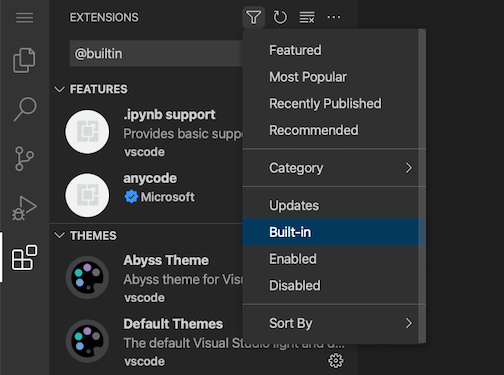
If you’d like to remove some of the default themes shipped with VS Code from the Color Theme picker, you can disable them from the Extensions view (⇧⌘X (Windows, Linux Ctrl+Shift+X)). Click the Filter Extensions button from the top of the Extensions view, select the Built-in option, and you’ll see a THEMES section listing the default themes.
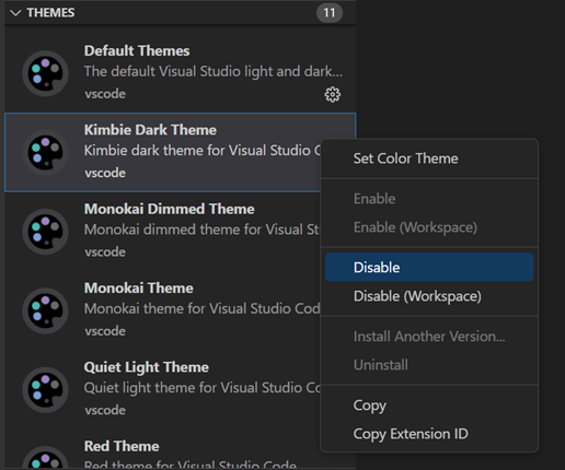
You can disable a built-in theme extension as you would any other VS Code extension with the Disable command on the gear context menu.
File Icon Themes
File icon themes can be contributed by extensions and selected by users as their favorite set of file icons. File icons are shown in the File Explorer and tabbed headings.
Selecting the File Icon Theme
- In VS Code, open the File Icon Theme picker with File > Preferences > Theme > File Icon Theme. (Code > Preferences > Theme > File Icon Theme on macOS).
- You can also use the Preferences: File Icon Theme command from the Command Palette (⇧⌘P (Windows, Linux Ctrl+Shift+P)).
- Use the cursor keys to preview the icons of the theme.
- Select the theme you want and hit Enter.
By default, the Seti file icon set is used and those are the icons you see in the File Explorer. Once a file icon theme is selected, the selected theme will be remembered and appear again whenever VS Code is restarted. You can disable file icons by selecting None.
VS code ships with two file icon themes; Minimal and Seti. To install more file icon themes, select the Install Additional File Icon Themes item in the file icon theme picker and you’ll see a query for file icon themes (tag:icon-theme) in the Extensions view.
You can also browse the VS Code Marketplace site directly to find available themes.
The active File Icon theme is persisted in your user settings (keyboard shortcut ⌘, (Windows, Linux Ctrl+,)).
  // Specifies the file icon theme used in the workbench.
  "workbench.iconTheme": "vs-seti"
Creating your own File Icon Theme
You can create your own File Icon Theme from icons (preferably SVG), see the File Icon Theme topic in our Extension API section for details.
Next steps
Themes are just one way to customize VS Code. If you’d like to learn more about VS Code customization and extensibility, try these topics:
- Settings — Learn how to configure VS Code to your preferences through user and workspace settings.
- Snippets — Add additional snippets to your favorite language.
- Extension API — Learn about other ways to extend VS Code.
- Color Theme — Color Theme extension API.
- File Icon Theme — File Icon Theme extension API.
2/2/2023

Just earlier this month, Microsoft released a new extension for theming in Visual Studio called Color Theme Designer. You read that right, Visual Studio, not VS Code! 😥😲 With the announcement I wanted to try my hand at making something I could enjoy, as there haven’t exactly been many VS themes to choose from. I must admit here I never tried the old Color Theme Editor extension, though from the lack of themes and what was mentioned in the announcement, I can see why few did.
«If you were brave enough to create your own theme, you had to edit elements one by one from an unorganized list of 3,000+ vaguely named color tokens.
This summer, a group of interns has developed a newly released Color Theme Designer extension, and we’re hoping that making custom themes just got a whole lot simpler for beginner and advanced designers alike.»
While there can still be moments that feel confusing, the process is bootstrapped by a «quick start», allowing you to start with a base theme then selecting primary, secondary, and accent colors.
This generates a palette of colors for you based on your selections. This got me about 90% to where I wanted to be, but there were still some glaring problems quirks.
Text and keywords had been altered in hue, but the editor background was the same. Menu backgrounds looked great, but their hover state had super low contrast. Don’t get me started on my map mode scrollbar.
I developed some patience for using the color categories within «All Elements», but only after learning the hard way that I couldn’t just mass update any color to a new one. Suddenly random text had an ugly background color that I couldn’t get back to normal, and when highlighting text that background covered the highlight color. It was here I realized I hadn’t started a git repo to track changes. Amateur hour! 🤦♂️
If you find yourself in this situation, here is the trick I used to get back on track. I made a second project using the same base theme and colors, then diffed the .vstheme file. I was able to save those changes I meant to keep, and revert the blanket changes I made. If you are doing anything more than a quick start, use version control!
In the end, I was super happy with the results. I now present to you my first ever theme, Midnight Lights.
While it still has quirks that I’m finding, It’s been a fun learning opportunity. Hopefully within the next week I’ll be publishing it as an extension, available within Visual Studio’s new extension category of Themes! Until then feel free to download or fork it on GitHub.
Midnight Lights Visual Studio Theme
🌌 Midnight Lights is a dark theme for Visual Studio 2019, made with Color Theme Designer.
This is my first theme and you will probably find some quirks. This is a personal project, but feel free to fork the repository!
Installation
After installing the extension from the Marketplace, the theme will be available in the dropdown under Tools -> Options -> General.
Misc
CI/CD uses Azure DevOps, following Meziantou’s Blog.
I like to extend my theme with Viasfora, mostly for Rainbow Braces. I’ve added my Viasfora theme within the github repo as viasfora-theme.json. If you’re a Viasfora user, themes can be exported/imported from Tools -> Options -> Viasfora -> Import/Export.
Versions
v1.1.5
- Modified peek background, updated theme icon
v1.1.1
- Modified Razor code highlighting to better match theme
v1.1
- Darkened editor background to match window backgrounds
- Darkened menu…
Have you tried the Color Theme Designer yet? What was your experience? What features/tweaks would you like to see?
UPDATE: The extension is now published! Install it from the Visual Studio Marketplace.
Timeless DEV post…
Git Concepts I Wish I Knew Years Ago
The most used technology by developers is not Javascript.
It’s not Python or HTML.
It hardly even gets mentioned in interviews or listed as a pre-requisite for jobs.
I’m talking about Git and version control of course.
Read next
Train a language model from scratch
David Mezzetti — Jan 12
Building Personalised Music Recommendation System
Vladyslav Hutov — Jan 11
How I archived 100 million PDF documents… — Part 1: Reasons & Beginning
Gyula Lakatos — Jan 11
Synapses: Event-driven Alternative to React Context
Can Mingir — Jan 10
Once unpublished, all posts by austinstanding will become hidden and only accessible to themselves.
If austinstanding is not suspended, they can still re-publish their posts from their dashboard.
Note:
Once unpublished, this post will become invisible to the public and only accessible to Austin Standing.
They can still re-publish the post if they are not suspended.
Thanks for keeping DEV Community 👩💻👨💻 safe. Here is what you can do to flag austinstanding:
Make all posts by austinstanding less visible
austinstanding consistently posts content that violates DEV Community 👩💻👨💻’s
code of conduct because it is harassing, offensive or spammy.


