Welcome to a quick tutorial on how to create custom error messages with pure CSS. By now, you should have experienced the intrusive default Javascript alert box. Every time it shows up, users get scared away. So here it is, let us walk through a few examples of “alternative” error notification bars that are more elegant and not as intrusive – Read on!
ⓘ I have included a zip file with all the source code at the start of this tutorial, so you don’t have to copy-paste everything… Or if you just want to dive straight in.
TABLE OF CONTENTS
DOWNLOAD & NOTES

Firstly, here is the download link to the example code as promised.
QUICK NOTES
If you spot a bug, feel free to comment below. I try to answer short questions too, but it is one person versus the entire world… If you need answers urgently, please check out my list of websites to get help with programming.
EXAMPLE CODE DOWNLOAD
Click here to download the source code, I have released it under the MIT license, so feel free to build on top of it or use it in your own project.
CSS-ONLY ERROR NOTIFICATIONS

Let us start with the raw basics by creating notification bars with just pure CSS and HTML.
1) BASIC NOTIFICATION BAR
1A) THE HTML
1-basic.html
<div class="bar">Plain message</div>
<div class="bar info">Information message</div>
<div class="bar success">Successful message</div>
<div class="bar warn">Warning message</div>
<div class="bar error">Error message</div>
That is actually all we need to create a custom error message, an HTML <div> with the notification message inside. Take note of the bar and info | success | warn | error CSS classes – We will use these to build the notification bar.
1B) THE CSS
error-bar.css
/* (A) THE BASE */
.bar {
  padding: 10px;
  margin: 10px;
  color: #333;
  background: #fafafa;
  border: 1px solid #ccc;
}

/* (B) THE VARIATIONS */
.info {
  color: #204a8e;
  background: #c9ddff;
  border: 1px solid #4c699b;
}
.success {
  color: #2b7515;
  background: #ecffd6;
  border: 1px solid #617c42;
}
.warn {
  color: #756e15;
  background: #fffbd1;
  border: 1px solid #87803e;
}
.error {
  color: #ba3939;
  background: #ffe0e0;
  border: 1px solid #a33a3a;
}
The CSS is straightforward as well –
.baris literally the “basic notification bar” with padding, margin, and border..info | .success | .warn | .errorsets various different colors to fit the “level of notification”.
Feel free to changes these to fit your own website’s theme.
1C) THE DEMO
Plain message
Information message
Successful message
Warning message
Error message
2) ADDING ICONS
2A) THE HTML
2-icon.html
<div class="bar">
  <i class="ico">☀</i> Plain message
</div>
<div class="bar info">
  <i class="ico">ℹ</i> Information message
</div>
<div class="bar success">
  <i class="ico">✔</i> Successful message
</div>
<div class="bar warn">
  <i class="ico">⚠</i> Warning message
</div>
<div class="bar error">
  <i class="ico">☓</i> Error message
</div>
To add icons to the notification bar, we simply prepend the messages with <i class="ico">&#XXXX</i>. For those who do not know – That &#XXXX is a “native HTML symbol”, no need to load extra libraries. Do a search for “HTML symbols list” on the Internet for a whole list of it.
P.S. Check out Font Awesome if you want more icon sets.
2B) THE CSS
error-bar.css
/* (C) ICONS */
i.ico {
  display: inline-block;
  width: 20px;
  text-align: center;
  font-style: normal;
  font-weight: bold;
}
Just a small addition to position the icon nicely.
2C) THE DEMO
☀ Plain message
ℹ Information message
✔ Successful message
⚠ Warning message
☓ Error message
JAVASCRIPT ERROR NOTIFICATIONS

The above notification bars should work sufficiently well, but here are a few small improvements if you are willing to throw in some Javascript.
3) ADDING CLOSE BUTTONS
3A) THE HTML
3-close.html
<div class="bar">
  <div class="close" onclick="this.parentElement.remove()">X</div>
  <i class="ico">☀</i> Plain message
</div>
<div class="bar info">
  <div class="close" onclick="this.parentElement.remove()">X</div>
  <i class="ico">ℹ</i> Information message
</div>
<div class="bar success">
  <div class="close" onclick="this.parentElement.remove()">X</div>
  <i class="ico">✔</i> Successful message
</div>
<div class="bar warn">
  <div class="close" onclick="this.parentElement.remove()">X</div>
  <i class="ico">⚠</i> Warning message
</div>
<div class="bar error">
  <div class="close" onclick="this.parentElement.remove()">X</div>
  <i class="ico">☓</i> Error message
</div>
Not much of a difference here, except that we now add a <div class="close"> that will act as the close button.
3B) THE CSS
error-bar.css
/* (D) CLOSE BUTTON */
.bar { position: relative; }
div.close {
  position: absolute;
  top: 30%;
  right: 10px;
  color: #888;
  cursor: pointer;
}
There is not much added to the CSS as well. We simply position the close button to the right of the notification bar, and that’s about it.
3C) THE DEMO
4) PACKAGED ERROR NOTIFICATIONS
4A) THE HTML
4-js.html
<!-- (A) LOAD CSS + JS -->
<link href="error-bar.css" rel="stylesheet">
<script src="error-bar.js"></script>

<!-- (B) HTML CONTAINER -->
<div id="demo"></div>

 <!-- (C) FOR TESTING -->
<script>
let demo = document.getElementById("demo");
ebar({ target: demo, msg: "Plain" });
ebar({ lvl: 1, target: demo, msg: "Information" });
ebar({ lvl: 2, target: demo, msg: "Success" });
ebar({ lvl: 3, target: demo, msg: "Warning" });
ebar({ lvl: 4, target: demo, msg: "Error" });
</script>
The notification bar is has gotten rather messy, and it is a pain to manually copy-paste them. So why not package everything into an easy-to-use Javascript ebar() function?
targetTarget HTML container to generate the error message.msgThe error or notification message.lvlOptional, error level.
4B) THE JAVASCRIPT
error-bar.js
function ebar (instance) {
// target : target html container
// msg : notification message
// lvl : (optional) 1-info, 2-success, 3-warn, 4-error

  // (A) CREATE NEW NOTIFICATION BAR
  let bar = document.createElement("div");
  bar.classList.add("bar");

  // (B) ADD CLOSE BUTTON
  let close = document.createElement("div");
  close.innerHTML = "X";
  close.classList.add("close");
  close.onclick = () => { bar.remove(); };
  bar.appendChild(close);

  // (C) SET "ERROR LEVEL"
  if (instance.lvl) {
    let icon = document.createElement("i");
    icon.classList.add("ico");
    switch (instance.lvl) {
      // (C1) INFO
      case 1:
        bar.classList.add("info");
        icon.innerHTML = "ℹ";
        break;

      // (C2) SUCCESS
      case 2:
        bar.classList.add("success");
        icon.innerHTML = "☑";
        break;

      // (C3) WARNING
      case 3:
        bar.classList.add("warn");
        icon.innerHTML = "⚠";
        break;

      // (C4) ERROR
      case 4:
        bar.classList.add("error");
        icon.innerHTML = "☓";
        break;
    }
    bar.appendChild(icon);
  }

  // (D) NOTIFICATION MESSAGE
  let msg = document.createElement("span");
  msg.innerHTML = instance.msg;
  bar.appendChild(msg);

  // (E) ADD BAR TO CONTAINER
  instance.target.appendChild(bar);
}
This may look complicated, but this function essentially just creates all necessary notification bar HTML.
4C) THE DEMO
LINKS & REFERENCES
- 6 Ways To Display Messages In HTML JS – Code Boxx
- 2 Ways To Display A Message After Submitting HTML Form – Code Boxx
- 10 Free CSS & JS Notification Alert Code Snippets -SpeckyBoy
- CSS Tips and Tricks for Customizing Error Messages! – Cognito Forms
THE END

Thank you for reading, and we have come to the end. I hope that it has helped you to better understand, and if you want to share anything with this guide, please feel free to comment below. Good luck and happy coding!
This tutorial will show you how to create and customize error messaging for various form elements. In this tutorial, we will customize everything from a basic error message to input field errors and tooltips. The best part? We will be using only CSS for customizations – that means no images or javascript required!
HTML
Below is the markup for the form elements we will be creating error messaging for. This is all of the HTML used throughout this tutorial. Copy and paste this code into your working file:
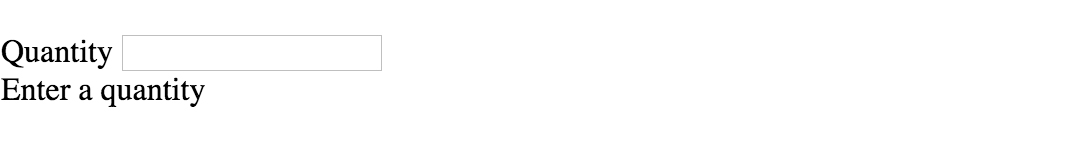
<!-- Basic Error Message -->
<div class="error-message">
  <span class="error-text">Checkout could not be completed. Please check your login information and try again.</span>
</div>

<!-- Input Field Error -->
<div class="input-group error">
  <label>Password *</label>
  <input type="text">
  <div class="error-message">Password is a required field.</div>
</div>

<!-- Input Field Error with Tooltip -->
<div class="input-group error">
  <label>Quantity</label>
  <input type="text">
  <div class="error-tip">Enter a quantity</div>
</div>
CSS
Now onto my personal favorite: the CSS. We will keep the basic functionality of the form elements but completely customize their appearance. In the end, they will stand on their own as custom design elements that thoughtfully guide the user through the form process, making it as straightforward and painless as possible.
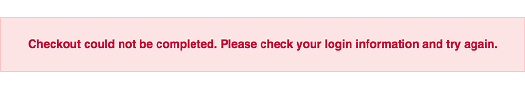
Basic Error Message
Let’s start with a basic error message. We are going to customize the HTML above to look like this:
This is what we start out with, by default, after adding the HTML:

Customizing a basic error message is really simple. All we have to do is give our text a colored background and a couple font styles using CSS. To style the error message background, add the following styles to your CSS stylesheet:
.error-message {
  background-color: #fce4e4;
  border: 1px solid #fcc2c3;
  float: left;
  padding: 20px 30px;
}
Now let’s style the text itself by adding the following font styles:
.error-text {
  color: #cc0033;
  font-family: Helvetica, Arial, sans-serif;
  font-size: 13px;
  font-weight: bold;
  line-height: 20px;
  text-shadow: 1px 1px rgba(250,250,250,.3);
}
That’s it! Keep reading to learn how to style input field and tooltip errors.
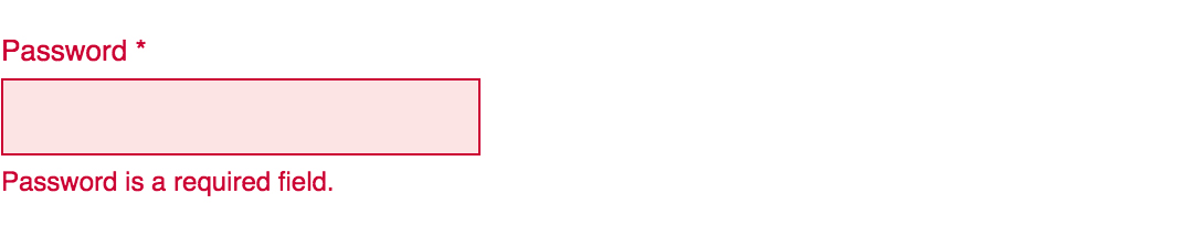
Input Field Error
Now that we have our basic error message styled, let’s work on input field errors. This is what the final product will look like:
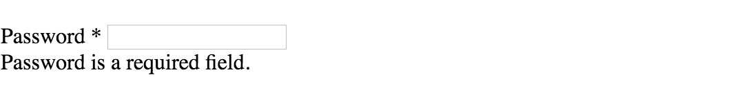
And this is what we start out with by default:
First, we want to override the browser’s default styles. Add the following CSS to give your input field a custom look:
/* Basic Input Styling */
.input-group {
  color: #333;
  float: left;
  font-family: Helvetica, Arial, sans-serif;
  font-size: 13px;
  line-height: 20px;
  margin: 0 20px 10px;
  width: 200px;
}

label {
  display: block;
  margin-bottom: 2px;
}

input[type=text] {
  background: #fff;
  border: 1px solid #999;
  float: left;
  font-size: 13px;
  height: 33px;
  margin: 0;
  padding: 0 0 0 15px;
  width: 100%;
}
Next, we need to add the styling for the error message that displays when a user does not correctly fill out an input field (i.e. the “This is a required field” message):
.error-message {
  color: #cc0033;
  display: inline-block;
  font-size: 12px;
  line-height: 15px;
  margin: 5px 0 0;
}
Lastly, add the error-specific styling for the input field elements:
.error label {
  color: #cc0033;
}

.error input[type=text] {
  background-color: #fce4e4;
  border: 1px solid #cc0033;
  outline: none;
}
Input Field Error with Tooltip
The last element we’re tackling is the tooltip. It is slightly more complicated than the others but well worth the effort. We will also be utilizing Sass nesting to better organize our code, and because we are only using SCSS it is 100% editable and scalable.
Once we are done, the tooltip will look like this:
And by default, this is what we start with after adding the HTML:
First, we override the browser’s default styles with our own custom styling:
/* Basic Input Styling */
.input-group {
  color: #333;
  float: left;
  font-family: Helvetica, Arial, sans-serif;
  font-size: 13px;
  line-height: 20px;
  margin-bottom: 10px;
  width: 100%;
}

label {
  display: block;
  margin-bottom: 5px;
}

input[type=text] {
  background: #fff;
  border: 1px solid #ccc;
  color: #333;
  float: left;
  font-family: Helvetica, Arial, sans-serif;
  font-size: 13px;
  height: 33px;
  line-height: 20px;
  margin: 0;
  padding: 0 0 0 15px;
  width: 45px;
}
Just like our previous example, we need to add the tooltip error message styling that displays when a form error occurs. Note: we are using Sass here to nest the tooltip’s left arrow properties. This comes in handy when trying to keep track of which values are assigned to the tooltip specifically:
/* Tooltip Styling */
.error-tip {
  background-color: #fce4e4;
  border: 1px solid #fcc2c3;
  border-radius: 7px;
  -moz-border-radius: 7px;
  -webkit-border-radius: 7px;
  display: inline;
  color: #cc0033;
  float: left;
  font-weight: bold;
  line-height: 24px;
  position: relative;
  padding: 7px 11px 4px;
  margin-left: 17px;
  // Left Arrow Styling Starts Here
  &:after, &:before {
    content: '';
    border: 7px solid transparent;
    position: absolute;
    top: 11px;
  }
  &:after {
    border-right: 7px solid #fce4e4;
    left: -14px;
  }
  &:before {
    border-right: 7px solid #fcc2c3;
    left: -15px;
  }
} // end .error-tip
Now all that’s left to do is define the input’s error-specific styling. Again, we will nest these styles under an “error” class selector to make classification and future changes easier:
/* Error Styling */
.error.input-group {
  label {
    color: #cc0033;
    font-weight: bold;
  }
  input {
    border: 2px solid #cc0033;
    line-height: 37px;
    outline: none;
  }
  .status {
    display: none;
  }
  .error-tip {
    display: inline;
  }
} // end .error
And that’s it! All the code you need to customize error messaging for default form elements. To experiment with the final results and copy and paste to your heart’s content (without fear of breaking anything), jump on over to Codepen by selecting any of the tutorial links below.
Codepen/Tutorial Links
All: codepen.io/seskew/
Basic Error Message: codepen.io/seskew/pen/akhLx
Input Field Error: codepen.io/seskew/pen/XKJKNQ
Input Field Error with Tooltip: codepen.io/seskew/pen/NrPNBp
Содержание
- Pure CSS Custom Error Messaging for Default Form Elements
- Basic Error Message
- Input Field Error
- Input Field Error with Tooltip
- Simple Custom Error Messages With Pure CSS
- TABLE OF CONTENTS
- DOWNLOAD & NOTES
- QUICK NOTES
- EXAMPLE CODE DOWNLOAD
- CSS-ONLY ERROR NOTIFICATIONS
- 1) BASIC NOTIFICATION BAR
- 1A) THE HTML
- 1B) THE CSS
- 1C) THE DEMO
- 2) ADDING ICONS
- 2A) THE HTML
- 2B) THE CSS
- 2C) THE DEMO
- JAVASCRIPT ERROR NOTIFICATIONS
- 3) ADDING CLOSE BUTTONS
- 3A) THE HTML
- 3B) THE CSS
- CSS Tips and Tricks for Customizing Error Messages!
- Before
- After
- Groundwork
- No Iframes
- This CSS Can Go Anywhere
- Selecting Elements
- The Class Names
- Selectors
- The CSS
- Error Message CSS Style Example with Demo
- HTML Structure
- CSS Style for Error Message
Pure CSS Custom Error Messaging for Default Form Elements
This tutorial will show you how to create and customize error messaging for various form elements. In this tutorial, we will customize everything from a basic error message to input field errors and tooltips. The best part? We will be using only CSS for customizations – that means no images or javascript required!
Below is the markup for the form elements we will be creating error messaging for. This is all of the HTML used throughout this tutorial. Copy and paste this code into your working file:
Now onto my personal favorite: the CSS. We will keep the basic functionality of the form elements but completely customize their appearance. In the end, they will stand on their own as custom design elements that thoughtfully guide the user through the form process, making it as straightforward and painless as possible .
Basic Error Message
Let’s start with a basic error message. We are going to customize the HTML above to look like this:
This is what we start out with, by default, after adding the HTML:
Customizing a basic error message is really simple. All we have to do is give our text a colored background and a couple font styles using CSS. To style the error message background, add the following styles to your CSS stylesheet:
Now let’s style the text itself by adding the following font styles:
That’s it! Keep reading to learn how to style input field and tooltip errors .
Input Field Error
Now that we have our basic error message styled, let’s work on input field errors. This is what the final product will look like:
And this is what we start out with by default:
First, we want to override the browser’s default styles. Add the following CSS to give your input field a custom look:
Next, we need to add the styling for the error message that displays when a user does not correctly fill out an input field (i.e. the “This is a required field” message):
Lastly, add the error-specific styling for the input field elements:
Input Field Error with Tooltip
The last element we’re tackling is the tooltip. It is slightly more complicated than the others but well worth the effort. We will also be utilizing Sass nesting to better organize our code, and because we are only using SCSS it is 100% editable and scalable.
Once we are done, the tooltip will look like this:
And by default, this is what we start with after adding the HTML:
First, we override the browser’s default styles with our own custom styling:
Just like our previous example, we need to add the tooltip error message styling that displays when a form error occurs. Note: we are using Sass here to nest the tooltip’s left arrow properties. This comes in handy when trying to keep track of which values are assigned to the tooltip specifically:
Now all that’s left to do is define the input’s error-specific styling. Again, we will nest these styles under an “error” class selector to make classification and future changes easier:
And that’s it! All the code you need to customize error messaging for default form elements. To experiment with the final results and copy and paste to your heart’s content (without fear of breaking anything), jump on over to Codepen by selecting any of the tutorial links below.
Источник
Simple Custom Error Messages With Pure CSS
Welcome to a quick tutorial on how to create custom error messages with pure CSS. By now, you should have experienced the intrusive default Javascript alert box. Every time it shows up, users get scared away. So here it is, let us walk through a few examples of “alternative” error notification bars that are more elegant and not as intrusive – Read on!
ⓘ I have included a zip file with all the source code at the start of this tutorial, so you don’t have to copy-paste everything… Or if you just want to dive straight in.
TABLE OF CONTENTS
DOWNLOAD & NOTES
Firstly, here is the download link to the example code as promised.
QUICK NOTES
EXAMPLE CODE DOWNLOAD
Click here to download the source code, I have released it under the MIT license, so feel free to build on top of it or use it in your own project.
CSS-ONLY ERROR NOTIFICATIONS
Let us start with the raw basics by creating notification bars with just pure CSS and HTML.
1) BASIC NOTIFICATION BAR
1A) THE HTML
That is actually all we need to create a custom error message, an HTML
1B) THE CSS
The CSS is straightforward as well –
- .bar is literally the “basic notification bar” with padding, margin, and border.
- .info | .success | .warn | .error sets various different colors to fit the “level of notification”.
Feel free to changes these to fit your own website’s theme.
1C) THE DEMO
2) ADDING ICONS
2A) THE HTML
To add icons to the notification bar, we simply prepend the messages with &#XXXX . For those who do not know – That &#XXXX is a “native HTML symbol”, no need to load extra libraries. Do a search for “HTML symbols list” on the Internet for a whole list of it.
P.S. Check out Font Awesome if you want more icon sets.
2B) THE CSS
Just a small addition to position the icon nicely.
2C) THE DEMO
JAVASCRIPT ERROR NOTIFICATIONS
The above notification bars should work sufficiently well, but here are a few small improvements if you are willing to throw in some Javascript.
3) ADDING CLOSE BUTTONS
3A) THE HTML
Not much of a difference here, except that we now add a
3B) THE CSS
There is not much added to the CSS as well. We simply position the close button to the right of the notification bar, and that’s about it.
Источник
CSS Tips and Tricks for Customizing Error Messages!
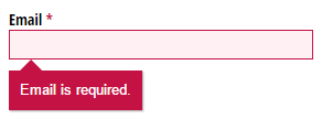
Error: Your validation needs spicing up!
In this post, we’re going to completely customize the look of our form’s error messages with just a sprinkling of CSS. CSS is simply a set of text rules that you can write to tell browsers how to style websites. This post assumes no knowledge of CSS, but if you are a super thorough type of person, check out my general introduction to CSS.
In order to have error messages to style, we need to have errors; and in order to have errors, we need rules. Below, I’ve set up a simple form that requires everything except for the Name field. So, if someone tries to submit this form without filling out the required fields, they’ll see a bunch of pre-customized error messages with bright red backgrounds:
Before
After
This is the same form, but with that sprinkling of CSS that I mentioned earlier. When you try to submit this form, you’ll notice that the error messages look a little different:
See the Pen by CognitoForms (@CognitoForms) on CodePen.
Groundwork
A few things we need to cover before getting into the styling:
No Iframes
The CSS we’re writing will only affect the form if it’s seamlessly embedded on the page, and not in an iframe. Iframes are like tall fortress walls that keep out things like hoards of CSS lines; sometimes that’s great, but not in this case.
This CSS Can Go Anywhere
You can put this CSS anywhere on the webpage that hosts the form, either through a reference to an external CSS doc, or by placing the style rules directly on the same page (learn more about the mechanics of these options here). Normally, the order of CSS does matter, with rules that come later on the page tending to override earlier rules. But I’ll write this example in a way that will force our custom rules to be applied no matter where they are.
Selecting Elements
The Class Names
HTML elements can have class names for CSS rules to hook onto. Cognito Forms have several class names that allow you to do this very thing. The ones we’ll be making use of are:
- c-error — This class name is added to all field containers if that field has an error. In our example, this class will get applied to the parent container after the user tries to submit an invalid email address.
- c-validation — This class name is on the container of the error message. It isn’t visible until an error has been made. The validation message is contained by the element that will have the c-error class.
- c-label — This is the container of the field label (which is “Email” in this case). Labels are also contained by the element that will have the c-error class.
Selectors
In my example, I’m styling four different things: the c-validation container, a triangle/arrow extending from that container, the asterisk next to “Email” that indicates the field is required, and the text field itself. These are the selectors we’re going to be using:
- .c-error .c-validation The dot in front of each class name just denotes that c-error and c-validation are class names. The order of the class names and how they are separated by a space mean that c-validation is contained by an element that has the class name c-error. All styles that we only want to take effect when there is an error will be prefaced with .c-error. Since this class is only on fields when they have errors, our styles won’t appear by default.
- .c-error .c-validation:before This is where the arrow/triangle is going to be. If you don’t want an arrow like this, then you don’t need the equivalent in your CSS. The “:before” means something like, “Create a pseudo-element that doesn’t really exist at the very beginning of c-validation.” The pseudo-element can be styled just like a real element, even though it doesn’t appear anywhere in the HTML.
- .c-label:after This is just like the “:before” pseudo-element, but it comes at the end of .c-label. This is how Cognito places the asterisks at the end of required labels. All we’re going to do with this is change the color of the asterisk. Since this asterisk shows up all the time on required fields, whether they have errors or not, we don’t want to qualify this by prefacing with the c-error class.
- .c-error input, .c-error select, .c-error .c-choice-option The commas here separate what are really three different selectors, all to only take effect with an error. “input” selects things like text inputs, “select” selects dropdown menus, and “.c-choice-option” selects the container of check boxes and radio buttons in Cognito Forms. We’re going to color the text and background color of all these things, as well as the border of inputs and selects.
The CSS
Here’s the CSS to style the error message itself:
We’ve already talked about the class “c-validation”. Every element that has that class name inside of an element with the c-error class will get the style rules inside the curly braces. I’ll go through them in order (the order doesn’t matter to the browser):
- background #c51244 is the code for the dark red I’ve chosen. Usually you don’t just know these codes off the top of your head; you can get them from a good color picker (like in Photoshop), or a website like this one. The “!important” at the end of this line means, “Hey, I don’t care what color Cognito Forms set as the background color, my color is more important!” Lines that need to override Cognito’s CSS will have this.
- padding This line just indicates that there should be a space of 10 pixels all the way around the error text and the edge of the box.
- border-radius By default, error messages have rounded corners on the bottom. By setting border-radius to 0, we are setting sharp corners instead.
- position This will help us when we place the arrow/triangle. I’ll explain this further below.
- box-shadow This adds a shadow to the box. I’ve set it to be the color #aaaaaa (gray), with 1 pixel on the right, 1 pixel on the bottom, and 1 pixel of blurriness. Learn more about the box-shadow property.
- margin-top This gives 10 pixels of space above the box. This is leaving room for the arrow we’ll talk about next.
Here’s the CSS for the arrow/triangle:
If you are curious about the first 6 properties of this, check out this classic explanation. Suffice it to say, the first 6 lines are for making a triangle.
position: absolute takes the triangle out of the flow of the document and layers it on top, preventing it from taking up space and pushing other elements around. top: -10px nudges it up 10 pixels. We needed the parent container to have position: relative for this to work right—that’s why we added it above.
The CSS to change the color of the required asterisk to match the c-validation box color is simply:
Note that since the color of the asterisk isn’t conditioned on whether there is an asterisk or not, we didn’t include the c-error class.
And finally, to color the background and text of the inputs, selects, and check box containers:
Plus, we can also color the border of just inputs and selects with:
And that’s it! Obviously you can copy what I did here exactly, but that’s boring. I hope you’ll take what you learned here and put your own spin on it. If you come up with something interesting, why not post it in the comments for others to see? If you have questions, feel free to post those in the comments too and I’ll be happy to help!

Tyler is the creative director for Cognito Forms. He is a gemini who was born in the year of the dog. Figure the rest out on your own!
Источник
Error Message CSS Style Example with Demo
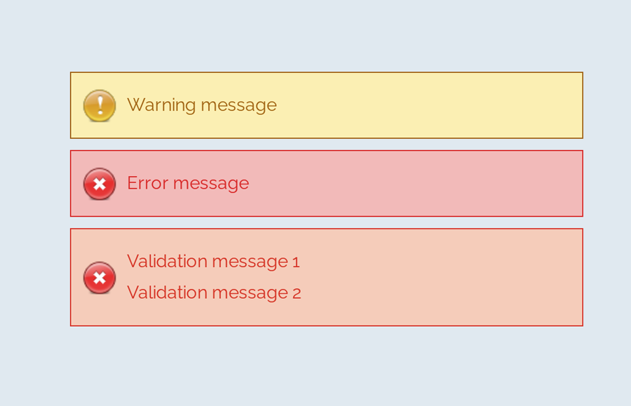
A message box is one of the informative components on a webpage. It displays on various events like success or failure of a process. These messages are really important in regards to interactive web design. In this tutorial, we are going to style an error message with the CSS code example.
Here, you’ll find not only an error message but also info, warning, and success message box design. Because of the CSS style quite similar for these type of messages except minor changes of color and icon. You can check out the final output on the demo page.
The coding concept is for this type of message boxes is clean and easy. You just need to wrap your message text in only a div tag with a specific class name. Then we’ll style these message boxes with CSS.
HTML Structure
The HTML is as simple as one line of code. You just need to wrap your “error message” in a div tag with the class name «error» . You can add any further elements inside this tag. Therefore, a basic HTML for an error message is as follows:
Additionally, you can also create the message boxes for info, success, warning, and validation with the same method mentioned above. Just add a relevant class name to your message that we’ll style in CSS.
You are not limited to add only plain text inside your message box element. You can also add any HTML elements such as images, buttons, links, or HTML5 videos. However, you’ll need to style these elements with additional CSS.
CSS Style for Error Message
First of all, define the common CSS for all types of messages. If you just need only an error message style, then simply erase the other class selector from the below code:
After that, create styles for an error message by targeting the «error» class. Define it’s color (for text), background color, and set error icon using CSS background-image property.
You can also add Font Awesome icon if you don’t want to add an image icon. To do so, include the Font Awesome CSS library into your project and add the specific icon by targeting the “.error:before” pseudo-selector. The following is an example of the use of the Font Awesome icon.
Similarly, create CSS styles for validation message as follows:
You may also need to style a “warning message” box to the attention of the users.
Likewise, create CSS styles for info and success messages described as follows:
That’s all! I hope you find this tutorial helpful to create an error message and successfully implement this CSS style example. If you need any further help in regards to CSS styling, let me know by comment below.
Источник
Simple Custom Error Messages With Pure CSS
Welcome to a quick tutorial on how to create custom error messages with pure CSS. By now, you should have experienced the intrusive default Javascript alert box. Every time it shows up, users get scared away. So here it is, let us walk through a few examples of “alternative” error notification bars that are more elegant and not as intrusive – Read on!
ⓘ I have included a zip file with all the source code at the start of this tutorial, so you don’t have to copy-paste everything… Or if you just want to dive straight in.
TABLE OF CONTENTS
DOWNLOAD & NOTES
Firstly, here is the download link to the example code as promised.
QUICK NOTES
EXAMPLE CODE DOWNLOAD
Click here to download the source code, I have released it under the MIT license, so feel free to build on top of it or use it in your own project.
CSS-ONLY ERROR NOTIFICATIONS
Let us start with the raw basics by creating notification bars with just pure CSS and HTML.
1) BASIC NOTIFICATION BAR
1A) THE HTML
That is actually all we need to create a custom error message, an HTML
1B) THE CSS
The CSS is straightforward as well –
- .bar is literally the “basic notification bar” with padding, margin, and border.
- .info | .success | .warn | .error sets various different colors to fit the “level of notification”.
Feel free to changes these to fit your own website’s theme.
1C) THE DEMO
2) ADDING ICONS
2A) THE HTML
To add icons to the notification bar, we simply prepend the messages with &#XXXX . For those who do not know – That &#XXXX is a “native HTML symbol”, no need to load extra libraries. Do a search for “HTML symbols list” on the Internet for a whole list of it.
P.S. Check out Font Awesome if you want more icon sets.
2B) THE CSS
Just a small addition to position the icon nicely.
2C) THE DEMO
JAVASCRIPT ERROR NOTIFICATIONS
The above notification bars should work sufficiently well, but here are a few small improvements if you are willing to throw in some Javascript.
3) ADDING CLOSE BUTTONS
3A) THE HTML
Not much of a difference here, except that we now add a
3B) THE CSS
There is not much added to the CSS as well. We simply position the close button to the right of the notification bar, and that’s about it.
Источник
How To Show Error Messages In HTML Forms (Simple Examples)
Welcome to a quick tutorial on how to show error messages in HTML forms. This is probably one of the major bugbears for some beginners, how do we handle and show error messages for HTML forms?
There are no fixed ways to show errors in HTML forms, but the common methods to display error messages are:
- Simply add checking attributes to the HTML form fields, and the browser will automatically show the errors. For example,
- Use Javascript to show custom error messages as the user types in the fields.
- Collectively show all error messages in a popup box when the user submits an invalid form.
- Show error messages below the invalid fields.
That covers the broad basics, let us walk through detailed examples in this guide – Read on!
ⓘ I have included a zip file with all the source code at the start of this tutorial, so you don’t have to copy-paste everything… Or if you just want to dive straight in.
TABLE OF CONTENTS
DOWNLOAD & NOTES
Firstly, here is the download link to the example code as promised.
QUICK NOTES
EXAMPLE CODE DOWNLOAD
Click here to download all the example source code, I have released it under the MIT license, so feel free to build on top of it or use it in your own project.
DISPLAY ERROR MESSAGES

All right, let us now get into the various examples of displaying error messages in an HTML form.
EXAMPLE 1) DEFAULT ERROR DISPLAY
Oh no, displaying error messages is SO DIFFICULT! Not. Just add the form checking attributes to the fields:
- required Self-explanatory. A required field that cannot be left blank.
- min-length max-length The minimum and maximum number of characters allowed.
- min max For number fields only, the minimum and maximum allowed values.
- pattern This field must match the custom pattern. Will leave a link in the extras section below if you want to learn more.
Yes, that’s all. The browser will do the rest of the magic.
EXAMPLE 2) SHOW ERRORS AS-YOU-TYPE
This one is a little naggy and requires some Javascript. A couple of functions and properties to take note of here:
- document.getElementById(«ID») Get element by ID. Captain Obvious.
- FIELD.addEventListener(«input», FUNCTION) Run this function whenever the user types something in the field.
- FIELD.validity.tooLong FIELD.validity.tooShort FIELD.validity.valueMissing We can actually target various invalid statuses and show different messages. Will leave a link in the extras section below to the full list.
- FIELD.setCustomValidity(«MESSAGE») and FIELD.reportValidity() Show custom error message.
EXAMPLE 3) DISPLAY ERROR MESSAGES IN POPUP
The less naggy method, where all the error messages are compiled into a single popup. Take note:
- A novalidate has been added to the
Lastly, this is pretty much similar to the popup example.
- Use novalidate and onsubmit to do our own customization.
- But instead of showing in a popup, we attach a
USEFUL BITS & LINKS

That’s all for the tutorial, and here is a small section on some extras and links that may be useful to you.
LINKS & REFERENCES
- HTML Pattern – MDN
- Validity State – MDN
- Form Validation – MDN
- HTML Form Validation Without Javascript – Code Boxx
THE END
Thank you for reading, and we have come to the end. I hope that it has helped you to better understand, and if you want to share anything with this guide, please feel free to comment below. Good luck and happy coding!
Источник
Pure CSS Custom Error Messaging for Default Form Elements
This tutorial will show you how to create and customize error messaging for various form elements. In this tutorial, we will customize everything from a basic error message to input field errors and tooltips. The best part? We will be using only CSS for customizations – that means no images or javascript required!
Below is the markup for the form elements we will be creating error messaging for. This is all of the HTML used throughout this tutorial. Copy and paste this code into your working file:
Now onto my personal favorite: the CSS. We will keep the basic functionality of the form elements but completely customize their appearance. In the end, they will stand on their own as custom design elements that thoughtfully guide the user through the form process, making it as straightforward and painless as possible .
Basic Error Message
Let’s start with a basic error message. We are going to customize the HTML above to look like this:
This is what we start out with, by default, after adding the HTML:
Customizing a basic error message is really simple. All we have to do is give our text a colored background and a couple font styles using CSS. To style the error message background, add the following styles to your CSS stylesheet:
Now let’s style the text itself by adding the following font styles:
That’s it! Keep reading to learn how to style input field and tooltip errors .
Input Field Error
Now that we have our basic error message styled, let’s work on input field errors. This is what the final product will look like:
And this is what we start out with by default:
First, we want to override the browser’s default styles. Add the following CSS to give your input field a custom look:
Next, we need to add the styling for the error message that displays when a user does not correctly fill out an input field (i.e. the “This is a required field” message):
Lastly, add the error-specific styling for the input field elements:
Input Field Error with Tooltip
The last element we’re tackling is the tooltip. It is slightly more complicated than the others but well worth the effort. We will also be utilizing Sass nesting to better organize our code, and because we are only using SCSS it is 100% editable and scalable.
Once we are done, the tooltip will look like this:
And by default, this is what we start with after adding the HTML:
First, we override the browser’s default styles with our own custom styling:
Just like our previous example, we need to add the tooltip error message styling that displays when a form error occurs. Note: we are using Sass here to nest the tooltip’s left arrow properties. This comes in handy when trying to keep track of which values are assigned to the tooltip specifically:
Now all that’s left to do is define the input’s error-specific styling. Again, we will nest these styles under an “error” class selector to make classification and future changes easier:
And that’s it! All the code you need to customize error messaging for default form elements. To experiment with the final results and copy and paste to your heart’s content (without fear of breaking anything), jump on over to Codepen by selecting any of the tutorial links below.
Источник
Error Message CSS Style Example with Demo
A message box is one of the informative components on a webpage. It displays on various events like success or failure of a process. These messages are really important in regards to interactive web design. In this tutorial, we are going to style an error message with the CSS code example.
Here, you’ll find not only an error message but also info, warning, and success message box design. Because of the CSS style quite similar for these type of messages except minor changes of color and icon. You can check out the final output on the demo page.
The coding concept is for this type of message boxes is clean and easy. You just need to wrap your message text in only a div tag with a specific class name. Then we’ll style these message boxes with CSS.
HTML Structure
The HTML is as simple as one line of code. You just need to wrap your “error message” in a div tag with the class name «error» . You can add any further elements inside this tag. Therefore, a basic HTML for an error message is as follows:
Additionally, you can also create the message boxes for info, success, warning, and validation with the same method mentioned above. Just add a relevant class name to your message that we’ll style in CSS.
You are not limited to add only plain text inside your message box element. You can also add any HTML elements such as images, buttons, links, or HTML5 videos. However, you’ll need to style these elements with additional CSS.
CSS Style for Error Message
First of all, define the common CSS for all types of messages. If you just need only an error message style, then simply erase the other class selector from the below code:
After that, create styles for an error message by targeting the «error» class. Define it’s color (for text), background color, and set error icon using CSS background-image property.
You can also add Font Awesome icon if you don’t want to add an image icon. To do so, include the Font Awesome CSS library into your project and add the specific icon by targeting the “.error:before” pseudo-selector. The following is an example of the use of the Font Awesome icon.
Similarly, create CSS styles for validation message as follows:
You may also need to style a “warning message” box to the attention of the users.
Likewise, create CSS styles for info and success messages described as follows:
That’s all! I hope you find this tutorial helpful to create an error message and successfully implement this CSS style example. If you need any further help in regards to CSS styling, let me know by comment below.
Источник
CSS Tips and Tricks for Customizing Error Messages!
Error: Your validation needs spicing up!
In this post, we’re going to completely customize the look of our form’s error messages with just a sprinkling of CSS. CSS is simply a set of text rules that you can write to tell browsers how to style websites. This post assumes no knowledge of CSS, but if you are a super thorough type of person, check out my general introduction to CSS.
In order to have error messages to style, we need to have errors; and in order to have errors, we need rules. Below, I’ve set up a simple form that requires everything except for the Name field. So, if someone tries to submit this form without filling out the required fields, they’ll see a bunch of pre-customized error messages with bright red backgrounds:
Before
After
This is the same form, but with that sprinkling of CSS that I mentioned earlier. When you try to submit this form, you’ll notice that the error messages look a little different:
See the Pen by CognitoForms (@CognitoForms) on CodePen.
Groundwork
A few things we need to cover before getting into the styling:
No Iframes
The CSS we’re writing will only affect the form if it’s seamlessly embedded on the page, and not in an iframe. Iframes are like tall fortress walls that keep out things like hoards of CSS lines; sometimes that’s great, but not in this case.
This CSS Can Go Anywhere
You can put this CSS anywhere on the webpage that hosts the form, either through a reference to an external CSS doc, or by placing the style rules directly on the same page (learn more about the mechanics of these options here). Normally, the order of CSS does matter, with rules that come later on the page tending to override earlier rules. But I’ll write this example in a way that will force our custom rules to be applied no matter where they are.
Selecting Elements
The Class Names
HTML elements can have class names for CSS rules to hook onto. Cognito Forms have several class names that allow you to do this very thing. The ones we’ll be making use of are:
- c-error — This class name is added to all field containers if that field has an error. In our example, this class will get applied to the parent container after the user tries to submit an invalid email address.
- c-validation — This class name is on the container of the error message. It isn’t visible until an error has been made. The validation message is contained by the element that will have the c-error class.
- c-label — This is the container of the field label (which is “Email” in this case). Labels are also contained by the element that will have the c-error class.
Selectors
In my example, I’m styling four different things: the c-validation container, a triangle/arrow extending from that container, the asterisk next to “Email” that indicates the field is required, and the text field itself. These are the selectors we’re going to be using:
- .c-error .c-validation The dot in front of each class name just denotes that c-error and c-validation are class names. The order of the class names and how they are separated by a space mean that c-validation is contained by an element that has the class name c-error. All styles that we only want to take effect when there is an error will be prefaced with .c-error. Since this class is only on fields when they have errors, our styles won’t appear by default.
- .c-error .c-validation:before This is where the arrow/triangle is going to be. If you don’t want an arrow like this, then you don’t need the equivalent in your CSS. The “:before” means something like, “Create a pseudo-element that doesn’t really exist at the very beginning of c-validation.” The pseudo-element can be styled just like a real element, even though it doesn’t appear anywhere in the HTML.
- .c-label:after This is just like the “:before” pseudo-element, but it comes at the end of .c-label. This is how Cognito places the asterisks at the end of required labels. All we’re going to do with this is change the color of the asterisk. Since this asterisk shows up all the time on required fields, whether they have errors or not, we don’t want to qualify this by prefacing with the c-error class.
- .c-error input, .c-error select, .c-error .c-choice-option The commas here separate what are really three different selectors, all to only take effect with an error. “input” selects things like text inputs, “select” selects dropdown menus, and “.c-choice-option” selects the container of check boxes and radio buttons in Cognito Forms. We’re going to color the text and background color of all these things, as well as the border of inputs and selects.
The CSS
Here’s the CSS to style the error message itself:
We’ve already talked about the class “c-validation”. Every element that has that class name inside of an element with the c-error class will get the style rules inside the curly braces. I’ll go through them in order (the order doesn’t matter to the browser):
- background #c51244 is the code for the dark red I’ve chosen. Usually you don’t just know these codes off the top of your head; you can get them from a good color picker (like in Photoshop), or a website like this one. The “!important” at the end of this line means, “Hey, I don’t care what color Cognito Forms set as the background color, my color is more important!” Lines that need to override Cognito’s CSS will have this.
- padding This line just indicates that there should be a space of 10 pixels all the way around the error text and the edge of the box.
- border-radius By default, error messages have rounded corners on the bottom. By setting border-radius to 0, we are setting sharp corners instead.
- position This will help us when we place the arrow/triangle. I’ll explain this further below.
- box-shadow This adds a shadow to the box. I’ve set it to be the color #aaaaaa (gray), with 1 pixel on the right, 1 pixel on the bottom, and 1 pixel of blurriness. Learn more about the box-shadow property.
- margin-top This gives 10 pixels of space above the box. This is leaving room for the arrow we’ll talk about next.
Here’s the CSS for the arrow/triangle:
If you are curious about the first 6 properties of this, check out this classic explanation. Suffice it to say, the first 6 lines are for making a triangle.
position: absolute takes the triangle out of the flow of the document and layers it on top, preventing it from taking up space and pushing other elements around. top: -10px nudges it up 10 pixels. We needed the parent container to have position: relative for this to work right—that’s why we added it above.
The CSS to change the color of the required asterisk to match the c-validation box color is simply:
Note that since the color of the asterisk isn’t conditioned on whether there is an asterisk or not, we didn’t include the c-error class.
And finally, to color the background and text of the inputs, selects, and check box containers:
Plus, we can also color the border of just inputs and selects with:
And that’s it! Obviously you can copy what I did here exactly, but that’s boring. I hope you’ll take what you learned here and put your own spin on it. If you come up with something interesting, why not post it in the comments for others to see? If you have questions, feel free to post those in the comments too and I’ll be happy to help!
Tyler is the creative director for Cognito Forms. He is a gemini who was born in the year of the dog. Figure the rest out on your own!
Источник