- matplotlib.pyplot.errorbar(x, y, yerr=None, xerr=None, fmt=», ecolor=None, elinewidth=None, capsize=None, barsabove=False, lolims=False, uplims=False, xlolims=False, xuplims=False, errorevery=1, capthick=None, *, data=None, **kwargs)[source]#
-
Plot y versus x as lines and/or markers with attached errorbars.
x, y define the data locations, xerr, yerr define the errorbar
sizes. By default, this draws the data markers/lines as well the
errorbars. Use fmt=’none’ to draw errorbars without any data markers.- Parameters:
-
- x, yfloat or array-like
-
The data positions.
- xerr, yerrfloat or array-like, shape(N,) or shape(2, N), optional
-
The errorbar sizes:
-
scalar: Symmetric +/- values for all data points.
-
shape(N,): Symmetric +/-values for each data point.
-
shape(2, N): Separate — and + values for each bar. First row
contains the lower errors, the second row contains the upper
errors. -
None: No errorbar.
All values must be >= 0.
See Different ways of specifying error bars
for an example on the usage ofxerrandyerr. -
- fmtstr, default: »
-
The format for the data points / data lines. See
plotfor
details.Use ‘none’ (case insensitive) to plot errorbars without any data
markers. - ecolorcolor, default: None
-
The color of the errorbar lines. If None, use the color of the
line connecting the markers. - elinewidthfloat, default: None
-
The linewidth of the errorbar lines. If None, the linewidth of
the current style is used. - capsizefloat, default:
rcParams["errorbar.capsize"](default:0.0) -
The length of the error bar caps in points.
- capthickfloat, default: None
-
An alias to the keyword argument markeredgewidth (a.k.a. mew).
This setting is a more sensible name for the property that
controls the thickness of the error bar cap in points. For
backwards compatibility, if mew or markeredgewidth are given,
then they will over-ride capthick. This may change in future
releases. - barsabovebool, default: False
-
If True, will plot the errorbars above the plot
symbols. Default is below. - lolims, uplims, xlolims, xuplimsbool, default: False
-
These arguments can be used to indicate that a value gives only
upper/lower limits. In that case a caret symbol is used to
indicate this. lims-arguments may be scalars, or array-likes of
the same length as xerr and yerr. To use limits with inverted
axes,set_xlimorset_ylimmust be called before
errorbar(). Note the tricky parameter names: setting e.g.
lolims to True means that the y-value is a lower limit of the
True value, so, only an upward-pointing arrow will be drawn! - erroreveryint or (int, int), default: 1
-
draws error bars on a subset of the data. errorevery =N draws
error bars on the points (x[::N], y[::N]).
errorevery =(start, N) draws error bars on the points
(x[start::N], y[start::N]). e.g. errorevery=(6, 3)
adds error bars to the data at (x[6], x[9], x[12], x[15], …).
Used to avoid overlapping error bars when two series share x-axis
values.
- Returns:
-
ErrorbarContainer-
The container contains:
-
plotline:
Line2Dinstance of x, y plot markers and/or line. -
caplines: A tuple of
Line2Dinstances of the error bar caps. -
barlinecols: A tuple of
LineCollectionwith the horizontal and
vertical error ranges.
-
- Other Parameters:
-
- dataindexable object, optional
-
If given, the following parameters also accept a string
s, which is
interpreted asdata[s](unless this raises an exception):x, y, xerr, yerr
- **kwargs
-
All other keyword arguments are passed on to the
plotcall
drawing the markers. For example, this code makes big red squares
with thick green edges:x, y, yerr = rand(3, 10) errorbar(x, y, yerr, marker='s', mfc='red', mec='green', ms=20, mew=4)
where mfc, mec, ms and mew are aliases for the longer
property names, markerfacecolor, markeredgecolor, markersize
and markeredgewidth.Valid kwargs for the marker properties are:
-
dashes
-
dash_capstyle
-
dash_joinstyle
-
drawstyle
-
fillstyle
-
linestyle
-
marker
-
markeredgecolor
-
markeredgewidth
-
markerfacecolor
-
markerfacecoloralt
-
markersize
-
markevery
-
solid_capstyle
-
solid_joinstyle
Refer to the corresponding
Line2Dproperty for more details:Property
Description
agg_filtera filter function, which takes a (m, n, 3) float array and a dpi value, and returns a (m, n, 3) array and two offsets from the bottom left corner of the image
alphascalar or None
animatedbool
antialiasedor aabool
clip_boxBboxclip_onbool
clip_pathPatch or (Path, Transform) or None
coloror ccolor
dash_capstyleCapStyleor {‘butt’, ‘projecting’, ’round’}dash_joinstyleJoinStyleor {‘miter’, ’round’, ‘bevel’}dashessequence of floats (on/off ink in points) or (None, None)
data(2, N) array or two 1D arrays
drawstyleor ds{‘default’, ‘steps’, ‘steps-pre’, ‘steps-mid’, ‘steps-post’}, default: ‘default’
figureFigurefillstyle{‘full’, ‘left’, ‘right’, ‘bottom’, ‘top’, ‘none’}
gapcolorcolor or None
gidstr
in_layoutbool
labelobject
linestyleor ls{‘-‘, ‘—‘, ‘-.’, ‘:’, », (offset, on-off-seq), …}
linewidthor lwfloat
markermarker style string,
PathorMarkerStylemarkeredgecoloror meccolor
markeredgewidthor mewfloat
markerfacecoloror mfccolor
markerfacecoloraltor mfcaltcolor
markersizeor msfloat
markeveryNone or int or (int, int) or slice or list[int] or float or (float, float) or list[bool]
mouseoverbool
path_effectsAbstractPathEffectpickerfloat or callable[[Artist, Event], tuple[bool, dict]]
pickradiusunknown
rasterizedbool
sketch_params(scale: float, length: float, randomness: float)
snapbool or None
solid_capstyleCapStyleor {‘butt’, ‘projecting’, ’round’}solid_joinstyleJoinStyleor {‘miter’, ’round’, ‘bevel’}transformunknown
urlstr
visiblebool
xdata1D array
ydata1D array
zorderfloat
-
Examples using matplotlib.pyplot.errorbar#
In this Python tutorial, we will discuss Matplotlib plot error bars in python. Here we will cover different examples related to error bars using matplotlib. And we will also cover the following topics:
- Matplotlib plot error bars
- Matplotlib plot error bars example
- Matplotlib interactive plot error bars
- Matplotlib chart error bars
- Matplotlib scatter plot error bars
- Matplotlib plot_date error bars
- Matplotlib plot only error bars
- Matplotlib plot error bars symmetric
- Matplotlib plot error bars asymmetric
- Matplotlib polar plot error bars
In this section, we are going to learn about the error bar. Before starting error bars firstly, we understand what does error means.
Error is a mistake or we can say that difference between the calculated value and actual value.
When we graphical represent the data, some of the data have irregularity. To indicate these irregularities or uncertainties we use Error Bars.
Basically, error bars are used to represent errors in the graphical plot.
The following steps are used to plot error bars in matplotlib which is outlined below:
- Defining Libraries: Import the libraries which are required to plot error bars (For data creation and manipulation: Numpy, For data visualization: pyplot from matplotlib).
- Define X and Y: Define the data values used for plotting. Data values of x-axis and y-axis.
- Plot error bars: By using the errorbar() method we can plot the error bars.
- Display: Finally we have to use the show() method to display the plot.
The syntax to plot error bars is as below:
matplotlib.pyplot.errorbar(x, y, yerr=None, xerr=None, fmt='', ecolor=None, elinewidth=None, capsize=None, barsabove=False, lolims=False, uplimes=False, xlolims=False, xuplims=False, errorevery=1, capthick=None, * , data=None, **kwargs)The above-used parameters are outlined as below:
- x: specifies horizontal coordinates of the data points.
- y: specifies vertical coordinates of the data points.
- xerr: Define the horizontal error bar sizes. Must have a float or array-like shape.
- yerr: Define the vertical error bar sizes. Must have a float or array-like shape.
- fmt: Contains string value. By default, this plot error bars with markers. Use ‘none’ to plot error bars without markers.
- ecolor: specifies the color of the error bars.
- elinewidth: specifies linewidth of the error bars.
- capsize: specifies the length of error bars in points or float.
- capthick: specifies the thickness of error bars cap in float or points.
- barsabove: It contains bool value. By default value is False, if the value is True error bars are plotted above the plot symbol.
- lolims,uplims,xlolims,xuplims: specifies that value gives only upper and lower limits. It contains bool value.
- errorevery: It contains integer values and is used to draw error bars on the subset of the data.
First, learn “How to install matplotlib python“.
Matplotlib plot error bars example
In the above sections, we discussed what does error and error bars mean. And we also discussed what are the various steps used to plot error bars.
Let’s understand the concept with the help of an example as below:
# Import Library

import matplotlib.pyplot as plt

# Define Data

x= [1, 2, 3, 5]
y= [9, 15, 20, 25]

# Plot error bar

plt.errorbar(x, y, xerr = 0.9)

# Display graph

plt.show()- In the above, example we import the matplotlib.pyplot library.
- Then we define the x-axis and y-axis data points.
- plt.errorbar() method is used to plot error bars and we pass the argument x, y, and xerr and set the value of xerr = 0.9.
- Then we use plt.show() method to display the error bar plotted graph.

Read: Matplotlib plot a line
Matplotlib plot interactive error bars
Here we format the error bars or we can say that customizing the error bar according to our choice to become our error bar more interactive.
Let’s change the following things in the error bars to become it more interactive:
- fmt: change style of marker. Set it to circle.
- color: change the color of the marker. Set it to orange.
- ecolor: change the color of the error bar. Set it to lightgreen.
- elinewidth: change the line width of the error bar. Set it to 5.
- capsize: change the capsize of the error bar. Set it to 10.
Understand the concept with the help of an example:
# Import Library

import matplotlib.pyplot as plt

# Define Data

x= [1, 2, 3, 5]
y= [9, 15, 20, 25]

# Plot error bar

plt.errorbar(x, y, xerr = 0.9, fmt = 'o',color = 'orange',
            ecolor = 'lightgreen', elinewidth = 5, capsize=10)

# Display graph

plt.show()- In the above example, we plot the error bars and format them according to above mention list.
- We use plt.errorbar() method to plot error bars and become it more interactive.

Read: Python plot multiple lines using Matplotlib
Matplotlib chart error bars
In this section, we will create a chart plot with error bars using Matplotlib. We use plt.errorbar() method to plot error bars in bar charts.
The following are the cases in the bar chart in which we draw error bars:
- Error in x values
- Error in y values
- Error in both x and y values
Matplotlib chart error bars in x values
By using the plt.errorbar() method we plot the error bars and pass the argument xerr to plot error on the x values.
The syntax for this is:
matplotlib.pyplot.errorbar(x, y, xerr=None)Let’s understand this concept with the help of an example:
# Import Library

import matplotlib.pyplot as plt

# Define Data

x= [6, 15, 2.3, 9]
y= [9, 15, 20, 25]

# Define Error

x_error = [2.3, 5.1, 1, 3.1]

# Plot Bar chart

plt.bar(x,y)

# Plot error bar

plt.errorbar(x, y, xerr = x_error,fmt='o',ecolor = 'red',color='yellow')

# Display graph

plt.show()- In the above example, we import matplotlib.pyplot library and define the data point on the x-axis and y-axis.
- Then we define the error value and use the plt.bar() method to plot a bar chart.
- plt.errorbar() method is used to plot error bars and we pass xerr as an argument and set its value to be x_error value which we define.

Matplotlib chart error bars in y values
By using the plt.errorbar() method we plot the error bars and pass the argument yerr to plot error on the y values.
The syntax to plot error bars on y values is as given below:
matplotlib.pyplot.errorbar(x, y, yerr=None)Let’s take an example for better understanding:
# Import Library

import matplotlib.pyplot as plt

# Define Data

x= [6, 15, 2.3, 9]
y= [9, 15, 20, 25]

# Define Error

y_error = [2.3, 5.1, 1, 3.1]

# Plot Bar chart

plt.bar(x,y)

# Plot error bar

plt.errorbar(x, y, yerr = y_error,fmt='o',ecolor = 'red',color='yellow')

# Display graph

plt.show()- In the above example, we import matplotlib.pyplot library
- After this defines the data point on the x-axis and y-axis.
- Then we define the error value and use the plt.bar() method to plot a bar chart and use plt.errorbar() method is used to plot error bars.
- Pass yerr as an argument and set its value to equal y_error value which we define.

Matplotlib chart error bars in x and y values
By using the plt.errorbar() method we plot the error bars and pass the argument xeer and yerr to plot error on both x and y values respectively.
The syntax to plot error bars on both the values is as given below:
matplotlib.pyplot.errorbar(x, y, xerr=None, yerr=None)Let’s take an example to know how to plot errorbars on both values:
# Import Library

import matplotlib.pyplot as plt

# Define Data

x= [6, 15, 2.3, 9]
y= [9, 15, 20, 25]

# Define Error

x_error = [4.2, 6, 10, 8.6]
y_error = [2.3, 5.1, 1, 3.1]

# Plot Bar chart

plt.bar(x,y)

# Plot error bar

plt.errorbar(x, y, xerr = x_error, yerr = y_error,
             fmt='o', ecolor = 'red',color='yellow')

# Display graph


plt.show()- In the above example, we import matplotlib.pyplot library
- After this defines the data point on the x-axis and y-axis.
- Then we define the error value and use the plt.bar() method to plot a bar chart and use plt.errorbar() method is used to plot error bars.
- Pass xeer, yerr as an argument and set its value to equal x_error, y_error value respectively which we define.

Read: What is matplotlib inline
Matplotlib scatter plot error bars
In this section, we will create a scatter plot with error bars using Matplotlib. We use plt.errorbar() method to plot error bars in scatter plot.
The following are the cases in the scatter plot in which we draw error bars:
- Error in x values
- Error in y values
- Error in both x and y values
Matplotlib scatter plot error bars in x values
By using the plt.errorbar() method we plot the error bars and pass the argument xerr to plot error on the x values in the scatter plot.
The syntax for this is:
matplotlib.pyplot.errorbar(x, y, xerr=None)Let’s understand this concept with the help of an example:
# Import Library

import matplotlib.pyplot as plt

# Define Data

x= [10, 20, 30, 40]
y= [4, 8, 12, 16]

# Define Error

x_error = [2, 4, 6, 8]

# Plot scatter plot

plt.scatter(x,y)

# Plot error bar

plt.errorbar(x, y, xerr = x_error,fmt='o',ecolor = 'cyan',color='black')

# Display graph

plt.show()- In the above example, we import matplotlib.pyplot library and define the data point on the x-axis and y-axis.
- Then we define the error value and use the plt.scatter() method to draw a scatter plot.
- plt.errorbar() method is used to plot error bars and we pass xerr as an argument and set its value to be x_error value which we define.

Matplotlib scatter plot error bars in y values
By using the plt.errorbar() method we plot the error bars and pass the argument yerr to plot error on the y values in the scatter plot.
The syntax to plot error bars on y values is as given below:
matplotlib.pyplot.errorbar(x, y, yerr=None)Let’s take an example for better understanding:
# Import Library

import matplotlib.pyplot as plt

# Define Data

x= [10, 20, 30, 40]
y= [4, 8, 12, 16]

# Define Error

y_error = [2, 4, 6, 8]

# Plot Scatter Plot

plt.scatter(x,y)

# Plot error bar

plt.errorbar(x, y, yerr = y_error,fmt='o',ecolor = 'cyan',color='black')

# Display graph

plt.show()- In the above example, we import matplotlib.pyplot library
- After this defines the data point on the x-axis and y-axis.
- Then we define the error value and use the plt.scatter() method to plot a scatter plot and use plt.errorbar() method is used to plot error bars.
- Pass yerr as an argument and set its value to equal y_error value which we define.

Matplotlib scatter plot error bars in x and y values
By using the plt.errorbar() method we plot the error bars and pass the argument xeer and yerr to plot error on both x and y values respectively.
The syntax to plot error bars on both the values is as given below:
matplotlib.pyplot.errorbar(x, y, xerr=None, yerr=None)Let’s take an example to know how to plot errorbars on both values:
# Import Library

import matplotlib.pyplot as plt

# Define Data


x= [10, 20, 30, 40]
y= [4, 8, 12, 16]

# Define Error

x_error= [3, 6, 9, 12]
y_error = [2, 4, 6, 8]

# Plot Scatter Plot

plt.scatter(x,y)

#Plot error bar

plt.errorbar(x, y, xerr= x_error, yerr = y_error,fmt='o',ecolor = 'cyan',color='black')

# Display graph

plt.show()- In the above example, we import matplotlib.pyplot library
- After this defines the data point on the x-axis and y-axis.
- Then we define the error value and use the plt.scatter() method to plot a scatter plot and use plt.errorbar() method is used to plot error bars.
- Pass xeer, yerr as an argument and set its value to equal x_error, y_error value which we define.

Read: Matplotlib plot bar chart
Matplotlib plot_date error bars
In this section, we will create a dates plot with error bars using Matplotlib. We use plt.errorbar() method to plot error bars.
The following are the cases in the dates plot in which we draw error bars:
- Error in x values
- Error in y values
- Error in both x and y values
Matplotlib plot_date error bars in x values
By using the plt.errorbar() method we plot the error bars and pass the argument xerr to plot error on the x values in the date plot.
The syntax for this is:
matplotlib.pyplot.errorbar(x, y, xerr=None)Let’s understand this concept with the help of an example:
# Import Library

import matplotlib.pyplot as plt

# Define Data

x= [1, 2, 3]
y= [1.5, 2, 2.5]

# Define Error

x_error= 1.5

# Plot Date

plt.plot_date(x,y)

#Plot error bar

plt.errorbar(x, y, xerr= x_error, fmt='o',
             ecolor = 'lightblue',color='m')

# Display graph


plt.tight_layout()

plt.show()- In the above example, we import matplotlib.pyplot library and define the data point on the x-axis and y-axis.
- Then we define the error value and use the plt.plot_date() method to draw a plot consisting dates.
- plt.errorbar() method is used to plot error bars and we pass xerr as an argument and set its value to be x_error value which we define.

Read: Matplotlib subplot tutorial
Matplotlib plot_date error bars in y values
By using the plt.errorbar() method, we plot the error bars and pass the argument yerr to plot the error on the y values in the date plot.
The syntax to plot error bars on y values is as given below:
matplotlib.pyplot.errorbar(x, y, yerr=None)Let’s take an example for better understanding:
# Import Library

import matplotlib.pyplot as plt

# Define Data


x= [1, 2, 3]
y= [0.5, 0.8, 1]

# Define Error


y_error= 0.1

# Plot Date

plt.plot_date(x,y)

# Plot error bar

plt.errorbar(x, y, yerr= y_error, fmt='o',
             ecolor = 'lightblue',color='m')

# Display graph

plt.tick_params(axis='x', which='major', labelsize=8)

plt.tight_layout()

plt.show()- In the above example, we import matplotlib.pyplot library
- After this defines the data point on the x-axis and y-axis.
- Then we define the error value and use the plt.plot_date() method to plot a graph consisting of dates and use plt.errorbar() method is used to plot error bars.
- Pass yerr as an argument and set its value to equal y_error value which we define.

Matplotlib plot_date error bars in x and y values
By using the plt.errorbar() method we plot the error bars and pass the argument xeer and yerr to plot error on both x and y values respectively in the date plot.
The syntax to plot error bars on both the values is as given below:
matplotlib.pyplot.errorbar(x, y, xerr=None, yerr=None)Let’s take an example to know how to plot errorbars on both valuesin date plot:
# Import Library

import matplotlib.pyplot as plt

# Define Data

x= [1,2,3]
y= [1.5, 2, 2.5]

# Define Error


x_error= 1.5
y_error = 2.3

# Plot Date

plt.plot_date(x,y)

# Plot error bar


plt.errorbar(x, y, xerr= x_error, yerr = y_error,fmt='o',ecolor = 'lightblue',color='m')

# Display graph


plt.tight_layout()

plt.show()- In the above example, we import matplotlib.pyplot library
- After this defines the data point on the x-axis and y-axis.
- Then we define the error value and use the plt.plot_date() method to plot a dates and use plt.errorbar() method is used to plot error bars.
- Pass xeer, yerr as an argument and set its value to equal x_error, y_error value which we define.

Read: Matplotlib best fit line
Matplotlib plot only error bars
Here we learn about how we can plot error bars only.
The syntax to plot error bars is:
matplotlib.pyplot.errorbar(x,y,xerr=None,yerr=None)The parameters used above are:
- x: horizontal coordinates of the data points.
- y: vertical coordinates of the data points.
- xerr: Define the horizontal error bar sizes. Must have a float or array-like shape.
- yerr: Define the vertical error bar sizes. Must have a float or array-like shape.
Let’s take an example to create only error bars:
# Import Library

import matplotlib.pyplot as plt

# Define Data

x= [1, 2, 3]
y= [1.5, 2, 2.5]

# Define Error

x_error = 0.2
y_error = 0.5

#Plot error bar

plt.errorbar(x, y, xerr= x_error, yerr = y_error,fmt='o',
             ecolor = 'pink',color='blue')

# Display graph

plt.show()
In the above example, we define the data and error values, and by using the errorbar() method we plot the only error bar graph.

Read: Matplotlib subplots_adjust
Matplotlib plot error bars symmetric
Here we learn what does symmetric error bars are. Errors are constant values and we represent the error values in the array form.
Sometimes, we have a case in which an error differed for each point, but the lower and upper values of error are equal. That type of case is known as the symmetric error bar.
In the symmetric case, the shape of an array is in the form: (N,)
Let’s see the example of symmetric error bars:
# Import library

import numpy as np
import matplotlib.pyplot as plt

# Define Data

x = np.arange(2, 16, 1.5)
y = np.exp(x*2)

# Define Data

error = 0.1 * x

# Plot error

plt.errorbar(x, y, yerr=error, fmt='-o')

# Display Graph

plt.show()- In the above example, we define data using NumPy arrange() method and exp() method. After that, we define error value in the shape of (N,).
- By using plt.errorbar() method, we plot the symmetric error bars.

Read: Matplotlib log log plot
Matplotlib plot error bars asymmetric
Here we learn what does asymmetric error bars are. Errors are constant values and they are represented in the array form.
Sometimes, we have a case in which an error differed for each point, but the lower and upper limits of error are unequal or different in nature. That type of case is known as the asymmetric error bar.
In the asymmetric case, the shape of an array is in the form: (2, N).
Let’s see the example of asymmetric error bars:
# Import Libraries

import numpy as np
import matplotlib.pyplot as plt

# Define Data

x = np.arange(2, 16, 1.5)
y = np.exp(x*2)

# Define errors

error = 0.1 * x

# Lower limit of error

lower_error = 0.6 * error

# Upper limit of error

upper_error = error

# plot error bars

asymmetric_error = [lower_error, upper_error]
plt.errorbar(x, y, xerr=asymmetric_error, fmt='o')

# Display Graph

plt.show()
In the above example, we define different values of error of lower and upper limits. By using the plt.errorbar() method we plot error bars in asymmetric nature.

Read: Matplotlib plot_date
Matplotlib polar plot error bars
A Cartesian coordinate system is plotted using the polar coordinates. plt.polar() method is used to plot the polar coordinates.
The syntax to plot polar plot is as given below:
matplotlib.pyplot.polar(r, theta)The parameter used above are:
- r: specifies the distance from the origin.
- theta: Specifies the angle at which distance from the origin has to be measured.
Let’s see an example of plotting error bars in polar coordinates:
# Import Library

import matplotlib.pyplot as plt
import numpy as np

# Define Data

r= np.arange(0, 4, 0.5)
theta= 2*np.pi*r

# Define Error

x_error = 0.2
y_error = 5

# Plot polar coordinates

plt.polar(r,theta,"ro")

# Plot error bar

plt.errorbar(r, theta, xerr = x_error, yerr= y_error,                           color='black')

# Display graph

plt.show()- In the above example, we import matplotlib and numpy library.
- After that, we define ‘r’ and ‘theta‘ i.e distance and angle.
- Then we plot the polar coordinates by using the plt.polar() method and by using the plt.errorbar() method we plot error bars in the polar plot.
- Finally, we display plt.show() method to display the polar plot.
You may also like to read the following Matplotlib tutorials.
- Matplotlib dashed line
- Matplotlib scatter marker
- Matplotlib change background color
- Matplotlib rotate tick labels
- Matplotlib remove tick labels
In this Python tutorial, we have discussed the “Matplotlib plot error bars” and we have also covered some examples related to it. These are the following topics that we have discussed in this tutorial.
- Matplotlib plot error bars
- Matplotlib plot error bars example
- Matplotlib interactive plot error bars
- Matplotlib chart error bars
- Matplotlib scatter plot error bars
- Matplotlib plot_date error bars
- Matplotlib plot only error bars
- Matplotlib plot error bars symmetric
- Matplotlib plot error bars asymmetric
- Matplotlib polar plot error bars

Python is one of the most popular languages in the United States of America. I have been working with Python for a long time and I have expertise in working with various libraries on Tkinter, Pandas, NumPy, Turtle, Django, Matplotlib, Tensorflow, Scipy, Scikit-Learn, etc… I have experience in working with various clients in countries like United States, Canada, United Kingdom, Australia, New Zealand, etc. Check out my profile.
Improve Article
Save Article
Improve Article
Save Article
Prerequisites: Matplotlib
In this article, we will create a scatter plot with error bars using Matplotlib. Error bar charts are a great way to represent the variability in your data. It can be applied to graphs to provide an additional layer of detailed information on the presented data.
Approach
- Import required python library.
- Create data.
- Pass required values to errorbar() function
- Plot graph.
Syntax: matplotlib.pyplot.errorbar(x, y, yerr=None, xerr=None, fmt=”, ecolor=None, elinewidth=None, capsize=None, barsabove=False, lolims=False, uplims=False, xlolims=False, xuplims=False, errorevery=1, capthick=None, *, data=None, **kwargs)
Parameters: This method accept the following parameters that are described below:
- x, y: These parameters are the horizontal and vertical coordinates of the data points.
- fmt: This parameter is an optional parameter and it contains the string value.
- capsize: This parameter is also an optional parameter. And it is the length of the error bar caps in points with default value NONE.
Implementation of the concept discussed above is given below:
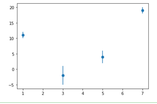
Example 1: Adding Some error in a ‘y’ value.
Python3
import matplotlib.pyplot as plt
a = [1, 3, 5, 7]
b = [11, -2, 4, 19]
plt.scatter(a, b)
c = [1, 3, 2, 1]
plt.errorbar(a, b, yerr=c, fmt="o")
plt.show()
Output:
Example 2: Adding Some errors in the ‘x’ value.
Python3
import matplotlib.pyplot as plt
a = [1, 3, 5, 7]
b = [11, -2, 4, 19]
plt.scatter(a, b)
c = [1, 3, 2, 1]
plt.errorbar(a, b, xerr=c, fmt="o")
plt.show()
Output:
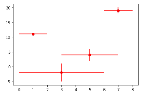
Example 3: Adding error in x & y
Python3
import matplotlib.pyplot as plt
a = [1, 3, 5, 7]
b = [11, -2, 4, 19]
plt.scatter(a, b)
c = [1, 3, 2, 1]
d = [1, 3, 2, 1]
plt.errorbar(a, b, xerr=c, yerr=d, fmt="o", color="r")
plt.show()
Output:
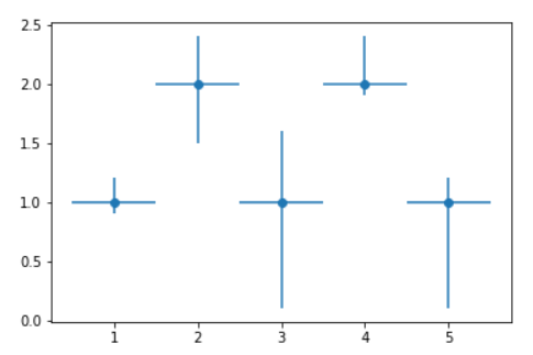
Example 4: Adding variable error in x and y.
Python3
import matplotlib.pyplot as plt
x = [1, 2, 3, 4, 5]
y = [1, 2, 1, 2, 1]
y_errormin = [0.1, 0.5, 0.9,
0.1, 0.9]
y_errormax = [0.2, 0.4, 0.6,
0.4, 0.2]
x_error = 0.5
y_error = [y_errormin, y_errormax]
plt.errorbar(x, y,
yerr=y_error,
xerr=x_error,
fmt='o')
plt.show()
Output:
Overview
Error is a deviation from the calculated value and actual value. When we graphically represent the data, some of it has irregularities. To mark these uncertainties and ambiguity, we use Error bars. They are used to show the errors in the plots. Matplotlib provides a function that can plot error bars along with the data to find ambiguity and improve the data’s accuracy. We are going to discuss about how we can plot error bars in matplotlib with some examples.
Scope
For plotting error bars in matplotlib, First, we have to import the required library (Matplotlib), from which we can use the function of error bars to plot it along with the data. We will also discuss the syntax, parameter, and return value of error bars in matplotlib to better understand the topic. Examples of implementing error bars in matplotlib are given below.
- Simplest errorbar
- Error bar with the only x-error axis
- Error bar with the only y-error axis
- Interactive Error bar in matplotlib
- Scatter plot with error bars
- Error bar in the bar graph
What are Error Bars in matplotlib?
Error bars in matplotlib are y vs. x as planes generated at each coordinate plotted on the axes. These are used to show the standard deviation or ambiguity to better understand the data’s accuracy. They can be implemented on different plots like line plots, scatter plots, and bar graphs.
So what is the Function used for Matplotlib Errorbars?
We have: matplotlib.pyplot.errorbar()for this! It takes atleast 2 parameters to plot error bars along with the data.
Two more optional parameters are actually behind the plotting of the error bar xerr and yerr. These parameters plot the error bar at each coordinate representing the data.
A Simple example of error bars in matplotlib.
Syntax of Matplotlib Errorbar
matplotlib.pyplot.errorbar(x, y, yerr=None,
xerr=None, fmt='', ecolor=None, elinewidth=None,
capsize=None, barsabove=False, lolims=False,
uplims=False, xlolims=False, xuplims=False,
errorevery=1, capthick=None, *, data=None, **kwargs)
Parameters of Matplotlib errorbar
- x, y: Array or list of x and y axes data points to plot coordinates on the graph.
- xerr, yerr: An array or list of positive values.
- fmt (optional parameter): The data points/lines format contains the string value.
- ecolor (optional parameter): Color of the errorbar lines.
- elinewidth (optional parameter): Linewidth of the errorbar lines
- capsize (optional parameter): The length of the error bar caps in points and default 0.0.
- barsabove (optional parameter): The datatype of this parameter is bool, and the default value is false. If true, will plot the error bars above the plot symbols.
- lolims, uplims, xlolims, xuplims (optional parameters): The data type of this parameter is bool, and the default value is false. They contain boolean values, indicating that a value only gives upper/lower limits.
- capthick (optional parameter): The datatype of this parameter is float and the default value is none. It controls the thickness of the error bar cap in points.
- errorevery (optional parameter): The datatype of this parameter is int, and the default value is 1. It contains integer values used to draw error bars on a subset of the data.
The Return Value of Matplotlib Errorbar
Matplotlib errorbar returns the ErrorbarContainer
The container contains:
- plotline: Line2D instance of x, y plot markers and line.
- caplines: A tuple of Line2D instances of the error bar caps.
- barlinecols: A tuple of collections of lines along with Horizontal and vertical error ranges.
Examples of Matplotlib Errorbar
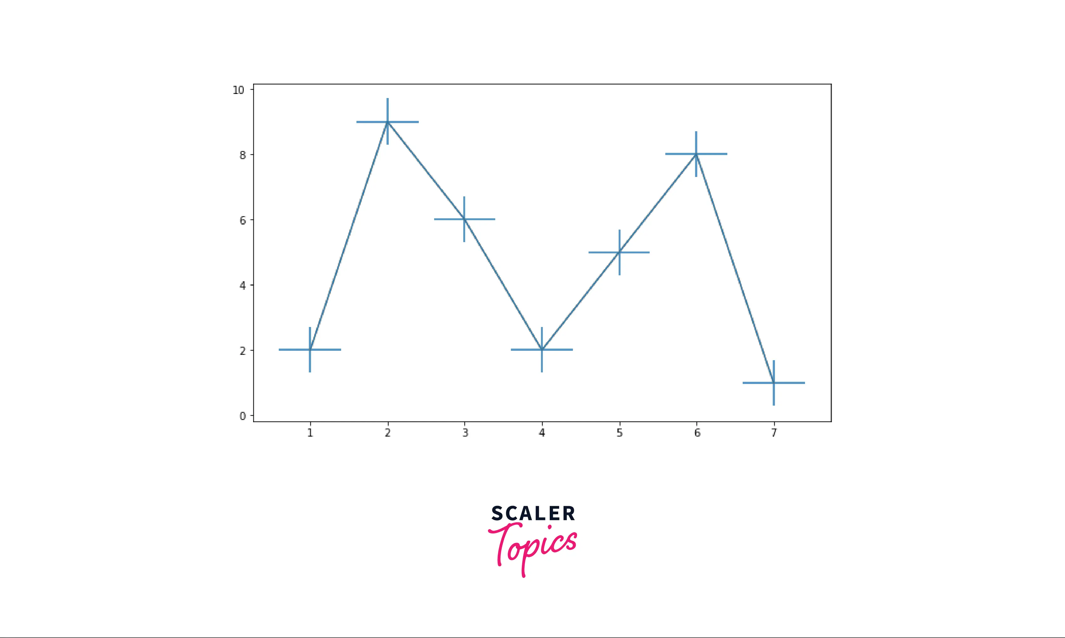
Example1: Simplest Errorbar
# This code is written in python # Importing the required module import matplotlib.pyplot as plt # x and y data points x=[1,2,3,4,5,6] y=[1,9,2,8,3,7] plt.title("Simplest errorbars") plt.xlabel('x-axis') plt.ylabel('y-axis') # function to plot errorbar with the line plots plt.errorbar(x,y,xerr=0.5,yerr=1) plt.grid() plt.show()Output:
Code Explanation:
- We import the required modules.
- x and y are the lists containing the data points on the axes.
- matplotlib.pyplot.title(), matplotlib.xlabel() and matplotlib.ylabel() are used to add more detail to the plot.
- matplotlib.pyplot.errorbar() takes at least two parameters (x and y data points) to add error bars to the plot. The error axes plotted on each coordinate are the xerr and yerr.
- matplotlib.pyplot.grid() and matplotlib.pyplot.show() are used to add grid to the plot and display the plot respectively.
Example2: Error Bar with x-error Axis Only
# This code is written in python # Importing the required module import matplotlib.pyplot as plt import random # x and y data points x=[1,2,3,4,5,6] y=[1,5,4,3,7,8] x_error= [random.uniform(1,2) for i in range(6)] plt.title("Error bar with only xerror axis") plt.xlabel('x-axis') plt.ylabel('y-axis') plt.plot(x,y) # function to plot errorbar with the line plots plt.errorbar(x,y,xerr=x_error,ecolor='r',elinewidth=5,fmt='s',color='k') plt.grid() plt.show()Output:
Code explanation:
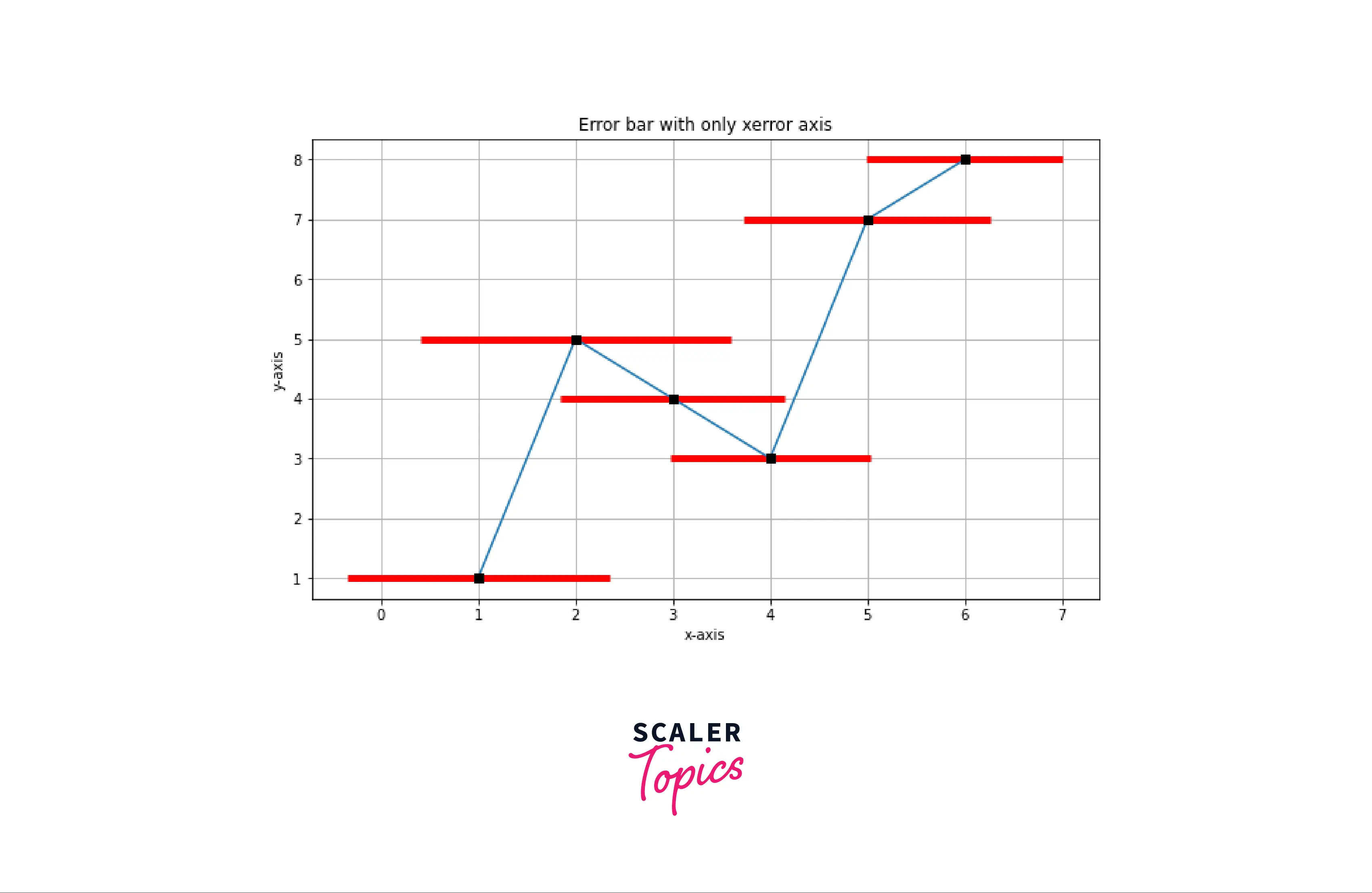
- Importing the required modules.
- x and y list containing data points.
- y_error list contains random floats ranging from 1 to 2, random floats are generated using random.uniform().
- matplotlib.pyplot.title(), matplotlib.pyplot.xlabel() and matplotlib.pyplot.ylabel() is used to add details to the figure.
- matplotlib.pyplot.errorbar() used to plot the error bar on the markers where ecolor is red, elinewidth is 5, fmt is square, color is black, and xerr is a list containing the length of each error x-axis at each coordinate.
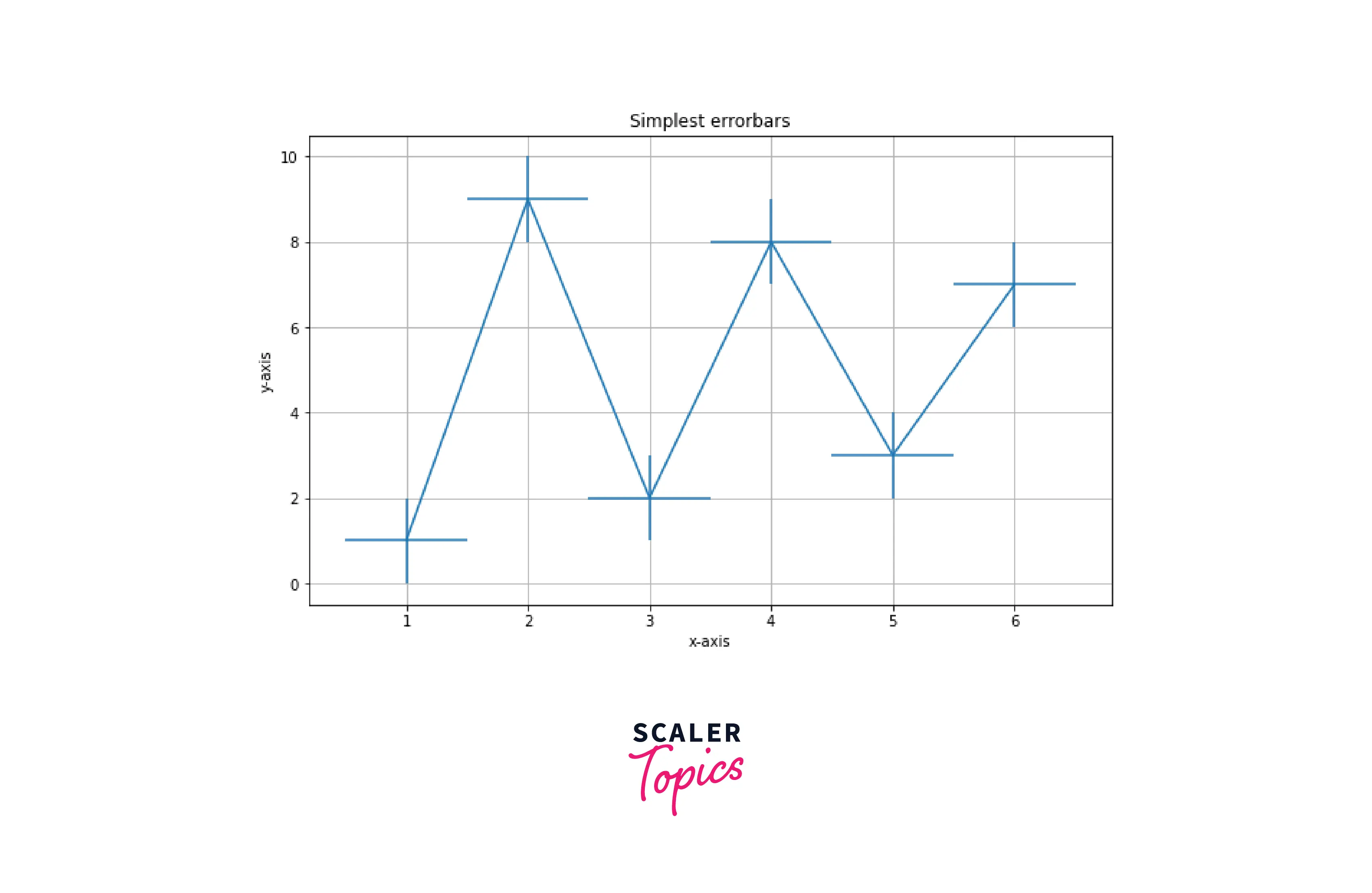
Example3: Error Bar ith y-error Axis Only
# This code is written in python # Importing the required module import matplotlib.pyplot as plt # x and y data points x=[1,2,3,4,5,6] y=[1,5,4,3,7,8] y_error= [random.uniform(1,2) for i in range(6)] plt.title("Error bar with only yerror axis") plt.xlabel('x-axis') plt.ylabel('y-axis') plt.plot(x,y) # function to plot errorbar with the line plots plt.errorbar(x,y,yerr=y_error,ecolor='r',elinewidth=5,fmt='s',color='k') plt.grid() plt.show()Output:
Code Explanation:
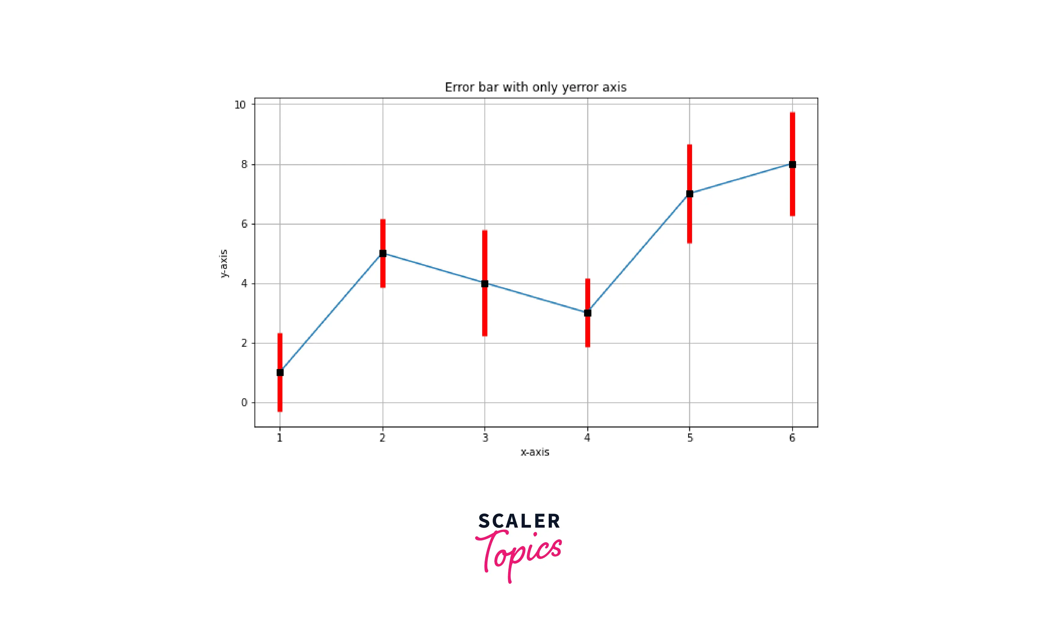
- Importing the required modules.
- x and y list containing data points.
- y_error list contains random floats ranging from 1 to 2; random floats are generated using random.uniform().
- matplotlib.pyplot.title(), matplotlib.pyplot.xlabel() and matplotlib.pyplot.ylabel() is used to add details to the figure.
- matplotlib.pyplot.errorbar() used to plot the error bar on the markers where ecolor is red, elinewidth is 5, fmt is square, color is black, and yerr is a list containing the length of each error y-axis at each coordinate.
Example4: Interactive Error Bar in Matplotlib
# This code is written in python # Importing the required module import matplotlib.pyplot as plt # x and y data points x=[1,2,3,4,5,6] y=[1,9,2,8,3,7] # Change the size of the figure plt.rcParams["figure.figsize"] = (10,6) plt.title("Interactive error bar") plt.xlabel('x-axis') plt.ylabel('y-axis') plt.plot(x,y) # function to plot errorbar with the line plots with more parameters plt.errorbar(x,y,xerr=0.5,yerr=1,fmt='s',color='brown',ecolor='green',elinewidth=4,capsize=5) plt.grid() plt.show()Output:
Code explanation:
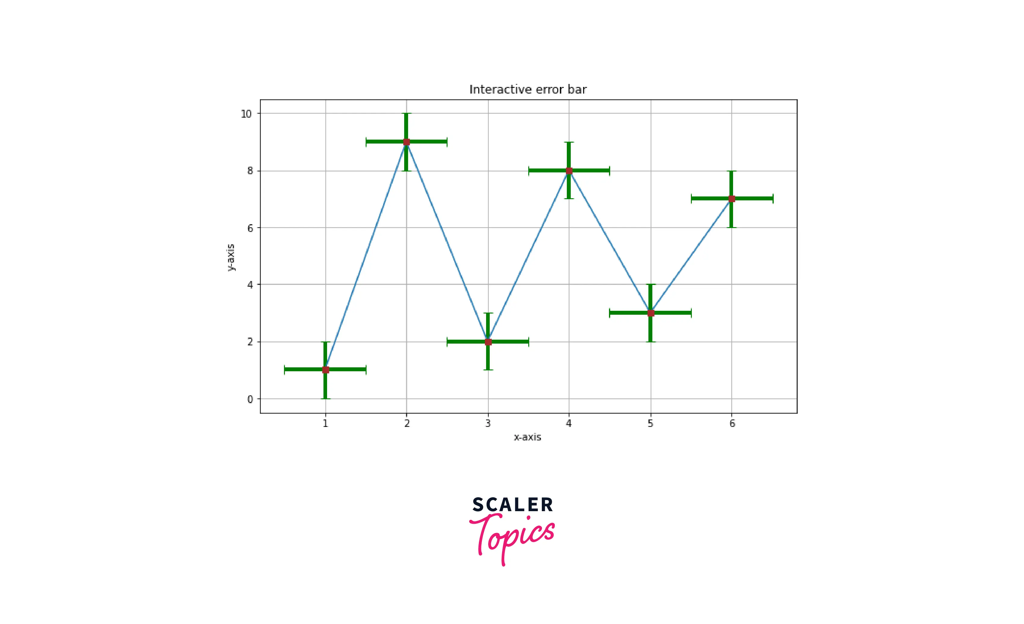
- Importing the required module.
- x and y are the lists containing the data points on the axes.
- matplotlib.pyplot.rcparams[‘figure.figsize’] is used to change the size of the figure.
- matplotlib.errorbar() used to draw errorbar at each coordinates.
- xerr and yerr are 0.5 and 1, respectively (length of error axes).
- fmt: change the style of the marker. Set it to square.
- ecolor: change the color of the errorbar. Set it to green.
- color: change the color of the marker. Set it to brown.
- elinewidth: set the error line width to 4.
- capsize: set the capsize of errorbar to 5.
Example5: Scatter Plot With Error Bars
# This code is written in python # Importing required modules import matplotlib.pyplot as plt import random # x and y data points x= [1,3,5,6,7,8,9,10,11] y= [6, 5, 2, 12,15,7,8,10,11] # Generating array of xerr and yerr of random floats x_error = [random.uniform(1,3) for i in range(9)] y_error = [random.uniform(1,3) for i in range(9)] plt.scatter(x,y) # Plot error bar plt.errorbar(x, y, xerr = x_error, yerr = y_error, fmt='s', ecolor = 'black',color='red') plt.title("Scatter plot with error bars") plt.xlabel('x-axis') plt.ylabel('y-axis') plt.grid() plt.show()Output:
Code explanation:
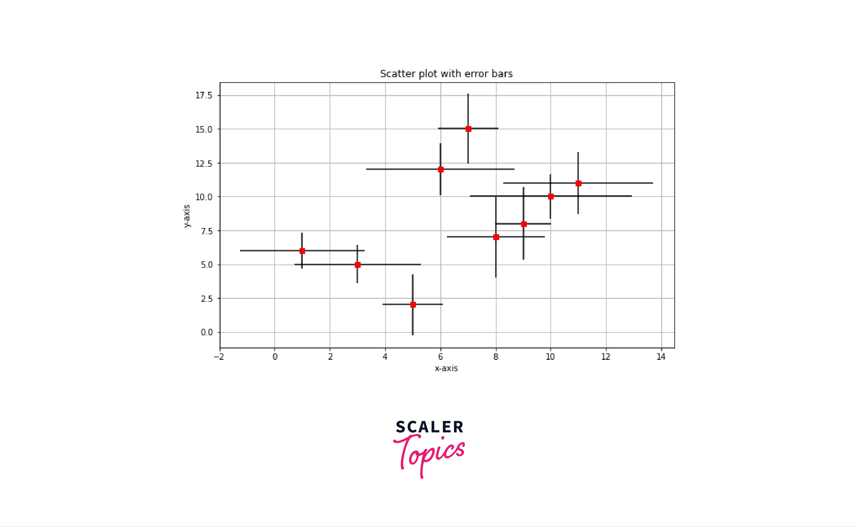
- Importing the required module.
- List x and y contain data points of the axes.
- random.uniform() is used to generate a float in a range, with for loop we can generate multiples random floats.
- matplotlib.scatter() is used to generate a scatter plot.
- matplotlib.errorbar() generates error bars at each marker. The marker shape is square, and the error line color is black. The marker color is red.
Example6: Error bar in a bar graph
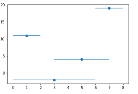
# This code is written in python # Importing required modules import matplotlib.pyplot as plt import random import numpy as np # x and y data points x= [1,2,3,4,5,6,7,8,9,10] y=[random.randint(0,20) for i in range(10)] # Generating array of xerr and yerr of random floats x_error = [random.uniform(0,1) for i in range(10)] y_error = [random.uniform(0,1) for i in range(10)] plt.bar(x,y,width=0.3) # Plot error bar plt.errorbar(x, y, xerr = x_error, yerr = y_error, fmt='s', ecolor = 'black',color='red') plt.title("bar plot with error bars") plt.xlabel('x-axis') plt.ylabel('y-axis') plt.grid() plt.show()Output:
Code explanation:
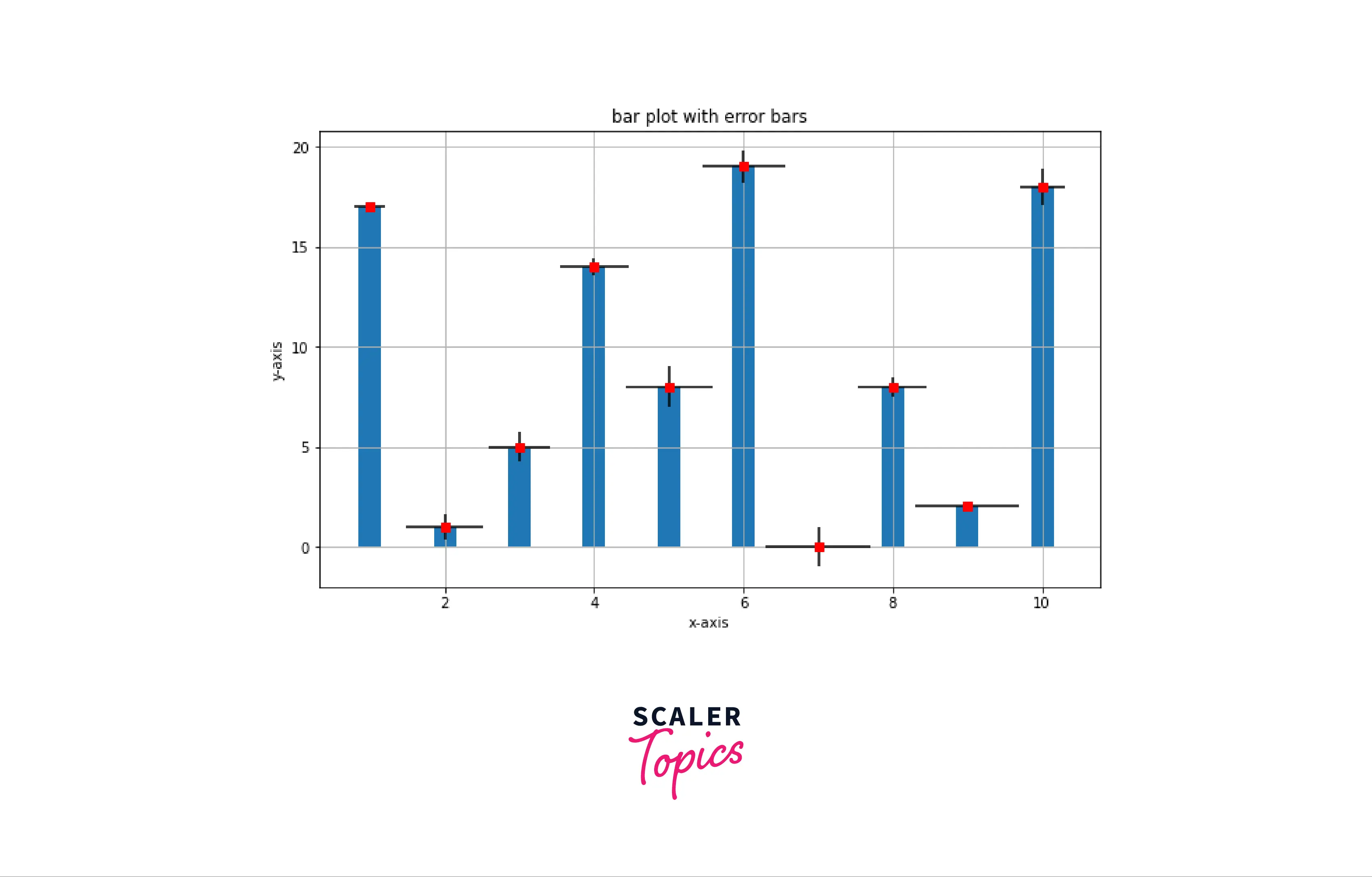
- Importing the required modules
- List x and y contain data points of the axes.
- random.uniform() is used to generate floats.
- matplotlib.pyplot.bar() is used to generate bar graph and width of bars is 0.3.
- matplotlib.errorbar() is used to generate error bars at each marker; marker shape is square, error lines color is black and marker color is red.
Conclusion
- Error bars in matplotlib are y vs. x planes generated at each coordinate to show the standard deviation and irregularities in the data.
- matplotlib.pyplot.errorbar() is the function required to generate error bars.
- This function takes at least two parameters,xand y data points, and other parameters are for modifying the properties of marker and error axes.
- Matplotlib error bar return ErrorbarContainer.
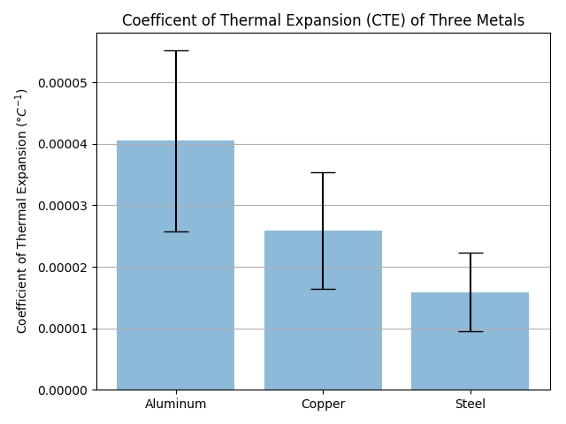
Bar charts with error bars are useful in engineering to show the confidence or precision in a set of measurements or calculated values. Bar charts without error bars give the illusion that a measured or calculated value is known to high precision or high confidence. In this post, we will build a bar plot using Python and atplotlib. The plot will show the coefficient of thermal expansion (CTE) of three different materials based on a small data set. Then we’ll add error bars to this chart based on the standard deviation of the data.
A bar chart with error bars is shown below. Note the labels on the x-axis and the error bars at the top of each bar.
In order to build this plot, we need a couple of things:
| Asset | Description |
|---|---|
| Python (version 3.6) | Run the program |
| Anaconda Prompt | create the virtual environment and install packages |
| numpy | calculate the mean and standard deviation |
| matplotlib | build the plot |
| data set | data to plot |
Before you can build the plot, make sure you have the Anaconda Distribution of Python installed on your computer. See installing Anaconda on Windows for installation instructions.
To get going, we’ll use the Anaconda Prompt to create a new virtual environment. Select Anaconda Prompt from the Windows Start Menu. (If using OSX or Linux, the terminal could also be used)
Once you have the Anaconda Prompt open, type the following command to create a new virtual environment:
conda create -n errorbars
Next, to activate our new (errorbars) virtual environment, type the following into the Anaconda Prompt
Now that the errorbars virtual environment is active, you should see (errorbars) in parenthesis before the Anaconda Prompt.
Now we’ll install matplotlib and numpy using conda. (pip will work to install these packages as well) You can write both package names on the same line or use two different conda install lines.
conda install matplotlib numpy
To confirm our (errorbars) virtual environment has matplotlib and numpy installed, run the command:
Now let’s create a new Python script called errorbars.py. At the top of the script we need to import numpy and matplotlib.
# errorbars.py

import numpy as np
import matplotlib.pyplot as plt
Next, we need to read in our data. The chart below shows the measured coefficient of thermal expansion (CTE) of three metals: Aluminum, Copper and Steel. The units for coefficient of thermal expansion is per degrees C ( / °C)
Coefficient of thermal expansion of three metals (units: / °C)
| Sample | Aluminum | Copper | Steel |
|---|---|---|---|
| 1 | 6.4e-5 | 4.5e-5 | 3.3e-5 |
| 2 | 3.01e-5 | 1.97e-5 | 1.21e-5 |
| 3 | 2.36e-5 | 1.6e-5 | 0.9e-5 |
| 4 | 3.0e-5 | 1.97e-5 | 1.2e-5 |
| 5 | 7.0e-5 | 4.0e-5 | 1.3e-5 |
| 6 | 4.5e-5 | 2.4e-5 | 1.6e-5 |
| 7 | 3.8e-5 | 1.9e-5 | 1.4e-5 |
| 8 | 4.2e-5 | 2.41e-5 | 1.58e-5 |
| 9 | 2.62e-5 | 1.85e-5 | 1.32e-5 |
| 10 | 3.6e-5 | 3.3e-5 | 2.1e-5 |
We’ll put this data into three different numpy arrays, one array for each metal. Notice the syntax np.array([ ... ]) has a parenthesis ( followed by a square bracket [. We are passing a Python list, [ denoted with square brackets ] into the numpy array function (argument enclosed in parenthesis).
# Enter raw data
aluminum = np.array([6.4e-5 , 3.01e-5 , 2.36e-5, 3.0e-5, 7.0e-5, 4.5e-5, 3.8e-5, 4.2e-5, 2.62e-5, 3.6e-5])
copper = np.array([4.5e-5 , 1.97e-5 , 1.6e-5, 1.97e-5, 4.0e-5, 2.4e-5, 1.9e-5, 2.41e-5 , 1.85e-5, 3.3e-5 ])
steel = np.array([3.3e-5 , 1.2e-5 , 0.9e-5, 1.2e-5, 1.3e-5, 1.6e-5, 1.4e-5, 1.58e-5, 1.32e-5 , 2.1e-5])
Now we need to calculate the mean (or average) for each of the three material’s CTE using numpy’s np.mean() function. The means will be the height of each bar in our chart.
# Calculate the average
Aluminum_mean = np.mean(aluminum)
Copper_mean = np.mean(copper)
Steel_mean = np.mean(steel)
Next we’ll calculate the standard deviation for each metal using numpy’s np.std() function. On the plot, we will use the standard deviation as the height of our error bars. The positive error will be show as +1 standard deviation above the mean, and the negative error will be shown as -1 standard deviation below the mean.
# Calculate the standard deviation
aluminum_std = np.std(aluminum)
copper_std = np.std(copper)
steel_std = np.std(steel)
There are a couple more things needed to build the plot. We need the names of the metals to go along our x-axis, one name below each bar. We’ll assign the metal names as list of strings in a variable called materials. We also need a variable that contains the means of the coefficients of thermal expansion, the data we are going to plot. We’ll put these into a Python list called CTEs. Our standard deviations will be used for the height of the error bars. The standard deviations will go together in a list called error.
Let’s code all of these Python list into our errorbars.py script.
# Create lists for the plot
materials = ['Aluminum', 'Copper', 'Steel']
x_pos = np.arange(len(materials))
CTEs = [aluminum_mean, copper_mean, steel_mean]
error = [aluminum_std, copper_std, steel_std]
OK. Now it’s time to build the plot. We are going to build a bar chart with three different bars, one bar for each material: Aluminum, Copper and Steel.
First we will create a figure object called fig and an axis object in that figure called ax using matplotlib’s plt.subplots() function. Everything in our plot will be added to the ax (axis) object. Next we put a bar chart on our ax (axis) with the ax.bar() method.
Note the arguments passed into the ax.bar() method:
x_posis the array with the count of the number of bars.CTEsis our array which contains the means or heights of the bars.yerr=errorsets the heights of the error bars and the standard deviations.- keyword arguments
(align='center', alpha=0.5, ecolor='black', capsize=10)styles the plot.
We’ll put a label on the y-axis with the title «Coefficient of thermal expansion (°C-1)» using ax.set_ylabel. We use ax.set_xticks() to feed in our number list to set the bars as numbers 1, 2, 3. Then we add labels to these numbered bars with ax.set_ticklabels(). ax.set_title() and ax.yaxis.grid(True) adds a title and horizontal grid lines.
Finally, we we’ll save the figure to a file called bar_plot_with_error_bars.png using matplotlib’s plt.savefig() function. The plt.thight_layout() method ensures our axis and labels don’t get cut off and are visible.
# Build the plot
fig, ax = plt.subplots()
ax.bar(x_pos, CTEs, yerr=error, align='center', alpha=0.5, ecolor='black', capsize=10)
ax.set_ylabel('Coefficient of Thermal Expansion ($degree C^{-1}$)')
ax.set_xticks(x_pos)
ax.set_xticklabels(materials)
ax.set_title('Coefficent of Thermal Expansion (CTE) of Three Metals')
ax.yaxis.grid(True)

# Save the figure and show
plt.tight_layout()
plt.savefig('bar_plot_with_error_bars.png')
plt.show()
The final plot looks like this:
For any scientific measurement, accurate accounting for errors is nearly as important, if not more important, than accurate reporting of the number itself.
For example, imagine that I am using some astrophysical observations to estimate the Hubble Constant, the local measurement of the expansion rate of the Universe.
I know that the current literature suggests a value of around 71 (km/s)/Mpc, and I measure a value of 74 (km/s)/Mpc with my method. Are the values consistent? The only correct answer, given this information, is this: there is no way to know.
Suppose I augment this information with reported uncertainties: the current literature suggests a value of around 71 $pm$ 2.5 (km/s)/Mpc, and my method has measured a value of 74 $pm$ 5 (km/s)/Mpc. Now are the values consistent? That is a question that can be quantitatively answered.
In visualization of data and results, showing these errors effectively can make a plot convey much more complete information.
Basic Errorbars
A basic errorbar can be created with a single Matplotlib function call:
Here the fmt is a format code controlling the appearance of lines and points, and has the same syntax as the shorthand used in plt.plot, outlined in Simple Line Plots and Simple Scatter Plots.
In addition to these basic options, the errorbar function has many options to fine-tune the outputs.
Using these additional options you can easily customize the aesthetics of your errorbar plot.
I often find it helpful, especially in crowded plots, to make the errorbars lighter than the points themselves:
In addition to these options, you can also specify horizontal errorbars (xerr), one-sided errorbars, and many other variants.
For more information on the options available, refer to the docstring of plt.errorbar.
Continuous Errors
In some situations it is desirable to show errorbars on continuous quantities.
Though Matplotlib does not have a built-in convenience routine for this type of application, it’s relatively easy to combine primitives like plt.plot and plt.fill_between for a useful result.
Here we’ll perform a simple Gaussian process regression, using the Scikit-Learn API (see Introducing Scikit-Learn for details).
This is a method of fitting a very flexible non-parametric function to data with a continuous measure of the uncertainty.
We won’t delve into the details of Gaussian process regression at this point, but will focus instead on how you might visualize such a continuous error measurement:
We now have xfit, yfit, and dyfit, which sample the continuous fit to our data.
We could pass these to the plt.errorbar function as above, but we don’t really want to plot 1,000 points with 1,000 errorbars.
Instead, we can use the plt.fill_between function with a light color to visualize this continuous error:
Note what we’ve done here with the fill_between function: we pass an x value, then the lower y-bound, then the upper y-bound, and the result is that the area between these regions is filled.
The resulting figure gives a very intuitive view into what the Gaussian process regression algorithm is doing: in regions near a measured data point, the model is strongly constrained and this is reflected in the small model errors.
In regions far from a measured data point, the model is not strongly constrained, and the model errors increase.
For more information on the options available in plt.fill_between() (and the closely related plt.fill() function), see the function docstring or the Matplotlib documentation.
Finally, if this seems a bit too low level for your taste, refer to Visualization With Seaborn, where we discuss the Seaborn package, which has a more streamlined API for visualizing this type of continuous errorbar.
In this article, we learn about the Matplotlib errorbar in Python. The Pyplot module of the Matplotlib library provides MATLAB like interface. And the matplotlib.pyplot.errorbar() function plots y versus x as lines and/or markers with attached errorbars. Moreover, Error bars help to indicate estimated error or uncertainty to give a general sense of how precise a measurement is; this is done through the use of markers drawn over the original graph and its data points. Before we look into examples of Matplotlib errobars and errorbar graphs, let me brief you with the syntax and return the same.
Syantax of matplotlib errorbar()
matplotlib.pyplot.errorbar(x, y, yerr=None, xerr=None, fmt=”, ecolor=None, elinewidth=None, capsize=None, barsabove=False, lolims=False, uplims=False, xlolims=False, xuplims=False, errorevery=1, capthick=None, *, data=None, **kwargs)Parameters of Matplotlib Errorbar:
- x, y: The horizontal and vertical coordinates of the data points.
- fmt: Contains the string value (Optional)
- xerr, yerr: An array containing errors, and the errors must be positive values.
- ecolor: (default: NONE) In simple words, it’s the color of the errorbar lines. (Optional)
- elinewidth: Linewidth of the errorbar lines with default value NONE. (Optional)
- capsize: Length of the error bar caps in points with default value NONE. (Optional)
- barsabove: (default: False)Contains boolean values for plotting error bars above the plot symbols. (Optional)
- lolims, uplims, xlolims, xuplims: Contains boolean values, which indicate that a value gives only upper/lower limits. (Optional) errorevery: Contain integer values that help draws error bars on a subset of the data. (Optional)
Return type of Matplotlib Errorbar:
The Matplotlib errorbar() function returns a container having:
plotline: Line2D instance of x, y plot markers and/or line.
caplines: Tuple of Line2D instances of the error bar caps.
barlinecols: Tuple of LineCollection with the horizontal and vertical error ranges.
Example of Matplotlib Errorbar in Python
Errorbar helps you to understand the nature of graphs and their convergence. The errorbar can give an idea about the graph’s variance with its mean. Correspondingly, you can identify the outliers from your graph and take care of them. Moreover, it represents uncertainty in your graph.
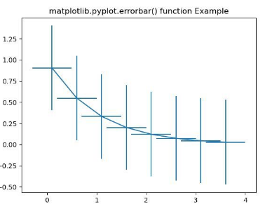
import numpy as np
import matplotlib.pyplot as plt

xval = np.arange(0.1, 4, 0.5)
yval = np.exp(-xval)

plt.errorbar(xval, yval, xerr = 0.4, yerr = 0.5)

plt.title('matplotlib.pyplot.errorbar() function Example')
plt.show()
OUTPUT:
EXPLANATION:
Firstly, the above example is a fundamental implementation of the Matplotlib errorbar() function. The ‘xval’ and ‘yval’ contains the horizontal and vertical coordinates of the data points required for errorbar plotting. In addition, the ‘xerr’ and ‘yerr’ are arguments to the errorbar function. The values assigned to them are 0.4 and 0.5, respectively, the positive error values. Finally, these four parameters passed to the errorbar() function are mandatory arguments required to plot any Python errorbars.
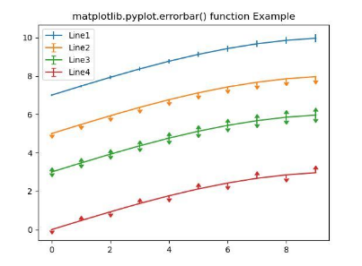
Matplotlib Errorbar in Python Multiple lines
It’s very important to be able to plot multiple lines in the same graphs. In the following example, we’ll plot multiple errorbars in the same graph.
import numpy as np
import matplotlib.pyplot as plt

fig = plt.figure()
x = np.arange(10)
y = 3 * np.sin(x / 20 * np.pi)
yerr = np.linspace(0.05, 0.2, 10)

plt.errorbar(x, y + 7, yerr = yerr,
             label ='Line1')
plt.errorbar(x, y + 5, yerr = yerr,
             uplims = True,
             label ='Line2')
plt.errorbar(x, y + 3, yerr = yerr,
             uplims = True,
             lolims = True,
             label ='Line3')

upperlimits = [True, False] * 5
lowerlimits = [False, True] * 5
plt.errorbar(x, y, yerr = yerr,
             uplims = upperlimits,
             lolims = lowerlimits,
             label ='Line4')

plt.legend(loc ='upper left')

plt.title('matplotlib.pyplot.errorbar()
function Example')
plt.show()
OUTPUT:
EXPLANATION:
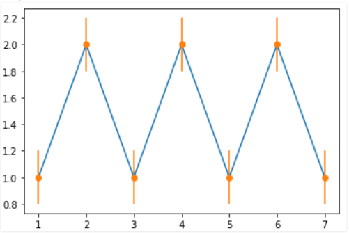
Firstly, in the above example, the matplotlib errorbar() function creates multiple errorbar lines. The x and y defined are the coordinates of the data points. Along the y-axis, graph plot error. Hence only ‘yerr’ is specified for each line. Additionally, the upper and lower limits indicate the values for only upper and lower limits. Also, the label is an argument indicating the lines as Line1, Line2, etc.
Errorbar graph with error in x
import matplotlib.pyplot as plt

# making a simple plot
x =[1, 2, 3, 4, 5, 6, 7]
y =[1, 2, 1, 2, 1, 2, 1]

# creating error
x_error = 0.5

# ploting graph
plt.plot(x, y)
plt.errorbar(x, y,
             xerr = x_error,
             fmt ='o')
OUTPUT:
EXPLANATION:
Firstly, in the above example, x and y are arrays defined containing x and y coordinates to plot the graph. Additionally, the ‘x_error’ is 0.5, which introduces errors only along the x-axis. The x, y, and xerr are the mandatory parameters passed to the Matplotlib errorbar in Python. The optional parameter ‘fmt’ containing string value is also passed.
Errorbar graph with error in y
import matplotlib.pyplot as plt


# making a simple plot
x =[1, 2, 3, 4, 5, 6, 7]
y =[1, 2, 1, 2, 1, 2, 1]

# creating error
y_error = 0.2

# ploting graph
plt.plot(x, y)

plt.errorbar(x, y,
             yerr = y_error,
             fmt ='o')
OUTPUT:
EXPLANATION:
Firstly, in the above example, x and y are arrays defined containing x and y coordinates to plot the graph. The ‘y_error’ is 0.2, which introduces errors only along the y-axis. The x, y, and yerr are the mandatory parameters passed to the errorbar function. The optional parameter ‘fmt’ containing string value is also passed.
Errorbar graph with Variable error in x and y
import matplotlib.pyplot as plt

x =[1, 2, 3, 4, 5]
y =[1, 2, 1, 2, 1]

y_errormin =[0.1, 0.5, 0.9,
             0.1, 0.9]
y_errormax =[0.2, 0.4, 0.6,
             0.4, 0.2]

x_error = 0.5
y_error =[y_errormin, y_errormax]

# ploting graph
# plt.plot(x, y)
plt.errorbar(x, y,
             yerr = y_error,
             xerr = x_error,
             fmt ='o')
OUTPUT:
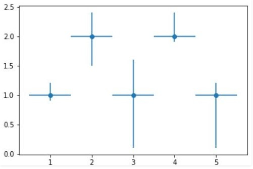
EXPLANATION:
The above example depicts an error bar graph plot for variable errors. Likewise, the x and y are two arrays defined containing the coordinate points. The error along the x-axis is 0.5. Simultaneously, the error along the y-axis between two arrays is y_errormin and y_errormax. These parameters are arguments to the Matplotlib errorbar function to get the desired output.
Conclusion
This article clearly presents to you different ways of using the Matplotlib errorbar in Python. Examples of both errorbar lines and graphs are provided with a detailed explanation. Errorbars provide an additional layer of detail on the presented data. Refer to this article for any queries related to the Matplotlib errorbar() function.
However, if you have any doubts or questions, do let me know in the comment section below. I will try to help you as soon as possible.
Happy Pythoning!
Learn how to create an error bar chart with the help of Matplotlib, Pandas, and Seaborn libraries.
Error bars are used on graphs to indicate an error, uncertainty in a measurement, or the variability of data. For example, if you have a data set with minimum/maximum values, you can calculate the average value and show the variability with the help of error bars.
Prerequisites
To create an error bars chart, we’ll need the following:
- Python installed on your machine
- Pip: package management system (it comes with Python)
- Jupyter Notebook: an online editor for data visualization
- Pandas: a library to prepare data for plotting
- Matplotlib: a plotting library
- Seaborn: a plotting library (we’ll only use part of its functionally to add a grid to the plot and get rid of Matplotlib’s default borders)
You can download the latest version of Python for Windows on the official website.
To get other tools, you’ll need to install recommended Scientific Python Distributions. Type this in your terminal:
pip install numpy scipy matplotlib ipython jupyter pandas sympy nose seaborn
Getting Started
Create a folder that will contain your notebook (e.g. “matplotlib-bar-chart”) and open Jupyter Notebook by typing this command in your terminal (don’t forget to change the path):
cd C:UsersSharkDocumentscodematplotlib-bar-chart
py -m notebook
This will automatically open the Jupyter home page at http://localhost:8888/tree. Click on the “New” button in the top right corner, select the Python version installed on your machine, and a notebook will open in a new browser window.
In the first line of the notebook, import all the necessary libraries:
import matplotlib.pyplot as plt
import matplotlib as mpl
import pandas as pd
import seaborn as sns
%matplotlib notebook
You’ll need the last line (%matplotlib notebook) to display plots in input cells.
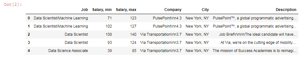
Data Preparation
Let’s create a chart that will show average salaries as well as their minimum and maximum values as data variations. We’ll plot a Matplotlib/Seaborn error bars chart using a .csv file. You can download the file on GitHub (glassdoor-data.csv).
On the second line in your Jupyter notebook, type this code to read the file:
df = pd.read_csv('glassdoor-data.csv')
df.head()
This will show the first 5 lines of the .csv file:
Next, sort and format values for plotting:
# Get rid of all non-numeric values
df['Salary, min'] = (pd.to_numeric(df['Salary, min'],errors='coerce').fillna(0)).astype(int)
df['Salary, max'] = (pd.to_numeric(df['Salary, max'],errors='coerce').fillna(0)).astype(int)

# Create a new column with average values
df['Mean'] = df[['Salary, min', 'Salary, max']].mean(axis=1)

# Select jobs for which you want the salaries to be displayed on the graph
jobs = [
        'Data Scientist',
        'Data Analyst',
        'Data Engineer',
        'Software Developer']

def get_grp(x, df, col_name, my_list):
    for c in my_list:
        if c in df[col_name][x]:
            return c

selected = df.loc[df['Job'].isin(jobs)]
selected = selected.groupby(lambda x : get_grp(x, df, 'Job', jobs))
table = selected.mean()
table.sort_values(['Mean'], ascending=[True], inplace=True)
table
The output will look like this:
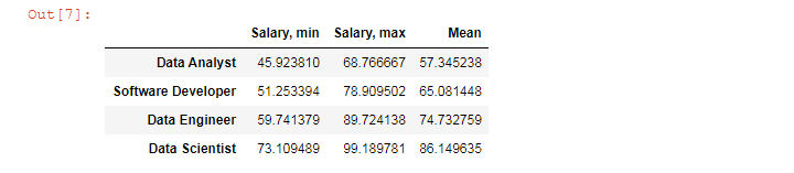
We’ll use this table to create our Matplotlib error bar chart.
Plotting
We’ll create a Matplotlib error bar chart in 5 steps. All the code snippets below should be placed inside one cell in your Jupyter Notebook.
1. Create subplots
First, set Seaborn styles with the chosen face color:
sns.set(rc={'axes.facecolor':'#EBDCB2'})
Next, draw a figure with a subplot.
fig, ax = plt.subplots(figsize=(10,5), facecolor=(.94, .94, .94))
plt.tight_layout()
figsize=(10,5) creates a 1000 × 500 px figure.
plt.tight_layout() adjusts subplot params so that subplots are nicely fit in the figure.
2. Create bars
means = table['Mean']
mins = table['Salary, min']
maxes = table['Salary, max']

ax.errorbar(table.index, means, [means - mins, maxes - means],
            fmt='D',
            mfc = '#C9A66B',
            mec = '#662E1C',
            ms = 16,
            mew = 3,
            ecolor='#AF4425',
            lw=3,
            ls = ':',
            color='#AF4425')
ax.errorbar will plot an error bar chart. This function takes several optional arguments:
- fmt=’D’ means diamond data points. This can also be ‘.’ (point), ‘o’ (circle), ‘s’ (square), ‘p’ (plus), ‘*’ (star), ‘8’ (octagon), etc. See more examples in Matplotlib documentation
- mfc = markerfacecolor
- mec = markeredgecolor
- ms = markersize
- mew = markeredgewidth
- ecolor (color of variability lines)
- lw = linewidth
- ls = linestyle (‘-‘, ‘—‘, ‘-.’, ‘:’, »)
- color (color of the line between error bars)
3. Create ticks and labels
font_color = '#525252'

# Create ticks and set their color
plt.xticks(color=font_color)
plt.yticks(color=font_color)

# Set ticks’ font size
for label in (ax.get_xticklabels() + ax.get_yticklabels()):
    label.set_fontsize(16)

# Create y-axis label
ax.set_ylabel('USD thousand', color=font_color, fontsize=16)
4. Set title and subtitle
# Set the title and subtitle
subtitle = fig.suptitle('Annual salaries, USD thousand', y=.95, fontsize=20, color=font_color)
title = plt.title('Source: Glassdoor', pad=16, fontsize=18, color=font_color)

# Set title position
title.set_position([.5, 1])

# Adjust subplots so that the title, subtitle, and labels would fit
plt.subplots_adjust(top=0.8, bottom=0.2, left=0.1, right=0.9)
5. Save the chart as a picture
filename = 'mpl-errorbar'
plt.savefig(filename+'.png', facecolor=(.94, .94, .94))
You might need to repeat facecolor in savefig(). Otherwise, plt.savefig might ignore it.
That’s it, your Matplotlib error bar chart is ready. You can download the notebook on GitHub to get the full code.
Read also:
→ Matplotlib: Double Bar Graph
→ Matplotlib: Vertical Bar Chart