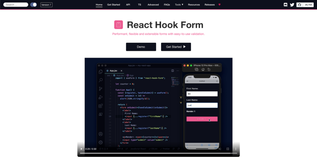
Performant, flexible and extensible forms with easy to use validation.

Goal
A simple component to render associated input’s error message.
Install
$ npm install @hookform/error-message
Quickstart
- Single Error Message
import React from 'react';
import { useForm } from 'react-hook-form';
import { ErrorMessage } from '@hookform/error-message';

export default function App() {
  const { register, formState: { errors }, handleSubmit } = useForm();
  const onSubmit = (data) => console.log(data);

  return (
    <form onSubmit={handleSubmit(onSubmit)}>
      <input
        name="singleErrorInput"
        ref={register({ required: 'This is required.' })}
      />
      <ErrorMessage errors={errors} name="singleErrorInput" />

      <ErrorMessage
        errors={errors}
        name="singleErrorInput"
        render={({ message }) => <p>{message}</p>}
      />

      <input name="name" ref={register({ required: true })} />
      <ErrorMessage errors={errors} name="name" message="This is required" />

      <input type="submit" />
    </form>
  );
}
- Multiple Error Messages
import React from 'react';
import { useForm } from 'react-hook-form';
import { ErrorMessage } from '@hookform/error-message';

export default function App() {
  const { register, formState: { errors }, handleSubmit } = useForm({
    criteriaMode: 'all',
  });
  const onSubmit = (data) => console.log(data);

  return (
    <form onSubmit={handleSubmit(onSubmit)}>
      <input
        name="multipleErrorInput"
        ref={register({
          required: 'This is required.',
          pattern: {
            value: /d+/,
            message: 'This input is number only.',
          },
          maxLength: {
            value: 10,
            message: 'This input exceed maxLength.',
          },
        })}
      />
      <ErrorMessage
        errors={errors}
        name="multipleErrorInput"
        render={({ messages }) =>
          messages &&
          Object.entries(messages).map(([type, message]) => (
            <p key={type}>{message}</p>
          ))
        }
      />

      <input type="submit" />
    </form>
  );
}
API
| Prop | Type | Required | Description |
|---|---|---|---|
name |
string |
✓ | Associated field name. |
errors |
object |
errors object from React Hook Form. It’s optional if you are using FormProvider. |
|
message |
string | React.ReactElement |
inline error message. | |
as |
string | React.ReactElement | React.ComponentType |
Wrapper component or HTML tag. eg: as="p", as={<p />} or as={CustomComponent}. This prop is incompatible with prop render and will take precedence over it. |
|
render |
Function |
This is a render prop for rendering error message or messages. Note: you need to set criteriaMode to all for using messages. |
Backers
Thank goes to all our backers! [Become a backer].
Contributors
Thanks goes to these wonderful people. [Become a contributor].
Tutorial built with React 17.0.2 and React Hook Form 7.15.0
This is a quick example of how to display a custom error message on a React Hook Form that is returned from an HTTP API request.
The below code snippets are from a React + Recoil auth tutorial I posted recently, to see the code running in a live demo app check out React + Recoil — Basic HTTP Authentication Tutorial & Example.
React Hook Form Component with Custom API Error
Path: /src/login/Login.jsx
The login page contains a form built with the React Hook Form library that contains username and password fields for logging into the React app.
Set error after failed HTTP request
The onSubmit function gets called when the form is submitted and valid, and posts the user credentials to the api by calling userActions.login(). If the api request fails the .catch() method is executed, which calls the React Hook Form setError() function with a name ('apiError') and an error object containing the message ({ message: error }). The setError() function adds the error to the formState.errors object which is then rendered at the bottom of the React Hook Form in the returned JSX template ({errors.apiError && ...).
import { useForm } from "react-hook-form";
import { yupResolver } from '@hookform/resolvers/yup';
import * as Yup from 'yup';

import { useUserActions } from '_actions';

export { Login };

function Login() {
    const userActions = useUserActions();

    // form validation rules
    const validationSchema = Yup.object().shape({
        username: Yup.string().required('Username is required'),
        password: Yup.string().required('Password is required')
    });
    const formOptions = { resolver: yupResolver(validationSchema) };

    // get functions to build form with useForm() hook
    const { register, handleSubmit, setError, formState } = useForm(formOptions);
    const { errors, isSubmitting } = formState;

    function onSubmit({ username, password }) {
        return userActions.login(username, password)
            .catch(error => {
                setError('apiError', { message: error });
            });
    }

    return (
        <div className="col-md-6 offset-md-3 mt-5">
            <div className="alert alert-info">
                Username: test<br />
                Password: test
            </div>
            <div className="card">
                <h4 className="card-header">Login</h4>
                <div className="card-body">
                    <form onSubmit={handleSubmit(onSubmit)}>
                        <div className="form-group">
                            <label>Username</label>
                            <input name="username" type="text" {...register('username')} className={`form-control ${errors.username ? 'is-invalid' : ''}`} />
                            <div className="invalid-feedback">{errors.username?.message}</div>
                        </div>
                        <div className="form-group">
                            <label>Password</label>
                            <input name="password" type="password" {...register('password')} className={`form-control ${errors.password ? 'is-invalid' : ''}`} />
                            <div className="invalid-feedback">{errors.password?.message}</div>
                        </div>
                        <button disabled={isSubmitting} className="btn btn-primary">
                            {isSubmitting && <span className="spinner-border spinner-border-sm mr-1"></span>}
                            Login
                        </button>
                        {errors.apiError &&
                            <div className="alert alert-danger mt-3 mb-0">{errors.apiError?.message}</div>
                        }
                    </form>
                </div>
            </div>
        </div>
    )
}
Subscribe or Follow Me For Updates
Subscribe to my YouTube channel or follow me on Twitter, Facebook or GitHub to be notified when I post new content.
- Subscribe on YouTube at https://www.youtube.com/JasonWatmore
- Follow me on Twitter at https://twitter.com/jason_watmore
- Follow me on Facebook at https://www.facebook.com/JasonWatmoreBlog
- Follow me on GitHub at https://github.com/cornflourblue
-
Feed formats available:
RSS,
Atom,
JSON
Other than coding…
I’m currently attempting to travel around Australia by motorcycle with my wife Tina on a pair of Royal Enfield Himalayans. You can follow our adventures on YouTube, Instagram and Facebook.

- Subscribe on YouTube at https://www.youtube.com/TinaAndJason
- Follow us on Instagram at https://www.instagram.com/tinaandjason
- Follow us on Facebook at https://www.facebook.com/TinaAndJasonVlog
- Visit our website at https://tinaandjason.com.au
Need Some React Hook Form Help?
Search fiverr to find help quickly from experienced React Hook Form developers.
As a React developer, you must know how to implement validation in form, and a form may hold one or more than one input element.
If you want to get the user-provided data in a subtle manner, then you must show reverence to proper error handling.
In this tutorial, we would like to show you how to add validation in React, show appropriate error messages in React application using Hook Form and Yup packages.
Let us understand what error messages are and why they should be displayed to the user.
Seldom, a user enters incorrect values into the form fields, and you must have seen some error messages manifest on the screen. These messages help in hinting your users about their blunders.
As per the common notion, error messages play a vital role in such a scenario and help users easily determine the issue. After that, users can quickly fix it and submit the form with absolutely no error.
How to Use React Hook Form to Show Validation Error Messages
- Step 1: Set Up React Project
- Step 2: Add Bootstrap Library
- Step 2: Add Yup and Hook Form Plugins
- Step 3: Create Form Component File
- Step 4: List Form Module in App Js
- Step 5: Run Development Server
Set Up React Project
First step tells you how to deal with blank React project installation.
On the terminal screen, you have to type the given command and quickly execute it.
npx create-react-app react-shineCarefully enter into the project folder.
cd react-shineAdd Bootstrap Library
This instruction is for adding the bootstrap in React app. Now, you have to add the library so run the following command.
npm install bootstrapHere, you have to include and use the bootstrap UI component in React. Ensure that you are importing the bootstrap CSS path in App.js file.
import React from 'react'
import 'bootstrap/dist/css/bootstrap.min.css'
export default function App() {
  return (
    <>

    <>
  )
}
Add Yup and Hook Form Plugins
Let us install the yup and hook form plugins, you have to use the provided command to add the libraries.
npm install @hookform/resolvers yupCreate Form Component File
We are going to build a new component, this file will have the code to show error messages.
Therefore, open the component/ folder and make a new file inside the folder. You can name it ErrorMsg.js file.
import React from 'react'
import * as Yup from 'yup'
import { yupResolver } from '@hookform/resolvers/yup'
import { useForm } from 'react-hook-form'

export default function ErrorMsg() {
  const yupValidation = Yup.object().shape({
    name: Yup.string()
      .required('Please enter some value.')
      .min(4, 'Add minimum 4 characters'),
    email: Yup.string().required('Email id is mendatory').email(),
  })
  const formOptions = { resolver: yupResolver(yupValidation) }
  const { register, handleSubmit, reset, formState } = useForm(formOptions)
  const { errors } = formState
  function onSubmit(data) {
    console.log(JSON.stringify(data, null, 4))
    return false
  }
  return (
    <div className="container mt-4">
      <h2>React Integrate Validation Error Messages with Hook Form</h2>
      <form onSubmit={handleSubmit(onSubmit)}>
        <div className="form-group">
          <label>Name</label>
          <input
            name="name"
            type="text"
            className={`form-control ${errors.name ? 'is-invalid' : ''}`}
            {...register('name')}
          />
          <div className="invalid-feedback">{errors.name?.message}</div>
        </div>
        <div className="form-group">
          <label>Email</label>
          <input
            name="email"
            type="text"
            className={`form-control ${errors.email ? 'is-invalid' : ''}`}
            {...register('email')}
          />
          <div className="invalid-feedback">{errors.email?.message}</div>
        </div>
        <div className="mt-3">
          <button type="submit" className="btn btn-primary">
            Send
          </button>
        </div>
      </form>
    </div>
  )
}
List Form Module in App Js
This instruction is all about listing the error message component in React’s main app component file.
Hence, open the src/App.js and import the component as shown below.
import React from 'react'
import ErrorMsg from './components/ErrorMsg'
import 'bootstrap/dist/css/bootstrap.min.css';

export default function App() {
  return (
    <div className="App">
      <ErrorMsg />
    </div>
  )
}
Run Development Server
Lastly, you have to open the terminal again type the command and press enter.
npm startHere is the url that you can use to check the app on the browser.
http://localhost:3000
Conclusion
We built a simple form with only two input controls name and email. And learned how to set validation error messages in React app using hook form and yup libraries.
Not just that, we also determine how to set form from the absolute beginning.
Table of Contents
- Introduction
- What Is React Hook Form?
- React Hook Form Features
- How to Use React Hook Form
- How to Use React Hook Form
- Error Handling in React Hook Form
- How To Validate React Forms With React Hook Form
- Required Validation
- Min Validation
- Max Validation
- MinLength Validation
- MaxLength Validation
- Pattern Validation
- React Hook Form Validation With Yup
- Using React Hook Form With UI Libraries
- Wrapping Up
- Where Do You Go Next?
Introduction
In web development, forms are used to collect required information in a logical, useable format for communication and data transfer to another entity such as database or component. Additionally, React Hook Form is one of the libraries in which data are retrieved, validated and processed in a React application.
In this article, we’ll dive down into getting started with React Hook Form and why the library is useful in building forms in a React application with less code.
What Is React Hook Form?
React Hook Form is a form state management and validation library for React web-based applications and React Native mobile applications. It focuses on reducing the amount of code that developers need to write when creating forms in React, as well as eliminating unnecessary re-renders of form components.
Unlike other form libraries that handle the implementation of their form management library with React state, React Hook Form makes use of ref to control the form inputs. As a result, the use of ref resolves the unnecessary re-rendering of forms in React.
React Hook Form Features
React Hook Form is distinguished from other React form libraries by a number of features and good efficiency. The following are some of the features:
- It has zero dependency
- High performance
- Great user experience (UX) and developer experience (DX)
- Support for native HTML form validation
- Supports third party form validation
- Support for third party UI libraries
- Light weight
React Hook Form is usually compared with Formik, a popular React form library. When it comes to Formik vs React Hook Form, below are the most obvious difference:
- Small bundle size
- Form component renders lesser than Formik’s
- Easy to integrate with any third UI libraries
- Uses uncontrolled method to improve the performance of form state while Formik that uses the controlled method.
- Has less boiler code than Formik.
How to Use React Hook Form
Create a new React app with the Create React APP (CRA) command below:
npx create-react-app my-react-hook-form
Next, navigate into the newly created project directory with the command below:
The easiest way to work with React Hook Form in your React project is by installing it with the command below:
npm install react-hook-form
or
These two commands will install the React Hook Form package into your React project.
How to Use React Hook Form
After installing the react-hook-form package into your app, the next step is to import the useForm hook from react-hook-form into your component:
Update your App.js file with the following lines of code:
import "./App.css";
import { useForm } from "react-hook-form";
function App() {
const {
register,
handleSubmit,
formState: { errors },
} = useForm();
const onSubmit = (data) => {
alert(data);
};
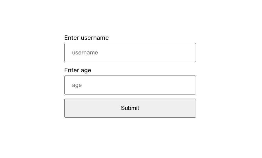
return (
<div className='App'>
<form onSubmit={handleSubmit(onSubmit)}>
{/* Username */}
<section>
<label>Enter username</label>
<input
type='text'
placeholder='username'
{...register("username", { required: true })}
/>
{errors.username && <span>Username is required</span>}
</section>
{/* Age */}
<section>
<label>Enter age</label>
<input
type='number'
placeholder='age'
{...register("age", { required: true })}
/>
{errors.age && <span>Age is required</span>}
</section>
{/* Submit button */}
<section>
<input type='submit' />
</section>
</form>
</div>
);
}
export default App;
In the code above, we’re importing the useForm hook from the react-hook-form package, the useForm hook is also an object that contains methods that we can use to interact with the form state.
These methods can also be used to watch changes in our form, display errors, reset the form, access the form state etc.
Next, update your App.css file with following CSS file to style our React hooks:
body{
  display: flex;
  justify-content: center;
  align-items: center;
  min-height: 100vh;
  padding: 10px;
}
form section{
  margin-bottom: 0.6rem;
  width: 300px;
}
label{
  display: block;
  margin-bottom: 0.3rem;
  font-size: 14px;
}
input{
  width: 100%;
  box-sizing: border-box;
  padding: 12px 16px;
}
span{
  color: red;
  font-size: 13px;
  padding-left: 4px;
}
Our form should look something like below:
Error Handling in React Hook Form
When an error is detected in a React Hook Form, it means one or two form field validations are not completed by the user.
Validation errors can be accessed through an error object from the formState property in the useForm hook. For instance,
const { formState: { errors } } = useForm();
or
const { formState } = useForm()
const { errors } = formState;
Validation error for a particular form field can be detected like this:
{errors.inputBox && <span>Error occurred in inputBox</span>}
A specific validation error type can also be accessed through the error type like this:
{errors.inputBox?.type === "validation-type" && <span>Custom error message</span>}
How To Validate React Forms With React Hook Form
React Hook Form has support for native HTML form validation, which are ways of ensuring the user is providing the right information on the React hooks.

Required Validation
The required validation is one of the most popular ways to validate forms that ensures the user does not leave the input field empty.
For example, a form field can be made required by setting the required to true as shown below:
<input
  type='text'
  placeholder='username'
  {...register("username", { required: true })}
/>
The above code will produce the result below:

Min Validation
The min number validation can be used to set the minimum number a form field should accept.
The code below will only accept age from 18 and above:
{/* Age */}
<section>
  <label>Enter age</label>
  <input
    type='number'
    placeholder='age'
    {...register("age", { required: true, min: 18 })}
  />
  {errors.age?.type === "required" && <span>Age is required</span>}
  {errors.age?.type === "min" && <span>Age is too small</span>}
</section>
When a user enters any age below 18, our min validation will look something like this:

Max Validation
The max number validation can be used to set the maximum number a form field should accept.
The form field below will only accept a maximum age of 70:
{/* Age */}
<section>
  <label>Enter age</label>
  <input
    type='number'
    placeholder='age'
    {...register("age", { required: true, min: 18, max: 70 })}
  />
  {errors.age?.type === "required" && <span>Age is required</span>}
  {errors.age?.type === "min" && <span>Age is too small</span>}
  {errors.age?.type === "max" && <span>Age is too high</span>}
</section>
When a user enters any age above 70, our max validation will look something like this:

MinLength Validation
The minLength validation specifies the minimum length of a value that will be accepted in a form field.
The form field below will only accept four-letter usernames:
{/* Username */}
<section>
  <label>Enter username</label>
  <input
    type='text'
    placeholder='username'
    {...register("username", { required: true, minLength: 4 })}
  />
  {errors.username?.type === "required" && (
    <span>Username is required</span>
  )}
  {errors.username?.type === "minLength" && (
    <span>Username must be at least 4 letters long</span>
  )}
</section>
When a user enters a username less than 4 letters, our minLength validation will look something like this:

MaxLength Validation
The maxLength validation specifies the maximum length of a value that can be accepted in a form field.
The form field below will only accept usernames with less than ten-letters:
{/* Username */}
<section>
  <label>Enter username</label>
  <input
    type='text'
    placeholder='username'
    {...register("username", {
      required: true,
      minLength: 4,
      maxLength: 10,
    })}
  />
  {errors.username?.type === "required" && (
    <span>Username is required</span>
  )}
  {errors.username?.type === "minLength" && (
    <span>Username must be at least 4 letters long</span>
  )}
  {errors.username?.type === "maxLength" && (
    <span>Username must not be 10 letters long</span>
  )}
</section>
When a user enters a username with more than ten-letters, our maxLength validation will look something like this:

Pattern Validation
Finally, the pattern validation can be used to set the regex pattern for a form field.
The form field below will only accept lowercase letters:
{/* Username */}
<section>
  <label>Enter username</label>
  <input
    type='text'
    placeholder='username'
    {...register("username", {
      required: true,
      minLength: 4,
      maxLength: 10,
      pattern: /[a-z]/,
    })}
  />
  {errors.username?.type === "required" && (
    <span>Username is required</span>
  )}
  {errors.username?.type === "minLength" && (
    <span>Username must be at least 4 letters long</span>
  )}
  {errors.username?.type === "maxLength" && (
    <span>Username must not be 10 letters long</span>
  )}
  {errors.username?.type === "pattern" && (
    <span>Username must be lowercase</span>
  )}
</section>
When a user enters their username in CAPITAL LETTERS, our pattern validation should look something like this:

More information on the Regex form pattern validation may be found here.
React Hook Form Validation With Yup
React Hook Form also supports Yup validation schema out of the box. Yup is a JavaScript object schema for value parsing and validation where you can pass your schema to the useForm hook as an optional config.
Yup will validate the user’s input data against the schema and return with either errors or a valid result.
Install yup and Hook Form resolver into your app with the command below:
npm install @hookform/resolvers yup
Next, we’ll recreate our native HTML form validation with yup schema. Create a new schema.js file in your src folder with the following content:
import * as yup from "yup";

export const schema = yup
  .object({
    username: yup
      .string()
      .required("Username is required")
      .min(4, "Username must be at least 4 letters long")
      .max(10, "Username must not be 10 letters long"),
    age: yup
      .number()
      .required("Age is required")
      .max(70, "Age is too high")
      .min(18, "Age is too small"),
  })
  .required();
- Create a new FormWithYup.js file in your src folder.
- We can apply the yup schema into our component as shown below:
import "./App.css";
import { useForm } from "react-hook-form";
import { schema } from "./schema";
import { yupResolver } from "@hookform/resolvers/yup";

function FormWithYup() {
  const {
    register,
    handleSubmit,
    formState: { errors },
  } = useForm({
    resolver: yupResolver(schema),
  });
  const onSubmit = (data) => {
    alert(data);
  };
  return (
    <div className='App'>
      <form onSubmit={handleSubmit(onSubmit)}>
        {/* Username */}
        <section>
          <label>Enter username</label>
          <input type='text' placeholder='username' {...register("username")} />
          <span>{errors.username?.message}</span>
        </section>
        {/* Age */}
        <section>
          <label>Enter age</label>
          <input type='number' placeholder='age' {...register("age")} />
          <span>{errors.age?.message}</span>
        </section>
        {/* Submit button */}
        <section>
          <input type='submit' />
        </section>
      </form>
    </div>
  );
}
export default FormWithYup;
The validation schema above will perform the same validation as we have done earlier:

Learn more about Validating Forms with React Hook In React Using YUP from the video below, made by wonderful people:
Using React Hook Form With UI Libraries
React Hook Form library also works with external UI libraries that don’t expose their input ref, such as Material UI, Chakra UI, and React Select.
In this tutorial, we’re going to use the Chakra UI OTP component specifically as an example.
Install Chakra UI with the command below:
npm i @chakra-ui/react @emotion/react@^11 @emotion/styled@^11 framer-motion@^6
Next, import Chakra provider in your index.js file:
import { ChakraProvider } from "@chakra-ui/react";
Wrap the ChakraProvider around the <App /> components in index.js as shown below:
<ChakraProvider>
  <App />
</ChakraProvider>
Next, inside your src folder, create a new OtpForm.jsx file with the following code:
import { HStack, PinInput, PinInputField } from "@chakra-ui/react";
import React from "react";
import { Controller, useForm } from "react-hook-form";
export const OtpForm = () => {
  const { control, handleSubmit } = useForm();
  const onSubmit = (data) => alert(JSON.stringify(data));
  return (
    <div>
      <Controller
        name='otp'
        control={control}
        render={({ field }) => (
          <HStack>
            <PinInput {...field} onComplete={handleSubmit(onSubmit)}>
              <PinInputField />
              <PinInputField />
              <PinInputField />
              <PinInputField />
            </PinInput>
          </HStack>
        )}
      />
    </div>
  );
};
In the code above, we’re wrapping the Controller component around the Chakra UI HStack and PinInput components. The Controller component will take care of registering the form field into the React Hook state management using the provided name.
The handleSubmit function will then handle the submission of the form when the user has provided all the required digits.
When you render the <OtpForm /> component in your App.js file, our otp page should look something like this:

You can learn more about the React Hook Form controller and how it works under the hood from the maintainer’s tutorial video below:
Wrapping Up
React Hook Form is a powerful React form library that allows you to develop and manage the state any kind of form with less code and high performance.
Through this article, you’ve learned about React Hook Form, how you can get started with it and why it’s a good choice for your React and React Native app forms.
Where Do You Go Next?
Do you want to build a better UI? Do you also want more information on React? Check out tips on how to build better UI faster with CopyCat. We are our own kind and lovely sponsors:
- Learn React best practices from here.
- Learn how to use Bootstrap in React from here.
- Learn how to build React Navigation here.
- Learn the difference between React and React Native here.
- Learn How to Make Drag and Drop with React Draggable here.
Try CopyCat yourself to see how much faster you can build using this Figma plugin. It generates production-ready React code, helps makes handoffs smooth, and has a seamless experience. Speed up development and build faster than your competitors.
In this step by step tutorial, we will reveal how to show custom error messages in React application. To build the form, we will use the React Hook Form and Yup libraries.
From the user experience’s standpoint, it is imperative to show informational messages when validation checks fail.
This feature helps your site visitors to take relevant action regarding the appropriate input field values.
A validation error message generally enables you to set a custom error message that we display to the user, especially when the specific validation checks fail.
This article will use the Yup and React hook form packages to build the basic form with a few input field values.
We will just take the mild approach to define and expose the validation error messages with the Yup schema associated with React Hook Form.
How to Display Validation Error Messages with React Hook Form
- Step 1: Build New React App
- Step 2: Install Yup Library
- Step 2: Install React Hook Form Package
- Step 3: Build Form Component
- Step 4: Import Form Component
- Step 5: Run App in Browser
Build New React App
We will start our first step by building a new react project, If you already know the process then jump on to the next step.
Head over to the command line tool of your code editor and execute the command to start the app installation process.
npx create-react-app react-blogNext, move into your app folder.
cd react-blogInstall Yup Library
We believe you have entered inside your app; from there, you have to invoke the command and let the Yup package settle inside your app.
npm install @hookform/resolversInstall React Hook Form Package
React Hook Form package will be added to react app; this library offers boundless, performant, flexible, and extensible options to handle forms with easy input validation.
npm install yupBuild Form Component
At this point, the required packages have been added to app. Subsequently, create the new HookForm.js file inside the component/ directory.
You have to import useForm (React Hook Form), yupResolver, and yup; these modules will help you handle the error messages generated after form input validation fails.
Ultimately, add code in HookForm.js file.
import React from 'react'
import { useForm } from 'react-hook-form'
import { yupResolver } from '@hookform/resolvers/yup'
import * as Yup from 'yup'

export default function HookForm() {
  const formSchema = Yup.object().shape({
    name: Yup.string()
      .required('Name is required')
      .min(3, 'Name length should be at least 3 characters'),
    email: Yup.string().required('Email is required').email(),
  })

  const validationOpt = { resolver: yupResolver(formSchema) }

  const { register, handleSubmit, reset, formState } = useForm(validationOpt)

  const { errors } = formState

  function onFormSubmit(data) {
    console.log(JSON.stringify(data, null, 4))
    return false
  }

  return (
    <div>
      <h2>React Hook Form - Set Validation Error Messages</h2>

      <form onSubmit={handleSubmit(onFormSubmit)}>
        <div className="form-group">
          <label>
            <strong>Name</strong>
          </label>
          <input
            name="name"
            type="text"
            {...register('name')}
            className={`form-control ${errors.name ? 'is-invalid' : ''}`}
          />
          <div className="invalid-feedback">{errors.name?.message}</div>
        </div>

        <div className="form-group">
          <label>
            <strong>Email</strong>
          </label>
          <input
            name="email"
            type="text"
            {...register('email')}
            className={`form-control ${errors.email ? 'is-invalid' : ''}`}
          />
          <div className="invalid-feedback">{errors.email?.message}</div>
        </div>
        <div className="d-grid">
          <button type="submit" className="btn btn-danger mt-3">
            Submit
          </button>
        </div>
      </form>
    </div>
  )
}
Import Form Component
It is necessary to add the form component, ensure that you are in the App.js.
Go ahead and import the Form component within the file main app component as suggested below.
import React from 'react'
import 'bootstrap/dist/css/bootstrap.min.css';
import HookForm from './components/HookForm'

export default function App() {
  return (
    <div className="container mt-3">
      <HookForm />
    </div>
  )
}
Run App in Browser
If you want to see the form in action, then you have to start the application.
Consequently, it requires a given command to be typed on the command line.
Don’t forget to execute the command to view the app in the browser.
npm start
Summary
Through this post, we understood how to set validation rules for name and email fields in conjunction with the yup and react hook form.
Our primary purpose was to set and show the validation errors for respective input fields in React.