Создание выпадающего меню
Макет TextInputLayout сначала появился в библиотеке Android Design Support Library и добавляет немного красоты к текстовому полю. Когда пользователь начинает вводить текст в текстовом поле, то подсказка, заданная в этом компоненте, всплывает над ним в специальном TextView. Пример можно увидеть на видео.
Библиотека больше не развивается, поэтому используйте AndroidX, которую я и буду теперь использовать в описании.
Компонент можно найти на панели инструментов в разделе Text.
При добавлении компонента через визуальный редактор автоматически добавляется дочерний элемент TextInputEditText.
<?xml version="1.0" encoding="utf-8"?>
<androidx.constraintlayout.widget.ConstraintLayout
    xmlns:android="http://schemas.android.com/apk/res/android"
    xmlns:app="http://schemas.android.com/apk/res-auto"
    xmlns:tools="http://schemas.android.com/tools"
    android:layout_width="match_parent"
    android:layout_height="match_parent"
    tools:context=".Main2Activity">

    <com.google.android.material.textfield.TextInputLayout
        android:id="@+id/textInputLayout"
        android:layout_width="0dp"
        android:layout_height="wrap_content"
        app:layout_constraintEnd_toEndOf="parent"
        app:layout_constraintStart_toStartOf="parent"
        app:layout_constraintTop_toTopOf="parent">

        <com.google.android.material.textfield.TextInputEditText
            android:layout_width="match_parent"
            android:layout_height="wrap_content"
            android:hint="hint" />
    </com.google.android.material.textfield.TextInputLayout>
</androidx.constraintlayout.widget.ConstraintLayout>
Так выглядел компонент в составе Support Library.
Подсказку не обязательно указывать в атрибуте android:hint у текстового поля. Можно программно присвоить через метод:
textInputLayout.setHint(getString(R.string.hint));
Стилизация
В AndroidX у компонента появились новые стили: OutlinedBox, FilledBox и другие. Можете самостоятельно попробовать пример с двумя стилями и посмотреть на отличия.
<com.google.android.material.textfield.TextInputLayout
    style="@style/Widget.MaterialComponents.TextInputEditText.OutlinedBox"
    ... />

<com.google.android.material.textfield.TextInputLayout
    style="@style/Widget.MaterialComponents.TextInputLayout.FilledBox"
    ... />
Общая стилизация доступна следующим образом. Пропишем стили в styles.xml:
<!--Floating label text style-->
<style name="MyHintText" parent="TextAppearance.AppCompat.Small">
    <item name="android:textColor">@color/pink</item>
</style>

<!--Input field style-->
<style name="MyEditText" parent="Theme.AppCompat.Light">
    <item name="colorControlNormal">@color/indigo</item>
    <item name="colorControlActivated">@color/pink</item>
</style>
Применим стили
<com.google.android.material.textfield.TextInputLayout
    android:layout_width="match_parent"
    android:layout_height="wrap_content"
    app:hintTextAppearance="@style/MyHintText">

    <EditText
        android:layout_width="match_parent"
        android:layout_height="wrap_content"
        android:hint="@string/Title"
        android:theme="@style/MyEditText" />

</com.google.android.material.textfield.TextInputLayout>
Обработка ошибки
Предыдущий пример показывал применение подсказки. Но также можно выводить сообщения об ошибке. Здесь потребуется написать немного кода. За вывод ошибки отвечает атрибут app:errorEnabled. Назначим текстовому полю тип клавиатуры и однострочный текст. При наборе текста после нажатия на клавишу Enter проверяем длину текста. Если текст меньше четырёх символов, то выводим сообщение об ошибке.
Добавить пространство имён к корневому элементу
xmlns:app="http://schemas.android.com/apk/res-auto"

<com.google.android.material.textfield.TextInputLayout
    android:id="@+id/textInputLayout"
    android:layout_width="match_parent"
    android:layout_height="wrap_content"
    app:errorEnabled="true">

    <EditText
        android:id="@+id/editTextName"
        android:layout_width="match_parent"
        android:layout_height="wrap_content"
        android:imeOptions="actionGo"
        android:inputType="text"
        android:singleLine="true"/>
</com.google.android.material.textfield.TextInputLayout>
Код
package ru.alexanderklimov.design;

import ...

public class MainActivity extends AppCompatActivity {

    private static final int MIN_TEXT_LENGTH = 4;
    private static final String EMPTY_STRING = "";

    private TextInputLayout mTextInputLayout;
    private EditText mEditText;

    @Override
    protected void onCreate(Bundle savedInstanceState) {
        super.onCreate(savedInstanceState);

        setContentView(R.layout.activity_main);

        mTextInputLayout = findViewById(R.id.textInputLayout);
        mEditText = findViewById(R.id.editTextName);

        mTextInputLayout.setHint(getString(R.string.hint));
        mEditText.setOnEditorActionListener(ActionListener.newInstance(this));
    }

    private boolean shouldShowError() {
        int textLength = mEditText.getText().length();
        return textLength > 0 && textLength < MIN_TEXT_LENGTH;
    }

    private void showError() {
        mTextInputLayout.setError(getString(R.string.error));
    }

    private void hideError() {
        mTextInputLayout.setError(EMPTY_STRING);
    }

    private static final class ActionListener implements TextView.OnEditorActionListener {
        private final WeakReference<MainActivity> mainActivityWeakReference;

        public static ActionListener newInstance(MainActivity mainActivity) {
            WeakReference<MainActivity> mainActivityWeakReference = new WeakReference<>(mainActivity);
            return new ActionListener(mainActivityWeakReference);
        }

        private ActionListener(WeakReference<MainActivity> mainActivityWeakReference) {
            this.mainActivityWeakReference = mainActivityWeakReference;
        }

        @Override
        public boolean onEditorAction(TextView v, int actionId, KeyEvent event) {
            MainActivity mainActivity = mainActivityWeakReference.get();
            if (mainActivity != null) {
                if (actionId == EditorInfo.IME_ACTION_GO && mainActivity.shouldShowError()) {
                    mainActivity.showError();
                } else {
                    mainActivity.hideError();
                }
            }
            return true;
        }
    }
}
Текст ошибки выводится снизу от текстового поля.

Стиль для сообщения об ошибке можно стилизовать. Добавим новый атрибут.
app:errorEnabled="true"
app:errorTextAppearance="@style/ErrorText"
В файле стилей res/values/styles.xml добавим новый стиль:
<style name="ErrorText" parent="TextAppearance.AppCompat.Small">
    <item name="android:textStyle">bold|italic</item>
    <item name="android:textColor">@color/colorPrimary</item>
</style>
Теперь выводится другим цветом.

Расширенный вид стилей:
<!--Error label text style-->
<style name="MyErrorText" parent="TextAppearance.AppCompat.Small">
    <item name="android:textColor">@color/colorPrimary</item>
</style>

<!--Input field style-->
<style name="MyEditText" parent="Theme.AppCompat.Light">
    <item name="colorControlNormal">@color/indigo</item>
    <item name="colorControlActivated">@color/pink</item>
</style>
Применяем через атрибуты app:errorTextAppearance и android:theme.
<com.google.android.material.textfield.TextInputLayout
    android:layout_width="match_parent"
    android:layout_height="wrap_content"
    app:errorTextAppearance="@style/MyErrorText"
    app:errorEnabled="true">

    <EditText
        android:layout_width="match_parent"
        android:layout_height="wrap_content"
        android:hint="@string/Title"
        android:theme="@style/MyEditText" />

</com.google.android.material.textfield.TextInputLayout>
Счётчик символов
С помощью атрибутов app:counterEnabled и app:counterMaxLength можно установить счётчик символов с указанием предела, который будет выводиться под текстовым полем.
<com.google.android.material.textfield.TextInputLayout
    ...
    app:counterEnabled="true"
    app:counterMaxLength="140">

    <EditText
        .../>

</com.google.android.material.textfield.TextInputLayout>

Когда будет превышен лимит, то цвет счётчика изменится. Этот цвет можно стилизовать через стиль.
<style name="MyCounterText" parent="TextAppearance.AppCompat.Small">
    <item name="android:textColor">@android:color/holo_orange_dark</item>
</style>
Стиль применяется к атрибуту app:counterOverflowTextAppearance:
<com.google.android.material.textfield.TextInputLayout
    ...
    app:counterOverflowTextAppearance="@style/MyCounterText"
    app:counterEnabled="true"
    app:counterMaxLength="10">
Связка TextInputLayout и AutoCompleteTextView позволяет создать выпадающее меню взамен стандартного компонента Spinner. Для этого задействуем один стилей, в котором присутствует ExposedDropdownMenu.

Разметка экрана.
<?xml version="1.0" encoding="utf-8"?>
<androidx.constraintlayout.widget.ConstraintLayout
    xmlns:android="http://schemas.android.com/apk/res/android"
    xmlns:app="http://schemas.android.com/apk/res-auto"
    xmlns:tools="http://schemas.android.com/tools"
    android:layout_width="match_parent"
    android:layout_height="match_parent"
    tools:context=".MainActivity">

    <com.google.android.material.textfield.TextInputLayout
        style="@style/Widget.MaterialComponents.TextInputLayout.OutlinedBox.ExposedDropdownMenu"
        android:layout_width="0dp"
        android:layout_height="wrap_content"
        android:layout_marginStart="16dp"
        android:layout_marginEnd="16dp"
        app:layout_constraintEnd_toEndOf="parent"
        app:layout_constraintStart_toStartOf="parent"
        app:layout_constraintTop_toTopOf="parent">

        <AutoCompleteTextView
            android:id="@+id/autoCompleteTextView"
            android:layout_width="match_parent"
            android:layout_height="match_parent"
            android:layout_weight="1"
            android:inputType="none"
            android:text="Барсик" />
    </com.google.android.material.textfield.TextInputLayout>
</androidx.constraintlayout.widget.ConstraintLayout>
В AutoCompleteTextView установлен тип android:inputType=»none», чтобы у пользователя не было возможности изменять текст. Ведь нам нужно меню, а не текстовое поле.
Для создания элементов меню воспользуемся массивом строк в ресурсах. Добавляем в res/values/strings.xml.
<string-array name="cats">
    <item>Барсик</item>
    <item>Мурзик</item>
    <item>Рыжик</item>
    <item>Васька</item>
</string-array>
Создадим отдельную разметку для элементов меню в файле res/layout/dropdown_item.xml.
<?xml version="1.0" encoding="utf-8"?>
<TextView
    xmlns:android="http://schemas.android.com/apk/res/android"
    android:layout_width="match_parent"
    android:layout_height="wrap_content"
    android:padding="14dp"
    android:textStyle="bold">
</TextView>
Присоединяем созданный макет к AutoCompleteTextView через адаптер.
override fun onCreate(savedInstanceState: Bundle?) {
    super.onCreate(savedInstanceState)
    setContentView(R.layout.activity_main)

    val autoCompleteTextView: AutoCompleteTextView = findViewById(R.id.autoCompleteTextView)

    val cats = resources.getStringArray((R.array.cats))
    val arrayAdapter = ArrayAdapter(this, R.layout.dropdown_item, cats)

    autoCompleteTextView.setAdapter(arrayAdapter)
}
Посмотрим на результат. Нажимаем на AutoCompleteTextView и получаем выпадающий список из массива строк.

Мы получили рабочий прототип, но при повороте меню работать не будет. Проверьте самостоятельно. Поэтому немного поправим код.
class MainActivity : AppCompatActivity() {

    private lateinit var autoCompleteTextView: AutoCompleteTextView

    override fun onCreate(savedInstanceState: Bundle?) {
        super.onCreate(savedInstanceState)
        setContentView(R.layout.activity_main)

        autoCompleteTextView = findViewById(R.id.autoCompleteTextView)
    }

    override fun onResume() {
        super.onResume()

        val cats = resources.getStringArray((R.array.cats))
        val arrayAdapter = ArrayAdapter(this, R.layout.dropdown_item, cats)

        autoCompleteTextView.setAdapter(arrayAdapter)
    }
}
Можно добавить к элементам меню значок. Заодно добавим подсказку.
<com.google.android.material.textfield.TextInputLayout
    style="@style/Widget.MaterialComponents.TextInputLayout.OutlinedBox.ExposedDropdownMenu"
    android:layout_width="0dp"
    android:layout_height="wrap_content"
    android:layout_marginStart="16dp"
    android:layout_marginEnd="16dp"
    android:hint="Коты"
    app:startIconDrawable="@drawable/ic_pets"
    app:layout_constraintEnd_toEndOf="parent"
    app:layout_constraintStart_toStartOf="parent"
    app:layout_constraintTop_toTopOf="parent">

TextInputEditText
Казалось бы простой компонент, никаких трудностей не возникает. Но не торопитесь. Стоит повернуть устройство в альбомный режим, как текстовое поле растянется на весь экран и никакой подсказки вы не увидите. Возможно, это баг, который когда-нибудь починят. Но проблему легко решить, если вместо стандартного EditText использовать специальный компонент TextInputEditText:
<com.google.android.material.textfield.TextInputLayout
    ...>

    <com.google.android.material.textfield.TextInputEditText
        android:layout_width="match_parent"
        android:layout_height="wrap_content"
        android:hint="Введите текст"/>

</com.google.android.material.textfield.TextInputLayout>
Дополнительное чтение
TextInputEditText
Реклама
TextInputLayout is the currently accepted, first party text input widget intended to match material design specs. However the widget itself does not lend itself to be easily styled to fit your needs, and documentation is sparse.
This tutorial comes from my own personal solution to theming and styling a TextInputLayout. It goes beyond just the regular theme colors but also ensuring all components of the layout (hint, label, input, error) have text appearances that you have control over.
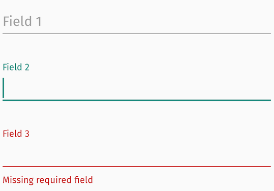
Basic TextInputLayout
Your basic TextInputLayout starts out like this:
<android.support.design.widget.TextInputLayout
    android:id="@+id/text_input_layout"
    android:layout_width="match_parent"
    android:layout_height="wrap_content"
    android:hint="Field 1">

  <android.support.design.widget.TextInputEditText
      android:layout_width="match_parent"
      android:layout_height="wrap_content"/>

</android.support.design.widget.TextInputLayout>
And basic theme colors are set like this:
<style name="AppTheme" parent="Theme.AppCompat.Light.DarkActionBar">
  <!-- Customize your theme here. -->
  <item name="colorPrimary">#3F51B5</item> // (Indigo 500)
  <item name="colorPrimaryDark">#303F9F</item> // (Indigo 700)
  <item name="colorAccent">#00897B</item> // (Teal 600)
</style>
And we get this result:
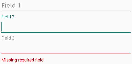
Noteworthy observations:
- Only
colorAccentis used from the basic app theme colors. - We’ve applied a custom font via Calligraphy (Fira Sans) for effect. We see here that the hint, label, and input text are properly formatted, but error text is Roboto.
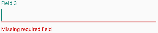
Even more annoying is when an error layout is selected, the label highlight still uses colorAccent which results in this awkward looking UI — a mix of colorAccent and red error, which may or may not clash:
Colors
Start with defining colors you want to apply:
<color name="error_color">#C62828</color> // Error color (Red 800)
<color name="hint_color_active">#00897B</color> // Active label color (Teal 600)
<color name="hint_color_inactive">#9E9E9E</color> // Inactive label / Hint (Grey 500)
And set up styles and themes like so:
<style name="MyStyle.InputLayout" parent="Widget.Design.TextInputLayout">
  <item name="fontPath">@string/app_font</item>
  <item name="errorTextAppearance">@style/ErrorTextAppearance</item>
  <item name="hintTextAppearance">@style/HintTextAppearance</item>
</style>

<style name="MyTheme.EditText" parent="Theme.AppCompat.Light">
  <!-- Inactive underline color-->
  <item name="colorControlNormal">@color/hint_color_inactive</item>

  <!-- Cursor and Active underline color, uses colorAccent by default if not defined-->
  <item name="colorControlActivated">@color/hint_color_active</item>
</style>

<style name="HintTextAppearance" parent="TextAppearance.Design.Hint">
  <!-- Inactive and Active label color, pointing to a selector-->
  <item name="android:textColor">@color/hint_color</item>
</style>

<style name="ErrorTextAppearance" parent="TextAppearance.Design.Error">
  <!-- Error text color-->
  <item name="android:textColor">@color/error_color</item>
</style>

// res/color/hint_color.xml
<selector xmlns:android="http://schemas.android.com/apk/res/android">
  <item android:state_focused="true" android:color="@color/hint_color_active"/>
  <item android:color="@color/hint_color_inactive"/>
</selector>
And applying them to your views:
<android.support.design.widget.TextInputLayout
    android:id="@+id/text_input_layout"
    android:layout_width="match_parent"
    android:layout_height="wrap_content"
    android:hint="Field 1"
    style="@style/MyStyle.InputLayout">

  <android.support.design.widget.TextInputEditText
      android:layout_width="match_parent"
      android:layout_height="wrap_content"
      android:theme="@style/MyTheme.EditText"/>

</android.support.design.widget.TextInputLayout>
What we can’t accomplish with pure styling alone is:
- Error label color
- Error view typeface
- Error cursor color
The Error View
The way TextInputLayout manages its error view thwarts how Calligraphy works. Essentially, Calligraphy only works when inflating views that have a fontPath attribute applied — it can’t apply a font path to a programmatically created view, even if the style with a fontPath is applied programmatically. Because the error view is created programmatically (and not inflated), any fontPath provided in errorTextAppearance is simply ignored.
Another annoying caveat is the exposed setTypeface method, which is intended to allow specifying the error and hint typefaces:
// TextInputLayout
/**
 * Set the typeface to use for the hint and any label views (such as counter and error views).
 *
 * @param typeface typeface to use, or {@code null} to use the default.
 */
public void setTypeface(@Nullable Typeface typeface);
but will fail to apply the typeface to the error view if it’s invoked before setErrorEnabled(true):
public void setTypeface(@Nullable Typeface typeface) {
  ...

  // this is null by default until the first time setErrorEnabled(true) is invoked
  if (mErrorView != null) {
    mErrorView.setTypeface(typeface);
  }
}
So my recommendation is to enable setErrorEnabled in TextInputLayout styles by default:
<style name="MyStyle.InputLayout" parent="Widget.Design.TextInputLayout">
  <item name="errorEnabled">true</item>
</style>
Error View: Typeface
Android 8.0 (API 26) introduced Fonts in XML and you’re encouraged to explore that solution to see if that works for you. I’ll walk through the more lengthy, Calligraphy based solution below.
Create a custom TextInputLayout, and load and apply setTypeface in the constructor using whatever fontPath is applied to the entire layout:
private static final int[] FONT_PATH = new int[] { R.attr.fontPath };

public MyTextInputLayout(...) {
    ...
    Typeface typeface = TypefaceUtils.load(context.getAssets(),
        loadFontPathFromStyle(context, attrs, FONT_PATH));

    // Only works if errorEnabled == true. Either call it here or set it in your style.
    setTypeface(typeface);
  }

  // Implementation from CalligraphyUtils#pullFontPathFromStyle
  private String loadFontPathFromStyle(Context context, AttributeSet attrs, int[] attributeId) {
    if (attributeId == null || attrs == null) return null;
    final TypedArray typedArray = context.obtainStyledAttributes(attrs, attributeId);
    if (typedArray != null) {
      try {
        // First defined attribute
        String fontFromAttribute = typedArray.getString(0);
        if (!TextUtils.isEmpty(fontFromAttribute)) {
          return fontFromAttribute;
        }
      } catch (Exception ignore) {
        // Failed for some reason.
      } finally {
        typedArray.recycle();
      }
    }
    return null;
  }
Remember this only works if errorEnabled is set to true in the style; otherwise you need override setErrorEnabled and call setTypeface yourself.
Label View: Error Active Color
We will create a custom attribute to represent the error state for our TextInputLayout implementation:
// attrs.xml
<resources>
  <declare-styleable name="ErrorState">
    <attr format="boolean" name="state_error"/>
  </declare-styleable>
</resources>
public class MyTextInputLayout extends TextInputLayout {

  private static final int[] ERROR_STATE = new int[] { R.attr.state_error };

  private boolean errorState = false;

  ...

  @Override
  public void setError(@Nullable CharSequence error) {
    // We'll manage the view's error state by calls to this method, which correctly reflects when the TextInputLayout hides/shows the error text
    errorState = !TextUtils.isEmpty(error);
    refreshDrawableState();
    super.setError(error);
  }

  @Override
  protected int[] onCreateDrawableState(int extraSpace) {
    // add a new drawable state we are defining as error state
    int[] state = super.onCreateDrawableState(extraSpace + 1);
    if (errorState) {
      View.mergeDrawableStates(state, ERROR_STATE);
    }
    return state;
  }
}
We update the hint text color referenced in the style for hintTextAppearance to take advantage of this new state:
// res/color/hint_color.xml
<selector xmlns:app="http://schemas.android.com/apk/res-auto">
  <item app:state_error="true" android:color="@color/error_color"/>
  ...
</selector>
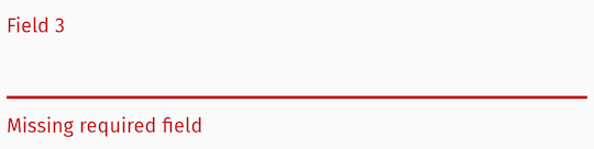
Add everything up and we should be able to reproduce this result, which has the correct error text view font applied, custom error label text color, custom hint and underline colors:
And selected error view behavior:
Error Cursor Color?
Have colorControlActivated also point to a selector that takes advantage of the new error state we’ve created, similar to hint_color.
Summary
Style/theme attributes can get you most places when styling the TextInputLayout, but fixing the error text typeface and tweaking the error label color takes more effort to deliver a look and feel that you want for your app outside of stock behavior.
Text fields
Text fields let users enter and
edit text.

Contents
- Using text fields
- Filled text field
- Outlined text field
- Theming
Using text fields
Before you can use Material text fields, you need to add a dependency to the
Material Components for Android library. For more information, go to the
Getting started
page.
<com.google.android.material.textfield.TextInputLayout
    android:id="@+id/textField"
    android:layout_width="match_parent"
    android:layout_height="wrap_content"
    android:hint="@string/label">

    <com.google.android.material.textfield.TextInputEditText
        android:layout_width="match_parent"
        android:layout_height="wrap_content"
    />

</com.google.android.material.textfield.TextInputLayout>
Note: A text field is composed of a TextInputLayout and a
TextInputEditText as a direct child. Using an EditText as the child might
work, but TextInputEditText provides accessibility support for the text field
and allows TextInputLayout greater control over the visual aspects of the
input text. If an EditText is being used, make sure to set its
android:background to @null so that TextInputLayout can set the proper
background on it.
Making text fields accessible
Android’s text field component APIs support both label text and helper text,
which explain what is requested for a text field. While optional, their use is
strongly encouraged.
Content description
When using custom icons, you should set a content description on them so
that screen readers, like TalkBack, are able to announce their purpose or
action.
For the leading icon, that can be achieved via the
app:startIconContentDescription attribute or setStartIconContentDescription
method. For the trailing icon, that can be achieved via the
app:endIconContentDescription attribute or setEndIconContentDescription
method.
When setting an error message that contains special characters that screen
readers or other accessibility systems are not able to read, you should set a
content description via the app:errorContentDescription attribute or
setErrorContentDescription method. That way the error will announce the
content description instead of the error message.
Note: Icons that don’t have click listeners set on them work as decorative
elements, and are therefore skipped by screen readers.
Custom EditText
If you are using a custom EditText as TextInputLayout‘s child and your text
field requires different accessibility support than the one offered by
TextInputLayout, you can set a TextInputLayout.AccessibilityDelegate via the
setTextInputAccessibilityDelegate method. This method should be used in place
of providing an AccessibilityDelegate directly on the EditText.
Adding a leading icon to a text field
<com.google.android.material.textfield.TextInputLayout
    ...
    app:startIconDrawable="@drawable/ic_search_24dp"
    app:startIconContentDescription="@string/content_description_start_icon">

    ...

</com.google.android.material.textfield.TextInputLayout>
Adding a trailing icon to a text field
Password toggle:
When the TextInputEditText is set to display a password, an icon can be added
to toggle between masking the password or displaying the password as plain-text.
<com.google.android.material.textfield.TextInputLayout
    ...
    app:endIconMode="password_toggle">

    <com.google.android.material.textfield.TextInputEditText
        ...
        android:inputType="textPassword"
    />

</com.google.android.material.textfield.TextInputLayout>
Clear text:
An icon can be set to display when text is present. The icon can be pressed to
clear the input text.
<com.google.android.material.textfield.TextInputLayout
    ...
    app:endIconMode="clear_text">

    ...

</com.google.android.material.textfield.TextInputLayout>
Custom icon:
It is possible to set a custom Drawable as the text field’s trailing icon via
app:endIconMode="custom". You should specify a drawable and content
description for the icon, and you have the option to specify custom behaviors.
In the layout:
<com.google.android.material.textfield.TextInputLayout
    ...
    app:endIconMode="custom"
    app:endIconDrawable="@drawable/ic_accelerator_24dp"
    app:endIconContentDescription="@string/content_description_end_icon">

    ...

</com.google.android.material.textfield.TextInputLayout>
Optionally, in code:
textField.setEndIconOnClickListener {
  // Respond to end icon presses
}

textField.addOnEditTextAttachedListener {
  // If any specific changes should be done when the edit text is attached (and
  // thus when the trailing icon is added to it), set an
  // OnEditTextAttachedListener.

  // Example: The clear text icon's visibility behavior depends on whether the
  // EditText has input present. Therefore, an OnEditTextAttachedListener is set
  // so things like editText.getText() can be called.
}

textField.addOnEndIconChangedListener {
  // If any specific changes should be done if/when the endIconMode gets
  // changed, set an OnEndIconChangedListener.

  // Example: If the password toggle icon is set and a different EndIconMode
  // gets set, the TextInputLayout has to make sure that the edit text's
  // TransformationMethod is still PasswordTransformationMethod. Because of
  // that, an OnEndIconChangedListener is used.
}
Note: You should opt to use the EndIconMode API instead of setting an
end/right compound Drawable on the TextInputEditText. The same applies to
the now-deprecated passwordToggle* attributes.
Important: Calling setEndIconMode will initialize the icon with its
default features, such as default drawables, and in the case of the custom mode,
an empty drawable. You can add customizations after calling setEndIconMode.
The exception for this is if a drawable was specified in XML via the
app:endIconDrawable attribute. An end icon drawable set in XML will take
precedence and override an existing default icon.
See the full list of
end icon modes.
Implementing an exposed dropdown menu

In the layout:
<com.google.android.material.textfield.TextInputLayout
    ...
    style="@style/Widget.Material3.TextInputLayout.*.ExposedDropdownMenu">

    <AutoCompleteTextView
        android:layout_width="match_parent"
        android:layout_height="wrap_content"
        android:inputType="none"
        app:simpleItems="@array/simple_items"
    />

</com.google.android.material.textfield.TextInputLayout>
The string array specified by app:simpleItems will be used as the default
item strings for auto-completion. Or you can also set it programmatically:
val items = arrayOf("Item 1", "Item 2", "Item 3", "Item 4")
(textField.editText as? MaterialAutoCompleteTextView)?.setSimpleItems(items)
Alternatively, to have more control over the auto-completion items rendering,
you can also provide a custom item adapter by:
val items = listOf("Item 1", "Item 2", "Item 3", "Item 4")
val adapter = ArrayAdapter(requireContext(), R.layout.list_item, items)
(textField.editText as? AutoCompleteTextView)?.setAdapter(adapter)
And a custom item layout (list_item.xml):
<TextView
    xmlns:android="http://schemas.android.com/apk/res/android"
    android:layout_width="match_parent"
    android:layout_height="wrap_content"
    android:padding="16dp"
    android:ellipsize="end"
    android:maxLines="1"
    android:textAppearance="?attr/textAppearanceTitleMedium"
/>
Adding helper text to a text field

<com.google.android.material.textfield.TextInputLayout
    ...
    app:helperTextEnabled="true"
    app:helperText="@string/helper_text">

    ...

</com.google.android.material.textfield.TextInputLayout>
Adding a counter to a text field

<com.google.android.material.textfield.TextInputLayout
    ...
    app:counterEnabled="true"
    app:counterMaxLength="20">

    ...

</com.google.android.material.textfield.TextInputLayout>
Adding errors to a text field

In the layout:
<com.google.android.material.textfield.TextInputLayout
    ...
    app:errorEnabled="true">

    ...

</com.google.android.material.textfield.TextInputLayout>
In code:
// Set error text
passwordLayout.error = getString(R.string.error)

// Clear error text
passwordLayout.error = null
Note: Non-null error text will replace any existing helper text, and
non-null helper text will replace any existing error text.
Adding a prefix/suffix to a text field

<com.google.android.material.textfield.TextInputLayout
    ...
    app:prefixText="@string/prefix"
    app:suffixText="@string/suffix">

    ...

</com.google.android.material.textfield.TextInputLayout>
Text field dimensions
The recommended default android:layout_width is 245dp.
By default, text fields have a maximum width of 488dp, and a minimum width of
56dp for layouts without a label. If a label is present, the minimum width
recommended is 88dp. android:minWidth and android:maxWidth (as well as
android:minEms and android:maxEms) should be set on the TextInputLayout
instead of on the TextInputEditText to avoid unintended behaviors.
You can override those values in a custom style that inherits from a
TextInputLayout style or by making changes directly on the layout:
<com.google.android.material.textfield.TextInputLayout
    android:id="@+id/textField"
    android:layout_width="wrap_content"
    android:layout_height="wrap_content"
    android:minWidth="@dimen/custom_min_width"
    android:maxWidth="@dimen/custom_max_width"
    android:hint="@string/label">

    <com.google.android.material.textfield.TextInputEditText
        android:layout_width="match_parent"
        android:layout_height="wrap_content"
    />

</com.google.android.material.textfield.TextInputLayout>
Note: The android:layout_width of the TextInputLayout should be
wrap_content in order for those minimum and maximum dimensions to be used.
Using text fields programmatically
If you construct the TextInputEditText child of a TextInputLayout
programmatically, you should use TextInputLayout‘s context to create the view.
This will allow TextInputLayout to pass along the appropriate styling to the
edit text.
val textInputLayout = TextInputLayout(context)
val editText = TextInputEditText(textInputLayout.context)
Types
There are two types of text fields: 1. Filled text field,
2. Outlined text field

Filled text field
Filled text fields
have more visual emphasis than outlined text fields, making them stand out when
surrounded by other content and components.
Filled text field examples
API and source code:
TextInputLayout- Class definition
- Class source
TextInputEditText- Class definition
- Class source
The following example shows a filled text field with a label.

In the layout:
<com.google.android.material.textfield.TextInputLayout
    style="?attr/textInputFilledStyle"
    android:id="@+id/filledTextField"
    android:layout_width="match_parent"
    android:layout_height="wrap_content"
    android:hint="@string/label">

    <com.google.android.material.textfield.TextInputEditText
        android:layout_width="match_parent"
        android:layout_height="wrap_content"
    />

</com.google.android.material.textfield.TextInputLayout>
In code:
// Get input text
val inputText = filledTextField.editText?.text.toString()

filledTextField.editText?.doOnTextChanged { inputText, _, _, _ ->
    // Respond to input text change
}
See the using text fields section above for more examples.
Anatomy and key properties
A filled text field has a filled container, input text, a label, an activation
indicator, optional helper/error text and optional leading/trailing icons.

- Container
- Leading icon
- Label
- Input text
- Trailing icon
- Activation indicator
- Helper/error/counter text
- Prefix/suffix/placeholder (not shown)
Note: All the attributes in the tables below should be set on the
TextInputLayout, with the exception of the input text attributes, which should
be set on the TextInputEditText.
Container attributes
| Element | Attribute | Related method(s) | Default value |
|---|---|---|---|
| Color | app:boxBackgroundColor |
setBoxBackgroundColorsetBoxBackgroundColorResourcegetBoxBackgroundColor |
?attr/colorSurfaceVariant (see all states) |
| Shape | app:shapeAppearance |
N/A | ?attr/shapeAppearanceSmallComponent |
| Text field enabled | android:enabled |
setEnabled |
true |
Leading icon attributes
| Element | Attribute | Related method(s) | Default value |
|---|---|---|---|
| Icon | app:startIconDrawable |
setStartIconDrawablegetStartIconDrawable |
null |
| Content description | app:startIconContentDescription |
setStartIconContentDescriptiongetStartIconContentDescription |
null |
| Color | app:startIconTint |
setStartIconTintList |
?attr/colorOnSurfaceVariant (see all states) |
| Checkable | app:startIconCheckable |
setStartIconCheckableisStartIconCheckable |
false |
| Size | app:startIconMinSize |
setStartIconMinSizegetStartIconMinSize |
48dp |
| Scale type | app:startIconScaleType |
setStartIconScaleType getStartIconScaleType |
ScaleType.CENTER |
Label attributes
| Element | Attribute | Related method(s) | Default value |
|---|---|---|---|
| Text | android:hint |
setHintgetHint |
null |
| Color | android:textColorHint |
setDefaultHintTextColorgetDefaultHintTextColor |
?attr/colorOnSurfaceVariant (see all states) |
| Collapsed (floating) color | app:hintTextColor |
setHintTextColorgetHintTextColor |
?attr/colorPrimary (see all states) |
| Typography | app:hintTextAppearance |
setHintTextAppearance |
?attr/textAppearanceBodySmall |
| Animation | app:hintAnimationEnabled |
setHintAnimationEnabledisHintAnimationEnabled |
true |
| Expanded enabled | app:expandedHintEnabled |
setExpandedHintEnabledisExpandedHintEnabled |
true |
Note: The android:hint should always be set on the TextInputLayout
instead of on the EditText in order to avoid unintended behaviors.
Input text attributes
| Element | Attribute | Related method(s) | Default value |
|---|---|---|---|
| Input text | android:text |
setTextgetText |
@null |
| Typography | android:textAppearance |
setTextAppearance |
?attr/textAppearanceBodyLarge |
| Input text color | android:textColor |
setTextColorgetTextColorsgetCurrentTextColor |
?attr/colorOnSurface |
| Cursor color | N/A (color comes from the theme attr ?attr/colorControlActivated) |
N/A | ?attr/colorPrimary |
| Text highlight color | N/A (color comes from the theme attr ?android:attr/textColorHighlight) |
N/A | @color/m3_highlighted_text |
Note: The input text attributes should be set on the TextInputEditText.
Trailing icon attributes
| Element | Attribute | Related method(s) | Default value |
|---|---|---|---|
| Mode | app:endIconMode |
setEndIconModegetEndIconMode |
END_ICON_NONE |
| Color | app:endIconTint |
setEndIconTintList |
colorOnSurfaceVariant (see all states) |
| Custom icon | app:endIconDrawable |
setEndIconDrawablegetEndIconDrawable |
null |
| Custom icon content description | app:endIconContentDescription |
setEndIconContentDescriptiongetEndIconContentDescription |
null |
| Custom icon checkable | app:endIconCheckable |
setEndIconCheckableisEndIconCheckable |
true |
| Error icon | app:errorIconDrawable |
setErrorIconDrawablegetErrorIconDrawable |
@drawable/mtrl_ic_error |
| Error icon color | app:errorIconTint |
setErrorIconTintList |
?attr/colorError |
| Size | app:endIconMinSize |
setEndIconMinSizegetEndIconMinSize |
48dp |
| Scale type | app:endIconScaleType |
setEndIconScaleType getEndIconScaleType |
ScaleType.CENTER |
Activation indicator attributes
| Element | Attribute | Related method(s) | Default value |
|---|---|---|---|
| Color | app:boxStrokeColor |
setBoxStrokeColorsetBoxStrokeColorStateListgetBoxStrokeColor |
?attr/colorOutline and ?attr/colorPrimary (focused) (see all states) |
| Error color | app:boxStrokeErrorColor |
setBoxStrokeErrorColorgetBoxStrokeErrorColor |
?attr/colorError |
| Width | app:boxStrokeWidth |
N/A | 1dp |
| Focused width | app:boxStrokeWidthFocused |
N/A | 2dp |
Helper/error/counter text attributes
| Element | Attribute | Related method(s) | Default value |
|---|---|---|---|
| Helper text enabled | app:helperTextEnabled |
setHelperTextEnabledisHelperTextEnabled |
false |
| Helper text | app:helperText |
setHelperTextgetHelperText |
null |
| Helper text color | app:helperTextColor |
setHelperTextColorgetHelperTextColor |
?attr/colorOnSurfaceVariant (see all states) |
| Helper text typography | app:helperTextAppearance |
setHelperTextAppearance |
?attr/textAppearanceBodySmall |
| Error text enabled | app:errorEnabled |
setErrorEnabledisErrorEnabled |
false |
| Error text | N/A | setErrorgetError |
null |
| Error text accessibility live region | app:errorAccessibilityLiveRegion |
setErrorAccessibilityLiveRegiongetErrorAccessibilityLiveRegion |
ViewCompat.ACCESSIBILITY_LIVE_REGION_POLITE |
| Error text color | app:errorTextColor |
setErrorTextColorgetErrorCurrentTextColors |
?attr/colorError |
| Error text typography | app:errorTextAppearance |
setErrorTextAppearance |
?attr/textAppearanceBodySmall |
| Counter text enabled | app:counterEnabled |
setCounterEnabledisCounterEnabled |
false |
| Counter text length | app:counterMaxLength |
setCounterMaxLengthgetCounterMaxLength |
-1 |
| Counter text typography | app:counterTextAppearanceapp:counterOverflowTextAppearance |
setCounterTextAppearancesetCounterOverflowTextAppearance |
?attr/textAppearanceBodySmall |
| Counter text color | app:counterTextColorapp:counterOverflowTextColor |
setCounterTextColorsetCounterOverflowTextColorgetCounterTextColorgetCounterOverflowTextColor |
?attr/colorOnSurfaceVariant (app:counterTextColor) (see all states)?attr/colorError (app:counterOverflowTextColor) |
Prefix/suffix attributes
| Element | Attribute | Related method(s) | Default value |
|---|---|---|---|
| Prefix | app:prefixText |
setPrefixTextgetPrefixText |
null |
| Prefix color | app:prefixTextColor |
setPrefixTextColorgetPrefixTextColor |
?attr/colorOnSurfaceVariant (see all states) |
| Prefix typography | app:prefixTextAppearance |
setPrefixTextAppearance |
?attr/textAppearanceTitleMedium |
| Suffix | app:suffixText |
setSuffixTextgetSuffixText |
null |
| Suffix color | app:suffixTextColor |
setSuffixTextColorgetSuffixTextColor |
?attr/colorOnSurfaceVariant (see all states) |
| Suffix typography | app:suffixTextAppearance |
setSuffixTextAppearance |
?attr/textAppearanceTitleMedium |
Styles
| Element | Style | Default style theme attribute |
|---|---|---|
| Default style | Widget.Material3.TextInputLayout.FilledBox |
?attr/textInputFilledStyle |
| Dense style | Widget.Material3.TextInputLayout.FilledBox.Dense |
?attr/textInputFilledDenseStyle |
| Exposed dropdown menu style | Widget.Material3.TextInputLayout.FilledBox.ExposedDropdownMenu |
?attr/textInputFilledExposedDropdownMenuStyle |
| Dense exposed dropdown menu style | Widget.Material3.TextInputLayout.FilledBox.Dense.ExposedDropdownMenu |
N/A |
See the full list of
styles
and
attrs.
Outlined text field
Outlined text fields
have less visual emphasis than filled text fields. When they appear in forms,
for example, where many text fields are placed together, their reduced emphasis
helps simplify the layout.
Note: The outlined text field is the default style.
Outlined text field examples
API and source code:
TextInputLayout- Class definition
- Class source
TextInputEditText- Class definition
- Class source
The following example shows an outlined text field.

In the layout:
<com.google.android.material.textfield.TextInputLayout
    android:id="@+id/outlinedTextField"
    android:layout_width="match_parent"
    android:layout_height="wrap_content"
    android:hint="@string/label">

    <com.google.android.material.textfield.TextInputEditText
        android:layout_width="match_parent"
        android:layout_height="wrap_content"
    />

</com.google.android.material.textfield.TextInputLayout>
In code:
// Get input text
val inputText = outlinedTextField.editText?.text.toString()

outlinedTextField.editText?.doOnTextChanged { inputText, _, _, _ ->
    // Respond to input text change
}
See the using text fields section above for more examples.
Anatomy and key properties
An outlined text field has a stroked container, input text, a label, optional
helper/error text and optional leading/trailing icons.

- Container
- Leading icon
- Label
- Input text
- Trailing icon
- Helper/error/counter text
- Prefix/suffix/placeholder (not shown)
Note: All the attributes in the tables below should be set on the
TextInputLayout, with the exception of the input text attributes, which should
be set on the TextInputEditText.
Container attributes
| Element | Attribute | Related method(s) | Default value |
|---|---|---|---|
| Stroke color | app:boxStrokeColor |
setBoxStrokeColorsetBoxStrokeColorStateListgetBoxStrokeColor |
?attr/colorOutline and ?attr/colorPrimary (focused) (see all states) |
| Stroke error color | app:boxStrokeErrorColor |
setBoxStrokeErrorColorgetBoxStrokeErrorColor |
?attr/colorError |
| Stroke width | app:boxStrokeWidth |
N/A | 1dp |
| Stroke focused width | app:boxStrokeWidthFocused |
N/A | 2dp |
| Shape | app:shapeAppearance |
N/A | ?attr/shapeAppearanceSmallComponent |
| Text field enabled | android:enabled |
setEnabled |
true |
Leading icon attributes
| Element | Attribute | Related method(s) | Default value |
|---|---|---|---|
| Icon | app:startIconDrawable |
setStartIconDrawablegetStartIconDrawable |
null |
| Content description | app:startIconContentDescription |
setStartIconContentDescriptiongetStartIconContentDescription |
null |
| Color | app:startIconTint |
setStartIconTintList |
?attr/colorOnSurfaceVariant (see all states) |
| Checkable | app:startIconCheckable |
setStartIconCheckableisStartIconCheckable |
false |
Label attributes
| Element | Attribute | Related method(s) | Default value |
|---|---|---|---|
| Text | android:hint |
setHintgetHint |
null |
| Color | android:textColorHint |
setDefaultHintTextColorgetDefaultHintTextColor |
?attr/colorOnSurfaceVariant (see all states) |
| Collapsed (floating) color | app:hintTextColor |
setHintTextColorgetHintTextColor |
?attr/colorPrimary |
| Typography | app:hintTextAppearance |
setHintTextAppearance |
?attr/textAppearanceBodySmall |
Note: The android:hint should always be set on the TextInputLayout
instead of on the EditText in order to avoid unintended behaviors.
Input text attributes
| Element | Attribute | Related method(s) | Default value |
|---|---|---|---|
| Input text | android:text |
setTextgetText |
@null |
| Typography | android:textAppearance |
setTextAppearance |
?attr/textAppearanceBodyLarge |
| Input text color | android:textColor |
setTextColorgetTextColorsgetCurrentTextColor |
?attr/colorOnSurface |
| Cursor color | N/A (color comes from the theme attr ?attr/colorControlActivated) |
N/A | ?attr/colorPrimary |
| Text highlight color | N/A (color comes from the theme attr ?android:attr/textColorHighlight) |
N/A | @color/m3_highlighted_text |
Note: The input text attributes should be set on the TextInputEditText.
Trailing icon attributes
| Element | Attribute | Related method(s) | Default value |
|---|---|---|---|
| Mode | app:endIconMode |
setEndIconModegetEndIconMode |
END_ICON_NONE |
| Color | app:endIconTint |
setEndIconTintList |
?attr/colorOnSurfaceVariant (see all states) |
| Custom icon | app:endIconDrawable |
setEndIconDrawablegetEndIconDrawable |
null |
| Custom icon content description | app:endIconContentDescription |
setEndIconContentDescriptiongetEndIconContentDescription |
null |
| Custom icon checkable | app:endIconCheckable |
setEndIconCheckableisEndIconCheckable |
true |
| Error icon | app:errorIconDrawable |
setErrorIconDrawablegetErrorIconDrawable |
@drawable/mtrl_ic_error |
| Error icon color | app:errorIconTint |
setErrorIconTintList |
?attr/colorError |
Helper/error/counter text attributes
| Element | Attribute | Related method(s) | Default value |
|---|---|---|---|
| Helper text enabled | app:helperTextEnabled |
setHelperTextEnabledisHelperTextEnabled |
false |
| Helper text | app:helperText |
setHelperTextgetHelperText |
null |
| Helper text color | app:helperTextColor |
setHelperTextColorgetHelperTextColor |
?attr/colorOnSurfaceVariant (see all states) |
| Helper text typography | app:helperTextAppearance |
setHelperTextAppearance |
?attr/textAppearanceBodySmall |
| Error text enabled | app:errorEnabled |
setErrorEnabledisErrorEnabled |
false |
| Error text | N/A | setErrorgetError |
null |
| Error text accessibility live region | app:errorAccessibilityLiveRegion |
setErrorAccessibilityLiveRegiongetErrorAccessibilityLiveRegion |
ViewCompat.ACCESSIBILITY_LIVE_REGION_POLITE |
| Error text color | app:errorTextColor |
setErrorTextColorgetErrorCurrentTextColors |
?attr/colorError |
| Error text typography | app:errorTextAppearance |
setErrorTextAppearance |
?attr/textAppearanceBodySmall |
| Counter text enabled | app:counterEnabled |
setCounterEnabledisCounterEnabled |
false |
| Counter text length | app:counterMaxLength |
setCounterMaxLengthgetCounterMaxLength |
-1 |
| Counter text typography | app:counterTextAppearanceapp:counterOverflowTextAppearance |
setCounterTextAppearancesetCounterOverflowTextAppearance |
?attr/textAppearanceBodySmall |
| Counter text color | app:counterTextColorapp:counterOverflowTextColor |
setCounterTextColorsetCounterOverflowTextColorgetCounterTextColorgetCounterOverflowTextColor |
?attr/colorOnSurfaceVariant (app:counterTextColor) (see all states)?attr/colorError (app:counterOverflowTextColor) |
Prefix/suffix attributes
| Element | Attribute | Related method(s) | Default value |
|---|---|---|---|
| Prefix | app:prefixText |
setPrefixTextgetPrefixText |
null |
| Prefix color | app:prefixTextColor |
setPrefixTextColorgetPrefixTextColor |
?attr/colorOnSurfaceVariant (see all states) |
| Prefix typography | app:prefixTextAppearance |
setPrefixTextAppearance |
?attr/textAppearanceTitleMedium |
| Suffix | app:suffixText |
setSuffixTextgetSuffixText |
null |
| Suffix color | app:suffixTextColor |
setSuffixTextColorgetSuffixTextColor |
?attr/colorOnSurfaceVariant (see all states) |
| Suffix typography | app:suffixTextAppearance |
setSuffixTextAppearance |
?attr/textAppearanceTitleMedium |
Styles
| Element | Style | Default style theme attribute |
|---|---|---|
| Default style | Widget.Material3.TextInputLayout.OutlinedBox |
?attr/textInputStyle and ?attr/textInputOutlinedStyle |
| Dense style | Widget.Material3.TextInputLayout.OutlinedBox.Dense |
?attr/textInputOutlinedDenseStyle |
| Exposed dropdown menu style | Widget.Material3.TextInputLayout.OutlinedBox.ExposedDropdownMenu |
?attr/textInputOutlinedExposedDropdownMenuStyle |
| Dense exposed dropdown menu style | Widget.Material3.TextInputLayout.OutlinedBox.Dense.ExposedDropdownMenu |
N/A |
See the full list of
styles
and
attrs.
Theming text fields
Text fields support
Material Theming which
provides color, typography and shape customization.
Text field theming example
API and source code:
TextInputLayout- Class definition
- Class source
TextInputEditText- Class definition
- Class source
The following example shows filled and outlined text field types with Material
Theming.

Implementing text field theming
Using theme attributes and styles in res/values/styles.xml adds themes to all
text fields and affects other components:
<style name="Theme.App" parent="Theme.Material3.*">
    ...
    <item name="colorPrimary">@color/shrine_pink_100</item>
    <item name="colorOnSurface">@color/shrine_pink_900</item>
    <item name="colorError">@color/shrine_red</item>
    <item name="textAppearanceTitleMedium">@style/TextAppearance.App.TitleMedium</item>
    <item name="textAppearanceBodySmall">@style/TextAppearance.App.BodySmall</item>
    <item name="shapeAppearanceSmallComponent">@style/ShapeAppearance.App.SmallComponent</item>
</style>

<style name="TextAppearance.App.TitleMedium" parent="TextAppearance.Material3.TitleMedium">
    <item name="fontFamily">@font/rubik</item>
    <item name="android:fontFamily">@font/rubik</item>
</style>

<style name="TextAppearance.App.BodySmall" parent="TextAppearance.Material3.BodySmall">
    <item name="fontFamily">@font/rubik</item>
    <item name="android:fontFamily">@font/rubik</item>
</style>

<style name="ShapeAppearance.App.SmallComponent" parent="ShapeAppearance.Material3.SmallComponent">
    <item name="cornerFamily">cut</item>
    <item name="cornerSize">4dp</item>
</style>
Using default style theme attributes, styles and theme overlays adds themes to
all text fields but does not affect other components:
<style name="Theme.App" parent="Theme.Material3.*">
    ...
    <item name="textInputStyle">@style/Widget.App.TextInputLayout</item>
</style>

<style name="Widget.App.TextInputLayout" parent="Widget.Material3.TextInputLayout.*">
    <item name="materialThemeOverlay">@style/ThemeOverlay.App.TextInputLayout</item>
    <item name="shapeAppearance">@style/ShapeAppearance.App.SmallComponent</item>
    <item name="hintTextColor">?attr/colorOnSurface</item>
</style>

<style name="ThemeOverlay.App.TextInputLayout" parent="">
    <item name="colorPrimary">@color/shrine_pink_100</item>
    <item name="colorOnSurface">@color/shrine_pink_900</item>
    <item name="colorError">@color/shrine_red</item>
    <item name="textAppearanceTitleMedium">@style/TextAppearance.App.TitleMedium</item>
    <item name="textAppearanceBodySmall">@style/TextAppearance.App.BodySmall</item>
    <item name="editTextStyle">@style/Widget.Material3.TextInputEditText.*</item>
</style>
Using the style in the layout affects only this text field:
<com.google.android.material.textfield.TextInputLayout
    ...
    style="@style/Widget.App.TextInputLayout">

    ...

</com.google.android.material.textfield.TextInputLayout>
Note: When setting a materialThemeOverlay on a custom TextInputLayout
style, don’t forget to set editTextStyle to either a
@style/Widget.Material3.TextInputEditText.* style or to a custom one that
inherits from that.
The TextInputLayout styles set
materialThemeOverlay to override editTextStyle with the specific
TextInputEditText style needed. Therefore, you don’t need to specify a style
tag on the edit text.
Содержание
- TextInputLayout
- Стилизация
- Обработка ошибки
- Счётчик символов
- Создание выпадающего меню
- TextInputEditText
- TextInputLayout Styling
- Hint color
- Label, Helper and Error
- Fonts
- Spaces
- Bottom line color
- Box background-color
- Cursor and Selection
- TextInputLayout Styling
- Hint color
- Label, Helper and Error
- Fonts
- Spaces
- Bottom line color
- Box background-color
- Cursor and Selection
- Валидация элементов формы textInputLayout в Android с помощью связывания данных
- Удобный способ валидации форм
- Что нам потребуется?
- https://github.com/Mustufa786/TextInputLayout-FormValidation
TextInputLayout
Макет TextInputLayout сначала появился в библиотеке Android Design Support Library и добавляет немного красоты к текстовому полю. Когда пользователь начинает вводить текст в текстовом поле, то подсказка, заданная в этом компоненте, всплывает над ним в специальном TextView. Пример можно увидеть на видео.
Библиотека больше не развивается, поэтому используйте AndroidX, которую я и буду теперь использовать в описании.
Компонент можно найти на панели инструментов в разделе Text.
При добавлении компонента через визуальный редактор автоматически добавляется дочерний элемент TextInputEditText.
Так выглядел компонент в составе Support Library.
Подсказку не обязательно указывать в атрибуте android:hint у текстового поля. Можно программно присвоить через метод:
Стилизация
В AndroidX у компонента появились новые стили: OutlinedBox, FilledBox и другие. Можете самостоятельно попробовать пример с двумя стилями и посмотреть на отличия.
Общая стилизация доступна следующим образом. Пропишем стили в styles.xml:
Обработка ошибки
Предыдущий пример показывал применение подсказки. Но также можно выводить сообщения об ошибке. Здесь потребуется написать немного кода. За вывод ошибки отвечает атрибут app:errorEnabled. Назначим текстовому полю тип клавиатуры и однострочный текст. При наборе текста после нажатия на клавишу Enter проверяем длину текста. Если текст меньше четырёх символов, то выводим сообщение об ошибке.
Текст ошибки выводится снизу от текстового поля.

Стиль для сообщения об ошибке можно стилизовать. Добавим новый атрибут.
В файле стилей res/values/styles.xml добавим новый стиль:
Теперь выводится другим цветом.

Расширенный вид стилей:
Применяем через атрибуты app:errorTextAppearance и android:theme.
Счётчик символов
С помощью атрибутов app:counterEnabled и app:counterMaxLength можно установить счётчик символов с указанием предела, который будет выводиться под текстовым полем.

Когда будет превышен лимит, то цвет счётчика изменится. Этот цвет можно стилизовать через стиль.
Стиль применяется к атрибуту app:counterOverflowTextAppearance:
Создание выпадающего меню
Связка TextInputLayout и AutoCompleteTextView позволяет создать выпадающее меню взамен стандартного компонента Spinner. Для этого задействуем один стилей, в котором присутствует ExposedDropdownMenu.

В AutoCompleteTextView установлен тип android:inputType=»none», чтобы у пользователя не было возможности изменять текст. Ведь нам нужно меню, а не текстовое поле.
Для создания элементов меню воспользуемся массивом строк в ресурсах. Добавляем в res/values/strings.xml.
Создадим отдельную разметку для элементов меню в файле res/layout/dropdown_item.xml.
Присоединяем созданный макет к AutoCompleteTextView через адаптер.
Посмотрим на результат. Нажимаем на AutoCompleteTextView и получаем выпадающий список из массива строк.

Мы получили рабочий прототип, но при повороте меню работать не будет. Проверьте самостоятельно. Поэтому немного поправим код.
Можно добавить к элементам меню значок. Заодно добавим подсказку.

TextInputEditText
Казалось бы простой компонент, никаких трудностей не возникает. Но не торопитесь. Стоит повернуть устройство в альбомный режим, как текстовое поле растянется на весь экран и никакой подсказки вы не увидите. Возможно, это баг, который когда-нибудь починят. Но проблему легко решить, если вместо стандартного EditText использовать специальный компонент TextInputEditText:
Источник
TextInputLayout Styling
Today, with the material components, we have at least 3 out of box implementations of input layout: Default, FilledBox, and OutlinedBox. And we want to briefly walk through their styling:
If you are looking for a brief solution you can use this table. Below you can find the description of each of these parameters in detail.
Hint color
Hint color could be set via “android:textColorHint” parameter of TextInputLayout. This parameter also changes the label default color (label focused color could also be changed in other ways). Let’s set a purple color (#673AB7) as an example.
Label, Helper and Error
Such parameters as “app:hintTextAppearance”, “app:helperTextTextAppearance” and “app:errorTextAppearance” together with all the necessary text parameters of styles.xml should be used to customize labels, helpers and errors in TextInputLayout. The parent of the text appearance style should be TextAppearance.AppCompat or some of its children.
Also, please keep in mind the following:
- “ app:hintTextAppearance” affects the focused label color and label size in any state;
- when an error is shown, the bottom/border line will have the color indicated in the “android:textColor” parameter of errorTextAppearance. This color will be changed to the default once the error is removed.
Here is the TextAppearances for error and helper that was used in the above shown TextInputLayouts:
Fonts
Fonts of all elements except inputted text (label, hint, error, and helper) could be easily changed in the program via the typeface parameter of TextInputLayout. We have done it in the following way:
Spaces
Label’s, Helper’s and Error’s spaces are connected to the EditText in the TextInputLayout. So, to increase or decrease spaces between the error/helper messages and bottom line/border you should use “android:layout_marginBottom” parameter, between the label and the top of the text, or add some space on the start of the error, helper and the label, and you should set positive or negative padding to the EditText. But you should understand that this will affect the text inside the InputLayout so, it would be better if horizontal spaces were symmetric from both sides.
As an example, let’s increase space above the errors for Default and OutlinedBox input layouts and decrease for FilledBox input layout. Also, let’s add some extra space at the start of the input layouts.
Bottom line color
Bottom line color could be changed with “app:backgroundTint” attribute of EditText view. Pay attention to the prefix, “app:” that makes this parameter back-compatible and useful even for Android API 16.
As for the OutlinedBox, it does not have the bottom line but has an outline instead. To change its color we should use “app:boxStrokeColor” parameter, but this parameter changes stroke color in the focused state only. Changing the default state of the stroke is a bit tricky. We should override mtrl_textinput_default_box_stroke_color color. The line below should be added to the color.xml file:
Let’s make the bottom line and the outline stroke color purple (#673AB7) as well.
Box background-color
This element is present in Filled and Outlined input layouts and can be changed via “app:boxBackgroundColor” parameter. Let’s change this parameter to the transparent purple (#26673AB7) only for FilledBox input layout.
Cursor and Selection
Finally, we get to the most interesting part — how to change the cursor and the selection handles. Most of you have already tried to use “app:textSelectHandle” parameters, that allow changing the drawable of the cursor handle and selection left and right handles. But how to change the color without drawing custom drawables and without changing the main application colors? It is not the secret that the cursor and handles color, as well as label color in focus mode, take their color from the AppTheme “colorAccent”. Of course, we can change it for the whole project but it is not obligatory. We can just use ThemeOverlay and change the “colorAccent” for a single view. We should inherit our style from ThemeOverlay.AppCompat and set it as the “android:theme” parameter of the view and that is all. As for the selection highlight, you can change it via android:textColorHighlight of the EditText.
In the example above was used android:color/holo_blue_light:
So, my final layout looked like this:
colors.xml includes the following colors:
styles.xml includes the following styles:
Tap the 👏 button if you found this article useful!
About the Author
Dmytro is Android Developer at OmiSoft, whose inner perfectionist does not allow to be content with mediocre results but forces him to move forward to excellence.
Need an Android mobile app with clean & maintainable code? Click here to get an estimate! Or find us on Facebook and Twitter.
Источник
Валидация элементов формы textInputLayout в Android с помощью связывания данных
Удобный способ валидации форм
«Чтобы научиться чему-то хорошо, нужно научиться делать это несколькими способами».
Несколько дней назад я работал над проектом, где мне нужно было реализовать валидацию элементов формы textInputLayout и textInputEditText с помощью связывания данных. К сожалению, доступно не так много документации на эту тему.
В конце концов я добился желаемого результата, изучив кое-какие материалы и проведя ряд экспериментов. Вот что я хотел получить:
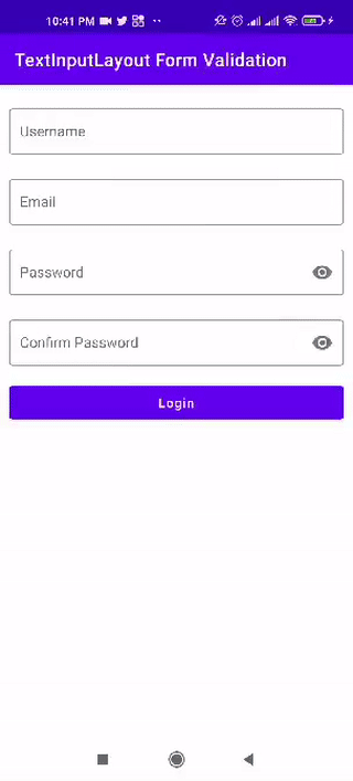
 Финальный вид приложения
Уверен, что многие разработчики хотели бы реализовать такой же функционал и удобное взаимодействие с формами. Итак, давайте начнем.
Что нам потребуется?
Я разобью проект на этапы, чтобы легче было понять, что мы делаем.
1. Настроим исходный проект и включим связывание данных в файле build.gradle(:app) , добавив под тег android<> следующую строку:
Для использования элементов textInputLayout и textInputEditText необходимо включить поддержку Material для Android, добавив в файл build.gradle(:app) следующую зависимость:
Создадим макет нашей формы. Я сделаю простой макет, потому что моя цель — определить его основной функционал, а не создать хороший дизайн.
Я создал вот такой простой макет:
Вот содержимое файла activity_main.xml :
Если вас смущают теги , не переживайте — о них я написал в своей предыдущей статье.
Наш макет готов. Теперь займемся кодом.
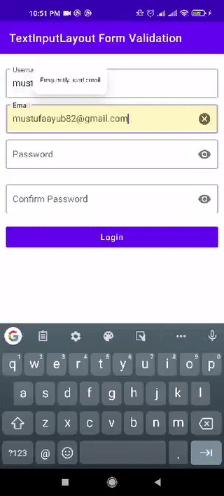
2. На GIF-анимации, показывающей поведение финального варианта приложения (см. выше), видно, как появляются и исчезают сообщения об ошибках, когда заданные условия принимают значение true. Это происходит потому, что я связал каждое текстовое поле с объектом TextWatcher, к которому постоянно происходит обращение по мере ввода текста пользователем.
В файле MainActivity.kt я создал класс, который унаследован от класса TextWatcher :
Параметр view , который передается в конструктор класса, я опишу позже.
3. Это основная часть. У каждого текстового поля имеется ряд условий, которые должны иметь значение true перед отправкой данных формы. Код, задающий условия для каждого текстового поля, представлен ниже:
4. Теперь необходимо связать каждое текстовое поле с классом textWatcher , который был создан ранее:
Но как класс TextFieldValidation узнает, с каким текстовым полем нужно связываться? Прокрутив статью выше, вы увидите, что я добавил следующий комментарий в один из методов класса TextFieldValidation :
Обратите внимание, что я передаю параметр view в конструктор класса TextFieldValidation , который отвечает за разделение каждого текстового поля и применение каждого из указанных выше методов следующим образом:
Финальный вариант файла MainActivity.kt выглядит так:
Запустим приложение и полюбуемся поведением формы ввода:

Полный исходный код этого проекта можно скачать по ссылке ниже:
https://github.com/Mustufa786/TextInputLayout-FormValidation
Надеюсь, вы узнали из этой статьи что-то новое для себя. Следите за появлением новых статей! Успехов в разработке!
Источник
Introduction
TextInputLayout was introduced to display the floating label on EditText. The EditText has to be wrapped by TextInputLayout in order to display the floating label.
TextInputLayout is a layout which wraps an EditText (or descendant) to show a floating label when the hint is hidden due to the user inputting text. Additonally the TextInputLayout enables you to display an error message below the EditText.
Make sure the following dependency is added to your app’s build.gradle file under dependencies:
compile 'com.android.support:design:25.3.1'
Basic usage
It is the basic usage of the TextInputLayout.
Make sure to add the dependency in the build.gradle file as described in the remarks section.
Example:
 <android.support.design.widget.TextInputLayout
         android:layout_width="match_parent"
         android:layout_height="wrap_content">

     <EditText
             android:layout_width="match_parent"
             android:layout_height="wrap_content"
             android:hint="@string/username"/>

 </android.support.design.widget.TextInputLayout>
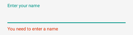
Handling Errors
You can use the TextInputLayout to display error messages according to the material design guidelines using the setError and setErrorEnabledmethods.
In order to show the error below the EditText use:
TextInputLayout til = (TextInputLayout) findViewById(R.id.username);
til.setErrorEnabled(true);
til.setError("You need to enter a name");
To enable error in the TextInputLayout you can eithr use app:errorEnabled="true" in xml or til.setErrorEnabled(true); as shown above.
You will obtain:
Adding Character Counting
The TextInputLayout has a character counter for an EditText defined within it.
The counter will be rendered below the EditText.
Just use the setCounterEnabled() and setCounterMaxLength methods:
TextInputLayout til = (TextInputLayout) findViewById(R.id.username);
til.setCounterEnabled(true);
til.setCounterMaxLength(15);
or the app:counterEnabled and app:counterMaxLength attributes in the xml.
<android.support.design.widget.TextInputLayout
    app:counterEnabled="true"
    app:counterMaxLength="15">

    <EditText/>

</android.support.design.widget.TextInputLayout>
Password Visibility Toggles
With an input password type, you can also enable an icon that can show or hide the entire text using the passwordToggleEnabled attribute.
You can also customize same default using these attributes:
passwordToggleDrawable: to change the default eye iconpasswordToggleTint: to apply a tint to the password visibility toggle drawable.passwordToggleTintMode: to specify the blending mode used to apply the background tint.
Example:
<android.support.design.widget.TextInputLayout
        android:layout_width="match_parent"
        android:layout_height="wrap_content"
        app:passwordToggleContentDescription="@string/description"
        app:passwordToggleDrawable="@drawable/another_toggle_drawable"
        app:passwordToggleEnabled="true">

            <EditText/>

</android.support.design.widget.TextInputLayout>
TextInputEditText
The TextInputEditText is an EditText with an extra fix to display a hint in the IME when in ‘extract’ mode.
The Extract mode is the mode that the keyboard editor switches to when you click on an EditText when the space is too small (for example landscape on a smartphone).
In this case, using an EditText while you are editing the text you can see that the IME doesn’t give you a hint of what you’re editing
The TextInputEditText fixes this issue providing hint text while the user’s device’s IME is in Extract mode.
Example:
<android.support.design.widget.TextInputLayout
    android:layout_width="match_parent"
    android:layout_height="wrap_content"
    android:hint="Description"
    >
    <android.support.design.widget.TextInputEditText
        android:id="@+id/description"
        android:layout_width="match_parent"
        android:layout_height="wrap_content"/>

</android.support.design.widget.TextInputLayout>
Customizing the appearance of the TextInputLayout
You can customize the appearance of the TextInputLayout and its embedded EditTextby defining custom styles in your styles.xml. The defined styles can either be added as styles or themes to your TextInputLayout.
Example for customizing the hint appearance:
styles.xml:
<!--Floating label text style-->
<style name="MyHintStyle" parent="TextAppearance.AppCompat.Small">
    <item name="android:textColor">@color/black</item>
</style>

<!--Input field style-->
<style name="MyEditText" parent="Theme.AppCompat.Light">
    <item name="colorControlNormal">@color/indigo</item>
    <item name="colorControlActivated">@color/pink</item>
</style>
To Apply Style update your TextInputLayout And EditText as follows
<android.support.design.widget.TextInputLayout
    android:layout_width="match_parent"
    android:layout_height="wrap_content"
    app:hintTextAppearance="@style/MyHintStyle">

    <EditText
        android:layout_width="match_parent"
        android:layout_height="wrap_content"
        android:hint="@string/Title"
        android:theme="@style/MyEditText" />

</android.support.design.widget.TextInputLayout>
Example to customize the accent color of the TextInputLayout. The accent color affects the color of the baseline of the EditText and the text color for the floating hint text:
styles.xml:
<style name="TextInputLayoutWithPrimaryColor" parent="Widget.Design.TextInputLayout">
    <item name="colorAccent">@color/primary</item>
</style>
layout file:
<android.support.design.widget.TextInputLayout
            android:id="@+id/textInputLayout_password"
            android:layout_width="match_parent"
            android:layout_height="wrap_content"
            android:theme="@style/TextInputLayoutWithPrimaryColor">

            <android.support.design.widget.TextInputEditText
                android:id="@+id/textInputEditText_password"
                android:layout_width="match_parent"
                android:layout_height="wrap_content"
                android:hint="@string/login_hint_password"
                android:inputType="textPassword" />

</android.support.design.widget.TextInputLayout>