Общие сведения
Программная установка текста
Программная установка фона
Реагируем на событие onClick
Многострочный текст
Увеличиваем интервалы между строками
Бой с тенью
Создание ссылок автоматом
Совет: Используйте полупрозрачность с умом
Выделить текст для копирования
Стили
Компонент TextView предназначен для отображения текста без возможности редактирования его пользователем, что видно из его названия (Text — текст, view — просмотр).
Находится в разделе Texts.
TextView — один из самых используемых компонентов. С его помощью пользователю удобнее ориентироваться в программе. По сути, это как таблички: Руками не трогать, По газону не ходить, Вход с собаками воспрещен, Часы работы с 9.00 до 18.00 и т.д., и служит для представления пользователю описательного текста.
Для отображения текста в TextView в файле разметки используется атрибут android:text, например:
android:text="Погладь кота, ...!"
Такой подход является нежелательным. Рекомендуется всегда использовать текстовые ресурсы. В будущем эта привычка позволит вам обеспечить многоязыковую поддержку:
android:text="@string/hello"
Программная установка текста
Программно текст можно задать методом setText():
// Инициализируем компонент
TextView textView = findViewById(R.id.textView);
// задаём текст
textView.setText("Hello Kitty!");
// или с использованием текстовых ресурсов
textView.setText(R.string.hello);
Атрибуты
- android:textsize
- размер текста. При установке размера текста используется несколько единиц измерения: px (пиксели), dp, sp, in (дюймы), pt, mm. Для текстов рекомендуется использовать sp: android:textSize=»48sp», аналог — метод setTextSize()
- android:textstyle
- стиль текста. Используются константы: normal, bold, italic. Например, android:textStyle=»bold» выводит текст жирным
- android:textcolor
- цвет текста. Используются четыре формата в шестнадцатеричной кодировке: #RGB; #ARGB; #RRGGBB; #AARRGGBB, где R, G, B — соответствующий цвет, А — прозрачность (alpha-канал). Значение А, установленное в 0, означает прозрачность 100%.
Для всех вышеперечисленных атрибутов в классе TextView есть соответствующие методы для чтения или задания соответствующих свойств.
Программно установим размеры текста при помощи setTextSize() с различными единицами измерения.
// 20 DIP (Device Independent Pixels)
textView.setTextSize(TypedValue.COMPLEX_UNIT_DIP, 20);

// 0.5 inch
textView.setTextSize(TypedValue.COMPLEX_UNIT_IN, 0.5f);

// 10 millimeter
textView.setTextSize(TypedValue.COMPLEX_UNIT_MM, 10);

// 30 points
textView.setTextSize(TypedValue.COMPLEX_UNIT_PT, 30);

// 30 raw pixels
textView.setTextSize(TypedValue.COMPLEX_UNIT_PX, 30);

// 30 scaled pixels
textView.setTextSize(TypedValue.COMPLEX_UNIT_SP, 30);

По умолчанию у компонентов TextView отсутствует фоновый цвет. Чтобы задать цвет, укажите значение Drawable для атрибута android:background. В качестве значения Drawable может использоваться изображение или XML-представление фигуры, включающий ресурс Drawable (поместить в папку res/drawable).
Программная установка фона
В некоторых случаях программисты из-за невнимательности неправильно меняют фон элемента программным способом и удивляются, почему ничего не работает.
Предположим, у вас определён в ресурсах зелёный цвет:
<color name="tvBackground">#337700</color>
Следующий код будет ошибочным:
textview.setBackgroundColor(R.color.tvBackground); // не работает
Нужно так (два варианта):
textView.setBackgroundResource(R.color.tvBackground); // первый вариант
textView.setBackgroundColor(getResources().getColor(R.color.tvBackground)); // второй вариант
Реагируем на событие onClick
Если вы хотите, чтобы TextView обрабатывал нажатия (атрибут android:onClick), то не забывайте также использовать в связке атрибут android:clickable=»true». Иначе работать не будет!
Многострочный текст
Если вы хотите создать многострочный текст в TextView, то используйте символы n для переноса строк.
Например, в ресурсах:
<string name="about_text">
    У лукоморья дуб зелёный;n
    Златая цепь на дубе том:n
    И днём и ночью <b>кот учёный</b>n
    Всё ходит по цепи кругом;n
    Идёт <b>направо</b> - песнь заводит,n
    <b>Налево</b> - сказку говорит.</string>
Обратите внимание, что в тексте также применяется простое форматирование.
Также перенос на новую строку можно задать в коде:
textView.setText("Первая строка nВторая строка nТретья строка");
Увеличиваем интервалы между строками
Вы можете управлять интервалом между соседними строчками текста через атрибут android:lineSpacingMultiplier, который является множителем. Установите дробное значение меньше единицы, чтобы сократить интервал или больше единицы, чтобы увеличить интервал между строками.
android:lineSpacingMultiplier="0.8"
Бой с тенью
Чтобы оживить текст, можно дополнительно задействовать атрибуты для создания эффектов тени: shadowColor, shadowDx, shadowDy и shadowRadius. С их помощью вы можете установить цвет тени и ее смещение. Во время установки значений вы не увидите изменений, необходимо запустить пример в эмуляторе или на устройстве. В следующем примере я создал тень красного цвета со смещением в 2 пикселя по вертикали и горизонтали. Учтите, что для смещения используются единицы px (пиксели), единицы dp не поддерживаются.
<TextView
    android:layout_width="wrap_content"
    android:layout_height="wrap_content"
    android:padding="12dp"
    android:text="Бой с тенью"
    android:textSize="80sp"
    android:textStyle="bold"
    android:shadowColor="#ff0000"
    android:shadowDx="2"
    android:shadowDy="2"
    android:shadowRadius="5"/>

Программный эквивалент — метод public void setShadowLayer (float radius, float dx, float dy, int color):
TextView textShadow = (TextView)findViewById(R.id.hello);
textShadow.setShadowLayer(
    5f,   //float radius
    10f,  //float dx
    10f,  //float dy
    0xFFFFFFFF //int color
);
Создание ссылок автоматом
У TextView есть ещё два интересных свойства Auto link (атрибут autoLink) и Links clickable (атрибут linksClickable), которые позволяют автоматически создавать ссылки из текста.
Выглядит это следующим образом. Предположим, мы присвоим элементу TextView текст Мой сайт: developer.alexanderklimov.ru и применим к нему указанные свойства.
<TextView
    android:id="@+id/textView"
    android:layout_width="match_parent"
    android:autoLink="web"
    android:linksClickable="true"
    android:text="Мой адрес: developer.alexanderklimov.ru" />
При этом уже на этапе разработки вы увидите, что строка адреса сайта после слов Мой адрес: стала ссылкой. Если вы запустите приложение и нажмете на ссылку, то откроется браузер с указанным адресом. Вам даже не придется писать дополнительный код. Аналогично, если указать номер телефона (параметр phone), то запустится звонилка.
У ссылки есть интересная особенность — при длительном нажатии на ссылку появляется диалоговое окно, позволяющее скопировать ссылку в буфер обмена.
Атрибут autoLink позволяет комбинировать различные виды ссылок для автоматического распознавания: веб-адрес, email, номер телефона.

Цвет ссылки можно поменять через свойство Text color link (XML-атрибут textColorLink), а программно через метод setTextLinkColor().
Программно можно установить ссылки на текст через класс Linkify:
TextView tvDisplay = (TextView)findViewById(R.id.tvDisplay);

String data = "" +
        "Пример использования Linkify для создания ссылок в тексте.n" +
        "n" +
        "URL: http://developer.alexanderklimov.ru/ n" +
        "Email: [email protected] n" +
        "Телефон: (495)-458-58-29 n" +
        "Адрес: 10110 ул.Котовского, г.Мышкин n" +
        "n" +
        "Классно получилось?";

        if(tvDisplay != null) {
            tvDisplay.setText(data);
            Linkify.addLinks(tvDisplay, Linkify.ALL);
        }

Кроме константы ALL, можно также использовать Linkify.EMAIL_ADDRESSES, Linkify.MAP_ADDRESSES, Linkify.PHONE_NUMBERS. К сожалению, русские адреса не распознаются. В моём случае индекс был распознан как телефонный номер, а город и улица не стали ссылкой.
В таких случаях придётся самостоятельно добавить ссылки в текстах. Например, определим ссылку в ресурсе:
<string name="my_site"><a href="http://developer.alexanderklimov.ru/android">Самый лучший сайт про android</a></string>
Присвоим созданный ресурс тексту в TextView и запустим пример. Сам текст будет выглядеть как ссылка, но реагировать не будет. Чтобы исправить данную проблему, добавим код:
TextView textView = (TextView) findViewById(R.id.textView);
textView.setMovementMethod(LinkMovementMethod.getInstance());
Ссылки в тексте выглядят не совсем удобными. Есть отдельная библиотека, которая улучшает функциональность. Описание проблем и ссылка на библиотеку есть в статье A better way to handle links in TextView — Saket Narayan.
Совет: Используйте полупрозрачность с умом
Если вам нужно установить текст полупрозрачным, то не используйте атрибут android:alpha:
<TextView
    android:textColor="#fff"
    android:alpha="0.5" />
Дело в том, что такой подход затрачивает много ресурсов при перерисовке.
Атрибут textColor позволяет установить полупрозрачность без потери производительности:
<TextView
    android:textColor="80ffffff" />
Выделить текст для копирования
По умолчанию, текст в TextView нельзя выделить для копирования. Но в API 11 появилась такая возможность, которая может пригодиться. Делается либо при помощи XML-атрибута android:textIsSelectable, либо через метод setTextIsSelectable().
Добавьте в разметку два компонента TextView и одно текстовое поле EditText для вставки скопированного текста. У первой текстовой метки установим возможность выделения текста декларативно.
<TextView
    android:id="@+id/textView"
    android:layout_width="match_parent"
    android:layout_height="wrap_content"
    android:text="Выдели слово Кот для проверки"
    android:textIsSelectable="true"
    android:textSize="26sp"/>
Для второго компонента возможность выделения создадим программно.
TextView secondTextView = (TextView) findViewById(R.id.textView2);
secondTextView.setTextIsSelectable(true);
Сделайте долгий тап на тексте в любом TextView. Увидите стандартные ползунки для выбора длины текста. Скопируйте текст, сделайте длинный тап в EditText и вставьте текст.
Стили
Выводим разделитель под текстом.
<TextView
    style="?android:listSeparatorTextViewStyle"
    ...
    android:text="Заголовок"/>
Дополнительное чтение
Используем собственные шрифты
Spannable
Продвинутые примеры с TextView
Автоподгонка текста по размеру TextView
Библиотеки
armcha/AutoLinkTextView: AutoLinkTextView is TextView that supports Hashtags (#), Mentions (@) , URLs (http://), Phone and Email automatically detecting and ability to handle clicks. — распознаёт ссылки, номера телефонов, хэштеги.
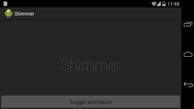
RomainPiel/Shimmer-android — сияющий текст.
Реклама
Overview
Every Android device comes with a collection of standard fonts: Droid Sans, Droid Sans Mono and Droid Serif. They were designed to be optimal for mobile displays, so these are the three fonts you will be working with most of the time and they can be styled using a handful of XML attributes. You might, however, see the need to use custom fonts for special purposes.
This guide will take a look at the TextView and discuss common properties associated with this view as well as how to setup custom typefaces.
Text Attributes
Typeface
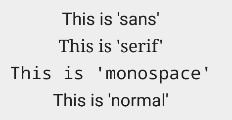
As stated in the overview, there are three different default typefaces which are known as the Droid family of fonts: sans, monospace and serif. You can specify any one of them as the value for the android:typeface attribute in the XML:
<TextView
    android:layout_width="match_parent"
    android:layout_height="wrap_content"
    android:text="This is a 'sans' demo!"
    android:typeface="sans"
/>
Here’s how they look:

In addition to the above, there is another attribute value named «normal» which defaults to the sans typeface.
Text Style
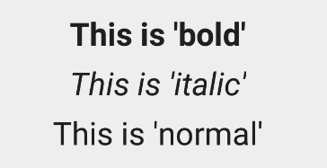
The android:textStyle attribute can be used to put emphasis on the text. The possible values are: normal, bold, italic. You can also specify bold|italic.
<TextView
    android:layout_width="match_parent"
    android:layout_height="wrap_content"
    android:text="This is bold!"
    android:textStyle="bold"
/>
A sampling of styles can be seen below:
Text Size
android:textSize specifies the font size. Its value must consist of two parts: a floating-point number followed by a unit. It is generally a good practice to use the sp unit so the size can scale depending on user settings.
<TextView
    android:layout_width="match_parent"
    android:layout_height="wrap_content"
    android:text="14sp is the 'normal' size."
    android:textSize="14sp"
/>
A sampling of styles can be seen below:
Too many type sizes and styles at once can wreck any layout. The basic set of styles are based on a typographic scale of 12, 14, 16, 20, and 34. Refer to this typography styles guide for more details.
Text Truncation
There are a few ways to truncate text within a TextView. First, to restrict the total number of lines of text we can use android:maxLines and android:minLines:
<TextView
    android:layout_width="match_parent"
    android:layout_height="wrap_content"
    android:minLines="1"
    android:maxLines="2"
/>
In addition, we can use android:ellipsize to begin truncating text
<TextView
    ...
    android:ellipsize="end"
    android:singleLine="true"
/>
Following values are available for ellipsize: start for ...bccc, end for aaab..., middle for aa...cc, and marquee for aaabbbccc sliding from left to right. Example:
There is a known issue with ellipsize and multi-line text, see this MultiplelineEllipsizeTextView library for an alternative.
Text Color
The android:textColor and android:textColorLink attribute values are hexadecimal RGB values with an optional alpha channel, similar to what’s found in CSS:
<TextView
    android:layout_width="match_parent"
    android:layout_height="wrap_content"
    android:text="A light blue color."
    android:textColor="#00ccff"
    android:textColorLink="#8DE67F"
/>
The android:textColorLink attribute controls the highlighting for hyperlinks embedded within the TextView. This results in:

We can edit the color at runtime with:
// based on hex value
textView.setTextColor(Color.parseColor("#000000"));
// based on a color resource file
textView.setTextColor(ContextCompat.getColor(context, R.color.your_color));
// based on preset colors
textView.setTextColor(Color.RED);
// based on hex value
textView.setTextColor(Color.parseColor("#000000"))
// based on a color resource file
textView.setTextColor(ContextCompat.getColor(this, R.color.your_color))
// based on preset colors
textView.setTextColor(Color.RED)
Text Shadow
You can use three different attributes to customize the appearance of your text shadow:
-
android:shadowColor— Shadow color in the same format as textColor. -
android:shadowRadius— Radius of the shadow specified as a floating point number. -
android:shadowDx— The shadow’s horizontal offset specified as a floating point number. -
android:shadowDy— The shadow’s vertical offset specified as a floating point number.
The floating point numbers don’t have a specific unit — they are merely arbitrary factors.
<TextView
    android:layout_width="match_parent"
    android:layout_height="wrap_content"
    android:text="A light blue shadow."
    android:shadowColor="#00ccff"
    android:shadowRadius="2"
    android:shadowDx="1"
    android:shadowDy="1"
/>
This results in:
Various Text Properties
There are many other text properties including android:lineSpacingMultiplier, android:letterSpacing, android:textAllCaps, android:includeFontPadding and many others:
<TextView
    android:layout_width="wrap_content"
    android:layout_height="wrap_content"
    android:lineSpacingMultiplier="1.1"
    android:textAllCaps="true"
/>
android:includeFontPadding removes the extra padding around large fonts. android:lineSpacingMultiplier governs the spacing between lines with a default of «1».
Inserting HTML Formatting
TextView natively supports HTML by translating HTML tags to spannable sections within the view. To apply basic HTML formatting to text, add text to the TextView with:
TextView view = findViewById(R.id.sampleText);

String formattedText = "This <i>is</i> a <b>test</b> of <a href='http://foo.com'>html</a>";
// or getString(R.string.htmlFormattedText);

view.setText(HtmlCompat.fromHtml(formattedText, HtmlCompat.FROM_HTML_MODE_LEGACY));
val view: TextView = findViewById(R.id.sampleText)

val formattedText = "This <i>is</i> a <b>test</b> of <a href='http://foo.com'>html</a>"
// or getString(R.string.htmlFormattedText)

view.text = HtmlCompat.fromHtml(formattedText, HtmlCompat.FROM_HTML_MODE_LEGACY)
You can read more about the html modes here.
This results in:
Note that all tags are not supported. See this article for a more detailed look at supported tags and usages.
Setting Font Colors
For setting font colors, we can use the <font> tag as shown:
HtmlCompat.fromHtml("Nice! <font color='#c5c5c5'>This text has a color</font>. This doesn't", HtmlCompat.FROM_HTML_MODE_LEGACY);
HtmlCompat.fromHtml("Nice! <font color='#c5c5c5'>This text has a color</font>. This doesn't", HtmlCompat.FROM_HTML_MODE_LEGACY)
And you should be all set.
Storing Long HTML Strings
If you want to store your HTML text within res/values/strings.xml, you have to use CDATA to escape such as:
<?xml version="1.0" encoding="utf-8"?>
<string name="htmlFormattedText">
    <![CDATA[
        Please <a href="http://highlight.com">let us know</a> if you have <b>feedback on this</b> or if
        you would like to log in with <i>another identity service</i>. Thanks!
    ]]>
</string>
and access the content with getString(R.string.htmlFormattedText) to load this within the TextView.
For more advanced cases, you can also check out the html-textview library which adds support for almost any HTML tag within this third-party TextView.
Autolinking URLs
TextView has native support for automatically locating URLs within the their text content and making them clickable links which can be opened in the browser. To do this, enable the android:autolink property:
<TextView
     android:id="@+id/custom_font"
     android:layout_width="match_parent"
     android:layout_height="wrap_content"
     android:autoLink="all"
     android:linksClickable="true"
/>
This results in:
Issues with ListView
One known issue when using android:autoLink or the Linkify class is that it may break the ability to respond to events on the ListView through setOnItemClickListener. Check out this solution which extends TextView in order to modify the onTouchEvent to correctly propagate the click. You basically need to create a LinkifiedTextView and use this special View in place of any of your TextView’s that need auto-link detection.
In addition, review these alternate solutions which may be effective as well:
- This stackoverflow post or this other post
- This android issue for additional context.
Displaying Images within a TextView
A TextView is actually surprisingly powerful and actually supports having images displayed as a part of it’s content area. Any images stored in the «drawable» folders can actually be embedded within a TextView at several key locations in relation to the text using the android:drawableRight and the android:drawablePadding property. For example:
<TextView xmlns:android="http://schemas.android.com/apk/res/android"
    android:layout_width="wrap_content"
    android:layout_height="wrap_content"
    android:gravity="center"
    android:text="@string/my_contacts"
    android:drawableRight="@drawable/ic_action_add_group"
    android:drawablePadding="8dp"
/>
Which results in:
In Android, many views inherit from TextView such as Buttons, EditTexts, RadioButtons which means that all of these views support the same functionality. For example, we can also do:
<EditText
    android:layout_width="match_parent"
    android:layout_height="wrap_content"
    android:hint="@string/user_name"
    android:drawableLeft="@drawable/ic_action_person"
    android:drawablePadding="8dp"
/>
Which results in:
The relevant attributes here are drawableLeft, drawableRight, drawableTop and drawableBottom along with drawablePadding. Check out this TextView article for a more detailed look at how to use this functionality.
Note that if you want to be able to better control the size or scale of the drawables, check out this handy TextView extension or this bitmap drawable approach. You can also make calls to setCompoundDrawablesWithIntrinsicBounds on the TextView.
Using Fonts
The easiest way to add font support is to upgrade to Android Studio 3.0, which provides the ability to use other fonts provided by Google. You can visit https://fonts.google.com/ to see the ones that are free to use. See the FAQ section for more information.
Android Studio v3.0 provides built-in support for these fonts and will automatically handles generating the XML and necessary metadata. Next to the Attributes section of a TextView, look for the fontFamily and click on More Fonts:
You will then see these choices:
Once you choose a font, you will notice that a font directory will be created and a similar XML file will be generated. Notice that Android Studio automatically takes care of adding the necessary font provider certificates required to request from Google:
<?xml version="1.0" encoding="utf-8"?> <font-family xmlns:app="http://schemas.android.com/apk/res-auto" app:fontProviderAuthority="com.google.android.gms.fonts" app:fontProviderPackage="com.google.android.gms" app:fontProviderQuery="name=Advent Pro&weight=100" app:fontProviderCerts="@array/com_google_android_gms_fonts_certs"> </font-family>
Adding custom fonts
We can actually use any custom font that we’d like within our applications. Check out fontsquirrel for an easy source of free fonts. For example, we can download Chantelli Antiqua as an example.
Fonts are stored in the «assets» folder. In Android Studio, File > New > folder > Assets Folder. Now download any font and place the TTF file in the assets/fonts directory:
We’re going to use a basic layout file with a TextView, marked with an id of «custom_font» so we can access it in our code.
<?xml version="1.0" encoding="utf-8"?>
<LinearLayout xmlns:android="http://schemas.android.com/apk/res/android"
              android:orientation="vertical"
              android:layout_width="match_parent"
              android:layout_height="match_parent">

    <TextView
            android:id="@+id/custom_font"
            android:layout_width="match_parent"
            android:layout_height="wrap_content"
            android:text="This is the Chantelli Antiqua font."
    />
</LinearLayout>
To set the custom font manually, open your activity file and insert this into the onCreate() method:
// Get access to our TextView
TextView txt = findViewById(R.id.custom_font);
// Create the TypeFace from the TTF asset
Typeface font = Typeface.createFromAsset(getAssets(), "fonts/Chantelli_Antiqua.ttf");
// Assign the typeface to the view
txt.setTypeface(font);
// Get access to our TextView
val txt: TextView = findViewById(R.id.custom_font)
// Create the TypeFace from the TTF asset
val font = Typeface.createFromAsset(assets, "fonts/Chantelli_Antiqua.ttf")
// Assign the typeface to the view
txt.typeface = font
Alternatively, you can use the third-party calligraphy library:
<TextView fontPath="fonts/Chantelli_Antiqua.ttf"/>
Either method will will result in:
You’ll also want to keep an eye on the total size of your custom fonts, as this can grow quite large if you’re using a lot of different typefaces.
Using Spans to Style Sections of Text
Spans come in really handy when we want to apply styles to portions of text within the same TextView. We can change the text color, change the typeface, add an underline, etc, and apply these to only certain portions of the text. The full list of spans shows all the available options.
As an example, let’s say we have a single TextView where we want the first word to show up in red and the second word to have a strikethrough:
We can accomplish this with spans using the code below:
String firstWord = "Hello";
String secondWord = "World!";

TextView tvHelloWorld = findViewById(R.id.tvHelloWorld);

// Create a span that will make the text red
ForegroundColorSpan redForegroundColorSpan = new ForegroundColorSpan(
        ContextCompat.getColor(this, android.R.color.holo_red_dark));

// Use a SpannableStringBuilder so that both the text and the spans are mutable
SpannableStringBuilder ssb = new SpannableStringBuilder(firstWord);

// Apply the color span
ssb.setSpan(
        redForegroundColorSpan,            // the span to add
        0,                                 // the start of the span (inclusive)
        ssb.length(),                      // the end of the span (exclusive)
        Spanned.SPAN_EXCLUSIVE_EXCLUSIVE); // behavior when text is later inserted into the SpannableStringBuilder
                                           // SPAN_EXCLUSIVE_EXCLUSIVE means to not extend the span when additional
                                           // text is added in later

// Add a blank space
ssb.append(" ");

// Create a span that will strikethrough the text
StrikethroughSpan strikethroughSpan = new StrikethroughSpan();

// Add the secondWord and apply the strikethrough span to only the second word
ssb.append(secondWord);
ssb.setSpan(
        strikethroughSpan,
        ssb.length() - secondWord.length(),
        ssb.length(),
        Spanned.SPAN_EXCLUSIVE_EXCLUSIVE);

// Set the TextView text and denote that it is Editable
// since it's a SpannableStringBuilder
tvHelloWorld.setText(ssb, TextView.BufferType.EDITABLE);
val firstWord  = "Hello"
val secondWord = "World!"

val tvHelloWorld: TextView = findViewById(R.id.tvHelloWorld)

// Create a span that will make the text red
val redForegroundColorSpan = ForegroundColorSpan(
    ContextCompat.getColor(this, android.R.color.holo_red_dark)
)

// Use a SpannableStringBuilder so that both the text and the spans are mutable
val ssb = SpannableStringBuilder(firstWord)

// Apply the color span
ssb.setSpan(
    redForegroundColorSpan,             // the span to add
    0,                                  // the start of the span (inclusive)
    ssb.length,                         // the end of the span (exclusive)
    Spanned.SPAN_EXCLUSIVE_EXCLUSIVE)   // behavior when text is later inserted into the SpannableStringBuilder
                                        // SPAN_EXCLUSIVE_EXCLUSIVE means to not extend the span when additional
                                        // text is added in later

// Add a blank space
ssb.append(" ")

// Create a span that will strikethrough the text
val strikethroughSpan = StrikethroughSpan()

// Add the secondWord and apply the strikethrough span to only the second word
ssb
    .append(secondWord)
    .setSpan(
        strikethroughSpan,
        ssb.length - secondWord.length,
        ssb.length,
        Spanned.SPAN_EXCLUSIVE_EXCLUSIVE)

// Set the TextView text and denote that it is Editable
// since it's a SpannableStringBuilder
tvHelloWorld.setText(ssb, TextView.BufferType.EDITABLE)
Note: There are 3 different classes that can be used to represent text that has markup attached. SpannableStringBuilder (used above) is the one to use when dealing with mutable spans and mutable text. SpannableString is for mutable spans, but immutable text. And SpannedString is for immutable spans and immutable text.
Creating Clickable Styled Spans
In certain cases, we might want different substrings in a TextView to different styles and then clickable to trigger an action. For example, rendering tweet items where @foo can be clicked in a message to view a user’s profile. For this, you should copy over the PatternEditableBuilder.java utility into your app. You can then use this utility to make clickable spans. For example:
// Set text within a `TextView`
TextView textView = findViewById(R.id.textView);
textView.setText("Hey @sarah, where did @jim go? #lost");
// Style clickable spans based on pattern
new PatternEditableBuilder().
    addPattern(Pattern.compile("\@(\w+)"), Color.BLUE,
       new PatternEditableBuilder.SpannableClickedListener() {
            @Override
            public void onSpanClicked(String text) {
                Toast.makeText(MainActivity.this, "Clicked username: " + text,
                    Toast.LENGTH_SHORT).show();
            }
       }).into(textView);
// Set text within a `TextView`
val textView: TextView = findViewById(R.id.textView)
textView.text = "Hey @sarah, where did @jim go? #lost"

// Style clickable spans based on pattern
PatternEditableBuilder()
    .addPattern(Pattern.compile("@(\w+)"), Color.BLUE) { text ->
        Toast.makeText(this@MainActivity, "Clicked username: $text",
            Toast.LENGTH_SHORT).show()
}.into(textView)
and this results in the following:

For more details, view the README for more usage examples.
References
- https://tutorialwing.com/android-textview-using-kotlin-example/
- https://tutorialwing.com/create-an-android-textview-programmatically-in-kotlin/
- https://code.tutsplus.com/tutorials/customize-android-fonts—mobile-1601
- https://www.androidhive.info/2012/02/android-using-external-fonts/
- https://stackoverflow.com/questions/3651086/android-using-custom-font
- https://www.tutorialspoint.com/android/android_custom_fonts.htm
- https://antonioleiva.com/textview_power_drawables/
- https://www.cronj.com/frontend-development/html.html
Improve Article
Save Article
Improve Article
Save Article
TextView in Android is one of the basic and important UI elements. This plays a very important role in the UI experience and depends on how the information is displayed to the user. This TextView widget in android can be dynamized in various contexts. For example, if the important part of the information is to be highlighted then the substring that contains, it is to be italicized or it has to be made bold, one more scenario is where if the information in TextView contains a hyperlink that directs to a particular web URL then it has to be spanned with hyperlink and has to be underlined. Have a look at the following list and image to get an idea of the overall discussion.
- Formatting the TextView
- Size of the TextView
- Changing Text Style
- Changing the Text Color
- Text Shadow
- Letter Spacing and All Caps
- Adding Icons for TextView
- HTML Formatting of the TextView

Step by Step Implementation
Step 1: Create an Empty Activity Project
- Create an empty activity Android Studio Project. Refer to Android | How to Create/Start a New Project in Android Studio? to know how To Create an empty activity Android Studio project.
Step 2: Working with the activity_main.xml file
- The main layout and one, which includes only a TextView and as varied as we go on discuss the various contexts.
- To implement the UI of the activity invoke the following code inside the activity_main.xml file.
XML
<?xml version="1.0" encoding="utf-8"?>
<androidx.constraintlayout.widget.ConstraintLayout
android:layout_width="match_parent"
android:layout_height="match_parent"
tools:context=".MainActivity"
tools:ignore="HardcodedText">
<TextView
android:layout_width="wrap_content"
android:layout_height="wrap_content"
android:text="GeeksforGeeks"
app:layout_constraintBottom_toBottomOf="parent"
app:layout_constraintLeft_toLeftOf="parent"
app:layout_constraintRight_toRightOf="parent"
app:layout_constraintTop_toTopOf="parent" />
</androidx.constraintlayout.widget.ConstraintLayout>
Output UI:

1. Formatting the TextView
Android offers mainly 3 types of typefaces
- normal
- sans
- serif
- monospace
- The above four types of faces are to be invoked under the “typeFace” attribute of the TextView in XML.
- Invoke the following code and note the “typeFace” attribute of the TextView.
XML
<?xml version="1.0" encoding="utf-8"?>
<androidx.constraintlayout.widget.ConstraintLayout
android:layout_width="match_parent"
android:layout_height="match_parent"
tools:context=".MainActivity"
tools:ignore="HardcodedText">
<TextView
android:layout_width="wrap_content"
android:layout_height="wrap_content"
android:text="GeeksforGeeks"
android:textSize="32sp"
android:typeface="normal"
app:layout_constraintBottom_toBottomOf="parent"
app:layout_constraintLeft_toLeftOf="parent"
app:layout_constraintRight_toRightOf="parent"
app:layout_constraintTop_toTopOf="parent" />
</androidx.constraintlayout.widget.ConstraintLayout>
Output:

2. Size of the TextView
- This feature of the Text view upholds what type of content has to be shown to the user. For example, if there is a Heading, there are 6 types of heading that can be implemented have a look at the following image which contains the guidelines for the size of the text view and style of the text view which is recommended by Google’s Material Design.

- The attribute which is used to change the size of the Text View in android is “textSize”.
- Refer to the following code and its output for better understanding.
XML
<?xml version="1.0" encoding="utf-8"?>
<LinearLayout
android:layout_width="match_parent"
android:layout_height="match_parent"
android:orientation="vertical"
tools:context=".MainActivity"
tools:ignore="HardcodedText">
<TextView
android:layout_width="wrap_content"
android:layout_height="wrap_content"
android:layout_marginStart="32dp"
android:layout_marginTop="64dp"
android:textSize="48sp"
android:text="H3 Heading" />
<TextView
android:layout_width="wrap_content"
android:layout_height="wrap_content"
android:layout_marginStart="32dp"
android:layout_marginTop="32dp"
android:textSize="32sp"
android:text="H6 Heading" />
<TextView
android:layout_width="wrap_content"
android:layout_height="wrap_content"
android:layout_marginStart="32dp"
android:layout_marginTop="32dp"
android:textSize="16sp"
android:text="Body 1" />
<TextView
android:layout_width="wrap_content"
android:layout_height="wrap_content"
android:layout_marginStart="32dp"
android:layout_marginTop="32dp"
android:textSize="14sp"
android:text="Body 2" />
</LinearLayout>
Output:

3. Changing Text Style
In Android there are basically three text styles:
- Bold
- Italic
- Normal
- The text style of the text in android can be implemented using the attribute “textStyle”.
- Multiple text styles can also be implemented using the pipeline operator. Example “android:textStyle=”bold|italic”.
- To implement the various text styles refer to the following code and its output.
XML
<?xml version="1.0" encoding="utf-8"?>
<LinearLayout
android:layout_width="match_parent"
android:layout_height="match_parent"
tools:context=".MainActivity"
tools:ignore="HardcodedText">
<LinearLayout
android:layout_width="match_parent"
android:layout_height="wrap_content"
android:layout_marginStart="32dp"
android:layout_marginTop="32dp"
android:orientation="vertical">
<TextView
android:layout_width="wrap_content"
android:layout_height="wrap_content"
android:text="GeeksforGeeks"
android:textStyle="italic"
android:textSize="32sp" />
<TextView
android:layout_width="wrap_content"
android:layout_height="wrap_content"
android:layout_marginTop="32dp"
android:text="GeeksforGeeks"
android:textStyle="bold"
android:textSize="32sp" />
<TextView
android:layout_width="wrap_content"
android:layout_height="wrap_content"
android:layout_marginTop="32dp"
android:text="GeeksforGeeks"
android:textStyle="normal"
android:textSize="32sp" />
<TextView
android:layout_width="wrap_content"
android:layout_height="wrap_content"
android:layout_marginTop="32dp"
android:text="GeeksforGeeks"
android:textStyle="bold|italic"
android:textSize="32sp" />
</LinearLayout>
</LinearLayout>
Output:

4. Changing the Text Color
- The color of the text should also change according to the change in the context of the information displayed to the user.
- For example, if there is warning text it must be in the red color and for disabled text, the opacity or the text color should be grayish. To change the color of the text, the attribute “textColor” is used.
- Android also offers the predefined text colors, which can be implemented using “@android:color/yourColor” as value for the “textColor”. Here the value may be hex code or the predefined colors offered by the android.
- Refer to the following code and its output for better understanding.
XML
<?xml version="1.0" encoding="utf-8"?>
<LinearLayout
android:layout_width="match_parent"
android:layout_height="match_parent"
android:orientation="vertical"
tools:context=".MainActivity"
tools:ignore="HardcodedText">
<TextView
android:id="@+id/text"
android:layout_width="wrap_content"
android:layout_height="wrap_content"
android:layout_marginStart="32dp"
android:layout_marginTop="64dp"
android:text="Warning Message"
android:textColor="#B00020"
android:textSize="32sp" />
<TextView
android:layout_width="wrap_content"
android:layout_height="wrap_content"
android:layout_marginStart="32dp"
android:layout_marginTop="16dp"
android:text="Disabled Text"
android:textColor="@android:color/darker_gray"
android:textSize="32sp" />
<TextView
android:layout_width="wrap_content"
android:layout_height="wrap_content"
android:layout_marginStart="32dp"
android:layout_marginTop="16dp"
android:text="GeeksforGeeks"
android:textColor="#000000"
android:textSize="32sp" />
</LinearLayout>
Output:

5. Text Shadow
- Shadow for the text can also be given in Android. The attributes required for the shadowed text view are:
android:shadowDx=”integer_value” -> which decides the distance of text from its shadow with respect to x axis, if the integer_value is positive the shadow is on positive of the x axis and vice versa.
android:shadowDy=”integer_value” -> which decides the distance of text from its shadow with respect to y axis, if the integer_value is positive the shadow is on negative of the y axis and vice versa.
android:shadowRadius=”integer_value” -> which decides the amount of the shadow to be given for the text view.
- Refer to the following code and its output for better understanding.
XML
<?xml version="1.0" encoding="utf-8"?>
<LinearLayout
android:layout_width="match_parent"
android:layout_height="match_parent"
android:orientation="vertical"
tools:context=".MainActivity"
tools:ignore="HardcodedText">
<TextView
android:layout_width="wrap_content"
android:layout_height="wrap_content"
android:layout_marginStart="32dp"
android:layout_marginTop="16dp"
android:shadowColor="@color/green_500"
android:shadowDx="4"
android:shadowDy="4"
android:shadowRadius="10"
android:text="GeeksforGeeks"
android:textColor="#000000"
android:textSize="32sp"
tools:targetApi="ice_cream_sandwich" />
<TextView
android:layout_width="wrap_content"
android:layout_height="wrap_content"
android:layout_marginStart="32dp"
android:layout_marginTop="16dp"
android:padding="8dp"
android:shadowColor="@color/green_500"
android:shadowDx="-15"
android:shadowDy="4"
android:shadowRadius="10"
android:text="GeeksforGeeks"
android:textColor="#000000"
android:textSize="32sp"
tools:targetApi="ice_cream_sandwich" />
<TextView
android:layout_width="wrap_content"
android:layout_height="wrap_content"
android:layout_marginStart="32dp"
android:layout_marginTop="16dp"
android:shadowColor="@color/green_500"
android:shadowDx="4"
android:shadowDy="-15"
android:shadowRadius="10"
android:text="GeeksforGeeks"
android:textColor="#000000"
android:textSize="32sp"
tools:targetApi="ice_cream_sandwich" />
</LinearLayout>
Output:

6. Letter Spacing and All Caps
- Letter spacing and capital letters are some of the important properties of the text View in android.
- For the text of buttons and tab layouts, the text should be in uppercase letters recommended by Google Material Design.
- The letter spacing also should be maintained according to the scenario.
android:letterSpacing=”floatingTypeValue” -> This attribute is used to give the space between each of the letters.
android:textAllCaps=”trueOrfalse” -> This attribute decides, all the letters should be in uppercase or not.
- Refer to the following code and its output for better understanding.
XML
<?xml version="1.0" encoding="utf-8"?>
<LinearLayout
android:layout_width="match_parent"
android:layout_height="match_parent"
android:orientation="vertical"
tools:context=".MainActivity"
tools:ignore="HardcodedText">
<TextView
android:layout_width="wrap_content"
android:layout_height="wrap_content"
android:layout_marginStart="32dp"
android:layout_marginTop="64dp"
android:letterSpacing="0.15"
android:text="GeeksforGeeks"
android:textColor="@android:color/black"
android:textSize="32sp" />
<TextView
android:layout_width="wrap_content"
android:layout_height="wrap_content"
android:layout_marginStart="32dp"
android:layout_marginTop="64dp"
android:text="GeeksforGeeks"
android:textAllCaps="true"
android:textColor="@android:color/black"
android:textSize="32sp" />
</LinearLayout>
Output:

7. Adding Icons for TextView
- Android also allows adding drawable with the text views.
- There are three positions to add the icons for the TextView. They are a start, end, top, and bottom.
- Refer to the following code and its output, to know how to add the drawable icons to the Text View.
XML
<?xml version="1.0" encoding="utf-8"?>
<LinearLayout
android:layout_width="match_parent"
android:layout_height="match_parent"
android:orientation="vertical"
tools:context=".MainActivity"
tools:ignore="HardcodedText">
<TextView
android:layout_width="wrap_content"
android:layout_height="wrap_content"
android:layout_marginStart="32dp"
android:layout_marginTop="64dp"
android:drawableStart="@drawable/ic_lappy"
android:padding="4dp"
android:text="GeeksforGeeks"
android:textColor="@android:color/black"
android:textSize="32sp" />
<TextView
android:layout_width="wrap_content"
android:layout_height="wrap_content"
android:layout_marginStart="32dp"
android:layout_marginTop="64dp"
android:drawableEnd="@drawable/ic_lappy"
android:padding="4dp"
android:text="GeeksforGeeks"
android:textColor="@android:color/black"
android:textSize="32sp" />
</LinearLayout>
Output:

8. HTML Formatting of the TextView
- In Android, the string can be formatted using the Html class.
- Refer to the following example for a better understanding.
- Add the following code inside the activity_main.xml.
XML
<?xml version="1.0" encoding="utf-8"?>
<androidx.constraintlayout.widget.ConstraintLayout
android:layout_width="match_parent"
android:layout_height="match_parent"
tools:context=".MainActivity">
<TextView
android:id="@+id/text"
android:layout_width="wrap_content"
android:layout_height="wrap_content"
android:layout_marginStart="8dp"
android:layout_marginEnd="8dp"
android:focusable="auto"
android:textSize="32sp"
app:layout_constraintBottom_toBottomOf="parent"
app:layout_constraintLeft_toLeftOf="parent"
app:layout_constraintRight_toRightOf="parent"
app:layout_constraintTop_toTopOf="parent" />
</androidx.constraintlayout.widget.ConstraintLayout>
- Now add the following code inside the MainActivity.kt file.
Kotlin
import android.os.Build
import androidx.appcompat.app.AppCompatActivity
import android.os.Bundle
import android.text.Html
import android.text.method.LinkMovementMethod
import android.widget.TextView
import androidx.annotation.RequiresApi
class MainActivity : AppCompatActivity() {
@RequiresApi(Build.VERSION_CODES.N)
override fun onCreate(savedInstanceState: Bundle?) {
super.onCreate(savedInstanceState)
setContentView(R.layout.activity_main)
val text: TextView = findViewById(R.id.text)
val s: String =
"This is <i>italic</i> <b>bold</b> <u>underlined</u> <br>Goto <a href='https://www.geeksforgeeks.org'>GeegksforGeeks</a>"
text.movementMethod = LinkMovementMethod.getInstance()
text.text = Html.fromHtml(s, Html.FROM_HTML_MODE_COMPACT)
}
}
Output: Run on Emulator

Отображение текстовой информации — наверное, самая базовая и важная часть многих Android-приложений. В данной статье пойдет речь о TextView. Каждый разработчик, начиная с «Hello World», постоянно сталкивается с этим элементом пользовательского интерфейса. Периодически в работе с текстом приходится задумываться о реализации различных дизайнерских решений или улучшении производительности при отрисовке экрана.
Я расскажу об устройстве TextView и некоторых тонкостях работы с ним. Основные советы были взяты из докладов прошедших Google I/O.
TextView под капотом
Для отрисовки текста в Android под капотом используется целый стек из различных библиотек. Их можно разделить на две основные части — java-код и нативный код:

Java-код по сути является частью Android SDK, доступной разработчикам приложений, и новые возможности из него могут быть перенесены в support library.
Само ядро TextView написано на C++, что ограничивает портирование в support library реализованных там новых возможностей из новых версий операционной системы. Ядро представляет из себя следующие библиотеки:
- Minikin используется для измерения длины текста, переноса строк и слов по слогам.
- ICU обеспечивает поддержку Unicode.
- HarfBuzz находит для символов юникода соответствующие графические элементы (глифы) в шрифтах.
- FreeType делает растровые изображения глифов.
- Skia – движок для рисования 2D графики.
Измерение длины текста и перенос строк
Если передать строку библиотеке Minikin, которая используется внутри TextView, то первым делом она определяет, из каких глифов строка состоит:

Как можно заметить из данного примера, сопоставление символов юникода с глифами не всегда будет один к одному: здесь сразу 3 символа будут соответствовать одному глифу ffi. Кроме того, стоит обратить внимание, что нужные глифы могут быть найдены в различных системных шрифтах.
Поиск глифов только в системных шрифтах может повлечь за собой сложности, особенно если через символы отображаются иконки или эмодзи, а в одной строке предполагается комбинировать символы из разных шрифтов. Поэтому, начиная с Android Q (29), появилась возможность сделать свой список шрифтов, поставляемых с приложением. Этот список будет использоваться для поиска глифов:
textView.typeface = TypeFace.CustomFallbackBuilder(
  FontFamily.Builder(
    Font.Builder(assets, “lato.ttf”).build()
  ).build()
).addCustomFallback(
  FontFamily.Builder(
    Font.Builder(assets, “kosugi.ttf”).build()
  ).build()
).build()
Теперь с использованием CustomFallbackBuilder при сопоставлении символов с глифами SDK будет перебирать указанные font family по порядку, и если не удастся найти соответствие, поиск продолжится в системных шрифтах (а через метод setSystemFallback() можно указать предпочитаемый системный font family). CustomFallbackBuilder имеет ограничение на количество font family – можно добавить не более 64 шрифтов.
Библиотека Minikin разделяет строки на слова и делает измерение отдельных слов. Для ускорения работы, начиная с Lollipop (21), используется системный LRU кэш из слов. Такой кэш дает огромный выигрыш в производительности: вызов Paint.measureText() для закешированного слова займет в среднем 3% от времени первого расчета его размеров.

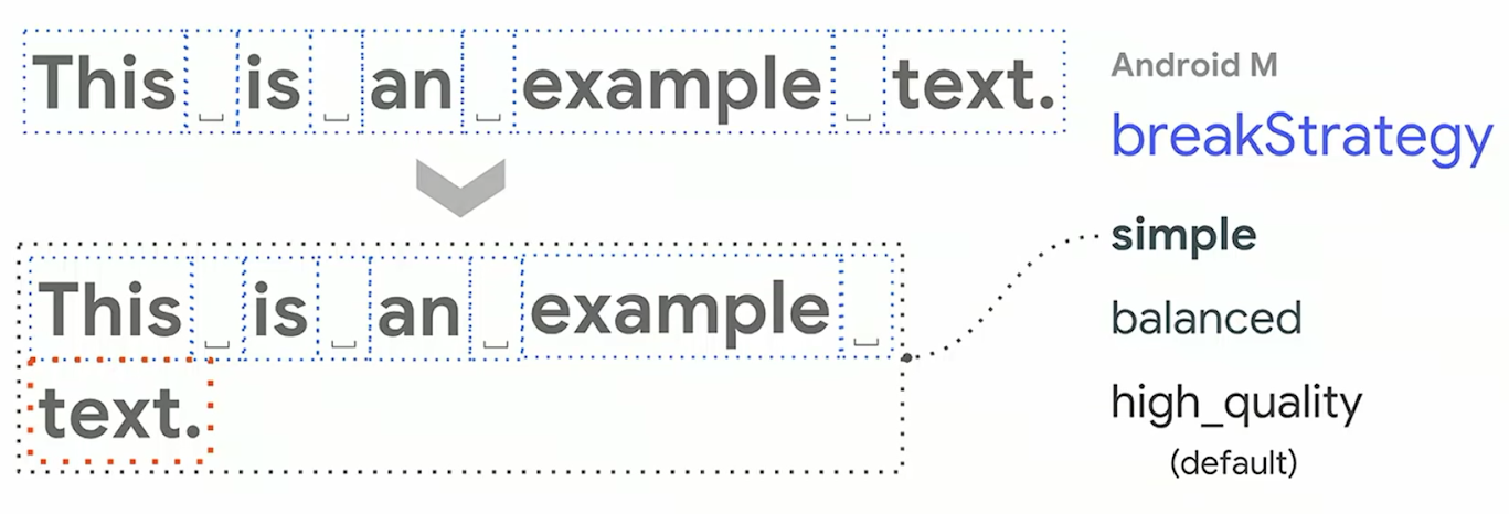
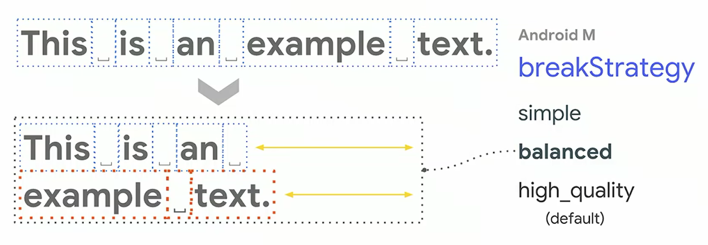
Если текст не помещается в заданную ширину, Minikin расставляет переносы строк и слов в тексте. Начиная с Marshmallow (23) можно управлять ее поведением, указав у TextView специальные атрибуты breakStrategy и hyphenationFrequency.
При значении breakStrategy=simple библиотека просто будет расставлять переносы последовательно, проходя по тексту: как только строка перестает помещаться, ставится перенос перед последним словом.
В значении balanced библиотека постарается сделать переносы строк так, чтобы строки оказались выровнены по ширине.
high_quality имеет почти такое же поведение, что и balanced, за исключением некоторых отличий (одно из них: на предпоследней строке перенос может быть не только отдельных слов, но и слова по слогам).
Атрибут hyphenationFrequency позволяет управлять стратегией переноса слов по слогам. Значение none не будет делать автоматический перенос слов, normal сделает небольшую частоту переносов, а full, соответственно, задействует максимальное количество слов.

Производительность отрисовки текста в зависимости от выбранных флагов (измерялась на Android P (28)):

Учитывая достаточно сильный удар по производительности, разработчики Google, начиная с версии Q (29) и AppCompat 1.1.0, решили по умолчанию выключить перенос слов (hyphenation). Если перенос слов важен в приложении, то теперь его надо включать явно.
При использовании переноса слов надо учитывать, что на работу библиотеки будет влиять текущий выбранный язык в операционной системе. В зависимости от языка система будет выбирать специальные словари с правилами переноса.
Стили текста
В Android есть несколько способов стилизации текста:
- Единый стиль (single style), который применяется для всего элемента TextView.
- Мультистиль (multi style) — сразу несколько стилей, которые могут быть применены к тексту, на уровне параграфа или отдельных символов. Для этого есть несколько способов:
- рисование текста на канве
- html-теги
- специальные элементы разметки – span’ы
Единый стиль подразумевает под собой использование XML-стилей или XML-атрибутов в разметке TextView. При этом система будет применять значения из ресурсов в следующем порядке: TextAppearance, тема (Theme), стиль по умолчанию (Default style), стиль из приложения, и наибольший приоритет — значения атрибутов View.
Использование ресурсов — это достаточно простое решение, но, к сожалению, оно не позволяет применить стиль к части текста.
Html-теги – еще одно простое решение, которое дает такие возможности, как сделать стиль отдельных слов жирным, курсивным, или даже выделить в тексте списки при помощи точек. Все что нужно разработчику — сделать вызов метода Html.fromHtml(), который превратит текст с тегами в текст, размеченный span’ами. Но такое решение имеет ограниченные возможности, так как распознает только часть html-тегов и не поддерживает CSS стили.
val text = "My text <ul><li>bullet one</li><li>bullet two</li></ul>"

myTextView.text = Html.fromHtml(text)
Различные способы стилизации TextView можно комбинировать, но стоит помнить о приоритете того или иного метода, что будет влиять на конечный результат:

Еще один способ — рисование текста на канве — дает разработчику полный контроль над выводом текста: например, можно нарисовать текст вдоль кривой линии. Но такое решение в зависимости от требований может быть достаточно сложным в реализации и выходит за рамки этой статьи.
Spans
Для тонкой настройки стилей в TextView используются span’ы. С помощью span’ов можно изменить цвет диапазона символов, сделать часть текста в виде ссылок, изменить размер текста, нарисовать точку перед параграфом и т.д.
Можно выделить следующие категории span’ов:
- Character spans – применяются на уровне символов строки.
- Appearance affecting – не меняют размер текста.
- Metric affecting – изменяют размер текста.
- Paragraph spans – применяются на уровне параграфа.

В Android фреймворке есть интерфейсы и абстрактные классы с методами, которые вызываются во время onMeasure() и отрисовки TextView, эти методы дают доступ span’ам к более низкоуровневым объектам вроде TextPaint и Canvas. Android фреймворк, применяя span, проверяет, какие интерфейсы этот объект реализует, чтобы вызвать нужные методы.

В android фреймворке определено порядка 20+ span’ов, так что прежде чем делать свой собственный, лучше проверить, нет ли в SDK подходящего.
Appearance vs metric affecting spans
Первая категория span’ов влияет на то, как будут выглядеть символы в строке: цвет символов, цвет фона, подчеркнутые или зачеркнутые символы и т.д. Эти span’ы имплементируют интерфейс UpdateAppearance и наследуются от класса CharacterStyle, который предоставляет доступ к объекту TextPaint.

Metric affecting span влияет на размер текста и layout’а, следовательно применение такого span’а потребует не только перерисовку TextView, но и вызов onMeasure()/onLayout(). Эти span’ы обычно наследуются от класса MetricAffectingSpan, который наследуется от упомянутого выше CharacterStyle.

Character vs paragraph affecting spans
Paragraph span влияет на целый блок текста: может изменить выравнивание, отступ или даже вставить точку в начале параграфа. Такие span’ы должны наследоваться от класса ParagraphStyle и вставляться в текст ровно с начала параграфа до его конца. Если диапазон окажется неверным, то span не будет работать.

В Android параграфами считается часть текста, отделённая символами перевода строки (n).

Написание своих span’ов
При написании собственных span’ов надо определиться, что будет затрагивать span, чтобы выбрать, от какого класса надо наследоваться:
- Затрагивает текст на уровне символов →
CharacterStyle - Затрагивает текст на уровне параграфа →
ParagraphStyle - Затрагивает вид текста →
UpdateAppearance - Затрагивает размер текста →
UpdateLayout
Вот пример span’а для смены шрифта:
class CustomTypefaceSpan(private val font: Typeface?) : MetricAffectingSpan() {

  override fun updateMeasureState(textPaint: TextPaint) = update(textPaint)

  override fun updateDrawState(textPaint: TextPaint) = update(textPaint)

  fun update(textPaint: TextPaint) {
    textPaint.apply {
      val old = typeface
      val oldStyle = old?.style ?: 0
      val font = Typeface.create(font, oldStyle)

      typeface = font // Устанавливаем новый шрифт
    }
  }
}
Представим, что мы хотим сделать свой собственный span для выделения блоков кода, для этого отредактируем наш предыдущий span – добавим после установки шрифта еще и изменение цвета фона текста:
class CodeBlockSpan(private val font: Typeface?) : MetricAffectingSpan() {

             …

  fun update(textPaint: TextPaint) {
    textPaint.apply {
      // Устанавливаем новый шрифт
             …
      bgColor = lightGray // Устанавливаем цвет фона
    }
  }
}
Применим span к тексту:
// Устанавливаем один кастомный span
spannable.setSpan(CodeBlockSpan(typeface), ...)
Но точно такой же результат можно получить, скомбинировав два span’а: возьмем наш предыдущий CustomTypefaceSpan и BackgroundColorSpan из Android фреймворка:
// Устанавливаем цвет фона
spannable.setSpan(BackgroundColorSpan(lightGray), ...)

// Устанавливаем шрифт
spannable.setSpan(CustomTypefaceSpan(typeface), ...)
Эти два решения будут иметь отличие. Дело в том, что самописные span’ы не могут реализовывать интерфейс Parcelable, в отличие от системных.
При передаче стилизованной строки через Intent или буфер обмена в случае самописного span’а разметка не сохранится. При использовании span’ов из фреймворка разметка останется.

Использование span’ов в тексте
Для стилизованного текста во фреймворке есть два интерфейса: Spanned и Spannable (с неизменяемой и изменяемой разметкой соответственно) и три реализации: SpannedString (неизменяемый текст), SpannableString (неизменяемый текст) и SpannableStringBuilder (изменяемый текст).
SpannableStringBuilder, например, используется внутри EditText, которому требуется изменять текст.
Добавить новый span к строке можно при помощи метода:
setSpan(Object what, int start, int end, int flags)
Через первый параметр передается span, затем указывается диапазон индексов в тексте. И последним параметром можно управлять, какое будет поведение span’а при вставке нового текста: будет ли span распространяться на текст, вставленный в начальную или конечную точки (если в середину вставить новый текст, то span автоматически применится к нему вне зависимости от значений флага).
Перечисленные выше классы различаются не только семантически, но и тем, как они устроены внутри: SpannedString и SpannableString используют массивы для хранения span’ов, а SpannableStringBuilder использует дерево интервалов.
Если провести тесты на скорость отрисовки текста в зависимости от количества span’ов, то будут такие результаты: при использовании в строке до ~250 span’ов SpannableString и SpannableStringBuilder работают примерно с одинаковой скоростью, но если элементов разметки становится больше 250, то SpannableString начинает проигрывать. Таким образом, если стоит задача применить стиль к какому-то тексту, то при выборе класса надо руководствоваться семантическими требованиями: будут ли строка и стили изменяемыми. Но если для разметки требуется больше 250 span’ов, то предпочтение надо всегда отдавать SpannableStringBuilder.
Проверка на наличие span’а в тексте
Периодически возникает задача проверить, есть ли в spanned строке определенный span. И на Stackoverflow можно встретить такой код:
fun <T> hasSpan(spanned: Spanned, clazz: Class<T>): Boolean {
  val spans: Array<out T> = spanned.getSpans(0, spanned.length, clazz)
  return spans.isNotEmpty()
}
Такое решение будет работать, но оно неэффективно: придется пройти по всем span’ам, проверить, относится ли каждый из них к переданному типу, собрать результат в массив и в конце всего лишь проверить, что массив не пустой.
Более эффективным решением будет использование метода nextSpanTransition():
fun <T> hasSpan(spanned: Spanned, clazz: Class<T>): Boolean {
  val limit = spanned.length
  return spanned.nextSpanTransition(0, limit, clazz) < limit
}
Разметка текста в различных языковых ресурсах
Может возникнуть такая задача, когда требуется выделить при помощи разметки определенное слово в различных строковых ресурсах. Например, нам надо выделить слово “text” в английской версии и “texto” в испанской:
<!-- values-en/strings.xml -->
<string name="title">Best practices for text in Android</string>

<!-- values-es/strings.xml -->
<string name=”title”>Texto en Android: mejores prácticas</string>
Если требуется что-то простое, например, выделить слово жирным, то можно использовать обычные html-теги (<b>). В UI надо будет просто установить строковый ресурс в TextView:
textView.setText(R.string.title)Но если требуется что-то более сложное, например, смена шрифта, то html уже не получится использовать. Решением будет использовать специальный тег <annotation>. Этот тег позволяет определить любую пару ключ-значение в xml-файле. Когда мы вытащим строку из ресурсов, эти теги автоматически сконвертируются в span’ы Annotation, расставленными по тексту с соответствующими ключами и значениями. После этого можно распарсить список аннотаций в тексте и применить нужные span’ы.
Предположим, нам надо поменять шрифт при помощи CustomTypefaceSpan.
Добавим тег и определим для него ключ “font” и значение – тип шрифта, который мы хотим использовать – “title_emphasis”:
<!-- values-en/strings.xml -->
<string name="title">Best practices for <annotation font=”title_emphasis”>text</annotation> in Android</string>

<!-- values-es/strings.xml -->
<string name=”title”><annotation font=”title_emphasis”>Texto</annotation> en Android: mejores prácticas</string>
Вытащим строку из ресурсов, найдем аннотации с ключом “font” и расставим span’ы:
// Вытаскиваем из ресурсов текст как SpannedString, чтобы найти в нем span’ы
val titleText = getText(R.string.title) as SpannedString

// Получаем все аннотации
val annotations = titleText.getSpans(0, titleText.length, Annotation::class.java)

// Делаем копию строки как SpannableString
// теперь можно менять разметку текста
val spannableString = SpannableString(titleText)

// проходим по всем аннотациям
for (annotation in annotations) {

  // находим аннотации с ключом "font"
  if (annotation.key == "font") {
    val fontName = annotation.value

    // проверяем значение аннотации, чтобы установить нужный шрифт
    if (fontName == "title_emphasis") {
      val typeface = getFontCompat(R.font.permanent_marker)
      // устанавливаем span в тот же диапазон, что и аннотации
      spannableString.setSpan(
        CustomTypefaceSpan(typeface),
        titleText.getSpanStart(annotation),
        titleText.getSpanEnd(annotation),
        Spannable.SPAN_EXCLUSIVE_EXCLUSIVE
      )
    }
  }
}

styledText.text = spannableString

Выше упоминалось, что span’ы не из Android-фреймворка не могут имплементировать Parcelable и передаваться через Intent. Но это не относится к аннотациям, которые имплементируют Parcelable. Так что аннотированную строку можно передать через Intent и распарсить точно таким же образом, расставив свои span’ы.
Как текст располагается в TextView
TextView умеет отображать не только текст, но и картинки. Также можно задавать различные отступы перед текстом. Под капотом это работает так, что TextView создает дочерний класс Layout, ответственный непосредственно за отображение текста. Это абстрактный класс, который имеет три реализации, напрямую с ними обычно не приходится работать, если не писать свой элемент управления:
- BoringLayout используется для простых текстов, не поддерживает переносы строк, RTL и другие вещи, но при этом является самым легковесным. TextView использует его, если текст удовлетворяет всем ограничениям.
- StaticLayout используется в TextView для остальных случаев.
- DynamicLayout используется для изменяемого текста в EditText.
У Layout есть много методов, которые позволяют узнать различные параметры отображаемого текста: координаты строк, baseline, координаты начала и конца текста в строке и т.д. (подробнее можно посмотреть в документации)
Такие методы могут быть очень полезны. Например, некоторые разработчики сталкиваются с задачей выделения части текста в прямоугольники с закругленными углами, и пытаются искать ее решение через span’ы, которые не применимы в решении этой проблемы.

Зато на помощь могут прийти методы класса Layout. Вот примерное решение:
При помощи аннотаций выделяем слова, которые должны быть обведены в прямоугольники.
Затем создаем 4 drawable ресурса для всех случаев переноса текста, который должен быть заключен в прямоугольники:

Далее находим нужные нам аннотации в тексте, как это описывалось выше. Теперь у нас есть индексы начала и конца такой аннотации. Через методы Layout можно узнать номер строки, на которой начинается проаннотированный текст, и на которой заканчивается:
val startLine = layout.getLineForOffset(spanStartIndex)
val endLine = layout.getLineForOffset(spanEndIndex)
Далее придется нарисовать один или несколько прямоугольников. Рассмотрим простой случай, когда проаннотированная часть текста оказалась на одной строке, тогда нам понадобится всего один прямоугольник с четырьмя закругленными углами. Определим его координаты и нарисуем:
...

if (startLine == endLine) {
  val lineTop = layout.getLineTop(startLine) // координаты верха строки
  val lineBottom = layout.getLineBottom(startLine) // координаты низа строки
  val startCoor = layout.getPrimaryHorizontal(spanStartIndex).toInt() // координаты начала прямоугольника
  val endCoor = layout.getPrimaryHorizontal(spanEndIndex).toInt() // координаты конца прямоугольника

  // Рисуем прямоугольник
  drawable.setBounds(startCoor, lineTop, endCoor, lineBottom)
  drawable.draw(canvas)

...
Как видно из этого примера, Layout хранит очень много полезной информации по отображаемому тексту, которая может помочь в реализации разных нестандартных задач.
Производительность TextView
TextView, как и любая View, при отображении проходит через три фазы: onMeasure(), onLayout() и onDraw(). При этом onMeasure() занимает больше всего времени, в отличие от двух других методов: в этот момент пересоздается класс Layout и производится расчет размеров текста. Так что изменение размера текста (например, смена шрифта) влечет за собой много работы. Изменение же цвета текста будет более легковесным, потому что потребует только вызова onDraw(). Как упоминалось выше, в системе есть глобальный кэш слов с рассчитанными размерами. Если слово уже есть в кэше, то повторный вызов onMeasure() для него займет 11-16% от времени, которое потребовалось бы для полного расчета.
Ускорение показа текста
В 2015 году разработчики Instagram ускорили показ комментариев к фотографиям, используя глобальный кэш. Идея была в том, чтобы виртуально рисовать текст до показа его на экране, таким образом “разогрев” системный кэш. Когда подходила очередь показа текста, пользователь видел его гораздо быстрее, так как текст уже был измерен и лежал в кэше.
Начиная с Android P (28) разработчики Google добавили в API возможность выполнить фазу измерения размера текста заранее в фоновом потоке – PrecomputedText (и бэкпорт для API начиная с Android I (14) — PrecomputedTextCompat). С использованием нового API в фоновом потоке будет выполнено 90% работы.
Пример:
// UI thread

val params: PrecomputedText.Params = textView.getTextMetricsParams()
val ref = WeakReference(textView)

executor.execute {

  // background thread
  val text = PrecomputedText.create("Hello", params)
  val textView = ref.get()
   textView?.post {

    // UI thread
    val textView = ref.get()
    textView?.text = text
  }
}
Показ большого текста
Если надо показать большой текст, то не стоит его сразу передавать в TextView. Иначе приложение может перестать плавно работать или вовсе начать зависать, так как будет делать много работы на главном потоке, чтобы показать огромный текст, который пользователь, возможно, даже и не прокрутит до конца. Решением будет разбиение текста на части (например, параграфы) и показ отдельных частей в RecyclerView. Для еще большего ускорения можно заранее рассчитывать размер блоков текста, используя PrecomputedText.
Для облегчения встраивания PrecomputedText в RecyclerView разработчики Google сделали специальные методы PrecomputedTextCompat.getTextFuture() и AppCompatTextView.setTextFuture():
fun onBindViewHolder(vh: ViewHolder, position: Int) {

  val data = getData(position)
  vh.textView.setTextSize(...)
  vh.textView.setFontVariationSettings(...)

  // запускаем расчет заранее
  val future = PrecomputedTextCompat.getTextFuture(
    data.text, vh.textView.getTextMetricsParamsCompat(), myExecutor
  )

  // передадим future в TextView, который будет ждать результат до onMeasure()
  vh.textView.setTextFuture(future)
}
Так как RecyclerView во время скролла создает новые элементы, которые еще не видны пользователю, то такое решение будет иметь достаточно времени для выполнения работы в фоне до того, как элемент будет показан пользователю.
Следует помнить, что после вызова метода getTextFuture() нельзя менять стиль текста (например, поставить новый шрифт), в противном случае произойдет исключение, так как значения, с которыми вызывался getTextFuture(), не будут совпадать с теми, которые окажутся в TextView.
Что нужно знать, когда устанавливаешь текст в TextView
При вызове метода TextView.setText() на самом деле внутри создается копия строки:
if (type == SPANNABLE || movementMethod != null) {
  text = spannableFactory.newSpannable(spannable) // Копирование
} else {
  text = new SpannedString(spannable) // Копирование
}
То есть если установить текст со span’ами в TextView, а затем попытаться изменить переданный в setText() объект, то в отображении ничего не произойдет.
Как видно из кода, новый объект создается при помощи фабрики. В TextView имеется возможность заменить фабрику, используемую по-умолчанию, на свою реализацию. Это может быть полезно, чтобы не делать лишних копирований строк. Для этого пишем фабрику, возвращающую тот же объект, и устанавливаем ее в TextView через сеттер spannableFactory:
class MySpannableFactory : Spannable.Factory() {
  override fun newSpannable(source: CharSequence): Spannable {
    return source as? Spannable ?: super.newSpannable(source)
  }
}

textView.spannableFactory = MySpannableFactory()
При установке текста надо не забывать делать вызов textView.setText(spannable, BufferType.SPANNABLE), чтобы происходило обращение к нашей фабрике.
Разработчики Google советуют использовать это решение для отображения текста со span’ами в RecyclerView, чтобы уменьшить потребление ресурсов нашим приложением.
Если текст уже установлен в TextView, и надо добавить новый span, то совсем не нужно делать повторный вызов setText(). Надо просто взять текст из TextView и добавить в него новый span. TextView автоматически слушает spannable-строку на добавление новых span’ов, и перерисовывается:
val spannable = textView.getText() as Spannable
val span = CustomTypefaceSpan(span)

spannable.setSpan(span, ...)
Если же у нас есть span, который стоит в тексте у TextView, то можно обновить значения его параметров и заставить TextView перерисоваться. Если новое изменение не затрагивает размер текста, достаточно вызвать invalidate(), в противном случае – requestLayout():
val spannable = textView.getText() as Spannable
val span = CustomTypefaceSpan(span)

spannable.setSpan(span, ...)

span.setTypeface(anotherTypeface)

textView.requestLayout() // re-measure and re-draw

// or

textView.invalidate() // re-draw
Использование autoLink
В TextView есть возможность автоматического обнаружения ссылок. Для ее включения достаточно указать в разметке атрибут autoLink. При значении autoLink=”web” TextView во время установки нового текста найдет в нем все URL через регулярное выражение и установит на найденные диапазоны символов URLSpan. Вот примерный код, как это происходит в SDK при вызове setText():
spannable = new SpannableString(string);
Matcher m = pattern.matcher(text);

while (...) { // проходимся по всем найденным ссылкам
  String utl = …
  URLSpan span = new URLSpan(url);
  spannable.setSpan(span, ...);
}
Так как это происходит на UI потоке, то не стоит использовать autoLink=”web” внутри элементов RecyclerView. В таком случае лучше вынести определение ссылок в фоновый поток. И здесь на помощь нам приходит класс LinkifyCompat:
// Вытаскиваем ссылки, когда подготавливаем данные к показу на background thread

val spannable = SpannableString(string)
LinkifyCompat.addLinks(spannable, Linkify.WEB_URLS)

// В адаптере RecyclerView
override fun onBindViewHolder(holder: ViewHolder, position: Int) {

  holder.textView.setText(spannable, BufferType.SPANNABLE)

  // ...
}
У autoLink еще есть возможность указать значение map – распознавание почтовых адресов (оно же будет включено при значении all). Эту возможность лучше вообще никогда не использовать. Проблема в том, что под капотом там будет создание экземпляра WebView, через который будет осуществляться поиск адреса! В исходном коде SDK в методе Linkify.gatherMapLinks() можно увидеть такую строку, этот код выполняется на главном потоке:
while ((address = WebView.findAddress(string)) != null) {
        ...
}
А внутри WebView стоит TODO от разработчиков SDK:
public static String findAddress(String addr) {

  // TODO: Rewrite this in Java so it is not needed to start up chromium
  // Could also be deprecated

  return getFactory().getStatics().findAddress(addr);
}
Но что же тогда использовать? Решением будет новая технология Smart Linkify, к сожалению доступная только начиная с Android P (28), которая работает на основе нейронных сетей и распознает различную информацию, в том числе и почтовые адреса. Вот небольшой пример использования:
// UI thread

val text: Spannable = …
val request = TextLinks.Request.Builder(text)
val ref = WeakReference(textView)

executor.execute {

  // background thread
  TextClassifier.generateLinks(request).apply(text)

  val textView = ref.get()
  textView?.post {
    // UI thread
    val textView = ref.get()
    textView?.text = text
  }
}
В отличие старого Linkify, распознанные адреса не будут простыми ссылками. Над адресами при нажатии будет отображаться контекстный toolbar с возможными действиями, например показ адреса на Google карте.
Технология Smart Linkify способна распознавать различные данные: номера телефонов, авиарейсы и многое другое.
Magnifier
Начиная с Android P (28), появился новый элемент управления – Magnifier, который показывает увеличенные символы при выделении текста. С его помощью пользователю гораздо проще установить курсор на нужную позицию.

По умолчанию он работает в TextView, EditText и WebView, но при желании его можно использовать при написании своих элементов пользовательского интерфейса: его API достаточно прост.
Заключение
В данной статье были опущены многие нововведения последних версий Android и смежные темы, заслуживающие отдельных статей, например:
- работа со стилями и темами при отображении текста
- работа со шрифтами
- работа с классами, производными от TextView (например, EditText)
Если кому-то интересна одна из этих тем, рекомендую посмотреть презентацию с прошедшего Google I/O’19 “Best Practices for Using Text in Android”.
Полезные ссылки
Статьи
- Florina Muntenescu. «Spantastic text styling with Spans»
- Florina Muntenescu. «Underspanding spans»
- Florina Muntenescu. «Styling internationalized text in Android»
- Instagram Engineering. «Improving Comment Rendering on Android»
- Daniel Lee. «Text rendering on Android»
- Mariusz Dąbrowski. «What is new in Android P — PrecomputedText»
- Chet Haase. «RecyclerView Prefetch»
- Chris Craik. «Prefetch Text Layout in RecyclerView»
Доклады
- Best practices for text on Android (Google I/O ’18)
- Use Android Text Like a Pro (Android Dev Summit ’18)
- Best Practices for Using Text in Android (Google I/O’19)
Overview
Every Android device comes with a collection of standard fonts: Droid Sans, Droid Sans Mono and Droid Serif. They were designed to be optimal for mobile displays, so these are the three fonts you will be working with most of the time and they can be styled using a handful of XML attributes. You might, however, see the need to use custom fonts for special purposes.
This guide will take a look at the TextView and discuss common properties associated with this view as well as how to setup custom typefaces.
Text Attributes
Typeface
As stated in the overview, there are three different default typefaces which are known as the Droid family of fonts: sans, monospace and serif. You can specify any one of them as the value for the android:typeface attribute in the XML:
<TextView
    android:layout_width="match_parent"
    android:layout_height="wrap_content"
    android:text="This is a 'sans' demo!"
    android:typeface="sans"
/>
Here’s how they look:
In addition to the above, there is another attribute value named «normal» which defaults to the sans typeface.
Text Style
The android:textStyle attribute can be used to put emphasis on the text. The possible values are: normal, bold, italic. You can also specify bold|italic.
<TextView
    android:layout_width="match_parent"
    android:layout_height="wrap_content"
    android:text="This is bold!"
    android:textStyle="bold"
/>
A sampling of styles can be seen below:
Text Size
android:textSize specifies the font size. Its value must consist of two parts: a floating-point number followed by a unit. It is generally a good practice to use the sp unit so the size can scale depending on user settings.
<TextView
    android:layout_width="match_parent"
    android:layout_height="wrap_content"
    android:text="14sp is the 'normal' size."
    android:textSize="14sp"
/>
A sampling of styles can be seen below:

Too many type sizes and styles at once can wreck any layout. The basic set of styles are based on a typographic scale of 12, 14, 16, 20, and 34. Refer to this typography styles guide for more details.
Text Truncation
There are a few ways to truncate text within a TextView. First, to restrict the total number of lines of text we can use android:maxLines and android:minLines:
<TextView
    android:layout_width="match_parent"
    android:layout_height="wrap_content"
    android:minLines="1"
    android:maxLines="2"
/>
In addition, we can use android:ellipsize to begin truncating text
<TextView
    ...
    android:ellipsize="end"
    android:singleLine="true"
/>
Following values are available for ellipsize: start for ...bccc, end for aaab..., middle for aa...cc, and marquee for aaabbbccc sliding from left to right. Example:

There is a known issue with ellipsize and multi-line text, see this MultiplelineEllipsizeTextView library for an alternative.
Text Color
The android:textColor and android:textColorLink attribute values are hexadecimal RGB values with an optional alpha channel, similar to what’s found in CSS:
<TextView
    android:layout_width="match_parent"
    android:layout_height="wrap_content"
    android:text="A light blue color."
    android:textColor="#00ccff"
    android:textColorLink="#8DE67F"
/>
The android:textColorLink attribute controls the highlighting for hyperlinks embedded within the TextView. This results in:

We can edit the color at runtime with:
// based on hex value
textView.setTextColor(Color.parseColor("#000000"));
// based on a color resource file
textView.setTextColor(ContextCompat.getColor(context, R.color.your_color));
// based on preset colors
textView.setTextColor(Color.RED);
// based on hex value
textView.setTextColor(Color.parseColor("#000000"))
// based on a color resource file
textView.setTextColor(ContextCompat.getColor(this, R.color.your_color))
// based on preset colors
textView.setTextColor(Color.RED)Text Shadow
You can use three different attributes to customize the appearance of your text shadow:
-
android:shadowColor— Shadow color in the same format as textColor. -
android:shadowRadius— Radius of the shadow specified as a floating point number. -
android:shadowDx— The shadow’s horizontal offset specified as a floating point number. -
android:shadowDy— The shadow’s vertical offset specified as a floating point number.
The floating point numbers don’t have a specific unit — they are merely arbitrary factors.
<TextView
    android:layout_width="match_parent"
    android:layout_height="wrap_content"
    android:text="A light blue shadow."
    android:shadowColor="#00ccff"
    android:shadowRadius="2"
    android:shadowDx="1"
    android:shadowDy="1"
/>
This results in:

Various Text Properties
There are many other text properties including android:lineSpacingMultiplier, android:letterSpacing, android:textAllCaps, android:includeFontPadding and many others:
<TextView
    android:layout_width="wrap_content"
    android:layout_height="wrap_content"
    android:lineSpacingMultiplier="1.1"
    android:textAllCaps="true"
/>
android:includeFontPadding removes the extra padding around large fonts. android:lineSpacingMultiplier governs the spacing between lines with a default of «1».
Inserting HTML Formatting
TextView natively supports HTML by translating HTML tags to spannable sections within the view. To apply basic HTML formatting to text, add text to the TextView with:
TextView view = findViewById(R.id.sampleText);

String formattedText = "This <i>is</i> a <b>test</b> of <a href='http://foo.com'>html</a>";
// or getString(R.string.htmlFormattedText);

view.setText(HtmlCompat.fromHtml(formattedText, HtmlCompat.FROM_HTML_MODE_LEGACY));
val view: TextView = findViewById(R.id.sampleText)
val formattedText = "This <i>is</i> a <b>test</b> of <a href='http://foo.com'>html</a>"
// or getString(R.string.htmlFormattedText)
view.text = HtmlCompat.fromHtml(formattedText, HtmlCompat.FROM_HTML_MODE_LEGACY)You can read more about the html modes here.
This results in:

Note that all tags are not supported. See this article for a more detailed look at supported tags and usages.
Setting Font Colors
For setting font colors, we can use the <font> tag as shown:
HtmlCompat.fromHtml("Nice! <font color='#c5c5c5'>This text has a color</font>. This doesn't", HtmlCompat.FROM_HTML_MODE_LEGACY); HtmlCompat.fromHtml("Nice! <font color='#c5c5c5'>This text has a color</font>. This doesn't", HtmlCompat.FROM_HTML_MODE_LEGACY)And you should be all set.
Storing Long HTML Strings
If you want to store your HTML text within res/values/strings.xml, you have to use CDATA to escape such as:
<?xml version="1.0" encoding="utf-8"?>
<string name="htmlFormattedText">
    <![CDATA[
        Please <a href="http://highlight.com">let us know</a> if you have <b>feedback on this</b> or if
        you would like to log in with <i>another identity service</i>. Thanks!
    ]]>
</string>
and access the content with getString(R.string.htmlFormattedText) to load this within the TextView.
For more advanced cases, you can also check out the html-textview library which adds support for almost any HTML tag within this third-party TextView.
Autolinking URLs
TextView has native support for automatically locating URLs within the their text content and making them clickable links which can be opened in the browser. To do this, enable the android:autolink property:
<TextView
     android:id="@+id/custom_font"
     android:layout_width="match_parent"
     android:layout_height="wrap_content"
     android:autoLink="all"
     android:linksClickable="true"
/>
This results in:

Issues with ListView
One known issue when using android:autoLink or the Linkify class is that it may break the ability to respond to events on the ListView through setOnItemClickListener. Check out this solution which extends TextView in order to modify the onTouchEvent to correctly propagate the click. You basically need to create a LinkifiedTextView and use this special View in place of any of your TextView’s that need auto-link detection.
In addition, review these alternate solutions which may be effective as well:
- This stackoverflow post or this other post
- This android issue for additional context.
Displaying Images within a TextView
A TextView is actually surprisingly powerful and actually supports having images displayed as a part of it’s content area. Any images stored in the «drawable» folders can actually be embedded within a TextView at several key locations in relation to the text using the android:drawableRight and the android:drawablePadding property. For example:
<TextView xmlns:android="http://schemas.android.com/apk/res/android"
    android:layout_width="wrap_content"
    android:layout_height="wrap_content"
    android:gravity="center"
    android:text="@string/my_contacts"
    android:drawableRight="@drawable/ic_action_add_group"
    android:drawablePadding="8dp"
/>
Which results in:

In Android, many views inherit from TextView such as Buttons, EditTexts, RadioButtons which means that all of these views support the same functionality. For example, we can also do:
<EditText
    android:layout_width="match_parent"
    android:layout_height="wrap_content"
    android:hint="@string/user_name"
    android:drawableLeft="@drawable/ic_action_person"
    android:drawablePadding="8dp"
/>
Which results in:

The relevant attributes here are drawableLeft, drawableRight, drawableTop and drawableBottom along with drawablePadding. Check out this TextView article for a more detailed look at how to use this functionality.
Note that if you want to be able to better control the size or scale of the drawables, check out this handy TextView extension or this bitmap drawable approach. You can also make calls to setCompoundDrawablesWithIntrinsicBounds on the TextView.
Using Fonts
The easiest way to add font support is to upgrade to Android Studio 3.0, which provides the ability to use other fonts provided by Google. You can visit https://fonts.google.com/ to see the ones that are free to use. See the FAQ section for more information.
Android Studio v3.0 provides built-in support for these fonts and will automatically handles generating the XML and necessary metadata. Next to the Attributes section of a TextView, look for the fontFamily and click on More Fonts:

You will then see these choices:
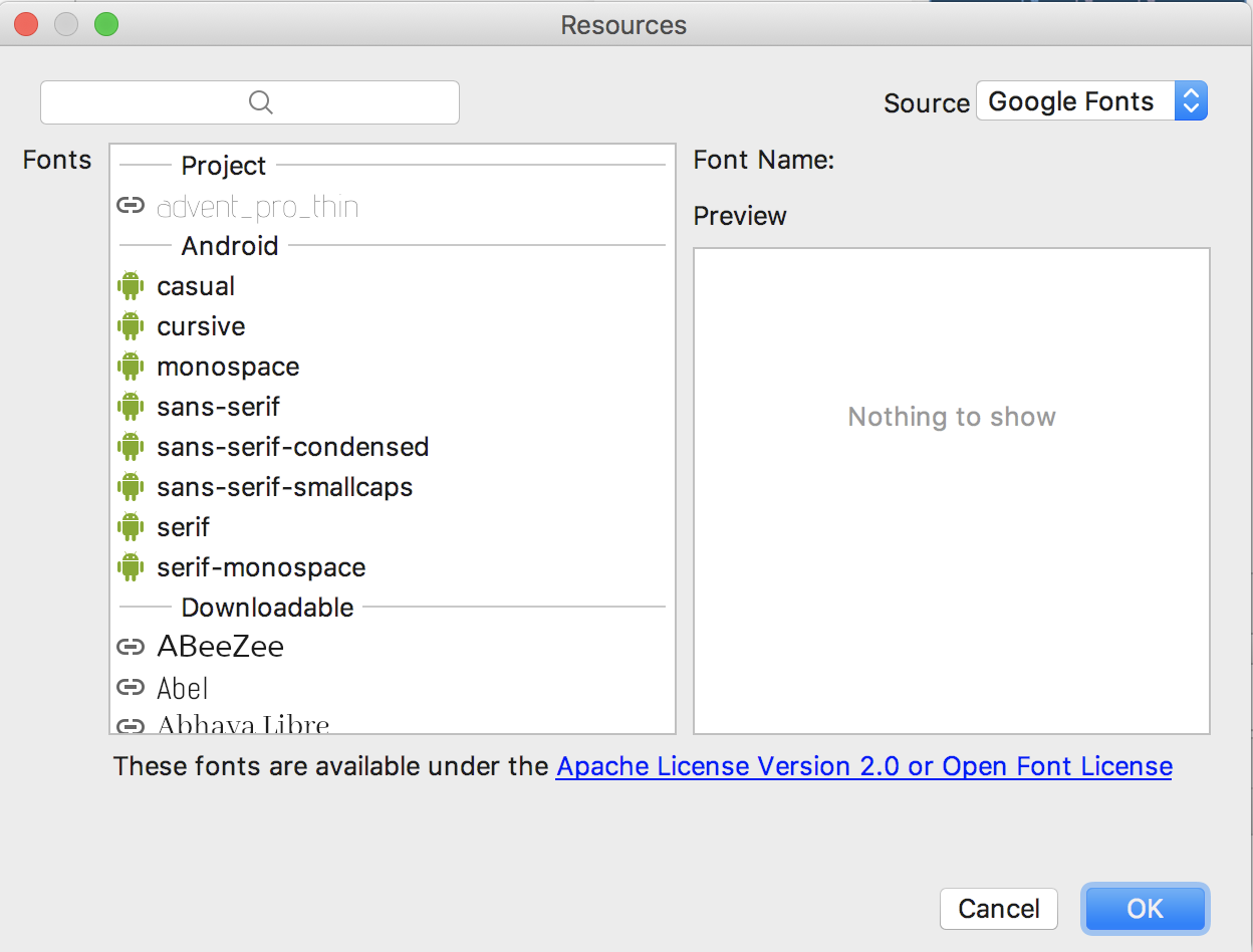
Once you choose a font, you will notice that a font directory will be created and a similar XML file will be generated. Notice that Android Studio automatically takes care of adding the necessary font provider certificates required to request from Google:
<?xml version="1.0" encoding="utf-8"?>
<font-family xmlns:app="http://schemas.android.com/apk/res-auto"
app:fontProviderAuthority="com.google.android.gms.fonts"
app:fontProviderPackage="com.google.android.gms"
app:fontProviderQuery="name=Advent Pro&weight=100"
app:fontProviderCerts="@array/com_google_android_gms_fonts_certs">
</font-family>Adding custom fonts
We can actually use any custom font that we’d like within our applications. Check out fontsquirrel for an easy source of free fonts. For example, we can download Chantelli Antiqua as an example.
Fonts are stored in the «assets» folder. In Android Studio, File > New > folder > Assets Folder. Now download any font and place the TTF file in the assets/fonts directory:
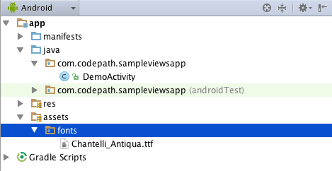
We’re going to use a basic layout file with a TextView, marked with an id of «custom_font» so we can access it in our code.
<?xml version="1.0" encoding="utf-8"?>
<LinearLayout xmlns:android="http://schemas.android.com/apk/res/android"
              android:orientation="vertical"
              android:layout_width="match_parent"
              android:layout_height="match_parent">

    <TextView
            android:id="@+id/custom_font"
            android:layout_width="match_parent"
            android:layout_height="wrap_content"
            android:text="This is the Chantelli Antiqua font."
    />
</LinearLayout>
To set the custom font manually, open your activity file and insert this into the onCreate() method:
// Get access to our TextView
TextView txt = findViewById(R.id.custom_font);
// Create the TypeFace from the TTF asset
Typeface font = Typeface.createFromAsset(getAssets(), "fonts/Chantelli_Antiqua.ttf");
// Assign the typeface to the view
txt.setTypeface(font);
// Get access to our TextView
val txt: TextView = findViewById(R.id.custom_font)
// Create the TypeFace from the TTF asset
val font = Typeface.createFromAsset(assets, "fonts/Chantelli_Antiqua.ttf")
// Assign the typeface to the view
txt.typeface = fontAlternatively, you can use the third-party calligraphy library:
<TextView fontPath="fonts/Chantelli_Antiqua.ttf"/>Either method will will result in:

You’ll also want to keep an eye on the total size of your custom fonts, as this can grow quite large if you’re using a lot of different typefaces.
Using Spans to Style Sections of Text
Spans come in really handy when we want to apply styles to portions of text within the same TextView. We can change the text color, change the typeface, add an underline, etc, and apply these to only certain portions of the text. The full list of spans shows all the available options.
As an example, let’s say we have a single TextView where we want the first word to show up in red and the second word to have a strikethrough:

We can accomplish this with spans using the code below:
String firstWord = "Hello";
String secondWord = "World!";

TextView tvHelloWorld = findViewById(R.id.tvHelloWorld);

// Create a span that will make the text red
ForegroundColorSpan redForegroundColorSpan = new ForegroundColorSpan(
        ContextCompat.getColor(this, android.R.color.holo_red_dark));

// Use a SpannableStringBuilder so that both the text and the spans are mutable
SpannableStringBuilder ssb = new SpannableStringBuilder(firstWord);

// Apply the color span
ssb.setSpan(
        redForegroundColorSpan,            // the span to add
        0,                                 // the start of the span (inclusive)
        ssb.length(),                      // the end of the span (exclusive)
        Spanned.SPAN_EXCLUSIVE_EXCLUSIVE); // behavior when text is later inserted into the SpannableStringBuilder
                                           // SPAN_EXCLUSIVE_EXCLUSIVE means to not extend the span when additional
                                           // text is added in later

// Add a blank space
ssb.append(" ");

// Create a span that will strikethrough the text
StrikethroughSpan strikethroughSpan = new StrikethroughSpan();

// Add the secondWord and apply the strikethrough span to only the second word
ssb.append(secondWord);
ssb.setSpan(
        strikethroughSpan,
        ssb.length() - secondWord.length(),
        ssb.length(),
        Spanned.SPAN_EXCLUSIVE_EXCLUSIVE);

// Set the TextView text and denote that it is Editable
// since it's a SpannableStringBuilder
tvHelloWorld.setText(ssb, TextView.BufferType.EDITABLE);
val firstWord = "Hello"
val secondWord = "World!"
val tvHelloWorld: TextView = findViewById(R.id.tvHelloWorld)
// Create a span that will make the text red
val redForegroundColorSpan = ForegroundColorSpan(
ContextCompat.getColor(this, android.R.color.holo_red_dark)
)
// Use a SpannableStringBuilder so that both the text and the spans are mutable
val ssb = SpannableStringBuilder(firstWord)
// Apply the color span
ssb.setSpan(
redForegroundColorSpan, // the span to add
0, // the start of the span (inclusive)
ssb.length, // the end of the span (exclusive)
Spanned.SPAN_EXCLUSIVE_EXCLUSIVE) // behavior when text is later inserted into the SpannableStringBuilder
// SPAN_EXCLUSIVE_EXCLUSIVE means to not extend the span when additional
// text is added in later
// Add a blank space
ssb.append(" ")
// Create a span that will strikethrough the text
val strikethroughSpan = StrikethroughSpan()
// Add the secondWord and apply the strikethrough span to only the second word
ssb
.append(secondWord)
.setSpan(
strikethroughSpan,
ssb.length - secondWord.length,
ssb.length,
Spanned.SPAN_EXCLUSIVE_EXCLUSIVE)
// Set the TextView text and denote that it is Editable
// since it's a SpannableStringBuilder
tvHelloWorld.setText(ssb, TextView.BufferType.EDITABLE)Note: There are 3 different classes that can be used to represent text that has markup attached. SpannableStringBuilder (used above) is the one to use when dealing with mutable spans and mutable text. SpannableString is for mutable spans, but immutable text. And SpannedString is for immutable spans and immutable text.
Creating Clickable Styled Spans
In certain cases, we might want different substrings in a TextView to different styles and then clickable to trigger an action. For example, rendering tweet items where @foo can be clicked in a message to view a user’s profile. For this, you should copy over the PatternEditableBuilder.java utility into your app. You can then use this utility to make clickable spans. For example:
// Set text within a `TextView`
TextView textView = findViewById(R.id.textView);
textView.setText("Hey @sarah, where did @jim go? #lost");
// Style clickable spans based on pattern
new PatternEditableBuilder().
    addPattern(Pattern.compile("\@(\w+)"), Color.BLUE,
       new PatternEditableBuilder.SpannableClickedListener() {
            @Override
            public void onSpanClicked(String text) {
                Toast.makeText(MainActivity.this, "Clicked username: " + text,
                    Toast.LENGTH_SHORT).show();
            }
       }).into(textView);
// Set text within a `TextView`
val textView: TextView = findViewById(R.id.textView)
textView.text = "Hey @sarah, where did @jim go? #lost"
// Style clickable spans based on pattern
PatternEditableBuilder()
.addPattern(Pattern.compile("@(\w+)"), Color.BLUE) { text ->
Toast.makeText(this@MainActivity, "Clicked username: $text",
Toast.LENGTH_SHORT).show()
}.into(textView)and this results in the following:

For more details, view the README for more usage examples.
References
- https://tutorialwing.com/android-textview-using-kotlin-example/
- https://tutorialwing.com/create-an-android-textview-programmatically-in-kotlin/
- https://code.tutsplus.com/tutorials/customize-android-fonts—mobile-1601
- https://www.androidhive.info/2012/02/android-using-external-fonts/
- https://stackoverflow.com/questions/3651086/android-using-custom-font
- https://www.tutorialspoint.com/android/android_custom_fonts.htm
- https://antonioleiva.com/textview_power_drawables/
- https://www.cronj.com/frontend-development/html.html
Было много вариантов этого урока. Рассматривались разные элементы интерфейса, был вариант уделить внимание layout ресурсам или же ресурсам стилей, но я решил, что зачем ходить далеко? У нас уже есть проект, в котором есть важный и полезный TextView. И сегодня разберем его подробнее.
Если вы обратили внимание на прошлых уроках (или поняли по названию TEXT) — этот элемент интерфейса создан для отображения текста. Только отображения. Для ввода у нас есть его дочерний класс EditText, и он именно создан для пользовательского ввода. С ним мы так же еще не раз столкнемся. Но потом.
Казалось бы, что там этого текста? Вывел и вывел, да? Ну цвет еще можно, ну размер текста, ну шрифт, разные языки поддерживать тоже нужно, еще положение, выравнивание, однострочный текст, бегающая строка иии… думаю вы поняли.
Так что не буду более тянуть, погнали!
Как хранить строки? Strings.xml
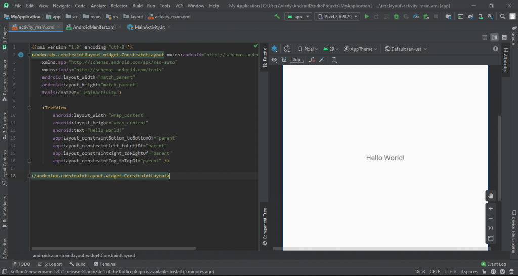
Очевидно, что элементу, который выводит текст — надо как-то этот текст задать. В данном примере он задан в layout файле активности при помощи аттрибута text. Найти это в коде не сложно.
Но такой способ считается плохой практикой, и я поясню почему. Во-первых, так мы теряем потенциальную мультиязычность приложения. Ведь вы уже строго указали какой текст будет выведен в этом TextView. И запустите вы приложение на английском устройстве, а может на русском — без разницы, все уже прописано. Во-вторых, повторение. Часто нам нужно использовать одну и ту же строку или один и тот же текст в разных местах. Писать каждый раз? А если этот текст потом нужно изменить? Всё и везде менять руками? Глупости. Это, кстати, было третье.
Что же делать? Использовать строковые ресурсы! У вас уже должен быть автоматически созданный файл strings.xml. Он должен быть расположен в папке values.
Если такого файла у вас нет — создайте его в папке values (если и папки у вас нет — создайте и её). Откровенно, вам никто не запрещает создать strings_jeans.xml или какой-то mycoolfilewithstrings.xml, их может быть сколько угодно. И это никак не влияет на способ получения этих ресурсов. Главное папку не меняйте. Все это так потому, что при компиляции проекта все ваши файлы будут собраны в одном месте — R.java с кучей ссылок.
У меня в этом файле есть только название приложения. Кстати, изменив его тут — измените и везде. В лаунчере, в тулбаре активности и т.д. Удобно же?
Создадим несколько своих ресурсов! Как видите, тут мы используем xml. Чем-то он похож на html, если сталкивались. У нас есть определенные теги и их аттрибуты. Сейчас на этом не будем заострять внимание, уточним лишь, что ваши строковые ресурсы (тег string) обязательно должны иметь имя, и это имя должно быть уникальным среди всех строковых ресурсов. Сама строка может содержать ПОЧТИ все, что душе угодно. Про это немного позже.
Кстати, имена этих строк. Как видите, нижний регистр + _ . Никаких пробелов, тире, собак и тому подобного. Не примет. Технически, правда, большие буквы использовать можно, но так вроде как не принято.
Хорошо. Мы указали несколько строк (которые переводить вообще-то и не нужно, мда) и теперь можем вывести их при помощи нашего TextView. Сделаем же это.
Как мы выводим текст?
Задать текст TextView можно двумя способами. Первый похож на то, что у нас уже есть. Только теперь вместо самого текста мы укажем ссылку на текст в файле string.xml.
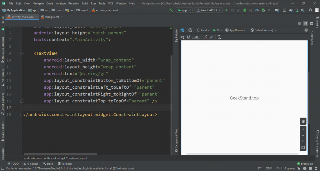
Как видите, вместо самой фразы Hello World! я вписал ссылку на строку с именем gs в файле strings. Доступ к ресурсам аналогичен R файлу, который мы уже видели в активности. Просто другой способ записи ссылок. Для наглядности: R.тип_ресурса.имя_ресура — это для доступа к ресурсам из java и kt файлов, они же исходный код, а @тип_ресурса/имя_ресурса для доступа к ресурсам из xml файлов.
Результат виден сразу в окошке просмотра дизайна layout файла.
Когда этот вариант подходит? Когда текст не нужно менять, т.е. это какой-либо заголовок, текст кнопки и т.д.
А если содержимое текста будет изменяться в зависимости от действий пользователя? Это какие-то переменные, текст приветствия с именем, счетчик в игре. Примеров очень много. В таком случае нам так же нужно указывать соответствующий текст нашему TextView, но уже из логики приложения. А как я и говорил ранее, всю логику пишем непосредственно в исходном коде.
Прим. да, вообще-то есть способы указания переменных значений прям в xml файле, но это уже будет потом. А пока помните: делить на ноль нельзя.
Наш альтернативний метод. Мы, при помощи уникального для этого layout файла id значения находим и сам TextView. Потому в первую очередь укажем его.
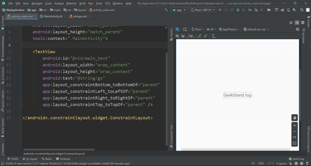
Теперь наш TextView имеет своё уникальное имя, при помощи которого мы сможем его найти. Прошу заметить, что при получении ссылки id мы указываем не просто @id, а @+id. Это укажет системе, что при отсутствии такого id нам нужно его создать.
В файле MainActivity.kt пишем очень простой код.
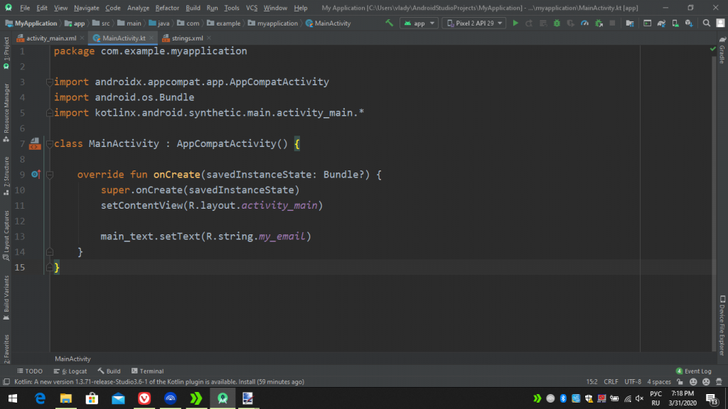
Тут буквально написано id TextView и происходит вызов функции setText, которая и меняет выводимый текст.
На этом остановлюсь немного подробнее. Например в Java это все было бы несколько иначе.
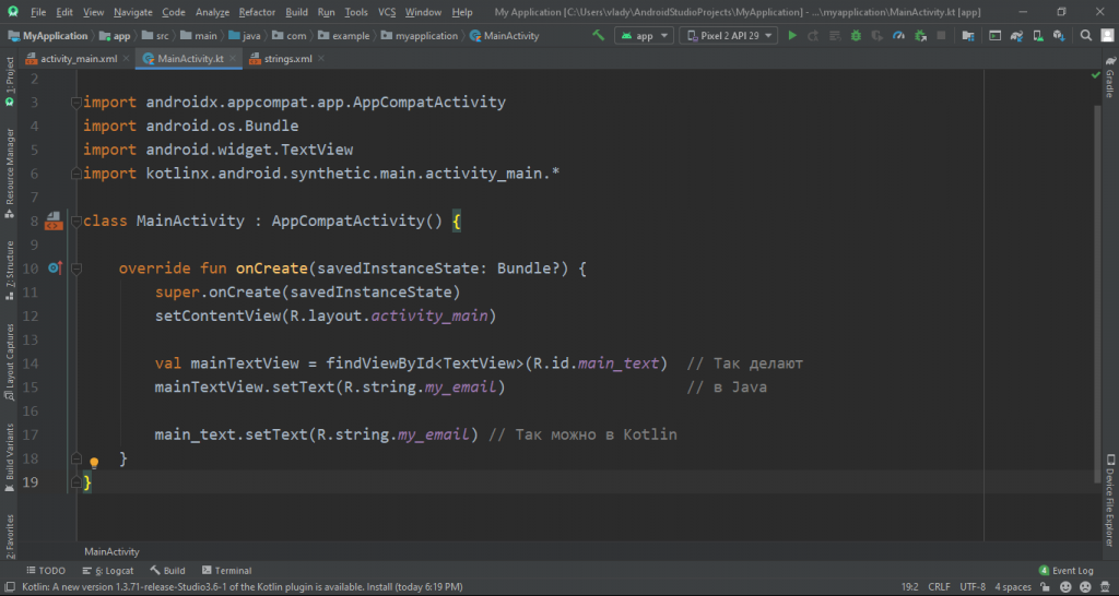
В импортах вы можете увидеть, что котлин в неком роде импортирует содержимое layout файла, и тем самым предоставляет доступ ко всем объектам с id, которые так же выступают в роли имен переменных соответствующих View. Это очень удобно!
Теперь можно запустить приложение и увидеть, что наш текст отображает не первую строку, а вторую.

Дело в том, что изначально он все ещё выводит GeekStand.top, но сразу после этого происходит замена старого текста на строку с именем my_email.
Кстати, да. Две минуты я ждал пока мой ноут соберет приложение с одной строкой… Достаточно сложно в таких реалиях полноценно творить, но как-то справляемся. Надеюсь у вас вышло быстрее =)
Этот урок вышел прям очень базовым. Но без этого никак. Завтра 1 апреля, а потому хочу сделать что-то реально интересное с этим же TextView. И конечно же покажу как использовать шрифты, менять цвет, размер и остальные важные мелочи.
Дополнительно!
Если у вас установлен русский язык системы (или любой другой, чего уж), то довольно странно видеть своё же приложение без локализации. Для поддержки нового языка нужно найти ваш strings.xml и нажав на него правой кнопкой мыши выбрать пункт: Translations Editor.
В открывшемся окне находим глубос, нажимаем и выбираем свой язык.
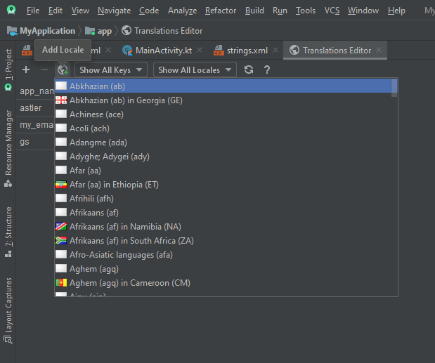
Выбор реально огромный, от основных языков до последних диалектов. Так что я почти уверен, что вы найдете то, что ищете.
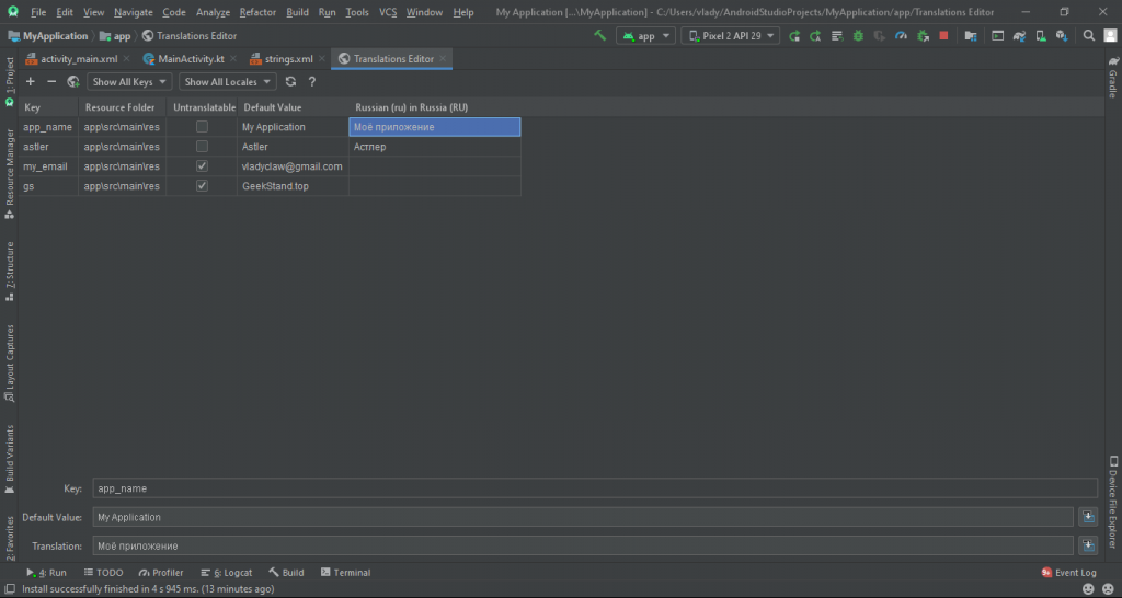
Теперь вы можете с удобством добавить перевод везде, где это нужно. А если есть что-то не требующее перевода — отмечаем как Untranslatable. Все просто! До скорого!