Table of Contents
- Introduction
- Multiple errors per property
- Asynchronous validation
- Visual feedback
- Custom error objects
- Cross-property errors
Introduction
You can validate data in a WPF application using the System.ComponentModel.INotifyDataErrorInfo interface that was introduced in the .NET Framework 4.5 (the same interface has been present in Silverlight since version 4).
It is a common requirement for any user interface application that accepts user input to validate the entered information to ensure that it has the expected format and type. Since .NET Framework 3.5, you have been able to use the
IDataErrorInfo interface to validate properties of a view model or model that is bound to some element in the view. While this interface basically only provides the capability to return a string that specifies what is wrong with a single given property,
the new INotifyDataErrorInfo interface gives you a lot more flexibility and should, in general, be used when implementing new classes.
- It enables you to perform server-side validations asynchronously and then notify the view by raising an ErrorsChanged event once the validations are completed.
- It makes it possible to invalidate a property when setting another property.
- It supports setting multiple errors per property.
- It supports custom error objects of some other type than System.String (string).
/* The built-in System.ComponentModel.INotifyDataErrorInfo interface */
public
interface
INotifyDataErrorInfo
{
bool
HasErrors { get; }
event
EventHandler<DataErrorsChangedEventArgs> ErrorsChanged;
IEnumerable GetErrors(string
propertyName);
}
Multiple errors per property
The GetErrors method of the interface returns an IEnumerable that contains validation errors for the specified property or for the entire entity. You should always raise the
ErrorsChanged event whenever the collection returned by the GetErrors method changes. If the source of a two-way data binding implements the
INotifyDataErrorInfo interface and the ValidatesOnNotifyDataErrors property of the binding is set to true (which it is by default), the WPF 4.5 binding engine automatically monitors the ErrorsChanged event and calls the GetErrors method to retrieve
the updated errors once the event is raised from the source object, provided that the
HasErrors property returns true.
Below is an example of a simple service with a single method that validates a username by first querying a database to determine whether it is already in use or not and then checks the length of it and finally determines whether it contains any illegal characters
by using a regular expression. The method returns true or false depending on whether the validation succeeded or not and it also returns a collection of error messages as an out parameter. Declaring an argument as out is useful when you want a method in C#
to return multiple values.
public
interface
IService
{
bool
ValidateUsername(string
username, out
ICollection<string> validationErrors);
}
public
class
Service : IService
{
public
bool
ValidateUsername(string
username, out
ICollection<string> validationErrors)
{
validationErrors =
new
List<string>();
int
count = 0;
using
(SqlConnection conn = new
SqlConnection(ConfigurationManager.ConnectionStrings[0].ConnectionString))
{
SqlCommand cmd =
new
SqlCommand("SELECT COUNT(*) FROM [Users] WHERE Username = @Username", conn);
cmd.Parameters.Add("@Username", SqlDbType.VarChar);
cmd.Parameters["@Username"].Value = username;
conn.Open();
count = (int)cmd.ExecuteScalar();
}
if
(count > 0)
validationErrors.Add("The supplied username is already in use. Please choose another one.");
/* Verifying that length of username */
if
(username.Length > 10 || username.Length < 4)
validationErrors.Add("The username must be between 4 and 10 characters long.");
/* Verifying that the username contains only letters */
if
(!Regex.IsMatch(username, @"^[a-zA-Z]+$"))
validationErrors.Add("The username must only contain letters (a-z, A-Z).");
return
validationErrors.Count == 0;
}
}
Asynchronous validation
The following view model implementation of the INotifyDataErrorInfo interface then uses this service to perform the validation asynchronously. Besides a reference to the service itself, it has a
Dictionary<string, ICollection<string>> where the key represents a name of a property and the value represents a collection of validation errors for the corresponding property.
public
class
ViewModel : INotifyDataErrorInfo
{
private
readonly
IService _service;
private
readonly
Dictionary<string, ICollection<string>>
_validationErrors =
new
Dictionary<string, ICollection<string>>();
public
ViewModel(IService service)
{
_service = service;
}
...
#region INotifyDataErrorInfo members
public
event
EventHandler<DataErrorsChangedEventArgs> ErrorsChanged;
private
void
RaiseErrorsChanged(string
propertyName)
{
if
(ErrorsChanged != null)
ErrorsChanged(this,
new
DataErrorsChangedEventArgs(propertyName));
}
public
System.Collections.IEnumerable GetErrors(string
propertyName)
{
if
(string.IsNullOrEmpty(propertyName)
|| !_validationErrors.ContainsKey(propertyName))
return
null;
return
_validationErrors[propertyName];
}
public
bool
HasErrors
{
get
{ return
_validationErrors.Count > 0; }
}
#endregion
}
The setter of a Username property of the view model is then using a private method to call the service method asynchronously using the async and await keywords — these were added to introduce a simplified approach to asynchronous programming in the .NET
Framework 4.5 and the Windows Runtime (WinRT) — and update the dictionary based on the result of the validation:
private
string
_username;
public
string
Username
{
get
{ return
_username; }
set
{
_username = value;
ValidateUsername(_username);
}
}
private
async void
ValidateUsername(string
username)
{
const
string
propertyKey = "Username";
ICollection<string> validationErrors =
null;
/* Call service asynchronously */
bool
isValid = await Task<bool>.Run(() =>
{
return
_service.ValidateUsername(username, out
validationErrors);
})
.ConfigureAwait(false);
if
(!isValid)
{
/* Update the collection in the dictionary returned by the GetErrors method */
_validationErrors[propertyKey] = validationErrors;
/* Raise event to tell WPF to execute the GetErrors method */
RaiseErrorsChanged(propertyKey);
}
else
if(_validationErrors.ContainsKey(propertyKey))
{
/* Remove all errors for this property */
_validationErrors.Remove(propertyKey);
/* Raise event to tell WPF to execute the GetErrors method */
RaiseErrorsChanged(propertyKey);
}
}
Visual feedback
If a user enters an invalid username and the validation fails, a validation error will occur and a visual feedback will be provided to the user to indicate this. By default you will see a red border around the UI element when this happens:

The actual message that is describing the error is stored in the ErrorContent property of a
System.Windows.Controls.ValidationError object that is added to the Validation.Errors collection of the bound element by the binding engine at runtime. When the attached property Validation.Errors have
ValidationError objects in it, another attached property named Validation.HasError returns true.
To be able to see the error messages in the view you can replace the default control template that draws the red border around the element with your own custom template by setting the Validation.ErrorTemplate attached property of the control. You typically
use an ItemsControl present a collection of items in XAML:
<TextBox
Text="{Binding Username, UpdateSourceTrigger=PropertyChanged, ValidatesOnNotifyDataErrors=True}">
<Validation.ErrorTemplate>
<ControlTemplate>
<StackPanel>
<!-- Placeholder for the TextBox itself -->
<AdornedElementPlaceholder
x:Name="textBox"/>
<ItemsControl
ItemsSource="{Binding}">
<ItemsControl.ItemTemplate>
<DataTemplate>
<TextBlock
Text="{Binding ErrorContent}"
Foreground="Red"/>
</DataTemplate>
</ItemsControl.ItemTemplate>
</ItemsControl>
</StackPanel>
</ControlTemplate>
</Validation.ErrorTemplate>
</TextBox>

Note that the Validation.ErrorTemplate will be displayed on the adorner layer. Elements in the adorner layer are rendered on top of the rest of the visual elements and they will not be considered when the layout system is measuring and arranging the controls
on the adorned element layer. The adorned element, in this case, is the TextBox control itself and you include an
AdornedElementPlaceholder in the control template where you want to leave space for it. The template above will cause any validation error messages to be displayed below the TextBox. The TextBlocks containing the validation error messages rendered
by the ItemsControl will appear on top of any elements that are located right below the TextBox as adorners are always visually on top.
Custom error objects
As mentioned, the INotifyErrorDataError interface also makes it possible to return error objects of any type from the GetErrors method and this can be very useful when you want to present some custom error reporting in the view. Consider the following
sample type that has a string property that describes the validation error and an additional property of enumeration type that specifies the severity of the error:
public
class
CustomErrorType
{
public
CustomErrorType(string
validationMessage, Severity severity)
{
this.ValidationMessage = validationMessage;
this.Severity = severity;
}
public
string
ValidationMessage { get;
private
set; }
public
Severity Severity { get;
private
set; }
}
public
enum
Severity
{
WARNING,
ERROR
}
public
class
Service : IService
{
/* The service method modifed to return objects of type CustomErrorType instead of System.String */
public
bool
ValidateUsername(string
username, out
ICollection<CustomErrorType> validationErrors)
{
validationErrors =
new
List<CustomErrorType>();
int
count = 0;
/* query database as before */
...
if
(count > 0)
validationErrors.Add(new
CustomErrorType("The supplied username is already in use. Please choose another one.", Severity.ERROR));
/* Verifying that length of username */
if
(username.Length > 10 || username.Length < 4)
validationErrors.Add(new
CustomErrorType("The username should be between 4 and 10 characters long.", Severity.WARNING));
/* Verifying that the username contains only letters */
if
(!Regex.IsMatch(username, @"^[a-zA-Z]+$"))
validationErrors.Add(new
CustomErrorType("The username must only contain letters (a-z, A-Z).", Severity.ERROR));
return
validationErrors.Count == 0;
}
}
If you use the same ErrorTemplate as shown above to present validation errors of the above type, you will see the ToString() representation of it when an error has been detected. You can choose to override the ToString() method of the custom type to return
an error message or simply adjust the template to fit the custom type. Below is for example how you could change the color of a validation error message based on the Severity property of the
CustomErrorType object returned by the ErrorContent property of a ValidationError object in the Validation.Errors collection:
<Validation.ErrorTemplate>
<ControlTemplate
xmlns:local="clr-namespace:WpfApplication1">
<StackPanel>
<!-- Placeholder for the TextBox itself -->
<AdornedElementPlaceholder
x:Name="textBox"/>
<ItemsControl
ItemsSource="{Binding}">
<ItemsControl.ItemTemplate>
<DataTemplate>
<TextBlock
Text="{Binding ErrorContent.ValidationMessage}">
<TextBlock.Style>
<Style
TargetType="{x:Type TextBlock}">
<Setter
Property="Foreground"
Value="Red"/>
<Style.Triggers>
<DataTrigger
Binding="{Binding ErrorContent.Severity}"
Value="{x:Static
local:Severity.WARNING}">
<Setter
Property="Foreground"
Value="Orange"/>
</DataTrigger>
</Style.Triggers>
</Style>
</TextBlock.Style>
</TextBlock>
</DataTemplate>
</ItemsControl.ItemTemplate>
</ItemsControl>
</StackPanel>
</ControlTemplate>
</Validation.ErrorTemplate>

Cross-property errors
As the GetErrors method returns a collection of validation errors for a given property, you can also easily perform cross-property validation — in cases where a change to a property value may cause an error in another property — by adding appropriate errors
to the dictionary, or whatever collection you are using to store the validation error objects, and then tell the binding engine to re-call this method by raising the ErrorsChanged event.
This is illustrated in the below sample code where the Interest property is only mandatory when the Type property has a certain value and the validation of the Interest property occurs whenever either of the properties are set.
public
class
ViewModel : INotifyDataErrorInfo
{
private
readonly
Dictionary<string, ICollection<string>>
_validationErrors =
new
Dictionary<string, ICollection<string>>();
private
Int16 _type;
public
Int16 Type
{
get
{ return
_type; }
set
{
_type = value;
ValidateInterestRate();
}
}
private
decimal? _interestRate;
public
decimal? InterestRate
{
get
{ return
_interestRate; }
set
{
_interestRate = value;
ValidateInterestRate();
}
}
private
const
stringdictionaryKey = "InterestRate";
private
const
stringvalidationMessage = "You must enter an interest rate.";
/* The InterestRate property must have a value only if the Type property is set to 1 */
private
void
ValidateInterestRate()
{
if
(_type.Equals(1) && !_interestRate.HasValue)
{
if
(_validationErrors.ContainsKey(dictionaryKey))
_validationErrors[dictionaryKey].Add(validationMessage);
else
_validationErrors[dictionaryKey] =
new
List<string> { validationMessage };
RaiseErrorsChanged("InterestRate");
}
else
if
(_validationErrors.ContainsKey(dictionaryKey))
{
_validationErrors.Remove(dictionaryKey);
RaiseErrorsChanged("InterestRate");
}
}
#region INotifyDataErrorInfo members
...
#endregion
}
Return to Top
Posted: August 26, 2013 | Filed under: WPF | Tags: WPF |
A common requirement for any user interface application that accepts user input is to validate the entered information to ensure that it has the expected format and type for the back-end to be able to accept and persist it. This post is about how data validation works in WPF and the different validation options there are available including implementing custom ValidationRules and using the IDataErrorInfo interface and the INotifyErrorDataError interface that was introduced in the .NET Framework 4.5. It also contains an example that shows how you can validate data using data annotations.
Data binding
In a typical WPF application that uses the MVVM (Model-View-View Model) design pattern, a dependency property of a user interface control in a XAML-defined view uses data binding to bind to some data returned by a CLR property of the view model. If the binding is setup correctly and the view model implements the System.ComponentModel.INotifyPropertyChanged interface to provide notifications when the data changes, the changes are automatically reflected in the elements in the view that are bound to it. Correspondingly, an underlying data value in the view model is automatically updated when the user modifies the bound value in the view.
Provided that the view model has a property called “Name”, you bind it to a TextBox’s Text property in XAML the following way:
<TextBox Text="{Binding Path=Name}"/>
<!-- equivalent to <TextBox Text="{Binding Name}"/> -->
Source
Besides the path that specifies the name of the property to bind to, the binding must also have a source object. If you don’t specify a source explicitly by setting the Source property of the binding, it will inherit the DataContext from its parent element to use as its source. In a MVVM WPF application, the view model acts as the window’s DataContext:
public partial class MainWindow : Window
{
    public MainWindow()
    {
        InitializeComponent();
        this.DataContext = new ViewModel();
    }
}
This means that that all controls inside the window will inherit its DataContext unless some parent element of a control overrides this by setting its own DataContext property. Besides inheriting and setting the DataContext property on an element directly you can also specify a binding source using the ElementName property, used when you want to bind to some other element, or the RelativeSource property. The latter can for example be very useful for bindings in Styles and ControlTemplates and when you want to bind to some property in a parent element.
Mode
The Mode property of the System.Windows.Data.Binding class lets you control the direction of the data flow, i.e. whether the binding should update only the user interface control, the source property of the DataContext or both, as defined by the System.Windows.Data.BindingMode enumeration:
- OneWay: Only the value of the dependency property of the UI element is updated when the source property changes. Used in read-only scenarios.
- TwoWay: Both the property of the UI element and the source property are updated whenever the value of either of them changes. Often used for interactive controls such as the TextBox.
- OneTime: Only the property of the UI element is updated and it is only updated when the application starts or when the DataContext undergoes a change. Used when the data to be displayed is truly static.
- OneWayToSource: Only the source property is updated when the property of the UI element is changed. The reverse of OneWay.
The enumeration also has a Default option which returns the default binding mode of the UI element’s dependency property. For a TextBox’s Text property the default mode is TwoWay but it varies for each dependency property.
UpdateSourceTrigger
For TwoWay and OneWayToSource bindings there is an additional property on the Binding class named UpdateSourceTrigger that specifies what triggers the update of a source property. If the UpdateSourceTrigger is set to LostFocus, which is the default for the Text property of the TextBox control, the text you type into the TextBox does not update the source property until the control loses focus which happens when you click away from it. If you require the source to get updated, i.e. the setter for the bound property of the DataContext to get called, as the user is typing into the TextBox you set the UpdateSourceTrigger property to PropertyChanged:
<TextBox Text="{Binding Name, UpdateSourceTrigger=PropertyChanged}" />
Besides a Default option that works similar to the one in the BindingMode enumeration, there is also an option called Explicit defined in the System.Windows.Data.Binding.UpdateSourceTrigger enumeration. Setting the property to this value means that the value of the source property only gets updated when you explicitly call the BindingExpression.UpdateSource() method in code. You will typically never use this approach in an MVVM application though.
Data type conversion
If you want to bind a view model property of a specific type to a dependency property in the view of a different type you may need to implement a custom converter class by implementing the System.Windows.Data.IValueConverter interface and setting the Converter property of the binding to an instance of this. A converter class converts data from one type to another during binding by implementing the Convert and ConvertBack methods of the mentioned interface. Once you have created a converter class you will typically add it as a resource in XAML with a unique x:Key attribute and then reference it from the binding as a StaticResource:
<Window x:Class="WpfDataValidation.MainWindow"
        xmlns="http://schemas.microsoft.com/winfx/2006/xaml/presentation"
        xmlns:x="http://schemas.microsoft.com/winfx/2006/xaml"
        xmlns:local="clr-namespace:MyApplication"
        Title="MainWindow" Height="350" Width="525">
    <Window.Resources>
        <local:MyCustomConverter x:Key="myCustomConverter"/>
    </Window.Resources>
    <Grid>
        <TextBox Text="{Binding Name, Converter={StaticResource myCustomConverter}}"/>
    </Grid>
</Window>
However, when binding some data of a different type than System.String (string) to a dependency property of type string you don’t necessarily need to use a converter as the default conversion will automatically apply the ToString() method on the value of the source property.
This means that you don’t have to use a converter to display a System.Int32 (int) value in a TextBox:
public class ViewModel
{
    public ViewModel()
    {
        /* Set default age */
        this.Age = 30;
    }

    public int Age { get; set; }
}
<TextBox Text="{Binding Age, UpdateSourceTrigger=PropertyChanged}"/>
Data validation
If a user enters an invalid value that cannot be converted to an int and be set as the value for the Age property in the view model in the above example, a validation error will occur and a visual feedback will be provided to the user to indicate this. By default you will see a red border around the UI element when this happens, e.g. if you are typing a letter into a TextBox bound to a source property of type int:

The actual message that is describing the error is stored in the ErrorContent property of a System.Windows.Controls.ValidationError object that is added to the Validation.Errors collection of the bound element by the binding engine at runtime. When the attached property Validation.Errors has ValidationError objects in it, another attached property named Validation.HasError returns true.
ErrorTemplate
To be able to see the error messages in the view you can replace the default control template that draws the red border around the element with your own custom template by setting the Validation.ErrorTemplate attached property of the control:
<TextBox Text="{Binding Age, UpdateSourceTrigger=PropertyChanged}">
    <Validation.ErrorTemplate>
        <ControlTemplate>
            <StackPanel>
                <!-- Placeholder for the TextBox itself -->
                <AdornedElementPlaceholder x:Name="textBox"/>
                <TextBlock Text="{Binding [0].ErrorContent}" Foreground="Red"/>
            </StackPanel>
        </ControlTemplate>
    </Validation.ErrorTemplate>
</TextBox>
Note that the Validation.ErrorTemplate will be displayed on the adorner layer. Elements in the adorner layer are rendered on top of the rest of the visual elements and they will not be considered when the layout system is measuring and arranging the controls on the adorned element layer. The adorned element in this case is the TextBox control itself and you include an AdornedElementPlaceholder in the control template where you want to leave space for it. The template above will cause the error message to be displayed in a TextBlock below the TextBox. Note that the TextBlock will appear on top of any elements that are located right below the TextBox as adorners are always visually on top.

ValidationRule
Now that you can see the actual error message, which reads “Value … could not be converted” when the conversion of the string value to an int fails, you may want to customize it. You can do this by implementing a custom validation rule and associate this with the Binding object. A custom validation rule is a class that derives from the abstract System.Windows.Controls.ValidationRule class and implements its Validate method. It has a property named ValidationStep that controls when the binding engine will execute the Validate method. The System.Windows.Controls.ValidationStep enumeration has the following options:
- RawProposedValue: The validation rule is run before the value conversion occurs. This is the default for a custom implementation.
- ConvertedProposedValue: The validation rule is run after the value is converted but before the setter of the source property is called.
- UpdatedValue: The validation rule is run after the source property has been updated.
- CommittedValue: The validation rule is run after the value has been committed to the source.
Below is how you could implement a custom validation rule that checks whether the string value can be converted to an integer value and sets the ErrorContent property of the ValidationError object in the Validation.Errors collection if not. Note that the ValidationStep property needs to be set to RawProposedValue, either explicitly or implictly by using the default value, for the rule to be applied before the default conversion occurs.
public class StringToIntValidationRule : ValidationRule
{
    public override ValidationResult Validate(object value, System.Globalization.CultureInfo cultureInfo)
    {
        int i;
        if(int.TryParse(value.ToString(), out i))
            return new ValidationResult(true, null);

        return new ValidationResult(false, "Please enter a valid integer value.");
    }
}
<Window x:Class="WpfDataValidation.MainWindow"
        xmlns="http://schemas.microsoft.com/winfx/2006/xaml/presentation"
        xmlns:x="http://schemas.microsoft.com/winfx/2006/xaml"
        xmlns:local="clr-namespace:WpfDataValidation"
        Title="MainWindow" Height="175" Width="400">
    <StackPanel Margin="50">
        <TextBox>
            <TextBox.Text>
                <Binding Path="Age" UpdateSourceTrigger="PropertyChanged">
                    <Binding.ValidationRules>
                        <local:StringToIntValidationRule ValidationStep="RawProposedValue"/>
                    </Binding.ValidationRules>
                </Binding>
            </TextBox.Text>
	 ...
        </TextBox>
    </StackPanel>
</Window>
Validation process
If the Validate method of a ValidationRule object returns an invalid ValidationResult, the binding engine’s validation procedure listed below will halt. If the returned object’s IsValid property is set true, the validation process continues to the next step.
- The Validate method of all custom ValidationRule objects that are associated with the binding and has the ValidationStep property set to RawProposedValue is executed until one of them returns an invalid ValidationResult or until all of them pass.
- If the binding has a converter, its ConvertBack method gets called.
- The binding engine tries to convert the value returned from the converter’s ConvertBack method, assuming there is a converter associated with binding, or the value of the dependency property to the type of the source property.
- The setter of the source property is called.
- The Validate method of the binding’s all ValidationRule objects with the ValidationStep property set to UpdatedValue are evaluated the same way as in the first step.
- The same as the previous step for all ValidationRule objects with the ValidationStep property set to CommittedValue
Before the Validate method is executed for a ValidationRule object at any given step, any errors that were added to the Validation.Errors attached property of the bound element during that step in a previous validation procedure are removed. The Validation.Errors collection is also cleared when a valid value transfer occurs.
ExceptionValidationRule
WPF ships with two built-in concrete implementations of the ValidationRule class. The System.Windows.Controls.ExceptionValidationRule class adds a ValidationError object to the Validation.Errors collection when an exception is thrown in the setter of the source property. For example, it would be useful if the Age property of the view model was constrained to only accept values between 10 and 100 and threw an exception if the value was outside of this range:
private int _age;
public int Age
{
    get { return _age; }
    set
    {
        if (value < 10 || value > 100)
            throw new ArgumentException("The age must be between 10 and 100");
         _age = value;
    }
}
<TextBox>
    <TextBox.Text>
        <Binding Path="Age" UpdateSourceTrigger="PropertyChanged">
            <Binding.ValidationRules>
                <ExceptionValidationRule />
            </Binding.ValidationRules>
        </Binding>
    </TextBox.Text>
</TextBox>
An alternative syntax to explicitly add this rule to the binding’s ValidationRules collection is to set the ValidatesOnExceptions property to true:
<TextBox Text="{Binding Path=Age, UpdateSourceTrigger=PropertyChanged, ValidatesOnExceptions=True}"/>
IDataErrorInfo
The other built-in validation rule is the System.Windows.Controls.DataErrorValidationRule class. It checks for validation errors that are raised by the source object’s, i.e. the view model’s, implementation of the System.ComponentModel.IDataErrorInfo interface. This interface defines two properties that returns a string indicating what is wrong with the object and some property of the object respectively. Below is how the view model would implement the IDataErrorInfo interface to validate the Age property according to the same rules as above but without throwing any exception:
public class ViewModel : System.ComponentModel.IDataErrorInfo
{
    public ViewModel()
    {
        /* Set default age */
        this.Age = 30;
    }

    public int Age { get; set; }

    public string Error
    {
        get { return null; }
    }

    public string this[string columnName]
    {
        get
        {
            switch (columnName)
            {
                case "Age":
                    if (this.Age < 10 || this.Age > 100)
                        return "The age must be between 10 and 100";
                    break;
            }

            return string.Empty;
        }
    }
}
WPF automatically identifies source objects that implement this interface to provide a way to display custom error information in a view. Just remember to associate the DataErrorValidationRule with the binding in view, either by adding it to the binding’s ValidationRules collection or by setting the ValidatesOnDataErrors property of the binding to true:
<TextBox Text="{Binding Path=Age, UpdateSourceTrigger=PropertyChanged, ValidatesOnDataErrors=True}"/>
INotifyDataErrorInfo
The .NET Framework 4.5 introduced a new System.ComponentModel.INotifyDataErrorInfo interface – the same interface has been present in Silverlight since version 4 – which enables you to perform server-side validations asynchronously and then notify the view by raising an ErrorsChanged event once the validations are completed. Similarly, it makes it possible to invalidate a property when setting another property and it also supports setting multiple errors per property and custom error objects of some other type than System.String (string).
/* The built-in System.ComponentModel.INotifyDataErrorInfo interface */
public interface INotifyDataErrorInfo
{
    bool HasErrors { get; }
    event EventHandler<DataErrorsChangedEventArgs> ErrorsChanged;
    IEnumerable GetErrors(string propertyName);
}
Multiple errors per property
The GetErrors method of the interface returns an IEnumerable that contains validation errors for the specified property or for the entire entity. You should always raise the ErrorsChanged event whenever the collection returned by the GetErrors method changes. If the source of a two-way binding implements the INotifyDataErrorInfo interface and the ValidatesOnNotifyDataErrors property of the binding is set to true (which it is by default), the WPF 4.5 binding engine automatically monitors the ErrorsChanged event and calls the GetErrors method to retrieve the updated errors once the event is raised from the source object provided that the HasErrors property returns true.
Below is an example of a simple service with a single method that validates a username by first querying a database to determine whether it is already in use or not and then checks the length of it and finally determines whether it contains any illegal characters by using a regular expression. The method returns true or false depending on whether the validation succeeded or not and it also returns a collection of error messages as an out parameter. Declaring an argument as out is useful when you want the method to return multiple values.
public interface IService
{
    bool ValidateUsername(string username, out ICollection<string> validationErrors);
}

public class Service : IService
{
    public bool ValidateUsername(string username, out ICollection<string> validationErrors)
    {
        validationErrors = new List<string>();
        int count = 0;
        using (SqlConnection conn = new SqlConnection(ConfigurationManager.ConnectionStrings[0].ConnectionString))
        {
            SqlCommand cmd = new SqlCommand("SELECT COUNT(*) FROM [Users] WHERE Username = @Username", conn);
            cmd.Parameters.Add("@Username", SqlDbType.VarChar);
            cmd.Parameters["@Username"].Value = username;
            conn.Open();
            count = (int)cmd.ExecuteScalar();
        }

        if (count > 0)
            validationErrors.Add("The supplied username is already in use. Please choose another one.");

        /* Verifying that length of username */
        if (username.Length > 10 || username.Length < 4)
            validationErrors.Add("The username must be between 4 and 10 characters long.");

        /* Verifying that the username contains only letters */
        if (!Regex.IsMatch(username, @"^[a-zA-Z]+$"))
            validationErrors.Add("The username must only contain letters (a-z, A-Z).");

        return validationErrors.Count == 0;
    }
}
Asynchronous validation
The following view model implementation of the INotifyDataErrorInfo interface then uses this service to perform the validation asynchronously. Besides a reference to the service itself, it has a System.Collections.Generic.Dictionary<string, System.Collections.Generic.ICollection<string>> where the key represents a name of a property and the value represents a collection of validation errors for the corresponding property.
public class ViewModel : INotifyDataErrorInfo
{
    private readonly IService _service;
    private readonly Dictionary<string, ICollection<string>>
        _validationErrors = new Dictionary<string, ICollection<string>>();

    public ViewModel(IService service)
    {
        _service = service;
    }

    ...

    #region INotifyDataErrorInfo members
    public event EventHandler<DataErrorsChangedEventArgs> ErrorsChanged;
    private void RaiseErrorsChanged(string propertyName)
    {
        if (ErrorsChanged != null)
            ErrorsChanged(this, new DataErrorsChangedEventArgs(propertyName));
    }

    public System.Collections.IEnumerable GetErrors(string propertyName)
    {
        if (string.IsNullOrEmpty(propertyName)
            || !_validationErrors.ContainsKey(propertyName))
            return null;

        return _validationErrors[propertyName];
    }

    public bool HasErrors
    {
        get { return _validationErrors.Count > 0; }
    }
    #endregion
}
The setter of a Username property of the view model is then using a private method to call the service method asynchronously using the async and await keywords – these were added to introduce a simplified approach to asynchronous programming in the .NET Framework 4.5 and the Windows Runtime (WinRT) – and update the dictionary based on the result of the validation:
private string _username;
public string Username
{
    get { return _username; }
    set
    {
        _username = value;
        ValidateUsername(_username);
    }
}

private async void ValidateUsername(string username)
{
    const string propertyKey = "Username";
    ICollection<string> validationErrors = null;
    /* Call service asynchronously */
    bool isValid = await Task<bool>.Run(() =>
    {
        return _service.ValidateUsername(username, out validationErrors);
    })
    .ConfigureAwait(false);

    if (!isValid)
    {
        /* Update the collection in the dictionary returned by the GetErrors method */
        _validationErrors[propertyKey] = validationErrors;
        /* Raise event to tell WPF to execute the GetErrors method */
        RaiseErrorsChanged(propertyKey);
    }
    else if(_validationErrors.ContainsKey(propertyKey))
    {
        /* Remove all errors for this property */
        _validationErrors.Remove(propertyKey);
        /* Raise event to tell WPF to execute the GetErrors method */
        RaiseErrorsChanged(propertyKey);
    }
}
For the view to be able show more than a single error message you have to make some changes to the Validation.ErrorTemplate of the data bound control. You typically use an ItemsControl present a collection of items in XAML:
<TextBox Text="{Binding Username, UpdateSourceTrigger=PropertyChanged, ValidatesOnNotifyDataErrors=True}">
    <Validation.ErrorTemplate>
        <ControlTemplate>
            <StackPanel>
                <!-- Placeholder for the TextBox itself -->
                <AdornedElementPlaceholder x:Name="textBox"/>
                <ItemsControl ItemsSource="{Binding}">
                    <ItemsControl.ItemTemplate>
                        <DataTemplate>
                            <TextBlock Text="{Binding ErrorContent}" Foreground="Red"/>
                        </DataTemplate>
                    </ItemsControl.ItemTemplate>
                </ItemsControl>
            </StackPanel>
        </ControlTemplate>
    </Validation.ErrorTemplate>
</TextBox>

Custom error objects
As mentioned, you can also return error objects of a any type from the GetErrors method and this can be very useful when you want to present custom error reporting in the view. Consider the following sample type that has a string property that describes the validation error and an additional property of enumeration type that specifies the severity of the error:
public class CustomErrorType
{
    public CustomErrorType(string validationMessage, Severity severity)
    {
        this.ValidationMessage = validationMessage;
        this.Severity = severity;
    }

    public string ValidationMessage { get; private set; }
    public Severity Severity { get; private set; }
}

public enum Severity
{
    WARNING,
    ERROR
}

public class Service : IService
{
    /* The service method modifed to return objects of type CustomErrorType instead of System.String */
    public bool ValidateUsername(string username, out ICollection<CustomErrorType> validationErrors)
    {
        validationErrors = new List<CustomErrorType>();
        int count = 0;
        /* query database as before */
	...
        if (count > 0)
            validationErrors.Add(new CustomErrorType("The supplied username is already in use. Please choose another one.", Severity.ERROR));

        /* Verifying that length of username */
        if (username.Length > 10 || username.Length < 4)
            validationErrors.Add(new CustomErrorType("The username should be between 4 and 10 characters long.", Severity.WARNING));

        /* Verifying that the username contains only letters */
        if (!Regex.IsMatch(username, @"^[a-zA-Z]+$"))
            validationErrors.Add(new CustomErrorType("The username must only contain letters (a-z, A-Z).", Severity.ERROR));

        return validationErrors.Count == 0;
    }
}
If you use the same ErrorTemplate as shown before to present validation errors of the above type, you will see the ToString() representation of it when an error has been detected. You can choose to override the ToString() method to return an error message or simply adjust the template to fit the custom type. Below is for example how you could change the colour of a validation error based on the Severity property of the CustomErrorType object returned by the ErrorContent property of a ValidationError object in the Validation.Errors collection:
<Validation.ErrorTemplate>
    <ControlTemplate xmlns:local="clr-namespace:WpfApplication1">
        <StackPanel>
            <!-- Placeholder for the TextBox itself -->
            <AdornedElementPlaceholder x:Name="textBox"/>
            <ItemsControl ItemsSource="{Binding}">
                <ItemsControl.ItemTemplate>
                    <DataTemplate>
                        <TextBlock Text="{Binding ErrorContent.ValidationMessage}">
                            <TextBlock.Style>
                                <Style TargetType="{x:Type TextBlock}">
                                    <Setter Property="Foreground" Value="Red"/>
                                    <Style.Triggers>
                                        <DataTrigger Binding="{Binding ErrorContent.Severity}"
                                                                 Value="{x:Static local:Severity.WARNING}">
                                            <Setter Property="Foreground" Value="Orange"/>
                                        </DataTrigger>
                                    </Style.Triggers>
                                </Style>
                            </TextBlock.Style>
                        </TextBlock>
                    </DataTemplate>
                </ItemsControl.ItemTemplate>
            </ItemsControl>
        </StackPanel>
    </ControlTemplate>
</Validation.ErrorTemplate>

Cross-property errors
As the GetErrors method returns a collection of validation errors for a given property, you can easily perform cross-property validation – in cases where a change to a property value may cause an error in another property – by adding appropriate errors to the dictionary, or whatever collection you are using to store the validation error objects, and then tell the binding engine to re-call this method by raising the ErrorsChanged event.
In the below sample code, the Interest property is only mandatory when the Type property has a certain value and the validation of the Interest property occurs whenever either of the properties are set.
public class ViewModel : INotifyDataErrorInfo
{
    private readonly Dictionary<string, ICollection<string>>
        _validationErrors = new Dictionary<string, ICollection<string>>();

    private Int16 _type;
    public Int16 Type
    {
        get { return _type; }
        set
        {
            _type = value;
            ValidateInterestRate();
        }
    }

    private decimal? _interestRate;
    public decimal? InterestRate
    {
        get { return _interestRate; }
        set
        {
            _interestRate = value;
            ValidateInterestRate();
        }
    }

    private const string dictionaryKey = "InterestRate";
    private const string validationMessage = "You must enter an interest rate.";
    private void ValidateInterestRate()
    {
        /* The InterestRate property must have a value only if the Type property is set to 1 */
        if (_type.Equals(1) && !_interestRate.HasValue)
        {
            if (_validationErrors.ContainsKey(dictionaryKey))
                _validationErrors[dictionaryKey].Add(validationMessage);
            else
                _validationErrors[dictionaryKey] = new List<string> { validationMessage };
            RaiseErrorsChanged("InterestRate");
        }
        else if (_validationErrors.ContainsKey(dictionaryKey))
        {
            _validationErrors.Remove(dictionaryKey);
            RaiseErrorsChanged("InterestRate");
        }
    }

    #region INotifyDataErrorInfo members
    ...
    #endregion
}
While the IDataErrorInfo interface that has been around since .NET 3.5 basically only provides the capability to return a string that specifies what is wrong with a single given property, the new INotifyDataErrorInfo interface gives you a lot more flexibility and should in general be used when implementing new classes.
Data annotations
In ASP.NET MVC the default model binder supports validation of properties using DataAnnotations attributes. DataAnnotations refers to a set of attributes in the System.ComponentModel.DataAnnotations namespace (defined in the System.ComponentModel.DataAnnotations.dll) that you can apply to a class or its members to specify validation rules, how data is displayed and relationships between classes. It basically enables you to move the validation logic from the controller to the model (or the model binder) which effectively makes it easier to write unit tests for the the controller actions.
In WPF you have to perform this kind of validation manually yourself and there is a System.ComponentModel.DataAnnotations.Validator static class that can be used for this. It exposes some overloaded methods that enable you to validate an entire object or a single property of an object.
Below is a sample model class with two properties that are decorated with DataAnnotations attributes. You’ll find the list of available built-in attributes on MSDN here and you can also define your one by creating a class that inherits from the abstract System.ComponentModel.DataAnnotations.ValidationAttribute class.
public class Model
{
    [Required(ErrorMessage = "You must enter a username.")]
    [StringLength(10, MinimumLength = 4,
        ErrorMessage = "The username must be between 4 and 10 characters long")]
    [RegularExpression(@"^[a-zA-Z]+$", ErrorMessage = "The username must only contain letters (a-z, A-Z).")]
    public string Username { get; set; }

    [Required(ErrorMessage = "You must enter a name.")]
    public string Name { get; set; }
}
The below view model then implements the previously mentioned INotifyDataErrorInfo interface and uses the TryValidateProperty method of the Validator class to execute the validation rules specified by the data annotations in the model class. The overload of the method used here takes an instance of the object to validate, a System.ComponentModel.DataAnnotations.ValidationContext object that describes the context in which the validation check is performed, a collection to hold the description for each failed validation and a Boolean value to specify whether to validate all properties. Note that the sample implementation below provides methods for validating a single property and the entire model object.
public class ViewModel : INotifyDataErrorInfo
{
    private readonly Dictionary<string, ICollection<string>>
       _validationErrors = new Dictionary<string, ICollection<string>>();
    private readonly Model _user = new Model();

    public string Username
    {
        get { return _user.Username; }
        set
        {
            _user.Username = value;
            ValidateModelProperty(value, "Username");
        }
    }

    public string Name
    {
        get { return _user.Name; }
        set
        {
            _user.Name = value;
            ValidateModelProperty(value, "Name");
        }
    }

    protected void ValidateModelProperty(object value, string propertyName)
    {
        if (_validationErrors.ContainsKey(propertyName))
            _validationErrors.Remove(propertyName);

        ICollection<ValidationResult> validationResults = new List<ValidationResult>();
        ValidationContext validationContext =
            new ValidationContext(_user, null, null) { MemberName = propertyName };
        if (!Validator.TryValidateProperty(value, validationContext, validationResults))
        {
            _validationErrors.Add(propertyName, new List<string>());
            foreach (ValidationResult validationResult in validationResults)
            {
                _validationErrors[propertyName].Add(validationResult.ErrorMessage);
            }
        }
        RaiseErrorsChanged(propertyName);
    }

    /* Alternative solution using LINQ */
    protected void ValidateModelProperty_(object value, string propertyName)
    {
        if (_validationErrors.ContainsKey(propertyName))
            _validationErrors.Remove(propertyName);

        PropertyInfo propertyInfo = _user.GetType().GetProperty(propertyName);
        IList<string> validationErrors =
              (from validationAttribute in propertyInfo.GetCustomAttributes(true).OfType<ValidationAttribute>()
               where !validationAttribute.IsValid(value)
               select validationAttribute.FormatErrorMessage(string.Empty))
               .ToList();

        _validationErrors.Add(propertyName, validationErrors);
        RaiseErrorsChanged(propertyName);
    }

    protected void ValidateModel()
    {
        _validationErrors.Clear();
        ICollection<ValidationResult> validationResults = new List<ValidationResult>();
        ValidationContext validationContext = new ValidationContext(_user, null, null);
        if (!Validator.TryValidateObject(_user, validationContext, validationResults, true))
        {
            foreach (ValidationResult validationResult in validationResults)
            {
                string property = validationResult.MemberNames.ElementAt(0);
                if (_validationErrors.ContainsKey(property))
                {
                    _validationErrors[property].Add(validationResult.ErrorMessage);
                }
                else
                {
                    _validationErrors.Add(property, new List<string> { validationResult.ErrorMessage });
                }
            }
        }

        /* Raise the ErrorsChanged for all properties explicitly */
        RaiseErrorsChanged("Username");
        RaiseErrorsChanged("Name");
    }

    #region INotifyDataErrorInfo members
    /* Same implementation as above */
    #endregion
}
In this post, I will show how you can present user input validation errors to the user. By default, WPF shows a red border around the TextBox when the entered value is invalid. But in this case, our user has no idea what is wrong with entered data. We need to inform the user by providing an error message on the view.
To show you available option I created a sample project. You can find it under the link: https://github.com/kmatyaszek/WPFValidationDisplayErrors
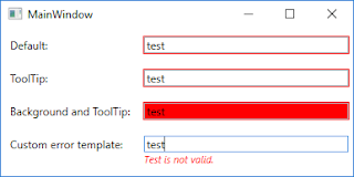
In our sample project, we have four TextBox elements. Each of them presents a different style of presenting the occurred error to the user. When an error occurs (user entered value equals test) on the data binding the attached property Validation.HasError property is set to true on the target element of the data binding process (in our case it’s TextBox element). So we can use this property to indicate if the value entered by the user is invalid. We also can use Validation.Errors attached property to retrieve error message.
Below you can see the output of our sample project. As you can see when I typed value test to each of the TextBox each of them shows me an error message in the different form.
In this example, I focused on presenting the error message to the user so I decided to use the ValidatesOnExceptions mechanism (to read more about this please go to the following link: WPF Validation — Using ValidatesOnExceptions). Let’s look at the source code especially on XAML code.
<Window x:Class="WPFValidationDisplayErrors.MainWindow"
        xmlns="http://schemas.microsoft.com/winfx/2006/xaml/presentation"
        xmlns:x="http://schemas.microsoft.com/winfx/2006/xaml"
        xmlns:d="http://schemas.microsoft.com/expression/blend/2008"
        xmlns:mc="http://schemas.openxmlformats.org/markup-compatibility/2006"
        mc:Ignorable="d"
        Title="MainWindow" Height="200" Width="400">
    <Window.Resources>
        <Style TargetType="Label">
            <Setter Property="Margin" Value="5" />
            <Setter Property="VerticalAlignment" Value="Center" />
        </Style>
        <Style x:Key="DefaultTextBoxStyle" TargetType="TextBox">
            <Setter Property="Margin" Value="5" />
            <Setter Property="VerticalAlignment" Value="Center" />
        </Style>

        <Style x:Key="ToolTipWithErrorMessageOnErrorStyle" TargetType="TextBox" BasedOn="{StaticResource DefaultTextBoxStyle}">
            <Style.Triggers>
                <Trigger Property="Validation.HasError" Value="True">
                    <Setter Property="ToolTip" Value="{Binding RelativeSource={RelativeSource Self}, Path=(Validation.Errors)[0].ErrorContent}" />
                </Trigger>
            </Style.Triggers>
        </Style>

        <Style x:Key="RedBackgroundOnErrorStyle" TargetType="TextBox" BasedOn="{StaticResource ToolTipWithErrorMessageOnErrorStyle}">
            <Style.Triggers>
                <Trigger Property="Validation.HasError" Value="True">
                    <Setter Property="Background" Value="Red" />
                </Trigger>
            </Style.Triggers>
        </Style>

        <Style x:Key="CustomErrorControlOnErrorStyle" TargetType="TextBox" BasedOn="{StaticResource DefaultTextBoxStyle}">
            <Setter Property="Validation.ErrorTemplate">
                <Setter.Value>
                    <ControlTemplate>
                        <StackPanel>
                            <AdornedElementPlaceholder x:Name="placeholder" />
                            <TextBlock FontSize="11" FontStyle="Italic" Foreground="Red"
                                       Text="{Binding ElementName=placeholder, Path=AdornedElement.(Validation.Errors)[0].ErrorContent}" />
                        </StackPanel>
                    </ControlTemplate>
                </Setter.Value>
            </Setter>
        </Style>
    </Window.Resources>
    <Grid Grid.IsSharedSizeScope="True">
        <Grid.RowDefinitions>
            <RowDefinition Height="Auto" />
            <RowDefinition Height="Auto" />
            <RowDefinition Height="Auto" />
            <RowDefinition Height="Auto" />
        </Grid.RowDefinitions>
        <Grid.ColumnDefinitions>
            <ColumnDefinition Width="Auto" SharedSizeGroup="Labels" />
            <ColumnDefinition Width="*" />
        </Grid.ColumnDefinitions>

        <Label Content="Default:" />
        <TextBox Grid.Column="1"
                 Text="{Binding Path=Default, Mode=TwoWay, ValidatesOnExceptions=True, UpdateSourceTrigger=PropertyChanged}"
                 Style="{StaticResource DefaultTextBoxStyle}" />

        <Label Content="ToolTip:" Grid.Row="1" />
        <TextBox Grid.Column="1" Grid.Row="1"
                 Text="{Binding Path=ToolTip, Mode=TwoWay, ValidatesOnExceptions=True, UpdateSourceTrigger=PropertyChanged}"
                 Style="{StaticResource ToolTipWithErrorMessageOnErrorStyle}" />

        <Label Content="Background and ToolTip:" Grid.Row="2" />
        <TextBox Grid.Column="1" Grid.Row="2"
                 Text="{Binding Path=Background, Mode=TwoWay, ValidatesOnExceptions=True, UpdateSourceTrigger=PropertyChanged}"
                 Style="{StaticResource RedBackgroundOnErrorStyle}" />

        <Label Content="Custom error template:" Grid.Row="3" />
        <TextBox Grid.Column="1" Grid.Row="3"
                 Text="{Binding Path=CustomError, Mode=TwoWay, ValidatesOnExceptions=True, UpdateSourceTrigger=PropertyChanged}"
                 Style="{StaticResource CustomErrorControlOnErrorStyle}" />
    </Grid>
</Window>
As you can see in the above code snippet we defined TextBox styles in the Window resources section. As I mentioned before to indicate if we should show error message we’re using attached Validation.HasError property. In the first row is presented default behavior of the validation errors in WPF, it only shows a red border around the TextBox. In the second row, I created a custom style to show an error message in the tooltip. In the third row, I added the background color if the value is invalid. And in the last row, I created custom error template to show error message right below TextBox.
Валидация данных
Последнее обновление: 31.10.2015
При работе с данными важную роль играет валидация данных. Прежде чем использовать полученные от пользователя данные, нам надо убедиться,
что они введены правильно и представляют корректные значения. Один из встроенных способов проверки введенных данных в WPF представлен классом
ExceptionValidationRule. Этот класс обозначает введенные данные как некорректные, если в процессе ввода возникает какое-либо исключение,
например, исключение преобразования типов.
Итак, допустим, у нас определен следующий класс:
    public class PersonModel
    {
        public string Name { get; set; }
        public int Age { get;set;}
        public string Position { get; set; }
    }
Этот класс представляет человека и предполагает три свойства: имя, возраст и должность. Понятно, что возраст должен представлять числовое значение.
Однако пользователи могут ввести что угодно. Мы можем обрабатывать ввод с клавиатуры, а можем воспользоваться классом ExceptionValidationRule,
который в случае неудачи преобразования строки в число установит красную границу вокруг текстового поля.
Сначала создадим в файле кода объект нашего класса PersonModel и установим контекст данных окна:
public partial class MainWindow : Window
{
    PersonModel Tom;
    public MainWindow()
    {
        InitializeComponent();
        Tom=new PersonModel();
        this.DataContext = Tom;
    }
}
Теперь установим привязку в xaml-коде:
<Window x:Class="DataValidationApp.MainWindow"
        xmlns="http://schemas.microsoft.com/winfx/2006/xaml/presentation"
        xmlns:x="http://schemas.microsoft.com/winfx/2006/xaml"
        xmlns:d="http://schemas.microsoft.com/expression/blend/2008"
        xmlns:mc="http://schemas.openxmlformats.org/markup-compatibility/2006"
        xmlns:local="clr-namespace:DataValidationApp"
        mc:Ignorable="d"
        Title="MainWindow" Height="250" Width="300">
    <Grid>
        <Grid.RowDefinitions>
            <RowDefinition />
            <RowDefinition />
            <RowDefinition />
        </Grid.RowDefinitions>
        <Grid.ColumnDefinitions>
            <ColumnDefinition Width="Auto" />
            <ColumnDefinition />
        </Grid.ColumnDefinitions>
        <TextBox Grid.Column="1" Height="30" Margin="0 0 15 0"/>

        <TextBox Grid.Column="1" Grid.Row="1" Height="30"  Margin="0 0 15 0">
            <TextBox.Text>
                <Binding Path="Age">
                    <Binding.ValidationRules>
                        <ExceptionValidationRule />
                    </Binding.ValidationRules>
                </Binding>
            </TextBox.Text>
        </TextBox>

        <TextBox Grid.Column="1" Grid.Row="2" Height="30" Margin="0 0 15 0" />
        <Label Content="Введите имя" Height="30" />
        <Label Grid.Row="1" Content="Введите возраст" Height="30" />
        <Label Grid.Row="2" Content="Введите должность" Height="30" />
    </Grid>
</Window>
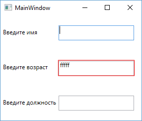
В данном случае мы задаем объект Binding для свойства Text. Данный объект имеет коллекцию правил валидации вводимых данных — ValidationRules.
Эта коллекция принимает только одно правило валидации, представленное классом ExceptionValidationRule. Запустим приложение на выполнение
и попробуем ввести в текстовое поле какое-нибудь нечисловое значение. В этом случае текстовое поле будет обведено красным цветом, указывая на то,
что в вводимых данных имеются ошибки.
Мы также можем реализовать свою логику валидации для класса модели. Для этого модель должна реализовать интерфейс IDataErrorInfo. Этот интерфейс
имеет следующий синтаксис:
public interface IDataErrorInfo
{
	string Error {get;}
    string this[string columnName] { get;}
}
Допустим, мы хотим ограничить возраст человека только положительными значениями от 0 до 100. Тогда валидация модели будет выглядеть следующим образом:
public class PersonModel : IDataErrorInfo
{
    public string Name { get; set; }
    public int Age {get;set;}
    public string Position { get; set; }
    public string this[string columnName]
    {
        get
        {
            string error=String.Empty;
            switch (columnName)
            {
                case "Age" :
					if ((Age < 0) || (Age > 100))
					{
						error = "Возраст должен быть больше 0 и меньше 100";
					}
					break;
                case "Name" :
                    //Обработка ошибок для свойства Name
                    break;
                case "Position" :
                    //Обработка ошибок для свойства Position
                    break;
            }
            return error;
        }
    }
    public string Error
    {
        get { throw new NotImplementedException(); }
    }
}
И последнее — нам осталось немного подкорректировать xaml-код. Теперь нам надо использовать в качестве правила валидации класс
DataErrorValidationRule:
<TextBox Grid.Column="1" Grid.Row="1" Height="30"  Margin="0 0 15 0">
    <TextBox.Text>
        <Binding Path="Age">
            <Binding.ValidationRules>
                <DataErrorValidationRule />
            </Binding.ValidationRules>
        </Binding>
    </TextBox.Text>
</TextBox>
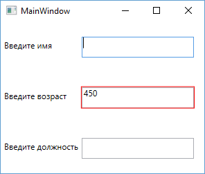
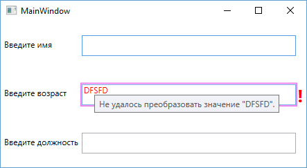
Так как число 450 больше 100 и поэтому не является валидным, то текстовое поле выделяется красным.
Настройка внешнего вида при ошибке валидации
Но это еще не все. Мы можем сами управлять через шаблоны отображением ошибки ввода. В предыдущем случае у нас граница текстового поля при ошибке
окрашивалась в красный цвет. Попробуем настроить данное действие. Для этого нам нужно использовать элемент AdornedElementPlaceholder.
Итак изменим разметку приложения следующим образом, добавив в нее шаблон элемента управления:
<Window x:Class="DataValidationApp.MainWindow"
        xmlns="http://schemas.microsoft.com/winfx/2006/xaml/presentation"
        xmlns:x="http://schemas.microsoft.com/winfx/2006/xaml"
        xmlns:d="http://schemas.microsoft.com/expression/blend/2008"
        xmlns:mc="http://schemas.openxmlformats.org/markup-compatibility/2006"
        xmlns:local="clr-namespace:DataValidationApp"
        mc:Ignorable="d"
        Title="MainWindow" Height="250" Width="300">
    <Window.Resources>
        <ControlTemplate x:Key="validationFailed">
            <StackPanel Orientation="Horizontal">
                <Border BorderBrush="Violet" BorderThickness="2">
                    <AdornedElementPlaceholder />
                </Border>
                <TextBlock Foreground="Red" FontSize="26" FontWeight="Bold">!</TextBlock>
            </StackPanel>
        </ControlTemplate>
    </Window.Resources>
    <Grid>
        <Grid.RowDefinitions>
            <RowDefinition />
            <RowDefinition />
            <RowDefinition />
        </Grid.RowDefinitions>
        <Grid.ColumnDefinitions>
            <ColumnDefinition Width="Auto" />
            <ColumnDefinition />
        </Grid.ColumnDefinitions>
        <TextBox Grid.Column="1" Height="30" Margin="0 0 15 0"/>

        <TextBox Grid.Column="1" Grid.Row="1" Height="30"  Margin="0 0 15 0"
			Validation.ErrorTemplate="{StaticResource validationFailed}" >
            <TextBox.Text>
                <Binding Path="Age">
                    <Binding.ValidationRules>
                        <DataErrorValidationRule />
                    </Binding.ValidationRules>
                </Binding>
            </TextBox.Text>
        </TextBox>

        <TextBox Grid.Column="1" Grid.Row="2" Height="30" Margin="0 0 15 0" />
        <Label Content="Введите имя" Height="30" />
        <Label Grid.Row="1" Content="Введите возраст" Height="30" />
        <Label Grid.Row="2" Content="Введите должность" Height="30" />
    </Grid>
</Window>
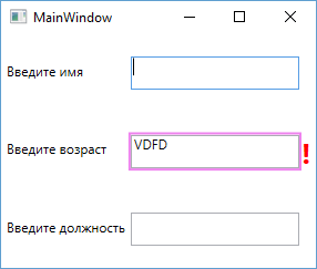
С помощью свойства Validation.ErrorTemplate мы получаем шаблон, который будет отрабатывать при ошибке валидации.
Этот шаблон, определенный выше в ресурсах окна, определяет границу фиолетового цвета вокруг элемента ввода, а также отображает рядом с ним
восклицательный знак красного цвета. Запустим приложение и попробуем ввести в текстовое поле какое-нибудь некорректное значение. В результате сработает наш шаблон:
Мы также можем определить поведение и визуализацию через триггер при установке свойства Validation.HasError в True. А с помощью свойства
ToolTip можно создать привязку к сообщению ошибки:
<Style TargetType="TextBox">
    <Style.Triggers>
        <Trigger Property="Validation.HasError" Value="True">
            <Setter Property="ToolTip"
                Value="{Binding RelativeSource={RelativeSource Self},
                    Path=(Validation.Errors)[0].ErrorContent}" />
            <Setter Property="Foreground" Value="Red" />
        </Trigger>
    </Style.Triggers>
</Style>
Обработка событий валидации
WPF предоставляет механизм обработки ошибки валидации с помощью события Validation.Error. Данное событие можно использовать в любом элементе управления.
Например, пусть при ошибке валидации при вводе в текстовое поле выскакивает сообщение с ошибкой. Для этого изменим текстовое поле следующим образом:
<TextBox Grid.Column="1" Grid.Row="1" Height="30"  Margin="0 0 15 0" Validation.Error="TextBox_Error">
    <TextBox.Text>
        <Binding Path="Age" NotifyOnValidationError="True">
            <Binding.ValidationRules>
                <DataErrorValidationRule />
            </Binding.ValidationRules>
        </Binding>
    </TextBox.Text>
</TextBox>
Здесь, во-первых, надо отметить установку свойства NotifyOnValidationError="True":
<Binding Path="Age" NotifyOnValidationError="True">
Это позволит вызывать событие валидации.
И также устанавливается сам обработчик события валидации:
<TextBox Grid.Column="1" Grid.Row="1" Height="30"  Margin="0 0 15 0"
	Validation.Error="TextBox_Error">
При этом следует отметить, что событие Validation.Error является поднимающимся (bubbling events), поэтому мы можем установить для него обработчик и в контейнере Grid или в любых других контейнерах,
в которых находится это текстовое поле. И в случае ошибки событие также будет генерироваться и обрабатываться.
И в конце определим в файле кода c# сам обработчик:
private void TextBox_Error(object sender, ValidationErrorEventArgs e)
{
    MessageBox.Show(e.Error.ErrorContent.ToString());
}
- Complete article in pdf format. — 1.4 MB
- Download MVVM_Validation_Example-noexe.zip — 408 KB
- Download MVVM_Validation_Example.zip — 863.4 KB
- Download ValidationMethods-noexe.zip — 561.3 KB
- Download ValidationMethods.zip — 815.6 KB
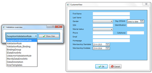
Contents
- Validation in WPF using the MVVM pattern
Introduction
I recently followed a course to become MCTS certified. The MCTS 70-511 course content is about Windows applications development with Microsoft .Net Framework 4. The things I have learned from this MCTS course, I want to share with you. I will publish several articles to give you an overview of the course. These articles will be supplemented with information that can be usefull, but was not covered by the MCTS course. In this first article, I will cover WPF and windows forms validation. My intention is to show the validation possibilities using the standard WPF framework. Validation methods discussed in this article will be illustrated with code examples that can be found on top of this article. Articles and literature used to create this article can be found in the reference section and in the code comment. If you have any remarks about this article, please feel free to contact me.
Background
In most applications, the user enters information for the application through the user interface. Data validation ensures that the entered data falls within acceptable parameters before proceeding with program execution. In other words, validation is logic that catches incorrect values and refuses them. By validating user input, you reduce the chance of input errors and you make your application more robust. WPF and windows forms validation gives you several options to catch invalid data, which are summarized below.
- ExceptionValidationRule
- ValidationRules
- BindingGroups
- IDataErrorInfo interface
- INotifyDataErrorInfo
- Data Annotations
- The ErrorProvider component (Windows Forms)
- Build validation directly into your controls
In this article I will give an in-depth discussion of each of the validation methods summarized above. Each validation method will be illustrated with a code example where the validation logic is implemented in the person class (the model). At the end of this article I will combine two validation methods, INotifyDataErrorInfo and Data Annotations to create an MVVM application that manages person records. Validation rules in the resulting application are applied to the person class by decorating its properties with validation attributes (Data Annotations). Validation errors in the application are displayed using a Silverlight-based error template, allowing for nicely styled errors.
ExceptionValidationRule
One validation approach that works closely with the WPF data binding system is that you can raise errors in your object to notify WPF of a validation error. By simply throwing an exception from a set property, you can notify WPF of an error. Ordinarily, WPF ignores any exceptions that are thrown when setting a property. The main reason for this is to preserve application flow and prevent application crashes. However, ExceptionValidationRule is a validation rule that tells WPF to report all exceptions as validation errors. The ExceptionValidationRule class inherits from the ValidationRule class, and the sealed modifier is used to prevent derivation from this class.
public sealed class ExceptionValidationRule : ValidationRule
If an exception is thrown, the WPF binding engine creates a ValidationError object and adds it to the Validation.Errors collection of the bound element. The validation error can then be displayed using the built-in WPF mechanism. By defining an error template in WPF, you can define how validation errors are styled and displayed to the application user. How to define an error template will be discussed in section reacting to validation errors. The example below shows how to set the ExceptionValidationRule for a text box in XAML code. In the code below you can also see that the NotifyOnValidationError property has been set to true for the text box, which causes the Validation.Error attached event to be raised when a validation error occurs or is cleared. The Validation.Error attached event is used to populate a validation summary list that is displayed at the bottom of the view. When the Validation.Error attached event is raised in the view, it is pushed from the view to the model using a behavior.
<TextBox>
    <TextBox.Text>
      <Binding Path="SSN"
               Mode="TwoWay"
               UpdateSourceTrigger="LostFocus"
               NotifyOnValidationError="True">
          <Binding.ValidationRules>
              <ExceptionValidationRule></ExceptionValidationRule>
          </Binding.ValidationRules>
      </Binding>
    </TextBox.Text>
    <i:Interaction.Behaviors>
        <local:ValidationBehavior/>
    <i:Interaction.Behaviors>
</TextBox>
An alternative syntax to setting the ExceptionValidationRule explicitly is to set the ValidatesOnExceptions property to true on your binding.
<TextBox>
    <TextBox.Text>
        <Binding Path="SSN"
                 Mode="TwoWay"
                 UpdateSourceTrigger="LostFocus"
                 NotifyOnValidationError="True"
                 ValidatesOnExceptions="True">
        </Binding>
    </TextBox.Text>
    <i:Interaction.Behaviors>
        <local:ValidationBehavior/>
    <i:Interaction.Behaviors>
</TextBox>
Validation logic shown in the example below prevents social security numbers from being entered that are unequal to eleven characters including two hyphens at the three and six position. A regular expression is used to enforce this validation rule. Examples of valid social security numbers are: 140-22-4532 (NJ), 601-20-4562 (AZ).
private const string RegexSSN = @"^(?!b(d)1+-(d)1+-(d)1+b)(?!123-45-6789|219-09-9999
                                |078-05-1120)(?!666|000|9d{2})d{3}-(?!00)d{2}-(?!0{4})d{4}$";
private string SSNValue = string.Empty;
public string SSN
{
    get { return SSNValue; }
    set
    {
        if (string.IsNullOrEmpty(value))
            throw new Exception("Social security number is required.");
        else if(!Regex.IsMatch(value, RegexSSN))
            throw new Exception("Please enter a valid social security number.");
        SSNValue = value;
        NotifyPropertyChanged();
    }
}
In the code example above the UpdateSourceTrigger property of the text box is set to LostFocus, which means that the bound source property is updated when the text box loses focus. However, it should be noted that the bound source property will only be updated if the text value of the text box changed from its previous value. If the initial text box value was an empty string, update of the bound source property will not take place while its value remains blank, even if the text box received and lost focus. This update behavior causes problems when you want to validate mandatory fields using the ExceptionValidationRule class because validation takes place when the bound source property is updated. One way to solve this problem is by manually updating all the bound source properties when the user click’s the Ok button. This can be accomplished using a method that iterates through all the FrameworkElements in the view thereby forcing an update of each bound source property. The implementation of this method is shown below. Using this approach you can make sure that each source properties bound to the view will be updated and validated when the user click’s the Ok button.
private void OnOkCommandExecute(object o)
{
    Window mainWindow = (Window)o;
    if (IsValid(mainWindow))
        mainWindow.Close();
}

public bool IsValid(Visual myVisual)
{
    EnumVisual(myVisual);
    if (Errors.Count == 0)
        return true;
    else
        return false;
}

public void EnumVisual(Visual myVisual)
{
    for (int i = 0; i < VisualTreeHelper.GetChildrenCount(myVisual); i++)
    {
        Visual childVisual = (Visual)VisualTreeHelper.GetChild(myVisual, i);
        if (childVisual is FrameworkElement)
        {
            LocalValueEnumerator localValues = childVisual.GetLocalValueEnumerator();
            while (localValues.MoveNext())
            {
               BindingExpressionBase bindingExpression =
                 BindingOperations.GetBindingExpressionBase(childVisual, localValues.Current.Property);
               if (bindingExpression != null)
                 bindingExpression.UpdateSource();
            }
        }
        EnumVisual(childVisual);
    }
}
Type conversion can also lead to exceptions being raised by the WPF framework. This occurs when the WPF framework is unable to convert the user input to the type of the bound source property. For example, if a text box is bound to an integer in the model, the WPF framework will attempt to convert the entered text to an integer. If the framework fails, it will generate an validation error (e.g. «Input string was not in a correct format»). This validation error can then be displayed using the built-in WPF mechanism.
ValidationRules
ValidationRules, IDataErrorInfo and INotifyDataErrorInfo are validation methods that give you the ability to indicate validation errors without throwing exceptions. In this section, the use of ValidationRules will be explained. One advantage of using ValidationRules is that you can easily reuse them in other bindings that store similar type of data. In the example below, three ValidationRules are used to validate the FirstName property of a person object. These three rules ensure that the FirstName property is mandatory and that its value consists of between two and fifty characters.
<TextBox x:Name="txtFirstName">
    <TextBox.Text>
        <Binding Path="FirstName"
                 Mode="TwoWay"
                 UpdateSourceTrigger="LostFocus"
                 NotifyOnValidationError="True">
            <Binding.ValidationRules>
                <local:RequiredValidationRule ErrorMessage="First name is required."/>
                <local:StringValidationRule MaxStringLength="50" MinStringLength="2"
                    ErrorMessage="First name needs to consist of between two and fifty chars."/>
                <local:NameValidationRule ErrorMessage="Only chars are allowed for first name."/>
            </Binding.ValidationRules>
        </Binding>
    </TextBox.Text>
    <i:Interaction.Behaviors>
        <local:ValidationBehavior/>
    </i:Interaction.Behaviors>
</TextBox>
When a new value is entered in the first name text box, each of the validation rules is evaluated in the order in which the rules are declared. In the example above, the RequiredValidationRule is evaluated first, followed by the StringValidationRule and last, the NameValidationRule is evaluated. When an evaluated ValidationRule indicates an error, the other upcoming ValidationRules will not be evaluated. In addition the bound source property will not be updated with the bad value and remains unchanged.
You can create custom validation rules by creating a class that inherits from the abstract ValidationRule class. The abstract ValidationRule class has one method that needs to be overridden in your custom ValidationRule class, the validate method. This method takes two parameters, the first is the object parameter that represents the value being evaluated, the second parameter represents the culture object in case you need to provide your own localization code. As can be seen below, the validate method returns a ValidationResult object, which contains an IsValid and an ErrorCondition property. A ValidationResult object with an IsValid value of true is considered to be valid and application execution proceeds normally. If a ValidationResult object with an IsValid value of false is returned, a new ValidationError object is created with the descriptive error text set to the content of the ErrorCondition property. The resulting ValidationError object is then added to the Validation.Errors collection of the bound element and can be displayed using the built-in WPF mechanism. The code below shows the implementation of the StringValidationRule class.
public sealed class StringValidationRule : ValidationRule
{
    private int iMaxStringLength = 0;
    private int iMinStringLength = 0;
    private string sErrorMessage = string.Empty;

    public int MaxStringLength
    {
        get { return iMaxStringLength; }
        set { iMaxStringLength = value; }
    }

    public int MinStringLength
    {
        get { return iMinStringLength; }
        set { iMinStringLength = value; }
    }

    public string ErrorMessage
    {
        get { return sErrorMessage; }
        set { sErrorMessage = value; }
    }

    public override ValidationResult Validate(object value, System.Globalization.CultureInfo culture)
    {
        string val = value.ToString();
        ValidationResult aValidationResult = null;

        if (val.Length >= MinStringLength &&
            val.Length <= MaxStringLength)
            aValidationResult = new ValidationResult(true, null);
        else
            aValidationResult = new ValidationResult(false, ErrorMessage);

        return aValidationResult;
    }
}
One disadvantage of using ValidationRules, is that they are not derived from DependencyObject. Therefore you cannot bind dependency properties directly to ValidationRules. On the internet I found two articles dealing with this shortcoming, which are article 1 and article 2. The first article uses a proxy class to make binding with ValidationRules possible. This approach will not be discussed further, if you are interested in it you can read the referenced article. The second article uses code behind to bind dependency properties to ValidationRules. This approach will be discussed below and the code of the example can be found in the included code on top of this article.
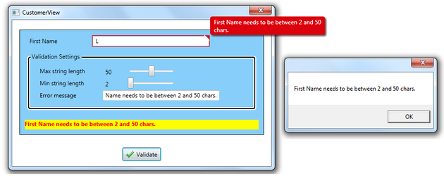
The code behind of the view is given below. There are two classes that play a role in the implementation of this validation approach, which are the StringValidationRule and the StringLengthCheck class. The StringLengthCheck class contains three dependency properties which are bound to the view in the code behind. As can be seen in the code below, the StringLengthCheck instance is defined in the resource section of the view, and it is retrieved from the view in the code behind using its resource key. After its retrieval, the bindings are set. In order to gain access to the bound dependency properties of the StringLengthCheck class, the StringValidationRule includes an instance of the StringLengthCheck class in its ValidStringLength property.
public void InitializeBinding()
{
    Binding MaxStringLengthBinding = new Binding();
    MaxStringLengthBinding.Source = MaxStringValueSlider;
    MaxStringLengthBinding.Path = new PropertyPath(Slider.ValueProperty);

    Binding MinStringLengthBinding = new Binding();
    MinStringLengthBinding.Source = MinStringValueSlider;
    MinStringLengthBinding.Path = new PropertyPath(Slider.ValueProperty);

    Binding ErrMsgBinding = new Binding();
    ErrMsgBinding.Source = txtboxErrorMsg;
    ErrMsgBinding.Path = new PropertyPath(TextBox.TextProperty);

    StringLengthCheck _aStringLengthCheckObj =
        (StringLengthCheck)this.Resources["aStringLengthCheckObj"];
    BindingOperations.SetBinding(_aStringLengthCheckObj,
        StringLengthCheck.MinStringLengthProperty, MinStringLengthBinding);
    BindingOperations.SetBinding(_aStringLengthCheckObj,
        StringLengthCheck.MaxStringLengthProperty, MaxStringLengthBinding);
    BindingOperations.SetBinding(_aStringLengthCheckObj,
        StringLengthCheck.ErrorMessageProperty, ErrMsgBinding);
}
<Window.Resources>
   <local:StringLengthCheck x:Key="aStringLengthCheckObj"></local:StringLengthCheck>
</Window.Resources>
<TextBox x:Name="txtFirstName">
   <TextBox.Text>
      <Binding Path="FirstName" Mode="TwoWay" UpdateSourceTrigger="Explicit">
         <Binding.ValidationRules>
            <local:StringValidationRule ValidStringLength="{StaticResource aStringLengthCheckObj}"/>
         </Binding.ValidationRules>
      </Binding>
   </TextBox.Text>
</TextBox>
The UpdateSourceTrigger of the first name text box is set to explicit. Explicit means that the FirstName source property is only updated and validated after you press the Validate button, which in turn invokes its corresponding handler and calls the UpdateSource() method. After validation, a message box pops up to show the validation result. In case of an error, the error is displayed using an error bar and the Silverlight-based error template. When there are no errors, the error bar is hidden using a data trigger.
private void btnValidate_Click(object sender, RoutedEventArgs e)
{
    string errorList = string.Empty;

    txtFirstName.GetBindingExpression(TextBox.TextProperty).UpdateSource();
    if (Validation.GetHasError(txtFirstName))
    {
        ReadOnlyObservableCollection<ValidationError> errorCollection
            = Validation.GetErrors(txtFirstName);
        foreach (ValidationError err in errorCollection)
            errorList += err.ErrorContent + Environment.NewLine;
        System.Windows.MessageBox.Show(errorList);
    }
    else
        System.Windows.MessageBox.Show("Validation succeeded for first name property.");
}
BindingGroups
The validation approaches discussed so far allow you to validate individual properties. However, there are situations where you need to perform a validation which relate to more than one property. For example, a membership to be valid needs that its membership end date falls after its start date. Binding groups can be used for this kind of validation that relates to more than one property. Binding groups also enable you to perform validation across multiple objects, an example can be found here. The idea behind binding groups is similar to implementing custom ValidationRules, as discussed in the previous section. But instead of applying the validation rule to a single binding, you attach it to the container that holds all your bound controls. This is illustrated in the example below, where a binding group is created for a grid container by setting its binding group property. The binding group has a single validation rule, named PersonValidationRule and this rule is automatically applied to the bound person that is stored within the DataContext of the grid.
<Grid x:Name="grdCustomerInformation" Margin="10" DatePicker.LostFocus="Control_LostFocus">
    <Grid.BindingGroup>
        <BindingGroup x:Name="personBindingGroup">
            <BindingGroup.ValidationRules>
                <local:PersonValidationRule/>
            </BindingGroup.ValidationRules>
        </BindingGroup>
    </Grid.BindingGroup>
    <DatePicker>
        <DatePicker.SelectedDate>
            <Binding Path="MembershipStartDate"
                     Mode="TwoWay"
                     UpdateSourceTrigger="PropertyChanged"
                     BindingGroupName="personBindingGroup"></Binding>
        </DatePicker.SelectedDate>
    </DatePicker>
</Grid>
In the validation rules discussed in the previous section, the Validate() method receives a single value object to inspect. When using binding groups, the Validate() method receives a binding group object instead of a value object, as illustrated in the code below. Validation starts by retrieving the person object, applying validation logic to its member properties and returning an error if the validation logic is not met. Alternatively, you can use BindingGroup.TryGetValue or BindingGroup.GetValue to retrieve member properties of the person object, which can then be validated. These two methods allow for better error control when accessing properties of the person object. In case of a validation error in the binding group, the WPF binding engine creates a ValidationError object which is then added to the Validation.Errors collection of the element associated with the BindingGroup. The resulting errors can then be styled and displayed using the built-in WPF mechanism.
public sealed class PersonValidationRule : ValidationRule
{
    public override ValidationResult Validate(object value,
        System.Globalization.CultureInfo cultureInfo)
    {
        ValidationResult aValidationResult = null;
        BindingGroup bindingGroup = (BindingGroup)value;
        Person person = (Person)bindingGroup.Items[0];

        if(person.MembershipEndDate > person.MembershipStartDate)
            aValidationResult = new ValidationResult(true, null);
        else
            aValidationResult = new ValidationResult(false,
                "Start date must be earlier than end date.");
        return aValidationResult;
    }
}
Binding groups use a transactional editing system, which means that it’s up to you to commit the edit before the validation logic runs. The easiest way to do this is to call the BindingGroup.CommitEdit() method. You can call this method from an event handler that runs when a button is clicked or when an editing control loses focus. In this example the LostFocus event of the two DatePickers is caught in the grid. This is possible because the LostFocus event is a bubbling event, and bubbles up the visual tree until it reaches the handler in the grid container. The LostFocus EventHandler is shown here:
private void Control_LostFocus(object sender, RoutedEventArgs e)
{
    personBindingGroup.CommitEdit();
}
As mentioned above, the properties MembershipStartDate and MembershipEndDate are validated using the validation rule defined in the binding group of the grid. The other properties in the person class are validated using the IDataErrorInfo interface, which will be discussed in the next section.
When validation fails, the entire grid is considered invalid and is outlined with a thin red border, as shown below. You can change the grid outlining by modifying its error template. In the view below, the error templates of the controls in the grid are set to {x:Null}, which causes them to revert to their default look in case of an error. Hence all the validation errors in the view are only displayed in the validation summary. The validation summary consists of an items control that is bound to the ErrorContent of the Validation.Errors collection. When all validation errors are cleared, the error summary is hidden using a datatrigger. In addition the Ok button will be enabled once there are no errors.
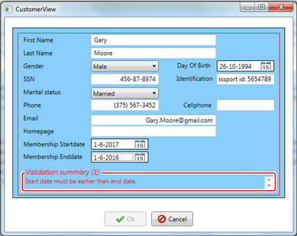
One disadvantage of using binding groups is that they are tightly coupled, which means that custom validation rules are unlikely to be reused in another binding group then for which they were intended.
IDataErrorInfo
Implementing the IDataErrorInfo interface enables you to build validation directly into your model. The IDataErrorInfo interface consists of two members, the first member is the error property, which provides an error message to indicate problems with the entire object. The value of the Error property can be accessed by directly querying the property value and is frequently not implemented. If you want to use the Error property you need to implement your own custom error reporting. How to do this will be discussed later in this section. The second member of the IDataErrorInfo interface is the item property, which provides error messages to indicate problems with properties of the object. Whenever a bound source property changes value, the WPF binding engine validates the new value by passing the property name to IDataErrorInfo.Item property. Resulting ValidationError objects are then added to the Validation.Errors collection of the bound element, which can then be displayed using the built-in WPF mechanism. The IDataErrorInfo interface is defined as follows:
public interface IDataErrorInfo
{
    string Error { get; }
    string this[ string columnName ] { get; }
}
Controls that are bound to objects that implements the IDataErrorInfo interface should set their ValidatesOnDataErrors property to true as shown below.
<TextBox>
    <TextBox.Text>
        <Binding Path="SSN"
                 Mode="TwoWay"
                 UpdateSourceTrigger="LostFocus"
                 ValidatesOnDataErrors="True">
        </Binding>
    </TextBox.Text>
</TextBox>
In the example below the IDataErrorInfo interface is implemented in the person class. Mandatory properties such as FirstName, Birthday and Gender are validated by checking if they contain a value. The email address and the social security number are checked using regular expressions. Membership start date and end date are validated using cross property validation. This cross property validation is done in the item property, alternatively it can also be done in the error property.
public bool IsValid
{
    get { return string.IsNullOrEmpty(this.Error); }
}

public string Error
{
    get
    {
        List<string> errors = new List<string>();
        PropertyDescriptorCollection properties = TypeDescriptor.GetProperties(this);
        foreach (PropertyDescriptor property in properties)
        {
            string msg = this[property.Name];
            if (!string.IsNullOrWhiteSpace(msg))
            {
                errors.Add(msg);
            }
        }
        return string.Join(Environment.NewLine, errors);
    }
}

public string this[string columnName]
{
    get
    {
        string result = string.Empty;
        switch (columnName)
        {
            case "FirstName" :
                if (string.IsNullOrEmpty(FirstName))
                    result = "First name is required.";
                else if (FirstName.Length < 2 || FirstName.Length > 50)
                    result = "First name needs to be between 2 and 50 chars.";
                break;
            case "Gender":
                if (Gender == null)
                    result = "Gender is required.";
                break;
            case "SSN" :
                if (string.IsNullOrEmpty(SSN))
                    result = "Social security number is required.";
                else if (!Regex.IsMatch(SSN, RegexSSN))
                    result = "Please enter a valid social security number.";
                break;
            case "Email":
                if (string.IsNullOrEmpty(Email))
                    result = "Email address is required.";
                else if (!Regex.IsMatch(Email, RegexEmail))
                    result = "Please enter a valid email address.";
                break;
            case "DayOfBirth":
                if (DayOfBirth == null)
                    result = "Day of birth is required.";
                else if (DateTime.Now.AddYears(-18) < DayOfBirth)
                    result = "You must be at least 18 years old to be an member.";
                break;
            case "MembershipStartDate":
            case "MembershipEndDate":
                if (MembershipStartDate > MembershipEndDate)
                    result = "Membership start date must be earlier than end date.";
                break;
            default:
                break;
        }
        return result;
    }
}

private void NotifyPropertyChanged(string propertyName)
{
    if (PropertyChanged != null)
    {
        PropertyChanged(this, new PropertyChangedEventArgs(propertyName));

        if (propertyName != "Error" && propertyName != "IsValid")
        {
            PropertyChanged(this, new PropertyChangedEventArgs("Error"));
            PropertyChanged(this, new PropertyChangedEventArgs("IsValid"));
        }
    }
}
There are several things to note about the view below. The first thing to note is that the validation summary displays all the active errors in the view, this is made possible by binding the Error property to the summary text box. The Error property contains all the object errors separated by a new line character. When there are no active errors, the error summary is hidden using a DataTrigger that is bound to the IsValid property. During the implementation of the IsValid and Error property, I noticed that bindings to these properties were not updated when a change occurred in these properties. I solved this problem by triggering a PropertyChanged event for these two properties each time a property in the person object changed, as can be seen in the NotifyPropertyChanged method. The Ok button is bound to a command, which can only be executed when the IsValid property returns true.
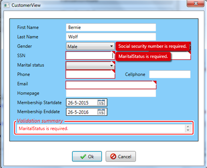
One disadvantage of the IDataErrorInfo interface is that it already displays validation errors when the view is loaded for the first time, as can be seen in the view above. An alternative syntax to setting the ValidatesOnDataErrors property to true is to implement the DataErrorValidationRule that checks for errors that are raised by the IDataErrorInfo implementation. By setting the ValidatesOnTargetUpdated property to false, you can suppress the displaying of validation errors when the target is updated by the source.
<TextBox>
    <TextBox.Text>
        <Binding Path="FirstName" Mode="TwoWay" UpdateSourceTrigger="LostFocus">
            <Binding.ValidationRules>
                <DataErrorValidationRule ValidatesOnTargetUpdated="false"/>
            </Binding.ValidationRules>
        </Binding>
    </TextBox.Text>
</TextBox>
INotifyDataErrorInfo
The INotifyDataErrorInfo was not covered in the MCTS 70-511 course, because this interface was added in the 4.5 .Net Framework. Similar to IDataErrorInfo, the INotifyDataErrorInfo interface allows you to indicate errors without throwing exceptions. In addition, it provides more flexibility then its predecessor IDataErrorInfo and should in general be used when implementing new classes. The INotifyDataErrorInfo interface has the following advantages:
- It supports multiple errors per property.
- It supports custom error objects (some other type than string).
- It makes it possible to invalidate a property when setting another property (Cross property validation).
- It supports asynchronous server-side validations. Once the validations are completed, the view is notified by raising the ErrorsChanged event.
For controls to use the INotifyDataErrorInfo interface, they have to set the ValidatesOnNotifyDataErrors property to true, which is the default value. However it is a good idea to set it explicitly to make your intention clear.
<TextBox>
    <TextBox.Text>
        <Binding Path="FirstName"
                 Mode="TwoWay"
                 UpdateSourceTrigger="LostFocus"
                 ValidatesOnNotifyDataErrors="True">
        </Binding>
    </TextBox.Text>
</TextBox>
As shown below, the INotifyDataErrorInfo interface consists of three members. The first member is the HasErrors property which returns true or false to indicate the presence of errors in the object. GetErrors returns an error list for the specified property or for the entire object in case the passed propertyname is null. The last member is the ErrorsChanged event which is raised whenever the error collection changes.
public interface INotifyDataErrorInfo
{
   bool HasErrors { get; }
   event EventHandler<DataErrorsChangedEventArgs> ErrorsChanged;
   IEnumerable GetErrors(string propertyName);
}
Before you can implement these three INotifyDataErrorInfo members you need to create a private collection to track errors in your object. The easiest way to track errors is by using a thread safe concurrent dictionary that stores error objects. A concurrent dictionary is used instead of a regular one because asynchronous validation can lead to multiple threads accessing the same dictionary.
private ConcurrentDictionary<string, ICollection<Error>> propertyErrors =
    new ConcurrentDictionary<string, ICollection<Error>>();
The first argument of the dictionary is the propertyname. Each property can have one or more errors, as can be seen by the second parameter (ICollection<Error>) of the dictionary. In this example, the dictionary stores a list of custom error objects. The implementation of this class is shown below, it consists of a string property that describes the error message and an enumeration property that specifies the severity of the error.
public enum Severity
{
    INFORMATION,
    WARNING,
    ERROR
}

public class Error
{
    private Severity _severity = Severity.ERROR;
    private string _message = string.Empty;

    public Error(string message, Severity severity)
    {
        Message = message;
        Severity = severity;
    }

    public string Message
    {
        get { return _message; }
        set { _message = value; }
    }

    public Severity Severity
    {
        get { return _severity; }
        set { _severity = value; }
    }

    public override string ToString()
    {
        return Message;
    }
}
The person class below shows how to implement the INotifyDataErrorInfo interface. For illustrative purposes, only the validation of two properties is shown, FirstName and HomePage. The complete implementation of the interface can be found in the included code on top of this article. In addition to the three mandatory members required to implement the INotifyDataErrorInfo interface, two helper methods have been added to the person class, named SetErrors and ClearErrors. These two methods facilitate error processing and raise the ErrorsChanged event whenever they modify the error collection. Validation of the FirstName property is implemented in the method IsFirstNameValid. This method checks if the FirstName length is between two and fifty characters, if so all errors are cleared. In case validation fails, a descriptive error is added to the errors collection of the FirstName property and the ErrorsChanged event is raised.
As mentioned earlier, the INotifyDataErrorInfo interface supports asynchronous validation, thereby keeping the view responsive during the validation process. For illustrative purposes, the person class implements asynchronous validation of the entered Homepage URL. Validation of the URL starts by calling the UrlValidationAsync() method which in turn calls the IsReachableURL() method. The IsReachableURL() method uses a task with a thread sleep in order to simulate a long running blocking call. When this method returns, the view is updated using the method SetErrors or ClearErrors. In addition to asynchronous validation, the INotifyDataErrorInfo interface also allows easy cross property validation. This is illustrated in the person class where cross property validation ensures that the membership start date is always earlier than the end date.
public class Person : INotifyPropertyChanged, INotifyDataErrorInfo
{
    private string FirstNameValue = string.Empty;
    public string FirstName
    {
        get { return FirstNameValue; }
        set
        {
            if (FirstNameValue != value)
            {
                FirstNameValue = value;
                IsFirstNameValid(value);
                NotifyPropertyChanged();
            }
        }
    }

    private bool IsFirstNameValid(string firstName)
    {
        ICollection<Error> validationErrors = new List<Error>();
        bool IsValid = false;

        if (string.IsNullOrEmpty(firstName))
            validationErrors.Add(new Error("First name is required.", Severity.ERROR));
        else if(firstName.Length < 2 || firstName.Length > 50)
            validationErrors.Add(new Error("First name must be between 2 and 50 chars.",
                                            Severity.ERROR));

        IsValid = validationErrors.Count == 0;
        if (IsValid)
            ClearPropertyErrors("FirstName");
        else
            SetErrors("FirstName", validationErrors);

        return IsValid;
    }

    private string HomepageValue = string.Empty;
    public string HomePage
    {
        get { return HomepageValue; }
        set
        {
            if (HomepageValue != value)
            {
                HomepageValue = value;
                UrlValidationAsync(value);
                NotifyPropertyChanged();
            }
        }
    }

    private async void UrlValidationAsync(string urlValue)
    {
        ICollection<Error> validationErrors = new List<Error>();
        bool IsValid = false;

        if (!string.IsNullOrEmpty(urlValue))
        {
            if (!Uri.IsWellFormedUriString(urlValue, UriKind.Absolute))
            {
                validationErrors.Add(new Error("Please enter a valid URL.", Severity.ERROR));
            }
            else
            {

                SetErrors("HomePage", new List<Error> { new Error("HomePage validation in progress.",
                           Severity.INFORMATION) });
                bool isReachableTask = await IsReachableURL(urlValue);
                if (!isReachableTask)
                    validationErrors.Add(new Error("URL is not reachable.", Severity.ERROR));
            }
        }

        IsValid = validationErrors.Count == 0;
        if (IsValid)
            ClearPropertyErrors("HomePage");
        else
            SetErrors("HomePage", validationErrors);
    }

    private Task<bool> IsReachableURL(string urlValue)
    {
        return Task<bool>.Factory.StartNew(() =>
        {
            bool isReachableURL = false;

            try
            {
                Thread.Sleep(5000);
                WebClient client = new WebClient();
                string urlContent = client.DownloadString(urlValue);
                isReachableURL = urlContent.Length > 0;
            }
            catch (Exception)
            {
                isReachableURL = false;
            }

            return isReachableURL;
        });
    }

    public bool HasErrors
    {
        get { return propertyErrors.Count > 0; }
    }

    public System.Collections.IEnumerable GetErrors(string propertyName)
    {
        if (string.IsNullOrEmpty(propertyName))
            return propertyErrors.Values;
        else if (propertyErrors.ContainsKey(propertyName) &&
                (propertyErrors[propertyName] != null) &&
                propertyErrors[propertyName].Count > 0)
            return propertyErrors[propertyName].ToList();
        else
            return null;
    }

    public event EventHandler<DataErrorsChangedEventArgs> ErrorsChanged;
    private void NotifyErrorChanged(string propertyName)
    {
        if (ErrorsChanged != null)
            ErrorsChanged(this, new DataErrorsChangedEventArgs(propertyName));
    }

    public event PropertyChangedEventHandler PropertyChanged;
    private void NotifyPropertyChanged([CallerMemberName] string propertyName = "")
    {
        if (PropertyChanged != null)
            PropertyChanged(this, new PropertyChangedEventArgs(propertyName));
    }

    private void ClearPropertyErrors(string propertyName)
    {
        if (propertyErrors.ContainsKey(propertyName))
        {
            ICollection<Error> existingErrors = null;
            propertyErrors.TryRemove(propertyName, out existingErrors);
            NotifyErrorChanged(propertyName);
        }
    }

    private void SetErrors(string propertyName, ICollection<Error> errors)
    {
        if (propertyErrors.ContainsKey(propertyName))
        {
            ICollection<Error> existingErrors = null;
            propertyErrors.TryRemove(propertyName, out existingErrors);
        }
        propertyErrors.TryAdd(propertyName, errors);
        NotifyErrorChanged(propertyName);
    }
}
As mentioned, WPF notifies the user of a validation error by highlighting the element in error with a small red border without any tooltip. The possibilities to customize error templates will be discussed in section reacting to validation errors. In search of a good error template to use, I found this article which describes a WPF error template based on Silverlight. In order to use it effectively, I made three changes to this error template. The first change I made was that I added the ability to display multiple errors per property. The second change is to display an image next to the error message to indicate the error severity. The third change was to replace the IsFocused event in the datatrigger by the IsKeyboardFocusWithin event, which made it possible to also apply the error template to DatePickers. The XAML code below shows part of the error template that displays the error message and its corresponding icon.
<ItemsControl ItemsSource="{Binding ElementName=adorner, Path=AdornedElement.(Validation.Errors)}">
   <ItemsControl.ItemTemplate>
      <DataTemplate>
         <StackPanel Orientation="Horizontal">
            <Image Margin="8,3,2,3">
               <Image.Style>
                  <Style TargetType="{x:Type Image}">
                     <Setter Property="Source" Value="/Images/Error_16x16.png"/>
                     <Style.Triggers>
                        <DataTrigger Binding="{Binding ErrorContent.Severity}"
                                     Value="{x:Static local:Severity.WARNING}">
                           <Setter Property="Source" Value="/Images/Warning_16x16.png"/>
                        </DataTrigger>
                        <DataTrigger Binding="{Binding ErrorContent.Severity}"
                                     Value="{x:Static local:Severity.INFORMATION}">
                           <Setter Property="Source" Value="/Images/Information_16x16.png"/>
                        </DataTrigger>
                     </Style.Triggers>
                  </Style>
               </Image.Style>
            </Image>
            <TextBlock Foreground="White"
                       Margin="2,3,8,3"
                       TextWrapping="Wrap"
                       Text="{Binding ErrorContent.Message}"/>
         </StackPanel>
      </DataTemplate>
   </ItemsControl.ItemTemplate>
</ItemsControl>
By using the Silverlight-based error template, validation errors are nicely styled, as can be seen in the view below. A control in error will be surrounded by a red border. When the control in error receives focus or the user hovers the mouse over the tooltip corner, a pop-up displaying all errors will be shown. The main advantage of using the Silverlight-based error template is that error messages will not appear on top of other elements because adorners are always placed visually on top. The Ok button handler closes the view only when the IsValid property returns true, which means that there are no more errors in the view.
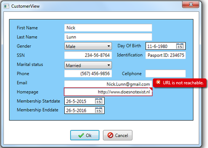
As explained earlier, the entered HomePage URL is validated asynchronously. When using asynchronous validation you need to inform the user about the validation progress. I implemented a simple solution that displays an informational message to the user, indicating that asynchronous validation is in progress. When the asynchronous validation is finished, the informational message is cleared or replaced by a list of validation errors that occurred during validation.
Data Annotations and INotifyDataErrorInfo
Another validation approach which was not part of the MCTS 70-511 exam but worth mentioning because of its ease of use, is the use of Data Annotations. Although the primary use of Data Annotations is in data classes (also known as entity classes), you can also use Data Annotations in custom classes. Before you can use Data Annotations, you need to add a reference to System.ComponentModel.DataAnnotations and refer the namespace in your class. Data Annotations attributes fall into three categories: validation attributes, display attributes and data modeling attributes. Without going into details, display attributes are used to specify how data from a class is displayed and data modeling attributes specify the relationships between data classes. Details can be found in this msdn article. Validation attributes derive from the ValidationAttribute class and are used to enforce validation rules. A complete overview of all the different supported validation types can be found in this msdn article.
Validation rules and error messages can be specified for class properties by decorating them with validation attributes. One thing you should keep in mind is that the DataGrid control is the only control that automatically applies validation attributes. When you do not use the DataGrid control, you must manually validate property values. The validation approach discussed in this section is based on a combination of INotifyDataErrorInfo interface and the use of Data Annotations. Using this combination of validation techniques, validation can be implemented in the person class by decorating each property with one or more validation attributes. When a source property is set in the person class, validation of that property takes place by calling the ValidateProperty method which then checks if the new value meets its validation rules.
private string PhoneValue = string.Empty;
[Required(AllowEmptyStrings = false, ErrorMessage = "Phone number is required.")]
[Phone(ErrorMessage = "Enter a valid phone number.")]
public string Phone
{
    get { return PhoneValue; }
    set
    {
        if (PhoneValue != value)
        {
            ValidateProperty(value);
            PhoneValue = value;
            NotifyPropertyChanged();
        }
    }
}

private string EmailValue = string.Empty;
[Required(AllowEmptyStrings = false, ErrorMessage = "Email is required.")]
[EmailAddress(ErrorMessage = "Please enter a valid email address.")]
public string Email
{
    get { return EmailValue; }
    set
    {
        if (EmailValue != value)
        {
            ValidateProperty(value);
            EmailValue = value;
            NotifyPropertyChanged();
        }
    }
}

protected void ValidateProperty(object value, [CallerMemberName] string propertyName = "")
{
    ICollection<System.ComponentModel.DataAnnotations.ValidationResult> validationErrors =
        new List<System.ComponentModel.DataAnnotations.ValidationResult>();

    bool isValid =  Validator.TryValidateProperty(value,
        new ValidationContext(this, null, null)
        { MemberName = propertyName },
        validationErrors);

    if (isValid)
        ClearPropertyErrors(propertyName);
    else
        SetErrors(propertyName, validationErrors);
}
Besides the Validator.TryValidateProperty there is also a Validator.TryValidateObject. This method is useful when you want to validate the complete object. The use of Validator.TryValidateObject has one disadvantage, when the value of a property is null, none of the validation attributes will be enforced, except the RequiredAttribute. This is in particular a problem if you implement a custom ValidationAttribute that should do something special in case of a null value. You can overcome this disadvantage by using Validator.TryValidateProperty and iterate over all properties of the class, as shown in the code below.
public bool IsValid()
{
    PropertyInfo[] properties = this.GetType().GetProperties();
    foreach (PropertyInfo property in properties)
    {
        if (property.GetCustomAttributes(typeof(ValidationAttribute), true).Any())
        {
            object value = property.GetValue(this, null);
            ValidateProperty(value, property.Name);
        }
    }

    return !HasErrors;
}

public bool HasErrors
{
    get { return propertyErrors.Count > 0; }
}
If the different supported validation types don’t fit, you can derive from the ValidationAttribute and write your own implementation. An example of this is the AgeCheckAttribute class shown below.
private DateTime? DayOfBirthValue = null;
[Required(ErrorMessage = "Day of birth is required.")]
[AgeCheck(18, ErrorMessage = "You must be at least 18 years old to be a member.")]
public DateTime? DayOfBirth
{
    get { return DayOfBirthValue; }
    set
    {
        if (DayOfBirthValue != value)
        {
            ValidateProperty(value);
            DayOfBirthValue = value;
            NotifyPropertyChanged();
        }
    }
}

[AttributeUsageAttribute(AttributeTargets.Property | AttributeTargets.Field | AttributeTargets.Parameter, AllowMultiple = false)]
public class AgeCheckAttribute : ValidationAttribute
{
    public AgeCheckAttribute(int minimumAge) { MinimumAge = minimumAge; }
    public AgeCheckAttribute(int minimumAge, string errorMessage) :
        base(() => errorMessage) { MinimumAge = minimumAge; }

    protected override ValidationResult IsValid(object value, ValidationContext validationContext)
    {
        DateTime? birthDate = (DateTime)value;

        if (birthDate != null &&
            DateTime.Now.AddYears(-1 * MinimumAge) > birthDate)
            return ValidationResult.Success;
        else
            return new ValidationResult(FormatErrorMessage(validationContext.DisplayName));
    }

    public int MinimumAge { get; private set; }
}
Alternatively, you can create a custom validation method, as shown below.
private DateTime MembershipEndDateValue = DateTime.Now.AddYears(1);
[CustomValidation(typeof(Person), "IsTimeSpanValid")]
public DateTime MembershipEndDate
{
    get { return MembershipEndDateValue; }
    set
    {
        if (MembershipEndDateValue != value)
        {
            MembershipEndDateValue = value;
            ValidateProperty(value);
            NotifyPropertyChanged();
        }
    }
}

public static ValidationResult IsTimeSpanValid(object value, ValidationContext validationContext)
{
    Person aPerson = (Person) validationContext.ObjectInstance;

    if (aPerson.MembershipStartDate < aPerson.MembershipEndDate)
        return ValidationResult.Success;
    else
        return new ValidationResult("Start date must be earlier than end date.");
}
Reacting to validation errors
The WPF Binding class establishes a relationship between the target and source properties. The Binding.Mode property determines how bound controls behave in response to changes in either the source or the target value. The most commonly used value for the Binding.Mode property is TwoWay, allowing data editing of the source property. A value of OneWay is typically used in applications that display data but do not allow data to be edited. Sometimes a value needs to be converted first in order to be synchronised with its source.
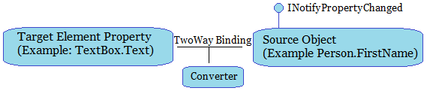
Validation occurs when the binding writes data to the underlying source property. The moment when the binding writes data to the underlying source is determined by the UpdateSourceTrigger property of the Binding. Hence the moment when validation takes place is also determined by the UpdateSourceTrigger property. Controls such as text boxes have their UpdateSourceTrigger set to LostFocus, which means that validation happens when focus leaves the controls. The value can also be set to PropertyChanged or Explicit, which means respectively that validation takes place when the value of the control changes or that validation has to be explicitly invoked on the binding. When using text boxes, you want to give validation feedback after the user has entered data. Because immediate validation of keyboard input can be problematic. A user can pass through a state which is not valid without doing anything «wrong». For example, a text box that accepts social security numbers. When the user enters the number, the control passes through invalid states until it reaches the completely filled out social security number. Therefore you should set the UpdateSourceTrigger property for text boxes to LostFocus.
WPF validation errors can be shown to the application user in different ways:
- Display the error collection using a custom error template.
- Handling the Validation.Error attached event to set for example an error message.
- React to the Validation.HasError attached property to set for example the ToolTip of a control to display the first error of the Validation.Errors collection using a trigger.
As mentioned earlier, when a validation error occurs a new ValidationError object is created and added to the Validation.Errors collection of the bound element. The Validation.Errors collection itself is not user settable, but you can use it in an error template. When the Validation.Errors collection is not empty, the Validation.HasError attached property of the bound element is set to true. Also, if the NotifyOnValidationError property of the Binding is set to true, the binding engine raises the Validation.Error attached event on the element to indicate the newly added error.
By default, WPF notifies you of an error by highlighting the element with the validation error with a thin red border. You can change this default behavior by providing your own custom error template and referring it in the ErrorTemplate attached property of the control that is using the template. The ErrorTemplate attached property takes a ControlTemplate value. By using a custom error template you can add visual elements such as images and text to indicate the validation error. One example of a custom error template is the in the previous section discussed Silverlight-based error template.
Error templates use the adorner layer, which is a drawing layer that exists above the window content. Central to the adorner layer is the AdornedElementPlaceholder which represents the control itself. By using the AdornedElementPlaceholder, you can arrange your error content in relation to the control underneath. This allows for a wide range of custom error templates that can be created using different layout panels such as a dockpanel, grid or stackpanel. One thing you should take into account when designing a custom error template is that the adorner layer can overwrite other elements in your view By carefully designing your error template you can avoid this.
The example below shows an error template that uses a red border and adds an error image and an error text on top of the text box with the invalid input. A style trigger sets the ToolTip property of the text box, which is invoked when the Validation.HasError attached property is true, indicating the presence of an error. In case of an error, the error will be visible in the ToolTip when the mouse hovers over the text box. The second ToolTip will be visible when the mouse hovers over the error image as indicated by the image ToolTip property. The error template below is part of a style and will automatically be applied to text boxes, as can be seen by the TargetType. Alternatively you can refer to an error template explicitly by setting the Validation.ErrorTemplate attached property.
<Style TargetType="{x:Type TextBox}">
    <Style.Triggers>
        <Trigger Property="Validation.HasError" Value="true">
            <Setter Property="ToolTip">
                <Setter.Value>
                    <Binding RelativeSource="{RelativeSource Mode=Self}"
                             Path="(Validation.Errors)[0].ErrorContent"/>
                </Setter.Value>
            </Setter>
        </Trigger>
    </Style.Triggers>
    <Setter Property="Validation.ErrorTemplate">
        <Setter.Value>
            <ControlTemplate>
                <DockPanel LastChildFill="True">
                    <StackPanel Orientation="Horizontal" DockPanel.Dock="Top">
                        <Image Width="16"
                                Height="16"
                                HorizontalAlignment="Center"
                                VerticalAlignment="Center"
                                Source="/Images/Error_16x16.png">
                            <Image.ToolTip>
                                <Binding ElementName="ErrorAdorner"
                                Path="AdornedElement.(Validation.Errors)[0].ErrorContent"/>
                            </Image.ToolTip>
                        </Image>
                        <TextBlock Foreground="Red" FontSize="12" Margin="2,0,0,0">
                            <TextBlock.Text>
                               <Binding ElementName="ErrorAdorner"
                                   Path="AdornedElement.(Validation.Errors)[0].ErrorContent"/>
                            </TextBlock.Text>
                        </TextBlock>
                    </StackPanel>
                    <Border Margin="0,2,0,0" BorderThickness="1" BorderBrush="Red">
                        <AdornedElementPlaceholder x:Name="ErrorAdorner"></AdornedElementPlaceholder>
                    </Border>
                </DockPanel>
            </ControlTemplate>
        </Setter.Value>
    </Setter>
</Style>
Validation errors can also be displayed by handling the Validation.Error attached event. To use this event you need to set the NotifyOnValidationError property to true. When the NotifyOnValidationError is set to true, the Validation.Error attached event is raised when an error occurs and when it is cleared. The Validation.Error attached event is a bubbling event. It is raised first in the control where the validation error occurred and then it bubbles up the visual tree. Thus you can create a local error handler, that handles errors from a specific control. Alternativley, you can create an error handler that is executed higher in the visual tree to create a more generalized validation error handler, as shown below.
<TextBox Name="TextBox1"
         Validation.Error="TextBox1_Error"
         NotifyOnValidationError="True"
         ValidatesOnExceptions="True"
         ValidatesOnDataErrors="True"/>


<Grid Validation.Error="Grid_Error" Name="mainGrid">
The Validation.Error attached event includes an instance of ValidationErrorEventArgs, which contains two important properties, Action which contains information if the error is added or cleared and the Error object that contains information about the error. The Error object consists of the following properties:
- BindingInError : Contains a reference to the binding object that caused the validation error.
- RuleInError : Contains a reference to the ValidationRule that caused the validation error.
- ErrorContent : Contains the string set by the validationRule object that returned the validation error.
- Exception : Contains a reference to the exception, if any, that caused the validation error.
private void Grid_Error(object sender, ValidationErrorEventArgs e)
{
    if (e.Action == ValidationErrorEventAction.Added)

    else (e.Action == ValidationErrorEventAction.Removed)

}
The validation summary control is used several times in this article to display active errors. This is made possible by binding the error collection in the person class with this control. The error collection is kept up to date by passing the Validation.Error attached event from the view to the person class using Interaction.Behaviors. Before you can use Interaction.Behaviors you need to add a reference to the System.Windows.Interactivity.dll and refer the namespace in your view, as shown below. The System.Windows.Interactivity.dll assembly is available with Visual Studio 2012 and onwards. Using this assembly you can push events from the view to the person model.
<Window xmlns:i="clr-namespace:System.Windows.Interactivity;assembly=System.Windows.Interactivity">

<TextBox x:Name="txtFirstName">
    <TextBox.Text>
        <Binding Path="FirstName" Mode="TwoWay"
                 UpdateSourceTrigger="LostFocus"
                 ValidatesOnDataErrors="True"
                 NotifyOnValidationError="True">
        </Binding>
    </TextBox.Text>
    <i:Interaction.Behaviors>
        <behaviors:ValidationBehavior/>
    </i:Interaction.Behaviors>
</TextBox>
The implementation of the ValidationBehavior class is shown below. This class is called from the view, and adds or clears errors in the person class.
public class ValidationBehavior : Behavior<FrameworkElement>
{
    protected override void OnAttached()
    {
        AssociatedObject.AddHandler(System.Windows.Controls.Validation.ErrorEvent,
            new EventHandler<ValidationErrorEventArgs>(OnValidationError));
    }

    private void OnValidationError(object sender, ValidationErrorEventArgs e)
    {
        Person aPerson = AssociatedObject.DataContext as Person;
        if (aPerson != null)
            if (e.Action == ValidationErrorEventAction.Added &&
                !aPerson.Errors.Contains(e.Error))
                aPerson.Errors.Add(e.Error);
            else if (e.Action == ValidationErrorEventAction.Removed &&
                    aPerson.Errors.Contains(e.Error))
                aPerson.Errors.Remove(e.Error);
    }
}
The view below illustrates the use of different error templates. Each control in the view uses a different error template to illustrate the customization possibilities. Implementation details of the templates can be found in the resource dictionary called ErrorTemplates.xaml. The error template of the email text box is similar to the Errorprovider found in windows forms, it blinks three times on startup, which is made possible by using an animation. As mentioned earlier my preference goes to the Silverlight-based error template.
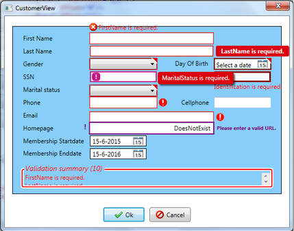
Build validation directly into your controls
In addition to the previously discussed validation methods, you can also build validation directly into your controls. This type of validation is called field or form level validation. Field level validation checks the data as it is entered in the control while form level validation checks the complete form after the user has filled in all the fields. Form level validation can be started by for example clicking the Ok button in the view.
One example of field level validation is to set the maxlength property of a text box. The maxlength property limits the number of characters that can be entered in the text box, the text box will accept no further input than the maxlength property, and the system beeps to alert the user. However, setting the maxlength property is only useful for text boxes that contain data with a fixed length, such as zip codes or social security numbers. Another example of field level validation would be to respond to routed events and refuse invalid characters by setting the handled property of the KeyEventArgs instance to true. Using this approach you can for example restrict the input to the social security number text box so that it only accepts numbers and hyphens. This approach is illustrated below where the IsNumeric method is called from the PreviewKeyDown eventhandler and filters out all entered keys that are not digits or hyphens.
private void mainWindow_PreviewKeyDown(object sender, KeyEventArgs e)
{
    if (e.Source.GetType() == typeof(TextBox) &&
        ((TextBox)e.Source).Name == "txtSSN" &&
        !IsNumeric(e.Key))
    {
        e.Handled = true;
    }
}

private bool IsNumeric(Key key)
{
    Key [] allowedKeys = {  Key.D0, Key.D1, Key.D2, Key.D3, Key.D4, Key.D5, Key.D6, Key.D7, Key.D8 ,
                            Key.D9, Key.NumLock, Key.Back, Key.NumPad0, Key.NumPad1, Key.NumPad2,
                            Key.NumPad3, Key.NumPad4, Key.NumPad5, Key.NumPad6, Key.NumPad7,
                            Key.NumPad8, Key.NumPad9, Key.OemMinus };

    return Array.IndexOf(allowedKeys, key) != -1;
}
As mentioned earlier, form level validation is the process of validating all the fields on a form at once. The code example below illustrates this approach. The code below checks all the text boxes on the form when the Ok button is clicked, and sets the focus to the first text box it encounters without input. In addition to setting the focus, an error message is shown to indicate the empty text box. In order to enumerate all the descendants of the maingrid, I used a static helper class called VisualTreeHelper.
private void btnOK_Click(object sender, RoutedEventArgs e)
{
    EnumVisual(mainGrid, true);
}


public void EnumVisual(Visual myVisual, bool firsttime = false)
{
    if(firsttime)
        txtblErrorMsg.Text = "";

    for (int i = 0; i < VisualTreeHelper.GetChildrenCount(myVisual); i++)
    {

        Visual childVisual = (Visual)VisualTreeHelper.GetChild(myVisual, i);

        if (childVisual.GetType() == typeof(TextBox) &&
            ((TextBox)childVisual).Text == "")
        {
            ((TextBox)childVisual).Focus();
            txtblErrorMsg.Text = ((TextBox)childVisual).Tag.ToString() + " is mandatory.";
            break;
        }

        EnumVisual(childVisual);
    }
}
The examples discussed so far illustrate form and field level validation in WPF. A similar validation approach can also be used in windows forms. You only need to keep in mind that windows forms does not support routed events. Instead of routed events you can use other events such as the validating event, which occurs before the control loses focus, as shown here: {Enter, GotFocus, Leave, Validating, Validated, LostFocus}. The validating event enables you to perform sophisticated validation on your controls before they lose focus. You could for example test whether the value entered in a text box corresponds to a specific format. The validating event includes an instance of the CancelEventArgs class, with a single property, cancel. You can use this cancel property to cancel the validating event and return the focus to the control. In order for a control to fire the validating event you need to set the CausesValidation property of that control to true.
private void txtSSN_Validating(object sender, CancelEventArgs e)
{
    IsSSNValid();
}

private ErrorProvider SSN_ErrorProvider = new ErrorProvider();
private const string RegexSSN = @"^(?!b(d)1+-(d)1+-(d)1+b)(?!123-45-6789|219-09-9999
                                |078-05-1120)(?!666|000|9d{2})d{3}-(?!00)d{2}-(?!0{4})d{4}$";
private bool IsSSNValid()
{
    string SSNValue = txtSSN.Text;
    bool IsValid = false;

    if (string.IsNullOrEmpty(SSNValue))
        SSN_ErrorProvider.SetError(txtSSN, "Social security number is required.");
    else if (!Regex.IsMatch(SSNValue, RegexSSN))
        SSN_ErrorProvider.SetError(txtSSN, "Please enter a valid social security number.");
    else
    {
        SSN_ErrorProvider.SetError(txtSSN, "");
        IsValid = true;
    }
    return IsValid;
}
Furthermore, without going into details, you can also use windows forms keyboard events (KeyDown, KeyPress and KeyUp) to validate controls. The KeyDown and KeyUp events are raised when a key is pressed and when a key is released. When a user presses a key that has a corresponding ASCII value, the KeyPress event is raised. One interesting thing to note is that windows forms has a form level keyboard handler similar to tunneling events in WPF. Using this form level keyboard handler, the form will raise keyboard events (KeyPress, KeyDown and KeyUp) for the control that has the focus. You can handle these events and halt any further tunneling by setting the Handled property of the KeyEventArgs to true. Using the form level keyboard handler you can for example create shortcuts to fill in the text boxes, as shown below. For a form to raise these events, the KeyPreview property must be set to true.
private void mainForm_KeyDown(object sender, KeyEventArgs e)
{
    if (e.Alt == true && e.KeyCode == Keys.P)
        txtIdentification.Text = "Passport Id:";
    else if (e.Alt == true && e.KeyCode == Keys.M)
        cmbGender.SelectedIndex = 0;
    else if (e.Alt == true && e.KeyCode == Keys.F)
        cmbGender.SelectedIndex = 1;
}
Form level validation in windows forms is similar as WPF validation discussed at the beginning of this section. You can loop through each control on the form and check if the control being considered is a text box and if it contains an empty string. If a text box is found that contains an empty string, it is given the focus and an error message notifies the user.
ErrorProvider (Windows Forms control)
The ErrorProvider provides an easy way to show validation errors in windows forms. To cause an error condition to be displayed next to a control, the SetError method of the ErrorProvider needs to be called. The SetError method requires the name of the element that is in error and the error message. In general it is recommended to set the ErrorProvider in the validating event of a control. In order for a control to fire the validating event you need to set its CausesValidating property to true if it is not already true. The usage of an ErrorProvider was illustrated in the previous section.
Different properties of the ErrorProvider effect how the error information is displayed to the user. The Icon property controls which icon is displayed next to the element, thus providing visual cues to the user. You might want to have multiple error providers on a single form, one that reports errors and one that reports warnings. Another property is the blinkstyle property. This property determines whether the error icon blinks when displayed. The blink rate property determines how rapid the icon blinks.
Combined validation approaches
You can combine different validation approaches by creating a data object that throws exceptions for some type of errors and uses IDataErrorInfo or INotifyDataErrorInfo to report others. When combining different validation approaches keep in mind that they are different. When an exception is thrown or a validation rule fails, the control in error is flagged and the bound source property is not updated with the bad value. But when you use the IDataErrorInfo or INotifyDataErrorInfo interface, it depends on your implementation whether the bound source property is updated or not.
Validation in WPF using the MVVM pattern
In order to illustrate the MVVM design pattern combined with the INotifyDataErrorInfo interface and Data Annotations, I created a customer management application. The application allows you to create, modify and delete person records. When deleting a person, the application displays a message box for confirming deletion. Person records are persisted using XML serialization and deserialization. The customer management application can be found in the source code directory mvvm_validation_example. In the release directory you can find the ready to use executable and one XML file that can be loaded into the application. Development of the MVVM customer management application was inspired by the framework described in this article. The article showed how to open a dialog from a ViewModel when using the MVVM design pattern. I made one modification to this MVVM framework by adding the Save File Dialog. During development of the customer management application, I found the following two articles very useful in understanding the MVVM pattern: article1 and article2.
During the developing of the customer management application, I faced several challenges. The solutions to these challenges, I want to share with you. One challenge was how to save a DateTime value to file without taking the culture of the system into account. This can be accomplished by saving a DateTime value as an Int64 value that represents the number of ticks. Using this approach, you don’t have to consider the culture of the systems the DateTime values are stored and restored on. To save a DateTime value, you need to convert the DateTime value to UTC by calling the ToUniversalTime method. Next you need to retrieve the number of ticks in the DateTime object by calling the ticks property. To restore a DateTime value that has been saved as an integer you need to instantiate a new DateTime object by passing the Int64 value to the DateTime(Int64) constructor. The resulting UTC time can then be converted to the local time by calling the ToLocalTime method. A detailed description and examples on how to save a DateTime object can be found here.
private DateTime MembershipEndDateValue = DateTime.Now.AddYears(1);
[XmlElement(typeof(Int64), ElementName = "MembershipStartDate")]
public Int64 MembershipStartDateInTicks
{
    get { return MembershipStartDateValue.ToUniversalTime().Ticks; }
    set { MembershipStartDateValue = new DateTime(value).ToLocalTime(); }
}
The customer management application uses a datagrid to show all the persons present in the xml file. Serialization and deserialization of person records to an xml file was straightforward. One thing to note is that the xml serializer also serializes parent class properties. In my case this was unwanted behavior, I used [XmlIgnore] attribute to skip parent properties from being serialized to xml file. Another thing to note is that you need to have a default/non-parameterised constructor in order to serialize objects. A final thing to note is that I used the properties directly for serialization rather than the setters of the properties. Reason for this is that the property setters also update the Last modify date and the dirty flag of the person object. The XML file structure of a serialized person collection is shown below.
="1.0"="utf-8"
<ArrayOfPerson xmlns:xsi="http://www.w3.org/2001/XMLSchema-instance"
               xmlns:xsd="http://www.w3.org/2001/XMLSchema">
  <Person>
    <ModifyDate>635659158502846032</ModifyDate>
    <CreationDate>635606470136152491</CreationDate>
    <UniqueId>Person_20150324175136690_b4b3dd9f-9186-46ba-b25a-275a8e3c40c3</UniqueId>
    <FirstName>Barbara</FirstName>
    <LastName>Strauss</LastName>
    <Gender>Female</Gender>
    <MaritalStatus>Married</MaritalStatus>
    <SSN>230-82-1365</SSN>
    <Email>Barbara.Strauss@gmail.com</Email>
    <Identification>Passport ID Number 8001015009087</Identification>
    <CellPhoneNumber>415-570-1889</CellPhoneNumber>
    <PhoneNumber>(425) 555-0123</PhoneNumber>
    <DayOfBirth>627518808000000000</DayOfBirth>
    <MembershipStartDate>635606470136152491</MembershipStartDate>
    <MembershipEndDate>635940838136162491</MembershipEndDate>
    <HomePage>https%3a%2f%2ffacebook.com%2fBarbara.straus</HomePage>
  </Person>
</ArrayOfPerson>
The first row of the datagrid contains an expander. When the expander is clicked, person details are shown. This functionality is made possible by implementing the RowDetailsTemplate of the DataGrid. The file menu, toolbar, datagrid contextmenu and buttons execute the same commands, which are implemented in the MainWindowViewModel. Command buttons are always enabled, as can be seen by the CanExecute method of the commands, which always return true. In this way the user is not confronted with disabled buttons for an unclear reason. Note that the CanExecute method of a command is optional, if the CanExecute method is not specified the command button is always enabled. The execute method of a command checks if it can be executed, if the command cannot be executed for a reason an descriptive error message will be displayed on the status bar. I use the window closing event to prompt the user to save changes before leaving. The window closing event is raised when the user clicks the close button or when the user clicks the ‘X’ close button on the top right corner. Serialization and deserialization of person records is done with a backgroundworker. Because of the backgroundworker, the person collection is accessed by two different threads, the first is the UI thread and the second thread is the backgroundworker. Because of multiple threads accessing the same collection, I used a thread-safe collection which can be found in this article. An alternative approach would be to wrap the code responsible for updating the collection in Dispatcher.Invoke, as can be read in this article.
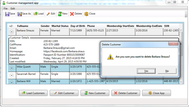
Error handling is carried out by using the INotifyDataErrorInfo interface in combination with Data Annotations. Validation errors are displayed using the Silverlight-based error template, which was discussed earlier in this article. The membership start date must be earlier than the end date. This requirement is enforced using cross property validation. Cross property validation is implemented using a custom validator. I created a validation summary control to show all the active errors. The validation summary control is updated using a simple behavior called ValidationBehavior that transfers validation errors from the View to the ViewModelBase class. When no errors are present the validation summary control is hidden using a datatrigger. You might have noticed that only two of nine errors are highlighted in the screen below. As mentioned earlier, the errors are only highlighted when the corresponding control has the focus or the mouse cursor hovers over the tooltip corner. In the screen below, the first name text box has the focus and the mouse cursor hovers over the tooltip corner of the phone text box. The validation summary control displays all the nine active errors.

Below, the class diagram of the customer management application is shown. You can create this class diagram from within Visual Studio. This allows you to see all the types in your project and their relationships. To create a class diagram that allows viewing all types in your project, do the following. In Solution Explorer, right-click the project and select View Class Diagram. A new class diagram will be created and added to the solution. I collapsed the resulting class diagram classes so that you can see the overview. The class diagram below is included in the source code and allows you to explore all the class properties.

The customer application consists of two views. The first view is the MainWindow view which is the default view and is shown to the user on startup of the application. It contains a datagrid to show all the loaded persons and it has multiple buttons to execute several commands. The second view is the CustomerView which is shown when the user wants to edit or add a new person. Both views don’t contain any code behind, instead the data context of both views is set to their corresponding viewmodel.
The ViewModelBase class contains a SetProperty method which is overridden in the ValidatableViewModelBase class. The SetProperty checks if a person property is changed, if so it raises the propertychanged event for that property, sets the IsDirty flag and updates the Last Modified date for that person object. The PersonService is responsible for loading and saving persons. When the customer application is started an instance of the PersonService is created and passed to the MainWindowViewModel which is then used by the MainWindowViewMode class to retrieve an Ilist of persons. This Ilist of persons is then filtred using a CollectionViewSource. Filtering is needed in order to remove persons from the view who’s deletion flag is set. The deletion flag of a person is set when a user deletes a person from the collection displayed in the MainWindowViewModel. When the user saves the person collection, all persons marked with the deletion flag are removed from the collection. In addition to the deletion flag, the person class also uses an IsNew and an IsDirty flag in order to keep track of changes. When editing a person, changes made in the CustomerView are directly applied to the person object. If the user cancel the changes made by clicking the cancel button, a rollback is performed using the memento pattern as displayed below.
Caretaker<Person> editableObject = new Caretaker<Person>(SelectedPersonValue);
editableObject.BeginEdit();
CustomerViewModel customerViewModel = new CustomerViewModel(ref SelectedPersonValue);
bool? dialogResult = _dialogService.ShowDialog<CustomerView>(this, customerViewModel, "Edit customer");
if (dialogResult.HasValue && dialogResult.Value)
    editableObject.EndEdit();
else
    editableObject.CancelEdit();
Conclusion
As can be seen in this article, there are many options to implement validation rules. From all the options discussed so far my preference goes out to the INotifyDataErrorInfo interface. This interface gives you a lot more flexibility then the IDataErrorInfo interface and should in general be used when implementing new classes. To increase maintainability of your code, I would suggest you use the INotifyDataErrorInfo interface combined with Data Annotations in your validations. The use of the Silverlight-based error template combined with an error summary control is my preferred way to display errors.
Points of Interest
Note that Visual Studio 2010 breaks on an unhandled exception. So in order to be able to test the ExceptionValidationRule error handling you need to uncheck Common Language Runtime Exceptions. To do this press the CTRL + ALT + E combination and uncheck the Thrown and User-unhandled checkboxes.
Another powerful validation control which was not discused in this article is the MaskedTextbox. Originally, it was developed for windows forms, it can also be used in WPF by hosting this control in the WIndowsFormsHost element. In addition there are also third parties who developed their own WPF MaskedTextbox control, a list can be found here. The MaskedTextProvider is the backbone of the MaskedTextbox, the MaskedTextProvider can be considered as a modified text box control that enables you to define a pattern for accepting or rejecting user input.
Note that ValidationRules can be executed at various points in the binding process, depending on the value you set for the ValidationStep property of the ValidationRule. The default value is RawProposedValue, which runs the ValidationRule before any conversion occurs. All possible ValidationStep Enumerations can be found here. In addition this msdn article describes the validation process in detail.
It is bad practice to use messages boxes to display validation errors, because message boxes are too intrusive.
In general the System.Windows.Interactivity.dll assembly can be found in the following location: C:Program FilesMicrosoft SDKsExpressionBlend.NETFrameworkv4.5Libraries
References
- MCTS Self Paced Training Kit Exam 70-511
- Pro WPF 4.5 in Csharp 4th Edition
History
Date, Assembly Version, Notes
August 1 2015, 1.0.0.0, Created the article.
Mohamed Kalmoua is a Microsoft Certified Solutions Developer (MCSD) with over a decade of programming experience. He creates software for the Windows platform using C#, WPF, ASP.NET Core, SQL and C++. Mohamed also loves to build websites using WordPress and Google analytics.